Si le Soleil
Fashion Responsive Website Template
#2 Live Product Previews
Online presentation of physical and digital products has significantly evolved in recent years. Instead of static product previews, we can now see different goods in action, watch video tours and even play around with various components. Live product previews provide the users with a glimpse of how the stuff that they are going to acquire operates. The technique can be integrated not only into the product pages but also on the front page of a website, as in the example given below.
Webydo
Lingerie WooCommerce Theme
#3 Advanced UI Animations
Animations can make your website more interactive and entertaining. These can be used to enhance your site’s storytelling, distract the user’s eye with motion graphics while the page is loading, hover animation, background animation and videos, and so much more. It’s a well-known fact that animation is a better attention trigger than a static image.
The power of animation is so tremendous that we might expect this technique to become obligatory for traditional businesses as well. In the example below you can see how scrolling animation activates new windows to slide open, without the need to click icons or text links.
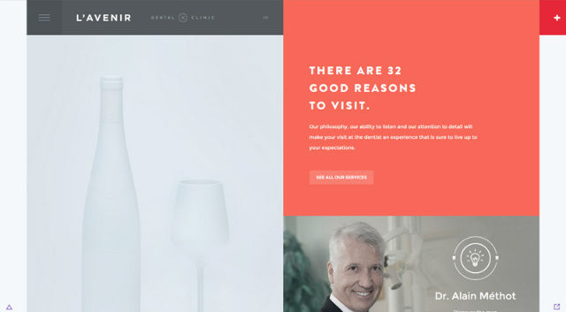
Avenir Clinic
Landing Page Theme
#4 Touch-friendly Design Elements
Taking into consideration the massive shift of web users from desktop to handheld devices, making your site responsive has become a “must”. However, it is not only the fluid adaptation of your site’s layout to various screen types and sizes that matter. The basic navigation elements should be no less touch- and user-friendly. When browsing a website from a desktop device, triggering very tiny elements with a mouse is not an issue at all. However, when it comes to tablets and smartphones, handling such small targets can be a challenging task. So, make sure that your icons, buttons, menus and other design elements are easy to swipe and tap on touchscreen displays.
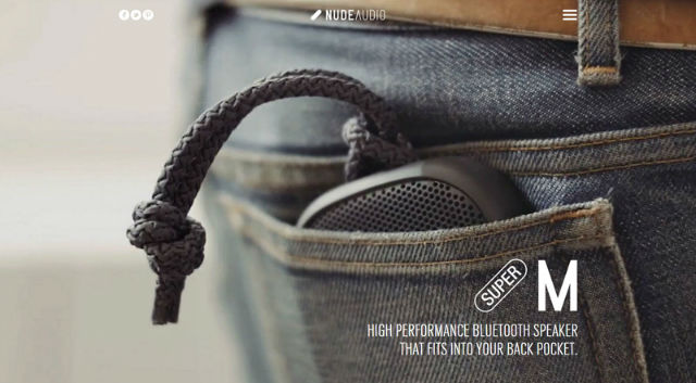
NudeAudio
Responsive Website Template
#5 Material Design
Material design trend has moved far beyond mobile apps within the world of web design. This is a set of Google design standards introduced back in 2014. It’s all about creating more realistic designs using shadows, layers and the concepts of movement and depth. The trend is not new. However, with every New Year, it gains more traction among web designers striving to create clean, sophisticated looks for their web projects, with the primary focus on UX.
Material Interaction
Material Style Joomla Template
#6 Flat and Almost-flat Design
Since we have already mentioned the material design trend, it would be logical to continue with flat style. The two have often been confused. While material design is based on 3D and aims to bring some nice graphical elements to the design, flat style minimizes all the showy stuff that can distract the user’s attention. Flat style uses sharp edges, thin lines, and solid colors.
In 2016, the trend continues to evolve. Flat-styled websites are still experiencing significant demand. However, instead of the traditional flat style with a heavy emphasis on minimalism, we achieve this through a more playful variation. In 2016, almost-flat will rule the web. This variation of flat style features more eye-catching elements, hints of shadows and coloration.
Minimums
Flat Style WordPress Theme
#7 “Old” Vintage Style is Back in Fashion
If you reach a website built in pale colors, featuring vintage fonts, pixelated icons, and texts, galactic backgrounds, stars and planets moving in an interactive way, don’t be in a hurry to leave it. This is a new web design trend that revives the good old style of the 80’s and brings it back into today’s online projects.
White Frontier
Lacrosse Club Website Template
#8 Vibrant Custom Illustrations
The growing popularity of high pixel density retina displays has resulted in a bad performance of such standard image formats as .jpeg and .png on the last generation devices. The unintentionally pixelated look of such visuals (we are not talking about the vintage style here) can spoil the general presentation of your site, and make the users leave in search of something of better quality.
For this not to happen, web designers have shifted to Scalable Vector Graphics and icon fonts, which can adapt to any screen flawlessly and remain crisp at any resolution. With the purpose of providing a better delivery of their message to the audience and making all images match their brand identity, the companies are creating custom SVG illustrations and hand-drawn icon fonts that will look amazing on any screen resolution.
Ice & Sky
Web Design Agency WordPress Theme
#9 Less Rigid Grids
Pinterest-inspired grids are still in high demand among the web audience. Minimalism, flat style, and Bootstrap make integration of the technique into web designs a breeze. Just like many other trends on the list, grid-based layouts have evolved and now look more creative and interactive.
In addition to providing for a more captivating storytelling process, grids are typical for mobile-friendly designs. Allowing a more balanced look, they can also adjust smoothly to multiple display sizes.
Bernd Kammerer
Hair Care PrestaShop Theme
#10 Dramatic Typography
Typography is one of the key elements that should be making a strong statement on your site. As web design trends evolve, so do the techniques and approaches of presenting the written data. Fonts of extreme size (either too big or too small), artistic typefaces, as well as creative use of simple fonts are in vogue this year. These styles can also be mixed within one design to create a more breathtaking visual palette.
Fake Music
7 Level WordPress Theme
#11 Dynamic Storytelling
This is a company story with the presentation of products or services being organized into a creative yet easy to follow way. Commonly achieved utilizing graphics, accompanied by text, it guides visitors through the entire story step-by-step, while clicking or scrolling. The technique can be organized into a timeline, with a perfect balance of graphics and text. An over-abundance of each of the components can make the UX overwhelming and confuse the visitors.
New Jumo Concept
Houston WordPress Theme
#12 Personal Branding
It’s all about visuals, ideas, concepts, and perceptions that distinguish one brand from another. The way you present your company, promote your products, work and communicate will make you distinguishable from others. Regarding web design, colors, custom fonts, your company logo, visuals and other unique elements can make your brand recognizable. Keep it consistent and unique, and people will start talking about you.
Swirls
Monstroid Multi-purpose WordPress Theme
#13 Hidden Menus
The Hamburger menu remains one of the most convenient ways of showcasing your website’s content in a concise manner. While being widely used in mobile designs, the technique can also make a desktop version of your web page more usable. While being widely recognized, the 3-line icon, placed in the upper right corner of your site, will provide the users with quick access to the rest of your pages, without distracting their attention when reading a text, viewing your portfolio, etc.
Sampedro
Home Electronics Magento Theme
#14 Microinteractions
As the name implies, the technique is all about micro-interactions that will make up the ultimate positive user experience on the site. These can be either active (like entering your password or clicking a ‘like’ button) or passive (like an audio notification when a new message arrives).
Being indispensable for a user-friendly UX, micro-interactions can be filtered by their purpose.
- The ones that are intended to accomplish a task (registration, login, sending an email). /
- Synchronization between devices, sites or apps.
- Managing site settings.
- Data feedback (obtaining real-time data in response to a request).
Brand Junkie
Reebo PrestaShop Theme
#15 HD Backgrounds
HD visuals are going to become stronger in 2016. The rise of HD displays will dictate new web design fashion. Standard JPEG images will no longer appeal to the users. Today, we need something that can scale up and down to any screen size. This is where HD backgrounds come in handy. As a rule, these are made in SVG format and are divided into the three broad groups: images, videos, and animation.
- HD images commonly have a full-width or hero placement. Known as great attention-grabbers, HD image backgrounds should be better paired with minimalist design elements, in order not to make your page look overwhelming.
- HD videos will help you create emotional connections with the audience. If you decide to opt for this choice, there are several basic rules to follow: 10-30 second loops in order not to slow down page loading; sound off to avoid annoyance; minimize video loading as much as possible, still keeping the quality at a high level. /
- HD animation is something in between the previous two options. For animation to look organic within your design, try to keep it simple. Design it in colors and with fonts that are used in your interface. And pay particular attention that you build it using vector type. Otherwise you might have a problem with its display on different screens.
Flipboard
Supreme WordPress Theme
#16 Functional Minimalism
“Less is more” – this is the fundamental concept that we bear in mind when speaking of minimalist web designs. Created in a clean and concise manner, these are not rich in multiple design elements. On the contrary, every detail is integrated to serve a particular function.
The best thing about minimalism is its ease of integration with other web design trends, like flat style, the use of white space and dramatic typography, integration of simple navigation or adding hero images to the site, etc. The key philosophy of the minimalist trend is to place the minimum number of elements on the page, thus making your objective more easily understood by the target audience.
Apple
Creative WordPress Theme
#17 Long Scroll
This is one more trend that was profoundly influenced by the growing use of mobile devices. Such a tendency means that web designers are faced with a challenge to become more creative in their works. This was when scrolling replaced clicking. The benefits of the long scroll are numerous. Here are just a few of them:
- Makes storytelling more creative and interactive than page-by-page navigation.
- Facilitates navigation on touch devices.
- Enhances the visual appeal with the parallax scroll, animations, smooth transitions, etc.
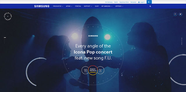
Samsung
Landing Page Template
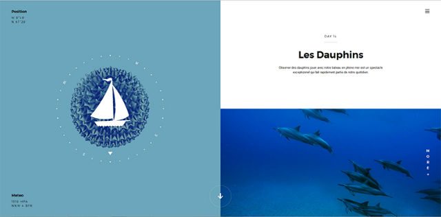
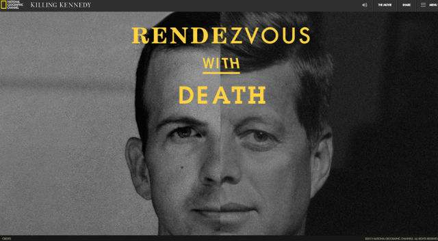
#18 Split Screen
The vertical divide of the page allows you to present two elements at a time. The technique will be of particular interest to businesses that have two equally important things to promote at the same time. On the other hand, you can use it to demonstrate some catchy visual stuff on one side and accompany it with brief explanations on the other.
Killing Kennedy
Business Joomla Template
#19 Single-page Websites
Single-page websites are the preferred option for enterprises that want to emphasize simplicity and speed of their web projects. Commonly used to present a certain product or service, single-page sites are rich in visual effects and animation. This can be literally everything – from parallax scrolling to scroll jacking. A long scroll technique is especially applicable to such web resources, making all content loading hassle-free on any device.
The Cook App
Responsive Landing Page Template
#20 Monochromatic Schemes
Bold, vibrant web design colors have become one of the most noticeable trends in recent months. Bold colors are especially popular among monochromatic schemes that use varying shades of the same colors in their designs. In the example below you can see how design, built in different shades of green, creates an aesthetic and visually pleasing effect when used within one minimalist design and accompanied by dramatic lettering and ghost buttons.
Exo-Skills
Communication WordPress Theme
As you may have already noticed, many of these 20 web design trends are not new. With the flow of time, most of them have evolved into something new, somewhat different, but no less usable. We hope that our post will help you create a smart website that keeps pace with current web design trends and stands out from the competition.
Now, we’d like you to speak up and share your suggestions on other cool web trends that are worth being mentioned in this publication. What do you think about the themes that we have shared? Are they good to start a website with? Your feedback is always appreciated!
About the Author
Katherine Crayon is a copywriter reporting on tech news and all aspects of the web design industry. Anyone looking for more inspirational posts, tips and advice or simply the latest industry news, meet her in person on
Time changes, and so does the web. In 2016, we are ready to meet and adopt new techniques, which we never came across before. Of course, some trends of the past year will still keep on dictating web fashion during the next 366 days. However, none of them will be left without changes. So, what are the key web design trends on which we should keep a close eye in 2016? Let’s find out in this post.
Just before we proceed to the compilation, I think that it’s worth mentioning that each of the 20 trends listed below is illustrated by means of an active website (where a certain technique is implemented) and a ready-made website template/WordPress theme/landing page template, which will help you attain similar results in no time.
#1 Card-based Layouts
Card-based UIs are now one of the fastest growing web design trends. Presented by Pinterest and then popularized by such social media platforms as Facebook and Twitter, the organization of content into separate containers can bring your site more value than you expect. Card-based UIs are pleasing to the eye and well balanced. However, this is also very practical regarding mobile designs. These types of layouts are very flexible and dynamic. They allow for a consistent experience across a variety of devices.
Si le Soleil
Fashion Responsive Website Template
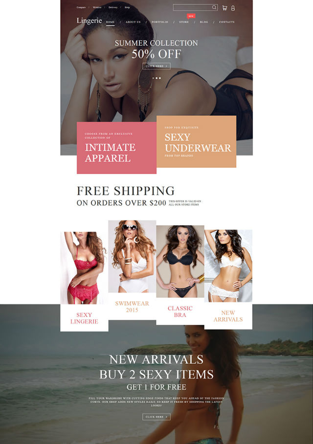
#2 Live Product Previews
Online presentation of physical and digital products has significantly evolved in recent years. Instead of static product previews, we can now see different goods in action, watch video tours and even play around with various components. Live product previews provide the users with a glimpse of how the stuff that they are going to acquire operates. The technique can be integrated not only into the product pages but also on the front page of a website, as in the example given below.
Webydo
Lingerie WooCommerce Theme
#3 Advanced UI Animations
Animations can make your website more interactive and entertaining. These can be used to enhance your site’s storytelling, distract the user’s eye with motion graphics while the page is loading, hover animation, background animation and videos, and so much more. It’s a well-known fact that animation is a better attention trigger than a static image.
The power of animation is so tremendous that we might expect this technique to become obligatory for traditional businesses as well. In the example below you can see how scrolling animation activates new windows to slide open, without the need to click icons or text links.
Avenir Clinic
Landing Page Theme
#4 Touch-friendly Design Elements
Taking into consideration the massive shift of web users from desktop to handheld devices, making your site responsive has become a “must”. However, it is not only the fluid adaptation of your site’s layout to various screen types and sizes that matter. The basic navigation elements should be no less touch- and user-friendly. When browsing a website from a desktop device, triggering very tiny elements with a mouse is not an issue at all. However, when it comes to tablets and smartphones, handling such small targets can be a challenging task. So, make sure that your icons, buttons, menus and other design elements are easy to swipe and tap on touchscreen displays.
NudeAudio
Responsive Website Template
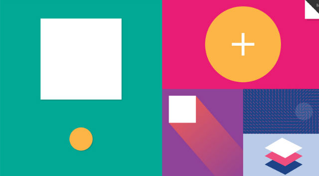
#5 Material Design
Material design trend has moved far beyond mobile apps within the world of web design. This is a set of Google design standards introduced back in 2014. It’s all about creating more realistic designs using shadows, layers and the concepts of movement and depth. The trend is not new. However, with every New Year, it gains more traction among web designers striving to create clean, sophisticated looks for their web projects, with the primary focus on UX.
Material Interaction
Material Style Joomla Template
#6 Flat and Almost-flat Design
Since we have already mentioned the material design trend, it would be logical to continue with flat style. The two have often been confused. While material design is based on 3D and aims to bring some nice graphical elements to the design, flat style minimizes all the showy stuff that can distract the user’s attention. Flat style uses sharp edges, thin lines, and solid colors.
In 2016, the trend continues to evolve. Flat-styled websites are still experiencing significant demand. However, instead of the traditional flat style with a heavy emphasis on minimalism, we achieve this through a more playful variation. In 2016, almost-flat will rule the web. This variation of flat style features more eye-catching elements, hints of shadows and coloration.
Minimums
Flat Style WordPress Theme
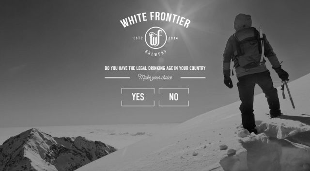
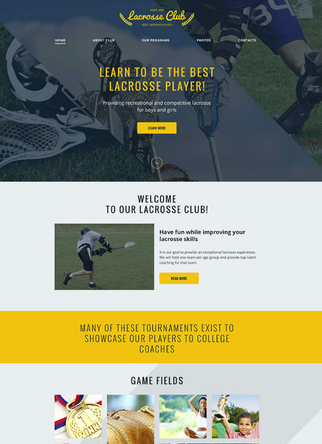
#7 “Old” Vintage Style is Back in Fashion
If you reach a website built in pale colors, featuring vintage fonts, pixelated icons, and texts, galactic backgrounds, stars and planets moving in an interactive way, don’t be in a hurry to leave it. This is a new web design trend that revives the good old style of the 80’s and brings it back into today’s online projects.
White Frontier
Lacrosse Club Website Template
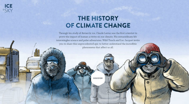
#8 Vibrant Custom Illustrations
The growing popularity of high pixel density retina displays has resulted in a bad performance of such standard image formats as .jpeg and .png on the last generation devices. The unintentionally pixelated look of such visuals (we are not talking about the vintage style here) can spoil the general presentation of your site, and make the users leave in search of something of better quality.
For this not to happen, web designers have shifted to Scalable Vector Graphics and icon fonts, which can adapt to any screen flawlessly and remain crisp at any resolution. With the purpose of providing a better delivery of their message to the audience and making all images match their brand identity, the companies are creating custom SVG illustrations and hand-drawn icon fonts that will look amazing on any screen resolution.
Ice & Sky
Web Design Agency WordPress Theme
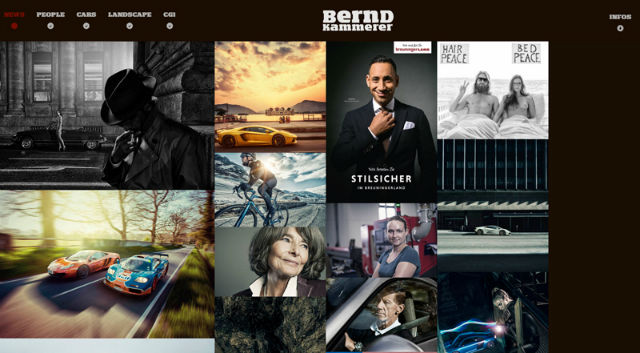
#9 Less Rigid Grids
Pinterest-inspired grids are still in high demand among the web audience. Minimalism, flat style, and Bootstrap make integration of the technique into web designs a breeze. Just like many other trends on the list, grid-based layouts have evolved and now look more creative and interactive.
In addition to providing for a more captivating storytelling process, grids are typical for mobile-friendly designs. Allowing a more balanced look, they can also adjust smoothly to multiple display sizes.
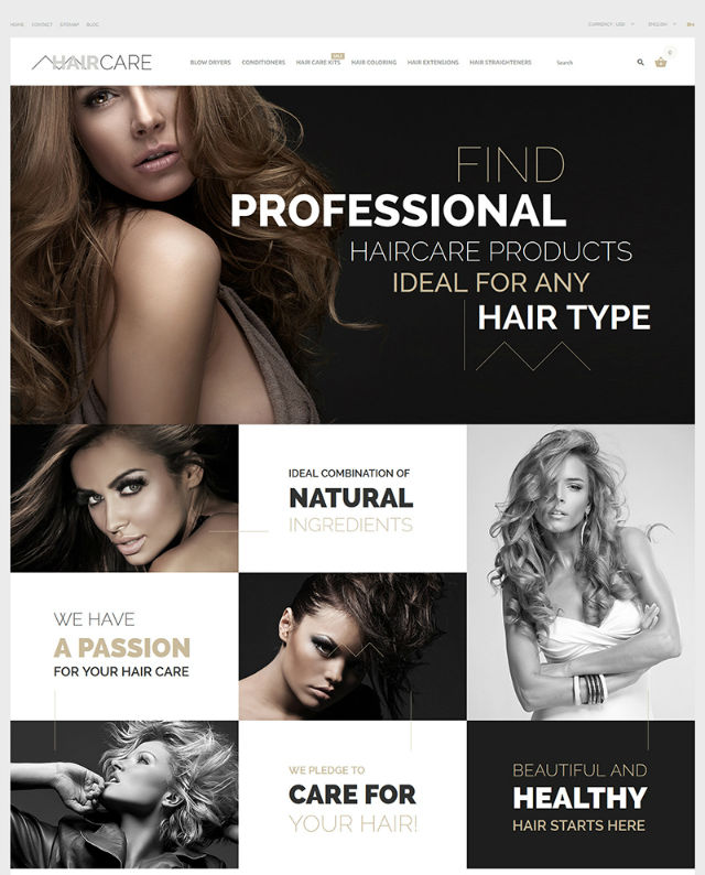
Bernd Kammerer
Hair Care PrestaShop Theme
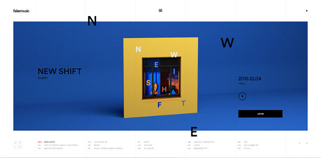
#10 Dramatic Typography
Typography is one of the key elements that should be making a strong statement on your site. As web design trends evolve, so do the techniques and approaches of presenting the written data. Fonts of extreme size (either too big or too small), artistic typefaces, as well as creative use of simple fonts are in vogue this year. These styles can also be mixed within one design to create a more breathtaking visual palette.
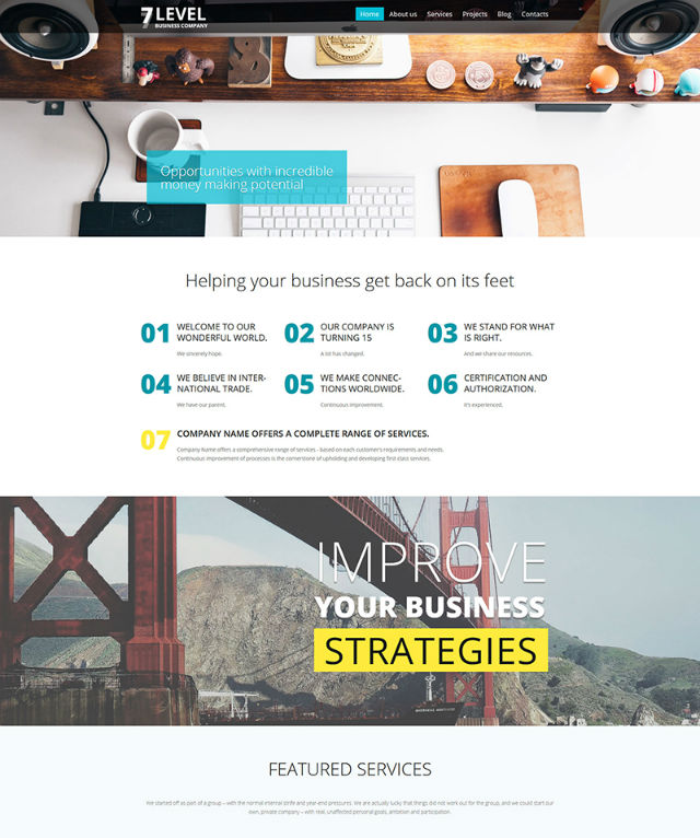
Fake Music
7 Level WordPress Theme
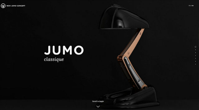
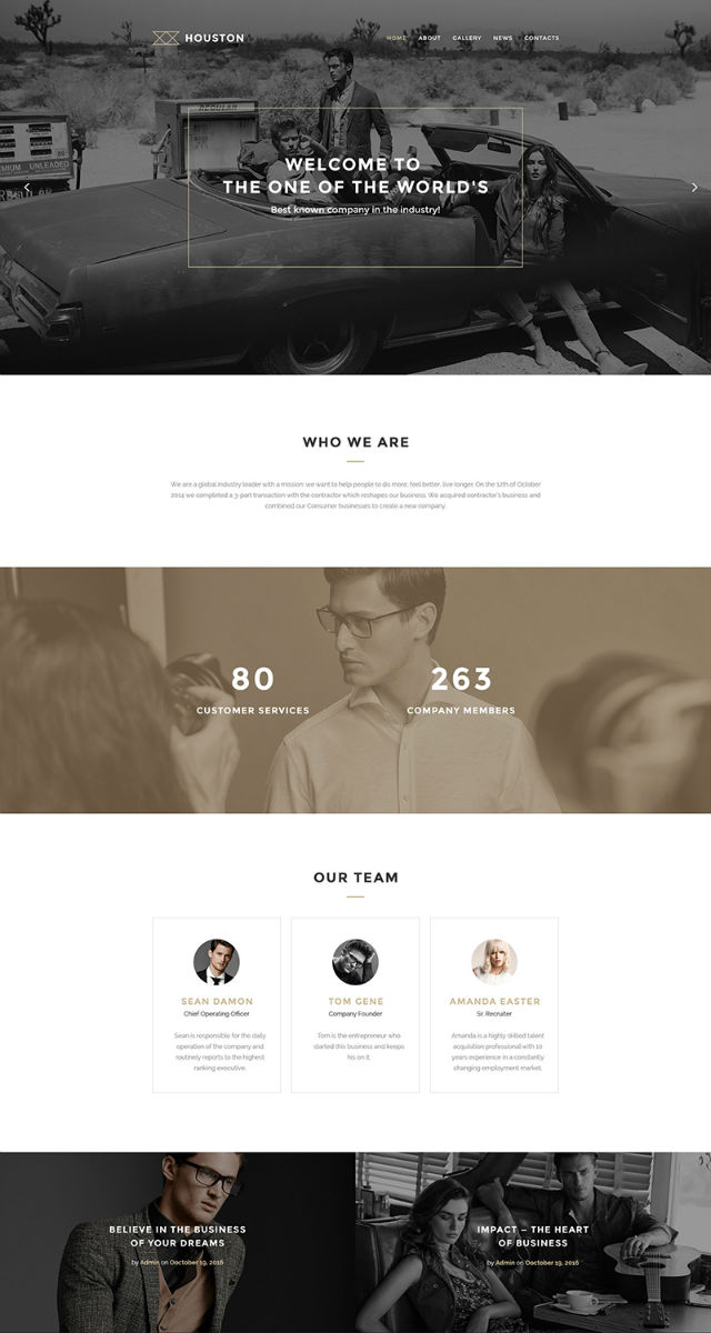
#11 Dynamic Storytelling
This is a company story with the presentation of products or services being organized into a creative yet easy to follow way. Commonly achieved utilizing graphics, accompanied by text, it guides visitors through the entire story step-by-step, while clicking or scrolling. The technique can be organized into a timeline, with a perfect balance of graphics and text. An over-abundance of each of the components can make the UX overwhelming and confuse the visitors.
New Jumo Concept
Houston WordPress Theme
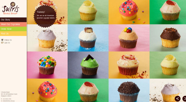
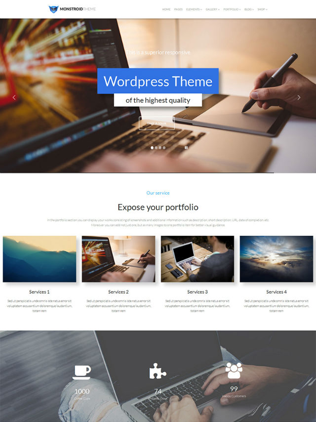
#12 Personal Branding
It’s all about visuals, ideas, concepts, and perceptions that distinguish one brand from another. The way you present your company, promote your products, work and communicate will make you distinguishable from others. Regarding web design, colors, custom fonts, your company logo, visuals and other unique elements can make your brand recognizable. Keep it consistent and unique, and people will start talking about you.
Swirls
Monstroid Multi-purpose WordPress Theme
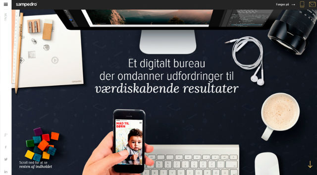
#13 Hidden Menus
The Hamburger menu remains one of the most convenient ways of showcasing your website’s content in a concise manner. While being widely used in mobile designs, the technique can also make a desktop version of your web page more usable. While being widely recognized, the 3-line icon, placed in the upper right corner of your site, will provide the users with quick access to the rest of your pages, without distracting their attention when reading a text, viewing your portfolio, etc.
Sampedro
Home Electronics Magento Theme
#14 Microinteractions
As the name implies, the technique is all about micro-interactions that will make up the ultimate positive user experience on the site. These can be either active (like entering your password or clicking a ‘like’ button) or passive (like an audio notification when a new message arrives).
Being indispensable for a user-friendly UX, micro-interactions can be filtered by their purpose.
- The ones that are intended to accomplish a task (registration, login, sending an email). /
- Synchronization between devices, sites or apps.
- Managing site settings.
- Data feedback (obtaining real-time data in response to a request).
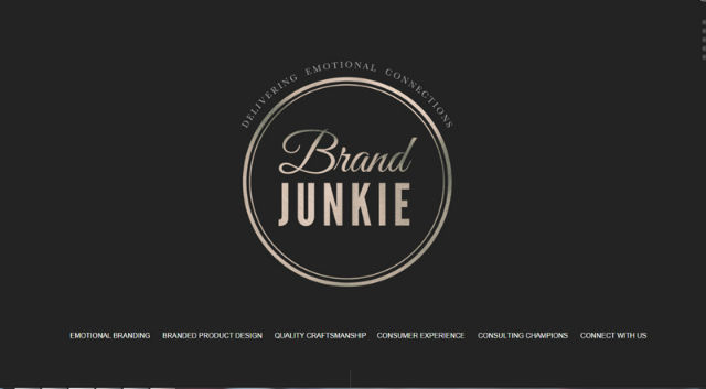
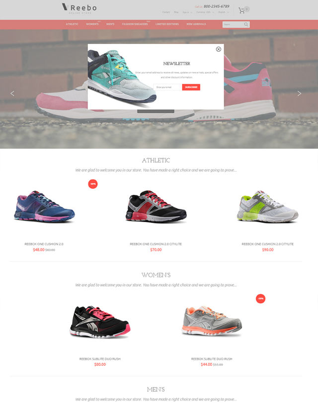
Brand Junkie
Reebo PrestaShop Theme
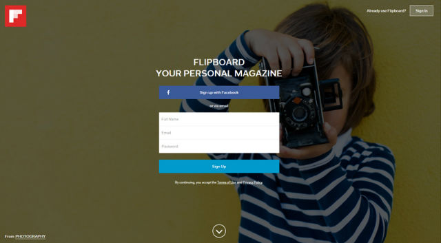
#15 HD Backgrounds
HD visuals are going to become stronger in 2016. The rise of HD displays will dictate new web design fashion. Standard JPEG images will no longer appeal to the users. Today, we need something that can scale up and down to any screen size. This is where HD backgrounds come in handy. As a rule, these are made in SVG format and are divided into the three broad groups: images, videos, and animation.
- HD images commonly have a full-width or hero placement. Known as great attention-grabbers, HD image backgrounds should be better paired with minimalist design elements, in order not to make your page look overwhelming.
- HD videos will help you create emotional connections with the audience. If you decide to opt for this choice, there are several basic rules to follow: 10-30 second loops in order not to slow down page loading; sound off to avoid annoyance; minimize video loading as much as possible, still keeping the quality at a high level. /
- HD animation is something in between the previous two options. For animation to look organic within your design, try to keep it simple. Design it in colors and with fonts that are used in your interface. And pay particular attention that you build it using vector type. Otherwise you might have a problem with its display on different screens.
Flipboard
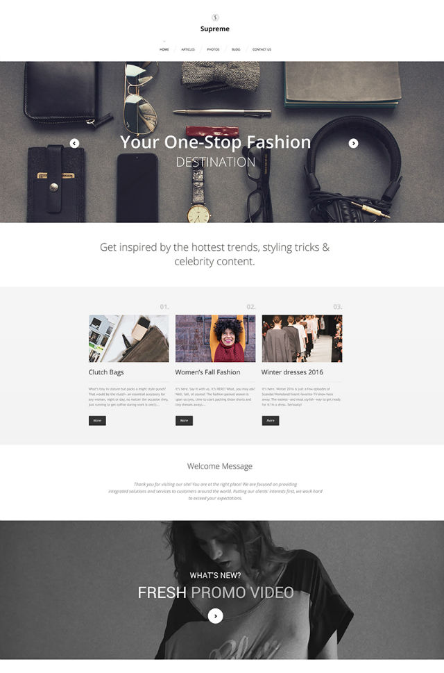
Supreme WordPress Theme
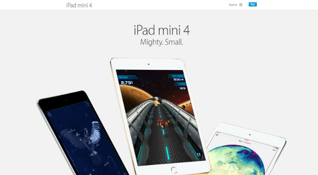
#16 Functional Minimalism
“Less is more” – this is the fundamental concept that we bear in mind when speaking of minimalist web designs. Created in a clean and concise manner, these are not rich in multiple design elements. On the contrary, every detail is integrated to serve a particular function.
The best thing about minimalism is its ease of integration with other web design trends, like flat style, the use of white space and dramatic typography, integration of simple navigation or adding hero images to the site, etc. The key philosophy of the minimalist trend is to place the minimum number of elements on the page, thus making your objective more easily understood by the target audience.
Apple
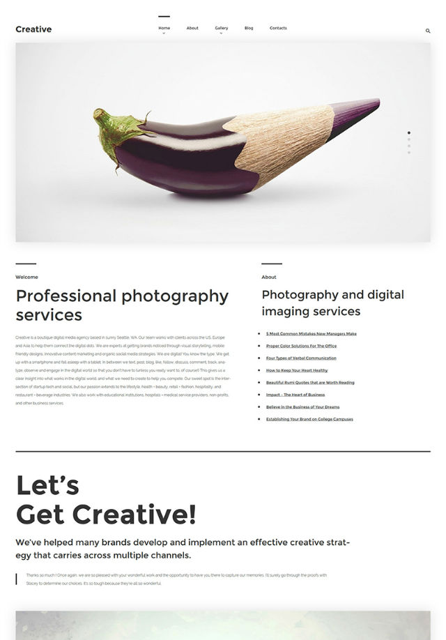
Creative WordPress Theme
#17 Long Scroll
This is one more trend that was profoundly influenced by the growing use of mobile devices. Such a tendency means that web designers are faced with a challenge to become more creative in their works. This was when scrolling replaced clicking. The benefits of the long scroll are numerous. Here are just a few of them:
- Makes storytelling more creative and interactive than page-by-page navigation.
- Facilitates navigation on touch devices.
- Enhances the visual appeal with the parallax scroll, animations, smooth transitions, etc.
Samsung
Landing Page Template
#18 Split Screen
The vertical divide of the page allows you to present two elements at a time. The technique will be of particular interest to businesses that have two equally important things to promote at the same time. On the other hand, you can use it to demonstrate some catchy visual stuff on one side and accompany it with brief explanations on the other.
Killing Kennedy
Business Joomla Template
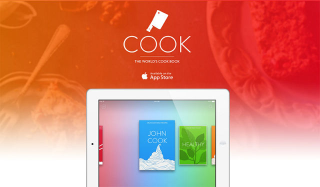
#19 Single-page Websites
Single-page websites are the preferred option for enterprises that want to emphasize simplicity and speed of their web projects. Commonly used to present a certain product or service, single-page sites are rich in visual effects and animation. This can be literally everything – from parallax scrolling to scroll jacking. A long scroll technique is especially applicable to such web resources, making all content loading hassle-free on any device.
The Cook App
Responsive Landing Page Template
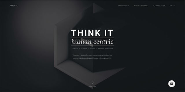
#20 Monochromatic Schemes
Bold, vibrant web design colors have become one of the most noticeable trends in recent months. Bold colors are especially popular among monochromatic schemes that use varying shades of the same colors in their designs. In the example below you can see how design, built in different shades of green, creates an aesthetic and visually pleasing effect when used within one minimalist design and accompanied by dramatic lettering and ghost buttons.
Exo-Skills
Communication WordPress Theme
As you may have already noticed, many of these 20 web design trends are not new. With the flow of time, most of them have evolved into something new, somewhat different, but no less usable. We hope that our post will help you create a smart website that keeps pace with current web design trends and stands out from the competition.
Now, we’d like you to speak up and share your suggestions on other cool web trends that are worth being mentioned in this publication. What do you think about the themes that we have shared? Are they good to start a website with? Your feedback is always appreciated!
About the Author
Katherine Crayon is a copywriter reporting on tech news and all aspects of the web design industry. Anyone looking for more inspirational posts, tips and advice or simply the latest industry news, meet her in person on G+ and Twitter.
(dpe)
* You might also be interested in the following articles


")


![Cartoon: If Web Designers Were Butchers… [008]](http://www.noupe.com/wp-content/plugins/contextual-related-posts-2.0.1/timthumb/timthumb.php?src=http%3A%2F%2Fwww.noupe.com%2Fwp-content%2Fuploads%2F2015%2F03%2Fteaser_noupe_butcher.png&w=250&h=200&zc=1&q=75 "Cartoon: If Web Designers Were Butchers… [008]")

![Cartoon: If Web Designers Were Florists … [007]](http://www.noupe.com/wp-content/plugins/contextual-related-posts-2.0.1/timthumb/timthumb.php?src=http%3A%2F%2Fwww.noupe.com%2Fwp-content%2Fuploads%2F2015%2F02%2Fnoupe_cartoon_teaser_220215.png&w=250&h=200&zc=1&q=75 "Cartoon: If Web Designers Were Florists … [007]")

![[Quick Tip] Dynatable for jQuery: Static Tables Are in Danger of Extinction](http://www.noupe.com/wp-content/plugins/contextual-related-posts-2.0.1/timthumb/timthumb.php?src=http%3A%2F%2Fwww.noupe.com%2Fwp-content%2Fuploads%2F2014%2F12%2Fdynatable.png&w=250&h=200&zc=1&q=75 "[Quick Tip] Dynatable for jQuery: Static Tables Are in Danger of Extinction")


