I’ve been auditing a ton of CSS lately and thought it would be neat to jot down how I’m going about doing that. I’m sure there are a million different ways to do this depending on the size and scale of your app and how your CSS works under the hood, so please take all this with a grain of salt.
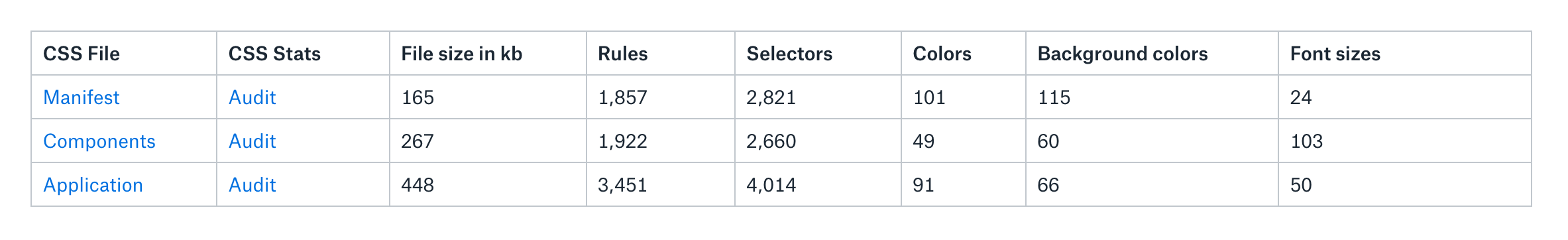
First a few disclaimers: at Gusto, the company I work for today, our engineers and designers all write in Sass and use webpack to compile those files into CSS. Our production environment minifies all that code into a single CSS file. However, our CSS is made up of three separate domains. so I downloaded them all to my desktop because I wanted to test them individually.
Here’s are those files and what they do:
manifest.css: a file that’s generated from all our Sass functions, mixins and contains all of our default HTML styles and utility classes.
components.css: a file that consists of our React components such as Button.scss, Card.scss, etc. This and manifest.css both come from our Component Library repo and are imported into our main app.
app.css: a collection of styles that override our components and manifest. Today, it exists in our main application repo.
After I downloaded everything, I threw them into an S3 bucket and ran them through CSS Stats. (I couldn’t find a command line tool that I liked, so I decided stuck with this tool.) The coolest thing about CSS Stats is that it provides a ton of clarity about the health and quality of a site’s CSS, and in turn, a design system. It does this by showing the number of unique font-size and unique background-color CSS declarations there are, as well as a specificity graph for that particular CSS file.
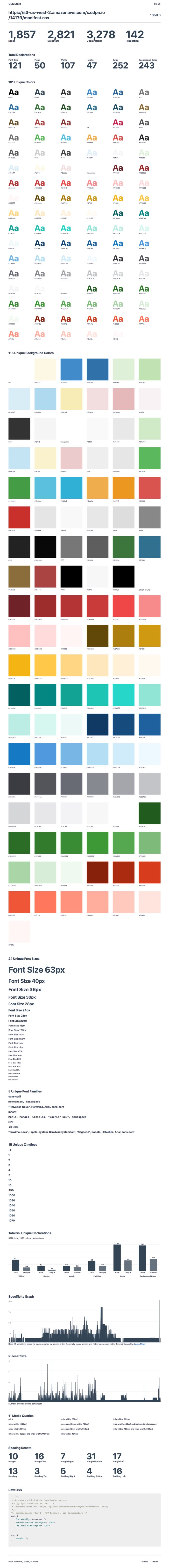
I wanted to better understand our manifest.css file first. As I mentioned, this file contains all our utility classes (such as padding-top-10px and c-salt-500) as well as our normalize and reset CSS files, so it’s pretty foundational for everything else. I started digging through the results:
There are some obvious issues here, like the fact that there are 101 unique colors and 115 unique background colors. Why is this a big deal? Well, it’s a little striking to me because our team had already made a collection of Sass functions to output a very specific number of colors. In our Figma UI Kit and variables_color.scss (which gets compiled into our manifest file, we declare a total of 68 unique colors:
So, where are all these extra colors coming from? Well, I assume that they’re coming from Bootstrap. Back when we started building the application, we hastily built on top of Bootstrap’s styles without refactoring things as we went. There was a certain moment when this started to hurt as we found visual inconsistencies across our application and hundreds of lines of code being written that simply overrode Bootstrap. In a rather gallant CSS refactor, I removed Bootstrap’s CSS from our main application and archived it inside manifest.css, waiting for the day when we could return to it and refactor it all.
These extra colors are likely come from that old Bootstrap file, but it’s probably worth investigating some more. Anyway, the real issue with this for me is that my understanding of the design system is different from what’s in the front-end. That’s a big problem! If my understanding of the design system is different from how the CSS works, then there’s enormous potential for engineers and designers to pick up on the wrong patterns and for confusion to disseminate across our organization. Think about the extra bloat and lack of maintainability, not to mention other implications.
I was reading Who Are Design Systems For? by Matthew Ström and perked up when he quotes a talk by Julie Ann-Horvath where she’s noted as saying, “a design system doesn’t exist until it’s in production.” Following the logic, it’s clear the design system I thought we had didn’t actually exist.
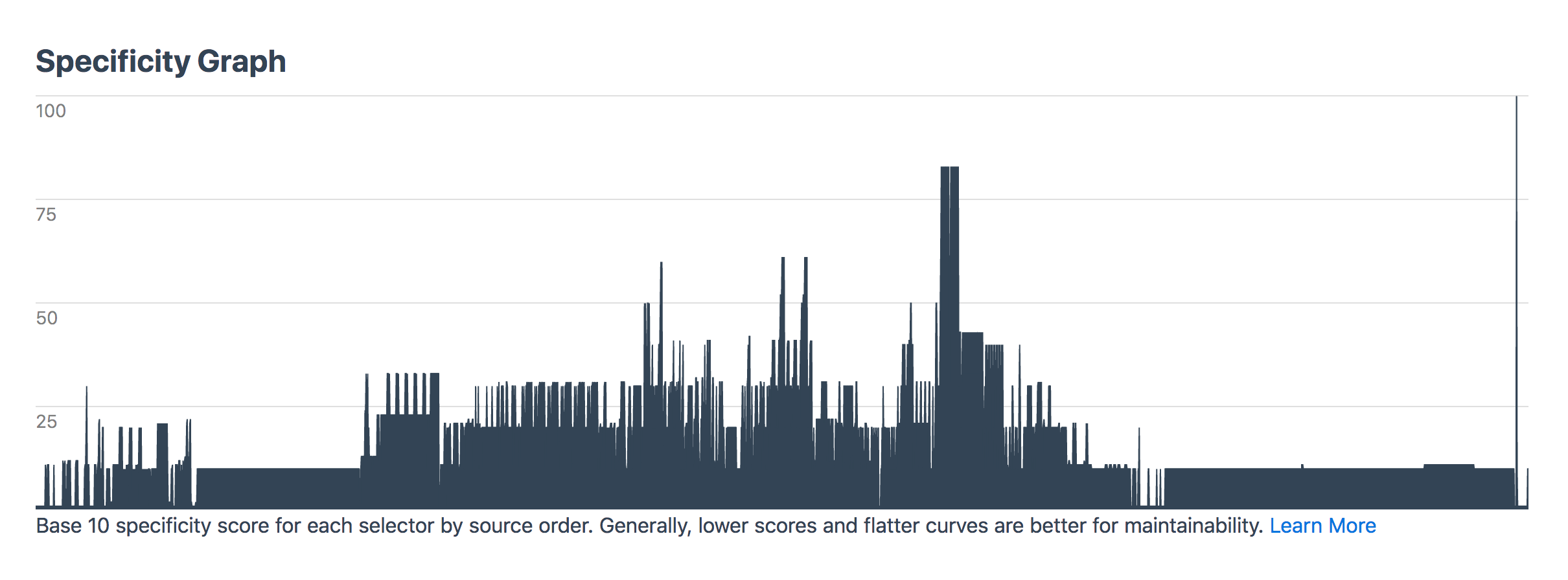
Going back to manifest.css though: the specificity graph for this file should be perfectly gradual and yet there are some clear spikes that show there’s probably a bit more CSS that needs to be refactored in there:
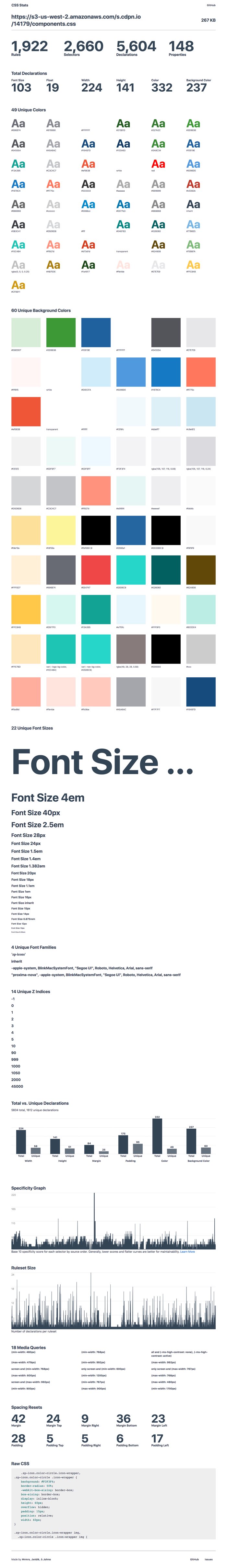
Anyway, next up is our components.css. Remember that’s the file that our styles for our components come from so I thought beforehand that it’s bound to be a little messier than our manifest file. Throwing it into CSS Stats returns the following:
CSS-Stats shows some of the same problems — like too many font sizes (what the heck is going on with that giant font size anyway?) — but there are also way too many custom colors and background-colors. I already had a hunch about what the biggest issue with this CSS file was before I started and I don’t think the problem is not shown in this data here at all.
Let me explain.
A large number of our components used to be Bootstrap files of one kind or another. Take our Accordion.jsx React component, for instance. That imports an accordion.css file which is then compiled with all the other component’s CSS into a components.css file. The problem with this is that some Accordion styles affect a lot more than just that component. CSS from this this file bleeds into other patterns and classes that aren’t tied to just one component. It’s sort of like a poison in our system and that impacts our team because it makes it difficult to reliably make changes to a single component. It also leads to a very fragile codebase.
So I guess what I’m saying here is that tools like CSS Stats are wondrous things to help us check core vital signs for CSS health, but I don’t think they’ll ever really capture the full picture.
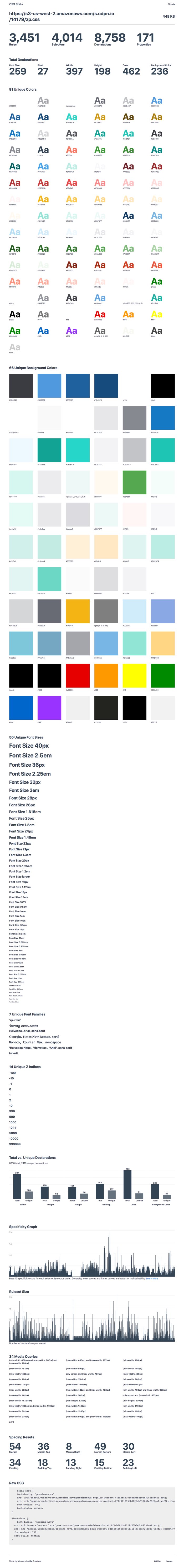
Anyway, next up is the app.css file:
This is the “monolith” — the codebase that our design systems team is currently trying to better understand and hopefully refactor into a series of flexible and maintainable React components that others can reuse again and again.
What worries me about this codebase is the specificity of it all what happens when something changes in the manifest.css or in our components.css? Will those styles be overridden in the monolith? What will happen to the nice and tidy component styles that we import into a new project?
Subsequently, I don’t know where I stole this, but I’ve been saying it an awful lot lately — you should always be able to predict what your CSS is going to do, whether that’s a single line of code or a giant codebase of intermingled styles. That’s what design systems are all about — designing and building predictable interfaces for the future. And if our compiled CSS has all these unpredictable and unknowable parts to it, then we need to gather everyone together to fix it.
Anywho, I threw some of the data into a Dropbox Paper doc after all this to make sure we start tackling these issues and see gradual improvements over time. That looks something like this today:
How have you gone about auditing your CSS? Does your team code review CSS? Are there any tricks and tips you’d recommend? Leave a comment below!
It’s rather heartwarming to know you can style a in a rather cross-browser friendly way that doesn’t hurt accessibility. Kudos for documenting this Scott!
<p data-height="372" data-theme-id="1" data-slug-hash="RELVWj" data-default-tab="css,result" data-user="chriscoyier" data-pen-title="Styled “>See the Pen Styled <select&rt; by Chris Coyier (@chriscoyier) on CodePen.
As we come to the end of 2018, I spoke to some of the Smashing team, to get some thoughts on what the past year has been like for Smashing Magazine. We’re a small and fully remote team, communicating via Slack and Notion. Many of us only work part-time for Smashing, however, in many ways, I think that is one of our strengths.
We’re not just the publishers of an online magazine or conference organizers, we are people who work in the web industry. Among the team, products have been launched, books are being written, conferences have been spoken at, and websites launched that have nothing to do with Smashing Magazine itself. I love that. It stops us being insular, and I hope this helps us to constantly broaden our reach — bringing people together from all over the world to share ideas and inspiration as we all work together to build a better web.
As Editor in Chief of Smashing Magazine, I look after the content that goes out on the online magazine, and also our upcoming print magazine for members. This year, we have published almost every weekday — that represents over 290 articles! That’s a whole lot of content on subjects from privacy and accessibility to CSS and WordPress. While I read every article that goes out, I do not have the expertise to know everything about all of these subjects. I couldn’t do my job without the help of our talented editors who work with individual authors: Alma Hoffmann (Design), Chui Chui Tan (UX Design), Drew McLellan (Coding), Jim Dabell (Mobile), Marko Dugonji? (Typography), Michel Bozgounov (Graphics), and Rey Bango (Coding). Plus thanks to Iris Lješnjanin, Markus Seyfferth, Yana Kirilenko, Cosima Mielke, Andrew Lobo and Ricardo Gimenes for their hard work and efforts.
In Between Timezones
On a personal note, this year has once again involved a lot of travel, as I continue to tour around speaking about new CSS and CSS Layout. That has included talks and workshops for Smashing. In total (with speaking engagements, workshops and CSS Working Group meetings), I have traveled 272,865 kilometers while visiting 45 cities and 15 countries. That amounts to spending 146 days on the road.
Here’s a fun fact: My weekly standup post in our Smashing Slack usually starts with sharing the timezones I’m going to be in that week. Well, next year will involve more travel, and I’ll be bringing my new CSS Layout workshop to San Francisco, Toronto, and New York.
As for the magazine, I hope we can continue to publish great content from authors — those who are experienced writers but also folks writing for the first time. We are very happy to work with you to shape an article for publication. Personally, writing has helped boost my career more than anything else I have done. I love to help other people get started. So, if you have an idea, read this and then send over an outline.
Please don’t hesitate. Some of our most popular posts have been beginner guides to a technology, so don’t feel you need to have solved a big problem, or have some brand new technique in order to contribute. A nice technique, demonstrated and explained well, is worth a lot to someone who has just hit that same issue.
Anyway, enough from me! What were the highlights of the year for everyone else here at Smashing?
2018 was a quite busy and adventurous year for me, with a good number of ups and downs, challenges, surprises, and rewards. I was honored to have had the opportunity to run trainings, workshops and even offer consultancy to the European Parliament, EPAM, OTTO, Sipgate, Axel Springer and Wondrous, among others. I was happy to support dozens of local meet-ups and conferences around the world with the kind help of our Smashing Members.
Earlier this year, I explored how we can improve the level of education for front-end and design. While speaking at universities and schools, I was also teaching to get a sense of what’s required to set up a proper design school. In February, I taught at the New Digital School in Porto, Portugal, for a week, while exploring the state of front-end and responsive interface design in a class of 20 students. In June, I helped dear friends from the Projector Design School in Kyiv, Ukraine, set up Berlin Design Campus, an initiative for Ukrainian students to explore how digital agencies and designers work and live in Berlin. In October, I participated in a week-long co-working co-living campus in Mokrin, Serbia.
Specifically, I was exploring the state of design and front-end in uncommon locations, mostly second- and third-largest cities: Porto and Braga in Portugal (thanks Tiago!), Yerevan in Armenia (thanks Sona and Sargis!), Gdansk in Poland (thanks Patrycja!), Salzburg in Austria (thanks Markus!), Moscow and Saint Petersburg in Russia (thanks Julia, Daria, Alex, Andrey, Vadim and Alexey!), Split and Labin in Croatia (thanks Toni, Antonio and Domagoj!), Belgrade and Mokrin in Serbia (thanks Tatjana and Marija!), Belfast in Northern Ireland (thanks Tash and Oliver!), Manila in Philippines (thanks Sophia!), Tallinn in Estonia (thanks Artur!).
Much of the time in the second half of the year was spent with wonderful people at the European Parliament in Brussels, where Nicolas and Manuel were kind enough to invite me to work on refinements and improvements of UIs for election sites, media library, and a few smaller sites. That was quite a bit of traveling, with the absolute worst highlight of the last years being a massively delayed 47-hour trip to the Philippines due to a closed runway at the Manila airport (thanks for bearing with me through this, dear Sophia and the crew!)
Over the course of the year, I have spoken at 17 conferences, and was privileged to meet many — many! — remarkable people. It ended up with conversations I will remember for years to come. Some of these conversations changed me for the better as a person and professional, so I was happy to receive constructive criticism on MCing skills, writing, as well as code and design. I managed to wrap my head around the intricacies of CSS Grid Layout and Service Workers but also spent a lot of time learning about network protocols and the underlying layers of the Internet. I also attended 6 workshops to stay afloat of what’s happening in our industry these days and sharpened up my front-end/UX/communication skills. In September, I was honored to participate in the Mozilla Tech Speakers coaching, along with Ada Rose Edwards and Marc Thiele, mentoring and giving feedback to dozens of new speakers (here’s a review of the event by Havi Hoffman).
In terms of the Smashing Universe, we spent quite a bit of time revising our workflows and streamlining our processes for conferences, books, and the Smashing Membership. With fantastic event management skills of Mariona Ciller, Amanda Tamny Annandale and Charis Rooda, we’ve run 5 conferences this year: in London, San Francisco, Toronto, Freiburg and New York.
For the first time, we experimented with a ‘no-slides’ format in Toronto (every speaker presented “live” on stage in front of a large screen shwoing how they build and design — with performance and accessibility audits to live designing/coding/sketching sessions on stage. In fact, that’s the format we are going to continue exploring in 2019.
Editor’s Note: If this format sounds interesting to you, you can watch all of the SmashingConf talks on Vimeo.
Nadieh Bremer presenting at SmashingConf Toronto (watch on Vimeo)
After many months of work, we finally published “Smashing Book 6” and “Form Design Patterns” by Adam Silver, but quite a bit of time was spent on the next upcoming books that will be published in the next years. For the Membership, we were able to secure Scott Whitehead and Bruce Lawson to help evolve the Membership program.
On a more personal level, I will vividly remember vacations to Morocco (Marrakesh, Fez and the Sahara desert trip) and Sardinia (Northern part) earlier this year. Also, on a sad note, I’ve moved out from Vilnius, Lithuania, where I’ve resided for the past 3 years.
Overall, I see 2018 as an important “transitional” year which took a lot of time, effort, and hard work. It feels like it’s been a transitional year between how things used to be and what’s coming up next. With this in mind, I couldn’t be more excited to see what 2019 will bring us! Expect a few new books coming up, Smashing Magazine Print edition, four Smashing Conferences (San Francisco, Toronto, Freiburg, New York) and many wonderful Smashing TV sessions!
Change happens everywhere and all the time — in all organizations, agencies, and businesses. If you don’t thrive change on your own, then there comes a time when change takes place on its own and things get out of control.
Looking back on the year 2018, we’ve undergone changes to even better fit the needs of our readers. We published the Smashing Book 6: New Frontiers in Web Design, a book packed into the probably the most beautiful cover that we have had designed so far. It’s a book that sheds light on all kinds of upcoming challenges that await web designers and developers in the near future.
We also published Form Design Patterns, a book that focusses on building all sorts of accessible and resilient web forms, and how to make them pretty (thanks to progressive enhancement) — a book that I personally learned a lot from. We’ve also started working on two new books that we’ll be publishing early next year: “Art Direction on the Web” by Andy Clarke, and “Inclusive Components” by Heydon Pickering. I am eagerly looking forward to holding both of them in my hands!
At the end of last year, we did something that we usually wouldn’t do because it would be too much of a risk. We launched a fully redesigned site: we migrated the entire magazine, the Job Board, and our Smashing Shop onto a new platform, and also launched our Membership initiative to reduce advertising on the site and to make Smashing more independent from ads in the long run. All of this took place at the same time. Was it worth it? A definite “Yes!” We’ve seen a noticeable uptrend in our analytics and many positive outcomes. At around mid-2018, we had already crossed the 1,000 members mark, and we look forward to breaking the next big mark in the next year (always with the long-term goal of getting fully independent within the next three years)!
That’s right; Smashing Membership continues to evolve. In the upcoming months, we’ll be introducing a new print magazine for our Members — something that is both visually appealing and also most useful to read. Rachel will be building the print magazine mostly with print.css, so I’m really looking forward to seeing how this will turn out and whether we can reuse some of it for our upcoming books!
And that’s not the only sort of change that is still ongoing at Smashing. We also tried a new live coding and design conference format at this year’s SmashingConf in Toronto; we thought that the old format had gotten a bit too much of the same, something that makes SmashingConf a bit too similar with what others already do. After all, we want to run conferences that contain content that we ourselves find most useful and interesting, and the new live format brings precisely that! It did take quite a bit of a risk though, and we’re thrilled that it turned out to be a tremendous success! So we are going to double down with this new format in the next year.
Last but not least, we also moved our smashingconf.com site to Netlify just recently, but that happened mostly in the background, so if no one really noticed the change, I guess that’s a good thing.
Yes, 2018 was a year full of transitions, but I guess you never can afford to stand still anyway? 😉
Before the end of the first year of Smashing Membership, we reached a thousand members — thank you so much, everyone! Those extra-special people who were with us for the whole year received a little thank you in the post.
I joined Scott in October, which allowed us to increase the number of Smashing TV webinars (which are free to Members and Smashing Members, of course). We’ve had sessions on coding Machine Learning, Designing with Ethics, the State of the Web in South-East Asia, and statistical techniques for collecting user data without compromising privacy. (All are recorded and available to members, if you have FOMO!)
When we set up Membership, we promised that it would be an inclusive place where lesser-heard voices (in addition to big names) would be beamed straight to your living room/ home office/ sauna over Smashing TV. While we’ve been speaking at other non-Smashing events, we’ve watched other sessions from lesser-known talents in our industry. With only $5 to $9 a month, your Membership subscription allows us to bring you even greater content, pay all our contributors fairly, and reduce advertising on the site.
Next year, we’ll be increasing the number of webinars again. Lined up is a course on how to make Progressive Web Apps, Internationalization, Semantic HTML, Houdini, as well as a monthly show hosted by me and Vitaly with industry guests. We sincerely hope you’ll join us!
2018 was a year of firsts, new cities, new attendees, new speakers, and even a couple new formats. We had more than a few challenges in store, but if you have any experience with the Smashing Team, you’ll know that we thrive on challenges.
We started the year in London (our first time in the capital city and the first time in England in a couple of years). The sold-out conference took place in LSO’s St. Luke’s Church, and bathed in sunlight. This performance-based conference brought in a new crowd of attendees and speakers — all discussing why Performance Matters, the common pitfalls, and the tips and tricks for improving the day to day user experience. With Una Kravets and Patrick Hamman as MCs, the experience was new and empowering.
In April, the Smashing team headed back to San Francisco. The weather was wonderful as we returned to the bay, with 14 speakers, 8 workshops, and nearly 500 attendees. Held at the Palace of Fine Arts, Mina Markham walked us through the process of redesigning Slack, while Joe Leech broke down the process of “Designing Powerful User Experiences With Psychology.” We toured the area, competed with each other at the arcade, and came together to find new ways to solve new processes and challenges.
Backstage at Smashing Conf Toronto (Photo credit: Marc Thiele)
A couple of months later, SmashingConf experimented with its boldest change: no slides! All of the presenters, from Aaron Draplin to Rachel Andrew, tossed out their ‘normal’ presentation format and showed the attendees how they work. The experience was enlightening, showing how similar we all are in our work processes in some ways, while approaching things from an entirely different angle in others. In fact, we loved it so much that we’ve decided 2019 should be the year of No Slides!
The end of the summer is when Smashing goes home. Set on the foothills of the Black Forest, at the infamous Markethall, SmashingConf came back to Freiburg, Germany with 14 speakers. Chui Chui Tan spoke about Designing for Global Audiences while Josh Clark talked about Design in the Era of the Algorithm. In addition, we had a new experience adding community lightning talks to our program. No matter what changes though, there’s nothing like hosting SmashingConf Freiburg and bringing people to our home.
And finally, we ended the year in the city that never sleeps — and lived up to the name! In New York City, we had 14 speakers, 8 workshops, a packed speaker panel, a couple of retro parties, and events that kept everyone busy for four days. Smashing challenged the sold-out audience with an engaging group of speakers from John Maeda to Debbie Millman and Sara Soueidan. No matter how many times we go back, the experiences always change us in a way.
But, then again, that’s how the Smashing team always feels at the end of a season: challenged, moved, and driven. We’ve learned from over 30 speakers, met over 1500 attendees, flown to 5 cities, eaten lots of incredible food, and had countless wonderful experiences. Now, the team is ready to create, improve, and progress to see what 2019 has in store for us!
If you ask me, I think that this year went by really quickly. When I look back, I see five Smashing conferences, which took place in London, San Francisco, Toronto, Freiburg and New York, as well as many improvements which we’ve achieved in the background.
Editor’s note: Marc has taken photos of many of our conferences, you can find the albums on his Flickr account.
When I say background, I mean that maybe readers, attendees or folks who visit Smashing Magazine don’t even recognize the work we do behind the curtains. Of course, there are final products that are presented in the articles published on Smashing Magazine, the Smashing Books, or projects that have been brought to your attention via Smashing TV or while attending a Smashing conference or workshops, but there is a small team of people who work hard to continue improving workflows and experiences for our cherished customers. What you often don’t see is see the messy middle and the bumpy journey we are on — from talking about a new idea to the final product. There actually is a lot of work, a lot of failure, and many discussions and conversations involved.
From the end of April onwards, we had many meetings and conversations to see where we can improve the work that we do. Defining clear roles and tasks, checking how the many different parts of the Smashing Universe can grow closer together, and also looking for new, exciting ideas to bring to life. There are also many new faces on board of the Smashing boat — fresh energy to move forward — and I am very much looking forward to seeing the results of their passion and input. Expect the quality you know from the magazine and the events and an even better Smashing Membership, Smashing TV, and maybe the one or other new idea.
So, when I personally speak about 2018, I tend to say that this year was not too good and felt strange for a reason that I can’t really grab and describe. Perhaps it is the overall mood and spirit that comes from what you see when you turn on the news, read the newspaper in the morning or talk to your neighbor? All I know is that it is important to stay positive and have a positive look into the future. I ran three very successful beyond tellerrand shows in Munich, Dusseldorf and Berlin, and I’ve seen the success we had with all the Smashing conferences and the improvements we’ve accomplished for the overall Smashing experience.
My wish for the upcoming new year: let’s meet — even more. Let’s share ideas and what we’ve learned. Let’s not just meet on the web, but in real life. It is wonderful to teach and share and to see other people taking what they’ve learned from you and take it further to create, inspire and teach others with it. One more thing that also is important: Stay curious and ask questions. Never fear to ask a question as you “might look stupid asking.” If you have a question, then it’s stupid not to ask.
With this, I wish everyone a wonderful journey over to 2019 and I am looking forward to meeting you in 2019!
Working at Smashing Magazine has been a very rewarding experience. Each time one of the articles I have edited gets published, I think I am happier than the authors.
One article, in particular, that was very meaningful to me was written by Trine Falbe and titled “Ethical Design The Practical Getting-Started Guide.” We all talk about ethical design, but not often we are provided with a way to get started. It is a good article to reflect upon as the current year ends and the new starts.
Thank you, Smashing, for keeping me around!
A Truly Smashing Year
Reading all of this certainly makes me proud to be part of the Smashing team. At the heart of everything Smashing, is an absolute focus on you, our readers, members, and conference attendees. We hope that the things we do demonstrate that, and we are always happy to listen and to learn when we get it wrong!
I’m excited for the things we will be sharing in 2019, and along with all of the team I am always happy to hear your feedback. What can we do better? What do you want to learn? How can we help? We will be opening up a survey for some more formal feedback early in 2019, but our door (or email inbox at least) is always open!
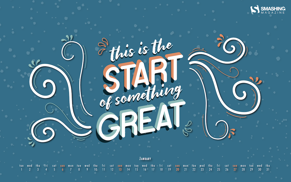
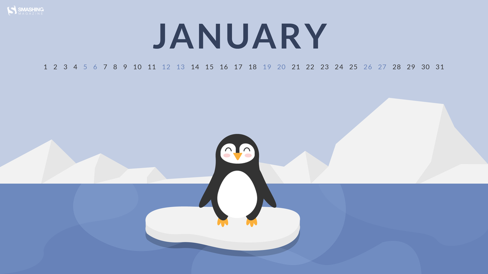
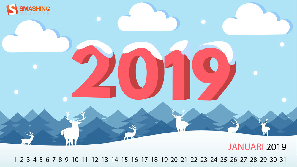
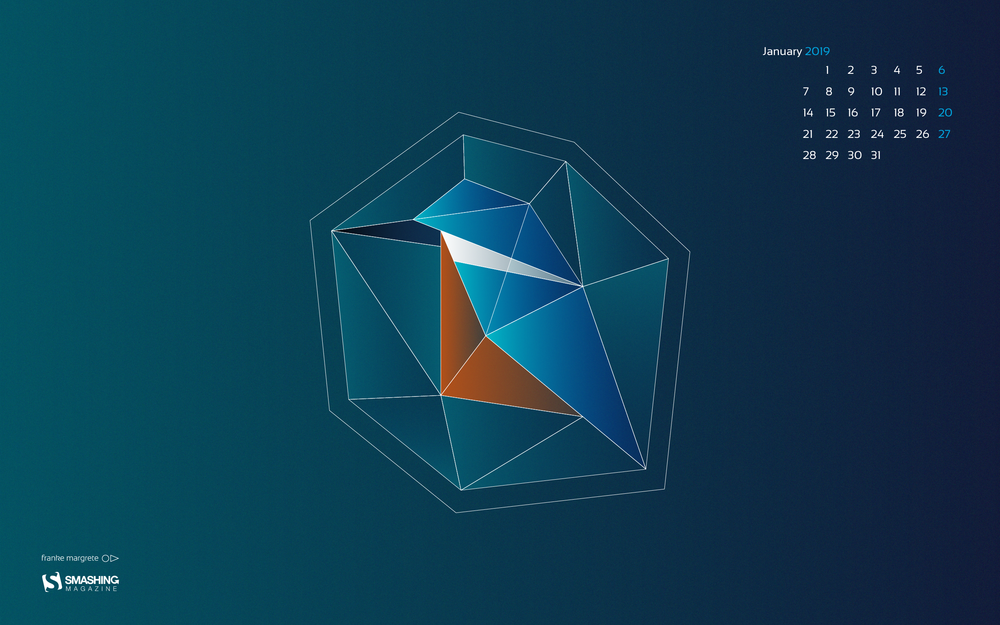
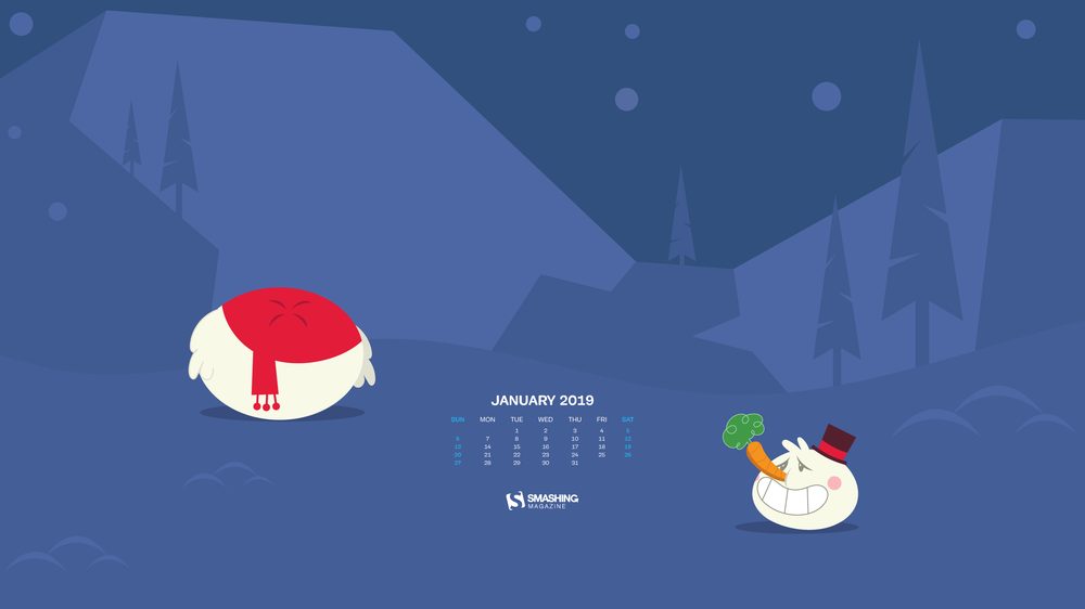
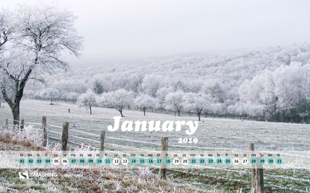
Maybe you’ve already started into the new year when you read this, maybe you’re still waiting for the big countdown to begin. No matter what: Let’s welcome 2019 with a fresh wallpaper!
To give you a little inspiration boost, artists and designers from across the globe once again tickled their creativity and designed unique wallpapers for you to indulge in. All of them come in versions with and without a calendar for January 2019 and can be downloaded for free — just like every month since more than nine years already. At the end of this post, we also compiled some January favorites from past years that are too good not to share. Have an exciting new year!
All images can be clicked on and lead to the preview of the wallpaper,
You can feature your work in our magazine by taking part in our Desktop Wallpaper Calendar series. We are regularly looking for creative designers and artists to be featured on Smashing Magazine. Are you one of them?
Let The Magic Begin
“When the noisy holidays stay behind us, and everything calms down to a peaceful setting, it is a perfect moment for the magic to step in and start making our wishes, hopes, and decisions come true. Happy January, everyone!” — Designed by PopArt Web Design from Serbia.
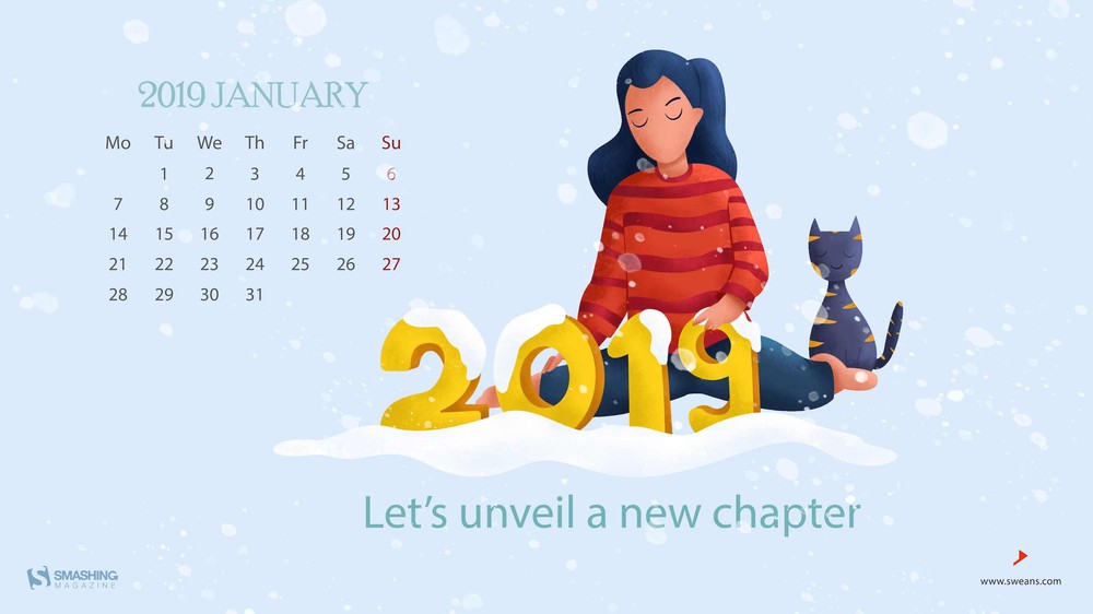
“The dawn of January the 1st of 2019 is the beginning of a new year which gives dreams, hopes and a lot more to billions of people around the world.” — Designed by Sweans Technologies Ltd. from London.
“I wanted to do a lettering-based wallpaper because I love lettering. I chose January because for a lot of people the new year is perceived as a new beginning and I wish to make them feel as positive about it as possible! The ideia is to make them feel like the new year is (just) the start of something really great.” — Designed by Carolina Sequeira from Portugal.
“Winter brings both Christmas & New Year together. A season which provides time for comfort, food, warmth, and touch of a friendly hand and for a talk beside the fire.” — Designed by Call Taxi Software from India.
“The climate is changing very fast. 2019 is a new chance to save the earth, the people and the animals who suffer from global warming.” — Designed by Melissa Bogemans from Belgium.
“January is a cold but cozy month so i tried to make my illustrations in cold and cozy colors. Blue and white as the cold colors and red darkblue as the cozy colors. I made some small details like reindeers, clouds snowflakes and trees to make it look better.” — Designed by Vince Teckmans from Belgium.
“Kingfishers are called ‘ijsvogels’ (ice-birds) in Dutch. Not because they like winter cold, but because of the intense blue and teal colors…” — Designed by Franke Margrete from the Netherlands.
“I took this photo while walking around the city where I live. It’s located in the Vosges, France. It was cold but without snow. White color is coming from freezy touchs of the fog remaining on everything. I found it amazing. White is a color for hope. Let’s have a pleasant year 2019” — Designed by Philippe Brouard from France
The past New Year’s editions have brought forth some timeless wallpaper goodies that work equally well in 2019. Please note that they don’t come with a calendar. May we present…
Open The Doors Of The New Year
“January is the first month of the year and usually the coldest winter month in the Northern hemisphere. The name of the month of January comes from ‘ianua’, the Latin word for door, so this month denotes the door to the new year and a new beginning. Let’s open the doors of the new year together and hope it will be the best so far!” — Designed by PopArt Studio from Serbia.
“If we wait until we’re ready, we’ll be waiting for the rest of our lives. Start today – somewhere, anywhere.” — Designed by Shawna Armstrong from the United States.
“You wake me up to a beautiful day; lift my spirit when I’m feeling blue. When I’m home you relieve me of the long day’s stress. You help me have a good time with my loved ones; give me company when I’m all alone. You’re none other than my favourite cup of hot tea.” — Designed by Acodez IT Solutions from India.
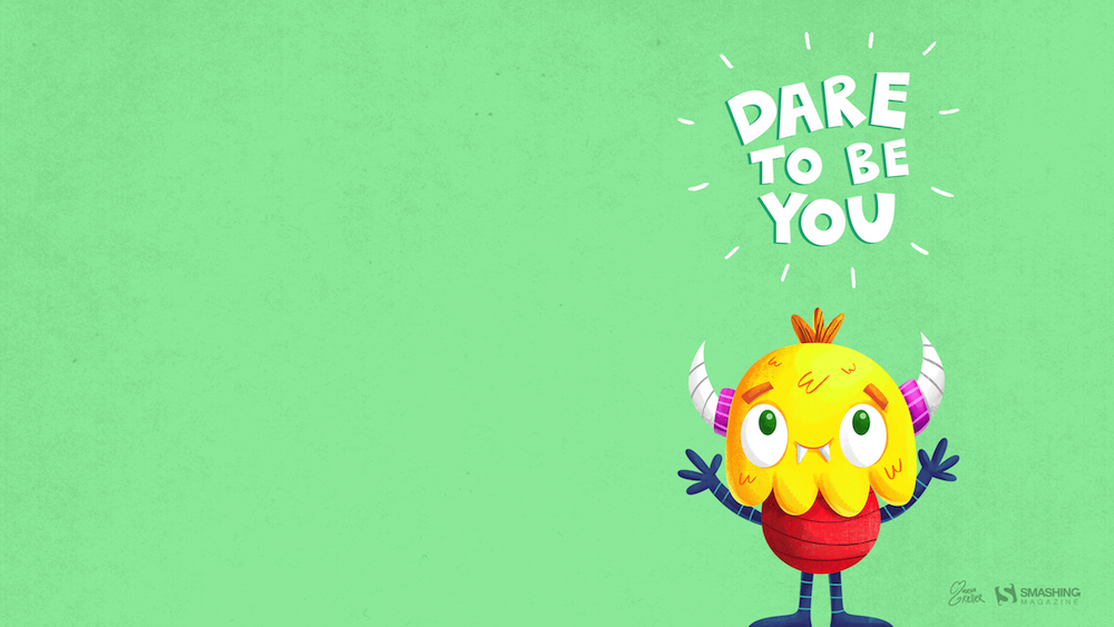
“The new year brings new opportunities for each of us to become our true selves. I think that no matter what you are — like this little monster — you should dare to be the true you without caring what others may think. Happy New Year!” — Designed by Maria Keller from Mexico.
“In Central Europe, we’ve had a very warm beginning of winter. I hope there will be lots of powder for snowboarding soon. I’d love to see the French Alps again as white as in 2015 when I took this photo.” — Designed by Annika Oeser from Germany.
“The new year brings hope, festivity, lots and lots of resolutions, and many more goals that need to be achieved. This wallpaper is based on the idea of ‘A New Start’.” — Designed by Damn Perfect from India.
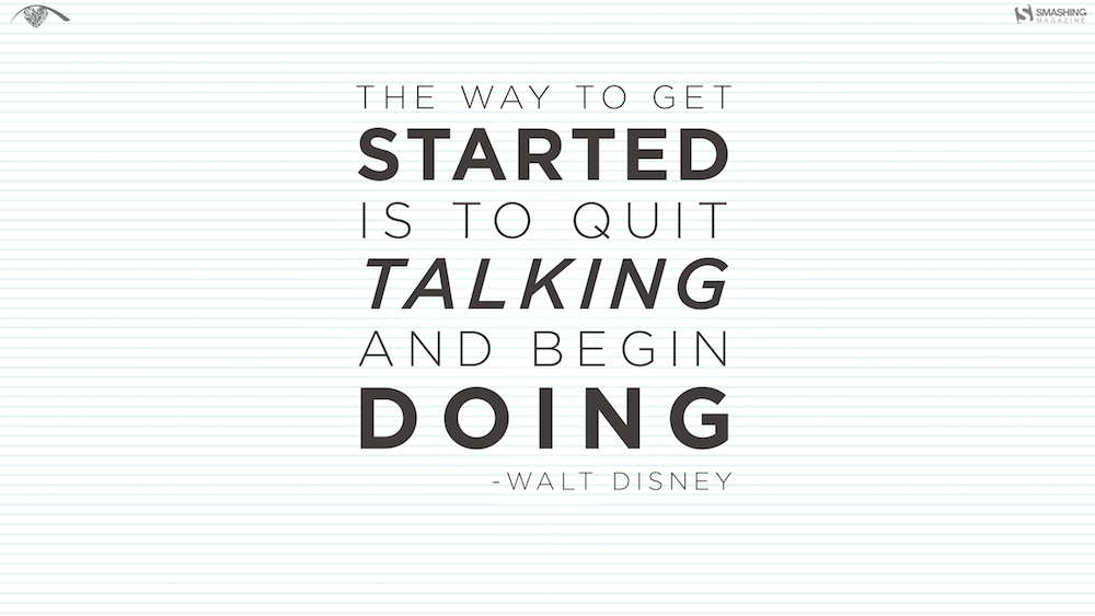
“January is all about renewing efforts and making plans, but sometimes we need little reminders that plans don’t matter if you don’t do anything about them. Initially, I was inspired by the idea of a fresh sheet of paper, which became the background for some great words from Walt Disney.” — Designed by Resa Barillas from the United States.
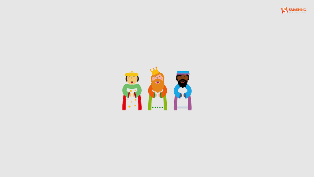
“In Belgium remember the Three Wise Men of the East is a tradition. It involves children going from door to door, dressed up as the three Wise Men. They sing a little song, in exchange for sweets and/or money. The design is very minimalistic and ‘flat’. I hope you like it :)” — Designed by Jeroen Bartels from Belgium.
“I was browsing for themes when I found this “Festival of Sleep” that takes place on the 3rd, and I’m a big fan of sleep… Especially in these cold months after the holiday craziness, it’s nice to get cozy and take a nice nap.” — Designed by Dorothy Timmer from Central Florida, USA.
Please note that we respect and carefully consider the ideas and motivation behind each and every artist’s work. This is why we give all artists the full freedom to explore their creativity and express emotions and experience throughout their works. This is also why the themes of the wallpapers weren’t anyhow influenced by us, but rather designed from scratch by the artists themselves.
Thank you to all designers for their participation. Join in next month!
Happy New Year to one and all! At this time every year we like to publish our predictions of what the web industry will be up to over the coming twelve months. It also serves as a chance to reflect on where we’ve been.
This year, I’ve decided to be a little more ambitious and come up with the click-baitey total of 19 predictions for 2019 (that’s 13 more than last year). Consequently, some of the predictions may be less likely than others, but I stand by them all. Speaking of last year…
Skeuomorphism Strikes Back: I argued that skeuomorphism in UI design lends itself to affordances, and communicates function; consequently it would return in 2018. We may not be calling it skeuomorphism, but look around. I’ve scored myself a point for that one.
The Agonisingly Slow Demise of WordPress: I said that WordPress would decline, I hedged my bets by saying it would take more than a year, but that it’s a dated technology that’s not fit for purpose. And then along came Gutenberg. Nil points.
2018 Will be the Year of AR: Was this just wishful thinking? We all know how awesome—in the literal sense of the word—both VR and AR can be, but very little reality was augmented in 2018. Again, no points.
The End of Online Advertising: Last year I said that we’d see the end of online advertising; advertising doesn’t work, and alternate payment models are emerging. Granted, we still see adverts everywhere, but Medium’s clap-o-meter has not only sustained, but grown Medium; the Guardian’s voluntary contributions is now a proven model. I’m giving myself 0.5 points for that one.
Flamboyant, Responsive Lettering: I suggested that the design world’s love of lettering, coupled with what we’ve learned about SVG would lead to typographic beauty unlike anything we’ve seen. I’ve seen something approaching this a couple of times, but 99.99% of the web is using whatever geometric sans Google Fonts recommends. No points again.
We’ll Abandon AI in Favor of Craft: My long-standing skepticism over the viability of AI led me to suggest that we’d reject AI in favor of craft skill. Craft skill certainly influenced visual design, but AI is still the Holy Grail of 4/5 startups, so I’d be clutching at straws to score myself any points for that one.
19 Predictions for Design in 2019
So in my predictions for 2018 I scored a pathetic 1.5 out of a possible 6. Buy hey, that’s 25%, which means at least 4.75 of what follows are (probably) nailed-on certainties. Which ones will it be?
Prediction 1: Sound Input
2019 will be the year of voice input, that much seems certain; when Adobe XD starts offering voice prototyping you know the technology has arrived. But I’m going to go further and say that sound input—whether that be detecting a user’s environment, or reacting to audible taps (instead of a touch screen)—will explode in 2019.
Prediction 2: A Return to Difference
Branding is bland, websites are bland, typography is bland; Google looks like Tesla looks like Amazon looks like Arby’s looks like Adidas; no more. 2019 will be the year that business realises that long-term engagement requires a distinct brand identity.
Prediction 3: The End of Social Media, the Rise of Homepages
I’m not suggesting that Facebook will be a dim and distant memory by this time next year, what I am suggesting is that the increasing competency of site builders, and the increasing number of adults who grew up comfortable with the web, will mean more people choose to take control of their online content by building and hosting their own homepages.
Prediction 4: The End of the Grid
The grid as a tool for laying out elements is always going to be useful, but it’s unlikely to have the same self-referential cool that it had in 2018. After all, when the CSS Working Group finally gave us gradients the first thing we did was embrace flat design. They’ve given us CSS Grid, so that’s organic, gridless design for the next few years.
Prediction 5: More Unicorns
When I first started on the web, being able to design and code was the norm. Over the years, the increasing complexity of the two disciplines means that people have specialized in one or the other and the notion of doing both has been dismissed as fantasy. But here’s the thing: most of the time, taking a holistic approach produces better results, and younger designers are catching on.
Prediction 6: More Expressive Animation
Animation is everywhere, thanks largely to CSS. But the relatively few effects available to us, and the constraints of responsive design, mean that animation is often employed for its own sake. In 2019 designers will begin to push animation into new, more expressive directions.
Prediction 7: Ethical Design
It’s impossible to avoid our impact on the environment, and upon one another’s well-being. Ten years ago design was selfish, five years ago design was asking where it stood ethically, next year we’re going to start seeing the fruits of that debate, as designers apply ethics to their design process.
Prediction 8: Pseudo-VR
VR has captured our cultural imagination, but there are still substantial technical hurdles to overcome. Bridging the gap between our love for the technology and our ability to implement it will be pseudo-VR design elements; 3D environments—possibly even reactive 3D environments—that give us the impression of VR, without the need to don a helmet.
Prediction 9: Responsive Design 2.0
It’s been a while since we started thinking about different viewports. The last year or two has been quiet on that front. But responsive design was such a fundamental shift in attitude that it’s inconceivable that we’ve solved every issue; something new is just around the corner…perhaps even a solution for the hamburger menu conundrum.
Prediction 10: Clearly Defined Tribes
Human beings seem to need to form tribes, and web professionals are no different. You might be a Sketch devotee, or an XD aficionado, you might love WordPress, or prefer Shopify. The last few years have seen a huge growth in tools, the ones that survive will be the ones that complement each other; so much so that we’ll not be picking tools, but picking toolkits.
Prediction 11: Video Replaces Images
We’ve been posting huge bandwidth-busting images on our landing pages for years; we know it’s a terrible idea, we do it anyway. The natural conclusion of that trend is, far from reducing size, to add more, and the only realistic way of making our sites even slower is to swap out huge images for huge videos.
Prediction 12: Vue.js Takes Over
There’s a long-standing argument over which JavaScript framework is better: React or Angular. While acolytes of those two duke it out in blog comments, Vue.js has quietly been growing. Version 3.0 is expected in 2019, and if you haven’t checked it out already, this year’s the perfect time.
Prediction 13: The Resurgence of Analog
The biggest trend of the last few years has been the slow, steady move away from anything that looks too digital, in favor of design that looks constructed by human hands. Last year I called this craft, but I’m going to go “double or nothing” and say that in 2019, designers will be working on paper first, digital second.
Prediction 14: 3D Gradients
Gradients have been back in our toolkits for a while—for some of us, they never left—and 2019 will see a continuation of that trend. What will be new, is how gradients will be used: No longer a simple decorative element, gradients will be used to create the illusion of three dimensional space.
Prediction 15: Design Gets Redefined
Designers have (apparently) “won a seat at the table”. But there are a finite number of chairs, so handing one to designers means taking it from someone else. Consequently, we’re likely to see marketers begin describing themselves as “marketing designers”, PR professionals describing themselves as “relations designers”. Us? We’ll be recategorised as “visual designers”.
Prediction 16: Enabling Websites
Most of us would like to think that we design sites that enable positive user experiences, but more often than not clients brief designers to create sites that keep customers at arm’s reach. In 2019, sites that block users instead of enabling them will be outperformed by anyone that actively works to empower consumers.
Prediction 17: The Decline of Flat Illustration
Flat illustration—pioneered by brands like Atlassian, long before the trend emerged—has been popular for a while, frankly, because it’s so easy to do adequately (if not well). Like the fashion for bland sans-serifs that often accompanies this style, it’s a trend well past its use-by date.
Prediction 18: The Reinvention of Design Frameworks
It’s nigh-on impossible to keep reinventing the wheel; there’s only so many times that you can solve the same problem. From Material Design to Bootstrap to Foundation, things have been quiet on the design framework front recently. But the concept is sound, so expect a host of upgrades to be unleashed, sooner or later.
Prediction 19: EX Design
As always, UX will be at the heart of what we do in 2019, and as always someone will try and come up with a new term to redefine what we’ve all been doing for years. Last year was the year of the “Product Designer”, 2019 will be the year of the “Emotion Designer” (yeah, I know…).
Looking Forward to 2019
So, is the web the place you want to be for the next 12 months? Does it sound challenging? Fun? A little scary?
The one thing we can be sure of is that the web gets a little better every year: the tools we have to work with take away more of the grunt work and leave us to be creative, the code we produce gets cleaner and easier to maintain, good content is easier to find than spam, we’re actively engaged in making the web as inclusive as possible.
Trust me, this time next year you’ll be looking back and thinking that 2019 was one of the best years of your working life. So uncap yourself a fresh Sharpie, delete your unsorted bookmarks, clean your screen for the first and only time this year, and let’s get started.
Every week users submit a lot of interesting stuff on our sister site Webdesigner News, highlighting great content from around the web that can be of interest to web designers.
The best way to keep track of all the great stories and news being posted is simply to check out the Webdesigner News site, however, in case you missed some here’s a quick and useful compilation of the most popular designer news that we curated from the past week.
Note that this is only a very small selection of the links that were posted, so don’t miss out and subscribe to our newsletter and follow the site daily for all the news.
Six Tips to Build Better Design Systems
How to Quit Acting like an Amateur Designer
The Worst Design Crimes of 2018
Evolution of a Landing Page
Micro and Macro Typography in Web Design
Accessibility Guidelines for UX Designers
How to Get a Job at a Startup
20+ Creative Project Ideas to Get You Out of a Design Rut
Inspiration: Good Email Copy – Email Copy from Great Companies.
Designers Talk: How to Be Unique in 2019
“Should We even Be Here?”: Three Perspectives on Imposter Syndrome
Looking Ahead to 2019 – WordPress in the Year to Come
Quick and Simple Image Placeholders
The Dilemma of Designers’ Empathy Delusions
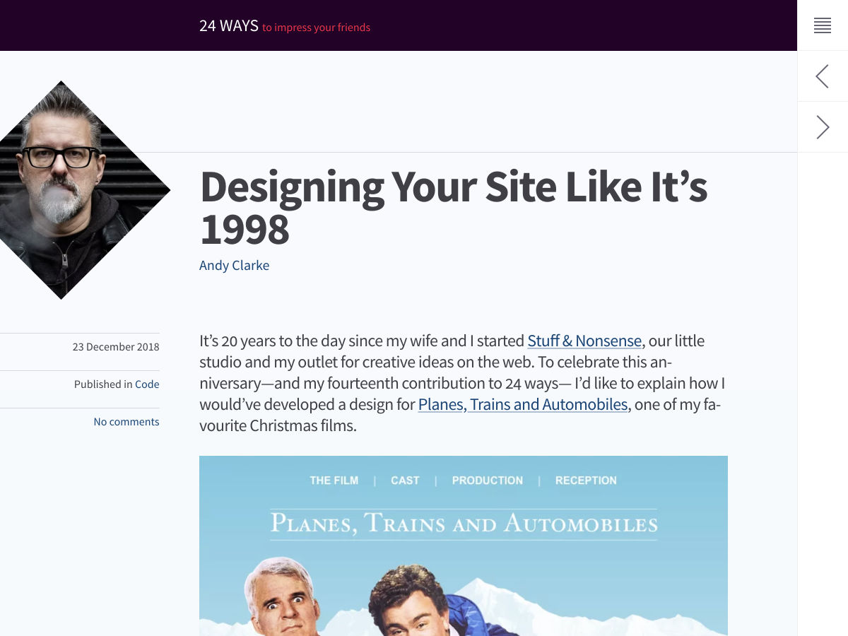
Designing your Site like it’s 1998
Awesome Demos from 2018
Learning Design from Musicians
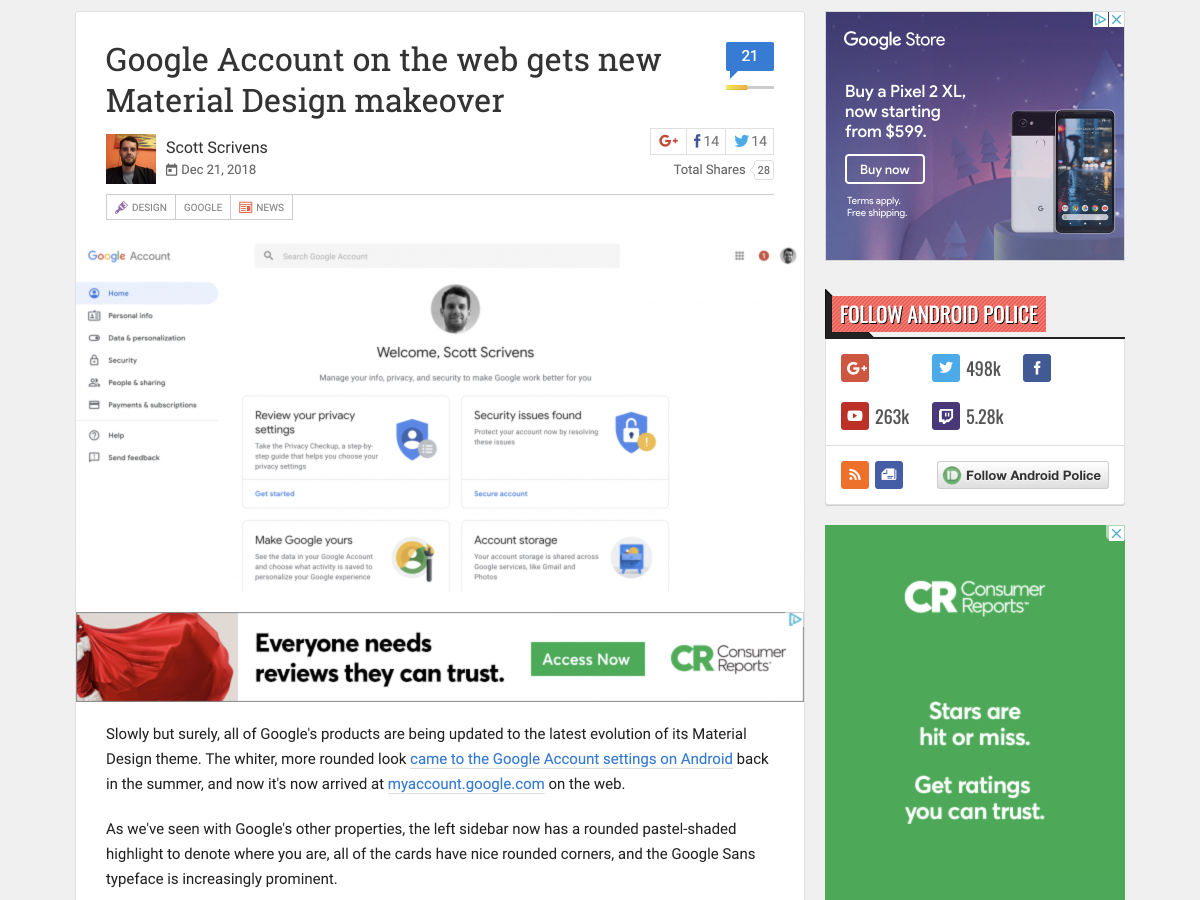
Google Account on the Web Gets New Material Design Makeover
Building a Better Rate Display Page for Customers
Useful Collection of Sketch UI Freebies
The Best and Worst Identities of 2018, Part 2: The Best Reviewed
How to Deal with a Creative Meltdown
Why Design Systems Fail, and How to Make Them Work
How We Built the Figma Design Team
P.U.R.E -a User Research Analytical Method
Want more? No problem! Keep track of top design news from around the web with Webdesigner News.
Let’s say you need a gradient border around an element. My mind goes like this:
There is no simple obvious CSS API for this.
I’ll just make a wrapper element with a linear-gradient background, then an inner element will block out most of that background, except a thin line of padding around it.
If you hate the idea of a wrapping element, you could use a pseudo-element, as long as a negative z-index value is OK (it wouldn’t be if there was much nesting going on with parent elements with their own backgrounds).
Here’s a Stephen Shaw example of that, tackling border-radius in the process:
You could even place individual sides as skinny pseudo-element rectangles if you didn’t need all four sides.
But don’t totally forget about border-image, perhaps the most obtuse CSS property of all time. You can use it to get gradient borders even on individual sides:
Using both border-image and border-image-slice is probably the easiest possible syntax for a gradient border, it’s just incompatible with border-radius, unfortunately.
There are many great benefits to working in a remote team. As long as everyone is on the same page, it seems like all the team members are working in the same office, one right next to the other. Ideally, this is how you want your team to function. Everyone’s workflow should be synchronized, even if they all work a little differently.
However, if you work in a remote team, you’ve probably had your fair share of hiccups along the way, too. Let’s be real, there are tons of obstacles that get in our way, and they’re not always easy to overcome. Perhaps the most overwhelming issue is the lack of effective collaboration. In a remote team, you can’t simply walk down the hall and hold a quick meeting. You have to schedule these things in advance and they usually take place online. With that in mind, here are a few tips and tools to make your life a little bit easier.
File Sharing
File sharing is an important part of working in a remote team. Emails just aren’t cutting it anymore. Sure, you can send an email with an attachment, but if you’re working with multiple people or need to send lots of files, then it gets complicated. In order to tackle this file sharing obstacle properly, you’ll need a tool capable of doing the job.
Dropbox is the perfect tool for this, as it’s speeds and service are unmatched. They offer plenty of features to help you get through your day without any hiccups.
Communication
Communication is the single most important aspect of remote collaboration. It is vital that you and your team are communicating regularly whether it be email, video chat, phone calls, or messaging.
It’s equally as important to know what channels to communicate with. No matter what size your team is, you should all have a go-to method of communicating with one another. If someone needs to communicate with another person, they should have a guaranteed way of getting into contact with that person.
Using your communication methods, take the time to get to know everyone on the team. Understandably, this can be hard in the larger teams, but it’s still really important to have that connection outside of work. Find out common interests and birthdays. The more you’re all familiar with each other, the more smooth collaboration will be. We do, however, have to keep in mind that we’re after effective collaboration. As important as it is to know your team, you don’t want to be standing around chatting all day. Find the appropriate time to have friendly talks.
Manage your time correctly
It goes without saying that if you’re in a remote team, it’s up to you to manage your time yourself. Undoubtedly, this can be a little hairy. For this, Toggl is a great tool. Toggl is an online time tracker that makes keeping up with work hours easy. This is especially important for anyone working hourly.
The best benefit to using a time tracker in a remote team is that everyone feels like they manage their own schedule, and for the most part, they are. As they’re able to keep track of their own time, they’ll be able to pinpoint weaknesses in their performance and fix them as needed.
Remote team building
Team building exercises can help your team function much more effectively. Although it can be harder to accomplish in a remote team, there are definitely some options out there:
Facts about yourself
This is probably the most basic game anyone can play, but it does involve getting to know one another a little more. It doesn’t have to be extensive, or even all at once, but get everyone on the team to give a few words about themselves.
Common things
Divide your team into small groups and have them write down and submit some things that they have in common. The team with the most in common wins.
Office tour
An office tour can both tell you a lot about a fellow team member and give them the opportunity to express themselves.
Create a chat channel for funny images
Create a Slack channel dedicated to funny GIFs and images. This is another great way for people to express themselves.
Virtual coffee break
If you’re remote, you don’t have the opportunity to get coffee like normal colleagues do. In this case, you can always have a video chat coffee break. Start up a general conversation, and treat it like you’re all in the same coffee shop.
There are lots, I repeat lots of ways you can get your team involved in activities together. You can go as wild as you want, all that really matters is that everyone is getting to know each other better. Once you learn about how people function outside of the workplace, you can better understand how they function within a work environment.
Summary
Remote work is difficult, there’s no getting around it. There are obstacles and challenges that come along with the job that most average office employees would never have to face. However, there are plenty of tools out there that allow remote teams to collaborate effectively, even though they don’t see each other every day.
This is a sponsored post for Dropbox. All opinions are my own. Dropbox is not affiliated with nor endorses any other products or services mentioned.
A developer friend of mine has decided to build a progressive web app for his new company. When I asked why he opted for a PWA instead of a native app, he said:
“Because the PWA is the future of the web.”
I thought that was an interesting sentiment. Until he mentioned it, I was of a similar mindset as Aaron Gustafson when he discussed the battle between the native app and PWA. In other words, I thought it really just came down to choice; not whether one was better than the other.
Now that the idea has been planted, though, I can’t help but notice a bunch of people proclaiming their support for the PWA over the native app. Not only that, many of them have gone as far as to say that the PWA will replace the native app entirely.
I’d like to see if that argument holds any water.
An Extensive Guide To PWAs
Progressive Web Applications are more of a methodology that involves a combination of technologies to make powerful web applications. Tell me more about PWAs ?
Will PWAs Replace Native Apps?
I’m going to go ahead and answer that question right now:
“Yes, but not for everyone.”
Here’s the way I see it:
The mobile web has definitely improved from where it was just a couple years ago. It’s very rare to run into a website that isn’t 100% responsive in design. That said, I don’t think many mobile websites are 100% mobile-first in design (which I recently hinted at when talking about ditching design elements instead of acquiring more in 2019).
I think for an experience to be truly mobile-first, it would need to be faster and have an app shell. Which is exactly what a PWA offers.
While native apps may provide a superior experience (mostly) to other mobile experiences, I just don’t see a valid reason to spend that amount of money and time to build and manage one… unless your app sits in the top 20 of your category in an app store.
Let me break down the logic I used to come to this decision.
comScore 2018 report shows use of mobile web vs. mobile apps (Image source: comScore) (Large preview)
That said, I don’t believe native apps will make mobile websites disappear. I also don’t believe this point counteracts the argument I’m attempting to make today. If this data demonstrates anything, it’s that mobile users strongly prefer the experience of interacting with a digital property through an app interface.
Web developers recognize this preference as well, as this survey from JAXenter demonstrates:
So, although the mobile web browser has proven to be the less preferred interface through which someone views a website, I don’t think that’ll be the case for much longer as more businesses build PWAs.
The PWA takes all of the things users love about native apps — the app shell, offline access, telephony features, an always-present navigation bar and so on — and gives users a more convenient means for experiencing them.
This major retailer has the funds to build a native app counterpart to its website, but it’s chosen not to go that route. Instead, the progressive web app experience gives mobile users the convenience of browsing the online store and making a purchase without having to leave the browser.
Or, if they’re frequent users, they can add this PWA to their home screen and treat it as they would any other app (but more on that later).
Now, let’s look at an example of a PWA that, again, has opted not to go the route of the native app. Instead, Infobae has created a PWA that beats the mobile web experience:
Sessions that are 230% longer than they were on mobile web.
Over three times more pages viewed per session than the mobile web.
So, if you’re worried that the PWA won’t cut it as an alternative to the mobile web, you can stop right there. There are clear benefits to building a PWA.
Reason #2: Native App Stores Are Overflowing
Native apps have a lot of competition in the native app stores — many of which are heavy hitters that mobile users are all too familiar with. If your intention is to launch an app in an already congested space, is the app store really the best place for it?
comScore‘s report breaks down the top 5 apps based on reach:
comScore data on the top 5 apps by reach in 2018 (Image source: comScore) (Large preview)
As you can see, the top 5 apps tend to be dominated by the same mobile apps, no matter what part of the world mobile users are located in.
What you might be thinking is, “But what if my app has a unique edge? Isn’t that enough to dominate our niche?”
I could see that, especially if your app is targeted to region-specific mobile users. Then again, you have to consider what sort of app types perform well with mobile app users.
comScore breaks down this point:
comScore data on share of total app minutes (Image source: comScore) (Large preview)
Roughly 70% to 80% of all time spent in mobile apps goes to four categories:
Entertainment (like YouTube);
Social media (like Facebook);
Instant messaging (like Whatsapp);
Games (like Fortnite).
If your app concept doesn’t fall into one of those categories, is it worth all that work to place your app in the app store? While I recognize that those aren’t the only kinds of apps that succeed, I just think it would be a risky and expensive gamble to make, especially if your client’s business is brand new. Even then, there are so many cases of well-known entities that have opted not to compete in app stores, despite having a large enough audience or customer base to do so.
West Elm is a great example of a retailer who’s done this:
If you look in the app stores, you’ll find that West Elm has developed two native apps. One is for registries. This makes sense as a mobile app could be conducive to tagging and tracking registry items. It also has one for the West Elm card. If someone is a frequent enough shopper, this type of app might make sense as well.
That said, neither of these native apps is popular with users (at least not in terms of quantity of reviews). So, it was a smart and economical move by West Elm to keep its main shopping interface in the PWA.
Reason #3: PWAs Rank In Search
On a related note, progressive web apps come with the added benefit of ranking in search engines. There are a few reasons why you and your clients should be overjoyed by this:
Your app’s rank in search is contingent upon the SEO work you put into it. If you’re already doing this with your website, this should be easy!
You don’t have to worry about a brand new app getting buried in app store search. Or easily dismissed because of a lack of ratings.
Because a PWA can live in mobile users’ browsers as well as from a button on the home screen, it needs to have a link. And links make for much easier sharing with friends/family/colleagues than telling them the name of an app, hoping they can find it in the store on their own.
Bottom line: if you can give users a tangible link to your app, you can drastically reduce the friction often caused by having one that only exists in the app store.
Plus, I think the searchability aspect is an important one to consider when you think about how people use your app. Take micro-moments, for example.
When a consumer is inspired to:
Research something of interest,
Go somewhere,
Make a purchase,
Or do something…
Instead of opening a data-hogging application on their device, they’ll open their search browser and type or speak their query. It’s what we’re all trained to do as consumers. Have a question? Need something? Want help choosing a restaurant? Go to Google.
If your website or app provides an answer to those kinds of questions, you don’t want it hidden away in app stores. You also don’t want to give them a mobile website that offers an option to “Download the App”. You’re only creating extra work for them.
A PWA enables you to place your app directly in search results and to get your users the instant answers they require.
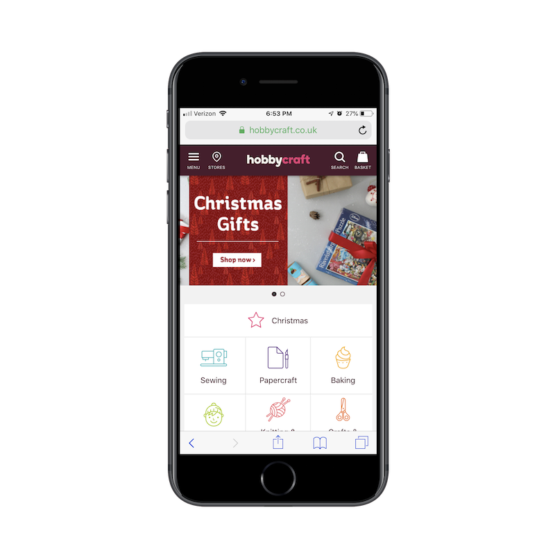
I think this is why e-commerce businesses have especially gravitated towards PWAs, like HobbyCraft.
As you can see here, HobbyCraft is a niche retailer that sells craft supplies out of the UK. It wouldn’t make much sense to put something like this in the app stores — especially when the PWA interface works well enough as it is.
Lancome is another e-tailer that’s made the conscious decision to forego the native app and keep the mobile shopping experience in a PWA format.
One important design element I would point you to in both these examples is the Stores icon located in the top navigation bar. For businesses with brick-and-mortar counterparts, there’s no reason to keep your app out of local search in Google.
If you design your PWA correctly, you can make it show up in relevant location-based queries. And if you present an interface that’s reminiscent of a native app — and just as secure as one (since PWAs require HTTPS) — you can compel more mobile users to make a purchase on the spot.
Reason #4: Native Apps Struggle With Retention
For app types that have a hook that compels users to spend time inside a native app and spend money to enjoy the experience further, that’s great. When you find that perfect fit, there’s good money to be made from having a native app. It’s simply a matter of having people willing to commit to the download.
It doesn’t matter how many initial downloads you get. If mobile users don’t return to the app to engage with your content, purchase subscriptions or upgrades or click on ads, consider it a wasted investment. Unfortunately, that’s the case with a lot of them.
PWAs, on the other hand, don’t require the lofty commitment of having to download an app to one’s device. Heck, users don’t even have to save the PWA to their home screens, if they don’t want to. It’s an overall more convenient experience.
Nevertheless, you may want to urge users to save it for instant access in the future, as The Weather Channel does:
Really, what it boils down to is the type of app you’ve built.
The Weather Channel, for instance, provides a service that mobile users will want to use on a daily basis. They could install a native app from the app store with up-to-date weather forecasting, but that app would likely chew through data and battery power a lot more quickly than the browser-based PWA will.
There are other business types that should consider using a PWA for this reason. Think about an online magazine like Forbes.
Users can add the Forbes PWA to their home screen just like a native app. (Image source: Forbes) (Large preview)
Highly specialized publications would do really well to develop PWAs for their daily readers.
Again, it provides a much lighter-weight experience for their phones. Plus, PWAs give users offline access, so they can get access to content no matter where they are or how limited their access may be to the Internet. And the home screen presence (if they choose to put the button there), provides a nice little shortcut around the mobile web browser.
Reason #5: PWAs Can Generate More Revenue
With the exception of in-app advertising, Apple and Google take a sizable cut from any sales you make through a native app. This includes paid downloads, in-app purchases or upgrades and subscription fees. At one point, these fees were as high as 30% per sale.
When you’re hoping to spend money on design tweaks, much-needed development updates and promotional advertising, that’s the last thing you want to hear. In other words, a significant portion of the money that starts to trickle in from your native app goes straight into the pockets of app store owners. That doesn’t seem right, especially if you have to pay for app store ads in order to gain visibility within them.
PWAs don’t come with fees to pay-to-play, which means all revenue generated from them go directly to you (or whoever the owner of the business is). This is especially nice if you have an app concept like a local newspaper (such as The Billings Gazette) that probably deals in smaller profit margins to begin with.
That’s not the only way you can make more money from PWAs than native apps either.
To start, they’re significantly easier to build than native apps. Plus, managing them after launch requires less of a time commitment and resources from you. Yes, it still needs to be updated and maintained — just like anything else on the web — but you don’t have to deal with the obstacles that come with apps in the app store.
For example, you only have to build one progressive web app. You don’t have to create separate ones to match the guidelines for different mobile devices.
Updates are easier, too, especially if your PWA is based off of a WordPress website. You push an update through the pipeline and it shows up immediately in the live PWA. There’s no need to push updates to the app store admins and wait for their approvals. Everything happens in real time, which means getting new features and money-making initiatives out to the public more quickly.
This is helpful in the case of PWAs like Twitter Lite.
The Twitter Lite PWA can stay on the cutting edge in real time (Image source: Twitter) (Large preview)
When going up against a plethora of social media giants that dominate the app stores, having the ability to keep your app updated in real time can serve as a strong competitive edge. This is in addition to all of the other benefits that come from developing your app in a progressive web format.
This is what happened when Twitter put out its PWA.
As this case study from Google shows, Twitter took an incremental approach to optimizing its PWA. As such, they’ve been able to introduce huge improvements to the user experience without much detection from the end user. Their only response to the updates, in fact, has been greater usage of the PWA.
The PWA Is The Future For (Most Of) The Web
Visibility and searchability are known problems with native mobile apps. User retainment is another. And they’re just not sustainable unless you have an idea that’s inherently meant for a native interface that’s sure to bring in money. Mobile games are one example of this. I’d argue that dating apps are another. I used to think social media fell into that category, but Twitter has since proven me wrong.
Based on what I’m seeing online and from what I’ve heard from developer friends and colleagues, I do believe the future is in the PWA.
I think app stores will slowly quiet down as developers realize there are many more benefits to putting a small- to medium-sized company’s app into a progressive web form. The major players will stay put, and companies that have outgrown the bounds of the PWA may eventually move over. But, otherwise, most apps will end up in the progressive web format.
As this trend towards the PWA continues to grow, consumers will become more accustomed to encountering it in search and know that this user-friendly interface is accessible right from their browser. In turn, they’ll only go to the app stores for the kinds of apps that belong there, i.e. messaging, games, entertainment, and some social media. This will create a clearer division between online search and app store search, and further help to improve the overall user experience online.
Everyone needs time off, and this is especially true for creative professions. The brain is like any other organ in your body: when it gets tired, it doesn’t work nearly as well. Keep going when your brain is tired, and it’ll start thinking daft thoughts like, “Maybe if I put some cocaine in my Adderall CoffeeTM, I can invent the next great framework after I finish up this site for my uncle’s business.”
Very rarely is anything of worth accomplished in that state of mind, and when it is, it’s an accident. You need rest. You need a long holiday, then a few days of vacation when you get back to recover from the holiday. Go. Do it. Doctor’s orders.
Here are a few handy clues to let you know when you absolutely need that rest:
When the kerning in a movie title ruins the rest of the movie for you.
When you ironically make the client’s logo take up half the page.
When you forget to be unironic, and submit that version of the design.
When the client signs off on it and says, “Good job! It’s like you read my mind!”
When you’ve slept on your keyboard often enough to figure out which bit of it is most comfortable, and leaves the most flattering indentations in your face.
When you’ve actually memorized all of Photoshop’s shortcuts. All of them.
When you find yourself making songs out of inspirational design quotes, e.g. “Keeeep iiit siiiimple, stuuupiiid…” [This is to be sung as a country song of some kind.]
When you actually sing those “songs” out loud…
…in front of people.
When you start coming up with your own inspirational design quotes because the ones you have just aren’t doing it anymore.
When you’d rather spend hours going through your inspiration collection than actually designing anything because actually designing a thing means making decisions and making deciSIONS MEANS YOU COULD FAIL AND OH MY GOD YOU’RE JUST NOT SURE YOU CAN HANDLE ANOTHER EMAIL FROM THE CLIENT ASKING FOR MORE REVISIONS YOU ONLY HAVE SO MANY IDEAS TO WORK WITH and how the hell do you just make something pop anyway?
Or maybe that’s just me.
When you find yourself looking for typographical ways to represent a small panic attack…and you succeed.
When you’ve run out of CSS/JS frameworks to try. Take fifteen minutes off and there’ll be another one along. Take a week off, and you’ll have plenty to do when you get back.
When you seriously consider just deleting all the HTML/CSS and starting over for the fourth time.
When you seriously consider bringing up file naming syntax in a meeting.
When you realize that no file should ever be labeled with the word “final”. That kind of growth as a person should be rewarded.
When you start to envy developers. Developers have to use math, and should never be envied.
When you start to speak aloud in ways reminiscent of your marketing copy, e.g. “Wanna go out with me? I’m a dating rockstar/ninja!”
When you see things misaligned in real life and think, “Who would just leave it like that? That’s 200 pixels off! What is that in ems, anyway?”
If you’re thinking of printing this article out and posting it in the office.
And finally…
Bonus round – here’s a classic: Any time someone says anything like “My nephew/daughter/middle school teacher could do that in PowerPoint for free.”
That’s right. By the power vested in me by absolutely no one, I declare that any designer who hears anything like that should get a week of vacation, no questions asked. I’m off for a few days. Don’t call me.