Archive

Archive for September, 2022

October Vibes For Your Desktop (2022 Wallpapers Edition)

September 30th, 2022 No comments

When we look closely, inspiration can lie everywhere. In the leaves shining in the most beautiful colors in many parts of the world at this time of year, in a cup of coffee and a conversation with a friend, or when taking a walk on a windy October day. Whatever your secret to finding new inspiration might be, our monthly wallpapers series is bound to give you a little inspiration boost, too.

For this October edition, artists and designers from across the globe once again challenged their creative skills and designed wallpapers to spark your imagination and make the month a bit more colorful than it already is. Like every month since we embarked on this wallpapers adventure more than eleven years ago.

The wallpapers in this collection all come in versions with and without a calendar for October 2022 — so no matter if you want to keep an eye on your deadlines or plan to use your favorite design even after the month has ended, we’ve got you covered. Speaking of favorites: As a little bonus goodie, you’ll also find some oldies but goodies from past October editions at the end of this post. A big thank-you to everyone who shared their designs with us — this post wouldn’t exist without you!

  • You can click on every image to see a larger preview,
  • We respect and carefully consider the ideas and motivation behind each and every artist’s work. This is why we give all artists the full freedom to explore their creativity and express emotions and experience through their works. This is also why the themes of the wallpapers weren’t anyhow influenced by us but rather designed from scratch by the artists themselves.
  • Submit a wallpaper!
    Did you know that you could get featured in our next wallpapers post, too? We are always looking for creative talent.

Dreamy Autumn Girl

“Our designers were inspired by the coziness of autumn and the mood that it evokes — the only desire that appears is to put on a warm cozy sweater, take a cup of warm tea, and just enjoy the view outside the window. If you want more free calendars on other thematic, check out our listicle.” — Designed by MasterBundles from Ukraine.

Spooky Season

“Trick or treating, Tim Burton movies, Edgar Allan Poe poems — once these terms rise up to the top of Google searches, we know that the spooky season is here. We witch you a happy Halloween!” — Designed by PopArt Studio from Serbia.

Boo!

Designed by Mad Fish Digital from Portland, OR.

Fall Colors

“Fall is about orange, brown, and earthly colors. People still enjoy waling through the parks, even if it’s a little bit colder, just to take in the fall palette of colors.” — Designed by Andrew from the United States.

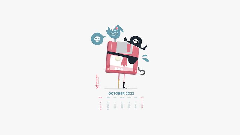
King Of The Pirates

Designed by Ricardo Gimenes from Sweden.

Tarzan In The Jungle

“We start this October with Tarzan in his jungle. Luckily Chita helps us!” — Designed by Veronica Valenzuela from Spain.

Happy Halloween

Designed by Ricardo Gimenes from Sweden.

Design Your Thinking

“Thinking helps us challenge our own assumptions, discover new things about ourselves and our perspective, stay mentally sharp, and even be more optimistic. Using divergent thinking strategies can help you examine a problem from every angle and identify the true root of the issue. Deep thinking allows you to try on perspectives that you may not have considered before.” — Designed by Hitesh Puri from Delhi, India.

Welcome Maa Durga!

“Welcome the power — Shakti. Welcome the love. Welcome her blessings. Welcome Maa Durga!” — Designed by Rahul Bhattacharya from India.

Old Tree

“No surprise, with October, Halloween time is back. In the north, days are becoming shorter. The night atmosphere takes place and a slightly scary feeling surrounds everything. It’s not only a matter of death. I had taken a picture of this old tree. Who knows if there is really noone in there?” — Designed by Philippe Brouard from France.

Oldies But Goodies

Hidden in our wallpapers archives, we rediscovered some almost-forgotten treasures from past October editions. May we present… (Please note that these designs don’t come with a calendar.)

Autumn Vibes

“Autumn has come, the time of long walks in the rain, weekends spent with loved ones, with hot drinks, and a lot of tenderness. Enjoy.” — Designed by LibraFire from Serbia.

The Night Drive

Designed by Vlad Gerasimov from Georgia.

The Return Of The Living Dead

Designed by Ricardo Gimenes from Sweden.

Goddess Makosh

“At the end of the kolodar, as everything begins to ripen, the village sets out to harvesting. Together with the farmers goes Makosh, the Goddess of fields and crops, ensuring a prosperous harvest. What she gave her life and health all year round is now mature and rich, thus, as a sign of gratitude, the girls bring her bread and wine. The beautiful game of the goddess makes the hard harvest easier, while the song of the farmer permeates the field.” — Designed by PopArt Studio from Serbia.

Bird Migration Portal

“October is a significant month for me because it is when my favorite type of bird travels south. For that reason I have chosen to write about the swallow. When I was young, I had a bird’s nest not so far from my room window. I watched the birds almost every day; because those swallows always left their nests in October. As a child, I dreamt that they all flew together to a nicer place, where they were not so cold.” — Designed by Eline Claeys from Belgium.

Game Night And Hot Chocolate

“To me, October is all about cozy evenings with hot chocolate, freshly baked cookies, and a game night with friends or family.” — Designed by Lieselot Geirnaert from Belgium.

Magical October

“‘I’m so glad I live in a world where there are Octobers.’ (L. M. Montgomery, Anne of Green Gables)” — Designed by Lívi Lénárt from Hungary.

Hello Autumn

“Did you know that squirrels don’t just eat nuts? They really like to eat fruit, too. Since apples are the seasonal fruit of October, I decided to combine both things into a beautiful image.” — Designed by Erin Troch from Belgium.

First Scarf And The Beach

“When I was little, my parents always took me and my sister for a walk at the beach in Nieuwpoort, we didn’t really do those beach walks in the summer but always when the sky started to turn grey and the days became colder. My sister and I always took out our warmest scarfs and played in the sand while my parents walked behind us. I really loved those Saturday or Sunday mornings where we were all together. I think October (when it’s not raining) is the perfect month to go to the beach for ‘uitwaaien’ (to blow out), to walk in the wind and take a break and clear your head, relieve the stress or forget one’s problems.” — Designed by Gwen Bogaert from Belgium.

Haunted House

“Love all the Halloween costumes and decorations!” — Designed by Tazi from Australia.

Autumn Gate

“The days are colder, but the colors are warmer, and with every step we go further, new earthly architecture reveals itself, making the best of winters’ dawn.” — Designed by Ana Masnikosa from Belgrade, Serbia.

Ghostbusters

Designed by Ricardo Gimenes from Sweden.

Spooky Town

Designed by Xenia Latii from Germany.

Strange October Journey

“October makes the leaves fall to cover the land with lovely auburn colors and brings out all types of weird with them.” — Designed by Mi Ni Studio from Serbia.

Autumn Deer

Designed by Amy Hamilton from Canada.

Dope Code

“October is the month when the weather in Poland starts to get colder, and it gets very rainy, too. You can’t always spend your free time outside, so it’s the perfect opportunity to get some hot coffee and work on your next cool web project!” — Designed by Robert Brodziak from Poland.

Tea And Cookies

“As it gets colder outside, all I want to do is stay inside with a big pot of tea, eat cookies and read or watch a movie, wrapped in a blanket. Is it just me?” — Designed by Miruna Sfia from Romania.

Discovering The Universe!

“Autumn is the best moment for discovering the universe. I am looking for a new galaxy or maybe… a UFO!” — Designed by Verónica Valenzuela from Spain.

Transitions

“To me, October is a transitional month. We gradually slide from summer to autumn. That’s why I chose to use a lot of gradients. I also wanted to work with simple shapes, because I think of October as the ‘back to nature/back to basics month’.” — Designed by Jelle Denturck from Belgium.

A Very Pug-o-ween

“The best part of October is undoubtedly Halloween. And the best part of Halloween is dog owners who never pass up an o-paw-tunity to dress up their pups as something a-dog-able. Why design pugs specifically in costumes? Because no matter how you look at it, pugs are cute in whatever costume you put them in for trick or treating. There’s something about their wrinkly snorting snoots that makes us giggle, and we hope our backgrounds make you smile all month. Happy Pug-o-ween from the punsters at Trillion!” — Designed by Trillion from Summit, NJ.

Whoops

“A vector illustration of a dragon tipping over a wheelbarrow of pumpkins in a field with an illustrative fox character.” Designed by Cerberus Creative from the United States.

Categories: Others Tags:

How to Handle Career Setbacks

September 30th, 2022 No comments

Career setbacks can be difficult to deal with. They can cause us to feel like we’re not good enough, and make us question our abilities.

It’s crucial to keep in mind that no one is immune to failure throughout their professional life. The key is to learn from your setbacks and use them as an opportunity to grow.

In this blog post, we will look at the common causes of career setbacks, and how you can constructively handle them.

Common Causes of Career Setbacks

Everyone experiences career setbacks from time to time. Whether it’s being passed over for a promotion or losing a major client, setbacks are an inevitable part of professional life.

While it can be difficult to recover from a setback, it’s important to remember that these challenges are often temporary and do not define your entire career. It has even been studied that failure at the beginning of your career can make you more successful in the long term.

Here are some of the most common causes of career setbacks:

Imposter Syndrome

At its simplest, imposter syndrome can be defined as a lack of confidence in one’s abilities, despite evidence to the contrary. It’s a feeling of being an imposter or fraudster in your job, and it’s something that can affect anyone, regardless of their experience or qualifications.

Imposter syndrome at work can manifest itself in several ways. For example, you might feel like you’re constantly faking it and that you’re not cut out for the role you’re in. You might find yourself over-preparing for meetings or presentations, or second-guessing your decisions. You might feel like you need to put on a persona at work, and that everyone around you is more competent than you are.

Burnout

Many of us have experienced some form of burnout at work. It might be after a particularly demanding project, or during a time of stress at home.

Whatever the cause, burnout can leave us feeling exhausted, unmotivated, and even disconnected from our colleagues. Symptoms of burnout can include feeling constantly tired, difficulty concentrating, and a general sense of apathy.

Lack of Opportunity

Sometimes, our career setbacks are out of our control. If you’re stuck in a dead-end job with no opportunity for growth, it can be frustrating and discouraging.

Lack of opportunity at work can refer to a few different things. It might mean that you’re not being given the chance to use your skills or advance in your career. Or, it might mean that you’re not being paid what you’re worth. Either way, lack of opportunity can be frustrating and discouraging.

Unclear Career Goals

If you’re not sure what you want to do with your career, it can be difficult to move forward. You might find yourself taking on jobs that don’t interest you or changing directions every few years.

Unclear career goals can also cause problems when it comes to networking and finding a mentor. It can be difficult to connect with people if you’re not sure what you want to achieve in your career.

These are just a few examples of different career setbacks. If you’re facing a challenge at work, remember that you are not alone. These challenges are an opportunity for you to learn and grow in your career.

How to Handle Career Setbacks

While it’s normal to feel discouraged after a setback, there are things you can do to help you recover and get back on track.

Here are some tips for how to handle career setbacks:

1. Accept That Setbacks Happen

The first step is to accept that setbacks are a normal part of professional life. They do not mean that you are not good enough or that you will never achieve your goals.

2. Take Some Time for Yourself

If you’re feeling overwhelmed, stressed, or burnt out, it’s important to take some time for yourself. This can help you relax and rejuvenate so that you can come back to work with fresh energy.

Think about some activities that make you feel good. This might include exercise, spending time outdoors, reading, listening to music, or spending time with friends and family. Doing something you enjoy can help reduce stress and boost your mood.

3. Seek Feedback

If you doubt your abilities, it can be helpful to seek feedback from your colleagues and superiors. This can give you a better sense of your performance and help us identify areas for improvement.

Sometimes it’s hard to ask for feedback, but it can be invaluable in helping you overcome a setback. Remember that your goal is to improve, not to be perfect.

4. Set Realistic Expectations

If you’re facing a difficult situation at work, it’s important to set realistic expectations for yourself. This can help you avoid getting overwhelmed and stressed out.

If you just started a new job, for example, you might not be able to accomplish everything on your first day. Start with small goals and build up from there.

5. Delegate Tasks

If you’re feeling overloaded at work, try to delegate tasks when possible. This can help you focus on the most important tasks and avoid burnout.

It’s not even beneficial to try to do everything yourself. By delegating tasks, you can focus on what you’re good at and delegate the rest. This will not only help you but also the people you work with and the company or organization as a whole.

6. Have a Clear Plan

If you’re not sure what you want to do with your career, it’s important to have a clear plan. This can help you stay focused and motivated as you work towards your goals.

What do you want to achieve in your career? What kind of impact do you want to make? What makes you happy and fulfilled?

Once you have a clearer idea of your goals, you can start taking steps to achieve them. Setting clear goals is the first step on the path to a successful and fulfilling career.

7. Stay Positive

Finally, it’s important to stay positive through setbacks. Remember that these challenges are often temporary and do not define your entire career.

Ask yourself what you can learn from the situation and how you can grow as a result. Wallowing in self-pity and constantly thinking about your mistakes will not help you achieve your goals. Instead, focus on what you can do to improve and move forward.

Conclusion

While setbacks can be discouraging, it’s important to remember that they are a normal part of professional life. You will have your moments of glory, ups and downs, and periods of transition. The key is to learn from your setbacks and use them to your advantage.

What could be more gratifying than overcoming a challenging situation and surpassing expectations? Well, that’s what we all aspire to do in our careers.

Keep these things in mind the next time you face a setback and remember that your career is not defined by your challenges, but by how you handle them.

The post How to Handle Career Setbacks appeared first on noupe.

Categories: Others Tags:

Unconscious Biases That Get In The Way Of Inclusive Design

September 29th, 2022 No comments

As designers, we want to design optimal experiences for the diverse range of people a product will serve. To achieve this, we take steps in our research and design decisions to minimize the risk of alienating product-relevant social identities, including but not limited to disability, race/ethnicity, gender, skin color, age, sexual orientation, and language.

According to psychologists, we all have unconscious biases. So, designs are often biased, just like we are. This article is for anyone involved in the product design and development process — writers, researchers, designers, developers, testers, managers, and stakeholders. We’ll explore how our biases impact design outcomes and what we can do to design more inclusive experiences.

Once we recognize our unconscious biases, we can take steps to reduce their influence on our decision-making, both as individuals and as collective development and design teams. In this article, we will discuss six unconscious biases that commonly result in delivering user experiences that fall short of being inclusive.

Let’s discuss the six most common unconscious biases are:

Confirmation Bias

This is probably one of the most well-known biases, yet we tend to underestimate how much it impacts our own behavior. Confirmation bias is the tendency to unconsciously look for and give more weight to data, feedback, and users’ behavior that affirms our existing assumptions.

What Is The Impact?

When we approach our work with a confirming and validating mindset, we are more likely to skew our research plan and ignore or minimize any findings that contradict our beliefs. These flaws undermine the purpose of doing research — the goal of inclusive design — and can result in building the wrong thing or the right thing the wrong way. It can also create overconfidence in our assumptions and incline us not to conduct any research at all.

Abercrombie & Fitch dominated the teen clothing market in the 1990s and early 2000s, promoting a very exclusive, all-American, cool-kid image. In the early 2010s, when consumer preferences shifted, the company failed to listen to consumers and maintain its exclusive brand image. After three years of declining sales and pressure from investors, CEO Mike Jefferies resigned. The new CEO, Fran Horowitz, rebranded the company saying, “We are a much more inclusive company, we are closer to the customer, we’re responding to the customer wants and not what we want them to want.”

What Can We Do?

  • Be curious.
    Approach conversations with users with a curiosity mindset and ask non-leading and open-ended questions. Having someone else take notes can serve as an accountability partner as you may hear things differently and can discuss them to clear up discrepancies. And, as much as possible, document exact quotes instead of inferences.
  • Be responsive.
    View each design idea as a hypothesis with a willingness to change direction in response to research findings. Until we conduct primary research with users, our design concepts are merely our best guess based on our own experiences and limited knowledge about our users. We start with that hypothesis as a prototype, then test it with a diverse cross-section of our audience before coding. As quoted by Renee Reid at a UX Research Conference, we should “investigate not validate” our design concepts.

Optimism Bias

While optimism has been linked to many health benefits, optimism bias can be detrimental. Our tendency to minimize the potential of negative outcomes and underestimate risks when it comes to our own actions is referred to as optimism bias. Teams will optimistically think that overlooking socially responsible design will not adversely affect our users’ experience or the bottom line.

What Is The Impact?

As a result of optimistic bias, we may skip user research, ignore accessibility, disregard inclusive language, and launch products that don’t account for the diverse people who use the product.

It turns out that people want and expect products to be designed inclusively. A 2021 survey found that 65% of consumers worldwide purchase from brands that promote diversity and inclusion. And a study by Microsoft found that 49% of Gen-Z consumers in the US stopped purchasing from a brand that did not represent their values.

What Can We Do?

  • Recognize the powerful influence of negativity bias for those on the receiving end of our optimistic bias.
    Psychologists’ research has consistently affirmed that people expect to have good experiences and are more unhappy about bad experiences than good ones. So, one bad interaction has a much greater impact on our users’ perceptions about their experiences than multiple positive interactions.
  • Prioritize impact over output.
    Nobel Prize-winning psychologist Daniel Kahneman suggests running a project premortem. He has extensively researched optimism bias and ways to reduce its influence on our decision-making. Premortem is a loss aversion technique that encourages us to brainstorm potential oversights and identify preventive measures early in our processes.

Omission Bias

Similar to optimism bias, omission bias pertains to our expectations of outcomes. Omission bias occurs when we judge harmful outcomes worse when caused by action than when caused by inaction. This bias can lead us to believe that intentionally deceptive design is a greater offense than failing to implement inclusive design practices.

What Is The Impact?

When we allow our omission bias to prevail, we feel reassured by an illusion of innocence. However, delivering products to market without considering diverse user expectations has the risk of creating harmful user experiences.

This bias is a possible catalyst for skipping user research or leaving inclusive UX work in the product backlog. Some companies profit off this bias by providing accessibility overlays as a post-production solution. These third-party tools attempt to detect accessibility issues in the code and fix the problem for users on the website in real time. Unfortunately, accessibility overlays have been widely documented as problematic and can worsen access.

What Can We Do?

  • Remember that inaction is not without consequence and no less damaging to our users than deliberately harmful actions.
    When our product or service creates barriers or exclusion for our users, whether intentional or unintentional, the effect of the experience feels the same.
  • Plan for inclusive research and design by factoring the necessary time, people, and money into the product roadmap.
    Studies have found that the business cost of going back to fix a design can be 100 times as high as it would have been if the work was addressed during the development stage.

False Consensus Bias

The next two biases, false consensus and perceptual biases, are influential in how we think about others. False consensus bias is when we assume that other people think and behave the same as we do, we are exhibiting. Jakob Nielsen is known for the clever phrase, “you are not the user,” which is derived from this bias. Our false consensus bias can lead us to think, “well, I’m a user too,” when making design decisions. However, we all have a varied mix of identities — our age, ethnicity, abilities, gender, and so on — which are attributed to our unique needs and expectations.

What Is The Impact?

We design for a broad range of people, most of whom are not like us.

That is illuminated when we consider intersectionality. Law professor Kimberlé Crenshaw coined the term intersectionality “to describe how race, class, gender, and other individual characteristics ‘intersect’ with one another and overlap.”

In early 2022, Olay’s senior design strategist Kate Patterson redesigned the packaging for their facial moisturizer. The new Easy Open Lid not only has side handles allowing a better grip for dexterity challenges but also has the product type in Braille and larger lettering with higher contrast for vision impairments. The product was released as a limited edition, and the company has a feedback form on its website to get feedback from users to make improvements for a second edition.

What Can We Do?

  • Avoid relying on personal preferences.
    Start with conventions and design guidelines, but don’t rely on them solely. Design guidelines are generic, so they don’t, and can’t, address all contextual situations. Optimal user experiences are the result of context-sensitive design.
  • Let go of the notion of the average user and engage with users in interviews, accessibility and usability testing, and other empirical research methods.
    Conducting primary user research is immensely insightful as it allows us to learn how intersecting identities can vary users’ expectations, behavior, and contextual use cases.

Perceptual Bias (Stereotyping)

Continuing with biases that distort how we think of others, perceptual biases include halo effect, recency bias, primary effect, and stereotyping. Regarding biases that get in the way of inclusive design, we’ll address stereotyping, which is when we have overgeneralized beliefs about people based on group attributes.

What Is The Impact?

How we gather and interpret research can be greatly influenced by stereotyping. Surveys, for example, typically don’t reveal a person’s motivations or intent. This leaves room for our speculations of “why” when interpreting survey responses, which creates many opportunities for relying on stereotyping.

The Mr. Clean Magic Eraser Sponge advertisement, “This Mother’s Day, get back to the job that really matters,” reinforced antiquated gender roles. A Dolce & Gabbana campaign included an Asian woman wearing one of their dresses and trying to use chopsticks to eat Italian food while a voiceover mocked her and made sexual innuendos. Designing based on stereotypes and tropes is likely to insult and alienate some of our user groups.

What Can We Do?

  • Include a broad spectrum of our users in our participant pool.
    The more we understand the needs and expectations of our users that are different from us (different ages, ethnicities, abilities, gender identities, and so on), the more we reduce the need to depend on generalizations and offensive constructs about various social identities.
  • Conduct assumption mapping which is an activity of documenting our questions and assumptions about users and noting the degree of certainty and risk for each.
    Assumption mapping can help us uncover how much we’re relying on oversimplified generalizations about people and which segments of the audience our design might not be accounted for and help us prioritize areas to focus our research on.

Status Quo Bias

Lastly, let’s look at a decision-making bias. Status quo bias refers to our tendency to prefer how things are and to resist change. We perceive current practices as ideal and negatively view what’s unfamiliar, even when changes would result in better outcomes.

What Is The Impact?

When we rely on default thinking and societal norms, we run the risk of perpetuating systemic social biases and alienating segments of our users. Failing to get input and critique from people across a diverse spectrum can result in missed opportunities to design broadly-valued solutions.

It took Johnson & Johnson 100 years to redesign their skin-tone colored adhesive bandages. The product was released in 1920 with a Eurocentric design that was optimal for light skin tones, and it wasn’t until 2020 that Band-aid added more shades “to embrace the beauty of diverse skin.”

What Can We Do?

  • Leaders can build non-homogenous teams and foster a workplace where it’s safe to question the status quo.
    Having team members with diverse lived experiences creates a wealth of variance and opportunities for divergent perspectives. Teams that are encouraged to challenge the default and propose alternatives have significant potential to minimize the risks of embedding biases in our UX processes.
  • As individuals, we can employ our System 2 thinking.
    Psychologist Daniel Kahneman popularized two modes of thinking in his book Thinking, Fast and Slow to encourage us to move beyond our visceral thoughts to slower, effortful, and analytical thinking. In this mode, we can question our default System 1 thinking, which is automatic and impulsive, awaken our curiosity about novel ways to approach design challenges, and find opportunities to learn about and engage with people outside our typical circles.

Summary

Designing for many means designing for demographic groups whose needs and expectations differ from ours. Our unconscious biases typically keep us in our comfort zones and stem from systemic social constructs that have historically been an anti-pattern for inclusivity.

Unconscious biases, when unrecognized and unchallenged, seep into our design practices and can insidiously pollute our research and design decisions.

We start to counter our unconscious biases by acknowledging that we have biases. You do. We all do. Next, we can take steps to be more mindful of how our designs impact the people who interact with our products so that we design inclusive experiences.

Additional Resources

  • Learning to Recognize Exclusion
    An article by Lesley-Ann Noel and Marcelo Paiva on what it means to exclude, why we do it, and tips for moving out of our comfort zones.
  • Biased by Design
    A website with information about other biases that influence the design and links to additional resources.
  • Coded Bias
    A Netflix documentary investigating bias in algorithms after M.I.T. Media Lab researcher Joy Buolamwini uncovered flaws in facial recognition technology.
  • Thinking, Fast and Slow
    A book by Daniel Kahneman about how thinking more slowly can help us reduce biased decision-making.
  • Design for Cognitive Bias
    A book by David Dylan Thomas that discusses how biases influence decision-making and techniques for noticing our own biases so we can design more consciously.
Categories: Others Tags:

How To Create An Instagram Wall For Events

September 29th, 2022 No comments

In recent years, Instagram has been the most expanding social media platform among companies and marketers. Social media has risen as an essential component of brand creation and marketing strategy.

Digital media and promotions have used these platforms for their online marketing. Still, social media is now influencing offline promotions like events and venues.

The result of this fusion of offline advertising and communications with digital media platforms and technologies is the Instagram wall.

In this piece, we will discuss what an Instagram wall is and how to create an Instagram wall for events.

What is an Instagram Wall

Instagram Walls is a real-time stream of content that has been collected and curated from Instagram using hashtags, handles, mentions, or tags. Instagram walls are displayed on digital screens and devices.

Source

The Instagram wall helps achieve prime event objectives such as audience engagement, promotions & communications, entertainment & leisure, brand building, event marketing, and driving results for the brand or event. 

Instagram Wall is created and displayed on screens primarily at events, venues, conferences, concerts, exhibitions, retail stores, malls, etc.

Ideas to make your Instagram Wall Engaging for Events

Instagram Q&A Sessions

You can use Instagram live to hold a series of Q&A sessions with the participants of your event. As a result, they will be hyper-engaged in the event and interested in what you have to say. 

To generate excitement among the viewers, you can allow questions to be asked during the live streaming session and even share the live Instagram post. 

Please encourage them to create more Instagram posts so that more of them can be shown on the screen at events.

How to do’s & Demos through Instagram Live

Bring your audience together and lead them through a demonstration or tutorial using Instagram live. Anything connected to the subject of your virtual event will do. 

As a result, you will establish a deeper level of connection with the attendees of your event. Customers might associate a name with your brand and gain new knowledge.

Showcase Instagram Stories

Request tagging from your audience in any content relevant to the event. Thus, you can display their real-time stories during the virtual event on the screen. 

You can ask participants to describe their participation and to tune in remotely. You can also access your @-mentions in the activity tab to view, respond to, and share tales about you.

Cast Speaker’s Content

Speakers and influencers are the main attractive point of an event. Most of the crowd comes to an event to see their favorite speaker or influencer, which gives you a chance to boost your presence. 

You can hit two birds with one stone by displaying the speaker’s social media profile and your user-generated content. This would impress the speaker and attract the speaker’s social media audience to your event page.

Run Contests and Questionnaires

Audience engagement is on top of the list of every event organizer when it comes to making an event memorable. The easiest way to hook an audience is to run a contest or questionnaire, which opens up two-way communication.

The audience is observing or listening to speakers for most parts of the event. But when you run a contest or questionnaire, the audience starts getting involved. This also breaks the monotony of the event and livens it up.

Suppose you throw in some gift hampers for winners of contests and questionnaires. In that case, the chances of audience participation go through the roof.

Display User-Generated Content

User-generated content in the form of social media posts captures the audience’s attention like nothing else. 

One can use User-generated content across multiple marketing channels. Still, events can be taken to a new level through user-generated content and Instagram walls.

Instagram is the go-to social media platform for collecting a large volume of user-generated content. 

Collect and display user-generated content from your event on the Instagram wall to boost audience engagement. 

Benefits Of Instagram Wall For Events

Boost your Social Media Presence

As we just stated, using Instagram content and incorporating digital media into events can help you expand your brand’s reach in the market.

As a result, by displaying pertinent material that has already been shared on Instagram on your hashtag wall display, you can reach a wider audience on the network.

Additionally, UGC produced by events will make such important information more visible to new networks, demographics, and audiences, increasing exposure & event recognition. It will also help you increase your Instagram following and reach.

Enhance Audience Engagement

We talked about how audience involvement is the most crucial factor in determining if an event or a marketing campaign for a brand succeeds.

You can curate and showcase interesting visual content from Instagram walls, whether it be an influencer, brand, or user-generated content. Attractively displaying this content at events will attract attendees and keep them interested.

Additionally, you can promote interaction by hosting Q&A sessions, panel discussions, keynote speakers, etc., with the Instagram wall display.

Offer Brilliant Gamified Experience

Event experience is a unique idea that marketers and event organizers place a high value on since it lays the groundwork for future events’ success.

On the Instagram wall, you may provide gamified experiences such as polls, leaderboards, challenges, quizzes, photo competitions, etc. in addition to rewards & recognition.

This would entice the audience to take part in these gamification initiatives and give them a remarkable audience experience that excites them and cultivates a positive attitude toward the business.

Wrapping Up

Instagram is a fan favorite among social media platforms. This makes Instagram the go-to platform for brands & businesses to collect user-generated content, as many posts are created on the platform.

This user-generated content can create an attractive Instagram wall to boost engagement and enhance audience awareness. 

We mentioned some ideas in this blog through which you can make your Instagram wall engaging. We hope we have served your purpose through this piece of content.

The post How To Create An Instagram Wall For Events appeared first on noupe.

Categories: Others Tags:

Ten Principles To Consider When Building Your Security Strategy (Case Study)

September 29th, 2022 No comments

This article is a sponsored by Wix

What should you focus on when designing your security strategy? This question becomes more and more tricky as your organization grows and matures. At an initial stage, you might be able to make due with a periodic penetration test. But you will soon find that as you scale up to hundreds and thousands of services, some of the procedures have to change. The focus shifts from project-based assessments to building and maintaining a lasting mindset and framework with security at the core, so you can minimize risk across your environment.

In this article, we’ll share some guiding principles and ideas for incorporating security by design into your own development process, taken from our work at Wix serving 220M+ users.

First And Foremost: Security By Design

Also known as security by default, security by design (SbD) is a concept in which we aim to “limit the opportunities” for making security-related mistakes. Consider a case where a developer builds a service to query a database. If the developer is required (or allowed) to build queries “from scratch” writing SQL directly into his code, they can very well end up introducing SQL Injections (SQLI) vulnerabilities. However, with a security by default approach, the developer can get a safe Object-Relational Mapping (ORM), letting the code focus on logic where the DB interactions are left for the ORM libraries. By ensuring the ORM library is safe once, we are able to block SQLI everywhere (or at least everywhere the library is used). This approach might restrict some developer liberties, but except for specific cases, the security benefits tend to outweigh the cons.

That previous example is rather well known, and if you use a mature application development framework, you’re probably using an ORM anyway. But the same logic can be applied to other types of vulnerabilities and issues. Input validation? Do this by default using your app framework, according to the declared var type. What about Cross-Site Resource Forgery (CSRF)? Solve it for everyone in your API gateway server. Authorization confusion? Create a central identity resolution logic to be consumed by all other services.

By following this methodology, we’re able to allow our developers the freedom to move quickly and efficiently, without needing to introduce security as a “blocker” in later stages before new features go live.

1. Establish Secure Defaults For Your Services

Take the time to ensure that your services are served by default with secure settings. For example, users should not need to actively choose to make their data private. Instead, the default should be “private” and users can have the option to make it public if they choose to. This of course depends on product decisions as well, but the concept stands. Let’s look at an example. When you build a site on our platform, you can easily set up a content “Collection”, which is like a simplified database. By default, editing permissions to this collection are restricted to admin users only, and the user has the option to expose it to other user types using the Roles & Permissions feature. The default is secure.

2. Apply The Principle Of Least Privilege (PoLP)

Put simply, users shouldn’t have permission for stuff they don’t need. A permission granted is a permission used, or if not needed, then abused. Let’s look at a simple example: When using Wix, which is a secure system with support for multiple users, a website owner can use Roles & Permissions to add a contributor, say with a Blog Writer role, to their site. As derived from the name, you would expect this user to have permissions to write blogs. However, would this new contributor have permissions, for example, to edit payments? When you put it like this, it sounds almost ridiculous. But the “least permission” concept (PoLP) is often misunderstood. You need to apply it not only to users, but also to employees, and even to systems. This way even if you are vulnerable to something like CSRF and your employees are exploited, the damage is still limited.

In a rich microservice environment, thinking about least permission might become challenging. Which permission should Microservice A have? Should it be allowed to access Microservice B? The most straightforward way to tackle this question is simply starting with zero permissions. A newly launched service should have access to nothing. The developer, then, would have an easy, simple way to extend their service permission, according to need. For example, a “self service” solution for allowing developers to grant permissions for services to access non-sensitive databases makes sense. In such an environment, you can also look at sensitive permissions (say for a database holding PII data), and require a further control for granting permissions to them (for example, an OK from the data owner).

3. Embrace The Principle Of Defense In Depth (DiD)

As beautifully put by a colleague, security is like an onion — it’s made of many layers built on top of layers, and it can make you cry. In other words, when building a secure system, you need to account for different types of risk and threats, and subsequently you need to build different types of protections on top of others.

Again, let’s look at a simple example of a login system. The first security gateway you can think of in this context is the “user-password” combination. But as we all know, passwords can leak, so one should always add a second layer of defense: two-factor authentication (2FA), also known as multi-factor authentication (MFA). Wix encourages users to enable this feature for their account security. And by now, MFA is pretty standard — but is it enough? Can we assume that someone who successfully logged into the system is now trusted?

Unfortunately, not always. We looked until now at one type of attack (password stealing), and we provided another layer to protect against it, but there are certainly other attacks. For example, if we don’t protect ourselves, a Cross Site Scripting (XSS) attack can be used to hijack a user’s sessions (for example by stealing the cookies), which is as good as a login bypass. So we need to consider added layers of defense: cookie flags to prevent JS access (HTTP only), session timeouts, binding a session to a device, etc. And of course, we need to make sure we don’t expose XSS issues.

You can look at this concept in another way. When writing a feature, you should almost protect it “from scratch”, thinking all defenses might have been broken. That doesnt mean writing every line of code again, it just means being aware that certain assumptions cannot be made. For example, you can’t assume that just because your service does not have an externally reachable endpoint, it has never been accessed by malicious entities. An attacker exploiting Server-Side Request Forgery (SSRF) issues can hit your endpoint any minute. Is it protected against such issues?

At Wix, we assume a “breach mindset” at all times, meaning each developer assumes the controls leading up to the application they’re working on have already been breached. That means checking permissions, input validations and even logic — we never assume previous services are sensible.

4. Minimize Attack Surface Area

What’s the safest way to secure a server? Disconnect it from the electricity socket. Jokes aside, while we don’t want to turn our services off just to ensure they’re not abused, we certainly don’t want to leave them on if they serve no real function. If something is not needed or being used, it should not be online.

The most straightforward way to understand this concept is by looking at non-production environments (QA, staging, etc). While such environments are often needed internally during the development process, they have no business being exposed such that external users can access them. Being publicly available means they can serve as a target for an attack, as they are not “production ready” services (after all, they are in the testing phase). The probability for them to become vulnerable increases.

But this concept doesn’t apply only to whole environments. If your code contains unused or unnecessary methods, remove them before pushing to production. Otherwise, they become pains instead of assets.

5. Fail Securely

If something fails, it should do so securely. If that’s confusing, you’re not alone. Many developers overlook this principle or misunderstand it. Imagining every possible edge case on which your logic can fail is almost impossible, but it is something you need to plan for, and more often than not it’s another question of adopting the right mindset. If you assume there will be failures, then you’re more likely to include all possibilities.

For instance, a security check should have two possible outcomes: allow or deny. The credentials inputted are either correct, or they’re not. But what if the check fails entirely, say, because of an unexpected outage of electricity in the database server? Your code keeps running, but you get a “DB not found” error. Did you consider that?

In this particular instance, the answer is probably “yes”, you thought of it, either because your framework forced you to consider it (such as Java’s “checked exceptions”) or simply because it actually happens often enough that your code failed in the past. But what if it is something more subtle? What if, for example, your SQL query fails due to non-unicode characters that suddenly appeared as input? What if your S3 bucket suddenly had its permissions changed and now you can’t read from it anymore? What if the DNS server you’re using is down and suddenly instead of an NPM repo you’re hitting a compromised host?

These examples might seem ludacris to you, and it would be even more ludacris to expect you to write code to handle them. What you should do, however, is expect things to behave in an expected manner, and make sure if such things occur, you “fail securely”, like by just returning an error and stopping the execution flow.

It would make no sense to continue the login flow if the DB server is down, and it will make no sense to continue the media processing if you can’t store that image on that bucket. Break the flow, log the error, alert to the relevant channel — but don’t drop your security controls in the process.

6. Manage Your Third-Party Risk

Most modern applications use third-party services and/or import third-party code to enhance their offering. But how can we ensure secure integrations with third parties? We think about this principle a lot at Wix, as we offer third-party integrations to our user sites in many ways. For example, users can install apps from our App Market or add third-party software to their websites using our full-stack development platform called Velo.

Third-party code can be infiltrated, just like your own, but has the added complication that you have no control over it. MPM node libraries, for instance, are some of the most used in the world. But recently a few well-known cases involved them being compromised, leaving every site that used them exposed.

The most important thing is to be aware that this might happen. Keep track of all your open-source code in a software bill of materials (SBOM), and create processes for regularly reviewing it. If you can, run regular checks of all your third-party suppliers’ security practices. For example, at Wix we run a strict Third-Party Risk Management Program (TPRM) to vet third parties and assess security while working with them.

7. Remember Separation Of Duties (SoD)

Separation of duties really boils down to making sure tasks are split into (and limited to) appropriate user types, though this principle could also apply to subsystems.

The administrator of an eCommerce site, for example, should not be able to make purchases. And a user of the same site should not be promoted to administrator, as this might allow them to alter orders or give themselves free products.

The thinking behind this principle is simply that if one person is compromised or acting fraudulently, their actions shouldn’t compromise the whole environment.

8. Avoid Security By Obscurity

If you write a backdoor, it will be found. If you hard-code secrets in your code, they will be exposed. It’s not a question of “if”, but “when” — there is no way to keep things hidden forever. Hackers spend time and effort on building reconnaissance tools to target exactly these types of vulnerabilities (many such tools can be found with a quick google search), and more often than not when you point at a target, you get a result.

The bottom line is simple: you cannot rely on hidden features to remain hidden. Instead, there should be enough security controls in place to keep your application safe when these features are found.

For example, it is common to generate access links based on randomly generated UUIDs. Consider a scenario where an anonymous user makes a purchase on your store, and you want to serve the invoice online. You cannot protect the invoice with permissions, as the user is anonymous, but it is sensitive data. So you would generate a “secret” UUID, build it into the link, and treat the “knowledge” of the link as “proof” of identity ownership.

But how long can this assumption remain true? Over time, such links (with UUID in them) might get indexed by search engines. They might end up on the Wayback Machine. They might be collected by a third-party service running on the end user’s browser (say a BI extension of some sort), then collected into some online DB, and one day accessed by a third party.

Adding a short time limit to such links (based on UUIDs) is a good compromise. We don’t rely on the link staying secret for long (so there’s no security by obscurity), just for a few hours. When the link gets discovered, it’s already no longer valid.

9. Keep Security Simple

Also known as KISS, or keep it simple, stupid. As developers, we need to keep users in mind at all times. If a service is too complicated to use, then its users might not know how to use it, and bypass it or use it incorrectly.

Take 2FA for example. We all know it’s more secure, but the process also involves a degree of manual setup. Making it as simple as possible to follow means more users will follow it, and not compromise their own accounts with weaker protections.

Adding new security functionality always makes a system more complex, so it can have an unintended negative impact on security. So keep it simple. Always weigh the value of new functionality against its complexity, and keep security architecture as simple as possible.

10. Fix Security Issues, Then Check Your Work

Thoroughly fixing security issues is important for all aspects of a business. At Wix, for example, we partner with ethical hackers through our Bug Bounty Program to help us find issues and vulnerabilities in our system, and practice fixing them. We also employ internal security and penetration testing, and the security team is constantly reviewing the production services, looking for potential bugs.

But fixing a bug is just the start. You also need to understand the vulnerability thoroughly before you fix it, and often get whoever spotted it to check your fix too. And then, when a bug is fixed, carry out regression tests to make sure it’s not reintroduced by code rollbacks. This process is crucial to make sure you’re actually advancing your application security posture.

Conclusion

By implementing security by design at Wix, we were able to build a robust and secure platform — and we hope that sharing our approach will help you do the same. We applied these principles not just to security features, but to all components of our system. We recommend considering this, whether you build from scratch or choose to rely on a secure platform like ours.

More importantly, following security by design instilled a security mindset into our company as a whole, from developers to marketing and sales. Cybersecurity should be top priority in everyone’s minds, as attacks increase and hackers find new ways of accessing sensitive information.

Taking a defensive position right from the start will put you at an advantage. Because when thinking about cybersecurity, it’s not if a breach happens. It’s when.

  • For more information on security by design, visit the Open Web Application Security Project. This non-profit community is dedicated to securing the web, and produces a range of free open-source tools, training and other resources to help improve software security.
  • To learn more about secure practices at Wix, check out wix.com/trust-center/security.
Categories: Others Tags:

How To Make Your Designs Scannable (And Why You Should)

September 28th, 2022 No comments

Jakob Nielsen’s How Users Read on the Web is 25 years old this week, and one glance at an eye-tracking study will tell you its key observations are still relevant today.

Simply put, users don’t read a web page; they scan it for individual words and sentences.

A typical pattern shown in eye-tracking reports is that users will rapidly scan a page, scrolling down to do so. Then either hit the back button and pump your bounce rate, or scroll to the top and re-engage with the content.

Even when content, volume, and quality tick all the user’s boxes, and they choose to stay on your site, they still don’t read; they scan; a slightly deeper scan, but still a scan.

As a result, it’s vital to design websites to be easily scannable, both in a split-second scan to decide if your page is worth the reader’s time and on a second or third pass.

Clarify the Page’s Purpose Immediately

Every page should have a primary goal. The majority of the time, that goal is embodied in a CTA (Call to Action).

The good news is, if your SEO (Search Engine Optimisation) has gone to plan, your goal (i.e., to sell something) and your user’s goal (i.e., to buy something) will align. By clarifying the page’s purpose, you can show the user that your goals align.

You can be experimental if you’re an established company and the user knows what to expect. But if you’re new to the market or have a lower profile, you need to conform to established design patterns. This means that a SaaS should look like a SaaS, a store should look like a store, and a blog should look like a blog.

Including your CTA above the fold — which in the context of the web, means the user doesn’t have to interact to see it. Doing so makes it easier for the user to progress and clearly tells the user what you are offering.

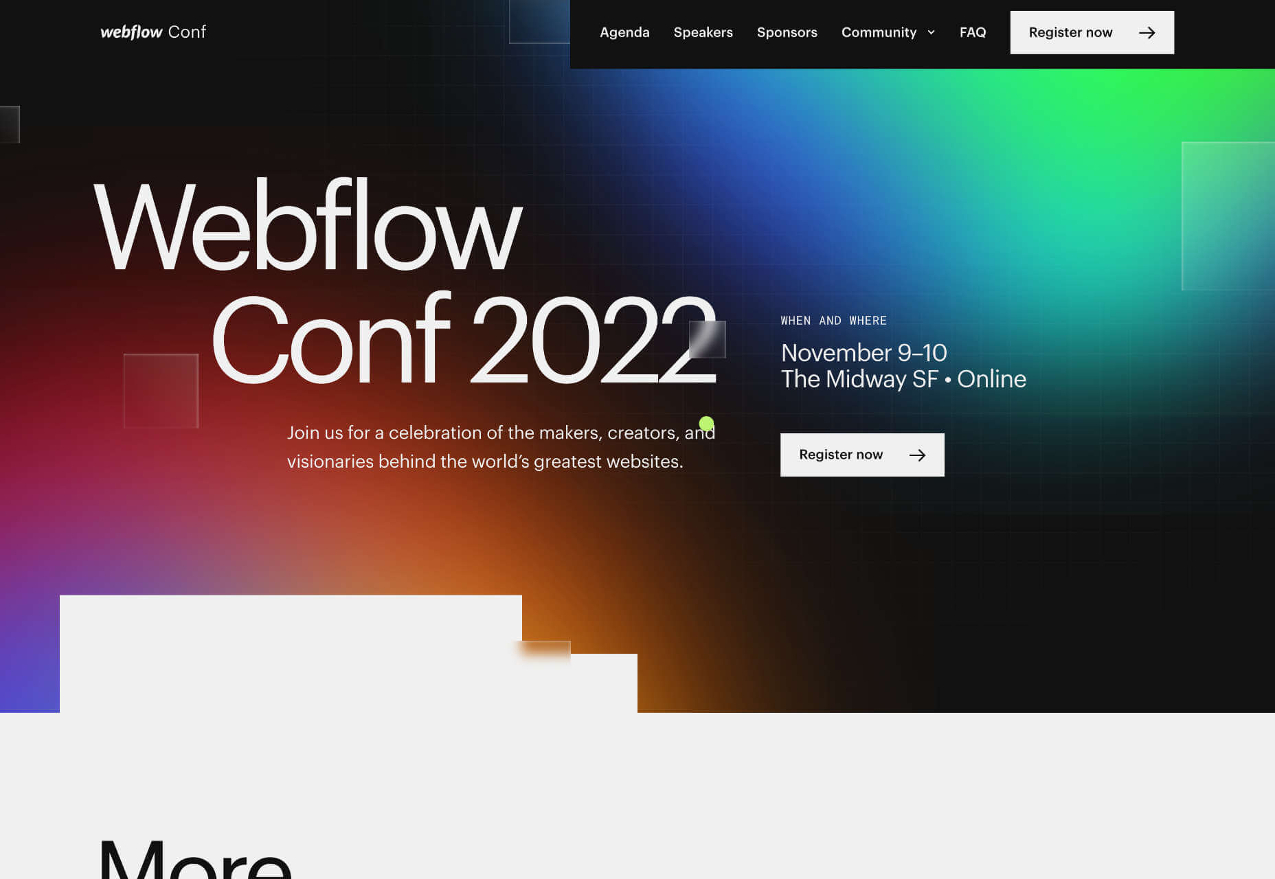
The landing page for next month’s Webflow Conf 2022 clarifies the page’s content, with a clear CTA above the fold.

Employ a Visual Hierarchy

The Von Restorff effect states that the more something stands out, the more likely we are to notice and remember it.

Visual hierarchies are excellent for guiding a user through content. HTML has the h1–h7 heading levels — although, in reality, only h1–h4 are much use — which gives you several levels of heading that can be scanned by different readers scanning at different rates.

For example, we know that subheadings have little impact if a user diligently reads the page from top to bottom, but they are excellent for catching the eye of skim readers.

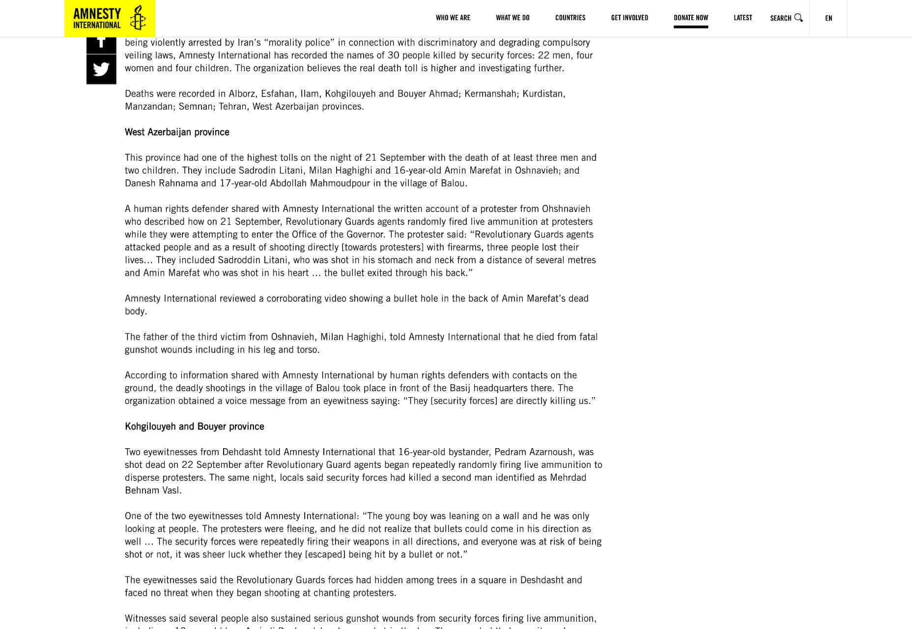
Amnesty uses very a very simple hierarchy, the only change for its subheading being increased weight. But it is enough to catch the user’s eye.

You can also create visual hierarchies with other forms of contrast; weight and color are often employed in addition to size. For accessibility and inclusive design, it’s wise to combine visual indicators when creating a hierarchy; for example, headings are usually larger, bolder, and colored.

Use Negative Space

Imagine a person standing in a crowd. Let’s say they’re wearing a red and white striped jumper and a red and white bobble hat — pretty distinctive. But if there are hundreds of other characters around them, they might be hard to spot.

Now imagine the same person dressed the same, standing on their own. How long will it take you to spot them? Even without the stripy outfit, it’s not much of a challenge.

Elements in isolation are not only easier to spot, but they pull the eye because the negative space (sometimes referred to as white space) around them creates contrast.

When using negative space, the key is to give elements enough room to breathe and attract the eye without giving them so much room that they are disassociated from the rest of your content.

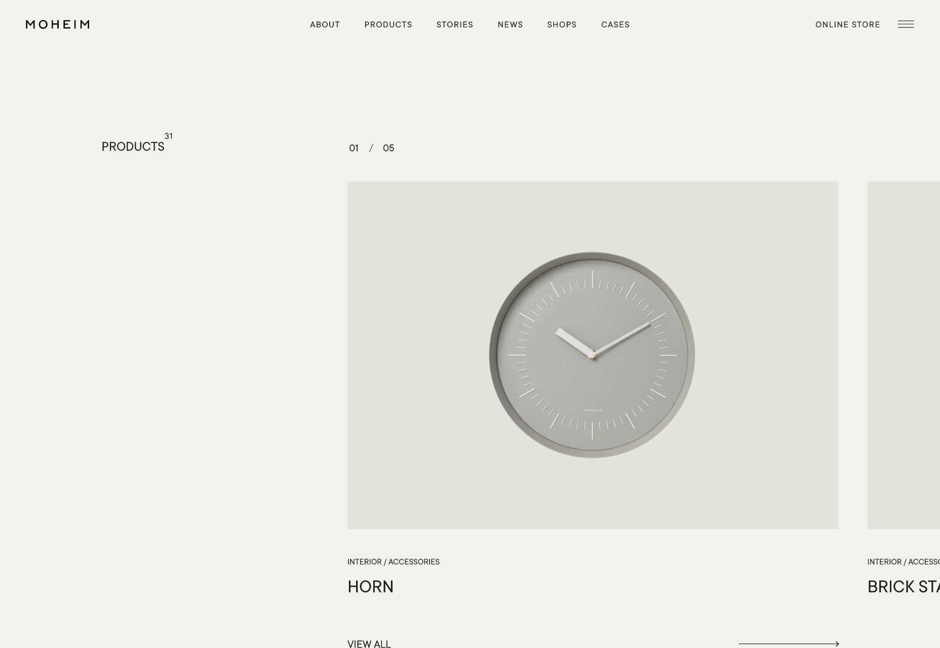
Across its site, Moheim uses negative space to highlight UI elements while grouping associated content.

Use F Patterns

Users scan a page using either an F-pattern or a Z-pattern.

Because users scan your page in predictable ways, we can employ layouts that cater to this tendency.

Designers have been aware of F and Z patterns for some time, and because they’ve been used for so long, they may be self-fulfilling, with users being trained to scan a page in this fashion. However, both patterns are similar to how eyes travel from line to line in horizontal writing systems.

Whatever the cause, by placing key content along these paths, you increase the chance of capturing a user’s attention.

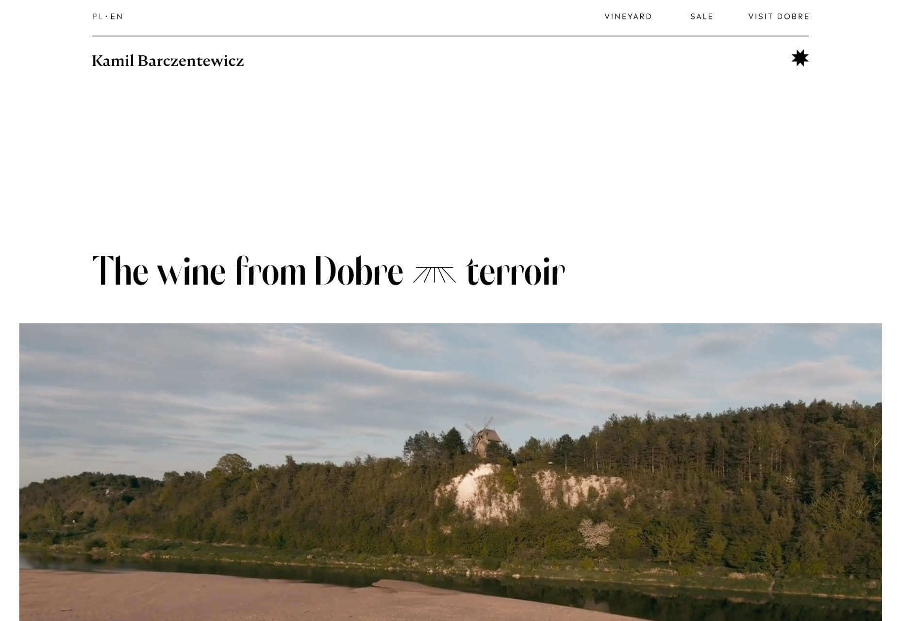
Kamil Barczentewicz uses a beautiful, natural layout that also conforms to a classic F pattern.

Include Images with Faces

Images are a great way of conveying brand values and making a site engaging. But when it comes to catching the eye of a user scanning your design, the best images include faces.

For example, a testimonial with an image of the customer will catch the eye more than a text-only testimonial.

The Awwwards Conference uses an animated computer with a face to capture attention. And large images of speakers making eye contact.

This is almost certainly due to social conditioning; we see a face, and we engage with it to see if it is a threat or not. Most of us naturally look to expressions of emotion to understand situations, and the distinction between a real-life person and an image hasn’t made its way into our mental programming yet.

You don’t need to use photos. Illustrations are fine. The key is to ensure there is a face in the image. That’s why illustrations of characters perform so well.
Copy Print Design

Print design is centuries older than the web, and many print applications, from newspapers to advertising, developed design elements to catch the eye of readers scanning the design.

Subheadings, lists, blockquotes, and pull quotes all catch the eye. Introductory paragraphs in a larger size or even italics draw users into the text. Shorter paragraphs encourage users to keep reading.

Horizontal rules used to delineate sections of text act as a break on eyes traveling over content with momentum. They are a good way of catching a scan-reader who is losing interest.

You can use a horizontal rule or break up your layout with bands of color that divide content sections.

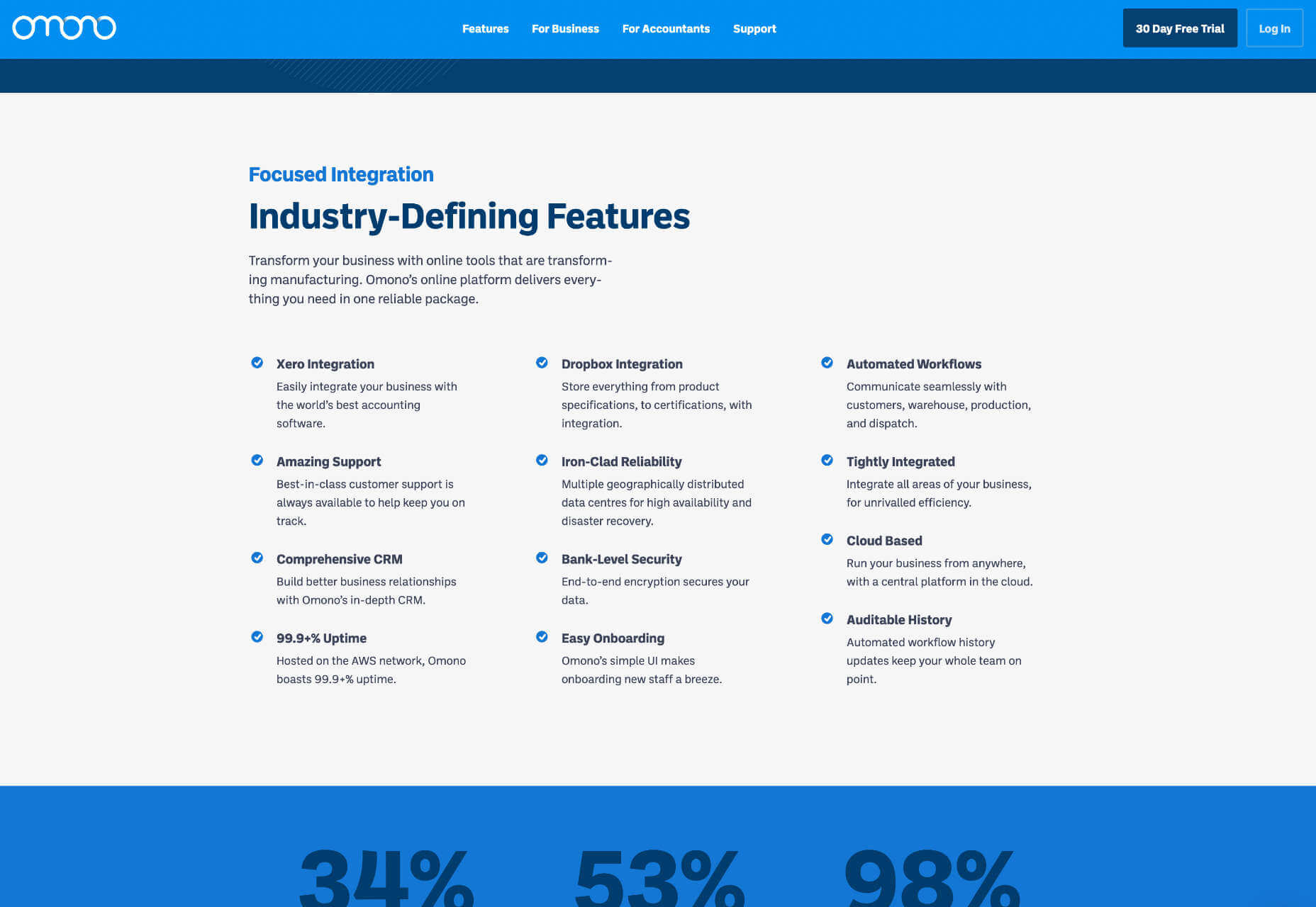
Omono uses horizontal bands to highlight different sections of content.

Mass, Not Weight

We often discuss design elements as having weight; font-weight is the thickness of strokes.

But it is more helpful to think of design elements as having mass; mass creates gravity, pulling a user’s eye towards them.

The trick is to design elements with enough mass to attract the user‘s eye when scanning at speed without forcing the user to change how they engage with your content.


Featured image via Pexels.

Source

The post How To Make Your Designs Scannable (And Why You Should) first appeared on Webdesigner Depot.

Categories: Designing, Others Tags:

Phone Numbers For Web Designers

September 28th, 2022 No comments

It is exciting how websites are being optimized. Localization, A/B testing, and cross-domain campaign tracking contribute to your bottom line. But why stop there? The customer experience is not determined by your website alone. Take the next step and start to include your telephony in the optimization span. And it is a relatively easy step to take as you are already familiar with the mechanisms. Simply follow these seven considerations.

First Things First: The Basics

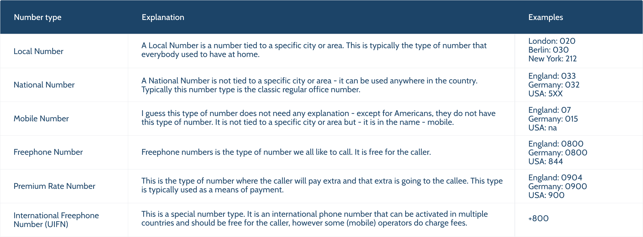
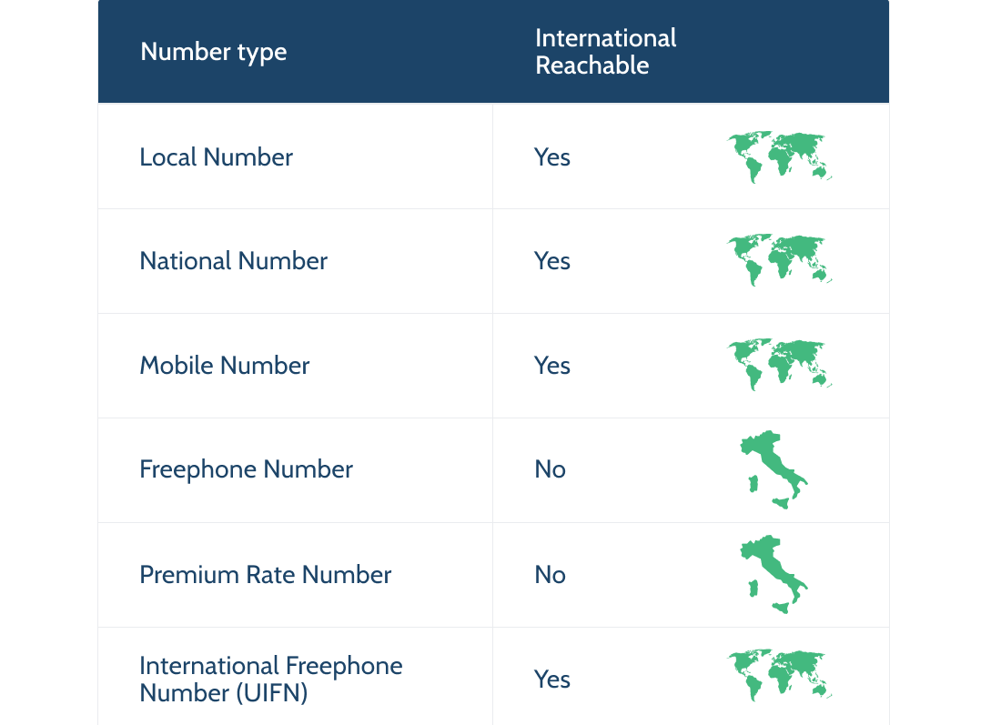
Before determining which number type to use and when and how to present them on your website, it helps to know which number types are available, to begin with:

Each of these numbers can be valid to use, depending on your strategy. It is important to line up the localization, appearance (tone of voice), and other factors of your website and the phone number type you choose. And — like your website — keep testing and optimizing your choice.

Let’s dive into the details of the seven considerations to make.

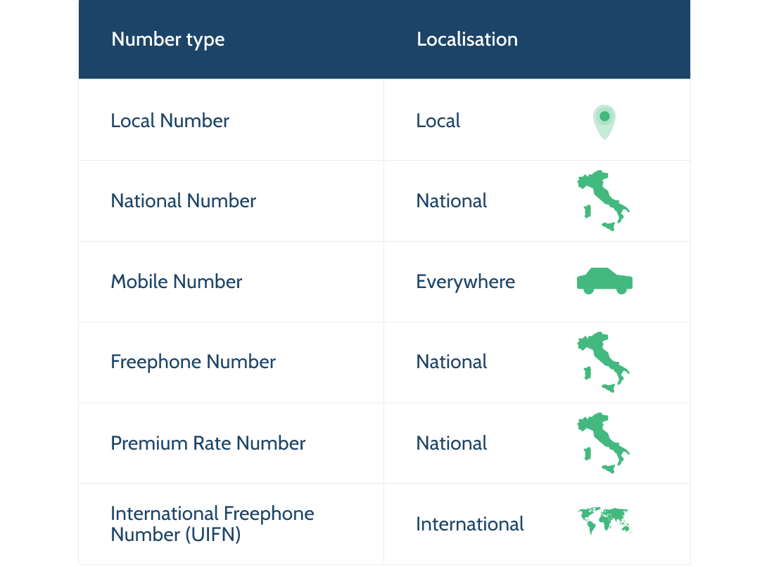
Localization

A lot has been written about localization. Why it is important and how to achieve it with your website. All this attention is leading to great results. However, a website and the product are not the only points of contact with the customer and do not fully cover the customer experience domain. So, there is much to be gained here.

The localization of your website and phone number choice needs to be in sync. If your website is tailored per country, the phone number should also be country-specific. It would be weird to have a site for a specific country but not a phone number. And the beauty is that you have already determined the level of localization required for your website. You can simply match the localization needed to the available phone number types.

If your website localization is country-based, then get one of these numbers:

  • National number,
  • Freephone number,
  • Premium Rate number.

All of these are suitable for country-wide operating businesses. We’ll get back to how to choose which one fits your case best later in this article.

If your website targets specific areas smaller than a country:

Get local numbers in the same areas you are targeting with your website. It strengthens your website localization strategy, and you continue to earn trust with the local phone numbers. If you have optimized (an instance of) your website specifically for London, it only makes sense to extend that strategy and present a Local London Phone number.

There are two number types that require additional attention:

  1. A mobile phone number is technically a number that is valid country-wide. However, it has its value for a very specific type of business: mostly local operating, independent service providers.
  2. An international freephone number (officially a UIFN number) is a single number that can be activated in multiple countries. If your website strategy is explicitly to express one voice for all, this number type fits that strategy; one single international phone number that can be activated in multiple countries. And it can have its advantages in other areas as well. We’ll dive into those a bit later in this article.

Appearance

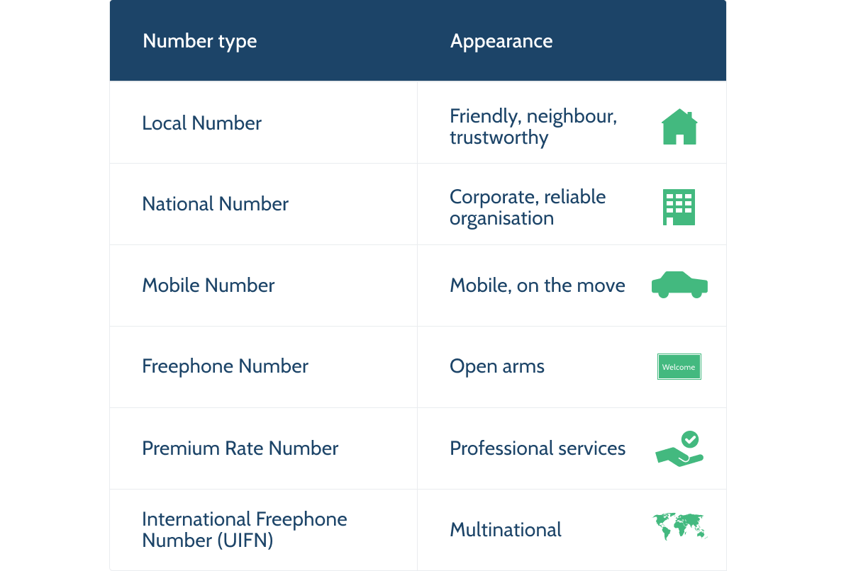
Every type of number expresses an identity. This should match the identity your target market expects from you. Again, consistency is key. Make sure to align the tone of voice and the image you are projecting with your website with the appearance of the phone number(s) you choose.

If you are trying to generate a familiar feel on your website, a local number is your best option. You are calling someone close by, your neighbor. It gives the feeling you know them and that they are trustworthy.

If you want to provide a more corporate or formal impression, a national number is your choice. Bigger companies need a lot of phone numbers, and in many cases, they have offices in different cities. National Numbers have been created to overcome the issue of local numbers being snagged away from consumers. And as stated earlier, they can be used in multiple cities, which enables a company to be reachable in multiple cities via the same phone number. Not for nothing, National phone numbers are also called corporate numbers.

Only use a mobile number if you have to exhume mobility while it is ok that you are an independent service provider. Like an independent courier.

Freephone numbers are by far the most effective phone number types for sales lines and support lines for high-end services and products. If you want to welcome your callers with open arms, this is the number type to opt for, without a doubt.

If the phone call is the medium via which you provide your services, premium rate numbers can provide financial compensation for the services provided. In some cases, these numbers are also used as support lines with the goal of building a threshold for the customer to call and some compensation for the cost of the time spent. Note that this will negatively impact your customer experience. In most countries, it is not even allowed to offer a premium rate number for the support line on services under contract or products under warranty.

An international freephone number is counterproductive in localization but has other advantages. This number type has been defined by the ITU as an international alternative for the regular in-country freephone number and has the calling code +800. Having the same number available in multiple countries has its advantages: You only have to print one number on documentation to be used in multiple countries. And if you have international traveling callers, they only have to memorize one number.

Caller And Operational Cost

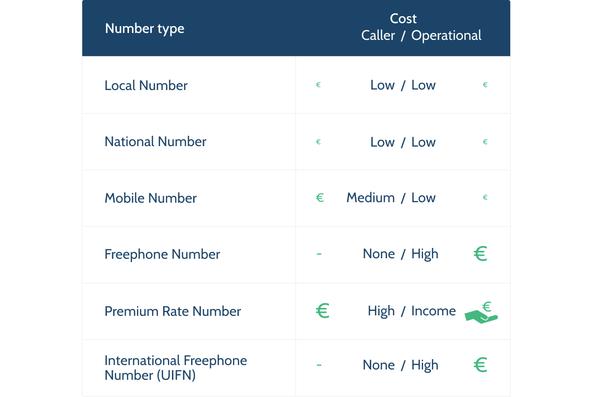
Each number type has its own caller and operational cost profile.

The most cost-effective numbers for both callers and you are local, national, and mobile numbers. These number types are mostly called from the caller bundle and have the lowest operational cost.

The purpose of a freephone number is to shift the caller cost from caller to operational. Therefore, the operational cost is relatively high.

A premium rate number is a payment method; therefore, caller cost is high and provides an operational source of income.

The cost model for an international freephone number is similar to the model of a normal freephone number. The cost is shifted to the operation.

Note: Since this is a globally defined phone number type, it is not regulated by the various in-country regulators to whom the caller operators have to answer.

Most fixed line operators do respect the 0-caller tariff. However, some mobile operators use this loophole to charge their customers for calls to these numbers.

Reachability

Not all number types can be called from everywhere. Obviously, you need to make sure your phone number is reachable by your target audience.

Local, national, mobile and international freephone numbers are usually internationally reachable.

Normal freephone and premium rate numbers are not. As discussed before, these numbers do have their added value for many organizations. If you use these types of numbers, it is important to make sure you get a number in every target market or at least an alternative number for your local customer who just happened to travel outside of your country.

A/B And Campaign Testing

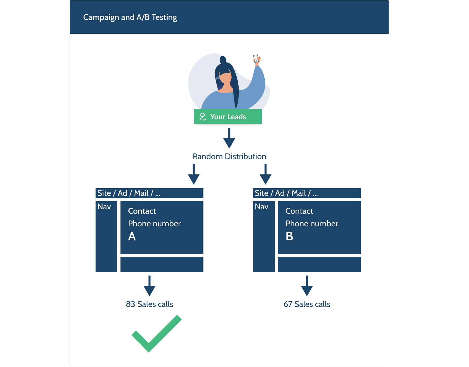
With these guidelines, you can make educated choices and proceed with confidence. But do you stop tweaking your website at this point? No, you don’t! This is where you start with optimization via methods like A/B Testing.

So why not include the phone number options in the scope of testing? All tools are available. All you have to do is include the phone numbers as an A/B parameter. And by adding the call statistics to the test evaluation, you can get to a more educated and accurate conclusion. Now, instead of the website, you are optimizing the website-phone number combination.

That also brings us to the next optimization. When evaluating an ad campaign or mailing, the evaluation usually stops with the clicks. But using different phone numbers (the same type of phone numbers to keep the evaluation clean) on both legs makes it very easy to add the call and call result statistics to the evaluation, enabling you to make even more educated decisions.

Conclusion

A/B testing can be used to evaluate and tweak your phone number choices. And by using different phone numbers (of the same type), you can make your Campaign evaluations more accurate.

Website And Phone Number Integration

Online communication and telephony are often regarded as two distinct domains, but they shouldn’t be. They are both customer contact points, and each can benefit greatly from the other.

Traditionally, just the phone number of the central office was presented. Once the realization set is that localization was also relevant for phone numbers, at least a block with multiple phone numbers was shown.

At the moment (hopefully even more after this article), the phone number shown is an integral part of the localization.

Best practice, however, is taking it a step further. Whatever you do, the goal should be to reach the goal as fast and efficiently as possible for your customer and you. This is valid for your website, your phone support, and both combined. The best results can be obtained when information gathered on the website is not wasted but put to the benefit of the following phone call. By simply presenting a phone number based on the information gathered, you skip the necessity of an (extensive) phone menu and have call screening in place. The image shows a chat setup, but obviously, the same result can be achieved with other setups as well.

And in many cases, that information can be used to present relevant self-service alternatives to the visitor. That could mean even higher efficiency for both your customers and you. Do note that it is essential to offer the options to the visitor — do not hide the possibility of calling. That will lead to frustration, negatively impact customer satisfaction, and cost you leads and customers.

Phone Number Presentation

The last consideration is the presentation of the phone number on your website. Obviously, the presentation depends highly on your website design, but here are a couple of pointers from the phone number perspective:

Link

Always link your phone numbers! Anything you do should contribute to making the life of your audience easier. Most devices are smart and connected, so link your phone number and enable your audience to place the call via a click.

Linking a phone number is easy with the ‘tel’ HTML tag, but what is important is always to use the international format. If you link the local format, visitors from another country will not be able to call the number. In the link, do not place spaces or dashes, just the phone number, for example, tel:+31201234567.

Flags

It does help to present the flag or ISO code of the country of the number presented. It confirms the localization to the caller. The caller recognizes the flag and feels confident to call the number. If it is someone from another country, at least they are aware they will call internationally. This way, you’ll prevent possible surprises for the caller afterward.

Furthermore, it gives you the opportunity to offer alternatives. If you have alternative phone numbers, it is possible to present the flag (combined with the number) in a dropdown. This way, in case the localization of the website is off, any visitor can find their relevant phone number. Note: When having alternatives, do not show all options, but show one (the one that should be relevant according to your site’s localization) and show there are alternatives. That way, you keep it simple.

Caller Tariffs

Important: When presenting a premium rate phone number, always present the caller’s cost as well.

Besides that, it is the right thing to do, and it is also obligatory in most countries. In most countries, it is even obligatory to present the cost with the same font type, size, and color as the phone number, to avoid any room misinterpretation.

On the other hand, when presenting a freephone number, it is good to make it explicit as well as you want to avoid any chance your visitor does not recognize the number is free to call. What is important in this case is to make sure to use the right language which is understood by your audience. Other names for a “freephone number” are, for instance, a “green number” or “toll-free number”; it has many different names in many other languages. Check with your target audience before naming your number.

The other number types usually fall within everybody’s calling bundle, and there is not really a reason to state the number type. The only thing important for your audience is the country of the phone number. Those numbers are internationally callable, which could impact the caller’s cost.

Takeaway

It could help to see phone numbers like URLs. They have — on an abstract level — the same dynamics and statistics.

Visits vs Calls
Session duration vs Call duration
Conversion result vs Conversion result

The customer journey is not limited to a website alone. Simply by combining the world of website design and telephony, far better results can be obtained for your organization. And thanks to the similarities and mutual benefits, it is an easy step to take.

Categories: Others Tags:

Five Data-Loading Patterns To Improve Frontend Performance

September 27th, 2022 No comments

When it comes to performance, you shouldn’t be stingy. There are millions of sites, and you are in close competition with every one of those Google search query results. Research shows that users will abandon sites that take longer than three seconds to load. Three seconds is a very short amount of time. While many sites nowadays load in less than one second, there is no one size fits all solution, and the first request can either be the do or die of your application.

Modern frontend applications are getting bigger and bigger. It is no wonder that the industry is getting more concerned with optimizations. Frameworks create unreasonable build sizes for applications that can either make or break your application. Every unnecessary bit of JavaScript code you bundle and serve will be more code the client has to load and process. The rule of thumb is the less, the better.

Data loading patterns are an essential part of your application as they will determine which parts of your application are directly usable by visitors. Don’t be the site that slows their entire site because they chose to load a 5MB image on the application’s homepage and understand the issue better. You need to know about the resource loading waterfall.

Loading Spinner Hell And The Resource Loading Waterfall

The resource loading waterfall is a cascade of files downloaded from the network server to the client to load your website from start to finish. It essentially describes the lifetime of each file you download to load your page from the network.

You can see this by opening your browser and looking in the Networking tab.

What do you see there? There are two essential components that you should see:

  1. The chart shows the timeline for each file requested and loaded. You can see which files go first and follow each consecutive request until a particular file takes a long time to load. You can inspect it and see whether or not you can optimize it.
  2. At the bottom of the page, you can check how many kB of resources your client consumes. It is important to note how much data the client needs to download. On your first try, you can use it as a benchmark for optimizations later.

No one likes a white blank screen, especially your users. Lagging resource loading waterfalls need a basic placeholder before you can start building the layout on the client side. Usually, you would use either a spinner or a skeleton loader. As the data loads one by one, the page will show a loader until all the components are ready.

While adding loaders as placeholders is an improvement, having it on too long can cause a “spinner hell.” Essentially, your app is stuck on loading, and while it is better than a blank HTML page, it could get annoying, and visitors would choose to exit your site.

But isn’t waiting for the data the point?

Well, yes, but you can load it faster.

Assuming you want to load a social media layout, you might add a loading spinner or a skeleton loader to ensure that you don’t load an incomplete site. The skeleton loader will usually wait for:

  • The data from the backend API;
  • The build layout according to the data.

You make an asynchronous call to an API, after which you get the URL for the asset on the CDN. Only then can you start building the layout on the client side. That’s a lot of work to show your face, name, status, and Instagram posts on the first try.

The Five Data-Loading Patterns You Need to Know

Developing software is becoming easier as frameworks like React, Vue, or Angular become the go-to solution for creating even the simplest applications. But using these bulky frameworks filled with a ton of magical functions you don’t even use isn’t what you should be going for.

You’re here to optimize. Remember, the less, the better.

But what if you can’t do less? How will you serve blazingly fast code, then? Well, it’s good that you’re about to learn five data-loading patterns that you can use to get your site to load quickly or, as you would say, blazingly fast.

Client Side Rendering, Server Side Rendering And Jamstack

Modern JavaScript frameworks often use client-side rendering (CSR) to render webpages. The browser receives a JavaScript bundle and static HTML in a payload, then it will render the DOM and add the listeners and events triggers for reactiveness. When a CSR app is rendered inside the DOM, the page will be blocked until all components are rendered successfully. Rendering makes the app reactive. To run it, you have to make another API call to the server and retrieve any data you want to load.

Server-side rendering (SSR) is when an application serves plain HTML to the client. SSR can be divided into two types: SSR with hydration and SSR without hydration. SSR is an old technique used by older frameworks such as WordPress, Ruby on Rails, and ASP.NET. The main goal of SSR is to give the user a static HTML with the prerequisite data. Unlike CSR, SSR doesn’t need to make another API call to the backend because the server generates an HTML template and loads any data within it.

Newer solutions like Next.js uses hydration, where the static HTML will be hydrated on the client side using JavaScript. Think of it like instant coffee, the coffee powder is the HTML, and the water is the JavaScript. What happens when you mix instant coffee powder with water? You get — wait for it — coffee.

But what is a Jamstack? Jamstack is similar to SSR because the client retrieves plain HTML. But during SSR, the client retrieves the HTML from the server. However, Jamstack apps serve pre-generated HTML directly from the CDN. Because of this, Jamstack apps usually load faster, but it’s harder for developers to make dynamic content. Jamstack apps are good with pre-generating HTML for the client, but when you use heavy amounts of JavaScript on the client side, it becomes increasingly harder to justify using Jamstack compared to Client Side Rendering (CSR).

Both SSR and Jamstack have their own differences. What they do have in common is they don’t burden the client with rendering the entire page from scratch using JavaScript.

When you optimize your site’s SEO, using SSR and Jamstack are recommended because, compared to CSR, both return HTML files that search bots can easily traverse. But search bots can still traverse and compile JavaScript files for CSR. However, rendering every JavaScript file in a CSR app can be time-consuming and make your site’s SEO less effective.

SSR and Jamstack are very popular, and more projects are moving to SSR frameworks like Next.js and Nuxt.js compared to their vanilla CSR counterparts, React and Vue, mainly because SSR frameworks provide better flexibility when it comes to SEO. Next.js has a whole section talking about SEO optimizations on their framework.

An SSR application will generally have templating engines that inject the variables into an HTML when given to the client. For example, in Next.js, you can load a student list writing:

export default function Home({ studentList }) {
  return (
    <Layout home>
        <ul>
          {studentList.map(({ id, name, age }) => (
            <li key={id}>
              {name}
              <br />
              {age}
            </li>
          ))}
        </ul>
    </Layout>
  );
}

Jamstack is popular with documentation sites that usually compile code to HTML files and host them on the CDN. Jamstack files usually use Markdown before being compiled to HTML, for example:

---
author: Agustinus Theodorus
title: ‘Title’
description: Description
---
Hello World

Active Memory Caching

When you want to get data that you already had quickly, you need to do caching — caching stores data that a user recently retrieved. You can implement caching in two ways: using a super-fast key-value store like Redis to save data keys and values for you and using a simple browser cache to store your data locally.

Caching partially stores your data and is not used as permanent storage. Using the cache as permanent storage is an anti-pattern. Caching is highly recommended for production applications; new applications will start using caches as they gradually mature.

But when should you choose between a Redis cache (server cache) and a browser cache (local cache)? Both can be used simultaneously but will ultimately serve a different purpose.

Server caches help lower the latency between a Frontend and Backend; since key-value databases are faster than traditional relational SQL databases, it will significantly increase an API’s response time. However, a local cache helps improve app state management, enabling the app to persist state after a page refresh, and helps future visits.

In summary, if you want to increase the performance of your application, you can use server caches to speed up your APIs, but if you want to persist your app state, you should use the local storage cache. While local caches might not seem helpful at all, it does help reduce the number of API calls to the backend by persisting state that doesn’t frequently change. However, local caches will be better when combined with live data.

Data Event Sourcing

You can make a real-time live connection between the Front-end and Backend via WebSockets. WebSockets are a two-way communication mechanism that relies on events.

In a common WebSocket architecture, the Front-end application will connect to a WebSocket API, an event bus, or a database. Most WebSocket architectures utilize it as a substitute to REST, especially in use cases like chat applications; polling your Backend service every few seconds becomes a very inefficient solution. WebSockets allow you to receive updates from the other end without needing to create a new request via the two-way connection.

WebSockets make a tiny, keep-alive connection compared to normal HTTP requests. Combining WebSockets with local browser cache creates a real-time application. You can update the app’s state based on the events received from the WebSocket. However, some caveats regarding performance, scalability, and potential data conflicts exist.

A pure WebSocket implementation still has a lot of faults. Using WebSockets instead of regular HTTP calls changes how your entire application behaves. Just a slight connection issue can affect your overall UX. For example, a WebSocket cannot have real-time performance when it needs to query the database every time there is a get request. There are bottlenecks in the backend that needs to be optimized for better real-time results to make WebSockets feasible and a more reasonable answer.

There needs to be an underlying architectural pattern that can support it. Event sourcing is a popular data pattern you can use to create reliable real-time applications. While it doesn’t guarantee overall app performance, it will give your customers better UX by having a real-time UI.

Modern JavaScript has WebSocket providers that you can use. The WebSocket class opens a connection to a remote server and enables you to listen when the WebSocket opens a connection, closes a connection, returns an error, or returns an event:

const ws = new WebSocket('ws://localhost');
ws.addEventListener('message', (event) => {
    console.log('Message from server ', event.data);
});

Do you want to react to server events? Add an addEventListener function and insert a callback that it will use:

ws.send('Hello World');

Want to send a message? WebSockets got you. Use the send function to get a message out to the server. It’s as easy as printing “Hello World.” The examples are from the MDN Docs.

Prefetching And Lazy Loading

Prefetching and lazy loading has become common knowledge among frontend developers. Efficient use of a client’s resources and bandwidth can greatly improve your application’s performance.

Prefetching

Prefetching gives developers more granular control over the client’s idle bandwidth, loading resources, and pages that the client might need next. When a website has a prefetch link, the browser will silently download the content and store it within its cache. Prefetched links can have significantly faster loading times when the user clicks them.

<link rel="prefetch" href="https://example.com/example.html">

You specify prefetch URLs within the link HTML element, more specifically, the rel attribute. Prefetching has a few pros and cons:

  • Pros: Prefetching waits until the browser’s network is idle and is no longer in use and will stop when you trigger usage by clicking a link or triggering a lazy loading function.
  • Pros: Prefetching caches data within the browser, making page transitions faster when redirecting to a link.
  • Cons: It can be used to download trackers, compromising user privacy.

Lazy Loading

Lazy loading is a common data-loading pattern that makes the client load à la carte results, not loading everything until the client needs it. Lazy loading will make the client fetch the latter parts of a website after they’ve scrolled into view.

Lazy loading makes your site load faster by allowing the browser to concentrate on more important, on-screen resources. You won’t need to load all the images/text on a given site when you can’t see it. But lazy loading can only help you delay downloading resources and doesn’t make your resources smaller and more cost-efficient.

However, if you are looking to make a more cost-efficient solution that is similar to lazy loading, try looking for Resumability.

Resumability

Many developers have never heard of the Resumability concept before. Resumability renders JavaScript partially in the server, the final state of the render will be serialized and sent to the client with the corresponding HTML payload. Then the client will finish the rendering, saving time and resources on the client side. Essentially, Resumability uses the server to do the heavy lifting and then gives the client a minimal amount of JavaScript to execute via serialization.

The main idea of Resumability is to serialize the application state from the server to the client. Instead of loading everything (HTML, JS) and hydrating them on the Front-end, Resumability serializes the JavaScript parsing in stages and sends them to the client in HTML.

Page startups will be instantaneous because the client doesn’t have to reload anything and can deserialize the state injected into the HTML. Resumability is a very foreign concept and is not common in many projects. It was coined by the founder of Qwik, Misko Hevery.

Qwik is a JavaScript framework that relies on Resumability under the hood. Unlike other frameworks, Qwik is built from the ground up with Resumability in mind. Frameworks like React and Vue can never utilize Resumability without sacrificing backward compatibility. It is because the lazy loading component of Qwik uses asynchronous lazy loading compared to the synchronous nature of most JavaScript frameworks.

The goal of Qwik is to load as minimal JavaScript as possible. Lazy loading JavaScript is hard and, in some instances, impossible. The less you need it, the better. Resumability allows developers to have fine-grained lazy loading and decreased memory usage for mobile applications optimizing your site for the mobile web.

Using Qwik is similar in some ways to React, specifically, its syntax. Here is a code snippet example of how Qwik works in code. The root of the application will be in the form of HTML:

import { App } from './app';
export const Root = () => {
  return (
    <html>
      <head>
        <title>Hello Qwik</title>
      </head>
      <body>
        <App />
      </body>
    </html>
  );
};

The root has a dependency on App. It will be the lazy loaded Qwik component:

import { component$ } from '@builder.io/qwik';
export const App = component$(() => {
  return <p>Hello Qwik</p>;
});

Qwik and React have similarities at the component level. But it differentiates when you get into the server side of things.

import { renderToString, RenderOptions } from '@builder.io/qwik/server';
import { Root } from './root';
export default function (opts: RenderOptions) {
  return renderToString(<Root />, opts);
}

The code snippet above shows you how the server-side of Qwik serializes the root component using the renderToString method. The client will then only need to parse pure HTML and deserialize the JavaScript state without needing to reload them.

Summary

Application performance is essential for the client. The more resources you have to load on startup, the more time your app will need to bootstrap. Loading times expectations are getting lower and lower. The less time you need to load a site, the better.

But if you are working on large enterprise applications, how you can optimize your apps are not obvious. Data-loading patterns are one way you can optimize your applications’ speed. In this article, you reviewed five data-loading patterns that may be of use:

  1. Server Side Rendering (SSR) and Jamstack;
  2. Active Memory Caching;
  3. Data Event Sourcing;
  4. Prefetching and Lazy Loading;
  5. Resumability.

All five of which are useful in their own circumstances.

SSR and Jamstack are generally good choices for applications that require less client-side state management. With the advent of modern JavaScript frameworks like React, more people have tried Client Side Rendering (CSR), and it seems that the community has come full circle back to SSR. SSR is the technique used by old MVC web frameworks to use template engines to generate HTML based on the data on the backend. Jamstack is an even older depiction of the original web, where everything was using just HTML.

Active memory caching helps users load data from APIs faster. Active memory caching solves the important issues around data loading by either caching the results on a remote cache server (Redis) or your local browser cache. Another data-loading pattern even uses it, prefetching.

Next, event sourcing is an architectural pattern that supplements the real-time event-based WebSocket APIs. Plain old WebSockets are not enough to become completely efficient because even though the WebSocket itself is real-time, the recurring API call to the database can cause a bottleneck. Event sourcing removes this problem by creating a separate database for retrieving data.

Prefetching and lazy loading are the easiest solutions to implement. The goal of prefetching is to load data silently during network idle times. Clients will save the prefetched link inside their browser caches, making it instantaneous on contact.

Lazy loading reduces the number of resources you need to load on the first click. You only need the resources that you see directly after the page loads. However, Resumability takes lazy loading to the extreme. Resumability is a method of lazy loading JavaScript components by rendering them in the server and then serializing the state to continue the render on the client via HTML.

Where To Go From Here?

Learning to optimize your Frontend applications is an ongoing process; you need to be proactive about what you implement daily. Data-loading patterns are only one of a few ways you can use to improve your application performance.

But it is best to consider the common pitfalls before making any drastic changes to how your application is structured and consumes and loads data.

If you’re interested in exploring the references, you can check out:

I hope you found this article helpful. Please join the forum discussion below if you have any questions or comments.

Categories: Others Tags:

Named Element IDs Can Be Referenced as JavaScript Globals

September 27th, 2022 No comments

Did you know that DOM elements with IDs are accessible in JavaScript as global variables? It’s one of those things that’s been around, like, forever but I’m really digging into it for the first time.

If this is the first time you’re hearing about it, brace yourself! We can see it in action simply by adding an ID to an element in HTML:

<div id="cool"></div>

Normally, we’d define a new variable using querySelector("#cool") or getElementById("cool") to select that element:

var el = querySelector("#cool");

But we actually already have access to #cool without that rigamorale:

CodePen Embed Fallback

So, any id — or name attribute, for that matter — in the HTML can be accessed in JavaScript using window[ELEMENT_ID]. Again, this isn’t exactly “new” but it’s really uncommon to see.

As you may guess, accessing the global scope with named references isn’t the greatest idea. Some folks have come to call this the “global scope polluter.” We’ll get into why that is, but first…

Some context

This approach is outlined in the HTML specification, where it’s described as “named access on the Window object.”

Internet Explorer was the first to implement the feature. All other browsers added it as well. Gecko was the only browser at the time to not support it directly in standards mode, opting instead to make it an experimental feature. There was hesitation to implement it at all, but it moved ahead in the name of browser compatibility (Gecko even tried to convince WebKit to move it out of standards mode) and eventually made it to standards mode in Firefox 14.

One thing that might not be well known is that browsers had to put in place a few precautionary measures — with varying degrees of success — to ensure generated globals don’t break the webpage. One such measure is…

Variable shadowing

Probably the most interesting part of this feature is that named element references don’t shadow existing global variables. So, if a DOM element has an id that is already defined as a global, it won’t override the existing one. For example:

<head>
  <script>
    window.foo = "bar";
  </script>
</head>
<body>
  <div id="foo">I won't override window.foo</div>
  <script>
    console.log(window.foo); // Prints "bar"
  </script>
</body>

And the opposite is true as well:

<div id="foo">I will be overridden :(</div>
<script>
  window.foo = "bar";
  console.log(window.foo); // Prints "bar"
</script>

This behavior is essential because it nullifies dangerous overrides such as

, which would otherwise create a conflict by invalidating the alert API. This safeguarding technique may very well be the why you — if you’re like me — are learning about this for the first time.

The case against named globals

Earlier, I said that using global named elements as references might not be the greatest idea. There are lots of reasons for that, which TJ VanToll has covered nicely over at his blog and I will summarize here:

Additional considerations

Let’s say we chuck the criticisms against using named globals and use them anyway. It’s all good. But there are some things you might want to consider as you do.

Polyfills

As edge-case-y as it may sound, these types of global checks are a typical setup requirement for polyfills. Check out the following example where we set a cookie using the new CookieStore API, polyfilling it on browsers that don’t support it yet:

<body>
  <img id="cookieStore"></img>
  <script>
    // Polyfill the CookieStore API if not yet implemented.
    // https://developer.mozilla.org/en-US/docs/Web/API/CookieStore
    if (!window.cookieStore) {
      window.cookieStore = myCookieStorePolyfill;
    }
    cookieStore.set("foo", "bar");
  </script>
</body>

This code works perfectly fine in Chrome, but throws the following error in Safari.:

TypeError: cookieStore.set is not a function

Safari lacks support for the CookieStore API as of this writing. As a result, the polyfill is not applied because the img element ID creates a global variable that clashes with the cookieStore global.

JavaScript API updates

We can flip the situation and find yet another issue where updates to the browser’s JavaScript engine can break a named element’s global references.

For example:

<body>
  <input id="BarcodeDetector"></input>
  <script>
    window.BarcodeDetector.focus();
  </script>
</body>

That script grabs a reference to the input element and invokes focus() on it. It works correctly. Still, we don’t know how long it will continue to work.

You see, the global variable we’re using to reference the input element will stop working as soon as browsers start supporting the BarcodeDetector API. At that point, the window.BarcodeDetector global will no longer be a reference to the input element and .focus() will throw a “window.BarcodeDetector.focus is not a function” error.

Bonus: Not all named elements generate global references

Want to hear something funny? To add insult to the injury, named elements are accessible as global variables only if the names contain nothing but letter. Browsers won’t create a global reference for an element with a ID that contains special characters and numbers, like hello-world and item1.

Conclusion

Let’s sum up how we got here:

  • All major browsers automatically create global references to each DOM element with an id (or, in some cases, a name attribute).
  • Accessing these elements through their global references is unreliable and potentially dangerous. Use querySelector or getElementById instead.
  • Since global references are generated automatically, they may have some side effects on your code. That’s a good reason to avoid using the id attribute unless you really need it.

At the end of the day, it’s probably a good idea to avoid using named globals in JavaScript. I quoted the spec earlier about how it leads to “brittle” code, but here’s the full text to drive the point home:

As a general rule, relying on this will lead to brittle code. Which IDs end up mapping to this API can vary over time, as new features are added to the web platform, for example. Instead of this, use document.getElementById() or document.querySelector().

I think the fact that the HTML spec itself recommends to staying away from this feature speaks for itself.


Named Element IDs Can Be Referenced as JavaScript Globals originally published on CSS-Tricks, which is part of the DigitalOcean family. You should get the newsletter.

Categories: Designing, Others Tags:

20 Best New Websites, October 2022

September 26th, 2022 No comments

The design world fluctuates back and forth, swerving between love and hate for different design trends. Sometimes we see a wide range of approaches, and sometimes designers all hop on the same idea.

This month, the web is dominated by animation. Designers are cramming in motion in unexpected ways. And it’s fun to explore. Here are 20 of the best new sites on the web this month. Enjoy!

Bannach

Bannach is a German furniture brand. Its products are colorful and geometric, so it makes sense that when you scroll down to the collection, the thumbnails begin as pixel blocks and animate into product photography.

Fornasetti Profumi

Fornasetti Profumi takes a different approach to motion. It uses video to emphasize stillness to promote the calming qualities of its candle products.

The Other Side of Truth

The Other Side of Truth is a superb exercise in utilizing the web for a cause. It presents facts on the Russia-Ukraine war, but the standout feature is the toggle switch that, instead of light mode-dark mode, toggles facts and Russian state propaganda.

Glasfurd & Walker

Glasfurd & Walker is a portfolio site for a design agency. So far, so standard. However, it sets itself apart because it’s slightly bigger than the browser and swerves left and right with your mouse movement.

Sirup 5th Anniversary

Sirup is a Japanese singer-songwriter, and to celebrate the fifth anniversary of his first hit single, his record company has put together this awesome maximalist micro-site that uses type, motion, and art direction to capture his style.

Fitzjohn’s

Fitzjohn’s is a slick site for a new apartment complex in the Hampstead area of London. It uses a refreshing modern color palette and calming animation to take the edge off the frankly ludicrous price tag.

Persepolis Reimagined

Persepolis Reimagined is an awe-inspiring WebGL tour through one of the most important cities in ancient Iran. Make sure you tour it on a large screen. It’s hard not to be wide-eyed with wonder.

JaM Cellars

JaM Cellars is a Californian wine brand that’s pitching to bachelorette parties. With names like Butter, and Sugar, it’s not the most sophisticated tipple, but yellow, we love a yellow site.

Danielle Levitt

This portfolio site for film director and photographer Danielle Levitt features samples of her best work scrolling past the viewport. There’s a clever switch of thumbnail and background color when you scroll down to the contact details.

Propel

From total color energy to Apple-levels of minimalism: Propel is a slick, animate-on-scroll site for a marine motor brand selling an outboard and inboard motor. The animated masks on the images are a nice subtle touch.

Standards

Standards is a site for a SaaS that helps organizations create, maintain, and share brand guidelines. It uses subtle animation, video of its UI, and compelling copy to sell its approach.

Chris Carruthers

The portfolio site for Chris Carruthers is deliberately self-indulgent with scrolling text, clipped images, and scroll-jacking, but it’s also delightful to peruse.

Theodore Ellison Designs

We don’t often see colored glass in real life, but the play of light on stained glass is beautiful. This site for Theodore Ellison Designs uses video to bring the effect to the web.

Owomaniya!

The Owomaniya report for 2022 uncovers the state of gender diversity in the Indian entertainment industry. Presented in the style of infographics, the information is brought to life by animation.

Meetings

Meetings is a French events company. Its site uses an animated collage approach to showcase its services, and animated text to pull you into its content.

Blakeney

Blakeney invests in African companies on behalf of institutional investors. Its site is typical of the financial industry, but it uses animation to lift it to a higher level of interest.

Becklyn

Becklyn is a digital design agency. Its portfolio site uses animated text, expanding image masks, and video to guide us through its site and app design approach.

Cabi

Cabi is a brand of Japanese condiments with a typically Japanese feeling site. Bright colors, a slowly scrolling slideshow of dishes, and editorial to pack shot hover effects are a great introduction to the brand.

Slantis

Slantis provides building information modeling to architecture and infrastructure providers. Its site uses animation to showcase the types of content it produces for clients.

July Fund

July Fund is a venture capital project. It takes an entirely different approach than its competitors by adopting a chaotic but enjoyable card-based design.

Source

The post 20 Best New Websites, October 2022 first appeared on Webdesigner Depot.

Categories: Designing, Others Tags: