Archive

Archive for June, 2019

Popular Design News of the Week: June 24, 2019 – June 30, 2019

June 30th, 2019 No comments

Every week users submit a lot of interesting stuff on our sister site Webdesigner News, highlighting great content from around the web that can be of interest to web designers.

The best way to keep track of all the great stories and news being posted is simply to check out the Webdesigner News site, however, in case you missed some here’s a quick and useful compilation of the most popular designer news that we curated from the past week.

Note that this is only a very small selection of the links that were posted, so don’t miss out and subscribe to our newsletter and follow the site daily for all the news.

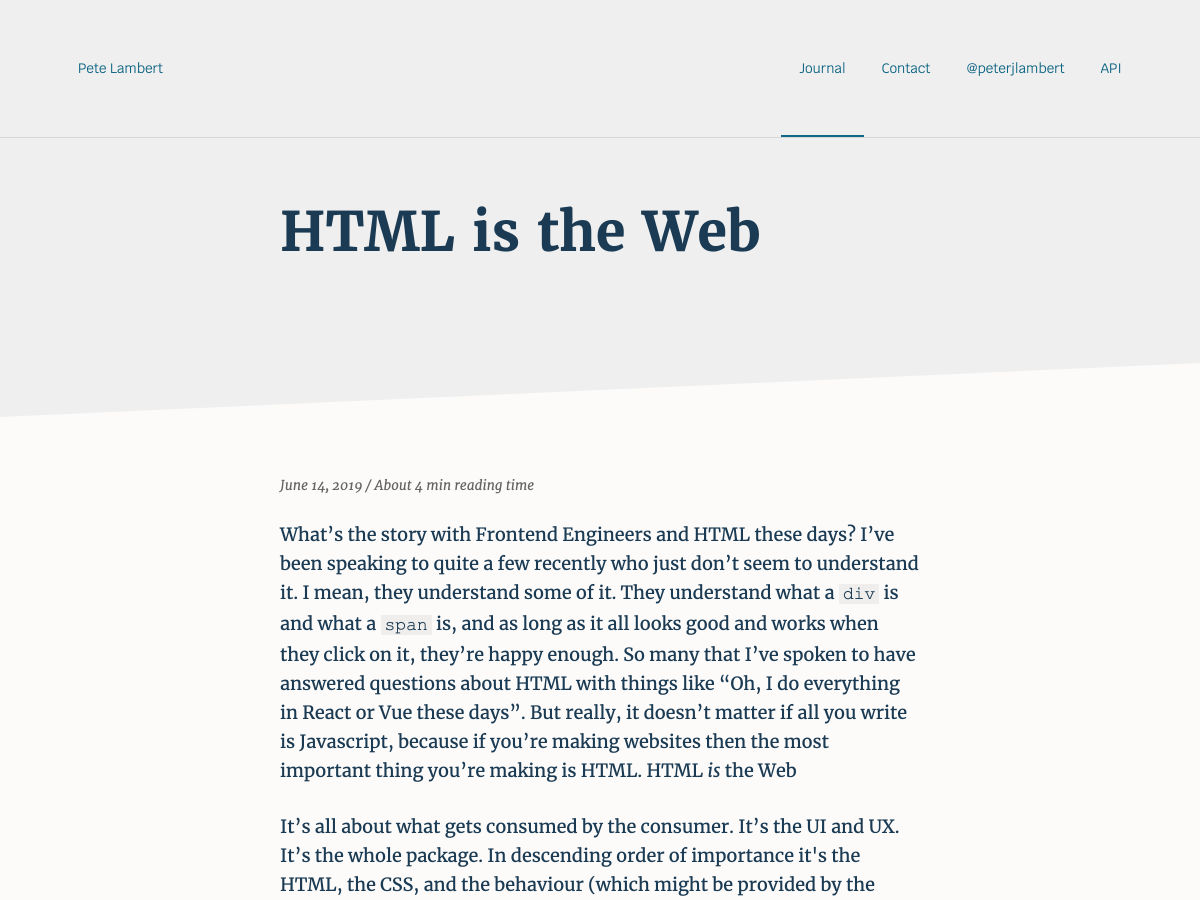
HTML is the Web

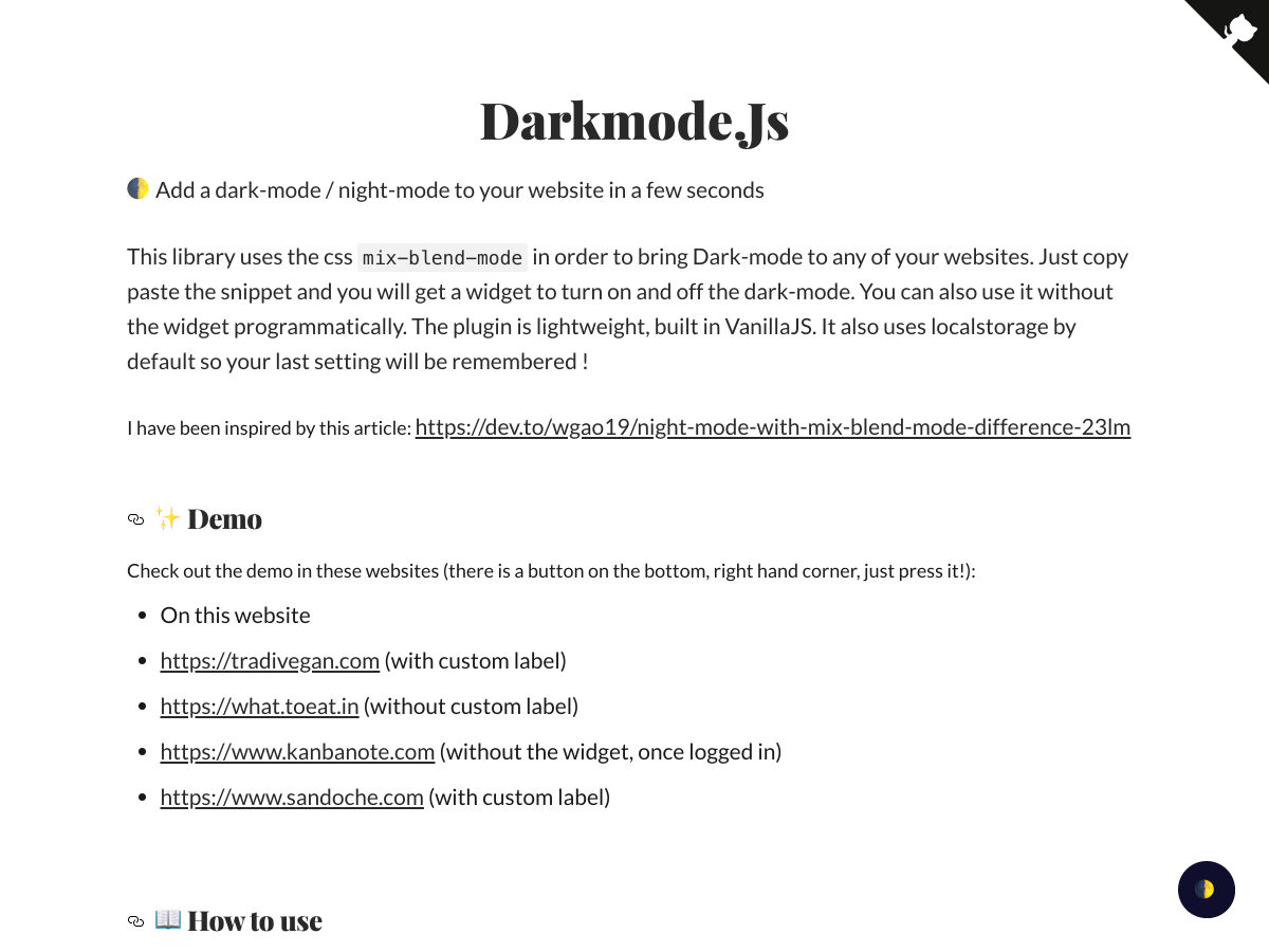
Darkmode.js

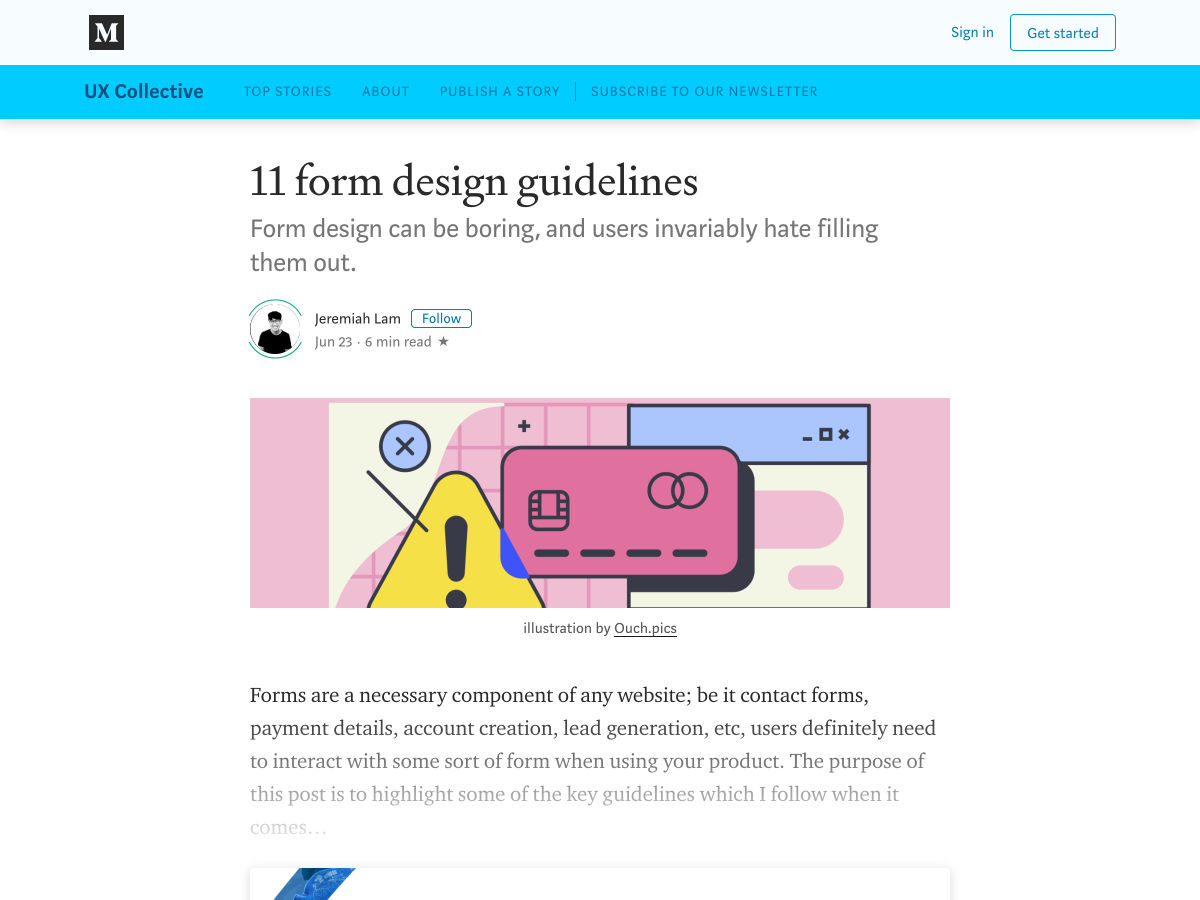
11 Form Design Guidelines

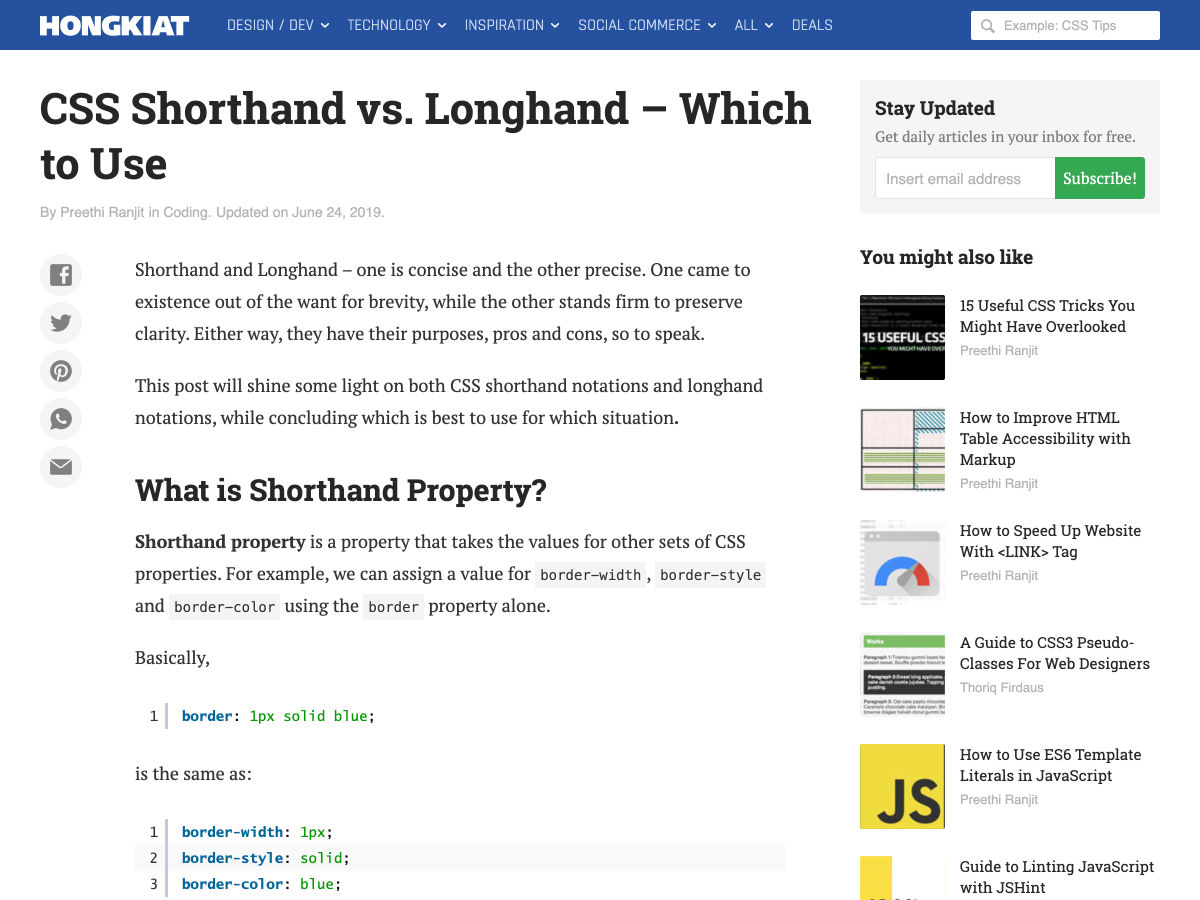
CSS Shorthand Vs. Longhand – Which to Use

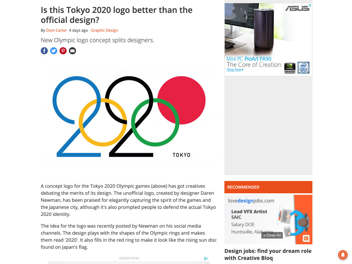
Is this Tokyo 2020 Logo Better than the Official Design?

Shape

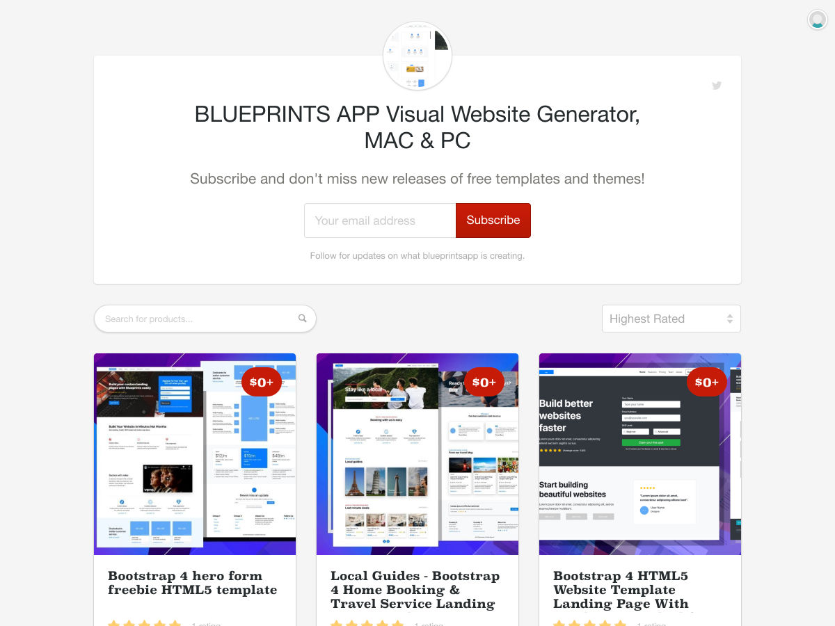
Free Bootstrap HTML5 Templates

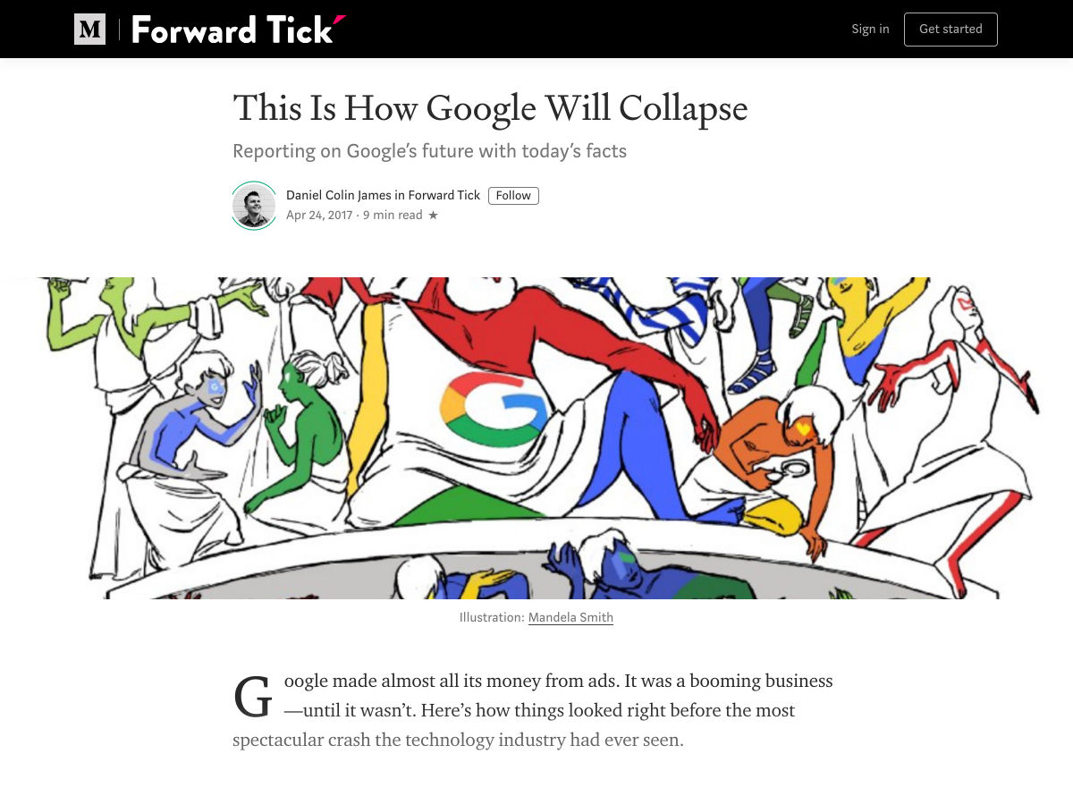
This is How Google will Collapse

Firefox Rebrand

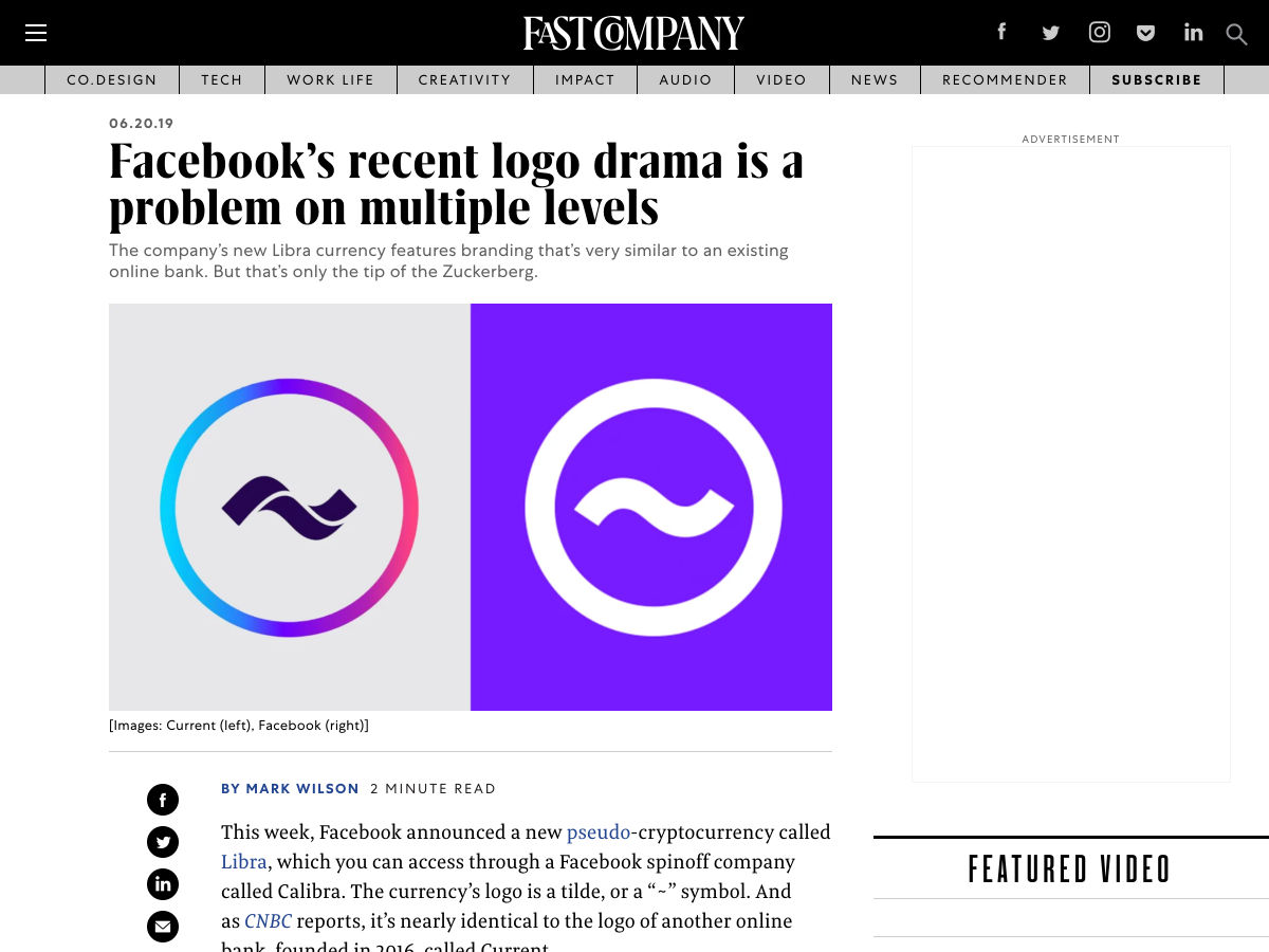
Facebook’s Logo Drama is a Problem and for More Reasons than You Think

7 Absolute Truths I Unlearned as Junior Developer

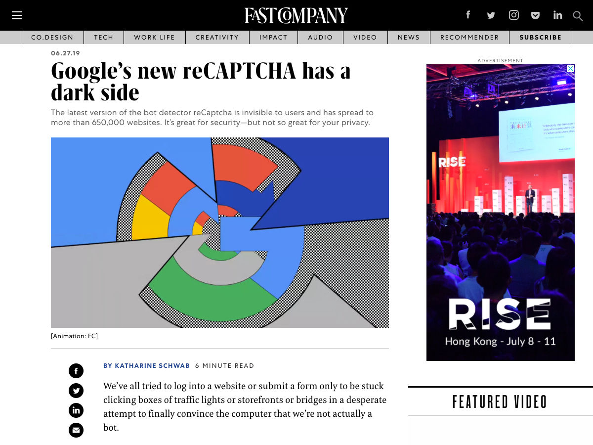
Google’s New ReCAPTCHA has a Dark Side

Google Warns its Employees that Pride Protests are Against the Company’s CoC

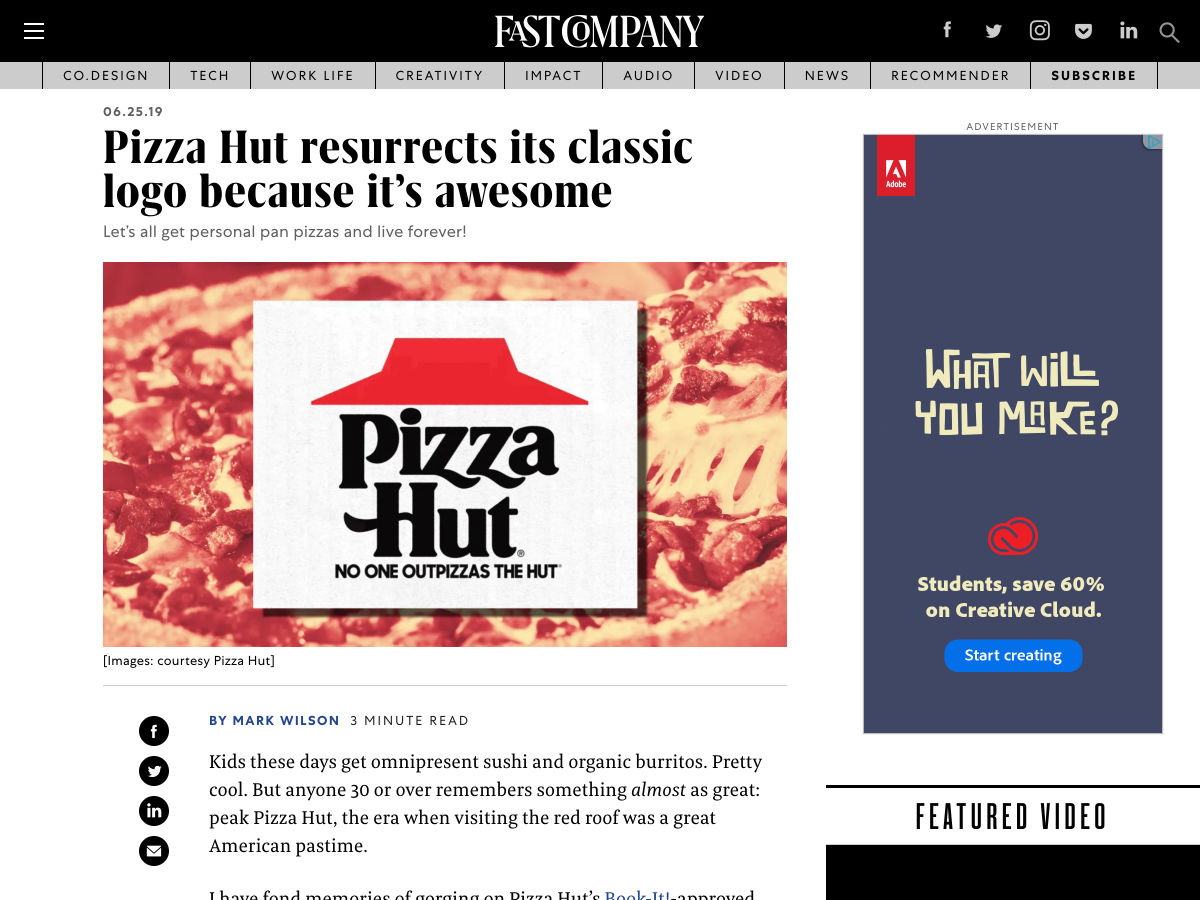
Pizza Hut Resurrects its Classic Logo Because It’s Awesome

10 Habits that Lead to Great Results for Every Designer

A Learning Secret: Don’t Take Notes with a Laptop

There’s $70,000 Worth of Bitcoin Hidden Inside this Image

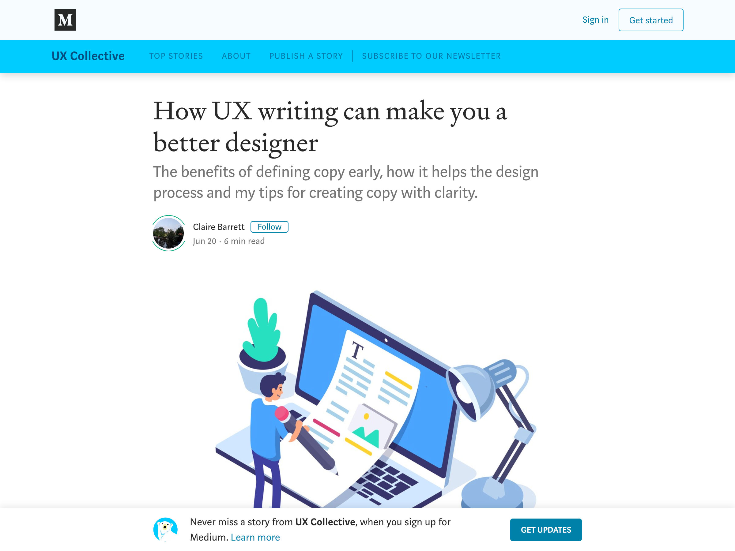
How UX Writing Can Make You a Better Designer

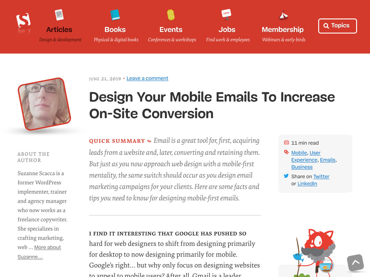
Design your Mobile Emails to Increase On-Site Conversion

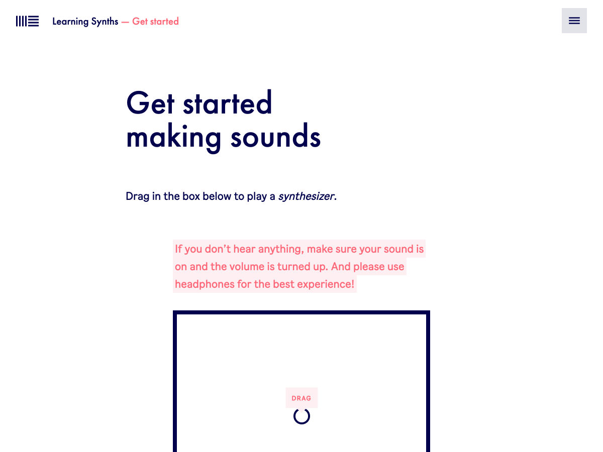
Learning Synths

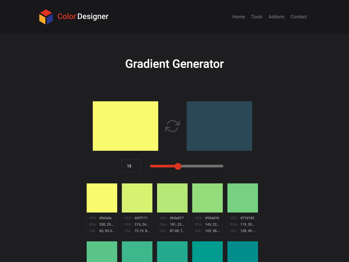
Gradient Generator – The Tool Generates a Stepped Gradient Between 2 Colors

Microsoft Bans Slack and Discourages AWS and Google Docs Use Internally

Great Products do Fewer Things, but Better

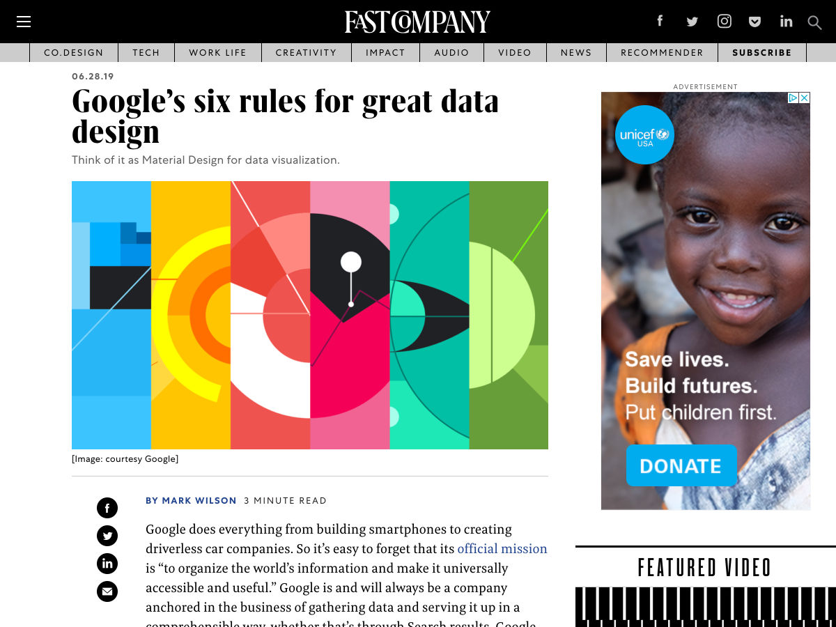
Google’s Six Rules for Great Data Design

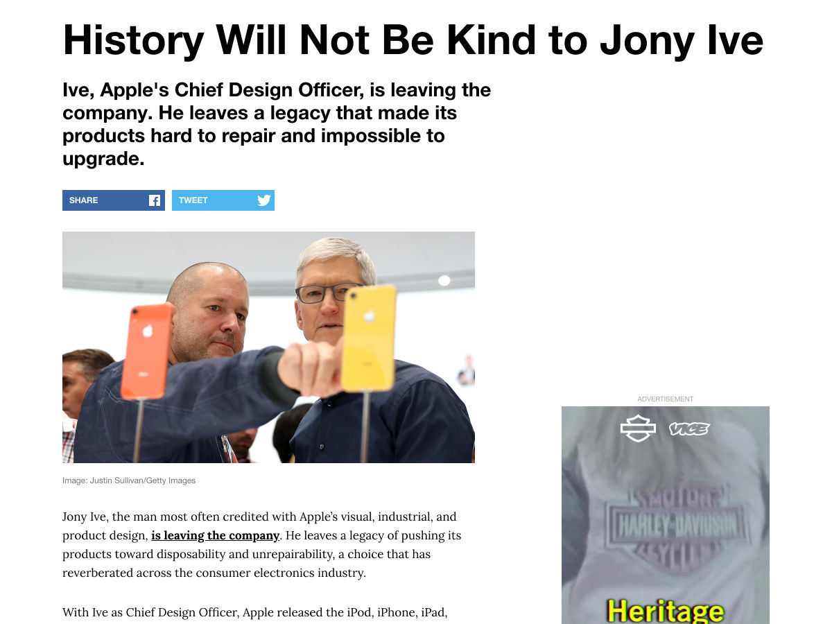
History will not Be Kind to Jony Ive

Want more? No problem! Keep track of top design news from around the web with Webdesigner News.

Source

Categories: Designing, Others Tags:

The Joys Of July (2019 Wallpapers Edition)

June 30th, 2019 No comments
Hello, Strawberry Sundae!

The Joys Of July (2019 Wallpapers Edition)

The Joys Of July (2019 Wallpapers Edition)

Cosima Mielke

2019-06-30T10:30:34+02:002019-06-30T12:36:21+00:00

A scoop of their favorite ice cream, a bike ride in the summer rain, or listening to the frog concert by the nearby lake — a lot of little things and precious moments have inspired the design community to create a wallpaper this July.

This monthly wallpapers challenge has been going on for more than nine years now, and each time anew, artists and designers from across the globe take it as an occasion to tickle their creativity and cater for beautiful, unique, and thought-provoking wallpaper designs. Wallpapers that are bound to get your ideas sparking, too.

The wallpapers in this collection all come in versions with and without a calendar for July 2019 and can be downloaded for free. A big thank-you to everyone who submitted their designs! At the end of this post, we also compiled some July favorites from past years’ editions that are just too good to be forgotten. Enjoy!

Please note that:

  • All images can be clicked on and lead to the preview of the wallpaper,
  • You can feature your work in our magazine, too. So if you have an idea for an August wallpaper design, please don’t hesitate to submit it. We’d love to see what you’ll come up with.

Further Reading on SmashingMag:

Hello, Strawberry Sundae!

“Is there anything more refreshing (and more delicious!) than a strawberry sundae on a hot summer day? Well, we don’t think so. And did you know that strawberry celebration is on its way in the U.S. Oh, yes! July 7th is the National Strawberry Sundae Day, and we predict that it’s going to be sweet and yummy. So, make your favorite dessert and start preparing yourself for the festive July days.” — Designed by PopArt Studio from Serbia.

Riding In The Drizzle

“Rain has come, showering the existence with new seeds of life… Everywhere life is blooming, as if they were asleep and the falling music of raindrops have awakened them… Feel the drops of rain… Feel this beautiful mystery of life… Listen to its music, melt into it…” — Designed by DMS Software from India.

We All Scream For Ice Cream

“There are two things that come to mind when I think about July: ice cream and the Fourth of July!” — Designed by Alyssa Merkel from the United States.

We All Scream For Ice Cream

My July

Designed by Cátia Pereira from Portugal.

My July

Alentejo Plain

“Based on the Alentejo region, south of Portugal, where there are large plains used for growing wheat. It thus represents the extensions of the fields of cultivation and their simplicity. Contrast of the plain with the few trees in the fields. Storks that at this time of year predominate in this region, being part of the Alentejo landscape and mentioned in the singing of Alentejo.” — Designed by José Guerra from Portugal.

Alentejo Plain

Frogs In The Night

“July is coming and the nights are warmer. Frogs look at the moon while they talk about their day.” — Designed by Veronica Valenzuela from Spain.

Frogs In The Night

July Rocks!

Designed by Joana Moreira from Portugal.

July Rocks!

Plastic Bag Free Day

“The objective of this date is to draw attention to the production and over-consumption of plastic bags worldwide, presenting alternatives to solve this serious environmental problem. It is urgent to change the behavior of all human beings regarding the use of plastic bags. For the preservation of the environment, we should use the same plastic bag for shopping, recycling or use paper bags. In this wallpaper I drew a plastic bag with a turtle inside it, as if it was imprisoned by its own bag, as if the ocean was reduced to a plastic bag, emphasizing the seriousness of this environmental problem, which has tortured both turtles and many others marine species.” — Designed by Carolina Santos from Portugal.

Plastic Bag Free Day

Save The Tigers

“Global Tiger Day, often called International Tiger Day, is an annual celebration to raise awareness for tiger conservation, held annually on July 29. It was created in 2010 at the Saint Petersburg Tiger Summit. The goal of the day is to promote a global system for protecting the natural habitats of tigers and to raise public awareness and support for tiger conservation issues.” — Designed by Athulya from Calicut.

Save The Tigers

Palms

“I was inspired by Hawaii type of scenarios with some reference to surf.” — Designed by Sónia Fernandes from Portugal.

Palms

Friendship Day

“The lower part of the image is represented in a more realistic and detailed form and represents the basis of the friendship, conveying a strong connection both in the simplicity and strength of the gestures, hands and medals that both children wear around their necks are symbols of this union. In terms of color I chose to use the ash scale, referring to the old photograph, implying the idea of a long duration of the relations of friendships and the memories we keep of our childhood friends, the illustration represented portrays a memory of mine, which makes it very personal. At the top of the wallpaper, the identity of the two characters appears pixelated, suggesting an idea of building deconstruction, through colored squares that come together and move away, as a symbol of connections and the sharing of emotions, which build and strengthen bonds of friendship.” — Designed by Carolina Santos from Portugal.

Friendship Day

Yellow Lemon Tree

“Summer is here, enjoy it and cool and stay hydrated!” — Designed by Melissa Bogemans from Belgium.

Yellow Lemon Tree

Summer Energy

Designed by IQUADART from Belarus.

Summer Energy

Heat Wave

Designed by Ricardo Gimenes from Sweden.

Heat Wave

Season Of Wind

“Summer is the season of wind. I like to stand on top of the mountains, hearing the song of the wind flying through the meadow.” — Designed by Anh Nguyet Tran from Vietnam.

Season Of Wind

Oldies But Goodies

Let’s go an a journey back in time: Down in our wallpaper archives, we rediscovered some July classics that are just too good to gather dust. May we present… (Please note that these designs don’t come with a calendar.)

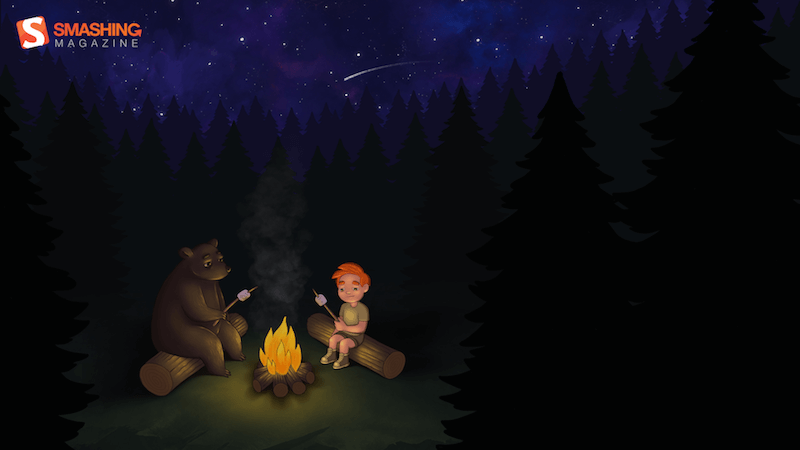
Fire Camp

“What’s better than a starry summer night with an (unexpected) friend around a fire camp with some marshmallows? Happy July!” — Designed by Etienne Mansard from the UK.

Fire Camp

Heated Mountains

“Warm summer weather inspired the color palette.” — Designed by Marijana Pivac from Croatia.

Heated Mountains

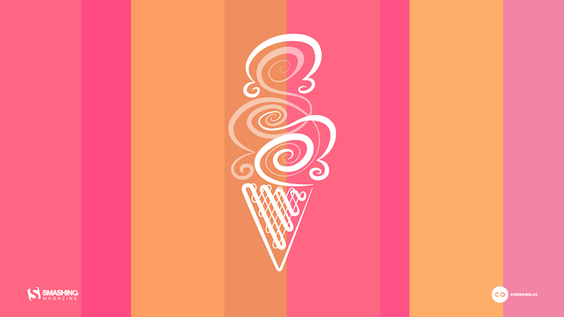
Tutti Frutti

“July is National Ice Cream Month and who needs an invitation for a scoop or two, or three! Lacking the real thing, our Tutti Frutti wallpaper can satisfy until your next creamy indulgence.” — Designed by Karen Frolo from the United States.

Tutti Frutti

Memories In July

“Words are few, thoughts are deep, memories of you we’ll always keep.” — Designed by Suman Sil from India.

Memories In July

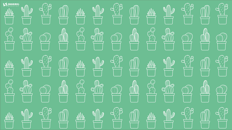
Cactus Hug

Designed by Ilaria Bagnasco from Italy.

Cactus Hug

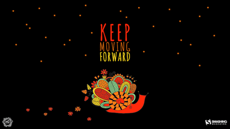
Keep Moving Forward

“Snails can be inspiring! If you keep heading towards your goal, even if it is just tiny steps, enjoy the journey and hopefully it will be worth the effort.” — Designed by Glynnis Owen from Australia.

Keep Moving Forward

Sand And Waves

“What do you do in summer? You go to the beach. Even if you can’t go — feel the waves and sand and sun through this funny wallpaper.” — Designed by Olga Lepaeva from Russia.

Sand And Waves

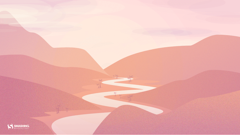
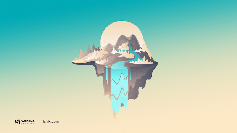
Island River

“Make sure you have a refreshing source of ideas, plans and hopes this July. Especially if you are to escape from urban life for a while.” — Designed by Igor Izhik from Canada.

Island River

Ice Cream vs. Hot Dog

“It’s both ‘National Ice Cream Month’ and ‘National Hot Dog Month’ over in the US, which got me thinking — which is better? With this as your wallpaper, you can ponder the question all month!” — Designed by James Mitchell from the UK.

Ice Cream vs. Hot Dog

Summer Heat

Designed by Xenia Latii from Berlin, Germany.

Summer Heat

Peaceful Memories

“July is one of the most beautiful months of the year. Enjoy every day, every hour, which gives us this month!” — Designed by Nikolay Belikov from Russia.

Peaceful Memories

Floral Thing

“The wallpaper which I created consists of my personal sketches of Polish herbs and flowers and custom typography. I wanted it to be light and simple with a hint of romantic feeling. I hope you’ll enjoy it!” — Designed by Beata Kurek from Poland.

Smashing Desktop Wallpapers - July 2012

An Intrusion Of Cockroaches

“Ever watched Joe’s Apartment when you were a kid? Well that movie left a soft spot in my heart for the little critters. Don’t get me wrong: I won’t invite them over for dinner, but I won’t grab my flip flop and bring the wrath upon them when I see one running in the house. So there you have it… three roaches… bringing the smack down on that pesky human… ZZZZZZZAP!!” — Designed by Wonderland Collective from South Africa.

An Intrusion Of Cockroaches

Celebrate Freedom

“This wallpaper encourages you to appreciate and celebrate the country’s freedom as well as your own!” — Designed by Marina Zhukov from the USA.

Desktop Wallpaper

Hot Air Balloon

Designed by Studcréa from France

Hot Air Balloon

Only One

Designed by Elise Vanoorbeek from Belgium

Only one

Cool Summer

“Even though it is not summer in my country, I made a summer theme. A cool approach to summer themes, tough, very fresh and ‘twilighty’.” — Designed by Marcos Sandrini from Brazil.

Smashing Desktop Wallpapers - July 2012

Birdie Nam Nam

“I have created a pattern that has a summer feeling. For me July and summer is bright color, joy and lots of different flowers and birds. So naturally I incorporated all these elements in a crazy pattern.” — Designed by Lina Karlsson, Idadesign Ab from Sweden.

Smashing Desktop Wallpapers - July 2012

Sun In July

”…enjoy the sun in July!” — Designed by Marco Palma from Italy/Germany.

Smashing Desktop Wallpapers - July 2012

Join In Next Month!

Please note that we respect and carefully consider the ideas and motivation behind each and every artist’s work. This is why we give all artists the full freedom to explore their creativity and express emotions and experience throughout their works. This is also why the themes of the wallpapers weren’t anyhow influenced by us but rather designed from scratch by the artists themselves.

Thank you to all designers for their participation. Join in next month!

Smashing Editorial(il)
Categories: Others Tags:

The (Developer’s) Growth Model

June 28th, 2019 No comments

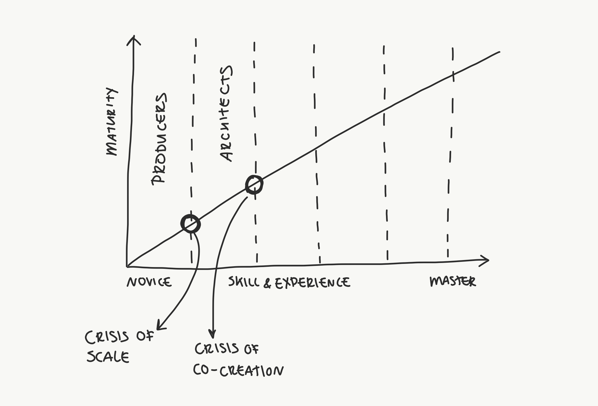
I really like the post “The Designer’s Growth Model” by Dennis Hambeukers. Dennis just invented this model, but it’s based on some existing ideas and it all rings true for me. Let me try to summarize the five stages as he lays them out for designers.

  1. Producers: You learn how to design. You learn fundamentals, you practice, you get good at doing design work and producing beautiful functional things. Then you have this “crisis” moment before the next stage where you find you can’t do enough work on your own and that you need to be able to scale your efforts, with multiple human beings and working on systems — and that’s an entirely new skill.
  2. Architects: Now that you’ve succeeded in scaling through team building and systems thinking, the next crisis moment is that that this the work still might be isolated, and too focused on internal thinking. To grow, you’ll need to work with people outside the design bubble, and understand problems more holistically.
  3. Connectors: Now that you’ve succeeded in being more collaborative across an entire organization and being a real problem solver, the next crisis moment is when everything becomes organizationally complicated. Just delivering products isn’t enough, because you’re involved deeply across the organization and you’re responsible for the success of what is delivered.
  4. Scientists: Now, you measure everything. You know what works and what doesn’t because you test it and can prove it, along with using all the skills you’ve honed along the way. Your next crisis is figuring out how to translate your work into actual change.
  5. Visionaries: You’re a leader now. You have an understanding of how the whole organization ticks, and you are a force for change.
From The Designer’s Growth Model

I think this can applies just as well to web development, with very little change. I can relate in many ways. I started plucking away at building sites alone. I found more success and was able to build bigger things by working with other people. At some point, it was clear to me that things don’t revolve around development. Development is merely one part of a car that doesn’t drive at all without many other parts. Even today, it’s clearer to me that I can be more effective and drive more positive change the more I know about all of the parts.

Not that I’ve completed my journey. If I had to map myself directly onto this model, I’m probably barely on step three — But a model is just a model. It’s not meant to be a perfect roadmap for everybody. Your own career path will be twistier than this. You might even experience bits from all the levels in different doses along the way.

The post The (Developer’s) Growth Model appeared first on CSS-Tricks.

Categories: Designing, Others Tags:

Weekly Platform News: Event Timing, Google Earth for Web, undead session cookies

June 28th, 2019 No comments

Šime posts regular content for web developers on webplatform.news.

In this week’s news, Wikipedia helps identify three slow click handlers, Google Earth comes to the web, SVG properties in CSS get more support, and what to do in the event of zombie cookies.

Tracking down slow event handlers with Event Timing

Event Timing is experimentally available in Chrome (as an Origin Trial) and Wikipedia is taking part in the trial. This API can be used to accurately determine the duration of event handlers with the goal of surfacing slow events.

We quickly identified 3 very frequent slow click handlers experienced frequently by real users on Wikipedia. […] Two of those issues are caused by expensive JavaScript calls causing style recalculation and layout.

(via Gilles Dubuc)

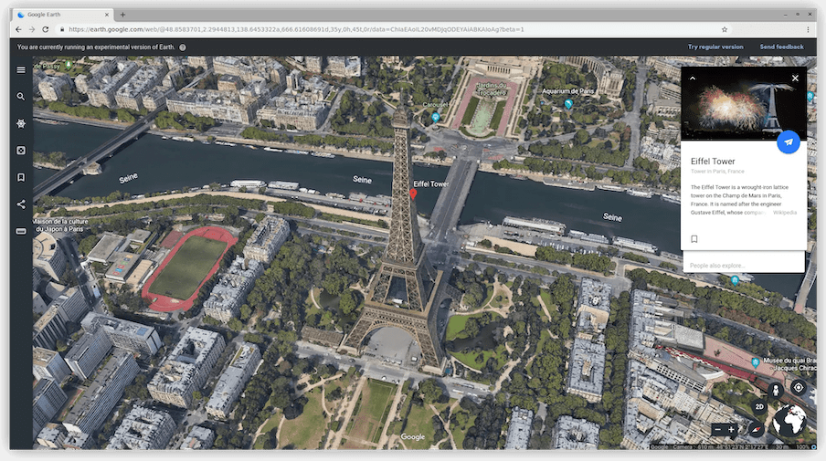
Google Earth for Web beta available

The preview version of Google Earth for Web (powered by WebAssembly) is now available. You can try it out in Chromium-based browsers and Firefox?—?it runs single-threaded in browsers that don’t yet have (re-)enabled SharedArrayBuffer?—?but not in Safari because of its lack of full support for WebGL2.

(via Jordon Mears)

SVG geometry properties in CSS

Firefox Nightly has implemented SVG geometry properties (x, y, r, etc.) in CSS. This feature is already supported in Chrome and Safari and is expected to ship in Firefox 69 in September.

See the Pen
Animating SVG geometry properties with CSS
by Šime Vidas (@simevidas)
on CodePen.

(via Jérémie Patonnier)

Browsers can keep session cookies alive

Chrome and Firefox allow users to restore the previous browser session on startup. With this option enabled, closing the browser will not delete the user’s session cookies, nor empty the sessionStorage of web pages.

Given this session resumption behavior, it’s more important than ever to ensure that your site behaves reasonably upon receipt of an outdated session cookie (e.g. redirect the user to the login page instead of showing an error).

(via Eric Lawrence)

The post Weekly Platform News: Event Timing, Google Earth for Web, undead session cookies appeared first on CSS-Tricks.

Categories: Designing, Others Tags:

Nownownow

June 28th, 2019 No comments

Matthias Ott, relaying an idea he heard from Derek Sivers:

Many personal websites, including this one here, have an “about” page. It’s a page that tells you something about the background of a person or about the services provided. But what this page often doesn’t answer – and neither do Twitter or Facebook pages – is what this person really is up to at the moment. A page that answers questions like: What are you focused on at this point in your life? What have you just started working on that excites you like nothing else? Did you just move to a new town? Did you start a new career as a Jengascript wrangler? To answer all those questions, Derek suggests to create a “now page”. A page that tells visitors of your site “what you’d tell a friend you hadn’t seen in a year.”

Very cool idea! Derek has a directory page of people who have done this.

I have more scattered thoughts:

  • It’s funny how social media sites aren’t very helpful with this. You’d think looking at someone’s social media profile would be the quickest and easiest way to catch up with what they are doing right now, but it just ain’t. That’s true for me, too. Random statements of what you’re working on don’t make very good social media posts. Maybe a pinned tweet could be like a “now” page, though.
  • I wonder if more homepages on people’s personal sites should be this. As I browse around some of the sites, I like a lot of the “now” pages more than I like the homepage.
  • I went with a “what I want you to do” section on my personal site. It’s a different vibe, but it almost doubles as a “now” page, as the things I want you to do are fairly related to the things I’m doing. Maybe the idea of a do page has some legs.

Direct Link to ArticlePermalink

The post Nownownow appeared first on CSS-Tricks.

Categories: Designing, Others Tags:

5 Inspirational Designs Trends to Follow for 2019

June 28th, 2019 No comments
Graphic Design trends for 2019

5 Inspirational Designs Trends to Follow for 2019

Design is all about expressing yourself through your art and showing people the beauty in simple or incredibly intricate designs. While you should always stay true to yourself and be authentically you through your designs, it is also good to stay on top of the trend game.

Today we’re going to go over 10 design trends that we stan this year. And hopefully, always.

We’ve got 6 months left in 2019 so we better make our designs count.

So let’s just get right into it, shall we?

1. GO BOLD

You know the saying, go bold or go home. And it rings absolutely true in design. We have two different types of “bold” that we’re going to go over in this section: bold colors and bold text.

Design trends for 2019

Source: https://www.behance.net/erikmusin

Design trends for 2019

Source: https://www.behance.net/erikmusin

Design trends for 2019

Source: https://www.behance.net/erikmusin

Design trends for 2019

Source: https://www.behance.net/erikmusin

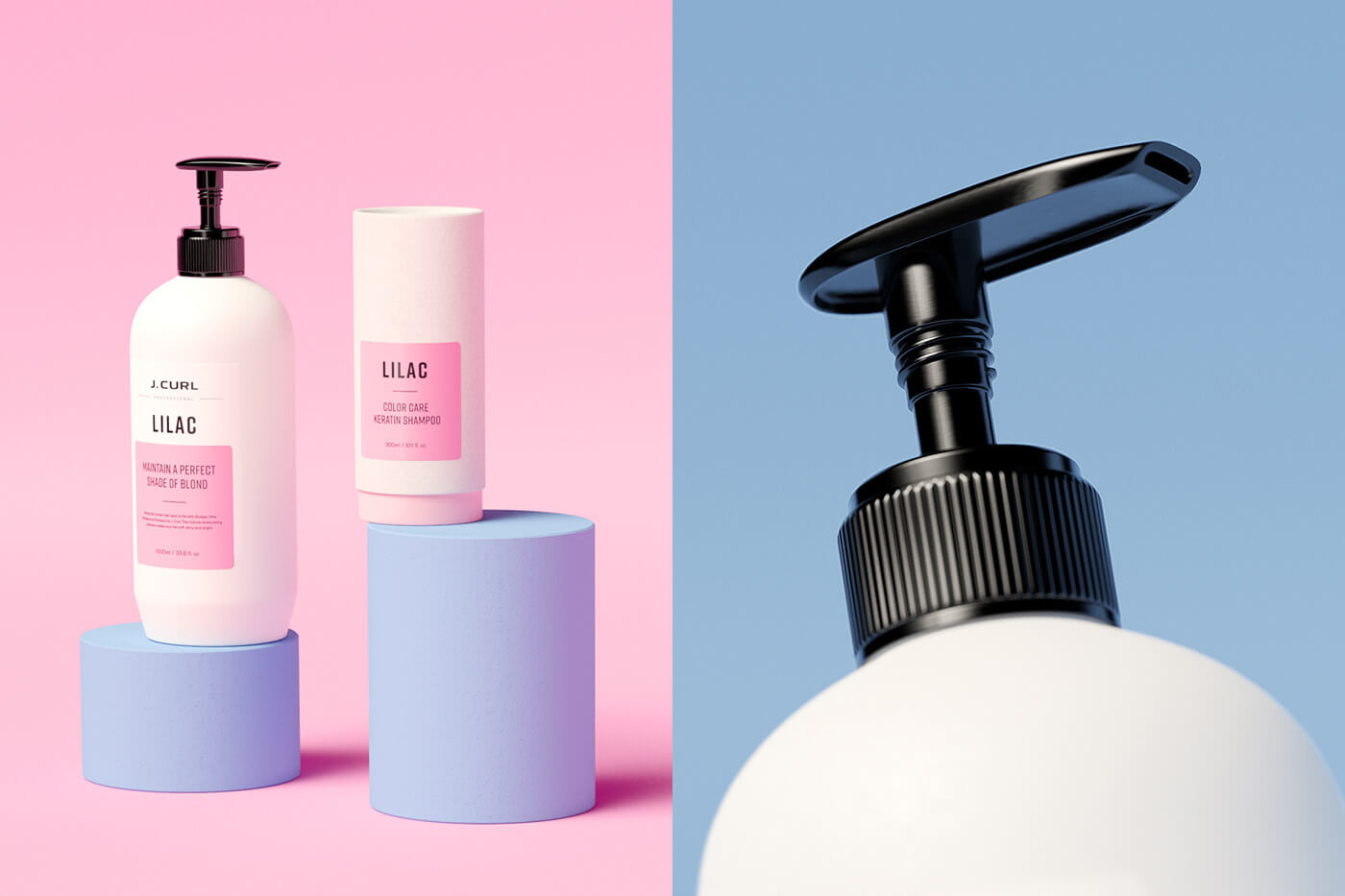
Here are some examples where minimalist background color meets bold product color. When photographing and editing a product, enhance its color by using a light, neutral color as the background. When you do this, the eye of your client will be drawn directly to your product. Make sure that the color you choose complements the product’s color and really enhances what you have to offer. This is definitely my favorite trend right now. Hats off to Erik Musen for hitting us with some sweet designs.

The next bold section is all about text. You have a message to share and you need to grab the attention of your readers. Do this with the same concept as with the products. Beetroot did an awesome job of using big and bold fonts to grab your attention. There’s no missing what you have to say when you use this bold technique.

Graphic Design trends for 2019

Source: https://www.behance.net/beetrootdesign

2. 3D Design

Really stand out, literally, with a 3D design. Incorporate real-looking elements into your graphic design to make your design truly unique and eye-catching. Take these designs for example.

Graphic Design trends for 2019

Source: https://www.behance.net/STATE7

Graphic Design trends for 2019

Source: https://www.behance.net/gallery/71276031/Mulher-3D-Type

3D design is just about everywhere right now, and as you could see above, there’s no specific font that is the set-in-stone font to use. Try out any font you’d like! A font that is skinny, bold, a sans-serif, script, or any other type of font can be rendered in 3D. Use this technique in your next project and drop the link to your portfolio in the comments below so we can check it out!

3. Flat Design meets Realism

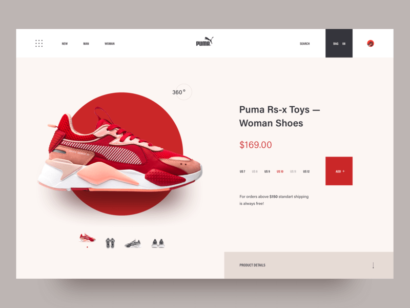
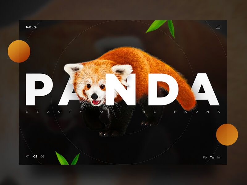
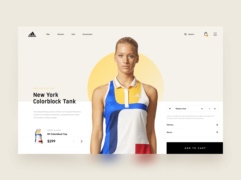
Another huge design trend right now is flat design combined with realism. Here are some prime examples of what I’m talking about.

Graphic Design trends for 2019

source:https://dribbble.com/shots/5591883-Puma-sneaker-shop

Graphic Design trends for 2019

Source: https://dribbble.com/shots/4854300-Panda-UI

Graphic Design trends for 2019

Source: https://dribbble.com/shots/3951710-Adidas-Online-Store

Feeding off of the 3D trend, flat design + realism is truly impressive. Two complete opposites, yet the perfect combination that gives a vibe of futuristic design. You can expect to see this trend in the E-commerce world, but not only. Add elements that look like they are floating or fly to add an aesthetic that is overall abstract. Combine 3D objects with a flat design to achieve this amazing look.

4. Open composition

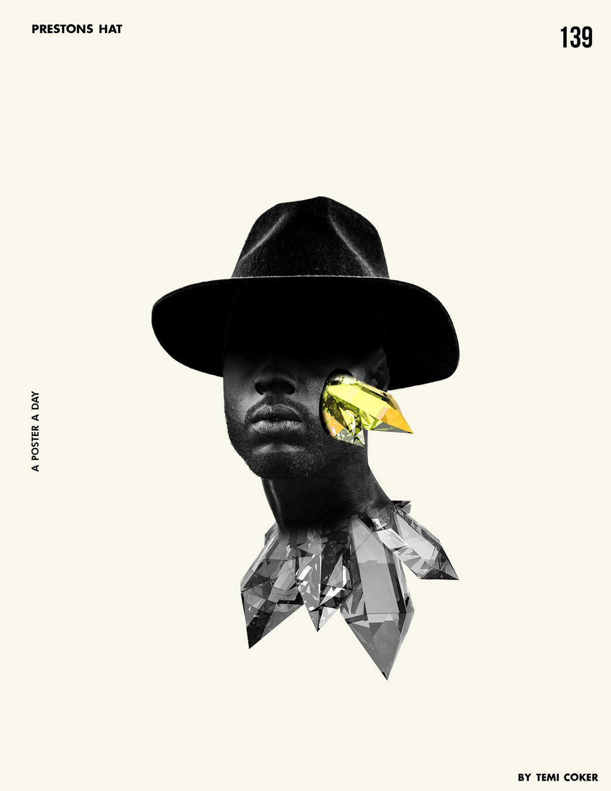
We’re taking a step back from mainstream, and a step forward in creativity. This trend exudes art. It’s chaotic, yet beautiful. For this look, the goal is to achieve a free-flowing final product. So say goodbye to a “perfect” framed finish. This trend is a combination of things: combine images with ideas. This is magic in real life. It gives people a sense that they’re just seeing a small piece of a bigger picture. The real magic of open-composition is that gives people the freedom to explore their creative side and see the deeper meaning of what the combined elements could mean.

Graphic Design trends for 2019

Source: https://www.behance.net/temicoker

Graphic Design trends for 2019

Source: https://www.behance.net/temicoker

Graphic Design trends for 2019

Source: https://www.behance.net/temicoker

Graphic Design trends for 2019

Source: https://www.behance.net/temicoker

Graphic Design trends for 2019

Source: https://www.behance.net/temicoker

And my all-time favorite designer for this technique is Temiloluwa Coker. Check out his work on Behance. All the images above are all his.

5. Electrified

I’m about to end this article with a bang. Maybe this trend is actually my favorite.

Graphic Design trends for 2019

Source: https://www.behance.net/cristianmg

Graphic Design trends for 2019

Source: https://www.behance.net/cristianmg

Graphic Design trends for 2019

Source: https://www.behance.net/gallery/66723565/FETE-DE-TROP-__-Eddy-de-Pretto

Graphic Design trends for 2019

Source: https://www.inspirationde.com/image/85051/

One of my favorite things about social media today is that we’re all pushing for authenticity and being real. There’s no excuse for designers. In this technique, designers are encouraged to let their inner-creator out by drawing, writing, doodling, splashing, and using unique brush strokes and color stains. Imperfections and mistakes are embraced in this trend because there’s absolutely no right or wrong in this style. And I think that’s why I love it so much.

Sadly, our time has come to an end…

But no worries, we’ll be back soon!

Let us know in the comments below what your favorite design trend was in this article, and if you have any other favorite design trends we didn’t cover, mention those down below as well.

Drop your portfolio down in the comments for us designers to support each other.

Until next time,

Be kind and stay positive.

Read More at 5 Inspirational Designs Trends to Follow for 2019

Categories: Designing, Others Tags:

8 Ways to Keep Your Startup Positively Aligned

June 28th, 2019 No comments

When companies become misaligned, different departments may be working toward entirely different goals – in some cases, these goals may be at odds with each other. This is a challenge for the best companies out there, not to mention a startup in the midst of rapid growth. The result is a lack of collaboration as well as a lack of a shared vision and internal conflict.

In some cases, misalignment can even be fatal. More than 90 percent of startups have been known to fail; not because of the competition, but by self-destruction.

Company alignment may be simultaneously simple to understand and also abstract. Often, however, it’s a concept that’s difficult to execute and put into practice. That’s exactly why this blog post will take you through actionable ways that you can keep your startup in alignment.

1. Your Mission Should Be Your Foundation

The foundation of company alignment is having a shared mission or purpose. Before you can think about aligning your team along revenue targets and other objectives, you need to unite your team with a more powerful vision first – your mission.

Your mission should be one that’s short, memorable and specific

More specifically, what are you trying to do for your customers? Take Google’s mission statement, for instance: “To organize the world’s information and make it universally accessible and useful.”

Think of your mission as a “theme” or motto or phrase – just a few words. Your mission should be one that’s short, memorable and specific.

The purpose of this mission is that it provides your team with the a broader perspective about what they are doing and, most importantly, why. It unites them around a more powerful vision – one that transcends revenue-based objectives.

The second component is then aligning your mission with your specific revenue targets, growth goals and other similar objectives (more on this to come). The idea behind this is that your targets become tied to something arguably much more powerful that your team members can personally connect with.

As you will see, in the chaos of a startup, a motto is something that everyone will find easy to remember. It can serve as a powerful mechanism for keeping your entire team aligned and simultaneously moving together toward your goals.

2. Clearly Define Your Goals & Objectives at the Top

This may seem like an obvious step, but it bears repeating: Your startup likely has goals and priorities, but it’s important that these are as clear as possible.

there will be things that you will need to say ‘no’ to

You also need to figure out what’s most important at this very moment. There will always be other things that you could be devoting attention to, but it’s a CEO’s job to stay focused on the most important goals at the present moment.

To put it another way: there will be things that you will need to say ‘no’ to.

But, why is this so important? Because it ensures that the CEO models this behaviour from the top down. When other priorities start to trickle in, you risk contaminating the entire team by leading them in alternate directions. This can be disastrous for startups because it can slow progress whereas, by nature, startups have to move quickly.

3. Align Departmental Goals With The Company’s

Once you have clearly defined your company’s goals at the top level, the next step is to ensure that: a) Your entire team understands what you’re working toward at the highest level, and b) You determine sub-objectives for each department (sales, marketing, accounting, etc.) and that they are tied to and help accomplish your company’s broader goals.

Having your own company objectives is important, but what does this mean for all of the other departments? Make that clear and ensure everyone is contributing to the greater whole – which is ultimately at the essence of company alignment.

You can also take this one step further by connecting departmental sub-objectives with your broader mission. In doing so, your goals become infused with meaning. Put another way, employees start to believe in the ‘why’ of what you’re doing, which is essential in getting them to act.

It’s one thing for your employees to understand your goals but it’s a whole other thing for them to actually believe in them.

4. Translate Goals Into Clearly Defined Actions

Once you have set your goals (both at the top level and at the departmental level), it’s important to determine how these goals can be further refined into clearly defined actions that both you and departments can work toward.

Here’s an example: It’s one thing to set a goal of losing 10 pounds but in order to accomplish that goal you need to refine the action steps that will move you in that direction (for example: eating healthier, starting a fitness plan, etc.).

So, start off by outlining two or three objectives and then breaking those goals into more concrete steps and even measurable metrics that will actually be your team’s focus.

5. Repetition is Key

In a startup, things move quickly. The content of meetings just a week ago can become like a distant memory. That’s why it’s so important for management to make it a point to go over your objectives on a daily basis.

It’s not enough to communicate your goals one time – this is a continual process.

One of the best ways to do this? Go back to your mission (step one). By connecting your objectives with your broader mission statement, you can easily reinforce these goals and keep them at the forefront of your startup without having to continually go into the specifics of those goals.

6. Regularly Review Progress

While it’s important to have clearly defined goals and action steps, it’s arguably equally important to review the progress of these action steps on a regular basis (at least monthly but ideally bi-weekly).

Management will likely find that teams will not be working in alignment at first, so it’s a good idea to ensure that everyone recognizes that this process will be a slow one – one that will require continual nudges in the direction of your goals.

misalignment doesn’t just happen overnight, it’s a slow process

Reviewing your progress on a regular basis not only gives your team the opportunity to redirect wherever necessary, but it also serves as a continual reminder of your company’s objectives.

Remember, too, that misalignment doesn’t just happen overnight, it’s a slow process. That’s why regularly reviewing your goals (and, more specifically, the action steps) will keep your company on the right track.

One of the best ways to track progress? Having an internal dashboard that is set up on the wall for all team members to see.

7. Daily Stand-ups for Everyone

Stand-ups – daily meetings where employees report on what they’re working on are a mainstay of software companies (and, more specifically, engineering teams).

However, there is a lot of value that can come from having involvement from everyone – or at least the core teams.

Communal stand-ups give an opportunity for all teams to share what they’re working on, to collaborate with one another and ultimately to keep your goals at the very culture of your startup.

8. Celebrate Success (But Also Be Transparent About Challenges)

It’s important to take the time to highlight success stories of team members or even entire departments that are working toward and hitting company’s goals. A great example is a team lunch.

Celebrating these milestones creates a culture of teamwork and reinforces your objectives.

Of course, it’s important to also be transparent as far as numbers go and to give insight into any challenges as well. This, too, creates transparency within your organization and ensures that everyone is always on the same page.

Wrapping It Up

Above all, the key to keeping company alignment is a solid foundation: a mission that unites your entire team. From there, top company goals and sub-departmental objectives should work in tandem so that everyone is contributing to the greater whole.

This shared mission, however, is the glue that holds your startup together. As your team grows, your mission (and, more specifically, your values) are what will guide management as they make a myriad of decisions, including those that have to do with hiring.

Throw in continually measuring progress, stand-ins and celebrating milestones and you have a recipe for success when it comes to ensuring that your entire organization is working toward a common goal.

Lastly, recognize that keeping company alignment is a continual process – after all, your goals and objectives will continue to change over time. Eventually, however, the process of setting clear goals and continually working toward them as a team will simply become part of your company culture.

Featured image via Unsplash.

Add Realistic Chalk and Sketch Lettering Effects with Sketch’it – only $5!

Source

Categories: Designing, Others Tags:

Better Search UX Through Microcopy

June 28th, 2019 No comments
The search bar on the ASOS website

Better Search UX Through Microcopy

Better Search UX Through Microcopy

Andrew Millen

2019-06-28T12:30:59+02:002019-06-30T01:36:11+00:00

It’s hard to overstate the importance of web search. Searching is as old as the Internet itself, and by some measures, even older. A well-designed search benefits both you and your users; it increases conversions, reduces bounce rates, and improves the user experience.

Search is especially important on large scale sites and e-commerce experiences, where the majority of revenue comes from search-driven sessions. Studies show that up to 50% of users go straight to the internal search bar of a website, and that 15% outright prefer using the search function to browsing the hierarchical menu. This means that for all the love and care that goes into determining the information architecture of a site, just as much has to go into designing the search experience.

Complicating the problem is the fact that users’ search skills are flimsy at best, and incompetent at worst. Getting good results from a search engine often requires multiple attempts and reformulations, which users rarely do. And as search technology improves over time, users are increasingly likely to accept the results of a search as the answer to their question, even if their query was flawed. Users who favor searches tend to move quickly, scanning the page for that familiar-looking rectangle, and bouncing quickly when they don’t find what they’re looking for.

Communicating with those users “at speed” is a tricky job that requires a specialized tool: microcopy. The name ‘microcopy’ belies its own importance. It may be small, but big successes often hinge on it. It’s a place where voice can shine through, where good impressions are made, and where utility and branding intersect. With that in mind, let’s dive into the many ways that microcopy and contextualization can vastly improve a search experience.

Placing And Labeling Your Search

In accordance with Jakob’s Law, your first instinct when designing a search bar should be to put a rectangular box in the upper right or upper left corner. You should add a label or A11y-friendly placeholder text, and include a submit button that says “Search.”

Hiding the search bar behind a link, forgoing placeholder text, or opting for magnifying glass icon CTA instead of plain text are all valid design decisions in the right context. Just make sure you’re not abstracting the function of the search bar unnecessarily because searching already has a higher interaction cost than browsing.

Every barrier, however inconsequential you may find it as a designer, risks negatively affecting the UX and your bottom line. If there’s a risk your users may confuse the magnifying glass icon for a “zoom” button, you should mitigate that.

Placeholder Text

Placeholder text is a great place to enhance the experience. It can be informational, it can be a place for brand expression, and it can nudge wavering users in the right direction. Anytime I see a search bar that just says “Search,” I see a missed opportunity.

So what’s a better approach? It varies from site to site. First, familiarize yourself with your business goals, your brand, and your users’ existing habits. Then, consider how you can be the most helpful.

Nudge The User

A suggestive approach can reduce the user’s anxiety. Clue your users into the fact that they can search in multiple ways, especially if they may not be familiar with your full range of products or services. ASOS suggests searching for inspiration in addition to products and brands:

The search bar on the ASOS website

(Image source: ASOS) (Large preview)
Be Informative

Tell the user exactly what they’ll be getting when they hit submit. On Shutterstock, a site wholly devoted to the search of a massive photo archive, this placeholder text cleverly doubles as a tagline when paired with the logo:

The search bar on the Shutterstock website

(Image source: Shutterstock) (Large preview)
Reinforce The Brand

Home Depot’s search bar doesn’t lead the user, but instead presents a helpful, personal tone which I’m sure is in line with their brand voice guidelines. This is probably the best approach considering the size of their product catalog:

Home Depot's search bar

(Image source: The Home Depot) (Large preview)

Using Search Logs To Your Advantage

If you’re not sure the best way to optimize your placeholder text, a good place to start is your search log database. Learning how to break down these results can be incredibly valuable when formulating helpful content design. You’ll be able to see first-hand the vocabulary people use to search your site, and more importantly, the gaps between what you offer and what your users are looking for.

Suggested, Related, And Recent Searches

During the search process, your copy should offer as much help along the way as possible without being overbearing. That includes everything from an obvious “Cancel” or “Clear” button to logging each user’s recent searches for surfacing later. When choosing the right microcopy to accompany these features, add a dash of brown sauce.

Autosuggestions

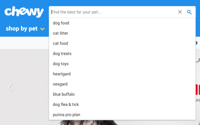
Users who use the search bar are doing so because they’re looking for something specific, which makes autosuggestions a valuable (and increasingly expected) tool. Specificity, in this case, may be as focused as “Women’s gray shoe size 9M” or as open-ended as “Sandwich shops near me.”

Autosuggestions also reduce the risk of returning bad results, alleviate the mental effort on the user, and present an opportunity to surface your most popular products.

Chewy

(Image source: Chewy) (Large preview)

Often these don’t require additional context or copy at all, but can just be listed below the search bar as the user types, as shown in the example above.

Related Searches

Showing related searches on the results page is another way to help guide users without getting in the way. A common pattern is providing a few clickable keywords related to the original query above the results. A little copy that states “Other users searched for” is a good way to incorporate social proof into the search experience.

Recent Searches

If your technology allows it, saving and resurfacing recent searches is another way to helpfully reduce the memory load on the user. Make sure you add context with copy, but it can be as straightforward as this:

The search bar on the Macy's website

(Image source: Macy’s) (Large preview)

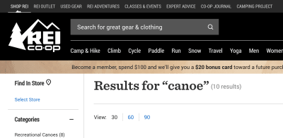
Handling Results

There are a two pieces of copy that I’d consider required when displaying search results:

  1. The query itself.
    If the search bar is highly visible, it can be displayed here. You can also create an H1 that states “Results for {{terms}}.”
  2. The number of results.
    If the results are paginated, you might also include the number of pages.

The search bar on the REI Co-op website

(Image source: REI Co-op) (Large preview)

No Results

Whether through their own error not, users will inevitably encounter a “no results” page at some point. Luckily, there are ways to handle this gracefully; in fact, with the right approach, this dead end can actually be a great opportunity for content discovery.

First of all, don’t expect your users to refine their search if they get no results — at least not without a UI that encourages it. Users are reluctant to reformulate their query and have trouble when trying to. They’re more likely to engage with whatever information they’re presented with and take it from there, or abandon the task entirely. (When was the last time you clicked through to the second page of Google search results?)

That said, it’s easy to see how a little copywriting and contextualization can improve the experience. Nielsen Norman Group has a comprehensive guide on how to handle No Results SERPs, with the gist being:

  • Make it obvious there are no results.
    It’s easy to get cute and accidentally bury the lede. It’s also tempting to intentionally hide the “no results” messaging to obfuscate the error entirely. Either way, don’t trick the user.
  • Offer paths forward.
    Suggest ways to refine the search query (such as checking your spelling), and also provide links to popular content or products that have the highest likelihood of connecting with the user.
  • Strike the right tone.
    Use your brand voice, but don’t run the risk of exacerbating the situation with humor that might be ill-received by a frustrated user.

Also, bear in mind that empty SERPs may arise because a user mistakenly submitted without entering any query at all. You should have a content plan for this scenario as well rather than returning all items in the database, for example.

Wrapping Up

Writing a good search experience comes down to thoughtfulness. As designers, we’ve probably used and created hundreds of different web search experiences, so we breeze through the process. But when we consider every small step of the process (every microinteraction and every edge case), the minor changes we make can have a major impact on the experience. Next time you find yourself reaching for a visual solution to a search problem, consider using your words instead.

Further Reading on SmashingMag:

(dm, yk, il)
Categories: Others Tags: