Archive

Archive for June, 2016

Rules to Successfully Launch New Websites

June 30th, 2016 No comments
2016-06-30

Launching a new site soon, but not sure if it’s going to go smooth? Maybe you have a history of getting in way too deep with website design only to reach a wall that stops you from moving forward. Setbacks, miscommunication, and missed deadlines are your biggest nightmare when building a new website.

What’s the best approach to launch a new website with success?

2016-06-30

Identify Mistakes

Don’t make the same mistakes twice. Before you ever dive into a redesign, take a good look at the website you currently have and identify the worst. Are there things that are just plain wrong? These days, you can develop a website design that becomes obsolete in less than a year. It’s probably not your fault, but it’s time to change all the mistakes left on your website.

Something that my team had to fix before our last website redesign was the blog feed location. The blog feed was running from the homepage instead of the subfolder /blog/, which created a mess before we ever started working on the new website redesign. We did our research and concluded it was best to move blog articles to the /blog/ subfolder with 301 redirects before we began building the new website.

Create a Plan

Know what you’re getting yourself into long before you begin. Launching websites is not an easy task, and it takes a lot more careful planning, time, and attention than you may think. Create a plan that outlines all work needed to be done, and get the conversation started with your team. Sometimes this is best done by conducting a meeting in which every department (design, programming, content, social, administrative) can communicate the total workload for each part of the website design and development.

Once all changes that need to be made are identified, it will be much easier to get a much clearer picture of what the website will look like when finished and what steps it might take to get there.

Map Your Work

Give yourself more direction by constructing a roadmap. After you’ve come up with a rough plan including each department’s workload, a general roadmap of your website design procedure will give everyone on your team a better understanding of timelines. Some aspects of your redesign will naturally begin with a programmer, a designer, and copywriter, but eventually, one person will be waiting on the next to supply content to be uploaded.

A map will outline key aspects of your workflow, and help you identify components that must be finished before the next part of the project can even be initiated. It helps to start with a website design checklist to assure that, when you do set tasks for everyone, nothing is overlooked.

Considering Blocks & Setbacks

Murphy’s law states — if there’s anything that can go wrong, it will. Considering this, you might want to allow yourself a few extra days or weeks for specific parts of your website redesign. Rushing through a website redesign is a quick way to pile on the stress and raise your blood pressure. It’s best to reach one conclusion before you begin — there will be setbacks. If you don’t see them coming, they turn into “blocks” that keep the website from launching on the deadline. To avoid being blindsided by blocks and losing momentum, take the time to consider everything that could possibly go wrong when building out your new website.

Set Steps & Deadlines

Once you’ve gotten the big picture out of the way, it’s time to set tasks, dates, and begin. Your website design should begin just after you’ve outlined the steps needed to finish the design and tasks needed to accomplish each step. All tasks and steps should have their own set of deadlines that move the project along. Keeping all parts of the project moving forward and finishing each step on time will assure your website is ready on launch day.

Promote the Launch

If you’re confident in your ability to publish a working site, then start promoting your website long before launch day arrives. Once you know launch day is in sight, set up a series of posts to complete a redesign launch campaign, and drive more traffic to your website.

The Testing Phase

Time to test your website before launch to assure everything works. Our web developer builds out new redesigns by first using a dev server then transferring the final product upon completion. This means that he has much more flexibility when programming the redesign since it’s not automatically affecting the live website. The testing phase of development assures that your website is going to work, and there are no broken elements before launch day.

Launch Day

By the time lauch day rolls around, you should be confident your website is finally FIN. Launch day is a time for celebration. If you haven’t already, start promoting your website redesign launch as soon as you are certain the website is up and running and most importantly works. Give everyone on your team a high five, and be happy because you launched a new website, and holy crap, it works!

Do you use these rules when launching new websites? Please leave a comment, and share this article with your network.

SOURCES:

Website Timeline: A Plan for Success

Read More at Rules to Successfully Launch New Websites

Categories: Designing, Others Tags:

Dreamweaver Beta

June 30th, 2016 No comments

The only jokes more played out than IE jokes are Dreamweaver jokes. But Dreamweaver just dropped a new Beta that some developers are pretty into. Anselm Hannemann:

This is a reduced workspace that then deactivates a couple of tools to declutter the UI from panels that are intended for users seeking for UI-supported editing. The new coding workspace simply focuses on code, and is intended to please professional coders who don’t want to use the visual tools and prefer a basic code editor with some context-helpers.

Quick Edit looks interesting – it takes you to the relevant CSS based on the HTML element you have selected in the HTML code. Preprocessing built-in is smart, too.

Weird that they demo Emmet, but don’t call it Emmet, they call it a “Web Development Toolkit”

Direct Link to ArticlePermalink


Dreamweaver Beta is a post from CSS-Tricks

Categories: Designing, Others Tags:

The Languages Which Almost Became CSS

June 30th, 2016 No comments

Today, CSS doesn’t really have any competitors. We might compile another language to get it, or apply it in unusual ways, but ultimately styling happens on the web through CSS.

But before CSS cemented itself, tells us there was RRP, PWP, FOSI, DSSSL, PSL, CHSS, and JSSS.

An awesome journey through web styling history by Zack Bloom.

Direct Link to ArticlePermalink


The Languages Which Almost Became CSS is a post from CSS-Tricks

Categories: Designing, Others Tags:

Facebook redesigns its “Like” button

June 30th, 2016 No comments

Those Facebook buttons that you just can’t live without because you’re always using them to engage with your friends and family, and the site’s content, have gotten a noticeable makeover. The new design signals a shift to more space-conscious design by the company, as well as a tendency to combine old design into something entirely new.

In a post on the company’s developer blog, Facebook reveals the reasons behind its decision to revamp how its social-sharing look.

For starters, the biggest design change affects perhaps the social network’s most prominent button: the Like button. Liking is so ingrained in the Facebook experience that one can’t imagine the site without it. This is perhaps why the most significant changes were made to this button.

The company performed copious qualitative and quantitative research to determine if their initial hypothesis was correct: They believed that more users would understand the straightforward thumbs up icon on the Like button, as opposed to the old design that featured the company’s lowercase “f” logo in the button.

When their testing told them that their hypothesis had some substance to it, they implemented these changes to the site.

In addition, the new Like button features a unification of two, separate icons. The old design separated the actual Like button from the number of likes that are registered beside the button. The new design seamlessly melds these two elements, combining the icon, the word “Like” and the overall number of likes into one, longer, rectangular blue button.

Besides the Like button, the Share, Save and Follow buttons get a different look, too, all based on Facebook’s new “cleaner design” approach.

Essentially, its suite of social buttons has been modernized. This means that each button receives an updated icon that can better represent the Facebook brand while at the same time offering a superior user experience to people on the network.

This dedication to better engagement includes the following design properties:

  • A consistent color
  • A flat button shape
  • A refined visual style that integrates the Like and Share counts within the button

Never one to neglect mobile, Facebook is also thinking of mobile usability in its button redesign. More than 30% of the engagement from people clicking or tapping the Like button comes from mobile, so the company is addressing mobile friendliness, too.

In an acknowledgement that the original version of the Like button is now obsolete as it was designed in the infancy of mobile, Facebook has released a variety of different button sizes. This means more freedom for designers and developers who can now decide on the specific button size to use with their desktop or mobile site.

Interestingly, these new button designs are also going to appear on Facebook’s Instant Articles in the next few weeks. Look for the new buttons at the bottom of those pages. They’re going to count toward aggregate share, like and follow counts.

Facebook won’t roll out these new buttons everywhere at once. Instead, you’ll probably see a trickle of these new designs popping up here and there on its site and apps over the next few weeks.

LAST DAY: Mr Moustache Font Family (10 styles) – only $9!

Source

Categories: Designing, Others Tags:

Desktop Wallpaper Calendars: July 2016

June 30th, 2016 No comments

To help you start into July freshly inspired, artists and designers from across the globe challenged their artistic abilities and created desktop wallpapers for you to indulge in. This monthly creativity mission has been going on for eight years now, and each month the enthusiastic work of the community brings forth interesting, beautiful, and unique results. Wallpapers that are a little more distinctive than the usual crowd.

Desktop Wallpaper Calendars: July 2016

This post features their designs for July 2016. All wallpapers come in versions with and without a calendar and can be downloaded for free. A big thank-you to everyone who contributed their ideas! Now could there be a better occasion to freshen up your desktop?

The post Desktop Wallpaper Calendars: July 2016 appeared first on Smashing Magazine.

Categories: Others Tags:

HTML5.1: The New Standard is Nearing Completion

June 30th, 2016 No comments
HTML5.1: The New Standard is Nearing Completion

HTML5 becoming the official standard in 2014 was a milestone for modern web development. Better semantics, and easier controls, especially on mobile devices, were central ideas of HTML5. About two years later, its successor, HTML5.1, is nearing completion. Many of the things that are new in HTML5.1 are already being used, and supported by most browsers.

“” Element and “srcset” Attribute

For a long time, there were discussions about how to provide different images for different resolutions in responsive webdesign. As a result, the “” element was introduced, which allows for the display of different images via their own “” elements.

The W3C also answered the question how to mark images for high resolution displays and monitors, and introduced the “srcset” attribute. Both the “” element, and the “srcset” attribute are supposed to become a part of the new standard HTML5.1.

Both markup types are already being used by many web developers. As there are fallback options for both cases, there was no reason to use the new element or attribute prematurely. By now, all large browsers have implemented “” and “srcset”, even though they still are no official part of HTML5.

“month” and “week” as New Input Forms

There are news in terms of forms as well. While HTML5 introduced new types for the “” element, like “email”, “url”, and “date”, for entering email and internet addresses, as well as dates, for example, there are two new entry types.

HTML5.1: The New Standard is Nearing Completion

New Types for Form Entries: “month” and “week”

Up to this point, you were only able to choose days and time for “”. Now, “month” allows you to choose a month. Choosing a specific day is not possible. The new type “week” works in a similar fashion. Here, you can determine a calendar week.

“”, “

” and “” on the Hit List

HTML5.1 didn’t only add new elements and attributes. It is also possible that some elements will be removed in the future. For instance, the elements “”, “

”, and “” are marked with the label “at-risk”. This means, that they might not be a part of HTML5.1.

While “” is meant for the creation of key pairs, the “

” element’s purpose is placing additional entries in the context menu. The “” displays content as a modular window above the page’s remaining content.

The decision whether these three elements will actually have to leave the new standard or not has yet to be made. Either way, they shouldn’t be used a lot as it is.

Completion in September

Currently, HTML5.1 is a so-called candidate recommendation. Thus, the work on it is done for the most part. No changes are to be expected. In September, HTML5.1 is supposed to be adopted officially, taking over from HTML5.

As most browsers already support the changes in HTML5.1, there is no reason not to use the new elements and attributes already, which a lot of people probably do anyway.

Regarding the “at-risk” candidates, you should say that these are not supported by all browsers. For instance, the “

” element is only supported by Firefox, and the “” element is only supported by Chrome and Opera.

By the way, a first draft of HTML5.2 is soon to be released. New features have already been announced. Things are sure to stay exciting when it comes to HTML5.

(dpe)

Categories: Others Tags:

Drawing a Speech Bubble Icon in Adobe XD

June 30th, 2016 No comments
Dansky_Learn How to Draw a Speech Bubble Icon in Adobe XD

In this tutorial, we’re going to learn how to draw a speech bubble icon in Adobe Experience Design CC (Adobe XD).

The Steps (1-8)

1. Create a New Artboard.

2. Select the Ellipse Tool, Left-click anywhere on the artboard and hold Shift to draw a circle.

drawing-speech-bubble-icon-adobe-xd-1

3. Next, select the Rectangle Tool, Left-click and hold Shift to draw a square. Make sure that the square is about 1/5 the size of the circle created in Step 2.

4. With the Selection Tool, Double-click the newly created square to edit, and select the top-right anchor point. Hit Delete or Backspace to remove this anchor point. This will leave you with a three-sided shape.

drawing-speech-bubble-icon-adobe-xd-2

5. Position the three-sided triangle shape in the bottom-left corner of the circle. Double-click the bottom-left anchor point to edit, and use the Left/Down arrow keys to move this anchor point downwards and towards the left. Whilst this can be done using the mouse, currently dragging the anchor point using the mouse does not snap it to a 45 degree angle, and so using the arrow keys (in turn, one after the other) ensures that as you adjust the ‘point’ on the triangle, it remains balanced without being skewed out of shape.

6. Once you are happy with the proportions of your triangle shape, adjust the overall size by Left-clicking and holding Alt + Shift on any one of the corner anchor points to scale the shape upwards/downwards from the centre.

drawing-speech-bubble-icon-adobe-xd-3

7. When you are happy with the shape and size of your speech bubble, Left-click and hold Shift to select both the circle and the triangle shapes, and in the Pathfinder Options in the Property Inspector, select the Add option. This will combine the two shapes into one complete speech bubble shape.

8. Select a Fill colour of your choice (for this tutorial, the Fill colour is set to white #FFFFFF) and also adjust the Colour and Width of the Border. For this tutorial, the Border Width is set to 30 pixels.

drawing-speech-bubble-icon-adobe-xd-4

Download Adobe Experience Design CC (Adobe XD).

Read More at Drawing a Speech Bubble Icon in Adobe XD

Categories: Designing, Others Tags:

Lessons Learned From Plugin Support

June 30th, 2016 No comments

A year and a half ago I released my first premium WordPress plugin, Advanced Ads. It’s true that once the plugin was out, my most important task was support. Support is a crucial element that determines not only the success of the project, but also how happy everyone will be, me included.

Lessons Learned From Plugin Support

With this in mind, I constantly optimized my approach to providing support. Let me share with you what I learned. Read on to find out what I learned about support, the four sides that will help you understand each request, which fears of mine proved to be unfounded, what an efficient support system looks like and, last but not least, how to optimize support.

The post Lessons Learned From Plugin Support appeared first on Smashing Magazine.

Categories: Others Tags:

The Keyboard Waffle Iron Giveaway

June 29th, 2016 No comments
website_waffle_beauty_shot_new2 copy

Do you love waffles? Do you love keyboards? We sure do!

Enter The Keyboard Waffle Iron Giveaway to win this geek-chic waffle iron by Chris Dimino.

key_1

The Keyboard Waffle Iron is designed from the waffle-out. It features a unique wide format plate that creates a delicious Belgian-style waffle in the shape of your beloved computer keyboard. It also features a comfortable heat-resistant bakelite curved handle for easy flipping.

All of this in a simple and sleek design that compliments your kitchen. Just add heat, batter, and toppings!

Whether on your kitchen stove, backyard BBQ, or outdoor camping grill, you can make great waffles just about anywhere! The Keyboard Waffle Iron’s slim and “wireless” design makes for easy toting to your next brunch, tailgate, or QWERTY club meeting.

In this case, playing with your food is HIGHLY recommended!

Winners will be announced on July 15th! Good luck!

website_waffle_beauty_shot_new2 copyKWI_Open_Stovetop_waffle_low3

Read More at The Keyboard Waffle Iron Giveaway

Categories: Designing, Others Tags:

30 Premium Responsive WordPress Themes – Part 2

June 29th, 2016 No comments
Interna-WordPress-Theme--838x1024

This article is a kind of sequel showcasing 30 more premium Responsive WordPress Themes you might like to take a look at. Click here to browse the first batch of WordPress themes.

So, what do we have for you today? 30 stylish WordPress themes that fit different business niches. All themes are easy to customize, so you don’t even need to have extensive coding skills to alter your WordPress site. It goes without saying that all WordPress themes listed below are cross-browser compatible and 100% responsive, which makes it possible to visit and enjoy your web page from any modern mobile device. The themes are also search engine friendly; thus you will always be able to optimize your website so that more clients are able to learn about the goods and services your company provides on the Internet.

Are you ready to browse 30 top-class premium responsive WordPress Themes right now? We hope that one of them will be ideal for promoting your business and you will take the lead position in your niche. Or maybe you’ll find a perfect design for your client’s website here.

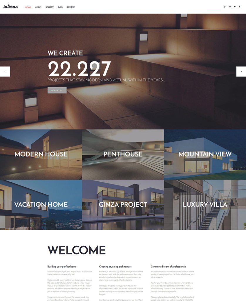
1. Interna WordPress Theme

Interna-WordPress-Theme

Demo
More Info

Interna is a responsive WordPress Theme which was created for an architectural company. This stylish theme has a lot of nice features like parallax scrolling effect, stick-to-top menu, drag and drop content editor, etc. Btw, Interna can be used for a multi language site as it is WPML ready. The theme has Cherry Framework at its core that offers solid Bootstrap options, numerous shortcodes and widgets and a simple way to update the current design with Parent/Child theme possibilities. Finally, the theme comes with 24/7 free lifetime support.

***

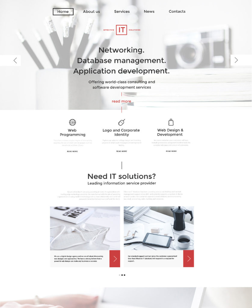
2. Effective IT Solutions WordPress Theme

Effective-IT-Solutions-WordPress-Theme - responsive WordPress themes

Demo
More Info

Here is a minimalist responsive WordPress theme which will be perfect for an IT company. This SEO friendly theme has a stylish slider, a parallax effect, a drag and drop content editor, a working contact form, and lots of other features.

***

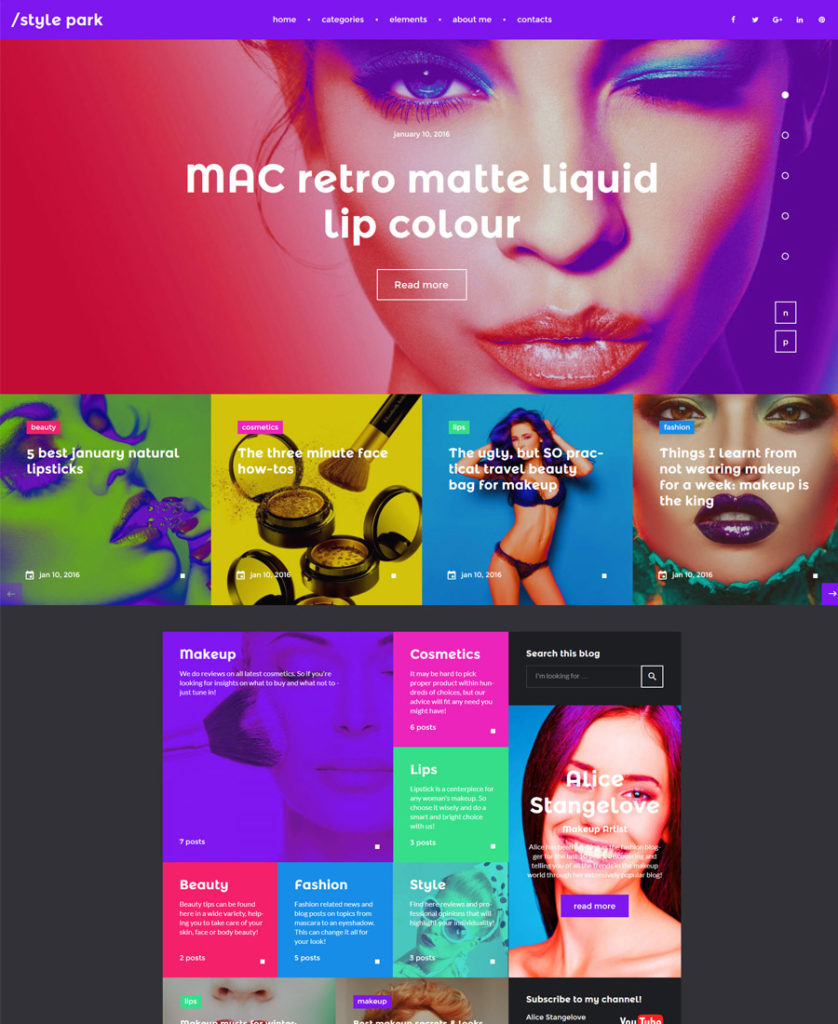
3. Style Park WordPress Theme

style park wordpress theme

Demo
More Info

This is the brightest theme in our responsive WordPress Themes collection. Its combination of neon colors and metro-style blocks will differentiate your fashion blog from the competitors. The theme is packed with a huge set of premium widgets which will help you build feature rich and versatile layouts. WordPress live customizer, Bootstrap, valid and well documented code, 24/7 free support are just a few things that you’ll get with this WP theme. In fact, Style Park is a GPL WordPress theme, meaning you can use it many times.

***

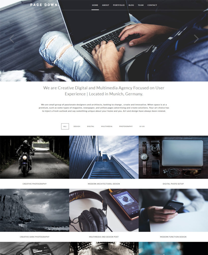
4. Page Down Responsive WordPress Theme

Page-Down-Responsive-WordPress-Theme

Demo
More Info

Page Down is a responsive WordPress theme that is suitable for design agencies and business sites. Its transparent header seamlessly blends with the layout. The projects are categorized. Contact form is available right on the home page. The theme has a clean design, a minimal layout, and a stylish responsive slider.

***

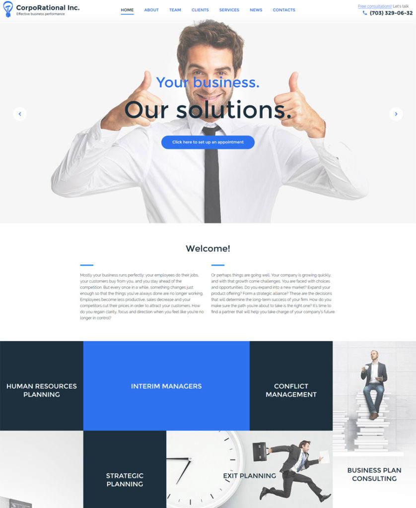
5. CorpoRational WordPress Theme

CorpoRational-WordPress-Theme - responsive WordPress themes

Demo
More Info

This business WordPress theme comes with a MotoPress editor plugin, which will help you process and edit your website. Drag and drop elements the way you like and enjoy the process of managing your site layout in a visual mode.

***

6. Clean Folio Responsive WordPress Theme
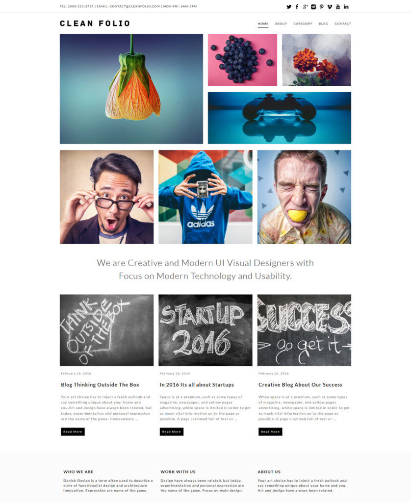
Clean-Folio-Responsive-WordPress-Theme

Demo
More Info

This bright theme is a great option for creative designers who want to be different from their competitors. The author skillfully uses white space, so that the page looks really professional.

***

7. Bit News WordPress Theme
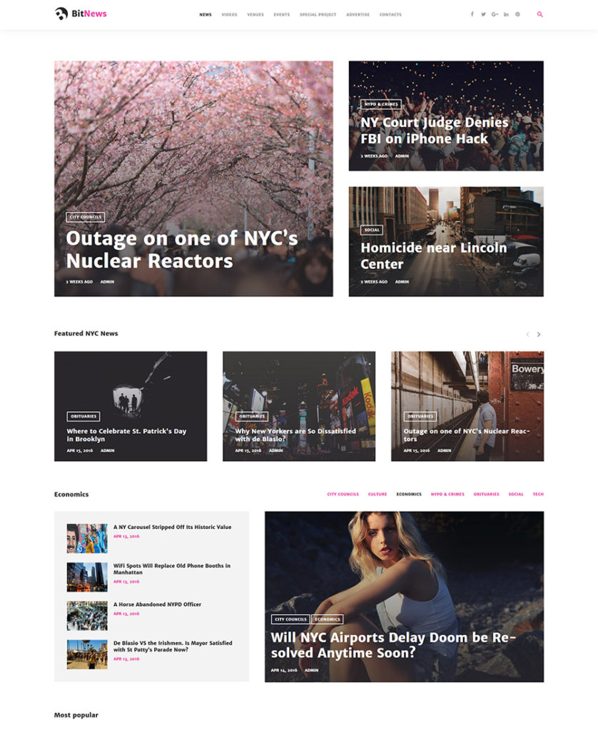
Bit-News---City-Portal-Magazine-WordPress-Theme

Demo
More Info

The theme is an ideal option for a news portal. It is delivered with a set of premium widgets (like posts carousel, simple slider, image grid, category tiles, and so on) to build feature-rich and versatile layouts.

***

8. Multimedia WordPress Theme
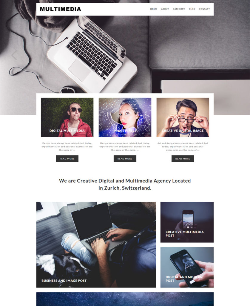
Multimedia-Responsive-WordPress-Theme - responsive WordPress themes

Demo
More Info

The next theme on our Responsive WordPress Themes list is ‘Multimedia’. It is coded with valid XHTML + CSS, which will provide flawless performance of your future website.

***

9. Editorso WordPress Theme
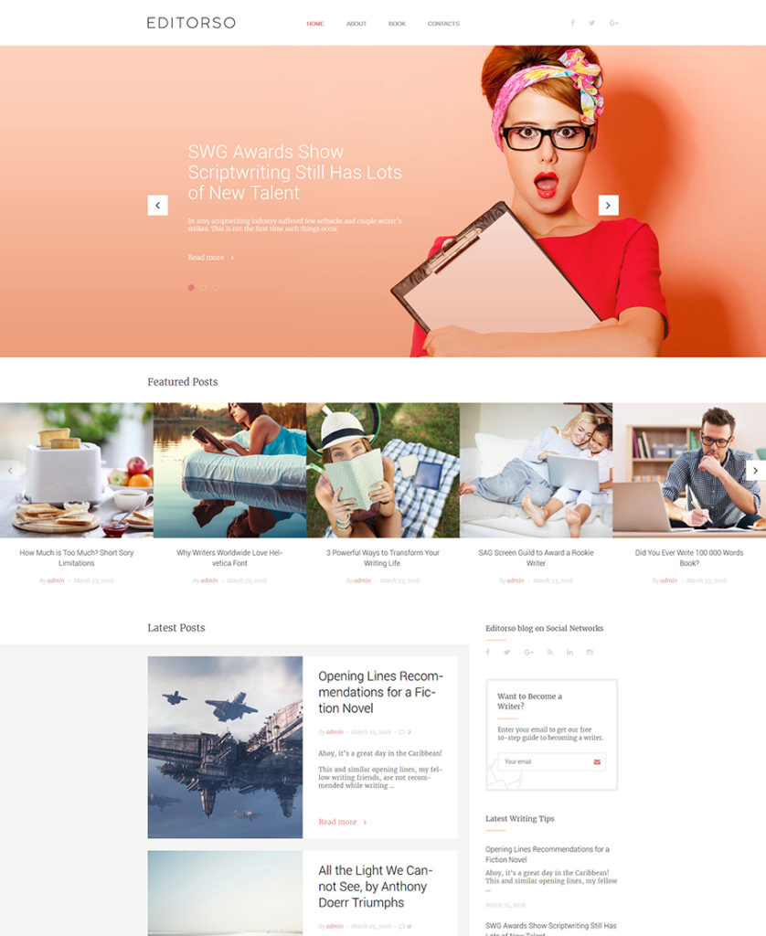
Editorso-Blogging-WordPress-Theme

Demo
More Info

Unlike many of the Responsive WordPress Themes, this one, for a journalist blog, doesn’t require any coding skills from you. You will cope with installation, fine-tuning and maintenance without difficulty as all these factors are being executed via a user-friendly interface with tons of settings. Btw, Editorso is a GPL WordPress theme, which means it can be used to build more than one WordPress site.

***

10. DailySports WordPress Theme
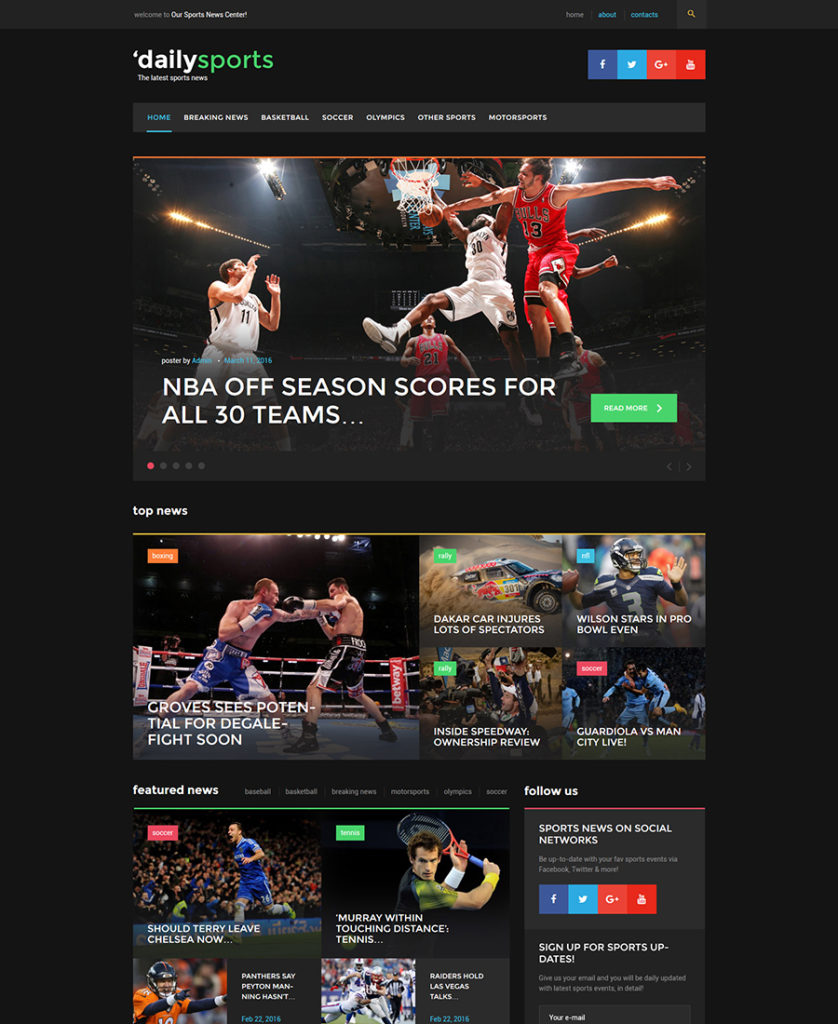
DailySports-WordPress-Theme - responsive WordPress themes

Demo
More Info

Dark layouts always capture users’ eyes, so it’s an ideal option for a sport news portal. The theme is 100% GPL, built with Bootstrap, SEO friendly and has valid and well documented code.

***

11. Kustrix WordPress Theme
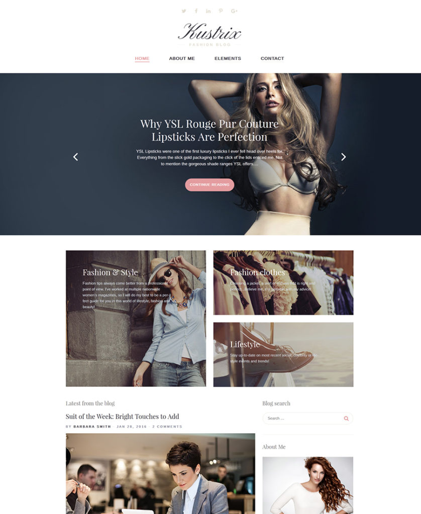
Kustrix WordPress theme

Demo
More Info

This fashion theme is customized with the help of WordPress live customizer. This feature gives you the ability to customize your website with just a few clicks and see the changes in real time.

***

12. OnePage Responsive WordPress Theme
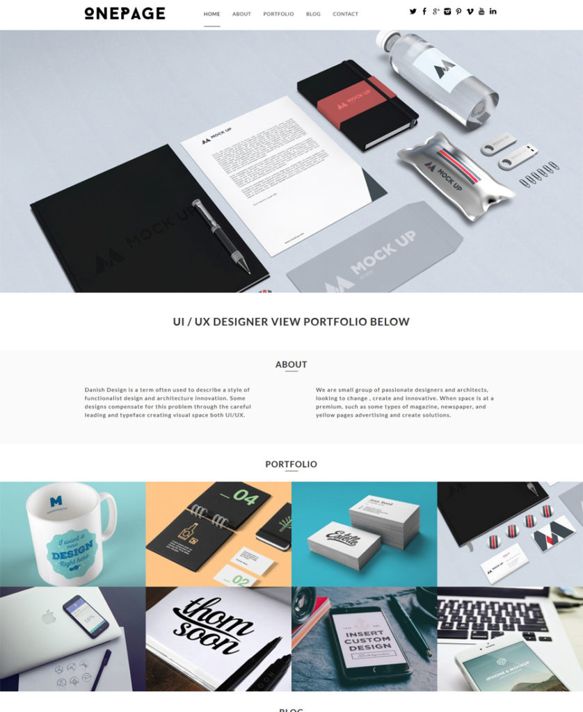
OnePage-WordPress-Theme

Demo
More Info

This is a trendy one page WordPress theme for a web design agency. Featured posts from the blog are placed into the slider (the second one on the home page), so you will be able not only to present your company online, but also to build a loyal community around it. OnePage has minimalist design and a stunning motion slider.

***

13. TripTastic WordPress Theme
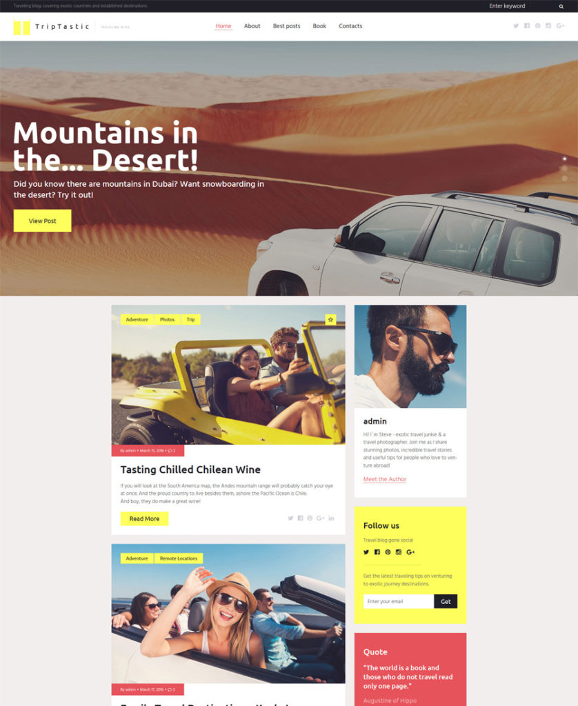
TripTastic---Travel-Blog-WordPress-Theme - responsive WordPress themes

Demo
More Info

This is a wonderful responsive WordPress theme for a travel blog. It is well documented and has clean code, but 24/7 effective and friendly support is always ready to solve any issue you might encounter.

***

14. Concept WordPress Theme
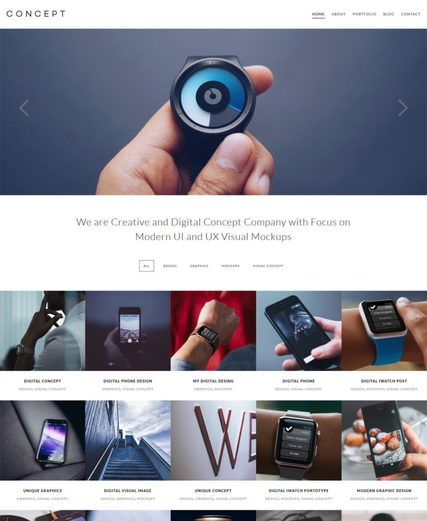
Concept-Responsive-WordPress-Theme

Demo
More Info

The theme is great for any design agency or business site. It has a clean and minimal layout and scroll motion slider. The theme is Search Engine Optimized and crossbrowser compatible.

***

15. HostPro WordPress Theme
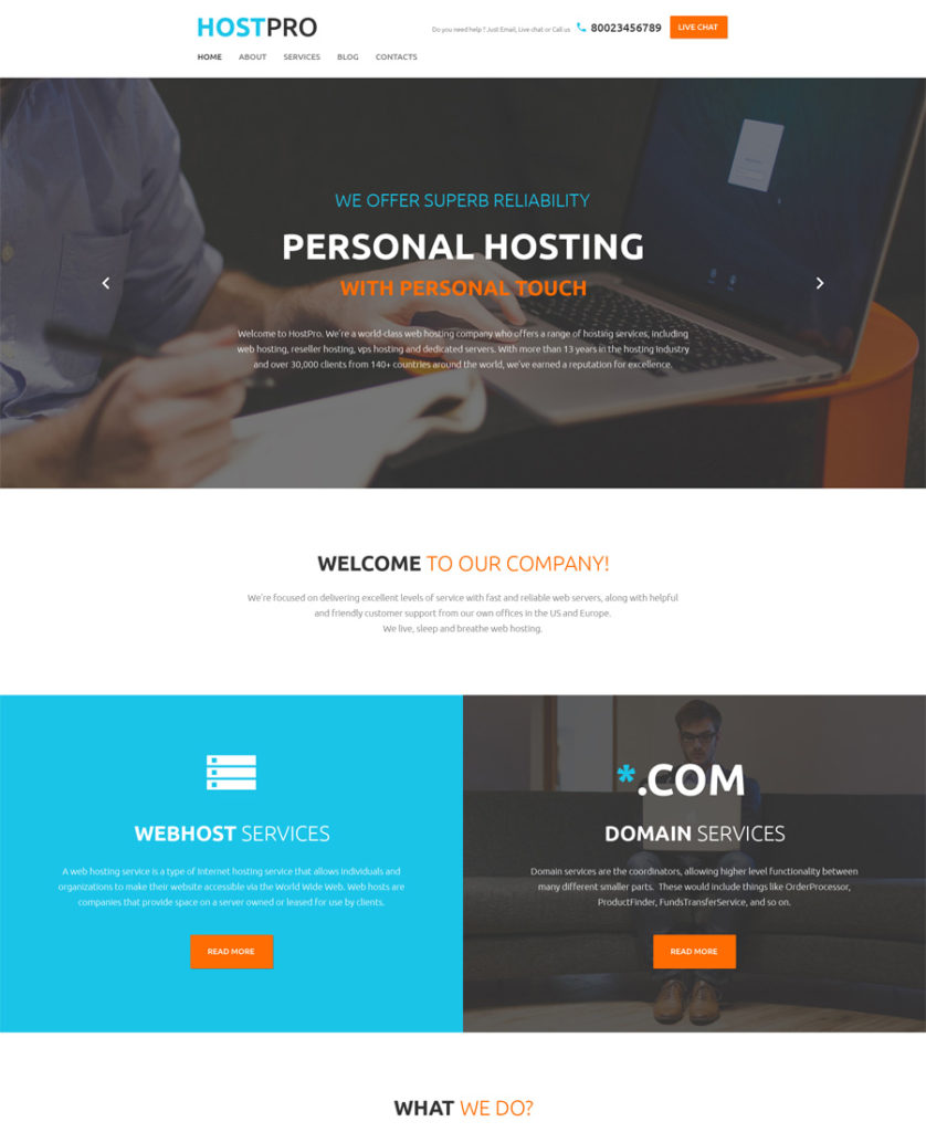
HostPro-WordPress-Theme

Demo
More Info

This theme, designed in flat style, has Infographic elements in the layout. Additionally, you can choose between multiple slider plugins (including Cherry Simple Slider and Premium MotoPress Slider) when crafting your theme. They allow you to assemble professional looking slides of text, images and videos, boosting them with cool transition effects.

***

16. Freelancer Responsive WordPress Theme
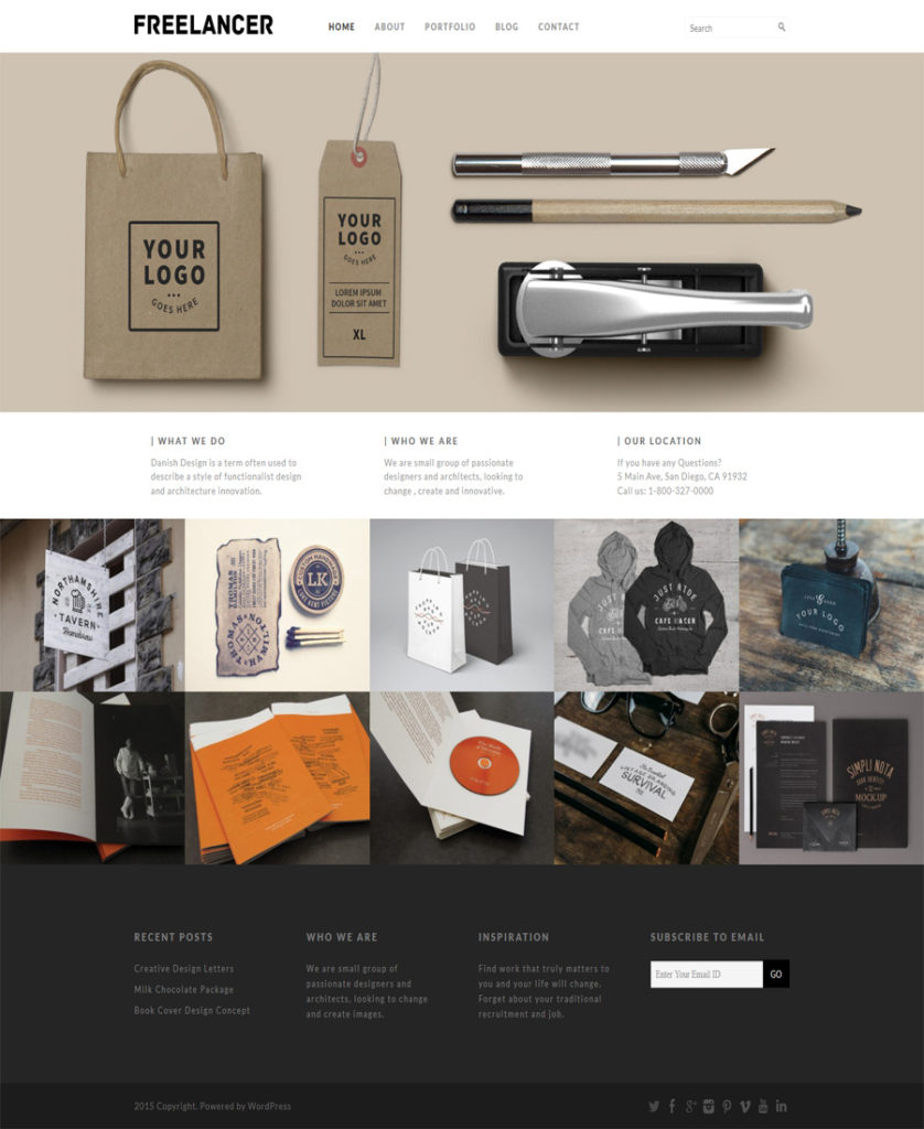
Freelancer-responsive-WordPress-Theme

Demo
More Info

This responsive WordPress theme can be used by design agencies. It has a sticky navigation menu that stays before your eyes as long as you are on the site. Company projects are presented in a grid and supplied with hover effect.

***

17. Fashion Spot WordPress Theme
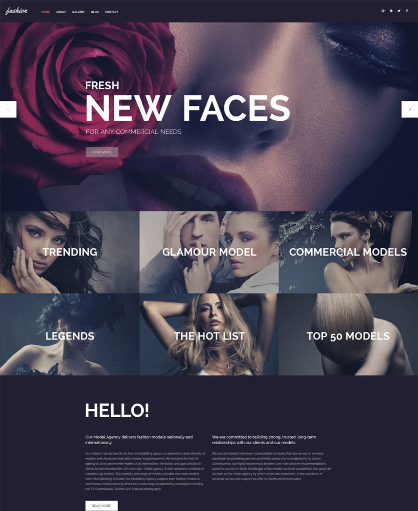
Fashion-Spot-WordPress-Theme - responsive WordPress themes

Demo
More Info

A very glamorous WordPress theme for fashion sites. By the way, you can use more than 80 handy shortcodes for post output, elements, grids, lists, tabs, video and audio, Google map, and much more.

***

18. Pixel WordPress Theme
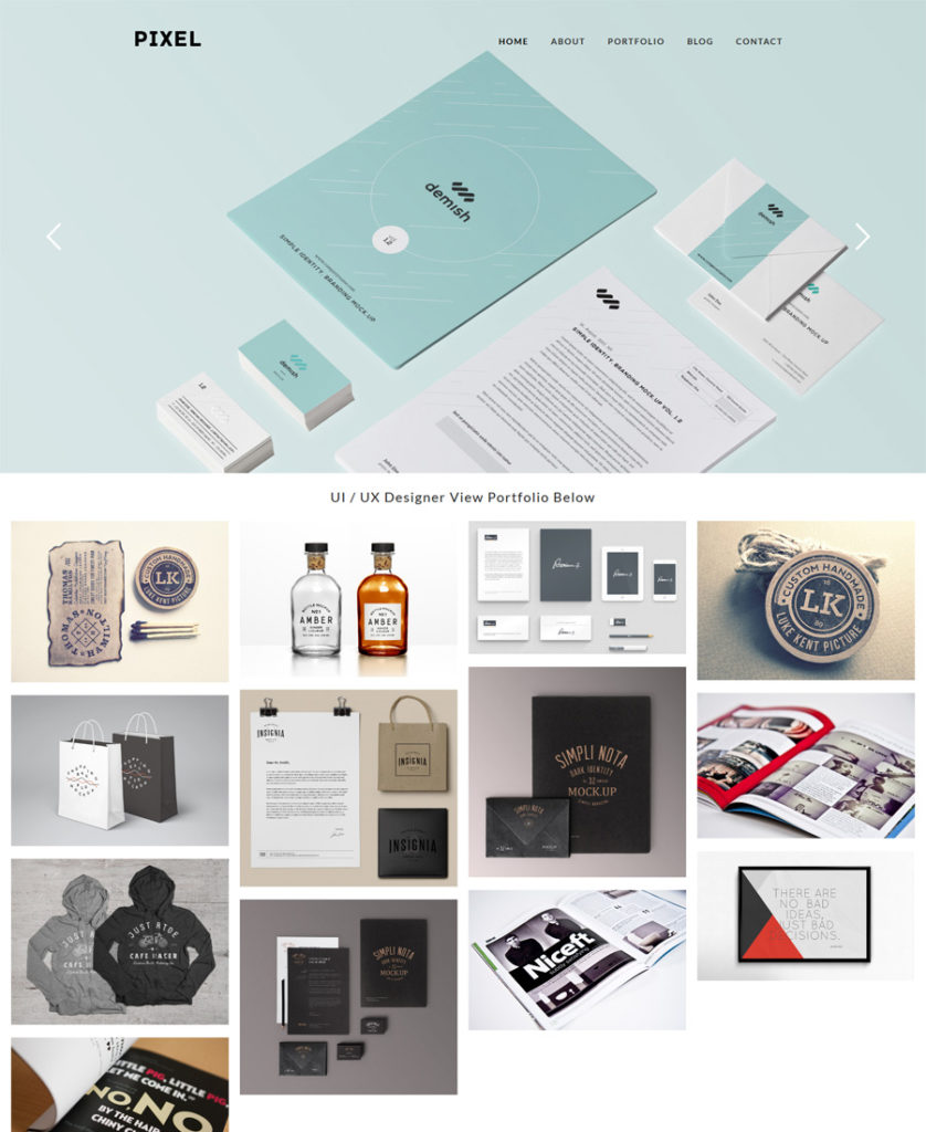
Pixel-Responsive-Theme-–-Fullscreen

Demo
More Info

This neat design will be a perfect fit for any creative agency. Responsive slider and masonry layout will help you present your work in a modern stylish manner.

***

19. Samuray WordPress Theme
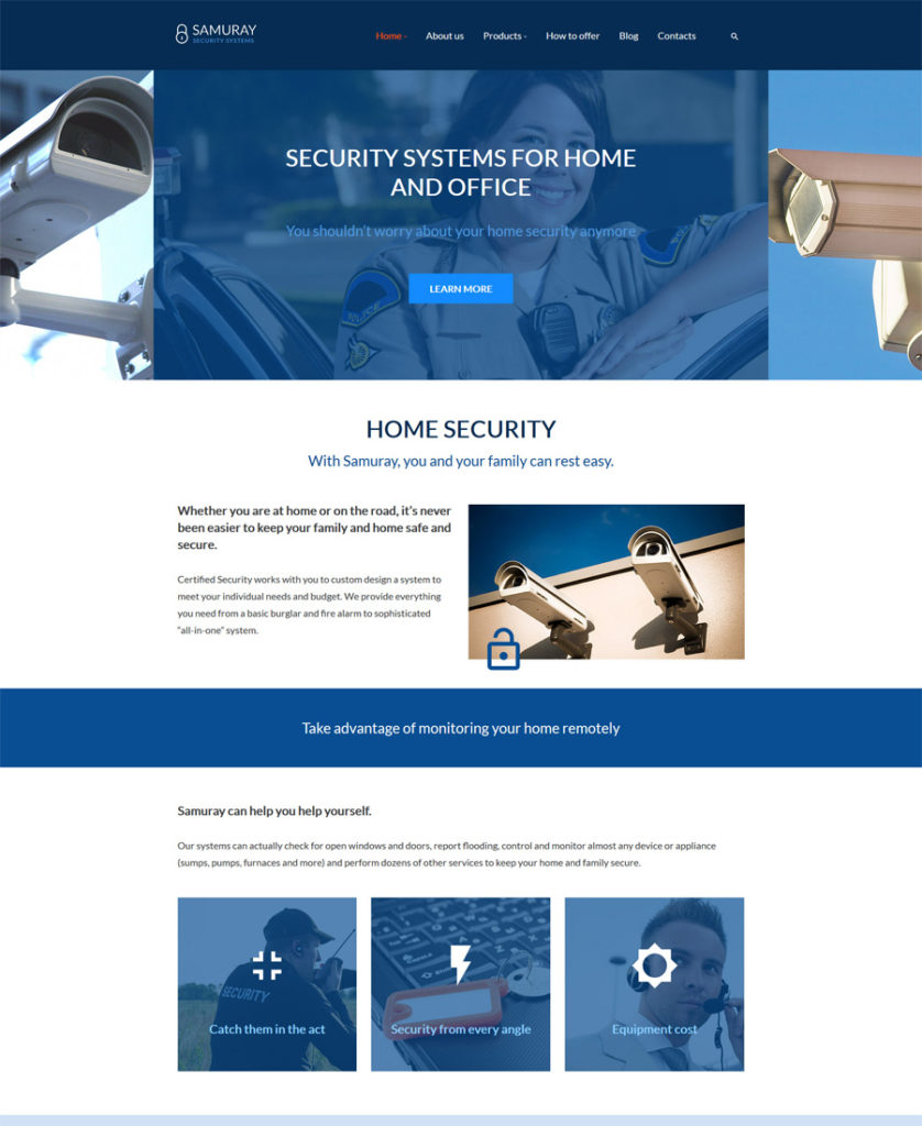
Samuray-WordPress-Theme - responsive WordPress themes

Demo
More Info

If you are choosing among responsive WordPress Themes for security sites, you should seriously check out this one. You will be able to build a unique and stylish site for any kind of business with a variety of custom pre-designed page templates.

***

20. Deltex WordPress Theme
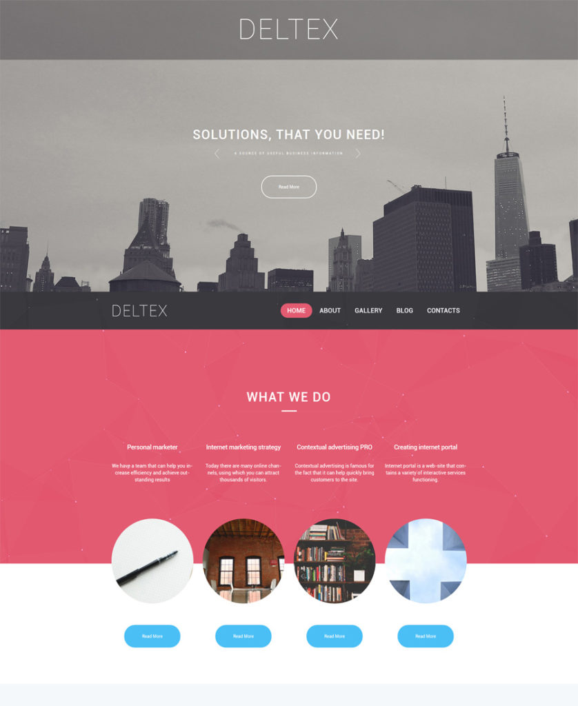
Deltex-WordPress-Theme

Demo
More Info

This is a solid business theme with transparent header and lowered main menu. It is supplied with WPML, which makes it easier to run a multilingual WordPress site with a single install. With WPML you can modify pages, posts, custom types, menus and the theme’s text and they will be displayed properly in every language.

***

21. Architecture WordPress Theme
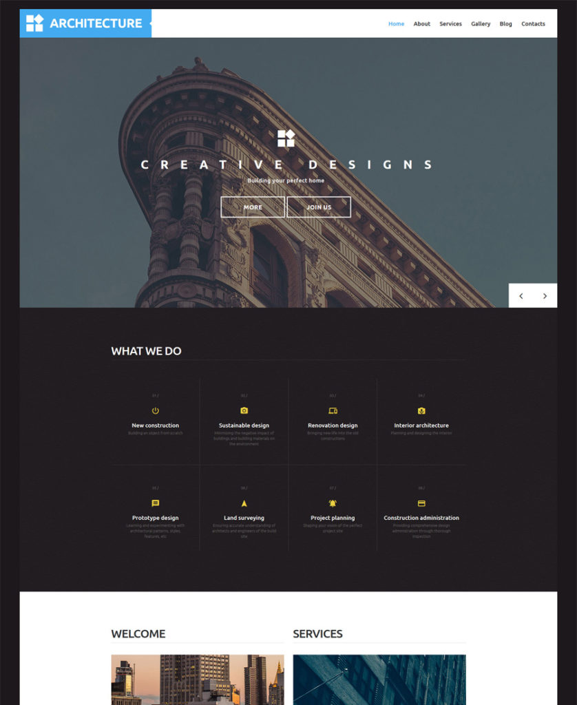
Architecture-WordPress-Theme

Demo
More Info

This is a responsive and retina ready architectural theme that includes PSD source files. That means the theme is fully customizable and is optimized to be used equally well by experts and beginners.

***

22. Redwoods Responsive WordPress Theme
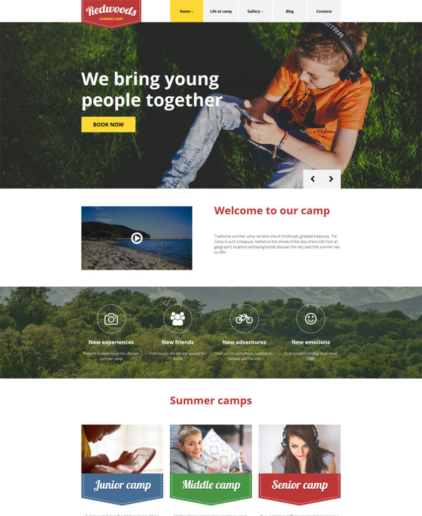
Redwoods-WordPress-Theme - responsive WordPress themes

Demo
More Info

This theme brings on a surge of sweet nostalgia. Happy kids photos, picturesque landscapes, decorative border stitching take site visitors back to their childhood, when their parents used to send them to summer camps and then they would come back home with lots of pleasant memories of that unforgettable experience.

***

23. Design Studio WordPress Theme
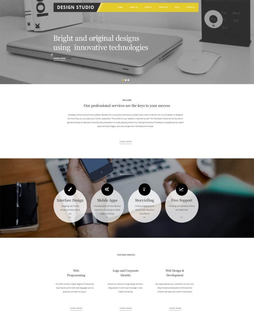
Design-Studio-WordPress-Theme

Demo
More Info

This theme for a web design studio will help you present your works in the best possible way. It is built on Cherry Framework 4, which provides hassle-free installation of your theme, Bootstrap options, shortcodes, widgets and so much more…

***

24. Adv WordPress Theme
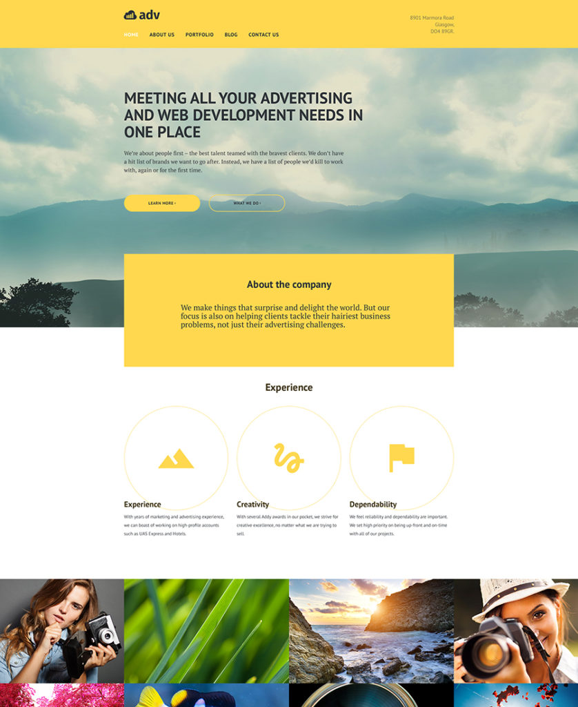
Adv-responsive-WordPress-Theme

Demo
More Info

If you are looking for a trendy theme for an advertising agency among responsive WordPress Themes, here is a good one to consider. It gives you the freedom to use unique types of posts for a variety of information, like customer testimonials, team bio posts, company services description, etc. In short, every page of your website will be special. All you need to do is choose from a list of available post formats.

***

25. Monstroid – Multipurpose WordPress Theme
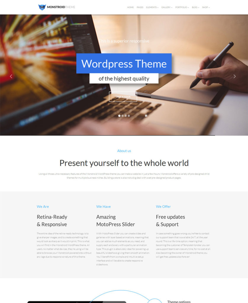
Monstroid-WordPress-Theme

Demo
More Info

This is one of the best responsive WordPress Themes featured here. Monstroid is a multipurpose theme, which means that you can make whatever you need out of it (a blog, an online portfolio, a news site, a corporate site or even a web shop). It is supplied with all necessary tools for the purpose.

***

26. VPress Responsive WordPress Theme
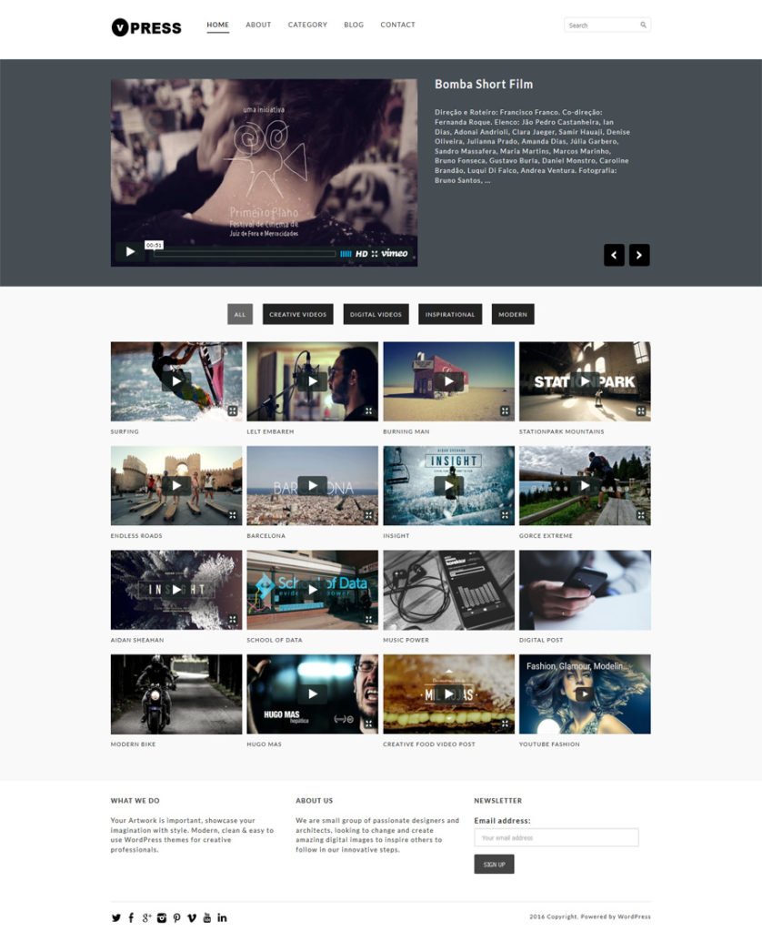
VPress-Responsive-Theme

Demo
More Info

The theme was created for video blogs and video design companies. Videos on the web page are categorized and have tabbed navigation for users’ convenience.

***

27. Vegetexia Responsive WordPress Theme
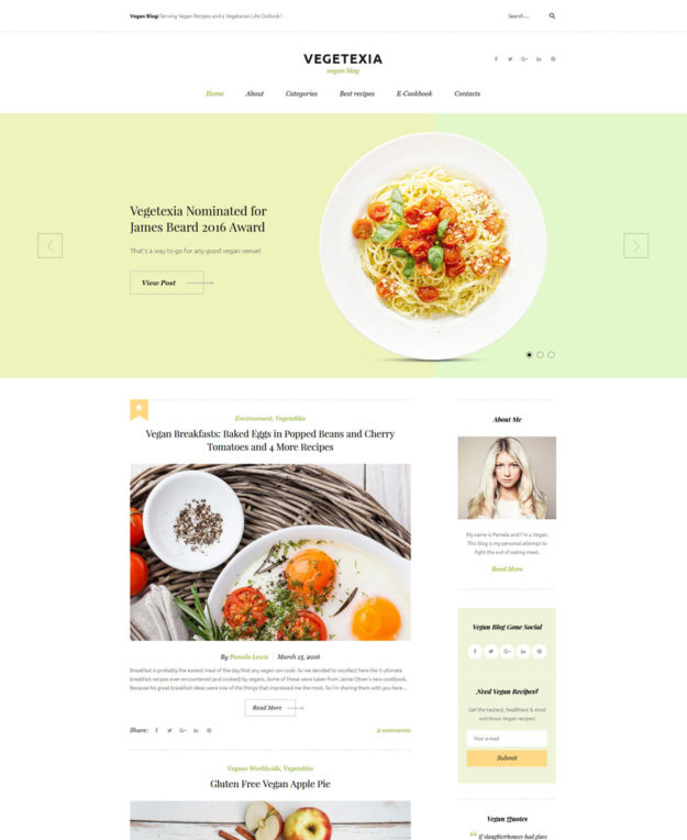
Vegetexia - Recipes Responsive WordPress Theme - responsive WordPress themes
Demo
More Info

You can place all your information on healthy diet on a clean vegetarian blog. This nice eye-pleasing WordPress theme is packed with a huge set of premium widgets allowing you to build feature-rich and versatile layouts.

***

28. Vector WordPress Theme
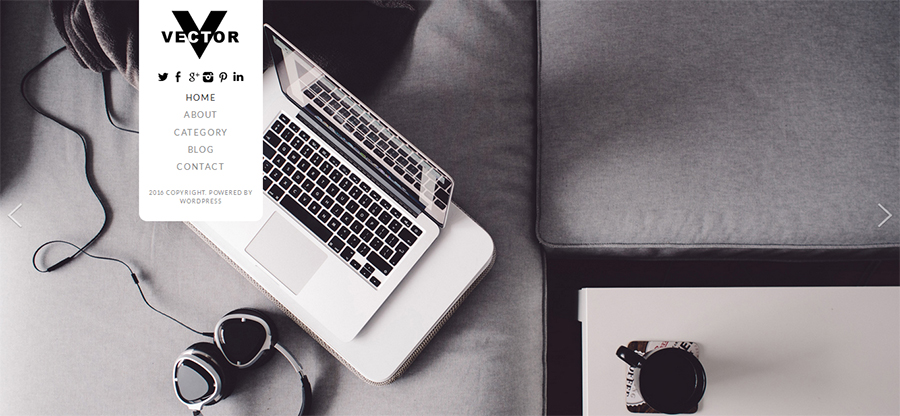
Vector WordPress Theme

Demo
More Info

This responsive WordPress theme has an uncommon navigation. You can use a vertical main menu, placed on the white text block together with logo, social icons and copyrights. Actually, the theme’s home page appears as a full screen slider showing HD images that capture users’ attention.

***

29. AutoTowing WordPress Theme
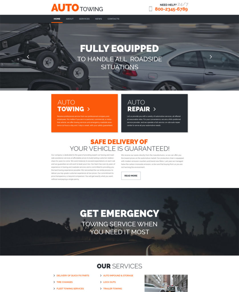
AutoTowing-responsive-WordPress-Theme

Demo
More Info

The theme is retina ready, so it will perform and look great even on displays with high pixel density. This will help you keep your site up to date for many years.

***

30. Creator Responsive WordPress Theme
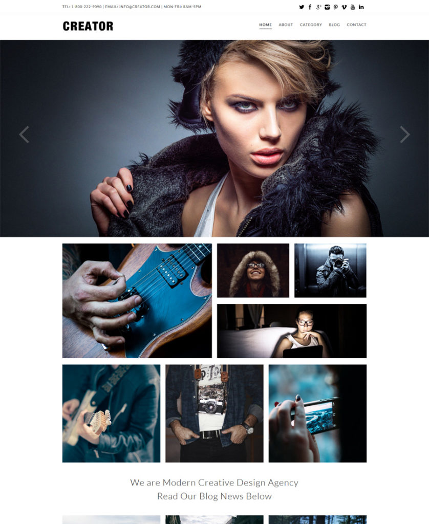
Creator-Responsive-WordPress-Theme

Demo
More Info

This responsive WordPress theme has a very impressive slider and intuitive navigation. You can use not only the main menu, but also promo banners to research website pages and their content.

***
So, these were 30 elegant premium responsive WordPress Themes for different kinds of businesses. Liked anything? Please leave us a comment! Do you think we’ve missed any extraordinary template? You are welcome to make your additions to our list.

Read More at 30 Premium Responsive WordPress Themes – Part 2

Categories: Designing, Others Tags: