Every week users submit a lot of interesting stuff on our sister site Webdesigner News, highlighting great content from around the web that can be of interest to web designers.
The best way to keep track of all the great stories and news being posted is simply to check out the Webdesigner News site, however, in case you missed some here’s a quick and useful compilation of the most popular designer news that we curated from the past week.
Note that this is only a very small selection of the links that were posted, so don’t miss out and subscribe to our newsletter and follow the site daily for all the news.
Web Design in 4 Minutes
How to Code a Scrolling Website
Why You Should Delete Pokémon Go Right Now
9 Ways to Dramatically Improve your Creativity
Marvel Studios Unveils New Logo
Hover is Dead. Long Live Hover.
Smart Redesign Makes Google Maps Easier on the Eyes
10 Professional Fonts for Designers
Design Doesn’t Scale
25 Must-Have Font Families
Bad UX Kills
MTV Explaining the Internet in 1995
Getting Better at Design is Easy, Just Copy People
Twitter Launches New Ad Campaign Because People Still Don’t Understand Twitter
You’re a UI Designer. You Just Don’t Know it Yet.
24 Headline Fonts to Transform your Designs
5 Awesome Design Hacks to Create Highly Shareable Social Media Graphics
Since the third of December 2015, the latest version of PHP, carrying the number seven, is available. To remove legacy waste, the developers decided to partially give up on backward compatibility. For WordPress users, this brings up the question whether PHP7 is already usable, and which advantages can come with using it if any. Therefore, let’s take a short look at these important questions.
A small notifier: This article will only briefly address PHP7 and WordPress to answer the question whether the new version is already usable without any problems. We will not go in-depth today.
PHP7 and WordPress – Dream Team?
PHP7 is the name of the official successor of PHP5 since December 2015. During the development of the programming language, backward compatibility was neglected for the most part. This brings up the question if that poses problems to the not so young WordPress core.
The new version’s big advantage is the up to 30 percent lower execution time than PHP5 as, among other things, hash tables were newly implemented. This should result in a massive performance boost for your WordPress website.
PHP is the coding language that was used to develop WordPress. PHP is what turned the web into what it is today. All functions and elements of your website are generated and distributed by PHP. Without it, the web would be static, and most likely, only pure HTML pages would be able to exist.
Is a PHP Update Important?
PHP updates are very rare, but also critical. Generally, one can say that the updates are always relevant for security and performance. Security gaps are closed, and a bit of performance is added. That’s why it’s always recommendable to use the latest version of PHP, but only if your web applications of choice run smoothly.
PHP7 = A Significant Performance Increase
PHP7 makes WordPress run, as the utilization of the given resources is significantly better than before. In the new version, all PHP operations require much less CPU computational power than it was the case with the old version 5.6. This saves server power during regular operation, which means that there is more power available during visitor peaks.
WordPress needs far less computational power to keep the old speed level. Roughly said, your website has an up to twice as high performance under PHP7. This is the result of in-depth testing by Zend, the developer of PHP. Zend used the WordPress version 4.1 for its tests, so there should be no difference between it and the current version 4.5.3.
Find Zend’s infographic further down.
Is PHP7 Already Usable?
I’ve been testing the new PHP version for weeks, and I haven’t been able to notice any compatibility issues. So far, when it comes to using PHP7, the web was very reserved.
However, I couldn’t find any errors on two (important) WordPress websites with a different set of plugins. The opposite was the case, as my websites were faster immediately after the activation of the new PHP version. No theme, no plugin had any compatibility issues. I also was unable to find a problem on any of my test pages. Everything runs fast and smoothly.
Only one customer website I maintain was slower than before while using PHP7. I suppose there was a problem with the custom scripts for the delivery of advertisements.
Many hosts already have the recent PHP version in its settings for hosting packages, so it only needs to be activated. In my managed root cloud server, I only had to comment out the new version and comment in the old one in the httpd.conf.
PHP7 is Usable in Live Operation If:
You use the latest version of WordPress.
You always update all plugins.
You don’t use any plugins you developed yourself years ago and haven’t touched since.
In the end, there’s only one thing left to do: test, test, test. Activate PHP7 and look what happens. In about 90 percent of all cases, everything will run smoothly and much faster. If you happen to notice problems, they can possibly be solved quickly. Often, switching to recent WordPress features is enough, the codex provides quick help.
Using PHP7 is very recommendable. In the most likely of all cases, you will not notice any problems. When WordPress, your plugins, and your themes are kept updated, you’ll experience a massive performance boost, and be happy about the decision to use it.
Since eight years, our monthly desktop wallpapers challenge is a Smashing favorite that wouldn’t be possible without the tireless efforts of talented designers and artists from across the globe. On a quest to cater for wallpapers that are a little more distinctive than the usual crowd, we challenge you, the design community, to get your creative juices flowing and produce some interesting and inspiring designs each month anew. And, well, it wasn’t any different this time around.
This post features wallpapers to get your desktop ready for August 2016. They all come in versions with and without a calendar and can be downloaded for free. A big thank-you to everyone who tickled their creativity and contributed their ideas!
Every week we feature a set of comics created exclusively for WDD.
The content revolves around web design, blogging and funny situations that we encounter in our daily lives as designers.
These great cartoons are created by Jerry King, an award-winning cartoonist who’s one of the most published, prolific and versatile cartoonists in the world today.
So for a few moments, take a break from your daily routine, have a laugh and enjoy these funny cartoons.
Feel free to leave your comments and suggestions below as well as any related stories of your own…
Honorary designer degree
Takes years
Google vacation
Can you relate to these situations? Please share your funny stories and comments below…
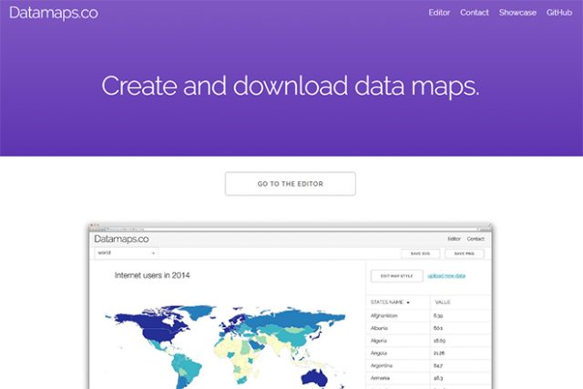
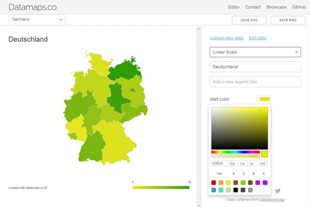
Maps are commonly used to visualize statistical data. Yet, these maps are not always available. Above all else, however, the editing of such datamaps always requires effort. The service Datamaps.co not only provides vector-based maps, but also makes it easy for you to add statistical data as well as adjust the design.
Choosing a Map
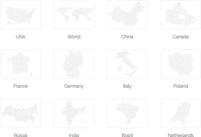
First, choose a map from Datamaps.co. Aside from a world map, there are maps of certain countries available as well. While only nation borders are marked on the world map, the maps of individual countries reflect political divisions. That means, that you’ll find all states on the USA map, and all regions on the French map.
Map Choice
In total, there are 13 maps in addition to the world map that can be found at Datamaps.co. These are maps of the USA, Germany, China, Canada, France, Italy, Poland, Russia, India, Brazil, the Netherlands, Austria, and Switzerland.
Lodging Data
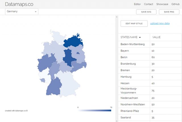
Once you’ve chosen a map, set a numeric value for each nation or region. That means, that you’ll have a list of all states for the USA map. You can enter a numerical value for each state. Subsequently, Datamaps.co will color all the states on the map differently.
Entering Data Manually or Via CSV File
The service creates a color scale between the highest and lowest value entered in the table, and colors each state according to its value. You’ll receive a map that tells you about the statistical distribution of your data by different colors (should you have used the numbering that way).
Uploading Files Via CSV File
Entering values for close to 200 nations takes a lot of effort. However, you could also upload a CSV file that contains the information. For that, the first column of the table always needs to contain the three-letter ISO-3166-1-label (ALPHA-3) of the country.
The names for the federal subdivision varies between countires. For German maps, for example, the ISO 3166-2-label (NW for North Rhine-Westphalia, for instance) is used. However, there’s also the option to download an example table for each map, which already contains all column labels. Then, all you need to do is place the numbers in the second column and upload the map.
Adjusting Looks and Labelling of the Maps
To round it all up you adjust the design of the map and add a title as well as a caption. The caption is used to explain the color scale and the way to read it. It will also reflect the lowest and highest value.
Custom Coloration is Possible
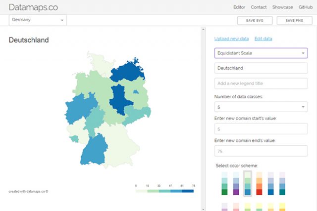
When it comes to the color scale, you get to choose between a linear scale that displays the transition between two colors, and an equidistant scale that is divided into equal sections. Here, a color is assigned to each section.
The latter scale is especially interesting when you want to divide the countries or subdivisions into statistical groups. This way, each group gets its own color. Here, you choose the amount of groups – between three and seven -, as well as the color scheme.
Map With an Equidistant Scale
Downloading Maps
Once your map is done, simply download it as a PNG or SVG file and implement it into your website, or wherever you need it. A small copyright notification is automatically integrated into the map.
As Datamaps.co runs under the free MIT license, the entire source code is available to you. Thus, you can even host the service yourself, add custom maps and use the service freely for personal as well as commercial projects.
I recently saw this loader on CodePen, a pure CSS 3D rotating set of bars with a fading reflection. It’s done by using an element for each bar, then duplicating each and every one of these elements to create the reflection and finally adding a gradient cover to create the fading effect. Which sounds a bit like scratching behind your right ear with the toes of your left foot! Not to mention the gradient cover method for the fading effect doesn’t work with non-flat-color backgrounds. Isn’t there a better way to do this with CSS?
The answer is: “yes” and “no”. “Yes”, there are things that really could work and “no”, they aren’t really there yet. Sadly, while the code can be compacted a bit using a preprocessor (not much outside what can get generated in a loop though), the method of duplicating all bars for the reflection and using a gradient cover for the fading effect is still the best way of doing this if we don’t want to use canvas and we want the result to work across the current versions of all main browsers.
This article is going to explore the options we have today for creating the reflection, illustrate the “almost” solutions, how cross-browser issues cause pain and, finally, discuss my thoughts on what should be done.
Basic setup for the demo
Before we get to reflections, let’s see how we create, position and shade the bars as this part is common for all browsers.
Creating the bars
First of all, we create a wrapper .loader element with 10 .bar elements in it.
<div class='loader'>
  <div class='bar'></div>
  <!-- repeat to create 9 more bars -->
</div>
Writing the same thing multiple times is a pain, so it’s easier to use a preprocessor in such situations. We’re using Haml here, but any other one will do.
.loader
  - 10.times do
  .bar
We position all these elements absolutely starting from the middle of the viewport. In most cases, we use top: 50%, but, in this case, it will be more convenient later if we use bottom: 50%:
div {
  position: absolute;
  bottom: 50%; left: 50%;
}
We decide on a width and a height for the bars and we give them a background just so that we can see them:
We want the bottom edge of the bars to coincide with the middle line of the viewport (separating the viewport into two equal parts) and we already have that as we’ve used bottom: 50%.
At this point, our bars are all stacked one on top of the other, their left edge being on the vertical line splitting the viewport into two equal halves (left and right) and their bottom edge being on the horizontal line splitting the viewport into two equal halves (top and bottom).
Positioning the bars
We need to position them such that the left edge of the first (leftmost) one and the right edge of the last (rightmost) one are at equal distance from the vertical line dividing the viewport into two equal halves. This distance is always half the number of bars ($n) times the bar width ($bar-w). The original demo uses vanilla CSS, but we’re going with Sass now to reduce the amount of code.
This means that, starting from the position that all the bars are in now, we need to shift the first bar to the left by .5 * $n * $bar-w. The left is the negative direction of the x axis, which means we need a - (minus) in front of it. So the margin-left value for the first bar is -.5 * $n * $bar-w.
The second bar (of 0-based index 1) is 1 bar width ($bar-w) to the right (in the positive direction of the x axis). So the margin-left value for this bar is -.5*$n*$bar-w + $bar-w.
The third bar (of 0-based index 2) is 2 bar widths to the right (in the positive direction of the x axis). So the margin-left value for this bar is -.5 * $n * $bar-w + 2 * $bar-w.
The last bar (of 0-based index $n - 1) is $n - 1 bar widths to the right (in the positive direction of the x axis). So the margin-left value for this bar is -.5 * $n * $bar-w + ($n - 1) * $bar-w.
In general, if we consider $i to be the 0-based index of the current bar, then the margin-left value for this $i-th bar is -.5 * $n * $bar-w + $i * $bar-w, which can be compacted as ($i - .5 * $n) * $bar-w.
This allows us to position the bars with a Sass loop:
$n: 10;

@for $i from 0 to $n {
  .bar:nth-child(#{$i + 1}) {
  margin-left: ($i - .5*$n)*$bar-w;
  }
}
We also give them a box-shadow so we can see where a bar ends and the next one begins:
Shading the bars
The backgrounds of the bars go from a dark blue (#1e3f57) for the leftmost bar to a light blue (#63a6c1) for the rightmost one. This sounds like a job for the Sass mix() function! The first argument would be the light blue, the second one the dark blue and the third one (called the relative weight) the amount (in %) of the light blue to be included in the resulting mix.
For the first bar, this amount would be 0% – 0% of the light blue in the result, so this result would be just the dark blue.
For the last bar, the amount would be 100% – 100% of the light blue in the final result (which also means 0% of the darker shade), which would make the background light blue.
For the rest of the bars, we need intermediate values distributed evenly. If we have $n bars, the first bar is at 0% and the last one at 100%, then we need to split the interval between them into $n - 1 equal intervals.
In general, the relative weight for the bar of index $i is $i * 100% / ($n - 1), which means we need to add the following code:
$c: #63a6c1 #1e3f57; // 1st = light 2nd = dark

@for $i from 0 to $n {
  // list of mix() arguments for current bar
  $args: append($c, $i * 100% / ($n - 1));

  .bar:nth-child(#{$i + 1}) {
  background: mix($args...);
  }
}
Now the bars look like in the original demo:
Exploring the options for the reflection
WebKit browsers: -webkit-box-reflect
Oh, no, a non-standard property! I don’t know why it didn’t become a standard. I hadn’t even heard of CSS when this first landed in Safari. But, for WebKit browsers, it does the job and it does it well! A lot of work went into it. It’s easy to use and it doesn’t break anything in non-supporting browsers, it just doesn’t display a reflection.
Let’s see how this works. The value it takes has three parts:
a direction, which can be any of the below, left, above, right keywords
an optional offset, which specifies how far from the edge of the element the reflection should start (this is a CSS length value)
an optional image mask (which can be a CSS gradient)
The following demo illustrates this:
Note that the linear-gradient() could have more stops or it could be replaced by a radial-gradient().
In our case, the first thing that springs to mind is to add this on the .loader element:
However, if we test this in a WebKit browser, we don’t see any reflection!
What is happening here? We have positioned all our elements absolutely and we haven’t set any explicit dimensions on our .loader element which contains the bars. This makes it a 0x0 element – zero width, zero height.
So let’s give it some explicit dimensions, a height equal to that of the bars ($bar-h) and a width big enough to contain all the bars ($n*$bar-w). We also temporarily give it a box-shadow just so we can see its boundaries clearly:
How box-shadow and outline behave in WebKit browsers and Edge (top) vs. Firefox (bottom) – outline gives different results when children overflow
The result of adding the above code can be seen live in WebKit browsers in the following Pen:
If you’re not on a WebKit browser, here’s what it looks like:
screenshot of the result in Chrome after explicitly sizing the .loader element
We can see the loader boundaries and we can see some reflection now, but things aren’t positioned correctly anymore. We want the loader to be dead in the middle horizontally, so we shift it to the left by half its width. We also want the bottom of the bars to coincide with the bottom of their parent, so we set bottom: 0 on them:
This fixes the positioning issue. Here’s what it looks like now:
Firefox: element() + mask
Creating the reflection with element()
The element() function (still in the works, so far only implemented by Firefox with the -moz- prefix) gives us an image value that we should be able to use anywhere an actual image can be used (works for background, for border-image, but doesn’t seem to work as a value for pseudo content – see bug 1285811). It takes one argument which is the id selector of the element we want to see displayed as a background or a border-image. This allows us to do evil things like using images of controls as backgrounds. But it can also come in handy if we want to get an element reflected in Firefox.
One very important thing to know about the element() function is that it’s not recursive – we cannot create fractals by using elements as their own backgrounds. This makes it safe to use on a loader pseudo for creating the reflection so we don’t need to use an extra element.
Alright, let’s see how we do this. First of all, we give our loader element an id (let’s say the obvious loader). Moving on to the styling, we start from the exact same CSS we have in the final demo for the WebKit case. Then we add an ::after pseudo on the loader, absolutely positioned and covering it fully.
We’ve also set a few more temporary styles just so we can have a clear idea of this pseudo’s boundaries and orientation as in the final form, we want it to be upside down:
Now we need to reflect our ::after pseudo against its bottom edge. In order to do this, we use a scaleY() transform with a properly chosen transform-origin. The following interactive demo illustrates how directional scaling works for various scale factors and transform origins:
Note that the values for the scale factors and the transform-origin can go beyond the limits imposed by this demo.
In our case, we need a scaleY(-1) and a transform-origin on the line of the bottom edge of the ::after pseudo:
reflect an element down using a scaleY(-1) transform with an appropriate transform-origin
We add this to the code and we set the #loader as the background of its ::after pseudo using the element() function (with a prefix because that’s the only way it’s supported for now).
Note that we use .loader for the selector for specificity reasons and #loader as the argument of the element() function as that needs to be an id selector.
The result of adding the above code can be seen in the following Pen (Firefox-only):
For everyone reading this on other browsers, here’s a screenshot of what it looks like:
result of the reflection using the element() function in Firefox
Fading the reflection with mask
We fade the reflection the same way we did in the WebKit case: using a mask. In that case, the mask was a component of the -webkit-box-reflect value. In this case, we’re talking about the CSS mask property which takes an SVG reference for a value:
mask: url(#fader);
Our #fader element is an SVG mask element containing a rectangle.
However, if we actually add the above to our code, our reflection disappears – this can be tested by viewing the following demo in Firefox:
This is because, by default, SVG shapes have a solid black fill, completely opaque and, at the same time, our mask is a luminance mask by default. So what we need to do in order to make the reflection fade is give the rectangle a fill that’s a reference to an SVG linearGradient.
%rect(width='1' height='1' fill='url(#grad)')
An SVG linearGradient is defined between two points specified by the x1, y1, x2 and y2 attributes. x1 and y1 are the coordinates of the start point (0%) of the gradient line, while x2 and y2 are the coordinates of the end point (100%) of this line. If these are missing, they are taken to be 0%, 0%, 100% and 0% respectively. These values describe the line from the top left (0% 0%) to the top right (100% 0%) of the element on which is applied (since the default value for gradientUnits is objectBoundingBox), meaning that, by default, the gradient goes from left to right.
But in our case, we want the gradient to go from top to bottom, so we change the value for x2 from 100% to 0% and the value for y2 from 0% to 100%. This makes the gradient vector go from the top left corner (0% 0%) to the bottom left (0% 100%) corner of the element on which it’s applied.
%linearGradient#grad(x2='0%' y2='100%')
Inside the linearGradient element, we have at least two stop elements. These have three specific attributes: offset, stop-color and stop-opacity.
offset can take a % value, usually between 0% and 100%, just like in the case of CSS gradients. It can also take a number value, usually between 0 and 1.
stop-color can take a keyword, hex, rgb(), rgba(), hsl() or hsla() value. In theory. In practice, Safari doesn’t support semitransparent values, so if we want semitransparency in our gradients, we should rely on the third attribute…
stop-opacity. This takes a value between 0 (fully transparent) and 1 (fully opaque).
We need to keep in mind that the loader pseudo on which we’re applying the gradient mask has been reflected down via a scaleY(-1) transform. This means that the bottom of our gradient mask is visually up. So our gradient needs to go from completely transparent at the top (visually down) to an alpha of .7 at the bottom (visually up).
Since our gradient goes from top to bottom, the first stop is the fully transparent one.
Adding the linear gradient gives us the result we wanted in Firefox as well:
This Pen shows it live:
The SVG gradient problem
In our case, things are pretty simple because our masking gradient is vertical. But what about gradients that aren’t vertical, or horizontal or don’t go from one corner to the other? What if we want to have a gradient at a certain angle?
Well, SVG gradients also have an attribute called gradientTransform that can rotate the gradient line defined by the x1, y1, x2 and y2 attributes. One might think that’s an easy way to reproduce CSS gradients at an angle. But… it’s not that simple!
Let’s consider the case of a gradient from gold to crimson. To make things clearer, we give it a sharp transition between the two at 50%. Initially, we take the angle of the CSS version of this gradient to be 0deg. This means that the gradient goes from 0% at the bottom (gold) to 100% at the top (crimson). The CSS to create this gradient would be:
To reproduce this with SVG, we create a gradient where y1 is 100%, y2 is 0% and x1 and x2 have the same value (we take it 0 for simplicity). This means the gradient line goes up vertically from the bottom to the top. We also set both stop offsets at 50%.
Editor’s note: I asked Ana why the switch to Jade here, and she says: I used Haml initially because I could avoid introducing a loop variable that I wasn’t using anywhere anyway. Later used Jade because it allows variables and computations.
This gradient is not yet rotated, so the value for its gradientTransform attribute is rotate(0 .5 .5) at this point. The second two values specify the coordinates of the point the gradient is rotated around, relative to the element that the gradient is applied on. 0 0 means the top left corner, 1 1 the bottom right corner and .5 .5 is exactly in the middle. This can be seen live in the following Pen:
If we want our gradient to go from left to right, then, in the case of the CSS gradient, we change the angle from 0deg to 90deg:
To get the same result with the SVG gradient, we change the value of the gradientTransform to rotate(90 .5 .5):
linearGradient#g(y1='100%' x2='0%' y2='0%'
                 gradientTransform='rotate(90 .5 .5)')
  // same stops as before
So far, so good. It doesn’t seem that much of a pain to replicate a CSS gradient with SVG. But let’s try other angles as well. In the interactive demo below, we have a CSS gradient on the left and the SVG version on the right. The purple line is the gradient line and it should be perpendicular onto the sharp separation line between the gold and the crimson. Dragging the slider changes the gradient angle for both the CSS and the SVG case. And we can see that something’s wrong for values that are not multiples of 90deg.
As the demo above shows, for values are not multiples of 90deg, we don’t get the same result. We would get the same result if the elements we set the gradients on were square. This means that we can set the gradient on a larger square element, which we then clip to our actual element. But having to do all this makes the method of creating fading reflections with element() and mask more complicated.
Edge: going all SVG?
Sadly, neither of the methods presented above works in Edge. So our only solution that would also work in Edge and wouldn’t involve manually duplicating each and every bar would be to just drop everything we have so far and recreate the loader with SVG. This has the advantage of being a crossbrowser method.
Basically, what we do is we create an SVG element with a viewBox such that its 0 0 point is dead in the middle. We define a bar that has its bottom edge on the x axis and its left edge on the y axis. We then clone (via the SVG use element) this bar as many times as necessary inside a #loader group. We handle the positioning of these clones the same way we did before.
- var bar_w = 125, bar_h = 5 * bar_w;
- var n = 10;
- var vb_w = n * bar_w;
- var vb_h = 2 * bar_h;
- var vb_x = -.5 * vb_w, vb_y = -.5 * vb_h;

svg(viewBox=[vb_x, vb_y, vb_w, vb_h].join(' '))
  defs
    rect#bar(y=-bar_h width=bar_w height=bar_h)

  g#loader
    - for(var i = 0; i < n; i++) {
      - var x = (i - .5 * n) * bar_w;
      use(xlink:href='#bar' x=x)
    - }
The result of the above code can be seen in the following Pen:
Now that we have created these bars, we want to position the svg element nicely and we do that using flexbox. We also want to shade the bars the same way we did before. We do all this from the SCSS:
This Pen shows the result of adding the above code:
We clone our #loader group (again, with a use element). We reflect this clone with a scale(1 -1) function and we apply a mask on it, the same way we did this earlier for the pseudo-element. By default, SVG elements are scaled with respect to the 0, 0 point of the SVG canvas, which in this case is located on the bottom edge of our loader which is perfect for reflecting the loader clone down, we don’t need to set a transform-origin.
use(xlink:href='#loader' transform='scale(1 -1)')
We’re using the transform attribute instead of a CSS transform as CSS transforms aren’t supported in Edge – if you want them, please vote for support!
We now have a reflection, as it can be seen in the following Pen:
The last step is to fade our reflection with a mask. It’s exactly the same method and the same code as before so we’re not going to go through it again. The full code is in the final Pen for this method, which you can check out below:
Animation
The CSS animation in the original pen is a pretty straightforward one, rotating the bars in 3D:
animation: bar 3s cubic-bezier(.81, .04, .4, .7) infinite;
We only add a different delay for each within the bar loop:
animation-delay: $i*50ms;
And since we’re rotating the bars in 3D, we also add a perspective on the loader element.
But this only works as intended in WebKit browsers using the -webkit-box-reflect method.
recording of the final result using -webkit-box-reflect in Chrome
We’ve also added an image background just to show how that would look. The finished demo in this WebKit-only case is:
We can try to get it to work in Firefox as well. However, if we add the animation code to the version that also works in Firefox, things don’t look quite right:
recording of the initial animated version using element() and mask in Firefox
We have a few problems here, as it can be tested live in Firefox:
The first issue is that the reflection gets cut off beyond the boundaries of the pseudo. We can fix this by increasing the loader element dimensions (and therefore, those of the pseudo as well):
$loader-w: ($n + 1)*$bar-w + $bar-h;
But there is nothing we can do about the other two problems – the reflection not being updated smoothly as the bars are rotating in 3D and the presence of the perspective property causing the bars to disappear (see bug 1282312).
recording of the animated version using element() and mask in Firefox (with perspective) recording of the animated version using element() and mask in Firefox (no perspective)
Live test for Firefox (you can toggle the perspective on and off to see the difference):
What about the all SVG solution? Well, unfortunately, in the above set of keyframes we’re animating CSS 3D transforms. CSS transforms are not yet supported in Edge for SVG elements, which is why we have relied on the transform attribute to create the reflection earlier. But the values of the transform attribute are strictly 2D and we cannot animate them without JavaScript anyway (some might think SMIL, but that’s markup vomit, it has never been supported in Edge/ IE and now it has been deprecated in Chrome).
So there is currently absolutely no way to recreate this kind of bar loader demo in a manner that both works across all browsers and doesn’t duplicate each and every bar. All we can do is have two loader elements, each with the same number of bars:
- 2.times do
  .loader
    - 10.times do
      .bar
The bars are styled the same way as before and we reflect the second loader element down with a scale(-1) transform:
.loader:nth-child(2) {
  transform: scaleY(-1);
}
We add the bar animation and we get the following result:
Now we need to fade the reflection. Sadly, we cannot apply a mask on the second loader element as masking is cross-browser only in the case of SVG elements. Edge doesn’t yet support masking of HTML elements, but you can vote for it to be implemented.
The only thing we can do is use a gradient cover for the second loader (the reflected one). Note that this also means we cannot have an image background. A solid background or, in very limited cases, a gradient background will have to do. We create this cover from the ::after pseudo-element of the second loader and we make it big enough to cover the bars even as they get rotated.
We need a better cross-browser solution for this. I believe that reflecting an element shouldn’t involve duplicating all its descendants like we needed to do for this bar loader. That we shouldn’t need to switch to an SVG solution (which also comes with its own problems) just so that we can make the reflection fade and have an image background behind.
Which is the better solution? -webkit-box-reflect or element() + mask? I don’t know. I’d personally like to have them both available cross-browser.
I used to be certain I didn’t want an extra element for the reflection, though a :reflection pseudo-element sounded reasonable. But now there’s something I’d like better than not having an extra element. It’s the freedom to create multiple reflections in different directions and transform these reflections in various ways, like rotating them in 3D or skewing them. Using the element() method allows for all this stuff, which is why I like it. Not to mention that using SVG for masking means we can apply more complex masks to these reflections and get cooler effects.
On the other hand, with great power comes great responsibility. Maybe you can’t afford to take the time to get familiar with all the intricacies behind the more powerful method. Sometimes you just want a simple method to get a simple result.
Choosing the right PHP framework is very important for web developers. A good PHP framework will help you build websites faster and easier and also provides a feature-rich environment for a smooth web development process.
PHP frameworksare always evolving and new updates are released often, that is why we decided to share with you today, some of the best, new PHP frameworks web developers can use to ease their work.
Do you use any of these? Or maybe we missed one PHP framework you like? Let us know in the comment section below.
Fuel PHP is an MVC framework, designed to have full support for HMVC. This is a modular and secure framework, ideal for beginner web developers as well as more advanced users.
This framework makes building web applications simpler, faster, while requiring less code. It also offers improved session management, ORM improvements, good code generation and scaffolding features.
Zend Server has many useful features for developers. It helps them create quality apps faster, automates the delivery of those apps from code to production, and provides the best back-end platform to ensure your apps perform at scale.
This is one of the most popular frameworks for PHP developers. It has an amazing ORM, painless routing, powerful queue library, simple authentication, and more awesome features.
POPPHP is a simple, lightweight, and powerful framework. It has many useful components that can be used within an application or as standalone components as well.
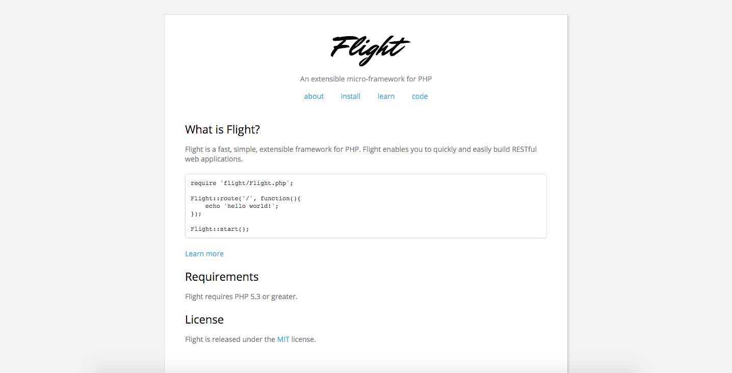
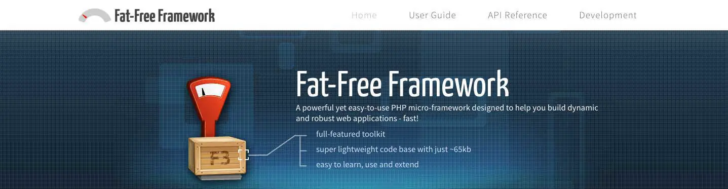
Fat-Free weighs in at under 50KB. It is a powerful yet easy-to-use PHP micro-framework designed to help you build dynamic and robust web applications – fast!
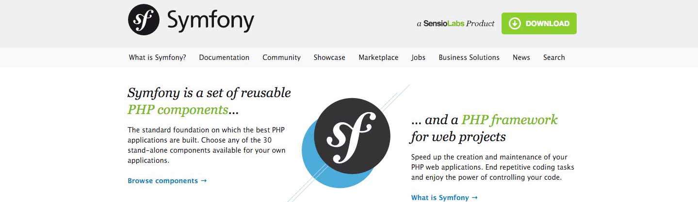
Symfony can be a great foundation on which you can build some of the best PHP applications. It lets you choose from any of the 30 stand-alone components available for your own applications.
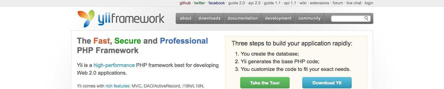
YiiFramework isn’t for beginners, as it is a high-performance PHP framework best for developing Web 2.0 applications. It is packed with rich features: MVC, DAO/ActiveRecord, I18N/L10N, caching, authentication and role-based access control, scaffolding, testing, etc.
Based around the geometry of a circle, the simple shapes create a modern aesthetic that evoke the near-future. Perfect for sci-fi, electronic music, or company branding, the typeface is clean, while being packed with character.
The distinct descenders on the lowercase ‘g’ and ‘y’ extend into the glyphs’ counters creating an underlying feeling of motion and energy.
Ideal as a display face, Solaris Eclipse offers designers an original geometric sans that brings with it a distinct tone of voice.
The font comes with dozens of analphabetics, making it suitable for most European languages. It comes in both regular, and bold weights. And it’s free for personal use. Download the files beneath the preview:
Please enter your email address below and click the download button. The download link will be sent to you by email, or if you have already subscribed, the download will begin immediately.
When working in a team, it’s important to stick to rules. A common challenge is to build all your projects with a similar or the same toolset and coding guidelines. Only yesterday I discussed how we could port over a project that outgrew its initial codebase over the years to a fresh, React.js-based source code.
The decision for this wasn’t easy, since we had invested quite a lot of work and money into this project already, and a move to React would require quite some time, too. But since the switch makes sense from a technical perspective and the team is already using React for three other projects, we concluded that this would be a good step to do. It will enable more developers of the team to contribute to the project, to review code and to reduce the shift of technologies in the company. Occasionally, it’s time to re-evaluate your projects and move on.


