Archive

Archive for August, 2015

Guide to Creating a Perfect Responsive WordPress Theme

August 31st, 2015 No comments
00-featured-responsive-wp

WordPress is remarkably popular, scalable, open-source and affordable CMS/blogging system. The vast majority of people are creating their websites on WordPress because it offers striking plugins and themes. In fact, both big and small businesses are using WP sites to boost their productivity and increase their ROI.

But with time it becomes necessary to design a website that not only run smoothly on desktop but also on different mobile devices. Thus, the need is increasing for more sublimely well-coded WordPress themes that run fluently across all devices. And this can be achieved by creating an impeccable responsive theme.

Creating and developing a fully responsive mobile-friendly theme is not an easy task. Therefore we bring you some tips to help in developing perfect WP responsive theme.

Preparation & Planning

At first you should have a detailed design concept for a responsive WP theme than for a static-width theme. In this stage you can craft new ideas for creating an impeccable and practical layout that can run smoothly on multiple screens.

Scrutinize what you want with your WordPress theme and which type of user-groups you’re targeting. Deliberately understand their needs and requirements and then you can add a list of useful aspects for your layout.

With a list of features you can design your theme by roughly sketching the layout at several screen sizes.

While drawing be aware that the layout widths you select are only rough reference used to display the screen sizes of the current desktop computer, smart phones and tablets.

Your objective is to create a top-notch responsive design that adjusts smoothly to assorted screen sizes. You can also consider layout options that you want to add into the theme, such as sidebar and header options or multiple widget areas.

Essential Tools Required for Concept Sketching

You can choose a tool for concept sketching that enables you to work efficiently and quickly, without any interruption.

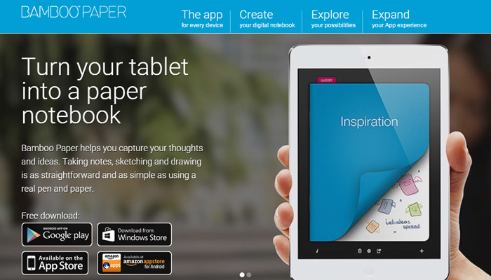
You can also sketch the theme’s concept on the notebook, or on a piece of a paper.

If you want to try sketching on an iPad you can download popular applications like Paper or Bamboo Paper, along with a digital pen such as Bamboo Stylus.

bamboo paper homepage

Developing a good concept will save a lot of time and effort in the further development process. If you have created an influential theme concept, then the layout will easily adapt to multiple screen sizes.

Theme-Specific Challenges

Creating a WordPress theme with very flexible content is a pretty different challenge than creating a static site. At this stage you should search out solutions to the following theme-specific issues:

1. Responsive Layout Options

Many WordPress themes offer several layout options such as header widgets, left or right sidebar and footer elements, etc. In order to provide these sort of options in the responsive theme you need to consider how all the layout aspects will behave on assorted screen sizes.

For example, if you want to provide a right sidebar option consider that this sidebar’s content would display the main content area on mobile phones.

This would not be the best solution because mobile visitors want to read the most important content first like the latest blog. So plan your ideas accordingly.

2. Navigation Menus

Most themes seem to depend on good traditional drop-down menus with an objective to give multi-level navigation to website users.

But drop-down menus won’t work on touch devices because they usually rely on mouse hovers. Therefore you need to introduce some excellent solutions for developing responsive navigation.

Each solution will be different based on your site so try different approaches.

3. Malleable Widget Areas

Another problem in responsive theme design is widget areas. Obviously it’s difficult to design the layout if you exactly don’t know what type of content will be added by the user. In that case you need to consider that your design works well no matter how many widgets will be used in the widget areas.

How to Work with Reference Points?

We know that the process of designing is executed to find out the visual appearance and feel of the theme. In this process you should also work more deeply on the problems or challenges that are mentioned above.

The design for further development will rely on the project’s nature and how closely you are working with the developer.

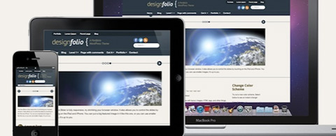
It’s good to showcase your design in the three layout versions i.e., desktop, smartphone and tablet.

Designing factors like white space, font sizes and button styles can be determined later directly in the browser. This is because browsers evaluate these factors differently.

Create a Design for Touch Devices

Your design will also run on touch devices so you have to figure out the special needs of such devices. There is a huge difference in using a finger to navigate a site than using a mouse cursor.

Form input fields and buttons need to be fixed in the right size. In fact, font sizes and white space should also be applied more deliberately. This can allow users to navigate the site easily.

It is important to stay connected with the developer during the designing and development process. When you create a responsive design it becomes more essential to incorporate the developer’s knowledge into your decisions.

Development Process

After completing the design process you need to decide whether to code the theme from scratch, or to use a starter or blank theme such as Toolbox.

If you want to work with the most robust and popular responsive theme like ZURB’s Foundation or Twitter’s Bootstrap then you could use a starter theme as it already includes the framework, such as BootstrapWP.

An intelligent decision is to design and develop for the smaller layout first like Smartphones. After that you can work on tablet and desktop screen sizes.

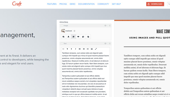
Consider Images in a Responsive Theme

High pixel density devices like the new iPad and Macbook Pro enable you to reconsider the images in your theme.

You can use CSS base64 or use icon fonts as alternatives to images. Very few images will also display in much more lightweight theme that will speed up performance even on slow mobile internet connections.

Support Media Queries in Old Browsers

With the Smartphone layout you need to depend on JavaScript solutions like Respond.js with an objective to support media queries in old browsers such as IE 7 and 8.

However you can insert CSS classes for old browsers through conditional comments, and then add CSS styles to define a maximum width for old IE browsers outside of media queries.

Time to Test your Work

After developing a responsive theme you’ll be required to test your work as quickly as possible. You can instantly correct styles during the development process.

You can also cross-check whether fonts are readable or not; whether images, videos and gallery sliders are working fine on multiple devices or not.

Certainly cross-checking your theme on different screen resolution testing tools can also be beneficial.

Testing the theme during development can be a big challenge for a developer. It is not always possible for you to test your theme on all devices. In that case you could ask friends or coworker to help you test on their devices if possible.

Many website owners are making their site compatible for all devices, and with the help of responsive web design you can make your site scalable for all devices be they desktop, laptop, smartphone or tablet.

Author Bio: Tracey Jones is an experienced WordPress Developer at WPGeeks Ltd. She is an expert of HTML Website to WordPress theme conversion with proven track records. Apart from development, she enjoys writing WordPress tutorials. Follow her company on social networks like Facebook and Google+.

Read More at Guide to Creating a Perfect Responsive WordPress Theme

Categories: Others Tags:

5 Sublime Text Plug-ins for Frontend Development

August 31st, 2015 No comments
00-featured-sublime-text-plugins

Every developer knows that workflow automation is extremely important to web development. Luckily there are tons of programs built around this concept of automating workflow.

In this article I’m going to talk about several plug-ins that have been created for Sublime Text 2, which is one of the most popular text-editors available. I want to quickly note that any plug-ins running on Sublime 2 should install perfectly in Sublime 3+. So without further ado, let’s take a look at some of these plug-ins and see how they can improve your efficiency when programming.

Package Control

sublime text package manager plugin

Package Control is essential for anyone using Sublime Text 2. It allows you to easily look up and install packages for Sublime Text 2.

Without this plug-in you would have to manually download and install plug-ins – but package control saves the day by providing an easier way for installation.

Emmet

Emmet is an extremely helpful toolkit for frontend developers. It allows you to quickly generate snippets of code.

For example, the code ul>li*4>a would generate an unordered list containing 4 anchored list items. The Emmet toolkit also provides the ability to move around throughout code seamlessly using keyboard shortcuts.

HTMLPrettify

When working on a big project, files can become cluttered with non-semantic code very quickly. In turn, these files become harder to maintain as this clutter makes it harder to find errors.

With the help of HTMLPrettify your code will automatically be formatted(or beautified) so that you can navigate easily. Although its name suggests otherwise, HTMLPrettify is not limited to HTML files. It can be used to “prettify” JavaScript, CSS, and JSON files as well.

ColorPicker

sublime text plugin colorpicker

Colorpicker is a plug-in built for generating hex values for your css files. Having to constantly look up different hex codes can be a pain, so ColorPicker provides you with a color wheel where you can choose a color.

Once you’ve chosen your desired color the Colorpicker plug-in will automatically generate the corresponding hexadecimal value.

AllAutocomplete

Next is the AllAutocomplete plug-in. Sublime Text automatically looks throughout individual files for repeated words; AllAutocomplete takes it one step further and searches through every file of your project so you don’t have to write out the same words over and over again.

HTML5 Boilerplate

It can be a pain to manually write all of the tags necessary to get started with an index.html file – however they are the basis of all web apps.

In an attempt to automate this process the HTML5Boilerplate plug-in was created. It generates an HTML5 template with all the tags necessary to get up and running. All you have to do is create an html file, type htmlboiler, hit tab & your barebones HTML5 boilerplate file will appear.

And there you have it! My list of Sublime Text 2 Plug-ins.

Although these will undoubtedly help your performance, definitely check out what other Sublime plug-ins have to offer. You surely will not be disappointed.

Read More at 5 Sublime Text Plug-ins for Frontend Development

Categories: Others Tags:

DIY Priority+ Navigation

August 31st, 2015 No comments

We’ve written a bit about the Priority+ pattern here before. Here’s a bunch of real world examples. I needed to use it recently. I found Gijs Rogé’s priority-navigation. It’s pretty nice: no dependencies, clean code, fairly configurable and designable. It’s not particularly small though, and there is a good amount of it defining helper functions. I was in an environment that had all that stuff available and so I figured I’d take a crack at a version.

Technique: Test if Elements Have Wrapped

See the Pen Priority Nav via Wrapping/jQuery by Chris Coyier (@chriscoyier) on CodePen.

This version has jQuery (for DOM easiness) and Lodash (for debouncing) as dependencies. Those are far from insignificant, and you wouldn’t probably add them just for navigation, but my project had them available.

I also took a slightly different approach than I’ve seen in other takes. Rather than measure the available width and the width of each menu item to see if they will fit or not, I just let the menu items wrap. When the window is resized, I check the position of the elements and if I can tell by their position that they have wrapped, they go into the overflow. So you never really see any wrapping. (If your menu items can wrap, you probably don’t need Priority+.)

Of course there is work to be done. With the information about which items should be in the overflow, I needed to clone them over there. And be ready to do it all over again when the window resizes, but not too quickly (hence the debouncing).

Technique: Measure Widths

The technique I see more commonly is to measure widths and make choices based on those widths. Johan van Tongeren has a version of that:

See the Pen Responsive horizontal menu by Johan van Tongeren (@Dreamdealer) on CodePen.

The code is quite short. Measure the available space and space needed by the elements. If there isn’t enough space, pluck one off into the overflow and try again. It seems like a lot of calculation, especially the recursion and that it’s not debounced, but hey it seems to run pretty ok.

Luke Jacksonn has written a version in a simliar fashion:

See the Pen Greedy Navigation by lukejacksonn (@lukejacksonn) on CodePen.

Technique: Choose Overflow Items Ahead of Time

Michael Scharnagl has a demo that needs to JavaScript at all.

It uses the :target selector to hide/show a set of links. He uses alpha/beta/gamma classes on the links in conjunction with media queries to show more/less of them at different screen widths.

The Point

Uhm. I guess it’s that you can always snag someone else’s code to get something done. Very often that’s a good idea. But sometimes it’s fun to dig in a little and try to write it yourself and explore other possibilities. I’m not sure my version is any better (it’s not), but I learned about the problem and different possible approaches.


DIY Priority+ Navigation is a post from CSS-Tricks

Categories: Others Tags:

Tools & Resources for Creating Seamless Patterns

August 31st, 2015 No comments
01-camping-night-pattern

It takes real skill to create a usable design from nothing but imagination. However the creative part is only the first half of the puzzle – the rest is figuring out how to technically create your idea.

Programs like Photoshop and Sketch are industry standards and once you learn how to use them you’ll command immeasurable power over your creative ideas.

If you’ve never created seamless patterns before then you may feel intimidated by the whole process. Luckily there are some exciting new tools and plugins which offer assistance to interface designers. I’ll offer a few tips for getting started with patterns & free resources to get you moving on the right path.

Tileable Icons vs. Textures

It should be noted there’s a difference between a tileable pattern & tileable texture. Most textures are manipulated from photographs or scanned images of real-life textures. This is because it’s incredibly hard to manifest realistic textures armed only with a graphic design program.

Alternatively tileable icons can be made with only digital tools. If you know how to create illustrations, icons, and/or graphics then you can pair them together into a seamless tile.

Both types of patterns can work great in different situations. Each project will call for different styles and as the designer you should be able to create any of them.

As you might imagine, it’s technically easier to create a repeating texture than icons. Not everyone is a good illustrator and thus may not be able to create the icons at all, let alone create a seamless tile from them.

But you can also work with free patterns to get started and learn how they’re built. It takes a little perspicacity to understand pattern design but with great examples you can get there.

free watercolor texture

The important thing to remember is that tileable patterns come in a few different styles. You should try to learn them all but when first getting started you really should focus on 1 particular style – and most of the time it’s easiest to stick with textures.

Digital Textures

Not every designer is a photographer so it’s not always easy to come across usable license-free images. Alternatively if you have textures lying around the house you could try scanning them into your computer.

But perhaps the quickest way to access digital textures would be through a photo library. Professional photographers often grab shots and sell them to premium libraries for designers to purchase and use in their work.

One of the most recent libraries is the Adobe Assets collection released alongside Creative Cloud. It’s only been around for a couple years but contains a voluminous collection of environments, people, animals, and certainly textures.

creative cloud photo assets library

If you purchase these photos with full rights then you can use them however you see fit. Many designers will create a “textures” folder on their computer full of usable texture images.

Designers who aren’t photographers should really consider using a texture library. Texturevault is another great resource for premium items.

find a photo texture

But if you’re stretched for cash take a look at the free photo engines like FindA.Photo or Pexels. Quantity may be limited but you have a good chance of finding something that works under an open source CC0 license.

Online Pattern Generators

Some very simple patterns can be generated without the need for photographs or icons. One particular example is the Noise Generator webapp that generates a tileable color with digital noise added into the mix.

noise texture generator webapp

It’s completely free and can be a little easier than making this same pattern in Photoshop. Since the tile is pre-built to repeat seamlessly you don’t need to make any last-minute adjustments.

A very similar web application is Noise PNG which generates dynamic noise and shows a preview on the screen. It behaves almost identically to Noise Texture Generator so you can’t go wrong with either one.

bg patterns webapp

Moving into the iconographic side of things we have BG Patterns. This free webapp can be used to style dynamic patterns including icons, illustrations, and even photographs.

It’s not the easiest thing to use but once you get the hang of how it works you’ll be amazed at what’s possible.

But perhaps one of my favorite go-to webapps is Stripe Generator. It’ll create striped tiles at various orientations, sizes, and colors.

stripe generator webapp

It’s completely free and very easy to use.

A slightly more complicated app named Patternizer follows a similar methodology. Patternizer has a few more settings and thus it’s a tad more complicated. Overall these are both terrific choices if you need a quick striped pattern in a hurry.

Designing Patterns from Scratch

If you really want to learn the technical skills then you’ll need to practice. This may present a problem to newbies considering they don’t have the necessary skills to practice.

The solution is to follow online tutorials and learn from other professionals. Most tuts use the Adobe software using either Photoshop or Illustrator.

Photoshop is more for textures and custom FX applied to bitmap images while Illustrator is made for icons and vector patterns.

You may prefer one style over the other but you should study both to develop competency as a skilled graphic designer.

Photoshop Tutorials

If you want to start with Photoshop then follow along with any of these tutorials that catch your attention. Some work with illustrated elements but others rely on filters and textured photos.

Seamless Grunge Texture

photoshop seamless grunge texture

Repeating Pattern

repeating texture pattern pscs6

Filter Offset in Photoshop

cs6 ps howto offset texture

Illustrative Seamless Pattern

seamless vector illustration pattern

Abstract Pattern

photoshop create an abstract pattern

Illustrator Tutorials

Adobe Illustrator was basically made for vector work. Since the canvas size is malleable it works great for custom-made patterns. If you already have illustration skills then try following these tutorials which focus your energy beyond illustration and into seamless pattern generation.

Honeycomb Pattern

vector honeycomb pattern

Children’s Animal Pattern

animal vector pattern tutorial

Seamless Wicker Pattern

illustrator wicker pattern howto

Cute Winter Pattern

cute seamless winter graphics pattern

Practice Makes Perfect

If there’s one true maxim of creative work it’s that practice makes perfect(or as my art teacher says, practice makes permanent). The more you practice the more you’ll screw up but you’ll also learn along the way. Stick with it and over time you’ll be creating patterns the same way you sleep or breathe: passively and involuntarily.

Read More at Tools & Resources for Creating Seamless Patterns

Categories: Others Tags:

The quick guide to getting started with Ghost

August 31st, 2015 No comments

You’ve probably heard of Ghost, the new-ish blogging platform that’s taken the blogging world by storm; it’s simple, it’s sleek, it’s sexy; it’s got that live-preview thing. What’s not to like?

I’m moving to Ghost, like many web designers, from a WordPress background. But before I actually managed to wrap my head around WordPress‘ template functions, I had tried dozens, possibly hundreds, of CMS options. Some of the more memorable include ExpressionEngine, Textpattern, the ill-fated FrogCMS, an old, old script called CuteNews, and many more.

For a long time WordPress gave me everything I needed: powerful template functions; an endless supply of plugins; just seeing what I could do.

But WordPress has been a heck of a lot more than a blogging engine for some time now. It’s moving steadily toward the realm of the framework in some ways. A publishing framework, if you will.

I’ve reached the point where I want software that blogs, and that’s it. I want to write my posts in Markdown, type in some keywords, add an image or two, and hit publish, then forget about the whole thing.

Enter Ghost

Turns out I’m not alone in my desire for a dead-simple blogging platform. The creators behind Ghost have gone to great lengths to strip out all of the cruft we’ve added to the blogging process, and build a simple, speedy publishing platform that will get the job done. It’s a whole different beast.

It operates on the philosophy that a CMS for blogging should do one thing, and do it well. You won’t see any magazines launched on this platform without a lot of customization. It’s a blog, and turning it into anything else would sort of defeat its purpose.

Then, there’s the fact that it’s built on new technologies. Ghost is built on Node.js, which executes JavaScript code on the server rather than in the browser. It is loved by the same people who love PaaS hosting, and all of these new systems that people like me are struggling to understand. In a sense, it’s been future-proofed from the get-go. It’s part of the first generation of a new breed of CMS.

Mind you, from the blogger’s perspective, it’s just a simple interface for blogging. From the end user’s perspective, nothing’s really changed except maybe the default blog theme looks a bit “flat”. But under the hood, we’re seeing something totally new, and that’s a good thing.

Installing Ghost (the easy way)

Installing Ghost the easy way.

Typically, you’d have to install a component or two separately to get Ghost installed and running on a local machine. You’d have to install Node.js, and then you’d have to go in and start installing some extra Node packages manually from the command line.

That’s right, the typical setup for Ghost requires using the command line. For people more used to WordPress’ “five-minute setup” process with MySQL databases and a graphical installer, this may be uncomfortable.

It could be a pain in the neck if you’re not used to using the command line on a Mac or Linux machine.

Luckily, the kind people over at Bitnami made graphical installers for Windows, Mac, and Linux.

Here are all of the steps you’ll need to follow:

  1. Download the appropriate installer for your OS here: https://bitnami.com/stack/ghost/installer
  2. When you run the installer, provide the following information: where you want it installed, what login info you want to use for the blog, and what IP address you want to use for testing. (I recommend 127.0.0.1.)
  3. Run the thing, and start playing. It comes with a cool control panel, and a start menu entry.

Since the installer provides you with all of the components you’ll need, such as Node.js and a mini-server, the file directory is not exactly straightforward.

You’ll need to open up whatever folder you installed Ghost in, and then navigate to apps/ghost/htdocs/. That’s the actual Ghost installation.

The themes are located in apps/ghost/htdocs/content/themes/.

Making a theme for Ghost

Ghost themes are fairly easy to make, as long as you know HTML and CSS. Programming knowledge is helpful, but not strictly necessary. Ghost’s templating system is simple, and even rather intuitive, if you’ve built themes for WordP… ahem, other CMSs before.

I know, I know. The comparison to WordPress is old. But that one bit of software has dominated the market for years now — much like Photoshop has for images — the comparisons are inevitable. In this case, they’re even useful.

People who have built WordPress themes will find some of the file structure and templating language to be familiar, though much simpler. WordPress’ PHP functions give you a lot of flexibility; but they also complicate the theme coding process.

Ghost’s templating system (built with Handlebars), is semantic, powerful, and a lot more readable than the raw PHP functions that we’re used to working with. Personally, I just find it a lot easier to use.

On the other hand, it is meant purely for building blogs. You won’t be building a hybrid news site/social network/forum with this thing. Simpler, but limited. That’s the trade-off inherent in the entire platform.

Creating a basic theme for Ghost.

Setting up your theme

Now, if you’ve watched the video (you really should), you’ll know the very basics. You’ll have your Ghost installation in development mode, and you’ll have a very, very limited theme to work with.

To recap, technically you only need three files to make a Ghost theme:

index.hbs (This template will list your posts)
post.hbs (This will display a single post)
package.json (This contains theme information)

However, there are other basic templates that you probably want to include. You can, of course, create custom templates for pages, posts, authors, tags, and more. We’ll get to all of that over time.

For now, I want to focus on only the basics: theme structure, extending template files, and where to put all of the HTML. This means adding some extra files and folders to our Ghost theme up there. Let’s have a look at the revised structure:

default.hbs
index.hbs
page.hbs
post.hbs
package.json
assets/
    css/
    images/
    javascript/
partials/ (Just examples, here. Not required.)
    navigation.hbs
    loop.hbs

default.hbs will act as the basis of your theme. Your , , and tags will go here. Every other template will be rendered ‘inside’ of this one. Now, you don’t have to do it this way; but it is standard practice, and comes highly recommended by the Ghost devs themselves.

page.hbs is exactly what you think it is, the template for static pages. The assets folder is fairly self-explanatory.

The partials/ folder is where you would keep bits and pieces of code that you use more than once, on various templates. For example, navigation.hbs might include your site name/logo and primary navigation. loop.hbs might output a list of posts with some generic HTML and styling. This could be used in a number of places on the site.

Mixing Handlebars and HTML

So let’s show you exactly how simple the templating can be. First, we’ll set up our default.hbs file:

<!DOCTYPE html>
<html>
<head>
    <meta charset="utf-8" />

    {{! Here we see the functions for page titles and descriptions. }}
    <title>{{meta_title}}</title>
    <meta name="description" content="{{meta_description}}" />
    <meta name="viewport" content="width=device-width, initial-scale=1.0" />
    {{! Anything in the assets/ folder can be easily linked to, like so: }}
    <link rel="stylesheet" type="text/css" href="{{asset "css/style.css"}}" />

    {{! This function here outputs meta keywords, some styling information, stuff like that. }}
    {{ghost_head}}
</head>
<body class="{{body_class}}">
    <div class="wrap">
      {{! Any .hbs file in the partials folder can be called in like this. }}
      {{> header}}

      {{! This is where the content of all the sub-templates will be output. }}
      {{{body}}}

      {{! Like ghost_head, this outputs scripts, data, that sort of thing. Currently adds a link to jQuery by default. }}
      {{ghost_foot}}
    </div>
</body>
</html>

Now let’s create the navigation.hbs template, because that’s going to be on every page:

<header id="page-header">
    {{! This should be fairly self-explanatory. }}
    <h1>{{@blog.title}}</h1>
    
    <nav>
        <ul>
            {{! This function calls in the navigation links, which can be managed in the Ghost admin panel. Note that the template *must* be called "navigation.hbs" for this to work. }}
            {{#foreach navigation}}
                <li class="nav-{{slug}}{{#if current}} nav-current{{/if}}" role="presentation"><a href="{{url absolute="true"}}">{{label}}</a></li>
            {{/foreach}}
        </ul>
    </nav>
</header>

Now we create the loop to display excerpts of the posts. To be honest, I ripped this one (almost) straight from the default theme, because the markup is perfect for what I have in mind. Put all of this in partials/loop.hbs:

{{! Each post excerpt will be displayed with this same markup. }}
{{#foreach posts}}
    <article class="excerpt {{post_class}}">
        <header>
        <h2 class="post-title"><a href="{{url}}">{{{title}}}</a></h2>
        </header>
        <section>
            {{! The actual excerpt. Not the variable that allows you to call in exactly as many words as you want. }}
            <p>{{excerpt words="26"}} <a class="read-more" href="{{url}}">&raquo;</a></p>
        </section>
        <footer>
            {{! This is the post's meta information. }}
            {{author}}
            {{tags prefix=" on "}}
            <time class="post-date" datetime="{{date format='YYYY-MM-DD'}}">{{date format="DD MMMM YYYY"}}</time>
        </footer>
    </article>
{{/foreach}}

{{! Links to the next and previous pages of links. You can define how many links are on each page in the admin panel. }}
{{pagination}}

Now we’re going to tie it all together with the index.hbs template, which will also act as the home page, unless you specify otherwise. The code for this, seeing how we’ve divided and organized most of the HTML elsewhere, is very simple:

{{!< default}}
{{! That isn't a comment up there. It tells Ghost that everything on this page must be rendered inside the default.hbs template.}}

<section class="posts">
    {{! This next function can be used to call in anything in the partials/ folder. In this case, we're calling up everything we just put into "loop.hbs". }}
    {{> loop}}
</section>

Conclusion

And that’s it. Told you it was simple!

If you have trouble, check out Ghost’s default theme, and the documentation. Play with the HTML, play with the template system, and start styling your theme.

Next time, we’ll dig a little deeper. In the meantime, have fun!

Featured image uses Ghost image via Shutterstock.

150 Retro, Vintage Vector Illustrations – only $9!

Source

Categories: Others Tags:

Desktop Wallpaper Calendars: September 2015

August 31st, 2015 No comments

As designers we usually turn to different sources of inspiration, but, well, sometimes the best inspiration lies right in front of us. With that in mind, we embarked on a special creativity mission seven years ago: to provide you with inspiring and unique desktop wallpapers every month. Wallpapers that are a little more distinctive than the usual crowd and that are bound to fuel your ideas.

Desktop Wallpaper Calendars: September 2015

We are very thankful to all artists and designers who have contributed and are still diligently contributing to this mission, who challenge their artistic abilities each month anew to keep the steady stream of wallpapers flowing. This post features their artwork for September 2015. Both versions with and without a calendar can be downloaded for free. It’s time to freshen up your desktop!

The post Desktop Wallpaper Calendars: September 2015 appeared first on Smashing Magazine.

Categories: Others Tags:

28 Graphic Design Podcast Homepages

August 30th, 2015 No comments
04-pencil-vs-pixel-website.jpg

Those who love design are willing to follow in the footsteps of greats who came before. Podcasts are an excellent way to pick up information from these greats – but the podcasts themselves are only audio. As designers we care deeply about the packaging and its shiny little red bow.

In the realm of web design that packaging is the website itself, and the bow is all the little graphics and textures on top. Design podcasts are full of great content but many of them also run beautiful websites. This gallery focuses on the well-designed websites of design podcasts. The topic may seem a little redundant but it’s also revitalizing and riveting for podcast creators.

Working Out

Read more…

Categories: Others Tags:

Landing Page Designs for CMS Engines

August 30th, 2015 No comments
00-fork-cms-illustrated-landing-page

Content Management Systems range from Python/Django to PHP and Ruby on Rails. This wide level of diversity is naturally emerging from the rapid growth of open source web development. Nowadays you have a whole litter of options beyond just WordPress to use for any website project.

I’ve compiled a handful of amazing CMS websites based on their content and style of design. This gallery focuses mostly on the homepage design for CMS engines. Whether you’re designing a new open source framework or want to build your own CMS from scratch, these examples can help you design a fantastic layout that matches perfectly with your project.

Fork CMS

ProcessWire

processwire open source cms

Light CMS

light cms open source homepage

Squarespace

squarespace cms homepage layout

Dropkick CMS

dropkick cms open source engine

Umbraco

umbraco open source cms

Invision Power

ipb ips invision power services

Vanilla Forums

vanilla cms forums open source

DotNetNuke

asp dot net dnn cms

Nuxeo

nuxeo cms open source homepage

Ghost

ghost blogging platform cms

Percussion

percussion cms design

Mura CMS

mura cms open source project

Concrete5

concrete5 cms open source

Composite

composite c1 cms open source

Craft

craft cms homepage

BigTree CMS

bigtree cms homepage design

SilverStripe

silver stripe homepage fullscreen cms

Read More at Landing Page Designs for CMS Engines

Categories: Others Tags:

Popular design news of the week: August 24, 2015 – August 30, 2015

August 30th, 2015 No comments

Every week users submit a lot of interesting stuff on our sister site Webdesigner News, highlighting great content from around the web that can be of interest to web designers.

The best way to keep track of all the great stories and news being posted is simply to check out the Webdesigner News site, however, in case you missed some here’s a quick and useful compilation of the most popular designer news that we curated from the past week.

Note that this is only a very small selection of the links that were posted, so don’t miss out and subscribe to our newsletter and follow the site daily for all the news.

UI Movement – The Best UI Design Inspiration, Every Day

Adobe Drops Fonts, Leaves Users Stranded

Why the Confirm Password Field Must Die

Rucksack – A Little Bag of CSS Superpowers

The Future of Layout with CSS: Grid Layouts

Why Introverts Make Great Entrepreneurs

Better Image Borders with Blend Modes

Simplify your Projects by Using a UX Checklist

Why Banksy’s Dismaland is Better than You’d Ever Expected

Google has Secret Interview Challenges Based on your Search History

Bernie Sander’s 404 Page

“Pixar in a Box” – How Pixar Uses Math to Make Movies

The Problem with Problems

Guidelines for Letter-spacing Type

Don’t Be Apple

Design Solutions: Placeholder Avatars

Busting 9 UX Myths like a Boss

Acorn 5 – The Image Editor for Humans

Thinking Outside the Square: Landscape and Portrait Formats on Instagram

Facebook Launches M, its Bold Answer to Siri and Cortana

McDonald’s Politely Declines Burger King’s Offer of World Peace

A Former Google Exec on How to Make Tough Decisions Quickly

In Less than Two Years, a Smartphone Could Be your Only Computer

What it Looks like to Use the Internet for the First Time

An Honest Guide to the San Francisco Startup Life

Want more? No problem! Keep track of top design news from around the web with Webdesigner News.

150 Retro, Vintage Vector Illustrations – only $9!

Source

Categories: Others Tags:

Pepsi’s Diverse Homepage Layout Design

August 29th, 2015 No comments
00-featured-pepsi-homepage

While sifting through websites of popular companies I happened upon Pepsi. Their layout is somewhat strange and initially caught my eye in an uncanny manner.

Most large corporate websites offer a direct connection to recent news, corporate info, products, marketing tools, or similar features.

But the Pepsi Co homepage feels shuffled up and almost chaotic. It’s a rather daring approach from such a large soft drink vendor and I’d like to explore their website to see if it can match up with such a big name corporation.

Block-Level Grid Layout

The first thing you’ll notice is that the layout breaks down into a square grid. This behaves almost like a Masonry grid featuring squares & rectangles of varying widths connected together in a seamless pattern.

At first glance the design looks cacophonous. Lots of varying colors, shapes, and font sizes lead the eye all over the place. But when you actually focus on individual items you’ll find product advertisements, tweets, and photos shared on social media.

It seems Pepsi’s homepage is meant to be a connecting driver between consumers and the corporation itself. I’m not saying this is a good or bad thing – but it certainly deviates from the norm of large corporations.

When hovering over different areas you’ll spot tiny animation effects. These almost feel out-of-place but they match with the layout’s sense of discord.

I have to say that my immediate reaction is to leave the site. Pepsi does not make a good first impression with such a chaotic design style.

But if you stick around and try interacting with the content you may find yourself lost in the wall of Pepsi media & branding.

Fixed Side Navigation

Another thing that makes this layout unique is the aligned sidebar navigation. There are only a handful of links that each lead to larger flyout menus.

pepsi vertical flyout menu

Everything is animated which in my opinion is a tad annoying. The animations are smooth and look great, but feel somewhat unnecessary. The site is already rather hectic and the delayed animations only draw out more discontent.

The strange thing is that all nav links seem to run with dynamically-generated text; that is to say all text seems graphical rather than textual. The navigation doesn’t follow many traditional rules for for web performance & semantics.

Also the real corporate links are only crammed into the bottom of the page. Not exactly the worst place, but still a rather confusing location if you’re digging for important corporate info like careers or contact details.

pepsi website footer links 2015

While Pepsi’s layout is unique and certainly eye-catching it does not deliver the most exhilarating experience. I’ve gotta give points for diversity – but on the topic of interface design, usability trumps diversity every time.

Fractured Content

It seems that most pages in the site break off and fracture from the home layout. The Pepsi Shop is found on its own domain, jobs/careers have their own page, and the Pepsi products just link out to Facebook.

The content structure feels fragmented with so many paths diverging from the original layout.

Delineation is a crucial part of good website navigation. If visitors don’t know how to delineate their actions, then they really don’t know how to do anything.

When people visit Pepsi’s website what are they trying to do? And does this layout actually help them get any of that done?

From my brief experience I’d have to say no, or at least not easily.

The odd design and customized navigation stands out on aesthetic principle but at the expense of clean, stable usability.

Risky or Rewarding Design?

One thing Pepsi does right is the branding. Colors, imagery, and typography seem to match up in a way that clearly demonstrate it’s Pepsi’s website.

The problem is that almost everything else drives a sense of confusion whereby visitors are desperate to find some equanimity. This is never a good thing in any website design.

Interfaces should be immediately obvious – you look at them and just instinctively know what to do. Branding and colorful design aesthetics can only go so far. I’m not sure this design actually harms Pepsi’s image, but I can’t say it helps a lot either.

All-in-all I give credit to Pepsi for daring to style their layout in such a bold way. However from a practical standpoint it’s really not the best option and certainly doesn’t lead me to investigate the site any further than a morsel of the second.

If there’s anything to learn from Pepsi’s website it’s that user experience should always come first.

Read More at Pepsi’s Diverse Homepage Layout Design

Categories: Others Tags: