Memories Of August (2022 Desktop Wallpapers Edition)

Everybody loves a beautiful wallpaper to freshen up their desktops and home screens, right? To cater for new and unique artworks on a regular basis, we started our monthly wallpapers challenge more than eleven years ago, and from the very beginning to today, artists and designers from across the globe have accepted the challenge and submitted their designs to it. Just like this month.
In this post, you’ll find their wallpapers for August 2022. All of them come in versions with and without a calendar, so no matter if you need to count down the days to a big deadline (or a few days off, maybe?) or plan to use your favorite wallpaper even after the month has ended, we’ve got you covered. A big thank-you to everyone who shared their designs with us — we sincerely appreciate it!
As a little bonus goodie, we also added some “oldies but goodies” at the end of this post, timeless wallpaper treasures that we rediscovered way down in our archives and that are just too good to be forgotten. Now there’s only one question left to be answered: Which one to choose? Happy August!
- You can click on every image to see a larger preview,
- We respect and carefully consider the ideas and motivation behind each and every artist’s work. This is why we give all artists the full freedom to explore their creativity and express emotions and experience through their works. This is also why the themes of the wallpapers weren’t anyhow influenced by us but rather designed from scratch by the artists themselves.
- Submit a wallpaper!
Did you know that you could get featured in our next wallpapers post, too? We are always looking for creative talent.
Swimming In The Summer
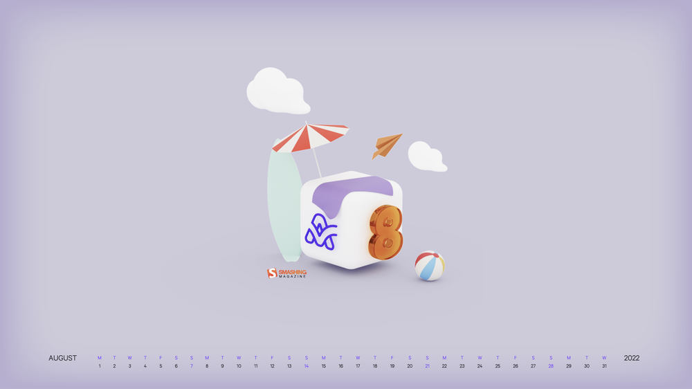
“It’s the perfect evening and the water is so warm! Can you feel it? You move your legs just a little bit and you feel the water bubbles dancing around you! It’s just you in there, floating in the clean lake and small sparkly lights shining above you! It’s a wonderful feeling, isn’t it?” — Designed by Creative Pinky from the Netherlands.
- preview
- with calendar: 320×480, 640×480, 800×480, 800×600, 1024×768, 1152×864, 1280×720, 1280×800, 1280×960, 1280×1024, 1400×1050, 1440×900, 1600×1200, 1680×1050, 1680×1200, 1920×1080, 1920×1200, 1920×1440, 2560×1440
- without calendar: 320×480, 640×480, 800×480, 800×600, 1024×768, 1152×864, 1280×720, 1280×800, 1280×960, 1280×1024, 1400×1050, 1440×900, 1600×1200, 1680×1050, 1680×1200, 1920×1080, 1920×1200, 1920×1440, 2560×1440
Vacation Vibes
“Is the time crawling by you’re eagerly awaiting your vacation? Or you’re back in the office, reminiscing the sweet feeling of freedom? Never mind, because our desktop calendar is here to bring a vacation vibe to your life throughout the entire August.” — Designed by PopArt Studio from Serbia.
- preview
- with calendar: 320×480, 640×480, 800×480, 800×600, 1024×768, 1024×1024, 1152×864, 1280×720, 1280×960, 1280×1024, 1366×768, 1400×1050, 1440×900, 1600×1200, 1680×1050, 1680×1200, 1920×1080, 1920×1440, 2560×1440
- without calendar: 320×480, 640×480, 800×480, 800×600, 1024×768, 1024×1024, 1152×864, 1280×720, 1280×960, 1280×1024, 1366×768, 1400×1050, 1440×900, 1600×1200, 1680×1050, 1680×1200, 1920×1080, 1920×1440, 2560×1440
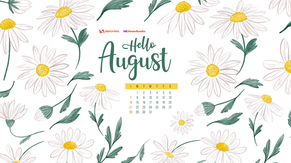
Subtle August Chamomiles
“Our designers wanted to create something summery, but not very colorful, something more subtle. The first thing that came to mind was chamomile because there are a lot of them in Ukraine and their smell is associated with a summer field. If you look for something colorful and juicy, you will find suitable options in our listicle.” — Designed by MasterBundles from Ukraine.
- preview
- with calendar: 320×480, 640×480, 800×480, 800×600, 1024×768, 1024×1024, 1152×864, 1280×720, 1280×800, 1280×960, 1280×1024, 1366×768, 1400×1050, 1440×900, 1600×1200, 1680×1050, 1680×1200, 1920×1080, 1920×1200, 1920×1440, 2560×1440
- without calendar: 320×480, 640×480, 800×480, 800×600, 1024×768, 1024×1024, 1152×864, 1280×720, 1280×800, 1280×960, 1280×1024, 1366×768, 1400×1050, 1440×900, 1600×1200, 1680×1050, 1680×1200, 1920×1080, 1920×1200, 1920×1440, 2560×1440
It’s Vacation O’Clock!
“It’s vacation o’clock! Or is it? While we bend our backs in front of a screen, it’s hard not to think about sandy beaches, flipping the pages of a corny book under the umbrella while waves splash continuously. Summer days! So hard to bear them in the city, so pleasant when you’re living the dolce far niente.” — Designed by ActiveCollab from the United States.
- preview
- with calendar: 1080×1920, 1366×768, 1400×1050, 1440×900, 1600×1200, 1680×1050, 1920×1080, 1920×1200, 1920×1440, 2560×1440
- without calendar: 1080×1920, 1366×768, 1400×1050, 1440×900, 1600×1200, 1680×1050, 1920×1080, 1920×1200, 1920×1440, 2560×1440
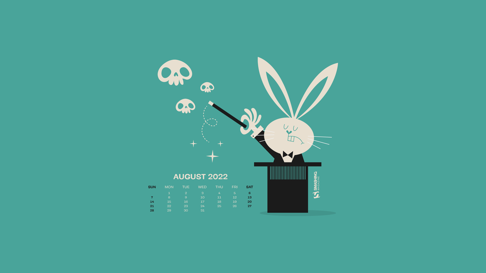
Freak Show Vol. 1
Designed by Ricardo Gimenes from Sweden.
- preview
- with calendar: 640×480, 800×480, 800×600, 1024×768, 1024×1024, 1152×864, 1280×720, 1280×800, 1280×960, 1280×1024, 1366×768, 1400×1050, 1440×900, 1600×1200, 1680×1050, 1680×1200, 1920×1080, 1920×1200, 1920×1440, 2560×1440, 3840×2160
- without calendar: 640×480, 800×480, 800×600, 1024×768, 1024×1024, 1152×864, 1280×720, 1280×800, 1280×960, 1280×1024, 1366×768, 1400×1050, 1440×900, 1600×1200, 1680×1050, 1680×1200, 1920×1080, 1920×1200, 1920×1440, 2560×1440, 3840×2160
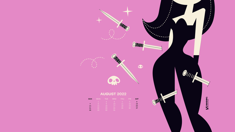
Freak Show Vol. 2
Designed by Ricardo Gimenes from Sweden.
- preview
- with calendar: 640×480, 800×480, 800×600, 1024×768, 1024×1024, 1152×864, 1280×720, 1280×800, 1280×960, 1280×1024, 1366×768, 1400×1050, 1440×900, 1600×1200, 1680×1050, 1680×1200, 1920×1080, 1920×1200, 1920×1440, 2560×1440, 3840×2160
- without calendar: 640×480, 800×480, 800×600, 1024×768, 1024×1024, 1152×864, 1280×720, 1280×800, 1280×960, 1280×1024, 1366×768, 1400×1050, 1440×900, 1600×1200, 1680×1050, 1680×1200, 1920×1080, 1920×1200, 1920×1440, 2560×1440, 3840×2160
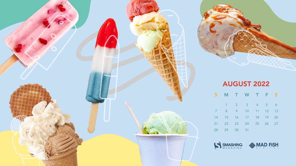
Ice Cream, All day, Everyday
“We like our ice cream at Mad Fish Digital so why not create a wallpaper for it?” — Designed by Suu Ng from Portland, OR.
- preview
- with calendar: 320×480, 1024×1024, 1280×720, 1680×1200, 1920×1080, 2560×1440
- without calendar: 320×480, 1024×1024, 1280×720, 1680×1200, 1920×1080, 2560×1440
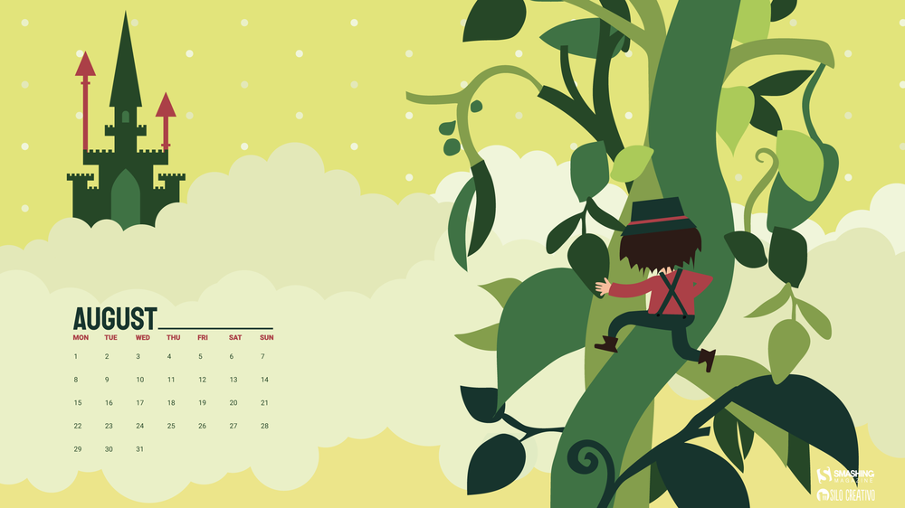
Climbing The Beanstalk
“In August, we accompany Jack through the Beanstalk on surprising adventures. You sign up?” — Designed by Veronica Valenzuela from Spain.
- preview
- with calendar: 640×480, 800×480, 1024×768, 1280×720, 1280×800, 1440×900, 1600×1200, 1920×1080, 1920×1440, 2560×1440
- without calendar: 640×480, 800×480, 1024×768, 1280×720, 1280×800, 1440×900, 1600×1200, 1920×1080, 1920×1440, 2560×1440
Oldies But Goodies
Childhood memories, camping under the stars, or a simple pencil and a piece of paper — a lot of things have inspired the design community to create an August wallpaper in the past few years. Here are some favorites from our archives. (Please note that these designs don’t come with a calendar.)
Happiness Happens In August
“Many people find August one of the happiest months of the year because of holidays. You can spend days sunbathing, swimming, birdwatching, listening to their joyful chirping, and indulging in sheer summer bliss. August 8th is also known as the Happiness Happens Day, so make it worthwhile.” — Designed by PopArt Studio from Serbia.

- preview
- without calendar: 320×480, 640×480, 800×480, 800×600, 1024×768, 1024×1024, 1152×864, 1280×720, 1280×800, 1280×960, 1280×1024, 1366×768, 1400×1050, 1440×900, 1600×1200, 1680×1050, 1680×1200, 1920×1080, 1920×1200, 1920×1440, 2560×1440
Bee Happy!
“August means that fall is just around the corner, so I designed this wallpaper to remind everyone to ‘bee happy’ even though summer is almost over. Sweeter things are ahead!” — Designed by Emily Haines from the United States.

- preview
- without calendar: 640×480, 800×600, 1280×720, 1280×800, 1280×960, 1366×768, 1400×1050, 1440×900, 1600×1200, 1680×1050, 1680×1200, 1920×1080, 1920×1200, 1920×1440, 2560×1440
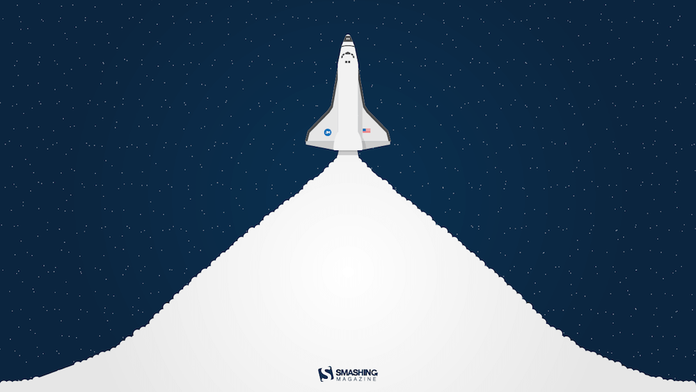
Launch
“The warm, clear summer nights make me notice the stars more — that’s what inspired this space-themed design!” — Designed by James Mitchell from the United Kingdom.
- preview
- without calendar: 1280×720, 1280×800, 1366×768, 1440×900, 1680×1050, 1920×1080, 1920×1200, 2560×1440, 2880×1800
Colorful Summer
“‘Always keep mint on your windowsill in August, to ensure that the buzzing flies will stay outside where they belong. Don’t think summer is over, even when roses droop and turn brown and the stars shift position in the sky. Never presume August is a safe or reliable time of the year.’ (Alice Hoffman)” — Designed by Lívi from Hungary.

- preview
- without calendar: 800×480, 1024×768, 1280×720, 1280×1024, 1400×1050, 1680×1050, 1680×1200, 1920×1200, 2560×1440, 3475×4633
Cowabunga
Designed by Ricardo Gimenes from Sweden.

- preview
- without calendar: 640×480, 800×480, 800×600, 1024×768, 1024×1024, 1152×864, 1280×720, 1280×800, 1280×960, 1280×1024, 1366×768, 1400×1050, 1440×900, 1600×1200, 1680×1050, 1680×1200, 1920×1080, 1920×1200, 1920×1440, 2560×1440, 3840×2160
Hello Again
“In Melbourne it is the last month of quite a cool winter so we are looking forward to some warmer days to come.” — Designed by Tazi from Australia.

- preview
- without calendar: 320×480, 640×480, 800×600, 1024×768, 1152×864, 1280×720, 1280×960, 1600×1200, 1920×1080, 1920×1440, 2560×1440
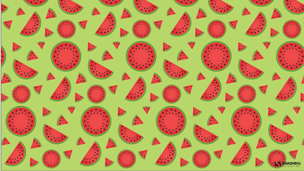
Melon Day
“Melon Day (second Sunday in August) is an annual national holiday in Turkmenistan devoted to festivities to celebrate the country’s muskmelon. Another reason for me to create this wallpaper is that melons are just awesome!” — Designed by Melissa Bogemans from Belgium.
- preview
- without calendar: 320×480, 640×480, 800×480, 800×600, 1024×768, 1024×1024, 1152×864, 1280×720, 1280×800, 1280×960, 1280×1024, 1400×1050, 1440×900, 1600×1200, 1680×1050, 1680×1200, 1920×1080, 1920×1200, 1920×1440, 2560×1440
Smoky Mountain Bigfoot Conference
“Headed towards Smoky Mountain Bigfoot Conference this summer? Oh, they say it’s gonna be a big one! Get yourself out there well-prepared, armed with patience and ready to have loads of fun with fellow Bigfoot researchers. Looking forward to those campsite nights under the starry sky, with electrifying energy of expectations filling up the air? Lucky you!” — Designed by Pop Art Studio from Serbia.

- preview
- without calendar: 320×480, 640×480, 800×480, 800×600, 1024×768, 1024×1024, 1152×864, 1280×720, 1280×800, 1280×960, 1280×1024, 1366×768, 1400×1050, 1440×900, 1600×1200, 1680×1050, 1680×1200, 1920×1080, 1920×1200, 1920×1440, 2560×1440
Childhood Memories
Designed by Francesco Paratici from Australia.

- preview
- without calendar: 320×480, 1024×768, 1024×1024, 1280×800, 1280×1024, 1366×768, 1440×900, 1680×1050, 1920×1080, 1920×1200, 2560×1440
About Everything
“I know what you’ll do this August. 🙂 Because August is about holiday. It’s about exploring, hiking, biking, swimming, partying, feeling and laughing. August is about making awesome memories and enjoying the summer. August is about everything. An amazing August to all of you!” — Designed by Ioana Bitin from Bucharest, Romania.

- preview
- without calendar: 320×480, 800×480, 800×600, 1024×768, 1280×960, 1280×1024, 1440×900, 1600×1200, 1680×1050, 1920×1080, 1920×1200, 1920×1440, 2560×1440
Shrimp Party
“A nice summer shrimp party!” — Designed by Pedro Rolo from Portugal.

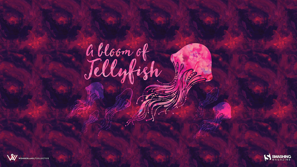
A Bloom Of Jellyfish
“I love going to aquariums — the colours, patterns and array of blue hues attract the nature lover in me while still appeasing my design eye. One of the highlights is always the jellyfish tanks. They usually have some kind of light show in them, which makes the jellyfish fade from an intense magenta to a deep purple — and it literally tickles me pink. On a recent trip to uShaka Marine World, we discovered that the collective noun for jellyfish is a bloom and, well, it was love-at-first-collective-noun all over again. I’ve used some intense colours to warm up your desktop and hopefully transport you into the depths of your own aquarium.” — Designed by Wonderland Collective from South Africa.
Handwritten August
“I love typograhy handwritten style.” — Designed by Chalermkiat Oncharoen from Thailand.

- preview
- without calendar: 320×480, 640×480, 800×480, 800×600, 1024×768, 1024×1024, 1152×864, 1280×720, 1280×800, 1280×960, 1280×1024, 1400×1050, 1440×900, 1600×1200, 1680×1050, 1680×1200, 1920×1080, 1920×1200, 1920×1440, 2560×1440
Live In The Moment
“My dog Sami inspired me for this one. He lives in the moment and enjoys every second with a big smile on his face. I wish we could learn to enjoy life like he does! Happy August everyone!” — Designed by Westie Vibes from Portugal.

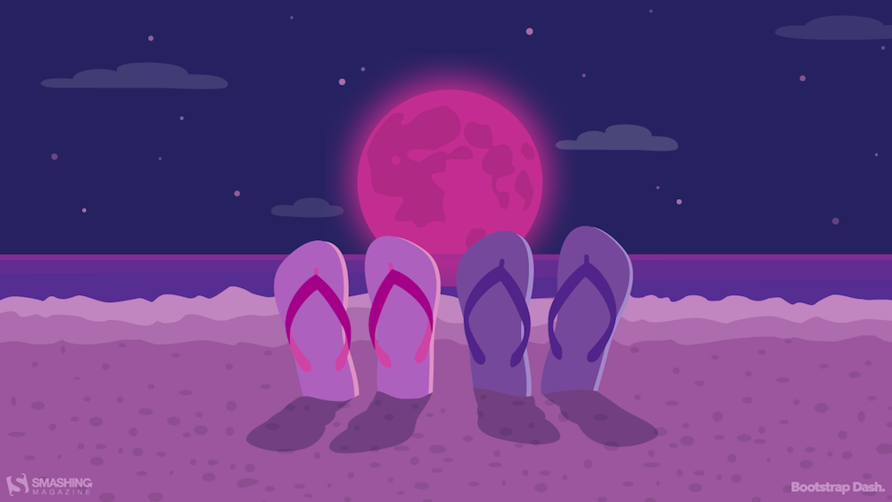
Unforgettable Summer Night
Designed by BootstrapDash from India.
- preview
- without calendar: 320×480, 640×480, 800×480, 800×600, 1024×768, 1024×1024, 1152×864, 1280×720, 1280×800, 1280×960, 1280×1024, 1366×768, 1440×900, 1440×1050, 1600×1200, 1680×1050, 1680×1200, 1920×1080, 1920×1200, 1920×1440, 2560×1440
Chill Out
“Summer is in full swing and Chicago is feeling the heat! Take some time to chill out!” — Designed by Denise Johnson from Chicago.

Treat Yourself
“It’s still winter in my part of Australia so warm coffee and donuts by the open fire is a treat. For warmer climates an outdoor picnic in the park with coffee and donuts sounds fun, too!” — Designed by Glynnis Owen from Australia.

- preview
- without calendar: 320×480, 640×480, 800×600, 1024×768, 1152×864, 1280×720, 1280×960, 1600×1200, 1920×1080, 1920×1440, 2560×1440
Psst, It’s Camping Time…
“August is one of my favorite months, when the nights are long and deep and crackling fire makes you think of many things at once and nothing at all at the same time. It’s about heat and cold which allow you to touch the eternity for a few moments.” — Designed by Igor Izhik from Canada.

- preview
- without calendar: 1024×768, 1024×1024, 1280×720, 1280×800, 1280×960, 1280×1024, 1400×1050, 1440×900, 1600×1200, 1680×1050, 1680×1200, 1920×1080, 1920×1200, 1920×1440, 2560×1440
Coffee Break Time
Designed by Ricardo Gimenes from Sweden.

- preview
- without calendar: 320×480, 640×480, 800×480, 800×600, 1024×768, 1024×1024, 1152×864, 1280×720, 1280×800, 1280×960, 1280×1024, 1366×768, 1400×1050, 1440×900, 1600×1200, 1680×1050, 1680×1200, 1920×1080, 1920×1200, 1920×1440, 2560×1440
Heatstroke
“Even the sun gets a heatstroke in August!” — Designed by Luc Versleijen from the Netherlands.

- preview
- without calendar: 800×600, 1024×768, 1152×864, 1280×720, 1280×800, 1280×960, 1280×1024, 1440×900, 1920×1080, 1920×1200, 2560×1440
A Midnight Summer Dream
“It’s not Shakespeare, it’s Monk, staring at the stars in a warm summer midnight. Just relax…” — Designed by Monk Software from Italy.

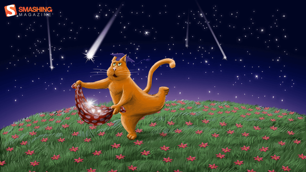
Falling Stars
“In August the stars are ‘falling’. The more falling stars you see, the more wishes will come true!” — Designed by Olga Bukhalova from Italy.