If a Data Saver user is on a 2G-speed or slower network according to the NetInfo API, Chrome disables scripts and sends an intervention header on every resource request. Users are shown a UI at the bottom of the screen indicating the page has been modified to save data. Users can enable scripts on the page by tapping “Show original” in the UI.
An excellent idea for people in low-bandwidth situations: automatically disable JavaScript. As long as the site is built with progressive enhancement, there’s no problem (and if not, the user is presented with the choice to enable scripts).
Power to the people!
This reminds me of the importance of a very useful building strategy called “Progressive Enhancement” ?
This is huge news for developing countries where mobile data packets may cost a lot and are not be affordable to all. Enabling NoScript by default will make sure that users don’t burn through their data without knowledge. The feature will probably be available in the Chrome 69, which will also come with the new Material Design refresh.
Are you team Apple or team Android? Regardless of which OS you prefer, you’ve undoubtedly seen Google’s popular Android logo floating around once or twice. We’ve gone over the history of the Apple logo, now it’s time to take a look at the origins of the cute little green dude behind Android.
Irina Blok
The logo that Android launched with and still uses today was created by Irina Blok, who was a big part of the original launch campaign. At the beginning, the logo was intended specifically for developers. After the reveal, individual customers fell in love with the little green robot so much that Google decided to use it as the logo.
“The idea was to create the open source logo (very much like open source Android platform), that was released to the developer community without regular brand guidelines.” – Irina Blok
The inspiration behind the Android logo
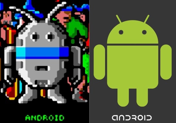
There are many critics out there that claim that the design of the android robot was stolen from an old Atari video game called “Gauntlet: The Third Encounter.”
If you take a look at the image above, the is no doubt that they look very similar. Ironically enough, the character in the game is also called ANDROID.
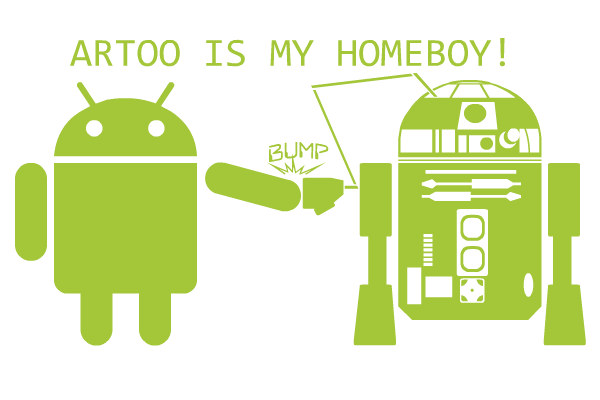
It would be hard to pin the inspiration of the Android logo on any one source. Some even believe that the logo was inspired by the original R2-D2 robot from Star Wars.
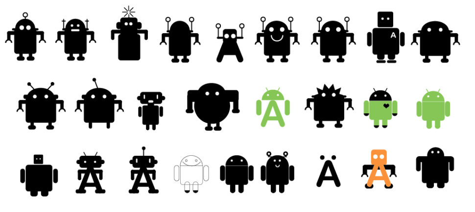
Much to everyone’s surprise, Irina has come out and disclosed that there are actually many early design drafts for the Android logo, and this just so happened to be the one they chose.
Given the fact that the design theme of the logo is apparent in multiple different popular games and movies, I highly doubt that it was stolen.
Other than the design, the color was also thought about deeply. The green color, fittingly being called “Android Green” is meant to depict growth, freshness, and prosperity.
Android has quickly taken over
Although Android hasn’t been around as long as some of the other tech giants, it’s safe to say that they definitely have earned their place among the rest. Since its creation in 2003, Android has risen in the ranks and only really has one competitor, Apple. Although there are many Apple fans out there, there are equally as many, if not more Android fans that will never be caught using anything else.
What do you think about the popular logo? Is it a good look for the company, or should google find something new? Personally, I believe that the logo is a big selling point for the devices sold using the Android OS. If Google continues to use this marketing formula, whatever it is, then I’m certain that we will soon be seeing Apple products becoming obsolete.
I love a good conference that exists because there is a rising tide in technology. JAMstack_conf:
Static site generators, serverless architectures, and powerful APIs are giving front-end teams fullstack capabilities — without the pain of owning infrastructure. It’s a new approach called the JAMstack.
I’ll be speaking at it! I’ve been pretty interested in all this and trying to learn and document as much as I can.
React encourages developers to build by breaking a UI up into components. This means there will always be a need to pass data from one component to another — more specifically, from parent to child component — since we’re stitching them together and they rely on one another.
React calls the data passed between components props and we’re going to look into those in great detail. And, since we’re talking about props, any post on the topic would be incomplete without looking at PropTypes because they ensure that components are passing the right data needed for the job.
With that, let’s unpack these essential but loaded terms together.
Props: The data being passed around
Basically, props are what make React the tool that it is. React was designed to break things down into pieces that are served when they are needed. Props are defining characteristics stored by those pieces and they are accessed and sent when they’re requested. The result is a screen that renders only what it needs and nothing more, speeding up page loads and boosting overall performance.
These data can come in different forms: namely, strings, array and functions. The ability to pass data between components, so let’s break down specifically how to access and pass data.
Passing and accessing props
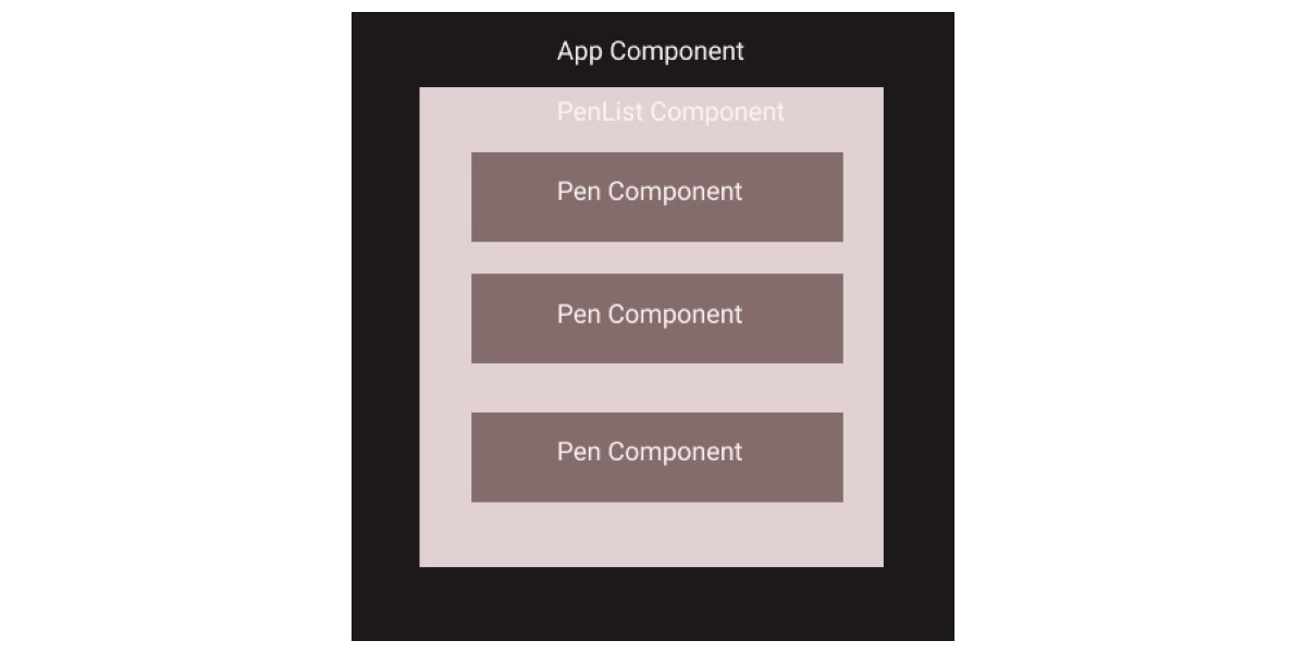
Let’s say we are working on an application that shows a list of interesting demos pulled from CodePen:
We are passing an array of pens as a prop to the PenList (which we’ll create in just a bit). The parent component (PenList) accesses the data (penList), which gets passed as pens props to the child component (Pen).
The PenList component loops through the pens props (props.pens) to return each item as a Pen component. If this was a class component, we would prefix the pens props with this, like this:
The next thing to note is the use of key in the example. A key is a unique identifier we can assign to each item in our list to make sure we can distinguish between items. In this case, we’re mapping the key to the URL of each pen. There’s no chance of two items being the same, so it’s a good piece of data to use for this purpose.
The remaining properties are passed as props to the Pen component. Here’s the Pen component making use of those props:
Note that we are constructing the Pen component (const Pen) rather than defining it as a class (class PenList) like we did for the PenList component. As such, we can access the values using props. That’s a handy little shorthand we can use instead of re-mapping Pen to the data. The parent already has it, so let’s just pass it along!
Passing functions using props
We just looked at passing an array of data as props from one component to another, but what if we’re working with functions instead? React allows us to pass functions between components, but it’s quite technical. Still, it’s something you’d want to do for specific use cases and worth us looking into.
Let’s use a simple example, say an app that allows you to create a list of tasks. You know, a to-do list, like for chores, projects or what have you. In this app, the list of tasks is contained in the App component, which is the parent component. The Todo component will be the child in this scenario, and its sole job will be to list each task that gets created.
In true to-do list form, we don’t just want to create tasks, but be able to remove them once a task has been created. Since the to-do list is contained in the App component, we have to be able to identify the specific item the user wants to remove from the list by obtaining the id and then remove the item in the App component.
Notice that we defined todoCounter at the top and set it to 1. We created this so we can have unique keys for the to-do items just like we did when we used URLs for the list of pens in our previous example.
The method for deleting tasks is created in the App component. In the render() function, we pass the to-do properties as props to the Todo component. We also pass the handleRemove() function as a prop named removeTodo(). We will use this in the Todo component which looks like this.
class Todo extends React.Component {
  deleteTodo = id => {
    this.props.removeTodo(id);
  };
  render() {
    return (
      <div>
        {this.props.value}
        <button onClick={() => this.deleteTodo(this.props.id)}>X</button>
      </div>
    );
  }
}
We have to pass the id of the to-do item to removeTodo() in the Todo component because we cannot update the state of the App component without it. This is essentially how we are able to pass a function between components using props — pretty similar to how we did it with an array, the difference being we’re passing functionality around instead of raw data.
PropTypes
PropTypes ensure that the right type of props is passed to a component — and, conversely, that the receiving component is receiving the right type of props.
We can think about them like a football quarterback passing the ball to a receiver. The quarterback only wants his players to receive the ball. And, for that matter, the quarterback wants the receiver to catch a ball — not a cat, pickle or taxi. PropTypes would ensure that the correct object (a ball) is being passed and that it is passed to the correct receiver (player on the team).
(If only football had PropTypes in real life!)
To make use of PropTypes, you have to add the package as a dependency to your application by running yarn add prop-types in the command line.
We can use PropTypes in our app that displays interesting pens. Here is how we will use it for the Pen component:
With this, the language prop will always have a value when it used — even if one isn’t provided.
Wrap Up
Well, that’s a broad look at props in React. It’s pretty much a guarantee that you will use both props and propTypes in a React application. Hopefully this post shows just how important they are to React as a whole because, without them, we have nothing to pass between components when interactions happen. They’re very much a core part of the component-driven and state management architecture that React is designed around.
And propTypes are an added bonus — like a built-in quality assurance checker for catching bugs and letting us know about them. Nice to know that they’ve got our back as we work.
September is a time of transition. While some are trying to conserve the summer feeling just a bit longer, others are eager for fall to come with its colorful leaves and rainy days. But no matter how you feel about September or what the new month might be bringing along, this wallpaper collection sure has something to inspire you.
Just like every month since more than nine years already, artists and designers from across the globe once again challenged their creative skills and designed wallpapers to help you break out of your routine and give your desktop a fresh makeover. Each one of them comes in versions with and without a calendar for September 2018 and can be downloaded for free.
As a little extra goodie, we also went through our archives on the look for some timeless September wallpaper treasures which you’ll find assembled at the end of this post. Please note that these oldies, thus, don’t come with a calendar. Happy September!
Please note that:
All images can be clicked on and lead to the preview of the wallpaper,
You can feature your work in our magazine by taking part in our Desktop Wallpaper Calendar series. We are regularly looking for creative designers and artists to be featured on Smashing Magazine. Are you one of them?
“Seasons come and go, but our brave cactuses still stand. Summer is almost over, and autumn is coming, but the beloved plants don’t care.” — Designed by Lívia Lénárt from Hungary.
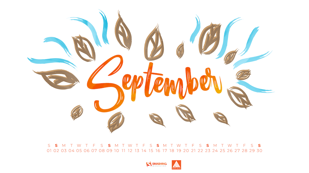
“This is our way of asking the summer not to go away. We were inspired by travel and exotic islands. In fact, it seems that September was the seventh month in the Roman calendar, dedicated to Vulcan, a god of fire. The legend has it that he was the son of Jupiter and Juno, and being an ugly baby with a limp, his mother tried to push him off a cliff into a volcano. Not really a nice story, but that’s where the tale took us. Anyway, enjoy September — because summer’s not over yet!” — Designed by PopArt Studio from Novi Sad, Serbia.
“The lands are painted gold lit with autumn blaze. And all at once the leaves of the trees started falling, but none of them are worried. Since, everyone falls in love with fall.” — Designed by Mindster from India.
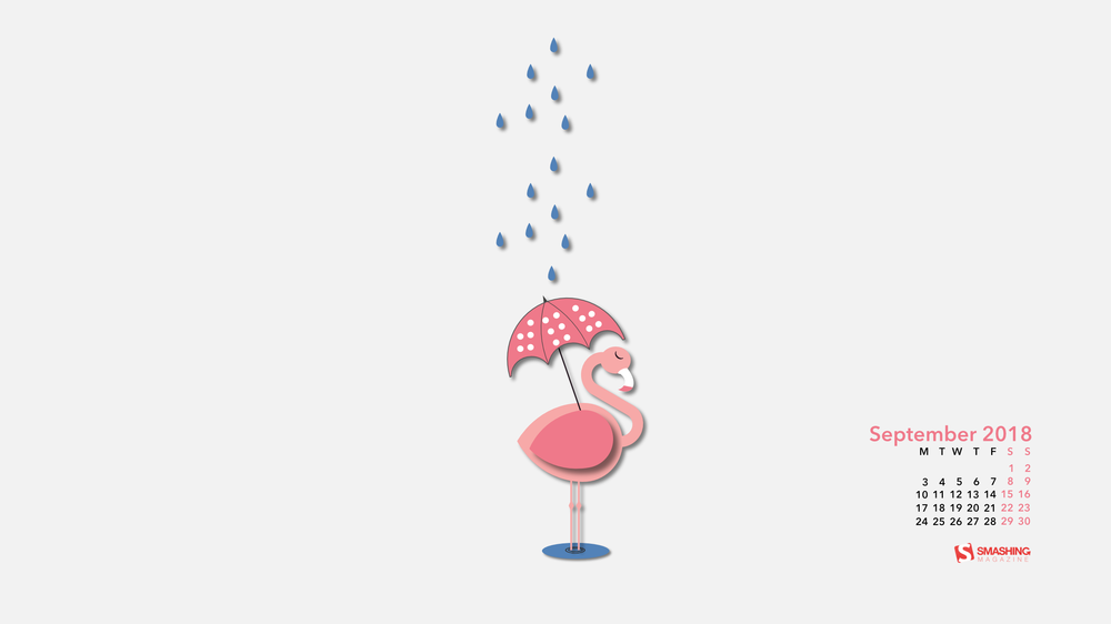
“Summer is officially over and we will no longer need our inflatable flamingos. Now, we’ll need umbrellas. And some flamingos will need an umbrella too!” — Designed by Marina Bošnjak from Croatia.
“September is the beginning of the course. We see it as a never ending road because we are going to enjoy the journey.” — Designed by Veronica Valenzuela from Spain.
“They say ‘patience is a virtue’, and so great opportunities and opulence in life come to those who are patient. Here we depicted a snail in the visual, one which longs to seize the shine that comes its way. It goes by the same watchword, shows no impulsiveness and waits for the right chances.” — Designed by Sweans from London.
Some things are too good to be forgotten and our wallpaper archives are full of timeless treasures. So here’s a small selection of favorites from past September editions. Please note that these don’t come with a calendar.
Autumn Rains
“This autumn, we expect to see a lot of rainy days and blues, so we wanted to change the paradigm and wish a warm welcome to the new season. After all, if you come to think of it: rain is not so bad if you have an umbrella and a raincoat. Come autumn, we welcome you!” — Designed by PopArt Studio from Serbia.
“As summer comes to a close, so does the end of blue crab season in Maryland. Blue crabs have been a regional delicacy since the 1700s and have become Maryland’s most valuable fishing industry, adding millions of dollars to the Maryland economy each year. With more than 455 million blue crabs swimming in the Chesapeake Bay, these tasty critters can be prepared in a variety of ways and have become a summer staple in many homes and restaurants across the state. The blue crab has contributed so much to the state’s regional culture and economy, in 1989 it was named the State Crustacean, cementing its importance in Maryland history.” — Designed by The Hannon Group from Washington DC.
“It is inevitable. Summer is leaving silently. Let us think of ways to make the most of what is left of the beloved season.” — Designed by Bootstrap Dashboards from India.
“September is usually considered as early autumn so I decided to draw some trees and leaves. However, nobody likes that summer is coming to an end, that’s why I kept summerish colours and style.” — Designed by Kat Gluszek from Germany.
“While September’s Autumnal Equinox technically signifies the end of the summer season, this wallpaper is for all those summer lovers, like me, who don’t want the sunshine, warm weather and lazy days to end.” — Designed by Vicki Grunewald from Washington.
“We all know the saying ‘Miss, my dog ate my homework!’ Well, not everyone has a dog, so here’s a wallpaper to inspire your next excuse at school ;)” — Designed by Ricardo Gimenes from Sweden.
“This summer we have seen lighting come to the forefront of design once again, with the light bulb front and center, no longer being hidden by lampshades or covers. Many different bulbs have been featured by interior designers including vintage bulbs, and oddly shaped energy-saving bulbs. We captured the personality of a variety of different bulbs in this wallpaper featuring the Bulb family.” — Designed by Carla Genovesio from the USA.
“In the night from September 20th to 21st, the world has one of the most unusual environmental events — Night of the bats. Its main purpose: to draw public attention to the problems of bats and their protection, as well as to debunk the myths surrounding the animals, as many people experience unjustified superstitious fear, considering them vampires.” — Designed by cheloveche.ru from Russia.
“September is the start of spring in Australia so this bright wallpaper could brighten your day and help you feel energized!” — Designed by Tazi Design from Australia.
Please note that we respect and carefully consider the ideas and motivation behind each and every artist’s work. This is why we give all artists the full freedom to explore their creativity and express emotions and experience throughout their works. This is also why the themes of the wallpapers weren’t anyhow influenced by us, but rather designed from scratch by the artists themselves.
Thank you to all designers for their participation. Join in next month!
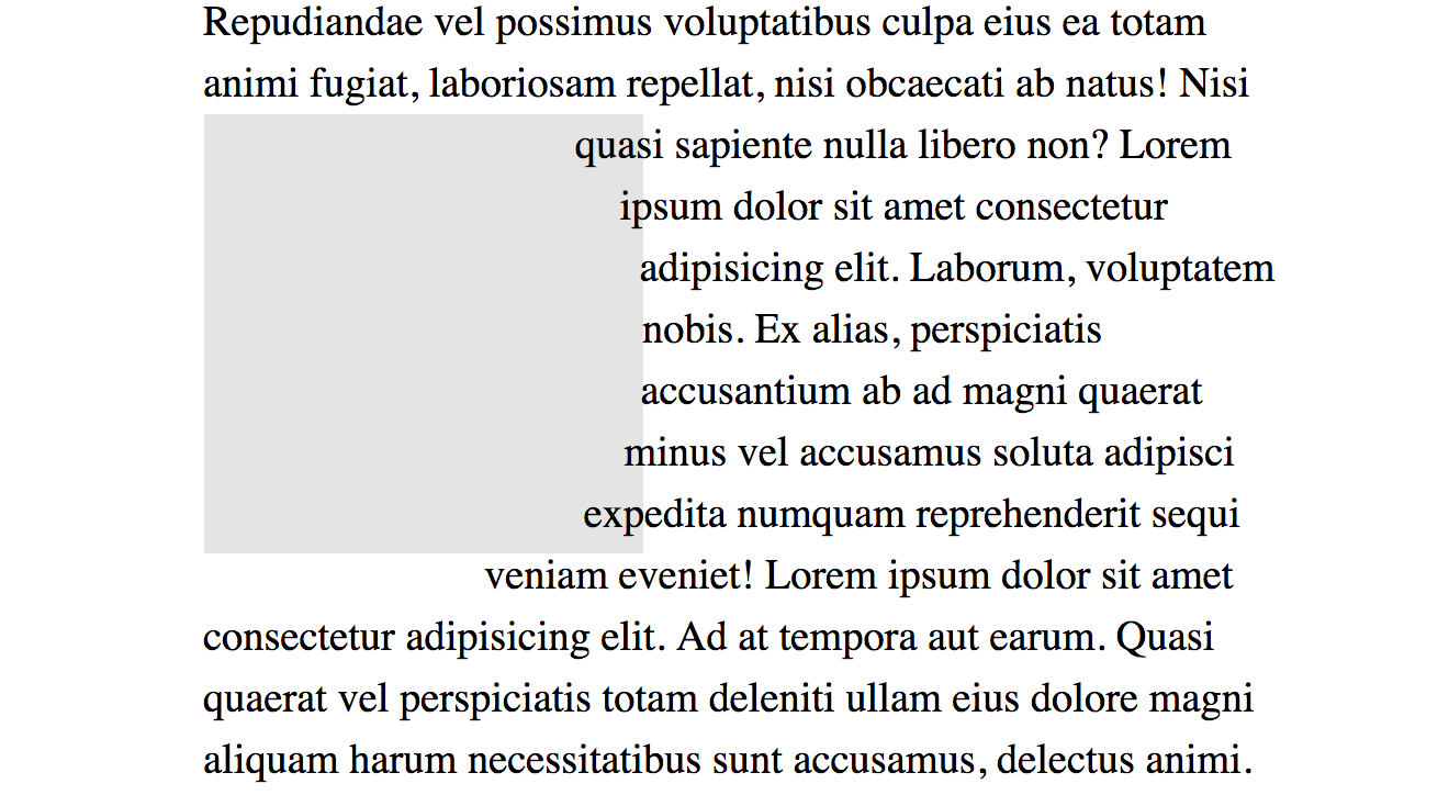
Firefox 62 is shipping out of beta on September 5th. The big notable thing for CSS developers is that it will now support the shape-outside property with polygon(), circle(), and ellipse(), joining Chrome and Safari.
What will be nice about the Firefox release (well, it’s kinda already nice if you use something like Firefox Developer Edition which is already on 62), is that it has a shape editor built right into DevTools.
Chrome supports shape-outside as well, but there is no native DevTools helper for working with them. Thankfully, Razvan Caliman has a Chrome Plugin that does a great job. (Razvan contributed to the Firefox version as well, I hear.)
I enjoy using shape-outside as it can add real visual interest to a page that isn’t nearly overdone or trendy just yet. Plus, in a lot of cases, it doesn’t matter whether it’s supported because the float behaves as a rectangle. If it causes major issues, you can wrap things in an @supports block and do something different.
@supports (shape-outside: circle(50%)) {
  img {
    /* Only round the image if we can float around it too, otherwise leave it square. */
    shape-outside: circle(50%);
    border-radius: 50%;
  }
}
I do have a few gripes with both the Firefox DevTools and the Chrome plugin though…
I wish it was easier to add a newshape-outside to an existing element. You can do it, but you have to manually add something like shape-outside: polygon(0 0, 10px 0, 20px 0); or something to the element to kick off the tool, then start using it.
I wish they worked with % by default instead of px units.
That second one particularly. It’s so common we size things flexibly these days that hard pixel values are sometimes useless and difficult to convert to flexible percentages.
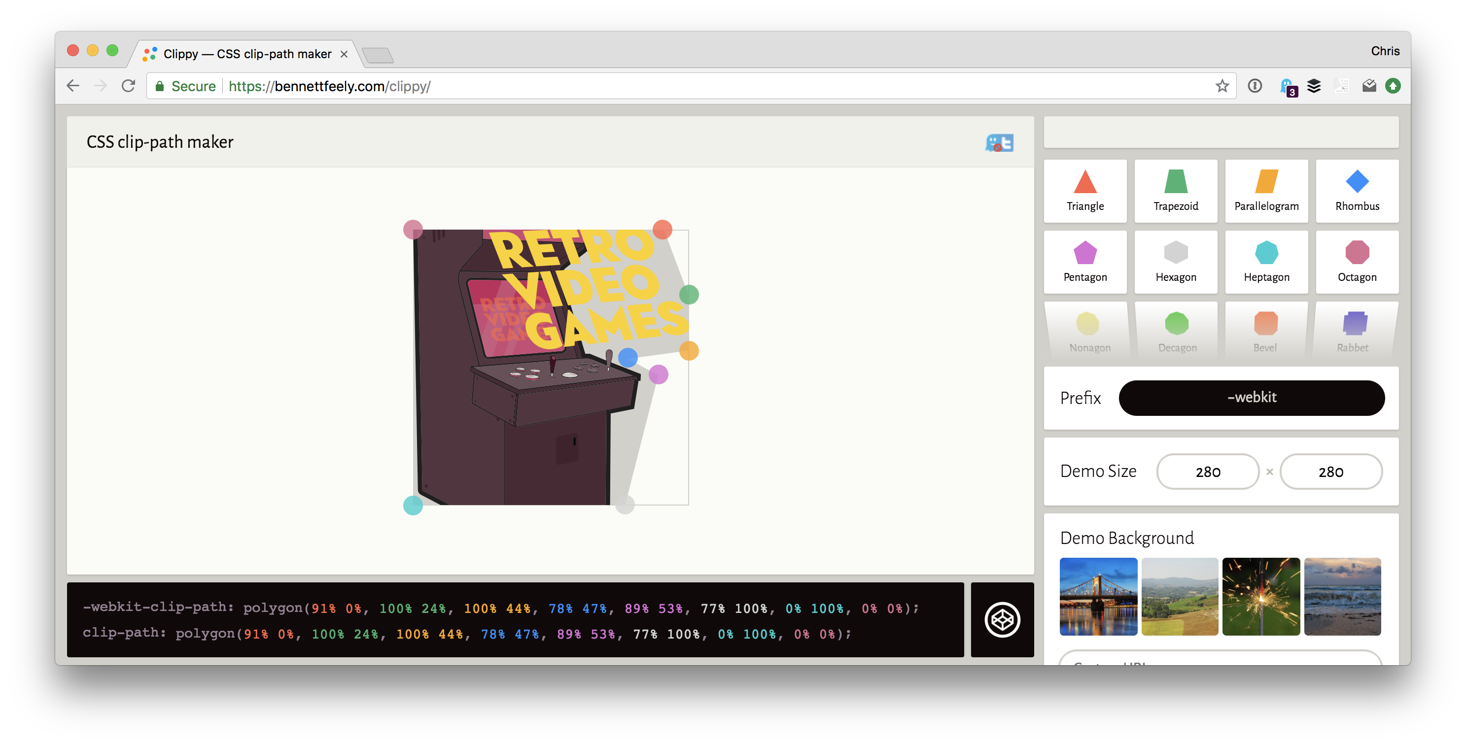
You’re probably better off starting with Bennett Feely’s Clippy (it’s technically for clip-path, but it includes polygon() it works works for either. It works with percentages, so great, moving on from there.
“The frustrations of using CSS Shapes and CSS Exclusions”
That’s what Ben Frain recently blogged and it has some good points about all this. One key point is that using shape-outside doesn’t necessarily mean that you’re clipping the background. Personally, I find that I’m cutting a shape on backgrounds that are transparent anyway, but I take the point.
To fix this you’ll need a clip-path as well.
The other big one is there is no shape-inside() property (yet), so if you’re hoping to put some text inside a shape rather than have it wrap around the outside of a shape, no luck yet.
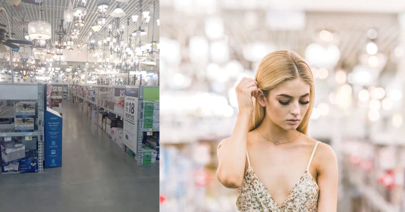
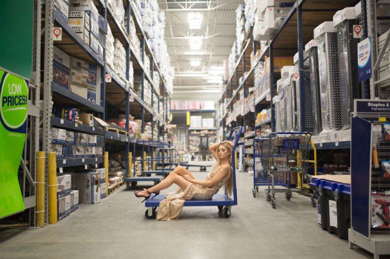
A few weeks ago, a model friend of mine, Rachelle Kathleen, and I were planning to meet for a fun little photo shoot. Instead of searching out the usual beautiful locations around where we live, I had the idea to do just the opposite. I wanted to go somewhere “ugly” by all conventional photography standards and then see what we could do with it. Lowe’s seemed like the perfect option.
The point was to challenge ourselves. I wanted somewhere with horrible lighting and limited backdrops. Somewhere that made absolutely no sense for a photo shoot. Our local Lowe’s home improvement retail store hits all those points. Before we went in we decided on a few rules:
1. We had to work with whatever was already there. I brought in just my camera without any artificial lighting or props. She simply brought a small bag with a couple outfit options.
2. We couldn’t rearrange the displays or make any big changes. In one instance (as you’ll see later) we moved a cart from the side of the aisle to the center, but then put it right back. We’ve both spent years in the service industry, we weren’t about to leave the workers with a trashed store an hour before closing time on a Sunday night.
3. We’d stop shooting if anyone was in the background. We didn’t want to give anyone any reason to complain, so we went to a place that was completely empty of customers, and if someone did show up, we lowered the camera until they were done browsing and left the area.
Of course, if none of this was allowed we would’ve left, but as soon as we walked in an employee asked if they could help us and I asked, “We were just going to take a few photos, is that okay?”
He replied, “Of course! I was just wondering why she was so overdressed for a trip to the hardware store!”
Since they were about an hour from closing the store was almost completely empty. Anyone we didcome in contact with was super friendly, if not slightly curious. We had a few people stop and watch, but that’s to be expected anytime Rachelle models anywhere. The girl just can’t help but stop traffic.
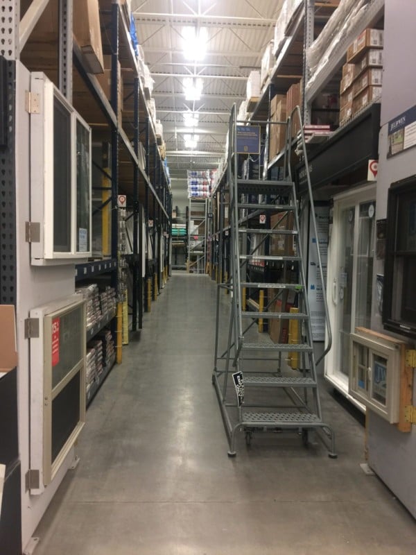
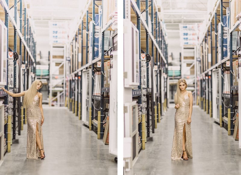
And this is what we got! I’ve included the cell-phone pic of the actual location along with each photoset, so you can see what we were working with.
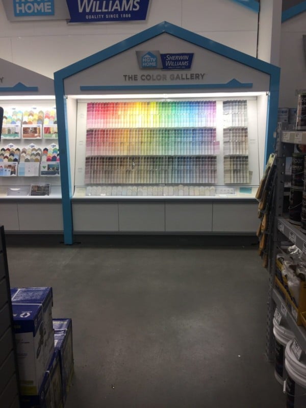
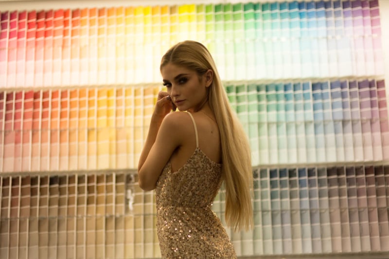
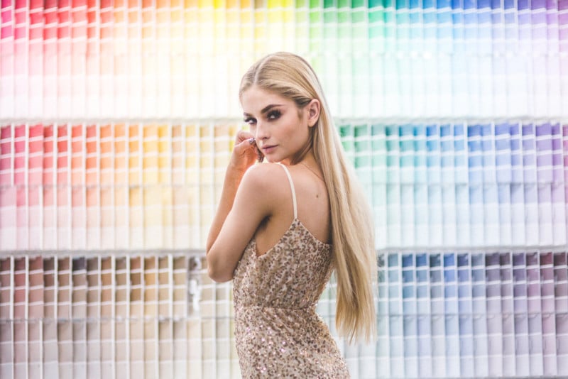
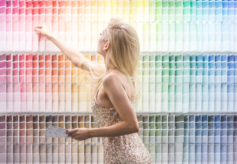
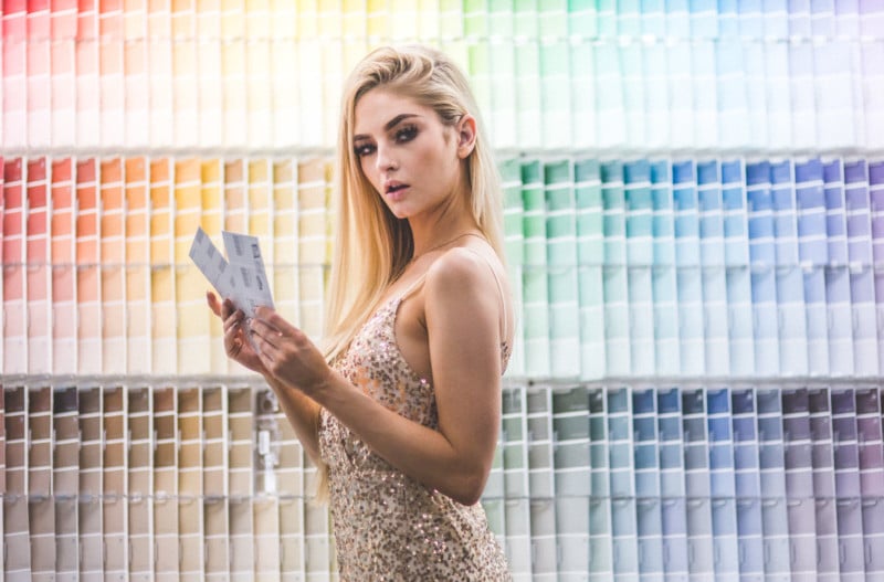
Lowe’s Location 1: The Paint Samples
I have to admit, I have always wanted to shoot in front of these paint samples, so as soon as we walked in the door I made a bee-line right to them. I’m excited I finally got to shoot in front of them – these shots turned out to be some of my favorites ever!
Location Shot:
Straight Out Of Camera (SOOC):
Edited:
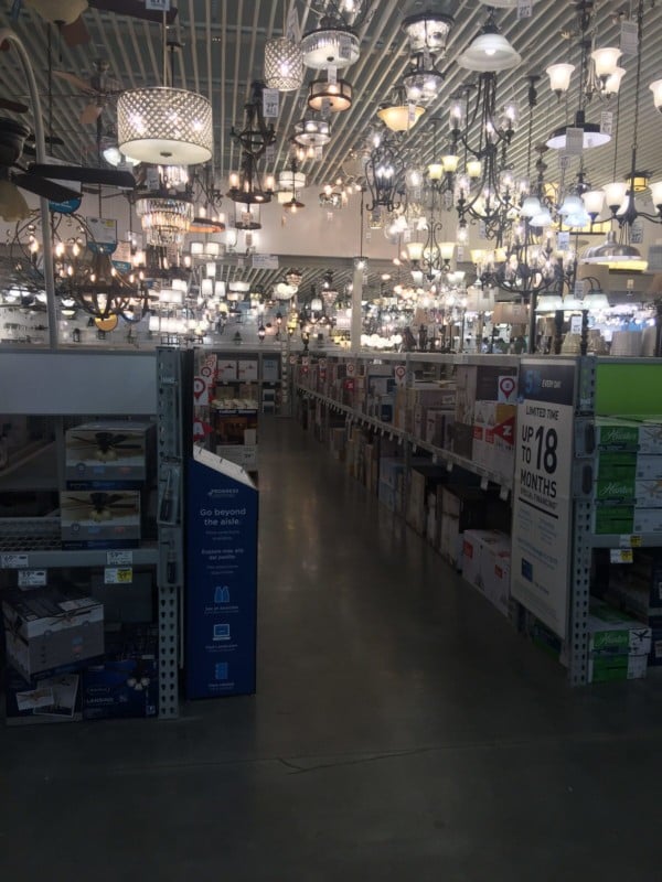
Lowe’s Location 2: The Lighting Section
I was also excited about the lighting section. I’ve always been a fan of shooting straight into the light (though I’ve heard it’s a bit of a no-no). The main problem was the lights were so much higher than we thought…or maybe we’re just a lot shorter than we realized (we’re both barely 5’4?).
I knew the light itself was going to be pretty horrendous, with all the different colors, brightness levels, and shadows, but I was excited to give it a shot. You can see in the second photo what it looked like straight out of camera.
Location Shot:
SOOC:
Edited:
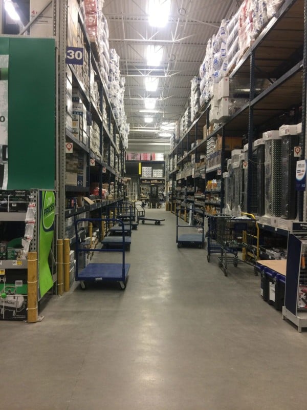
Lowe’s Location 3: The Aisles
We knew we couldn’t avoid the aisles. Photographically speaking, they were awful. Horrible lighting, lots of plastic surfaces, really nothing that would be considered aesthetically pleasing, but that was the point. This was the essence of Lowe’s, and we wouldn’t have been doing the challenge justice to steer away from it.
Also, yes, we know you aren’t allowed to sit on the carts. An employee was there and gave us permission to keep shooting. Like I mentioned earlier, we were in a pretty big hurry, so she was sitting on that cart for a total of maybe 6 minutes, so calm the hell down, it’s not like we were dancing on them.
And yes, we know there has probably been something pretty disgusting spilled on them at some point, but we really couldn’t care less. Rachelle and I have shot nude in abandoned buildings full of spiders, bats and bird shit, a dry cart really isn’t much of an issue.
We shot in both the larger aisles and the skinnier ones. Here’s the larger aisle:
Location Shot: Aisle 1
SOOC:
Edited:
Location Shot: Aisle 2
Lowe’s Location 4: The Garden Section
I would’ve loved to spend more time in the garden section, but the store was closing and we were running out of time. We spotted a cluster of fake shrubs and I had her kneel down in front of them so I could fill the frame. It’s too bad we had to move on so quickly – this was actually the best lighting we got out of the entire store! If we had been there in the daytime, it probably would’ve been even better!
I knew I wanted to edit the finished photo with a kind of moody, wintery look. So even though the raw image really wasn’t too bad, it still needed some adjustments to get to what I wanted it to be.
Location Shot:
SOOC:
Edited:
Overall, this was a really fun challenge! Not that I’d invite an actual client to ever do a Lowe’s photo shoot (I mean, never say never), but I was pretty happy with the result! Horrible location for the win! Next time you see an awful spot, maybe give it a chance, you never know what you might end up with.
About the author: Jenna Martin is the founder of PhotoFern.com and a fine art and underwater photographer based out of Billings, Montana. After acquiring her Master’s in Psychiatric Rehabilitation, she made a drastic career change into the field of photography where she has been producing surreal images ever since. You can find more of her work and writing on her website and blog, or follow her via Instagram or Facebook. This article was also published here.
A few years ago, Journalist Esther Honig published a viral series of images showing how different countries around the world would retouch a portrait of a woman according to their beauty standards.
This is the original portrait that was sent out to 18 freelance designers in 18 countries around the world:
Here are the simple instructions that were given by the market agency Fractl, which was commissioned for this project:
Photoshop her form. The idea is to Photoshop and retouch this woman to make her more attractive to the citizens of your country. We are looking to explore how perceptions of beauty change across the world. Multiple designers are involved. You can modify clothing, but her form must be visible. No nudity. All other changes, including those to her shape and form, are up to you.
“We focused on female designers, as we wanted a woman’s view of what her culture finds attractive and to understand more about the pressures they face,” the project says. Here are the Photoshopped images that were sent back:
“The goal of this project is to better understand potentially unrealistic standards of beauty and to see how such pressures vary around the world,” the project says.
The experiment found that…
Some of the designers kept the woman looking like herself, while others made her look like a completely new person.
Some countries gave her an exaggerated hourglass figure, while others gave her an apparent BMI of 17.5, or near anorexic.
China and Italy returned the thinnest Photoshopped figures (China’s had an estimated BMI of 17), while Spain returned the heaviest.
“Beauty cannot be judged objectively, for what one person finds beautiful or admirable may not appeal to another,” the experiment concludes. “And the range of depictions found in our study appears to confirm this notion.”
The team behind this project is planning to do future experiments to further explore perceptions of male and female beauty.
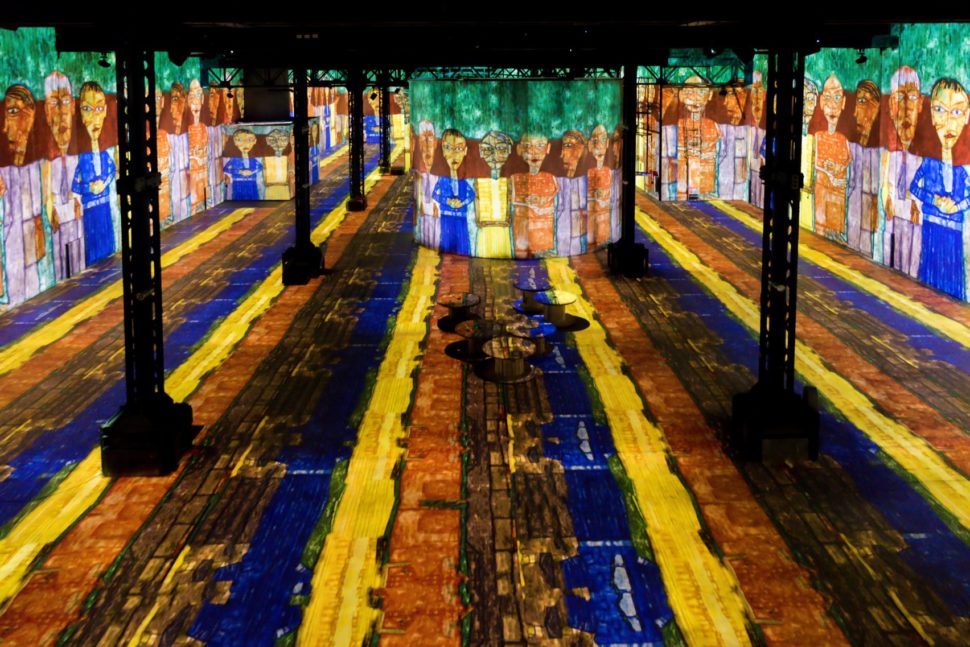
A new museum joins the world wide known touristic attractions from Paris. The new digital museum of fine art opened its gates for the public and the people simply can’t get enough of it. It’s called the Atelier des Lumiere.
What makes this museum so unique is that it’s located in a former foundry in the 11th arrondissement. The opening of this museum marks the French capital’s first ever digital arts museum.
Facts and opinions about the Digital Museum of Fine Art
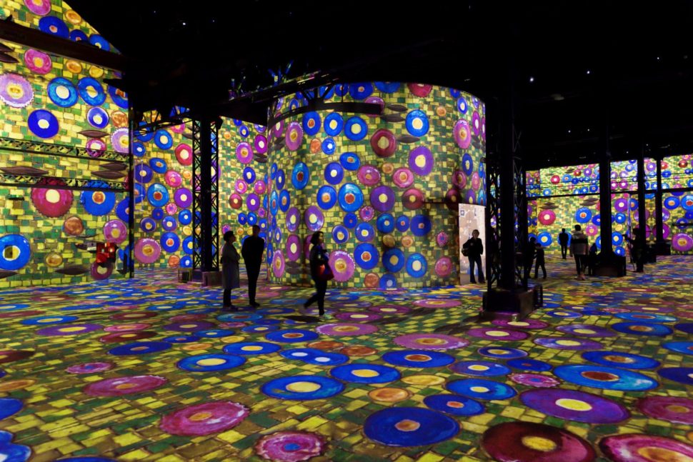
Culturespaces, a private operator of museums and monuments, has overseen the project from the time of it’s creation until now. When you walk in the door, you’ll find yourself surrounded by digitally projected art. Spread beautifully across 10-meter high walls in the massive 3,300 square-meter space.
The whole idea behind the creation of this museum was to give people access to art that normally wouldn’t have such access. In addition, the way the art is displayed is meant to showcase the way technology has impacted the way people view art.
These immersive exhibitions can be an introductory way to discover pictorial art and such a digital center was lacking in Paris, explained Michael Couzigou, director of the Atelier des Lumiere.
The team that makes the magic happen in the digital museum believe that art culture is drawing closer and closer to digital representations. This means it takes us farther away from the standard paint and canvas.
“People do not learn about culture as they did in the past,” said Bruno Monnier, the president of Culturespaces. “Practices are evolving and the cultural offering must be in step with them. The marriage of art and digital technology is, in my opinion, the future of the dissemination of art among future generations.”
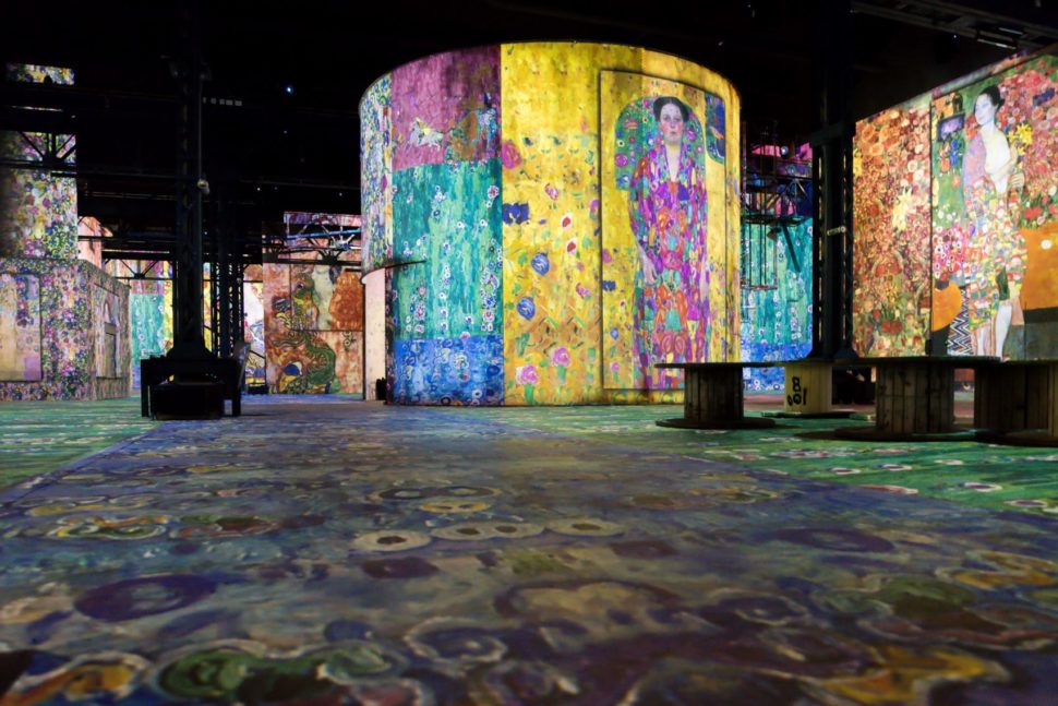
The building boasts three main exhibition rooms. Two of those three rooms are strictly dedicated to Austrian painter Gustav Klimt and an entire century of Viennese paintings, which include work by Egon Schiele and Hundertwasser.
“We decided to focus on Gustav Klimt, on the centenary of his death, for three reasons: the variety of his expressive forms, which range from classicism to early impressionism, and his quest to create a ‘total art’ during the secession (an art movement at the turn of the 19th century), his fame, and the poetic and romantic nature of his oeuvre, which we saw as an ideal starting point,” said Couzigou.
“We are also including a short programme devoted to the painter and architect Friedensreich Hundertwasser, who was influenced by Klimt’s work.”
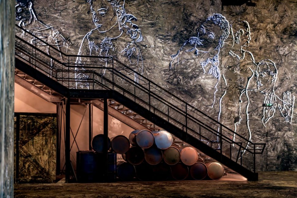
The third room is dedicated to up coming artists that wish to display their work. It features digital and AI installations.
Final thoughts
It’s no secret that digital art is on the rise. As technology advances, so will everything else, including art expression. I see it as just another way for creative minds to use their talents to unlock the secrets hidden in their mind. Without this technology, we may never get to experience what it’s like to see through the eyes of these individuals.
Early in my career when I worked at agencies and later at Microsoft on Edge, I heard the same lament over and over: “Argh, why doesn’t Edge just run on Blink? Then I would have access to ALL THE APIs I want to use and would only have to test in one browser!”
Let me be clear: an Internet that runs only on Chrome’s engine, Blink, and its offspring, is not the paradise we like to imagine it to be.
As a Google Developer Expert who has worked on Microsoft Edge, with Firefox, and with the W3C as an Invited Expert, I have some opinions (and a number of facts) to drop on this topic. Let’s get to it.
What is a browser, even?
Let’s clear up some terminology.
Popular browsers you know today include Google Chrome, Apple Safari, Mozilla Firefox, and Microsoft Edge, but in the past we’ve also had such greats as NCSA Mosaic and Netscape Navigator. Whichever browser you use daily (I use Firefox, thanks for asking) is only an interface layer wrapped around a browser engine. All your bookmarks, the forward and backward arrows, that URL bar thingy—those aren’t the browser. Those are the browser’s interface. Often the people who build the browser’s engine never even touch the interface!
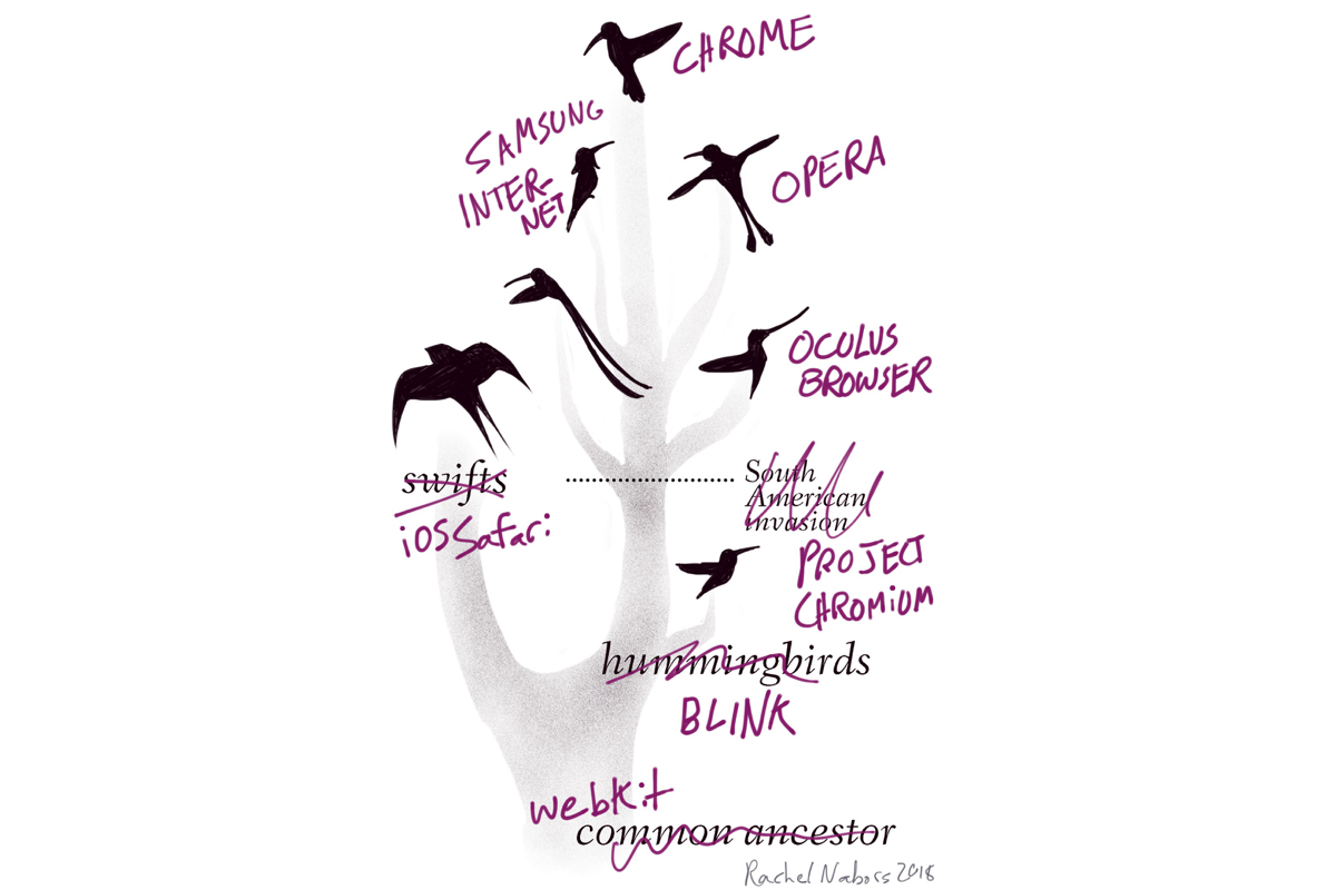
Browser engines are the things that actually read all the HTML and CSS and JavaScript that come down across the Internet, interpret them, and display a pretty picture of a web page for you. They have their own names. Chrome’s engine is Blink. Safari runs on WebKit. Firefox uses Gecko. Edge sits on top of EdgeHTML. (I like this naming convention. Good job, Edge.)
Except for Edge, all of these engines are open source, meaning anybody could grab one, wrap it in a new interface, and boom, release their own browser—maybe with a different (perhaps better) user experience—and that’s just what some browsers are! Oculus Browser, Brave, Vivaldi, Samsung Internet, Amazon’s Silk, and Opera all run on Blink. We call them “Chromium-based browsers”—Chromium is Google’s open source project from which Chrome and its engine emerged.
But what’s inside a browser engine? MOAR ENGINES! Every browser engine is comprised of several other engines:
A layout and rendering engine (often so tightly coupled that there’s no distinction) that calculates how the page should look and handles any paints, renders, and even animations.
A JavaScript engine, which is its own thing and can even run independently of the browser altogether. For instance, you can use Chrome’s V8 engine or Microsoft Edge’s Chakra to run Node on a server.
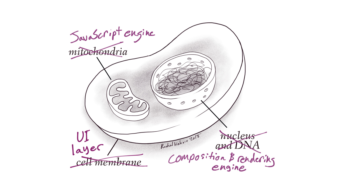
I like to compare browser engines to biological cells. Where a cell contains many organelles to perform different functions, so too do browsers. One can think of the nucleus as the rendering engine, containing the blueprints for how the page should display, and the mitochondria as the JavaScript engine, powering our everyday interactions. (Fun fact: mitochondria used to be standalone cells at one point, too, and they even carry their own DNA!)
And you know what? Another way browsers are like living things is that they evolve.
Browser evolution
Back when the first browsers came out, it was a simpler time. CSS was considered the hot new thing when it first appeared in Microsoft Internet Explorer 3 in 1996! There were far fewer JavaScript APIs and CSS specifications to implement than there are today. Over the years, browser codebases have grown to support the number of new features users and developers require to build modern web experiences. It is a delicate evolution between user needs, browser engineering effort, and specification standardization processes.
We have three major lineages of engines right now:
WebKit and Blink (Blink originally being a fork of WebKit) running Safari, Chrome, and Opera
Gecko running Firefox
EdgeHTML (a fork of Trident, aka MSHTML) running Microsoft Edge
Each is very different and has different strengths and weaknesses. Each could pull the Web in a different direction alone: Firefox’s engine has multithreaded processing for rendering blazing fast graphics. Edge’s engine has the least abstraction from the operating system, giving it more direct access to system resources—but making it a Windows-only browser engine as a result. And Chrome’s Blink has the most web developers testing for it. (I’ll get back to why this is a “feature” in a little bit.)
Remember all those Chromium-based browsers we talked about? Well, none of these browsers have to build their rendering engine or JavaScript engines from scratch: they just piggy-back off of Blink. And if there are new features they need? They can develop those features and keep them to themselves, or they can share those features back “upstream” to become a part of the core engine for other browsers to use. (This process is often fraught with politics and logistics—”contributing back” is easier said than done!)
It is hard to imagine any one entity justifying the hours and expense it would take to spin up a browser engine from scratch today. Even the current three engine families are evolutions of engines that were there from the very start of the Internet. They’ve evolved piecemeal alongside us, growing to meet our needs.
Right now, the vast majority of traffic on the Web is happening on Chrome, iOS Safari, or some other permutation of Blink or WebKit.
Branches, renovations, and gut jobs
Some developers would say that WebKit and Blink were forked so long ago that the two are practically completely different browser engines now, no longer able to share contributions. That may be true to a point. But while a common chimney swift and a ruby-throated hummingbird are completely different animals in comparison to each other, when compared to the other animal families, they are still very much birds. Neither’s immediate offspring are likely to manifest teeth, hands, or tails in the near future. Neither WebKit nor Blink have the processing features that Gecko and EdgeHTML have been building up to for years.
Other developers might point out that Microsoft Edge is supposedly a “complete rewrite” of Internet Explorer. But the difference between a “complete gut job” and a mere “renovation” can be a matter of perspective. EdgeHTML is a fork of Internet Explorer’s Trident engine, and it still carries much of Trident’s backlog with it.
Browser extinction
So these are the three browser engines we have: WebKit/Blink, Gecko, and EdgeHTML. We are unlikely to get any brand new bloodlines in the foreseeable future. This is it.
If we lose one of those browser engines, we lose its lineage, every permutation of that engine that would follow, and the unique takes on the Web it could allow for.
And it’s not likely to be replaced.
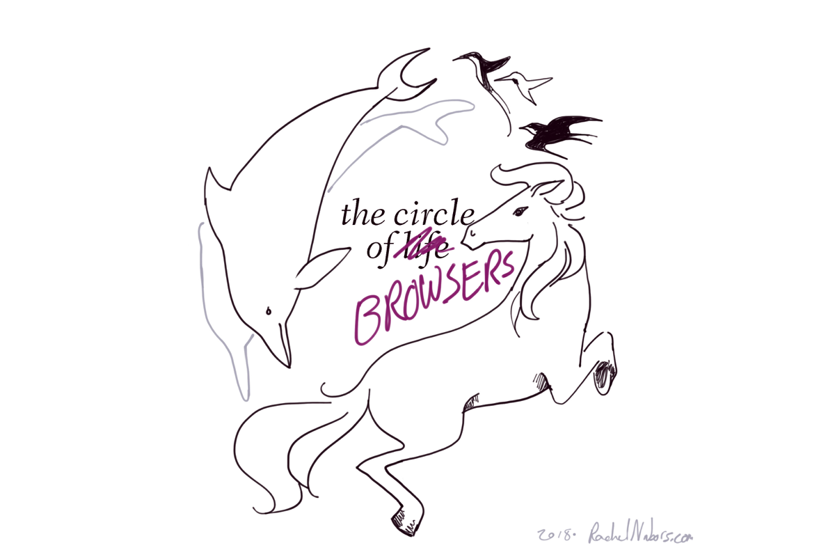
Imagine a planet populated only by hummingbirds, dolphins, and horses. Say all the dolphins died out. In the far, far future, hummingbirds or horses could evolve into something that could swim in the ocean like a dolphin. Indeed, ichthyosaurs in the era of dinosaurs looked much like dolphins. But that creature would be very different from a true dolphin: even ichthyosaurs never developed echolocation. We would wait a very long time (possibly forever) for a bloodline to evolve the traits we already have present in other bloodlines today. So, why is it ok to stand by or even encourage the extinction of one of these valuable, unique lineages?
We have already lost one.
We used to have four major rendering engines, but Opera halted development of its own rendering engine Presto before adopting Blink.
Three left. Spend them wisely.
By our powers combined…
Some folks feel that if a browser like Microsoft Edge ran on Blink, then Microsoft’s engineers could help build a better Blink, contributing new features upstream for all other Chromium browsers to benefit from. This sounds sensible, right?
But remember Blink was forked from WebKit. Now there are WebKit contributors and Blink contributors, and their contributions don’t port one to one. It’s not unlikely that a company like Microsoft would, much like Samsung and Occulus, want to do things with the engine differently from Google. And if those differences are not aligned, the company will work on a parallel codebase and not contribute that work upstream. We end up with a WebKit and a Blink—but without the deep differentiation that comes from having a codebase that has been growing with the Internet for decades.
It’s is a nice idea in theory. But in practice, we end up in a similar pickle—and with less “genetic variety” in our ecosystem of browser engines.
Competition is about growing, not “winning”
I’m a fan of competition. Competing with other cartoonists to make better comics and reach a larger audience got me to where I am today. (True story: got my start building websites as a cartoonist building her own community site, newsletter, and shopping cart.) I like to remind people that competition isn’t about annihilating your competitors. If you did, you’d stagnate and lose your audience: see also Internet Explorer 6.
Internet Explorer 6 was an amazing browser when it came out: performant enough to really deliver on features previous versions of Internet Explorer introduced like the DOM, data-binding, and asynchronous JavaScript. It’s rival, Netscape Navigator, couldn’t compete and crumbled into dust (only to have its engine, Gecko, rewritten from scratch—it was that small!—by the Mozilla Foundation to be reborn as Firefox later).
Thinking it had Won the Internet, Microsoft turned its attention to other fronts, and Internet Explorer didn’t advance much. When the iPhone came, Apple focused on its profitable apps marketplace and cut efforts to support Flash—the Web’s most app-like interaction platform. Apps gave content creators a way to monetize their efforts with something other than an advertising model. Advertising being Google’s bread and butter, the Big G grew concerned as the threat of a walled garden of apps only using the Internet for data plumbing loomed. Microsoft, meanwhile, was preoccupied with building its own mobile OS. So Google did two things: Android and Chrome.
Chrome promised a better, faster browsing experience. It was barebones, but Google even went all out and got famous (in my circles at least) cartoonist Scott McCloud to make a comic explaining the browser’s mission to users. With Chrome’s omnipresence on every operating system and Android phone, its dev tools modeled off Firefox’s beloved Firebug extension, and increasing involvement in specs, Chrome not only shook Internet Explorer out of its slumber, it was damn near threatening to kill off every other browser engine on the planet!
Pruning the great family tree of browsers (or collection of bushes as it were) down to a single branch smacks of fragile monoculture. Monocultures are easily disrupted by environmental and ecological challenges—by market and demographic changes. What happens when the next threat to the Web rears its head, but we don’t have Firefox’s multithreading? Or Microsoft Edge’s system integration? Will we be able to iterate fast enough without them? Or will we look to the Chrome developers to do something and pray that they have not grown stagnant as Google turned, like Microsoft did, to attend to other matters after “winning the Web.”
It is ironic that the browser Google built to keep the Web from losing to the apps model is itself monopolizing web development much the same way Internet Explorer 6 did.
It’s good to be king (of the jungle)
I promised I’d get back to “user base size as a feature.” Having the vast majority of the web development community building and testing for your platform is a major competitive advantage. First off, you’re guaranteed that most sites are going to work perfectly in your browser—you won’t have to spend so much time and effort tapping Fortune 500 sites on the shoulder about this One Weird Bug that is causing all their internal users to switch to your competitor browser and never come back. A downward spiral of fewer users leading to less developer testing leading to fewer users begins that is hard to shake.
It also makes it much easier to propose new specifications that serve your parent company’s goals (which may or may not serve the web community’s goals) and have that large community of developers build to your implementation first without having to wait for other browsers to catch up. If a smaller browser proposes a spec that no one notices and you pick it up when you need it, people will remember it as being your effort, continuing to build your mindshare whether intentionally or not.
This creates downward pressure on the competition, which simply doesn’t have or cannot use the same resources the biggest browser team has at its disposal. It’s a brutally efficient method, whether by design or accident.
Is it virtuous? At the individual contributor level, yes. Is it a vicious cycle by which companies have driven their competition to extinction by forcing them to spend limited resources to catch up? Also yes. And having legions of people building for just your platform helps.
All the awesome, well-meaning, genuinely good-hearted people involved—from the Chrome team to web developers—can throw their hands up and legitimately say, “I was just trying to build the Web forward!” while contributing to further a corporate monopoly.
Chrome has the most resources and leads the pack in building the Web forward to the point that we can’t be sure if we’re building the Web we want… or the Web Google wants.
Speculative biology
There was a time when Microsoft bailed out Apple as it was about to sink. This was not because Bill Gates and Steve Jobs were friends—no, Microsoft needed Apple to succeed so there would still be operating system competition. (No business wants to be seen as a monopoly!)
But consider, for a moment, that Apple had died. What would personal computers be like today if we’d only had Linux and Windows left standing? What would mobile computing look like if Apple hadn’t been around to work on the iPhone?
Yes, it’s easier to develop and test in only one browser. I’m sure IT professionals would have loved to only support one kind of machine. But variety creates opportunity for us as developers in the long run. Microsoft saving Apple lead to apps which challenged the Web which gave us Chrome and the myriad of APIs Google is charging ahead with. If at any point in this chain of events someone had said, “Meh, it’s so much easier if we all use the same thing,” we wouldn’t have the careers—or the world—that we have now.
Develop in more than one browser. Test in more than one browser. Use more than one browser.
You are both consumer and producer. You have a say in how the future plays out.