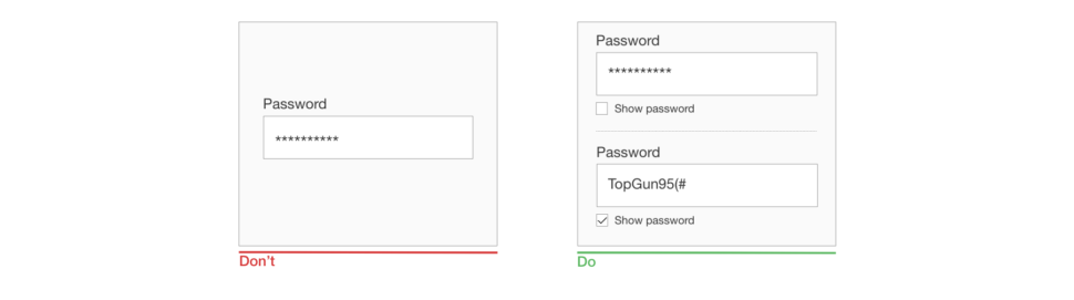
In this article, I will introduce the subject of competitive analysis, which is basically a method to determine how well your competitors are performing. My aim is to introduce the subject to those of you who are new to the concept. It should be useful if you are new to product design, UX, interaction or digital design, or if you have experience in these fields but have not performed a competitive analysis before.
No prior knowledge of the topic is needed because I’ll be explaining what the term means and how to perform a competitive analysis as we go. I am assuming some basic knowledge of the design process and UX research, but I’ll provide plenty of practical examples and reference links to help with any terms and concepts you might be unfamiliar with.
Note:If you are a beginner in UX and interaction design, it would be good to know the basics of the design process and to know what is UX research (and the methods used for UX research) before diving into the article’s main topic. Please read the next section carefully because I’ve added reference links to help you get started.
Competitive Analysis, Service Design Cycle, Five-Stages Design Process
If you are a UX designer, then you might be aware of the service design cycle. This cycle contains four stages: discover, explore, test and listen. Each one of these stages has multiple research methods, and competitive analysis is part of the exploration. Susan Farrell has very helpfully distinguished different UX research methods and activities that can be performed for your project. (You can check this detailed segregation in her “UX Research Cheat Sheet”.)
The image below shows the four steps and the most commonly used methods in these steps.
Please don’t confuse the five-stages design process with the service design cycle. Basically, they serve the same purpose in the design thinking process, but are explained in different styles. Here is a brief explanation of what these five stages contain:
Empathize
This stage involves gaining a clear understanding of the problem you are trying to solve from the user’s point of view.
Define
This stage involves defining the correct statement for the problem you are trying to solve, using the knowledge you gained in the first stage.
Ideate
In this stage, you can generate different solution ideas for the problem.
Prototype
Basically, a prototype is an attempt to give your solution some form so that it can be explained to others. For digital products, a prototype could be a wireframe set created using pen and paper or using a tool such as Balsamiq or Sketch, or it could be a visual design prototype created using a tool such as Sketch, Figma, Adobe XD or InVision.
Test
Testing involves validating and evaluating all of your solutions with the users.
You can perform UX research at any stage. Many articles and books are available for you to learn more about this design process. “Five Stages in the Design Thinking Process” by Rikke Dam and Teo Siang is one of my favorite articles on the topic.
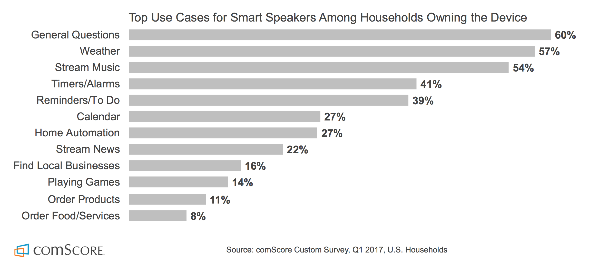
The most frequent methods used by UX professionals during the exploration stage of the design life cycle. (Nielsen Norman Group, “User Experience Careers” survey report) (Large preview)
According to Nielsen Norman Group’s “User Experience Careers” survey report, 61% of UX professionals prefer to do the competitive analysis for their projects. But what exactly is competitive analysis? In simple language, competitive analysis is nothing but a method to determine how your competitors are performing, what they are offering and how well they are doing it.
Sometimes, competitive analysis is referred as competitive usability evaluation.
Why Should You Do A Competitive Analysis?
There are many reasons to do a competitive analysis, but I think the most important reason is that it helps us to understand the rights and wrongs of our own product or service.
Using competitive analysis, you can make decisions based on knowledge of what is currently working well for your users, rather than based on guesses or intuition. In doing competitive analysis, you can also identify risks in your product or service and use those insights to add value to it.
Recently, I was working on a project in which I did a competitive analysis of a feature (collaborative meeting note-taking) that a client wanted to introduce in their web app. Note-taking is not exactly a new or highly innovative thing, so the biggest challenge I was facing was to make this functionality simpler and easier to handle, because the product I was working on was in the very early stages of development. The feature, in a nutshell, was to create a simple text document where some interactive action items could be added.
Because a ton of apps are out there that allow you to create simple text documents, I decided to do a competitive analysis for this functionality. (I’ll explain this process in more detail later in the section “Five Easy Steps to Do a Competitive Analysis”.)
How To Find The Right Competitors?
Basically, there are two types of competitors: direct and indirect. As a UX designer, your role is to study the designs of these competitors.
Jaime Levy gives very good definitions of direct and indirect competitors in her book UX Strategy. You can learn more about competitive analysis (and types of competitors) in chapter 4 of the book, “Conducting Competitive Research”.
Direct competitors are the ones who offer the same, or a very similar, set of features to your current or future customers, which means they are solving a similar problem to the one you are trying to solve, for a customer base that you are targeting as well.
Indirect competitors are the ones who offers a similar set of features but to a different customer segment; or, they target your exact customer base without offering the exact same set of features, which means indirect competitors are solving the same problem but for a different customer base, or are solving the same problem but offer a different solution.
You can search for these types of competitors online (by doing a simple web search), or you can directly ask your current and potential customers what they are using already. You can also look for your direct and indirect competitors on websites such as Crunchbase and Product Hunt, and you can search for them in the Google Play and the iOS App Store.
Five Easy Steps To Do A Competitive Analysis
You can perform a competitive analysis for your existing or new product using the following five-step process.
5 steps to do a competitive analysis. (Large preview)
1. Define And Understand The Goals
Defining and understanding the goal is an integral part of any UX research process. You must define an accurate goal (or set of goals) for your research; otherwise, there is a chance you’ll get the wrong outcome.
Draft all of your goals right before starting your process. When defining your goals, consider the following questions: Why are you doing this competitive analysis? What kind of outcome do you expect? Will this analysis affect UX decisions?
Remember: When setting up goals for any kind of UX research, be as specific as possible.
I mentioned earlier that I recently performed a competitive analysis for a collaborative meeting note-taking feature, to be introduced in the app that I was developing for a client. The goals for my research were very general because innumerable apps all provide this type of functionality, and the product I was working on was in the very early stages of development.
Even though your research goals might be simple, make them as specific as possible, and write them all down. Writing down your goals will help you stay on the right track.
The goals for my analysis were more like questions for which I was trying to find the answers. Here is the list of goals I set for this research:
Which apps do users prefer for note-taking? And why do they prefer them?
Goal: To find out the user’s behavior with these apps, their preferences and their comfort zone.
What is the working mechanism of these apps?
Goal: To find how out competitors’ apps work, so that we can identify their pros and cons.
What are the “star” features of these apps?
Goal: To identify functionalities that we were trying to introduce as well, to see whether they already exist and, if they exist, how exactly they were implemented.
How comfortable does a user feel when using these apps?
Goal: To identify user loyalty and engagement in the apps of our competitors.
How does collaborative editing work in these competitive apps?
Goal: To identify how collaborative-editing functionality works and to study its technical aspects.
What is the visual structure and user interface of these apps?
Goal: To check the visual look and feel of the apps (user interface and interaction).
2. Find The Right Competitors
After setting the goals, go on a search and make a list of both direct and indirect competitors. It’s not necessary to analyze all of the competitors you find. The number is completely up to you. Some people suggest analyzing at least two to four competitors, while others suggest five to ten or more.
Finding the right competitors for my research wasn’t a hard task because I already knew many apps that provided similar features, but I still did a quick search on Google, and the results were a bit surprising — surprising because most of the apps I knew turned out to be more like indirect competitors to the app I was working on; and later, after a bit more searching, I also found the apps that were our direct competitors.
Putting each competitor in the right list is a very important part of competitive analysis because the features and functionality in your competitors’ apps are based on exactly what users of those apps want. Let’s assume you put one indirect competitor, XYZ, under the “direct competitors” list and start doing your analysis. While doing the research, you might find some impressive feature in XYZ’s app and decide to add a similar feature in your own app; then, later it turns out that the feature you added is not useful for the users you are targeting. You might end up wasting a lot of energy, time and money building something that is not at all useful. So, be careful when sorting your competitors.
For my research, the competitors were as follows:
Direct competitors br>Quip, Cisco Spark Meeting Notes, Workboard, Lucid Meeting, Less Meeting, MeetingSense, Minute-it, etc.
All of the apps above provide the same type of functionality, which we were trying to introduce for almost the same type of user base.
Indirect competitors br>Evernote, Google Keep, Google Docs, Microsoft Word, Microsoft OneNote and other traditional note-taking apps and pen-paper note-taking methods.
The user base for all of the above is not exactly different from the user base we were targeting, but most of the users we were targeting were using these apps because they were unaware of the more convenient ways to take meeting notes.
3. Make A Competitive Analysis Matrix
A competitive analysis matrix is not complex, just a simple spreadsheet. You can use Microsoft Excel, Google Sheets, Apple Numbers or any other tool you are comfortable with.
First, divide all competitors you’ve found into two groups (direct and indirect) and put them in a spreadsheet. Jamie Levy suggests making the following columns:
competitor’s name,
URL,
login credentials,
purpose,
year founded.
Example of competitive analysis matrix spreadsheet from UX Strategy, Jaime Levy’s book. (Large preview)
I would recommend digging a bit deeper and adding a few more columns, such as for “unique features”, “pros and cons”, etc. It would help to summarize your analysis. It’s not necessary to set your columns exactly as mentioned above. You can modify the columns to your own research goals and needs.
For my analysis, I created only four columns. My competitive analysis matrix looked as follows:
Competitor name br>In this column, I put the names of all of the competitors.
URL br>These are website links or app download links for these competitors.
Features/comments br>In this column, I put all of my comments, some ”star” features I needed to focus on, and the pros and cons of the competitor. I color-coded the cells so that later I (or anyone viewing the matrix) could easily identify the difference between them. For example, I used light yellow for features, light purple for comments, green for pros and red for cons.
Screenshots/video links br>In this column, I put all of the screenshots and videos related to the features and comments mentioned in the third column. This way, it became very easy and quick to understand what a particular comment or feature was all about.
Once you are done with the analysis matrix spreadsheet, move on and create a summary of your findings. Be as specific as possible, and try to answer all of your questions while setting up a goal or during the overall process.
This will help you and your team members and stakeholders make the right design and UX decisions. This summary will also help you find new design and UX opportunities in the product you’re building.
In writing the summary and the presentation for the competitive analysis that I did for this collaborative note-taking app, the competitive analysis matrix helped me a lot. I drafted a document with all of the high-level takeaways from this analysis and answered all of the questions that were set as goals. For the presentation, I shared the document with the client, which helped both the client and me to finalize the features, the flows and the end requirements for the product.
5. Presentation
The last step of your competitive analysis is the presentation. It’s not a typical slideshow presentation — rather, just share all of the data and information you collected throughout the process with your teammates, stakeholders and/or clients.
Getting feedback from everywhere you can and being open to this feedback is a very important part of the designer’s workflow. So, share all of your finding with your teammates, stakeholders and clients, and ask for their opinion. You might find some missing points in your analysis or discover something new and exciting from someone’s feedback.
Conclusion
We live in a data-driven world, and we should build products, services and apps based on data, rather than our intuition (or guesswork).
As UX designers, we should go out there and collect as much data as possible before building a real product. This data will help us to create a solid product that users will want to use, rather than a product we want or imagine. These kinds of products are more likely to succeed in the market. Competitive analysis is one of the ways to get this data and to create a user-friendly product.
Finally, no matter what kind of product you are building or research you are conducting, always try to put yourself in the users’ shoes every now and then. This way, you will be able to identify the users’ struggles and ultimately deliver a better solution.
I hope this article has helped you plan and make your first competitive analysis for your next project!
Further Reading
If you want to become a better UX, interaction, visual (UI) or product designer, there are a lot of sources from which you can learn — articles, books, online courses. I often check the following few: Smashing Magazine, InVision blog, Interaction Design Foundation, NN Group and UX Mastery. These websites have a very good collection of articles on the topics of UI and UX design and UX research.
No, it’s not a clickbait title and yes, starting with $100 can get you an actual running store.
In this article I’ll go through every step you need to take to get your store up and running and explain the costs involved.
Granted, to keep the costs down you’ll do all the heavy lifting but hey, nothing worthwhile ever comes easy so let’s dive right in…
1. The Product
It might feel odd for some that I would go about explaining how to launch a $100 store and start with the product but truth is, the site, domain, logo everything needs to be tailored to fit the product you are trying to sell. The success or failure of your business will rely on your ability to select the correct product and the right market so don’t skip over this step.
Here’s a quick way to validate your idea: Go to Google Trends and type in a word that describes your product, eg: “phone case” or “headlights”. You’ll see in a graph below how much interest there is in a particular region like the US. Keep in mind you can also see the results of Worldwide searches but if you are going to target a particular region I’d advise you look there. Look for trends going up or have a steady above 40 interest. That’s what you are looking for.
A couple of years ago I launched a business selling baby and toddler related toys, clothes, etc. When I looked at Google Trends I remember doing around 40 different searches and seeing what my audience was looking for to get a proper understanding of what my target audience looks for and what types of products I need to add to the store.
A second, yet just as important step here is to look for what your competition does, how they address their customers and look for negative feedback from their users. See what they do wrong and aim to improve on those aspects specifically.
Cost: $0
2. The Domain
So you found your product and market. Good for you. Now you need to get the domain that will bring in your flock of loyal customers and though it might sound irrelevant, the domain can really hurt you if you don’t get the right one.
So what makes a good domain name?
Good question. It’s hard to decide if you want to get something brandable or get some keywords in the domain name. If you end up using keywords in the domain name you’d give your viewers a clear idea of they’ll be getting when seeing your store but what if you want to pivot? What if you find out 6 months in, that the store is selling more than just whatever your keyword in the domain is. If your aim is to build a strong brand, then by all means, put your brand name in the domain.
In regards to the TLD (Top-level domain) you choose, get a “.com” if your audience is worldwide, and go local if you are targeting a specific country. It’s as simple as that.
Other than that, keep your domain name short, be unique and unless you have no other choice, avoid hyphens.
As far as providers go I usually stick to Godaddy.com or namecheap.com, both are great services with good service and solid support.
Cost: $10
3. The Platform (Self-Hosted Solution vs SaaS)
I could probably talk for the next hour on why you should pick one CMS or another, why you can go serverless or use a traditional hosting or even if you should go for a SaaS option or not, but I won’t go into that much detail. Instead, I’ll touch briefly on each subject and only talk about the main “players” in each category.
We’ve seen, the past few years, an explosion of E-commerce SaaS options, some better than others yet the fact that almost every week you hear about a new SaaS in this segment makes me think there’s still room for innovation.
What are the benefits of having a SaaS? Basically, you get to launch your store exponentially faster. You basically signup, add your products, set up payments and delivery options and you are good to go.
Before I get swarmed by angry mobs yelling at me for not talking about their favorite e-commerce platform provider, I want to point out that I’ll limit this article to only two SaaS platforms, that I think, are different enough to give you a wider perspective on how far you can actually go choosing an e-commerce SaaS.
SaaS
Number 1: the king of e-commerce SaaS: Shopify, an easy to use platform that will make sense for most people needing a simple shop with no need for a whole lot of customization. There’s a ton of support for it, themes, plugins and customizing your shop is really easy.
Number 2: a newer player in the SaaS space, yet special: Blugento, a simple to use SaaS, similar to Shopify in this regards, the difference being that behind the curtains, there a fully functioning Magento platform doing the heavy lifting. (I’ll talk about Magento as a self-hosted platform below.) The main benefit of Blugento is the scalability of the store, something lacking from all other providers and an aspect that’s incredibly important.
Self-hosted solutions are dime a dozen and they differ from one another by a number of differences but perhaps the most important one is the community surrounding it. This is a crucial factor for you and your store. Since you are reading a “$100 e-commerce site” article you probably can’t rely on a big team of in-house developers that you can breed, educate, and have lying around until that inevitable time when your site will go down.
And it will. It will crash in the most unexpected way at the most inconvenient time…
Cost: around $50/month
Self-Hosted CMS
…that’s why I’m going to only talk about the two biggest platforms, Magento and WooCommerce. They are both immensely popular with crazy big communities around them, testing, developing and pushing the platform to the limits.
Number 1:Magento has been around since 2008 and it quickly became a favorite amongst developers even if, at the time, there were bigger and more popular e-commerce CMS. Magento is not going to be for everyone, hosting costs are going to be higher, development is more complicated but in return, you get a versatile store with a lot of room for customization and it scales gracefully so when your business grows, your store can grow with it handling hundreds of thousands of products without a problem.
Number 2:WooCommerce is on the other side of the spectrum, easy to install, development is easy and you get a ton of free plugins and themes. Since it runs on top of WordPress development is cheap and it’s relatively easy to find developers to work on the store adding extra features. Compared to Magento, the management of inventory and orders is faster and easier but after about 50K products added to your store, you’ll have to think about upgrading to something like Magento.
Both self-hosted options described above will need a hosting company before they can see the light of day. I personally recommend going with hostgator.com or siteground.com but there are a ton of great choices out there.
Installing either platform is easy as both hosting providers offer tools for installing Magento or WordPress through a simple point and click wizard. No more messing with the console, creating databases and editing confusing PHP files.
Cost: $0 for the platforms, between $10 – $25 / month for hosting
Serverless
I’d be remiss not to mention serverless in this discussion as this is something that has been talked a lot about in the recent months and we’ve seen big names in E-commerce move their operations to the cloud, companies like Zalora.
Zalora moved everything to AWS, website, mobile apps, warehouse operations, everything is running off of EC2, S3, Lambda, and RedShift. They are the biggest retailer in Asia with over 20 million users and yet, their entire infrastructure development team is composed of 3 people, which for anyone understanding the difficulties running such a large website can say it’s amazing!
This is done through AWS Lambda, a service launched by Amazon that lets you upload small pieces of code that work as microservices, called functions—hence the term Functions as a Service or FaaS. They basically do a very specific task that your website triggers, returning a simple result. The technology behind it promises to allow developers to build websites and apps without having to worry about the backend or the infrastructure, all while keeping the costs at an all-time low.
There are three big reasons for switching to a serverless framework: cost, development speed and scalability. There are companies saving tens of thousands of dollars a month after switching to serverless and an average of 77% faster delivery speed of the products. Check out this case study on how serverless saves money in comparison to traditional hosting solutions.
Poor website performance is now measured in terms of lost customers and revenues
– Tom Lounibos, CEO, SOASTA
4. Branding
If I’d were to say branding is important I’d be grossly understating it. I will say that a solid logo and branding will make up the foundation of your successful store. So how can you build one that reflects your company’s image while still looking professional? Well, the easy way would be to throw money at it, but we don’t roll like that, so we’ll be doing this ourselves.
The first place to start is to look for inspiration and you do this by going through design and branding websites looking at the current trends, tutorials and any tips or tricks that will help you in this endeavor. My suggestion would be to start with sites like hipsthetic.com or designoholic.com and then try to expand your search to Pinterest.
Alright, you now have an idea of what you need but you aren’t going to pay a couple of hundred dollars per month for Photoshop because that will blow the entire budget we’ve set for ourselves. So what we do is we sign up with Canva.com. It’s free and it will get you started quite fast. After watching a 1-minute tutorial you’ll be ready to start creating your first logo.
Don’t stop at one. Make two or three and show them to a couple of friends to get feedback. After picking the winner get back to Canva.com and make a few more: one that has transparency; one that is all black; and one that is all white. You can use the color one for your website and the rest you’ll use to watermark catalog images (I don’t really recommend using watermarks on product images but if you absolutely have to, place them in a corner somewhere) business cards, social media posts, etc. You get the point.
Cost $0
5. First Marketing Steps
Alright, we almost made it. There’s only one little step ahead of us. And by little I actually mean the most important thing you’ll end up doing for your business.
SEO
Let’s start with something basic: on page SEO, sounds easy enough, right? Well, not exactly. There are a lot of moving parts when it comes to SEO and I won’t have time to go into much detail but I will let you with this awesome infographic that will teach you pretty much all you need.
Social Media
You probably know this by now, SM is a tool that you can leverage to get in front of the right customers. Start posting on a regular basis but be careful not to alienate your readers with overzealous posts promoting products. I recommend people use the 8 + 2 rule. You provide 8 pieces of useful content, regardless if it’s on your site or not. Content like tutorials, tips and tricks, peer reviews, etc. Don’t be afraid to test the water with this strategy, find out what your users like and with that type of content they interact and start sharing.
Content Marketing
This will be your bread and butter for the next few months. It’s crucial to have a blog where you can share your experiences and knowledge with your peers. As part of the content marketing efforts, you’ll have to do guest posts. Find like minded people who own blogs and start pitching ideas for guest posts. Most blog owners are fairly easy to reach and communicate with so I highly advise you do this. Guest blogging on small blogs is a great way to reach new audiences but perhaps even better than that would be to go on Medium.com. It’s a great platform to publish content, with a ton of viewers, so I’d strongly suggest you try it out.
6. Advertising
So if my math is correct after getting set up with your website domain and host you’d be left with $30 to $40. I’d advise you drop a few dollars in Facebook ads. It’s easy to do, you don’t need to spend money on a consultant and Facebook has a bunch of tutorials on this. What I’d suggest you do is select the best products you have in your store and create a carousel. Have at least 4 products in there. Select a small audience with the demographic that fits your niche and place a $5 limit on the ad spending. You’ll have around a week to tweak the ad and if you have the right combination of audience and product, chances are you’ll have made your first sell by now.
The Grand Total
If you do the math, going with a self-hosted solution will cost around $50 to host ( for a 5 or 6 month period), add to that $ 10 for the domain and you get to $ 60. You’ll have to host it yourself, do all the maintenance and configuration but you get to have about 6 months to make up your investment.
Going with a SaaS will cost around $60 but you will be done and ready to go in a couple of days which is great if you don’t want to spend time learning to code or set up a CMS. The downside here is that your $50 will cover only that first month which adds to the pressure of making a few sells (which shouldn’t be a problem).
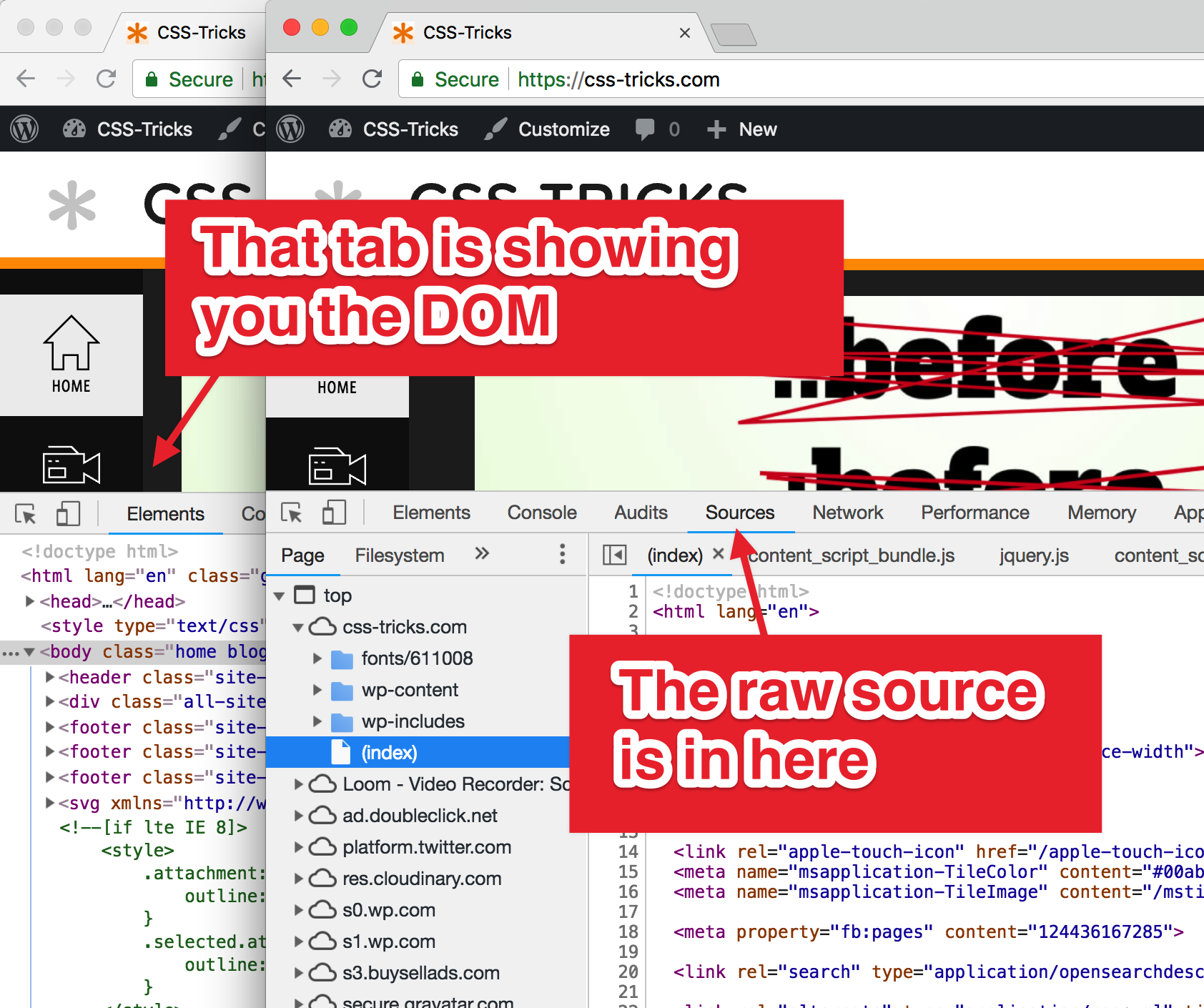
No way, Jose! I use View Source all the time! It’s very useful when you want to look at the raw HTML, not the DOM.
Yes, that is useful, and yes, there is a difference. But just because you are looking at DevTools doesn’t mean the DOM is the only thing you can see.
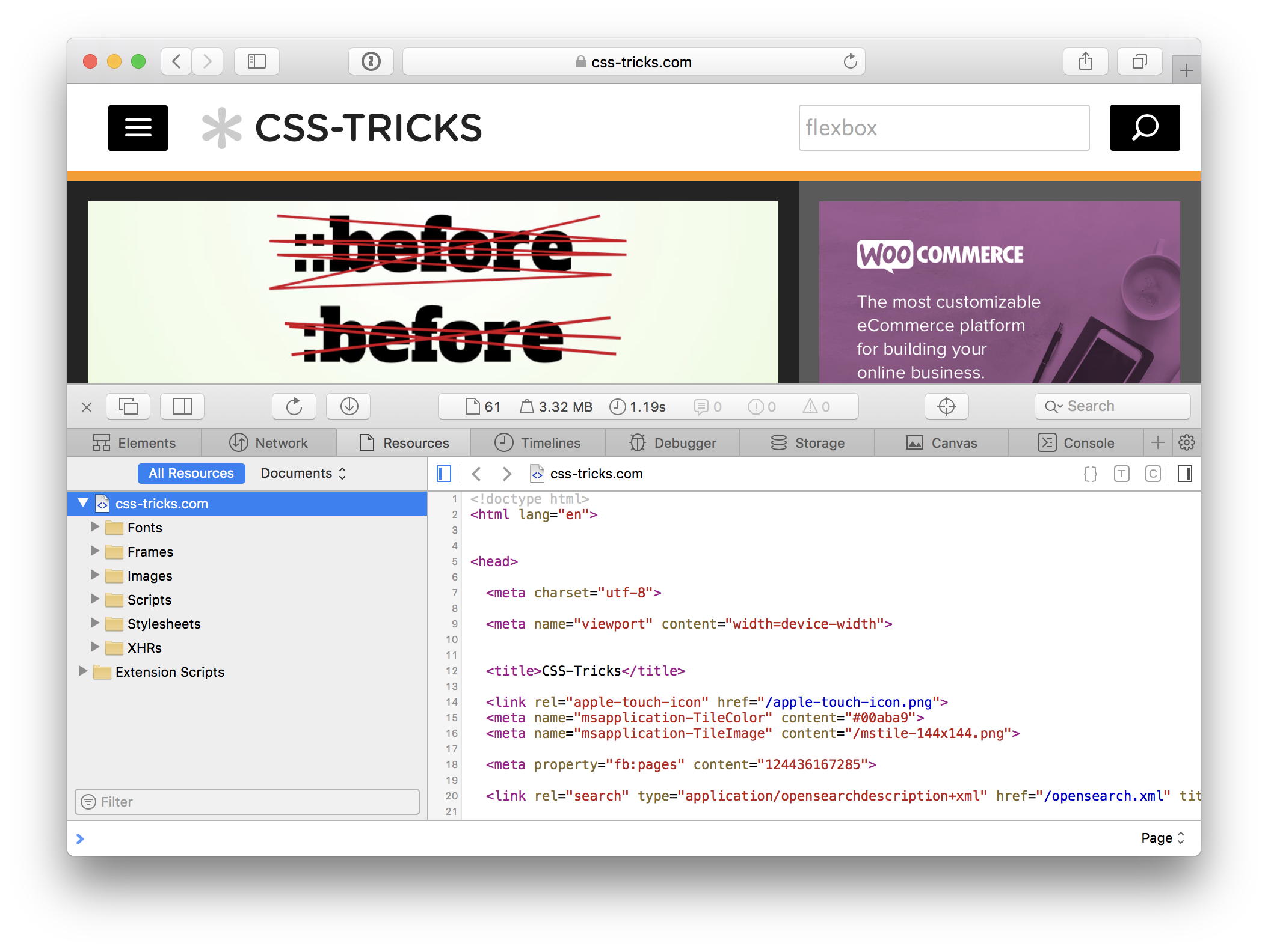
This is Chrome DevTools.Safari has a Resources tab
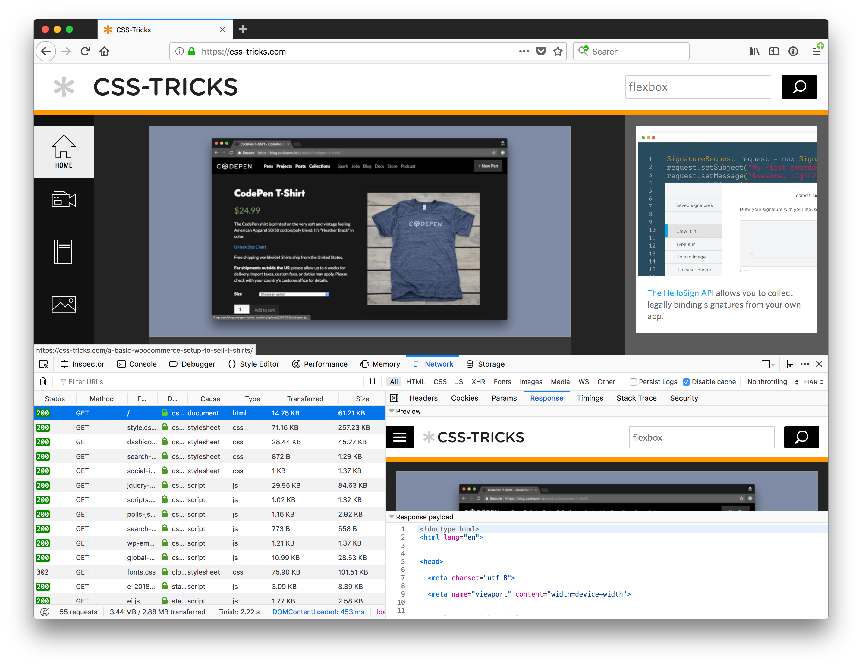
There is also a Network tab in DevTools for every browser. That’s where you find a way to look at the document.
Firefox’s Network tab
So, if your concern about losing View Source is that you’d have no possible way to see the document instead of just the DOM, that’s just not true. You can rest assured that you have the same affordance in DevTools.
If your concern is that it’s handier to see the source as a full-window tab with an easy keyboard shortcut, then sure, OK, that’s a reasonable argument to make.
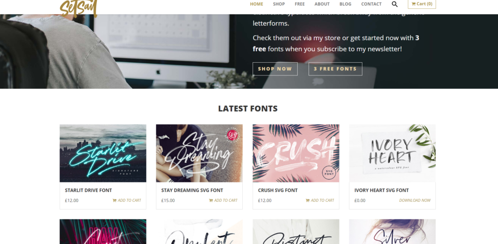
In this week’s installment of Font of the Week, we’re going to be taking a look at some of the work of the very talented sam Parrett. In particular, we’re going to highlight the font named Northwell.
Northwell is a handwritten, rustic font that offers homemade sense to whatever design it’s attached to. The brush strokes and signature style make this the perfect font for any branding or home-ware designs.
What would Northwell go well with?
The font gives a personal touch to anything it finds itself on. It would be perfect for some inspirational signage hanging in a farm-style house, studio apartment, or cozy office space.
It’s also a great choice for business cards, wedding invitations, or trendy packaging. It’s all about that handwritten, personal vibe nowadays, and the star font hits it dead on.
What’s in the package?
In Northwell’s total package, you get 3 font files.
Northwell – The handwritten script font with uppercase and lowercase characters, numerals, and a very large selection on punctuals.
Northwell Alt – This is the second version of Northwell. It contains a completely new set of uppercase and lowercase characters. If you’re going after a truly handwritten feel, you can swap between the two versions to avoid repetition.
Northwell swash – The swash file is a set of 20 hand drawn swashes to complement your text. To use it, install it as a separate font, select it from the font menu, and use any A-U character to create your swash.
The amazing work of Sam Parrett
Sam is no stranger to brilliant work. You’ll find that Sam creates quite a few massively detailed fonts that will make any project of yours stand out wonderfully.
Setsailstudios.com is an entire website dedicated to Sam’s work. It’s packed to the absolute brim with custom fonts that you’ll adore. Go and take a look, and I’m sure you’ll find exactly what you’re looking for. You might even find some nice freebees along the way.
We hope that you liked this article and the Northwell font. If you liked what you saw, be sure to give it a download and personalize any project you’ve been working on.
End-to-end testing is awesome because it mirrors the user’s experience. Where you might need a ton of unit tests to get good coverage (the kind where you test that a function returns a value you expect), you can write a single end-to-end test that acts like a real human as it tests several pieces of your app at once. It’s a very economical way of testing your app.
Cypress is a new-ish test runner with some features that take some of the friction out of end-to-end testing. It sports the ability to automatically wait for elements (if you try to grab onto an element it can’t find), wait for Ajax requests, great visibility into your test outcomes, and an easy-to-use API.
Note: Cypress is both a test runner and a paid service that records your tests, allowing you to play them back later. This post focuses on the test runner which you can use for free.
Installing Cypress
Cypress.io installs easily with npm. Type this into your terminal to install it for your project:
npm install --save-dev cypress
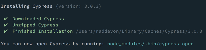
If everything works, you should see output that looks like this in your terminal:
Now, let’s write some tests to see how this thing works!
Setting up tests for CSS-Tricks
We’ll write some tests for CSS-Tricks since it’s something we’re all familiar with… and maybe this will help Chris avoid any regressions (that’s where changing one thing on your site breaks another) when he adds a feature or refactors something. ?
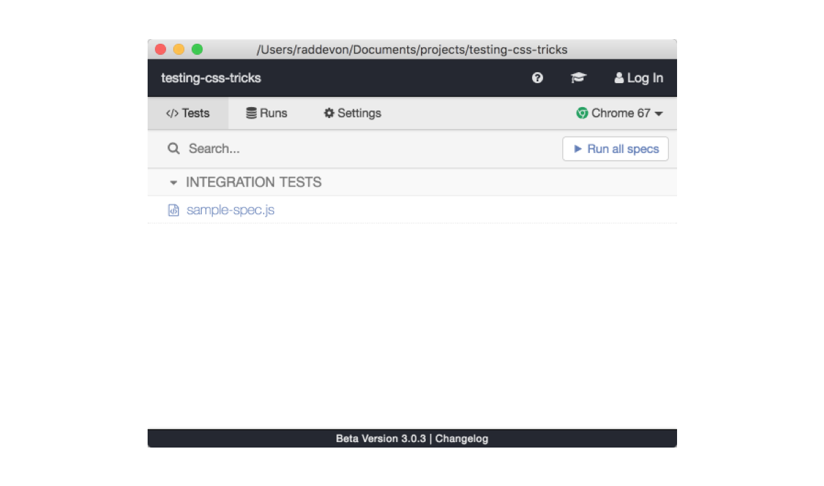
I’ll start inside my directory for this project. I created a new directory called testing-css-tricks inside my projects directory. Typically, your Cypress tests will go inside the directory structure of the project you want to test.
By default, Cypress expects integration tests to be in cypress/integration from the project root, so I’ll create that folder to hold my test files. Here’s how I’d do that in the terminal:
mkdir cypress
mkdir cypress/integration
You don’t have to use this default location though. You can change this by creating a cypress.jsonconfiguration file in your project root and setting the integrationFolder key to whatever path you want.
Test: Checking the Page Title
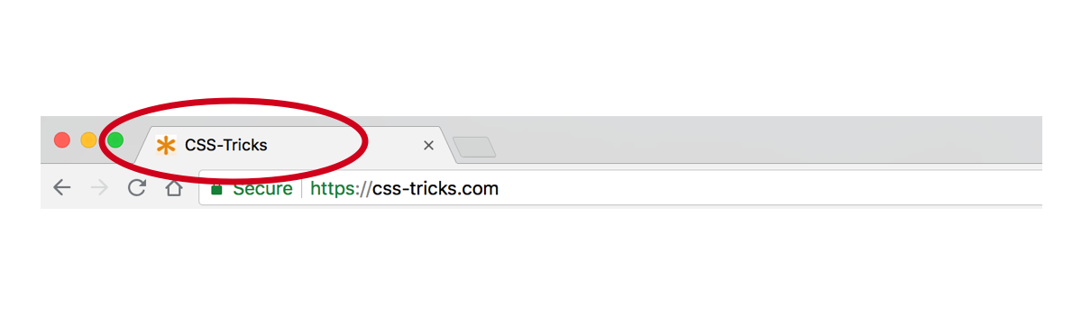
Let’s start with something really simple: I want to make sure the name of the site is in the page title.
A Chrome browser window with an open tab containing the CSS-Tricks page title.
The describe function
I’ve created a file inside cypress/integration called sample-spec.js. Inside that file, I’ll kick off a test with a call to describe.
describe('CSS-Tricks home page', function() {
});
describe takes two arguments: a string which I think of as the “subject” of your testing sentence and a callback function which can run any code you want. The callback function should probably also call it which tells us what we expect to happen in this test and checks for that outcome.
The it function
describe('CSS-Tricks home page', function() {
  it('contains "CSS-Tricks" in the title', function() {
  });
});
The it function has the same signature: it takes a string and a callback function. This time, the string is the “verb” of our testing sentence. The code we run inside the it callback should ultimately check our assertion (our desired result) for this test against reality.
This describe callback can contain multiple calls to it. Best practice says each it callback should test one assertion.
Setting up tests
We’re getting slightly ahead of ourselves, though. In our describe call, we’ve made it clear that we intend to test the homepage, but we’re not on the homepage. Since all the tests inside this describe callback should be testing the homepage (or else they belong somewhere else), we can just go ahead and navigate to that page in a beforeEach inside the describe callback.
describe('CSS-Tricks home page', function() {
  beforeEach(function() {
    cy.visit('https://css-tricks.com/');
  });

  it('contains "CSS-Tricks" in the title', function() {
  });
});
beforeEach reads just like what it does. Whatever code is in the callback function passed to it gets executed before each of the tests in the same scope (in this case, just the single it call under it). You have access to a few others like before, afterEach, and after.
You may wonder why not use before here since we’re going to test the same page with each of our assertions in this block. The reason beforeEach and afterEach are used more frequently than their one-time counterparts is that you want to ensure a consistent state at the start of each test.
Imagine you write a test that confirms you can type into the search field. Great! Imagine you follow it with a test that ensures the search field is empty. Fail! Since you just typed into the search field in the previous test without cleaning up, your second test will fail even though the site functions exactly as you wanted: when it’s first loaded, the search field is empty. If you had loaded the page before each of your assertions, you wouldn’t have had a problem since you’d have a fresh state each time.
Driving the browser
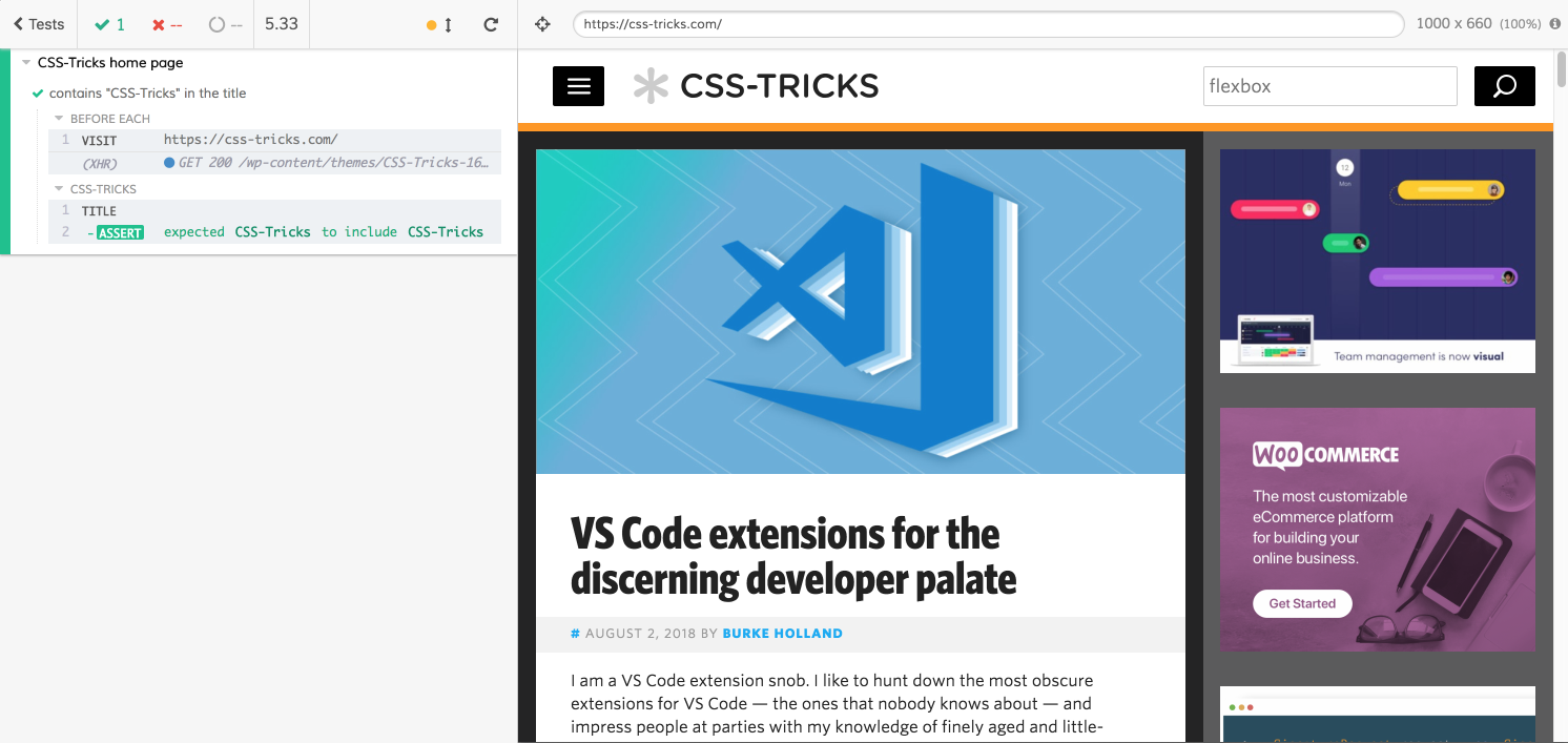
cy.visit() in the example above is the equivalent to our user clicking in the address bar, typing https://css-tricks.com/, and pressing return. It will load up this page in the web browser. Now, we’re ready to write out an assertion.
describe('CSS-Tricks home page', function() {
  beforeEach(function() {
    cy.visit('https://css-tricks.com/');
  });

  it('contains "CSS-Tricks" in the title', function() {
    cy.title().should('contain', 'CSS-Tricks');
  });
});
Title Assertion
cy.title() yields the page title. We chain it with should() which creates an assertion. In this example, we pass should() two arguments: a chainer and a value. For your chainer, you can draw from the assertions in a few different JavaScript testing libraries. contains comes from Chai. (The Cypress docs has a handy list of all the assertions it supports.)
Sometimes, you’ll find multiple assertions that accomplish the same thing. Your goal should be for your entire test to read as close to an English sentence as possible. Use the one that makes the most sense in context.
In our case, our assertion reads as: The title should contain “CSS-Tricks.”
Running our first test
Now, we have everything we need in place to run our test. Use this command from the project root:
$(npm bin)/cypress open
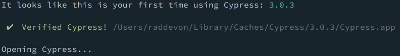
Since Cypress isn’t installed globally, we have to run it from this project’s npm binaries. $(npm bin) gets replaced with the npm binary path for this project. We’re running the cypress open command from there. You’ll see this output in the terminal if everything worked:
…and you’ll get a web browser with the test runner GUI:
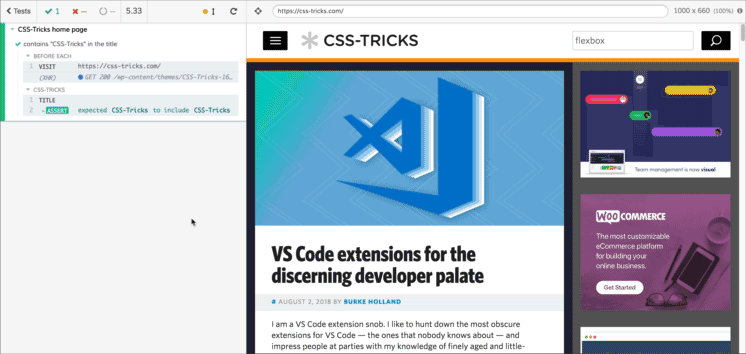
Click that “Run all specs” button to start running your tests. This will spawn a new browser window with your test results. On the left, you have your tests and their steps. On the right, you have the test “browser.”
This brings us to another cool feature of Cypress. One problem with end-to-end tests is visibility into your test outcomes. Every test runner gives you a “pass” or “fail,” but they do a terrible job of showing you what happened to cause a failure. You know what didn’t happen (your test assertion), but it’s harder to find out what did happen. In the past, I have resorted to taking a screenshot of the test browser at various points throughout the test which rarely gave me the answers I needed. It’s the automated test equivalent to spamming your code with console.log to debug a problem.
With Cypress, I can click on each step of the test on the left to see the state of the page at that point on the right.
Test: Checking for an element on the page
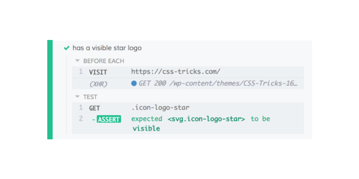
Next, we’ll check for an element we want to be sure is on the page. The page should always include the logo, and it should be visible.
Since we’re testing the same page, we’ll add a new it call to our describe callback.
it('has a visible star logo', function() {
  cy.get('.icon-logo-star').should('be.visible');
});
We’re still testing from the home page like before since the cy.visit() call happens before each of these tests. This test is using cy.get() to grab the element we want to check for. It works kinda like jQuery: you pass it a CSS selector string. Then, I chain a should() call and check for visibility.
Two things to note here: first, if this element had loaded asynchronously, cy.get() will automatically wait the defaultCommandTimeout to see if the element shows up. (The default value for that is four seconds, which can be changed in cypress.json.) Second, if you add that test and save the file, your tests will automatically re-run with the new test. This makes it really quick and easy to iterate your tests.
Here’s the result:
Test: Making sure navigation is responsive
We’ll try something slightly fancier with this test. I want to be sure the responsive menu is available on smaller viewports. Otherwise, users might not be able to navigate the site properly.
We’re still testing the home page, so I’ll write this test inside the same describe callback. I’m testing a slightly different scenario though, so I’ll nest another describe call to indicate the specific circumstances of my test and to set up those circumstances.
describe('CSS-Tricks home page', function() {
  // Our existing tests and the beforeEach are here

  describe('with a 320x568 viewport', function() {

  });
});
Testing at 320px width
Here, I’ve decided to test for the responsive navigation menu at 320px width, but it would be useful to know about the default testing viewport. You can click on any of your tests in the test runner and see the viewport width above the browser pane.
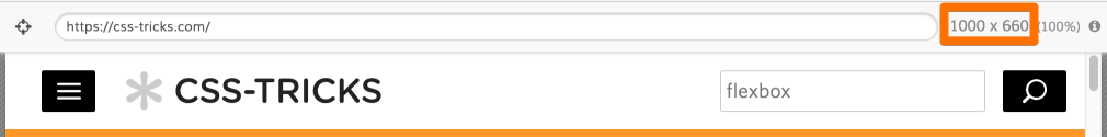
1000×660 is the default viewport size. You can change this in your cypress.json configuration file. We’ll start by writing the test to run at 320px width. Then, we’ll duplicate that test for a few different viewports.
To change the viewport for this test only, we can call cy.viewport().
Now, we’ll drop an it call inside the nested describe callback. Now that we have the viewport set, this test will look very similar to the logo test.
it('has a visible mobile menu toggle', function() {
  cy.get('#mobile-menu-toggle').should('be.visible');
});
Testing at 1100px width
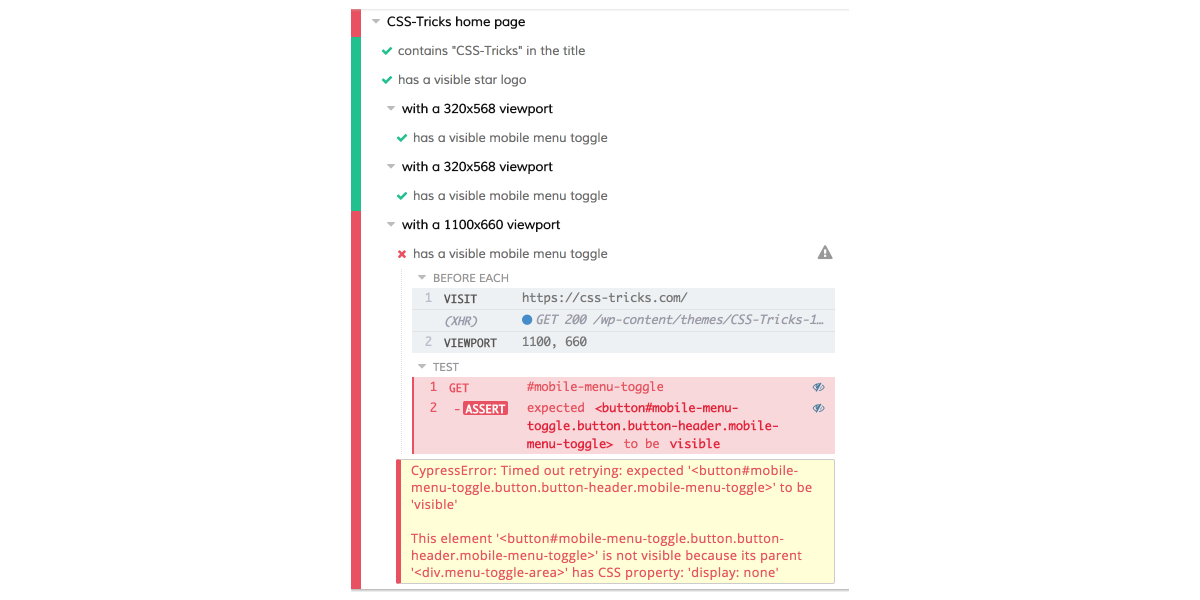
I’m going to run the same test at 1100px to make sure the responsive menu is still there. I think this is the maximum width that should have the menu, so I want to make sure it does.
describe('with a 1100x660 viewport', function() {
  beforeEach(function() {
    cy.viewport(1100, 660);
  });

  it('has a visible mobile menu toggle', function() {
    cy.get('#mobile-menu-toggle').should('be.visible');
  });
});
Oh crap! What happened here?
Since the test only tested for a single thing, we have a good idea what happened: the responsive menu wasn’t visible at 1100px viewport width. The feedback from the test give us some good information, too.
“Timed out retrying: expected ‘
This element is not visible because its parent
has CSS property display: none.
Cypress waited the defaultCommandTimeout for the mobile menu toggle to be visible, and it wasn’t. It wasn’t considered visible because a parent element had display: none. Makes sense.
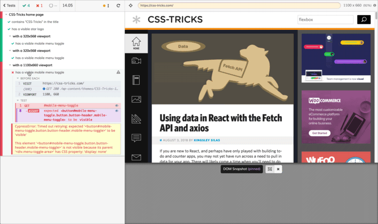
Here’s something Cypress gives us that other test runners don’t: the opportunity to inspect the failure state.
When I click on one of the test steps, I see the state of the page at the time that step ran in the browser on the right, but I also get the output in the console. (Bring up Chrome Developer Tools and check the console to see that.)
In this case, that’s not even necessary. It’s easy to see that the page doesn’t have the responsive menu at this width.
In an idealized, real-world scenario, I would first write tests to reflect what I want (in this case, a responsive menu at 1100px viewport width). Then, I would go back and make changes in the code to fix my test failures. In other words, I would make sure the responsive menu is displayed at 1100px. This is called test-driven development.
In this case, though, since I’m testing a live site, I’ll just rewrite the test to fit what the site already does. If you’re adding tests to an existing site to prevent regressions, you might use a method more like this one where you write tests to reflect the existing functionality.
The responsive menu is visible at widths up to 1086px, so we’ll change this test’s viewport width to 1085px. We want to make sure we change the string we’re passing to describe to properly reflect the new width, too.
describe('with a 1085 viewport', function() {
  beforeEach(function() {
    cy.viewport(1085, 660);
  });

  it('has a visible mobile menu toggle', function() {
    cy.get('#mobile-menu-toggle').should('be.visible');
  });
})
Now, we have a passing test!
Test: Search
Functioning search is critical for a site with as much content as CSS-Tricks. We’ll divide up testing it into two parts: first, ensuring the request goes out and, second, ensuring the results get displayed on the page.
Before we can do either of those, though, we have to trigger a search.
Let’s add a describe call inside the home page describe callback to indicate we are testing search.
describe('site search', function() {
});
We need to call beforeEach with a callback that will trigger the search. To trigger a search, we’ll use the Cypress API to interact with the page the same way a user would. We’ll first type into the search field. Then, we’ll press the keyboard Enter key.
If you look at the documentation for thetype method, you can see that {enter} is a special sequence that triggers a press of the enter key. That should submit our search.
Time for the actual testing!
Checking the URL
Our search should load a new page at https://css-tricks.com/?s=. Let’s call it:
it('requests the results', function() {
});
To make sure the page was requested, we’ll check the URL for the search term now that we’ve triggered the search.
cy.url().should('include', '?s=flexbox');
The question mark kicks off a query string in a URL. Since CSS-Tricks always puts the search parameter first in the query string, we can look for a substring that starts with ?. The site’s search term parameter is s. By confirming that parameter is in the URL with the value we searched, we know the search request was made.
Confirming we have results
To confirm results, we’re not actually testing the home page. We’re testing the results page instead. Since the page is our top-level describe call, we’ll create a new top-level describe call to test the search results page.
describe('Search results page', function() {
});
In the real world, we might break this out into a separate files. This makes it easier to find tests, but it also makes our development cycle more efficient. Cypress will re-run tests when you save changes to your tests. If you’re working with a single page and you have your tests split into different files, you can run only that file’s tests. Since tests take some time to run, this can make your iterations tighter as you make changes or add new tests.
Now, we need to get to this page. We’ll use visit inside a beforeEach just inside the new describe call’s callback to navigate there before the test.
This would work, but, since all the pages we’re going to test are on CSS-Tricks, it would be nice if we didn’t have to repeat the protocol (https) and the domain (css-tricks.com) in every test. That would make our tests DRYer.
Fortunately, we can do this with configuration in cypress.json with the baseUrl property. Here’s what the cypress.json file looks like with baseUrl set.
{
  "baseUrl": "https://css-tricks.com/"
}
Make sure this file is in the root of your project. Any settings will override the Cypress defaults.
With this configuration in place, we can remove this portion of the URL from any visit calls.
We’re ready to check if the page has results. Here’s the it call:
it('displays search results', function() {
});
By inspecting the page, I can see that each search result is an li element inside an element with the class search-grid-list. I’ll use this as the basis of the selector for the test.
This test will tell us we have at least one result on the search results page. It’s good enough for the purposes of this demo, but, in a real-world test, we’d want some way to control the results that come back from the search. It would be easier because we’d be testing against a local copy of the site instead of a live one. We can’t control the content on the live CSS-Tricks site, and, as a result, we can’t accurately predict what will come back for any search term. For this demo, I’ve made the assumption that the search term flexbox will always return at least one result on the site.
Let’s check the results:
What’s next…
Now, we have a good baseline for implementing some testing with Cypress. We learned:
how to organize tests
how to visit pages in the test browser
how to check the title
how to test at different viewport sizes
how to check the URL in the browser
how to grab on to elements and test them
how to interact with forms
We didn’t get to touch on one of the coolest aspects of Cypress: the way it allows you to deal with Ajax requests. This is great for single-page apps. Cypress can sit between the server and your app. This allows it to wait for responses to come back when you make a request.
You can also control the responses. I mentioned before that it would be nicer if we had control over the results coming back from the search. If the CSS-Tricks search had used Ajax to load the results, we could have easily delivered a static set of results and tested that they were properly rendered on the page.
Wherever you go from here, take what you know now and use it to implement some automated testing in your current project. As your app or site becomes more complex, the chance you’ll introduce regressions increases dramatically. You don’t want to get so wrapped up in introducing new features that you end up breaking the old ones. Automated testing is a great way to help you avoid this but without forcing you to manually test each feature every time.
Are you at CSS-Tricks because you want to become a web developer? If so, I want to help. I write technical tutorials like this one, but I also cover other skills you need to make the transition. You’ll miss these if your learning diet is exclusively technical.
Right now, I’m giving away four free mentoring sessions each week to CSS-Tricksters who sign up for my list. Everyone will get great articles and resources to help you become a web developer, and as many people as I can fit into my schedule will get live personalized advice on how to take the next steps in your career transition.
Knowing which room you’re in enables various IoT applications — from turning on the light to changing TV channels. So, how can we detect the moment you and your phone are in the kitchen, or bedroom, or living room? With today’s commodity hardware, there are a myriad of possibilities:
One solution is to equip each room with a bluetooth device. Once your phone is within range of a bluetooth device, your phone will know which room it is, based on the bluetooth device. However, maintaining an array of Bluetooth devices is significant overhead — from replacing batteries to replacing dysfunctional devices. Additionally, proximity to the Bluetooth device is not always the answer: if you’re in the living room, by the wall shared with the kitchen, your kitchen appliances should not start churning out food.
Another, albeit impractical, solution is to use GPS. However, keep in mind hat GPS works poorly indoors in which the multitude of walls, other signals, and other obstacles wreak havoc on GPS’s precision.
Our approach instead is to leverage all in-range WiFi networks — even the ones your phone is not connected to. Here is how: consider the strength of WiFi A in the kitchen; say it is 5. Since there is a wall between the kitchen and the bedroom, we can reasonably expect the strength of WiFi A in the bedroom to differ; say it is 2. We can exploit this difference to predict which room we’re in. What’s more: WiFi network B from our neighbor can only be detected from the living room but is effectively invisible from the kitchen. That makes prediction even easier. In sum, the list of all in-range WiFi gives us plentiful information.
This method has the distinct advantages of:
not requiring more hardware;
relying on more stable signals like WiFi;
working well where other techniques such as GPS are weak.
The more walls the better, as the more disparate the WiFi network strengths, the easier the rooms are to classify. You will build a simple desktop app that collects data, learns from the data, and predicts which room you’re in at any given time.
For this tutorial, you will need a Mac OSX. Whereas the code can apply to any platform, we will only provide dependency installation instructions for Mac.
Mac OSX
Homebrew, a package manager for Mac OSX. To install, copy-and-paste the command at brew.sh
Your desktop app will be written in NodeJS. However, to leverage more efficient computational libraries like numpy, the training and prediction code will be written in Python. To start, we will setup your environments and install dependencies. Create a new directory to house your project.
mkdir ~/riot
Navigate into the directory.
cd ~/riot
Use pip to install Python’s default virtual environment manager.
sudo pip install virtualenv
Create a Python3.6 virtual environment named riot.
virtualenv riot --python=python3.6
Activate the virtual environment.
source riot/bin/activate
Your prompt is now preceded by (riot). This indicates we have successfully entered the virtual environment. Install the following packages using pip:
numpy: An efficient, linear algebra library
scipy: A scientific computing library that implements popular machine learning models
pip install numpy==1.14.3 scipy
==1.1.0
With the working directory setup, we will start with a desktop app that records all WiFi networks in-range. These recordings will constitute training data for your machine learning model. Once we have data on hand, you will write a least squares classifier, trained on the WiFi signals collected earlier. Finally, we will use the least squares model to predict the room you’re in, based on the WiFi networks in range.
Step 1: Initial Desktop Application
In this step, we will create a new desktop application using Electron JS. To begin, we will instead the Node package manager npm and a download utility wget.
brew install npm wget
To begin, we will create a new Node project.
npm init
This prompts you for the package name and then the version number. Hit ENTER to accept the default name of riot and default version of 1.0.0.
package name: (riot)
version: (1.0.0)
This prompts you for a project description. Add any non-empty description you would like. Below, the description is room detector
description: room detector
This prompts you for the entry point, or the main file to run the project from. Enter app.js.
entry point: (index.js) app.js
This prompts you for the test command and git repository. Hit ENTER to skip these fields for now.
test command:
git repository:
This prompts you for keywords and author. Fill in any values you would like. Below, we use iot, wifi for keywords and use John Doe for the author.
keywords: iot,wifi
author: John Doe
This prompts you for the license. Hit ENTER to accept the default value of ISC.
license: (ISC)
At this point, npm will prompt you with a summary of information so far. Your output should be similar to the following.
On line 12, change index.html to static/index.html, as we will create a directory static to contain all HTML templates.
function createWindow () {
  // Create the browser window.
  win = new BrowserWindow({width: 1200, height: 800})

  // and load the index.html of the app.
  win.loadFile('static/index.html')

  // Open the DevTools.
Save your changes and exit the editor. Your file should match the source code of the app.js file. Now create a new directory to house our HTML templates.
Now, amend the package file to contain a start command.
nano package.json
Right after line 7, add a start command that’s aliased to electron .. Make sure to add a comma to the end of the previous line.
"scripts": {
  "test": "echo "Error: no test specified" && exit 1",
  "start": "electron ."
},
Save and exit. You are now ready to launch your desktop app in Electron JS. Use npm to launch your application.
npm start
Your desktop application should match the following.
Home page with “Add New Room” button available (Large preview)
This completes your starting desktop app. To exit, navigate back to your terminal and CTRL+C. In the next step, we will record wifi networks, and make the recording utility accessible through the desktop application UI.
Step 2: Record WiFi Networks
In this step, you will write a NodeJS script that records the strength and frequency of all in-range wifi networks. Create a directory for your scripts.
mkdir scripts
Open scripts/observe.js in nano or your favorite text editor.
nano scripts/observe.js
Import a NodeJS wifi utility and the filesystem object.
var wifi = require('node-wifi');
var fs = require('fs');
Define a record function that accepts a completion handler.
/**
 * Uses a recursive function for repeated scans, since scans are asynchronous.
 */
function record(n, completion, hook) {
}
Inside the new function, initialize the wifi utility. Set iface to null to initialize to a random wifi interface, as this value is currently irrelevant.
Define an array to contain your samples. Samples are training data we will use for our model. The samples in this particular tutorial are lists of in-range wifi networks and their associated strengths, frequencies, names etc.
function record(n, completion, hook) {
    ...
    samples = []
}
Define a recursive function startScan, which will asynchronously initiate wifi scans. Upon completion, the asynchronous wifi scan will then recursively invoke startScan.
function record(n, completion, hook) {
  ...
  function startScan(i) {
    wifi.scan(function(err, networks) {
    });
  }
  startScan(n);
}
In the wifi.scan callback, check for errors or empty lists of networks and restart the scan if so.
Double check that your file matches the following:
var wifi = require('node-wifi');
var fs = require('fs');

/**
 * Uses a recursive function for repeated scans, since scans are asynchronous.
 */
function record(n, completion, hook) {
  wifi.init({
      iface : null // network interface, choose a random wifi interface if set to null
  });

  samples = []
  function startScan(i) {
    wifi.scan(function(err, networks) {
        if (err || networks.length == 0) {
          startScan(i);
          return
        }
        if (i
Save and exit. Run the script.
node scripts/observe.js
Your output will match the following, with variable numbers of networks.
* [INFO] Collected sample 1 with 39 networks
Examine the samples that were just collected. Pipe to json_pp to pretty print the JSON and pipe to head to view the first 16 lines.
cat samples.json | json_pp | head -16
The below is example output for a 2.4 GHz network.
This concludes your NodeJS wifi-scanning script. This allows us to view all in-range WiFi networks. In the next step, you will make this script accessible from the desktop app.
Step 3: Connect Scan Script To Desktop App
In this step, you will first add a button to the desktop app to trigger the script with. Then, you will update the desktop app UI with the script’s progress.
Open static/index.html.
nano static/index.html
Insert the “Add” button, as shown below.
<h1 class="title" id="predicted-room-name">(I dunno)</h1>
        <!-- start new code -->
        <div class="buttons">
            <a href="add.html" class="button">Add new room</a>
        </div>
        <!-- end new code -->
    </main>
Beneath the cli function, define a new ui function.
function cli() {
    ...
}

// start new code
function ui() {
}
// end new code

cli();
Update the desktop app status to indicate the function has started running.
function ui() {
  var room_name = document.querySelector('#add-room-name').value;
  var status = document.querySelector('#add-status');
  var number = document.querySelector('#add-title');
  status.style.display = "block"
  status.innerHTML = "Listening for wifi..."
}
Partition the data into training and validation data sets.
function ui() {
  ...
  function completion(data) {
    train_data = {samples: data['samples'].slice(0, 15)}
    test_data = {samples: data['samples'].slice(15)}
    var train_json = JSON.stringify(train_data);
    var test_json = JSON.stringify(test_data);
  }
}
Still within the completion callback, write both datasets to disk.
Invoke record with the appropriate callbacks to record 20 samples and save the samples to disk.
function ui() {
  ...
  function completion(data) {
    ...
  }
  record(20, completion, function(i, networks) {
    number.innerHTML = i
    console.log(" * [INFO] Collected sample " + i + " with " + networks.length + " networks")
  })
}
Finally, invoke the cli and ui functions where appropriate. Start by deleting the cli(); call at the bottom of the file.
function ui() {
    ...
}

cli();  // remove me
Check if the document object is globally accessible. If not, the script is being run from the command line. In this case, invoke the cli function. If it is, the script is loaded from within the desktop app. In this case, bind the click listener to the ui function.
Once all 20 samples are recorded, your app will match the following. The status will read “Done.”
“Add New Room” page after recording is complete (Large preview)
Click on the misnamed “Cancel” to return to the homepage, which matches the following.
“Add New Room” page after recording is complete (Large preview)
We can now scan wifi networks from the desktop UI, which will save all recorded samples to files on disk. Next, we will train an out-of-box machine learning algorithm-least squares on the data you have collected.
Step 4: Write Python Training Script
In this step, we will write a training script in Python. Create a directory for your training utilities.
mkdir model
Open model/train.py
nano model/train.py
At the top of your file, import the numpy computational library and scipy for its least squares model.
import numpy as np
from scipy.linalg import lstsq
import json
import sys
The next three utilities will handle loading and setting up data from the files on disk. Start by adding a utility function that flattens nested lists. You will use this to flatten a list of list of samples.
import sys

def flatten(list_of_lists):
    """Flatten a list of lists to make a list.
    >>> flatten([[1], [2], [3, 4]])
    [1, 2, 3, 4]
    """
    return sum(list_of_lists, [])
Add a second utility that loads samples from the specified files. This method abstracts away the fact that samples are spread out across multiple files, returning just a single generator for all samples. For each of the samples, the label is the index of the file. e.g., If you call get_all_samples('a.json', 'b.json'), all samples in a.json will have label 0 and all samples in b.json will have label 1.
def get_all_samples(paths):
  """Load all samples from JSON files."""
  for label, path in enumerate(paths):
  with open(path) as f:
    for sample in json.load(f)['samples']:
      signal_levels = [
        network['signal_level'].replace('RSSI', '') or 0
        for network in sample]
      yield [network['mac'] for network in sample], signal_levels, label
Next, add a utility that encodes the samples using a bag-of-words-esque model. Here is an example: Assume we collect two samples.
wifi network A at strength 10 and wifi network B at strength 15
wifi network B at strength 20 and wifi network C at strength 25.
This function will produce a list of three numbers for each of the samples: the first value is the strength of wifi network A, the second for network B, and the third for C. In effect, the format is [A, B, C].
[10, 15, 0]
[0, 20, 25]
def bag_of_words(all_networks, all_strengths, ordering):
  """Apply bag-of-words encoding to categorical variables.

  >>> samples = bag_of_words(
  ...     [['a', 'b'], ['b', 'c'], ['a', 'c']],
  ...     [[1, 2], [2, 3], [1, 3]],
  ...     ['a', 'b', 'c'])
  >>> next(samples)
  [1, 2, 0]
  >>> next(samples)
  [0, 2, 3]
  """
  for networks, strengths in zip(all_networks, all_strengths):
    yield [strengths[networks.index(network)]
      if network in networks else 0
      for network in ordering]
Using all three utilities above, we synthesize a collection of samples and their labels. Gather all samples and labels using get_all_samples. Define a consistent format ordering to one-hot encode all samples, then apply one_hot encoding to samples. Finally, construct the data and label matrices X and Y respectively.
def create_dataset(classpaths, ordering=None):
  """Create dataset from a list of paths to JSON files."""
  networks, strengths, labels = zip(*get_all_samples(classpaths))
  if ordering is None:
    ordering = list(sorted(set(flatten(networks))))
  X = np.array(list(bag_of_words(networks, strengths, ordering))).astype(np.float64)
  Y = np.array(list(labels)).astype(np.int)
  return X, Y, ordering
These functions complete the data pipeline. Next, we abstract away model prediction and evaluation. Start by defining the prediction method. The first function normalizes our model outputs, so that the sum of all values totals to 1 and that all values are non-negative; this ensures that the output is a valid probability distribution. The second evaluates the model.
def softmax(x):
  """Convert one-hotted outputs into probability distribution"""
  x = np.exp(x)
  return x / np.sum(x)


def predict(X, w):
  """Predict using model parameters"""
  return np.argmax(softmax(X.dot(w)), axis=1)
Next, evaluate the model’s accuracy. The first line runs prediction using the model. The second counts the numbers of times both predicted and true values agree, then normalizes by the total number of samples.
def evaluate(X, Y, w):
  """Evaluate model w on samples X and labels Y."""
  Y_pred = predict(X, w)
  accuracy = (Y == Y_pred).sum() / X.shape[0]
  return accuracy
This concludes our prediction and evaluation utilities. After these utilities, define a main function that will collect the dataset, train, and evaluate. Start by reading the list of arguments from the command line sys.argv; these are the rooms to include in training. Then create a large dataset from all of the specified rooms.
def main():
  classes = sys.argv[1:]

  train_paths = sorted(['data/{}_train.json'.format(name) for name in classes])
  test_paths = sorted(['data/{}_test.json'.format(name) for name in classes])
  X_train, Y_train, ordering = create_dataset(train_paths)
  X_test, Y_test, _ = create_dataset(test_paths, ordering=ordering)
Apply one-hot encoding to the labels. A one-hot encoding is similar to the bag-of-words model above; we use this encoding to handle categorical variables. Say we have 3 possible labels. Instead of labelling 1, 2, or 3, we label the data with [1, 0, 0], [0, 1, 0], or [0, 0, 1]. For this tutorial, we will spare the explanation for why one-hot encoding is important. Train the model, and evaluate on both the train and validation sets.
Save and exit. Double check that your file matches the following:
import numpy as np
from scipy.linalg import lstsq
import json
import sys
def flatten(list_of_lists):
"""Flatten a list of lists to make a list.
>>> flatten([[1], [2], [3, 4]])
[1, 2, 3, 4]
"""
return sum(list_of_lists, [])
def get_all_samples(paths):
"""Load all samples from JSON files."""
for label, path in enumerate(paths):
with open(path) as f:
for sample in json.load(f)['samples']:
signal_levels = [
network['signal_level'].replace('RSSI', '') or 0
for network in sample]
yield [network['mac'] for network in sample], signal_levels, label
def bag_of_words(all_networks, all_strengths, ordering):
"""Apply bag-of-words encoding to categorical variables.
>>> samples = bag_of_words(
... [['a', 'b'], ['b', 'c'], ['a', 'c']],
... [[1, 2], [2, 3], [1, 3]],
... ['a', 'b', 'c'])
>>> next(samples)
[1, 2, 0]
>>> next(samples)
[0, 2, 3]
"""
for networks, strengths in zip(all_networks, all_strengths):
yield [int(strengths[networks.index(network)])
if network in networks else 0
for network in ordering]
def create_dataset(classpaths, ordering=None):
"""Create dataset from a list of paths to JSON files."""
networks, strengths, labels = zip(*get_all_samples(classpaths))
if ordering is None:
ordering = list(sorted(set(flatten(networks))))
X = np.array(list(bag_of_words(networks, strengths, ordering))).astype(np.float64)
Y = np.array(list(labels)).astype(np.int)
return X, Y, ordering
def softmax(x):
"""Convert one-hotted outputs into probability distribution"""
x = np.exp(x)
return x / np.sum(x)
def predict(X, w):
"""Predict using model parameters"""
return np.argmax(softmax(X.dot(w)), axis=1)
def evaluate(X, Y, w):
"""Evaluate model w on samples X and labels Y."""
Y_pred = predict(X, w)
accuracy = (Y == Y_pred).sum() / X.shape[0]
return accuracy
def main():
classes = sys.argv[1:]
train_paths = sorted(['data/{}_train.json'.format(name) for name in classes])
test_paths = sorted(['data/{}_test.json'.format(name) for name in classes])
X_train, Y_train, ordering = create_dataset(train_paths)
X_test, Y_test, _ = create_dataset(test_paths, ordering=ordering)
Y_train_oh = np.eye(len(classes))[Y_train]
w, _, _, _ = lstsq(X_train, Y_train_oh)
train_accuracy = evaluate(X_train, Y_train, w)
validation_accuracy = evaluate(X_test, Y_test, w)
print('Train accuracy ({}%), Validation accuracy ({}%)'.format(train_accuracy*100, validation_accuracy*100))
np.save('w.npy', w)
np.save('ordering.npy', np.array(ordering))
sys.stdout.flush()
if __name__ == '__main__':
  main()
Save and exit. Recall the room name used above when recording the 20 samples. Use that name instead of bedroom below. Our example is bedroom. We use -W ignore to ignore warnings from a LAPACK bug.
python -W ignore model/train.py bedroom
Since we’ve only collected training samples for one room, you should see 100% training and validation accuracies.
Next, we will link this training script to the desktop app.
Step 5: Link Train Script
In this step, we will automatically retrain the model whenever the user collects a new batch of samples. Open scripts/observe.js.
nano scripts/observe.js
Right after the fs import, import the child process spawner and utilities.
var fs = require('fs');
// start new code
const spawn = require("child_process").spawn;
var utils = require('./utils.js');
In the ui function, add the following call to retrain at the end of the completion handler.
function ui() {
  ...
  function completion() {
    ...
    retrain((data) => {
      var status = document.querySelector('#add-status');
      accuracies = data.toString().split('n')[0];
      status.innerHTML = "Retraining succeeded: " + accuracies
    });
  }
    ...
}
After the ui function, add the following retrain function. This spawns a child process that will run the python script. Upon completion, the process calls a completion handler. Upon failure, it will log the error message.
Save and exit. For the conclusion of this step, physically move to a new location. There ideally should be a wall between your original location and your new location. The more barriers, the better your desktop app will work.
Once again, run your desktop app.
npm start
Just as before, run the training script. Click on “Add room”.
Home page with “Add New Room” button available (Large preview)
Type in a room name that is different from your first room’s. We will use living room.
Click “Start recording,” and you will see the following status “Listening for wifi…”.
“Add New Room” starting recording for second room (Large preview)
Once all 20 samples are recorded, your app will match the following. The status will read “Done. Retraining model…”
“Add New Room” page after recording for second room complete (Large preview)
In the next step, we will use this retrained model to predict the room you’re in, on the fly.
Step 6: Write Python Evaluation Script
In this step, we will load the pretrained model parameters, scan for wifi networks, and predict the room based on the scan.
Open model/eval.py.
nano model/eval.py
Import libraries used and defined in our last script.
import numpy as np
import sys
import json
import os
import json

from train import predict
from train import softmax
from train import create_dataset
from train import evaluate
Define a utility to extract the names of all datasets. This function assumes that all datasets are stored in data/ as _train.json and _test.json.
from train import evaluate

def get_datasets():
  """Extract dataset names."""
  return sorted(list({path.split('_')[0] for path in os.listdir('./data')
    if '.DS' not in path}))
Define the main function, and start by loading parameters saved from the training script.
Save and exit. Double check your code matches the following (source code):
import numpy as np
import sys
import json
import os
import json

from train import predict
from train import softmax
from train import create_dataset
from train import evaluate


def get_datasets():
    """Extract dataset names."""
    return sorted(list({path.split('_')[0] for path in os.listdir('./data')
        if '.DS' not in path}))


def main():
    w = np.load('w.npy')
    ordering = np.load('ordering.npy')

    classpaths = [sys.argv[1]]
    X, _, _ = create_dataset(classpaths, ordering)
    y = np.asscalar(predict(X, w))

    sorted_y = sorted(softmax(X.dot(w)).flatten())
    confidence = 1
    if len(sorted_y) > 1:
        confidence = round(sorted_y[-1] - sorted_y[-2], 2)

    category = get_datasets()[y]
    print(json.dumps({"category": category, "confidence": confidence}))


if __name__ == '__main__':
    main()
Next, we will connect this evaluation script to the desktop app. The desktop app will continuously run wifi scans and update the UI with the predicted room.
Step 7: Connect Evaluation To Desktop App
In this step, we will update the UI with a “confidence” display. Then, the associated NodeJS script will continuously run scans and predictions, updating the UI accordingly.
Open static/index.html.
nano static/index.html
Add a line for confidence right after the title and before the buttons.
<h1 class="title" id="predicted-room-name">(I dunno)</h1>
<!-- start new code -->
<p class="subtitle">with <span id="predicted-confidence">0%</span> confidence</p>
<!-- end new code -->
<div class="buttons">
Right after main but before the end of the body, add a new script predict.js.
</main>
  <!-- start new code -->
  <script>
  require('../scripts/predict.js')
  </script>
  <!-- end new code -->
</body>
Save and exit. Open scripts/predict.js.
nano scripts/predict.js
Import the needed NodeJS utilities for the filesystem, utilities, and child process spawner.
var fs = require('fs');
var utils = require('./utils');
const spawn = require("child_process").spawn;
Define a predict function which invokes a separate node process to detect wifi networks and a separate Python process to predict the room.
After both processes have spawned, add callbacks to the Python process for both successes and errors. The success callback logs information, invokes the completion callback, and updates the UI with the prediction and confidence. The error callback logs the error.
Define a main function to invoke the predict function recursively, forever.
function main() {
  f = function() { predict(f) }
  predict(f)
}

main();
One last time, open the desktop app to see the live prediction.
npm start
Approximately every second, a scan will be completed and the interface will be updated with the latest confidence and predicted room. Congratulations; you have completed a simple room detector based on all in-range WiFi networks.
Recording 20 samples inside the room and another 20 out in the hallway. Upon walking back inside, the script correctly predicts “hallway” then “bedroom.” (Large preview)
Conclusion
In this tutorial, we created a solution using only your desktop to detect your location within a building. We built a simple desktop app using Electron JS and applied a simple machine learning method on all in-range WiFi networks. This paves the way for Internet-of-things applications without the need for arrays of devices that are costly to maintain (cost not in terms of money but in terms of time and development).
Note: You can see the source code in its entirety on Github.
With time, you may find that this least squares does not perform spectacularly in fact. Try finding two locations within a single room, or stand in doorways. Least squares will be large unable to distinguish between edge cases. Can we do better? It turns out that we can, and in future lessons, we will leverage other techniques and the fundamentals of machine learning to better performance. This tutorial serves as a quick test bed for experiments to come.
Much is made of the need for inspiration in design work. While most of a designer’s job is sweating the details, we all still need that little spark to get us going. We need (or at least enjoy having) that one initial idea or concept to get us started on the path to design greatness.
And so we binge. We read articles that show off cool things other people have designed, watch videos of new and innovative products being unveiled, and generally seek that spark. The only problem with this process is that in our haste to be inspired, our good ideas can sometimes be obscured by everything else that’s already in our brains.
Unless things have gone very wrong, our thoughts generally don’t happen in a vacuum. Our minds are filled to the brim with our daily tasks, our relationships, and most importantly in this article, everything we already know about design. It’s like eating foods of drastically different flavors, one after the other: the flavor of the first dish will affect the flavor of the second. Jumping from one design project to the next will affect how the second one plays out.
People who eat for fun and profit use palate cleansers to help them more easily distinguish between flavors. We can use this same principle in the world of design to clear our heads a bit, and allow new ideas to fully reveal themselves.
Neutral Flavors
The most common type of palate cleanser is the one with the most neutral flavor possible, which is used to sort of reset the taste buds. Think “white bread”.
In design, this idea might translate as getting back to basics. Go browse a corporate website or two. Look at stuff that’s simple and calming, but which also reinforces the most basic of design principles. Give your mind a nearly-blank canvas on which to project its wilder ideas.
Now I say nearly-blank, because even white bread has a flavor, even if it’s not much of one. This approach is not about completely emptying your mind so much as just mentally going back over your fundamentals.
Bitter Flavors
Others take the exact opposite approach to cleansing their palate by assaulting the senses until they withdraw as a means of self defense. In some sushi restaurants, they’ll give you some ginger for pretty much this exact purpose. Other people just use really dark beer.
In some ways, brutalist design has served this function. Others have gone far beyond brutalism, however, by building the ugliest pages they could*, complete with all the worst bits and bobs the late ’90s had to offer. Staring at these sites is enough to make nearly anyone’s mind blank itself out for a bit. If nothing else, browsing sites like that will make you thankful for what we have now.
*Screenshot intentionally not provided. Click at your own risk.
Stop Eating
Sometimes, the best way is to simply let your taste buds and your stomach rest. The same goes for your brain. I will never stop extolling the virtues of time off. I know I’ve mentioned it in at least one or two other articles here on WDD, but it needs to be reiterated ad nauseum in this age of the workaholic.
Rest. Your. Brain. Think about literally anything else for a while. A rested brain can be the difference between repeatedly running into walls, and having everything finally click into place.
Absorption
When you’re eating spicy food, milk and sometimes bread are recommended as palate cleansers. This is not for their neutral flavor, but because they actually absorb the spicy chemicals a bit, literally taking them off your tongue.
(Incidentally, this is a great tip for when you buy quesadillas from a little old lady in Mexico, and she doesn’t tell you that the salsa is made with habanero peppers. So keep that in mind.)
In a design context, one of the best ways to sponge stuff out of your brain is to get another brain involved. The same way talking out our emotional problems can give immense relief, talking about your design work to someone can help leave some space for new ideas. It doesn’t even have to be a real brain. Programmers sometimes use rubber ducks in a similar way to help them troubleshoot code. I’m not joking, it’s a thing.
Meditation
This section is where the food analogy fails me, I’m afraid. That’s because I want to talk about meditation, and meditation isn’t just doing something else, or “not eating”. It’s sort of a very intentional way of doing nothing.** Yeah, I’m going to massively oversimplify things in this section.
Whether you use transcendental meditation (focusing on one very specific thing), or Zen meditation (refusing to focus on anything, which is far easier for my ADD-addled brain), or some other form, meditative rituals can do a lot to open up space for new ideas. Unlike taking significant time off, meditation can be done just about any time, and with practice, just about anywhere.
You don’t need to meditate for long to get some benefit from it either. A few minutes of breathing deeply in a quiet state of mind can be enough to quiet the incessant input from the world around you, and from your own thoughts. You’re not looking for nirvana, after all. You just need a little bit of empty space in your brain, and that’s a lot easier to achieve.
**The closest analogue to intentionally not eating is fasting. Though the practice does have spiritual significance in many cultures, I don’t think the analogy works here.
As an avid internet user, both mobile and computer, I think it’s safe to safe that filling out forms is one of the worst things ever. As boring and time consuming as they can be, they are undisputedly necessary. Today, we are looking at what should a mobile form look like and how to give it a formal touch.
Let’s think for a second about how many times we use forms for an online interaction. You use them basically anytime you purchase goods, hotel rooms, or movie tickets. Not to mention, companies often use them to bring better service to the customer. So, the question remains: what can we do to make this process better? I’m glad you asked.
Say no to too much info
In terms of a transaction form, one thing that needs to become the norm is putting all the necessary information on one page. Notice that I said “necessary.” Too often, I’ll go online to order something and I’m bombarded with additional advertisements and options that make my eyes water if I stare too long. Listen, I already purchased something from your website. You don’t have to convince me anymore.
First impressions mean the most
I think most people will admit that if the form looks too complex, they won’t finish it. It’s not really anything new. People are going online for their convenience. If you make something too complex, or even just look complex, people will avoid it. I’m certainly guilty of thinking this way. Make forms effective and efficient.
What exactly does a good form comprise of? Believe it or not, there is a basic recipe for a good form. One that doesn’t overwhelm users, and one that gets the job done. Here’s what we’ve got:
Input fields
Here, you’ll have room for all the required information. Things such as passwords, discount codes, sliders, checkboxes, etc. will all be input in these boxes.
Field labels
Field labels tell the user what to put into the input fields.
Structure
You have to have some sort of framework for your fields. Make the order make sense and it’ll be easier to follow along.
Action button(s)
The page will have to have at least one button that submits all the input info.
Feedback
After the action button is triggered, the submitter should get a notification that everything went smoothly.
There are many successful form templates out there. Depending on what the form is used for, it will probably look a little different than the last. The key is to make it simple, understandable, and convenient for the user. Remember, people do things online to make it easier for them. A complex form will only scare away potential customers.
A little while ago, I wrote a well-received article about combining CSS variables with CSS grid to help build more maintainable layouts. But CSS grid isn’t just for pages! That is a common myth. Although it is certainly very useful for page layout, I find myself just as frequently reaching for grid when it comes to components. In this article I’ll address using CSS grid at the component level.
Grid is neither a substitute for flexbox nor vice versa. In fact, using a combination of the two gives us even more power when building components.
Building a simple component
In this demo, I’ll walk through building a text-and-image component, something you might commonly find yourself building on a typical site, and which I have frequently built myself.
This is what our first component should look like:
Simple component with text and an image
Let’s imagine that the elements that make up our component need to align to the same grid as other components on the page. Here is the same component with grid columns overlaid (ignoring the background):
The same component with a grid overlay
You should see a grid of 14 columns—12 central columns of a fixed width and two flexible columns, one on either side. (These are for illustration purposes and won’t be visible in the browser.) Using display: grid on an element allows us to position that element’s direct children on the grid container. We’re keeping things simple, so our component has just two grid children—an image and a block of text. The image starts at Line 2 and spans seven tracks on the column axis. The text block starts at Line 9 and spans five columns.
First, and importantly, we need to start with semantic markup. Although grid gives us the power to place its children in any layout we choose, for accessibility and non-grid-supporting browsers, the underlying markup should follow a logical order. Here is the markup we’ll be using for our grid component:
The .grid__media and .grid__text classes will be used for positioning the child items. First, we will need to define our grid container. We can use the following CSS to size our grid tracks:
This will give us the grid we illustrated earlier—12 central columns with a maximum width of 100px, a flexible column on either side, and a gap of 20px between each column. If you’re curious about the minmax() function I wrote an article about it, which explains what’s going on with our grid columns here.
In this case, as both our image and text block will be on the same grid row track (and I want the track size to just use the default auto, which will size the row according to the content within), I have no need to declare my grid row sizing here. However, explicitly placing the grid items on the same row will make things easier when it comes to different component variants, which we’ll get to shortly.
If you’re new to Grid and looking for ways to get started, I recommend heading over to grid-by-example.com. Don’t worry too much about the grid-template-columns declaration for now—many of the points in this article can be applied to simpler grids too.
Now, we need to place our grid items with the following CSS. Grid offers us a whole range of different ways to place items. In this case, I’m using grid-column, which is the shorthand for grid-column-start / grid-column-end:
.grid__media {
  grid-column: 2 / 9; /* Start on Column 2 and end at the start of Column 9 */
}

.grid__text {
  grid-column: 9 / 14; /* Start on Column 9 and end at the start of Column 14 */
}

.grid__media,
.grid__text {
  grid-row: 1; /* We want to keep our items on the same row */
}
Building our component is simple enough, but what if we have many variants of the same component? Here are some examples of different layouts we might want to use:
Four different layout variants of the same type of component
As you can see, the text blocks and images occupy different positions on the grid, and the image blocks span a different number of columns.
Personally, I have previously worked on components that had as many as nine variants! Coding grid for these types of situations can become difficult to manage, especially when you take things like fallbacks and responsiveness into account, because our grid declarations can become difficult to scan and debug. Let’s look at ways we can make this easier to manage and maintain.
Consistency
First, let’s determine which property values are going to remain consistent among our component variants, so that we can write as little code as possible. In this case, our text block should always span four columns, while our image can be larger or smaller, and align to any column.
For our text block I’m going to use the span declaration—that way, I can be sure to keep this block a consistent width. For our image, I’m going to keep using the start line and end line instead, since the number of columns the images span varies between the different component variants, as well as its position.
Naming grid lines
Grid allows you to name your lines and refer to them by name as well as number, which I find extremely helpful when placing items. You might not want to go too crazy with naming lines, as your grid declaration can become difficult to read, but naming a few commonly-used lines can be useful. In this example, I’m using the names wrapper-start and wrapper-end. Now, when placing items against either of these lines, I know they’ll align to the central wrapper.
Pre-fixing grid line names with *-start and *-end has the added advantage of allowing us to place items by grid area. By setting grid-column: wrapper on a grid item, it will be placed between our wrapper-start and wrapper-end lines.
Using CSS Variables for placement
CSS variables (also known as custom properties) can allow us to write more maintainable code for our components. They enable us to set and reuse values within our CSS. If you use a preprocessor like Sass or Less, it’s likely you’re familiar with using variables. CSS variables differ from preprocessor variables in a few important ways:
They are dynamic. In other words, once they are set, the value can still be changed. You can update the same variable to take different values, e.g. within different components or at different breakpoints.
They cannot be used within selector names, property names or media query declarations. They must only be used for property values (hence they’re known as custom properties).
CSS variables are set and used like this:
.box {
  --color: orange; /* Defines the variable and default value */
  background-color: var(--color); /* Applies the variable as a property value */
}
We can take advantage of the fact that CSS variables allow defaults—so that if a variable is not found, a fallback value will be used.
You can set a default value for a variable like this:
background-color: var(--color, red);
So, in this case, we’re setting the background-color property to the value of --color but if that variable can’t be found (e.g. it hasn’t been declared yet), then the background will be red.
In the CSS code for placing our grid items, we can use a variable and declare a default value, like so:
Quite a difference, right? To me, the version with variables is more readable and helps me understand at a glance where the elements of each component variant are positioned.
Variables within media queries
CSS variables also allow us to easily adjust the position of our grid items at different breakpoints by declaring them within media queries. It’s conceivable that we might want to show a simpler grid layout for tablet-size screens and move to a more complex layout once we get to desktop sizes. With the following code, we can show a simple, alternating layout for smaller screen, then wrap the variables for the more complex layout in a media query.
One thing to be aware of when using CSS variables is that changing a variable on an element will cause a style recalculation on all of that element’s children (here’s an excellent article that covers performance of variables in great detail). So, if your component has many children, then this may be a consideration, particularly if you want to update the variables many times.
Conclusion
There are many different ways of handling responsive design with CSS grid, and this certainly isn’t the only way. Neither would I advise using variables for all your grid code in every part of your project—that could get pretty confusing and would likely be unnecessary! But, having used CSS grid a lot over the past year, I can attest that this method works really well to keep your code maintainable when dealing with multiple component variants.
(This article is kindly sponsored by Adobe.) Forms are the linchpin of all mobile interactions; it stands between the person and what they’re looking for. Every day, we use forms for essential online activities. Recall the last time you bought a ticket, booked a hotel room or made a purchase online — most probably those interactions contained a step with filling out a form.
Forms are just a means to an end. Users should be able to complete them quickly and without confusion. In this article, you’ll learn practical techniques that will help you design an effective form.
What Makes For An Effective Form
The primary goal with every form is completion. Two factors have a major impact on completion rate:
Perception of complexity The first thing users do when they see a new form is estimate how much time is required to complete it. Users do this by scanning the form. Perception plays a crucial role in the process of estimation. The more complex a form looks, the more likely users will abandon the process.
Interaction cost Interaction cost is the sum of efforts — both cognitive and physical — that the users put into interacting with an interface in order to reach their goal. Interaction cost has a direct connection with form usability. The more effort users have to make to complete a form, the less usable the form is. A high interaction cost could be the result of data that is difficult to input, an inability to understand the meaning of some questions, or confusion about error messages.
The Components Of Forms
A typical form has the following five components:
Input fields These include text fields, password fields, checkboxes, radio buttons, sliders and any other fields designed for user input.
Field labels These tell users what the corresponding input fields mean.
Structure This includes the order of fields, the form’s appearance on the page, and the logical connections between different fields.
Action buttons The form will have at least one call to action (the button that triggers data submission).
Feedback Feedback notifies the user about the result of an operation. Feedback can be positive (for example, indicating that the form was submitted successfully) or negative (saying something like, “The number you’ve provided is incorrect”).
This article covers many aspects related to structure, input fields, labels, action buttons and validation. Most points mentioned in this article have visual do and don’t examples; all such examples were created using Adobe XD.
Input Fields
When it comes to form design, the most important thing a designer can do is to minimize the need for typing. Reducing input effort is essential. Designers can achieve this goal by focusing on form field design.
Minimize The Total Number Of Fields
Every field you ask users to fill out requires some effort. The more effort is needed to fill out a form, the less likely users will complete the form. That’s why the foundational rule of form design is shorter is better — get rid of all inessential fields.
Baymard Institute analyzed checkout forms and found that a too long or too complicated checkout process is one of the top reasons for abandonment during checkout. The study found that the average checkout contains almost 15 form fields. Most online services could reduce the number of fields displayed by default by 20 to 60%.
Many designers are familiar with the “less is more” rule; still, they ask additional questions in an attempt to gather more data about their users. It might be tempting to collect more data about your users during the initial signup, but resist that temptation. Think about it this way: With every additional field you add to your form, you increase the chance of losing a prospective user. Is the information you gain from a field worth losing new users? Remember that, as long as you’ve collected a user’s contact information, you can always follow up with a request for more data.
Clearly Distinguish All Optional Fields
Before optimizing optional fields, ask yourself whether you really need to include them in your form. Think about what information you really need, not what you want. Ideally, the number of optional fields in your form should be zero.
If after a brainstorming session, you still want to include a few optional questions in your form, make it clear for users that those fields are optional:
Mark optional fields instead of mandatory ones. If you ask as little as possible, then the vast majority of fields in your form will be mandatory. Therefore, mark only those fields in the minority. For instance, if five out of six fields are mandatory, then it makes sense to mark only one field as optional.
Use the “Optional” label to denote optional fields. Avoid using the asterisk (*) to mean “optional.” Not all users will associate the asterisk with optional information, and some users will be confused by the meaning (an asterisk is often used to denote mandatory fields).
Clearly distinguish all optional fields. (Large preview)
Size Fields Accordingly
When possible, use field length as an affordance. The length of an input field should be in proportion to the amount of information expected in the field. The size of the field will act as a visual constraint — the user will know how much text is expected to be entered just by looking at the field. Generally, fields such as ones for area codes and house numbers should be shorter than ones for street addresses.
The size of a field is used as a visual constraint. (Large preview)
Offer Field Focus
Auto-focus the first input field in your form. Auto-focusing a field gives the user an indication and a starting point, so that they are able to quickly start filling out the form. By doing that, you reduce the interaction cost — saving the user one unnecessary tap.
Make the active input field prominent and focused. The field focus itself should be crystal clear — users should be able to understand at a glance where the focus is. It could be an accented border color or a fade-in of the box.
Amazon puts strong visual focus on the input field. (Large preview)
Don’t Ask Users To Repeat Their Email Address
The reason why an extra field for the email address is so popular among product developers is apparent: Every company wants to minimize the risk of hard bounces (non-deliverables caused by invalid email addresses). Unfortunately, following this approach doesn’t guarantee that you’ll get a valid address. Users often copy and paste their address from one field to another.
Avoid asking users to retype their email address. (Large preview)
Provide “Show Password” Option
Duplicating the password input field is another common mistake among product designers. Designers follow this approach because they believe it will prevent users from mistyping a password. In reality, a second field for a password not only increases interaction cost, but also doesn’t guarantee that users will proceed without mistakes. Because users don’t see what they’ve entered in the field, they can make the same mistake twice (in both fields) and will face a problem when they try to log in using a password. As Jakob Nielsen summarized:
Usability suffers when users type in passwords and the only feedback they get is a row of bullets. Typically, masking passwords doesn’t even increase security, but it does cost you business due to login failures.
Instead of duplicating the password field, provide an option that allows users to view the password they have chosen to create. Have an icon or checkbox that unmasks the password when clicked. A password preview can be an opportunity for users to check their data before sending.
Not being able to see what you’re typing is a huge issue. Providing a ‘Show password’ option next to the password field will help to solve this problem. (Large preview)
Don’t Slice Data Fields
Do not slice fields when asking for a full name, phone number or date of birth. Sliced fields force the user to make additional taps to move to the next field. For fields that require some formatting (such as phone numbers or a date of birth), it’s also better to have a single field paired with clear formatting rules as its placeholder.
Avoid splitting input fields; don’t make people jump between fields. Instead of asking for a first name and last name in two separate fields, have a single ‘Full name’ field. (Large preview)
Avoid Dropdown Menus
Luke Wroblewski famously said that dropdowns should be the UI of last resort. Dropdowns are especially bad for mobile because collapsed elements make the process of data input harder on a small screen: Placing options in a dropdown requires two taps and hides the options.
If you’re using a dropdown for selection of options, consider replacing it with radio buttons. They will make all options glanceable and also reduce the interaction cost — users can tap on the item and select at once.
Formatting uncertainty is one of the most significant problems of form design. This problem has a direct connection with form abandonment — when users are uncertain of the format in which they should provide data, they can quickly abandon the form. There are a few things you can do to make the format clear.
Placeholder Text
The text in an input field can tell users what content is expected. Placeholder text is not required for simple fields such as “Full name”, but it can be extremely valuable for fields that require data in a specific format. For example, if you design search functionality for tracking a parcel, it would be good to provide a sample tracking number as a placeholder for the tracking-number field.
It’s vital that your form should have a clear visual distinction between the placeholder text and the actual value entered by the user. In other words, placeholder text shouldn’t look like a preset value. Without clear visual distinction, users might think that the fields with placeholders already have values.
Masked Input
Field masking is a technique that helps users format inputted text. Many designers confuse field masking with placeholder text — they are not the same thing. Unlike placeholders, which are basically static text, masks automatically format the data provided by the user. In the example below, the parentheses, spaces and dashes appear on the screen automatically as a phone number is entered.
Masked input also makes it easy for users to validate information. When a phone number is displayed in chunks, it makes it easier to find and correct a typo.
Masked input for a phone number. (Image: Josh Morony)
Provide Matching Keyboard
Mobile users appreciate apps and websites that provide an appropriate keyboard for the field. This feature prevents them from doing additional actions. For example, when users need to enter a credit card number, your app should only display the dialpad. It’s essential to implement keyboard matching consistently throughout the app (all forms in your app should have this feature).
Set HTML input types to show the correct keypad. Seven input types are relevant to form design:
input type="text" displays the mobile device’s normal keyboard.
input type="email" displays the normal keyboard and ‘@’ and ‘.com’.
input type="tel" displays the numeric 0 to 9 keypad.
input type="number" displays a keyboard with numbers and symbols.
input type="date" displays the mobile device’s date selector.
input type="datetime" displays the mobile device’s date and time selector.
input type="month" displays the mobile device’s month and year selector.
When users tap into a field with credit card number, they should see a numerical dialpad — all numbers, no letters. (Large preview)
Use A Slider When Asking For A Specific Range
Many forms ask users to provide a range of values (for example, a price range, distance range, etc.). Instead of using two separate fields, “from” and “to”, for that purpose, use a slider to allow users to specify the range with a thumb interaction.
Sliders are good for touch interfaces because they allow users to specify a range without typing. (Large preview)
Clearly Explain Why You’re Asking For Sensitive Information
People are increasingly concerned about privacy and information security. When users see a request for information they consider as private, they might think, “Hm, why do they need this?” If your form asks users for sensitive information, make sure to explain why you need it. You can do that by adding support text below relevant fields. As a rule of thumb, the explanation text shouldn’t exceed 100 characters.
A request for a phone number in a booking form might confuse users. Explain why you are asking for it. (Large preview)
Be Careful With Static Defaults
Unlike smart defaults, which are calculated by the system based on the information the system has about users, static defaults are preset values in forms that are the same for all users. Avoid static defaults unless you believe a significant portion of your users (say, 95%) would select those values — particularly for required fields. Why? Because you’re likely to introduce errors — people scan forms quickly, and they won’t spend extra time parsing all of the questions; instead, they’ll simply skip the field, assuming it already has a value.
Protect User Data
Jef Raskin once said, “The system should treat all user input as sacred.” This is absolutely true for forms. It’s great when you start filling in a web form and then accidentally refresh the page but the data remains in the fields. Tools such as Garlic.js help you to persist a form’s values locally until the form is submitted. This way, users won’t lose any precious data if they accidentally close the tab or browser.
Automate Actions
If you want to make the process of data input as smooth as possible, it’s not enough to minimize the number of input fields — you should also pay attention to the user effort required for the data input. Typing has a high interaction cost — it’s error-prone and time-consuming, even with a physical keyboard. But when it comes to mobile screens, it becomes even more critical. More typing increases the user’s chance of making errors. Strive to prevent unnecessary typing, because it will improve user satisfaction and decrease error rates.
Here are a few things you can do to achieve this goal:
Autocomplete
Most users experience autocompletion when typing a question in Google’s search box. Google provides users with a list of suggestions related to what the user has typed in the field. The same mechanism can be applied to form design. For example, a form could autocomplete an email address.
This form suggests the email host and saves users from typing a complete address. (Image: GitHub)
Autocapitalize
Autocapitalizing makes the first letter a capital automatically. This feature is excellent for fields like names and street addresses, but avoid it for password fields.
Autocorrect
Autocorrection modifies words that appear to be misspelled. Turn this feature off for unique fields, such as names, addresses, etc.
Auto-filling of personal details
Typing an address is often the most cumbersome part of any online signup form. Make this task easier by using the browser function to fill the field based on previously entered values. According to Google’s research, auto-filling helps people fill out forms 30% faster.
Use The Mobile Device’s Native Features To Simplify Data Input
Modern mobile devices are sophisticated devices that have a ton of amazing capabilities. Designers can use a device’s native features (such as camera or geolocation) to streamline the task of inputting data.
Below are just a few tips on how to make use of sensors and device hardware.
Location Services
It’s possible to preselect the user’s country based on their geolocation data. But sometimes prefilling a full address can be problematic due to accuracy issues. Google’s Places API can help solve this problem. It uses both geolocation and address prefilling to provide accurate suggestions based on the user’s exact location.
Using location services, it’s also possible to provide smart defaults. For example, for a “Find a flight” form, it’s possible to prefill the “From” field with the nearest airport to the user based on the user’s geolocation.
Biometric Authorization
The biggest problem of using a text password today is that most people forget passwords. 82% of people can’t remember their passwords, and 5 to 10% of sessions require users to reset a password. Password recovery is a big deal in e-commerce. 75% of users wouldn’t complete a purchase if they had to attempt to recover their password while checking out.
The future of passwords is no passwords. Even today, mobile developers can take advantage of biometric technologies. Users shouldn’t need to type a password; they should be able to use biometric readers for authentication — signing in using a fingerprint or face scanning.
eBay took advantage of the biometrics functionality on smartphones. Users can use their thumbprint to login into their eBay account. (Large preview)
Camera
If your form asks users to provide credit card details or information from their driver’s license, it’s possible to simplify the process of data input by using the camera as a scanner. Provide an option to take a photo of the card and fill out all details automatically.
Let users scan their identity card, instead of having to fill out their credit card information manually. (Image: blinkid)
But remember that no matter how good your app fills out the fields, it’s essential to leave them available for editing. Users should be able to modify the fields whenever they want.
Voice
Voice-controlled devices, such as Apple HomePod, Google Home and Amazon Echo, are actively encroaching on the market. The number of people who prefer to use voice for common operations has grown significantly. According to ComScore, 50% of all searches will be voice searches by 2020.
As users get more comfortable and confident using voice commands, they will become an expected feature of mobile interactions. Voice input provides a lot of advantages for mobile users — it’s especially valuable in situations when users can’t focus on a screen, for example, while driving a car.
When designing a form, you can provide voice input as an alternative method of data input.
Google Translate provides an option to enter the text for translation using voice. (Large preview)
Field Labels
Write Clear And Concise Labels
The label is the text that tells users what data is expected from them in a particular input field. Writing clear labels is one of the best ways to make a form more accessible. Labels should help the user understand what information is required at a glance.
Avoid using complete sentences to explain. A label is not help text. Write succinct and crisp labels (a word or two), so that users can quickly scan your form.
Place The Label And Input Close Together
Put each label close to the input field, because the eye will visually know they’re tied together.
A label and its field should be visually grouped, so that users can understand which label belongs to which field. (Large preview)
Don’t Use Disappearing Placeholder Text As Labels
While inline labels look good and save valuable screen estate, these benefits are far outweighed by the significant usability drawbacks, the most critical of which is the loss of context. When users start entering text in a field, the placeholder text disappears and forces people to recall this information. While it might not be a problem for simple two-field forms, it could be a big deal for forms that have a lot of fields (say, 7 to 10). It would be tough for users to recall all field labels after inputting data. Not surprisingly, user testing continually shows that placeholders in form fields often hurt usability more than help.
Don’t use placeholder text that disappears when the user interacts with the field. (Large preview)
There’s a simple solution to the problem of disappearing placeholders: the floating (or adaptive) label. After the user taps on the field with the label placeholder, the label doesn’t disappear, it moves up to the top of the field and makes room for the user to enter their data.
Floating labels assure the user that they’ve filled out the fields correctly. (Image: Matt D. Smith)
Top-Align Labels
Putting field labels above the fields in a form improves the way users scan the form. Using eye-tracking technology for this, Google showed that users need fewer fixations, less fixation time and fewer saccades before submitting a form.
Another important advantage of top-aligned labels is that they provide more space for labels. Long labels and localized versions will fit more easily in the layout. The latter is especially suitable for small mobile screens. You can have form fields extend the full width of the screen, making them large enough to display the user’s entire input.
Title case: Capitalize every word. “This Is Title Case.”
Sentence case: Capitalize the first word. “This is sentence case.”
Using sentence case for labels has one advantage over title case: It is slightly easier (and, thus, faster) to read. While the difference for short labels is negligible (there’s not much difference between “Full Name” and “Full name”), for longer labels, sentence case is better. Now You Know How Difficult It Is to Read Long Text in Title Case.
Avoid Using Caps For Labels
All-caps text? — ?meaning text with all of the letters capitalized? — ?is OK in contexts that don’t involve substantive reading (such as acronyms and logos), but avoid all caps otherwise. As mentioned by Miles Tinker in his work Legibility of Print, all-capital print dramatically slows the speed of scanning and reading compared to lowercase type.
All-capitalized letters are hard to scan and read. (Large preview)
Layout
You know by now that users scan web pages, rather than read them. The same goes for filling out forms. That’s why designers should design a form that is easy to scan. Allowing for efficient, effective scanning is crucial to making the process of the filling out a form as quick as possible.
Use A Single-Column Layout
A study by CXL Institute found that single-column forms are faster to complete than multi-column forms. In that study, test participants were able to complete a single-column form an average of 15.4 seconds faster than a multi-column form.
Multiple columns disrupt a user’s vertical momentum; with multiple columns, the eyes start zigzagging. This dramatically increases the number of eye fixations and, as a result, the completion time. Moreover, multiple-column forms might raise unnecessary questions in the user, like “Where should I begin?” and “Are questions in the right column equal in importance to questions in the left one?”
In a one-column design, the eyes move in a natural direction, from top to bottom, one line at a time. This helps to set a clear path for the user. One column is excellent for mobile because the screens are longer vertically, and vertical scrolling is a natural motion for mobile users.
There are some exceptions to this rule. It’s possible to place short and logically related fields on the same row (such as for the city and area code).
If a form has horizontally adjacent fields, the user has to scan the form following a Z pattern. When the eyes start zigzagging, it slows the speed of comprehension and increases completion time. (Large preview)
(Large preview)
Create A Flow With Your Questions
The way you ask questions also matters. Questions should be asked logically from the user’s perspective, not according to the application or database’s logic, because it will help to create a sense of conversation with the user. For example, if you design a checkout form and asks for details such as full name, phone number and credit card, the first question should be for the full name. Changing the order (for example, starting with a phone number instead of a name) leads to discomfort. In real-world conversations, it would be unusual to ask for someone’s phone number before asking their name.
Defer In-Depth Questions To The End
When it comes to designing a flow for questions you want to ask, think about prioritization. Follow the rule “easy before difficult” and place in-depth or personal questions last. This eases users into the process; they will be more likely to answer complex and more intrusive questions once they’ve established a rapport. This has a scientific basis: Robert Cialdini’s principle of consistency stipulates that when someone takes a small action or step towards something, they feel more compelled to finish.
Group Related Fields Together
One of the principles of Gestalt psychology, the principle of proximity, states that related elements should be near each other. This principle can be applied to the order of questions in a form. The more related questions are, the closer they should be to each other.
Designers can group related fields into sections. If your form has more than six questions, group related questions into logical sections. Don’t forget to provide a good amount of white space between sections to distinguish them visually.
Generally, if your form has more than six questions, it’s better to group related questions into logical sections. Put things together that make sense together. (Large preview)
Make A Long Form Look Simpler
How do you design a form that asks users a lot of questions? Of course, you could put all of the questions on one screen. But this hinder your completion rate. If users don’t have enough motivation to complete a form, the form’s complexity could scare them away. The first impression plays a vital role. Generally, the longer or more complicated a form seems, the less likely users will be to start filling in the blanks.
Minimize the number of fields visible at one time. This creates the perception that the form is shorter than it really is.
There are two techniques to do this.
Progressive Disclosure
Progressive disclosure is all about giving users the right thing at the right time. The goal is to find the right stuff to put on the small screen at the right time:
Initially, show users only a few of the most important options.
Reveal parts of your form as the user interacts with it.
Using progressive disclosure to reduce cognitive load and keep the user focused on a task. (Image: Ramotion)
Chunking
Chunking entails breaking a long form into steps. It’s possible to increase the completion rate by splitting a form into a few steps. Chunking can also help users process, understand and remember information. When designing multi-step forms, always inform users of their progress with a completeness meter.
Designers can use either a progress tracker (as shown in the example above) or a “Step # out of #” indicator both to tell how many steps there are total and to show how far along the user is at the moment. The latter approach could be great for mobile forms because step indication doesn’t take up much space.
Action Buttons
A button is an interactive element that direct users to take an action.
Make Action Buttons Descriptive
A button’s label should explain what the button does; users should be able to understand what happens after a tap just by looking at the button. Avoid generic labels such as “Submit” and “Send”, using instead labels that describe the action.
Label should help users finish the sentence, ‘I want to…’ For example, if it’s a form to create an account, the call to action could be ‘Create an account’. (Large preview)
Don’t Use Clear Or Reset Buttons
Clear or reset buttons allow users to erase their data in a form. These buttons almost never help users and often hurt them. The risk of deleting all of the information a user has entered outweighs the small benefit of having to start again. If a user fills in a form and accidentally hits the wrong button, there’s a good chance they won’t start over.
Use Different Styles For Primary And Secondary Buttons
Avoid secondary actions if possible. But if your form has two calls to action (for example, an e-commerce form that has “Apply discount” and “Submit order”) buttons, ensure a clear visual distinction between the primary and secondary actions. Visually prioritize the primary action by adding more visual weight to the button. This will prevent users from tapping on the wrong button.
Ensure a clear visual distinction between primary and secondary buttons. (Large preview)
Design Finger-Friendly Touch Targets
Tiny touch targets create a horrible user experience because they make it challenging for users to interact with interactive objects. It’s vital to design finger-friendly touch targets: bigger input fields and buttons.
The image below shows that the width of the average adult finger is about 11 mm.
People often blame themselves for having “fat fingers”. But even baby fingers are wider than most touch targets. (Image: Microsoft) (Large preview)
According to material design guidelines, touch targets should be at least 48 × 48 DP. A touch target of this size results in a physical size of about 9 mm, regardless of screen size. It might be appropriate to use larger touch targets to accommodate a wider spectrum of users.
Not only is target size important, but sufficient space between touch targets matters, too. The main reason to maintain a safe distance between touch targets is to prevent users from touching the wrong button and invoking the wrong action. The distance between buttons becomes extremely important when binary choices such as “Agree” and “Disagree” are located right next to each other. Material design guidelines recommend separating touch targets with 8 DP of space or more, which will create balanced information density and usability.
Forms actions commonly require some time to be processed. For example, data calculation might be required after a submission. It’s essential not only to provide feedback when an action is in progress, but also to disable the submit button to prevent users from accidentally tapping the button again. This is especially important for e-commerce websites and apps. By disabling the button, you not only prevent duplicate submissions, which can happen by accident, but you also provide a valuable acknowledgment to users (users will know that the system has received their submission).
This form disables the button after submission. (Image: Michaël Villar)
Assistance And Support
Provide Success State
Upon successful completion of a form, it’s critical to notify users about that. It’s possible to provide this information in the context of an existing form (for example, showing a green checkmark above the refreshed form) or to direct users to a new page that communicates that their submission has been successful.
Users will make mistakes. It’s inevitable. It’s essential to design a user interface that supports users in those moments of failures.
While the topic of errors and validation deserves its own article, it’s still worth mentioning a few things that should be done to improve the user experience of mobile forms.
Use Input Constraints for Each Field
Prevention is better than a cure. If you’re a seasoned designer, you should be familiar with the most common cases that can lead to an error state (error-prone conditions). For example, it’s usually hard to correctly fill out a form on the first attempt, or to properly sync data when the mobile device has a poor network connection. Take these cases into account to minimize the possibility of errors. In other words, it’s better to prevent users from making errors in the first place by utilizing constraints and offering suggestions.
For instance, if you design a form that allows people to search for a hotel reservation, you should prevent users from selecting check-in dates that are in the past. As shown in the Booking.com example below, you can simply use a date selector that allows users only to choose today’s date or a date in the future. Such a selector would force users to pick a date range that fits.
You can significantly decrease the number of mistakes or incorrectly inputted data by putting constraints on what can be inputted in the field. The date picker in Booking.com’s app displays a full monthly calendar but makes past dates unavailable for selection. (Large preview)
Don’t Make Data Validation Rules Too Strict
While there might be cases where it’s essential to use strict validation rules, in most cases, strict validation is a sign of lazy programming. Showing errors on the screen when the user provides data in a slightly different format than expected creates unnecessary friction. And this would have a negative impact on conversions.
It’s very common for a few variations of an answer to a question to be possible; for example, when a form asks users to provide information about their state, and a user responds by typing their state’s abbreviation instead of the full name (for example, CA instead of California). The form should accept both formats, and it’s the developer job to convert the data into a consistent format.
Clear Error Message
When you write error messages, focus on minimizing the frustration users feel when they face a problem in interacting with a form. Here are a few rules on writing effective error messages:
Never blame the user. The way you deliver an error message can have a tremendous impact on how users perceive it. An error message like, “You’ve entered a wrong number” puts all of the blame on the user; as a result, the user might get frustrated and abandon the app. Write copy that sounds neutral or positive. A neutral message sounds like, “That number is incorrect.”
Avoid vague or general error messages. Messages like “Something went wrong. Please, try again later” don’t say much to users. Users will wonder what exactly went wrong. Always try to explain the root cause of a problem. Make sure users know how to fix errors.
Make error messages human-readable. Error messages like “User input error: 0x100999” are cryptic and scary. Write like a human, not like a robot. Use human language, and explain what exactly the user or system did wrong, and what exactly the user should do to fix the problem.
Display Errors Inline
When it comes to displaying error messages, designers opt for one of two locations: at the top of the form or inline. The first option can make for a bad experience. Javier Bargas-Avila and Glenn Oberholzer conducted research on online form validation and discovered that displaying all error messages at the top of the form puts a high cognitive load on user memory. Users need to spend extra time matching error messages with the fields that require attention.
It’s much better to position error messages inline. First, this placement corresponds with the user’s natural top-to-bottom reading flow. Secondly, the errors will appear in the context of the user’s input.
The time at which you choose to display an error message is vital. Seeing an error message only after pressing the submit button might frustrate users. Don’t wait until users finish the form; provide feedback as data is being entered.
Use inline validation with real-time feedback. This validation instantly tells people whether the information they’ve typed is compatible with the form’s requirements. In 2009, Luke Wroblewski tested inline validation against post-submission validation and found the following results for the inline version:
22% increase in success rate,
22% decrease in errors made,
31% increase in satisfaction rating,
42% decrease in completion times,
47% decrease in the number of eye fixations.
But inline validation should be implemented carefully:
Avoid showing inline validation on focus. In this case, as soon as the user taps a field, they see an error message. The error appears even when the field is completely empty. When an error message is shown on focus, it might look like the form is yelling at the user before they’ve even started filling it out.
Don’t validate after each character typed. This approach not only increases the number of unnecessary validation attempts, but it also frustrates users (because users will likely see error messages before they have completed the field). Ideally, inline validation messages should appear around 500 to 1000 milliseconds after the user has stopped typing or after they’ve moved to the next field. This rule has a few exceptions: It’s helpful to validate inline as the user is typing when creating a password (to check whether the password meets complexity requirements), when creating a user name (to check whether a name is available) and when typing a message with a character limit.
Reward early, punish late is a solid validation ?approach. (Image: Mihael Konjevi?)
Accessibility
Users of all abilities should be able to access and enjoy digital products. Designers should strive to incorporate accessibility needs as much as they can when building a product. Here are a few things you can do to make your forms more accessible.
Ensure The Form Has Proper Contrast
Your users will likely interact with your form outdoors. Ensure that it is easy to use both in sun glare and in low-light environments. Check the contrast ratio of fields and labels in your form. The W3C recommends the following contrast ratios for body text:
Small text should have a contrast ratio of at least 4.5:1 against its background.
Large text (at 14-point bold, 18-point regular and up) should have a contrast ratio of at least 3:1 against its background.
Measuring color contrast can seem overwhelming. Fortunately, some tools make the process simple. One of them is Web AIM Color Contrast Checker, which helps designers to measure contrast levels.
Do Not Rely On Color Alone To Communicate Status
Color blindness (or color vision deficiency) affects approximately 1 in 12 men (8%) and 1 in 200 women in the world. While there are many types of color blindness, the most common two are protanomaly, or reduced sensitivity to red light, and deuteranomaly, or reduced sensitivity to green light. When displaying validation errors or success messages, don’t rely on color alone to communicate the status (i.e. by making input fields green or red). As the W3C guidelines state, color shouldn’t be used as the only visual means of conveying information, indicating an action, prompting a response or distinguishing a visual element. Designers should use color to highlight or complement what is already visible. Support colorblind people by providing additional visual cues that help them understand the user interface.
Use icons and supportive text to show which fields are invalid. This will help colorblind people fix the problems. (Large preview)
Allow Users To Control Font Size
Allow users to increase font size to improve readability. Mobile devices and browsers include features to enable users to adjust the font size system-wide. Also, make sure that your form has allotted enough space for large font sizes.
WhatsApp provides an option to change the font size in the app’s settings. (Large preview)
Test Your Design Decisions
All points mentioned above can be considered as industry best practices. But just because something is called a “best practice” doesn’t mean it is always the optimal solution for your form. Apps and websites largely depend on the context in which they are used. Thus, it’s always essential to test your design decisions; make sure that the process of filling out a form is smooth, that the flow is not disrupted and that users can solve any problems they face along the way. Conduct usability testing sessions on a regular basis, collect all valuable data about user interactions, and learn from it.
Conclusion
Users can be hesitant to fill out forms. So, our goal as designers is to make the process of filling out a form as easy as possible. When designing a form, strive to create fast and frictionless interactions. Sometimes a minor change — such as properly writing an error message — can significantly increase the form’s usability.
his article is part of the UX design series sponsored by Adobe. Adobe XD tool is made for a fast and fluid UX design process, as it lets you go from idea to prototype faster. Design, prototype and share — all in one app. You can check out more inspiring projects created with Adobe XD on Behance, and also sign up for the Adobe experience design newsletter to stay updated and informed on the latest trends and insights for UX/UI design.

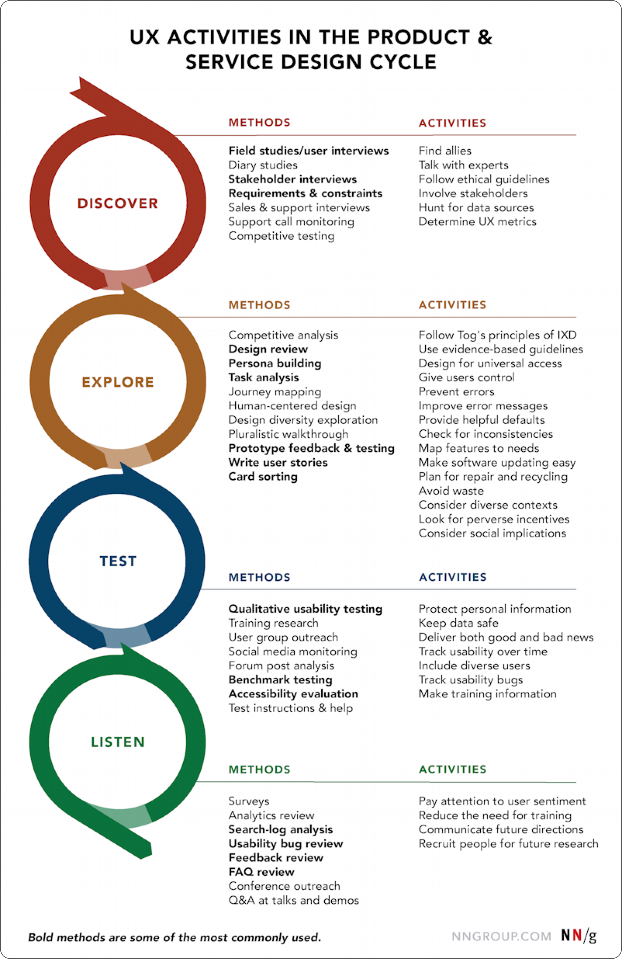

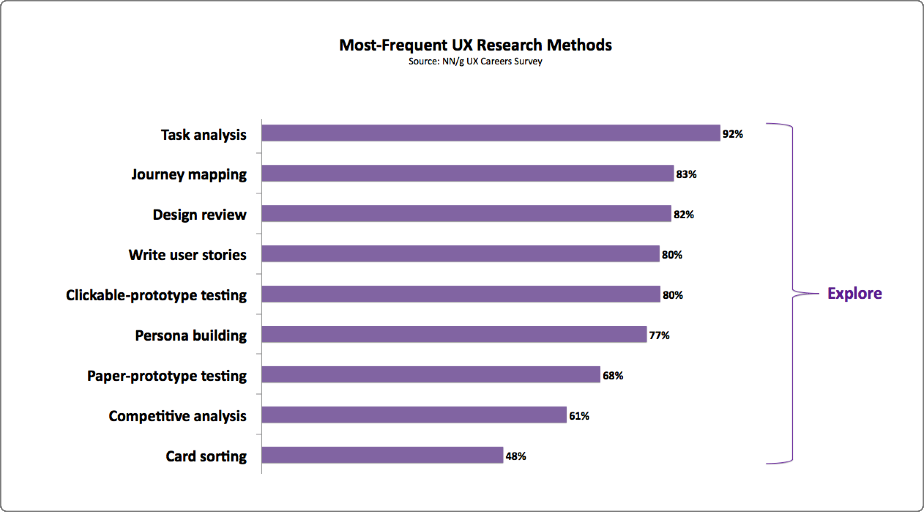


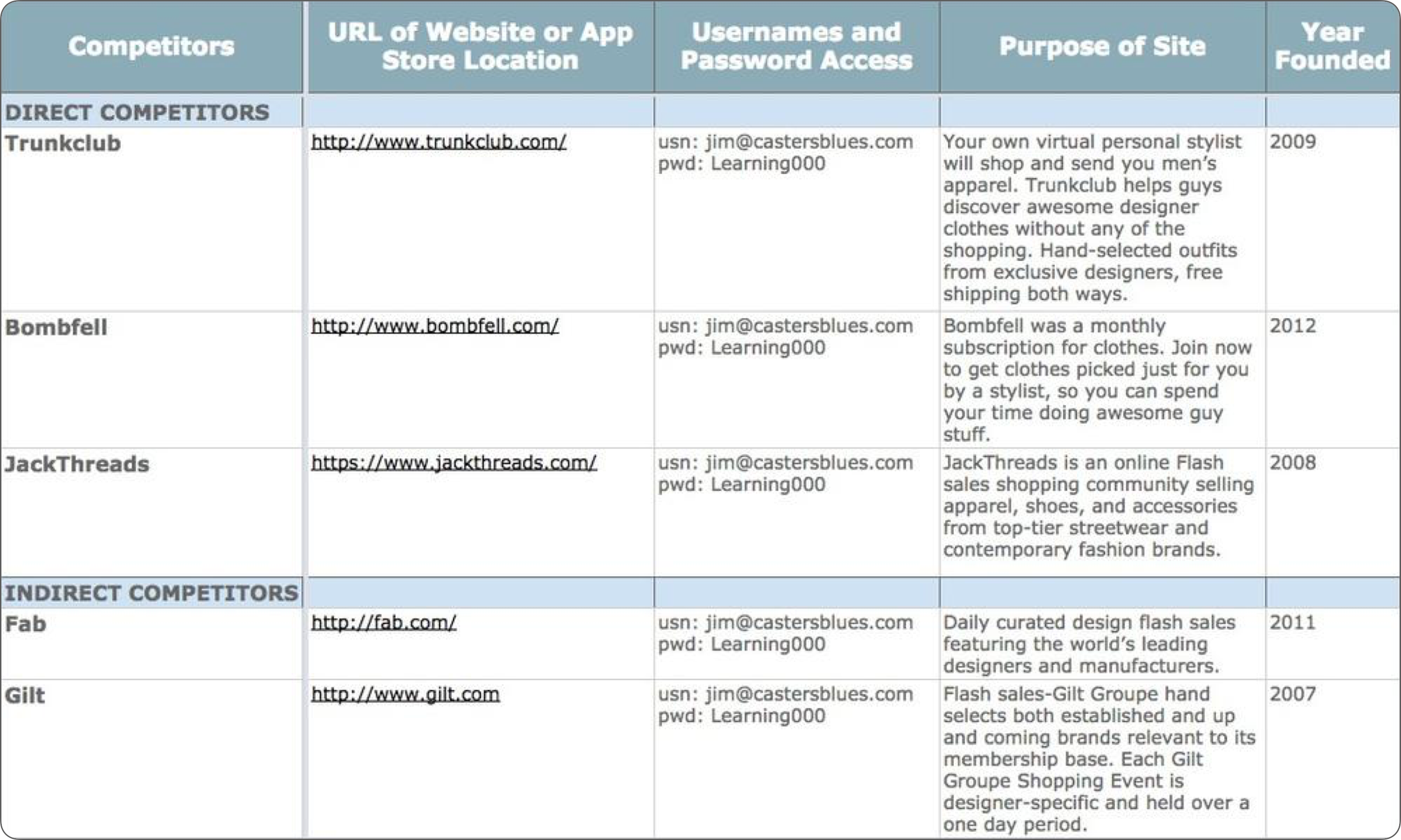

 (mb, ra, al, yk, il)
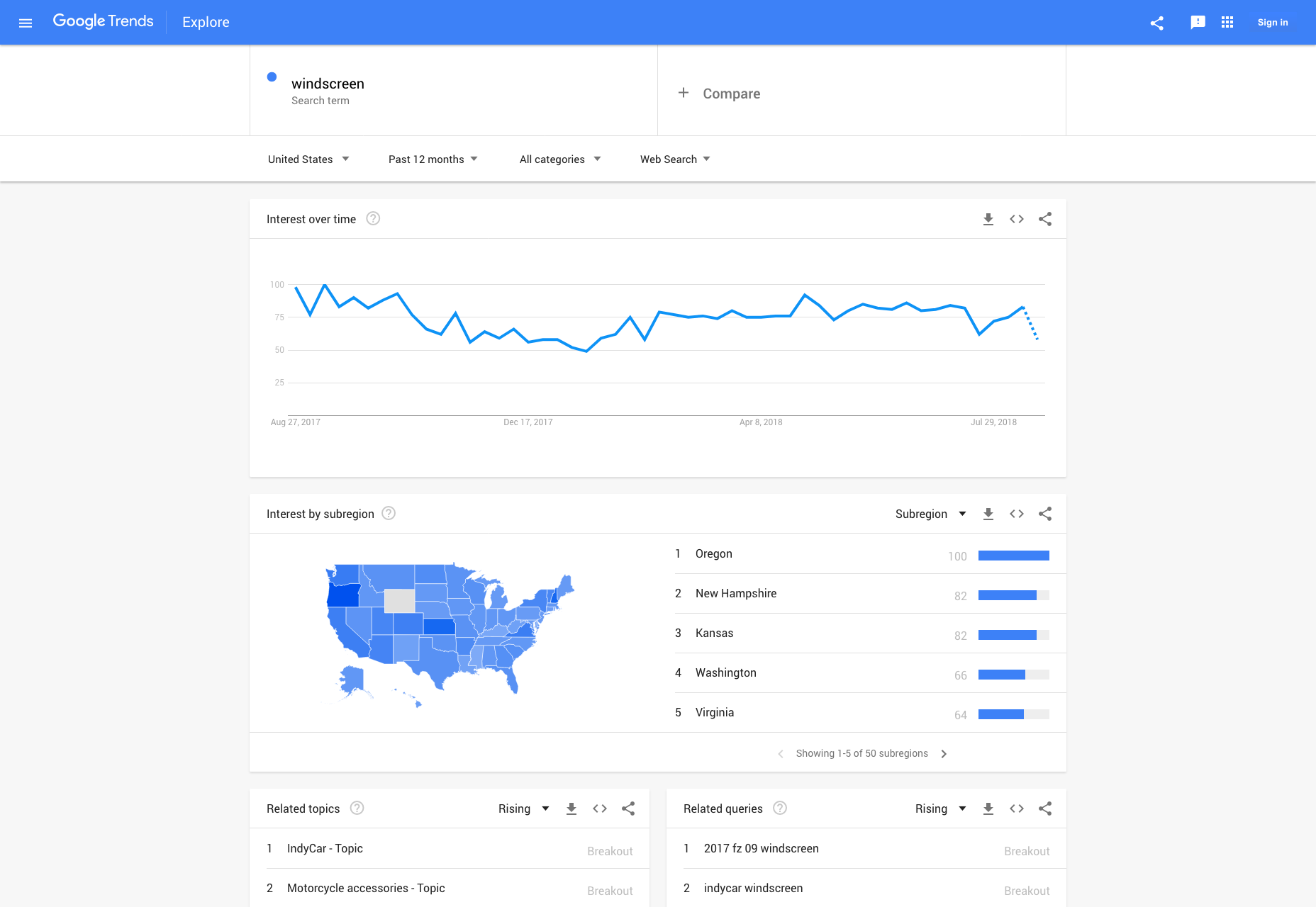