Archive

Archive for September, 2019

Multi-Million Dollar HTML

September 30th, 2019 No comments

Two stories:

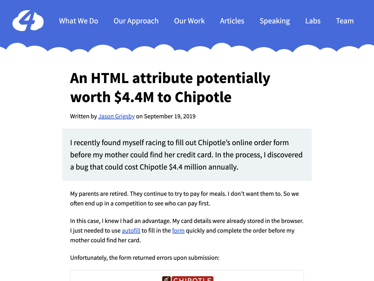
  • Jason Grigsby finds Chipotle’s online ordering form makes use of an input-masking technique that chops up a credit card expiration year making it invalid and thus denying the order. If pattern="dd" maxlength="2" was used instead (native browser feature), the browser is smart enough to do the right thing and not deny the order. Scratchpad math, based on published data, makes that worth $4.4 million dollars.
  • Adrian Roselli recalls an all-too-common form accessibility fail of missing a for/id attribute on labels and inputs results in an unusable experience and a scratchpad math loss of $18 million dollars to campaigns.

The label/input attribution thing really gets me. I feel like that’s an extremely basic bit of HTML knowledge that benefits both accessibility and general UX. It’s part of every HTML curriculum I’ve ever seen, and regularly pointed at as something you need to get right. And never a week goes by I don’t find some production website not doing it.

We can do this everyone!

<label for="name">Name:</label>
<input id="name" name="name" type="text">

<!-- or -->

<label>
  Name:
  <input name="name" type="text">
</label>

The post Multi-Million Dollar HTML appeared first on CSS-Tricks.

Categories: Designing, Others Tags:

How I Learned to Stop Worrying and Love Git Hooks

September 30th, 2019 No comments

The merits of Git as a version control system are difficult to contest, but while Git will do a superb job in keeping track of the commits you and your teammates have made to a repository, it will not, in itself, guarantee the quality of those commits. Git will not stop you from committing code with linting errors in it, nor will it stop you from writing commit messages that convey no information whatsoever about the nature of the commits themselves, and it will, most certainly, not stop you from committing poorly formatted code.

Fortunately, with the help of Git hooks, we can rectify this state of affairs with only a few lines of code. In this tutorial, I will walk you through how to implement Git hooks that will only let you make a commit provided that it meets all the conditions that have been set for what constitutes an acceptable commit. If it does not meet one or more of those conditions, an error message will be shown that contains information about what needs to be done for the commit to pass the checks. In this way, we can keep the commit histories of our code bases neat and tidy, and in doing so make the lives of our teammates, and not to mention our future selves, a great deal easier and more pleasant.

As an added bonus, we will also see to it that code that passes all the tests is formatted before it gets committed. What is not to like about this proposition? Alright, let us get cracking.

Prerequisites

In order to be able to follow this tutorial, you should have a basic grasp of Node.js, npm and Git. If you have never heard of something called package.json and git commit -m [message] sounds like code for something super-duper secret, then I recommend that you pay this and this website a visit before you continue reading.

Our plan of action

First off, we are going to install the dependencies that make implementing pre-commit hooks a walk in the park. Once we have our toolbox, we are going to set up three checks that our commit will have to pass before it is made:

  • The code should be free from linting errors.
  • Any related unit tests should pass.
  • The commit message should adhere to a pre-determined format.

Then, if the commit passes all of the above checks, the code should be formatted before it is committed. An important thing to note is that these checks will only be run on files that have been staged for commit. This is a good thing, because if this were not the case, linting the whole code base and running all the unit tests would add quite an overhead time-wise.

In this tutorial, we will implement the checks discussed above for some front-end boilerplate that uses TypeScript and then Jest for the unit tests and Prettier for the code formatting. The procedure for implementing pre-commit hooks is the same regardless of the stack you are using, so by all means, do not feel compelled to jump on the TypeScript train just because I am riding it; and if you prefer Mocha to Jest, then do your unit tests with Mocha.

Installing the dependencies

First off, we are going to install Husky, which is the package that lets us do whatever checks we see fit before the commit is made. At the root of your project, run:

npm i husky --save-dev

However, as previously discussed, we only want to run the checks on files that have been staged for commit, and for this to be possible, we need to install another package, namely lint-staged:

npm i lint-staged --save-dev

Last, but not least, we are going to install commitlint, which will let us enforce a particular format for our commit messages. I have opted for one of their pre-packaged formats, namely the conventional one, since I think it encourages commit messages that are simple yet to the point. You can read more about it here.

npm install @commitlint/{config-conventional,cli} --save-dev

## If you are on a device that is running windows
npm install @commitlint/config-conventional @commitlint/cli --save-dev

After the commitlint packages have been installed, you need to create a config that tells commitlint to use the conventional format. You can do this from your terminal using the command below:

echo "module.exports = {extends: ['@commitlint/config-conventional']}" > commitlint.config.js

Great! Now we can move on to the fun part, which is to say implementing our checks!

Implementing our pre-commit hooks

Below is an overview of the scripts that I have in the package.json of my boilerplate project. We are going to run two of these scripts out of the box before a commit is made, namely the lint and prettier scripts. You are probably asking yourself why we will not run the test script as well, since we are going to implement a check that makes sure any related unit tests pass. The answer is that you have to be a little bit more specific with Jest if you do not want all unit tests to run when a commit is made.

"scripts": {
  "start": "webpack-dev-server --config ./webpack.dev.js --mode development",
  "build": "webpack --config ./webpack.prod.js --mode production",
  "test": "jest",
  "lint": "tsc --noEmit",
  "prettier": "prettier --single-quote --print-width 80 "./**/*.{js,ts}" --write"
}

As you can tell from the code we added to the package.json file below, creating the pre-commit hooks for the lint and prettier scripts does not get more complicated than telling Husky that before a commit is made, lint-staged needs to be run. Then you tell lint-staged to run the lint and prettier scripts on all staged JavaScript and TypeScript files, and that is it!

"scripts": {
  "start": "webpack-dev-server --config ./webpack.dev.js --mode development",
  "build": "webpack --config ./webpack.prod.js --mode production",
  "test": "jest",
  "lint": "tsc --noEmit",
  "prettier": "prettier --single-quote --print-width 80 "./**/*.{js,ts}" --write"
},
"husky": {
  "hooks": {
    "pre-commit": "lint-staged"
  }
},
"lint-staged": {
  "./**/*.{ts}": [
    "npm run lint",
    "npm run prettier"
  ]
}

At this point, if you set out to anger the TypeScript compiler by passing a string to a function that expects a number and then try to commit this code, our lint check will stop your commit in its tracks and tell you about the error and where to find it. This way, you can correct the error of your ways, and while I think that, in itself, is pretty powerful, we are not done yet!

By adding "jest --bail --coverage --findRelatedTests" to our configuration for lint-staged, we also make sure that the commit will not be made if any related unit tests do not pass. Coupled with the lint check, this is the code equivalent of wearing two safety harnesses while fixing broken tiles on your roof.

What about making sure that all commit messages adhere to the commitlint conventional format? Commit messages are not files, so we can not handle them with lint-staged, since lint-staged only works its magic on files staged for commit. Instead, we have to return to our configuration for Husky and add another hook, in which case our package.json will look like so:

"scripts": {
  "start": "webpack-dev-server --config ./webpack.dev.js --mode development",
  "build": "webpack --config ./webpack.prod.js --mode production",
  "test": "jest",
  "lint": "tsc --noEmit",
  "prettier": "prettier --single-quote --print-width 80 "./**/*.{js,ts}" --write"
},
"husky": {
  "hooks": {
    "commit-msg": "commitlint -E HUSKY_GIT_PARAMS",  //Our new hook!
    "pre-commit": "lint-staged"
  }
},
"lint-staged": {
  "./**/*.{ts}": [
    "npm run lint",
    "jest --bail --coverage --findRelatedTests", 
    "npm run prettier"
  ]
}

If your commit message does not follow the commitlint conventional format, you will not be able to make your commit: so long, poorly formatted and obscure commit messages!

If you get your house in order and write some code that passes both the linting and unit test checks, and your commit message is properly formatted, lint-staged will run the Prettier script on the files staged for commit before the commit is made, which feels like the icing on the cake. At this point, I think we can feel pretty good about ourselves; a bit smug even.

Implementing pre-commit hooks is not more difficult than that, but the gains of doing so are tremendous. While I am always skeptical of adding yet another step to my workflow, using pre-commit hooks has saved me a world of bother, and I would never go back to making my commits in the dark, if I am allowed to end this tutorial on a somewhat pseudo-poetical note.

The post How I Learned to Stop Worrying and Love Git Hooks appeared first on CSS-Tricks.

Categories: Designing, Others Tags:

Beneath The Autumn Leaves (October 2019 Wallpapers Edition)

September 30th, 2019 No comments
First Scarf And The Beach

Beneath The Autumn Leaves (October 2019 Wallpapers Edition)

Beneath The Autumn Leaves (October 2019 Wallpapers Edition)

Cosima Mielke

2019-09-30T13:42:00+02:002019-09-30T14:06:40+00:00

Misty mornings, pumpkins, leaves shining in bright red, yellow, and orange hues — these are just some of the things about October that inspired artists and designers to participate in this month’s wallpapers challenge.

The monthly challenge has been going on for more than nine years already, and each time anew, creatives from all across the globe submit their designs to it to cater for some variety on your desktop and mobile screens — and for a bit of fresh inspiration, of course.

In this collection, you’ll find their wallpaper designs for October 2019. They come in versions with and without a calendar so that you can continue to use your favorite even after the month has ended. Speaking of favorites: As a little extra goodie, we compiled some favorites from past wallpapers editions at the end of this post. A big thank-you to everyone who shared their designs with us this time around. Happy October!

Please note that:

  • All images can be clicked on and lead to the preview of the wallpaper,
  • We respect and carefully consider the ideas and motivation behind each and every artist’s work. This is why we give all artists the full freedom to explore their creativity and express emotions and experience through their works. This is also why the themes of the wallpapers weren’t anyhow influenced by us but rather designed from scratch by the artists themselves.

Submit your wallpaper

We are always looking for designers and artists to be featured in our wallpapers posts. So if you’re feeling creative, please don’t hesitate to submit your design. We’d love to see what you’ll come up with for November. Join in! ?

First Scarf And The Beach

“When I was little my parents always took me and my sister for a walk at the beach in Nieuwpoort, we didn’t really do those beach walks in the summer but always when the sky started to turn grey and the days became colder. My sister and I always took out our warmest scarfs and played in the sand while my parents walked behind us. I really loved those Saturday or Sunday mornings where we were all together. I think October (when it’s not raining) is the perfect month to go to the beach for ‘uitwaaien’ (to blow out), to walk in the wind and take a break and clear your head, relieve the stress or forget one’s problems.” — Designed by Gwen Bogaert from Belgium.

Rain And Acorns

“Waiting at the bus stop when it’s raining in October can be a sad and wet experience. The bus is late, the dry spot is taken by other people and you’re just standing there in the rain with your hands in your pockets with nowhere to go. Acorns must have a hard time like that too! Waiting in the rain for the squirrels to come and pick them up.” — Designed by Casey Dulst from Belgium.

Transitions

“To me, October is a transitional month. We gradually slide from summer to autumn. That’s why I chose to use a lot of gradients. I also wanted to work with simple shapes, because I think of October as the ‘back to nature/back to basics month’.” — Designed by Jelle Denturck from Belgium.

Transitions

Autumn Is In The Air

“October reminds me of autumn, the season where you see fall leaves, squirrels, the weather that’s changing. Ever walked into the woods when it’s autumn? You can hear the magical sound of the wind blowing away the leaves. The woods are the most beautiful at fall, everything starts to color into yellow, orange, and brown. And you can meet some nice squirrels at the corner of a tree.” — Designed by Delphine Wylin from Belgium.

Autumn Is In The Air

The Return

Designed by Ricardo Gimenes from Sweden.

The Return

Sleepy Hedgehog

“Hedgehogs usually start to hibernate around October. This little hedgehog is celebrating Halloween on his own terms, while he is asleep.” — Designed by Aaron Harinck from Belgium.

Sleepy Hedgehog

The Month Of Tricks And Treats

“The fiery pumpkins blaze in the dark. The bonfires, the songs, the dancing around and the sumptuous feast. There is so much to look forward to this month.” — Designed by Mobile App Development from India.

The Month Of Tricks And Treats

Turtles In Space

“Finished September, with October comes the month of routines. This year we share it with turtles that explore space.” — Designed by Veronica Valenzuela from Spain.

Turtles In Space

Halloween House Call

“Halloween brings a nighttime of fun for all the family. With trick-or-treating round the neighborhood, it’s a pastime families love to take part in nationwide. We wanted to celebrate this event by coming up with a design concept that would pay homage to the most iconic Halloween fruit of them all, the mighty Pumpkin! What better way to look forward to this spooktacular night than with a geometric art pumpkin calendar. Enjoy your night, whatever you have planned!” — Designed by Ever Increasing Circles from the United Kingdom.

Halloween House Call

Create More

“The colors of the sun inspired me.” — Designed by Hitesh Puri from India.

Create More

Sober October

“Every year when October begins, my family and I light up the fireplace for the first time. This time of the year the leaves start falling and it starts to become cold outside which makes it even cosier.” — Designed by Jasper Vermeulen from Belgium.

Sober October

Brexit

“October 2019 will always be remembered as Brexit-month so I wanted to create a wallpaper that’s inspired by Brexit. At the same time I wanted to stay away from the classic Brexit/Europe colours. I came up with a pop-up window to imply that maybe, before really exiting the EU, the UK should reconsider what they are doing. ‘Is it ok to take this huge decision while people are screaming for another referendum’ is only one of the questions I want the British government to ask themselves.” — Designed by Nand Rogge from Belgium.

Brexit

Month Of Gratitude

“As autumn advances, the leaves descend in great gratitude, they return to Earth to rise again. Under the shedding tree the students and teachers learn, for a teacher sheds her years so that the students can grow.” — Designed by Mindster from India.

Month Of Gratitude

Disarmament Week

“According to research, 44 million Americans own firearms. The last week of October is Disarmament Week, so we are inspired by states like Liechtenstein, who abolished army and don’t use weapons. This monthly calendar is dedicated to all those who follow this trend. If the whole world was like Liechtenstein, we would be happier and cheerful. So, let’s all stand together against guns and bombs and establish a world without ammunition.” — Designed by PopArt Studio from Serbia.

Disarmament Week

Apples

“Apples are known all throughout the world yet barely anyone knows about Apple Day. For this reason I decided to put Apple Day in an extra spotlight and create a calendar about it. I hope others may enjoy apples as much as I do.” — Designed by Miguel De Pelsmaeker from Belgium.

Apples

Wandering In Woods

“The icy mountains keeping the body frozen, yet the mind wandering over the expansive woods.” — Designed by Sweans Technologies from London.

Wandering In Woods

Oktoberfest

“When I think about October, I immediately say ‘Oktoberfest’, partly for the obvious October part, but mostly for the ‘fest’ one. As we all know, Oktoberfest is a German traditional celebration dedicated to beer, that annually gathers friends from everywhere around the world, all having in common the passion for good beer (in large quantities), traditional food and the fun factor. And what can be more entertaining than having fun with your friends while drinking beer in an authentic German scenario?” — Designed by Loredana Codau (@loricacucrizanteme on Instagram) from Romania.

Oktoberfest

Oldies But Goodies

Hidden in our wallpapers archives, we rediscovered some nearly-forgotten treasures from past editions. May we present… (Please note that these designs don’t come with a calendar.)

Shades Of Gold

“We are about to experience the magical imagery of nature, with all the yellows, ochers, oranges, and reds coming our way this fall. With all the subtle sunrises and the burning sunsets before us, we feel so joyful that we are going to shout it out to the world from the top of the mountains.” — Designed by PopArt Studio from Serbia.

Shades Of Gold

Flying Home For Halloween

“You can only fully master the sky wearing an aviator hat and goggles. Like this little bat, flying home to celebrate Halloween with his family and friends.” — Designed by Franke Margrete from the Netherlands.

Flying Home For Halloween

Hanlu

“The term ‘Hanlu’ literally translates as ‘Cold Dew.’ The cold dew brings brisk mornings and evenings. Eventually the briskness will turn cold, as winter is coming soon. And chrysanthemum is the iconic flower of Cold Dew.” — Designed by Hong, ZI-Qing from Taiwan.

Hanlu

Strange October Journey

“October makes the leaves fall to cover the land with lovely auburn colors and brings out all types of weird with them.” — Designed by Mi Ni Studio from Serbia.

Strange October Journey

Fallen Woods

Designed by Dan Ioanitescu from Canada.

Desktop Wallpaper - October 2012
  • preview
  • without calendar: 1280×720, 1280×800, 1680×1050, 1920×1080, 2560×1440

Autumn Gate

“The days are colder, but the colors are warmer, and with every step we go further, new earthly architecture reveals itself, making the best of winters’ dawn.” — Designed by Ana Masnikosa from Belgrade, Serbia.

Autumn Gate

Discovering The Universe!

“Autumn is the best moment for discovering the universe. I am looking for a new galaxy or maybe… a UFO!” — Designed by Verónica Valenzuela from Spain.

Discovering The Universe!

All The Things

“During our recent rebrand, everyone in our team got their very own icon, each one has been custom illustrated by a lovely man called Paul, who wears glasses. The icons have all been chosen to represent something personal to each individual as well as all the other usual suspects you’d expect from an iconset.” — Designed by Engage Interactive from the United Kingdom.

All the things

Exploration

“In my travels to Selinsgrove, PA this past month, I had another opportunity to appreciate the beauty that surrounded me: trees, mountains, streams, rivers and fauna. This exploration was the inspiration for this piece encouraging others to explore new places and cherish the experience of being outdoors.” — Designed by Gabrielle Gorney from the United States.

Exploration

Dreaming

“The moment when you just walk and your imagination fills up your mind with thoughts.” — Designed by Gal Shir from Israel.

Dreaming

Say “Bye” To Summer

“And hello to Autumn! The Summer heat and high season is over. It’s time to pack our backpacks and head for the mountains — there are many treasures waiting to be discovered!” Designed by Agnes Sobon from Poland.

Desktop Wallpaper - October 2012
  • preview
  • without calendar: 1280×800, 1440×900, 1680×1050, 1920×1080, 1920×1200, 2560×1440

Haunted House

Designed by Mad Fish Digital from the United States.

Trick Or Treat

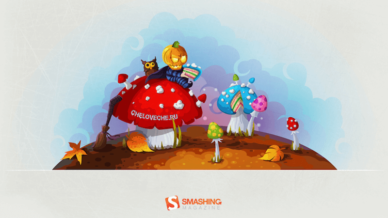
Mushrooms

“Autumn is the mushroom season. Be vigilant. Do not abuse.” Designed by Cheloveche.ru from Russia.

Free Desktop Wallpaper - October 2011
  • preview
  • without calendar: 1024×768, 1280×800, 1280×1024, 1440×900, 1680×1050, 1920×1200

Save Water, Drink Rain

Designed by Marika Smirnova from Russia.

Smashing Wallpaper - october 11
  • preview
  • without calendar: 320×480, 1024×768, 1024×1024, 1280×800, 1280×1024, 1440×900, 1680×1050, 1920×1080, 1920×1200, 2560×1440

Autumn Colors

“I love the autumn colors and making pictures, this is a collage of bits and pieces of various autumn photos from previous seasons. Enjoy!” — Designed by Agnes Swart from the Netherlands.

Autumn colors

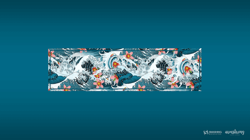
A Time For Reflection

“‘We’re all equal before a wave.’ (Laird Hamilton)” — Designed by Shawna Armstrong from the United States.

A Time for Reflection

Join In Next Month!

Thank you to all designers for their participation. Join in next month!

Categories: Others Tags:

Why a relationship with your client is about more than your skills

September 30th, 2019 No comments

Designers are masters of the craft. Well, lots of crafts: experience, aesthetic, and communication.

Communicating with non-designers is key to success as a designer.

As the Design Team Manager at Netguru, I manage the amazing team of 60 talented designers, one of the top & fastest-growing design teams in Europe. Together we help companies design beautiful software that meets their business goals. My mission here is to support and mentor them while they help our clients achieve their business goals.

We’re going to discuss:

  • Earning your client’s trust
  • Explaining design in non-design language
  • Managing your relationship
  • Keeping realistic expectations

Every relationship starts somewhere

We design products and interfaces for humans. Apart from being an employee, a manager, or a boss with budgets and deadlines to meet, a client is also a person with their own professional and personal goals and limitations, with a background and a family. Therefore, your first meeting with a client relies on gaining trust as much as on showing your portfolio and proving your designs bring enough value.

You should remember they put a huge investment into building the product, often having one shot—pass the project to impress investors or audience and keep the project alive. So you should make them feel they do the right thing putting their future in your hands. It is crucial to know the business environment your partner comes from. You need to gain trust and show not only do you care about getting the job done but also about your client’s business success.

Earn trust with transparency

Your client might not be a design expert, but they are experts in their field. To gain their respect, make them feel respected: listen to what they have to say and make them part of your process.

Part of developing trust with your client is giving them visibility into your process and your progress. If your client can grow to understand your decision-making on a micro-level, you’ll see it pay off on the macro.

To keep your client in check, follow these tips:

  • Be transparent with your progress,
  • Provide regular status updates on whether you are on or off track,
  • Propose measurable goals for your work and measure and track them,
  • Show real/test user session recordings, present heatmaps, and flows.

This will demand regular and open communication—whether it’s a daily/weekly email, a weekly video call, or regular meetings is up to you. The goal is to make sure your client is aware of the hard work that goes into the design, and the consideration you put into every detail and decision.

Learn to speak the client’s language

The language you use can have a tremendous impact on trust—you must never hesitate. Your doubts will raise the client’s doubts about hiring. The last thing they need is to leave their business future to your gut feeling. Always talk about facts, not assumptions and statements.

Your knowledge should go beyond UI/UX—see what the business strategy and the go-to-market strategy are, how the company works, whether your solutions will make them inoperative, what their competitors do well and what they do poorly, and what the overall market conditions are.

Moreover, you should address the client’s business needs—not some mythical users they don’t know or care about. Talk about users in the business context. For example: “(X) would help our new users achieve (business goal)”

The ability to talk openly is an incredibly difficult skill to obtain that will often distinguish great designers from outstanding ones. It requires courage, self-criticism, and humbleness. When you learn how to speak about the flaws of your solution and stop being afraid of asking questions, you will notice a big difference in the relationship.

Risk management in your relationship

You’re often the person with the least to lose when a project fails, but get involved so much as if your career depended on that one single project. You should feel co-responsible for your clients’ successes. Your responsibility is to keep them informed about the broad implications your design solution may have. Look at every decision and argument from their perspective, and it will truly change the quality of your relationship.

Clients appreciate it if you share your concerns so that they are not surprised at any stage of project design or development. Speaking about risks will strengthen your position as an expert and increase trust. As a designer, you might quit the project earlier, so your decisions might start to affect other stakeholders in the further stages. Therefore, sharing your insights throughout the process will positively influence the future success of the project.

Sometimes, the best solutions are beyond the risk threshold of risk of a given client. Be vigilant and see if solutions that seem to be the best from your perspective, are too risky for the client to introduce or operate. You might save their budget.

Respect the client’s time and money

There are not only technological but also organizational and personal costs of designing digital products. Everything you design will eventually need to be built, maintained and supported. Your idea for a new tool or feature will then require somebody’s time to operate it.

Sometimes a simple CRM or no CRM at all is better for the organization. A custom system can generate a big operational overhead for small startup teams. So unless it’s at the core of a business you can advise skipping this idea. Introducing a wide range of best-suited tools will not only generate more costs at the beginning, but could also cause issues with training the staff to operate them either now or in the foreseeable future. I personally remember clients’ appreciation expressed many times, whenever our design recommendations took the nature of their business into consideration.

Pick tools and priorities wisely

Keeping your client’s affairs in mind, you should focus on what has the biggest impact at an acceptable cost. Small changes in big, well-established organizations can bring about huge costs and impact. For example, changing a logo will have a marginal effect in small companies. In developed enterprises, on the other hand, it has the potential to cascade to a lot of effort expended for altering all bits of brand exposure and generate a ton of costs.

Don’t overestimate the value of some elements of the design process that might not matter at all in the end. Start with questions about things such as the product’s go-to-market strategy and sources of traffic. The client’s homepage should present a value proposition that is easy to understand as well as a unique selling point. At certain situations, these are way more important than animations, micro-interactions, and a flashy UI.

Swap mobile app screens (Source: Behance)

Educate your partner

Software might be eating the world, as they say, but not everyone must have shipped a software product to the world. Each time you recommend a certain solution, or recommend against it, you should back it with a straightforward explanation. Explore the technical expertise and savviness of your partner and explain the nuances of wording or terminology. It is our job to educate them—we shouldn’t force anything or expect a leap of faith. The client has the right not to understand basic design patterns—it is a designer’s duty to explain and educate, and, most importantly, stay patient throughout the process.

Engage experts to help your client

Last but not least, use your network to help your client’s business. If the go-to-market strategy or content plan is missing, find someone who can jump on a call and help you establish some basics and guide the client. Consult technical experts often and appreciate their expertise. Have an open mindset and synergy with other teams.

  • Marketing can help you study the market and the competition, and better understand the go-to-market strategy and the internal resources needed to execute it;
  • An SEO expert will ensure that the application benefits fully from search engine optimization, which includes websites, apps and Google, Bing or app stores;
  • Content writers can help adjust the copy to fit the target audience and convey the brand message better so that it generates the necessary conversions;

Technical experts (engineers) will make sure that your solution is viable for implementation, both on the frontend and the backend.

A relationship with a client is a long-term investment

While beautiful designs can attract much attention from the design community and bring you more potential clients at some particular moment, they will never be as profitable as strong relationships based on trust and good communication in the long run. Treating your client as a business partner, and their affairs as if they were yours, will pay off in recommendations and positive testimonials. Keep these tips in mind from the very first meeting with your clients, and you will notice a huge difference in the design process, the cooperation, and the relationship.

Categories: Others Tags:

3 Essential Design Trends, October 2019

September 30th, 2019 No comments

There’s a bonus trend in the roundup this month. (Four trends rather than three…but you’ll have to find it!)

Our more obvious collection of trends are visual elements – skinny vertical design blocks, a shift to tiny logos and branding rather than the oversized center logos that have been popular for a while, and dark and moody design schemes.

The extra trend is more interactive; you’ll have to click through the examples to find it. (Good luck!)

Here’s what’s trending in design this month.

Skinny Vertical Elements

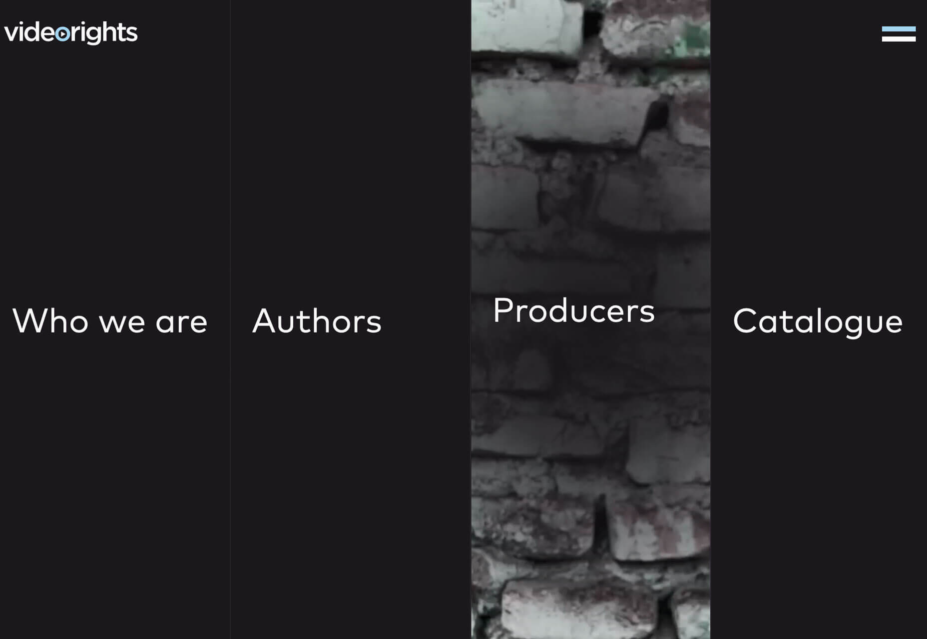
This might be the coolest looking trend in the roundup: Skinny vertical elements that add a fresh visual aspect to website projects. The space they occupy and the fact that they look different are engaging.

The only trouble can be with the conversion away from desktop sizes to smaller screen resolutions, but all of the examples below seem to handle that well.

It’s also a technique that can be used for different purposes.

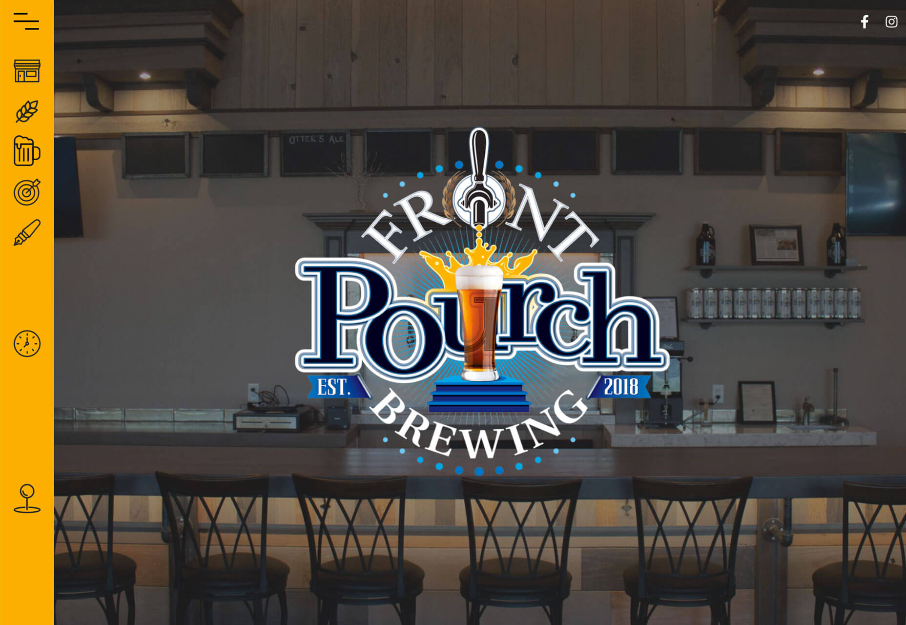
Front Pourch Brewing uses a skinny vertical bar with icons on the left side of the screen to highlight navigation elements. On mobile, the yellow bar collapses into a bottom of the screen nav with a hamburger menu. (Bottom of the screen menus are great for ease of navigating and tapping elements.)

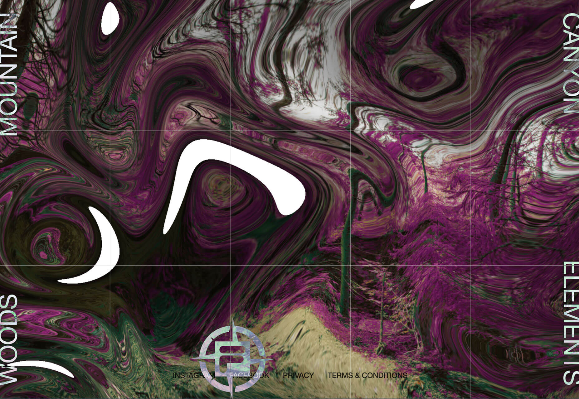
Fila Explore uses skinny vertical navigation elements on both sides of the screen that change the hero image when you hover over them. Each word is also clickable to go to another page. The UX is the same on mobile, albeit with a different aspect ratio.

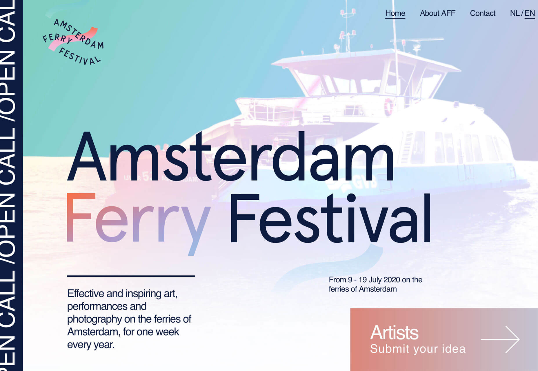
Amsterdam Ferry Festival uses a skinny vertical element on the left side of the screen with scrolling text to highlight an important event message. The area is also clickable and takes you to the call for entries listing in the scrolling text. It’s a different way to provide a scroller that isn’t at the top of the homepage. The placement is nice because it doesn’t detract from the rest of the design and the visuals could work equally well if it were removed. The placement and UX is the same on mobile, although it is a little harder to actually click/tap.

Tiny Logos and Branding

It’s best practice to place your logo, brand, or website name in the top left corner of the design. It’s not a new idea and one that users understand. (Just don’t forget to make that logo your home button.)

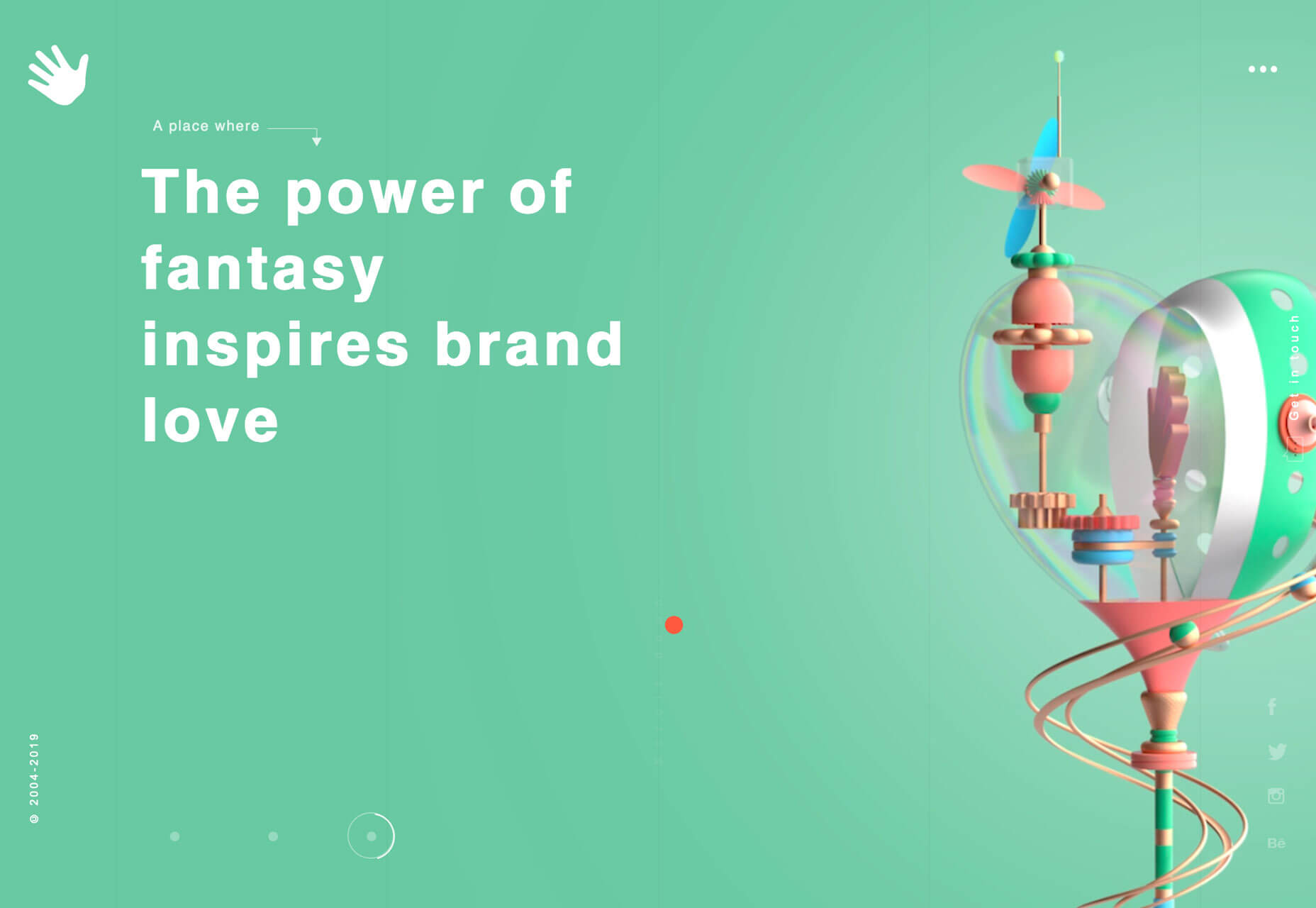
But there is a shift that these logos and brand marks are getting smaller and smaller.

Part of it might be due to responsive design and how many website we are looking at on phones or small devices. A big honkin’ logo will surely get in the way.

create good content first and worry about creating brand loyalty after

But more, it’s a practice of subtlety. If your content is good and what users expect when they come to your website, a large logo or brand name isn’t always contributing to the design or content.

Think about it for a minute. None of the examples below are household names, but they are all well-designed websites that serve a purpose for a specific user group. Aside from major companies such as Coca-Cola, Google, or Amazon that everyone is familiar with, the brand is often secondary to what’s on display. This applies to websites that deal in ecommerce or provide goods or services and sites that are purely informational or for entertainment.

A big homepage logo never got anyone excited; create good content first and worry about creating brand loyalty after users have already connected with what you have to offer.

Dark and Moody

Dark and moody website themes have a sleek look and aura of mystery that seems to instantly jump out. This trend really pops right now because light and white minimalism or bright, bold color palettes have been so dominant.

It makes dark themes stand out even more.

Each of these examples does it in a similar, but different way.

Warped Cigars uses a black and white theme with bold, beautiful typography. Images lack color and also have a bit of a black overlay to give more room to text elements and contribute to readability.

Vandal uses a combination of intriguing images in dark lighting. Each looks like it was taken in a dark room. Images and a dark scheme are magnified with gold accents, lettering, and lines that create a regal feel of elegance and mystery.

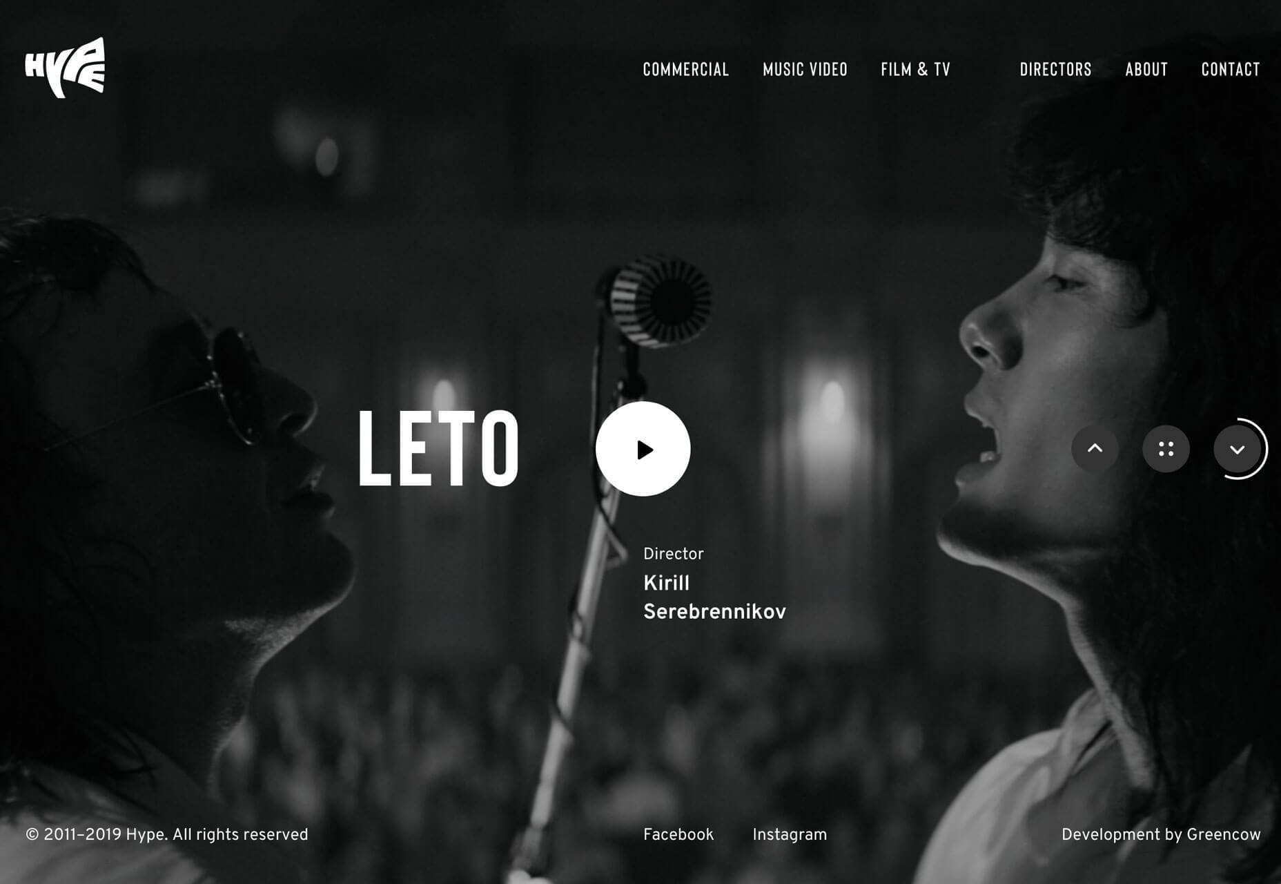
Hype uses a fairly traditional dark scheme with a slider of images with a dark overlay for highlight text elements. Images are both color and black and white as the slider almost allows the dark, moody scheme to flip for a moment (depending on the image) and draw you back in for another glance. The image selections here also contribute to the moody feel of the website project.

Conclusion

If you clicked through the examples above you might have uncovered another trend. There’s a growing number of websites using oversized cursor circles that help user discover interactive elements. Several of these examples use them and it’s starting to show up on all kinds of websites.

What you see is often a large circle that moves with the mouse on the screen. It might activate hover states of other elements or help you find fun divots to explore. And now that you are aware of this little goodie, take note of how often you are finding it when you browse the web.

Source

Categories: Designing, Others Tags:

Top Drawing and Art Apps for iPads

September 30th, 2019 No comments

To create a digital drawing, beginning artists need apps that can give them the best tools to practice. Depending on your specific needs, different drawing, painting, and art apps focus on different aspects of the art. We’ve compiled a list of top drawing apps in the market, some of which are free.

Here are a few drawing apps you should check out:

  1. Pigment. Pigment is an adult coloring app that works on iPhone, iPad, and Android. The app provides a realistic experience that simulates using paper and pencil. With tools like a pencil, a marker, an airbrush, a paintbrush, etc., you can draw whatever you want. The app is also compatible with Apple Pencil on the iPad. Pigment provides more than 4,000 coloring pages, such as mandalas, floral designs, animals, geometric patterns, and more. There are also more than 300 designs, 34 color palettes, and 11 brushes for you to use.
  2. Sketch – Draw & Paint. Sketch is a fun drawing app by Sony that works on both Android and iOS. Beginners can use the app, as it’s very intuitive. Sketch has a large community of users who inspire each other with new creations every day. Artists can use advanced tools like layers to create art. Other tools in the app include a background selector, a color tool, and smudge, among others.
  3. RoughAnimator. This app is built for people who are interested in creating hand-drawn animations. It can run on all platforms and is easy enough for beginners to use. There are professional tools like unlimited layers, adjustable exposure length, custom brushes, audio and video import, etc. RoughAnimator supports various styluses like Apple Pencil, Adonit, Wacom, and more. The files from this photo app can be imported to Adobe Flash/Animate, After Effects, and Toon Boom Harmony.
  4. Dotpict – Easy to Pixel Arts. Dotpict is a niche drawing app where you can create pixel art. The app works on both Android and iOS devices. Dotpict has features like undo, redo, canvas zoom, easy sharing, and autosave to create stunning art pieces.
  5. ibisPaint. ibisPaint has dubbed itself “the social drawing app” because it allows users to share their drawing process. The app aims to make drawing fun and collaborative. It can be used on smartphones and tablets with various operating systems. ibisPaint also has desktop-level features that allow you to draw exactly what you want. With ibisPaint, you can create manga drawings with tools like screen tone, frame divider, and text input. Choose from more than 140 realistic brushes, 30 high-quality filters, and 2,100 other freebies.
  6. PaperColor: Paint, Draw Sketchbook & PaperDraw. Draw and doodle with a “real” paintbrush using this app. Artists can even add their signatures to drawings with the help of the app’s pen tool. Add text, a custom cover, a custom background color, and cool backgrounds to your drawing. Additional app features can be accessed through in-app purchases.
  7. uMake. Built for the iPad, this app is for drawing and modeling 3D designs. uMake brings the power of desktop CAD to the iOS tablet. Using sketch plans, you can quickly create 3D lines in space, and auto surfacing makes creating 3D objects faster and easier. You can customize uMake to your preferences. The app includes a library of tutorials that make it easy to learn how to use.
  8. Clip Studio Paint for Manga. This popular drawing and painting iPad app is most suitable for manga and comics. Clip Studio Paint has many pens and brushes that enable you to create realistic art. Using the vector formats, you can scale drawings without compromising quality. There are several rulers for drawing and sketching, and the app supports Apple Pencil and Wacom bamboo sketch. Artists can create their own colors for filling tools.
  9. Brushes Redux. An iOS-only app, Brushes Redux is built on an OpenGL-based painting engine that provides a smooth and responsive experience. The app has a simple interface that supports all retina devices. Some of the app’s core features include full-screen painting, record and replay painting, and 14 parameterized brush shapes. You can use up to 10 layers, plus you can lock and hide them if needed. You can also adjust the opacity level in the layers, and duplicate, rearrange, and merge layers. The app allows you to save all of your files to Dropbox. You can also import and export brushes in different file formats.

No matter your skill level or interest, there’s an app out there for you. Start with one of these to see which one best suits your drawing style.

Categories: Others Tags:

Popular Design News of the Week: September 23, 2019 – September 29, 2019

September 29th, 2019 No comments

Every week users submit a lot of interesting stuff on our sister site Webdesigner News, highlighting great content from around the web that can be of interest to web designers.

The best way to keep track of all the great stories and news being posted is simply to check out the Webdesigner News site, however, in case you missed some here’s a quick and useful compilation of the most popular designer news that we curated from the past week.

Note that this is only a very small selection of the links that were posted, so don’t miss out and subscribe to our newsletter and follow the site daily for all the news.

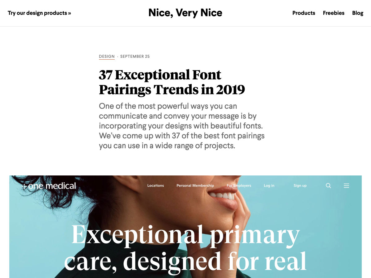
37 Font Pairing Trends in 2019

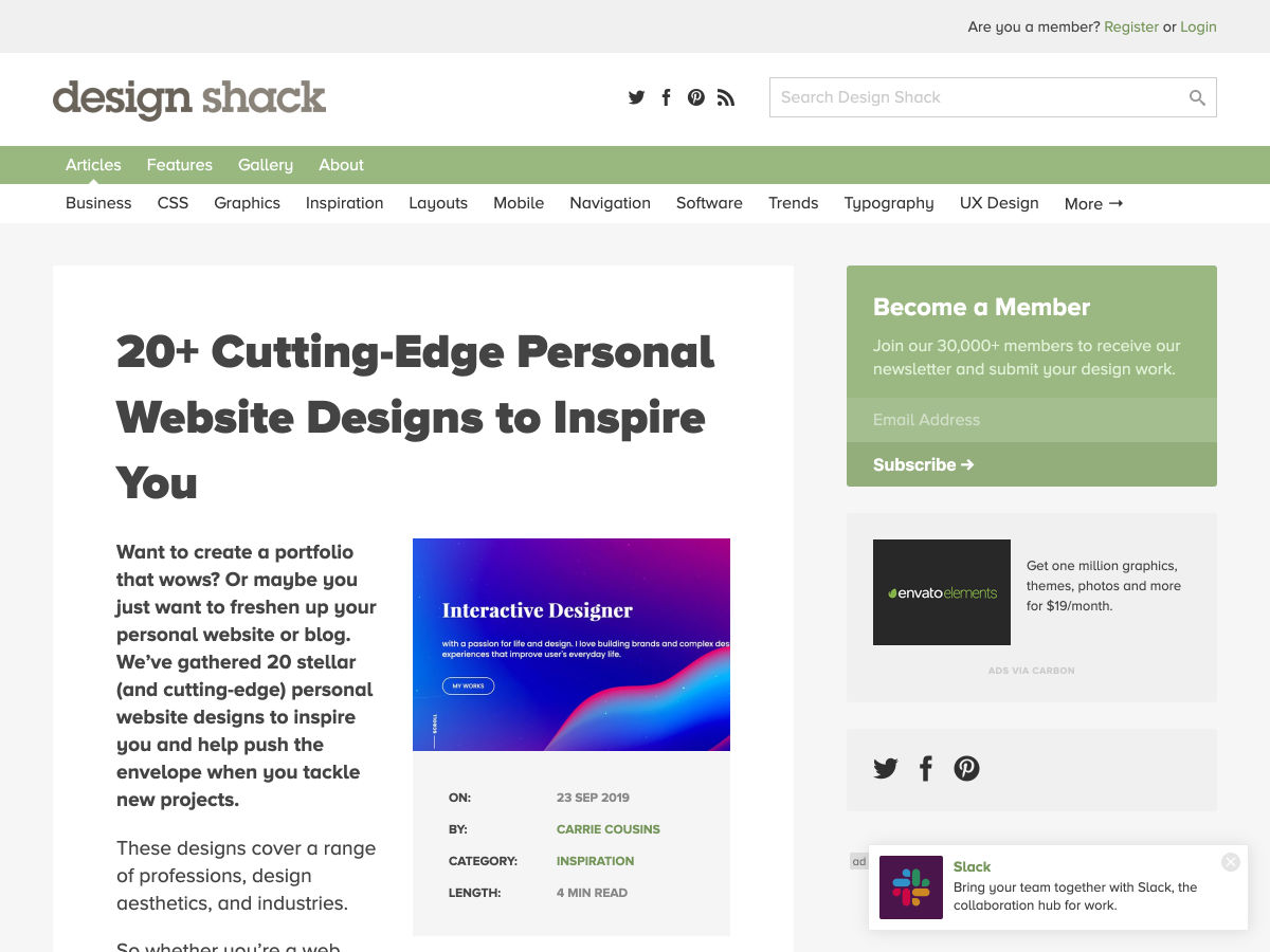
20+ Cutting-Edge Personal Website Designs to Inspire You

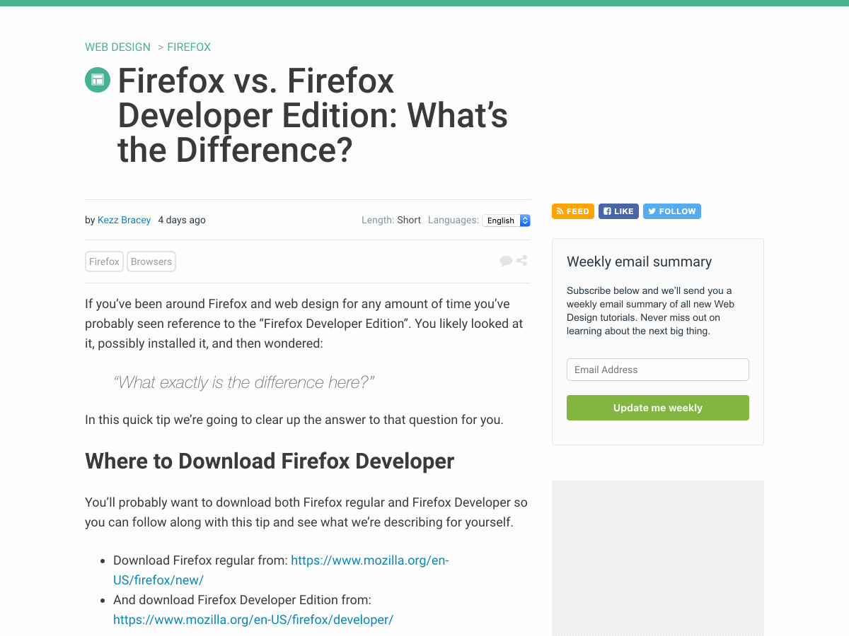
Firefox Vs. Firefox Developer Edition: What’s the Difference?

Site Design: A Website Coding Itself Live

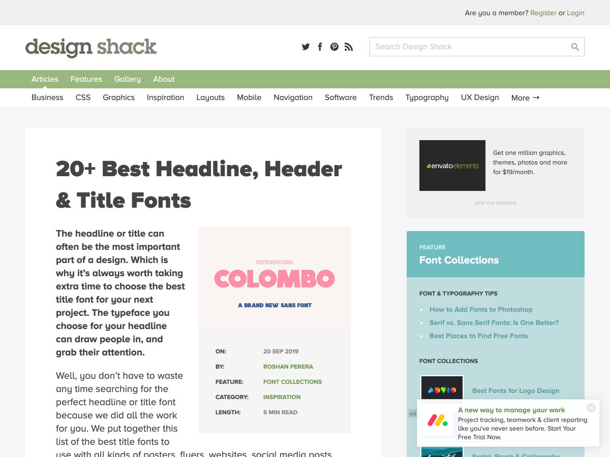
20+ Best Headline, Header & Title Fonts

Free Shots Mockups for Dribbble and Instagram

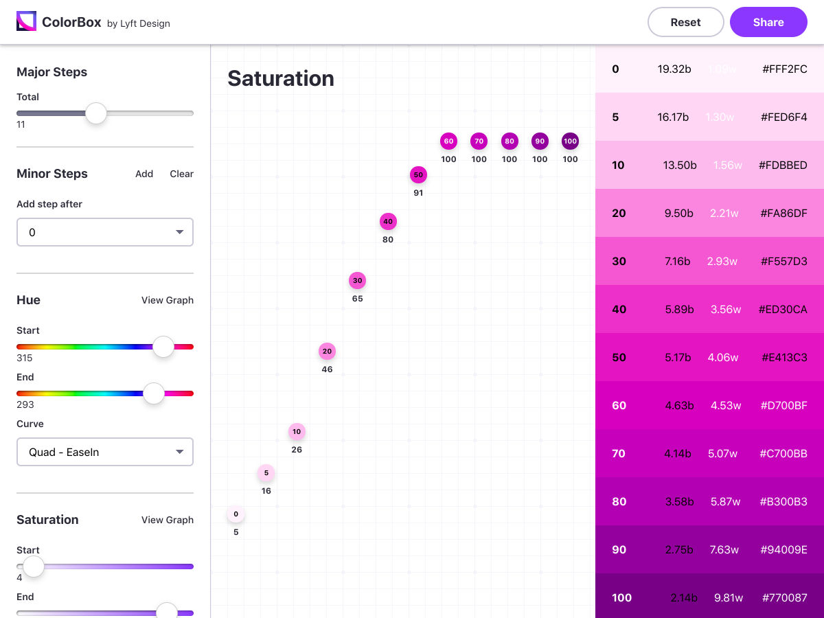
ColorBox

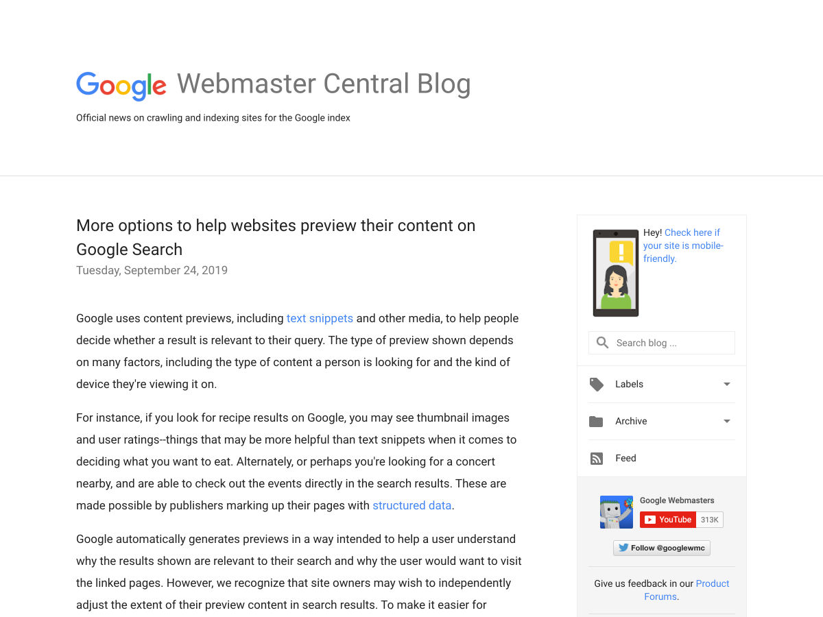
More Options to Help Websites Preview their Content on Google Search

An HTML Attribute Potentially Worth $4.4M to Chipotle

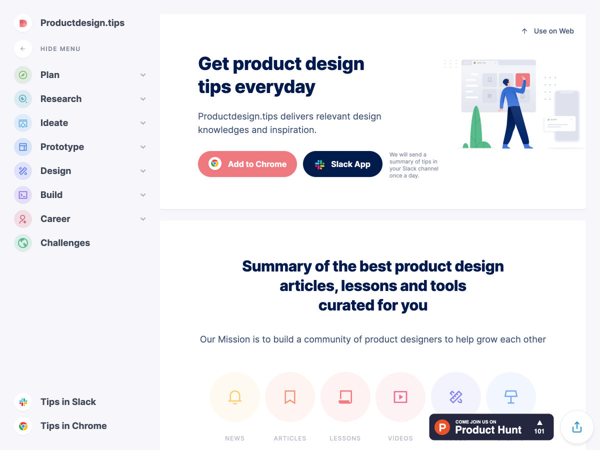
Productdesign.tips

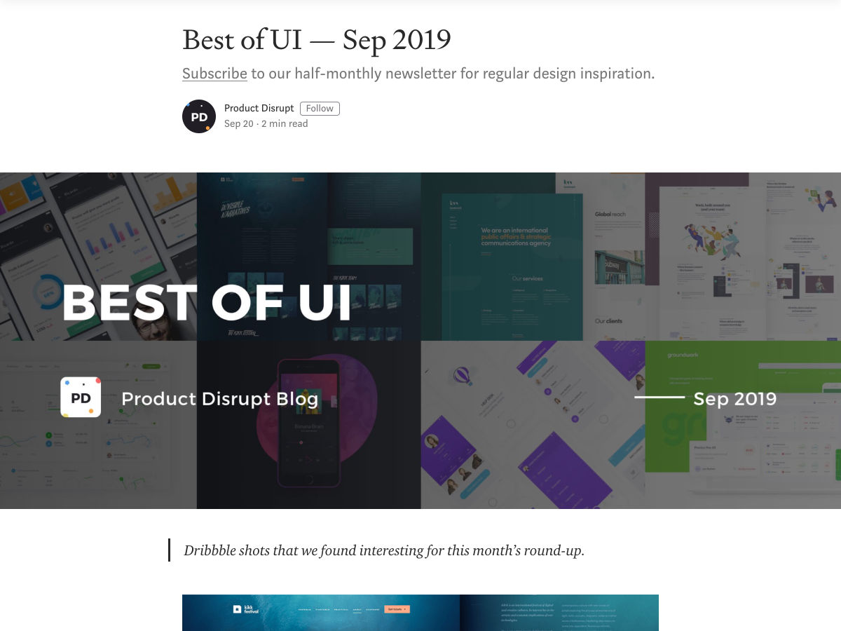
UI Design Inspiration – Sep 2019

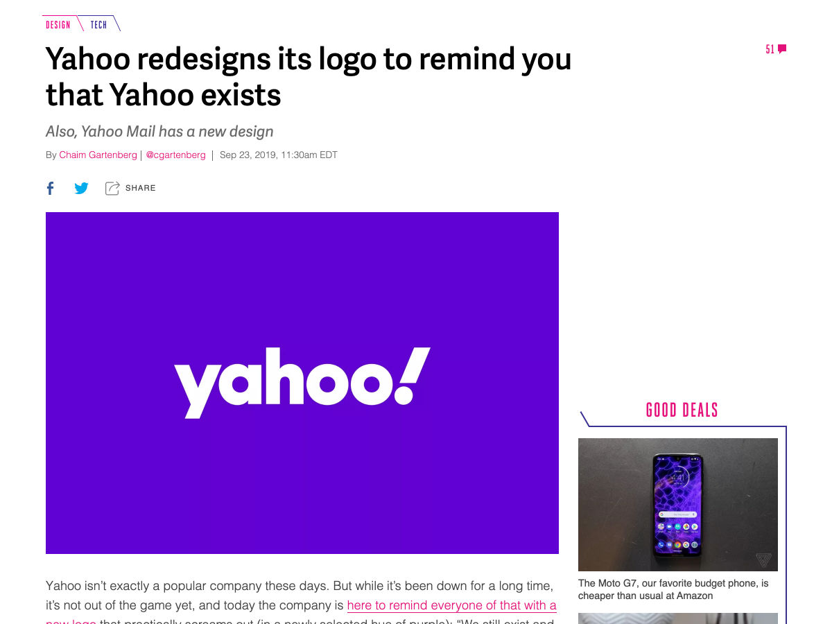
Yahoo Redesigns its Logo to Remind You that Yahoo Exists

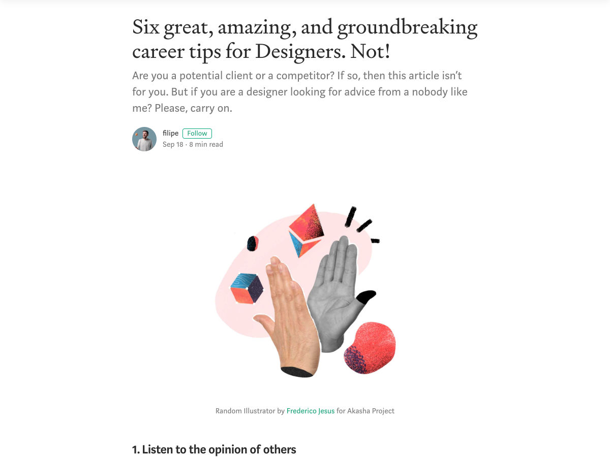
Six Great, Amazing, and Groundbreaking Career Tips for Designers. Not!

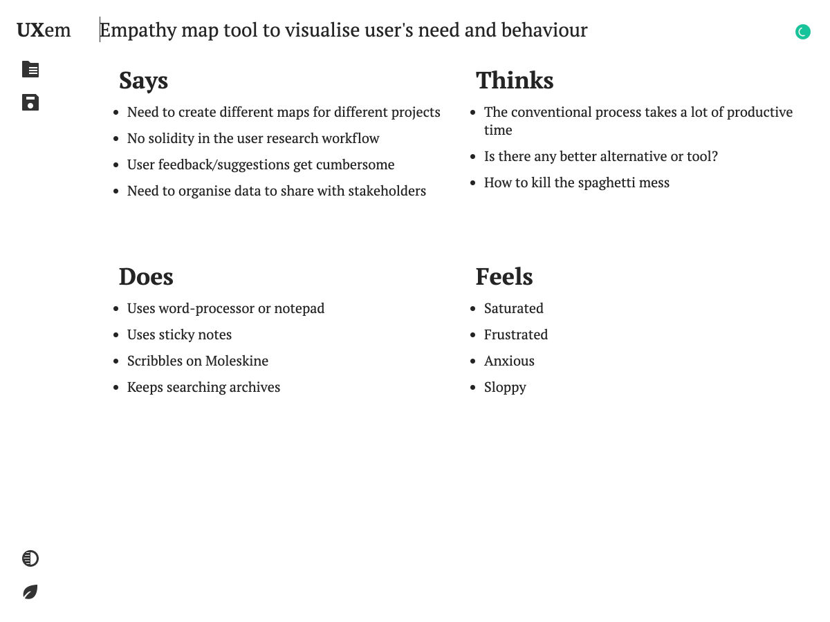
UX Mapping Tool

Free UX UI Practice Projects

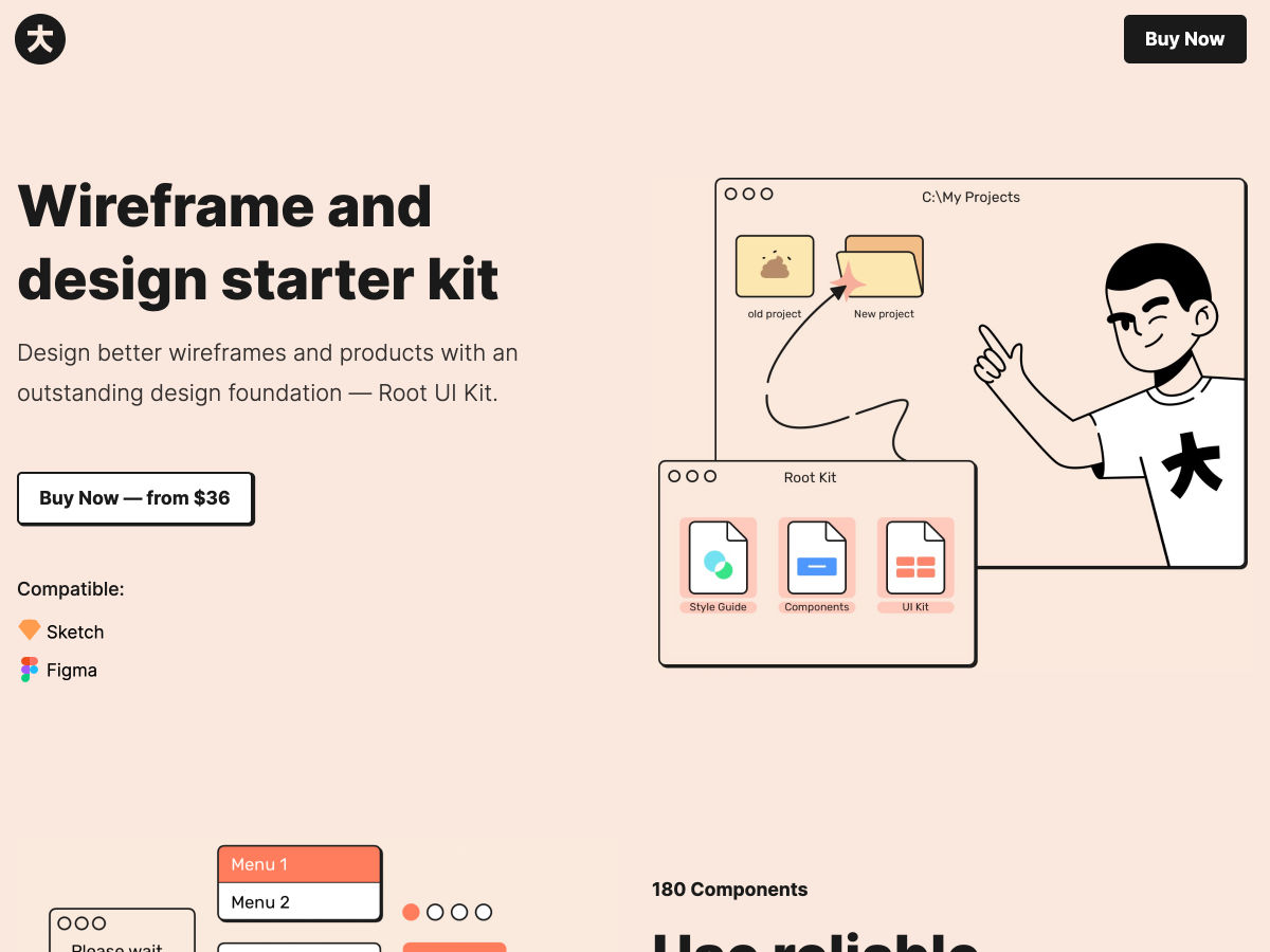
Root – Wireframe & Design Starter Kit for Sketch and Figma

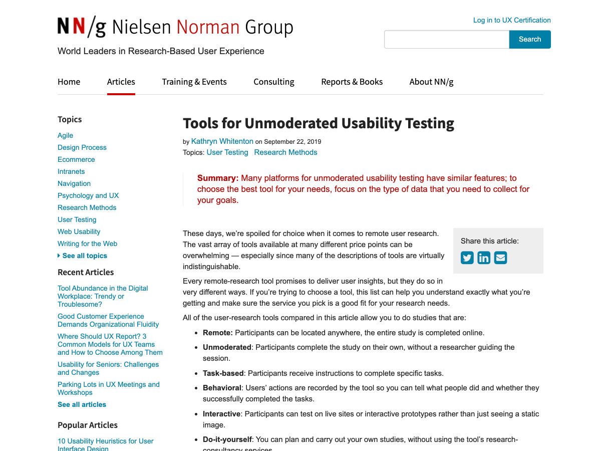
Tools for Unmoderated Usability Testing

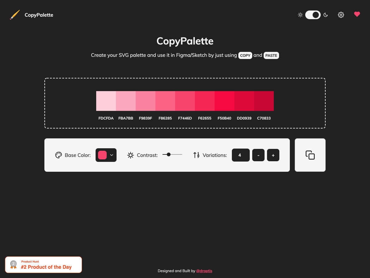
CopyPalette

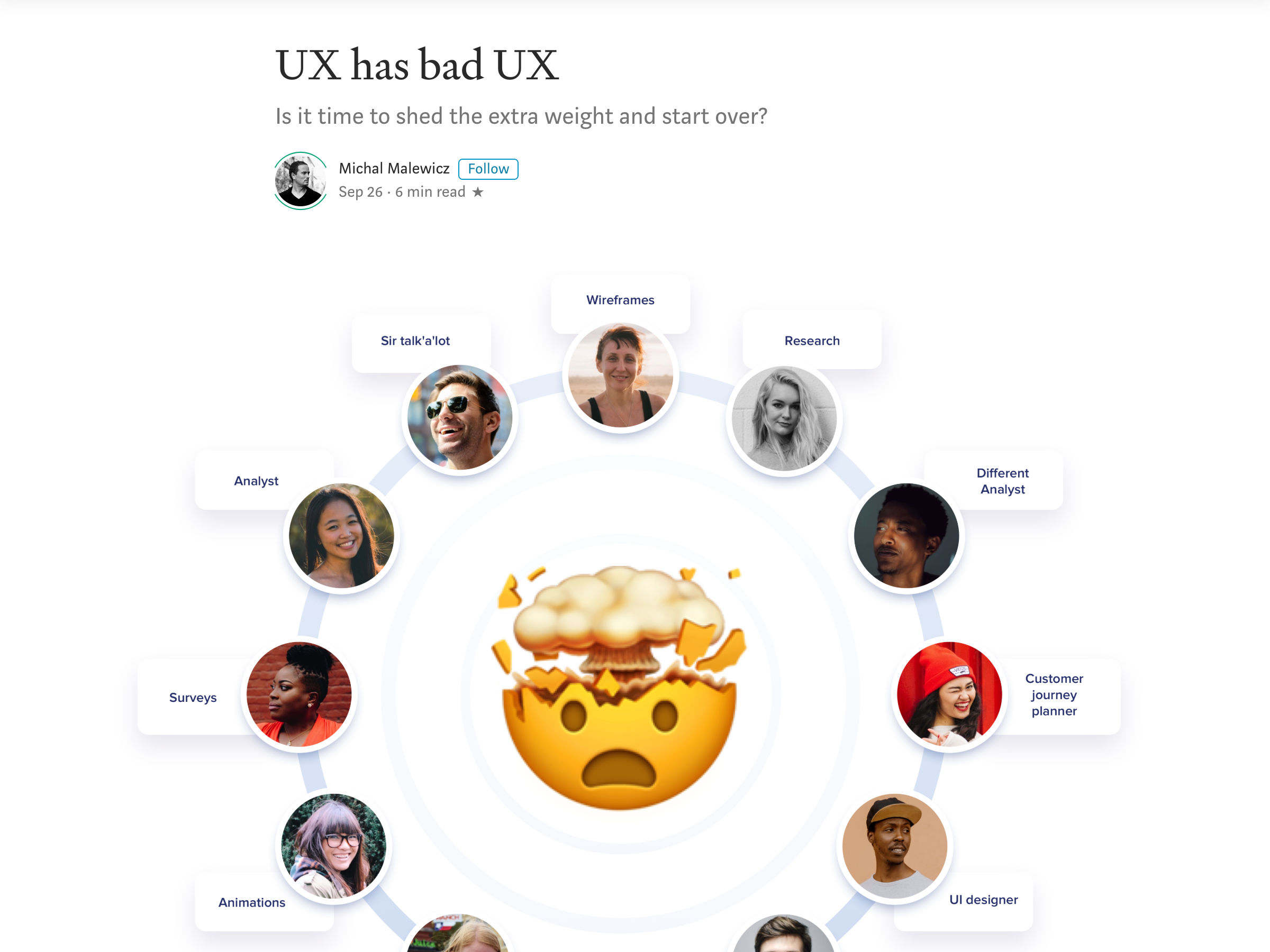
UX has Pretty Bad UX

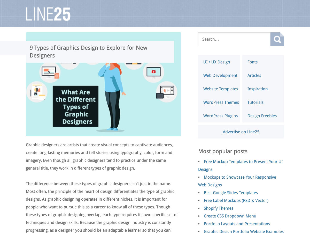
9 Types of Graphics Design to Explore for New Designers

Designing at Google: 10 Things I Know to Be True

How to Have Impact as a Product Designer

How Disney+ Onboards New Users

Improve Remote Collaboration: 5 Techniques for UX Designers

A Simple Guide to What Investors Usually Want to See in a Pitch Deck

Want more? No problem! Keep track of top design news from around the web with Webdesigner News.

Source

Categories: Designing, Others Tags:

Preloading Pages Just Before They are Needed

September 27th, 2019 No comments

The typical journey for a person browsing a website: view a page, click a link, browser loads new page. That’s assuming no funny business like a Single Page App, which still follows that journey, but the browser doesn’t load a new page — the client fakes it for the sake of a snappier transition.

What if you could load that new page before the person clicks the link so that, when they do, the loading of that next page is much faster? There are two notable projects that try to help with that:

  • quicklink: detects visible links, waits for the browser to be idle and if it isn’t on slow connection, it prefetches those links.
  • instant.page: if you hover over a link for 65ms, it preloads that link. The new Version 2 allows you to configure of the time delay or whether to wait for a click or press before preloading.

Combine those things with technological improvements like paint holding, and building a SPA architecture just for the speed benefits may become unnecessary (though it may still be desirable for other reasons, like code-splitting, putting the onus of routing onto front-end developers, etc.).

The post Preloading Pages Just Before They are Needed appeared first on CSS-Tricks.

Categories: Designing, Others Tags:

SmashingConf 2020 – San Francisco, Freiburg, New York And Austin

September 27th, 2019 No comments
Vitaly interviewing Val Head on stage at Smashing Conf Freiburg 2019

SmashingConf 2020 – San Francisco, Freiburg, New York And Austin

SmashingConf 2020 – San Francisco, Freiburg, New York And Austin

Rachel Andrew

2019-09-27T17:00:00+02:002019-09-28T08:06:19+00:00

We’ve been running SmashingConf since 2012, when we held our very first conference in Freiburg, Germany. Since then, we’ve continued to experiment and improve on our conference experience. Our aim is that you enjoy your time with us, but also return to work with new insights and knowledge. Each time we hope to leave you with practical takeaways that will help you in your own work and want to share with your team.

What is a SmashingConf like? It’s hard to explain until you have been there, however ,this video compilation from Toronto might just give you an idea!

Experimenting With Presentation Formats

Back in 2018, we began to experiment with the live-coding format. While not every presentation at SmashingConf was live-coded, many presenters brought a live element to their talk. Some speakers opted to present without slides completely, and these interactive sessions have been incredibly popular with audiences. Being able to watch an expert doing their work, seeing the tools they use and the choices they make in real time, brought many subjects to life.

“I love the fact that this talk format also kind of rid me of the expectation that it needed to be flawless.”

Sara Soueidan

Many of our speakers enjoyed the chance to try something different on stage; some have gone so far as to decide to make live-coding part of how they present in the future.

“I didn’t expect this, but I’m now seriously considering this format as a way I do talks at other conferences.”

Dan Mall

Not every talk fits a live-coding format, of course. Throughout 2019, we feel that we’ve found a great balance of practical live-coded (or live-designed) sessions, more traditional presentations with slides, and some which have mixed the two approaches. SmashingConf audiences are a mixture of designers and developers, of visual thinkers and those who learn best from seeing a lot of code.

As Dan Mall noted in his write-up of his live-coded talk:

“A few designers felt validated in their processes by seeing mine […]

“A few developers said design felt less intimidating now, both to understand as well as to try.”

In mixing up the formats as well as the subjects being discussed, we hope to bring parts of the industry to life — even for those who don’t normally work in that area.

Vitaly interviewing Val Head on stage at Smashing Conf Freiburg 2019

Talks are usually followed by an interview. (Photo credit: Drew McLellan)

In addition to playing with the format of presentations, we encourage audiences to engage with the speakers and each other. Talks are followed by an interview on stage — with the emcee posing questions asked by the audience. We publish a live Google Doc, so everyone can share their thoughts and ideas with the speakers as well as each other. Most of our speakers will attend the entire event, and enjoy the chance to chat with attendees. We believe everyone has useful knowledge to share — whether on stage or from the comfort of your seat!

Looking Forward To 2020

SmashingConf has always taken a holistic approach to the web. We believe that we all do better work when we work together and understand something of the roles of other team members. In 2020, we hope to build on the successes of 2019 by continuing to bring you some of the best live sessions — mixed with case studies, opportunities for networking, and surfacing some topics that are sometimes forgotten when focusing on design and development! We’ll cover topics such as HTML email, internationalization and localization, how to provide more accurate estimates, privacy, security, refactoring, debugging and the way designers and developers think as they work through their tasks and challenges.

We’re currently working hard on curating the line-up for all of the events next year. So, the big question is… where will you join us?

San Francisco, Freiburg, New York Or Austin!

The Smashing Cat will soon be on its way to Austin for the first time. We’re really excited about heading to Texas and about our events in cities we already know and love. Over the next few months, we’ll be announcing speakers and schedules for all of the events, but early-bird tickets are already available for San Francisco, Austin, and Freiburg 2020.

This year’s events have all been sold out well in advance of the conference dates, so mark the following dates in your calendars, have a chat with your boss, and work out where you will be heading to spend a fun and educational few days with the Smashing crew!

San Francisco, USA

SmashingConf SF will be taking place on April 21–22 where we’ll be bringing back two full days packed with front-end, UX and all that jazz! Live sessions on performance, accessibility, security, interface design, debugging and fancy CSS/JS techniques — and a few surprises along the way, of course! ?

Austin, USA

SmashingConf Austin will be taking place in the wonderful ZACH Theatre on June 9–10, 2020. Tacos, cats, and a friendly community — see ya in Austin, I reckon? ?

Freiburg, Germany

Smashing FreiburgWe will be returning to our hometown for SmashingConf Freiburg on the 7-8 September 2020. We pour our hearts into creating friendly, inclusive events that are focused on real-world problems and solutions. Our focus is on front-end and UX, but we cover all things web — be it UI design or machine learning. The Freiburg edition is, of course, no exception!

New York, USA

Join us for SmashingConf NYC on the 20-21 October 2020. This event is always a popular one, so watch out for tickets going on sale very soon!

Smashing Editorial(ra, vf, il)
Categories: Others Tags:

A Codebase and a Community

September 27th, 2019 No comments

I woke up one morning and realized that I had it all wrong. I discovered that code and design are unable to solve every problem on a design systems team, even if many problems can be solved by coding and designing in a dark room all day. Wait, huh? How on earth does that make any sense? Well, that’s because good design systems work is about hiring, too.

Let me explain.

First, let’s take a look at some common design systems issues. One might be that your components are a thick div soup which is causing issues for users and is all-round bad for accessibility. Another issue might be that you have a large number of custom components that are fragile and extremely difficult to use. Or maybe you have eight different illustration styles and four different modal components. Maybe you have a thousand different color values that are used inconsistently.

Everyone in an organization can typically feel these problems but they’re really hard to describe. Folks can see that it takes way longer to build things than it should and miscommunication is rampant. Our web app might have bad web performance, major accessibility issues and wildly inconsistent design. But why is this? What’s the root cause of all these dang problems?

The strange thing about design systems is it’s difficult to see what the root cause of all these inconsistencies and issues might be. And even the answer isn’t always entirely obvious once you see the problem.

A design systems team can write component documentation to fix these issues, or perhaps refactor things, audit patterns, refactor even more things, redesign components, and provide training and guidance. But when apps get to a certain size then one person (or even a whole team of people) tackling these problems isn’t enough to solve them.

Sure a design systems team can spend a whole bunch of time helping fix an issue but is that really the best use of their time? What if they convinced another team in the company to instead hire a dedicated front-end engineer to build a sustainable working environment? What if they hired an illustrator to make things consistent and ensure high quality across the entire app?

This is why design systems work is also about hiring.

A design systems team is in the perfect place to provide guidance around hiring because they’ll be the first to spot issues across an organization. They’ll see how components are being hacked together or where there’s too many unnecessary custom components that are not part of a library or style guide. The design systems team will see weaknesses in the codebase that no one else can see and they can show which teams are missing which particular skill sets — and fix that issue by hiring folks with skills in those specific areas.

If you’re in management and don’t see all those inconsistencies every day, then it’s likely nothing will get done about it. We’re unlikely to fix the issues we cannot see.

So as design systems folks, we ultimately need to care about hiring because of this: a codebase is a neighborhood and a community.

And the only way we can fix the codebase is by fixing the community.

The post A Codebase and a Community appeared first on CSS-Tricks.

Categories: Designing, Others Tags: