Archive

Archive for October, 2022

3 Essential Design Trends, November 2022

October 31st, 2022 No comments

Color and depth are key themes this month as we look at what design trends are happening across websites. Red is the primary color of choice, and you can see it almost everywhere; the new thing is that it’s being used in backgrounds and as more than an accent color. Additionally, 3D elements and depth of field are making significant impressions.

Here’s what’s trending in design this month.

1. Red Backgrounds

Red is the color of power, passion, and attention, but until recently, it wasn’t the go-to choice for website backgrounds. Now trending is red as a background color.

These designs are bold and in-your-face with bright color, an almost brash feel in some cases, and a lot of impact.

But it works.

In the projects below, red is a powerful tool to help convey the message of the website design. The color demands that you engage with the design to see what’s happening and the content therein, and in the case of Pentel, it’s part of the brand color.

Arze uses a bold red background with a smaller inset of contrasting color to show items on the site. It’s an interesting and quite bold choice. The red background carries through the scroll as well. This is a use of color that verges on off-putting but still gets the point across and helps show products thanks to a lot of contrast.

Russia Invaded Ukraine is a perfect use of red as a color that invokes feelings of passion with content to explain the conflict. Red can be a charged color; here, that’s precisely the intent.

Pentel uses a red background that’s a little softer than the previous examples. Here, red is a brand color, and they use the background to help draw attention to items and elements on the site. The red carries below the scroll as well to keep the theme moving.


2. 3D Icons and Graphics

Three-dimensional elements seem to keep ebbing and flowing with designers. We see a lot of 3D in projects, and then it seems to vanish again. It’s like we haven’t really figured out how to use it well or in a way that works with the content of various designs.

Admittedly, 3D icons, graphics, and illustrations can be difficult to create and use. Often they look a bit light and don’t go with all kinds of content. Therefore, they don’t get used that often.

Each of these projects takes a different approach:
Admilk goes all in with a series of 3D animations featuring the brand name. They are fun, light, and a bit unexpected. The graphics include objects that look like balloons, milk and cereal, and grass with flowers. (Click through to see each one.)

Refokus uses three-dimensional objects that move on a scroll to create directional flow and visual interest in a space where there’s not much else in terms of art. The objects stick with the aesthetic on the scroll and create an interesting element that carries you through the design without overwhelming you with tricks.

Junni is one of those website designs that goes all in with 3D. This illustrated bubble style of graphics is beginning to be a 3D trend in itself as a style that’s being used more and more with icons and even emojis. It has a light feel, and the animation almost makes it seem silly and somewhat childish.


3. Long Focal Depth

It’s been a while since a true photography or videography trend made this roundup, but there are so many instance of this image/video style in projects it can’t be ignored. Long focal depth is almost everywhere, from travel sites to architecture to e-commerce.

Long focal depth or depth of field allows the image to show a lot of space in an image in a way that’s sharp and viewable. Depth of field, in photography terms, is the distance between the closest and farthest objects in an image that are acceptably sharp.

In this trend, each website features a strong image with plenty of depth of field. The image can be still or moving, and the image is the thing that really draws you into the design.

What’s great about this trend is that you can see a lot of a scene and even feel like you are part of it. It’s an engaging visual concept that can work for a variety of purposes.

Interest Media uses a video reel that slowly zooms even further out. The image is lovely, and with the text overlay is easy to read and understand. It almost feels like you are walking backward on the bridge in the video.

Bloomingdales uses an immersive video with plenty of depth and virtual reality elements to create an immersive shopping experience. It makes you feel like you are in the store via the website and encourages shopping. It’s a fun way for the retailer to showcase its 150th anniversary.


Arredamento Design uses a photo with a wide focal area to provide interior design inspiration. Note the crisp lines and ease of which you find yourself engaging with the image, or even imagining a room like the one pictured. The effect used in the design, with a zoom on scroll, pulls the user into the image even more. Depth here keeps the motion and zoom from being too much and almost allows you to see more and feel even closer to objects that are further away in the image.


Conclusion

There are two trends here that tend to cross over into one another: The color red is everywhere and having a major emergence this fall as a dominant hue and depth, and three-dimensional focus is everywhere.

Both are highly usable design elements that can be incorporated easily, making them even more likely to continue to gain prominence in projects.

Source

The post 3 Essential Design Trends, November 2022 first appeared on Webdesigner Depot.

Categories: Designing, Others Tags:

The New CSS Media Query Range Syntax

October 31st, 2022 No comments
A desktop layout with a logo and menu up top, a large heading in white, and an image of a silhouetted person underneath the heading, followed by a footer.

We rely on CSS Media Queries for selecting and styling elements based on a targeted condition. That condition can be all kinds of things but typically fall into two camps: (1) the type of media that’s being used, and (2) a specific feature of the browser, device, or even the user’s environment.

So, say we want to apply certain CSS styling to a printed document:

@media print {
  .element {
    /* Style away! */
  }
}

The fact that we can apply styles at a certain viewport width has made CSS Media Queries a core ingredient of responsive web design since Ethan Marcotte coined the term. If the browser’s viewport width is a certain size, then apply a set of style rules, which allows us to design elements that respond to the size of the browser.

/* When the viewport width is at least 30em... */
@media screen and (min-width: 30em) {
  .element {
    /* Style away! */
  }
}

Notice the and in there? That’s an operator that allows us to combine statements. In that example, we combined a condition that the media type is a screen and that it’s min-width feature is set to 30em (or above). We can do the same thing to target a range of viewport sizes:

/* When the viewport width is between 30em - 80em */
@media screen and (min-width: 30em) and (max-width: 80em) {
  .element {
    /* Style away! */
  }
}

Now those styles apply to an explicit range of viewport widths rather than a single width!

But the Media Queries Level 4 specification has introduced a new syntax for targeting a range of viewport widths using common mathematical comparison operators — things like <, >, and = — that make more sense syntactically while writing less code.

Let’s dig into how that works.

New comparison operators

That last example is a good illustration of how we’ve sort of “faked” ranges by combining conditions using the and operator. The big change in the Media Queries Level 4 specification is that we have new operators that compare values rather than combining them:

  • < evaluates if a value is less than another value
  • > evaluates if a value is greater than another value
  • = evaluates if a value is equal to another value
  • <= evaluates if a value is less than or equal to another value
  • >= evaluates if a value is greater than or equal to another value

Here’s how we might’ve written a media query that applies styles if the browser is 600px wide or greater:

@media (min-width: 600px) {
  .element {
    /* Style away! */
  }
}

Here’s how it looks to write the same thing using a comparison operator:

@media (width >= 600px) {
  .element {
    /* Style away! */
  }
}

Targeting a range of viewport widths

Often when we write CSS Media Queries, we’re creating what’s called a breakpoint — a condition where the design “breaks” and a set of styles are applied to fix it. A design can have a bunch of breakpoints! And they’re usually based on the viewport being between two widths: where the breakpoint starts and where the breakpoint ends.

Here’s how we’ve done that using the and operator to combine the two breakpoint values:

/* When the browser is between 400px - 1000px */
@media (min-width: 400px) and (max-width: 1000px) {
  /* etc. */
}

You start to get a good sense of how much shorter and easier it is to write a media query when we ditch the Boolean and operator in favor of the new range comparison syntax:

@media (400px <= width <= 1000px) {
  /* etc. */
}

Much easier, right? And it’s clear exactly what this media query is doing.

Browser support

This improved media query syntax is still in its early days at the time of this writing and not as widely supported at the moment as the approach that combines min-width and max-width. We’re getting close, though! Safari is the only major holdout at this point, but there is an open ticket for it that you can follow.

This browser support data is from Caniuse, which has more detail. A number indicates that browser supports the feature at that version and up.

Desktop

Chrome Firefox IE Edge Safari
104 63 No 104 No

Mobile / Tablet

Android Chrome Android Firefox Android iOS Safari
106 106 106 No

Let’s look at an example

Here’s a layout for that’s nicely suited for larger screens, like a desktop:

This layout has base styles that are common to all breakpoints. But as the screen gets narrower, we start to apply styles that are conditionally applied at different smaller breakpoints that are ideally suited for tablets all the way down to mobile phones:

Side-by-side screenshots of the mobile and tablet layouts with their CSS Grid tracks overlaid.

To see what’s happening, here’s a how the layout responds between the two smaller breakpoints. The hidden nav list getting displayed as well as title in the main gets increased in font-size.

That change is triggered when the viewport’s changes go from matching one media’s conditions to another:

/* Base styles (any screen size) */
header {
  display: flex;
  justify-content: center;
}

header ul {
  display: none;
}

.title p {
  font-size: 3.75rem;
}

/* When the media type is a screen with a width greater or equal to 768px */
@media screen and (width >= 768px) {
  header {
    justify-content: space-between;
  }

  header ul {
    display: flex;
    justify-content: space-between;
    gap: 3rem;
  }

  .title p {
    font-size: 5.75rem;
  }
}

We’ve combined a few of the concepts we’ve covered! We’re targeting devices with a screen media type, evaluating whether the viewport width is greater than or equal to a specific value using the new media feature range syntax, and combining the two conditions with the and operator.

Diagram of the media query syntax, detailing the media type, operator, and range media feature.

OK, so that’s great for mobile devices below 768px and for other devices equal to or greater than 768px. But what about that desktop layout… how do we get there?

As far as the layout goes:

  • The main element becomes a 12-column grid.
  • A button is displayed on the image.
  • The size of the .title element’s font increases and overlaps the image.

Assuming we’ve done our homework and determined exactly where those changes should take place, we can apply those styles when the viewport matches the width condition for that breakpoint. We’re going to say that breakpoint is at 1000px:

/* When the media type is a screen with a width greater or equal to 1000px  */
@media screen and (width >= 1000px) {
  /* Becomes a 12-column grid */
  main {
    display: grid;
    grid-template-columns: repeat(12, 1fr);
    grid-template-rows: auto 250px;
  }

  /* Places the .title on the grid */
  .title {
    grid-row: 1;
  }

  /* Bumps up the font-size */
  .title p {
    font-size: 7.75rem;
  }

  /* Places .images on the grid */
  .images {
    grid-row: 1 / span 2;
    align-self: end;
    position: relative;
  }

  /* Displays the button */
  .images .button {
    display: block;
    position: absolute;
    inset-block-end: 5rem;
    inset-inline-end: -1rem;
  }
}
Showing the CSS grid tracks for a desktop layout using a CSS media query with the new range syntax.

Have a play with it:

CodePen Embed Fallback

Why the new syntax is easier to understand

The bottom line: it’s easier to distinguish a comparison operator (e.g. width >= 320px) than it is to tell the difference between min-width and max-width using the and operator. By removing the nuance between min- and max-, we have one single width parameter to work with and the operators tell us the rest.

Beyond the visual differences of those syntaxes, they are also doing slightly different things. Using min- and max- is equivalent to using mathematical comparison operators:

  • max-width is equivalent to the <= operator (e.g. (max-width: 320px) is the same as (width <= 320px)).
  • min-width is equivalent to the >= operator (e.g. (min-width: 320px) is the same as (width >= 320px)).

Notice that neither is the equivalent of the > or < operators.

Let’s pull an example straight from the Media Queries Level 4 specification where we define different styles based on a breakpoint at 320px in the viewport width using min-width and max-width:

@media (max-width: 320px) { /* styles for viewports <= 320px */ }
@media (min-width: 320px) { /* styles for viewports >= 320px */ }

Both media queries match a condition when the viewport width is equal to 320px. That’s not exactly what we want. We want either one of those conditions rather than both at the same time. To avoid that implicit changes, we might add a pixel to the query based on min-width:

@media (max-width: 320px){ /* styles for viewports <= 320px */ }
@media (min-width: 321px){ /* styles for viewports >= 321px */ }

While this ensures that the two sets of styles don’t apply simultaneously when the viewport width is 320px, any viewport width that fall between 320px and 321px will result in a super small zone where none of the styles in either query are applied — a weird “flash of unstyled content” situation.

One solution is to increase the second comparison scale value (numbers after the decimal point) to 320.01px:

@media (max-width: 320px) { /* styles for viewports <= 320px */ }
@media (min-width: 320.01px) { /* styles for viewports >= 320.01px */ }

But that’s getting silly and overly complicated. That’s why the new media feature range syntax is a more appropriate approach:

@media (width <= 320px) { /* styles for viewports <= 320px */ }
@media (width > 320px) { /* styles for viewports > 320px */ }

Wrapping up

Phew, we covered a lot of ground on the new syntax for targeting viewport width ranges in CSS Media Queries. Now that the Media Queries Level 4 specification has introduced the syntax and it’s been adopted in Firefox and Chromium browsers, we’re getting close to being able to use the new comparison operators and combining them with other range media features besides width, like height and aspect-ratio

And that’s just one of the newer features that the Level 4 specification introduced, alongside a bunch of queries we can make based on user preferences. It doesn’t end there! Check out the Complete Guide to CSS Media Queries for a sneak peek of what might be included in Media Queries Level 5.


The New CSS Media Query Range Syntax originally published on CSS-Tricks, which is part of the DigitalOcean family. You should get the newsletter.

Categories: Designing, Others Tags:

On The Edge Of November (2022 Desktop Wallpapers Edition)

October 31st, 2022 No comments

November tends to be a rather gray month in many parts of the world. So what better remedy could there be as some colorful inspiration? To bring some good vibes to your desktops and home screens, artists and designers from across the globe once again tickled their creativity and designed beautiful and inspiring wallpapers to welcome the new month.

This monthly wallpapers challenge has been going on for more than eleven years already, and we are very thankful to everyone who has put their creative skills to the test and contributed their artworks to it — back in the early days, just like today.

The wallpapers in this collection all come in versions with and without a calendar for November 2022 and can be downloaded for free. As a little bonus goodie, we also compiled some timeless treasures from past November editions at the end of this post for you. Enjoy!

  • You can click on every image to see a larger preview,
  • We respect and carefully consider the ideas and motivation behind each and every artist’s work. This is why we give all artists the full freedom to explore their creativity and express emotions and experience through their works. This is also why the themes of the wallpapers weren’t anyhow influenced by us but rather designed from scratch by the artists themselves.
  • Submit a wallpaper!
    Did you know that you could get featured in our next wallpapers post, too? We are always looking for creative talent.

Anbani

Anbani means alphabet in Georgian. The letters that grow on that tree are the Georgian alphabet. It’s very unique!” — Designed by Vlad Gerasimov from Georgia.

Cozy Autumn Cups And Cute Pumpkins

“Autumn coziness, which is created by fallen leaves, pumpkins, and cups of cocoa, inspired our designers for this wallpaper. You can find more calendar options in our collection.” — Designed by MasterBundles from Ukraine.

A Jelly November

“Been looking for a mysterious, gloomy, yet beautiful desktop wallpaper for this winter season? We’ve got you, as this month’s calendar marks Jellyfish Day. On November 3rd, we celebrate these unique, bewildering, and stunning marine animals. Besides adorning your screen, we’ve got you covered with some jellyfish fun facts — they aren’t really fish, they need very little oxygen, eat a broad diet, and shrink in size when food is scarce. Now that’s some tenacity to look up to.” — Designed by PopArt Studio from Serbia.

Snoop Dog

Designed by Ricardo Gimenes from Sweden.

Sunset On The Mississippi

“After a long day, a walk along the Mississippi renews our soul, and more, if we do it in great company.” — Designed by Veronica Valenzuela Jimenez from Spain.

No Shave November

“The goal of No-Shave November is to grow awareness by embracing our hair, which many cancer patients lose, and letting it grow wild and free. Donate the money you typically spend on shaving and grooming to educate about cancer prevention, save lives, and aid those fighting the battle.” — Designed by ThemeSelection from India.

Star Wars

Designed by Ricardo Gimenes from Sweden.

NOvember

“I created simple geometric lines which can refer to the month’s name. I chose sweet colors so the letter ‘o’ looks like a donut. It’s a nightmare, NO donut for NOvember!” — Designed by Philippe Brouard from France.

Oldies But Goodies

Umbrellas, autumn winds, mushrooms, and, well, cats, of course — a lot of things have inspired the design community to design a November wallpaper in the years we’ve been running our monthly series. Below you’ll find a selection of oldies but goodies from the archives. Please note that these wallpapers don’t come with a calendar.

Colorful Autumn

“Autumn can be dreary, especially in November, when rain starts pouring every day. We wanted to summon better days, so that’s how this colourful November calendar was created. Open your umbrella and let’s roll!” — Designed by PopArt Studio from Serbia.

The Kind Soul

“Kindness drives humanity. Be kind. Be humble. Be humane. Be the best of yourself!” — Designed by Color Mean Creative Studio from Dubai.

Me And The Key Three

“This wallpaper is based on screenshots from my latest browser game (I’m an indie games designer).” — Designed by Bart Bonte from Belgium.

Time To Give Thanks

Designed by Glynnis Owen from Australia.

Tempestuous November

“By the end of autumn, ferocious Poseidon will part from tinted clouds and timid breeze. After this uneven clash, the sky once more becomes pellucid just in time for imminent luminous snow.” — Designed by Ana Masnikosa from Belgrade, Serbia.

Moonlight Bats

“I designed some Halloween characters and then this idea came to my mind — a bat family hanging around in the moonlight. A cute and scary mood is just perfect for autumn.” — Designed by Carmen Eisendle from Germany.

Mushroom Season

“It is autumn! It is raining and thus… it is mushroom season! It is the perfect moment to go to the forest and get the best mushrooms to do the best recipe.” — Designed by Verónica Valenzuela from Spain.

On The Edge Of Forever

“November has always reminded me of the famous Guns N’ Roses song, so I’ve decided to look at its meaning from a different perspective. The story in my picture takes place somewhere in space, where a young guy beholds a majestic meteor shower and wonders about the mysteries of the universe.” — Designed by Aliona Voitenko from Ukraine.

Sad Kitty

Designed by Ricardo Gimenes from Sweden.

November Nights On Mountains

“Those chill November nights when you see mountain tops covered with the first snow sparkling in the moonlight.” — Designed by Jovana Djokic from Serbia.

Hello World, Happy November

“I often read messages at Smashing Magazine from the people in the southern hemisphere ‘it’s spring, not autumn!’ so I’d like to design a wallpaper for the northern and the southern hemispheres. Here it is, northerners and southerns, hope you like it!” — Designed by Agnes Swart from the Netherlands.

Outer Space

“This November, we are inspired by the nature around us and the universe above us, so we created an out-of-this-world calendar. Now, let us all stop for a second and contemplate on preserving our forests, let us send birds of passage off to warmer places, and let us think to ourselves — if not on Earth, could we find a home somewhere else in outer space?” — Designed by PopArt Studio from Serbia.

Captain’s Home

Designed by Elise Vanoorbeek (Doud) from Belgium.

Welcome Home Dear Winter

“The smell of winter is lingering in the air. The time to be home! Winter reminds us of good food, of the warmth, the touch of a friendly hand, and a talk beside the fire. Keep calm and let us welcome winter.” — Designed by Acodez IT Solutions from India.

Deer Fall, I Love You

Designed by Maria Porter from the United States.

Sailing Sunwards

“There’s some pretty rough weather coming up these weeks. Thinking about November makes me want to keep all the warm thoughts in mind. I’d like to wish everyone a cozy winter.” — Designed by Emily Trbl. Kunstreich from Germany.

A Gentleman’s November

Designed by Cedric Bloem from Belgium.

Hold On

“We have to acknowledge that some things are inevitable, like winter. Let’s try to hold on until we can, and then embrace the beautiful season.” — Designed by Igor Izhik from Canada.

The Collection Of Birds

“The collection of birds are my travels. At each destination I buy a wood, bronze, stone bird, anything the local bazaars sell. I have all gathered at a modest vitrine in my house. I have so much loved my collection, that, after taking pictures of them, I designed each one, then created a wallpaper and overdressed a wall of my living room. Now my thought is making them as a desktop wallpaper and give them to you as a gift.” — Designed by Natasha Kamou from Greece.

November Fun

Designed by Xenia Latii from Germany.

Categories: Others Tags:

Motion Controls In The Browser

October 28th, 2022 No comments

In this article, I’m going to explain how to implement motion controls in the browser. That means you’ll be able to create an application where you can move your hand and make gestures, and the elements on the screen will respond.

Here’s an example:

Here’s some boilerplate to get started (adapted from MediaPipe’s JavaScript API example):

<script src="https://cdn.jsdelivr.net/npm/@mediapipe/camera_utils/camera_utils.js" crossorigin="anonymous"></script>
<script src="https://cdn.jsdelivr.net/npm/@mediapipe/control_utils/control_utils.js" crossorigin="anonymous"></script>
<script src="https://cdn.jsdelivr.net/npm/@mediapipe/drawing_utils/drawing_utils.js" crossorigin="anonymous"></script>
<script src="https://cdn.jsdelivr.net/npm/@mediapipe/hands/hands.js" crossorigin="anonymous"></script>

<video class="input_video"></video>
<canvas class="output_canvas" width="1280px" height="720px"></canvas>

<script>
const videoElement = document.querySelector('.input_video');
const canvasElement = document.querySelector('.output_canvas');
const canvasCtx = canvasElement.getContext('2d');

function onResults(handData) {
  drawHandPositions(canvasElement, canvasCtx, handData);
}

function drawHandPositions(canvasElement, canvasCtx, handData) {
  canvasCtx.save();
  canvasCtx.clearRect(0, 0, canvasElement.width, canvasElement.height);
  canvasCtx.drawImage(
      handData.image, 0, 0, canvasElement.width, canvasElement.height);
  if (handData.multiHandLandmarks) {
    for (const landmarks of handData.multiHandLandmarks) {
      drawConnectors(canvasCtx, landmarks, HAND_CONNECTIONS,
                     {color: '#00FF00', lineWidth: 5});
      drawLandmarks(canvasCtx, landmarks, {color: '#FF0000', lineWidth: 2});
    }
  }
  canvasCtx.restore();
}

const hands = new Hands({locateFile: (file) => {
  return https://cdn.jsdelivr.net/npm/@mediapipe/hands/${file};
}});
hands.setOptions({
  maxNumHands: 1,
  modelComplexity: 1,
  minDetectionConfidence: 0.5,
  minTrackingConfidence: 0.5
});
hands.onResults(onResults);

const camera = new Camera(videoElement, {
  onFrame: async () => {
    await hands.send({image: videoElement});
  },
  width: 1280,
  height: 720
});
camera.start();

</script>

The above code does the following:

  • Load the library code;
  • Start recording the video frames;
  • When the hand data comes in, draw the hand landmarks on a canvas.

Let’s take a closer look at the handData object since that’s where the magic happens. Inside handData is multiHandLandmarks, a collection of 21 coordinates for the parts of each hand detected in the video feed. Here’s how those coordinates are structured:

{
  multiHandLandmarks: [
    // First detected hand.
    [
      {x: 0.4, y: 0.8, z: 4.5},
      {x: 0.5, y: 0.3, z: -0.03},
      // ...etc.
    ],

    // Second detected hand.
    [
      {x: 0.4, y: 0.8, z: 4.5},
      {x: 0.5, y: 0.3, z: -0.03},
      // ...etc.
    ],

    // More hands if other people participate.
  ]
}

A couple of notes:

  • The first hand doesn’t necessarily mean the right or the left hand; it’s just whichever one the application happens to detect first. If you want to get a specific hand, you’ll need to check which hand is being detected using handData.multiHandedness[0].label and potentially swapping the values if your camera isn’t mirrored.
  • For performance reasons, you can restrict the maximum number of hands to track, which we did earlier by setting maxNumHands: 1.
  • The coordinates are set on a scale from 0 to 1 based on the size of the canvas.

Here’s a visual representation of the hand coordinates:

Now that you have the hand landmark coordinates, you can build a cursor to follow your index finger. To do that, you’ll need to get the index finger’s coordinates.

You could use the array directly like this handData.multiHandLandmarks[0][5], but I find that hard to keep track of, so I prefer labeling the coordinates like this:

const handParts = {
  wrist: 0,
  thumb: { base: 1, middle: 2, topKnuckle: 3, tip: 4 },
  indexFinger: { base: 5, middle: 6, topKnuckle: 7, tip: 8 },
  middleFinger: { base: 9, middle: 10, topKnuckle: 11, tip: 12 },
  ringFinger: { base: 13, middle: 14, topKnuckle: 15, tip: 16 },
  pinky: { base: 17, middle: 18, topKnuckle: 19, tip: 20 },
};

And then you can get the coordinates like this:

const firstDetectedHand = handData.multiHandLandmarks[0];
const indexFingerCoords = firstDetectedHand[handParts.index.middle];

I found cursor movement more pleasant to use with the middle part of the index finger rather than the tip because the middle is more steady.

Now you’ll need to make a DOM element to use as a cursor. Here’s the markup:

<div class="cursor"></div>

And here are the styles:

.cursor {
  height: 0px;
  width: 0px;
  position: absolute;
  left: 0px;
  top: 0px;
  z-index: 10;
  transition: transform 0.1s;
}

.cursor::after {
  content: '';
  display: block;
  height: 50px;
  width: 50px;
  border-radius: 50%;
  position: absolute;
  left: 0;
  top: 0;
  transform: translate(-50%, -50%);
  background-color: #0098db;
}

A few notes about these styles:

  • The cursor is absolutely positioned so it can be moved without affecting the flow of the document.
  • The visual part of the cursor is in the ::after pseudo-element, and the transform makes sure the visual part of the cursor is centered around the cursor’s coordinates.
  • The cursor has a transition to smooth out its movements.

Now that we’ve created a cursor element, we can move it by converting the hand coordinates into page coordinates and applying those page coordinates to the cursor element.

function getCursorCoords(handData) {
  const { x, y, z } = handData.multiHandLandmarks[0][handParts.indexFinger.middle];
  const mirroredXCoord = -x + 1; /* due to camera mirroring */
  return { x: mirroredXCoord, y, z };
}

function convertCoordsToDomPosition({ x, y }) {
  return {
    x: ${x * 100}vw,
    y: ${y * 100}vh,
  };
}

function updateCursor(handData) {
  const cursorCoords = getCursorCoords(handData);
  if (!cursorCoords) { return; }
  const { x, y } = convertCoordsToDomPosition(cursorCoords);
  cursor.style.transform = translate(${x}, ${y});
}

function onResults(handData) {
  if (!handData) { return; }
  updateCursor(handData);
}

Note that we’re using the CSS transform property to move the element rather than left and top. This is for performance reasons. When the browser renders a view, it goes through a sequence of steps. When the DOM changes, the browser has to start again at the relevant rendering step. The transform property responds quickly to changes because it is applied at the last step rather than one of the middle steps, and therefore the browser has less work to repeat.

Now that we have a working cursor, we’re ready to move on.

Step 3: Detect Gestures

The next step in our journey is to detect gestures, specifically pinch gestures.

First, what do we mean by a pinch? In this case, we’ll define a pinch as a gesture where the thumb and forefinger are close enough together.

To designate a pinch in code, we can look at when the x, y, and z coordinates of the thumb and forefinger have a small enough difference between them. “Small enough” can vary depending on the use case, so feel free to experiment with different ranges. Personally, I found 0.08, 0.08, and 0.11 to be comfortable for the x, y, and z coordinates, respectively. Here’s how that looks:

function isPinched(handData) {
  const fingerTip = handData.multiHandLandmarks[0][handParts.indexFinger.tip];
  const thumbTip = handData.multiHandLandmarks[0][handParts.thumb.tip];
  const distance = {
    x: Math.abs(fingerTip.x - thumbTip.x),
    y: Math.abs(fingerTip.y - thumbTip.y),
    z: Math.abs(fingerTip.z - thumbTip.z),
  };
  const areFingersCloseEnough = distance.x < 0.08 && distance.y < 0.08 && distance.z < 0.11;

  return areFingersCloseEnough;
}

It would be nice if that’s all we had to do, but alas, it’s never that simple.

What happens when your fingers are on the edge of a pinch position? If we’re not careful, the answer is chaos.

With slight finger movements as well as fluctuations in coordinate detection, our program can rapidly alternate between pinched and not pinched states. If you’re trying to use a pinch gesture to “pick up” an item on the screen, you can imagine how chaotic it would be for the item to rapidly alternate between being picked up and dropped.

In order to prevent our pinch gestures from causing chaos, we’ll need to introduce a slight delay before registering a change from a pinched state to an unpinched state or vice versa. This technique is called a debounce, and the logic goes like this:

  • When the fingers enter a pinched state, start a timer.
  • If the fingers have stayed in the pinched state uninterrupted for long enough, register a change.
  • If the pinched state gets interrupted too soon, stop the timer and don’t register a change.

The trick is that the delay must be long enough to be reliable but short enough to feel quick.

We’ll get to the debounce code soon, but first, we need to prepare by tracking the state of our gestures:

const OPTIONS = {
  PINCH_DELAY_MS: 60,
};

const state = {
  isPinched: false,
  pinchChangeTimeout: null,
};

Next, we’ll prepare some custom events to make it convenient to respond to gestures:

const PINCH_EVENTS = {
  START: 'pinch_start',
  MOVE: 'pinch_move',
  STOP: 'pinch_stop',
};

function triggerEvent({ eventName, eventData }) {
  const event = new CustomEvent(eventName, { detail: eventData });
  document.dispatchEvent(event);
}

Now we can write a function to update the pinched state:

function updatePinchState(handData) {
  const wasPinchedBefore = state.isPinched;
  const isPinchedNow = isPinched(handData);
  const hasPassedPinchThreshold = isPinchedNow !== wasPinchedBefore;
  const hasWaitStarted = !!state.pinchChangeTimeout;

  if (hasPassedPinchThreshold && !hasWaitStarted) {
    registerChangeAfterWait(handData, isPinchedNow);
  }

  if (!hasPassedPinchThreshold) {
    cancelWaitForChange();
    if (isPinchedNow) {
      triggerEvent({
        eventName: PINCH_EVENTS.MOVE,
        eventData: getCursorCoords(handData),
      });
    }
  }
}

function registerChangeAfterWait(handData, isPinchedNow) {
  state.pinchChangeTimeout = setTimeout(() => {
    state.isPinched = isPinchedNow;
    triggerEvent({
      eventName: isPinchedNow ? PINCH_EVENTS.START : PINCH_EVENTS.STOP,
      eventData: getCursorCoords(handData),
    });
  }, OPTIONS.PINCH_DELAY_MS);
}

function cancelWaitForChange() {
  clearTimeout(state.pinchChangeTimeout);
  state.pinchChangeTimeout = null;
}

Here’s what updatePinchState() is doing:

  • If the fingers have passed the pinch threshold by starting or stopping a pinch, we’ll start a timer to wait and see if we can register a legitimate pinch state change.
  • If the wait is interrupted, that means the change was just a fluctuation, so we can cancel the timer.
  • However, if the timer is not interrupted, we can update the pinched state and trigger the correct custom change event, namely, pinch_start or pinch_stop.
  • If the fingers have not passed the pinch change threshold and are currently pinched, we can dispatch a custom pinch_move event.

We can run updatePinchState(handData) each time we get hand data so that we can put it in our onResults function like this:

function onResults(handData) {
  if (!handData) { return; }
  updateCursor(handData);
  updatePinchState(handData);
}

Now that we can reliably detect a pinch state change, we can use our custom events to define whatever behavior we want when a pinch is started, moved, or stopped. Here’s an example:

document.addEventListener(PINCH_EVENTS.START, onPinchStart);
document.addEventListener(PINCH_EVENTS.MOVE, onPinchMove);
document.addEventListener(PINCH_EVENTS.STOP, onPinchStop);

function onPinchStart(eventInfo) {
  const cursorCoords = eventInfo.detail;
  console.log('Pinch started', cursorCoords);
}

function onPinchMove(eventInfo) {
  const cursorCoords = eventInfo.detail;
  console.log('Pinch moved', cursorCoords);
}

function onPinchStop(eventInfo) {
  const cursorCoords = eventInfo.detail;
  console.log('Pinch stopped', cursorCoords);
}

Now that we’ve covered how to respond to movements and gestures, we have everything we need to build an application that can be controlled with hand motions.

Here are some examples:

See the Pen Beam Sword – Fun with motion controls! [forked] by Yaphi.

See the Pen Magic Quill – Air writing with motion controls [forked] by Yaphi.

I’ve also put together some other motion control demos, including movable playing cards and an apartment floor plan with movable images of the furniture, and I’m sure you can think of other ways to experiment with this technology.

Conclusion

If you’ve made it this far, you’ve seen how to implement motion controls with a browser and a webcam. You’ve read camera data using browser APIs, you’ve gotten hand coordinates via machine learning, and you’ve detected hand motions with JavaScript. With these ingredients, you can create all sorts of motion-controlled applications.

What use cases will you come up with? Let me know in the comments!

Categories: Others Tags:

Fancy Image Decorations: Outlines and Complex Animations

October 28th, 2022 No comments
Diagram showing the size of the outline sround the image and how it covers the image on hover.

The rest is what happens on :hover. We update the outline and the transition between both outlines creates the cool hover effect. The same technique can also be used to create a fading effect where we don’t move the outline but make it transparent.

CodePen Embed Fallback

Instead of using half the image size in this one, I am using a very big outline thickness value (100vmax) while applying a CSS mask. With this, there’s no longer a need to know the image size — it trick works at all sizes!

Diagram showing how adding a mask clips the extra outline around the image.

You may face issues using 100vmax as a big value in Safari. If it’s the case, consider the previous trick where you replace the 100vmax with half the image size.

We can take things even further! For example, instead of simply clipping the extra outline, we can create shapes and apply a fancy reveal animation.

CodePen Embed Fallback

Cool right? The outline is what creates the yellow overlay. The clip-path clips the extra outline to get the star shape. Then, on hover, we make the color transparent.

Oh, you want hearts instead? We can certainly do that!

CodePen Embed Fallback

Imagine all the possible combinations we can create. All we have to do is to draw a shape with a CSS mask and/or clip-path and combine it with the outline trick. One solution, infinite possibilities!

And, yes, we can definitely animate this as well. Let’s not forget that clip-path is animatable and mask relies on gradients — something we covered in super great detail in the first two articles of this series.

CodePen Embed Fallback

I know, the animation is a bit glitchy. This is more of a demo to illustrate the idea rather than the “final product” to be used in a production site. We’d wanna optimize things for a more natural transition.

Here is a demo that uses mask instead. It’s the one I teased you with at the end of

We’ve spent the last two articles in this three-part series playing with gradients to make really neat image decorations using nothing but the element. In this third and final piece, we are going to explore more techniques using the CSS outline property. That might sound odd because we generally use outline to draw a simple line around an element — sorta like border but it can only draw all four sides at once and is not part of the Box Model.

We can do more with it, though, and that’s what I want to experiment with in this article.

Fancy Image Decorations series

Let’s start with our first example — an overlay that disappears on hover with a cool animation:

CodePen Embed Fallback

We could accomplish this by adding an extra element over the image, but that’s what we’re challenging ourselves not to do in this series. Instead, we can reach for the CSS outline property and leverage that it can have a negative offset and is able to overlap its element.

img {
  --s: 250px; /* the size of the image */
  --b: 8px;   /* the border thickness*/
  --g: 14px;  /* the gap */
  --c: #4ECDC4;

  width: var(--s);
  aspect-ratio: 1;
  outline: calc(var(--s) / 2) solid #0009;
  outline-offset: calc(var(--s) / -2);
  cursor: pointer;
  transition: 0.3s;
}
img:hover {
  outline: var(--b) solid var(--c);
  outline-offset: var(--g);
}

The trick is to create an outline that’s as thick as half the image size, then offset it by half the image size with a negative value. Add in some semi-transparency with the color and we have our overlay!

Diagram showing the size of the outline sround the image and how it covers the image on hover.

The rest is what happens on :hover. We update the outline and the transition between both outlines creates the cool hover effect. The same technique can also be used to create a fading effect where we don’t move the outline but make it transparent.

CodePen Embed Fallback

Instead of using half the image size in this one, I am using a very big outline thickness value (100vmax) while applying a CSS mask. With this, there’s no longer a need to know the image size — it trick works at all sizes!

Diagram showing how adding a mask clips the extra outline around the image.

You may face issues using 100vmax as a big value in Safari. If it’s the case, consider the previous trick where you replace the 100vmax with half the image size.

We can take things even further! For example, instead of simply clipping the extra outline, we can create shapes and apply a fancy reveal animation.

CodePen Embed Fallback

Cool right? The outline is what creates the yellow overlay. The clip-path clips the extra outline to get the star shape. Then, on hover, we make the color transparent.

Oh, you want hearts instead? We can certainly do that!

CodePen Embed Fallback

Imagine all the possible combinations we can create. All we have to do is to draw a shape with a CSS mask and/or clip-path and combine it with the outline trick. One solution, infinite possibilities!

And, yes, we can definitely animate this as well. Let’s not forget that clip-path is animatable and mask relies on gradients — something we covered in super great detail in the first two articles of this series.

CodePen Embed Fallback

I know, the animation is a bit glitchy. This is more of a demo to illustrate the idea rather than the “final product” to be used in a production site. We’d wanna optimize things for a more natural transition.

Here is a demo that uses mask instead. It’s the one I teased you with at the end of the last article:

CodePen Embed Fallback

Did you know that the outline property was capable of so much awesomeness? Add it to your toolbox for fancy image decorations!

Combine all the things!

Now that we have learned many tricks using gradients, masks, clipping, and outline, it’s time for the grand finale. Let’s cap off this series by combine all that we have learned the past few weeks to showcase not only the techniques, but demonstrate just how flexible and modular these approaches are.

CodePen Embed Fallback

If you were seeing these demos for the first time, you might assume that there’s a bunch of extra divs wrappers and pseudo-elements being used to pull them off. But everything is happening directly on the element. It’s the only selector we need to get these advanced shapes and effects!

Wrapping up

Well, geez, thanks for hanging out with me in this three-part series the past few weeks. We explored a slew of different techniques that turn simple images into something eye-catching and interactive. Will you use everything we covered? Certainly not! But my hope is that this has been a good exercise for you to dig into advanced uses of CSS features, like gradients, mask, clip-path, and outline.

And we did everything with just one element! No extra div wrappers and pseudo-elements. Sure, it’s a constraint we put on ourselves, but it also pushed us to explore CSS and try to find innovative solutions to common use cases. So, before pumping extra markup into your HTML, think about whether CSS is already capable of handling the task.

Fancy Image Decorations series


Fancy Image Decorations: Outlines and Complex Animations originally published on CSS-Tricks, which is part of the DigitalOcean family. You should get the newsletter.

Categories: Designing, Others Tags:

Why 3d Rendering is Perfect for Creating Captivating Social Media Content

October 27th, 2022 No comments

If you’re a creative entrepreneur or content creator for a business, service, or advocacy, you’ve probably experimented with several mediums to get eyes on your social media platforms. It’s a tough job, and competition is fierce. Everyone and their grandmother is taking advantage of the latest content creation tool, whether Instagram filters or AI images, as soon as it drops.

As new tools proliferate, the content from those tools becomes more ubiquitous and homogenized, and then it’s off to find the next magic button out there. This is why it pays to have some hard designer-y skills under your belt. One of the skills that design students or anyone tech savvy with an artistic bent are quickly adopting these days is 3d rendering. Once relatively niche and primarily used in the gaming and VFX industry, working with 3d today is as accessible and inexpensive as picking up Photoshop, thanks to software like Blender 3d, Unreal Engine, and the online community built around these programs. 

3d rendering (or 3d production, to be a little more accurate) takes some effort to learn, but the rewards are worth it. By working in 3d, you can build a vast library of different materials that you can mix, match and place in front of a virtual camera to come up with captivating pieces of content for your socials, and in much less time than you’d think. In this article, we’ll look at the philosophies at play in the medium of digital 3d, and go through the process of creating an exciting piece of content from start to finish. 

Core Advantages of 3d

A Logistical Dream

The primary advantage digital 3d has over other media is that it has all the perks of working in a (simulated) physical space without the constraints you might experience working in the real world. Consider, for example, a post meant to promote a product- a new soda brand, let’s say. You might schedule a photo shoot with your photographer, travel to the studio on the agreed day, wait for post-processing and then finally have your content, only to realize that perhaps an outdoor setup would have been more appealing. With a digital 3d representation of the product, this sudden change of mind would not be as expensive.

An example of the aforementioned fictitious soda brand

3d models of  “HexaBerry Soda Cans” by hexabear2020

With a digital 3d representation of the product, you can act on your creative whim immediately and, within half an hour, have an alternate shot ready!

The digital version of the product and the additional elements for the alternate shot

The alternate shot

Proceduralism

Modern 3d programs have proceduralism as a major focus since creatives from any industry benefit from being able to work faster. There are too many features to discuss at any length in this article, but here’s a glimpse of how a 3d project might be drastically altered just by fiddling with sliders or pressing buttons.

Here is another fictitious post for a fictitious courier service. Let’s assume the client isn’t too happy with the figure’s layout and the orange accents on the runner. Fortunately for us, the graphics were made in a 3d program.

On the right of this image is the 3d model’s material, which affects its color and surface properties. The colored rectangles on the panel correspond to the different colored areas in the character’s suit. 

We made the changes in a matter of seconds by simply clicking on these fields and choosing a new color.

Likewise, we could reposition our camera and adjust the lighting streaks by adjusting the sliders on the modifier panel on the right.

This is the essence of proceduralism in digital 3d. You can set up a workflow that frees time to work on the bigger picture instead of getting lost in the minutiae of a larger project when the time comes to respond to feedback. You can automate smaller tasks and focus on things like your composition, colors, and storytelling. Some parts of production in 3d are already procedural, but virtually anything can be set up to work procedurally – even creating models in some cases. 

Abundance of resources/ Community

Well and good, you might think, but not everyone has the luxury of spending a few days learning the ins and outs of digital 3d. For the busy designer or anyone with time constraints, there are many resources to shorten or even bypass the learning curve for some 3d tools:

Asset providers like Kitbash 3d, Sketchfab, and Polyhaven have a large collection of pre-made models you can use in your projects instead of creating everything from scratch.

Developers create plugins or modifier setups that can simplify arduous but necessary tasks. Gumroad is a great repository for such things.

Channels on Youtube or aggregate websites like are perfect for keeping your ear on the ground for the latest game-changing tools.

All images thus far contain CC-0 or CC-BY assets, generators, or plugins available online. While some resources are free to use with no restrictions, others are for sale or require you to credit the original creator. As in any form of digital media, it is always wise to read carefully the terms of use for anything you might use in your work.

In-Practice Example

The examples above were for static images, but where 3d can really shine is in animation. Halloween is just around the corner at the time of this writing, so we’ll go over (in very broad strokes) how I created an animated skit for GarageFarm.NET that would suit the occasion.

Concept

GarageFarm.NET is an online render farm that allows 3d artists to meet their deadlines and save time by distributing the render process of a project over a host of high-powered computers. I decided that the skit would be about the Grim Reaper coming to claim a character only to realize that it had been beaten to it by long render times on a single workstation (a common pain point that 3d artists trying to meet short deadlines face). I used Blender 3d – an open-source 3d program available to everyone. 

The final result was completed within a total of 14-16 hours. You can check out the final video here.

Collating Assets

To manage this time constraint, I used a combination of assets that I had saved from previous projects and assets that were shared in online hubs like BlendSwap and Polyhaven – limiting my hand modeling to elements that would take less time to create than to search for online. 

The grim reaper model was just drapery simulated on a human base mesh. The base mesh would lend volume to the cloth but would otherwise be pure black save the eye regions that would glow red.
The workstation asset was shared by Bannerz from Blend Swap

The opening scene layout consists of a few elements from the talented artists who contributed to Polyhaven arranged around planes that would serve as the walls and floor of an interior setting.

The skeleton asset was from an older post I made years ago. I used clothing from a human generator plugin for Blender called HumGen, available on BlenderMarket.

Staging the scenes

I arranged the elements into two scenes and used minimal lighting schemes to both save time and adhere to the campy/spooky theme.

Animation

With everything prepared, all that was left to do was animate the characters. I used a pointing animation from Mixamo to animate the Grim Reaper, which left only the cameras, the door, and the skeleton to think about.

Mixamo is a library of motion capture data that allows users to choose animation and quickly transfer that animation to their custom 3d character.

Hand-animating elements in 3d can be thought of as manipulating controls on a virtual puppet and keyframing changes as one would in any other animation software.


Sound

For the Grim Reaper’s voice, I used Replica, a program that reads text input using a selection from a library of AI voices.

And I used the YouTube Studio sound library for the music and sound effects. 

Conclusion

To go into more detail would require its own article, and I am by no means suggesting that you can pick up 3d software and instantly create something like this. Still, with dedicated study and practice and the modern tools available, I believe any creator can leverage 3d to create diversity and more interest in their social media content within a year or two. 

Whether you’re considering learning 3d or are an experienced user, I hope this article gave you a glimpse of new possibilities and inspired you to try something new. Best of luck, and happy creating!

The post Why 3d Rendering is Perfect for Creating Captivating Social Media Content appeared first on noupe.

Categories: Others Tags:

Holographic Trading Card Effect

October 26th, 2022 No comments

Simon Goellner (@simeydotme)’s collection of Holographic Trading Cards have captured our attention.

Under the hood there is a suite of filter(), background-blend-mode(), mix-blend-mode(), and clip-path() combinations that have been painstakingly tweaked to reach the desired effect. I ended up using a little img { visibility: hidden; } in DevTools to get a better sense of each type of holographic effect.

Josh Dance (@JoshDance) replied with a breakdown of the effects that lets you manually control the inputs.

To Shared LinkPermalink on CSS-Tricks


Holographic Trading Card Effect originally published on CSS-Tricks, which is part of the DigitalOcean family. You should get the newsletter.

Categories: Designing, Others Tags:

Photostockeditor Now Includes AI-Generated Images in 4k

October 26th, 2022 No comments

Everyone needs high-quality stock images; they’re essential for breaking up text-heavy websites, creating an emotional connection with your users, and for reinforcing your brand.

They say images are worth 1,000 words, but with the way users tend to scan and read online, it’s more like 10,000.

So the next time you’re looking for high-quality stock images, check out Photostockeditor.com. Its images are all free to download, and it has just introduced AI-generated photos to increase your options further.

Download Free Stock Images

One of the best things about Photostockeditor is that you can download images without registering. That means you don’t have to waste time creating an account to download a few photos!

Photostockeditor has a robust search algorithm, which means if you’ve found an almost-right image, the search algorithm will help you find the all-the-way-right image by suggesting similar photos — it’s spookily accurate.

Free AI-Generated Images

Photostockeditor.com already has over 350,000 photos that you can download for free. That’s an incredible resource by any standard. But now, it has introduced AI-generated images to give you even more options.

We all know that AI images will be incredible…one day. These days, AI-created images are a little hit-and-miss. For every masterpiece, you get a few dozen duds that really aren’t of any use.

Photostockeditor.com combats this problem by using skilled photographers to curate all of the images produced by AI. Once selected for inclusion in the library, images are professionally retouched in Photoshop to ensure they meet Photostockeditor.com’s very exacting standards.

No More Copyright Issues

When you’re browsing a stock site, you’ll often see different types of licenses. For example, some licenses let you use an image however you like, other licenses place modest restrictions on usage, and some will provide really controlling limits on you, like the number of visitors your website is permitted to have when using the image.

Those kinds of licensing headaches mean finding a good image that is also commercially usable is incredibly frustrating.

Photostockeditor.com provides one license: you can download and use all the images on the site for personal or commercial use entirely for free.

What this means is that you can find the right image for your project, download it, and then forget about licensing; nobody’s going to come looking for a payout as they might with other stock images.

You don’t even have to credit Photostockeditor.com as the source — although attributions are welcome.

Edit Images Online

Finding the right image on Photostockeditor.com is easy; you can search by keyword or browse by category. You can find pictures of people in any style, perfect for any project. Plus, all images on the site are in 4k resolution!

Once you’ve found an image you want to use, you can customize it with Photostockeditor.com’s excellent online image editor. This handy tool can crop, resize, and edit your photos to perfection. The online photo editor also offers filters, effects, and more! You can even add text or watermarks to your photos.

Plus, the online photo editor is also completely free to use!

Conclusion

With more than 350,000 free-to-download images, Photostockeditor.com is the perfect solution for all your stock image needs.

With new AI-generated images, high-quality photos, and free downloads, Photostockeditor.com has everything you’re looking for. So what are you waiting for? Browse Photostockeditor today!


[- This is a sponsored post on behalf of Photostockeditor.com -]

Source

The post Photostockeditor Now Includes AI-Generated Images in 4k first appeared on Webdesigner Depot.

Categories: Designing, Others Tags:

Typographic Hierarchies

October 26th, 2022 No comments

Simply defined, the concept of typographic hierarchies refers to the visual organization of content in terms of their relative importance. In other words, the manner in which we organize the text, the headers, the subheaders, the columns, the paragraphs, the callouts, and others on the page or space signify their importance.

That sounds easy enough, right? Yes, it does. The problem is that visually accomplishing this is more challenging than it sounds, especially for those unfamiliar with the nuances of typography. Everything in typography behaves like a domino effect causing a chain reaction of changes by the designer. That is why when a client asks for a “small change,” it is never small and never linear. Typography is symbiotic. Each element contributes to the other, even in a very small way.

These two words: typographic and hierarchies are not familiar concepts to those outside our field. In fact, even in the art and design field, fellow artists do not necessarily understand typographic hierarchy. The term typographic refers to matters related to typography: type choice, sizes, weights, how far or close we set the letters, and others. The term hierarchy refers to levels of priority or importance: what comes first, second, and third. Thus, when these two terms are put together, we mean to arrange content in levels of importance with the intention of communicating to the reader.

Choosing typefaces, arranging content in terms of visual importance, and organizing elements (title, subtitles, body copy, images, space, and so on) on the page evoke responses from the reader. When things are in competition on a page, we might feel confused. We all have a sense of it, and we can even recall moments of disgust when we see a printed note with bloody type or a website in which the typography is all jumbled up. However, learning to use typography is elusive. It is a matter of constant practice and honing visual acumen.

While it is true that the advent of the computer to our field has expedited the design and printing process, it is also true that typographic proportions do not look the same when looking at things online versus printing. The relationship between the reader and their monitor differs from the relationship between the reader and anything printed, whether hand-held or seen at a distance.

To provide an example, let me share my experience with typography. Before becoming a designer, I graduated with a BA in Art Education. I understood color, research, composition, contrast, drawing, images, sketching, painting, and so on. When I went back to school to study design and specifically graphic design, I was lost. My biggest challenge was that I could not see the letters as something other than the semantic symbols of language. Questions constantly flooded my mind. For instance, “What do you mean that the letters have a grid? What do you mean I am doing too much? And what is too much? How is this too big?” The questions were endless and excruciating. My beginner’s typography was, to put it mildly, a prime example of what not to do. I did not know any better, but I also did not understand any better.

My “aha” moment came when another instructor explained to me that typography was like auditioning for a part in a play that I wanted really badly. She suggested that I enunciate the words as if I was playing in the theater. Mind you, I had no experience in theater whatsoever but somehow, the idea resonated with me. It was then that I realized, in a very experiential way, that typography was the spoken language in visual form. That, somehow, the letters, words, titles, typeface choices, size, weight, color, spacing — all conspired together to emanate a visual language. The page was the stage. The letters, words, titles, paragraphs, and so on were performers on that stage. Another instructor used to say that the typographic hierarchy was like a ballet company where only one was the prima ballerina, and everything else bowed to her. Having a cultural background where music and dance were vital, I started to get the idea.

After I made it into graduate school, my exploration of typography intensified, leading to my thesis work. My graduate thesis combined two things that were special to me: dance, specifically ballroom dancing, and my newfound love for typography. To develop a body of work for my thesis, I used one of my classes’ undergraduate projects — Typographic Hierarchies. Since then, I have been teaching typography and hierarchy using this project.

The typographic hierarchies project is based on two books by professor Rob Carter from Virginia Commonwealth University. These books are Typographic Design: Form and Communication and Experimental Typography. The latter is out of print now. The objective of the project is to isolate six basic variables to establish a typographic hierarchy. These variables are:

  • Proximity or space,
  • Weight,
  • Size,
  • Size and weight,
  • Color,
  • Visual punctuation.

When we look at a typographic composition, a poster, a brochure, or a web page, what we see is the application of these variables together. We don’t often think of dissecting the composition in front of us to say, “How many sizes are there?” Even as designers, we are not accustomed to dissecting design work. Imagine a non-designer, even less, right? Yet, when we come to school or start as designers, we are all non-designers and need to retrain our brains to look at content as a relationship of shapes in a context, format, or space. In this article, we will discuss the variables mentioned above, learn how to look at each differently, and in turn, design pieces by intentionally modifying each variable to create a typographic hierarchy effectively. Let’s get started with proximity or space.

Note: These are studies done in a university class intended to expose the students to a series of compositional exercises. These exercises will provide students with a skill set to innovate and push the boundaries when appropriate. It will also help them to acquire a good understanding of compositional parameters. Therefore, use your discernment and consider the project’s needs when applying and/or breaking these principles and variables.

Proximity Or Space

This variable requires us to briefly discuss the grid. The grid is an underlying tool that helps us organize elements on a page. It is so foundational that there are books dedicated to it. For example, the book by designer and design educator Timothy Samara, titled Making and Breaking the Grid is one of the most eloquent discussions of it.

A Short Discussion About The Grid

A grid is simply an underlying structure used to organize elements in a context. This context can be a page, printed or web, an app, a brochure, a poster, a book, a newspaper, a building, furniture, and so on. Though this article is not a study of the grid, it is important to understand that the variables we will learn work within a grid. A grid allows us to break up the space into modules or smaller chunks like pieces in a puzzle that must come together to create the bigger picture. There are usually two ways to approach the application of a grid: predetermined or improvisational (also known as a visual or linear association).

Predetermined Grid

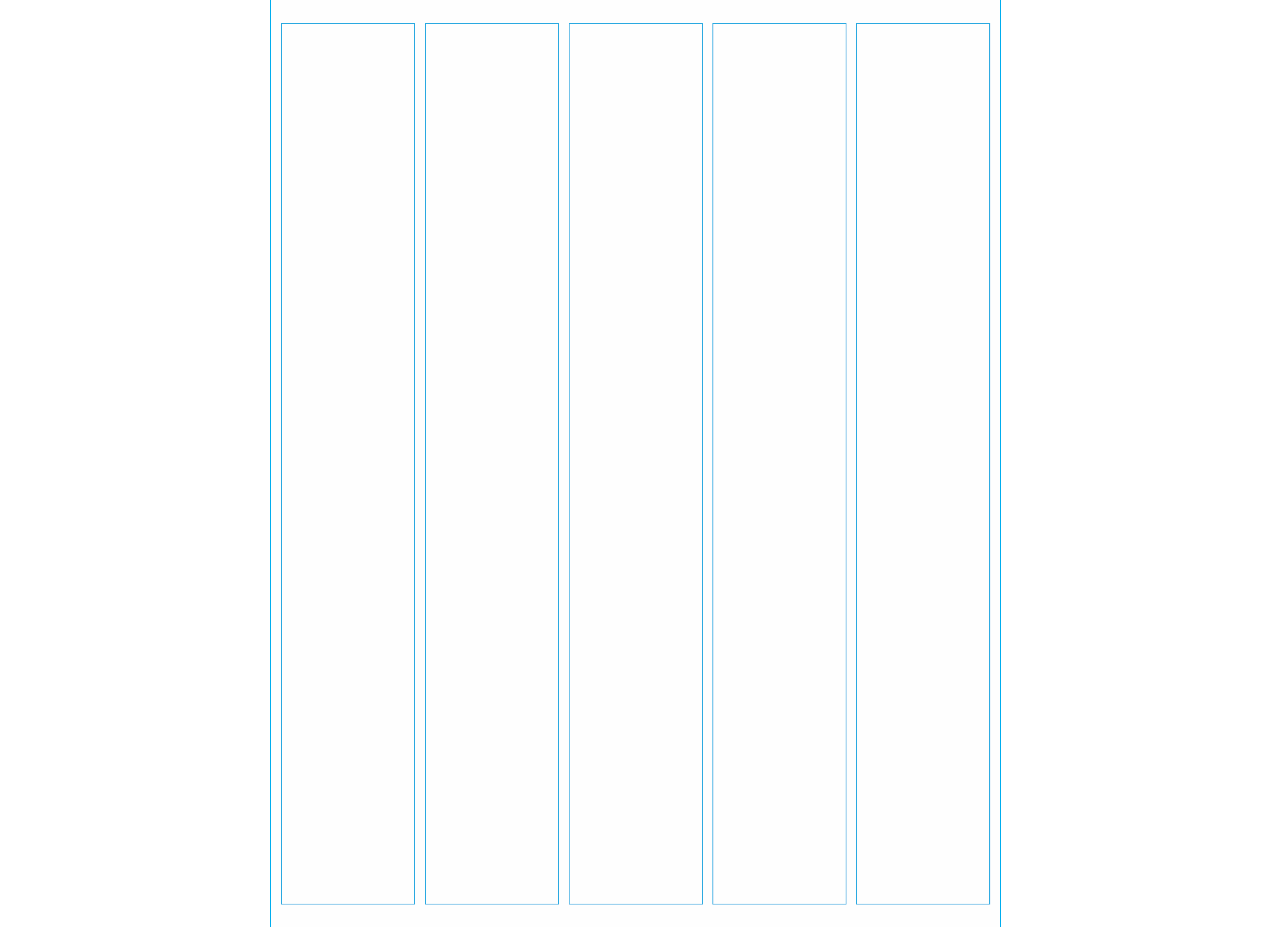
A predetermined grid is the division of the space into a certain amount of columns. There is even a one-column grid, also commonly called a manuscript grid (commonly seen in wedding invites and perhaps the first page of an article in a magazine).

We can keep adding columns to our grids and have two, three, four, five, and sometimes more. Software such as Adobe InDesign, Affinity Publisher, and others come equipped with the ability to determine what type of grid we want to use. It is usually easy to spot the grid used in a design piece. For example, if we look at a web page, we can usually spot the type of grid used — two, three, or four columns.

Perhaps the best examples of predetermined grids come from Modernist design and the Swiss Typography schools of thought.

Later on, Post Modern typography came along. Characterized by the juxtaposition of graphic elements, typography, and page use in a more organic way, it sought to find alternative typographic organizational arrangements. John Choi, a former student at NYUAD, wrote on the blog NYUAD Types of Art the following:

“Postmodern typography would be born out of the rejection of the modernist idea that certain forms, due to their inherent characteristics, are able to perform certain objective functions such as neutrality or legibility.”

As a result, the grid became a more organic and playful tool.

Improvisational Grid

Alternatively to a predetermined grid, an improvisational grid can be used. An improvisational grid is created when we lay down one element, perhaps in a very large size, and use it to extend its lines to organize elements around it. Thus, visual alignments or associations are emphasized or highlighted by placing elements following invisible lines emanating from them. For example, the image below does not feature the traditional vertical and horizontal modules that are common on a column grid. The image and the pattern created for the Evince Diagnostics logo at the top are the foundation for the organization of the type on the banner.

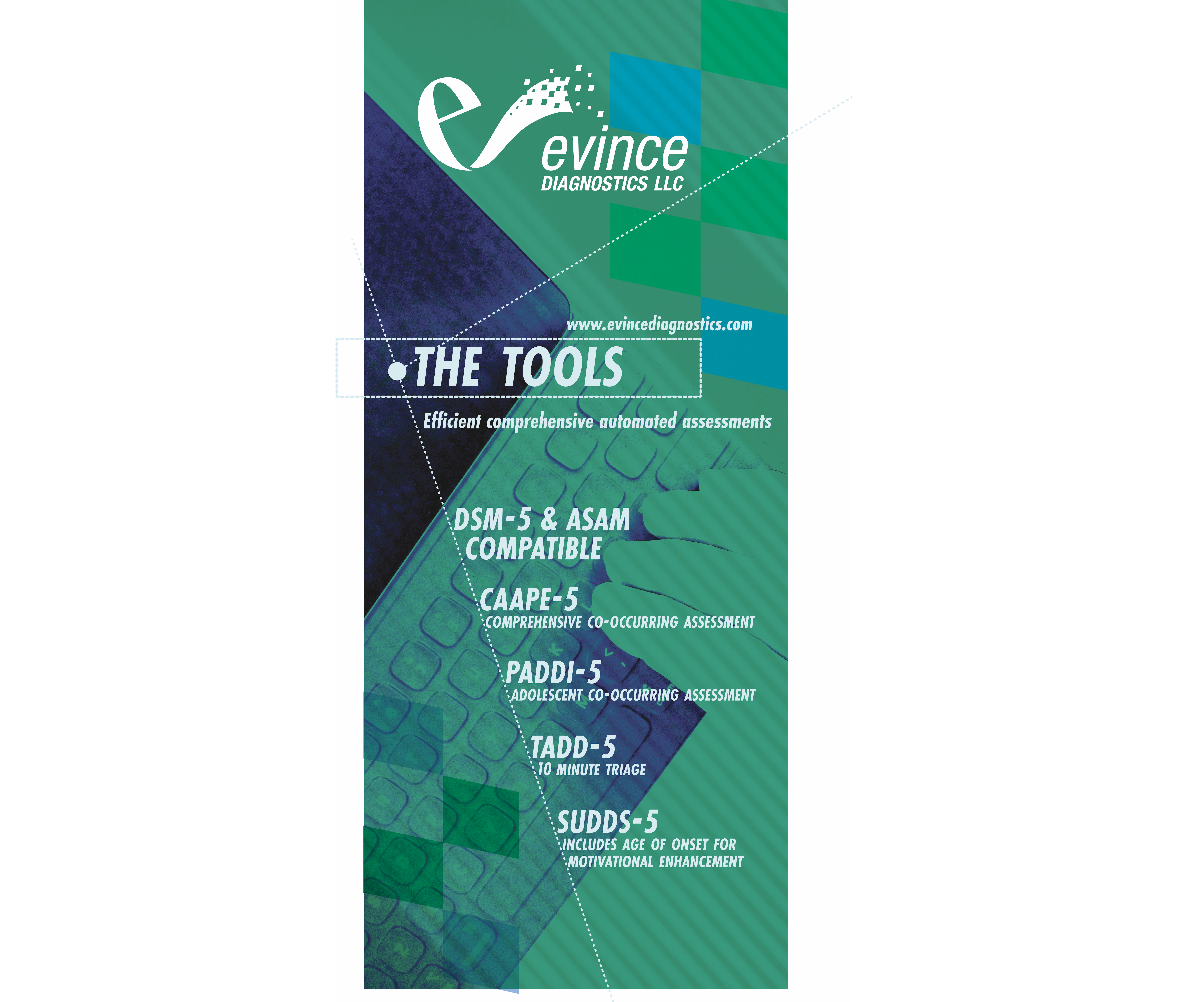
It is one of the funniest ways to create hierarchy because it allows for playful and unexpected results. However, it calls for attention to detail and sensitivity to the composition as a whole. Thus, it is both easy and difficult to master. It is frequently achieved by a large letter, but it can also be done with images or graphics.

Now that we have a basic understanding of the grid, let’s discuss our first variable or principle of hierarchy — proximity — in more detail.

Proximity

Proximity refers to the relative distance between elements, right? An easy metaphor is to think of friends, close friends, and strangers. The closer the friend, the closer the distance. The stranger the person, the farthest we stand from them. Our proximity or space shrinks or grows depending on our familiarity with things or people. Because it is usually easier for the students to refer to it as space, we will refer to proximity as space throughout the article.

When we discuss or think of space in a typographic hierarchy, we refer to things like space between letters, words, titles, paragraphs, margins, and how and where we place elements on the page.

In order to really understand proximity or space, we need to set some limits:

  • All type has to be 8-12 point size depending on the typeface;
  • It all has to be one size (even the titles);
  • No color;
  • A grid should be used from two to five columns, or an improvisational grid can be used. Please note that though we discussed the use of an improvisational grid based on size, when we leave elements at the same size, an improvisational grid can be used based on space or alignments.

The goal of this variable is to explore only the distance between any elements we choose and where we place our paragraphs and titles. You might be wondering, “how does space work in relation to typographic hierarchies? To answer this question, we will discuss some examples.

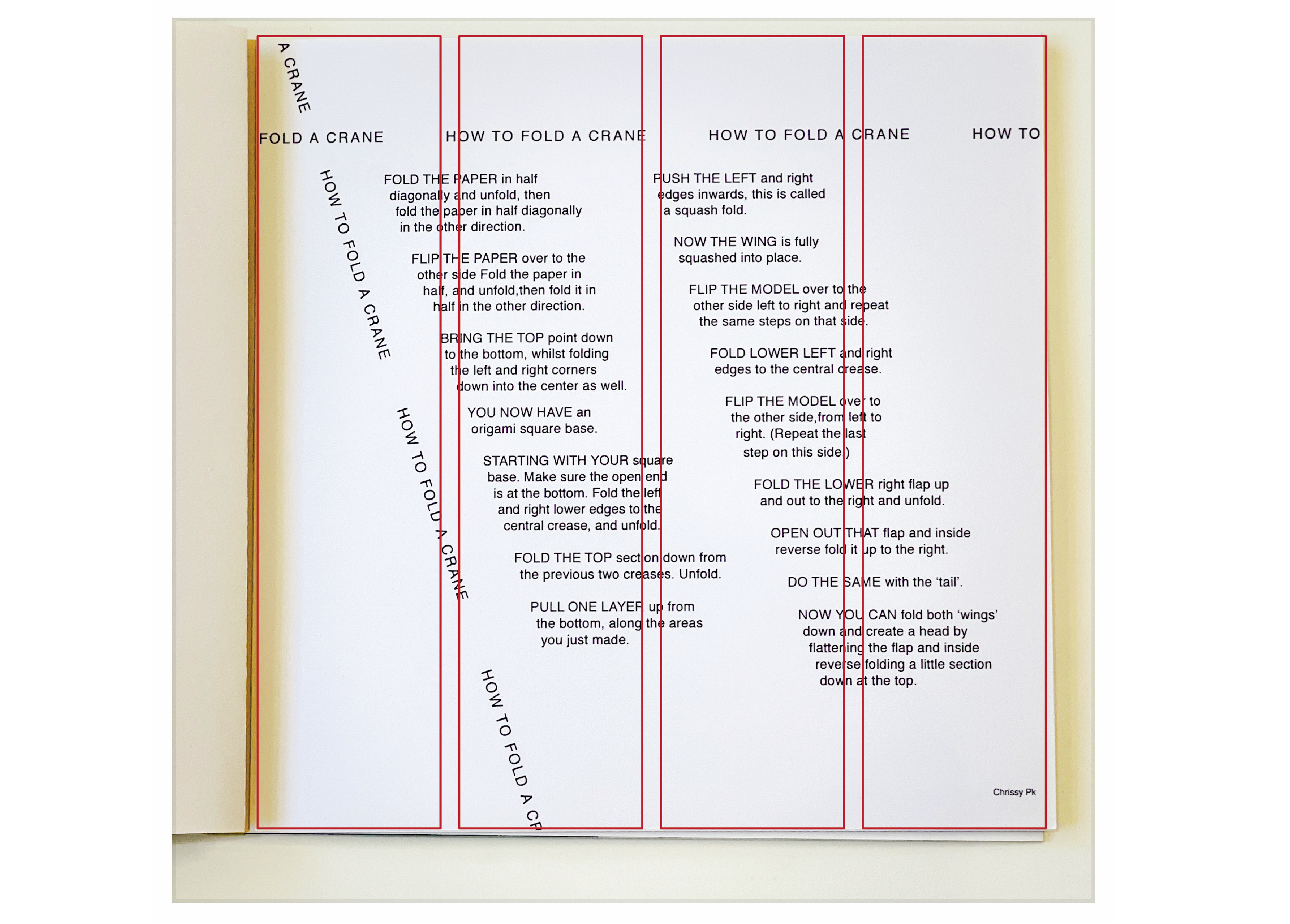
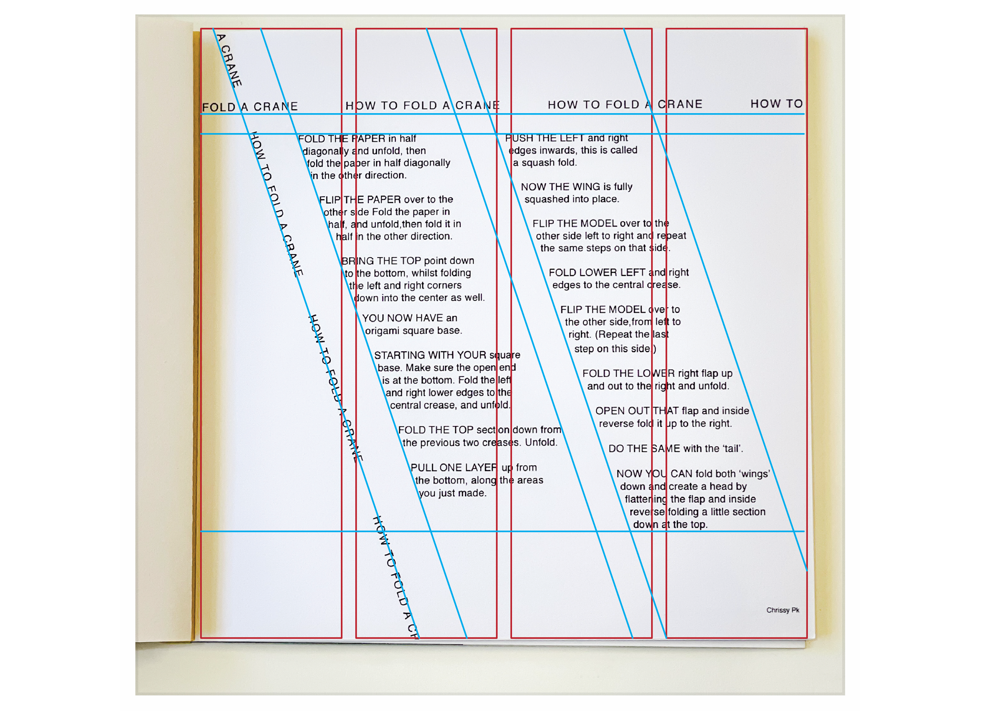
In the example above, we have a set of instructions, How to Fold a Crane, written by Chrissy Pk. As we can see, the columns of text are diagonally arranged. The grid, then, has been set before any other element has been placed on the page. By using diagonals, we create a sense of movement and energy around the composition.

Repetition of the title has been applied to create a sense of framing the page, and it serves to anchor the eye. Otherwise, we might feel that our eyes want to wander away from the page. Having the title repeated creates a kind of loop around the page and helps us keep our eyes contained. The type size is all consistent. The sense of movement and hierarchy comes from the title set in uppercase. To indicate each new step, instead of numbers or bullets, space and upper case letters in the first three words of the sentence are used.

Below are two analyses of the grid. The first one lets us see that the designer has probably divided the page into a four-column grid. In the second example, we can see that the diagonal grid has been applied over the four-column one.

To summarize what we see in this example:

  • We can use diagonal columns in place of vertical columns.
  • We can use uppercase to create a sense of hierarchy.
  • We can add spaces between items that follow a sequence instead of numbers or bullets.
  • We can repeat one element as long as it supports the purpose and conceptually keeps our eyes and mind focused on the subject.

In my experience, my students find that thinking of only the space or proximity is the hardest aspect of this study. But it is all about looking at the paragraphs, sentences, columns, and pages as shapes. If we think of each component in the example above as only shapes, we will see something like this below:

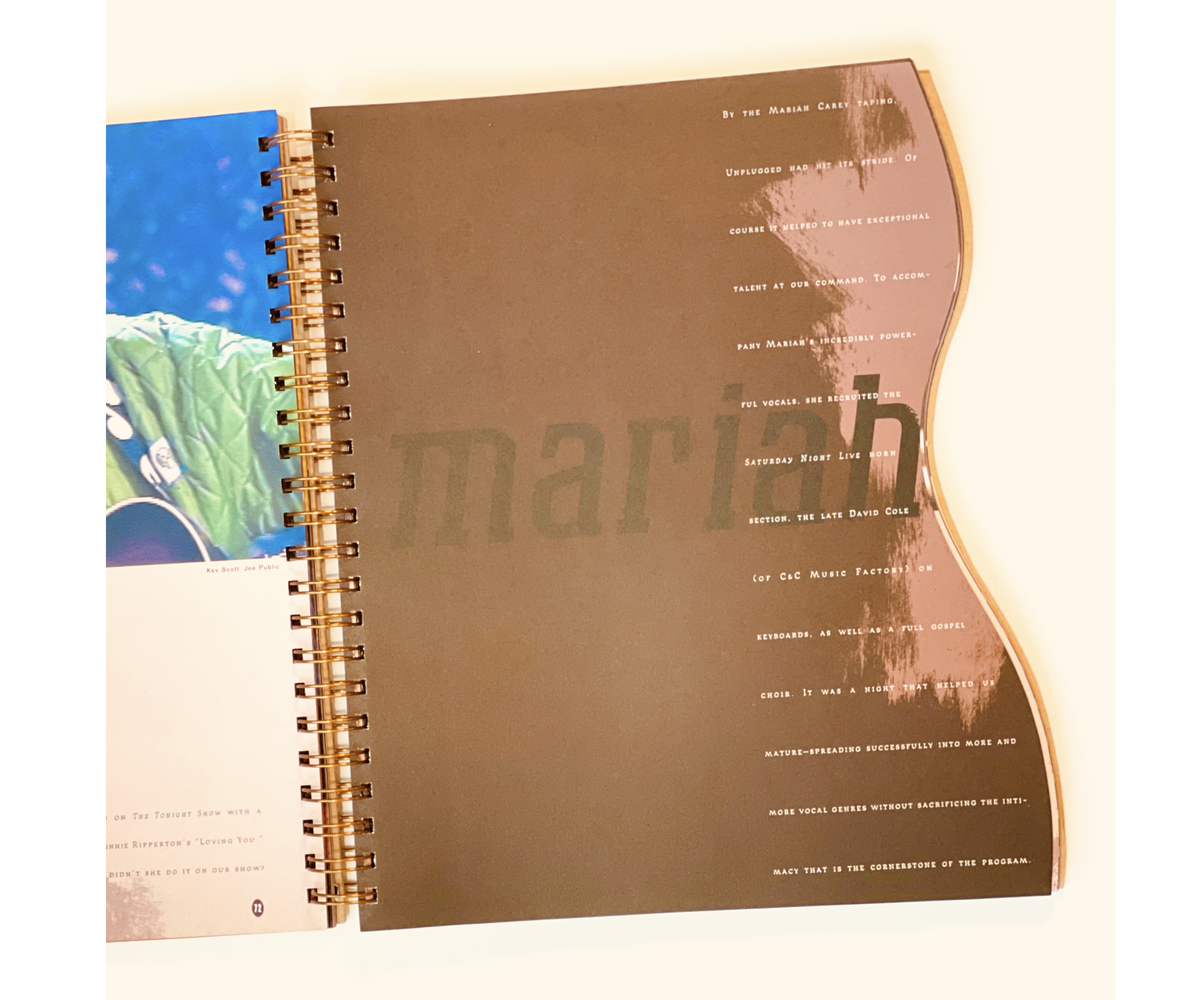
The page, space, and background, whether two or three-dimensional, is a shape. It can be a rectangle in portrait or landscape orientation or something more circular, or something organic like the shape of a guitar like this one titled MTV Unplugged, First Edition by Sarah Maralkey published in 1995:

The text in one of the spreads follows the gentle curve of the book:

If we consider the area we are using to organize our design as a shape, then the rest is a matter of subdividing that space in interesting ways. Thus, we always need to take the format into consideration.

Here is an interesting example of how to use a simple two-column grid:

As we move forward to the next variables, it is essential to note that how we treat the space will continue to be something we experiment with. We do not leave it behind. Let’s see how only changing the weight (bold versus regular + space) changes things around.

Weight

Weight refers to changes in the typeface as bold, regular, italic, heavy, medium, and so on. In this variable, we keep the sizes all even. In other words, we do not change the size at all.

It is worth mentioning that a typeface with no weight options will not be helpful in our exploration, as well as funky or heavily ornamental typefaces. Those are great for one instance or for display purposes such as a poster. However, in creating a hierarchy, it is best to stick to typefaces with well-proportioned shapes and multiple font options in their family.

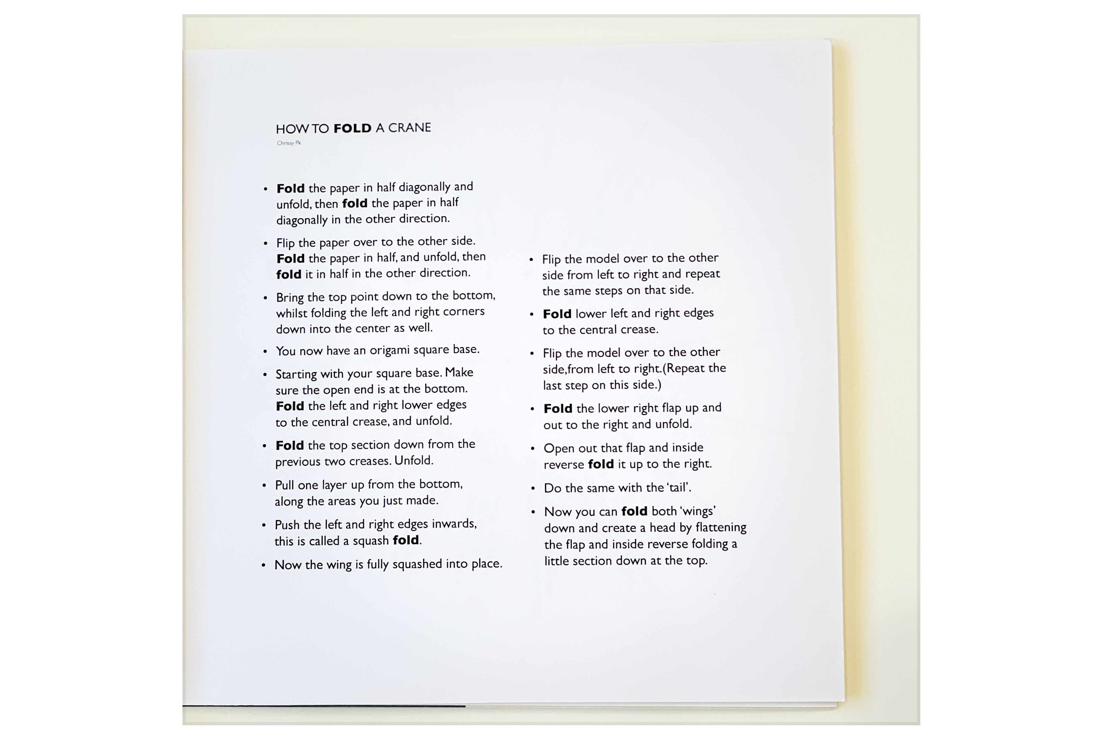
In the image above, the layout is more traditional — a two-column grid with the text aligned to the left. The bold weight is used on the word Fold on the title and in the rest of the content each time the word Fold is used. This visual detail helps with establishing a conceptual and visual connection as well as a hierarchy. It is a visual reminder that these instructions are about learning to fold a crane.

In the following example, we have a much less traditional layout. The designer used a circular grid to subdivide the format or the space in the composition. The bold weight is more delicate here since the typeface is also more delicate. The text’s organization resembles a clock. The design requires more participation from the reader as they would need to turn the page around.

In addition to our first summary, we can add the following:

  • We can use organic shapes to subdivide the format.
  • We can follow a logical system to establish a visual hierarchy: bold a word and consistently bold the same word throughout the text.

Now, let’s move on to applying size but without weight.

Size

We understand that size refers to, well, sizes. How large or small the font used is displayed. For the purposes of this exercise, we will limit ourselves to three sizes, and we will refer to them in categories:

  • Body copy
    Depending on the typefaces’ x-height, anywhere from 8 points to 12. Never over 12.
  • Titles
    Here you can have some fun and play with contrast — very, very large. Anything over 14 points is considered a display, but you will find that it is still too small to make an impact.
  • Subheaders or accents
    Depending on what sizes you are using for the titles, you can select something in between the body copy size and the titles.

Something worth mentioning: these parameters are not solely mathematical. There is much to learn about how things look (regardless of size) once something is printed.

Along those lines, let’s discuss a note about titles. The best way to think of titles is to see them as a group of little cousins or a group of best friends who are really tight. The spaces (again, proximity) you create between each word on the title affect how the title is seen. In other words, do the words go together? If so, should there be a gap? This will become more clear in the discussion of the examples below:

We can see how the designer decided to create a sense of upward direction by setting the title along the column pointing towards the beginning of the text. The designer not only used size to create emphasis on the word CRANE but cleverly led the reader to the top. The rest is pretty straightforward, as we can see — using bullet points and space between the steps to conform to the sequential nature of the content.

Here we have three sizes used following the expected pattern (title, numbers to indicate sequence, and the text). But, notice how the numbers are not the same size as the text. They are a size in between the title and the text, indicating read the title first and then read in order.

In addition to the items we have added to our summary, we can add the following:

  • We can set one word of the title much larger than the rest.
  • We can direct the reader with the title to the beginning of the content by setting the title in an upwards orientation.
  • We can set numbers slightly larger than the text to indicate the reading order.

Now we will discuss variables in combination.

Size And Weight

We start here by combining two variables and still using proximity to create a hierarchy. We are still limiting ourselves to three size changes. In terms of weight, we can change the weight of words we think need to be seen but are not as important as the title or things like that. We can certainly make a word very large and bold. But, as you are experimenting, keep an eye on the balance of the page. Are things too heavy on one side? Is the page too busy on one side versus the other?

Size and weight experimentation also allow you to start playing with an improvisational grid. When making a letter or word really large, you may use it to establish visual alignments from it.

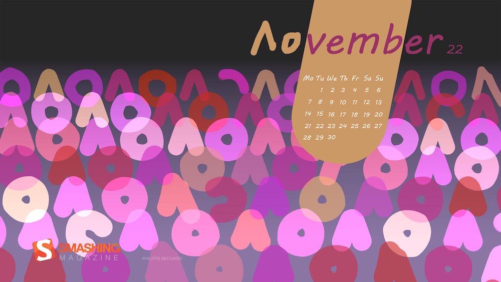
The example below is a page from a calendar I designed last Christmas holiday. Calendars are a great playground to explore sizes and weights. In this instance, I opted for the number of the month, the largest element on the page, while also increasing its weight, but right under the name — April — is very light or thin, creating a nice contrast between the two. The year is smaller but bold, as bold as the number above it. Though the contrast is sharp, the three pieces together create a nice typographic unit working together to create the focal point of the piece. The right side is the list of the month’s dates in bold. The holidays are stated in lightweight.

Of particular note is that if you notice, the words April and 2022 are tucked in under the vertical line of the number. This typeface has serifs (the little eyelashes at the bottom of the number). I aligned the two words under the number within its serifs. By doing this, I reinforce the visual alignment and implied vertical lines of the number.

In addition to the items we have added to our summary, we can add the following:

  • We can make a word very large on the page. If you go big, go big.
  • We can bold the largest element. Though not always necessary, it can sometimes create a nice and juicy hierarchy.
  • We can create units or groupings by keeping the type contained within an imaginary box.
  • We can use visual alignments or improvised grids to reinforce the typographic grouping.

With what we have learned so far, we will move on to color.

Color

Discussing color can be an article all by itself. There are many resources available both online and printed about color. Indeed, here are a few Smashing articles by Cameron Chapman covering the subject more broadly:

In this article, however, we will focus on how color enhances or emphasizes hierarchy, how it helps to create a composition that keeps the eye inside of itself, and how it helps the eye navigate the page. For these reasons, when studying this variable, we limit the use of color to two or three colors. By limiting the use of color, we can focus on how it helps to establish a hierarchy in typography.

Factors That Affect The Use And Application Of Color

I do not mean we use color arbitrarily. It is important to read the content to establish a sense of the article. In other words, let’s assume we are designing a leaflet for a school-aged children’s birthday party. We would probably use vibrant colors and convey a sense of fun. Alternatively, if we are designing a leaflet for hospital patients with instructional material, perhaps the colors we use might be less vibrant, softer, and aimed to provide a sense of calm. There are usually three essential aspects to consider when using color and designing in general:

  • Content,
  • Audience,
  • Context.

The audience determines not only how the content is written but also the typefaces, sizes, weights, and overall design of the content. The context of the content also determines how we design: is the content meant to be read at a distance, as in a poster, or is the content meant to be read closer to us, as in a mobile device or a book? Because color affects how we perceive the content, we must become familiar with that content. Thus, reading the content given to us by our clients helps us make smart design decisions.

Now that we discussed factors that are important for the use of color, let’s look at examples of the use of color as it pertains to this exercise:

In the example above, we can see how all the colors and attention have been dedicated to the title. It has also been added to the name of the author of the instructions, but because of its small size, it does not create conflict. The layout takes advantage of once making everything on the title large; it creates a nice pocket of space where the instructions can be easily tucked in. In this way, even though there is no color used on the body copy, it does not matter because we have no choice but to land our eyes on the beginning of the text.

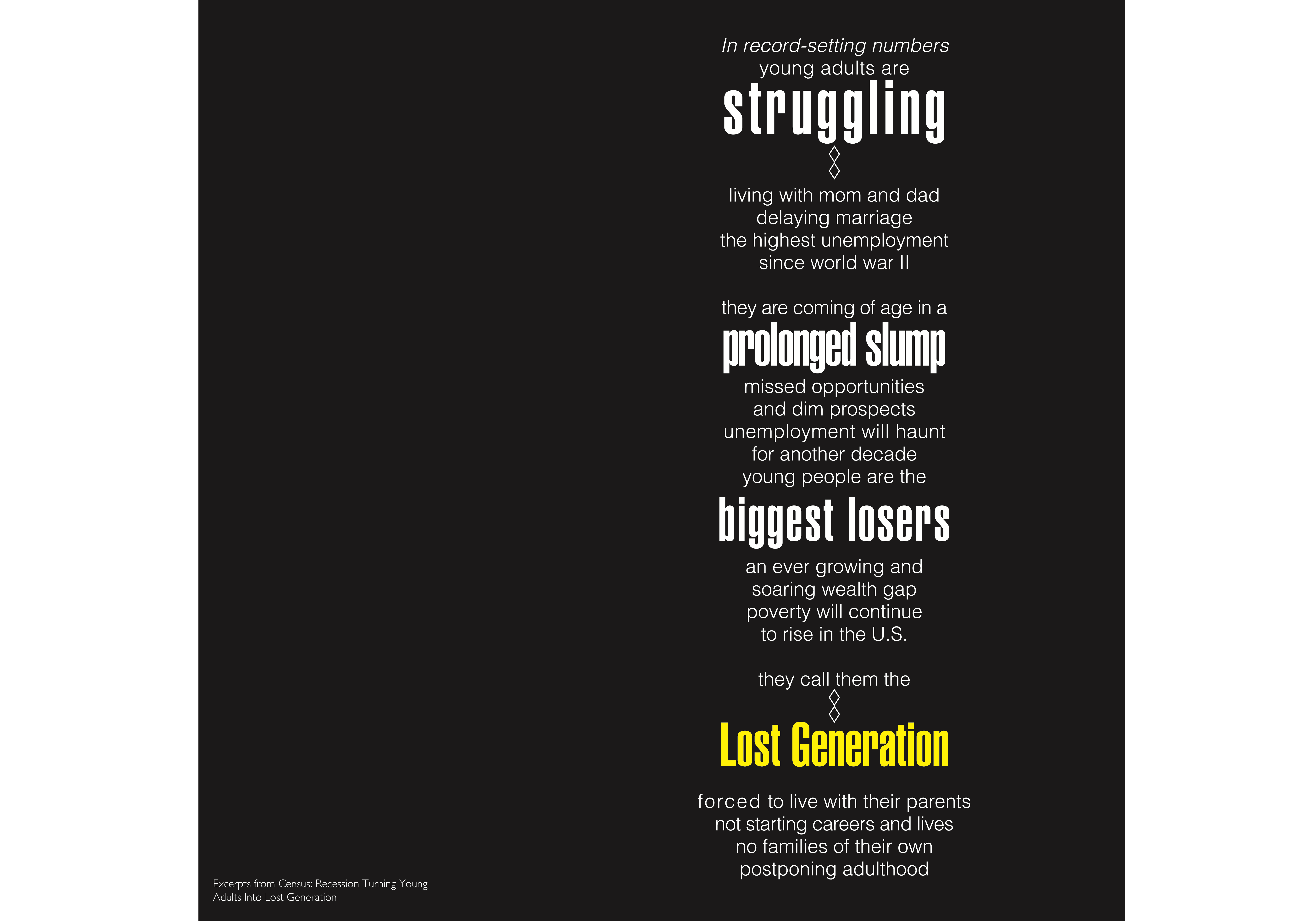
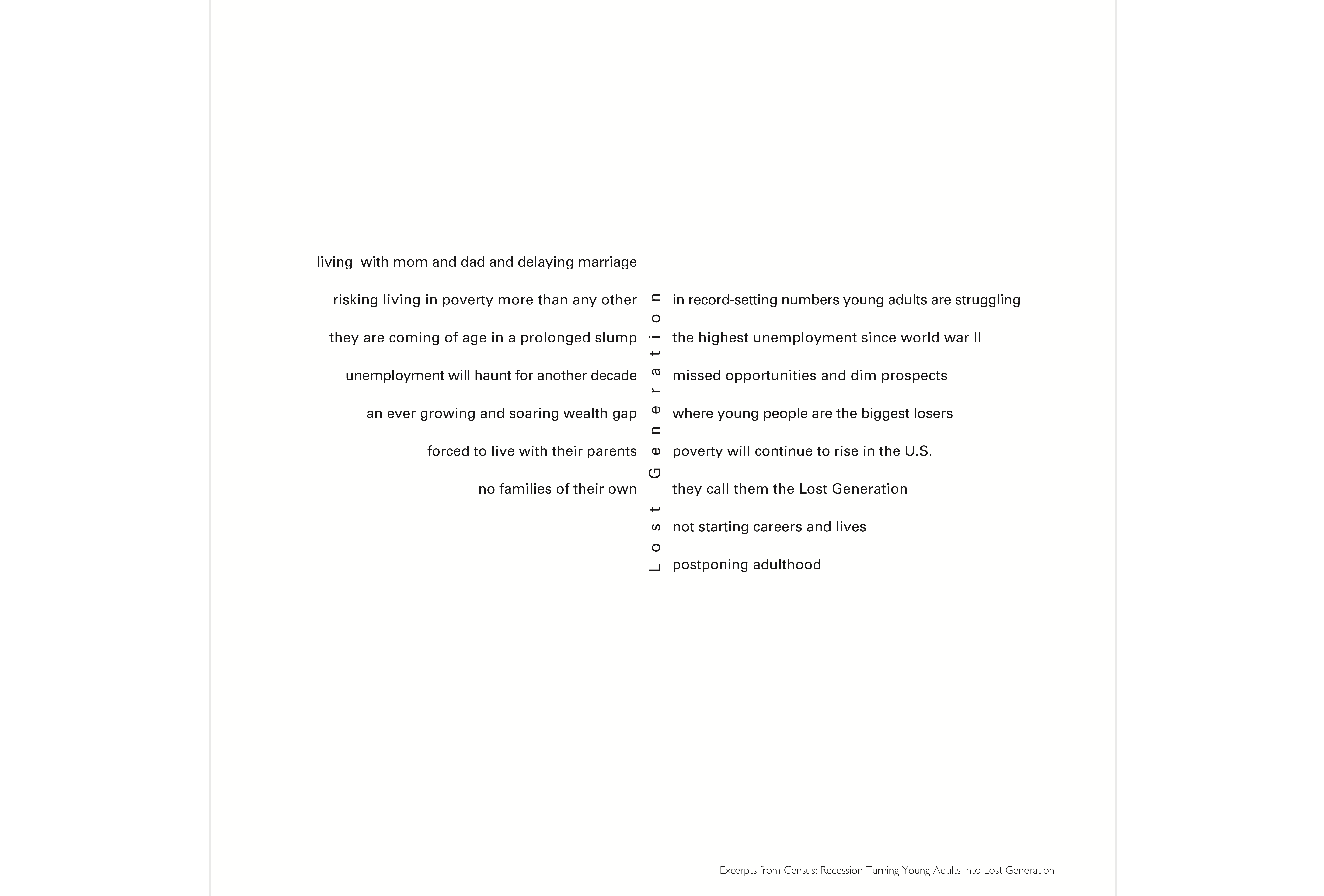
Above, we see how the background has been turned black. Once you read the title and read a little bit of the text, it makes sense. The text has a pessimistic and somber tone to it. Thus, no cheerful colors. With that, notice how the column of text is concentrated to the right side, creating asymmetry, once again creating a sense of visual instability to enhance the text’s meaning.

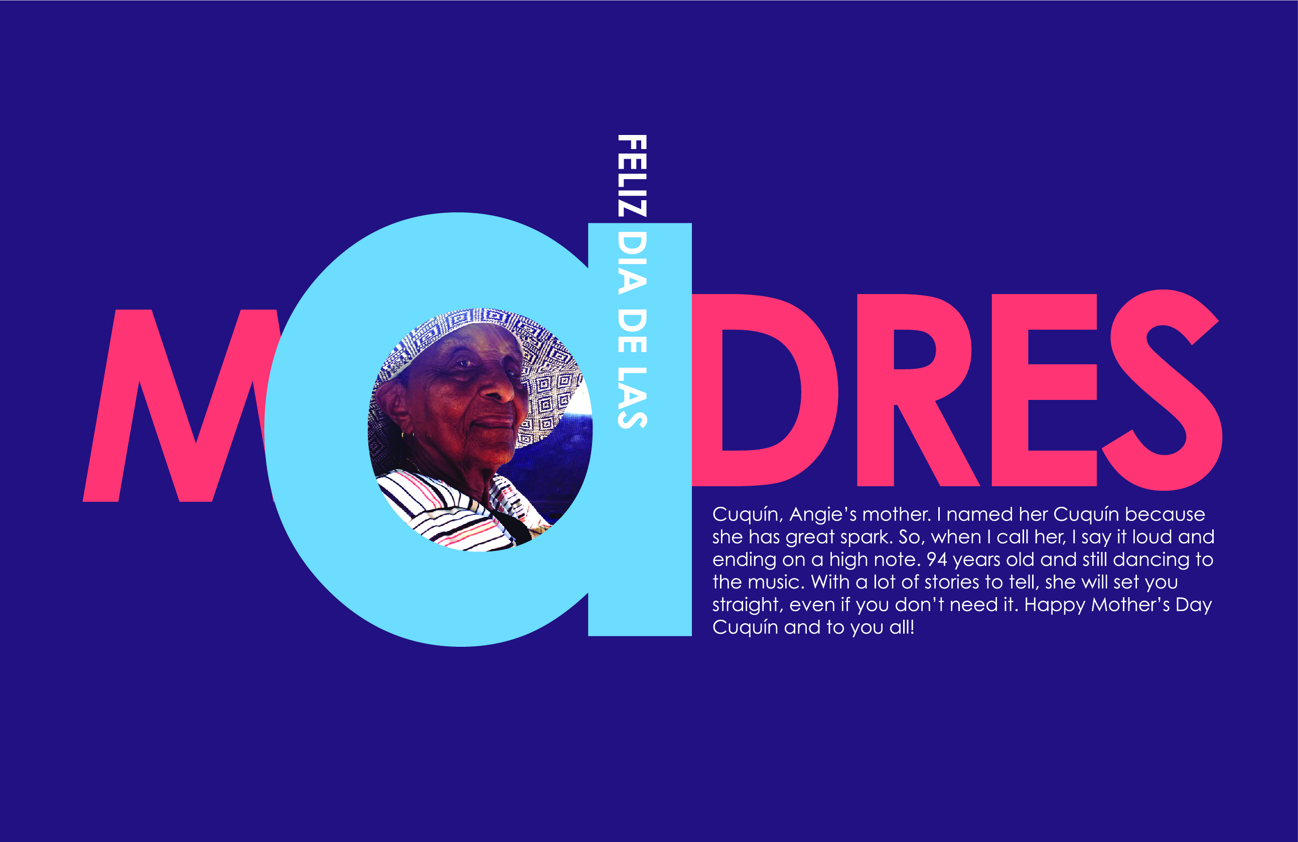
Below is a greeting card for Mother’s Day in the United States. I designed this card to honor my best friend’s mom. Though I am using a picture, it is used in a way that helps the text come together in the lowercase a. The lowercase a is the largest element on the page. Its bowl or empty space creates a nice place to tuck something in — a picture, pattern, letters, and so on. The rest of the letters are capitalized, but the lowercase a continues to be the focal point. We can also notice that there are four sizes here. I broke the rule of using only three sizes… but it does not feel that there is competition. The colors are vibrant because, in this case, Cuquin was a vibrant person, and the colors are needed to honor her.

In addition to the items we have added to our summary, we can add the following:

  • We can use color to convey personality and tone.
  • We can break a rule as long as it works within the system we have established and does not compete with the focal point.
  • We can create spaces within the letters or words to tuck in text, patterns, or pictures.

Our last variable to discuss is visual punctuation. Let’s take a look at how everything comes together in this variable.

Visual Punctuation

A common question I often hear from my students is, “What is visual punctuation?” We see it all the time but don’t think about it. Visual punctuation refers to the use of lines, shapes, symbols, and other geometric elements to enhance the hierarchy. Remember, the goal is always to enhance the hierarchy and help the reader’s eye move around the space.

Let’s see some examples of how visual punctuation is actually frequently used and applied in typographic compositions:

The example above uses visual punctuation in the form of the crane to cleverly point to the title. Then it repeats the use of white in the text at the beginning of the instructions. The similarity established creates unity, and the word FOLD pulls our eye back to the top. Notice how the designer also bolded the beginning of each instruction. We saw this before in the weight discussion. The use of the bold weight on each instruction helps us move from one to the other sequentially. It also helps to signal each new step without numbers.

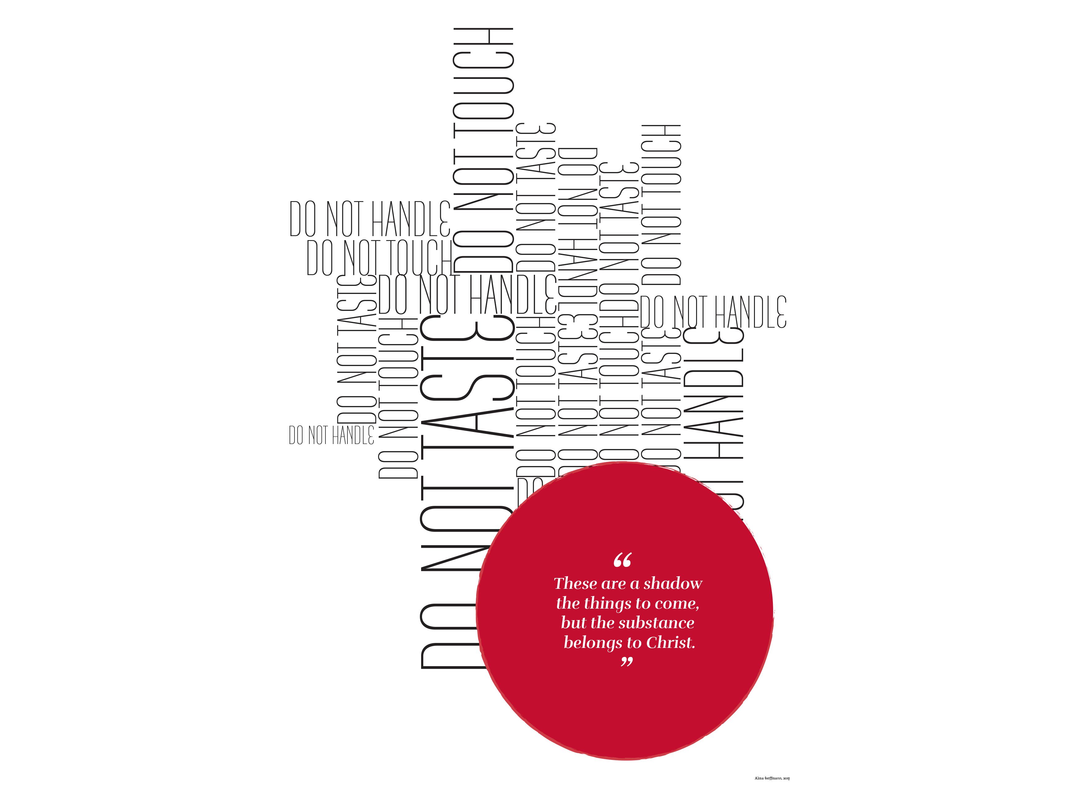
The above example was designed to undermine the sometimes unnecessary rules and regulations that we find in places of worship. The point is not to follow all the rules but rather to focus on the object of affection. Here, a visual point is made to emphasize the conceptual point:

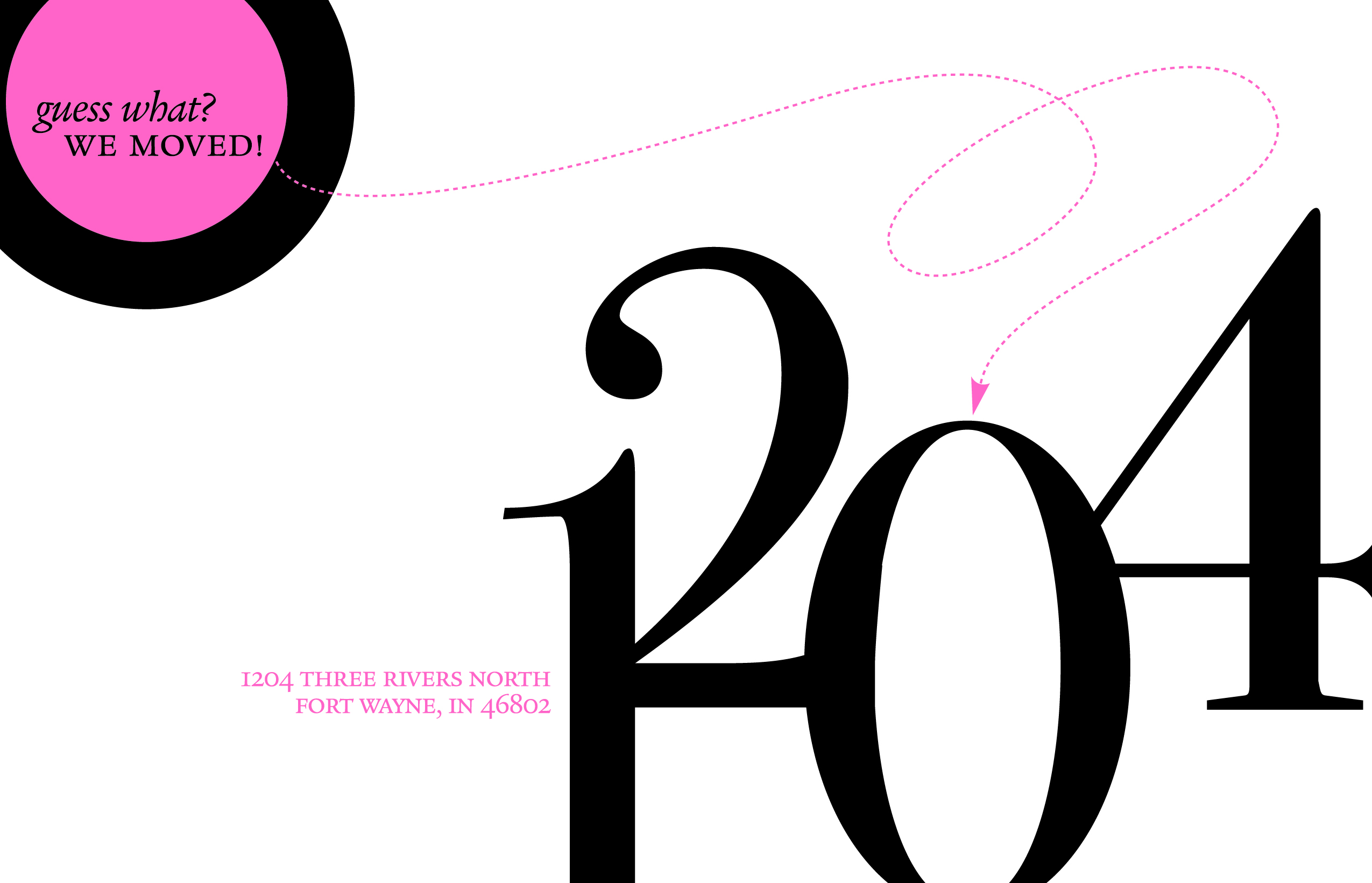
Circles are a great way to call attention to something. And so are the dotted lines. In this example, the dotted and playful line is colored in the same color as the circle on the top left. It points to the new number in the address aligned or set on the imaginary line the base of the number 2 provides. The rest of the address is provided following the same color palette. It creates a type of triangular movement from the top left to the middle right to the bottom left. Notice the sizes too. The numbers are the largest item on the card. There is a nice relationship between the numbers and the top left circle.

In addition to the items we have added to our summary, we can add the following:

  • We can and should use visual punctuation to enhance the meaning, the concept, or the message.
  • We can use only one color and one shape.
  • We can also use more than one color to create a hierarchy.

Now that we have discussed all the variables, it would be a good idea to see them all used together.

All Variables In Examples

We have discussed the variables of proximity, weight, size, size and weight, color, and visual punctuation. Take a look at the following examples and see how many you can identify:

Like these, we can find more examples of the variables used together. In fact, they are used and applied so ubiquitously that we don’t really see them independently from each other. When starting out with typography, it is a good idea to isolate what we see. This is true for any discipline: isolate and then combine them. Learn each one well and then start adding and mixing.

The poster below was designed for a youth program called Empowered. It was a research-based project led by Dr. Krista Mehari with the goal of empowering marginalized young teens to make effective and productive decisions. When she asked me to work with them, we had several brainstorming sessions. The Watch, Wave, and Wait is a poster intended to help the kids memorialize the process of dealing with emotions. In this poster, I broke some rules. While still sticking to the three sizes rule, I managed to create a pattern using repetition of the outline words mimicking the internal thought process we engage in when upset: calm down, calm down, or counting or something similar.

Your Turn!

At this point, after reading this article, you might want to give this process a try. If so, I have prepared a simple table for you to use. Below are some instructions:

  • Pick content that isn’t too long. For example, a two-page editorial would be too long. But a set of ten-step instructions would be better suited. An excerpt from an essay would be good too.
  • Do not use letter-size pages. Think smaller: eight inches by eight inches format would be best. We do this to focus on the content and not feel strange if the page does not look “full.” Your sketches, which should be small, will also be square.
  • Always do your sketches. Always do sketches first. It is the best way to literally think outside the box since you are outside the box, that is, the computer. Do as many sketches as you can think.
  • For each of the variables, sketch several. Maybe think of four options for each.
  • Then, take the best two or three for each variable and put them on the computer.
  • When you print, and you should always print to “see” how the proportions are working, use crop marks to cut the page.
  • Once you have printed them, tape them to a wall away from you. But tape them upside down. It is the best way to assess proportions, space, hierarchy, balance, tension, and so on.
  • After you do this, revise them on the computer, print them again, and tape them upside down again.
  • Once you are certain you have attained a good typographic hierarchy, you can make a small booklet out of them. Below you can see the booklet my former student Anh Dang did for her project, How to Fold a Crane. Or you can create a virtual flipbook showing your masterpieces!

And you needn’t stop there. As you get comfortable with the process, perhaps you want to try designing a poster. Or tackle that two-page editorial layout? Give it a try!

Conclusion

So far, we have seen how these six variables can powerfully transform the content in any format. It is all about how creative we are about organizing things within the parameters. After all, that is what design is about — creative solutions within a set of parameters. The more you practice, the better you get at something, right?

This old adage has proven itself to be true consistently. It applies to typography and anything design. Fine-tuning our senses comes with exposure and repetition. Take any opportunity to design and establish a hierarchy. Even small things like a business card can look incredible when you add a contrast of space, weight, size, size and weight, color, and visual punctuation. If we think about it, we are exposed to these variables daily and constantly. We just don’t look at them as isolated variables that can affect the entire composition. But they do. And once we know how to use them, we can push the boundaries and create pieces with more impact and intention.

Below I am listing resources to look at for more inspiration.

Resources

Categories: Others Tags:

Creating Animated, Clickable Cards With the :has() Relational Pseudo Class

October 25th, 2022 No comments

The CSS :has() pseudo class is rolling out in many browsers with Chrome and Safari already fully supporting it. It’s often referred to it as “the parent selector” — as in, we can select style a parent element from a child selector — but there is so much more that :has() can help us solve. One of those things is re-inventing the clickable card pattern many of us love to use from time to time.

We’ll take a look at how :has() can help us handle linked cards, but first…

What is this :has() pseudo class?

There is already a bunch of great posts floating around that do an excellent job explaining what :has() is and what it’s used for, but it’s still new enough that we ought to say a few words about it here as well.

:has() is a relational pseudo class that’s part of the W3C Selectors Level 4 working draft. That’s what the parentheses are all about: matching elements that are related to — or, more accurately, contain — certain child elements.

/* Matches an article element that contains an image element */
article:has(img) { }

/* Matches an article element with an image contained immediately within it */
article:has(> img) { }

So, you can see why we might want to call it a “parent” selector. But we can also combine it with other functional pseudo classes to get more specific. Say we want to style articles that do not contain any images. We can combine the relational powers of :has() with the negation powers of :not() to do that:

/* Matches an article without images  */
article:has(:not(img)) { }

But that’s just the start of how we can combine powers to do more with :has(). Before we turn specifically to solving the clickable card conundrum, let’s look at a few ways we currently approach them without using :has().

How we currently handle clickable cards

There are three main approaches on how people create a fully clickable card these days and to fully understand the power of this pseudo class, it’s nice to have a bit of a round-up.

The “Link as a Wrapper” approach

This approach is something used quite frequently. I never use this approach but I created a quick demo to demonstrate it:

CodePen Embed Fallback

There are a lot of concerns here, especially when it comes to accessibility. When users navigate your website using the rotor function, they will hear the full text inside of that element — the heading, the text, and the link. Someone might not want to sit through all that. We can do better. Since HTML5, we can nest block elements inside of an element. But it never feels right to me, especially for this reason.

Pros:

  • Quick to implement
  • Semantically correct

Cons:

  • Accessibility concerns
  • Text not selectable
  • A lot of hassle to overwrite styles that you used on your default links

The JavaScript method

Using JavaScript, we can attach a link to our card instead of writing it in the markup. I found this great CodePen demo by costdev who also made the card text selectable in the process:

CodePen Embed Fallback

This approach has a lot of benefits. Our links are accessible on focus and we can even select text. But there are some drawbacks when it comes to styling. If we want to animate those cards, for example, we would have to add :hover styles on our main .card wrapper instead of the link itself. We also would not benefit from the animations when the links are in focus from keyboard tabbing.

Pros:

  • Can be made perfectly accessible
  • Ability to select text

Cons:

  • Requires JavaScript
  • Right clicking not possible (although could be fixed with some extra scripting)
  • Will require a lot of styling on the card itself which would not work when focussing the link

The ::after selector approach

This method requires us to set the card with relative positioning, then set absolute positioning on the link’s ::after pseudo selector of a link. This doesn’t require any JavaScript and is pretty easy to implement:

CodePen Embed Fallback

There are a few drawbacks here, especially when it comes to selecting text. Unless you provide a higher z-index on your card-body, you won’t be able to select text but if you do, be warned that clicking the text will not activate your link. Whether or not you want selectable text is up to you. I think it can be a UX issue, but it depends on the use-case. The text is still accessible to screen readers but my main problem with the method is the lack of animation possibilities.

Pros:

  • Easy to implement
  • Accessible link without bloated text
  • Works on hover and focus

Cons:

  • Text is not selectable
  • You can only animate the link as this is the element you’re hovering.

A new approach: Using ::after with :has()

Now that we’ve established the existing approaches for clickable cards, I want to show how introducing :has() to the mix solves most of those shortcomings.

In fact, let’s base this approach on the last one we looked at using ::after on the link element. We can actually use :has() there to overcome that approach’s animation constraints.

Let’s start with the markup:

<div class="card">
  <img src="cat.webp" alt="Fluffy gray and white tabby kitten snuggled up in a ball." />
  <div clas="article-body">
    <h2>Some Heading</h2>
    <p>Curabitur convallis ac quam vitae laoreet. Nulla mauris ante, euismod sed lacus sit amet, congue bibendum eros. Etiam mattis lobortis porta. Vestibulum ultrices iaculis enim imperdiet egestas.</p>
  </div>
</div>

I will be keeping things as simple as possible by targeting elements in the CSS instead of classes.

For this demo, we’re going to add an image zoom and shadow to the card on hover, and animate the link with an arrow popping up and while changing the link’s text color. To make this easy, we’re going to add some custom properties scoped on our card. Here’s the basic styling:

/* The card element */
article {
  --img-scale: 1.001;
  --title-color: black;
  --link-icon-translate: -20px;
  --link-icon-opacity: 0;

  position: relative;
  border-radius: 16px;
  box-shadow: none;
  background: #fff;
  transform-origin: center;
  transition: all 0.4s ease-in-out;
  overflow: hidden;
}
/* The link's ::after pseudo */
article a::after {
  content: "";
  position: absolute;
  inset-block: 0;
  inset-inline: 0;
  cursor: pointer;
}

Great! We added an initial scale for the image (--img-scale: 1.001), the initial color of the card heading (--title-color: black) and some extra properties we will use to make our arrow pop out of the link. We’ve also set an empty state of the box-shadow declaration in order to animate it later . This sets up what we need for the clickable card right now, so let’s add some resets and styling to it by adding those custom properties to the elements we want to animate:

article h2 {
  margin: 0 0 18px 0;
  font-family: "Bebas Neue", cursive;
  font-size: 1.9rem;
  letter-spacing: 0.06em;
  color: var(--title-color);
  transition: color 0.3s ease-out;
}
article figure {
  margin: 0;
  padding: 0;
  aspect-ratio: 16 / 9;
  overflow: hidden;
}
article img {
  max-width: 100%;
  transform-origin: center;
  transform: scale(var(--img-scale));
  transition: transform 0.4s ease-in-out;
}
article a {
  display: inline-flex;
  align-items: center;
  text-decoration: none;
  color: #28666e;
}
article a:focus {
  outline: 1px dotted #28666e;
}
article a .icon {
  min-width: 24px;
  width: 24px;
  height: 24px;
  margin-left: 5px;
  transform: translateX(var(--link-icon-translate));
  opacity: var(--link-icon-opacity);
  transition: all 0.3s;
}

.article-body {
  padding: 24px;
}

Let’s be kind to people and also add a screen reader class hidden behind the link:

.sr-only:not(:focus):not(:active) {
  clip: rect(0 0 0 0); 
  clip-path: inset(50%);
  height: 1px;
  overflow: hidden;
  position: absolute;
  white-space: nowrap; 
  width: 1px;
}

Our card is starting to look pretty sweet. It’s time to add a bit of magic to it. With the :has() pseudo class, we can now check if our link is hovered or focused, then update our custom properties and add a box-shadow. With this little chunk of CSS our card really comes to life:

/* Matches an article element that contains a hover or focus state */
article:has(:hover, :focus) {
  --img-scale: 1.1;
  --title-color: #28666e;
  --link-icon-translate: 0;
  --link-icon-opacity: 1;

  box-shadow: rgba(0, 0, 0, 0.16) 0px 10px 36px 0px, rgba(0, 0, 0, 0.06) 0px 0px 0px 1px;
}

See what’s up there? Now we get the updated styles if any child element in the card is hovered or focused. And even though the link element is the only thing that can contain a hover or focus state in the ::after clickable card approach, we can use that to match the parent element and apply the transitions.

And there you have it. Just another powerful use case for the :has() selector. Not only can we match a parent element by declaring other elements as arguments, but we can match also use pseudos to match and style parents as well.

Pros:

  • Accessible
  • Animatable
  • No JavaScript needed
  • Uses :hover on the correct element

Cons:

  • Text is not easily selectable.
  • Browser support is limited to Chrome and Safari (it’s supported in Firefox behind a flag).

Here is a demo using this technique. You might notice an extra wrapper around the card, but that’s just me playing around with container queries, which is just one of those other fantastic things rolling out in all major browsers.

CodePen Embed Fallback

Got some other examples you wish to share? Other solutions or ideas are more than welcome in the comment section.


Creating Animated, Clickable Cards With the :has() Relational Pseudo Class originally published on CSS-Tricks, which is part of the DigitalOcean family. You should get the newsletter.

Categories: Designing, Others Tags: