Every week users submit a lot of interesting stuff on our sister site Webdesigner News, highlighting great content from around the web that can be of interest to web designers.
The best way to keep track of all the great stories and news being posted is simply to check out the Webdesigner News site, however, in case you missed some here’s a quick and useful compilation of the most popular designer news that we curated from the past week.
Note that this is only a very small selection of the links that were posted, so don’t miss out and subscribe to our newsletter and follow the site daily for all the news.
14 Free Fresh Resources for Designers
Gmail’s Material Design Update, Very Bright, Very White Redesign is Now Rolling Out to all Devices
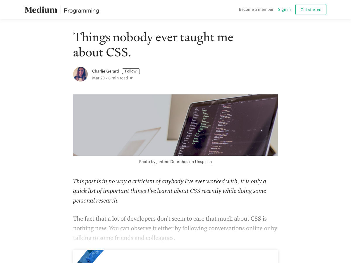
Things Nobody Ever Taught Me About CSS
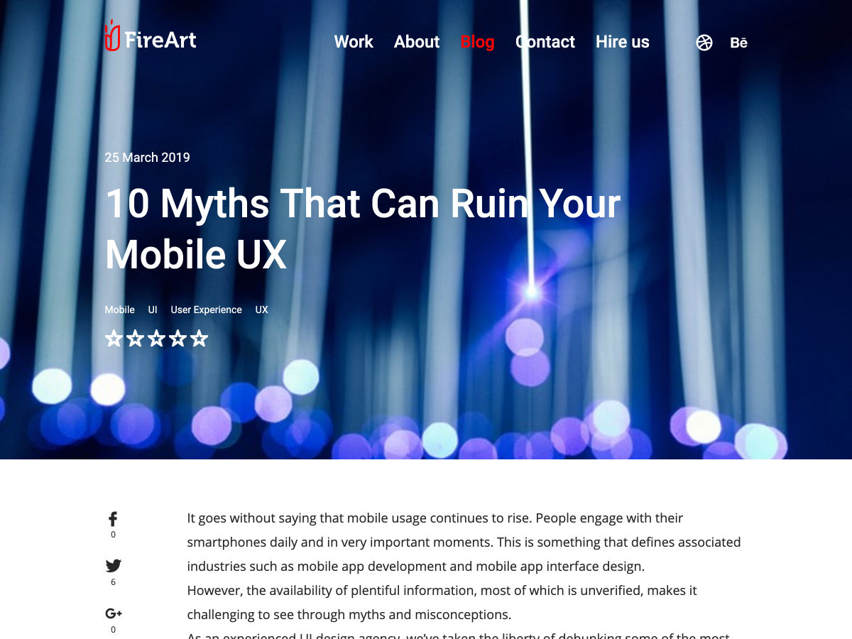
10 Myths that Can Ruin your Mobile UX
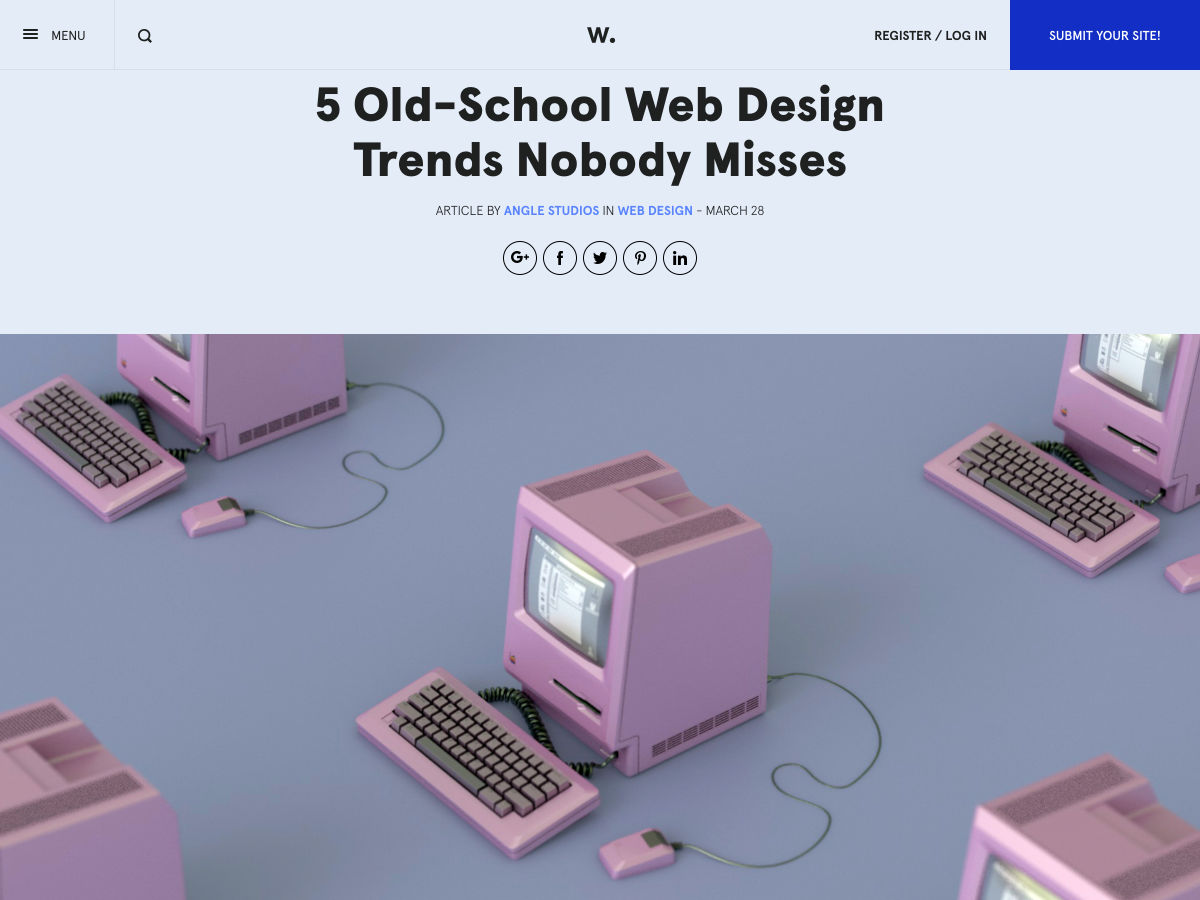
5 Old-School Web Design Trends Nobody Misses
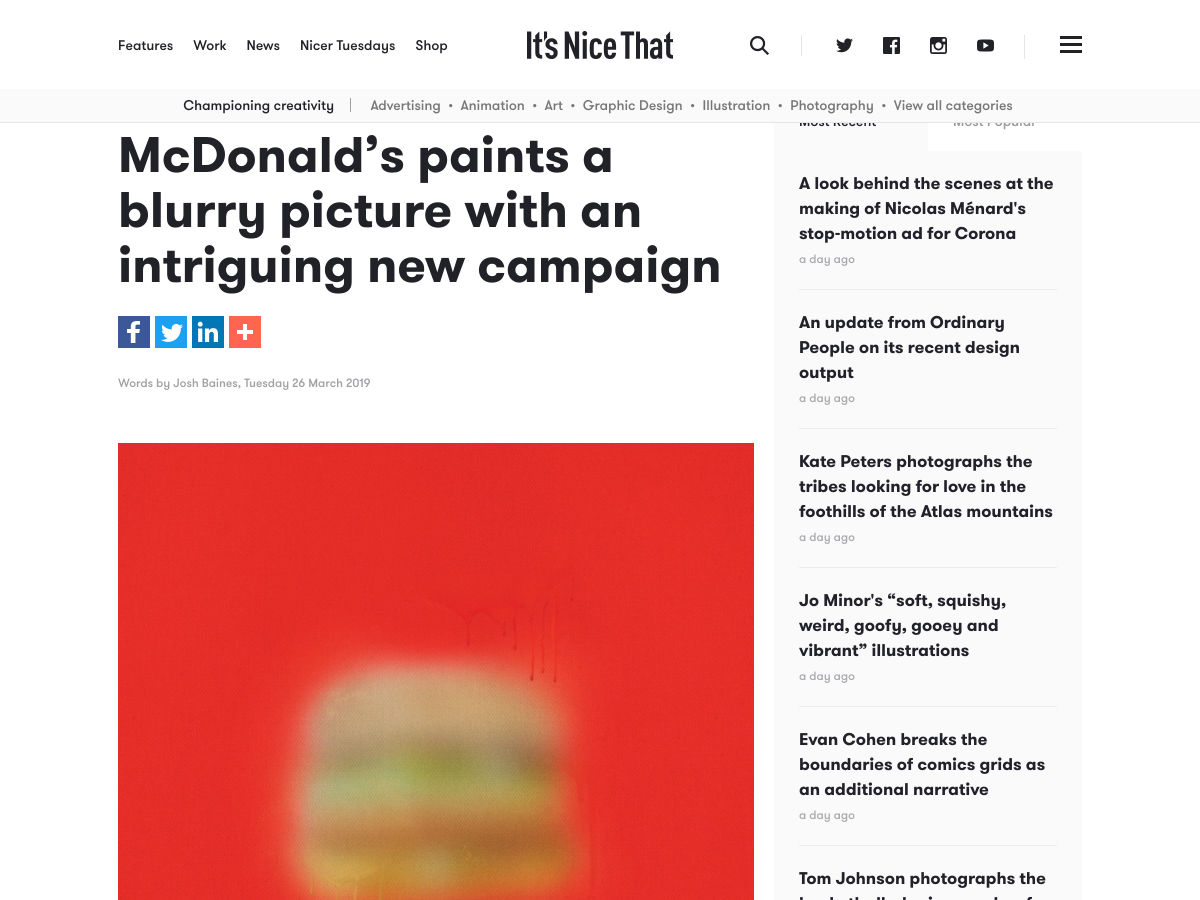
McDonald’s Paints a Blurry Picture with an Intriguing New Campaign
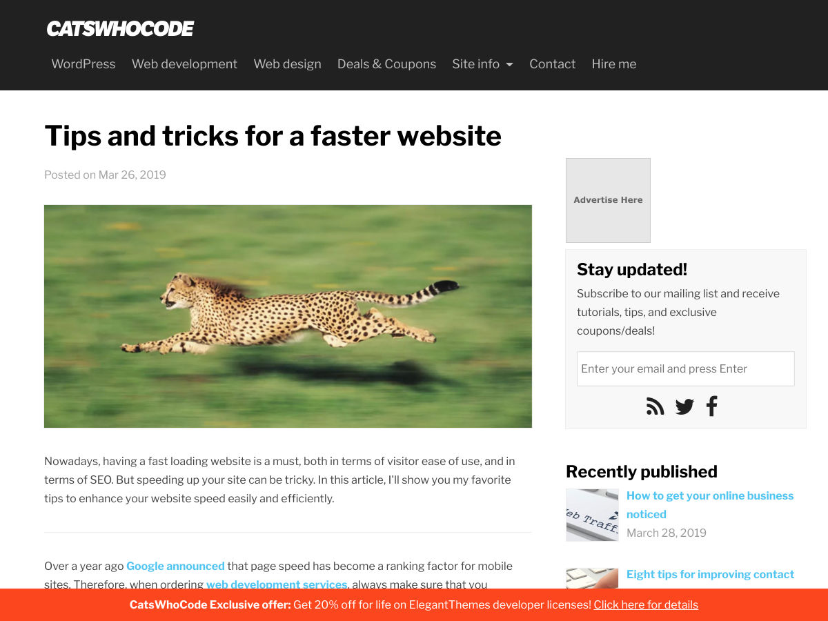
Tips and Tricks for a Faster Website
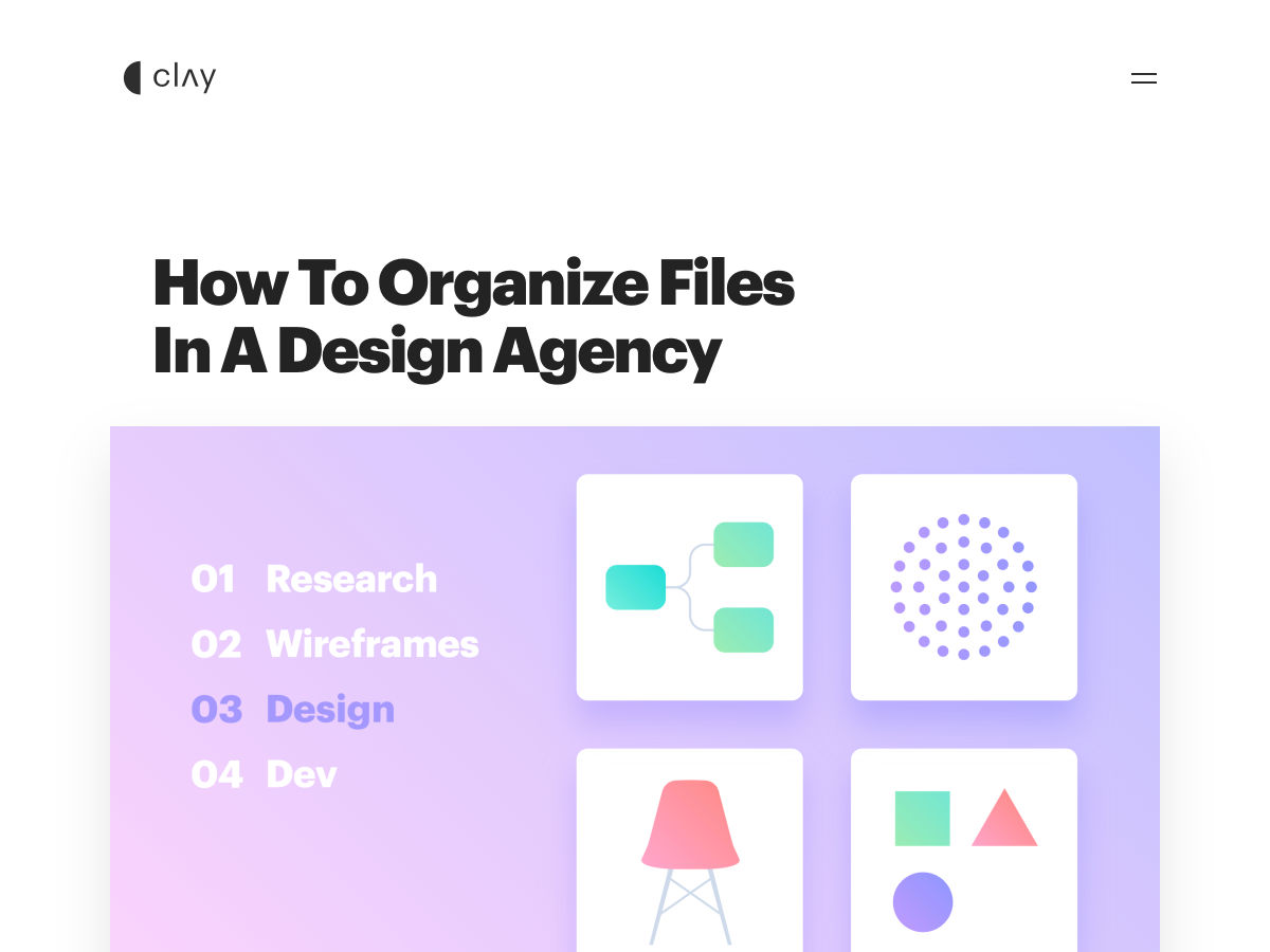
How to Organize Files in a Design Agency
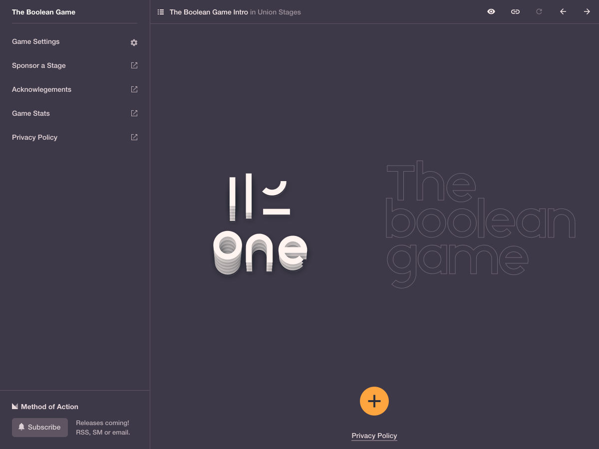
The Boolean Game
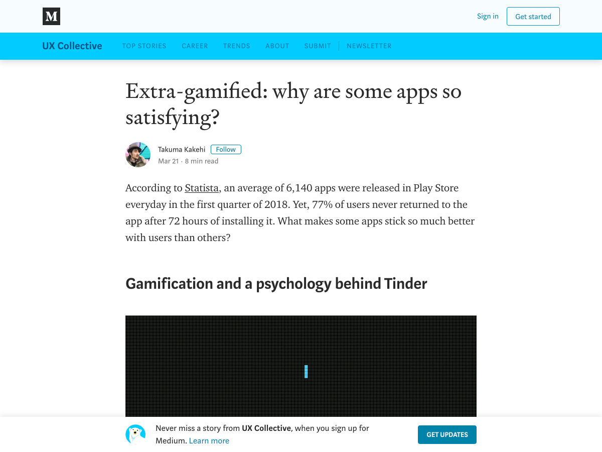
Extra-gamified: Why are Some Apps so Satisfying?
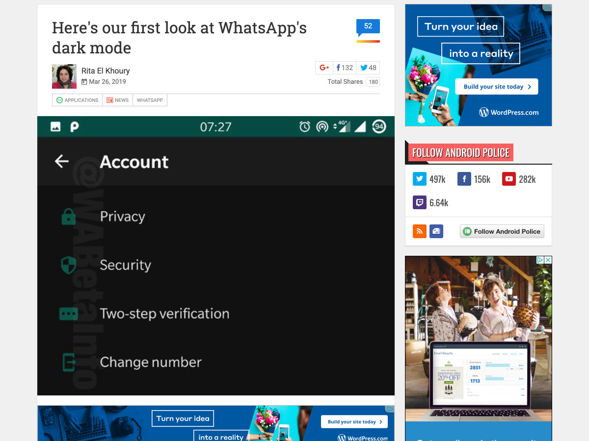
Here’s Our First Look at WhatsApp’s Dark Mode
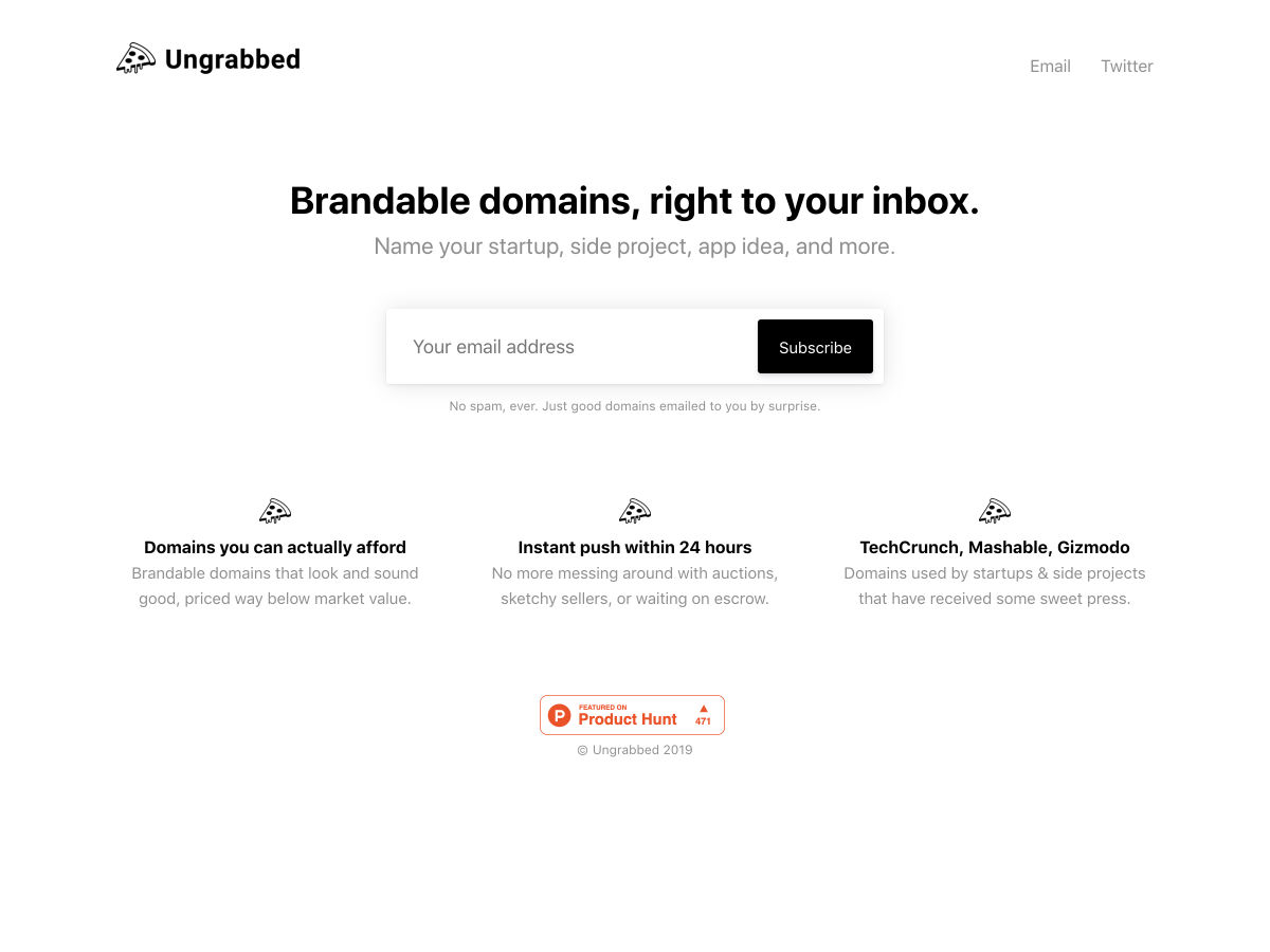
Ungrabbed: Brandable Domains, Right to your Inbox.
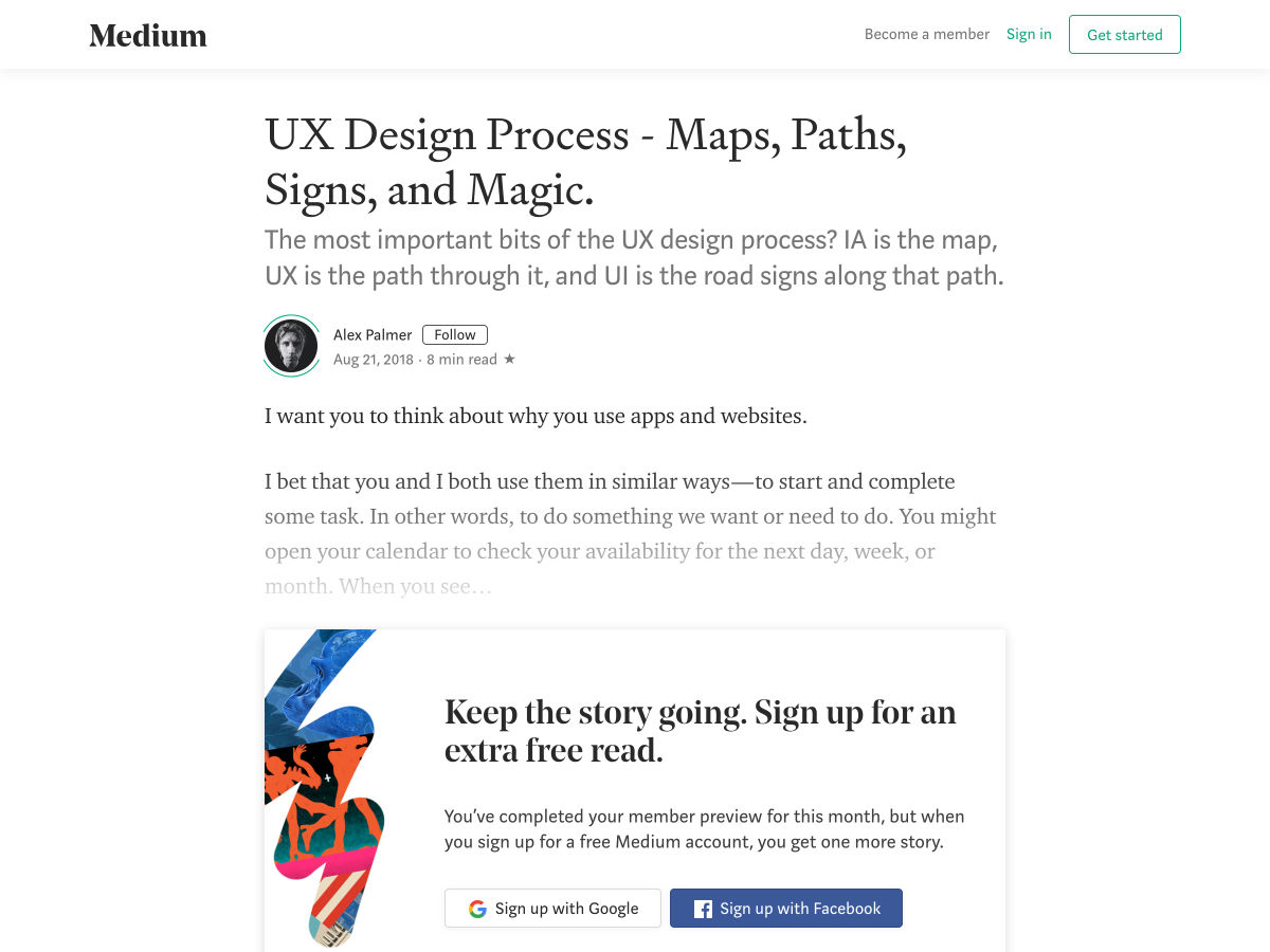
UX Design – Maps, Paths, Signs, and Magic
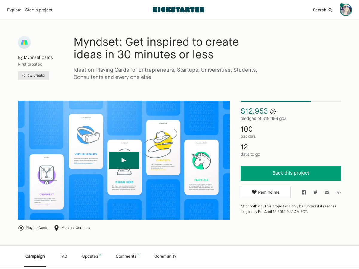
Myndset: Ideation Cards for Design Thinking
What Does a UX-designer Normally Do?
How to Promote Yourself Online When You’re a Total Introvert
Color Theory for Designers – a Crash Course
Switching to Variable Fonts
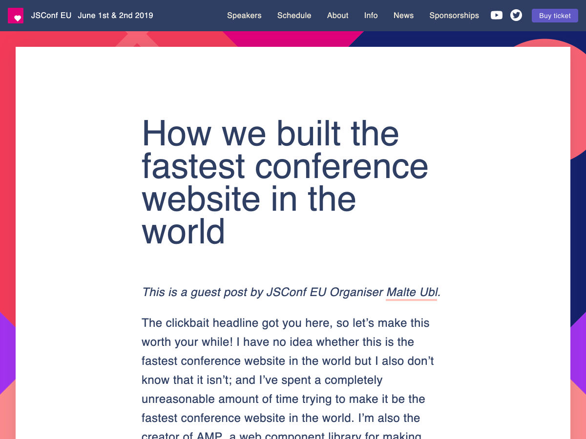
How We Built the Fastest Conference Website in the World
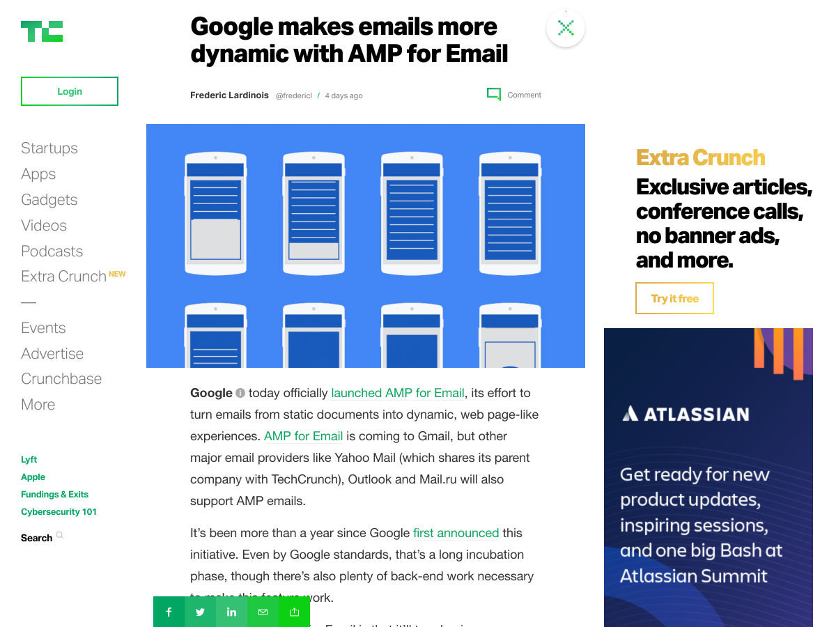
Google Today Officially Launched AMP for Email
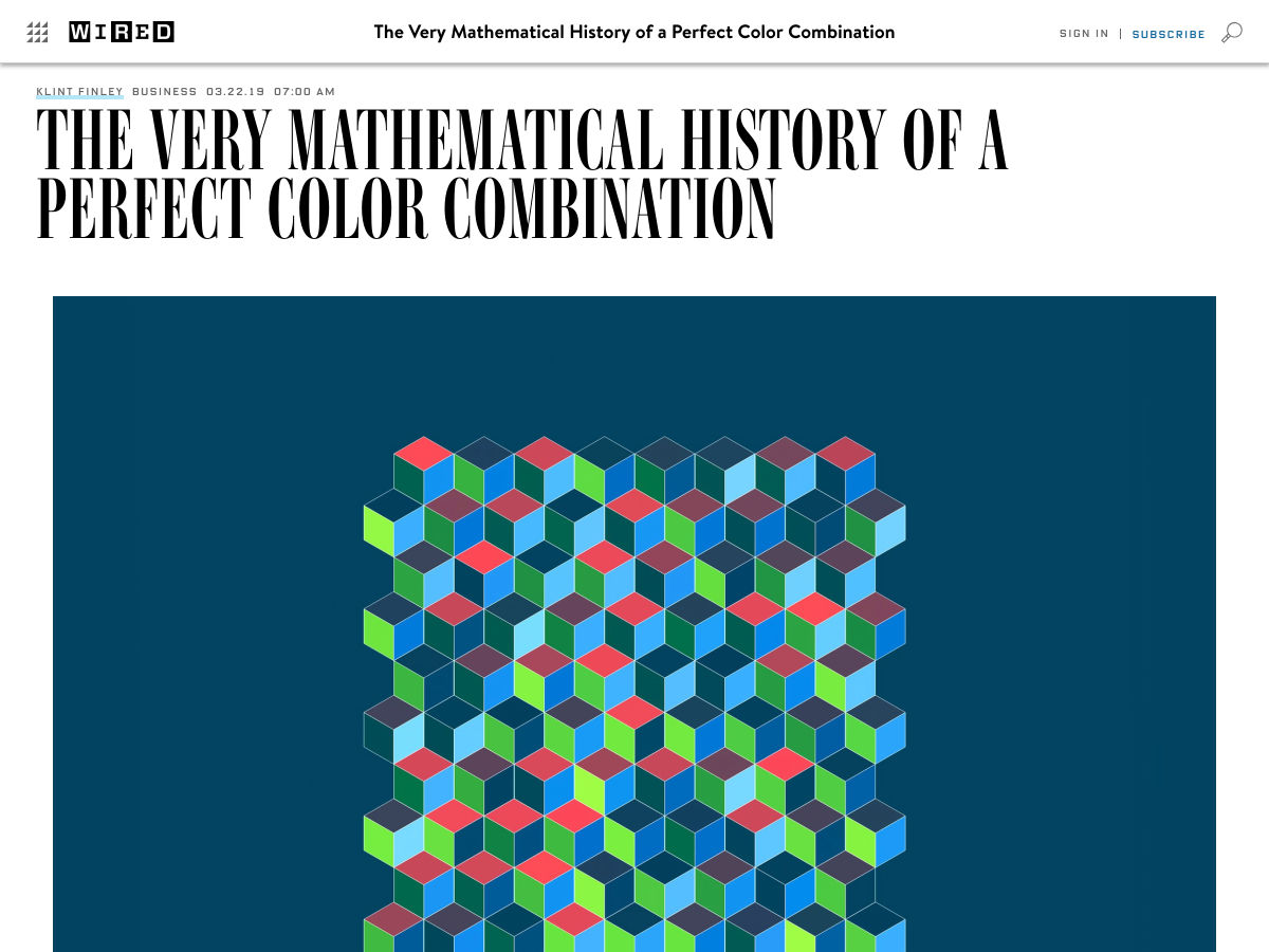
The Very Mathematical History of a Perfect Color Combination
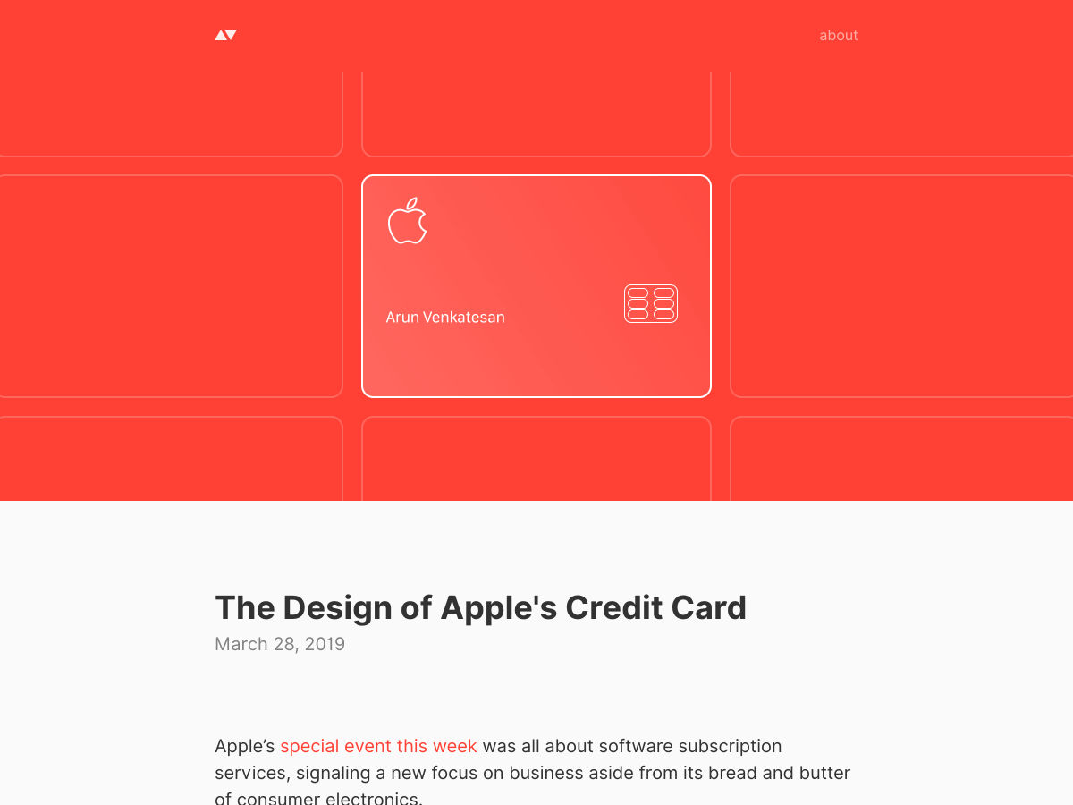
The Design of Apple’s Credit Card
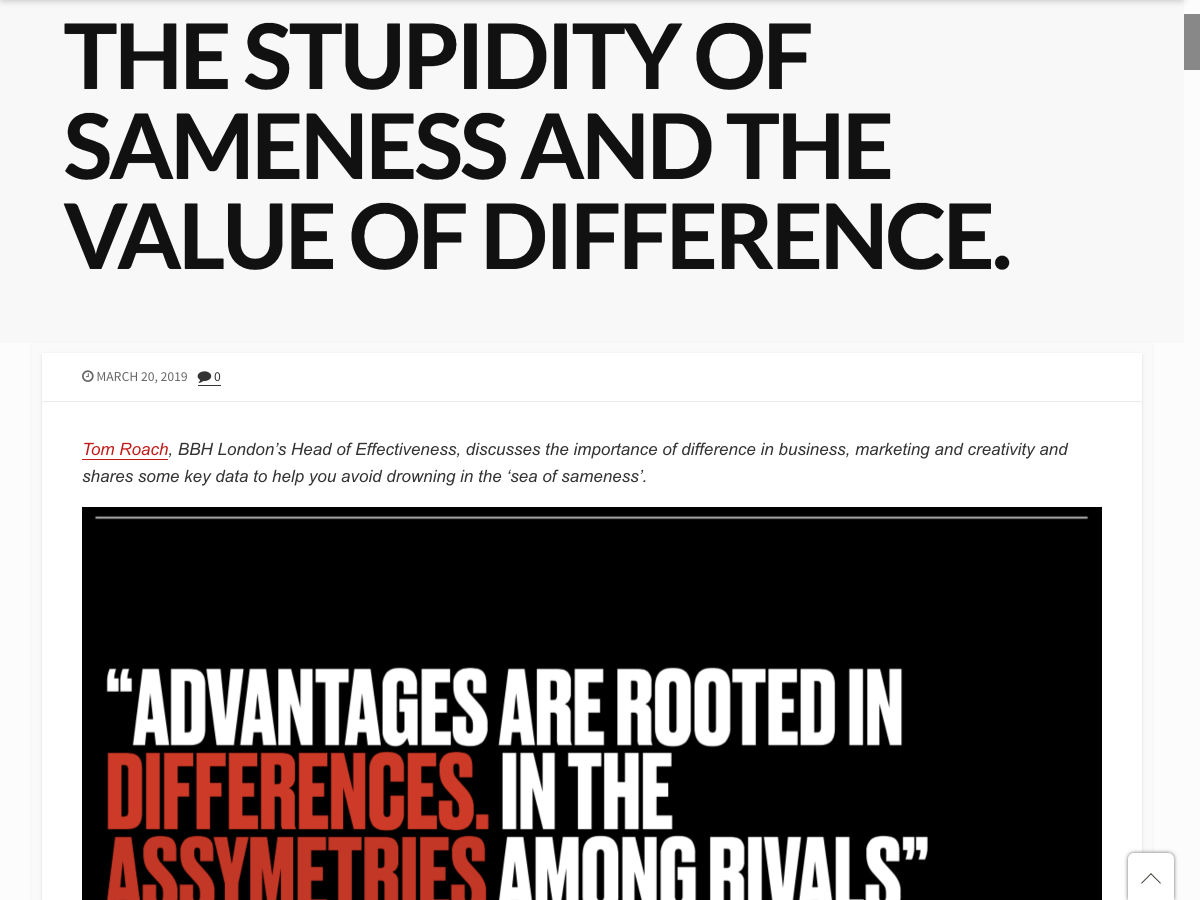
The Stupidity of Sameness
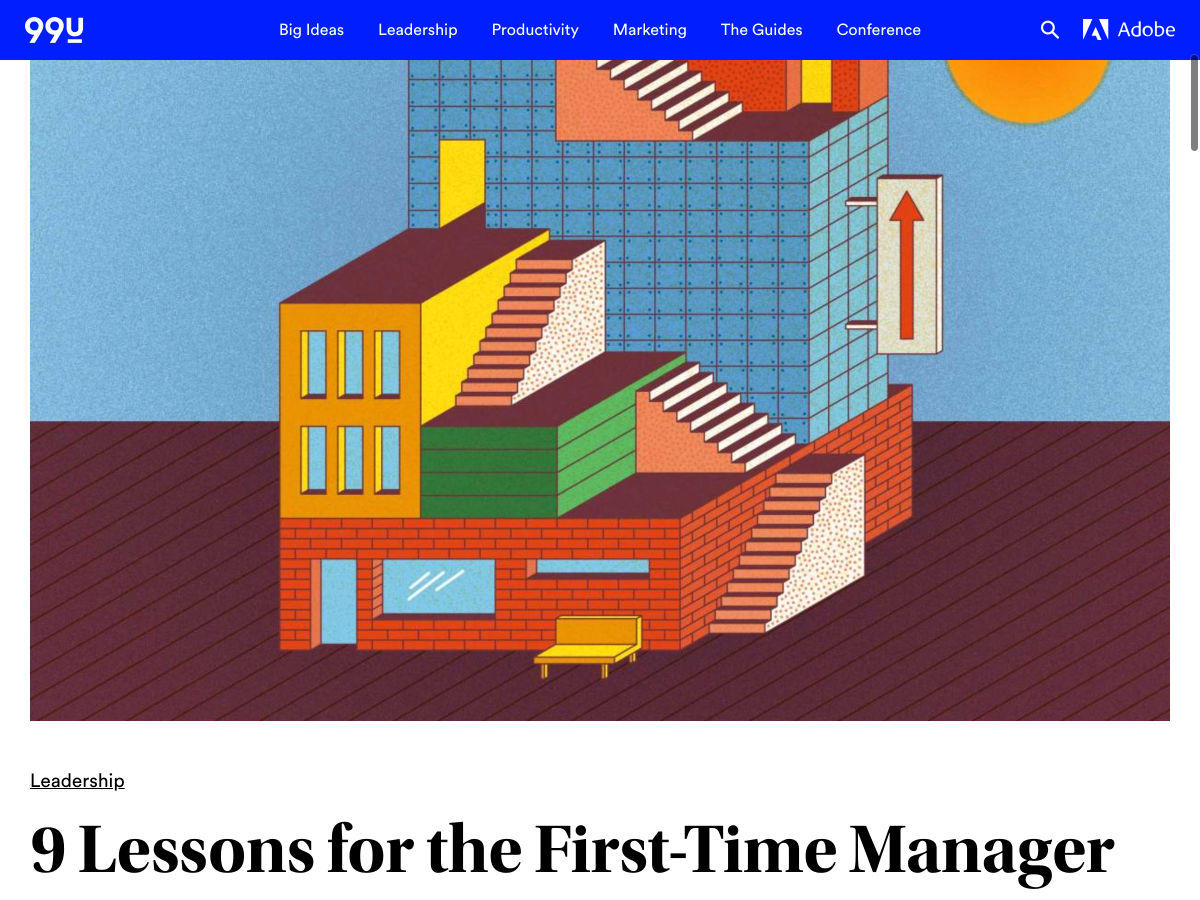
9 Lessons for the First-Time Manager
The Lies People Tell You About Landing Freelance Gigs Online
Want more? No problem! Keep track of top design news from around the web with Webdesigner News.
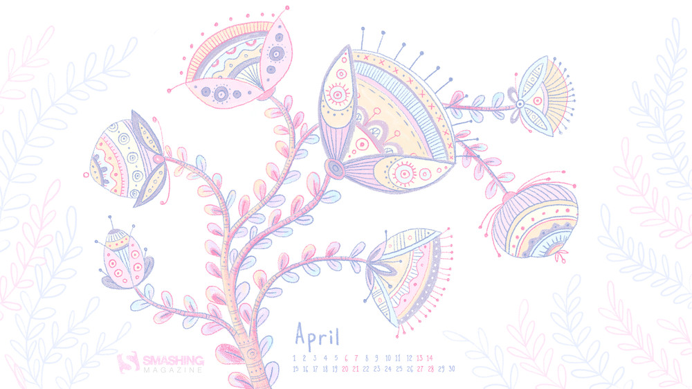
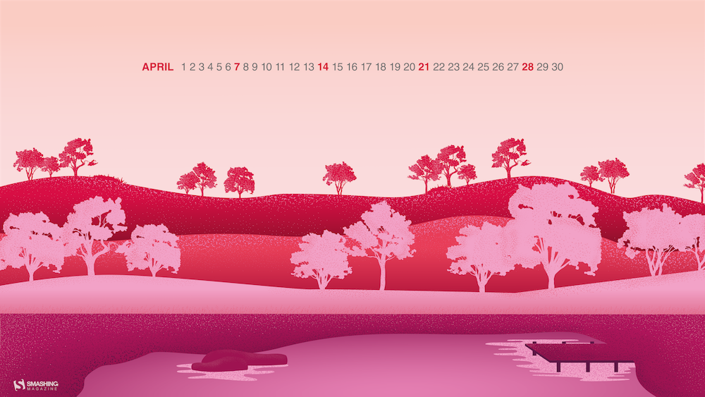
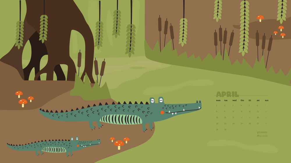
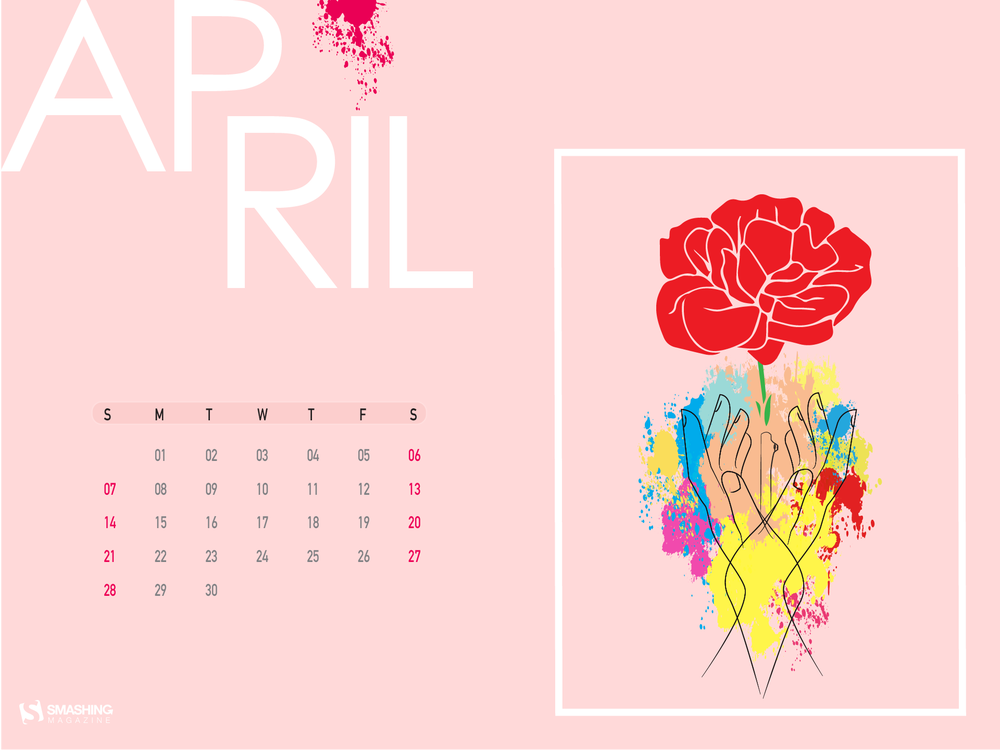
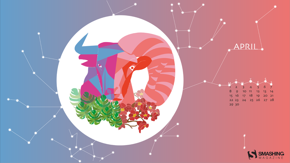
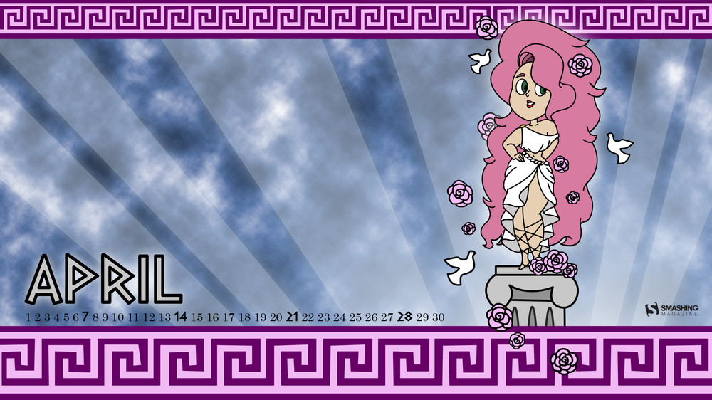
Starting off the new month with an inspiration boost, that’s the idea behind our monthly wallpapers series which has been going on for more than nine years already. What makes it special: the wallpapers are created by the community for the community, and everyone who has an idea for a wallpaper design is welcome to submit it — no matter if they are experienced designers or aspiring artists.
For this April edition, people from across the globe once again took on the creative challenge to cater for some variety on your screens. The result: a colorful collection of unique and inspiring wallpapers dedicated to the big and small joys of April. All wallpapers come in versions with and without a calendar and can be downloaded for free. Thank you to everyone who participated!
As a bonus goodie, you’ll also find a little April best-of at the end of this post. Please note that these wallpapers come from our archives, and, thus, are only available without a calendar. Enjoy!
Please note that:
All images can be clicked on and lead to the preview of the wallpaper,
You can feature your work in our magazine by taking part in our Desktop Wallpaper Calendar series. We are regularly looking for creative designers and artists to be featured on Smashing Magazine. Are you one of them?
“‘Sweet spring is your time is my time is our time for springtime is lovetime and viva sweet love’, wrote E. E. Cummings. And we have a question for you. Is there anything more refreshing, reviving, and recharging than nature in blossom? Don’t wait. Go outside and enjoy this lovely flourishing season. Let it inspire us all to rise up, hold our heads high, and show the world what we are made of. It’s time to bloom!” — Designed by PopArt Studio from Serbia.
“After so many months of grey winter weather, I can’t wait to feel the warmth of sun rays on my skin, to see and smell the flavor of blooming flowers and trees… Thinking about all this inspired me to create these blooming flowers in gentle warm colors.” — Designed by Yuliia Bahniuk from Ukraine.
“My inspiration was the arrival of spring that transmits a sense of calmness and happiness through its beautiful colors.” — Designed by Margarida Granchinho from Portugal.
“April is Easter time and I wanted to remind us that there’s a child inside all of us. My illustration is based on the story that fills our imagination since childhood, Alice in Wonderland, and joined to one of the most traditional customs in America at this time of year, the egg hunt. That’s how we get an ‘egg hunt in wonderland’.” — Designed by Patrícia Garcia from Portugal.
“If you need to find anything beautiful, there is no better place than nature. Everything in nature is unique and beautiful in its own way!” — Designed by Dental Expression from Lee’s Summit, Missouri.
“My choice to represent the month of April was the 25th of April in 1974 in Portugal, also known as the great revolution for freedom (‘Revolução dos Cravos’). It started with a political and social movement, which deposed the dictatorial regime of the New State. This date will always inspire us and remind us that freedom is worth fighting for and that people united are stronger than any kind of tyranny. For this reason, my project is called Freedom.” — Designed by Mirella Damasceno from Portugal.
“Celebrated all around the world in Christian tradition, April is the month of Easter. For kids Easter is about bunnies and painted eggs. Because April is also the month of early spring I chose joyful colours to give life to this lovely Easter illustration.” — Designed by Joana Duarte from Portugal.
“Every year around April, the cherry blossom marks the beginning of spring in Japan. There is a tradition of watching this phenomenon which the locals refer to as ‘Hanami’ — flower viewing. This event occurs for a short time because of the cherry blossom’s short lifespan. The concept of Hanami reminds us that we should appreciate and even celebrate life in all its beauty and fragility while we can.” — Designed by Tetyana Malakhova from Portugal.
“Every month of our calendar is named after a god or goddess. The month of April is named after Aphrodite, the Greek goddess of love.” — Designed by Rita Falé from Portugal.
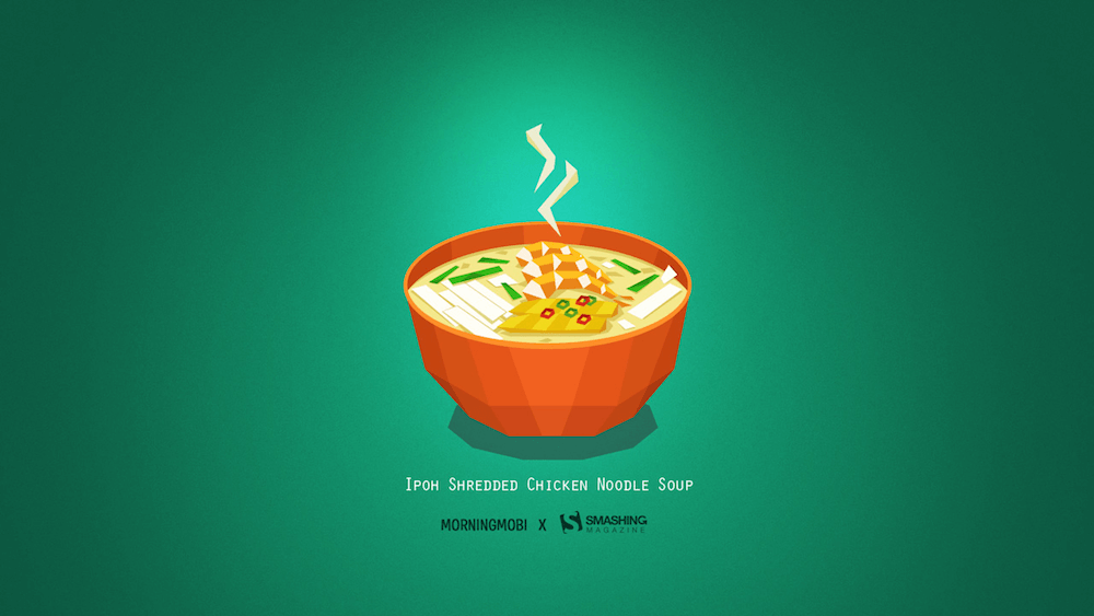
A lot of things have inspired the community to create their April wallpapers in the past few years — be it a tasty bowl of soup on a rainy day or grabbing their bike and exploring new places. Below you’ll find some of these almost forgotten favorites. Please note that they don’t come with a calendar.
April Is The Nicest Month
“T.S. Eliot wrote in 1922 that ‘April is the cruelest month,’ but we quite disagree. April is the month when spring has finally come so nature starts blooming, providing us with more time to go out into nature and enjoy nice weather, long walks, and riding a bike. This is our message to you: go out and play. We surely will.” — Designed by PopArt Studio from Serbia.
“We love the art direction, story and overall cinematography of the ‘Wildest Dreams’ music video by Taylor Swift. It inspired us to create this illustration. Hope it will look good on your desktops.” — Designed by Kasra Design from Malaysia.
“April — its first day reminds us that laughter makes life better. Nature also laughs, but it does so in daisies!” — Designed by Ana Masnikosa from Belgrade, Serbia.
“April is the month of spring but also the month of books. ‘A book is a proof that humans are capable of doing magic.’ (Carl Sagan)” — Designed by Verónica Valenzuela from Spain
“We got inspired by the song ‘Nikes on My Feet’ by Mac Miller, which was perfect for the upcoming month of April and the warm weather that spring brings. As Mac Miller said, ‘All I really need is some shoes on my feet…” — Designed by PopArt Web Design from Serbia.
“It’s spring already, my favourite season! You can smell it, you can see it, you can feel it in the air. Trees blossom, the grass is smiling at the sun, everything is so eager to show itself.” — Designed by Vane Kosturanov from Macedonia.
“I created that mouse character for a series of illustrations about a poem my mom often told me when I was a child. In that poem the mouse goes on an adventure. Here it is after the adventure, ready for new ones.” — Designed by Anja Sturm from Germany.
“Missing my hometown’s delicious ‘Kai See Hor Fun’ (in Cantonese), that literally translates to ‘Shredded Chicken Flat Rice Noodles’. It is served in a clear chicken and prawn soup with chicken shreds, prawns, spring onions and noodles.” — Designed by Lew Su Ann from Brunei.
“In my neck of the woods, April means a lot of rain, and therefore a lot of umbrellas. I’ve noticed a lot of pretty unique umbrellas out there, especially when I walked to class in college. Happy Umbrella Season!” — Designed by Angelia DiAntonio from Ohio, USA.
Please note that we respect and carefully consider the ideas and motivation behind each and every artist’s work. This is why we give all artists the full freedom to explore their creativity and express emotions and experience throughout their works. This is also why the themes of the wallpapers weren’t anyhow influenced by us but rather designed from scratch by the artists themselves.
Thank you to all designers for their participation. Join in next month!
You scroll down to a certain point, now you want to style things in a certain way. A header becomes fixed. An animation triggers. A table of contents appears. To do anything based on scroll position, JavaScript is required right now. You watch the scroll position via a DOM event and alter an element’s styling based on that position. Or, probably better if you can, use IntersectionObserver. We just blogged about all this.
Now there is a new (unofficial) spec trying to bring these possibilities to CSS. I love it when web standards get involved because it sees authors like us trying to pull off certain design effects and wants to (presumably) help make it easier and more performant. I also like how this spec lists editors from Mozilla and Google and Apple.
I wonder how they’ll handle the infinite-loop stuff here. Like you scroll to a point, it triggers some animation, which moves some element such that it changes the scroll position, which stops the animation, which moves the scroll position again… etc. I also wonder why it’s all specific to animation. “Scroll-position styling” seems like it would have the widest appeal and use level of usefulness.
The best writers, speakers, trainers, leaders, teachers tell stories.
A brand that is engaging is easier to remember and easier to process than others in the same category. Over time, it manages to establish a connection with potential customers, which directly contributes to a relevance in the market.
An emerging brand can evolve into a strong brand.
The most accessible tools for brands to become strong are words. Words create a story, and the story is what manages to capture the attention of any user. Stories portray emotion, and emotion attaches us to everything.
Story
To build your brand’s story, you have to answer two questions:
1.What is the purpose of your brands existence?
An excellent example of storytelling that can easily answer this question is represented by non-profit organizations (non-governmental organizations). In NGOs, we choose to invest our money and time without receiving a specific product or service in return.
They promote a cause, we become attached to that cause through emotion, and we choose to give them money.
If brands would address the communication process from an NGO perspective, helping the consumer first and selling second, they would all be more successful.
2. How does your brand differ from others?
The importance of a brand’s offer, whether it be a product or service, has diminished over time. On a constantly growing market, competition is unavoidable, and what makes the biggest difference is how a brand promotes the offer. Why does the brand choose to do what it does? What drives us to do what we do regarding the brand?
How to turn your story into a tool
To turn a story into an effective tool for your brand, it must be narrated in a transparent and authentic way. It must have a core belief (the moral of the story) and help the target audience reach the happy ending they hoped for.
The stronger the moral of the story is, the more significant of an impact it makes, the stronger the relationship between brand and consumer. However, the moral of the story can not be the same for all audiences. Brands need to understand this and create different approaches if they want to identify themselves with a larger audience of individuals.
Advertising. Storytelling. Engagement.
Every brand tries to create a connection with the audience to which it addresses, but this goal is not always met as expected. Most brands create user personas to help them better understand the kinds of people that usually buy from them. By doing this, you can also understand who isn’t buying from you, and develop strategies to reach those people.
Over 75% of emails received from companies are not open and over 99% of banners end up being ignored. The main objective of advertising is to attract long term attention. Another objective is to engage customers on a personal level. Make them feel at home with your brand, and develop a relationship that fortifies their decision in choosing you.
In advertising, the story is not just an entertainment tool, but the basis for changing a decision, attitude, or behavior. That’s why brands need to invest time building relationships to help them integrate the target audience into the brand story.
The conclusion
Storytelling is a key element in advertising. It’s not enough anymore to simply sell a product. You have to sell your story. You have to make these potential customers believe in what you believe. They have to understand why you do what you do, and the journey you took to get there. A story is more than a tool for a brand, but the brand itself.
The evolution of a brand involves all these elements, based on two fundamental concepts: creating a story and transmitting the narrative. They aim to establish a long-term connection with the target audience in order to build relationships, and generate not just customers, but loyal and happy customers.
The idea behind most of web applications is to fetch data from the database and present it to the user in the best possible way. When we deal with data there are cases when the best possible way of presentation means creating a list.
Depending on the amount of data and its content, we may decide to show all content at once (very rarely), or show only a specific part of a bigger data set (more likely). The main reason behind showing only part of the existing data is that we want to keep our applications as performant as possible and avoid loading or showing unnecessary data.
If we decide to show our data in “chunks” then we need a way to navigate through that collection. The two most common ways of navigating through set of data are:
The first is pagination, a technique that splits the set of data into a specific number of pages, saving users from being overwhelmed by the amount of data on one page and allowing them to view one set of results at a time. Take this very blog you’re reading, for example. The homepage lists the latest 10 posts. Viewing the next set of latest posts requires clicking a button.
The second common technique is infinite scrolling, something you’re likely familiar with if you’ve ever scrolled through a timeline on either Facebook or Twitter.
The Apple News app also uses infinite scroll to browse a list of articles.
We’re going to take a deeper look at the first type in this post. Pagination is something we encounter on a near-daily basis, yet making it is not exactly trivial. It’s a great use case for a component, so that’s exactly what we’re going to do. We will go through the process of creating a component that is in charge of displaying that list, and triggering the action that fetches additional articles when we click on a specific page to be displayed. In other words, we’re making a pagination component in Vue.js like this:
Let’s go through the steps together.
Step 1: Create the ArticlesList component in Vue
Let’s start by creating a component that will show a list of articles (but without pagination just yet). We’ll call it ArticlesList. In the component template, we’ll iterate through the set of articles and pass a single article item to each ArticleItem component.
Now we need to create a method that will load the next page, the previous page or a selected page.
In the pageChangeHandle method, before loading new articles, we change the currentPage value depending on a property passed to the method and fetch the data respective to a specific page from the API. Upon receiving new data, we replace the existing articles array with the fresh data containing a new page of articles.
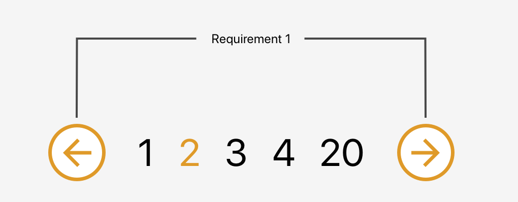
The component will accept currentPage and pageCount properties from the parent component and emit proper actions back to the parent when the next or previous button is clicked. It will also be responsible for disabling buttons when we are on the first or last page to prevent moving out of the existing collection.
That was the easy part. Now we need to create a list of page numbers, each allowing us to select a specific page. The number of pages should be customizable and we also need to make sure not to show any pages that may lead us beyond the collection range.
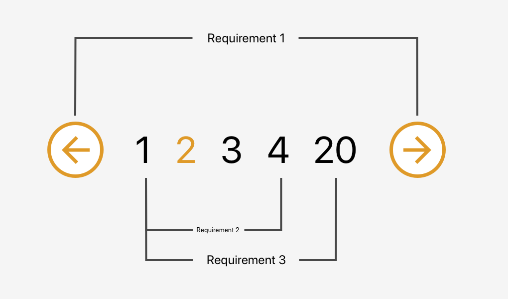
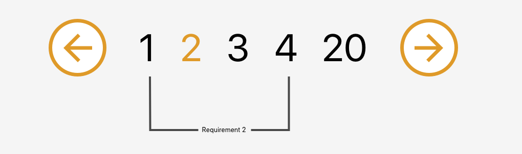
Requirement 2: Allow the user to go to a specific page within a range
Let’s start by creating a component that will be used as a single page number. I called it BasePaginationTrigger. It will do two things: show the page number passed from the BasePagination component and emit an event when the user clicks on a specific number.
In the script section, we need to add one more method (onLoadPage) that will be fired when the loadPage event is emitted from the trigger component. This method will receive a page number that was clicked and emit the event up to the ArticlesList component.
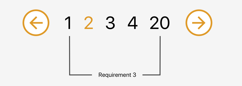
Requirement 3: Change the range of page numbers based on the current page
OK, now we have a single trigger that shows us the current page and allows us to fetch the same page again. Pretty useless, don’t you think? Let’s make some use of that newly created trigger component. We need a list of pages that will allow us to jump from one page to another without needing to go through the pages in between.
We also need to make sure to display the pages in a nice manner. We always want to display the first page (on the far left) and the last page (on the far right) on the pagination list and then the remaining pages between them.
We have three possible scenarios:
The selected page number is smaller than half of the list width (e.g. 1 – 2 – 3 – 4 – 18)
The selected page number is bigger than half of the list width counting from the end of the list (e.g. 1 – 15 – 16 – 17 – 18)
All other cases (e.g. 1 – 4 – 5 – 6 – 18)
To handle these cases, we will create a computed property that will return an array of numbers that should be shown between the next and previous buttons. To make the component more reusable we will accept a property visiblePagesCount that will specify how many pages should be visible in the pagination component.
Before going to the cases one by one we create few variables:
visiblePagesThreshold:- Tells us how many pages from the centre (selected page should be shown)
paginationTriggersArray: Array that will be filled with page numbers
visiblePagesCount: Creates an array with the required length
Scenario 1: The selected page number is smaller than half of the list width
We set the first element to always be equal to 1. Then we iterate through the list, adding an index to each element. At the end, we add the last value and set it to be equal to the last page number — we want to be able to go straight to the last page if we need to.
Scenario 2: The selected page number is bigger than half of the list width counting from the end of the list
Similar to the previous scenario, we start with the last page and iterate through the list, this time subtracting the index from each element. Then we reverse the array to get the proper order and push 1 into the first place in our array.
We know what number should be in the center of our list: the current page. We also know how long the list should be. This allows us to get the first number in our array. Then we populate the list by adding an index to each element. At the end, we push 1 into the first place in our array and replace the last number with our last page number.
And we are done! We just built a nice and reusable pagination component in Vue.
When to avoid this pattern
Although this component is pretty sweet, it’s not a silver bullet for all use cases involving pagination.
For example, it’s probably a good idea to avoid this pattern for content that streams constantly and has a relatively flat structure, like each item is at the same level of hierarchy and has a similar chance of being interesting to the user. In other words, something less like an article with multiple pages and something more like main navigation.
Another example would be browsing news rather than looking for a specific news article. We do not need to know where exactly the news is and how much we scrolled to get to a specific article.
That’s a wrap!
Hopefully this is a pattern you will be able to find useful in a project, whether it’s for a simple blog, a complex e-commerce site, or something in between. Pagination can be a pain, but having a modular pattern that not only can be re-used, but considers a slew of scenarios, can make it much easier to handle.
Brad Frost wrote about a recent experience with a website that used :
Last week I got a call from my bank regarding a wire transfer I had just scheduled. The customer support guy had me repeat everything back to him because there seemed to be a problem with the information. “Hmmmm, everything you said is right right except the last 3 digits of the account number.”
He had me resubmit the wire transfer form. When I exited the account number field, the corner of my eye noticed the account number change ever so slightly. I quickly refocused into the field and slightly moved my index finger up on my Magic Mouse. It started looking more like a slot machine than an input field!
Brad argues that we then shouldn’t be using for “account numbers, social security numbers, credit card numbers, confirmation numbers” which makes a bunch of sense to me! Instead we can use the pattern attribute that Chris Ferdinandi looked at a while back in a post all about constraint validation in HTML.
It’s worth mentioning that numeric inputs can be more complex than they appear and that their appearance and behavior vary between browsers. All good things to consider along alongside Brad’s advice when evaluating user experience.
Also:
is the way forward for mobile numeric keyboards (paired with `pattern=”[0-9]*”` on iOS pending inputmode support).
Just a few years ago, design blogs were all abuzz with tips on how to build websites for the millennial consumer. At this point, however, that’s old news. We know what millennials want from the online experience and have, for the most part, been able to meet their expectations.
But now we have a new generation of consumers to worry about: Generation Z.
Are they all that different from millennials?
As an old millennial myself, I can tell you that this next generation is one I don’t feel much of a connection to. I can remember a time when the most exciting part of my day was when my mom got off the phone and I was able to finally connect to the Internet with our dial-up AOL account.
This next generation doesn’t understand any of that. They weren’t caught between worlds the way many millennials were, which means they have a whole different set of expectations when it comes to the technology they interact with on a daily basis.
Consider this your quick and dirty guide to designing mobile websites for Gen Z.
What You Need to Know About Designing Mobile Web for Gen Z
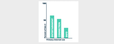
According to Reality Bytes, a report published by WP Engine and The Center For Generational Kinetics, Gen Z cannot live without Internet access. More specifically:
55% won’t go more than five hours without it.
27% won’t go more than one.
Now, what’s really interesting about this particular generation is that, despite their attachment to the Internet, 61% of them prefer to shop on websites instead of mobile apps.
Considering how long they’ve had smart devices in their hands, it’s surprising that they’d gravitate towards browsers over native applications. That just goes to show you that native apps aren’t necessarily the best way to reach a mobile audience (especially if you want to make money from your app).
But all this is good news for you. Mobile apps are expensive to build and time-consuming to maintain. Plus, it’s quite difficult to convert users on mobile apps. If you were nervous about having to make the leap into mobile app development, or about losing money to those working in that field, don’t be. Generation Z wants your clients’ websites.
Now that you know which experience Gen Z is more likely to lean towards, it’s time to discuss designing for it.
Entertain Them
Before you do anything else, think about how to engage Gen Z visitors with entertainment.
According to Reality Bytes, entertainment is the primary reason why they visit the Internet:
Generation Z overwhelmingly prefers to be entertained online over anything else. (WP Engine) (Large preview)
Until now, the primary reason why consumers flocked to the Internet was for informational purposes. But that’s not all bad news for you as it means you have an excuse to reach out to older clients and say:
“Hey, times are changing! Here’s what’s on trend now and what your website needs in order to reach these new consumers.”
Just be careful: even for the most relaxed and youthful company, you don’t want to go over the top with adding entertaining elements into a mobile website. Just because 66% of Generation Z consumers name gaming as their #1 hobby doesn’t mean you need to build a mobile game and put it on your site. (Leave that to the gaming app developers.)
Instead, look at subtle ways to surprise Generation Z with something unexpected and engaging.
The first place to start? Video.
KFC has a great example of this right on its home page:
KFC shares its well-known and hilarious video ads on its home page. (Source: KFC) (Large preview)
There’s a number of reasons why this video example is so awesome.
First, every visitor to the website — both on desktop and mobile — will see it right away. On mobile, visitors can’t even scroll down the home page. What you see above is what you get.
Next, this ensures your visitors get a taste of the brand’s humor and personality. Whereas content-driven sites or blogs can do that with GIFs and memes, Gen Z might not take the time to read content. Video makes sure they won’t miss out.
Also, this video is totally on brand, showcasing KFC’s humor in video form.
Even if you don’t have a humorous mascot to trot around, show off your client’s CEO or other engaging brand ambassador. Video is a great way to quickly suck Gen Z visitors in and let them know this is not going to be a dry or unmemorable experience.
If you don’t have video to play with, that’s okay. Think about adding humor as you educate visitors. Old Spice demonstrates:
Old Spice’s informative, yet funny Ingredients pages. (Source: Old Spice) (Large preview)
Old Spice is another company that’s known for its entertaining video ads. However, their website also contains some humorous gems where you’d least expect them:
In the Ingredients section.
Visitors that are concerned about the ingredients within their deodorant can visit this page to learn more about what goes into each of the products. But read those descriptions closely. Not only are they transparent about what’s inside, but they also do it in a casual and playful way which says:
“Hey, we’re taking your concerns seriously. But don’t sweat it. We got you.”
Another way you can appeal to the entertainment-loving Generation Z is to add a social component to your site.
Don’t worry about building your own social network, community or forum either. Gen Z is going to flock to their favorite social platforms for that purpose: YouTube, Snapchat, Instagram, etc.
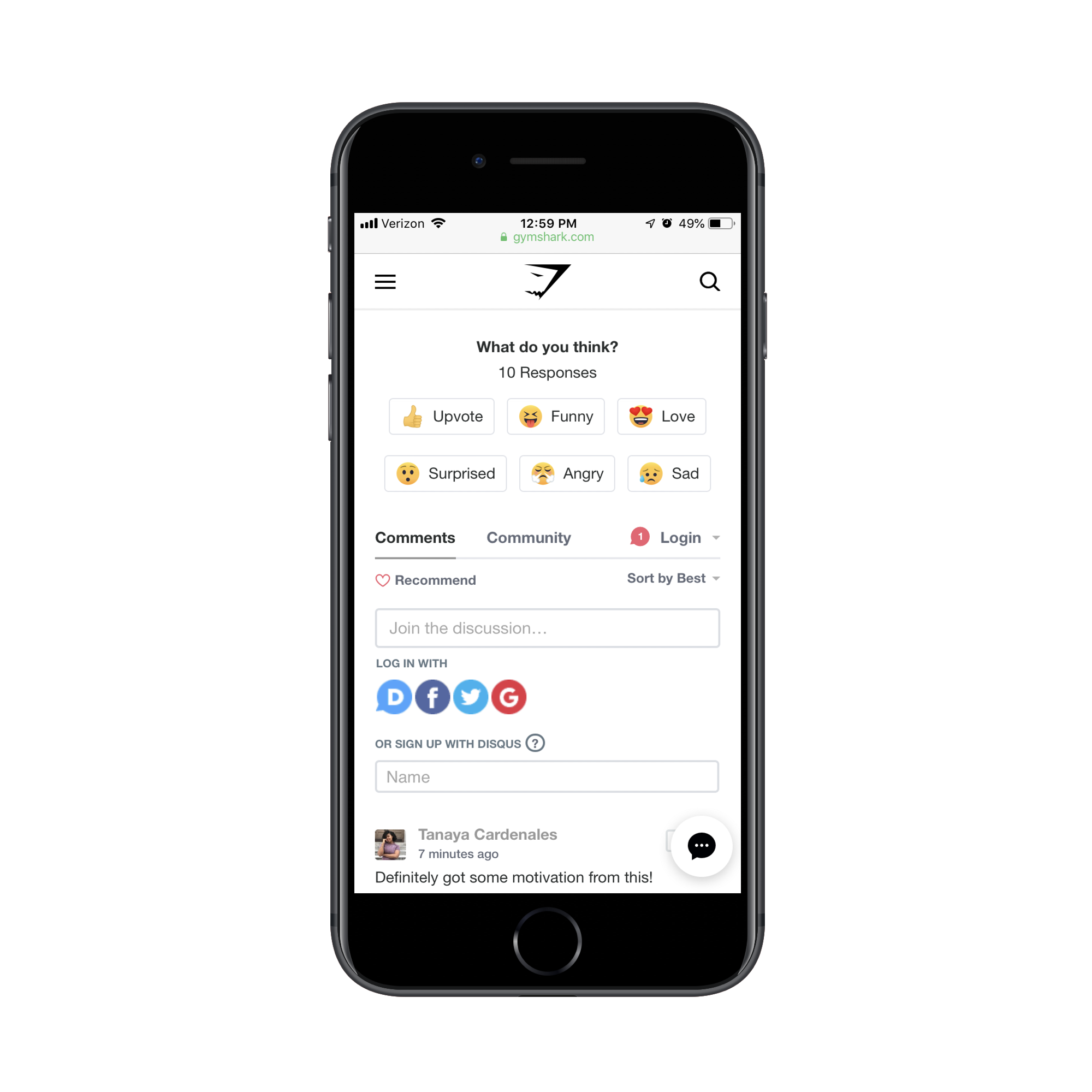
Instead, think about what it is that makes those environments so engage-worthy. Here’s an example from the Gymshark Central blog:
Gymshark uses social media-like reactions to improve blog engagement. (Source: Gymshark) (Large preview)
The blog post looks like any other. However, at the bottom of each post is this emoji reaction system. That’s pretty unique, right? Plus, this type of engagement doesn’t require much work from the reader. Simply click on the recognizable and well-labeled emoji and let the writer know what you thought of the content.
Another reason why this works so well is because Gymshark actively targets Gen Z customers. If you look on their website, you’ll see a section where they give discounts to college students.
So, if your client’s website needs to reach a younger audience, take a lesson from Gymshark. There’s no need to do a complete overhaul and convert an otherwise well-designed website into a superficial social network. Instead, add the most engaging elements from social networks and encourage your Gen Z visitors to interact more.
Personalize It
Think about what makes video games and social media so attractive to Gen Z. There’s obviously the fun aspect of it, but there’s another force at play that keeps users returning time and time again:
And that’s personalization.
This is something you should already be designing your mobile websites for as you target millennial consumers. However, if you haven’t bothered to add personalized touches to your sites, yet, you’re going to need to take this more seriously now.
Forbes Agency Council and YPulse worked together to find out what Generation Z really wants in terms of personalized experiences. Here’s a snippet from their findings:
“71% of the 3,000 respondents ages 14–29 said they prefer to receive offers that are customized to their location. In the same survey, 80% said they expect tailored onscreen experiences that not only target location but also recognize their interests and habits — who they are and how they self-identify.”
With 44% of Gen Z more likely to give up their personal data than other generations, you can’t afford to ignore this one.
One way to deliver a personalized experience based on what Gen Z visitors want is through push notifications. The only problem is, whether you have a mobile website or a progressive web app, push notifications are not supported on iOS devices.
While you can still use them to connect with Android users, consider other means for personalization that will help you connect with 100% of them.
Take, for instance, something as seemingly simple as what Amazon does with data:
About ¾ of the Amazon mobile home page contains personalized information. (Source: Amazon) (Large preview)
As you can see here, Amazon has saved a whole bunch of information about me:
My name and account information;
My cart items (which were not put there on this shopping trip);
My delivery location.
I also happen to own a Fire TV Stick, so this top ad is super relevant to me. Overall, I’m quite pleased with how tailor-made this first step inside the mobile website feels.
If you’re building a registration or membership system into your client’s website, make sure you’re leveraging user data to provide a personalized experience for them.
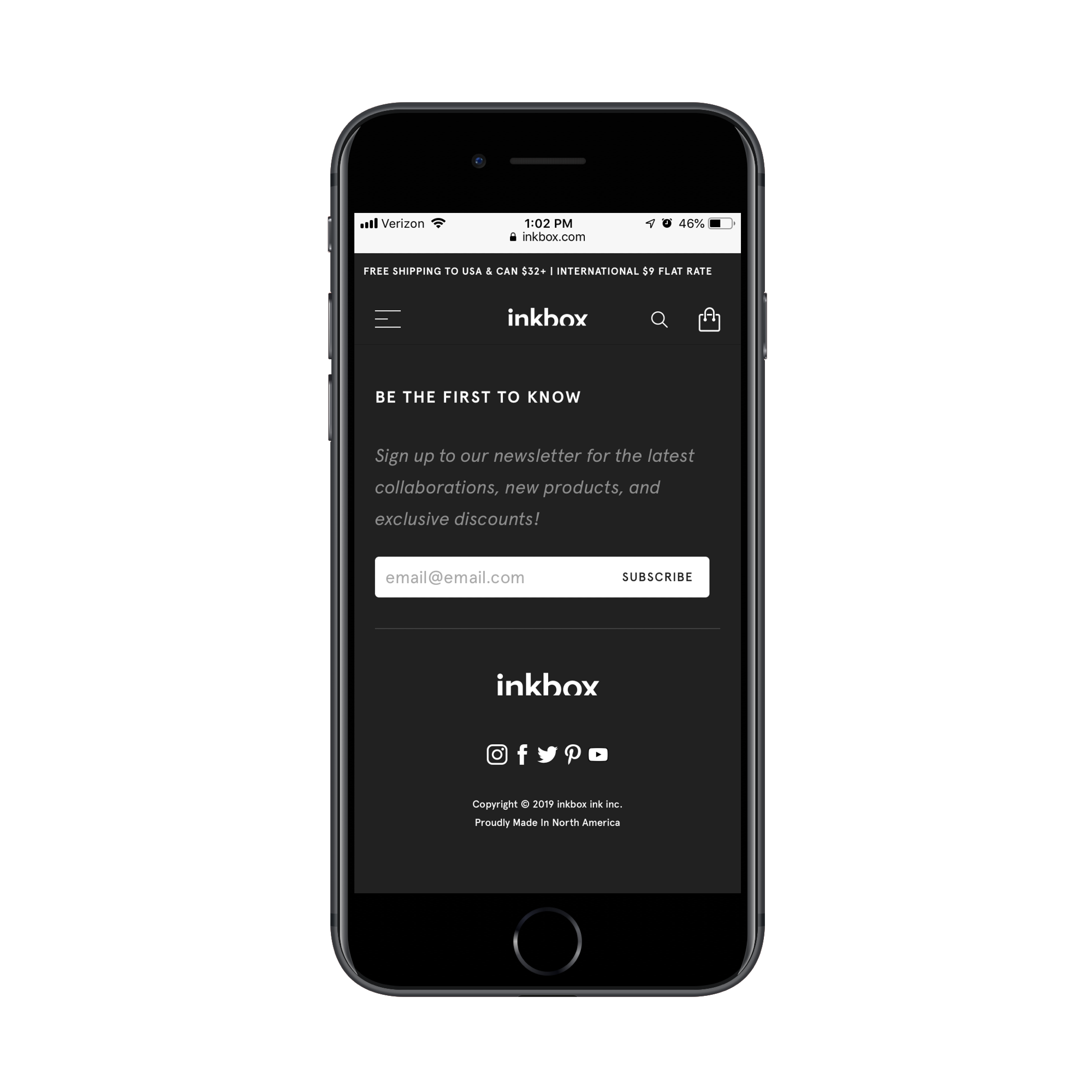
And if you don’t have a reason to ask mobile visitors to log in, that’s okay. You can still gather information by placing simply designed email subscription forms on the mobile website — preferably above the fold or at the very bottom. And most definitely on the home page.
inkbox uses a subscription form to start collecting information on visitors. (Source: inkbox) (Large preview)
inkbox has done a nice job with this subscription form. Even if mobile users scroll past the content on the page, they’re likely to see that white box screaming back at them, begging them to sign up.
Because there’s such a low commitment compared to the potential for such valuable rewards (like information on new products and access to exclusive discounts), Generation Z visitors will love this. Like I said earlier, they’re more than willing to give you their personal data if you can make it worth their while.
For mobile websites with a brick-and-mortar presence, geolocation features are non-negotiable. Generation Z shoppers often use their mobile devices while in-store, so this would definitely take their experience to the next level.
One of the easiest ways to implement this is with geolocation sensors like the ones used by The North Face:
The North Face auto-populates search parameters based on the user’s location. (Source: The North Face) (Large preview)
The above screenshot is what happens when I use the Find a Store feature on the mobile website. What’s great about this is it detected my location (which is currently Boston) and it auto-populated my search query with a nearby store.
Mobile users don’t have time to waste and Gen Z certainly won’t take kindly to a website that forces them to do all the work. Take what you know about your user — even if all you can detect is a location — and make their job of connecting with you easier.
Make Them Feel Special
Now, there’s a difference between adding personal touches to a website and taking it up a notch so that Generation Z visitors feel special. They’re going to need you to make them feel like their money and opinions and faces are worth more than anyone else’s.
You have to remember, this is the generation that grew up with reality TV and smartphone cameras pointed at their faces. That’s why it’s no surprise they’re known as the “influencer” generation.
On a related note, this makes Generation Z much more likely to build a relationship with brands as there’s the hope that, someday, they’ll reward their loyalty with a public-facing partnership.
Your clients will ultimately have to decide how far they want to take this. After all, affiliate partnerships and influencer marketing won’t make sense for everyone. That said, there are other ways to reap the advantages of having a generation of consumers willing to “help” a brand out.
According to data from the IBM Institute for Business Value and the National Retail Federation, 44% of Generation Z consumers said they’d be happy to share ideas for product design. That makes sense as that level of contribution will make them feel like they have more invested in the relationship with the company.
While your clients need to decide if consumers have any say in the shaping of their offering, you can do something about this from the web design side of things.
Check out what the Panera website is doing to solicit visitors for feedback:
Panera calls attention to its redesign and asks visitors for feedback. (Source: Panera) (Large preview)
These “Feedback” tabs are a somewhat new feature on the web, but more and more websites are certainly taking advantage of it. With this intro pop-up from Panera, it’s looking as though they want to make sure their visitors take notice, too.
This is a smart move in terms of trying to appeal to a younger audience. You let them know, straight out the gate, “We made some changes!” and then ask them to provide feedback. But that’s not all. Panera is saying: “Thanks for your help.” This implies that they want customers to take a greater part in shaping both the online experience and the brand itself.
There are other ways to make Generation Z feel like they’re more than just the average customer.
Sephora has created something called the “Rewards Bazaar” to layer on top of its more traditional BeautyInsider loyalty program:
Rewards Bazaar is Sephora’s point-based rewards system that can be used to buy products and experiences. (Source: Sephora) (Large preview)
The Rewards Bazaar program works similarly to credit card points or airline miles programs. In other words, the more money customers spend with Sephora, the more points they accumulate.
And points don’t just buy them more Sephora goods. Points buy them experiences, like an Algenist R&R sleep retreat in Tucson, Arizona. They can also get “swag” bundles full of makeup and body products, clothes, artwork and more.
Sephora is rewarding their loyalty with celeb-like treats.
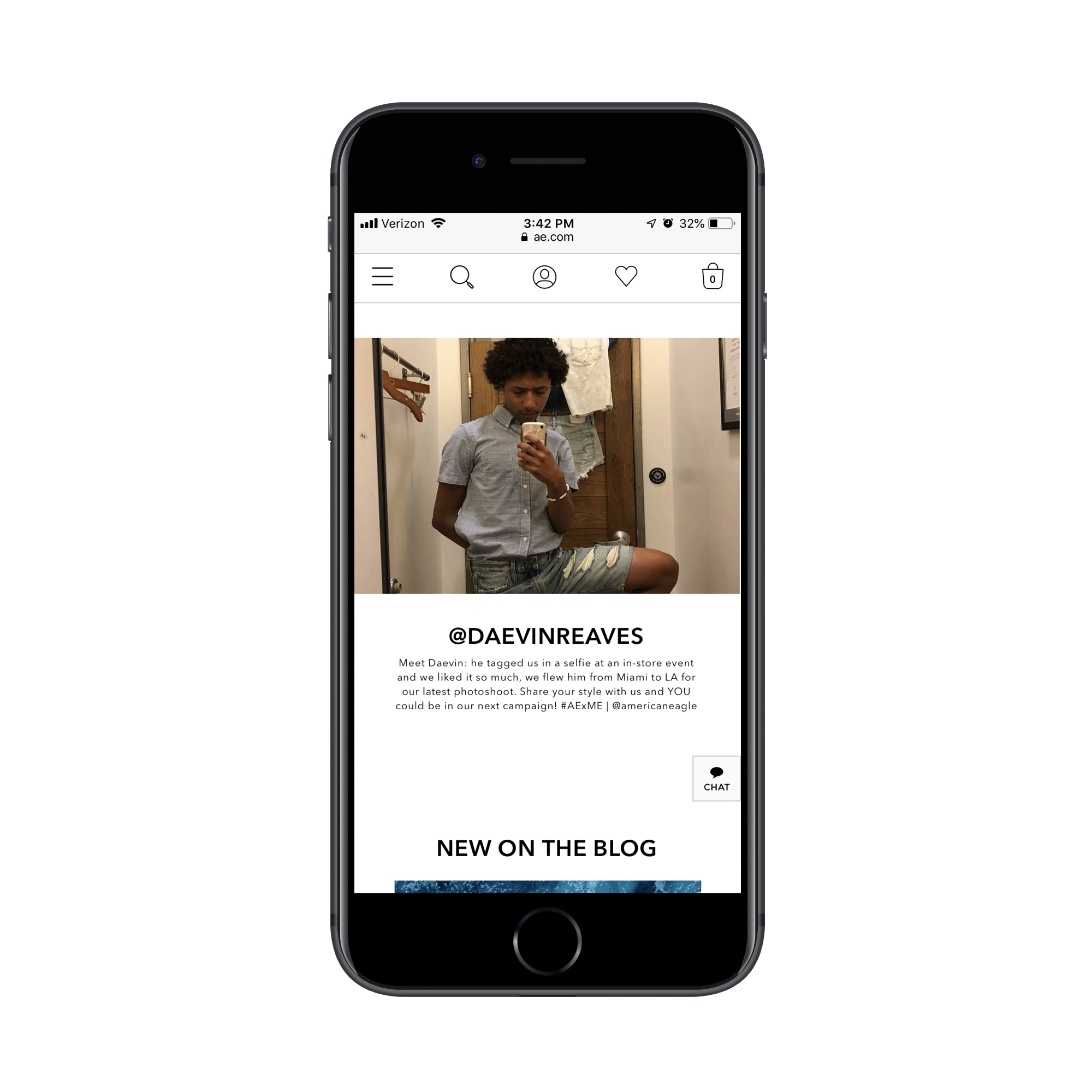
If you want to go crazy and actually encourage Gen Z customers to act like the influencers they so desire to be, take inspiration from this American Eagle example:
American Eagle asks customers to become unofficial influencers with AE x ME. (Source: American Eagle) (Large preview)
Generation Z customers already have their cameras ready to snap the next Insta-worthy photo, so why not give them a reason to put it to good use?
American Eagle has created an influencer-like program called AE x ME. Really, this is nothing more than a brilliant ploy to ask customers for user-generated content that American Eagle can then use on its website and beyond.
Whereas brands usually have to dig around for these types of photos or videos featuring their products in action, American Eagle is saying:
“You’re going to take pictures of your awesome new duds anyway. Why not let us show them off to a much larger audience for you?”
That’s not the only reward American Eagle dangles in front of influencers. While most of the people featured get a unique URL that features their Instagram handle and some information about them, there’s a profile at the bottom of this page that suggests there might be a greater opportunity here.
Daevin tagged American Eagle in one of his posts and then was flown out to become one of the faces in an upcoming campaign for the famous clothing brand. If that’s not living the dream for Gen Z influencer wannabes, I don’t know what is.
Keep It Real
One last thing to keep in the back of your minds as you design websites for Generation Z is the “keep it real” component. Anyone else remember this Dave Chappelle gem?
Dave Chappelle struggles to keep it real, long before Gen Z had a say in it. (Source: Giphy)
Gen Z has very high standards when it comes to the authenticity of a company. And, not only that, they expect brands to be socially good, too.
Reality Bytes reports that:
79% of Gen Z consumers respect brands more if they keep their images Photoshop-free.
84% of them trust companies that put real customers in their ad campaigns (see American Eagle’s example above).
69% of them will buy from companies that give money to and support good causes.
Really, what all of this data points to is this:
Generation Z wants to know that they’re engaging with genuinely good and honest people; not just a brand name.
That’s why, if your clients have a strong mission and values, their websites need to have one page specifically dedicated to them.
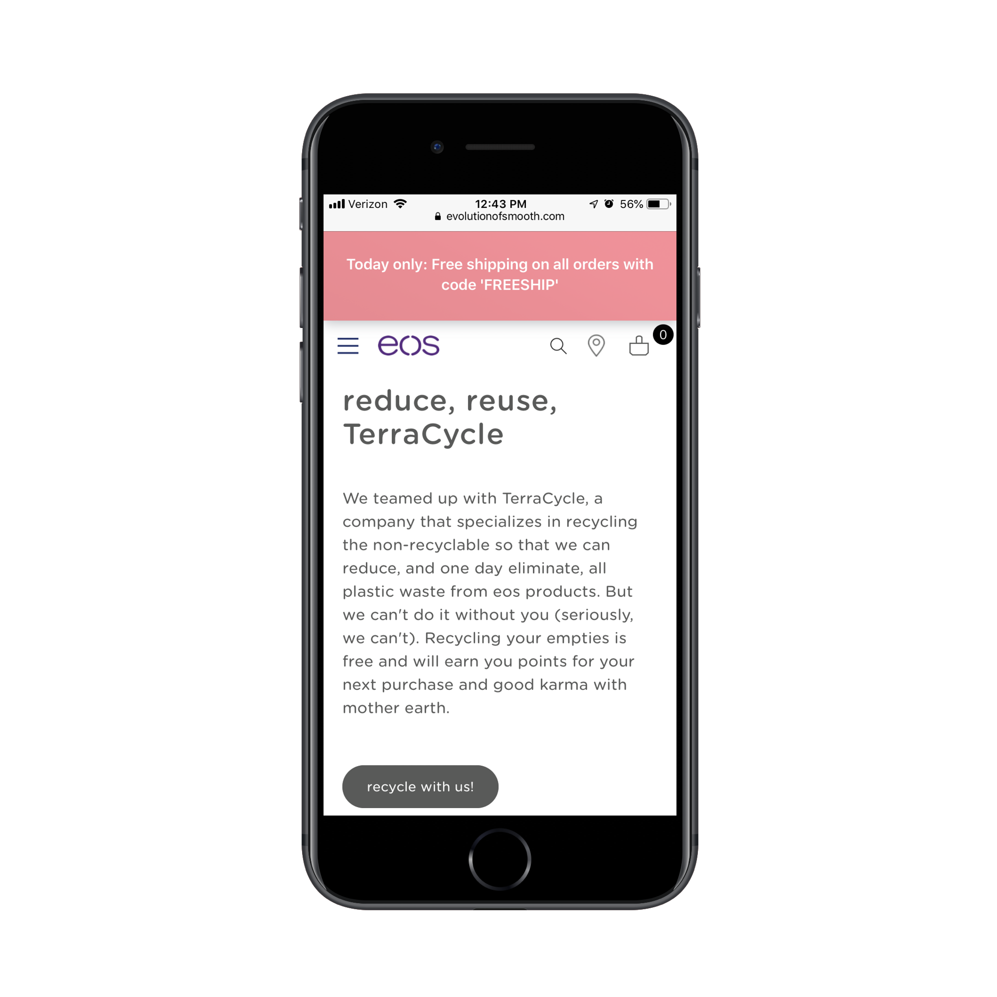
One way to do this is with a partnership highlight page like eos has:
eos touts its recycling initiatives and partnership with TerraCycle. (Source: eos) (Large preview)
The eos website actually has two pages dedicated to this recycling cause. The first is called “Social Responsibility” where the company discusses its mission to build clean products. The second is called “TerraCycle” where it goes more into the recycling partnership.
For consumers looking to buy from companies that take causes like this seriously, these landing pages may be all they need to convince them to convert.
Samsung does something similar on its About Us page, except the key difference is that it calls out social responsibility and sustainability as part of its core company values:
Samsung makes it its mission to make the environment a priority. (Source: Samsung) (Large preview)
This way, it’s not just Samsung telling customers where their products come from or where they end up. Instead, their entire identity becomes synonymous with this mission to create a better world.
When you compare them to companies that prioritize profit before anything else or who have been accused of being dishonest for the purposes of driving up their bottom line, Samsung stands out as a shining example of what to do.
Another way to stand out with this concept of social goodness is by showing customers how they’re contributing to a good cause by giving their business to them.
The Giving Keys is a brand that’s built its entire concept around this.
The Giving Keys isn’t just a website to buy jewelry from. This is a place where consumers can make a difference in more ways than one. It works like this:
Customers purchase a piece of jewelry and add a personalized inscription to the key charm.
They then give the inspirational message jewelry to someone who needs it. (The website features a section where customers can “Share Your Story” to talk about who they gave it to and why.)
In turn, the company uses a portion of the sale to help create jobs for the homeless.
This is the kind of thing that makes Generation Z stop and think twice about giving their money to a money-hungry mega brand instead of a smaller company that backs a good cause.
Wrapping Up
It’s an interesting thing, isn’t? Raise kids in a certain timeframe and environment and they’ll turn out to be completely different shoppers than the generations before them.
Thankfully, the same kinds of technologies that have powered Generation Z’s lives are the ones we can use to learn more about them. And we’ve certainly learned a lot. As you go about designing websites for clients in the future, don’t forget to bring up the Gen Z question to them. Even if they’re not selling to them now, someday in the not-so-distant future, they will.
UX design and a solid SEO strategy go hand in hand.
Design is here to boost user experiences, inspire users to spend more time on your pages, and ensure they don’t leave your site frustrated. This way, it minimizes bounce rates and turns your visitors into leads and, ultimately, sales.
However, designing a spotless website is pointless if it’s not visible on Google. This is where SEO shines. It increases your site’s exposure in the SERPs, drives greater traffic to it, and gives you the opportunity to delight a visitor with your gorgeous website design and quality content.
When merged together, web design and SEO are indicators of your credibility and professionalism.
So, let’s see how to combine them for a better online performance.
The Basics of Implementing SEO and Web Design
In the world of digital marketing, building your online presence on strong foundations is critical. If some basic aspects of your site are poorly managed, you cannot expect your web design or SEO to deliver exceptional results.
Here are key elements of any strong web design:
Choosing a Domain Name
Stuffing your domain with a bunch of keywords won’t help. They look spammy and may hurt both your rankings and user experience.
Remember that there are millions of domain names out there. So, your goal is to make your domain name catchy and memorable. It needs to be relevant to your business’ focus and be easy to spell and pronounce. To make your site easier to find, it’s always good to use your brand name as your domain name, too.
Investing in the Right Hosting Provider
Choosing the right hosting plan directly impacts your website speed, server performance, and uptime/downtime. These are all important UX factors Google considers while indexing and ranking your site.
Building Your Website Using a Reliable CMS
A solid CMS is one that is easy to use and manage. You should be able to design your site however you want, without taking additional courses in web design. It should also help you make your site mobile-friendly, add social media integrations effortlessly, and use various content management tools. The most popular CMS option is definitely WordPress, followed by Joomla, Drupal, TYPO3, and Squarespace.
When choosing the right CMS for your business, ask yourself how it will impact your online performance. For example, does it allow you to customize your URLs? Can you make on-page changes without changing the URL? Some systems create meta tags (meta descriptions and title tags) automatically, so you should check whether you can modify them.
The Link Between Web Design and Indexability
Did you now that Google crawls each page of your site individually when indexing it? That’s why you need to add internal links to make these pages findable by search engines. Most importantly, you need to check whether all your interlinks work.
Start with the simple Google search. For example, the site: operator will help you see all your pages that are indexed. You could also check robots.txt files (https//www.yourdomainname.com/robots.txt) to identify your site’s disallows. Sure, you can speed this process up using web crawlers like Screaming Frog or Google Search Console’s Index Status that will do the job for you.
Keyword Research and Meta Tags
On-page SEO can be viewed as a process of optimizing individual pages on a site to rank higher. In short, you need to do detailed keywords research and optimize your key page elements for them.
A title is the first element a visitor sees in the SERPs. It should be creative, intriguing, and authentic to stand out from other results in the SERPs. Above all watch your title length (it should be up to 60 characters) and add your major keywords to it naturally.
Meta descriptions tell a searcher what the page is about. It’s pretty limited- you need to use these 160 characters wisely to grab people’s attention and entice them to click on your link.
Headings increase the readability of your textual content, making it more user-friendly. Use them to separate your content into smaller chunks and help visitors find the information they’re looking for easily.
Google still cannot understand your visual content. When optimizing your images, infographics, and image captioning for visibility, make sure you have a clear alt text that describes what the image is about. Brief descriptions including your main keywords will be enough.
Information Architecture and URLs
Which URL seems more logical to you?
www.example.com/services/content-marketing/audits
www.example.com/s456/s4/85
The first one, I hope.
Well-optimized URLs tell users what the page is about and help them find the desired information or products faster. Just like title tags and meta descriptions, they provide a wider context around your keywords for both users and search engines. Precisely because of that, your URLs need to be descriptive, short, understandable, and optimized for your major keywords.
Simplifying Website Navigation
Navigation goes beyond a simple menu bar at the top of your site. When used properly, it inspires people to stay more on your site and browse through it.
When building website navigation, it’s critical to understand the needs and expectations of your potential customers. Just like at any physical store, website navigation should help a potential customer find a product or content faster and guide them through their buyer journey towards finalizing a purchase. If a customer needs to waste their time thinking where to click, that’s a clear sign you need to improve your navigation.
The Impact of Page Load Speed on Rankings
Page speed is one of the most significant ranking factors. And, with the 2018 Speed Update, it has become a notable ranking signal for mobile devices, too.
Page load times are important for a good reason- they impact user experiences and can result in either higher conversions or bounce rates. Stats back me up on that. For example, did you know that your visitors expect your site to load in less than 2 seconds? And, if it fails to do so, almost half of them would leave it. Apart from losing potential leads and conversions, high bounce rates have a negative impact on your online performance and ranking in the long run.
For starters, use Google’s Page Speed Insights to find out how fast your pages are. Here are a few steps to take to boost your site speed, such as:
Choosing the right hosting plan
Compressing your high-quality images
Using browser caching
Removing auto-play content
Reducing the number of plugins and popups
Investing in a reliable content delivery network (CDN)
Website Responsiveness is the Mobile-First Era
With the number of mobile users, mobile searches have also grown. For example, did you know that 57% of all US online traffic is generated through mobile devices?
And, for your mobile visitors, their browsing experience determines whether they will buy from you. Stats say that 52% of your potential customers would not to make a purchase after a negative mobile experience.
Given these figures, it’s not surprising that Google is constantly striving to improve mobile users’ satisfaction and provide them with relevant results. This year, they finally rolled out the Mobile-First Index, meaning that they’re now indexing a mobile version of your site.
And, to meets these standards, you need to make your site design highly responsive.
What does this mean?
Use Google’s Mobile-Friendly Test to check how friendly your pages are to mobile users. When optimizing your site, pay attention to the overall site’s usability, such as its speed and page layout. How appealing is your site to mobile users? Can they read your content and see your videos without having to zoom and pinch continually? What about your CTA’s and links- are they easy to tap? Does your content fit the screen size, irrespective of its size? Are your forms easy to fill out from mobile devices?
Putting it All Together
Even if you believed that SEO and web design have nothing in common, I hope this article proves you wrong. Your website design impacts visitors’ perceptions of your brand, making it feel professional and authoritative. Above all, it impacts user experiences and impacts their engagement and purchase decisions. These are all factors Google takes into account when ranking you.
Freelancing is particularly popular among the IT industry, with the number of professionals wanting to become a freelance designer growing each day.
Results from a freelance survey show that around 70% of all freelancers are either designers, back-end engineers or mobile developers. And while the fastest-growing skill sets for freelancers are extremely diverse, both UI and UX design skills are among the top 20.
These statistics alone highlight how crowded the freelance UI/UX designer market really is. Standing out from the crowd and offering a bespoke service are two of the most important factors when it comes to being a successful freelancer. However, it’s far from being that simple! Here are my top tips for becoming a successful freelancer.
1- Portfolio/Social Media Presence
As a freelance designer in a crowded area, knowing how to market yourself is important. In fact, it’s quite possibly the most important thing. The rise of brand-new technologies has made it practically impossible to become a successful UX/UI designer without an outstanding online portfolio.
I’m not going to bore you with all the intricate details, but it’s important that your portfolio engages with potential clients and represents your brand in a unique way. The main focal point of your portfolio should be your most impressive work samples. Making people aware of your brand is important too, so include your brand logo wherever you can.
Once you’ve finished creating your portfolio, it’s time to market yourself as a freelancer. Social media marketing is one of the most effective forms of marketing, especially platforms such as Facebook, LinkedIn, Instagram, and YouTube.
According to Optinmonster, video marketers achieve a 54% increase in brand awareness. That’s right, a whopping 54%! I can’t underline the importance of video marketing enough.
2. Networking
UI and UX design are continuously evolving, therefore, it’s vital that you stay in touch with the latest trends and software. The online creative/tech community is home to thousands of creative professionals that you can learn from. Following industry influencers on Twitter and interesting UX/UI subreddits are just two great ways to network. Commenting on relevant posts is also rewarding, as this gives you the opportunity to communicate with other creative professionals.
When you first start to interact with other designers, I understand that it can seem difficult to give your honest opinion because you lack confidence or experience. However, it’s important that you try, as this will help to build a positive reputation around yourself and your brand.
Just because you begin networking online, it doesn’t mean it has to continue that way. Websites such as meetup.com give you the opportunity to meet up with other UI/UX designers in person. There are groups for all different skill levels and types – from experts to beginners. If you attend these meetings, it’s important that you get involved and try to be as proactive as possible.
3. Take Some Smaller Jobs First
When you’re just starting out, it might even be the case that your first job is voluntary. This isn’t a bad thing, because being a successful freelance designer isn’t about making a ton of money in your first month of working. Being a successful freelance UI/UX designer is about perfecting your niche and providing outstanding services for your clients.
Working on smaller jobs will build up a reputation around your brand, and could potentially lead to a higher paid job working for a bigger company. Also, if you’re new to UI/UX design, there’s a chance that you’re not the most confident or experienced designer out there. Accepting jobs which are too complex or challenging from the start could have a negative impact on your confidence, or worse, your future success.
4. Go The Extra Mile for Your Clients
Some may say that word of mouth is everything as a freelancer, I say that they’re not wrong. Studies show that 73% of freelancers get their work through word of mouth. This statistic highlights the importance of going the extra mile for your clients. No matter how big or small the gesture, your client will almost definitely talk about it within the community.
5. Always Be Willing to Learn
Whether your reading books, blog posts or listening to podcasts, it’s important as a creative that you’re continuously learning. One of the sites that I highly recommend is Lynda.com, which offers hundreds of online courses on everything from UX design to Visual design.
Learning plays is a vital part of becoming a successful UI/UX freelance designer. Both UI/UX design encompasses many fields from psychology to marketing to programming and so forth.
While it’s important that take onboard new techniques, it’s just as important to master your trade. As the old saying goes, practice makes perfect.
Becoming a freelancer isn’t easy, and it certainly doesn’t happen overnight. In fact, it takes a lot of time and hard graft. But hopefully, after reading my blog post you have a clear understanding of what it takes to become a successful freelance UI/UX designer.
The next step should be to identify your niche and perfect your brand. Remember, your brand and its reputation are two of the most important factors for any freelancer. Take your time, don’t rush your portfolio because you want to start making money.
Once you’ve built a standout portfolio, test the waters on websites such as Upwork, PeoplePerHour, and freelancer.
Refactoring is one of those words that evokes fear in the eyes of many folks, from developers to product owners and everyone in between. It may as well be a four-letter word in many ways. It’s also something that we talk about quite a bit around here because, like books on the topic, where to start with one, and the impact of letting technical debt pile up.
Ben Rady has thoughts on refactoring as well, but in the context of pair programming:
We pair for about 6 hours a day, every day. Everything that’s on the critical path is worked on in a pair. Always. Our goal is always to get the thing we’re working on to production as fast as we responsibly can, and the best way I’ve found to that is with a pair.
Ben then dives into the process of working alongside others and how to ship software with that approach, a lot of which I think relates to front-end development best practices, too. But I also love how punk rock this team is, as they appear not to develop software with a backlog or a ton of meetings for managing their projects:
No formal backlog. We have three states for new features. Now, next, and probably never. Whatever we’re working on now is the most valuable thing we can think of. Whatever’s next is the next most valuable thing. When we pull new work, we ask “What’s next?” and discuss. If someone comes to us with an idea, we ask “Is this more valuable that what we were planning to do next?” If not, it’s usually forgotten, because by the time we finish that there’s something else that’s newer and better. But if it comes up again, maybe it’ll make the cut.
I wonder how much time a year they save without having to argue about stories and points and whether this one tiny feature is more important than this other one. Anyway, I find all of this stuff thoroughly inspiring.