What is a logo? Basically, it is a symbol, a text, or a combination of the two that helps us identify a brand. The latter is not just a logo, it is the general way in which customers perceive you. This includes the way of communication, promotional materials, images, products or services, physical stores or online stores, and more.
Why is it important to have a logo? Representing the “face” of your business, it is necessary for the purpose of identifying, differentiating competition, constant communication and loyalty.
With that in mind, let’s talk about 10 of the biggest features that should go into a logo:
Represents the niche and the target audience
The features of a logo must depend on the niche and the target audience accordingly. That’s why a marketing brief is the basis for creating a good logo.
For a specific example, let’s use a heavy metal band’s logo. The band’s logo might look ugly and grotesque to some, but it’s exactly what it should be for their target audience.
It is adaptable
A good logo can be easily used in the online environment, embroidery, huge banners, small labels, business cards, bottles, you name it. Keep in mind that you need a logo in vector format, not just .png or .jpg, because this format offers scalability. Do not forget to always ask the graphic designer.
In this regard, you really should consider working with a graphic designer. Remember, your logo is the face of your company. It’s the thing that almost every customer sees before they even know what you do as a company. Spend the extra time and money to get it right the first time, and avoid having to spend more time and money in the future.
It differentiates you from the competition
First, to differentiate yourself, you have to know your competition. Considering the multitude of existing business and logos, it is extremely important to assume your own identity and not to copy it from others. Of course, in this case, differentiation must target the niche and the target audience. To continue with the previous example, heavy metal logos do not fit a law firm.
It is timeless
Trends come and go, but your logo does not have to be based on time preferences, but it has to pass the test of time. Of course, many businesses change their logos through rebranding campaigns, because they have changed their values ??or just because they originally made a trendy logo.
A good example of a timeless logo is the Coca-Cola logo. Since its creation in 1887, it’s kept roughly the same design. It’s easily recognized, and it stays up-to-date.
It’s memorable
The memorable character of a logo can be provided by simplicity, uniqueness, color, hidden elements or many other features. The customer will choose a brand they know and trust, and ultimately become faithful to your brand.
Leave a lasting impression, and gain a lasting customer.
It’s read easily
Handwriting fonts can be beautiful for a particular audience, but they are often hard to read and therefore hard to remember and perceive. If a font is not readable at a comfortable size, how does it look on a business card or a mobile site?
Again, keep it simple and clean, and you’ll avoid this mistake.
It doesn’t describe the business
Just because you deal with car production does not mean that your car needs a car illustration. Of all existing car brands, none of them include the main subject of their business (except those that make toy cars).
Many graphic designers (or business owners) tend to make the logo descriptive. This might not be considered a mistake, but, more often than not, it comes off as a generic looking logo. It usually limits you to certain services, which can prevent the expansion of your business.
It’s smart
A visible concept is not a must, but it’s a plus . A logo that contains a surprise item or something that needs to be discovered generates interest (have you ever noticed the arrow in the FedEx logo?). But one element is more than enough. Many times, designers take this idea too far, and overcomplicate the logo.
Contains the appropriate fonts and colors
Fonts and colors are excellent forms of communication. For example, a handwritten font is more feminine and personal, usually unmatched in a corporate logo. Every color has its psychology, which is dependent on culture. In this sense, have you ever wondered why most corporations have the blue logo? The answer is simple: because blue inspires confidence and is a favorite color of both genders.
It’s not complicated
Too many fonts, colors, elements, symbols, or slogans can complicate the design. This leads to a hard-to-remember and unidentifiable logo.
The summary
Now you know what a logo is, why it is important to have one, and what the characteristics that can fit it into the category of good ones are.
There are lots of examples of great logos out there. I’m sure you can think of a few right off the top of your head right now. But, for every good example of a logo, there’s at least one bad example. Avoid being one of those bad examples, and stick to these 10 features.
CSS Houdini may be the most exciting development in CSS. Houdini is comprised of a number of separate APIs, each shipping to browsers separately, and some that have already shipped (here’s the browser support). The Paint API is one of them. I’m very excited about it and recently started to think about how I can use it in my work.
One way I’ve been able to do that is to use it as a way to avoid reinventing the wheel. We’ll go over that in this post while comparing it with methods we currently use in JavaScript and CSS. (I won’t dig into how to write CSS Houdini because there are great articles like this, this and this.)
Houdini brings modularity and configurations to CSS
The way CSS Houdini works brings two advantages: modularity and configurability. Both are common ways to make our lives as developers easier. We see these concepts often in the JavaScript world, but less-so with CSS world… until now.
Here’s a table the workflows we have for some use cases, comparing traditional CSS with using Houdini. I also added JavaScript for further comparison. You can see CSS Houdini allows us to use CSS more productively, similar to how the JavaScript world had evolved into components.
Traditional CSS
CSS Houdini
JavaScript
When we need a commonly used snippets
Write it from scratch or copy-paste from somewhere.
Import a worklet for it.
Import a JS library.
Customize the snippet for the use case
Manually tweak the value in CSS.
Edit custom properties that the worklet exposes.
Edit configs that the library provides.
Sharing code
Share code for the raw styles, with comments on how to tweak each piece.
Share the worklet (in the future, to a package management service) and document custom properties.
Share the library to a package management service (like npm) and document how to use and configure it.
Modularity
With Houdini, you can import a worklet and start to use it with one line of code.
This means there’s no need to implement commonly used styles every time. You can have a collection of your own worklets which can be used on any of your projects, or even shared with each other.
If you’re looking for modularity for HTML and JavaScript in additional to styles, then web components is the solution.
It’s very similar to what we already have in the JavaScript world. Most people won’t re-implement commonly used functions, like throttling or deep-copying objects. We simply import libraries, like Lodash.
I can imagine we could have CSS Houdini package management services if the popularity of CSS Houdini takes off, and anyone could import worklets for interesting waterfall layouts, background patterns, complex animation, etc.
Configurability
Houdini works well with CSS variables, which largely empowers itself. With CSS variables, a Houdini worklet can be configured by the user.
In the snippet, --direction and --size are CSS variables, and they’re used in the triangle worklet (defined by the author of the triangle worklet). The user can change the property to update how it displays, even dynamically updating CSS variables in JavaScript.
If we compare it to what we already have in JavaScript again, JavaScript libraries usually have options that can be passed along. For example, we can pass values for speed, direction, size and so on to a carousel library to make it perform the way we want. Offering these APIs at the element level in CSS is very useful.
A Houdini workflow makes my development process much more efficient
Let’s see a complete example of how this whole thing can work together to make development easier. We’ll use a tooltip design pattern as an example. I find myself using this pattern often in different websites, yet somehow re-implement for each new project.
Let’s briefly walk through my old experience:
OK, I need a tooltip.
It’s a box, with a triangle on one side. I’ll use a pseudo-element to draw the triangle.
I can use the transparent border trick to draw the triangle.
At this time, I most likely dig up my past projects to copy the code. Let me think… this one needs to point up, which side is transparent?
Oh, the design requires a border for the tooltip. I have to use another pseudo-element and fake a border for the pointing triangle.
What? They decide to change the direction of the triangle?! OK, OK. I will tweak all the values of both triangles…
It’s not rocket science. The whole process may only take five minutes. But let’s see how it can be better with Houdini.
I built a simple worklet to draw a tooltip, with many options to change its looks. You can download it on GitHub.
Here’s a demo! Go ahead and play around with variables!
CSS Houdini opens a door to modularized, configurable styles sharing. I look forward to seeing developers using and sharing CSS Houdini worklets. I’m trying to add more useful examples of Houdini usage. Ping me if you have ideas, or want to contribute to this repo.
I remember when Gutenberg was released into core, because I was at WordCamp US that day. A number of months have gone by now, so I imagine more and more of us on WordPress sites have dipped our toes into it. I just wrote about our first foray here on CSS-Tricks and using Gutenberg to power our newsletter.
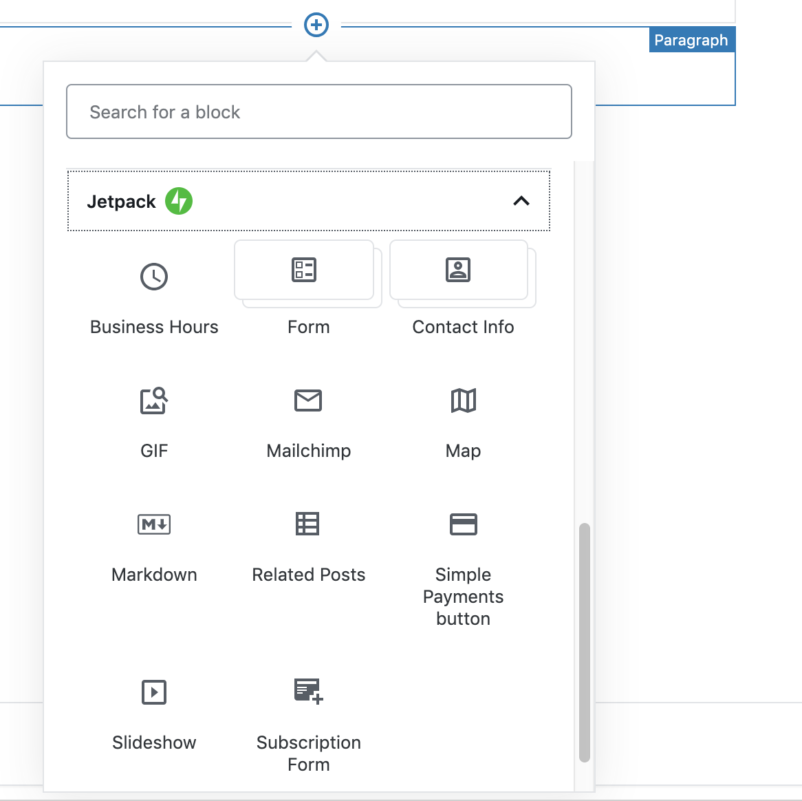
Jetpack, of course, was ahead of the game. Jetpack adds a bunch of special, powerful blocks to Gutenberg that it’s easy to see how useful they can be.
Here they are, as of this writing:
Maps! Subscriptions! GIFs! There are so many good ones. Here’s a look at a few more:
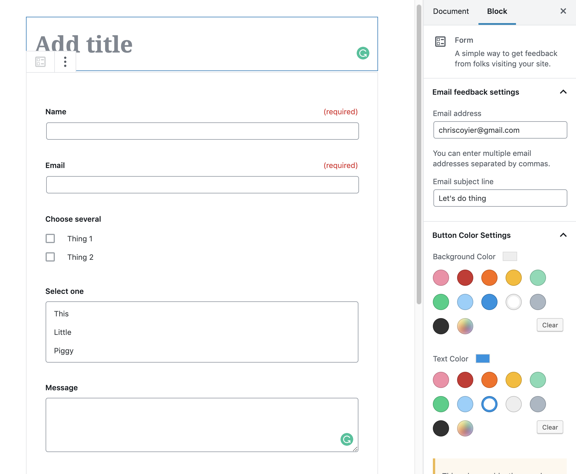
The form widget, I hear, is the most popular.
You get a pretty powerful form builder right within your editor:
Instant Markdown Processing
Jetpack has always enabled Markdown support for WordPress, so it’s nice that there is a Markdown widget!
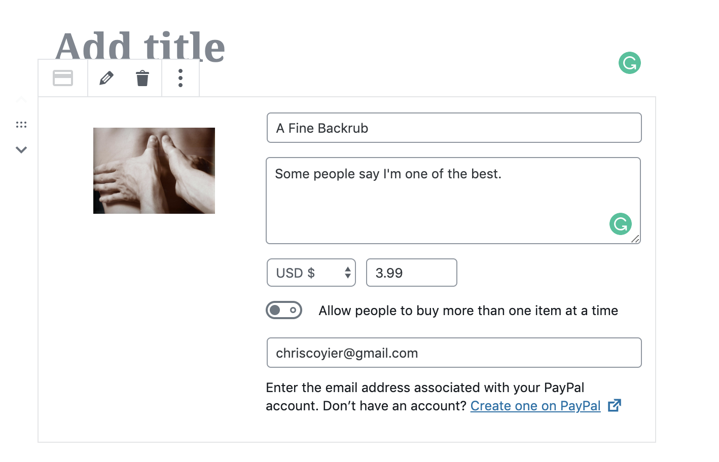
PayPal Selling Blocks
There is even basic eCommerce blocks, which I just love as you can imagine how empowering that could be for some folks.
You can read more about Jetpack-specific Gutenberg blocks in their releases that went out for 6.8 and 6.9. Here at CSS-Tricks, we use a bunch of Jetpack features.
I like Gutenberg, the new WordPress editor. I’m not oblivious to all the conversation around accessibility, UX, and readiness, but I know how hard it is to ship software and I’m glad WordPress got it out the door. Now it can evolve for the better.
I see a lot of benefit to block-based editors. Some of my favorite editors that I use every day, Notion and Dropbox Paper, are block-based in their own ways and I find it effective. In the CMS context, even moreso. Add the fact that these aren’t just souped-up text blocks, but can be anything! Every block is it’s own little configurable world, outputting anything it needs to.
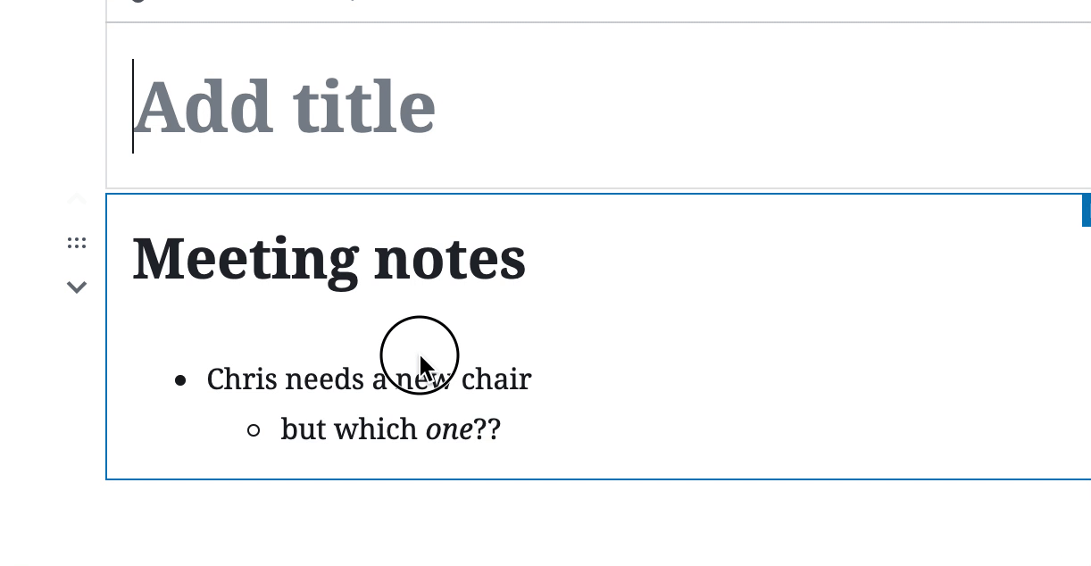
I’m using Gutenberg on a number of sites, including my personal site and my rambling email site, where the content is pretty basic. On a decade+ old website like CSS-Tricks though, we need to baby step it. One of our first steps was moving our newsletter authoring into a Gutenberg setup. Here’s how we’re doing that.
Gutenberg Ramp
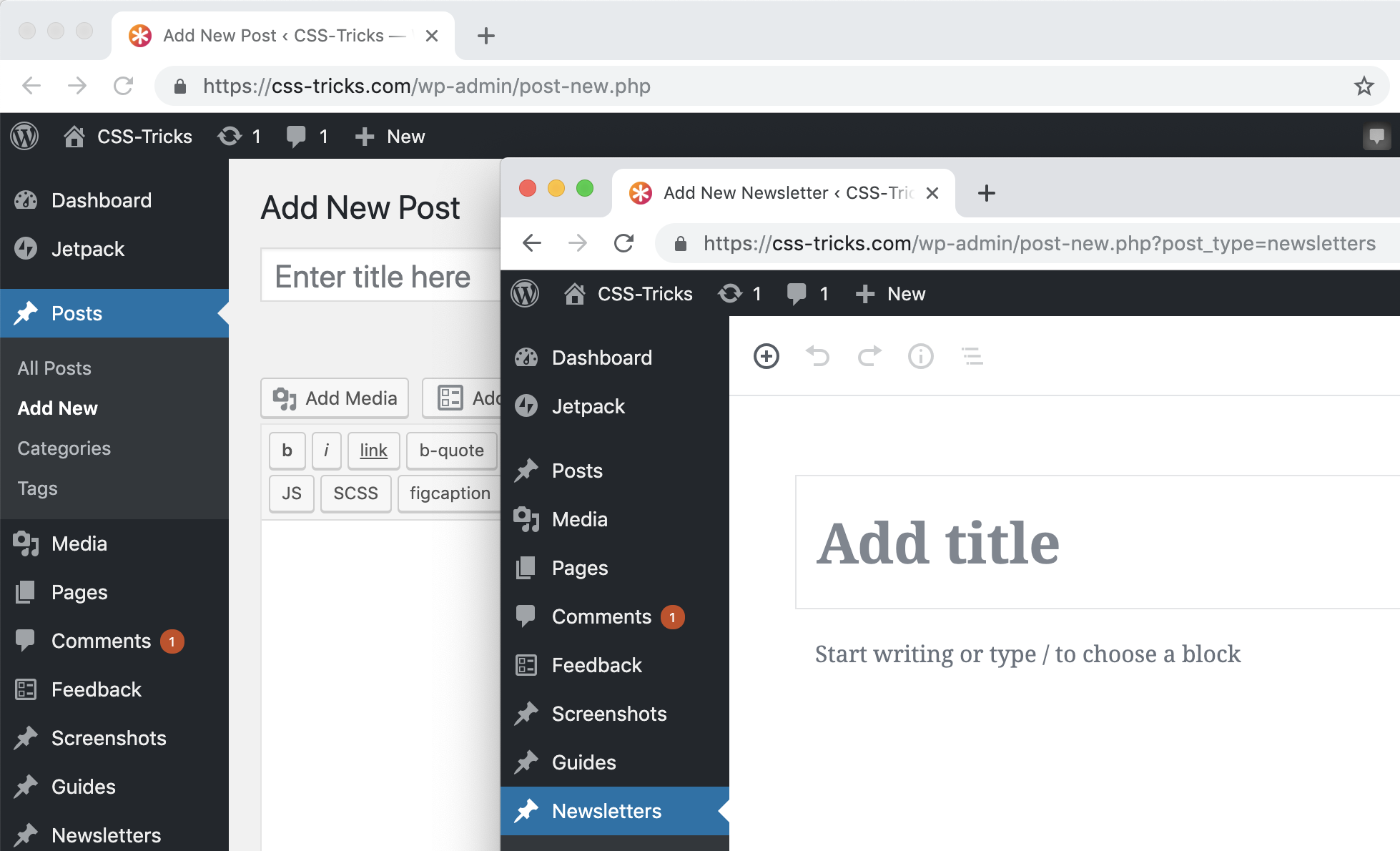
Gutenberg Ramp is a plugin with the purpose of turning Gutenberg on for some areas and not for others. In our case, I wanted to turn on Gutenberg just for newsletters, which is a Custom Post Type on our site. With the plugin installed and activated, I can do this now in our functions.php:
if (function_exists('gutenberg_ramp_load_gutenberg')) {
  gutenberg_ramp_load_gutenberg(['post_types' => [ 'newsletters' ]]);
}
Which works great:
Classic editor for posts, Gutenberg for the Newsletters Custom Post Type
We already have 100+ newsletters in there, so I was hoping to only flip on Gutenberg over a certain date or ID, but I haven’t quite gotten there yet. I did open an issue.
What we were doing before: pasting in HTML email gibberish
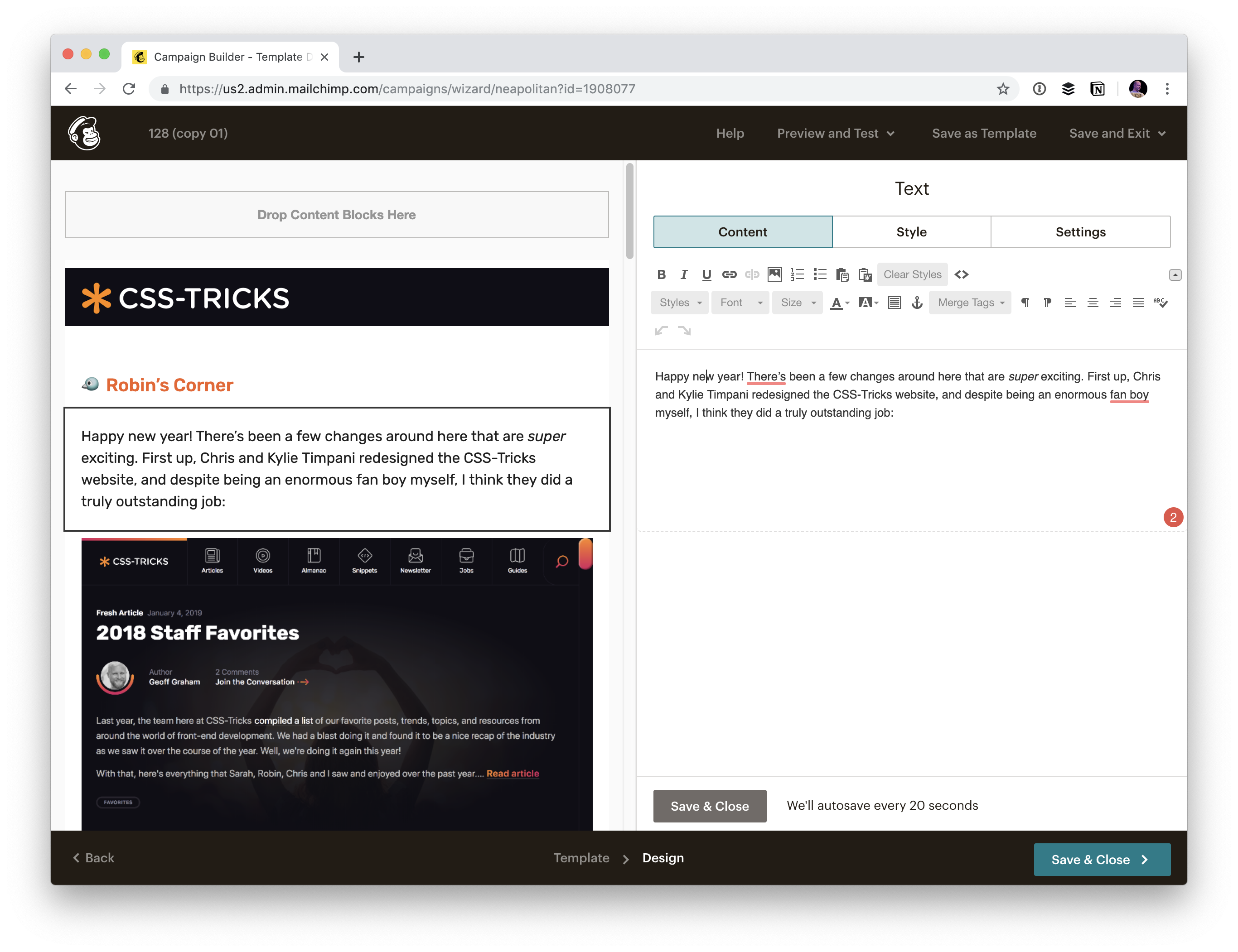
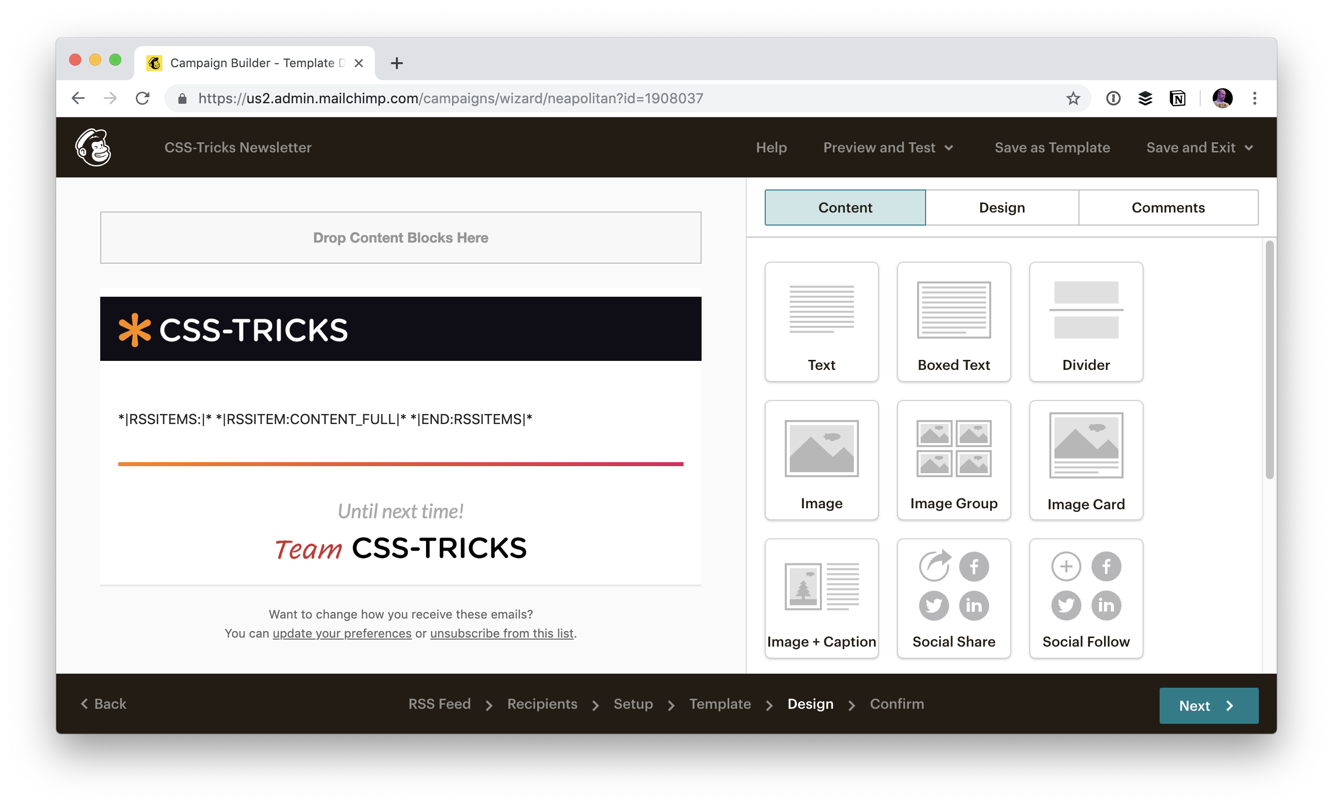
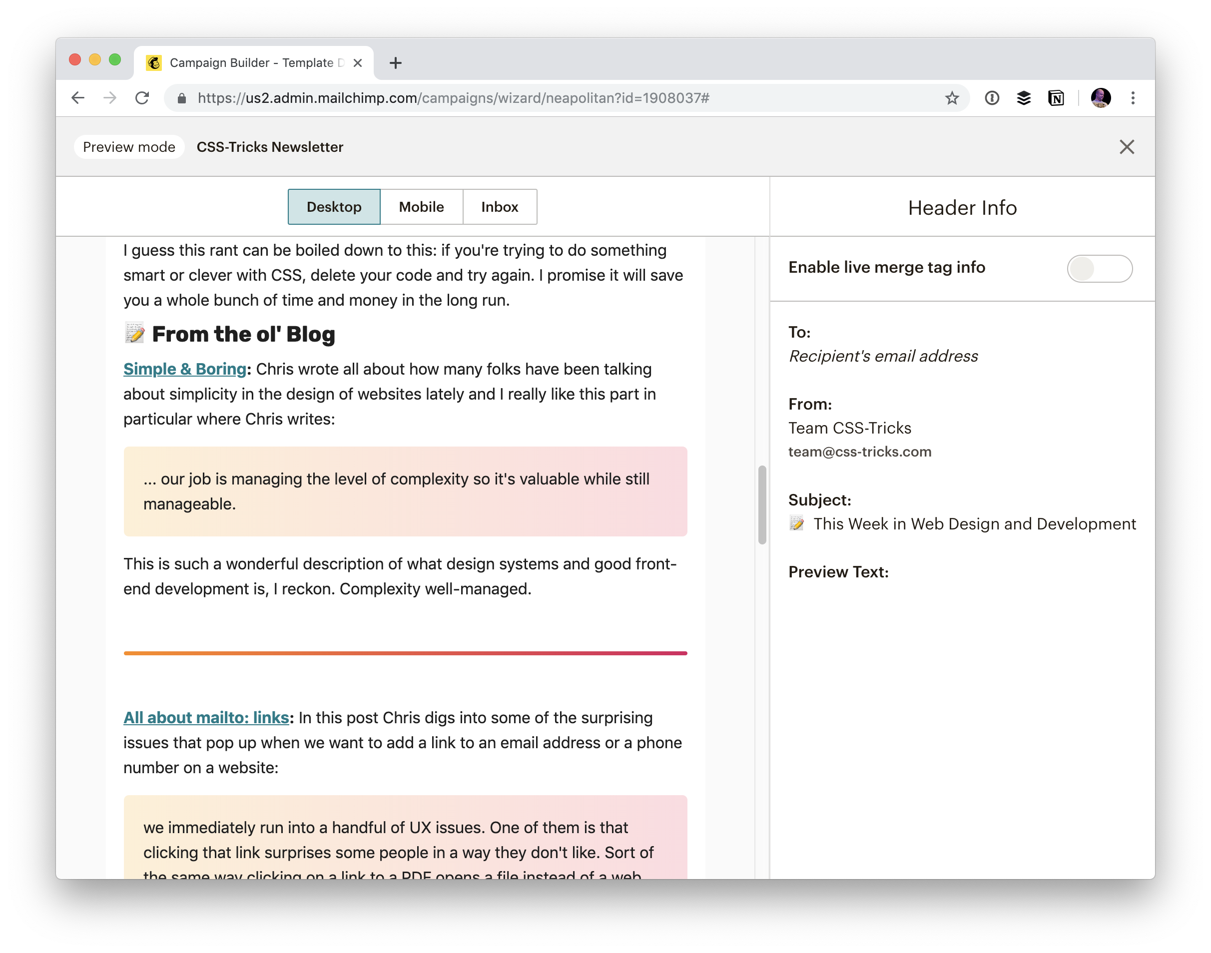
We ultimately send out the email from MailChimp. So when we first started hand-crafting our email newsletter, we made a template in MailChimp and did our authoring right in MailChimp:
The MailChimp Editor
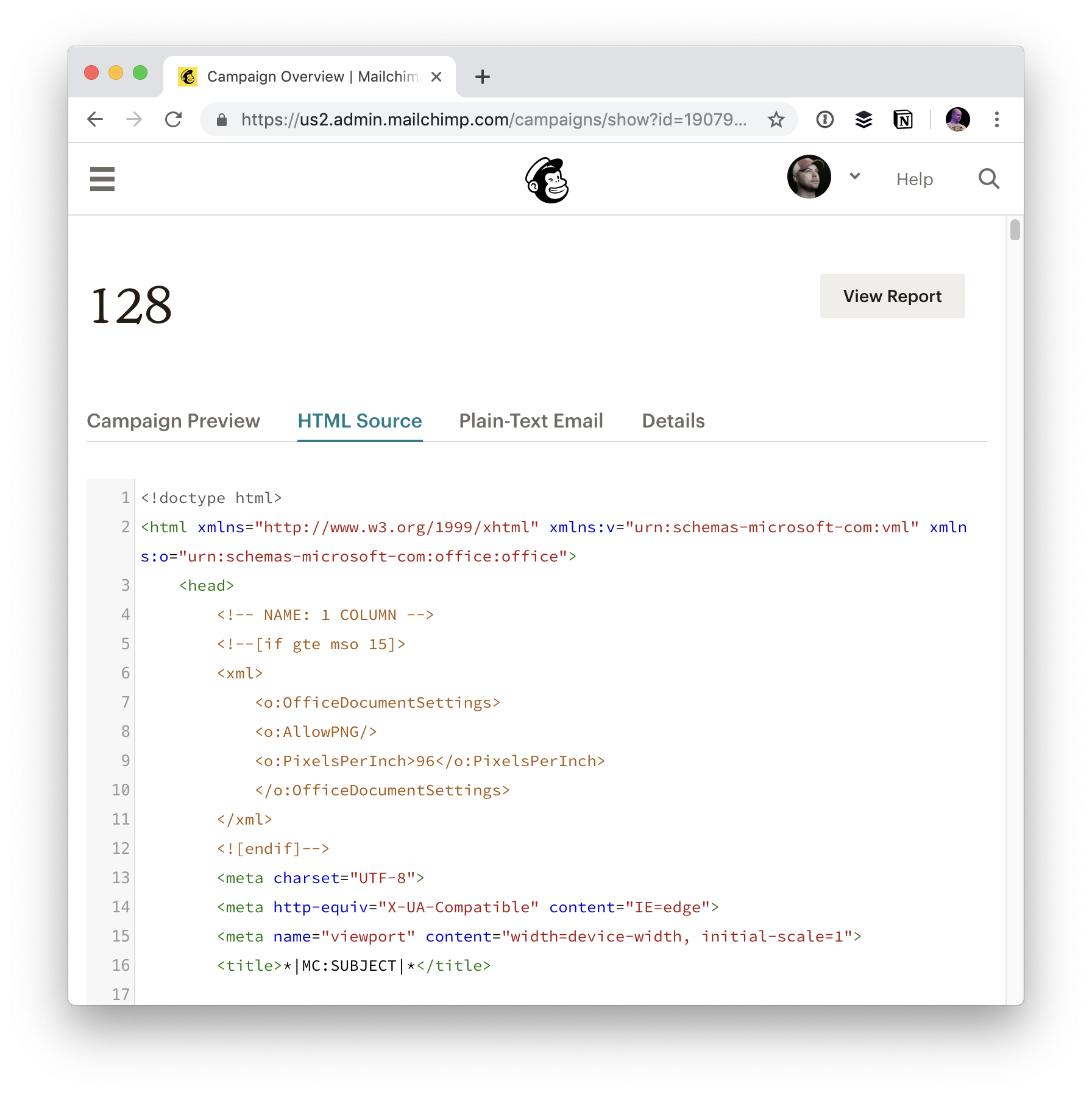
Nothing terrible about that, I just much prefer when we keep the clean, authored content in our own database. Even the old way, we ultimately did get it into our database, but we did it in a rather janky way. After sending out the email, we’d take the HTML output from MailChimp and copy-paste dump it into our Newsletter Custom Post Type.
That’s good in a way: we have the content! But the content is so junked up we can basically never do anything with it other than display it in an as the content is 100% bundled up in HTML email gibberish.
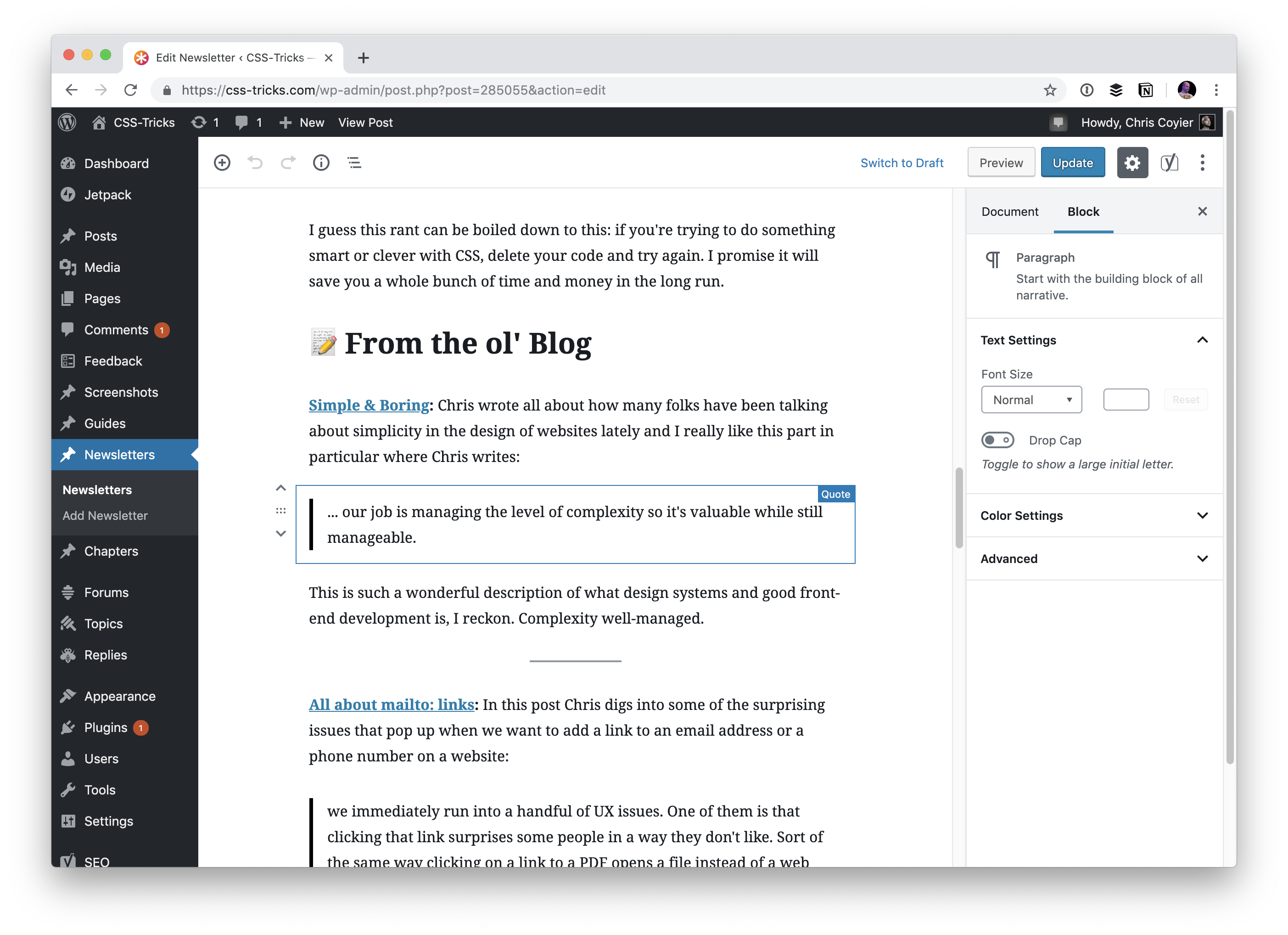
Now we can author cleanly in Gutenberg
I’d argue that the writing experience here is similar (MailChimp is kind of a block editor too), but nicer than doing it directly in MailChimp. It’s so fast to make headers, lists, blockquotes, separators, drag and drop images… blocks that are the staple of our newsletter.
Displaying the newsletter
I like having a permanent URL for each edition of the newsletter. I like that the delivery mechanism is email primarily, but ultimately these are written words that I’d like to be a part of the site. That means if people don’t like email, they can still read it. There is SEO value. I can link to them as needed. It just feels right for a site like ours that is a publication.
Now that we’re authoring right on the site, I can output in a WordPress loop just like any other post or page and get clean output.
But… we have that “old” vs. “new” problem in that old newsletters are HTML dumps, and new newsletters are Gutenberg. Fortunately this wasn’t too big of a problem, as I know exactly when the switch happened, so I can display them in different ways according to the ID. In my `single-newsletters.php`:
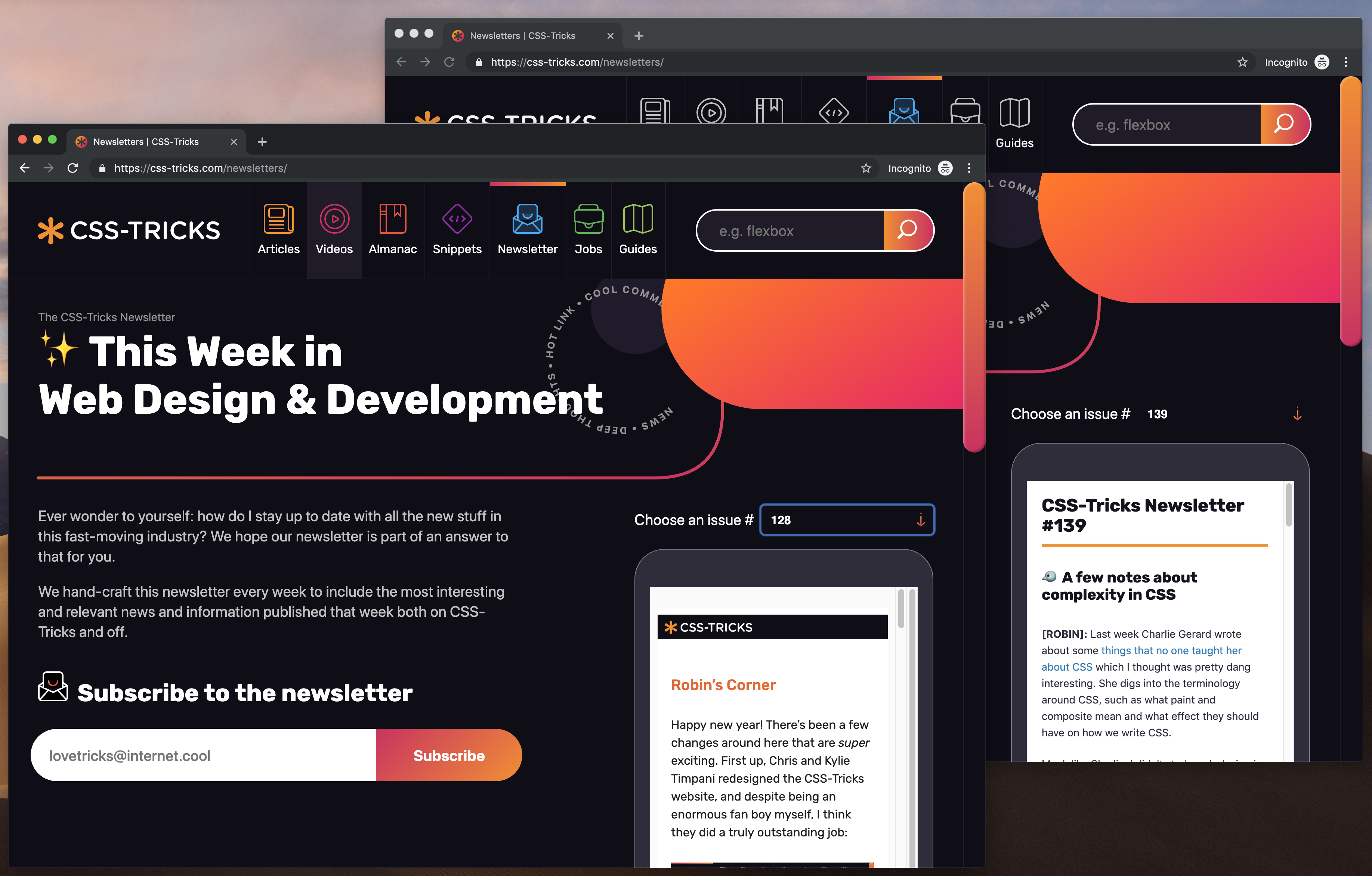
At the moment, the primary way we display the newsletters is in a little faux phone UI on the newsletters page, and it handles both just fine:
Old and new newsletters display equally well, it’s just the old newsletters need to be iframed and I don’t have as much design control.
So how do they actually get sent out?
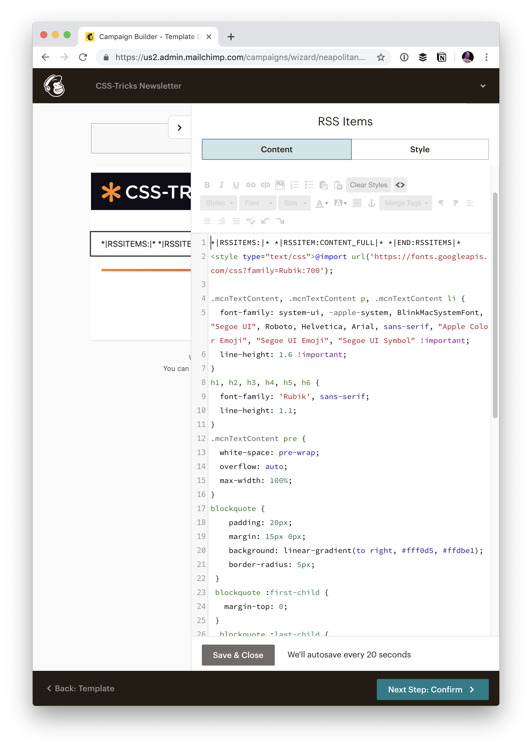
Since we aren’t creating the newsletters inside MailChimp anymore, did we have to find another way to send them out? Nope! MailChimp can send out a newsletter based on an RSS feed.
And WordPress is great at coughing up RSS feeds for Custom Post Yypes. You can do…
/feed/?post_type=your-custom-post-type
But… for us, I wanted to make sure that any of those old HTML dump emails never ended up in this RSS feed, so that the new MailChimp RSS feed would never see them an accidentally send them. So I ended up making a special Page Template that outputs a custom RSS feed. I figured that would give us ultimate control over it if we ever need it for even more things.
With a MailChimp RSS campaign, you still have control over the outside template like any other campaign:
But then content from the feed just kinda gets dumped in there. Fortunately, their preview tool does go grab content for you so you can actually see what it will look like:
And then you can style that by injecting a block into the editor area yourself.
That gives us all the design control we need over the email, and it’s nicely independent of how we might choose to style it on the site itself.
We have a whole selection of ways to align things in CSS today, and it isn’t always an obvious decision which to use. However, knowing what is available means that you can always try a few tactics if you come across a particular alignment problem.
In this article, I will take a look at the different alignment methods. Instead of providing a comprehensive guide to each, I’ll explain a few of the sticking points people have and point to more complete references for the properties and values. As with much of CSS, you can go a long way by understanding the fundamental things about how the methods behave, and then need a place to go look up the finer details in terms of how you achieve the precise layout that you want.
Aligning Text And Inline Elements
When we have some text and other inline elements on a page, each line of content is treated as a line box. The property text-align will align that content on the page, for example, if you want your text centered, or justified. Sometimes, however, you may want to align things inside that line box against other things, for example, if you have an icon displayed alongside text, or text of different sizes.
In the example below, I have some text with a larger inline image. I am using vertical-align: middle on the image to align the text to the middle of the image.
Remember that the line-height property will change the size of the line-box and therefore can change your alignment. The following example uses a large line-height value of 150px, and I have aligned the image to top. The image is aligned to the top of the line box and not the top of the text, remove that line-height or make it less than the size of the image and the image and text will line up at the top of the text.
It turns out that line-height and indeed the size of text is pretty complicated, and I’m not going to head down that rabbit hole in this article. If you are trying to precisely align inline elements and want to really understand what is going on, I recommend reading “Deep Dive CSS: Font Metrics, line-height And vertical-align.”
When Can I Use The vertical-align Property?
The vertical-align property is useful if you are aligning any inline element. This includes elements with display: inline-block. The content of table cells can also be aligned with the vertical-align property.
The vertical-align property has no effect on flex or grid items, and therefore if used as part of a fallback strategy, will cease to apply the minute the parent element is turned into a grid or flex Container. For example, in the next pen, I have a set of items laid out with display: inline-block and this means that I get the ability to align the items even if the browser does not have Flexbox:
In this next pen, I have treated the inline-block as a fallback for Flex layout. The alignment properties no longer apply, and I can add align-items to align the items in Flexbox. You can tell that the Flexbox method is in play because the gap between items that you will get when using display: inline-block is gone.
Now that we do have better ways to align boxes in CSS (as we will look at in the next section), we don’t need to employ the vertical-align and text-align properties in places other than the inline and text elements for which they were designed. However, they are still completely valid to use in those text and inline formats, and so remember if you are trying to align something inline, it is these properties and not the Box Alignment ones that you need to reach for.
Box Alignment
The Box Alignment Specification deals with how we align everything else. The specification details the following alignment properties:
justify-content
align-content
justify-self
align-self
justify-items
align-items
You might already think of these properties as being part of the Flexbox Specification, or perhaps Grid. The history of the properties is that they originated as part of Flexbox, and still exist in the Level 1 specification; however, they were moved into their own specification when it became apparent that they were more generally useful. We now also use them in Grid Layout, and they are specified for other layout methods too, although current browser support means that you won’t be able to use them just yet.
Therefore, next time someone on the Internet tells you that vertical alignment is the hardest part of CSS, you can tell them this (which even fits into a tweet):
In the future, we may even be able to dispense with display: flex, once the Box Alignment properties are implemented for Block Layout. At the moment, however, making the parent of the thing you want centering a flex container is the way to get alignment horizontally and vertically.
The Two Types Of Alignment
When aligning flex and grid items, you have two possible things to align:
You have the spare space in the grid or flex container (once the items or tracks have been laid out).
You also have the item itself inside the grid area you placed it in, or on the cross axis inside the flex container.
I showed you a set of properties above, and the alignment properties can be thought of as two groups. Those which deal with distribution of spare space, and those which align the item itself.
Dealing With Spare Space: align-content And justify-content
The properties which end in -content are about space distribution, so when you choose to use align-content or justify-content you are distributing available space between grid tracks or flex items. They don’t change the size of the flex or grid items themselves; they move them around because they change where the spare space goes.
Below, I have a flex example and a grid example. Both have a container which is larger than required to display the flex items or grid tracks, so I can use align-content and justify-content to distribute that space.
Moving Items Around: justify-self, align-self, justify-items And align-items
We then have align-self and justify-self as applied to individual flex or grid items; you can also use align-items and justify-items on the container to set all the properties at once. These properties deal with the actual flex or grid item, i.e. moving the content around inside the Grid Area or flex line.
Grid Layout
You get both properties as you can shift the item on the block and inline axis as we have a defined Grid Area in which it sits.
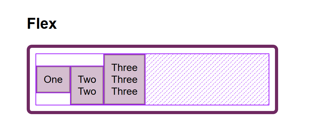
Flex Layout
You can only align on the cross axis as the main axis is controlled by space distribution alone. So if your items are a row, you can use align-self to shift them up and down inside the flex line, aligning them against each other.
In my example below, I have a flex and a grid container, and am using align-items and align-self in Flexbox to move the items up and down against each other on the cross axis. If you use Firefox, and inspect the element using the Firefox Flexbox Inspector, you can see the size of the flex container and how the items are being moved vertically inside of that.
Aligned flex items with the flex container highlighted in Firefox (Large preview)
In grid, I can use all four properties to move the items around inside their grid area. Once again, the Firefox DevTools Grid Inspector will be useful when playing with alignment. With the grid lines overlaid, you can see the area inside which the content is being moved:
Aligned grid items with the Grid highlighted in Firefox (Large preview)
Play around with the values in the CodePen demo to see how you can shift content around in each layout method:
One of the cited issues with people remembering the alignment properties in Grid and Flexbox, is that no one can remember whether to align or to justify. Which direction is which?
For Grid Layout, you need to know if you are aligning in the Block or Inline Direction. The Block direction is the direction blocks lay out on your page (in your writing mode), i.e. for English that is vertically. The Inline direction is the direction in which sentences run (so for English that is left to right horizontally).
To align things in the Block Direction, you will use the properties which start with align-. You use align-content to distribute space between grid tracks, if there is free space in the grid container, and align-items or align-self to move an item around inside the grid area it has been placed in.
The below example has two grid layouts. One has writing-mode: horizontal-tb (which is the default for English) and the other writing-mode: vertical-rl. This is the only difference between them. You can see that the alignment properties which I have applied work in exactly the same way on the block axis in both modes.
To align things in the inline direction, use the properties which begin with justify-. Use justify-content to distribute space between grid tracks, and justify-items or justify-self to align items inside their grid area in the inline direction.
Once again, I have two grid layout examples so that you can see that inline is always inline — no matter which writing mode you are using.
Flexbox is a little trickier due to the fact that we have a main axis which can be changed to row or column. So, let’s first think about that main axis. It is set with the flex-direction property. The initial (or default) value of this property is row which will lay the flex items out as a row in the writing mode currently in use — this is why when working in English, we end up with items laid out horizontally when we create a flex container. You can then change the main axis to flex-direction: column and the items will be laid out as a column which means they are laid out in the block direction for that writing mode.
As we can do this axis switching, the most important factor in Flexbox is asking, “Which axis is my main axis?” Once you know that, then for alignment (when on your main axis) you simply use justify-content. It doesn’t matter if your main axis is row or column. You control space between the flex items with justify-content.
On the cross axis, you can use align-items which will align the items inside the flex container or flex line in a multi-line flex container. If you have a multi-line container using flex-wrap: wrapand have space in that container, you can use align-content to distribute the space on the cross axis.
In the example below, we are doing both with a flex container displayed as a row and a column:
The justify-content and align-content properties in Grid and Flexbox are about distributing extra space. So the thing to check is that you have extra space.
Here is a Flex example: I have set flex-direction: row and I have three items. They don’t take up all of the space in the flex container, so I have spare space on the main axis, the initial value for justify-content is flex-start and so my items all line up at the start and the extra space is at the end. I am using the Firefox Flex Inspector to highlight the space.
The spare space at the end of the container (Large preview)
If I change flex-direction to space-between, that extra space is now distributed between the items:
The spare space is now between the items (Large preview)
If I now add more content to my items so they become larger and there is no longer any additional space, then justify-content does nothing — simply because there is no space to distribute.
A common question I’m asked is why justify-content isn’t working when flex-direction is column. This is generally because there is no space to distribute. If you take the above example and make it flex-direction: column, the items will display as a column, but there will be no additional space below the items as there is when you do flex-direction: row. This is because when you make a Flex Container with display: flex you have a block level flex container; this will take up all possible space in the inline direction. In CSS, things do not stretch in the block direction, so no extra space.
The column is only as tall as needed to display the items (Large preview)
Add a height to the container and — as long as that is more than is required to display the items — you have extra space and therefore justify-content will work on your column.
Adding a height to the container means we have spare space (Large preview)
Why Is There No justify-self In Flexbox?
Grid Layout implements all of the properties for both axes because we always have two axes to deal with in Grid Layout. We create tracks (which may leave additional space in the grid container in either dimension,) and so we can distribute that space with align-content or justify-content. We also have Grid Areas, and the element in that area may not take up the full space of the area, so we can use align-self or justify-self to move the content around the area (or align-items, justify-items to change the alignment of all items).
Flexbox does not have tracks in the way that Grid layout does. On the main axis, all we have to play with is the distribution of space between the items. There is no concept of a track into which a flex item is placed. So there is no area created in which to move the item around in. This is why there is no justify-self property on the main axes in Flexbox.
Sometimes, however, you do want to be able to align one item or part of the group of items in a different way. A common pattern would be a split navigation bar with one item being separated out from the group. In that situation, the specification advises the use of auto margins.
An auto margin will take up all of the space in the direction it is applied, which is why we can center a block (such as our main page layout) using a left and right margin of auto. With an auto margin on both sides, each margin tries to take up all the space and so pushes the block into the middle. With our row of flex items, we can add margin-left: auto to the item we want the split to happen on, and as long as there is available space in the flex container, you get a split. This plays nicely with Flexbox because as soon as there is no available space, the items behave as regular flex items do.
One of the things I think is often overlooked is how useful Flexbox is for doing tiny layout jobs, where you might think that using vertical-align is the way to go. I often use Flexbox to get neat alignment of small patterns; for example, aligning an icon next to text, baseline aligning two things with different font sizes, or making form fields and buttons line up properly. If you are struggling to get something to line up nicely with vertical-align, then perhaps try doing the job with Flexbox. Remember that you can also create an inline flex container if you want with display: inline-flex.
There is no reason not to use Flexbox, or even Grid for tiny layout jobs. They aren’t just for big chunks of layout. Try the different things available to you, and see what works best.
People are often very keen to know what the right or wrong way to do things is. In reality, there often is no right or wrong; a small difference in your pattern might mean the difference between Flexbox working best, where otherwise you would use vertical-align.
Wrapping Up
To wrap up, I have a quick summary of the basics of alignment. If you remember these few rules, you should be able to align most things with CSS:
Are you aligning text or an inline element? If so, you need to use text-align, vertical-align, and line-height.
Do you have an item or items you want to align in the center of the page or container? If so, make the container a flex container then set align-items: center and justify-content: center.
For Grid Layouts, the properties that start with align- work in the Block direction; those which start with justify- work in the inline direction.
For Flex Layouts, the properties that start with align- work on the Cross Axis; those which start with justify- work on the main axis.
The justify-content and align-content properties distribute extra space. If you have no extra space in your flex or grid container, they will do nothing.
If you think you need justify-self in Flexbox, then using an auto margin will probably give you the pattern you are after.
You can use Grid and Flexbox along with the alignment properties for tiny layout jobs as well as main components — experiment!
For more information about alignment, see these resources:
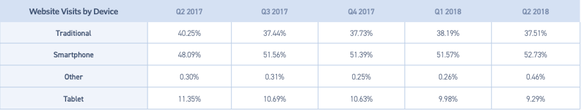
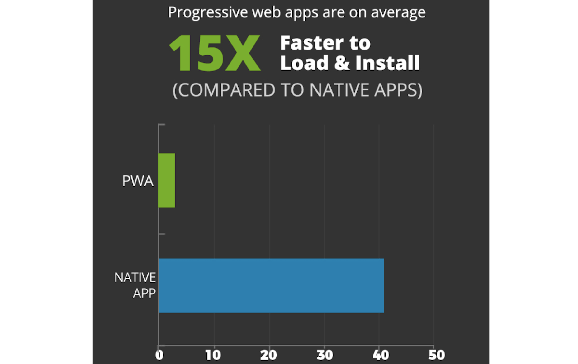
The good news is that smartphones drive significantly more traffic to websites than all other devices with 52.73%:
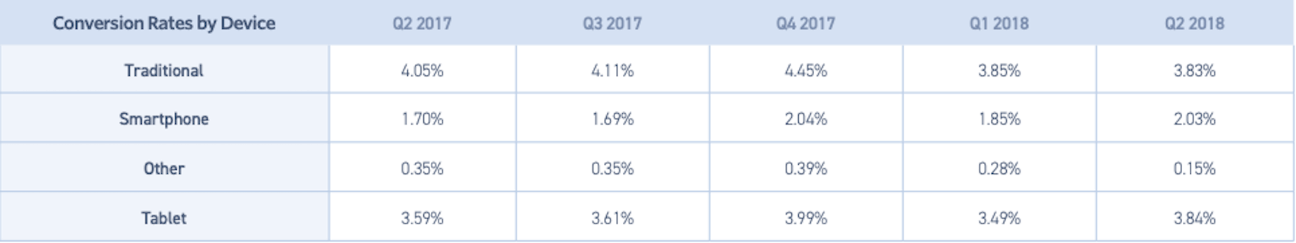
But conversions? Ehhhh…
Smartphone conversions lag behind all other devices with 2.03%.
It’s not just conversion rates that are low either. There are also fewer pages looked at, which means engagement rates suffer on the mobile web, too.
It’s no wonder, then, why businesses want to create mobile apps. According to a Criteo Mobile Commerce Growth report from 2017, mobile apps convert at a rate of 3x their web counterparts.
That said, no matter how well users convert on mobile apps, the cost to build and maintain one is out of reach for many businesses. So, what do you do when your client wants to capitalize on this mobile-first world? Tell them to be content with the mobile web for now?
Nope! It’s time to turn their attention to progressive web apps.
What Is a Progressive Web App?
In the simplest of terms, progressive web apps (or PWAs) bridge the gap between the mobile web and mobile apps. They take a basic set of components — an app shell, service workers, and app manifest — then serve them through HTTPS to give users the convenience of the mobile web within an app-like experience.
Google has a bunch of starter guides that will walk you through the process of building a PWA from-scratch, in case you’re interested in learning more.
PWAs are:
Secure
They must run through HTTPS, which makes them inherently more secure than mobile websites that don’t always have SSL certificates in place.
Unlike mobile apps that tend to drain battery power and bandwidth, PWAs don’t have that problem since they’re served over the web.
Searchable
Users don’t have to dig through an app store to find a PWA. They can find them in their mobile search browser as this search for Flipkart‘s PWA demonstrates:
That also means less work for you.
Prepping information and screenshots for an app store listing takes time. If you’re already doing SEO for your clients’ websites, then you can just use that for your PWA.
And working with each of the individual app store’s rules and timelines (because you have to submit separately to Apple and Google) is a pain. Whether you’re launching an app or pushing an update through, launch will never truly be predictable as their teams have to review and approve your app first.
PWAs, again, are much easier. You own it all, which means that when someone searches for and finds the PWA in search, the latest and greatest version is what they’ll encounter. There’s no red tape here.
Convenient
PWAs can be saved to mobile home screens the way apps can, too. For example, here is the Weather Channel PWA:
Users can then save it to their home screen, so that the icon displays alongside their other apps:
If you want to help mobile users get the most out of it, let them know it’s easy to get one-click access to with a small popup notification.
Online / Offline
PWAs are a really great choice for businesses that want to get the mobile face of their company into the hands of a global audience. For visitors that live in remote areas or ones that simply have unreliable Internet access, the offline storage component of PWAs make them the obvious choice over mobile websites.
Feature-rich
Unlike mobile websites which are limited by the technology sitting behind them, PWAs are like mobile apps in that they can leverage a smartphone’s features. While PWAs don’t have the ability to directly integrate with mobile apps, they can sync up with your users’ telephony features (like push notifications).
Great Looking
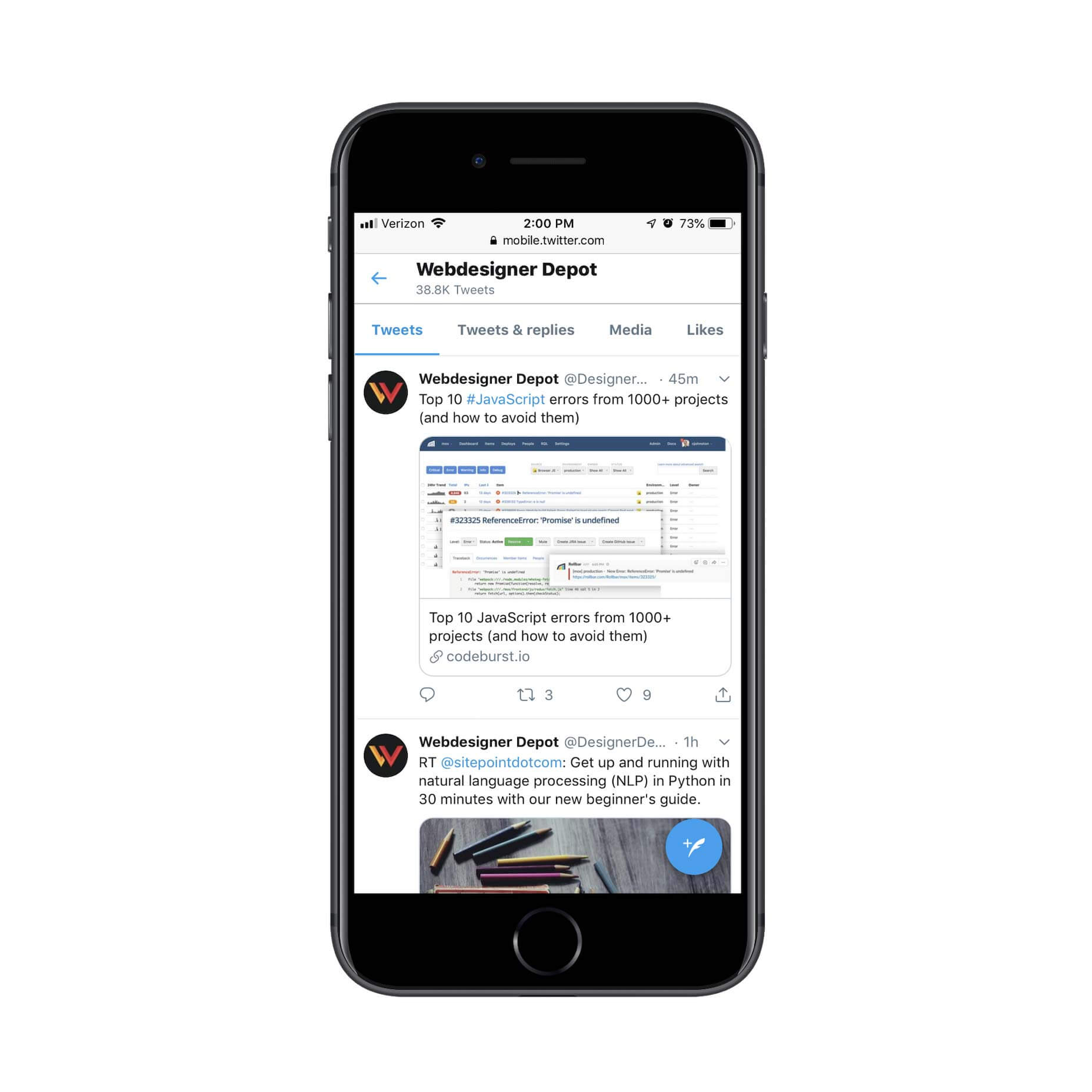
Building a website that works just as well for desktop as it does for mobile can be a challenge. Thanks to the app shell, a PWA has a significantly improved and upgraded look from a standard website on mobile.
Notice how the stream of content fits beautifully within the borders of the page. Also, check out the header and blue new tweet button. These elements hold firm no matter where visitors go on the Twitter website or how far down the page they scroll.
You can also greatly improve the UI of things like internal search and filtering as Housing.com does:
By improving the look and functionality of your web presence with a PWA, you’ll encourage more mobile users to engage.
PWAs Are Engaging!
All of the elements above will certainly help drive up engagement rates and conversions if you’re making the switch from a mobile website to a PWA. There’s plenty of proof online that demonstrates how and why this happens, too:
AliExpress saw twice as many mobile visitors and an 82% increase in iOS user conversion rate alone after switching to a PWA.
Lancome decreased the time it took their mobile web page to become interactive by 84%. In turn, their bounce rate dropped by 15% and they had a 17% boost in conversions.
MakeMyTrip used their PWA’s increased speeds to increase shopping sessions by 160% and conversions by 300%.
Needless to say, your clients don’t need to feel trapped or held back by the constraints of the mobile web. While it’s still important to have a presence there to start, the PWA is where they should be headed next. It’s cheaper and easier to build than a mobile app and there’s a lot to be gained in terms of engagements and conversions.
(This is a sponsored article.) In early discussions you have with clients about the website you’re tasked with designing, does the topic of web hosting ever come up? My guess is that it’s not something your clients give much thought to, waving it away with:
“Just give me the cheapest, no-frills hosting.”
I get why they’d think that way. For starters, they’re paying you a large sum of money to design the site. Of course, they’re going to look to other areas to offset those costs. Because server technology is rarely understood by the people who own websites, it’s easy for them to mistakenly think they can save money there.
Here’s the problem though:
As a website grows in authority and expands its reach, security and performance problems will arise if the hosting configuration isn’t prepared to handle it.
In the following article, I’m going to show you why clients need the power of VPS hosting behind the websites you design for them. And why you — the administrator — need a tool like the Plesk control panel to manage it.
The Web Designer’s Connection to Web Hosting
In many cases, people get stuck being the go-to person for one highly specialized task at the companies they work for. This person handles the marketing. This person manages inventory. This person coordinates client meetings.
One of the things I love about working with websites is that there are so many new things to learn about and other areas to branch out to. If you don’t want to be relegated to building website after website, day in and day out, there are ways to expand your offering and become the total end-to-end solution provider for clients.
In my opinion, web hosting is one of the areas you should look to for expansion. Now, I’m not saying you should become a reseller of hosting or anything like that. All I mean is that it would be beneficial to understand how the technology behind a website affects the outcomes of what you’ve built.
For example:
An underpowered hosting plan fails to handle influxes of traffic, which leads to slower page speeds and a drop in conversion rates.
Occasional downtime on the website leaves visitors wondering if it’s even worth going to the site if its availability is unreliable.
There’s a high demand for the inventory sold on the site, but potential customers are too nervous to pull the trigger since security seems to be non-existent.
Even if you’re not the one responsible for the server technology your client’s site sits on, you can see how this sort of thing could have a negative effect on your business. You build an amazing website that aims to do exactly what your client wanted, but the server technology is holding it back.
Who do you think the client is going to blame in that case?
Rather than let it get that far, I’d suggest you engage your clients early on in conversations about their web hosting. As we move on, I’m going to present you with specific arguments you should be prepared to make regarding the hosting as well as how it’s managed.
An Introduction To VPS Hosting
When it comes to choosing the right hosting for your clients’ websites, there’s a lot to think about:
Who Should You Entrust Your Website To?
There are thousands of web hosting companies to choose from. But in terms of reliability? That list could easily be narrowed down to less than a hundred.
HostGator has been a web hosting company I’ve recommended to clients for years, especially ones who need a powerful hosting solution like Plesk VPS hosting. If your client doesn’t have a strong preference of provider, start here.
What Type Of Web Hosting Will Serve Your Website And Audience Best?
This is what you need to know about the different kinds of web hosting:
Shared Hosting
This is the cheapest form of hosting available and probably the one your clients will be most inclined to purchase.
The hosting provider designates a section of a web server to a number of clients who will then share the resources. This means there are strict limitations set on how much bandwidth and storage a website can use, but very little you can do to control any of it — especially if another website in the shared server space hogs the resources.
It’s this last point that’s especially problematic on shared hosting. Although your hosting plan might indicate you get X amount of memory, it’s actually a cap on how much you might have access to if no one else is using resources from the server at the same time. In reality, it’s very likely you’ll run into lack of memory errors due to this limitation quite frequently.
Shared hosting is fine for small, personal blogs or private websites. Not for serious businesses.
Cloud Hosting
This is similar to shared hosting except that it’s more secure and stable.
Rather than relegate a website to one specific segment of a web server, the site is hosted across a number of servers. That way, if one server experiences an outage or another website compromises the performance of others around it, your website can safely be hosted elsewhere.
That said, there are still a number of limitations that come from cloud hosting. If your website is for a growing business, but you don’t expect a lot of traffic to it (say, if it were a simple portfolio), cloud hosting would be a good choice.
Dedicated Hosting
This is the most robust form of web hosting, which also makes it the most expensive.
As the name indicates, your hosting company will lease you an entire server to host your website. So, think of this like shared hosting, but on steroids. As you can imagine, when you have your own server environment, it greatly reduces the risk of anyone else compromising the performance of your website.
That said, there is a lot more work involved in managed a dedicated hosting account and the website on it. This is really only best for large enterprises, social networks, e-commerce sites and others that require this type of extreme web hosting.
VPS Hosting
This stands for “virtual private server”. The name alone should give you a good idea of how this differs from the other kinds of hosting already mentioned.
In sum, a virtual private server is like a scaled-back version of dedicated hosting. Instead of having an entire server to yourself, the web hosting company carves out a dedicated portion of the server and personalizes its settings for you. Although you share the server with other VPS clients, you don’t share the resources with anyone else. You get exactly what you pay for.
Here are some other highlights of VPS hosting:
It’s faster and more secure than shared or cloud hosting.
It’s cheaper than dedicated hosting.
It’s custom-tailored to your needs, but still allows you to take more control over your server configuration.
Bottom line: VPS is an overall better hosting solution for growing businesses.
How Will You Manage Your Web Hosting Account?
There’s one more question you have to ask yourself before you commit to a new hosting provider and plan.
Because VPS hosting is more complex and requires a greater degree of management than a set-it-and-forget-it type of hosting like shared or cloud, you need a control panel you can rely on.
So, let’s explore the Plesk panel and take a look at what you can do to maximize the management of your new website with it.
It won’t take long to realize that Plesk is not like other control panel solutions. The website will help clarify some of this for you, but I’d like to give you an inside look at the control panel so you can see for yourself.
A Universally Friendly Control Panel
Plesk is one of those tools you step inside of and immediately realize you made the right choice. With a very short learning curve, Plesk is a highly intuitive control panel solution that’s great for anyone:
Plesk is a universally user-friendly platform. (Image source: Large preview)
In all honesty, I don’t know how much time your clients will spend inside the control panel. When I’ve managed and built websites for clients in the past, just asking for login credentials to their hosting account tended to be a real chore.
“What’s hosting? Is that WordPress? I don’t think I need that.”
Regardless of whether they want or know what to do with a control panel, Plesk provides a user-friendly experience regardless of who the user is as well as their level of comfort with website management. I’ll show you why in this next example.
Words cannot describe how frustrating it is to ask clients to complete simple tasks. (Source)
Great Interface For Clients And Other End Users
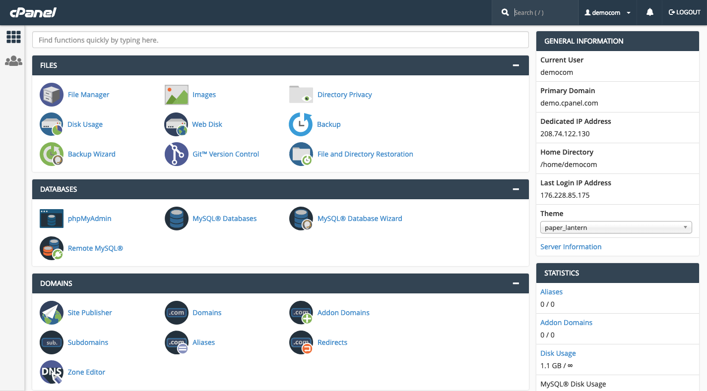
If you’ve ever tried to use cPanel to manage hosting and domain services, you know how overwhelming it can be to use.
If you’re not familiar with it, this is typically what cPanel looks like upon first logging in:
This is how the cPanel interface (meant for end users) looks like. (Image source: cPanel) (Large preview)
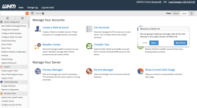
If you plan on reselling or managing hosting for your cPanel clients, then you’ll need to use a separate dashboard called WHM:
There’s a navigation and sub-navigation bar at the top, which makes management options seem simple enough.
Then, you’re presented with individual actions you can take to manage hosting, your website or email accounts within the control panel itself. This is just too much — even for technically-minded clients who know what the heck they’re looking for.
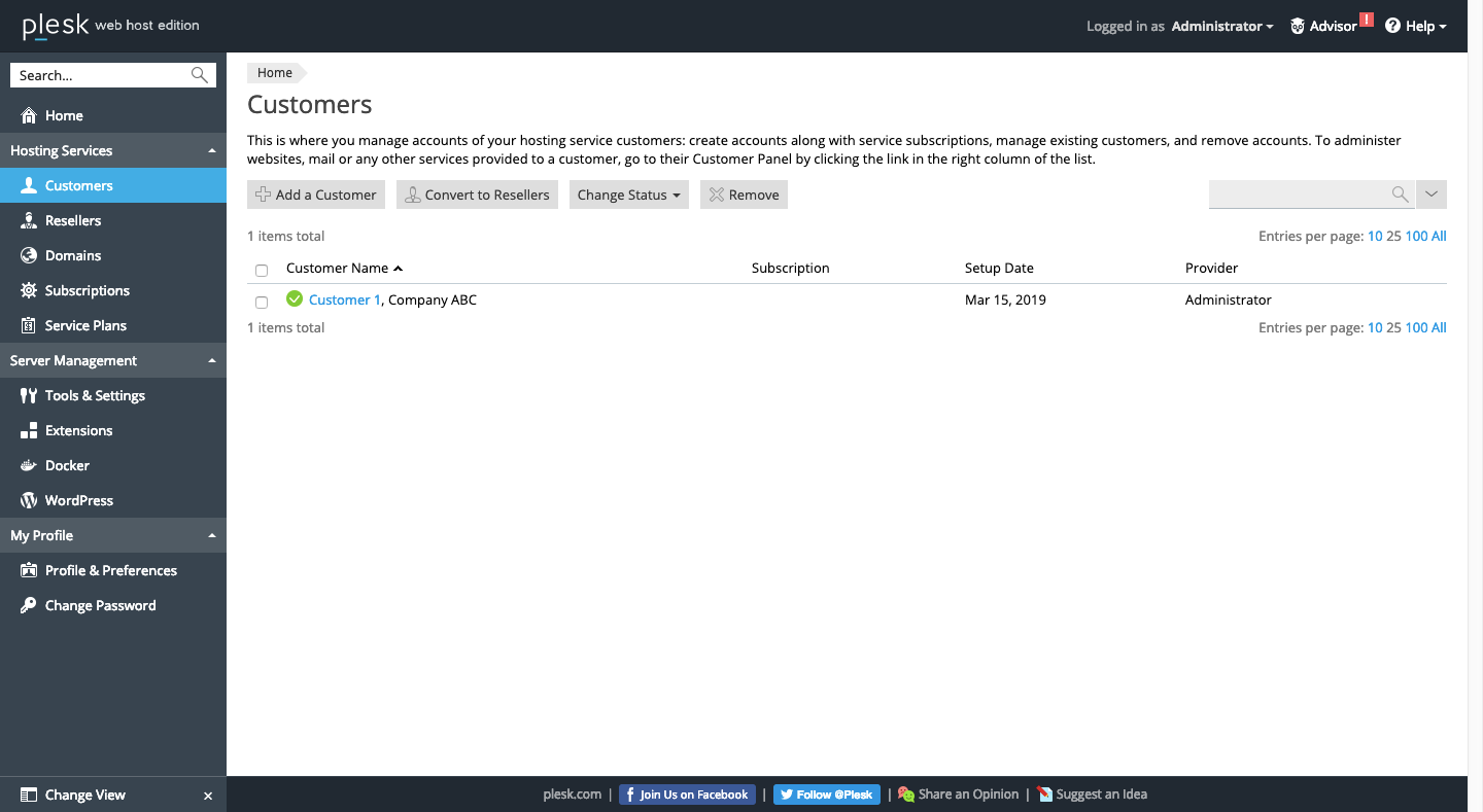
Now, check out the Plesk interface for power users:
This is insanely well-organized and clearly labeled. If your clients or other novice users were to step inside of Plesk, they’d instantly know where to go as well as which actions they could possibly take from the sidebar alone.
It gets better within each of the individual modules. For instance:
An example of the clean layout of the Plesk UI. (Source: Plesk) (Large preview)
This is what the Tools & Settings page looks like. As you can see, it’s not bogged down by a barrage of icons for each setting. Instead, it presents options in a succinct and well-organized manner, which will greatly reduce friction that might otherwise exist in a tool of this nature.
Great Interface For Designers And Developers
Plesk offers an alternative “service provider” view for web developers and designers:
A look at the Plesk service provider interface for developers. (Source: Plesk) (Large preview)
It looks a lot like the power user view, except you can see that the sidebar is broken up into different modules. What I like about this is that it encourages developers to manage more of their business from one tool instead of a variety of business management tools.
From within Plesk, you can:
Add new customer accounts and manage them from one dashboard.
Adding and managing customers in Plesk is easy. (Source: Plesk) (Large preview)
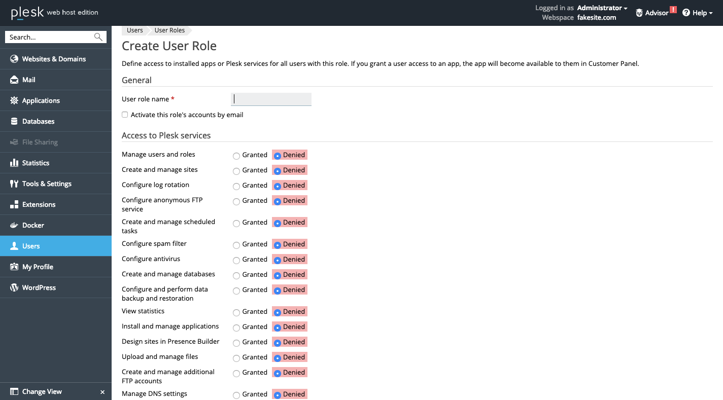
Customize what they do and see in their “power user” view of Plesk. This helps keep server and website management under control.
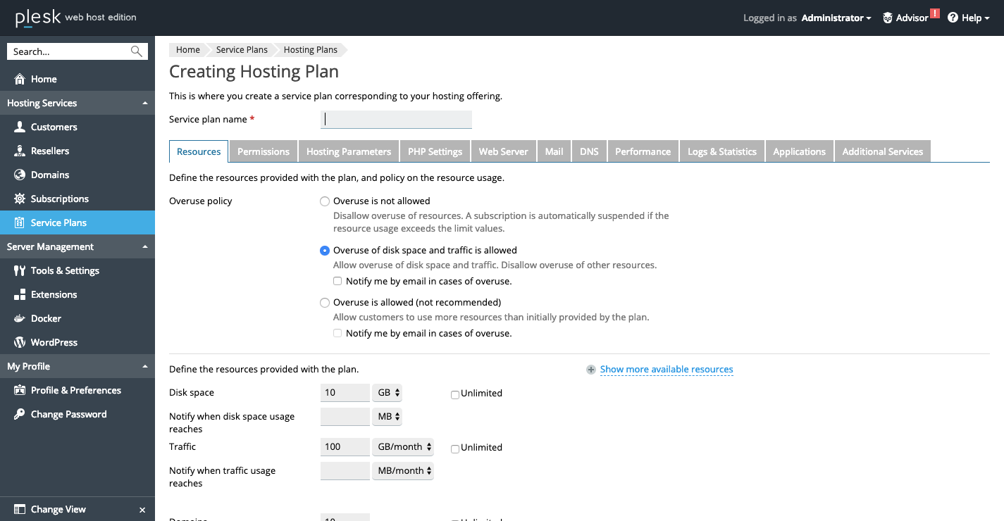
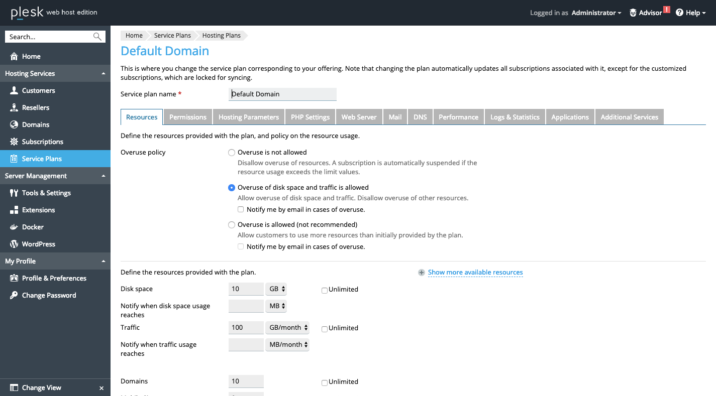
Customize nearly every aspect of your clients’ server configurations. Like disk space:
It’s easy to configure your server with Plesk. (Source: Plesk) (Large preview)
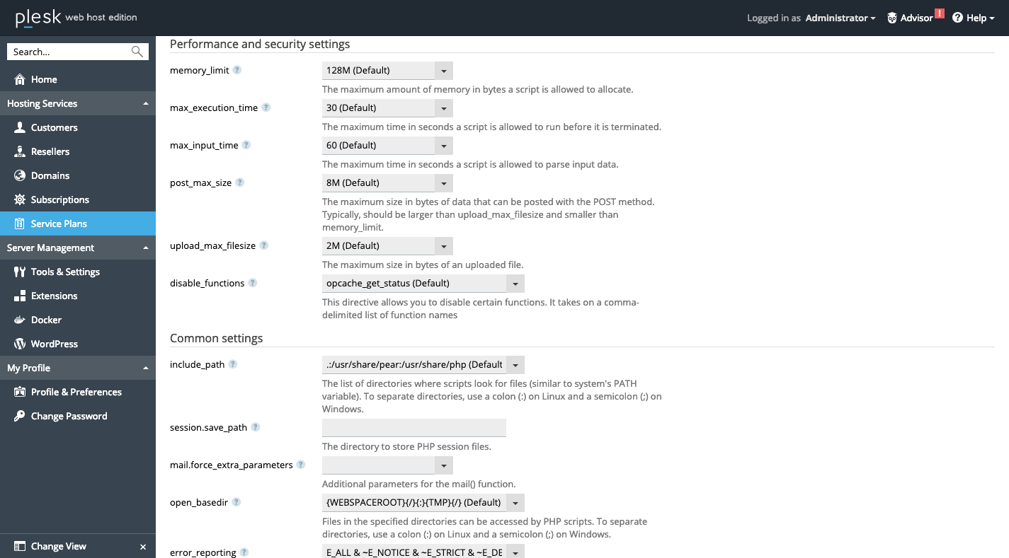
Manage the essentials to ensure the server runs in tip-top shape. For instance, here are some of the PHP settings for security and performance:
Security and performance controls are a priority in Plesk. (Source: Plesk) (Large preview)
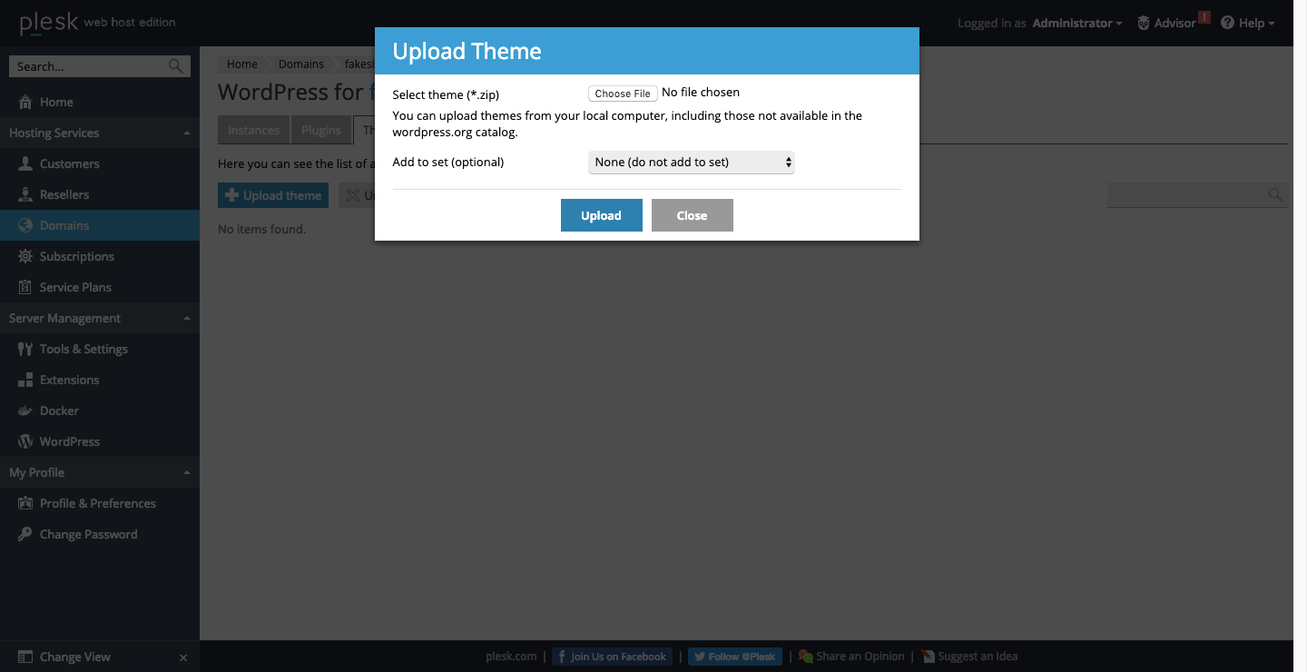
Manage things like plugins, themes and more if you build websites with WordPress.
Plesk users can control various WordPress settings and tools inside of the control panel. (Source: Plesk) (Large preview)
If you’ve ever been frustrated with the management piece of your business or felt that your ability to control things was lacking, Plesk is the solution. Plus, you can use Plesk extensions to really open this tool up. Add business management features like invoicing and site-builder tools to improve your offering, streamline your workflow and make more money.
Last but not least, you can white label it with your branding. That way, when clients step inside, they’re reminded that they have a trusted website pro like you to properly manage their server and website.
Flexible Workflows
Another developer-friendly feature of Plesk is its flexibility.
One of the issues with letting clients make decisions about their web hosting and server management is that they don’t understand the amount of work that goes into it behind the scenes. They might think:
“You’re the developer. Why can’t you work with whatever I give you?”
But you and I know it’s not that simple.
For starters, there’s your level of comfort in using the command line. For some developers, that level of comfort is low, so having a flexible solution like Plesk that removes the need for programming is great.
That said, you can still use the CLI if you prefer. Plesk provides you with full root access, so you won’t have to worry about being restricted to the control panel’s settings to manage your VPS server either. Like I said, it’s flexible. It allows you to work as you want to work.
Plus, it works on a number of configurations:
Linux vs. Windows
Apache vs. nginx
Ruby on Rails vs. Node.js.
Whatever you choose, settings are available to deeply customize and configure each so that the VPS hosting plan works exactly as you need it to.
Wrapping Up
It’s your hope that when you build a website for a client, it doesn’t go to waste. You design powerful website experiences so that clients can effectively leverage their web presences to drum up new business and increase conversions.
Sadly, something like a poor choice of web hosting can compromise all of that planning and hard work on your part. Unless you’re in the habit of designing websites for very small businesses or nonprofits, Plesk VPS Hosting is the logical choice. Not only is it a great solution in terms of easing your administration and management responsibilities, but it’s also an amazing tool for building your design business.
If you’re interested in using Plesk VPS hosting, I’d suggest you start by looking at HostGator. In addition to being one of the leading hosting companies around the world, there is a 45-day Money-Back Guarantee available which may help you encourage your clients to give it a try.
So many web projects use npm to pull in their dependencies, for both the front end and back. npm install and away it goes, pulling thousands of files into a node_modules folder in our projects to import/require anything. It’s an important cog in the great machine of web development.
While I don’t believe the npm registry has ever been meaningfully challenged, the technology around it regularly faces competition. Yarn certainly took off for a while there. Yarn had lockfiles which helped us ensure our fellow developers and environments had the exact same versions of things, which was tremendously beneficial. It also did some behind-the-scenes magic that made it very fast. Since then, npm now also has lockfiles and word on the street is it’s just as fast, if not faster.
I don’t know enough to advise you one way or the other, but I do find it fascinating that there is another next generation of npm puller-downer-thingies that is coming to a simmer.
pnpm is focused on speed and efficiency when running multiple projects: “One version of a package is saved only ever once on a disk.”
Turbo is designed for running directly in the browser.
Pika’s aim is that, once you’ve downloaded all the dependencies, you shouldn’t be forced to use a bundler, and should be able to use ES6 imports if you want. UNPKG is sometimes used in this way as well, in how it gives you URLs to packages directly pulled from npm.
Even npm is in on it! tink is their take on this, eliminating even Node.js from the equation and being able to both import and require dependencies without even having a node_modules directory.
Andy Bell wrote up his thoughts about the whole web versus native app debate which I think is super interesting. It was hard to make it through the post because I was nodding so aggressively as I read:
The whole idea of competing with native apps seems pretty daft to me, too. The web gives us so much for free that app developers could only dream of, like URLs and the ability to publish to the entire world for free, immediately.
[…] I believe in the web and will continue to believe that building Progressive Web Apps that embrace the web platform will be far superior to the non-inclusive walled garden that is native apps and their app stores. I just wish that others thought like that, too.
If the goal of the web is just to compete with native, then we’ve set the bar way too low.
I entirely agree with both Andy and Jeremy. The web should not compete with native apps that are locked within a store. The web should be betterin every way — it can be faster and more beautiful, have better interactions, and smoother animations. We just need to get to work.
Your website is your business card in the online environment. As a representative element for your business image, your website needs to look and behave impeccably in the online environment. This is a must if you want your site to bring you results, drive traffic, and ultimately increase conversion rates.
In a world where the number of websites is growing from day to day, only the most advanced and well-developed websites will manage to bring your business to another level. Sites that contain very few mistakes, if any at all.
In today’s article, we’re going to reveal 5 mistakes that you are simply not allowed to make in making your website – especially if you want it to bring you the desired results.
Not mobile friendly
If anyone were to compile a massive list of mistakes to avoid in regards to building a website in 2019, this would definitely be at the top. Everyone preaches this. A website that isn’t friendly to mobile users is 100% wasted potential.
Currently, over 7 out of 10 people are searching on Google with their mobile devices. In addition, Google made it clear a while ago that mobile adaptive sites will have advantages in terms of positioning in SERP. In other words, the adaptability of your website is becoming an extremely important SEO factor.
More and more people are making the switch to mobile browsing, so we can only expect mobile search percentages to go up from here. If you do not have a mobile and tablet-compatible website in 2019, it’s like opening a business and consciously closing the door in your nose for your clients in 7 out of 10 cases.
Unoptimized SEO content
This is the second fatal mistake in 2019, and again, something that most people know by now. SEO content will always make the top of everyone’s list because the Google algorithm is always changing. It’s no small task to optimize your SEO content, but it’s a vital one.
Writing SEO optimized content means you adopt the text to Google’s requirements. For the most part, that’s pretty straight forward. However, the tricky part comes into play when you have to keep it SEO optimized and appeal to real people. You’re not just creating content to make a robot happy, you have to keep the users happy, too. SEO in 2019 greatly relies on relevance – the content of your website should be 100% relevant to your target audience.
You have to find the balance. Find your brand voice and keep the Google robots in mind. If you don’t, this might be the first and last mistake you make on your website.
Slow loading time
This mistake is every bit as unforgiving as the first 2. People come to your website to get what they need and get out. If you hinder their convenience in any way, you might find yourself minus a customer.
There are a lot of factors that come into play regarding loading speeds. Most of them have to do with your content. Think of it this way: longer content = longer loading times. That’s why it’s so important to say what you need to say, and leave it at that.
Lots of people mistake detail with long-form content. While it’s true that Google favors longer content, it doesn’t always mean your users will. Again, the key here is to keep it short and sweet for the sake of the real people but to keep those keywords in mind for Google.
Bad CTA elements
A website that does not present the information in an attractive way, influencing the sales by Call-to-Action elements, will be a website that is not successful in the online environment. If the essential information and the call to action are not VISIBLE on the site, in a way that will invite the visitor to act, the site will not help you accomplish anything. So basically, it’s useless.
It is recommended that each page uses buttons, icons, and links that will lead to the contact forms or the offer request pages. Each page of the website must push the user one step closer to the final stage: the sale.
Nowadays, everything happens at the speed of lightning. No one has time to read hot air on your website. The world searches for fast, easy-to-understand and understandable information. Take that away, you take your customers away, too.
Lack of updates
In 2019 everyone expects your website to be “up to date” with all the trends and information. If you provide outdated information (even information about your products), you’ve lost the race with competing sites.
Your site needs to be updated and provide real-time information about you, about your products and about your business in general. Also, functionality is very important.
Sites with dead links or pages leading to errors – lack of content or missing pages are among the most common errors that turn users away from your website. Keep your site up-to-date. All pages should follow this rule and all information needs to be up to date.
Your website will always be a work-in-progress
Don’t let this header discourage you. A proper website, no matter the content or who owns it, will always need improvements and updates. There will always be something new to do, optimize, or add.
These are the 5 biggest mistakes people make when creating a new website in 2019, and they most likely always be mistakes that developers struggle with. The biggest takeaway from all these mistakes? Learn and adapt. If you see a mistake, fix it, and always be on the lookout for ways to improve.


