March is here! With the days getting noticeably longer in the northern hemisphere, the sun coming out, and the flowers blooming, we are fueled with fresh energy. And even if spring is far away in your part of the world, you might feel that 2020 has gained full speed by now — the perfect opportunity to bring all those plans you made and ideas you’re carrying around to life!
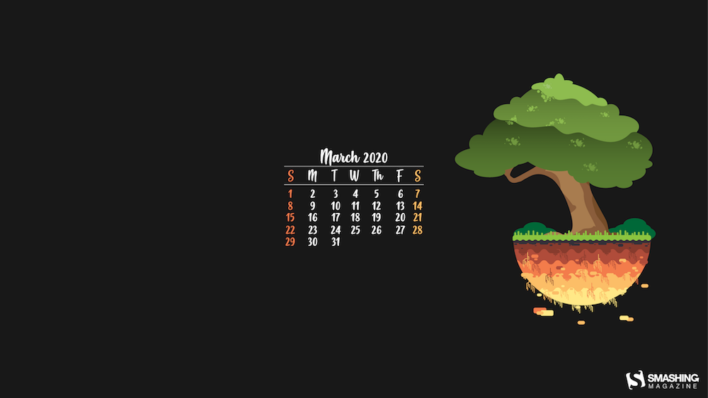
To cater for some extra inspiration this March, artists and designers from across the globe once again challenged their creative skills and designed wallpapers for your desktop and mobile screens. They come in versions with and without a calendar for March 2020 and can be downloaded for free.
We embarked on this monthly wallpapers journey more than nine years ago and we’re very thankful for everyone who submits their artworks to it each month anew. To shine a light on some of the beautiful, unique, but almost forgotten designs from the past, we also compiled some timeless March favorites at the end of this post. Maybe one of your favorites is in there, too? Enjoy!
Please note that:
All images can be clicked on and lead to the preview of the wallpaper,
We respect and carefully consider the ideas and motivation behind each and every artist’s work. This is why we give all artists the full freedom to explore their creativity and express emotions and experience through their works. This is also why the themes of the wallpapers weren’t anyhow influenced by us but rather designed from scratch by the artists themselves.
Submit your wallpaper
Did you know that you could get featured in one of our upcoming wallpapers posts, too? We are always looking for creative talent, so if you have an idea for a wallpaper design, please don’t hesitate to submit it. Join in! ?
International Earth Day
“There’s never been a more important time to take the time to appreciate the planet we live on. We only have one home and we need to take care of it. Celebrate it on the 22nd of March.” — Designed by Ever Increasing Circles from the United Kingdom.
“My inspiration for the month of March was the celebration of Saint Patrick. I tried to create a clean wallpaper with relaxing colors to not disturb the eyes of those who use this wallpaper. The predominance of green, yellow and blue tones beyond Saint Patrick’s Day can also be associated with the beginning of spring.” — Designed by Gonçalo Mota from Portugal.
“In the month of March the weather starts to improve and landscapes become more beautiful so I decided to represent this with a beautiful floating island.” — Designed by Simão Cerqueira from Portugal.
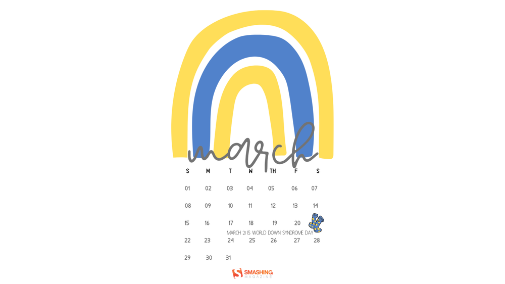
“March 21 is World Down Syndrome Day, so to bring awareness I chose to make a WDSD calendar wallpaper. World Down Syndrome Day is March 21st because in number form, it is 3/21. People are typically born with a pair of each chromosome; Down syndrome occurs when a person is born with three copies of the 21st chromosome. The acceptance of Down syndrome has come such a long way in a short period of time and I am keeping the trend going. There are socks on March 21st because WDSD is celebrated in one way by wearing colorful, crazy, mismatched, whatever socks that draw attention. This is a way of celebrating because socks kind of resemble chromosomes and the underlying message is that it is okay to be different! It is acceptable to be different. People with Down syndrome have different abilities, not disabilities.” — Designed by Tiffany McGinnis from Florida, USA.
“International Women’s Day stands for more than colorful bouquets and shiny jewelry. It’s a force of change, the movement that calls for equality in rights and possibilities for all women worldwide. That’s why we mark this day by evoking the infamous ‘glass ceiling’ — a metaphor that represents an invisible barrier from advancing toward the top, especially in the workforce. Let’s work towards breaking the glass together.” — Designed by PopArt Studio from Serbia.
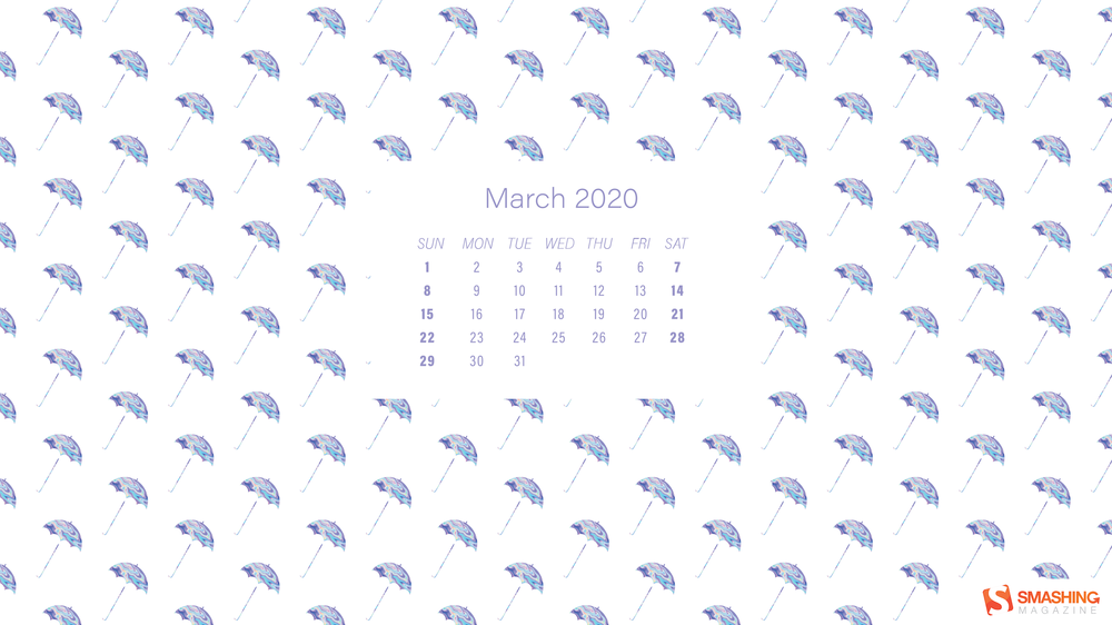
“I thought it would be cute to feature holographic umbrellas in a rain-like pattern. I love patterned wallpapers, but I wanted to do something a little fun and fresh with a pattern that reminded me of rain and light bouncing off an umbrella!” — Designed by Bailey Zaputil from the United States.
“I was simply inspired by the illuminated skyline of the city of Frankfurt and created this abstract light compisition. The cold blue color represents the possibility that the weather in March can still get very cold.” — Designed by Boris Mayer from Germany.
“These are two important pillars of the month of March that we should give more value to: women and the planet.” — Designed by Joana Vicente from Portugal.
Be it St. Patrick’s Day, a favorite song, or a quote — looking back, a lot of things have inspired the community to design a wallpaper for March in the past few years. Here are some almost forgotten favorites. Enjoy! (Please note that these designs don’t come with a calendar.)
Bunny O’Hare
“When I think of March, I immediately think of St. Patrick’s Day and my Irish heritage… and then my head fills with pub music! I had fun putting a twist on this month’s calendar starring my pet rabbit. Erin go Braugh.” — Designed by Heather Ozee from the United States.
“A day, even a whole month, isn’t enough to show how much a woman should be appreciated. Dear ladies, any day or month are yours if you decide so.” — Designed by Ana Masnikosa from Belgrade, Serbia.
“We wanted to pay homage to Starman who entered the Earth’s orbit. We truly hope to see it on Mars some day, so we made this graphic to visualize what it would be like up there.” — Designed by PopArt Studio from Serbia.
“March the 2nd marks the birthday of the most creative and extraordinary author ever, Dr. Seuss! I have included an inspirational quote about learning to encourage everyone to continue learning new things every day.” — Designed by Safia Begum from the United Kingdom.
“Spring is the best part of the year! Nature breaking free and spring awakening is symbolic of our awakening.” — Designed by Silvia Bukovac from Croatia.
“When I think about March, a rhythm starts in my mind… sounds like a bossa nova song… Oh yes! it’s ‘Águas de Março’ by Antônio Carlos Jobim. My design for this month is dedicated to this beautiful song and, of course, the 22nd of March is the International Day of Water.” — Designed by Mavi Zanirato from Italy.
“Doodles are slowly becoming my trademark, so I just had to use them to express this phrase I’m fond of recently. A bit enigmatic, philosophical. Inspiring, isn’t it?” — Designed by Marta Paderewska from Poland.
“Rays of sunlight had cracked into the bear’s cave. He slowly opened one eye and caught a glimpse of nature in blossom. Is it spring already? Oh, but he is so sleepy. He doesn’t want to wake up, not just yet. So he continues dreaming about those sweet sluggish days while everything around him is blooming.” — Designed by PopArt Studio from Serbia.
“As days are getting longer again and the first few flowers start to bloom, we are all waiting for Spring to finally arrive.” — Designed by Naioo from Germany.
“Keep working towards that new year’s resolution! Be it getting a promotion, learning a skill, or getting fit, whatever it is — keep running!” — Designed by Andy Patrick from Canada.
“I live in a small town with big ironworks and I wanted to create something fresh and tender, colorful and light, to feel a little bit happier.” — Designed by Jane Lane from Russia.
Not long ago, I posted about PHP templating in just PHP (which is basically HEREDOC syntax). I’m literally using that technique for some super basic templating I needed to do on this very WordPress site. The main pushback was that this kind of thing can be an XSS vulnerability. In my case, it’s not, because I’m not using it for anything other than an abstraction convenience for my own hand-written strings.
Since then, we’ve had a couple of good articles about templating and I’ve seen some other approaches. I thought I’d make a quick link dump of them.
Chris Geelhoed took a different approach than I did, passing data to a functio then using a require statement for a template file that expects global variables you set right before the require.
If you’re into the idea of using Twig as a PHP templating engine on your WordPress site, check out Timber. TJ Fogarty has written about this for us.
If Timber is a little heavy-handed, check out Sprig from Russell Heimlich. I really like this approach!
A standard e-commerce site has a few common pages. There are product pages, shop pages that list products, and let’s not forget pages for the user account, checkout flow and cart.
WooCommerce makes it a trivial task to set these up on a WordPress site because it provides templates for them and create the pages for you right out of the box. This is what makes it easy to get your store up and running in a few minutes just by setting up some products and your payment processing details. WooCommerce is very helpful that way.
But this isn’t a post extolling the virtues of WooCommerce. Instead, let’s look at how we can customize parts of it. Specifically, I want to look at the cart. WooCommerce is super extensible in the sense that it provides a ton of filters and actions that can be hooked into, plus a way to override the templates in a WordPress theme. The problem is, those take at least some intermediate-level dev chops which may not be feasible for some folks. And, at least in my experience, the cart page tends to be the most difficult to grok and customize.
Let’s look at how to change the WooCommerce cart page by implementing a different layout. This is how a standard default cart page looks:
We’ll go for something like this instead:
Here’s what’s different:
We’re adopting a two-column layout instead of the single full-width layout of the default template. This allows us to bring the “Cart totals” element up top so it is more visible on larger screens.
We’re adding some reassurance for customers by including benefits below the list of products in the cart. This reminds the customer the value they’re getting with their purchase, like free shipping, easy exchanges, customer support and security.
We’re including a list of frequently asked questions beneath the list of products in an accordion format. This helps the customer get answers to questions about their purchase without have to leave and contact support.
This tutorial assumes that you have access to your theme files. If you don’t feel comfortable logging in to your hosting server and going to the file manager, I would suggest you install the plugin WP File Manager. With just the free version, you can accomplish everything explained here.
First, let’s roll our own template
One of the many benefits of WooCommerce is that it gives us pre-designed and coded templates to work with. The problem is that those template files are located in the plugin folder. And if the plugin updates in the future (which it most certainly will), any changes we make to the template will get lost. Since directly editing plugin files is a big ol’ no-no in WordPress, WooCommerce lets us modify the files by making copies of them that go in the theme folder.
It’s a good idea to use a child theme when making these sorts of changes, especially if you are using a third-party theme. That way, any changes made to the theme folder aren’t lost when theme updates are released.
To do this, we first have to locate the template we want to customize. That means going into the site’s root directory (or wherever you keep your site files if working locally, which is a great idea) and open up the /wp-content where WordPress is installed. There are several folders in there, one of which is /plugins. Open that one up and then hop over to the /woocommerce folder. That’s the main directory for all-things-WooCommerce. We want the cart.php file, which is located at:
Let’s open up that file in a code editor. One of the first things you’ll notice is a series of comments on top of the file:
/**
* Cart Page
*
* This template can be overridden by copying it to yourtheme/woocommerce/cart/cart.php. // highlight
*
* HOWEVER, on occasion WooCommerce will need to update template files and you
* (the theme developer) will need to copy the new files to your theme to
* maintain compatibility. We try to do this as little as possible, but it does
* happen. When this occurs the version of the template file will be bumped and
* the readme will list any important changes.
*
* @see https://docs.woocommerce.com/document/template-structure/
* @package WooCommerce/Templates
* @version 3.8.0
*/
The highlighted line is exactly what we’re looking for — instructions on how to override the file! How kind of the WooCommerce team to note that up front for us.
Let’s make a copy of that file and create the file path they suggest in the theme:
Drop the copied file there and we’re good to start working on it.
Next, let’s add our own markup
The first two things we can tackle are the benefits and frequently asked questions we identified earlier. We want to add those to the template.
Where does our markup go? Well, to make the layout look the way we laid it out at the beginning of this post, we can start below the cart’s closing table , like this:
We won’t cover the specific HTML that makes these elements. The important thing is knowing where that markup goes.
Once we’ve done that, we should end up with something like this:
Now we have all the elements we want on the page. All that’s left is to style things up so we have the two-column layout.
Alright, now we can override the CSS
We could’ve add more markup to the template to create two separate columns. But the existing markup is already organized nicely in a way that we can accomplish what we want with CSS… thanks to flexbox!
The first step involves making the .woocommerce element a flex container. It’s the element that contains all our other elements, so it makes for a good parent. To make sure we’re only modifying it in the cart and not other pages (because other templates do indeed use this class), we should scope the styles to the cart page class, which WooCommerce also readily makes available.
We have two child elements in the .woocommerce element, perfect for our two-column layout: .woocommerce-cart-form and .cart-collaterals. This is the CSS we need to split things up winds up looking something like this:
/* The table containing the list of products and our custom elements */
.woocommerce-cart .woocommerce-cart-form {
flex: 1 0 70%; /* 100% at small screens; 70% on larger screens */
margin-right: 30px;
}
/* The element that contains the cart totals */
.woocommerce-cart .cart-collaterals {
flex: 1 0 30%; /* 100% at small screens; 30% on larger screens */
margin-left: 30px;
}
/* Some minor tweak to make sure the cart totals fill the space */
.woocommerce-cart .cart-collaterals .cart_totals {
width: 100%;
padding: 0 20px 70px;
}
That gives us a pretty clean layout:
It looks more like Amazon’s cart page and other popular e-commerce stores, which is not at all a bad thing.
Best practice: Make the most important elements stand out
One of the problems I have with WooCommerce’s default designs is that all the buttons are designed the same way. They’re all the same size and same background color.
Look at all that blue!
There is no visual hierarchy on the action users should take and, as such, it’s tough to distinguish, say, how to update the cart from proceeding to checkout. The next thing we ought to do is make that distinction clearer by changing the background colors of the buttons. For that, we write the following CSS:
/* The "Apply Coupon" button */
.button[name="apply_coupon"] {
background-color: transparent;
color: #13aff0;
}
/* Fill the "Apply Coupon" button background color and underline it on hover */
.button[name="apply_coupon"]:hover {
background-color: transparent;
text-decoration: underline;
}
/* The "Update Cart" button */
.button[name="update_cart"] {
background-color: #e2e2e2;
color: #13aff0;
}
/* Brighten up the button on hover */
.button[name="update_cart"]:hover {
filter: brightness(115%);
}
This way, we create the following hierarchy:
The “Proceed to checkout” is pretty much left as-is, with the default blue background color to make it stand out as it is the most important action in the cart.
The “Update cart” button gets a grey background that blends in with the white background of the page. This de-prioritizes it.
The “Apply coupon” is less a button and more of a text link, making it the least important action of the bunch.
The full CSS that you have to add to make this design is here:
Not too bad, right? It’s nice that WooCommerce makes itself so extensible, but without some general guidance, it might be tough to know just how much leeway you have to customize things. In this case, we saw how we can override the plugin’s cart template in a theme directory to future-proof it from future updates, and how we can override styles in our own stylesheet. We could have also looked at using WooCommerce hooks, the WooCommerce API, or even using WooCommerce conditions to streamline customizations, but perhaps those are good for another post at another time.
In the meantime, have fun customizing the e-commerce experience on your WordPress site and feel free to spend a little time in the WooCommerce docs — there are lots of goodies in there, including pre-made snippets for all sorts of things.
Over a decade ago, I did a little three-part video series on Designing for WordPress. Then I did other series with the same spirit, like videocasting the whole v10 redesign, a friend’s website, and even writing a book. Those are getting a little long in the tooth though. You might still learn from watching them if you’re getting into WordPress theme development, but there will be moments that feel very aged (old UI’s and old versions of software). All the code still works though, because WordPress is great at backward compatibility. I still hear from people who found those videos very helpful for them.
But since time has pressed on, and I was recently asked what resources I would suggest now, I figured I’d have a look around and see what looks good to me.
Do you like how I plopped the WordPress logo over some stock art I bought that features both a computer and a chalkboard, by which to evoke a feeling of “learning”? So good. I know.
Who are we talking to?
There’s a spectrum of WordPress developers, from people who don’t know any code at all or barely touch it, to hardcore programming nerds building custom everything.
Pick out a theme that looks good, use it.
????
????
????
????
Hardcore programmer nerd.
I can’t speak to anybody on either edge of that spectrum. There is this whole world of people in the middle. They can code, but they aren’t computer science people. They are get the job done people. Maybe it’s something like this:
Pick out a theme that will work, use it.
Start with a theme, customize it a bit using built-in tools.
Start with a theme, hack it up with code to do what you need it to do.
Start from scratch, build out what you need.
Start from scratch, build a highly customized site.
Hardcore programmer nerd.
I’ve always been somewhere around #4, and I think that’s a nice sweet spot. I try to let off-the-shelf WordPress and big popular plugins do the heavy lifting, but I’ll bring-my-own front-end (HTML, CSS, and JavaScript) and customize what I have to. I’m making templates. I’m writing queries. I’m building blocks. I’m modularizing where I can.
I feel powerful in that zone. I can build a lot of sites that way, almost by myself. So where are the resources today that help you learn this kind of WordPress theme development? Lemme see what I can find.
Wing it, old school
There is something to be said for learning by doing. Trial by fire. I’ve learned a lot under these circumstances in my life.
The trick here is to get WordPress installed on a live server and then play with the settings, plugins, customizer, and edit the theme files themselves to make the site do things. You’ll find HTML in those theme files — hack it up! You’ll see PHP code spitting out content. Can you tell what and how to manipulate it? You’ll find a CSS file in the theme — edit that sucker!
Editing a WordPress theme and seeing what happens
The official documentation can help you somewhat here:
To some degree, I’m a fan of doing it live (on a production website) because it lends a sense of realness to what you are doing when you are a beginner. The stakes are high there, giving you a sense of the power you have. When I make these changes, they are for anyone in the world with an internet connection to see.
I did this in my formative years by buying a domain name and hosting, installing WordPress on that hosting, logging into it with SFTP credentials, and literally working on the live files. I used Coda, which is still a popular app, and is being actively developed into a new version of itself as I write.
This is Nova, a MacOS code editor from Panic that has SFTP built-in.
Hopefully, the stakes are real but low. Like you’re working on a pet project or your personal site. At some point, hacking on production sites becomes too dangerous of an idea. One line of misplaced PHP syntax can take down the entire site.
If you’re working on something like a client site, you’ll need to upgrade that workflow.
Modern winging it
The modern, healthy, standard way for working on websites is:
Work on them locally.
Use version control (Git), where new work is done in branches of the master branch.
Deployment to the production website is done when code is pushed to the master branch, like your development branch is merged in.
My web hosting is also Flywheel, but that isn’t required. It could be anything that gives you SFTP access and runs what WordPress needs: Apache, PHP, and MySQL. Disclosure, Flywheel is a sponsor here, but because I like them and their service :).
Code is hosted on a private repo on GitHub.
Deployment to the Flywheel hosting is done by Buddy. Buddy watches for pushes to the master branch and moves the files over SFTP to the production site.
Local by Flywheel
Now that you have a local setup, you can go nuts. Do whatever you want. You can’t break anything on the live site, so you’re freer to make experimental changes and just see what happens.
When working locally, it’s likely you’ll be editing files with a code editor. I’d say the most popular choice these days is the free VS Code, but there is also Atom and Sublime, and fancier editors like PhpStorm.
The freedom of hacking on files is especially apparent once you’ve pushed your code up to a Git repo. Once you’ve done that, you have the freedom of reverting files back to the state of the last push.
I use the Git software Tower, and that lets me can see what files have changed since I last committed code. If I’ve made a mistake, caused a problem, or done something I don’t like — even if I don’t remember exactly what I changed — I can discard those changes back to their last state. That’s a nice level of freedom.
When I do commit code, to master or by merging a branch into master, that’s when Buddy kicks in and deploys the changes to the production site.
CSS-Tricks itself is a WordPress site, which has continuously evolved over 13 years.
But like, where do you start?
We’re talking about WordPress theme development here, so you start with a theme. Themes are literally folders of files in your WordPress installation.
root
- /wp-content/
- /themes/
- /theme-name/
WordPress comes with some themes right out of the box. As I write, the Twenty Twenty theme ships with WordPress, and it’s a nice one! You could absolutely start your theme hackin’ on that.
Themes tend to have some opinions about how they organize themselves and do things, and Twenty Twenty is no different. I’d say, perhaps controversially, that there is no one true way to organize your theme, so long as it’s valid code and does things the “WordPress” way. This is just something you’ll have to get a feel for as you make themes.
Starter themes
Starter themes were a very popular way to start building a theme from scratch in my day. I don’t have a good sense if that’s still true, but the big idea was a theme with all the basic theme templates you’ll need (single blog post pages, a homepage, a 404 page, search results page, etc.) with very little markup and no styling at all. That way you have an empty canvas from which to build out all your HTML, CSS, and JavaScript yourself to your liking. Sorta like you’re building any other site from scratch with these core technologies, only with some PHP in there spitting out content.
There was a theme called Starkers that was popular, but it’s dead now. I made one called BLANK myself but haven’t touched that in a long time. In looking around a bit, I found some newer themes with this same spirit. Here’s the best three I found:
I can’t personally vouch for them, but they’ve all been updated somewhat recently and look like pretty good starting points to me. I’d give them a shot in the case that I was starting from absolute scratch on a project. I’d be tempted to download one and then spruce it up exactly how I like it and save that as my own starter in case I needed to do it again.
It feels worth mentioning that a lot of web development isn’t starting from scratch, but rather working on existing projects. In that case, the process is still getting a local environment set up; you just aren’t starting from scratch, but with the existing theme. I’d suggest duplicating the theme and changing the name while you hack on it, so even if you deploy it, it doesn’t affect the live theme. Others might suggest using the starter as a “parent” theme, then branching off into a “child” theme.
To get your local development environment all synced up with exactly what the production website is like, I think the best tool is WP DB Migrate Pro, which can yank down the production database to your local site and all the media files (paid product and a paid add-on, worth every penny).
Fancier Starter Themes
Rather than starting from absolute scratch, there are themes that come with sensible defaults and even modern build processes for you start with. The idea is that building a site with essentially raw HTML, CSS, and JavaScript, while entirely doable, just doesn’t have enough modern conveniences to be comfortable.
Here are some.
Morten Rand-Hendriksen has a project called WP Rig that has all sorts of developer tools built into it. A Gulp-based build process spins up a BrowserSync server for auto updating. JavaScript gets processed in Babel. CSS gets processed in PostCSS, and code is linted. He teaches WordPress with it.
Roots makes a theme called Sage that comes with a templating engine, your CSS framework of choice, and fancy build process stuff.
Ignition has a build process and all sorts of helpers.
Timber comes with a templating engine and a bunch of code helpers.
I think all these are pretty cool, but are also probably not for just-starting-out beginner developers.
Books
This is tough because of how many there are. In a quick Google search, I found one site selling fifteen WordPress books as a bundle for $9.99. How would you even know where to start? How good can they be for that rock bottom price? I dunno.
A lot of other books specifically about WordPress theme development are just fairly old. 2008-2015 stuff. Again, not that there isn’t anything to be learned there, especially as WordPress doesn’t change that rapidly, but still, I’d want to read a book more recent that half a decade old. Seems like a big opportunity for a target audience as large as WordPress users and developers. Or if there is already stuff that I’m just not finding, lemme know in the comments.
Perhaps learning is shifting so much toward online that people don’t write books as much…
Online learning courses
Our official learning partner Frontend Masters has one course on WordPress focused on JavaScript and WordPress, so that might not be quite perfect for learning the basics of theme development. Still, fascinating stuff.
Here’s some others that looked good to me while looking around:
Zac’s course looks like the most updated and perhaps the best option there.
A totally different direction for theme Development
One way to build a site with WordPress is not to use WordPress themes at all! Instead, you can use the WordPress API to suck data out of WordPress and build a site however the heck you please.
This idea of decoupling the CMS and the front end you build is pretty neat. It’s often referred to as using a “headless” CMS. It’s not for everyone. (One big reason is that, in a way, it doubles your technical debt.). But it can bring a freedom to both the CMS and the front end to evolve independently.
Think of building sites with Gatsby as an hourglass shape.
Gatsby itself is right in the middle. The wide funnel at the top represents the fact that Gatsby can take in data from all sorts of sources. The data could be in markdown files, from a headless CMS or some other API, from a hosted database, or pretty much whatever.
The wide funnel at the bottom represents that the output from Gatsby is static files, so those files can go anywhere. Netlify, GitHub Pages, ZEIT, S3, whatever.
Gatsby does a bunch of neat stuff (just the fact that it’s in React I’m sure is appealing to a wide swath of developers), but it seems to me the secret sauce is how it works with any data source.
If you were going to widen that hourglass shape into a, uhhh, pipe, you’d build a tool that connects arbitrary data sources with arbitrary static site generators. It appears that is what Stackbit is doing with Sourcebit. It has a two-sided plugin model (Sources: e.g. Contentful or Sanity; Targets: e.g. Jekyll or Hugo) with the goal of contacting any data source with any site-building tool that needs that data.
I would think contributors to all projects in both the data source and site builder arenas would be interested in seeing this succeed, including Gatsby.
What piques your interest in a movie? What makes a movie great? Your answer might depend on what you actually look for in a movie. It could be its cinematography, soundtracks, actors, directing, theme, storytelling or an idiosyncrasy that you can’t characterize.
True movie lovers probably would agree that a great movie should embody more than one of the elements above to be considered one of a kind and transcendent. If a movie falls into a predictable pattern, many of us lose interest.
If you think about it, you’ll realize that most of our favorite movies tend to have a surprise factor. Because let’s admit it – our brains need surprises! What surprises us more than any movie? – Horror movies beyond the limits of ordinary storyline…
Although this particular genre usually has a very predictable flow, when the story and execution are both strong and far from clichés, the movie exceeds expectations and evolves into being something that has more than just shock value.
We have seen some fantastic horror movies released in the last couple of decades. Got a few in your head? Cool. Now try to remember their posters. If you are having a hard time, perhaps their posters were not striking enough to leave a lasting impression.
The Importance of Movie Posters
Sometimes the effect of a movie can go beyond the plot itself by blending other semiotic factors such as its poster. When you think about it, movie posters can actually be the number one element that has the potential to leave an unshakeable impact on moviegoers. So it’s better to make it good.
Putting modern horror movies aside, it is hard to say that retro horror movie posters are well-thought-of and tell us so much about the movies. Yet their simple illustrations, graphics, and typographies are fascinating enough to get us in the mood and take us back to those simpler days.
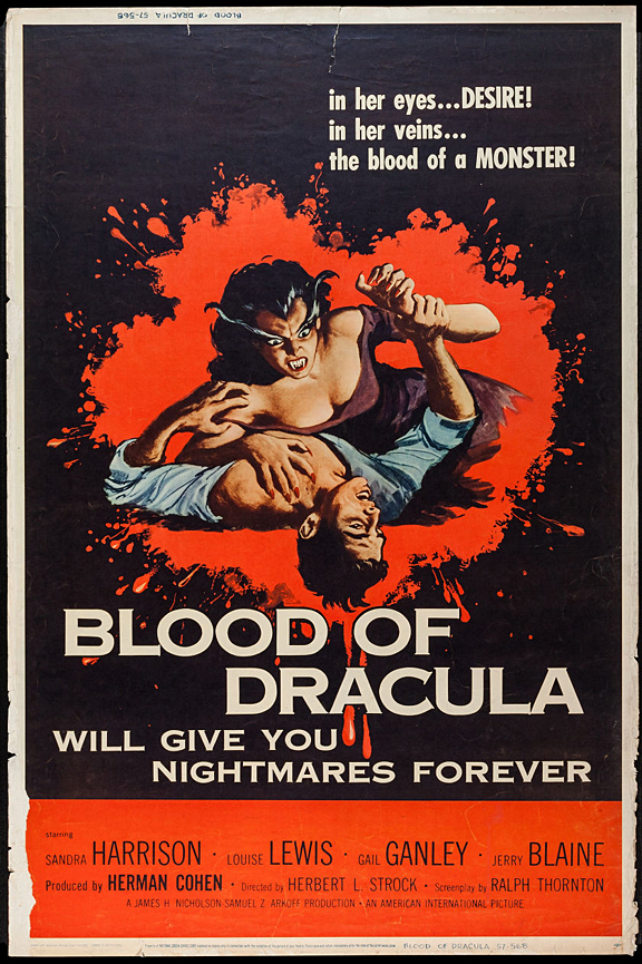
Now it’s time to buckle up! We did the work for you and wandered through the most interesting retro horror movies. Let’s dig through some gruesome retro horror movie posters that will knock you sideways. And be careful Freddy may be coming for you tonight!
What piques your interest in a movie? What makes a movie great? Your answer might depend on what you actually look for in a movie. It could be its cinematography, soundtracks, actors, directing, theme, storytelling or an idiosyncrasy that you can’t characterize.
True movie lovers probably would agree that a great movie should embody more than one of the elements above to be considered one of a kind and transcendent. If a movie falls into a predictable pattern, many of us lose interest.
If you think about it, you’ll realize that most of our favorite movies tend to have a surprise factor. Because let’s admit it – our brains need surprises! What surprises us more than any movie? – Horror movies beyond the limits of ordinary storyline…
Although this particular genre usually has a very predictable flow, when the story and execution are both strong and far from clichés, the movie exceeds expectations and evolves into being something that has more than just shock value.
We have seen some fantastic horror movies released in the last couple of decades. Got a few in your head? Cool. Now try to remember their posters. If you are having a hard time, perhaps their posters were not striking enough to leave a lasting impression.
Sometimes the effect of a movie can go beyond the plot itself by blending other semiotic factors such as its poster. When you think about it, movie posters can actually be the number one element that has the potential to leave an unshakeable impact on moviegoers. So it’s better to make it good.
Putting modern horror movies aside, it is hard to say that retro horror movie posters are well-thought-of and tell us so much about the movies. Yet their simple illustrations, graphics, and typographies are fascinating enough to get us in the mood and take us back to those simpler days.
The Importance of Movie Posters
Now it’s time to buckle up! We did the work for you and wandered through the most interesting retro horror movies. Let’s dig through some gruesome retro horror movie posters that will knock you sideways. And be careful Freddy may be coming for you tonight!
Social media consists of 3.5 billion users, and the figure’s constantly rising. That’s a pretty sizable market for businesses to tap into.
According to SproutSocial, the likes of Facebook and Instagram have become the top two channels for prospective customers aiming to find and buy items online. As confidence in social platforms has grown, so too has our willingness to conduct market research through this avenue, and thus social networks have become unignorable to marketers today.
Despite its massive number of users, it’s important to avoid assuming that conversions via social media are a foregone conclusion. Businesses need a coherent social strategy that carries a consistent voice with their brand.
There are plenty of pitfalls and assumptions surrounding social media that it’s important to steer clear of, so with this in mind, let’s take a look at seven key ways in which your website can harness the power of social media:
Optimise your ads
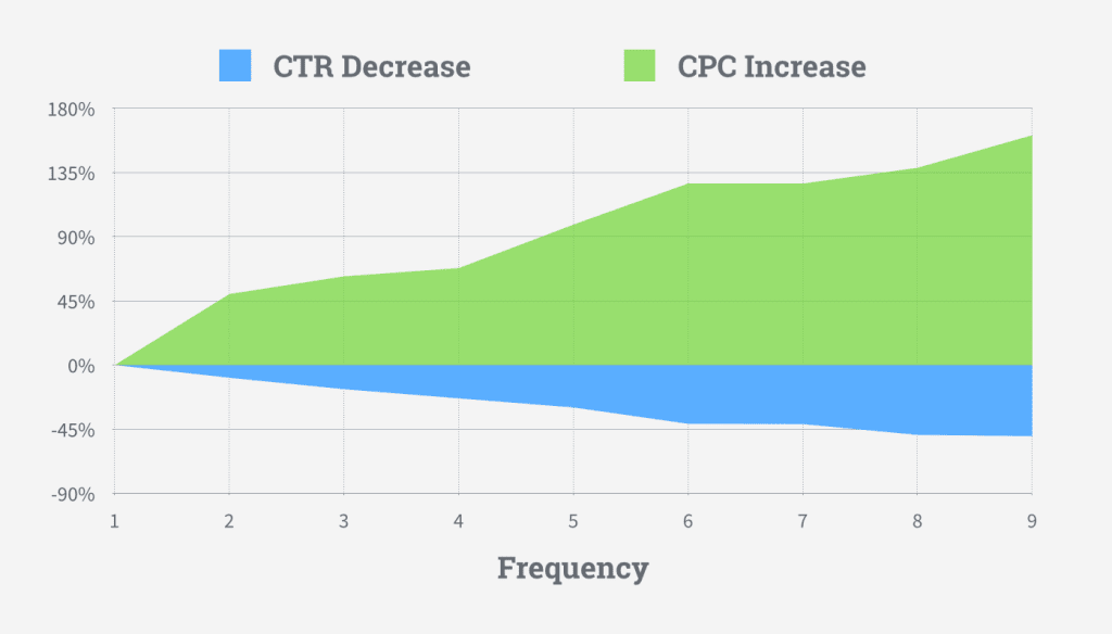
The likes of Facebook and Instagram may be a hotbed for potential engagements, but if you don’t appropriately optimise your ads, you’ll end up throwing money away. One of the best ways of making your budget last longer is by optimising your ad schedule. If you’re running ads over 24 hours every day, you may have noticed that some hours perform better than others. Here, it’s important to monitor what times you’re most likely to attract a click, and place adverts to show around these hours. It may be cost-effective to advertise at 4am, but if your audience is tucked in bed by this time, it could amount to lost money.
It’s also important to A/B test your ads and run new variations. AdEspresso found that instead of losing money on running the same ads over and over, it’s worth trying out new ideas in fresh posts to help attract new customers.
Depending on the type of campaign you’re running, be sure to exclude converted users from your future campaigns. This can be done by excluding users who have visited specific web pages – like your ‘thank you’ page or a particular blog post.
Turn to user-generated content
One of the most effective ways of optimising your approach to social media marketing can be found in allowing customers to pick up the slack and create content on your behalf.
User-generated content is not only easy to get hold of, but it also adds a social-proof and layer of authenticity to the quality of items that your website is selling.
The presence of aggressive marketing tactics has made social media users somewhat warier when it comes to placing their trust in brands, but by sharing pictures sent by happy customers and interacting with positive reviews and feedback, it helps other audiences recognise the appeal of your products – thus encouraging sales.
What’s more is that inviting customers to share multimedia can help to boost engagements and even send your company viral. If your social team isn’t packed with personnel then user-generated content could go some way in making your company appear ever-present to users.
Use multimedia
One sure-fire way to boost conversion is through the production of relevant videos. It’s long been an asset when it comes to marketing, but videos are really making waves in social media, as well as on websites.
The beauty of using videos to promote products comes from their ability to not only show products off but catch the eye of prospective customers too.
Video budgets don’t have to be massive for social media campaigns either. Users are more receptive and appreciative of memorable multimedia experiences, rather than slick, smoothly edited clips. Just be sure to uphold your company values within any multimedia campaigns or else you’ll risk alienating your customers.
Leverage relationships with influencers
Influencers have evolved to become the kings and queens of social media. Follower figures can comfortably reach into the millions for key personalities in a variety of niche areas.
The power of the influencer is such that platforms like Ninja Outreach specialise in putting businesses in touch with influencers who are willing to help their campaigns.
The effect that influencers have is similar to that of user-generated content. Influencers essentially offer audiences an authentic connection to a product that feels external from the company that developed it.
If you have any working relationships with marketers or influencers already, it’s worth asking them to spare time for a brief Twitter post or Facebook mention. While it’s the job of both parties to make money from their endorsements, a simple mention could help to skyrocket your conversions.
Keep things consistent
It might not seem like much, but it certainly deserves a mention on this list. Make sure you’re consistent with your branding and the messages that your company is sending.
Regardless of your business’ age, you should have a clear idea of your target audience and need to make sure they’re able to identify with your business and recognise your social posts from the tone alone.
Shifting from extremely formal language to including hefty levels of slang will only contribute to alienating your audience, who may struggle to build a relationship with your brand as a result.
As a customer navigates onto your site from Instagram, they’ll be expecting to see your pages offer a consistent tone of voice to the content they’ve just clicked on. Imagery and colour must remain recognisable as your customers approach the point of purchase. There must be no disorientating factors in the mix that could compromise their focus.
Avoid the temptation of the hard sell
It can be tempting. And link stuffing can be much easier than building meaningful ads, but the hard-sell very rarely works for businesses in the modern landscape.
Here, it’s worth remembering that you’re likely marketing products to users who have already had to endure life with the relentless popups of the early 21st Century. Users have grown fed up with big bright adverts with little substance being banded around cyberspace.
Conversion rates can be boosted via adding value to your campaigns. Build content and conduct some research into what your target audiences like. Pander to their interests in a way that offers substance. On top of this, building effective content is a good way of adding SEO friendly keywords into your campaign.
Keep monitoring traffic
While many social media networks will be able to provide insights into the performance of your ads, and there are some degrees of information available regarding engagements, to really get to grips with your marketing campaigns, it’s worth tapping into the wealth of insights available with website analytics platforms.
Conversion statistics are widely available from a range of platforms and tools like Finteza and Sprout Social can work wonders in helping website owners learn more about how visitors are accessing their pages.
The level of insight your business can receive from monitoring where your traffic is arriving from can work wonders in helping you to know which social network campaigns are working better than others and where your money would be best spent.
There’s a wide world of social media users out there, and if your business is willing to adapt its marketing campaigns to tap into the potential of social, not to mention appeal to customers on a more personal level, then the sky’s the limit for your conversion rates.
We all have a role to play in the building of a website. Designers create beautiful and interactive interfaces. Copywriters create messaging that gets visitors to take notice and action. Developers bring it all together with code.
But there’s one piece of the puzzle that can’t be handed off to just one person. And that’s SEO.
If you’re building websites for clients and they’re expecting impressive outcomes in the end (i.e. high conversion rates), SEO has to be part of your process. You can’t just leave it in the hands of your writer or a dedicated SEO and assume that’s enough.
Google is a demanding overlord and we must appease it if we want our websites to reach the top of search. And what that means is taking a well-rounded approach to SEO throughout the lifecycle of the website design and development process.
If you haven’t accounted for this already or you want to make sure you’ve covered all the bases in what you currently do, this post is for you. I’m going to run through when and how SEO needs to enter the picture in your workflow. In addition, I’ve included an SEO checklist at the bottom of this post that you and your team can adapt to your workflow.
Where Does SEO Belong in Your Web Design Process?
SEO should be something you’re always thinking about and planning for, from the prospecting phase all the way to the launch date.
SEO During the Proposal Phase
When you talk to a prospect about what they need your help for, they’re going to focus on the website itself.
“I need a website so I can sell my products online/grow my presence/get new customers.”
But that’s not really what they’re asking for. What they want is a website to help their business get found in Google and to convert visitors, which requires something more complex from you than just slapping together some copy and designs.
You know that the website needs to be optimized for search if the website is to do what the client needs it to. Because of this, it’s going to impact things like cost, timeline and process flow. All of these details should be mapped out on your end as you prepare the proposal.
As for what you actually tell your clients? This is where things get tricky.
You have to somehow address SEO with your prospect 1) to set the right expectations and 2) to justify what you’re about to propose to them in terms of scope and cost. The only problem is, some clients might know the term “SEO”, but they don’t really understand what it entails.
The conversation could quickly devolve into something like this:
You: [You explain the details of your design offering and mention that SEO is part of it.]
Client: “Oh, great. I have a list of 20 keywords I want included in every page.”
You: “Well, that’s not really what search engine optimization is. If you want your website to perform well, you need to pay attention to things like caching, security and mobile-first design.”
Client: “What are you talking about? Cashing? What even is that? I thought you said you do SEO. I want to rank for these 20 keywords.”
It’s your job to get clients the results they need, not to try and explain to them the technicalities of how you do it. That’s why they’re paying you to do this, after all. So, here’s what I’d recommend for your proposal and early discussions with clients:
First, let your website do all the talking about SEO like UPQODE‘s does:
UPQODE briefly details the kinds of SEO services it provides. (Image source: UPQODE) (Large preview)
This would allow you to clearly spell out the kinds of SEO you provide (which will also help those SEO-minded clients find you in the first place). It’s okay to include technical terms here so long as you briefly explain what each is in layman’s terms:
UPQODE explains what’s involved in on-page SEO. (Image source: UPQODE) (Large preview)
What I like about this approach is that it enables you to say “We’re going to do X, Y and Z” while framing it in a light that the client actually understands. In this case, what you’d really be saying is “We handle all the technical stuff so your site’s visibility grows in search and, consequently, you get more traffic.”
This is how you should be talking to your prospects and laying out SEO-related details in your proposals and contracts, too.
In other words, don’t delve too much into your SEO tasks. Instead, just spell out the benefits. For example:
Responsive web design that looks great on all devices.
Web pages that load in three seconds or less for optimal visitor experiences.
Tightened up security to keep all your business data as well as your visitors’ data private.
Content that’s easy for humans to read and even easier for Google bots to understand.
Custom-built user pathways that turn visitors into customers in no time.
The goal is to get them onboard with your search-optimized web design services and perhaps even ongoing maintenance and support afterwards. To do that, you have to clearly convey the benefits without getting them wrapped up in the technicalities of SEO.
SEO During the Setup and Planning Phase
In the early phases of an approved project, SEO shouldn’t be far from your mind. While you might not actively be working on optimizations yet, it’s a good idea to make sure the baseline you’re working from won’t cause more work for you down the line.
Here are some things to keep in mind:
Review the Client’s Design Assets
You probably ask clients to provide you with assets, logins and even copy before a project gets underway. While this is mainly to protect yourself from scope creep, it can also come in handy for SEO.
Say your client hands over logos and other image assets that are really low quality or look super outdated. The earlier you have these assets in hand, the sooner you can let them know that they need to be replaced if they want people to take their website seriously.
If visitors don’t like the look of a website, they’re going to abandon it without fail and that high bounce rate is going to kill the site’s ranking. So, make sure your clients don’t stand in the way of the results you’re trying to help them achieve.
Work in Tandem with the Copywriter
Even if a professional copywriter is creating the content for your website, if you’re not working closely with them from the start, there could be problems.
Web design agencies often debate the merits of content-first website development vs. design-first. The truth is, they should be created together. If you don’t, you put the whole project at risk.
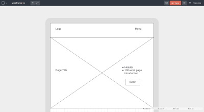
For starters, a writer and designer working in isolation are bound to come up with different ways to handle style and layout. But if you establish guidelines from the get-go (which you can easily do with wireframes), you can avoid any disjoint in how the copy and design are created.
Designers can use a tool like Wireframe.cc to create wireframes that both they and the writer can work out of. (Image source: Wireframe.cc) (Large preview)
You’re going to wireframe any website you build anyway, so why not provide a copy of it to the writer so you two can be on the same page from the beginning? Even better, why not collaborate with the writer? They might not know design techniques or best practices, but they can certainly provide insight on things like optimal text length, the priority of certain sales or marketing messages and so on.
Then, there’s the matter of optimizing copy for search. Ideally, you’d want to work with a copywriter who can do the following:
Create actionable messaging and CTAs,
Naturally weave target keywords into the copy,
Write for user intent,
Write in HTML,
Create copy that’s both readable and scannable,
Build a system of internal links from page to page,
Create meta tags and optimize URLs for search,
Write alt tags for images.
The more of this that gets built into the copy from the get-go, the less back-and-forth you have to do with them later. It’ll also spare you the trouble of trying to fix this on your own (which you shouldn’t attempt to do).
Design for Sales Funnels
In order to increase conversions on a site, you should be designing sales funnels into them. But sales funnels aren’t just a series of steps that you lay down for visitors on the website.
It all begins with understanding user intent outside of the site. If you know what draws visitors to your site from search engines and social media, you can design your metadata and landing pages to align with that intent.
Again, if you do the research and planning upfront with SEO in mind, you’ll have less cleanup work to do later.
SEO During Design and Development
This, obviously, is the most important and labor-intensive stage for you. And while it’s easy to get wrapped up in designing and coding, it’s important not to lose sight of SEO here.
What I’d recommend is creating a universal SEO checklist you can use from project to project. If you account for every possible optimization now, you can take the guesswork out of SEO. Plus, a checklist allows you to become better acquainted with everything that needs to be done, which will enable you to find more efficient ways of building search optimizations into your process.
To help you along, I’ve created the following SEO checklist. Feel free to copy and use for your own needs:
Technical SEO
Web hosting with 99.9%+ uptime
Domain with clean web history
SSL certificate installed
Firewall implemented
Caching enabled (page, browser, object, etc.)
Image compression and resizing (in-house system or automated)
Automated backups
Google Analytics account connected
Google Analytics goal tracking, ecommerce tracking and other special tracking enabled
Google Search Console account connected
XML sitemap set up and submitted to Google
Separate sitemap submitted for images and for videos
Robots.txt set up
Schema.org markup (when relevant) written
Design SEO
Information architecture mapped out
Responsive web design
Mobile-first web design
1 clear CTA per page
Custom 404 page set up
All links, buttons and forms tested and working
On-page SEO
1 unique focus keyword per page
Focus keyword density between 1-3%
50-60 character meta title including the focus keyword
150-160 character meta description including the focus keyword
Short but descriptive slug including the focus keyword
Error-free content
At least 1 relevant internal link per page
Featured image for each page
Descriptive alt text for each image
Header tags used (focus keyword included in at least 1)
Headers appear every 300 words or so
Sentences stretch no more than two lines
Paragraphs stretch no more than five lines
Duplicate content analysis
Plagiarism check
Local SEO
Google My Business page set up
Geo-specific keywords included
Location-specific pages created (when relevant)
Contact information provided (e.g. phone number, address, etc.)
Ongoing SEO Support
Web server uptime, speed and security analysis
Page speed testing
Security monitoring
Google blacklist monitoring
Keyword rank monitoring
Broken link checking
Software updates
A Few Notes
Anything that’s not relevant to the kinds of clients you serve or the kinds of services you offer, delete the row.
If there’s anything I’m missing, feel free to add it on (like if you specialize in e-commerce design and want to prep product pages to appear in Google Shopping results).
If you’re not comfortable checking the on-page SEO stuff, hand it off to a proofreader or editor (someone who didn’t do the copywriting).
For those of you looking for additional opportunities to make money, this SEO checklist can also be used to analyze an existing website and present a prospective client with a website redesign or optimization plan.
Wrapping Up
Keyword optimization and link building are only part of the SEO puzzle. As a web designer or developer, you have a huge contribution to make here as well.
Whether it’s in the quality of code written on the backend, the way images are optimized or how well-secured the site is, these are the kinds of tasks you’re responsible for managing that no writer or SEO is going to or should handle. And, without these optimizations, Google and your visitors will fail to take notice of the site you worked so hard to build for them.