I got this exact question in an email the other day, and I thought it would make a nice blog post because of how wonderfully satisfying this is to do in CSS these days. Plus we can sprinkle in polish to it as we go.
HTML-wise, I’m thinking image, text, image, text, etc.
<img src="..." alt="..." height="" width="" />
<p>Text text text...</p>

<img src="..." alt="..." height="" width="" />
<p>Text text text...</p>

<img src="..." alt="..." height="" width="" />
<p>Text text text...</p>
If that was our entire body in an HTML document, the answer to the question in the blog post title is literally two lines of CSS:
body {
  display: grid;
  grid-template-columns: min-content 1fr;
}
It’s going to look something like this…
Not pretty but we got the job done very quickly.
So cool. Thanks CSS. But let’s clean it up. Let’s make sure there is a gap, set the default type, and reign in the layout.
The click event is quite simple and easy to use; you listen for the event and run code when the event is fired. It works on just about every HTML element there is, a core feature of the DOM API.
As often the case with the DOM and JavaScript, there are nuances to consider. Some nuances with the click event are typically not much a concern. They are minor and probably most people would never even notice them in the majority of use cases.
Take, for example, the click event listening to the grandfather of interactive elements, the element. There are nuances associated with button clicks and these nuances, like the difference between a “click” from a mouse pointer and “click” from the keyboard. Seen this way, a click is not always a “click” the way it’s typically defined. I actually have run into situations (though not many) where distinguishing between those two types of clicks comes in handy.
How do we distinguish between different types of clicks? That’s what we’re diving into!
The HTML element represents a clickable button, used to submit forms or anywhere in a document for accessible, standard button functionality. By default, HTML buttons are presented in a style resembling the platform the user agent runs on, but you can change buttons’ appearance with CSS.
The part we’ll cover is obviously the “anywhere in a document for accessible, standard button functionality” part of that description. As you may know, a button element can have native functionality within a form, for example it can submit a form in some situations. We are only really concerning ourselves over the basic clicking function of the element. So consider just a simple button placed on the page for specific functionality when someone interacts with it.
CodePen Embed Fallback
Consider that I said “interacts with it” instead of just clicking it. For historical and usability reasons, one can “click” the button by putting focus on it with tabbing and then using the Space or Enter key on the keyboard. This is a bit of overlap with keyboard navigation and accessibility; this native feature existed way before accessibility was a concern. Yet the legacy feature does help a great deal with accessibility for obvious reasons.
In the example above, you can click the button and its text label will change. After a moment the original text will reset. You can also click somewhere else within the pen, tab to put focus on the button, and then use Space or Enter to “click” it. The same text appears and resets as well. There is no JavaScript to handle the keyboard functionality; it’s a native feature of the browser. Fundamentally, in this example the button is only aware of the click event, but not how it happened.
One interesting difference to consider is the behavior of a button across different browsers, especially the way it is styled. The buttons in these examples are set to shift colors on its active state; so you click it and it turns purple. Consider this image that shows the states when interacting with the keyboard.
Keyboard Interaction States
The first is the static state, the second is when the button has focus from a keyboard tabbing onto it, the third is the keyboard interaction, and the fourth is the result of the interaction. With Firefox you will only see the first two and last states; when interacting with either Enter or Space keys to “click” it you do not see the third state. It stays with the second, or “focused”, state during the interaction and then shifts to the last one. The text changes as expected but the colors do not. Chrome gives us a bit more as you’ll see the first two states the same as Firefox. If you use the Space key to “click” the button you’ll see the third state with the color change and then the last. Interestingly enough, with Chrome if you use Enter to interact with the button you won’t see the third state with the color change, much like Firefox. In case you are curious, Safari behaves the same as Chrome.
Now, let’s consider something here with this code. What if you found yourself in a situation where you wanted to know what caused the “click” to happen? The click event is usually tied to a pointer device, typically the mouse, and yet here the Space or Enter key are triggering the same event. Other form elements have similar functionality depending on context, but any elements that are not interactive by default would require an additional keyboard event to work. The button element doesn’t require this additional event listener.
I won’t go too far into reasons for wanting to know what triggered the click event. I can say that I have occasionally ran into situations where it was helpful to know. Sometimes for styling reasons, sometimes accessibility, and sometimes for specific functionality. Often different context or situations provide for different reasons.
Consider the following not as The Way™ but more of an exploration of these nuances we’re talking about. We’ll explore handling the various ways to interact with a button element, the events generated, and leveraging specific features of these events. Hopefully the following examples can provide some helpful information from the events; or possibly spread out to other HTML elements, as needed.
Which is which?
One simple way to know a keyboard versus mouse click event is leveraging the keyup and mouseup events, taking the click event out of the equation.
CodePen Embed Fallback
Now, when you use the mouse or the keyboard, the changed text reflects which event is which. The keyboard version will even inform you of a Space versus Enter key being used.
A bit verbose, true, but we’ll get to a slight refactor in a bit. This example gets the point across about a nuance that needs to be handled. The mouseup and keyup events have their own features to account for in this situation.
With the mouseup event, about every button on the mouse could trigger this event. We usually wouldn’t want the right mouse button triggering a “click” event on the button, for instance. So we look for the e.button with the value of 0 to identify the primary mouse button. That way it works the same as with the click event yet we know for a fact it was the mouse.
With the keyup event, the same thing happens where about every key on the keyboard will trigger this event. So we look at the event’s code property to wait for the Space or Enter key to be pressed. So now it works the same as the click event but we know the keyboard was used. We even know which of the two keys we’re expecting to work on the button.
Another take to determine which is which
While the previous example works, it seems like a bit too much code for such a simple concept. We really just want to know if the “click” came from a mouse or a keyboard. In most cases we probably wouldn’t care if the source of the click was either the Space or Enter keys. But, if we do care, we can take advantage of the keyup event properties to note which is which.
Buried in the various specifications about the click event (which leads us to the UI Events specification) there are certain properties assigned to the event concerning the mouse location, including properties such as screenX/screenY and clientX/clientY. Some browsers have more, but I want to focus on the screenX/screenY properties for the moment. These two properties essentially give you the X and Y coordinates of the mouse click in relation to the upper-left of the screen. The clientX/clientY properties do the same, but the origin is the upper-left of the browser’s viewport.
This trick relies on the fact that the click event provides these coordinates even though the event was triggered by the keyboard. When a button with the click event is “clicked” by the Space or Enter key it still needs to assign a value to those properties. Since there’s no mouse location to report, if it falls back to zero as the default.
Back to just the click event, but this time we look for those properties to determine whether this is a keyboard or mouse “click.” We take both screenX and screenY properties, add them together, and see if they equal zero; which makes for an easy test. The possibilities of the button being in the immediate upper-left of the screen to be clicked has to be quite low. It could be possible if one attempted to make such an effort of a pixel-perfect click in such an odd location, but I would think it’s a safe assumption that it won’t happen under normal circumstances.
Now, one might notice the added e.offsetX + e.offsetY === 0 part. I have to explain that bit…
Enter the dreaded browser inconsistencies
While creating and testing this code, the all-too-often problem of cross-browser support reared its ugly head. It turns out that even though most browsers set the screenX and screenY values on a keyboard-caused click event to zero, Safari decides to be different. It applies a proper value to screenX and screenY as if the button was clicked by a mouse. This throws a wrench into my code which is one of the fun aspects of dealing with different browsers — they’re made by different groups of different people creating different outcomes to the same use cases.
But, alas, I needed a solution because I didn’t necessarily want to rely only on the keyup event for this version of the code. I mean, we could if we wanted to, so that’s still an option. It’s just that I liked the idea of treating this as a potential learning exercise to determine what’s happening and how to make adjustments for differences in browsers like we’re seeing here.
Testing what Safari is doing in this case, it appears to be using the offsetX and offsetY properties in the event to determine the location of the “click” and then applying math to determine the screenX and screenY values. That’s a huge over-simplification, but it sort of checks out. The offset properties will be the location of the click based on the upper-left of the button. In this context, Safari applies zero to offsetX and offsetY, which would obviously be seen as the upper-left of the button. From there it treats that location of the button as the determination for the screen properties based on the distance from the upper-left of the button to the upper-left of the screen.
The other usual browsers technically also apply zero to offestX and offsetY, and could be used in place of screenX and screenY. I chose not to go that route. It’s certainly possible to click a button that happens to be at the absolute top-left of the screen is rather difficult while clicking the top-left of a button. Yet, Safari is different so the tests against the screen and offsets is the result. The code, as written, hopes for zeroes on the screen properties and, if they are there, it moves forward assuming a keyboard-caused click. If the screen properties together are larger then zero, it checks the offset properties just in case. We can consider this the Safari check.
This is not ideal, but it wouldn’t be the first time I had to create branching logic due to browser inconsistencies.
In the hope that the behavior of these properties will not change in the future, we have a decent way to determine if a button’s click event happened by mouse or keyboard. Yet technology marches on providing us new features, new requirements, and new challenges to consider. The various devices available to us has started the concept of the “pointer” as a means to interact with elements on the screen. Currently, such a pointer could be a mouse, a pen, or a touch. This creates yet another nuance that we might want to be consider; determining the kind of pointer involved in the click.
Which one out of many?
Now is a good time to talk about Pointer Events. As described by MDN:
Much of today‘s web content assumes the user’s pointing device will be a mouse. However, since many devices support other types of pointing input devices, such as pen/stylus and touch surfaces, extensions to the existing pointing device event models are needed. Pointer events address that need.
So now let’s consider having a need for knowing what type of pointer was involved in clicking that button. Relying on just the click event doesn’t really provide this information. Chrome does have an interesting property in the click event, sourceCapabilities. This property in turn has a property named firesTouchEvents that is a boolean. This information isn’t always available since Firefox and Safari do not support this yet. Yet the pointer event is available much everywhere, even IE11 of all browsers.
This event can provide interesting data about touch or pen events. Things like pressure, contact size, tilt, and more. For our example here we’re just going to focus on pointerType, which tells us the device type that caused the event.
CodePen Embed Fallback
Clicking on the button will now tell you the pointer that was used. The code for this is quite simple:
Really, not that much different than the previous examples. We listen for the pointerup event on the button and output the event’s pointerType. The difference now is there is no event listener for a click event. So tabbing onto the button and using space or enter key does nothing. The click event still fires, but we’re not listening for it. At this point we only have code tied to the button that only responds to the pointer event.
That obviously leaves a gap in functionality, the keyboard interactivity, so we still need to include a click event. Since we’re already using the pointer event for the more traditional mouse click (and other pointer events) we have to lock down the click event. We need to only allow the keyboard itself to trigger the click event.
CodePen Embed Fallback
The code for this is similar to the “Which Is Which” example up above. The difference being we use pointerup instead of mouseup:
Here we’re using the screenX + screenY (with the additional offset check) method to determine if the click was caused by the keyboard. This way a mouse click would be handled by the pointer event. If one wanted to know if the key used was space or enter, then the keyup example above could be used. Even then, the keyup event could be used instead of the click event depending on how you wanted to approach it.
Anoher take to determine which one out of many
In the ever-present need to refactor for cleaner code, we can try a different way to code this.
Another scaled down version to consider: this time we’ve reduced our code down to a single handler method that both pointerup and click events call. First we detect if the mouse “click” caused the event; if it does, we wish to ignore it in favor of the pointer event. This is checked with a test opposite of the keyboard test; is the sum of screenX and screenY larger than zero? This time there’s an alteration to the offset check by doing the same as the screen test, is the sum of those properties larger than zero as well?
Then the method checks for the pointer event, and upon finding that, it reports which pointer type occurred. Otherwise, the method checks for keyboard interactions and reports accordingly. If neither of those are the culprit, it just reports that something caused this code to run.
So here we have a decent number of examples on how to handle button interactions while reporting the source of those interactions. Yet, this is just one of the handful of form elements that we are so accustomed to using in projects. How does similar code work with other elements?
Checking checkboxes
Indeed, similar code does work very much the same way with checkboxes.
There are a few more nuances, as you might expect by now. The normal usage of <inputtype="checkbox"> is a related label element that is tied to the input via the for attribute. One major feature of this combination is that clicking on the label element will check the related checkbox.
Now, if we were to attach event listeners for the click event on both elements, we get back what should be obvious results, even if they are a bit strange. For example, we get one click event fired when clicking the checkbox. If we click the label, we get two click events fired instead. If we were to console.log the target of those events, we’ll see on the double event that one is for the label (which makes sense as we clicked it), but there’s a second event from the checkbox. Even though I know these should be the expected results, it is a bit strange because we’re expecting results from user interactions. Yet the results include interactions caused by the browser.
So, the next step is to look at what happens if we were to listen for pointerup, just like some of the previous examples, in the same scenarios. In that case, we don’t get two events when clicking on the label element. This also makes sense as we’re no longer listening for the click event that is being fired from the checkbox when the label is clicked.
There’s yet another scenario to consider. Remember that we have the option to put the checkbox inside the label element, which is common with custom-built checkboxes for styling purposes.
<label for="newsletter">
  <input type="checkbox" />
  Subscribe to my newsletter
</label>
In this case, we really only need to put an event listener on the label and not the checkbox itself. This reduces the number of event listeners involved, and yet we get the same results. Clicks events are fired as a single event for clicking on the label and two events if you click on the checkbox. The pointerup events do the same as before as well, single events if clicking on either element.
These are all things to consider when trying to mimic the behavior of the previous examples with the button element. Thankfully, there’s not too much to it. Here’s an example of seeing what type of interaction was done with a checkbox form element:
CodePen Embed Fallback
This example includes both types of checkbox scenarios mentioned above; the top line is a checkbox/label combination with the for attribute, and the bottom one is a checkbox inside the label. Clicking either one will output a message below them stating which type of interaction happened. So click on one with a mouse or use the keyboard to navigate to them and then interact with Space or Enter; just like the button examples, it should tell you which interaction type causes it.
To make things easier in terms of how many event listeners I needed, I wrapped the checkboxes with a container div that actually responds to the checkbox interactions. You wouldn’t necessarily have to do it this way, but it was a convenient way to do this for my needs. To me, the fun part is that the code from the last button example above just copied over to this example.
That means we could possibly have the same method being called from the the various elements that need the same detecting the pointer type functionality. Technically, we could put a button inside the checkbox container and it should still work the same. In the end it’s up to you how to implement such things based on the needs of the project.
Radioing your radio buttons
Thankfully, for radio button inputs, we can still use the same code with similar HTML structures. This mostly works the same because checkboxes and radio buttons are essentially created the same way—it’s just that radio buttons tend to come in groups tied together while checkboxes are individuals even in a group. As you’ll see in the following example, it works the same:
CodePen Embed Fallback
Again, same code attached to a similar container div to prevent having to do a number of event listeners for every related element.
When a nuance can be an opportunity
I felt that “nuance” was a good word choice because the things we covered here are not really “issues” with the typical negative connotation that word tends to have in programming circles. I always try to see such things as learning experiences or opportunities. How can I leverage things I know today to push a little further ahead, or maybe it’s time to explore outward into new things to solve problems I face. Hopefully, the examples above provide a somewhat different way to look at things depending on the needs of the project at hand.
We even found an opportunity to explore a browser inconsistency and find a workaround to that situation. Thankfully we don’t run into such things that much with today’s browsers, but I could tell you stories about what we went through when I first started web development.
Despite this article focusing more on form elements because of the click nuance they tend to have with keyboard interactions, some or all of this can be expanded into other elements. It all depends on the context of the situation. For example, I recall having to do multiple events on the same elements depending on the context many times; often for accessibility and keyboard navigation reasons. Have you built a custom element to have a nicer design than the standard one, that also responds to keyboard navigation? You’ll see what I mean when you get there.
Just remember: a “click” today doesn’t always have to be what we think a click has always been.
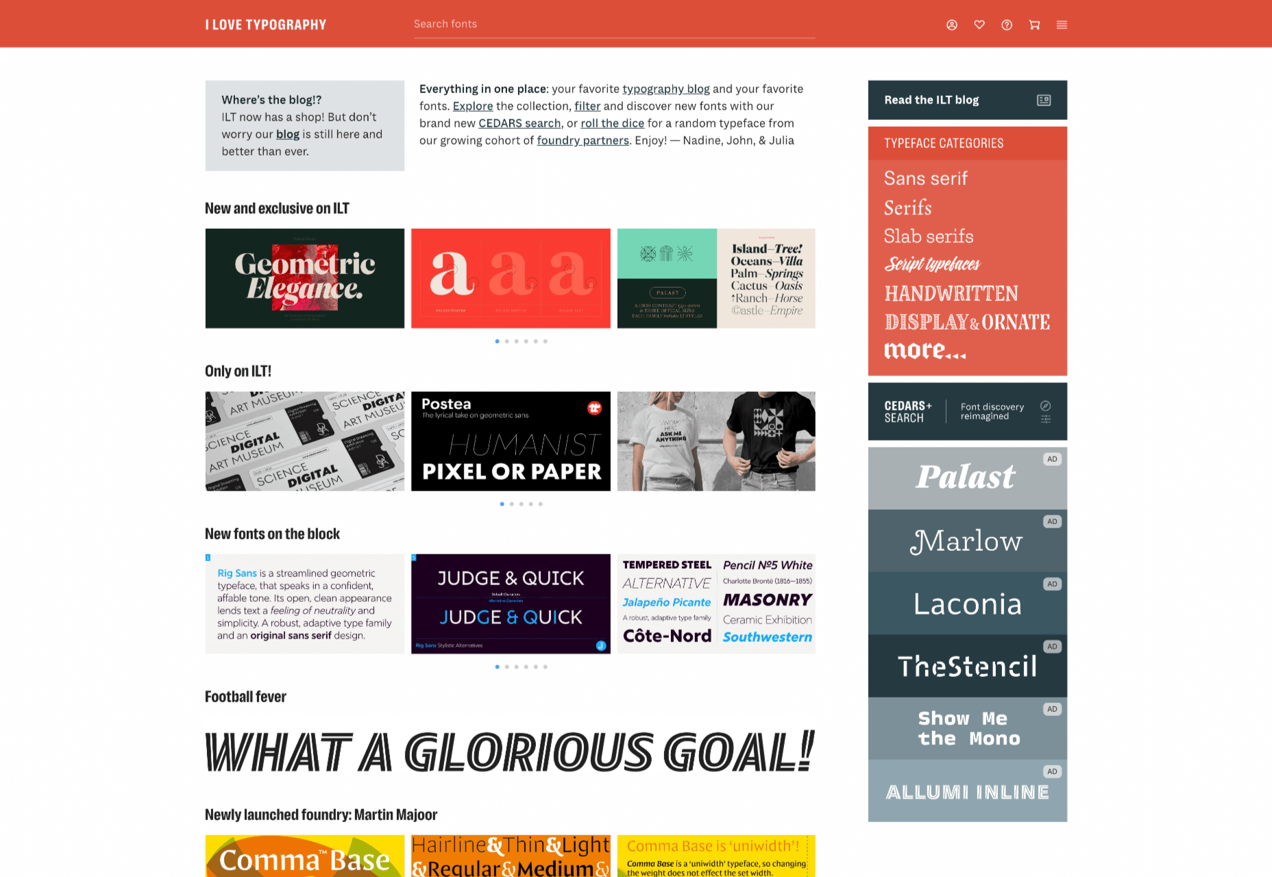
There is no shortage of places to buy fonts online, but the quality of what is on offer is variable, and the way of searching catalogs has remained largely unchanged since the first stores appeared decades ago.
I Love Typography — a popular source of news about typography and type design since 2007 — has stepped into the marketplace, starting by inviting some of the world’s top designers to contribute to its new store, resulting in 40 foundries joining the project and 15 new type families available at launch.
ILT’s boldest move is to step away from the traditionally shallow type categories and attempt to devise a system that drills down into the nuances of type design, all to aid discovery.
The approach is named CEDARS+, which is a method of describing the formal characteristics of a (mainly Latin) typeface based on the characteristics of the marks if made by a writing tool such as a pen or chisel.
CEDARS+ can be broken down as follows:
Contrast: the difference between the thickest and the thinnest strokes in a character. Permissible values range from ‘none’ through ‘medium’ to ‘extreme.’
Energy: the visual energy in the letterform. Values range from ‘calm’ to ‘lively’ and ‘very high.’
Details: with several sub-categories, details is a catch-all category that covers aspects such as how strokes end and intersect.
Axis: the angle at which the tool would be held to create the form. Axis uses degrees, with 90 degrees being a vertical axis.
Rhythm: covers both the tightness or looseness of letters varying from ‘very tight’ to ‘very loose, and the difference in width between the narrow and wide letters varying from ‘highly regular’ to ‘highly irregular.’
Structure: another catch-all category that covers the structure of loops with values such as ‘triangular’ and ‘oval,’ and the general construction, which can be ‘formal,’ ‘cursive,’ ‘organic,’ ‘layered,’ ‘stencil,’ or ‘modular.’
+: the plus covers several characteristics that don’t fit neatly into an acronym, including the shape of crossbars, and single or double storey ‘a’s and ‘g’s.
With a way to browse font families that is based on the feel of the design, rather than popularity (or alphabetical order!) ILT hopes to expose lesser-known designs and designers, and to encourage more creative typography on the web.
I was working on a bug ticket the other day where it was reported that an icon was sitting low in a button. Just not aligned like it should be. I had to go on a little journey to figure out how to replicate it before I could fix it. Lemme set the scene.
Here’s the screenshot:
See how the icon is just… riding low?
But I go to look at the button on my machine, and it looks perfectly fine:
What the heck, right? Same platform (macOS), same browser (Firefox), same version, everything. Other people on the team looked too, and it was fine for them.
It only showed up that way on her low-resolution external monitor. I don’t know if “low” is fair, but it’s not the “retina” of a MacBook Pro, whatever that is.
My problem is I don’t even have a monitor anymore that isn’t high resolution. So how I can test this? Maybe I just… can’t? Nope! I can! Check it out. I can “Get Info” on the Firefox app on my machine, and check this box:
Checked box for “Open in Low Resolution”
Now I can literally see the bug. It is unique to Firefox as far as I can tell. Perhaps something to do with pixel… rounding? I have no idea. Here’s a reduced test case of the HTML/CSS at play though.
The solution? Rather than using an inline-block display type for buttons, we moved to inline-flex, which feels like the correct display type for buttons because of how good flexbox is at centering.
.button {
   /* a million things so that all buttons are perfect and... */

  display: inline-flex;
  align-items: center;
}
For most internet business owners, consistent revenue is the ultimate goal. Learning how to build a membership site is one of the most common ways to monetize your business and adds constant regular money.
How to Creating a membership website in 2021 is a significant undertaking question. To have your ducks in order, you’ll need to wrestle with technology, create content, establish an audience, and generate buzz to assure a successful launch.
However, suppose you can bring some of those things to the table right away, such as an existing following interested in buying from you or a variety of content selected from previous projects. In that case, you can construct a membership website much more quickly than you may expect.
You can utilize a membership website to lock down unique material and charge people for access. People that sign up for a subscription, for example, can get eBooks, courses, research papers, PDFs, webinars, forum access, and more. It is also a fantastic method to make money from your website.
What is a membership website?
A membership website is a gated section of an internet business where just members who have subscribed can view the content that has been placed behind the door. Or a membership site is a collection of pages that contain password-protected material that can only access by logging in. Your membership site might be charged, completely free, or a combination of the two.
A door is just a barrier that you can incorporate into your website using a plugin. As soon as you’ve set up that barrier, members will be able to log in and gain access to unique content, special discounts, and even become part of a society of other members
Choose the right platform for your Website
Here are some to choose from a right platform for your website:
MemberPress
MemberPress is a simple membership plugin for WordPress. This total Membership Software installs quickly on your website and allows you to begin charging for access right away. It’s great to see many WordPress plugins for membership sites, considering WordPress already has such a large number of extensions that it’s only natural that a simple membership site would use WordPress over a custom design.
MemberPress allows you to create an unlimited number of product pages and membership levels, as well as features. Such as a coupon device, access rules to develop sophisticated membership levels, product categories to create a large-scale membership site, and reports to stay up to date on the latest developments in your business and how you can improve it.
Amember
Amember is, without a doubt, one of the older and most famous membership site systems available. It distinguishes out since it is a self-contained membership platform with WordPress-like functionality and aesthetics. The option to schedule content is the most popular feature.
This motivates your subscribers to stay subscribed for extended periods to gain access to previously unreleased material. Other characteristics include integrated modules, which allow you to combine different modules to increase the capability of your membership site more than what it now has.
Furthermore, the extensive affiliate program entices them to begin marketing your products to their relatives and friends.
Learndash
If you want a bespoke structure or set of features, and you have the expertise or budget, building a course online on your WordPress site using LearnDash can be a terrific option.
It’s a little more complex and time-consuming, but it provides you with complete creative flexibility and control.
Although it is the most difficult, it is also the choice that gives you the most flexibility over the appearance and functionality of your course.
Learndash is the most well-known and extensively used WordPress LMS and membership plugin, and it comes with many useful features.
You can design stunning courses with almost any feature you want, and you can link it with the other WordPress plugins and themes to customize your system even more.
Teachable
Teachable is the most popular and well-known online course platform available. It’s jam-packed with features that provide you with everything you’ll need to develop and advertise an online course. In addition, the tools for creating online courses are simple to use and very flexible.
It’s also relatively simple to use and has a modest entrance price, making it an excellent alternative for someone just starting up.
It has several excellent marketing features, like configurable checkouts and one-click upsell webpages, and also the ability to set up your customized affiliate network and manage EU VAT payments.
Teachable also supports your success by hosting regular webinars and articles on topics related to course production, marketing, and selling.
It’s just as important to sell your virtual classroom as it is to create great content. Both are necessary, and these teaching activities assist you in staying current and ahead of the competition.
Kajabi
Kajabi has a more feature-rich premium package than Teachable or Thinkific. For example, there’s built-in email marketing, as well as a library of glossy courses, homepage, and website themes to help you promote and sell your system.
While you can still use the other platforms on this list, in order to do so you’ll need to find tools to work together to achieve the same functionality that Kajabi does itself.
For example, if you wanted to use another tool on this list, you’d have to find your preferred email marketing software to complement your member platform.
Kajabi is an excellent choice and is one of the most extensive tools for designing and selling your material in a straightforward manner.
Kajabi-based courses have a high-quality look and feel, and it includes a variety of tools for creating online courses.
It’s also relatively simple to accomplish without any technical experience. You’ll be able to bypass the hassles of coding & web development while still creating a course that’s completely tailored to your needs.
After evaluating all of the options, I feel Kajabi is the most excellent online course platform available if you can pay $100 per month or more. The student course area’s design is superior to all other options, providing a positive user experience for your students.
You can operate anything from Kajabi without using any third-party solutions because of the extensive marketing options.
Kajabi’s customer service is excellent. You can get help right immediately through chat, and it’s rapid, professional, and thorough. Kajabi is also one of the best (if not the best) teaching platforms available, and it provides you with all of the tools you need to create a world-class learning experience for your students.
Learnworlds
LearnWorlds is a powerful, fully customizable, and user-friendly Teachable alternative. It can be an excellent option for selling online courses or for training employees internally within a company.
LearnWorlds is a feature-rich option that allows you to create an entire course catalog if that’s what you want.
You’ll have significant exposure to over 300 templates for creating sales pages, keyword research, and course pages. When particularly in comparison to developing an app from the ground up, this can save you a lot of time.
And, because there are so many options, you won’t run into the issues that some other platforms do, where everyone’s courses tend to look the same. LearnWorld’s page builder is simple to use and assists you in creating an SEO and mobile-friendly course website.
Set your Membership Model
The Membership is based on value.
Members can combine services and benefits could choose them a-la-carte in a value-based membership model, depending on where they found the most value. This approach gives your members different levels of flexibility, making much more in line with some other non-association services that your target users are already using.
However, because of the many service tiers and accompanying dues, value-based Membership introduces significant revenue volatility. As a result, your bottom line may fluctuate as members try out new providers or choose the cheapest memberships.
Trade organizations, some trade groups, and other organizations have had remarkable success with value-based Membership. Even members who prefer a one-time fee which is easy to get authorized by their employer can package services to achieve a clearer ROI.
Ability-to-Pay Membership is a type of Membership that allows you to pay as you.
Ability-to-pay membership is single-cost, only specific plans that give everyone who joins access to all of your services. This strategy, which has long been regarded as the industry standard, generates dependable cash streams for your organization. They are, however, less appealing to members who want more flexibility. In addition, less involved organizations and individuals have a more challenging time justifying the cost of ability-to-pay memberships since they can’t be appropriately linked to a return on investment.
For organizations looking for more consistent revenue, the capacity membership model works well. However, even at the minor level, they may throw in necessary lobbying costs into another dues structure.
Hybrid Value-Based
Finally, an ability-to-pay structure can be combined with an accurate worth component. This gives members more choice regarding pricing and benefits while also giving your organization a more stable cash stream.
This is accomplished by allowing members to upgrade from a basic membership to a premium membership, which provides more perks for a more fantastic price. The cost of both the base and premier memberships are determined by the member’s financial ability to pay.
Set a Price for Your Membership
It’s no easy task to find that perfect balance with your pricing strategy, and picking the wrong price can be disastrous for your organization.
If you charge too little, you risk losing money, and if you charge too much, you risk alienating potential customers. Therefore, it would help if you devoted time and study to determine your membership pricing approach.
The expense of joining your club should ideally not break the bank, but it also shouldn’t leave you scrabbling for dollars to pay your bills!
After all, you’re running a business, so your membership site must be successful. So, how much will your membership website cost? Is there a target number that you should shoot for?
Unfortunately, when it comes to membership price, there is no such thing as a one-size-fits-all solution. However, there are four crucial factors to consider in arriving at acceptable pricing for you and your members.
You’re Membership Profitability & Your Business Financials
When it comes to determining the cost of your membership site, the first thing you should examine is your company’s finances.
Although you may want to keep your Membership as low-cost as possible, you must be careful not to run out of funds.
Your Membership must be profitable. All of your hard work will be for naught if you don’t make enough money to cover your expenses. So said, if you aren’t producing money, your business will be doomed to fail.
Marketing and Maintain a Membership Site
Membership sites are a fantastic way to distribute your material while also earning money on the side. With a monthly membership, users can gain access to exclusive information on a helpful platform. You can also collect a one-time fee and then upsell additional material.
Make a pre-launch plan.
The ideal time to recruit a significant number of members is when you launch a new membership site. The introduction of a website can elicit feelings of excitement and expectation. You can use such emotions to gain more attention and attract visitors to your web site website.
Prepare content for your website launch several weeks ahead of time. To let users know about the launch, you can create a buzz on social media and send out email blasts.
You can also use limited-time offers to kick-start the launch. You’ll use the Fear of Missing Out (FOMO) to instill a sense of urgency in your audience. People will take advantage of the deal, which will result in increased conversions for your site.
Collaborate
Your Website launch, contests, and discounts can all be useful material for non-competing websites. In addition, you may track down social media influencers in your industry and have your content posted on their pages.
You can also collaborate with well-known bloggers in your field. Make unique offers for their readers, and you’ll be able to persuade them to join your site.
Create social proof
Uncertainty is one of the main reasons why people are hesitant to join membership sites. By including social evidence on your Website, you can reduce their fear of taking a risk.
This can accomplish by requesting client testimonials. In addition, look for and highlight internet reviews and user-generated content. Sharing this type of information generates social proof, fosters trust, and boosts your membership rate.
Affiliate marketing is a powerful approach to promote your Website.
Many people will contribute to the creation of content and the promotion of your membership site. In addition, they benefit from the money they make from the sales they make. This benefits several parties and helps deliver high-quality material to clients who are prepared to pay for it.
With digital marketing, you may multiply the growth of your membership site.
An excellent online business can build on the foundation of your membership site. However, to attract members, you must employ effective marketing methods. You can use the tips provided here to draw attention to your Website. Earning money online will benefit you. Exclusive content will also help your members.
Conclusion
Here we have placed How to create a membership website in 2021 and some other strategies for you. Now you don’t have to think more about your future. You don’t want to prepare carelessly or hurriedly because marketing will account for most of your membership model spending. So before making any judgments learn from your mistakes to go over these stages.
Payment Gateway is a phrase that refers to receiving and transmitting money from online customers to seller accounts for their purchased products online in a safe manner using any form of transaction, such as credit card or debit card.
Actually, a payment gateway is a third-party resource that assists both vendors and purchasers in completing safe and secure transactions. They should also be in charge of maintaining high levels of security on online shops in order to direct online consumers to third-party pages where they may complete their orders.
Magento 2 is a free and open-source e-commerce platform that allows you to create an online store through a custom web development company with extensive functionality and scalability, allowing you to sell both physical and digital items and services. It works with the most recent PHP versions, as well as CSS3, HTML5, and MySQL. Magento 2 facilitates the online transaction procedure and this makes companies hire expert magneto developers.
If all internet shoppers are included and an average is calculated, roughly 19 online transactions per person per year occur globally.
Online fraud, as opposed to in-person fraud, currently accounts for 58 percent of all instances.
Furthermore, 7 out of 10 buyers proceed with a transaction depending on the payment gateway option that is accessible.
Backend order processing is a crucial aspect of eCommerce that is sometimes ignored.
Business owners spend a significant amount of money to create a visually appealing website but often place less emphasis on payment delivery methods.
Consumers throughout the world expect more in the 2010s and 2020s.
What do you mean by payment gateways?
An eCommerce payment gateway is a third-party service that approves credit card payments within your eCommerce software and connects your eCommerce shop to a bank.
Consider it a physical POS (point of sale) terminal at a grocery store or café. A payment gateway, like a cash register, is offered and supported by a third party for your convenience. It takes, verifies, and encrypts your customers’ credit card information. As a result, sensitive financial information is sent securely from a consumer to the merchant, and subsequently between the merchant and the bank.
What are Magento payment methods?
The payment gateway for the Magento store is the manner through which a client decides to pay for an item. Cash, credit/debit card payments, e-Wallets, bitcoin transactions, and other internal and external ways are examples. Yes, you read it correctly: cash transactions are used in eCommerce, though they are less common than other payment methods.
The following payment methods may be configured by a Magento merchant: check/money order, bank transfer, cash on delivery, buy delivery, and zero subtotal checkout. The methods may be installed by going to Admin Stores Configuration Sales Payment Methods in the admin panel.
Understanding a merchant account
A merchant account is a bank account into which proceeds from a successful financial transaction are placed. Your retail business can accept credit and debit card payments processed through a payment processor with a merchant account.
The payment gateway’s primary function is to refuse or authorize each financial transaction, whereas a merchant account is responsible for accepting credit and debit card payments. In simple terms, a merchant account is an agreement between an internet business owner and a credit card processing firm. As a retailer, you don’t need a merchant account because it isn’t required.
What are the best 5 Magento gateways?
Let us have a look at the top 5 payment gateways of Magento2 that one must know:
1. World pay business payment
Most eCommerce shop owners select Worldpay Business Payment Module as one of their preferred Magento2 online payment solution integration extensions because it allows them to sell their products while remaining calm and relaxed without having to worry about technical issues. Many new online store owners, regardless of which PHP-based online store they have just launched, may be perplexed when it comes to choosing Worldpay payment extensions because it is available in two different types: Business account and Online account. They should know which account they have before purchasing any Worldpay payment extensions.
It allows you to apply customer-specific discounts.
It aids in the provision of a discount in order details and order emails.
2. World pay the online payment
Worldpay Online Payment Extension allows store owners to manage all payments and transactions within their store, and buyers can continue shopping after checking out by paying with any of their credit cards (Visa, Mastercard, JCB, AE, etc.) within your online shop without being redirected to the Worldpay payment page, as in Worldpay Business. It also aids the Magento2 store administrator in increasing sales and maximizing profits.
The payment system is completely automated.
It has a feature that allows you to receive automated payment updates.
It provides secure codes to improve payment security.
3. Paypal adaptive
PayPal is a well-known Top Online Payment Gateway for a variety of companies other than e-commerce domains since it has had a significant beneficial influence on online businesses such as online hotel bookings, online shopping, rental bookings, and travel bookings, among others. I discovered PayPal’s Adaptive Payments Extension provides a flexible manner of collecting and transferring funds received from purchasers, which may be divided into different user tiers (primary receiver, secondary receiver). Because it allows sellers to easily handle admin to shopper commission transactions, this type of adaptive payment system will be best suited for the Multivendor Marketplace, which comprises vendors, admin, and buyers.
Both Magento 2.0 and 2.1 are supported by this plugin.
This addon is very simple to set up.
It accepts both normal PayPal payments and PayPal express payments.
It accepts payments in all currencies except the base currency.
Customers are able to pay in any currency of their choice.
4. Stripe payments
Stripe is a well-known payment gateway among all internet users, similar to the PayPal payment system, so there is no need for a lengthy introduction. Since store owners included the Stripe Payment Module by default along with PayPal to collect huge quantities of transactions within their online store, Stripe is another smart payment option on virtually all shopping cart websites. It enables Magento2 shop owners to create partial billing from both the admin panel and the customer dashboard.
It offers credit card processing for level II and level III data.
This extension offers encrypted card readers.
It helps to protect customer data and secure checkout.
It minimizes PCI scope and reduces liability
5. Sage pay
In comparison to other payment methods that are frequently incorporated into an online business, such as Worldpay, 2 checkouts, and so on, Sage Pay is one of the most dominant payment service providers in the UK. It also enables online consumers to conduct safe purchases using credit or debit cards. With the aid of a PCI-compliant data vault, Sage Pay Payments would be able to collect and preserve payments from consumers, as well as save payment information via checkout forms.
It comes with a responsive checkout page by default.
This add-on is simple to use.
This plugin allows you to auto-fill your address.
How do these payment gateways work?
As a middleman between a merchant and a bank, an eCommerce payment gateway protects customers’ privacy while also reducing merchant costs. But how does it function in practice? Let’s have a look at each step.
A payment gateway (and especially Magento payment processing) follows the four stages below:
Step 1: A consumer chooses the product he or she wishes to buy and completes the transaction by entering his or her credit card information on the checkout page. The transaction data is encrypted before being sent to your payment gateway.
Step 2: The payment gateway receives the order and uses a Digital Certificate to authenticate the store (a sort of your online shop ID). When a client selects a payment method, the payment gateway sends the information to either the acquiring bank (in the case of Magento credit card payment method) or a merchant account (in the case of another chosen method).
Step 3: After the issuing bank or credit card (Mastercard, VISA, Maestro, American Express) authenticates the transaction, it is accepted or refused (depending on the charges available on the customer’s bank account).
Step 4: The bank transfers the funds to the payment gateway, which then directs the funds to the merchant account. The money may arrive on a merchant account in a few minutes or a few working days, depending on the payment gateway.
What’s the appeal of it? This entire process takes no more than 2-3 seconds! The final stage of settling the payments may take a few days, but with the appropriate payment gateway, your customer will be able to check out in the blink of an eye.
Conclusion
These extensions are the backbone of not only online retailers, but also many enterprises that have switched from conventional direct store sales to a digital platform. While many online shop administrators obtain the Best Ecommerce Website, others fail to integrate the Best Online Payment Extensions on their particular eCommerce marketplaces. At the end of this post, any online shop owner will be able to choose the best payment gateway modules for their Custom Magento2 Marketplace.
Consumer trust is a key factor in any eCommerce platform’s marketing strategy.
Regardless of how big or small a business is, it is trust that helps them build online credibility, attract new prospects, nurture relationships with existing customers, and ultimately sell more products or services!
Incidentally, one of the most efficient resources that businesses have to inspire confidence and bridge relationship gaps with prospects is video content. As it helps them connect their core messages with their audiences while keeping it engaging, dynamic, and genuine.
Now, there are several types and techniques you can use to build consumer trust with videos. So, today, we’ll go over the most relevant in terms of enhancing your marketing strategy and earning your prospects’ trust.
Let’s go!
The Three Desirable Traits to Inspire Confidence
When you want to start a business relationship with potential customers, it’s vital to first shape how they perceive your brand.
Given that we are focusing on consumer trust let’s take a quick look at three desirable traits that can help you inspire confidence in your prospects: competence, expertise, and humanity.
1. Use quality to display competence
In the digital landscape, your content is the presentation letter you’ll offer to potential customers. Your website, social media accounts, videos, and blog posts will be their point of reference to help them understand if your brand’s worth it or not.
And for that matter, quality is paramount because it speaks to the standards you hold your company to! So, if you are developing videos to show how professional your company is, it’s essential to keep a certain quality level and make sure they have a professional finish.
Now, several elements will come into play for how your video’s quality is perceived – for example, a well-written script and a top-notch visual delivery. However, this may depend on the type of video you are producing.
Whatever the case might be, you need to remember that poor quality can be harmful and scare your target audience away. So, make sure the piece you end up with matches your audience’s expectations.
2. Showcase your expertise
Few things inspire more confidence than sharing knowledge about the topic in question. It demonstrates to your audience that you are an expert in your field.
Keep in mind that when browsing online, people are usually trying to find a solution to a specific problem. But not just any solution – the best solution. So, to be seen as a reliable source of information (and solutions), you must be ready to address those pain points and provide all the right answers.
That’s when video waltz’s in.
This awesome and versatile medium has the ability to condense a lot of important information in a short amount of time, no matter how complex that information might be. Making it a great resource to share your knowledge and display your expertise in the most creative, simple, and engaging way.
3. Humanize your brand
We, humans, are inherently social creatures. We crave to be seen and treated as unique individuals, especially in the often-so-cold-and-impersonal online field.
So, to build a sincere connection with your audience, you need to show them that there are real people behind your brand. People that care about them and their problems.
Take into account that people bond with other people and their experiences, not with brands and logos. Make a stand and prove that your company’s more than just a business, an office, or a product that needs to be sold.
Go beyond the mere fleeting impact and create video content that’s relatable, interesting, and above all, human. By doing so, you’ll be able to build more loyal, long-lasting relationships with your audience.
5 Types of Videos that Excel at Generating Consumer Trust
Now that we know which attributes or elements you need to focus on to foster consumer trust, let’s take a cue from experienced video companies, and break down a few types of videos that can really help you achieve it.
Explainer Videos
Explainer videos – a.k.a.: promotional videos – are short, usually, animated pieces that help to illustrate complex business ideas or concepts in simple and meaningful ways.
Instead of hard-selling, their main goal is to describe a company’s product or service in a way that resonates with their target audiences’ pain points, introducing their solution as the ideal choice.
To achieve that, these videos use storytellingas a secret weapon to connect a brand’s message with its target audience. How? By focusing on telling a relatable story about a product or a brand and showing how it can make a prospect’s life easier, all while keeping it exciting and compelling.
This is why explainer videos are great to foster consumer trust – if well executed, they speak directly to the audience, making the message more personal, intimate, and relatable.
Take a look at this cool motion graphics video as an example. In less than 2 minutes, an empathetic narrator walks the viewer through an in-depth but understandable explanation of several types of explainers. And on top of that, it has gorgeous animations to make the brand’s core message come alive!
Company Story Videos
If you want to show your company’s human side, few things can stand against a company story video. These are a great marketing tool for conveying your brand’s culture and sharing your story with prospects and existing customers.
As explainer videos do, company story videos also use appealing narratives – driven by powerful scripts – to create a strong connection with viewers and foster consumer trust. To do so, they mostly revolve around a brand’s core values, targeting topics that resonate with the audience.
That said, for a company story video to be effective, it needs to feel authentic and unique. There’s no other brand like yours, and you should exploit that. Show your prospects how you like to do things, what drives you, what you stand for, and so on.
Check out this company story video developed by Ben & Jerry’s. They used it to convey a powerful message: their desire to make a positive impact and create linked prosperity for everyone involved in their business (suppliers, employees, farmers, customers, etc.)
Product Videos
One of the trickiest parts about online shopping is that people can’t try out or even touch a product before purchasing it. Fortunately, product videos came to save the day!
These cool videos showcase how a product or service works, highlighting its benefits and key features through detailed visuals. By doing so, people can see it in action and understand what kind of value it brings to them.
As it happens with most video content, there’s not just one right way to make a product video. This will depend on your industry, your target audience’s characteristics, and how they usually make purchase decisions.
Nevertheless, it’s important to remember that these videos are the cornerstone of anyeCommerce company. In classy and precise ways, they can reinforce consumer trust by offering solid evidence that supports all the great things you are saying about your products.
Like this Cambridge Sound piece that offers a thorough demonstration of the product’s functions and special features with elegant animations. The video also features a calm tune that matches the brand’s overall tone.
Customer Testimonials
When we’re interested in buying something online, one of the first things we all do is go and check the reviews. This is because there’s nothing more trustworthy than hearing or reading what another fellow human has to say about it.
So, customer testimonials and reviews in any form help you build trust, and pair really well with email outreach strategies across all niches. But testimonial videos are particularly effective because they feature real people with real emotions. Sharing their personal experiences and impressions about your product or service.
If you want to develop a testimonial video – and we really encourage you to do so – there are a couple of important things that you should take into account first:
Testimonials need to feel natural and authentic. People can really tell when someone’s faking an opinion, especially on camera. So, it’s always better not to try to stage it!
You will probably plan ahead and write some important questions you want to ask. That’s fine, but try to make it as conversational as you can.
Ensure that your interviewees clearly address how your product or service helped them solve their specific problems and improved their lives.
Check out how all these elements we’ve just mentioned play together in the following testimonial video. The person interviewed takes the time to elaborate his answer without sounding robotic or fake.
How-To Videos
Truly helpful content is another way to form a strong connection with your target audience and build trust in your brand.
In its more basic form, a how-to video quickly teaches something related to your product or brand by answering a specific question and providing immediate value. For example, how to prepare a mocha cappuccino, how to use Instagram Stories for businesses, or how to cut your own hair!
Because they are very instructional and easy to follow, people love watching them when they need to solve a problem or learn something new. For businesses, developing this kind of content is a great opportunity to position them as an authority and source of useful (and sometimes fun) information.
As a side benefit, how-to videos are not only helpful for converting potential customers but also for existing ones, as they can use these videos to learn to handle your product correctly or how to get the most out of them.
This type of video can take on many forms, such as DIY, training videos, or tutorials. Check out this screencast how-to video created by Asana:
Bonus Round: More Videos to Build Trust and Delight Your Customers
Some video styles help boost consumer trust indirectly by strengthening the customer-brand relationship. Let’s take a look at some of the best:
Behind the Scenes Videos
These can be included in the “company culture videos” category, but they are so powerful that they deserve a special mention on our list.
Audiences really like taking a look behind the curtains to discover how everything’s done inside a brand. It makes them feel special and included because you are opening your brand’s door, inviting them to be a part of your world.
Since this type of content is (or should be) transparent, it works particularly well on social media – a place that thrives on genuine interactions between brands and customers. By sharing behind-the-scenes videos and other types of BTS content, a company can look approachable and develop a more personal bond with its audience.
The thing is, not every behind-the-scenes moment is worth sharing. The video should send a consistent message about your brand and revolve around a single topic, such as a company event, a new project, or even the office’s pets if that speaks to your core values!
Take a look at this tour inside Facebook’s engineering office in London and see how they’ve managed to convey their company values throughout the piece.
These videos have proven their power to captivate audiences, amassing excellent results in terms of online engagement. They allow companies to interact directly with their customers and establish a strong relationship with them.
If you think about it, it’s no wonder that live videos succeed at fostering trust in a brand. There’s something truly remarkable about a company that dares to speak directly to their audience, addressing their questions and feedback in real-time.
Why does that matter? Because live videos are not so much about the company and its products as about its audience.
So remember: to create truly great live streaming, you need to pay special attention to your viewers. Welcome them to the streaming by name, allow them to leave comments – deactivating that feature may leave a poor impression about your brand – and answer their questions.
A final piece of advice: keep in mind live videos need to be well-promoted before time. Otherwise, don’t be surprised if hardly any viewer shows up to the streaming!
Customer Appreciation Videos
Customer appreciation videos are a great marketing resource that brands can use to nurture their bonds with existing customers.
As you may know, one of the biggest challenges business owners have to face is trying to turn a one-time purchase into a loyal customer.
With these videos, you can go above and beyond, keep in touch with them, and create a memorable customer experience. Plus, this will help you to extend your reach organically because your happy and loyal customers will spread the word about your brand.
One of the most common ways to connect with your customers and show them appreciation is on special occasions. For example, sending a thank you video when they make a purchase or greeting them on their birthdays or holidays.
Take, for example, this Lyft ‘thank you’ video honoring one of the company’s drivers:
Summing Up
An eCommerce company – or any type of company really, can’t exist without its loyal customers. But for that to happen, you first need to create a relationship with each of them. One based on trust and credibility.
As we’ve just learned, video can be a really powerful tool for building a bridge that connects you with your prospects and nurtures consumer trust. Depending on your industry and specific business needs, there are many options for you to choose from: explainer videos, customer testimonials, behind the scenes, product videos, company stories, how-to videos, live streamings, you name it!
However, regardless of what type of video you end up choosing, remember this: There’s only one way to achieve that kind of trust bond with your prospects. And that is, showing that you care about their problems and that you’re more than committed to solving them.
The squiggly lines that indicate possible spelling or grammar errors have been a staple of word processing on computers for decades. But on the web, these indicators are powered by the browser, which doesn’t always have the information needed to place and render them most appropriately. For example, authors might want to provide their own grammar checker (placement), or tweak colors to improve contrast (rendering).
To address this, the CSS pseudo and text decoration specs have defined new pseudo-elements ::spelling-error and ::grammar-error, allowing authors to style those indicators, and new text-decoration-line values spelling-error and grammar-error, allowing authors to mark up their text with the same kind of decorations as native indicators.
This is a unique post too, as Delan is literally the person implementing the feature in the browser. So there is all sorts of deep-in-the-weeds stuff about how complex all this is and what all the considerations are. Kinda like, ya know, web development. Love to see this. I’ve long felt that it’s weird there is seemingly such little communication between browser engineers and website authors, despite the latter being a literal consumer of the former’s work.
Sara digs into a bug I happened to have mentioned back in 2012 where fluid type didn’t resize when the browser window resized. Back then, it affected Chrome 20 and Safari 6, but the bug still persists today in Safari when a calc() involves viewport units.
Sara credits Martin Auswöger for a super weird and clever trick using -webkit-marquee-increment: 0vw; (here’s the documentation) to force Safari into the correct behavior. I’ll make a screencast just to document it:
I randomly happened to have Safari Technology Preview open, which at the moment is Safari 15, and I see the bug is fixed. So I wouldn’t rush out the door to implement this.
Not news to any web developer in 2021: CSSGrid is an incredibly powerful tool for creating complex, distinct two-dimensional modern web layouts.
Recently, I have been experimenting with CSS Grid and alignment properties to create component layouts that contain multiple overlapping elements. These layouts could be styled using absolute positioning and a mix of offset values (top, right, bottom, left), negative margins, and transforms. But, with CSS Grid, positioning overlay elements can be built using more logical, readable properties and values. The following are a few examples of where these grid properties come in handy.
In the demo, there is a checkbox that toggles the overflow visibility so that we can see where the image dimensions expand beyond the container on larger viewport widths.
Here’s a common hero section with a headline overlapping an image. Although the image is capped with a max-width, it scales up to be quite tall on desktop. Because of this, the content strategy team has requested that some of the pertinent page content below the hero remain visible in the viewport as much as possible. Combining this layout technique and a fluid container max-height using the CSS clamp() function, we can develop something that adjusts based on the available viewport space while anchoring the hero image to the center of the container.
CSS clamp(), along with the min() and max() comparison functions, are well-supported in all modern browsers. Haven’t used them? Ahmad Shadeed conducts a fantastic deep dive in this article.
Open this Pen and resize the viewport width. Based on the image dimensions, the container height expands until it hits a maximum height. Notice that the image continues to grow while remaining centered in the container. Resize the viewport height and the container will flex between its max-height’s lower and upper bound values defined in the clamp() function.
Prior to using grid for the layout styles, I might have tried absolute positioning on the image and title, used an aspect ratio padding trick to create a responsive height, and object-fit to retain the ratio of the image. Something like this could get it there:
Maybe it’s possible to whittle the code down some more, but there’s still a good chunk of styling needed. Managing the same responsive layout with CSS Grid will simplify these layout style rules while making the code more readable. Check it out in the following iteration:
place-content: center instructs the image to continue growing out from the middle of the container. Remove this line and see that, while the image is still vertically centered via place-items, once the max-height is reached, the image will stick to the top of the container block and go on scaling beyond its bottom. Set place-content: end center and you’ll see the image spill over the top of the container.
This behavior may seem conceptually similar to applying object-fit: cover on an image as a styling method for preserving its intrinsic ratio while resizing to fill its content-box dimensions (it was utilized in the absolute position iteration). However, in this grid context, the image element governs the height of its parent and, once the parent’s max-height is reached, the image continues to expand, maintaining its ratio, and remains completely visible if the parent overflow is shown. object-fit could even be used with the aspect-ratio property here to create a consistent aspect ratio pattern for the hero image:
Moving on to the container’s direct children, grid-area arranges each of them so that they overlap the same space. In this example, grid-template-areas with the named grid area makes the code a little more readable and works well as a pattern for other overlay-style layouts within a component library. That being said, it is possible to get this same result by removing the template rule and, instead of grid-area: container, using integers:
.container > * {
  grid-area: 1 / 1;
}
This is shorthand for grid-row-start, grid-column-start, grid-row-end, and grid-column-end. Since the siblings in this demo all share the same single row/column area, only the start lines need to be set for the desired result.
Setting place-self to place itself
Another common overlay pattern can be seen on image carousels. Interactive elements are often placed on top of the carousel viewport. I’ve extended the first demo and replaced the static hero image with a carousel.
CodePen Embed Fallback
Same story as before: This layout could fall back on absolute positioning and use integer values in a handful of properties to push and pull elements around their parent container. Instead, we’ll reuse the grid layout rulesets from the previous demo. Once applied, it appears as you might expect: all of the child elements are centered inside the container, overlapping one another.
With place-items: center declared on the container, all of its direct children will overlap one another.
The next step is to set alignment values on individual elements. The place-self property—shorthand for align-self and justify-self—provides granular control over the position of a single item inside the container. Here are the layout styles altogether:
There’s just one small problem: The title and carousel dot indicators get pulled out into the overflow when the image exceeds the container dimensions.
To properly contain these elements within the parent, a grid-template-row value needs to be 100% of the container, set here as one fractional unit.
For this demo, I leaned into the the grid-template shorthand (which we will see again later in this article).
.container {
  grid-template: "container" 1fr;
}
After providing that little update, the overlay elements stay within the parent container, even when the carousel images spread beyond the carousel’s borders.
Alignment and named grid-template-areas
Let’s use the previous overlay layout methods for one more example. In this demo, each box contains elements positioned in different areas on top of an image.
CodePen Embed Fallback
For the first iteration, a named template area is declared to overlay the children on the parent element space, similar to the previous demos:
The image and semi-transparent overlay now cover the box area, but these style rules also stretch the other items over the entire space. This seems like the right time for place-self to pepper these elements with some alignment magic!
That‘s looking great! Every element is positioned in their defined places over the image as intended. Well, almost. There’s a bit of nuance to the bottom area where the tagline and action buttons reside. Hover over an image to reveal the tagline. This might look fine with a short string of text on a desktop screen, but if the tagline becomes longer (or the boxes in the viewport smaller), it will eventually extend behind the action buttons.
Note how the tagline in the first box on the second row overlaps the action buttons.
To clean this up, the grid-template-areas use named areas for the tagline and actions. The grid-template-columns rule is introduced so that the actions container only scales to accommodate the size of its buttons while the tagline fills in the rest of the inline area using the 1fr value.
Everything should look the way it did before. Now for the finishing touch. The tagline and actions keywords are set as their respective element grid-area values:
Now, when hovering over the cards in the demo, the tagline wraps to multiple lines when the text becomes too long, rather than pushing past the action buttons like it did before.
Named grid lines
Looking back at the first iteration of this code, I really liked having the default grid-area set to the box keyword. There’s a way to get that back.
I’m going add some named grid lines to the template. In the grid-template rule below, the first line defines the named template areas, which also represents the row. After the slash are the explicit column sizes (moved to a new line for readability). The [box-start] and [box-end] custom identifiers represent the box area.
One of the really interesting parts to observe in this last example is the use of logical values, like start and end, for placing elements. If the direction or writing-mode were to change, then the elements would reposition accordingly.
When the “right to left” direction is selected from the dropdown, the inline start and end positions are reversed. This layout is ready to accommodate languages, such as Arabic or Hebrew, that read from right to left without having to override any of the existing CSS.
Wrapping up
I hope you enjoyed these demos and that they provide some new ideas for your own project layouts—I’ve compiled a collection of examples you can check out over at CodePen. The amount of power packed into the CSS Grid spec is incredible. Take a minute to reflect on the days of using floats and a clearfix for primitive grid row design, then return to the present day and behold the glorious layout and display properties of today‘s CSS. To make these things work well is no easy task, so let’s applaud the members of the CSS working group. The web space continues to evolve and they continue to make it a fun place to build.
Now let’s release container queries and really get this party started.