Get that desk more cuter, fam. Amy (@sailorhg) has this perfectly cute minisite with assorted desktop backgrounds, fonts, editor themes, keyboard stuff, and other accessories. These rainbow cables are great.
I updated my personal website the other day. Always a fun project since it’s one of the few where it’s 100% just me. It’s my own personal playground with no other goal than making the site represent me to have a little fun. It’s not a complete re-write, just some new paint.
I thought I’d document little bits of it here just to hone in on some of the bits of trickery in the spirit of learning through sharing.
Hoefler Fonts
I think the Inkwell family is super cool. I like mix and matching not just the weights but the serif and sans-serif and caps vs not.
I used Inkwell in the last design as well, but I was worried that it was a little too jokey for blog post body copy. My writing is extremely casual, but not always, and Inkwell is way too jovial for serious topics. I went with Ideal Sans for body copy last time, but the pairing with Inkwell felt a little off.
This time I went with Whitney for general body copy, which is still pretty lighthearted, but works when the copy is more straight toned.
Blogroll
If you’re going to zebra-stripe a table, you’d do something like…
What if you wanted to rotate four colors though? It’s still :nth-child trickery, selecting every four, and then offsetting. Here, I’ll do it with list items in Sass (the nesting is nice, not having to repeat the selector):
li {
  &:nth-child(4n) a {
    color: $blue;
  }
  &:nth-child(4n + 1) a {
    color: $yellow;
  }
  &:nth-child(4n + 2) a {
    color: $red;
  }
  &:nth-child(4n + 3) a {
    color: $purple;
  }
}
That’s what I did to build the colorized blogroll:
Note the Sass used above… I used Sass because it was already in use on the project. All I had to do was open CodeKit and the processing was ready-to-go.
Oh, and blogrolls are cool again.
Chill YouTube
I used this click-to-load-YouTube-(at all) technique which is still extremely clever. Having an that behaves just like a YouTube embed would but only loading a simple static image (rather than heaps and heaps of resources) is great for performance and behaves essentially the same as a normal YouTube embed does.
<iframe
  width="560"
  height="315"
  src="https://www.youtube.com/embed/Y8Wp3dafaMQ"
  srcdoc="<style>*{padding:0;margin:0;overflow:hidden}html,body{height:100%}img,span{position:absolute;width:100%;top:0;bottom:0;margin:auto}span{height:1.5em;text-align:center;font:48px/1.5 sans-serif;color:white;text-shadow:0 0 0.5em black}</style><a href=https://www.youtube.com/embed/Y8Wp3dafaMQ?autoplay=1><img src=https://img.youtube.com/vi/Y8Wp3dafaMQ/hqdefault.jpg alt='Video The Dark Knight Rises: What Went Wrong? – Wisecrack Edition'><span>▶</span></a>"
  frameborder="0"
  allow="accelerometer; autoplay; encrypted-media; gyroscope; picture-in-picture"
  allowfullscreen
  title="The Dark Knight Rises: What Went Wrong? – Wisecrack Edition"
></iframe>
Custom Post Types everywhere
I’m a big fan of giving myself structured data to work with. In WordPress-land, that often means Custom Post Types paired with something like the Advanced Custom Fields plugin for just the right data needed for the job.
Then I can loop over stuff and output it however I want. This isn’t that fancy, but it opens up whatever future doors I want to a lot easier.
Build your own bio
There is nothing fancy about how this works:
I literally made 18
elements (3 lengths * 2 styles * 3 code types = 18) and swap between with a bit of JavaScript that calculates a class string based on the current choices, selects that class, and unhides it while hiding the rest.
$(".bio-choices input").on("change", function () {
  var lengthClass = ".bio-" + $("input[name=length]:checked").attr("id");
  var styleClass = ".bio-" + $("input[name=style]:checked").attr("id");
  var codeClass = ".bio-" + $("input[name=code]:checked").attr("id");
  var selector = lengthClass + styleClass + codeClass;

  $(".bio").hide();
  $(selector).show();
});
jQuery! That’s what was already on the site, and the site also uses the jQuery version of FitVids for responsive videos — so I figured I’d just leave it all be.
If I was going to re-write these bits of the site, I’d probably rip out jQuery and use this for FitVids. Then I’d find a way to only have three bios (maybe six if I can’t find a nice way to handle first vs. third person with word swaps) and then get the rest by automatically converting the formats somehow (maybe some cloud function if I had to).
ztext.js
I used ztext for the header! It’s this kinda stuff that makes the web feel extra webby to me. I’m not sure I’d do something with quite so much movement on a site like CSS-Tricks (because people visit it more often and the time-on-site is higher). But for a site that people might land on once in a blue moon, it has the right amount of cheerful levity, I think.
Background SVG
I was stoked to see the SVG Backgrounds site get an upgrade lately. I was playing around in there and was like YES, I’m doing this.
I went with a background-attachment: fixed look, which I think I like. I also added the slideout footer effect on desktop, but I’m less sold that it’s working here. It’s more fun when the background changes, and that doesn’t happen here. I’ll probably either change the background of the footer, or rip the effect out.
Filter trick for links
Some of the different sections on the site use a different primary highlight color, and I’m having the links in those sections follow that color. That might be questionable (perhaps all links should be blue) but, so far, I think it makes decent sense (they still have hover and focus styles). When you have a variety of colors and styles for interactive elements though, it often means that you have to create special alternate styles for hover and focus. That could mean crafting bespoke color alterations for each color. Not the end of the world, but I really like this little trick for interactive styles that ends up with a consistent look across all colors:
Anyway! This was just a couple hours of paint on this site. Mostly because blogrolls were the CodePen Challenge that week. But I can never touch a site I haven’t in a while and just do one thing. I get sucked in and gotta do more!
Twenty-plus years ago, tables were the main way web pages were created in HTML. It gave web builders consistent control of constructing pages with some “design.” No longer did sites only have to be top-to-bottom in a linear manner — they could be set up with columns that align left-to-right and top-to-bottom. Back then, it was seen as a huge breakthrough.
Tables, however, were never designed to lay out pages and, in fact, have all sorts of problems when used that way today. It was a convenient hack, but at the time, a very welcome one, particularly for those trying to achieve a super-specific layout that previous ways couldn’t handle.
Fast-forward to modern days and it’s now obvious that were tons of issues with the table layout approach. Accessibility is a big one.
,
,
and
elements aren’t exactly accessible, especially when they’re nested several levels deep. Screen readers — the devices that read web content and serve as a measure of accessibility compliance — struggle to parse them into cohesive blocks of content. That’s not to say tables are bad; they simply were never intended as a layout mechanism.
Check out this table layout. Feel free to run it through VoiceOver or whatever screen reading software you have access to.
CodePen Embed Fallback
Yes, that example looks very much like a typical website layout, but it’s crafted solely with a table. You can see how quickly it becomes bloated and inaccessible the very moment we start using it for anything other than tabular data.
So after more than 20 years of being put through the ringer, you might think we should avoid tables altogether. If you’ve never shipped a table-based layout, you’ve undoubtedly heard war stories from those of us who have, and those stories are never kind. It’s like we’ve sort of made tables the “Internet Explorer of HTML elements.”
But that’s not totally fair because tables do indeed fill a purpose on the web and they are indeed accessible when they are used correctly.
Tables are designed to handle data that is semantically related and is best presented in a linear-like format. So, yes, we can use tables today in the year 2020, and that will likely continue to be true many years from now.
Here’s a table being used to display exactly what it’s intended to: tabular data!
CodePen Embed Fallback
With the push toward web standards in the early 2000s, tables were pushed aside as a layout solution in favor of other approaches, most notably the CSS float property. Designers and developers alike rejoiced because, for the first time, we had a true separation of concerns that let markup do the markup-y things it needs to do, and CSS to do the visual stuff it needs to do. That made code both cleaner and way easier to maintain and, as a result, we could actually focus on true standards, like accessibility, and even other practices, like SEO.
See (or rather hear) the difference in this example?
CodePen Embed Fallback
Many of us have worked with floats in the past. They were originally designed to allow content to flow around images that are floated either to the left or right, and still be in the document flow. Now that we’ve gotten newer layout features — again, like grid and flexbox — floats, too, have sort of fallen by the wayside, perhaps either because there are better ways to accomplish what they do, or because they also got the same bad rap as tables after being (ab)used for a long time.
But floats are still useful and relevant! In fact, we have to use them for the shape-outside property to work.
CodePen Embed Fallback
A legitimate float use case could be for wrapping content around a styled
.
CodePen Embed Fallback
CSS features like grid, flexbox, and multicolumn layouts are among the wonderful tools we have to work with these days. With even more layout possibilities, cleaner and more accessible code, they will remain our go-to layout approaches for many years to come.
No hacks or extra code in this flexbox example of the same layout we’ve looked at throughout this article:
CodePen Embed Fallback
So, next time you find yourself considering tables or floats, reach for them with confidence! Well, when you know the situation aligns with their intended use. It’s not like I’m expecting you to walk away from this with a reinvigorated enthusiasm for tables and floats; only that, when used correctly, they are perfectly valid techniques, and even continue to be indispensable parts of our overall toolset.
If you’re wondering why your website conversion rate is painfully low after investing a lot of time (and money) into it, then you probably haven’t considered its page speed.
Did you know that a whopping 1% of a business’s revenue is lost for every second a page takes to load? With statistics like that, there’s no denying that page speed has a lot to do with the success of your business. Find a website designer near you.
Unfortunately, improving your website’s speed is harder than you might think. There are multiple reasons why your website load time could be struggling. Here are five tried and tested ways that are effective in tackling the issue.
Use A CDN
The internet has given businesses a unique opportunity to reach customers across all corners of the globe. However, delivering great web performance and user experience across continents can be tricky. That’s where a Content Delivery Network (CDN) comes in. A CDN distributes your website in servers located in different regions of the world, reducing the distance the information travels to the end-user. Cloudflare is one of the most recognized CDN providers, but there are many other options available.
Get rid of pop-ups
If you think the only purpose of pop-ups is to irritate users with annoying and irrelevant spammy ads, then think again. In the contemporary world of web design, they are regularly used by businesses as a form of promotion. While they can prove effective for promotional purposes, they need to be loaded on top of your website content, reducing the overall page speed.
Google PageSpeed
Google PageSpeed is a handy tool that analyses your website’s page speed performance. It will dissect all of the factors affecting your page load speed, displaying it in a simple rating out of 100 formats. The lower the score, the more issues you have to deal with. Bear in mind that many of the problems identified are pretty technical, so you may need someone with knowledge of website technicalities on hand to interpret it for you.
Image optimization
Images are often a major culprit for sites with slow page speed. Heavy visual content on websites, including motion graphics, images, and videos, could contribute to your slow load time. Rather than removing your images, you can always optimize them. You can do this by choosing the right file format, image resizing, and reducing image dimensions. You can also find an abundance of free image optimization tools online to do the legwork for you, such as Adobe Photoshop, or JPEG optimizer.
Keep redirects to a minimum
Every time a page redirects to a new page, this will add waiting time for the user as the HTTP request-response cycle completes. While redirects send users to the correct pages on your website, they can significantly slow down your page speed. By reducing the number of redirects on your website, you can improve its page speed considerably.
In summary
By carrying out frequent audits of your website speed, you can keep on top of its performance and take action when you need to. However, if you’re not accustomed to the technicalities of websites you might need to get a web designer or web developer in to identify and tackle the issue, especially as the root of the problem causing your page to load slowly isn’t always obvious.
However, the above points should set you on the right path to identifying the problem so you can start to resolve the issue yourself.
When it comes to compliance, website developers need to keep their eyes on more than just ADA regulations and Section 508. Privacy laws are a big consideration and decisions on how to build privacy into a website start with architects.
And that’s exactly what website developers (and designers!) are. They build up attractive, functional websites and apps for their clients. Yes, they work closely with clients, copywriters, vendors, and other professionals to get the job done, but the developers are the ones who put it all together.
That’s why it’s critical that website developers are well-versed in marketing privacy laws — these regulations directly impact the end results of their work. But how does a website architect create a digital platform that honors both user privacy and the needs of their clients?
What Privacy Laws Are Important For Web Developers?
The two biggest privacy laws that web developers need to keep tabs on are the General Data Protection Regulations (GDPR) and the California Consumer Privacy Act (CCPA). Each law has its own unique scope and provisions, but they both shifted the landscape in defining an individual’s rights to their personal data and set mechanisms for how these rights would be protected and enforced.
Each regulation also carries with it fines, fees, and legal measures for non-compliance. These can be substantial. And if that’s not enough, there’s an ever-increasing consumer demand for websites that prioritize privacy and security. Consider these statistics:
79% of adults claim they are very or somewhat worried about how companies use the data they collect about them
63% of Americans believe they understand very little or nothing at all about privacy laws and regulations that are intended to protect their data
How Can Developers Implement These Laws?
Privacy by Design is Critical for Websites
Under GDPR, web developers are required to adopt the Privacy by Design framework, which is a multi-point methodology intended to standardize data protection measures.
Building privacy into websites shouldn’t happen at the end stages. It should start with how the websites are conceptualized in the first place. Here are points to prioritize:
Minimize that data you’re collecting and pseudonymize it to protect data privacy
Are you capturing consent? How? Where?
Integrating security measures to protect data — anytime you capture data or implement a third party product, a security risk is born.
Knowing where you’re introducing privacy and data sharing notices
Implement just-in-time notices to provide consumers transparency and build trust
Giving your users the opportunity to manage their personal data
Let’s look at these a little more closely…
Data Minimization is the Goal
Data minimization is an important principle embedded in GDPR. Data minimization itself is a pretty straightforward concept: organizations should limit how much personal data they collect and only process the information necessary to accomplish their business purposes. Once the data is no longer useful, it should be deleted.
For web developers, this means several things. When it comes to building websites, forms, cookies, and other methods should only ask for essential information. For example, if you are creating a pop-up to collect email addresses, don’t ask for their location unless it’s relevant to the email list and better serving their needs.
How and Where Do You Introduce Privacy Policies and Notices?
Let’s say you take data minimization seriously. That’s great! Now you need to put those data collection practices into words and share them with your customers.
Privacy policies and notices are a big part of both GDPR and CCPA. Both the CCPA and the GDPR mandate that your privacy policy detail why you’re collecting information and how it will be used, as well as what the individual’s rights are and how they can exercise them.
CCPA takes a slightly different angle, requiring privacy policies to disclose if the business sells personal data and what third parties have access to the data. CCPA also dictates that privacy policies and notices are current, updated at least annually. (Nota bene: GDPR also asks for updated privacy documents, but doesn’t specify frequency.)
How does this translate from policy into web development?
If you’re collecting data to improve user experience, allow for targeted ads, or sharing information with third-parties, this information will need to be included in a privacy notice. Remember, CCPA works with a broad definition of selling data, so you may need to account for a “Do Not Sell” link on your home page.
Considering using data beyond these purposes? Plan to obtain explicit user consent for each additional purpose.
What’s your plan for the data after the user gives it to you? Where is it stored? Who has access to it? How long are you keeping it? These are all questions that a website developer should consider, and that needs to go into a privacy notice.
Just-in-Time Notices for Transparency and Trust
Part of Privacy by Design is the use of individual components of your website to create transparency and support compliance. From a development and design perspective, this means you should always be looking for ways to communicate the hows and whys of data collection.
Yes, your privacy policies and notices aid in this, but going beyond these pieces is important. Customers recognize when businesses go the extra mile for them, after all.
So consider implementing just-in-time notices at points where users enter their information. These notices are a chance to share your data collection practices with your users. It’s transparent! It’s open! It aids in consumer awareness!
Keep Users in the Loop
Want to win over your customers? Make it as easy as possible for them to manage their personal data and how it’s being used. This starts with making sure they are aware of why you’re requesting their information and how you’re planning on using it for the website. You should also:
Get user consent — clear and unambiguous user consent — prior to gathering any data at all. This includes cookies.
Don’t pre-tick boxes for consent. Just don’t. (It’s bad practice AND it’s against GDPR.)
Link to all legal documents on the site. Users should be required to agree to them before using the service.
Want to send marketing communications like email newsletters to your customers? Make sure they agree to this. Expressly.
One helpful tool for keeping users in the loop is a marketing preference center. A marketing preference center allows users easy access to their information. From there, they can manage, edit, and delete their information at their discretion.
Bonus? A marketing preference center is an excellent point at which to communicate a business’ commitment to privacy. While users will pick up this through all the discrete elements of privacy on your website, putting it all into one hub that also allows users control over their data really reinforces this message.
Remember, it’s not just on the consumer to manage their data. Web developers should commit to managing the data in their systems. This means they should:
Maintain accurate and clean records of users’ data consent preferences
Send regular reminders to users to update their personal information in your system
If a user deletes their account, promptly delete all of their personal information
If your client goes out of business or is sold, they should delete all personal information in their system
Make it User Friendly
A final point: making your websites user friendly is important regardless of privacy compliance. Users expect websites that don’t make them think deeply about, or worry about, their privacy. Make it accessible and easy. Don’t make people figure it out on their own.
Give them value for sharing their data
Your users don’t have to share their data. They’re choosing to. So in exchange for their personal information, make sure you’re using it to provide a user-friendly website. Offer them a secure, enjoyable experience.
But don’t ask for more than you need
Let’s loop back around to this point again. While consumer data can help you build a better website, don’t plan your websites around it and don’t demand data to create a good experience.
Usability, web design, and website security; all of these things benefit from consumer data. But privacy laws should always guide how any personal data is collected and used, and respect for consumers’ individual rights, and honoring their privacy should be top-of-mind for web developers.
Maybe you’ve already heard of (or even worked with!) KendoReact. It’s popped up in some of my day-to-day conversations, especially those about working with design systems and React. You could think of it as a component library like Bootstrap or Material Design, except the components in KendoReact are far more robust. These are interactive, state-driven components ready to start building full-blown UI’s right out of the gate (not to mention, if you want to use Bootstrap as the theme, you absolutely can).
Whenever you’re thinking about using a UI library, you need to think about the styling capabilities. Are you able to really express your brand with these? Were they meant to be styled? What is the styling experience going to be like?
Fortunately, KendoReact really makes styling a citizen of the entire UI library.
KendoReact is a collection of UI components for building sites. It’s a pretty massive one. Over 80 by my count, and that doesn’t include the child components of heavy lifters like the family.
Here’s one, the , and just using the default theme (even that is optional):
CodePen Embed Fallback
If I want to style this, I don’t need any special proprietary skills, I can just use CSS. Here’s me forcing a whole new look onto it with different colors and fonts, with just some simple CSS:
CodePen Embed Fallback
But hey, maybe you want to do something a bit more systematized than cowboying some random override CSS. I don’t blame you. Good news: KendoReact themes are Sass-powered. So you can control a lot of the colorization and styling just by changing a few Sass variables.
They have a whole theme builder you can use right on their site that spits out exactly what you need. Say you want to start from their base theme and go from there, select the Default theme:
Then you can play with all the colors in the UI to your liking. Here’s me poking at a theme with some CSS-Tricks colors.
I can download that from the site which will give me the variables as a SCSS file that I can apply before the default theme in my build (there is a great tutorial covering how to do that over on the Telerik blog). Plus, it gives me the whole dang CSS file of the theme if I want to use it that way, which is simple and quick. Here’s me using their conversational chat widget with that theme:
CodePen Embed Fallback
Again, I can start with Bootstrap, I can start with Material, I can start with their default theme, or I can start from scratch. Styling is totally up to me. Each theme has its perks and, as you might expect, are super flexible as far as configuring colors, fonts, and other design elements.
If you really get into this, of course you’ll be consulting their docs and finding your way around there (it’s nice to know they have really comprehensive docs). It’s all pretty straightforward though, you’ll do great! If you need to get going building out a state-driven interactive interface quickly without sacrificing any customizability or power, you’ll find KendoReact is your friend.
Back in July 2020, I got an email from James0x57 (I always try to refer to people by their name, but I think I get the sense they prefer to go by screen name) that says:
The entire world of branching conditional logic and bulk feature toggling for custom CSS properties is possible and only exists because of a tiny footnote in the CSS spec that has gone unnoticed.
Note: While must represent at least one token, that one token may be whitespace.
In other words, --foo: ; is valid.
If you’re like me, this doesn’t read as some massive revelation that unlocks huge doors, but to smarter people, like James0x57, it does! We started working on a draft blog post, but for various reasons it didn’t make it all the way here. One of those reasons is that I just wasn’t getting it. Call me dense, sorry James0x57. One demo they sent me when I asked super dumbed-down example was helpful though, and I think it’s kind of clicked for me. Here’s my interpretation:
CodePen Embed Fallback
Let me attempt to explain:
The breakpoint we’ve set up here is a 900px max-width media query. You can see that’s where the variable --mq-sm flops from initial to an empty space value.
When the browser window is wider than 900px, that the value of --mq-sm is initial.
That makes the variable --padding-when-small contain two values — initial and 2rem —which, I guess is invalid.
So when we actually set the padding and call that variable like padding: var(--padding-when-small, var(--padding-when-large)), the second value (the “fallback”) is used because the first value is invalid.
When the browser window is narrower than 900px, the --mq-sm value is a space.
That makes the variable --padding-when-small value "(space)2rem" which, I guess is valid.
That means when we actually set the padding and call that variable like padding: var(--padding-when-small, var(--padding-when-large)), the first value is used.
So, now we can flip the padding between two values by changing a placeholder variable.
That clicks for me.
When see this as simply changing a single value, it’s almost like uh, ok, you’ve found a really complex way to change some padding, but you could have just changed the padding in the media query. But the trick is that now we have this placeholder variable that has changed and we can key into that to change unlimited other values.
We could have a single media query (or set of media queries) in our CSS that only toggles these placeholder variables and we use elsewhere to toggle values. That could be nice and clean compared to sprinkling media queries all over the CSS. It’s a proper toggle in CSS, like a form of IF/THEN logic that we haven’t quite had before.
James0x57 extended that thinking to all the logical possibilities, like AND, OR, XOR, NAND, NOR, and XNOR, but that lost me again. Not really a computer scientist over here. But you can follow their work if you want to see real world usage of this stuff.
This variable stuff is wild and gets very confusing. I noted in a possibly recent (but the byline says 2015?) article from Patrick Brosset that covers some tricky CSS custom properties stuff. For example, fallbacks can be infinitely nested, like:
Also, valid values for CSS custom properties can have commas in them like this:
content: var(--foo, one, two, three);
Is that really just one fallback with a single one, two, three value? This is rather mind-bending.
Anyway, fast-forward a bunch of months now, and CSS trickery master Lea Verou has set her sights on this whitespace-in-custom-properties stuff:
What if I told you you could use a single property value to turn multiple different values on and off across multiple different properties and even across multiple CSS rules?
It’s the same trick! In Lea’s example, though, she uses this ability to:
set variations on a button, and
set four different properties rather than one.
This really hones in on why this is the concept is so cool.
CodePen Embed Fallback
Lea points to some downsides:
There is no way to say “the background should be red if --foo is set and white otherwise”. Some such conditionals can be emulated with clever use of appending, but not most.
And of course there’s a certain readability issue: --foo: ; looks like a mistake and --foo: initial looks pretty weird, unless you’re aware of this technique.
We’re certainly entering the next era of how custom properties are used. First, we used them like preprocessor variables. Then we started seeing more cascade and fallback usage. Next, we used it alongside JavaScript more frequently. Now this.
There is even more writing about keeping CSS preprocessor variables around, not so much for the times when you only need what they can do, but for the things that only they can do, like having their color values manipulated.
Back in August 2020, when the content-visiblity property in CSS trickled its way into Chrome browsers, Una Kravets and Vladimir Levin wrote about it and we covered it. The weirdest part is that to get the performance value out of it, you pair it with contain-intrinsic-size on these big chunks of the page where you insert some arbitrary guess at a height. I wrote:
That part seems super weird to me. Just guess at a height? What if I’m wrong? Can I hurt performance? Can (or should) I change that value at different viewports if the height difference between small and large screens is drastic?
Jake Archibald and Das Surma just did a video on all this and it helped clarify that a bit. You can see at about 7:30 in just how confusing it is. Jake used this massive HTML spec page as a demo, and made
wrappers around big chunks of HTML, and applied:
section {
content-visibility: auto; /* this is the thing that delays painting */
contain-intrinsic-size: 1px 5000px; /* this is the guess at the height of the content, and also saying width doesn't matter */
}
Apparently that 5000px isn’t the height of the element, it’s the size of the content of that element. I guess that matters because it will push that parent element taller by that number, unless the parent element overrides that with a height of its own. The magic comes from the fact that the browser will only paint¹ the first section (where it’s very likely the viewport isn’t over 5000px tall) and defer the painting on the rest. Sorta like lazy loading, but everything rather than media alone. It assumes the next section is 5000px tall, but once the top of it becomes visible, it will actually get painted and the correct height will be known. So assuming your page is just big ass blocks on top of each other, using an extremely large number should work fine there. Godspeed if your site is more complicated than that, I guess.
It’s a good video and you should watch it:
This is yet another thing where you have to inform the browser about your site so that it can Do Performance Good™. It is information that it can figure out by itself, but not until it has done things that have a performance cost. So you have to tell it up front, allowing it to avoid doing certain types of work. With responsive images, if we give images a srcset attribute with images and tell the browser in advance how big they are, including a sizes attribute with information about how our CSS behaves, it can do calculations ahead of time that only download the best possible image. Likewise, with the will-change property in CSS, we can tell the browser when we’re going to be doing movement ahead of time so it can pre-optimize for that in a way it couldn’t otherwise. It’s understandable, but a little tiresome. It’s like we need a stuff-you-need-to-know.manifest file to give browsers before it does anything else — only that would be an additional request!
The accessibility implications are important too. Steve Faulkner did a test applying content-visibility: auto to images and paragraphs:
The content is visually hidden, but in both JAWS and NVDA the hidden is announced but the content of the
element is not. This has to do with how the img and the p element content are represented in the browser accessibility tree: The img is exposed in the accessibility tree with the alt text as the accessible name. The content of the p element is not present in the accessibility tree.
He notes that content hidden this way should not be available to screen readers, per the spec. I could see it going either way, like hide it all as if it was display: none, meaning none of it is in the accessibility tree. Or, leave it all in the accessibility tree. Right now it’s a tweener where you might see a bunch of stray images in the accessibility tree without any other context than their alt text. This is an interesting example of new tech going out with more rough edges than you might like to see.
Speaking of alt text, we all know those shouldn’t be empty when they represent important content that needs to be described to someone who can’t see them. They should be like paragraphs, says Dave:
I finally made the simplest of all connections: alt text is like a paragraph. Word pictures. Basic I know, but it helps me contextualize how to write goodalt text as well as source order of my code.
I don’t want to be overly negative here! The performance gains for setting up a long-scrolling page with content-visibility is huge and that’s awesome. Being able to inform the browser about what is OK not to paint in two lines of code is pretty nice.
I keep saying “paint” but I’m not sure if that’s really the right term or if it means something more specific. The spec says stuff like “allowing user agents to potentially omit large swathes of layout and rendering work until it becomes needed” (emphasis mine).
There are so manystatic site generators (SSGs). It’s overwhelming trying to decide where to start. While an abundance of helpful articles may help wade through the (popular) options, they don’t magically make the decision easy.
I’ve been on a quest to help make that decision easier. A colleague of mine built a static site generator evaluation cheatsheet. It provides a really nice snapshot across numerous popular SSG choices. What’s missing is how they actually perform in action.
One feature every static site generator has in common is that it takes input data, runs it through a templating engine, and outputs HTML files. We typically refer to this process as The Build.
There’s too much nuance, context, and variability needed to compare how various SSGs perform during the build process to display on a spreadsheet — and thus begins our test to benchmark build times against popular static site generators.
This isn’t just to determine which SSG is fastest. Hugo already has that reputation. I mean, they say it on their website — The world’s fastest framework for building websites — so it must be true!
This is an in-depth comparison of build times across multiple popular SSGs and, more importantly, to analyze why those build times look the way they do. Blindly choosing the fastest or discrediting the slowest would be a mistake. Let’s find out why.
The tests
The testing process is designed to start simple — with just a few popular SSGs and a simple data format. A foundation on which to expand to more SSGs and more nuanced data. For today, the test includes six popular SSG choices:
Each test used the following approach and conditions:
The data source for each build are Markdown files with a randomly-generated title (as frontmatter) and body (containing three paragraphs of content).
The content contains no images.
Tests are run in series on a single machine, making the actual values less relevant than the relative comparison among the lot.
The output is plain text on an HTML page, run through the default starter, following each SSG’s respective guide on getting started.
Each test is a cold run. Caches are cleared and Markdown files are regenerated for every test.
These tests are considered benchmark tests. They are using basic Markdown files and outputting unstyled HTML into the built output.
In other words, the output is technically a website that could be deployed to production, though it’s not really a real-world scenario. Instead, this provides a baseline comparison among these frameworks. The choices you make as a developer using one of these frameworks will adjust the build times in various ways (usually by slowing it down).
For example, one way in which this doesn’t represent the real-world is that we’re testing cold builds. In the real-world, if you have 10,000 Markdown files as your data source and are using Gatsby, you’re going to make use of Gatsby’s cache, which will greatly reduce the build times (by as much as half).
The same can be said for incremental builds, which are related to warm versus cold runs in that they only build the file that changed. We’re not testing the incremental approach in these tests (at this time).
The two tiers of static site generators
Before we do that, let’s first consider that there are really two tiers of static site generators. Let’s call them basic and advanced.
Basic generators (which are not basic under the hood) are essentially a command-line interface (CLI) that takes in data and outputs HTML, and can often be extended to process assets (which we’re not doing here).
Advanced generators offer something in addition to outputting a static site, such as server-side rendering, serverless functions, and framework integration. They tend to be configured to be more dynamic right out of the box.
I intentionally chose three of each type of generator in this test. Falling into the basic bucket would be Eleventy, Hugo, and Jekyll. The other three are based on a front-end framework and ship with various amounts of tooling. Gatsby and Next are built on React, while Nuxt is built atop Vue.
Basic generators
Advanced generators
Eleventy
Gatsby
Hugo
Next
Jekyll
Nuxt
My hypothesis
Let’s apply the scientific method to this approach because science is fun (and useful)!
My hypothesis is that if an SSG is advanced, then it will perform slower than a basic SSG. I believe the results will reflect that because advanced SSGs have more overhead than basic SSGs. Thus, it’s likely that we’re going to see both groups of generators — basic and advanced — bundled together, in the results with basic generators moving significantly quicker.
Let me expand on that hypothesis a bit.
Linear(ish) and fast
Hugo and Eleventy will fly with smaller datasets. They are (relatively) simple processes in Go and Node.js, respectively, and their build output will reflect that. While both SSG will slow down as the number of files grows, I expect them to remain at the top of the class, though Eleventy may be a little less linear at scale, simply because Go tends to be more performant than Node.
Slow, then fast, but still slow
The advanced, or framework-bound SSGs, will start out and appear slow. I suspect a single-file test to contain a significant difference — milliseconds for the basic ones, compared to several seconds for Gatsby, Next, and Nuxt.
The framework-based SSGs are each built using webpack, bringing a significant amount of overhead along with it, regardless of the amount of content they are processing. That’s the baggage we sign up for in using those tools (more on this later).
But, as we add thousands of files, I suspect we’ll see the gap between the buckets close, though the advanced SSG group will stay farther behind by some significant amount.
In the advanced SSG group, I expect Gatsby to be the fastest, only because it doesn’t have a server-side component to worry about — but that’s just a gut feeling. Next and Nuxt may have optimized this to the point where, if we’re not using that feature, it won’t affect build times. And I suspect Nuxt will beat out Next, only because there is a little less overhead with Vue, compared to React.
Jekyll: The odd child
Ruby is infamously slow. It’s gotten more performant over time, but I don’t expect it to scale with Node, and certainly not with Go. And yet, at the same time, it doesn’t have the baggage of a framework.
At first, I think we’ll see Jekyll as pretty speedy, perhaps even indistinguishable from Eleventy. But as we get to the thousands of files, the performance will take a hit. My gut feeling is that there may exist a point at which Jekyll becomes the slowest of all six. We’ll push up to the 100,000 mark to see for sure.
After many iterations of building out a foundation on which these tests could be run, I ended up with a series of 10 runs in three different datasets:
Base: A single file, to compare the base build times
Small sites: From 1 to 1024 files, doubling each to time (to make it easier to determine if the SSGs scaled linearly)
Large sites: From 1,000 to 64,000 files, double on each run. I originally wanted to go up to 128,000 files, but hit some bottlenecks with a few of the frameworks. 64,000 ended up being enough to produce an idea of how the players would scale with even larger sites.
Click or tap the images to view them larger.
Summarizing the results
A few results were surprising to me, while others were expected. Here are the high-level points:
As expected, Hugo was the fastest, regardless of size. What I didn’t expect is that it wasn’t even close to any other generator, even at base builds (nor was it linear, but more on that below.)
The basic and advanced groups of SSGs are quite obvious when looking at the results for small sites. That was expected, but it was surprising to see Next is faster than Jekyll at 32,000 files, and faster than both Eleventy and Jekyll at 64,000 files. Also surprising is that Jekyll performed faster than Eleventy at 64,000 files.
None of the SSGs scale linearly. Next was the closest. Hugo has the appearance of being linear, but only because it’s so much faster than the rest.
I figured Gatsby to be the fastest among the advanced frameworks, and suspected it would be the one to get closer to the basics. But Gatsbyturned out to be the slowest, producing the most dramatic curve.
While it wasn’t specifically mentioned in the hypothesis, the scale of differences was larger than I would have imagined. At one file, Hugo was approximately 170 times faster than Gatsby. But at 64,000 files, it was closer — about 25 times faster. That means that, while Hugo remains the fastest, it actually has the most dramatic exponential growth shape among the lot. It just looks linear because of the scale of the chart.
What does it all mean?
When I shared my results with the creators and maintainers of these SSGs, I generally received the same message. To paraphrase:
The generators that take more time to build do so because they are doing more. They are bringing more to the table for developers to work with, whereas the faster sites (i.e. the “basic” tools) focus their efforts largely in converting templates into HTML files.
I agree.
To sum it up: Scaling Jamstack sites is hard.
The challenges that will present themselves to you, Developer, as you scale a site will vary depending on the site you’re trying to build. That data isn’t captured here because it can’t be — every project is unique in some way.
What it really comes down to is your level of tolerance for waiting in exchange for developer experience.
For example, if you’re going to build a large, image-heavy site with Gatsby, you’re going to pay for it with build times, but you’re also given an immense network of plugins and a foundation on which to build a solid, organized, component-based website. Do the same with Jekyll, and it’s going to take a lot more effort to stay organized and efficient throughout the process, though your builds may run faster.
At work, I typically build sites with Gatsby (or Next, depending on the level of dynamic interactivity required). We’ve worked with the Gatsby framework to build a core on which we can rapidly build highly-customized, image-rich websites, packed with an abundance of components. Our builds become slower as the sites scale, but that’s when we get creative by implementing micro front-ends, offloading image processing, implementing content previews, along with many other optimizations.
On the side, I tend to prefer working with Eleventy. It’s usually just me writing code, and my needs are much simpler. (I like to think of myself as a good client for myself.) I feel I have more control over the output files, which makes it easier for me to get ?s on client-side performance, and that’s important to me.
In the end, this isn’t only about what is fast or slow. It’s about what works best for you and how long you’re willing to wait.
Wrapping up
This is just the beginning! The goal of this effort was to create a foundation on which we can, together, benchmark relative build times across popular static site generators.
What ideas do you have? What holes can you poke in the process? What can we do to tighten up these tests? How can we make them more like real-world scenarios? Should we offload the processing to a dedicated machine?
These are the questions I’d love for you to help me answer. Let’s talk about it.
Want to create an amazing yet one-of-a-kind mobile application that grabs users’ attention? If yes, then you’re at the right place to question “HOW.” Discover some refreshing mobile app design practices that will surely help you to reap millions of downloads and skyrocket your sales funnel in 2020
What are the essential mobile app design practices to follow in 2020? Well, the final look of any product depends heavily on aspects like technology, the trendsetter in a particular industry, project requirements, business and user needs, and much more. It means predicting what will generally dominate each sector is not so easy as it seems since each business has its own set of rules.
Let’s take the example of Uber. It was one of the most dominant and early-adopter companies to embrace the public transport, cargo, and taxi-hailing service market. Soon, the other applications copied this solution. Trends and designs may vary depending upon the industry. It is worth following the larger companies because they often act as a trendsetter and dictate how the particular design and features will look.
This article will give you an overview of what mobile app design practices should be followed in 2020 and how future apps would look like. Maybe these design practices may help your app to become a trendsetter in this highly disrupting app market.
Why Mobile App Design Trends/Practices Are Essential?
Considering how jam-packed the app stores have become, it is quite challenging to build an app that effectively grabs the user’s attention. You don’t need to be a simplified interface; instead, you need to create something that’s not difficult to use, striking the right balance between design and usability in a positive way.
To maximize the benefits, it is essential to incorporate the latest technology in your UI/UX design practices. The system-centric app design has shifter to be human-centric. How well your app pleases and comforts consumers has become the primary agenda for app success regardless of how well it is built and the features it offers.
So, what are the best mobile app design practices to be followed in 2020 and onwards? Let’s get started.
Mobile App Design Practices You Can’t Afford to Miss Out In 2020
1. Dynamic and Functional Animations
Dynamic and functional animations play a crucial role in personalizing the user experience. It makes the conversation a two-sided affair and keeps the user engaged in the experience. Several ecommerce sites like Amazon have started adopting this animation by incorporating a 360-degree view of the products.
Even small and minor animation like icon popup upon a single tap or change in the title size while scrolling can improve user interaction and experience. Another trend that’s picking the pace in app design is personalized animation. Having mobile elements that behave exactly like your interaction is fantastic. The modern analytical algorithm also supports such personalized mobile elements.
2. Virtual Reality & Augmented Reality
AR and VR technologies are among the most current product design trends that are highly incorporated in mobile apps, especially in sectors like E-commerce, real estate, etc.
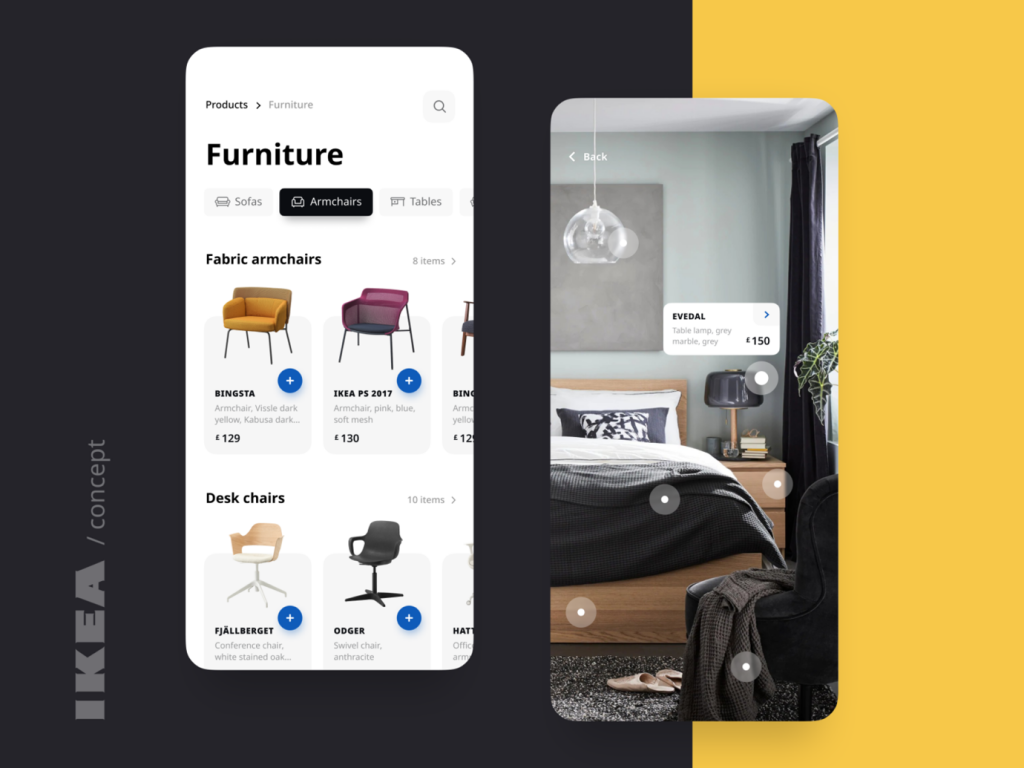
Let’s take an example of IKEA – one of the best smart home solutions that combine the latest AR technology to experience the specially curated collection within a tap. It allows users to visualize how a real place would look like their products and compels them to purchase the products.
Snapchat is such another example that emphasizes social distancing by introducing an AR-powered lens that allows users to measure 6 feet distance in a real-time scenario.
3. Voice Technology
Voice interfaces have already entered its footsteps in ecommerce and streaming services such as Netflix, Amazon Prime, and much more. There are currently multiple voice control technologies available, such as Amazon Echo, Siri, and Google Assistant, to name a few.
Voice technology has made accessibility to the technology quite handy. It has allowed us to control our interfaces while multitasking, whether it’s cooking, walking, or driving.
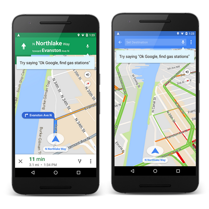
Google Maps allow free-hand control of the app. It let users allow using voice commands to drive safely while hitting the road. Users can make commands such as: “when’s my next turn?”, “How’s the traffic to office?”, “nearby Gas Station,” etc.
4. Reasonable Personalization
Personalization has become the critical factor of enterprises in various sectors. More than 90% of the top mobile app development companies and industries believe that providing highly personalized services is the topmost priority to engage your app in their lifestyle.
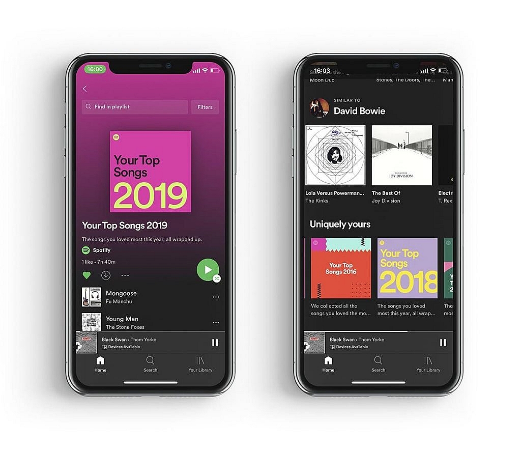
Let’s take an example of Spotify. The app is preparing personalized listings like Top songs 2018, Weekly mashup, Discover Weekly, Top 10 most listened to songs global, etc. The app allows discovering the new brands based on your song selection. The more users have a content based on their taste, the more likely they’re to associate your product with their lifestyle.
5. IoT and adaptable interfaces to different devices
The internet of things is a network of connected devices that exchange and interact information with each other. With the increasing popularity and the more diverse use cases, it will surely be one of the top trends in mobile app designs in 2020.
Let’s take the example of Apple. Its universal clipboard functionality shows how easy and comfortable it can be to use different devices through a shared, connected software. With Apple products, there is a singular environment shared across multiple devices, be its smartwatches, MacBooks, iPhones, or iPads.
These trends are expected to increase in almost every field and domain, giving you endless possibilities such as analysis, prediction, real-time communication, and responses. If your offline product isn’t compatible with any online technology, it’s high time to get started.
Key Takeaways of Mobile App Design Trends 2020
Focus on real user demands and deliver problem-oriented solutions.
Please pay close attention to the user experience since it can make or break the product.
Incorporating AI will uplift your application to the next level and leverage unique functionalities in real-time scenarios.
Dynamic and functional animations are the future. The smoother your interface, the more users are about to remain hooked with the app.
Focus more on app personalization.
We hope that our list of mobile app design trends in 2020 will help you build a top-notch app product that your users would love to use.
Did we miss out on anything? Do you have something more valuable to share? We’d love to hear back more on design trends. Do let us know in the comments section below.