When looking at good design, I often look for things that aren’t totally obvious. There’s an instinct that you like something before you know why. That’s the common thread among this month’s three essential design trends.
From animations that delight and take projects to the next level, to white space that makes a design so approachable, to dark color overlays that enhance readability, these trends contribute to better user experiences.
Here’s what’s trending in design this month:
1. Next-Level Animation
Nothing makes you want to click around and engage with a website like a delightful animation.
While full-screen video is still one of the most popular animated effects of the year, other opportunities for animation can be just as impressive. Use animation to bring attention to certain elements, create the scene for your story and grab user attention or prompt continued engagement with an interesting way to navigate a design. Each of these techniques is used in the examples below (you should definitely click through each to see the animated effects in action).
What makes a good animation? Here’s how each of these designs takes animation to the next level:
Mistretta Coiffure uses a water effect over still images so that the whole background seems to be right below the surface of a pool. Text elements are static to ensure readability. The effect isn’t overwhelming and it’s something that feels unique to the content of the website for a salon—which uses a lot of water.
Wonderland uses animation in a more interactive way, meaning users have to engage to activate it. Each of the photos in the row across the bottom of the screen serves as a secondary navigation element. Hover over any one and it pops up into a larger element and impacts the background as well. This instance of a cool hover animation can help encourage users to interact more with the design.
Naturalis Topstukken takes a completely different approach—every card in the design is part of the complete website. User-controlled animation allows you to drag and drop elements on the screen to enter different parts of the website. It almost feels like a game. The design is highly engaging and for those that don’t quite “get it” the screen scrolls on its own after a few seconds to encourage that first click.
2. Large White Margins
One of the most dramatic—and easy—ways to draw attention to a design or specific element is through appropriate use of white space. While many designs have trended toward more packed full-screen designs recently, there’s a growing shift back to open space.
And there’s a reason for it.
This technique and design make content the focus for users. Elements surrounded by white space are obvious focal points. The simplicity and balance of such as design is easy to engage with and isn’t overwhelming to the user.
Maybe one of the best things about a design with so much white space is that it feels approachable. The clean white space in the design does draw you in.
Think about some of the color associations of white—purity, light, goodness, perfection, cleanliness, safety—all of these are inviting and welcoming feelings that come with an open white background.
Looking at the examples below from Panda Monk, It’s Alive, and Centros, it’s easy to see how this feeling comes from each of the designs. It’s as if each website is inviting users to engage and learn more.
3. Dark Color Overlays
One of the website design trends that’s been popular is use of dark backgrounds in design projects. That trend has extended to the foreground with dark color overlays on images as well.
While this technique can look cool and help emphasize brand colors, there’s another key reason for using dark color overlays. This technique can help make text elements more readable over photos or backgrounds elements with varying light and dark colors.
Each of the examples below uses this concept in a slightly different way:
Lafayette Grande frames an image with a dark color overlay with a double-stacked navigation menu using brand colors. It creates a solid frame that then drives users down to the main headline.
Julius Silvert uses a full screen video b-roll background where all of the images have a mostly transparent dark color overlay. On scroll, the overlay darkens to a mostly saturated box so that text is easy to read while the video still runs in the background. This is a great solution to the probable presented by moving images—it can be tough to find a good place to put text elements so that they are easy to read at all times. The dark color overlay solves this problem nicely.
Scalzo Design uses a dark background plus dark color overlay on images to draw users into his portfolio. The overlay shows that there are visual elements to explore but maintains a focus on the words first, before users get too deep into visual content. This leaves users with the information that Scalzo is a designer first and showcases the work second for a strong first impression.
Conclusion
While some of the animated techniques featured here are more complex techniques, you can start small with a similar idea. The key to using any trendy design element is that it works with the content in the design, contributing to the overall message.
Every week users submit a lot of interesting stuff on our sister site Webdesigner News, highlighting great content from around the web that can be of interest to web designers.
The best way to keep track of all the great stories and news being posted is simply to check out the Webdesigner News site, however, in case you missed some here’s a quick and useful compilation of the most popular designer news that we curated from the past week.
Note that this is only a very small selection of the links that were posted, so don’t miss out and subscribe to our newsletter and follow the site daily for all the news.
New Adidas Site Takes it Back to the ’90s
100 Days CSS
The Evolution of Website Web Design Trends from the 90s to Now
Don’t Be Design Shamed Because You like What Adobe is Doing
8 Tips for Great Code Reviews
The Scandinavian Rule that Every Designer Should Follow
Websites in 2018
Is Gutenberg the End or a New Beginning for WordPress?
Crack Adobe CC with this Keyboard Cheat Sheet
Bird Scooter Redesign
Keep Notes on the Web is the Latest to Get a Material Design Refresh
Dangerous Times in Design
Bad Practices on Phone Number Form Fields
User Experience: How to Improve your Website UX with Humor And Cuteness
6 Ways to Improve Contrast in your Designs
Site Design: Friends, a Collaborative Design Company
Chrome 70’s Best New Feature is Picture-in Picture
Now You See It: Dark Patterns in Design
Confessions of a Flawed Designer
Typographica: Our Favorite Typefaces of 2017
UI Design Inspiration – Oct 2018
Web Accessibility for 2019
You Know your Web Page Sucks When it Cost 7-million Dollars To read!
Black Light Pro – Color Effects on a Schedule
Making your Design Systems Dynamic
Want more? No problem! Keep track of top design news from around the web with Webdesigner News.
Choosing the best font for your logo is not a minor step in creating your brand’s identity. In fact, when your business receives some recognition, simply seeing the font you chose but in another context, will make people think of your brand instantly. That’s how valuable fonts are. When you choose the best logo font for your company, you have to put a lot of thought into it. It’s not a difficult process, but it’s certainly a crucial one. Today, we are here to give you some comprehensive tips and examples on how to choose the best logo font.
Let’s start with a little exercise of imagination. The images below depict some fonts of the most renowned brands out there. Your job is to try to guess to which brand does each font belong. Here we go:
In order of appearance: Coca-Cola, Lego, Hershey’s, Vimeo, and Disney. I’m sure you were all able to solve the mystery, as there is no mystery at all. The fonts have been chosen correctly, which ensured the companies with easy recognition. This is what you need for your business, as well. Let’s go over some tips that will stick to your clients’ minds and will make them come for more.
1. Find a font that best describes your brand’s personality
The playful Disney font would look rather silly if Mercedes-Benz decided to use it for their logo, but it fits Disney’s personality so well! And that’s all due to the font’s swirls and swashes. Before you go into the particularities of a font, start first by choosing one of these general categories:
Serif: for a classy and traditional look
Sans serif: for a modern, and simple touch
Script: for a feminine and elaborate look
Novelty: for a funky and unique look
2. Never go for trendy fonts
When you choose a font, it’s like choosing a coat for your brand that needs to stay on forever. And as we all know, fashion always changes. What might look cool and trendy today, will look outdated tomorrow, or the day after tomorrow. We know, trendy is very tempting, but as we mentioned earlier, when you pick your coat you need to put a lot of thought into it. We would suggest that you go for an older font that features some of the particularities of the trendy font you like.
3. Look into a custom design
If you feel like any of the already existing fonts don’t describe your brand, custom designing it might be the solution. Not only can you have the perfect font for your brand, but you won’t have to worry about sharing the same typeface with any other brands. There are ups and, unfortunately, downs to this option. On one hand, you can get creative and design the font of your dreams, on the other hand, it can be more expensive than picking a font that has already been created. But if you have the financial resources to go for a custom design, this will probably be your best option, if not, go with plan B.
4. Plan B
We get it, commissioning a custom typeface may not be in your budget, especially if you’re just starting out. If that’s the case, then you should put all your effort into finding a new font that is still unique. Websites such as Creative Market and MyFonts are great outlets for shopping for fonts. Taking this route has its advantages, though. When you purchase a font from websites like the ones mentioned, the original creator will typically allow you to add a few custom touches. It’s nothing major, but it could be a tweak like bolder letters or maybe an additional character or two.
5. Keep your brand’s growth in mind
One of the biggest mistakes you can make when choosing your logo font is limiting yourself. What do I mean by that? Change is inevitable, especially if you are a growing business. Your logo should be unique, but flexible. You never know when color schemes need to be changed, or even the brand itself. You should look for a font that looks good in multiple colors and different sizes.
6. Keep it simple and personal
As important as it is to have a unique look, you also do not want to go over the top with it. What you want instead is to make it easy to read and understand. If your audience cannot easily identify your name, then they can’t establish an emotional connection. Some of the mistakes people do are: choosing a messy handwriting typeface, a super elaborate cursive, tight lettering, harsh and thick strokes, and the worst, mixed lettering (using random typefaces). The key to an amazing logo font is to make it look effortless.
7. Don’t overuse your logo font
Have you heard a song over and over again, even unwillingly, until you got sick of it? In the same way, you can overuse the typeface of your logo. You want the experience people get when they view your logo to be unique to the logo. Make sure you choose a different font for headlines and body texts in order to keep the importance of your logo fresh. You need your logo to stand out, so don’t blend it in with other parts of your branding.
Conclusion
Keep your logo font simple. Make it personal. Take time to find the perfect logo font, don’t make an impulse decision. Here’s an extra tip: whatever you do, be the best at it. Quality always surpasses quantity.
Last week, I attended W3C TPAC as well as the CSS Working Group meeting there. Various changes were made to specifications, and discussions had which I feel are of interest to web designers and developers. In this article, I’ll explain a little bit about what happens at TPAC, and show some examples and demos of the things we discussed at TPAC for CSS in particular.
What Is TPAC?
TPAC is the Technical Plenary / Advisory Committee Meetings Week of the W3C. A chance for all of the various working groups that are part of the W3C to get together under one roof. The event is in a different part of the world each year, this year it was held in Lyon, France. At TPAC, Working Groups such as the CSS Working Group have their own meetings, just as we do at other times of the year. However, because we are all in one building, it means that people from other groups can more easily come as observers, and cross-working group interests can be discussed.
Attendees of TPAC are typically members of one or more of the Working Groups, working on W3C technologies. They will either be representatives of a member organization or Invited Experts. As with any other meetings of W3C Working Groups, the minutes of all of the discussions held at TPAC will be openly available, usually as IRC logs scribed during the meetings.
The CSS Working Group
The CSS Working Group meet face-to-face at TPAC and on at least two other occasions during the year; this is in addition to our weekly phone calls. At all of our meetings, the various issues raised on the specifications are discussed, and decisions made. Some issues are kept for face-to-face discussions due to the benefits of being able to have them with the whole group, or just being able to all get around a whiteboard or see a demo on screen.
When an issue is discussed in any meeting (whether face-to-face or teleconference), the relevant GitHub issue is updated with the minutes of the discussion. This means if you have an issue you want to keep track of, you can star it and see when it is updated. The full IRC minutes are also posted to the www-style mailing list.
Here is a selection of the things we discussed that I think will be of most interest to you.
CSS Scrollbars
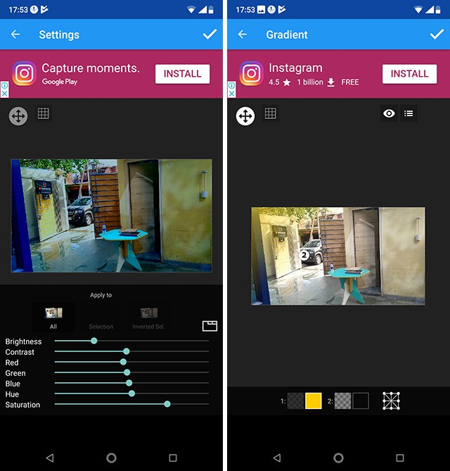
The CSS Scrollbars specification seeks to give a standard way of styling the size and color of scrollbars. If you have Firefox Nightly, you can test it out. To see the examples below, use Firefox Nightly and enable the flags layout.css.scrollbar-width.enabled and layout.css.scrollbar-color.enabled by visiting http://about:config in Firefox Nightly.
The specification gives us two new properties: scrollbar-width and scrollbar-color. The scrollbar-width property can take a value of auto, thin, none, or length (such as 1em). It looks as if the length value may be removed from the specification. As you can imagine, it would be possible for a web developer to make a very unusable scrollbar by playing with the width, so it may be better to allow the browser to decide the exact width that makes sense but instead to either show thin or thick scrollbars. Firefox has not implemented the length option.
If you use auto as the value, then the browser will use the default scrollbars: thin will give you a thin scrollbar, and none will show no visible scrollbar (but the element will still be scrollable).
In this example I have set scrollbar-width: thin.(Large preview)
In a browser with support for CSS Scrollbars, you can see this in action in the demo:
The scrollbar-color property deals with — as you would expect — scrollbar colors. A scrollbar has two parts which you may wish to color independently:
thumb
The slider that moves up and down as you scroll.
track
The scrollbar background.
The values for the scrollbar-color property are auto, dark, light and .
Using auto as a keyword value will give you the default scrollbar colors for that browser, dark will provide a dark scrollbar, either in the dark mode of that platform or a custom dark mode, light the light mode of the platform or a custom light mode.
To set your own colors, you add two colors as the value that are separated by a space. The first color will be used for the thumb and the second one for the track. You should take care that there is enough contrast between the colors, as otherwise the scrollbar may be difficult to use for some people.
In this example, I have set custom colors for the scrollbar elements. (Large preview)
In a browser with support for CSS Scrollbars, you can see this in the demo:
We’ve been using the padding hack in CSS to achieve aspect ratio boxes for some time, however, with the advent of Grid Layout and better ways of sizing content, having a real way to do aspect ratios in CSS has become a more pressing need.
There are two issues raised on GitHub which relate to this requirement:
There is now a draft spec in Level 4 of CSS Sizing, and the decision of the meeting was that this needed further discussion on GitHub before any decisions can be made. So, if you are interested in this, or have additional use cases, the CSS Working Group would be interested in your comments on those issues.
The :where() Functional Pseudo-Class
Last year, the CSSWG resolved to add a pseudo-class which acted like :matches() but with zero specificity, thus making it easy to override without needing to artificially inflate the specificity of later elements to override something in a default stylesheet.
The :matches() pseudo-class might be new to you as it is a Level 4 Selector, however, it allows you to specify a group of selectors to apply some CSS, too. For example, you could write:
.foo a:hover,
p a:hover {
  color: green;
}
Or with :matches()
:matches(.foo, p) a:hover {
  color: green;
}
If you have ever had a big stack of selectors just in order to set the same couple of rules, you will see how useful this will be. The following CodePen uses the prefixed names of webkit-any and -moz-any to demonstrate the matches() functionality. You can also read more about matches() on MDN.
Where we often do this kind of stacking of selectors, and thus where :matches() will be most useful is in some kind of initial, default stylesheet. However, we then need to be careful when overwriting those defaults that any overwriting is done in a way that will ensure it is more specific than the defaults. It is for this reason that a zero specificity version was proposed.
The issue that was discussed in the meeting was in regard to naming this pseudo-class, you can see the final resolution here, and if you wonder why various names were ruled out take a look at the full thread. Naming things in CSS is very hard — because we are all going to have to live with it forever! After a lot of debate, the group voted and decided to call this selector :where().
Since the meeting, and while I was writing up this post, a suggestion has been raised to rename matches() to is(). Take a look at the issue and comment if you have any strong feelings either way!
Logical Shorthands For Margins And Padding
On the subject of naming things, I’ve written about Logical Properties and Values here on Smashing Magazine in the past, take a look at “Understanding Logical Properties and Values”. These properties and values provide flow relative mappings. This means that if you are using Writing Modes other than a horizontal top to bottom writing mode, such as English, things like margins and padding, widths and height follow the text direction and are not linked to the physical screen dimensions.
For example, for physical margins we have:
margin-top
margin-right
margin-bottom
margin-left
The logical mappings for these (assuming horizontal-tb) are:
margin-block-start
margin-inline-end
margin-block-end
margin-inline-start
We can have two value shorthands. For example, to set both margin-block-start and margin-block-end as a shorthand, we can use margin-block: 20px 1em. The first value representing the start edge in the block dimension, the second value the end edge in the block dimension.
We hit a problem, however, when we come to the four-value shorthand margin. That property name is used for physical margins — how do we denote the logical four-value version? Various things have been suggested, including a switch at the top of the file:
@mode "logical";
Or, to use a block that looks a little like a media query:
@mode (flow-mode: relative) {

}
Then various suggestions for keyword modifiers, using some punctuation character, or creating a brand new property name:
You can read the issue to see the various things that are being considered. Issues discussed were that while the logical version may well end up being generally the default, sometimes you will want things to relate to the screen geometry; we need to be able to have both options in one stylesheet. Having a @mode setting at the top of the CSS could be confusing; it would fail if someone were to copy and paste a chunk of the stylesheet.
My preference is to have some sort of keyword value. That way, if you look at the rule, you can see exactly which mode is being used, even if it does seem slightly inelegant. It is the sort of thing that a preprocessor could deal with for you; if you did indeed want all of your properties and values to use the logical versions.
We didn’t manage to resolve on the issue, so if you do have thoughts on which of these might be best, or can see problems with them that we haven’t described, please comment on the issue on GitHub.
Web Platform Tests Discussion
At the CSS Working Group meeting and then during the unconference style Technical Plenary Day, I was involved in discussing how to get more people involved in writing tests for CSS specifications. The Web Platform Tests project aims to provide tests for all of the web platform. These tests then help browser vendors check whether their browser is correct as to the spec. In the CSS Working Group, the aim is that any normative change to a specification which has reached Candidate Recommendation (CR) status, should be accompanied by a test. This makes sense as once a spec is in CR, we are asking browsers to implement that spec and provide feedback. They need to know if anything in the spec changes so they can update their code.
The problem is that we have very few people writing specs, so for spec writers to have to write all the tests will slow the progress of CSS down. We would love to see other people writing tests, as it is a way to contribute to the web platform and to gain deep knowledge of how specifications work. So we met to think about how we could encourage people to participate in the effort. I’ve written on this subject in the past; if the idea of writing tests for the platform interests you, take a look at my 24 Ways article on “Testing the Web Platform”.
On With The Work!
TPAC has added to my personal to-do list considerably. However, I’ve been able to pick up tips about specification editing, test writing, and to come up with a plan to get the Multi-Column Layout specification — of which I’m the co-editor — back to CR status. As someone who is not a fan of meetings, I’ve come to see how valuable these face-to-face meetings are for the web platform, giving those of us contributing to it a chance to share the knowledge we individually are developing. I feel it is important though to then take that knowledge and share it outside of the group in order to help more people get involved with developing as well as using the platform.
Anybody building a site in that requires users to create accounts is going to face this language challenge. You’ll probably have this language strewed across your entire site, from prominent calls-to-action in your homepage hero, to persistent header buttons, to your documentation.
So which is correct? “Sign Up” or “Signup”? Let’s try to figure it out.
With some light internet grammar research, the term “sign up” is a verbal phrase. As in, “sign” is a verb (describes an action) and “sign up” is a verb plus a complement — participial phrase, best I can tell. That sounds about right to me.
My best guess before looking into this was that “signup” isn’t even a word at all, and more of a lazy internet mistake. Just like “frontend” isn’t a word. It’s either “front-end” (a compound adjective as in a front-end developer), or “front end” (as in, “Your job is to work on the front end.”).
I was wrong, though. “Signup” is a noun. Like a thing. As in, “Go up the hallway past the water fountain and you’ll see the signup on the wall.” Which could certainly be a digital thing as well. Seems to me it wouldn’t be wrong to call a form that collects a user’s name and email address a “signup form.”
“Sign-up” is almost definitely wrong, as it’s not a compound word or compound adjective.
The fact that both “sign up” and “signup” are both legit words/phrases makes this a little tricky. Having a verbal phrase as a button seems like a solid choice, but I wouldn’t call it wrong to have a button that said “Signup” since the button presumably links directly to a form in which you can sign up and that’s the correct noun for it.
Let’s see what some popular websites do.
Twitter goes with “Sign Up” and “Log in.” We haven’t talked about the difference between “Log in” and “Login” yet, but the difference is very much the same. Verbal phrase vs. noun. The only thing weird about Twitter’s approach here is the capitalization of “Up” and the lowercase “in.” Twitter seems giant enough that they must have thought of this and decided this intentionally, so I’d love to understand why because it looks like a mistake to my eyes.
Facebook, like Twitter, goes with “Sign Up” and “Log In.”
Google goes with “Sign in” and “Create account.” It’s not terribly rare to see companies use the “Create” verb. Visiting Microsoft’s Azure site, they used the copy “Create your account today” complemented with a “Start free” button. Slack uses “Sign in” and “Get Started.”
I can see the appeal of going with symmetry. Zoom uses “SIGN IN” and “SIGN UP” with the use of all-caps giving a pass on having to decide which words are capitalized.
Figma goes the “Sign In” and “Sign up” route, almost having symmetry — but what’s up with the mismatched capitalization? I thought, if anything, they’d go with a lowercase “i” because the uppercase “I” can look like a lowercase “L” and maybe that’s slightly weird.
At CodePen, we rock the “Sign Up” and “Log In” and try to be super consistent through the entire site using those two phrases.
If you’re looking for a conclusion here, I’d say that it probably doesn’t matter all that much. There are so many variations out there that people are probably used to it and you aren’t losing customers over it. It’s not like many will know the literal definition of “Signup.” I personally like active verb phrases — like “Sign Up,” “Log In,” or “Sign In” — with no particular preference for capitalization.
Hey gang, time for another broad update about various goings on as we tend to do occasionally. Some various happenings around here, appearances on other sites, upcoming conferences, and the like.
At the end of this month, October 29th-30th, I’ll be speaking at JAMstack_conf. Ever since I went to a jQuery conference several million years ago (by my count), I’ve always had a special place in my heart for conferences with a tech-specific focus. Certainly this whole world of JAMstack and serverless can be pretty broad, but it’s more focused than a general web design conference.
In December, I’ll be at WordCamp US. I like getting to go to WordPress-specific events to help me stay current on that community. CSS-Tricks is, and always has been a WordPress site, as are many other sites I manage. I like to keep my WordPress development chops up the best I can. I imagine the Gutenburg talk will be hot and heavy! I’ll be speaking as well, generally about front-end development.
Next Spring, March 4th-6th, I’ll be in Seattle for An Event Apart !
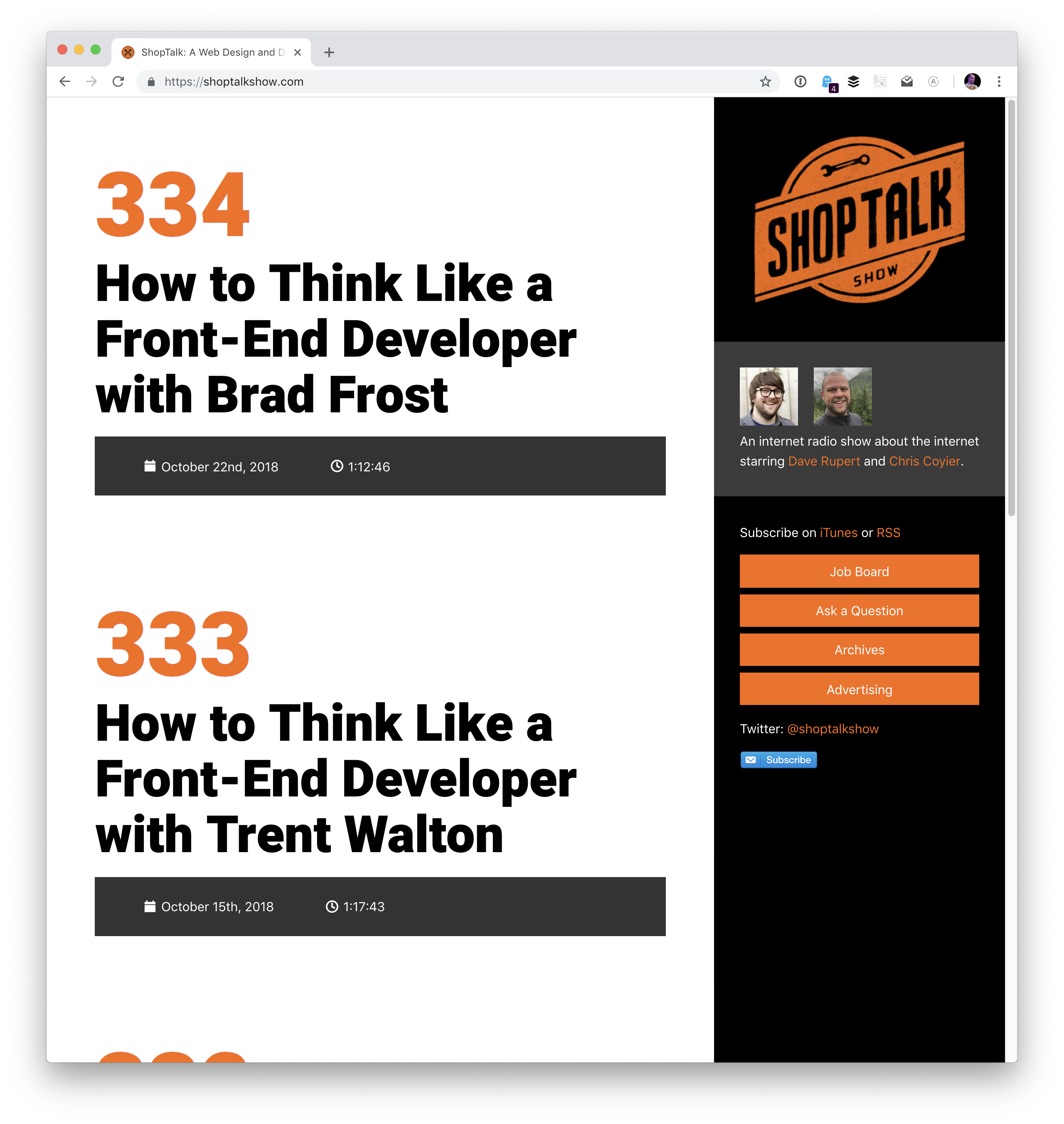
Over on ShopTalk, Dave and I have kicked off a series of shows we’re calling “How to Think Like a Front-End Developer.”
I’ve been fascinated by this idea for a while and have been collecting thoughts on it. I have my own ideas, but I want to contrast them with the ideas of other front-end developers much more accomplished than myself! My goal is to turn all this into a talk that I can give toward the end of this year and next year. This is partially inspired by some posts we’ve published here over the years:
…as well other people’s work, of course, like Brad Frost and Dan Mall’s Designer/Developer Workflow, and Lara Schenck and Mandy Michael’s thoughts on front-end development. Not to mention seismic shifts in the front-end development landscape through New JavaScript and Serverless.
Speaking of ShopTalk, a while back Dave and I mused about wanting to redesign the ShopTalk Show website. We did all this work on the back end making sure all the data from our 350+ episodes is super clean and easy to work when, then I slapped a design on top of it that is honestly pretty bad.
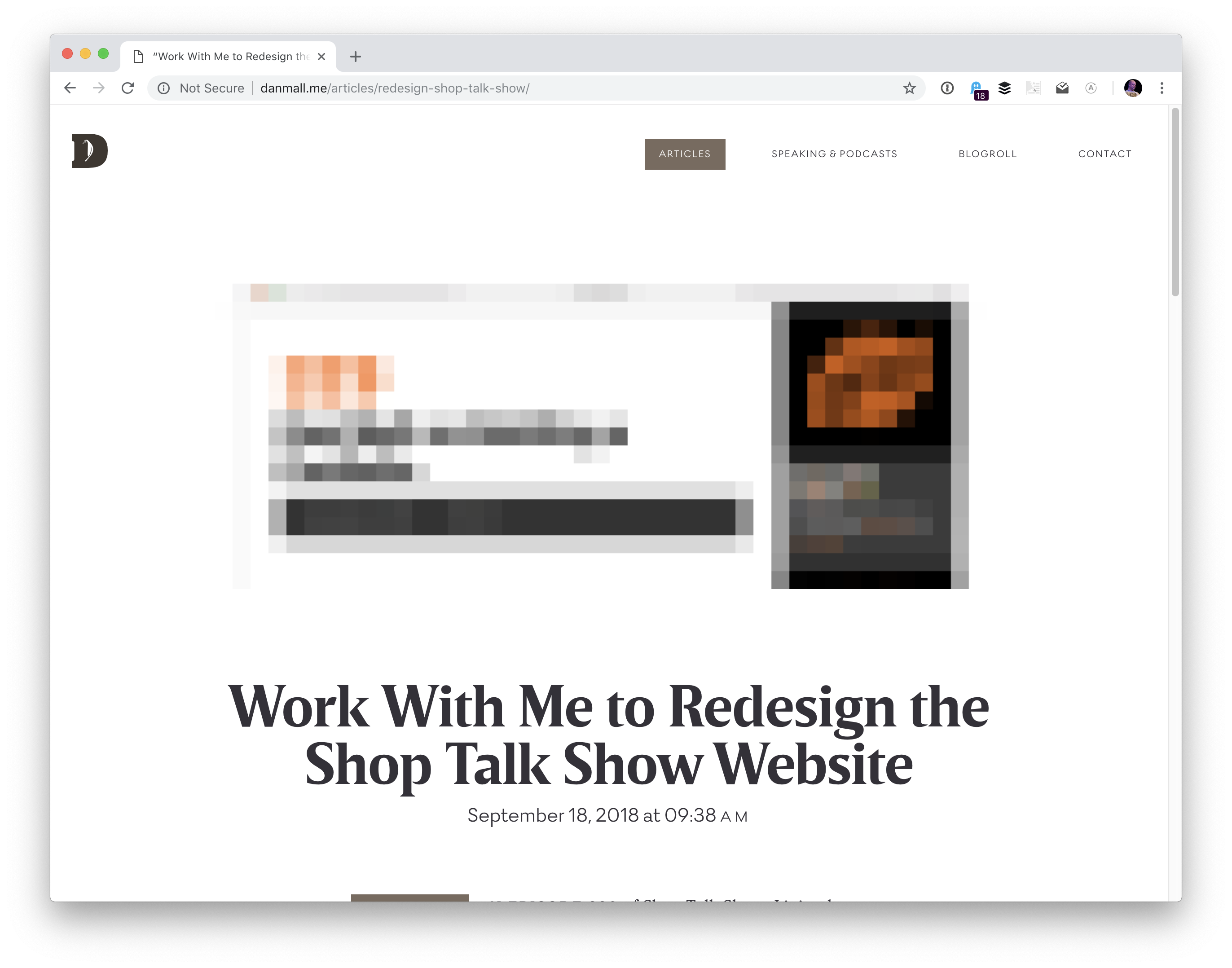
Dan Mall heard us talk about it and reached out to us to see if he could help. Not to do the work himself… that would be amazing, but Dan had an even better idea. Instead, we would all work together to find a newcomer to design and have them work under Dan’s direction and guidence to design the site. Here’s Dan’s intro post (and note that applications are now closed).
We’re currently in the process of narrowing down the applicants and interviewing finalists. We’re planning on being very public about the process, so not only will we hopefully be helping someone who could use a bit of a break into this industry, but we’ll also help anyone else who cares to watch it happen.
I’ve recently had the pleasure of being a guest on other shows.
First up, I was on the Script & Style Show with David Walsh and Todd Gardner
I love that David has ressurected the name Script & Style. We did a site together quite a few years back with that same name!
What one piece of advice would you give to other makers?
I’d say that you’re lucky. The most interesting people I know that seem to lead the most fulfilling, long, and interesting lives are those people who do interesting things, make interesting things, and generally just engage with life at a level deeper than just skating by or watching.
If you happen to live in Central Oregon, note that our BendJS meetups have kicked back up for the season. We’ve been having them right at our CodePen office and it’s been super fun.
I haven’t even gotten to CodePen stuff yet! Since my last chronicle, we’ve brought in a number of new employees, like Klare Frank, Cassidy Williams, and now Stephen Shaw. We’re always chugging away at polishing and maintaining CodePen, building new features, encouraging community, and everything else that running a social coding site requires.
Oh and hey! CodePen is now a registered trademark, so I can do this: CodePen®. One of our latest user-facing features is pinned items. Rest assured, we have loads of other features that are in development for y’all that are coming soon.
If you’re interested in the technology side of CodePen, we’ve dug into lots of topics lately on CodePen radio like:
WordPress came a long way from its start as a simple blog writing tool. A long 15 years later it became the number one CMS choice for developers and non-developers alike. WordPress now powers roughly 30% of the top 10 million sites on the web.
Ever since REST API was bundled in the WordPress core, developers can experiment and use it in a decoupled way, i.e. writing the front-end part by using JavaScript frameworks or libraries. At Infinum, we were (and still are) using WordPress in a ‘classic’ way: PHP for the frontend as well as the backend. After a while, we wanted to give the decoupled approach a go. In this article, I’ll share an overview of what it was that we wanted to achieve and what we encountered while trying to implement our goals.
There are several types of projects that can benefit from this approach. For example, simple presentational sites or sites that use WordPress as a backend are the main candidates for the decoupled approach.
In recent years, the industry thankfully started paying more attention to performance. However, being an easy-to-use inclusive and versatile piece of software, WordPress comes with a plethora of options that are not necessarily utilized in each and every project. As a result, website performance can suffer.
If long website response times keep you up at night, this is a how-to for you. I will cover the basics of creating a decoupled WordPress and some lessons learned, including:
When it comes down to how WordPress is programmed, one thing is certain: it doesn’t follow the Model-View-Controller (MVC) design pattern that many developers are familiar with. Because of its history and for being sort of a fork of an old blogging platform called “b2” (more details here), it’s largely written in a procedural way (using function-based code). WordPress core developers used a system of hooks which allowed other developers to modify or extend certain functionalities.
It’s an all-in-one system that is equipped with a working admin interface; it manages database connection, and has a bunch of useful APIs exposed that handle user authentication, routing, and more.
But thanks to the REST API, you can separate the WordPress backend as a sort of model and controller bundled together that handle data manipulation and database interaction, and use REST API Controller to interact with a separate view layer using various API endpoints. In addition to MVC separation, we can (for security reasons or speed improvements) place the JS App on a separate server like in the schema below:
One thing why you may want to use this approach for is to ensure a separation of concerns. The frontend and the backend are interacting via endpoints; each can be on its separate server which can be optimized specifically for each respective task, i.e. separately running a PHP app and running a Node.js app.
By separating your frontend from the backend, it’s easier to redesign it in the future, without changing the CMS. Also, front-end developers only need to care about what to do with the data the backend provides them. This lets them get creative and use modern libraries like ReactJS, Vue or Angular to deliver highly dynamic web apps. For example, it’s easier to build a progressive web app when using the aforementioned libraries.
Another advantage is reflected in the website security. Exploiting the website through the backend becomes more difficult since it’s largely hidden from the public.
First, having a decoupled WordPress means maintaining two separate instances:
WordPress for the backend;
A separate front-end app, including timely security updates.
Second, some of the front-end libraries do have a steeper learning curve. It will either take a lot of time to learn a new language (if you are only accustomed to HTML and CSS for templating), or will require bringing additional JavaScript experts to the project.
Third, by separating the frontend, you are losing the power of the WYSIWYG editor, and the ‘Live Preview’ button in WordPress doesn’t work either.
Working With WordPress REST API
Before we delve deeper in the code, a couple more things about WordPress REST API. The full power of the REST API in WordPress came with version 4.7 on December 6th, 2016.
What WordPress REST API allows you to do is to interact with your WordPress installation remotely by sending and receiving JSON objects.
Setting Up A Project
Since it comes bundled with latest WordPress installation, we will be working on the Twenty Seventeen theme. I’m working on Varying Vagrant Vagrants, and have set up a test site with an URL http://dev.wordpress.test/. This URL will be used throughout the article. We’ll also import posts from the wordpress.org Theme Review Teams repository so that we have some test data to work with. But first, we will get familiar working with default endpoints, and then we’ll create our own custom endpoint.
Access The Default REST Endpoint
As already mentioned, WordPress comes with several built-in endpoints that you can examine by going to the /wp-json/ route:
http://dev.wordpress.test/wp-json/
Either by putting this URL directly in your browser, or adding it in the postman app, you’ll get out a JSON response from WordPress REST API that looks something like this:
So in order to get all of the posts in our site by using REST, we would need to go to http://dev.wordpress.test/wp-json/wp/v2/posts. Notice that the wp/v2/ marks the reserved core endpoints like posts, pages, media, taxonomies, categories, and so on.
So, how do we add a custom endpoint?
Create A Custom REST Endpoint
Let’s say we want to add a new endpoint or additional field to the existing endpoint. There are several ways we can do that. First, one can be done automatically when creating a custom post type. For instance, we want to create a documentation endpoint. Let’s create a small test plugin. Create a test-documentation folder in the wp-content/plugins folder, and add documentation.php file that looks like this:
<?php /**
 * Test plugin
 *
 * @since             1.0.0
 * @package           test_plugin
 *
 * @wordpress-plugin
 * Plugin Name:       Test Documentation Plugin
 * Plugin URI:
 * Description:       The test plugin that adds rest functionality
 * Version:           1.0.0
 * Author:            Infinum
 * Author URI:        https://infinum.co/
 * License:           GPL-2.0+
 * License URI:       http://www.gnu.org/licenses/gpl-2.0.txt
 * Text Domain:       test-plugin
 */

namespace Test_Plugin;

// If this file is called directly, abort.
if ( ! defined( 'WPINC' ) ) {
  die;
}

/**
 * Class that holds all the necessary functionality for the
 * documentation custom post type
 *
 * @since  1.0.0
 */
class Documentation {
  /**
   * The custom post type slug
   *
   * @var string
   *
   * @since 1.0.0
   */
  const PLUGIN_NAME = 'documentation-plugin';

  /**
   * The custom post type slug
   *
   * @var string
   *
   * @since 1.0.0
   */
  const POST_TYPE_SLUG = 'documentation';

  /**
   * The custom taxonomy type slug
   *
   * @var string
   *
   * @since 1.0.0
   */
  const TAXONOMY_SLUG = 'documentation-category';

  /**
   * Register custom post type
   *
   * @since 1.0.0
   */
  public function register_post_type() {
    $args = array(
        'label'              => esc_html( 'Documentation', 'test-plugin' ),
        'public'             => true,
        'menu_position'      => 47,
        'menu_icon'          => 'dashicons-book',
        'supports'           => array( 'title', 'editor', 'revisions', 'thumbnail' ),
        'has_archive'        => false,
        'show_in_rest'       => true,
        'publicly_queryable' => false,
    );

    register_post_type( self::POST_TYPE_SLUG, $args );
  }

  /**
   * Register custom tag taxonomy
   *
   * @since 1.0.0
   */
  public function register_taxonomy() {
    $args = array(
        'hierarchical'          => false,
        'label'                 => esc_html( 'Documentation tags', 'test-plugin' ),
        'show_ui'               => true,
        'show_admin_column'     => true,
        'update_count_callback' => '_update_post_term_count',
        'show_in_rest'          => true,
        'query_var'             => true,
    );

    register_taxonomy( self::TAXONOMY_SLUG, [ self::POST_TYPE_SLUG ], $args );
  }
}

$documentation = new Documentation();

add_action( 'init', [ $documentation, 'register_post_type' ] );
add_action( 'init', [ $documentation, 'register_taxonomy' ] );
By registering the new post type and taxonomy, and setting the show_in_rest argument to true, WordPress automatically created a REST route in the /wp/v2/namespace. You now have http://dev.wordpress.test/wp-json/wp/v2/documentation and http://dev.wordpress.test/wp-json/wp/v2/documentation-category endpoints available. If we add a post in our newly created documentation custom post going to http://dev.wordpress.test/?post_type=documentation, it will give us a response that looks like this:
This is a great starting point for our single-page application. Another way we can add a custom endpoint is by hooking to the rest_api_init hook and creating an endpoint ourselves. Let’s add a custom-documentation route that is a bit different than the one we registered. Still working in the same plugin, we can add:
/**
 * Create a custom endpoint
 *
 * @since 1.0.0
 */
public function create_custom_documentation_endpoint() {
  register_rest_route(
    self::PLUGIN_NAME . '/v1', '/custom-documentation',
    array(
        'methods'  => 'GET',
        'callback' => [ $this, 'get_custom_documentation' ],
    )
  );
}

/**
 * Create a callback for the custom documentation endpoint
 *
 * @return string                   JSON that indicates success/failure of the update,
 *                                  or JSON that indicates an error occurred.
 * @since 1.0.0
 */
public function get_custom_documentation() {
  /* Some permission checks can be added here. */

  // Return only documentation name and tag name.
  $doc_args = array(
      'post_type'   => self::POST_TYPE_SLUG,
      'post_status' => 'publish',
      'perm'        => 'readable'
  );

  $query = new WP_Query( $doc_args );

  $response = [];
  $counter  = 0;

  // The Loop
  if ( $query->have_posts() ) {
    while ( $query->have_posts() ) {
      $query->the_post();

      $post_id   = get_the_ID();
      $post_tags = get_the_terms( $post_id, self::TAXONOMY_SLUG );

      $response[ $counter ]['title'] = get_the_title();

      foreach ( $post_tags as $tags_key => $tags_value ) {
        $response[ $counter ]['tags'][] = $tags_value->name;
      }
      $counter++;
    }
  } else {
    $response = esc_html__( 'There are no posts.', 'documentation-plugin' );
  }
  /* Restore original Post Data */
  wp_reset_postdata();

  return rest_ensure_response( $response );
}
And hook the create_custom_documentation_endpoint() method to the rest_api_init hook, like so:
This will add a custom route in the http://dev.wordpress.test/wp-json/documentation-plugin/v1/custom-documentation with the callback returning the response for that route.
There are a lot of other things you can do with REST API (you can find more details in the REST API handbook).
Work Around Long Response Times When Using The Default REST API
For anyone who has tried to build a decoupled WordPress site, this is not a new thing — REST API is slow.
My team and I first encountered the strange WordPress-lagging REST API on a client site (not decoupled), where we used the custom endpoints to get the list of locations on a Google map, alongside other meta information created using the Advanced Custom Fields Pro plugin. It turned out that the time the first byte (TTFB) — which is used as an indication of the responsiveness of a web server or other network resource — took more than 3 seconds.
After a bit of investigating, we realized the default REST API calls were actually really slow, especially when we “burdened” the site with additional plugins. So, we did a small test. We installed a couple of popular plugins and encountered some interesting results. The postman app gave the load time of 1.97s for 41.9KB of response size. Chrome’s load time was 1.25s (TTFB was 1.25s, content was downloaded in 3.96ms). Just to retrieve a simple list of posts. No taxonomy, no user data, no additional meta fields.
Why did this happen?
It turns out that accessing REST API on the default WordPress will load the entire WordPress core to serve the endpoints, even though it’s not used. Also, the more plugins you add, the worse things get. The default REST controller WP_REST_Controller is a really big class that does a lot more than necessary when building a simple web page. It handles routes registering, permission checks, creating and deleting items, and so on.
There are two common workarounds for this issue:
Intercept the loading of the plugins, and prevent loading them all when you need to serve a simple REST response;
Load only the bare minimum of WordPress and store the data in a transient, from which we then fetch the data using a custom page.
Improving Performance With The Decoupled JSON Approach
When you are working with simple presentation sites, you don’t need all the functionality REST API offers you. Of course, this is where good planning is crucial. You really don’t want to build your site without REST API, and then say in a years time that you’d like to connect to your site, or maybe create a mobile app that needs to use REST API functionality. Do you?
For that reason, we utilized two WordPress features that can help you out when serving simple JSON data out:
Loading the minimum necessary WordPress using SHORTINIT constant.
Creating A Simple Decoupled Pages Endpoint
Let’s create a small plugin that will demonstrate the effect that we’re talking about. First, add a wp-config-simple.php file in your json-transient plugin that looks like this:
The define( 'SHORTINIT', true ); will prevent the majority of WordPress core files to be loaded, as can be seen in the wp-settings.php file.
We still may need some of the WordPress functionality, so we can require the file (like wp-load.php) manually. Since wp-load.php sits in the root of our WordPress installation, we will fetch it by getting the path of our file using $_SERVER['SCRIPT_FILENAME'], and then exploding that string by wp-content string. This will return an array with two values:
The root of our installation;
The rest of the file path (which is of no interest to us).
Keep in mind that we’re using the default installation of WordPress, and not a modified one, like for example in the Bedrock boilerplate, which splits the WordPress in a different file organization.
Lastly, we require the wp-load.php file, with a little bit of sanitization, for security.
In our init.php file, we’ll add the following:
<?php /**
 * Test plugin
 *
 * @since             1.0.0
 * @package           json-transient
 *
 * @wordpress-plugin
 * Plugin Name:       Json Transient
 * Plugin URI:
 * Description:       Proof of concept for caching api like calls
 * Version:           1.0.0
 * Author:            Infinum
 * Author URI:        https://infinum.co/
 * License:           GPL-2.0+
 * License URI:       http://www.gnu.org/licenses/gpl-2.0.txt
 * Text Domain:       json-transient
 */

namespace Json_Transient;

// If this file is called directly, abort.
if ( ! defined( 'WPINC' ) ) {
  die;
}

class Init {
  /**
   * Get the array of allowed types to do operations on.
   *
   * @return array
   *
   * @since 1.0.0
   */
  public function get_allowed_post_types() {
    return array( 'post', 'page' );
  }

  /**
   * Check if post type is allowed to be save in transient.
   *
   * @param string $post_type Get post type.
   * @return boolean
   *
   * @since 1.0.0
   */
  public function is_post_type_allowed_to_save( $post_type = null ) {
    if( ! $post_type ) {
      return false;
    }

    $allowed_types = $this->get_allowed_post_types();

    if ( in_array( $post_type, $allowed_types, true ) ) {
      return true;
    }

    return false;
  }

  /**
   * Get Page cache name for transient by post slug and type.
   *
   * @param string $post_slug Page Slug to save.
   * @param string $post_type Page Type to save.
   * @return string
   *
   * @since  1.0.0
   */
  public function get_page_cache_name_by_slug( $post_slug = null, $post_type = null ) {
    if( ! $post_slug || ! $post_type ) {
      return false;
    }

    $post_slug = str_replace( '__trashed', '', $post_slug );

    return 'jt_data_' . $post_type . '_' . $post_slug;
  }

    /**
   * Get full post data by post slug and type.
   *
   * @param string $post_slug Page Slug to do Query by.
   * @param string $post_type Page Type to do Query by.
   * @return array
   *
   * @since  1.0.0
   */
  public function get_page_data_by_slug( $post_slug = null, $post_type = null ) {
    if( ! $post_slug || ! $post_type ) {
      return false;
    }

    $page_output = '';

    $args = array(
      'name'           => $post_slug,
      'post_type'      => $post_type,
      'posts_per_page' => 1,
      'no_found_rows'  => true
    );

    $the_query = new WP_Query( $args );

    if ( $the_query->have_posts() ) {
      while ( $the_query->have_posts() ) {
        $the_query->the_post();
        $page_output = $the_query->post;
      }
      wp_reset_postdata();
    }
    return $page_output;
  }

  /**
   * Return Page in JSON format
   *
   * @param string $post_slug Page Slug.
   * @param string $post_type Page Type.
   * @return json
   *
   * @since  1.0.0
   */
  public function get_json_page( $post_slug = null, $post_type = null ) {
    if( ! $post_slug || ! $post_type ) {
      return false;
    }

    return wp_json_encode( $this->get_page_data_by_slug( $post_slug, $post_type ) );
  }

  /**
   * Update Page to transient for caching on action hooks save_post.
   *
   * @param int $post_id Saved Post ID provided by action hook.
   *
   * @since 1.0.0
   */
  public function update_page_transient( $post_id ) {

    $post_status = get_post_status( $post_id );
    $post        = get_post( $post_id );
    $post_slug   = $post->post_name;
    $post_type   = $post->post_type;
    $cache_name  = $this->get_page_cache_name_by_slug( $post_slug, $post_type );

    if( ! $cache_name ) {
      return false;
    }

    if( $post_status === 'auto-draft' || $post_status === 'inherit' ) {
      return false;
    } else if( $post_status === 'trash' ) {
      delete_transient( $cache_name );
    } else  {
      if( $this->is_post_type_allowed_to_save( $post_type ) ) {
        $cache = $this->get_json_page( $post_slug, $post_type );
        set_transient( $cache_name, $cache, 0 );
      }
    }
  }
}

$init = new Init();

add_action( 'save_post', [ $init, 'update_page_transient' ] );
The helper methods in the above code will enable us to do some caching:
get_allowed_post_types()
This method lets post types know that we want to enable showing in our custom ‘endpoint’. You can extend this, and the plugin we’ve actually made this method filterable so that you can just use a filter to add additional items.
is_post_type_allowed_to_save()
This method simply checks to see if the post type we’re trying to fetch the data from is in the allowed array specified by the previous method.
get_page_cache_name_by_slug()
This method will return the name of the transient that the data will be fetched from.
get_page_data_by_slug()
This method is the method that will perform the WP_Query on the post via its slug and post type and return the contents of the post array that we’ll convert with the JSON using the get_json_page() method.
update_page_transient()
This will be run on the save_post hook and will overwrite the transient in the database with the JSON data of our post. This last method is known as the “key caching method”.
Let’s explain transients in more depth.
Transients API
Transients API is used to store data in the options table of your WordPress database for a specific period of time. It’s a persisted object cache, meaning that you are storing some object, for example, results of big and slow queries or full pages that can be persisted across page loads. It is similar to regular WordPress Object Cache, but unlike WP_Cache, transients will persist data across page loads, where WP_Cache (storing the data in memory) will only hold the data for the duration of a request.
It’s a key-value store, meaning that we can easily and quickly fetch the desired data, similar to what in-memory caching systems like Memcached or Redis do. The difference is that you’d usually need to install those separately on the server (which can be an issue on shared servers), whereas transients are built in with WordPress.
As noted on its Codex page — transients are inherently sped up by caching plugins. Since they can store transients in memory instead of a database. The general rule is that you shouldn’t assume that transient is always present in the database — which is why it’s a good practice to check for its existence before fetching it
You can use it without expiration (like we are doing), and that’s why we implemented a sort of ‘cache-busting’ on post save. In addition to all the great functionality they provide, they can hold up to 4GB of data in it, but we don’t recommend storing anything that big in a single database field.
The last piece of the puzzle that we need is an ‘endpoint’. I’m using the term endpoint here, even though it’s not an endpoint since we are directly calling a specific file to fetch our results. So we can create a test.php file that looks like this:
get_page_cache_name_by_slug( $post_slug, $post_type ) );

// Return error on false.
if ( $cache === false ) {
  wp_send_json( 'Error, the page does not exist or it is not cached correctly. Please try rebuilding cache and try again!' );
}

// Decode json for output.
wp_send_json( json_decode( $cache ) );
If we go to http://dev.wordpress.test/wp-content/plugins/json-transient/test.php, we’ll see this message:
Error, page slug or type is missing!
So, we’ll need to specify the post type and post slug. When we now go to http://dev.wordpress.test/wp-content/plugins/json-transient/test.php?slug=hello-world&type=post we’ll see:
Error, the page does not exist or it is not cached correctly. Please try rebuilding cache and try again!
Oh, wait! We need to re-save our pages and posts first. So when you’re starting out, this can be easy. But if you already have 100+ pages or posts, this can be a challenging task. This is why we implemented a way to clear the transients in the Decoupled JSON Content plugin, and rebuild them in a batch.
But go ahead and re-save the Hello World post and then open the link again. What you should now have is something that looks like this:
{
  "ID": 1,
  "post_author": "1",
  "post_date": "2018-06-26 18:28:57",
  "post_date_gmt": "2018-06-26 18:28:57",
  "post_content": "Welcome to WordPress. This is your first post. Edit or delete it, then start writing!",
  "post_title": "Hello world!",
  "post_excerpt": "",
  "post_status": "publish",
  "comment_status": "open",
  "ping_status": "open",
  "post_password": "",
  "post_name": "hello-world",
  "to_ping": "",
  "pinged": "",
  "post_modified": "2018-06-30 08:34:52",
  "post_modified_gmt": "2018-06-30 08:34:52",
  "post_content_filtered": "",
  "post_parent": 0,
  "guid": "http://dev.wordpress.test/?p=1",
  "menu_order": 0,
  "post_type": "post",
  "post_mime_type": "",
  "comment_count": "1",
  "filter": "raw"
}
And that’s it. The plugin we made has some more extra functionality that you can use, but in a nutshell, this is how you can fetch the JSON data from your WordPress that is way faster than using REST API.
Before And After: Improved Response Time
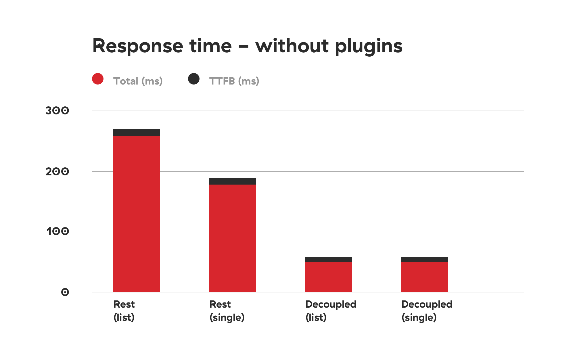
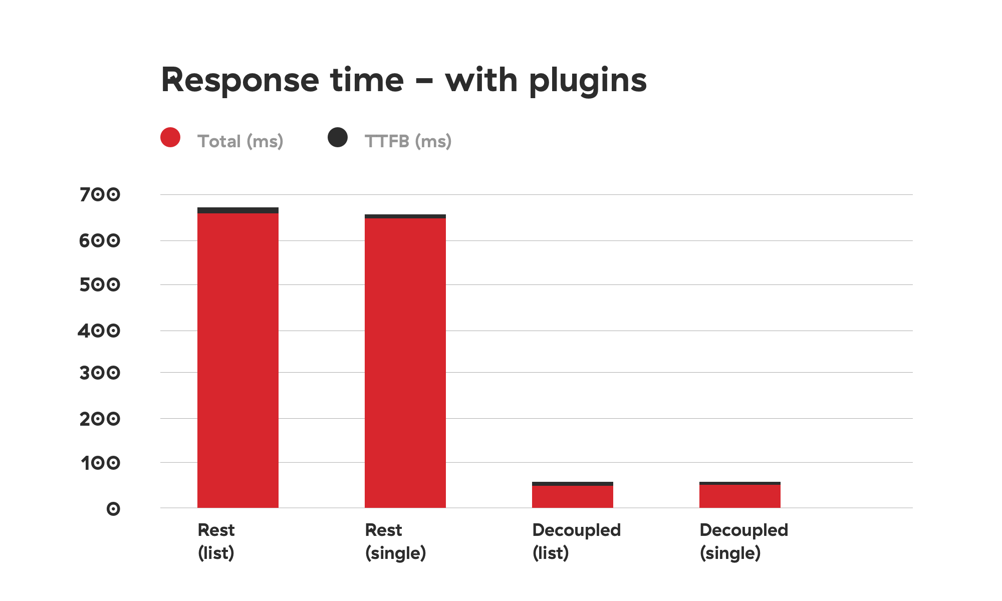
We conducted testing in Chrome, where we could see the total response time and the TTFB separately. We tested response times ten times in a row: first without plugins and then with the plugins added. Also, we tested the response for a list of posts and for a single post.
The results of the test are illustrated in the tables below:
Comparison graph depicting response times of using WordPress REST API vs using the decoupled approach without added plugins. The decoupled approach is 2 to 3 times faster. (Large preview)
Comparison graph depicting response times of using WordPress REST API vs using the decoupled approach with added plugins. The decoupled approach is up to 8 times faster. (Large preview)
As you can see, the difference is drastic.
Security Concerns
There are some caveats that you’ll need to take a good look at. First of all, we are manually loading WordPress core files, which in the WordPress world is a big no-no. Why? Well, besides the fact that manually fetching core files can be tricky (especially if you’re using nonstandard installations such as Bedrock), it could pose some security concerns.
If you decide to use the method described in this article, be sure you know how to fortify your server security.
First, add HTML headers like in the test.php file:
The first header is a way to bypass CORS security measure so that only your front-end app can fetch the contents when going to the specified file.
Second, disable directory traversal of your app. You can do this by modifying nginx settings, or add Options -Indexes to your .htaccess file if you’re on an Apache server.
Adding a token check to the response is also a good measure that can prevent unwanted access. We are actually working on a way to modify our Decoupled JSON plugin so that we can include these security measures by default.
A check for an Authorization header sent by the frontend app could look like this:
Then you can check if the specific token (a secret that is only shared by the front- and back-end apps) is provided and correct.
Conclusion
REST API is great because it can be used to create fully-fledged apps — creating, retrieving, updating and deleting the data. The downside of using it is its speed.
Obviously, creating an app is different than creating a classic website. You probably won’t need all the plugins we installed. But if you just need the data for presentational purposes, caching data and serving it in a custom file seems like the perfect solution at the moment, when working with decoupled sites.
You may be thinking that creating a custom plugin to speed up the website response time is an overkill, but we live in a world in which every second counts. Everyone knows that if a website is slow, users will abandon it. There are many studies that demonstrate the connection between website performance and conversion rates. But if you still need convincing, Google penalizes slow websites.
The method explained in this article solves the speed issue that the WordPress REST API encounters and will give you an extra boost when working on a decoupled WordPress project. As we are on our never-ending quest to squeeze out that last millisecond out of every request and response, we plan to optimize the plugin even more. In the meantime, please share your ideas on speeding up decoupled WordPress!
Before you ever sit down to design a website for a client, you develop user personas that are representative of their target audience. Once you’ve established an identity for the main user (or users), you can more easily shape an experience that caters to their needs and motivations.
But what do you do when the target audience isn’t so clearly defined into one or two neatly packaged personas?
Zappos serves customers all over the world. So, how does one go about designing a website for an unidentifiable audience? Granted, you would know they’re interested in purchasing shoes and accessories online, but that’s about it.
Today, I’d like to address the matter of geography in web design as it’s an important one to consider and could have a significant impact on your conversion rate if not handled properly.
How to Design for a Global Audience
You might think it’s easier to design a website that appeals to international consumers than, say, one that targets users in a smaller geographic region. After all, if you’re not focused on targeting one segment of the population, then anything goes, right?
Not so fast…
Great care must be taken when designing a website that’s meant to appeal to an international audience. Here are 7 ways in which you can safely design for and appeal to a broader, global audience:
1. Make Translation Easy
Unless your website speaks directly to an audience located in a region of the world that speaks the same language, it’s better to plan for a space on your site that allows for quick translation. For many websites, a language/country widget appears in one of the four corners of the site—in the header or the footer.
Ideally, so long as visitors can find it easily, it doesn’t matter where you add it to the design.
In the bottom-left corner of the page, users can select their Country/Region. This makes the site go from something like this in English:
To something like this for Russian speakers:
Not only does this translate the website for users, but it also provides them with localized information, targeted at their geographic location.
2. Keep Design Minimal
Because you’re designing for a large, international audience, you have to be very careful with certain design factors that might not be perceived the same way from country to country. (I’ll discuss each of those a bit further down below.)
To ensure that your design:
Doesn’t offend anyone;
Is accommodating of other languages and cultures;
Plays well with browsers and devices for users around the globe;
Performs just as well for someone located next door as someone located halfway across the world.
Use a minimal design.
This allows you to present a clean and simple narrative that won’t be disrupted by any number of factors that could get in the way.
Take Physiq Apparel, for example. There isn’t much needed in the way of text as the strong image speaks for itself. The navigation also contributes to this overall uncomplicated and universally appealing design.
3. Watch the Layout
Thanks to responsive design, we don’t really have to worry about strange layouts not translating well from one user’s device to another’s. That said, when you take a website that’s written in one language and put it into another, you do have to think about layout and spacing in a way that you wouldn’t for monolingual sites.
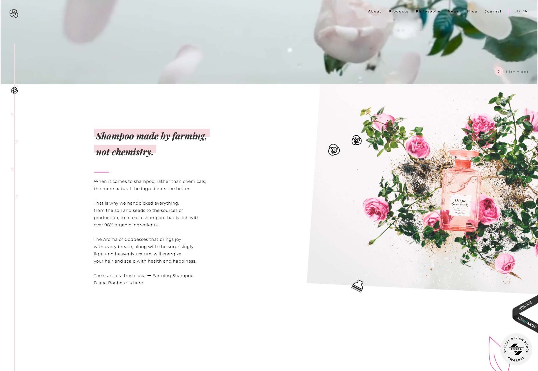
Diane Bonheur‘s website is the perfect example of this.
Here is the English version of the site:
Now, slowly scroll down and compare the same section in Japanese:
The design is slightly off for both because of how much room each of the languages need. For starters, they’re not identical translations, which leads to a variation in number of lines. And, because they use different character sets, spacing is much different, which actually leads to more of the pictures being revealed for Japanese visitors.
Varying alphabets. Text direction (right-to-left, top-to-bottom, etc). Length of translations. Pay close attention to these subtle distinctions between languages, so you can plan the design for to work well with all of them.
4. Use Safe Colors
Understanding something like complementary color contrast makes sense in the work of every web designer. As does the matter of using colors that work well in terms of accessibility. But what about the psychology of color and how that translates in other countries? That’s why major e-commerce sites like Amazon, Zappos, and Walmart use neutral-colored interfaces.
Their logos have color within them as do the products sold on the websites, but each of these sites plays it safe by avoiding major swatches of color that could hold a negative connotation for some users.
5. Personalize But Don’t Localize Images
Images are another element to be careful with as you don’t want to isolate or unintentionally offend any of your audience if you’ve favored one geographic segment over another. As such, when choosing images for your site, consider personalizing images for the different geographic subdomains, but don’t localize them.
Here’s what I mean by that: Belmond uses this video to welcome visitors to its English landing page:
For other speakers, it uses a variety of welcome images, including this one:
Instead of putting the focus on people that are representative of the cultures or geographic areas this site targets, the designer is highlighting the experience sold here.
6. Be Careful with Shorthand
When designing e-commerce sites for English speakers, there are certain icons your users likely recognize that allow you to establish a sort of shorthand for headers:
Three horizontal lines laid atop one another for a hamburger menu;
A shopping bag holding the place of the online shopping cart;
A magnifying glass for search.
While it’s okay to use some symbols to cut down on clutter, you have to be careful about which ones you use on international websites. If you can’t guarantee that each symbol included in the interface will be understood, it’s probably best to spell each of those elements out as Bellroy has done:
As you can see towards the bottom-right, Bellroy does still use a symbol for live chat. However, since this icon is encapsulated in a button-like design element, this is fine. Users will be prompted to engage with it, unlike the header which needs to remain simple in design.
7. Simplify Contact Form Design
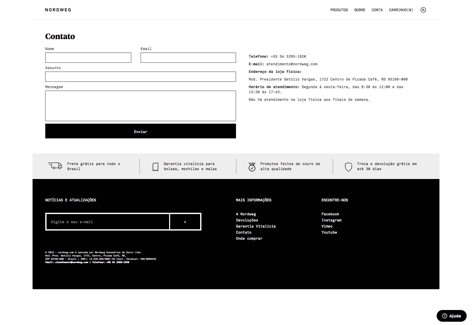
Unless you want to build out specially designed contact forms for each language your site is translated into, it’s best to use a universally friendly form design.
Here is a good example of this:
As you can see, Nordweg keeps it simple. Each element of the form is clearly and simply labeled outside the field (which is good for accessibility, too). And, more importantly, it isn’t formatted in a way that suits one user over another.
Take, for instance, contact forms that ask for a First Name and Last Name, and in that specific order. In some cultures (like Japan), that logically wouldn’t make sense as the last name should appear first and you might run into issues with users providing their last name as a first name and vice versa.
Or what about addresses? You ask for the Street, City, State, and Zip Code… but those fields don’t apply in every country. Even if they do, they aren’t always formatted the same way. The same goes for phone numbers.
So, be careful about how you design contact forms. They should be something your users want to fill out and not something that makes them question whether you cater to customers in their geographic region.
Where in the World Is Your Audience?
To design a website that’s welcoming of all visitors, it requires a certain degree of sensitivity and balance. The 7 tips above will get you started in thinking the right way towards your global users.
For those of you who design websites for the opposite end of the spectrum, stay tuned for my next article which handles designing for the local consumer.
Photoshop has been out on the market for a long time and there isn’t a designer who hasn’t heard about it. That’s a fact. Professionals use it to edit everything, from photos, movies, to anything graphic design related. Undoubtedly, Photoshop is a leader among the editing tools, and rightly so. The multitude of features and options it comes with make it a software for the advanced. Unfortunately, its complexity can be an impossible labyrinth for some, an unpenetrable mystery. For this very reason, we decided to make all your lives easier by putting together a handy list of the best Photoshop alternatives.
We know the hassle that Photoshop comes with, and we know the price. Not only does it need hundreds of hours of practice until you get familiarized with it, but it can also be quite costly for designers at the beginning of their career. Our goal on Webdesignledger is to make designers’ work as enjoyable as possible through accessible resources. Today’s blog post is for those who have been looking for Photoshop alternatives that are easier to use and more affordable. Check these out and choose your favorite:
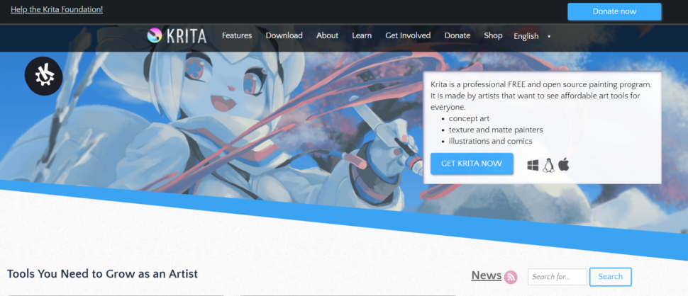
The reasons we love this tool are quite numerous. We’ll start with our favorite: it’s free. Don’t we all like free quality products? Krita is Photoshop’s younger sister, they look and feel very similar. It’s feature-rich and highly recommended by the people online. We recommend you all to use Krita as a Photoshop alternative because:
it has a ton of cool effects
it offers a multitude of templates on different subjects
you can use it on tablets
Unfortunately, Krita doesn’t keep the history of your edits, nor does it have a camera RAW filter. But these little negatives don’t matter so much when all the other features complement each other so well.
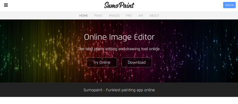
One of the downsides of Photoshop is that you need room for it. You may have to delete stuff on your computer in order to install it. This is where Sumpaint comes into action. This amazing alternative is an online tool which means you can keep everything on your laptop in place. Sumopaint is on our list today because:
it’s super easy to use
it has plenty of features
it offers support for layers and blending modes
3. Multi-Layer (Android)
Edit on the go with your tablet or smartphone with this amazing Photoshop alternative. Multi Layer beats all the other phone tools with its richness of features. Believe it or not, the app offers grit support and even support for blending and layers. Being a free tool, they have to financially support the app through ads which will pop up at times. But even so, we love it for:
Unlike Krita which doesn’t feature a history toolbar, GIMP does! It is also free and that always makes us happy. Plus, what if I told you that it’s able to do almost everything that Photoshop can, sometimes even better? No wonder people recommend it so much online as a Photoshop alternative. It’s easy to work with and we wouldn’t trade it for Photoshop as:
We dare to say that Affinity Photo is better than Photoshop. First, let’s start with the price. Compared to Photoshop, Affinity Photo is so much cheaper! With a one-off payment, you are good to go. Its creators openly affirmed that the aspects Photoshop lacks in, they’ve got it covered. Affinity Photo is among the best on the market, and this is why:
it’s much faster than Photoshop
crashes less than Photoshop
features unlimited undos
6. Sketch
This list could not exist without Sketch. The tool is as feature rich as flexible. Although it is a paid software, you get a ton for the price. And that’s due to the numerous community-created plugins you can access anytime to extend its functionality. The only downside to Sketch is its limited platform availability. Unless you are a Mac user you can’t enjoy this amazing tool. But even so, we applaud it for:
its infinite zooming
the ability to build a new graphic with the vector and pencil tool
including color picker, layers, gradients, and style presets
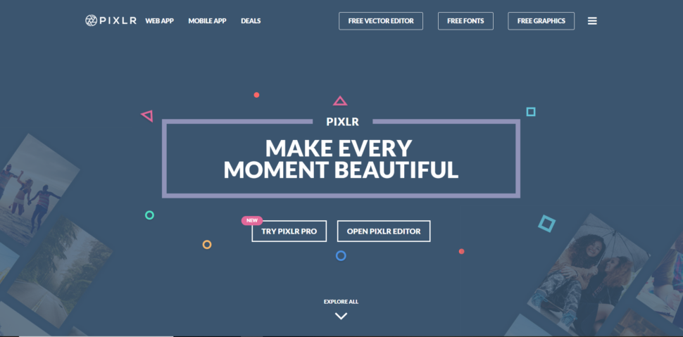
This app is for free. You’ll want to know this little detail when I tell you that it comes with more than 600 effects. Pixlr is that app that you must have on downloaded on your phone for quick edits that actually look good. Crop, resize, whiten teeth if needed, it’s all possible with Pixlr. We added the app to our list due to:
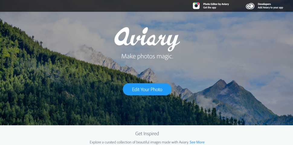
Aviary specializes in basic editing and it does it in style. It’s a super tool for editing images into memes and not only. It’s easy to use, yet full of features. You can edit small details such as blemishes, add stickers, and change the depth of focus. Aviary can be accessed both online and on phones. We mostly like that:
it’s free and the online editor is add free
it comes with a wide range of tools
it’s easy to use
Which Photoshop alternative do you use? We would love to know your recommended tools and what makes them special in the comment section below. Also, stay up to date with the latest news and trends in design by visiting us daily. We strive to bring the best and most useful content and would appreciate if you liked, shared, and subscribe to our blog.
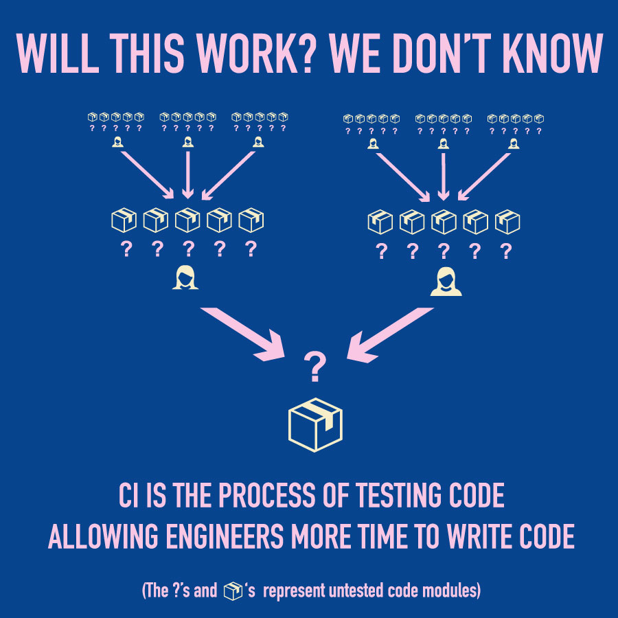
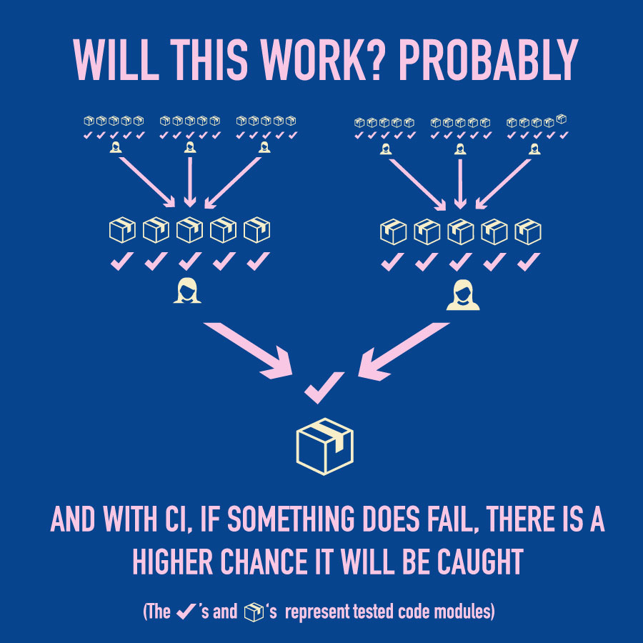
Not long ago, I had a novice understanding of Continuous Integration (CI) and thought it seemed like an extra process that forces engineers to do extra work on already large projects. My team began to implement CI into projects and, after some hands-on experience, I realized its great benefits, not only to the company, but to me, an engineer! In this post, I will describe CI, the benefits I’ve discovered, and how to implement it for free, and fast.
CI and Continuous Delivery (CD) are usually discussed together. Writing about both CI and CD within a post is a lot to write and read about all at once, so we’ll only discuss CI here. Maybe, I will cover CD in a future post. ?
Continuous Integration, as I understand it, is a pattern of programming combining testing, safety checks, and development practices to confidently push code from a development branch to production ready branch continuously.
Microsoft Word is an example of CI. Words are written into the program and checked against spelling and grammar algorithms to assert a document’s general readability and spelling.
Why CI should be used everywhere
We’ve already touched on this a bit, but the biggest benefit of CI that I see is that it saves a lot of money by making engineers more productive. Specifically, it provides quicker feedback loops, easier integration, and it reduces bottlenecks. Directly correlating CI to company savings is hard because SaaS costs scale as the user base changes. So, if a developer wants to sell CI to the business, the formula below can be utilized. Curious just how much it can save? My friend, David Inoa, created the following demo to help calculate the savings.
What really excites enough to scream to the top of the rooftops is how CI can benefit you and me as developers!
For starters, CI will save you time. How much? We’re talking hours per week. How? Oh, do I want to tell you! CI automatically tests your code and lets you know if it is okay to be merged in a branch that goes to production. The amount of time that you would spend testing your code and working with others to get code ready for production is a lot of time.
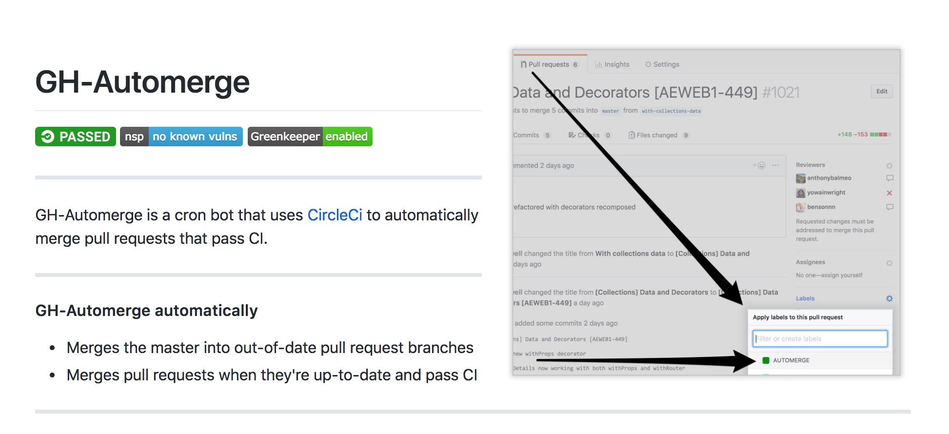
Then there’s the way it helps prevent code fatigue. It sports tools like Greenkeeper, which can automatically set up — and even merge — pull requests following a code review. This keeps code up-to-date and allows developers to focus on what we really need to do. You know, like writing code or living life. Code updates within packages usually only need to be reviewed for major version updates, so there’s less need to track every minor release for breaking changes that require action.
CI takes a lot of the guesswork out of updating dependencies that otherwise would take a lot of research and testing.
No excuses, use CI!
When talking to developers, the conversation usually winds up something like:
“I would use CI but…[insert excuse].”
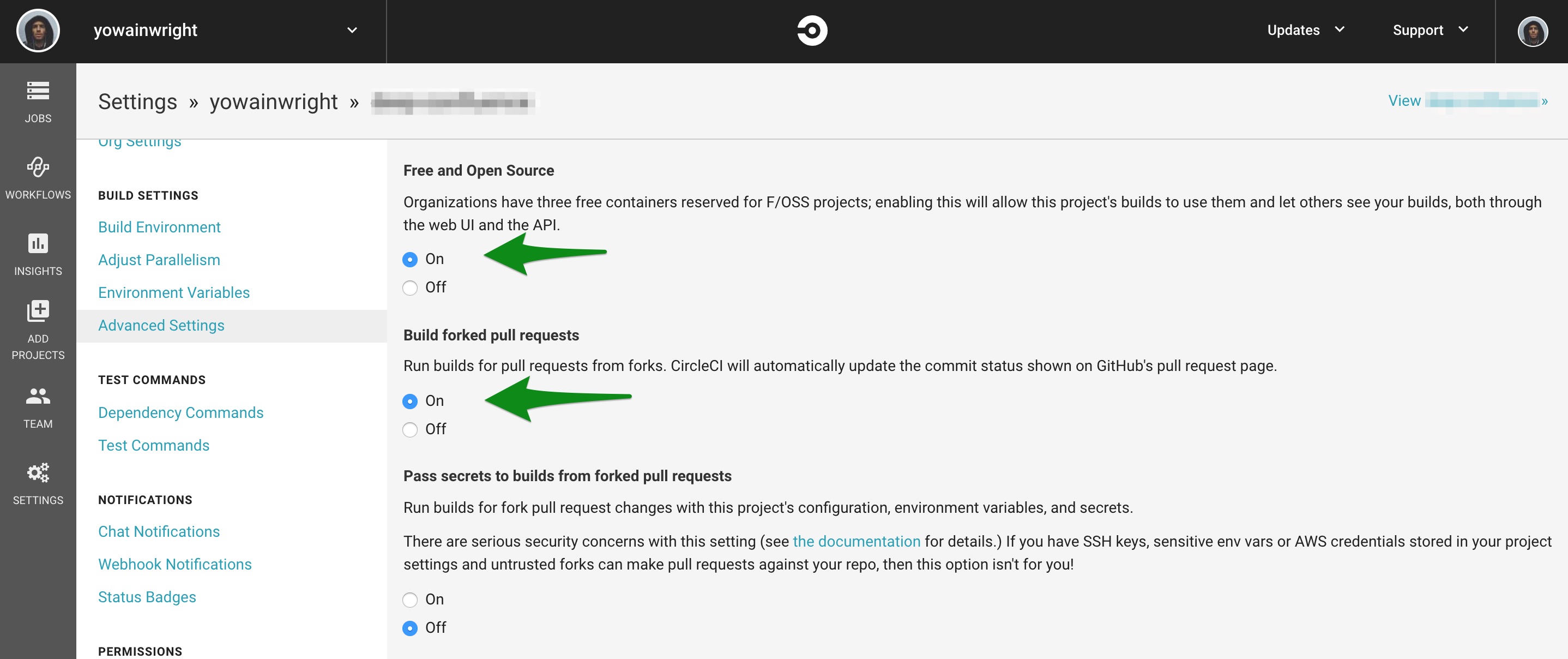
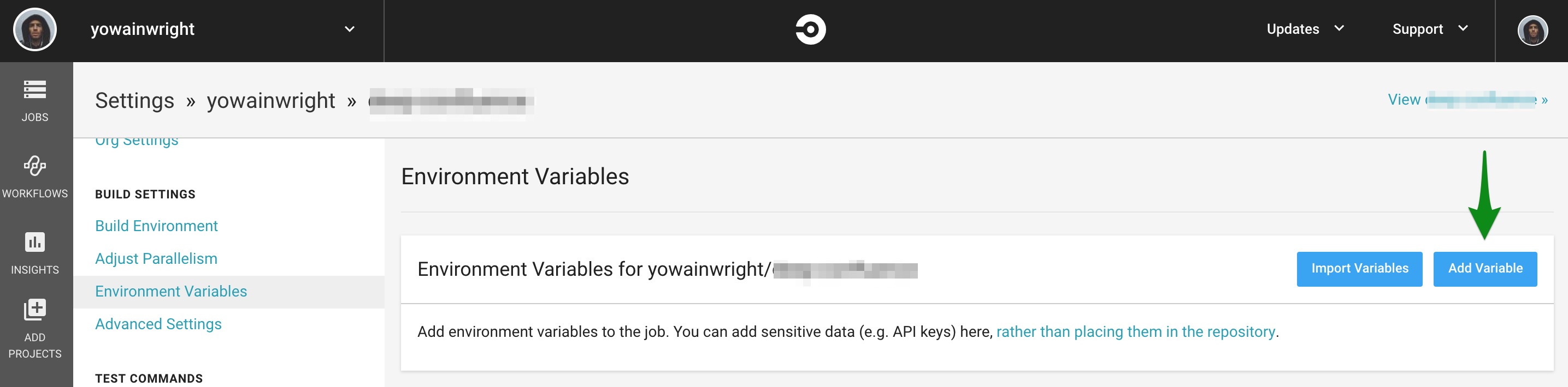
To me, that’s a cop out! CI can be free. It can also be easy. It’s true that the benefits of CI come with some costs, including monthly fees for tools like CircleCI or Greenkeeper. But that’s a drop in the bucket with the long-term savings it provides. It’s also true that it will take time to set things up. But it’s worth calling out that the power of CI can be used for free on open source projects. If you need or want to keep your code private and don’t want pay for CI tools, then you really can build your own CI setup with a few great npm packages.
So, enough with the excuses and behold the power of CI!
What problems does CI solve?
Before digging in much further, we should cover the use cases for CI. It solves a lot of issues and comes in handy in many situations:
When more than one developer wants to merge into a production branch at once
When mistakes are not caught or cannot be fixed before deployment
When dependencies are out of date
When developers have to wait extended periods of time to merge code
When packages are dependent on other packages
When a package is updated and must be changed in multiple place
CI tests updates and prevents bugs from being deployed.
Recommended CI tools
Let’s look at the high level parts used to create a CI feedback loop with some quick code bits to get CI setup for any open source project today. We’ll break this down into digestible chunks.
Documentation
In order to get CI working for me right away, I usually set CI up to test my initial documentation for a project. Specifically, I use MarkdownLint and Write Good because they provide all the features and functionality I need to write tests for this part of the project.
The great news is that GitHub provides standard templates and there is a lot of content that can be copied to get documentation setup quickly. about quickly setting up documentation and creating a documentation feedback loop.
I keep a package.json file at the root of the project and run a script command like this:
Those two lines allow me to start using CI. That’s it! I can now run CI to test grammar.
At this point, I can move onto setting up CircleCI and Greenkeeper to help me make sure that packages are up to date. We’ll get to that in just a bit.
Unit testing
Unit tests are a method for testing small blocks (units) of code to ensure that the expected behavior of that block works as intended.
Unit tests provide a lot of help with CI. They define code quality and provide developers with feedback without having to push/merge/host code. about unit tests and quickly setting a unit test feedback loop.
Here is an example of a very basic unit test without using a library:
const addsOne = (num) => num + 1 // We start with 1 as an initial value
  const numPlus1 = addsOne(3) // Function to add 3
  const stringNumPlus1 = addsOne('3') // Add the two functions, expect 4 as the value

  /**
    * console.assert
    * https://developer.mozilla.org/en-US/docs/Web/API/console/assert
    * @param test?
    * @param string
    * @returns string if the test fails
    **/

  console.assert(numPlus1 === 4, 'The variable `numPlus1` is not 4!')
  console.assert(stringNumPlus1 === 4, 'The variable `stringNumPlus1` is not 4!')
Over time, it is nice to use libraries like Jest to unit test code, but this example gives you an idea of what we’re looking at.
Here’s an example of the same test above using Jest:
Using Jest, tests can be hooked up for CI with a command in a package.json like this:
"test:jest": "jest --coverage",
The flag --coverage configures Jest to report test coverage.
Safety checks
Safety checks help communicate code and code quality. Documentation, document templates, linter, spell checkers, and type checker are all safety checks. These tools can be automated to run during commits, in development, during CI, or even in a code editor.
Safety checks fall into more than one category of CI: feedback loop and testing. I’ve compiled a list of the types of safety checked I typically bake into a project.
All of these checks may seem like another layer of code abstraction or learning, so be gentle on yourself and others if this feels overwhelming. These tools have helped my own team bridge experience gaps, define shareable team patterns, and assist developers when they’re confused about what their code is doing.
Committing, merging, communicating: Tools like husky, commitizen, GitHub Templates, and Changelogs help keep CI running clean code and form a nice workflow for a collaborative team environment.
Defining code (type checkers): Tools like TypeScript define and communicate code interfaces — not only types!
Linting: This is the practice of ensuring that something matches defined standards and patterns. There’s a linter for nearly all programming languages and you’ve probably worked with common ones, like ESlint (JavaScript) and Stylelint (CSS) in other projects.
Writing and commenting:Write Good helps catch grammar errors in documentation. Tools like JSDoc, Doctrine, and TypeDoc assist in writing documentation and add useful hints in code editors. Both can compile into markdown documentation.
ESlint is a good example for how any of these types of tools are implemented in CI. For example, this is all that’s needed in package.json to lint JavaScript:
"eslint": "eslint ."
Obviously, there are many options that allow you to configure a linter to conform to you and your team’s coding standards, but you can see how practical it can be to set up.
High level CI setup
Getting CI started for a repository often takes very little time, yet there are plenty of advanced configurations we can also put to use, if needed. Let’s look at a quick setup and then move into a more advanced configuration. Even the most basic setup is beneficial for saving time and code quality!
Two features that can save developers hours per week with simple CI are automatic dependency updates and build testing. Dependency updates are written about in more detail here.
Build testing refers to node_modules installation during CI by running an install — for example, (npm install where all node_modules install as expected. This is a simple task and does fail. Ensuring that node_modules installs as expected saves considerable time!
Quick CI Setup
CI can be setup automatically for both CircleCI and Travis! If a valid test command is already defined in the repository’s package.json, then CI can be implemented without any more configuration.
In a CI tool, like CircleCI or Travis, the repository can be searched for after logging in or authentication. From there, follow the CI tool’s UI to start testing.
For JavaScript, CircleCI will look at test within a repository’s package.json to see if a valid test script is added. If it is, then CircleCI will begin running CI automatically! Read more about setting up CircleCI automatically here.
Advanced configurations
If unit tests are unfinished, or if a more configuration is needed, a .yml file can be added for a CI tool (like CircleCI) where the execute runner scripts are made.
Below is how to set up a custom CircleCI configuration with JavaScript linting (again, using ESlint as an example) for a CircleCI.
First off, run this command:
mkdir .circleci && touch .circleci/config.yml
Then add the following to generated file:
defaults: &defaults
  working_directory: ~/code
  docker:
    - image: circleci/node:10
  environment:
  NPM_CONFIG_LOGLEVEL: error # make npm commands less noisy
  JOBS: max <h3>https://gist.github.com/ralphtheninja/f7c45bdee00784b41fed
    version: 2
    jobs:
    build:
      <<: *defaults
      steps:
        - checkout
        - run: npm i
        - run: npm run eslint:ci
After these steps are completed and after CircleCI has been configured in GitHub (more on that here), CircleCI will pick up .circleci/config.yml and lint JavaScript in a CI process when a pull request is submitted.
I created a folder with examples in this demo repository to show ideas for configuring CI with config.yml filesand you can reference it for your own project or use the files as a starting point.
The are more even more CI tools that can be setup to help save developers more time, like auto-merging, auto-updating, monitoring, and much more!
Summary
We covered a lot here! To sum things up, setting up CI is very doable and can even be free of cost. With additional tooling (both paid and open source), we can have more time to code, and more time to write more tests for CI — or enjoy more life away from the screen!
Here are some demo repositories to help developers get setup fast or learn. Please feel free to reach out within the repositories with questions, ideas or improvements.


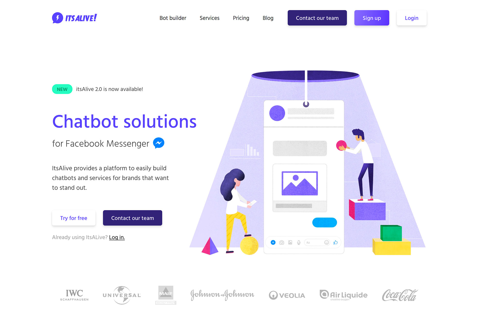
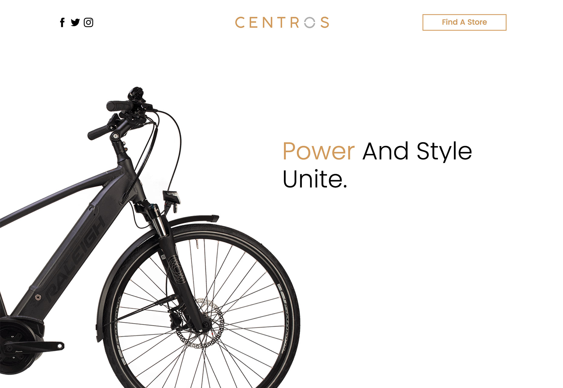


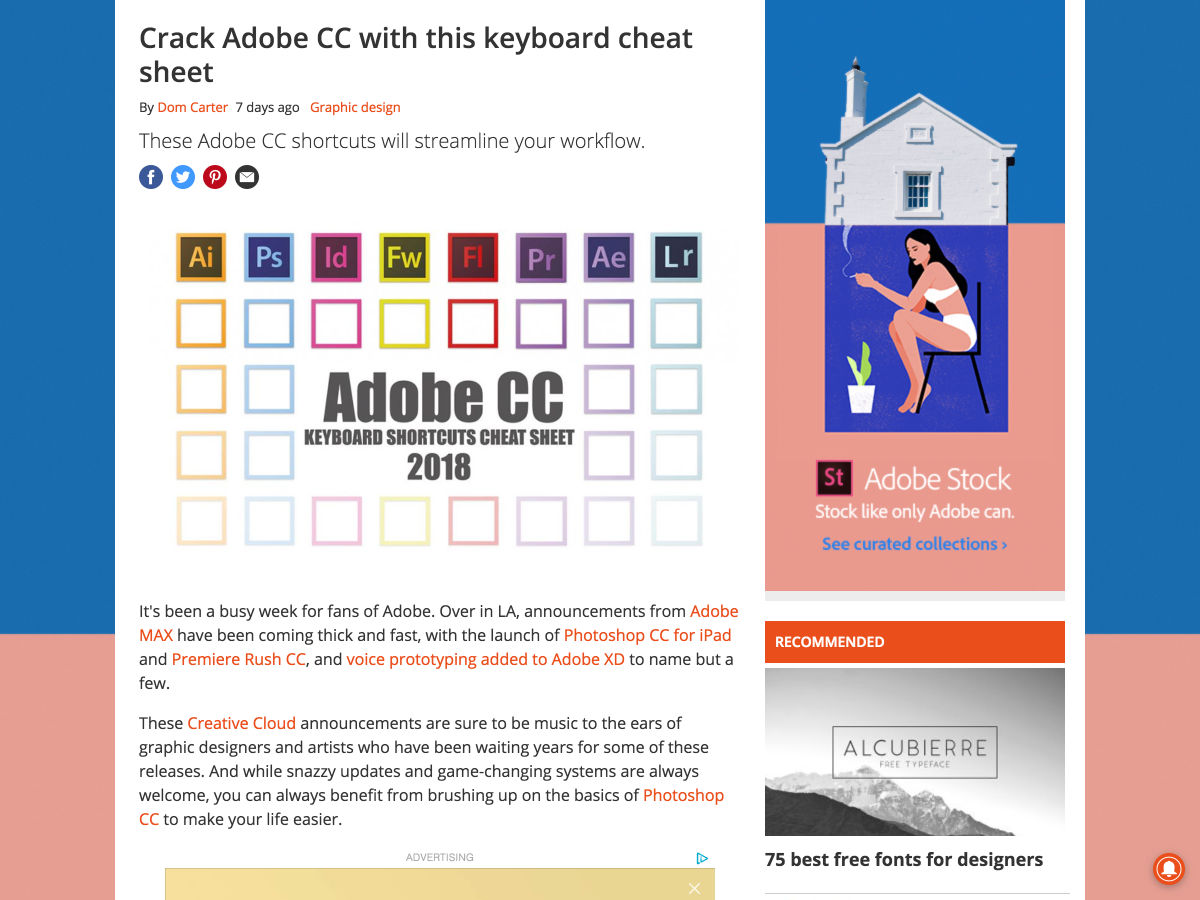
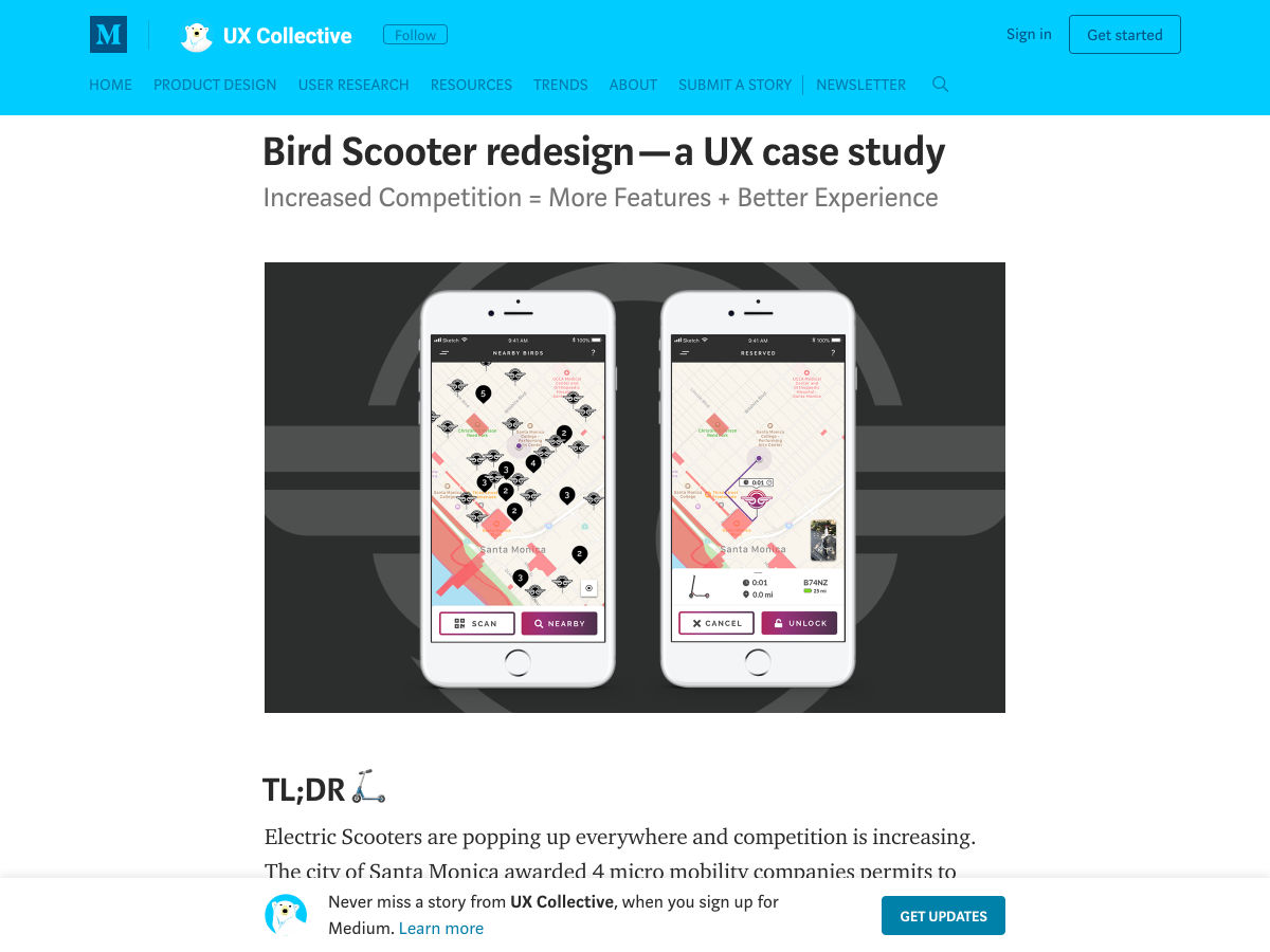
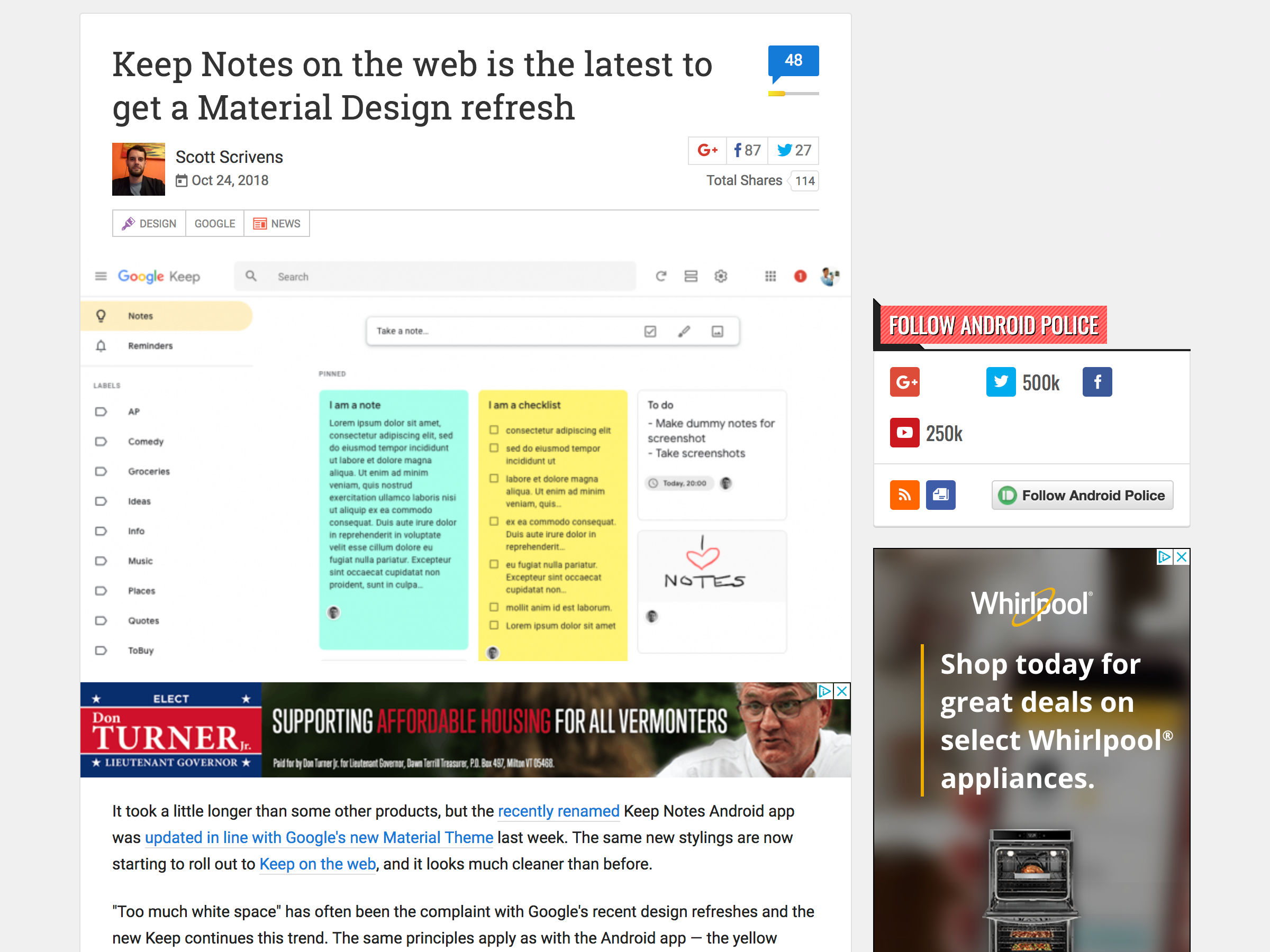

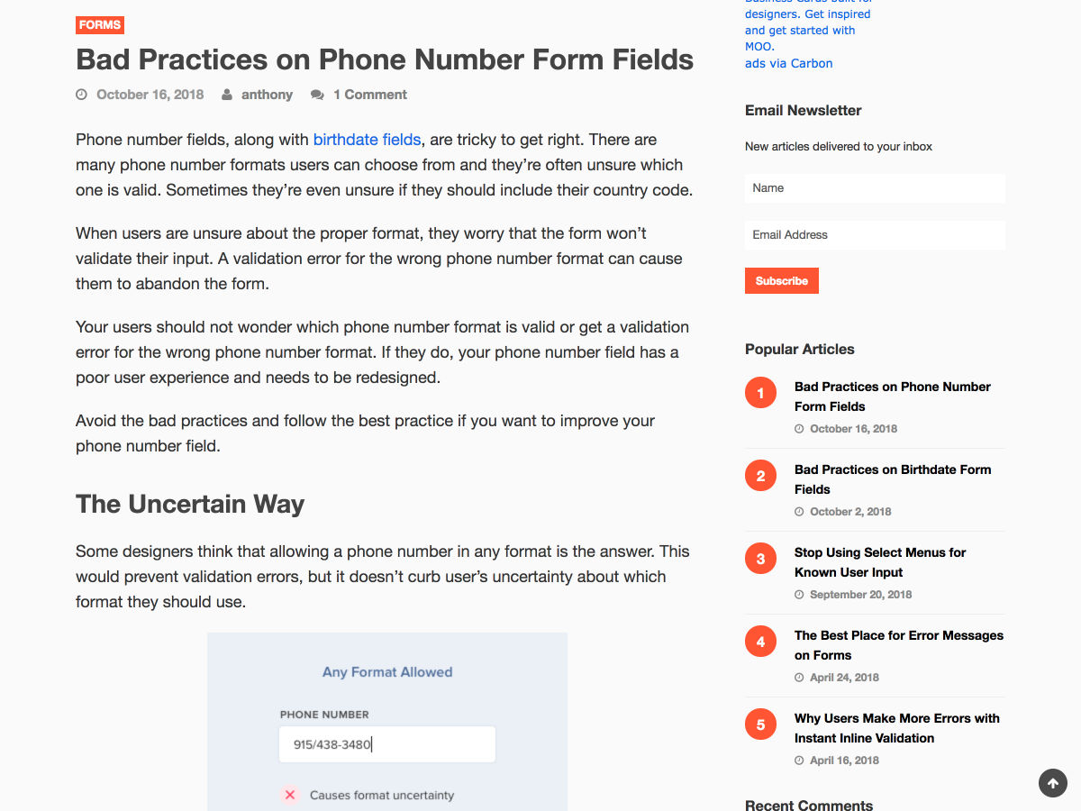


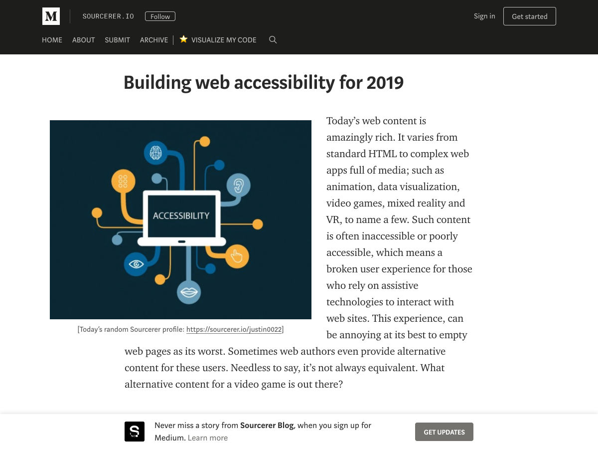


