With our robust SDK, super clean dashboard, detailed documentation, and world-class support, HelloSign API is one of the most flexible and powerful API on the market. Start building for free today.
In my previous post, I examined video trends on the web today, using data from the HTTP Archive. I found that many websites serve the same video content on mobile and desktop, and that many video streams are being delivered at bitrates that are too high to playback on 3G speed connections. We also discovered that may websites automatically download video to mobile devices — damaging customer’s data plans, battery life, for videos that might not ever be played.
TL;DR: In this post, we look at techniques to optimize the speed and delivery of video to your customers, and provide a list of 9 best practices to help you deliver your video assets.
Video Playback Metrics
There are 3 principal video playback metrics in use today:
Video Startup Time
Video Stalling
Video Quality
Since video files are large, optimizing the video to be as small as possible will lead to faster video delivery, speeding up video start, lowering the number of stalls, and minimizing the effect of the quality of the video delivered. Of course, we need to balance startup speed and stalling with the third metric of quality (and higher quality videos generally use more data).
Video Startup
When a user presses play on a video, they expect to be able to watch the video quickly. According to Conviva (a leader in video metric analysis), in Q1 of 2018, 14% of videos never started playing (that’s 2.4 Billion video plays) after the user pressed play.
2.3% of videos (400M video requests) failed to play after the user pressed the play button. 11.54% (2B plays) were abandoned by the user after pressing play. Let’s try to break down what might be causing these issues.
Video Playback Failure
Video playback failure accounted for 2.3% of all video plays. What could lead to this? In the HTTP Archive data, we see 0.3% of all video requests resulting in a 4xx or 5xx HTTP response — so some percentage fail to bad URLs or server misconfigurations. Another potential issue (that is not observed in the HTTP Archive data) are videos that are blocked by Geolocation (blocked based on the location of the viewer and the licensing of the provider to display the video in that locale).
Video Playback Abandonment
The Conviva report states that 11.5% of all video plays would play, but that the customer abandoned the playback before the video started playing. The issue here is that the video is not being delivered to the customer fast enough, and they give up. There are many studies on the mobile web where long delays cause abandonment of web pages, and it appears that the same effect occurs with video playback as well.
Research from Akamai shows that viewers will wait for 2 seconds, but for each subsequent second, 5.8% of viewers abandon the video.
So what leads to video playback issues? In general, larger files take longer to download, so will delay playback. Let’s look at a few ways that one can speed up the playback of videos. To reduce the number of videos abandoned at startup, we should ‘slim’ down these files as best as possible, so they download (and begin playback) quickly.
MP4: Video Preload
To ensure fast playback on the web, one option is to preload the video onto the device in advance. That way, when your customer clicks ‘play’ the video is already downloaded, and playback will be fast. HTML offers a preload attribute with 3 possible options: auto, metadata and none.
preload = auto
When your video is delivered with preload="auto", the browser downloads the entire video file and stores it locally. This permits a large performance improvement for video startup, since the video is available locally on the device, and no network interference will slow the startup.
However, preload="auto" should only be used if there is a high probability that the video will be viewed. If the video is simply resident on your webpage, and it is downloaded each time, this will add a large data penalty to your mobile users, as well as increase your server/CDN costs for delivering the entire video to all of your users.
This website has a section entitled “Video Gallery” with several videos. Each video in this section has preload set to auto, and we can visualize their download in the WebPageTest waterfall as green horizontal lines:
There is a section called “Video Gallery”, and the files for this small section of the website account for 14.6M (83%) of the page download. The odds that one (of many) videos will be played is probably pretty low, and so utilizing preload="auto" only generates a lot of data traffic for the site.
In this case, it is unlikely that even one of these videos will be viewed, yet all of them are downloaded completely, adding 14.8MB of content to the mobile site (83% of the content on the page). For videos that are have a high probability of playback (perhaps >90% of page views result in video play) — preloading the entire video is a very good idea. But for videos that are unlikely to be played, preload="auto" will only cause extra tonnage of content through your servers and to your customer’s mobile (and desktop) devices.
preload="metadata"
When the preload="metadata" attribute is used, an initial segment of the video is downloaded. This allows the player to know the size of the video window, and to perhaps have a second or 2 of video downloaded for immediate playback. The browser simply makes a 206 (partial request) of the video content. By storing a small bit of video data on the device, video startup time is decreased, without a large impact to the amount of data transferred.
On Chrome, metadata is the default choice if no attribute is chosen.
Note: This can still lead to a large amount of video to be downloaded, if the video is large.
For example, on a mobile website with a video set at preload="metadata", we see just one request for video:
And the request is a partial download, but it still results in 2.7 MB of video to be downloaded because the full video is 1080p, 150s long and 97 MB (we’ll talk about optimizing video size in the next sections).
So, I would recommend that preload="metadata" still only be used when there is a fairly high probability that the video will be viewed by your users, or if the video is small.
preload="none"
The most economical download option for videos, as no video files are downloaded when the page is loaded. This will potentially add a delay in playback, but will result in faster initial page load For sites with many videos on a single page, it may make sense to add a poster to the video window, and not download any of the video until it is expressly requested by the end user. All YouTube videos that are embedded on websites never download any video content until the play button is pressed, essentially behaving as if preload="none".
Preload Best Practice: Only usepreload="auto"if there is a high probability that the video will be watched. In general, the use ofpreload="metadata"provides a good balance in data usage vs. startup time, but should be monitored for excessive data usage.
MP4 Video Playback Tips
Now that the video has started, how can we ensure that the video playback can be optimized to not stall and continue playing. Again, the trick is to make sure the video is as small as possible.
Let’s look at some tricks to optimize the size of video downloads. There are several dimensions of video that can be optimized to reduce the size of the video:
Audio
Video files are split into different “streams” — the most common being the video stream. The second most common stream is the audio track that syncs to the video. In some video playback applications, the audio stream is delivered separately; this allows for different languages to be delivered in s seamless manner.
If your video is played back in a silent manner (like a looping GIF, or a background video), removing the audio stream from the video is a quick and easy way to reduce the file size. In one example of a background video, the full file was 5.3 MB, but the audio track (which is never heard) was nearly 300 KB (5% of the file) By simple eliminating the audio, the file will be delivered quickly without wasting bytes.
42% of the MP4 files found on the HTTP Archive have no audio stream.
Best Practice: Remove the audio tracks from videos that are played silently.
Video Encoding
When encoding a video, there are options to reduce the video quality (number of pixels per frame, or the frames per second). Reducing a high-quality video to be suitable for the web is easy to do, and generally does not affect the quality delivered to your end users. This article is not long enough for an in depth discussion of all the various compression techniques available for video. In x264 and x265 encoders, there is a term called the Constant Rate Factor (CRF). Using a CRF of 23-28 will generally give a good compression/quality trade off, and is a great first start into the realm of video compression
Video Size
Video size can be affected by many dimensions: length, width, and height (you could probably include audio here as well).
Video Duration
The length of the video is generally not a feature that a web developer can adjust. If the video is going to playback for three minutes, it is going to playback for three minutes. In cases in which the video is exceptionally long, tools like preload="none" or streaming the video can allow for a smaller amount of data to be downloaded initially to reduce page load time.
Video Dimensions
18% of all video found in the HTTP Archive is identical on mobile and desktop. Those who have worked with responsive web design know how optimizing images for different viewports can drastically reduce load times since the size of the images is much smaller for smaller screens.
The same holds for video. A website with a 30 MB 2560×1226 background video will have a hard time downloading the video on mobile (probably on desktop, too!). Resizing the video drastically decreases the files size, and might even allow for three or four different background videos to be served:
Width
Video (MB)
1226
30
1080
8.1
720
43
608
3.3
405
1.76
Now, unfortunately, browsers do not support media queries for video in HTML, meaning that this just does not work:
Therefore, we’ll need to create a small JS wrapper to deliver the videos we want to different screen sizes. But before we go there…
Downloading Video, But Hiding It From View
Another throwback to the early responsive web is to download full-size images, but to hide them on mobile devices. Your customers get all the delay for downloading the large images (and hit to mobile data plan, and extra battery drain, etc.), and none of the benefit of actually seeing the image. This occurs quite frequently with video on mobile. So, as we write our script, we can ensure that smaller screens never request the video that will not appear in the first place.
Retina Quality Videos
You may have different videos for different device screen densities. This can lead to added time to download the videos to your mobile customers. You may wish to prevent retina videos on smaller screen devices, or on devices with a limited network bandwidth, falling to back to standard quality videos for these devices. Tools like the Network Information API can provide you with the network throughput, and help you decide which video quality you’d like to serve to your customer.
Downloading Different Video Types Based On Device Size And Network Quality
We’ve just covered a few ways to optimize the delivery of movies to smaller screens, and also noted the inability of the video tag to choose between video types, so here is a quick JS snippet that will use the screen width to:
Not deliver video on screens below 500px;
Deliver small videos for screens 500-1400;
Deliver a larger sized video to all other devices.
<html><body>
<div id="video"> </div>
<div id="text"></div>
<script>
    //get screen width and pixel ratio
    var width = screen.width;
    var dpr = window.devicePixelRatio;
//initialise 2 videos —
//“small” is 960 pixels wide (2.6 MB), large is 1920 pixels wide (10 MB)
    var smallVideo="http://res.cloudinary.com/dougsillars/video/upload/w_960/v1534228645/30s4kbbb_oblsgc.mp4";
    var bigVideo = "http://res.cloudinary.com/dougsillars/video/upload/w_1920/v1534228645/30s4kbbb_oblsgc.mp4";
    //TODO add logic on adding retina videos
    if (width<500){
        console.log("this is a very small screen, no video will be requested");
        }

    else if (width< 1400){
            console.log("let's call this mobile sized");
            var videoTag = "<video preload="auto" width="100%" autoplay muted controls src="" +smallVideo +""/>";
            console.log(videoTag);
            document.getElementById('video').innerHTML = videoTag;
            document.getElementById('text').innerHTML = "This is a small video.";
            }
    else{
            var videoTag = "<video preload="auto" width="100%" autoplay muted controls src="" +bigVideo +""/>";
            document.getElementById('video').innerHTML = videoTag;
            document.getElementById('text').innerHTML = "This is a big video.";

    }

</script>
</html></body>
This script divides user’s screens into three options:
Under 500 pixels, no video is shown.
Between 500 and 1400, we have a smaller video.
For larger than 1400 pixel wide screens, we have a larger video.
Our page has a responsive video with two different sizes: one for mobile, and another for desktop-sized screens. Mobile users get great video quality, but the file is only 2.6 MB, compared to the 10MB video for desktop.
Animated GIFs
Animated GIFs are big files. While both aGIFs and video files compress the data through width and height dimensions, only video files have compression (on the often larger) time axis. aGIFs are essentially “flipping through” static GIF images quickly. This lack of compression adds a significant amount of data. Thankfully, it is possible to replace aGIFs with a looping video, potentially saving MBs of data for each request.
In this case, Safari will play the animated GIF, while Chrome (and other browsers that support WebP) will play the animated WebP, with a fallback to the animated GIF. You can read more about this approach in Colin Bendell’s great post.
Third-Party Videos
One of the easiest ways to add video to your website is to simply copy/paste the code from a video sharing service and put it on your site. However, just like adding any third party to your site, you need to be vigilant about what kind of content is added to your page, and how that will affect page load. Many of these “simply paste this into your HTML” widgets add 100s of KB of JavaScript. Others will download the entire movie (think preload="auto"), and some will do both.
Third-Party Video Best Practice: Trust but verify. Examine how much content is added, and how much it affects your page load time. Also, the behavior might change, so track with your analytics regularly.
Streaming Startup
When a video stream is requested, the server supplies a manifest file to the player, listing every available stream (with dimensions and bitrate information). In HLS streaming, the player generally chooses the first stream in the list to begin playback. Therefore, the stream positioned first in the manifest file should be optimized for video startup on both mobile and desktop (or perhaps alternative manifest files should be delivered to mobile vs. desktop).
In most cases, the startup is optimized by using a lower quality stream to begin playback. Once the player downloads a few segments, it has a better idea of available throughput and can select a higher quality stream for later segments. As a user, you have likely seen this — where the first few seconds of a video looks very pixelated, but a few seconds into playback the video sharpens.
In examining 1,065 manifest files delivered to mobile devices from the HTTP Archive, we find that 59% of videos have an initial bitrate under 1.2 MBPS — and are likely to start streaming without any much delay at 1.6 MBPS 3G data rates. 11% use a bitrate between 1.2 and 1.6 MBPS — which may slow the startup on 3G, and 30% have a bitrate above 1.6 MBPS — and are unable to playback at this bitrate on a 3G connection. Based on this data, it appears that ~41% of all videos will not be able to sustain the initial bitrate on mobile — adding to startup delay, and possibly increased number of stalls during playback.
Streaming Startup Best Practice: Ensure your initial bitrate in the manifest file is one that will work for most of your customers. If the player has to change streams during startup, playback will be delayed and you will lose video views.
So, what happens when the video’s bitrate is near (or above) the available throughput? After a few seconds of download without a completed video segment ready for playback, the player stops the download and chooses a lower quality bitrate video, and begins the process again. The action of downloading a video segment and then abandoning leads to additional startup delay, which will lead to video abandonment.
We can visualize this by building video manifests with different initial bitrates. We test 3 different scenarios: starting with the lowest (215 KBPS), middle (600 KBPS), and highest bitrate (2.6 MBPS).
When beginning with the lowest quality video, playback begins at 11s. After a few seconds, the player begins requesting a higher quality stream, and the picture sharpens.
When starting with the highest bitrate (testing on a 3G connection at 1.6 MBPS), the player quickly realizes that playback cannot occur, and switches to the lowest bitrate video (215 KBPS). The video starts playing at 17s. There is a 6-second delay, and the video quality is the same low quality delivered to in the first test.
Using the middle-quality video allows for a bit of a tradeoff, the video begins playing at 13s (2 seconds slower), but is high quality from the start -and there is no jump from pixelated to higher quality video.
Best Practice for Video Startup: For fastest playback, start with the lowest quality stream. For longer videos, you might consider using a ‘middle quality’ stream at start to deliver sharp video at startup (with a slightly longer delay).
WebPageTest results: Initial video stream is low, middle and high (from top to bottom). The video starts the fastest with the lowest quality video. It is important to note that the high quality start video at 17s is the same quality as the low quality start at 11s.
Streaming: Continuing Playback
When the video player can determine the optimal video stream for playback and the stream is lower than the available network speed, the video will playback with no issues. There are tricks that can help ensure that the video will deliver in an optimal manner. If we examine the following manifest entry:
The information line reports that this stream has a 913 KBPS bitrate, and 640×360 resolution. If we look at the URL that this line points to, we see that it references a 600k video. Examining the video files shows that the video is 600 KBPS, and the manifest is overstating the bitrate.
Overstating The Video Bitrate
PRO
Overstating the bitrate will ensure that when the player chooses a stream, the video will download faster than expected, and the buffer will fill up faster than expected, reducing the possibility of a stall.
CON
By overstating the bitrate, the video delivered will be a lower quality stream. If we look at the entire list of reported vs. actual bitrates:
Reported (KBS)
Actual
Resolution
913
600
640×360
142
64
320×180
297
180
512×288
506
320
512×288
689
450
412×288
1410
950
853×480
2090
1500
1280×720
For users on a 1.6 MBPS connection, the player will choose the 913 KBPS bitrate, serving the customer 600 KBPS video. However, if the bitrates had been reported accurately, the 950 KBPS bitrate would be used, and would likely have streamed with no issues. While the choices here prevent stalls, they also lower the quality of the delivered video to the consumer.
Best Practice: A small overstatement of video bitrate may be useful to reduce the number of stalls in playback. However, too large a value can lead to reduced quality playback.
Test the Neilsen video in the browser, and see if you can make it jump back and forth.
Conclusion
In this post, we’ve walked through a number of ways to optimize the videos that you present on your websites. By following the best practices illustrated in this post:
preload="auto"
Only use if there is a high probability that this video will be watched by your customers.
preload="metadata"
Default in Chrome, but can still lead to large video file downloads. Use with caution.
Silent Videos (looping GIFs or background videos)
Strip out the audio channel
Video Dimensions
Consider delivering differently sized video to mobile over desktop. The videos will be smaller, download faster, and your users are unlikely to see the difference (your server load will go down too!)
Video Compression
Don’t forget to compress the videos to ensure that they are delivered
Don’t ‘hide’ videos
If the video will not be displayed — don’t download it.
Audit your third-party videos regularly
Streaming
Start with a lower quality stream to ensure fast startup. (For longer play videos, consider a medium bitrate for better quality at startup)
Streaming
It’s OK to be conservative on bitrate to prevent stalling, but go too far, and the streams will deliver a lower quality video.
You will find that the video on your page is streamlined for optimal delivery and that your customers will not only delight in the video you present but also enjoy a faster page load time overall.
Many people have messaged me, confused about where to get started with testing. Just like everything else in software, we work hard to build abstractions to make our jobs easier. But that amount of abstraction evolves over time, until the only ones who really understand it are the ones who built the abstraction in the first place. Everyone else is left with taking the terms, APIs, and tools at face value and struggling to make things work.
One thing I believe about abstraction in code is that the abstraction is not magic — it’s code. Another I thing I believe about abstraction in code is that it’s easier to learn by doing.
Imagine that a less seasoned engineer approaches you. They’re hungry to learn, they want to be confident in their code, and they’re ready to start testing. ? Ever prepared to learn from you, they’ve written down a list of terms, APIs, and concepts they’d like you to define for them:
Assertion
Testing Framework
The describe/it/beforeEach/afterEach/test functions
Mocks/Stubs/Test Doubles/Spies
Unit/Integration/End to end/Functional/Accessibility/Acceptance/Manual testing
So…
Could you rattle off definitions for that budding engineer? Can you explain the difference between an assertion library and a testing framework? Or, are they easier for you to identify than explain?
Here’s the point. The better you understand these terms and abstractions, the more effective you will be at teaching them. And if you can teach them, you’ll be more effective at using them, too.
Enter a teach-an-engineer-to-fish moment. Did you know that you can write your own assertion library and testing framework? We often think of these abstractions as beyond our capabilities, but they’re not. Each of the popular assertion libraries and frameworks started with a single line of code, followed by another and then another. You don’t need any tools to write a simple test.
Here’s an example:
const {sum} = require('../math')
const result = sum(3, 7)
const expected = 10
if (result !== expected) {
  throw new Error(`${result} is not equal to ${expected}`)
}
Put that in a module called test.js and run it with node test.js and, poof, you can start getting confident that the sum function from the math.js module is working as expected. Make that run on CI and you can get the confidence that it won’t break as changes are made to the codebase. ?
Let’s see what a failure would look like with this:
Terminal window showing an error indicating -4 is not equal to 10.
So apparently our sum function is subtracting rather than adding and we’ve been able to automatically detect that through this script. All we need to do now is fix the sum function, run our test script again and:
Terminal window showing that we ran our test script and no errors were logged.
Fantastic! The script exited without an error, so we know that the sum function is working. This is the essence of a testing framework. There’s a lot more to it (e.g. nicer error messages, better assertions, etc.), but this is a good starting point to understand the foundations.
Once you understand how the abstractions work at a fundamental level, you’ll probably want to use them because, hey, you just learned to fish and now you can go fishing. And we have some pretty phenomenal fishing polls, uh, tools available to us. My favorite is the Jest testing platform. It’s amazingly capable, fully featured and allows me to write tests that give me the confidence I need to not break things as I change code.
I feel like fundamentals are so important that I included an entire module about it on TestingJavaScript.com. This is the place where you can learn the smart, efficient way to test any JavaScript application. I’m really happy with what I’ve created for you. I think it’ll help accelerate your understanding of testing tools and abstractions by giving you the chance to implement parts from scratch. The (hopeful) result? You can start writing tests that are maintainable and built to instill confidence in your code day after day. ?
The early bird sale is going on right now! 40% off every tier! The sale is going away in the next few days so grab this ASAP!
TestingJavaScript.com – Learn the smart, efficient way to test any JavaScript application.
P.S. Give this a try: Tweet what’s the difference between a testing framework and an assertion library? In my course, I’ll not only explain it, we’ll build our own!
As one of the leaders in the software world, Microsoft has definitely worked hard at putting Windows on the map. I’m sure that there are lots of people interested in the history of Microsoft’s tech, but here in this article we are going to discuss something a little more related to design. Over the years, the face of Microsoft Windows has changed drastically. In fact, with the launch of each new operating system, the logo design has changed completely.
We’re starting this article off with a fun fact: the Windows logo key has no less than eight nicknames. These are: Windows key, Winkey,start key, logo key, flag key, super key, command key or flag. Here’s a fast rundown of the Windows logo designs in chronological order:
1985 – The Beginning (Windows 1.0, 2.0)
The first versions of their state of the art software that Microsoft relied were simply called Windows 1.0 and 2.0. If you take a look, this logo highly resembles the Windows 8, 8.1, and 10 logo. This is the start of the basic structure we will see in every Windows logo. Fun Fact, even though Windows 3.0 was released in 1990 support for 1.0 and 2.0 didn’t end until December 31, 2001.
1990 – 2001 (Windows 3.0)
At this point, Microsoft was evolving as a company. They took everything they had learned from the previous two versions and made Windows 3.0. You will notice that along with their evolution as a business, their logo also evolved in professionalism. This is the version of windows that made it popular. Support for this version also ended on December 31, 2001.
1992 – 2001 (Windows 3.1x, NT 3.1, and NT 3.5x)
During this period of time, Windows came up with a lot of new programs, but they only used two different logos. Both of these logos are very similar in appearance, but there are a few details that make them slightly different. Aside from the obvious differences like the window being tilted and the placement of the name, the colors were also changed to be brighter.
1995 – 2001 (Windows 95)
On August 24th, 1995, Windows 95 was released to the public. Microsoft really went big with this launch and it was the first time that a Windows program would get a massive face-lift via the graphical use interface and start menu. There are three different versions of the logo Microsoft used with Windows 95. The first one with just the word mark, the second one with the word mark and the logo, and the final one with the word mark, shadow, and logo. Each one uses the exact same font and the same logo, the only difference is the combination of word mark, the logo, and shadow.
1998 – 2006 (Windows 98, 98 SE)
On June 25th, 1998, Windows 98 was released. Shortly after, in May of 1999, the second edition was released, which fixed major bug problems from the previous version. You’ll notice that the geniuses at Microsoft Corporate didn’t get very creative with their new logo. It’s simply the Windows 95 logo with a new number at the end. It’s also worth mentioning that the 98 SE didn’t have an official logo.
1999 – 2010 (Windows 2000)
Windows 2000 was released only for business customers in December of 1999, and eventually became available for everyone in January of 2000. If this logo doesn’t scream late 90’s, early 2000, I don’t know what it does.
2000 – 2006 (Windows ME)
Windows ME is commonly referred to as the worst version of Windows Microsoft ever created. As it crashed very often and contained tons of bugs. It’s not very often you see this logo floating around because literately everyone that used it hated it.
2001 – 2014 (Windows XP)
In 2001, Microsoft completely renovated their program along with the logo that came with it. The idea was to give the new look a very clean feel. Strangely enough, there are at least eleven versions of the Windows XP logo.
2006 – 2017 (Windows Vista)
In 2006, Microsoft modified their famous Windows logo to glow from the center. Although Vista wasn’t received well by the customers, their logo they created for this program is one of their most iconic.
2009 – Present (Windows 7)
Windows 7 basically copied and pasted the Vista logo. Much like the Windows 95/98 logo design. All Microsoft really did was change the number at the end.
2012 – Present (Windows 8 and 8.1)
2012 would mark the year Windows took their approach towards modernism. This new logo is sleek, simple, and one color. It definetely achieves a minimalist style, at the same time, it salutes Windows’ roots. Take a look at the difference betweern the fonts in the 8 and 8.1 versions. The Windows 8 font is much bolder, while the 8.1 is very thin. This possibly because of the new length the new logo achieved with the additional .1.
2015 – Present (Windows 10)
Almost everyone in the world is using Windows 10 now and has been since it launched. Compared to the Windows 8 logo, the new Windows 10 logo has been unbolded and changed to a much darker shade of blue. It’s been a few years since the new operating system from Windows so don’t get too comfortable with this look. Although nothing has been announced, we can expect something new in the near future, which means a new logo design… or does it?
What do you think of the direction Microsoft has taken Windows? Does the logo design suit the product, or does it need to be revamped completely? Regardless, we know that we will get a killer operating system. Thoughts? Opinions? Let us know in the comment section below. If you want to stay up to date with the design world and want to read more stories like this, be sure to check Webdesignledger daily.
Charts! My least favorite subject besides Social Studies. But you just won’t get very far in this industry before someone wants you to make a chart. I don’t know what it is with people and charts, but apparently we can’t have a civilization without a bar chart showing Maggie’s sales for last month so by ALL MEANS — let’s make a chart.
Yes, I know this is not how you would display this data. I’m trying to make a point here.
To prepare you for that impending “OMG I’m going to have to make a chart” existential crisis that, much like death, we like to pretend is never going to happen, I’m going to show you how to hand-roll your own scatter plot graph with D3.js. This article is heavy on the code side and your first glance at the finished code is going to trigger your “fight or flight” response. But if you can get through this article, I think you will be surprised at how well you understand D3 and how confident you are that you can go make some other chart that you would rather not make.
Before we do that, though, it’s important to talk about WHY you would ever want to roll your own chart.
Building vs. Buying
When you do have to chart, you will likely reach for something that comes “out of the box.” You would never ever hand-roll a chart. The same way you would never sit around and smash your thumb with a hammer; it’s rather painful and there are more productive ways to use your hammer. Charts are rather complex user interface items. It’s not like you’re center-aligning some text in a div here. Libraries like Chart.js or Kendo UI have pre-made charts that you can just point at your data. Developers have spent thousands of hours perfecting these charts You would never ever build one of these yourself.
Or would you?
Charting libraries are fantastic, but they do impose a certain amount of restrictions on you…and sometimes they actually make it harder to do even the simple things. As Peter Parker’s grandfather said before he over-acted his dying scene in Spiderman, “With great charting libraries, comes great trade-off in flexibility.”
Toby never should have been Spiderman. FITE ME.
This is exactly the scenario I found myself in when my colleague, Jasmine Greenaway, and I decided that we could use charts to figure out who @horse_js is. In case you aren’t already a big @horse_js fan, it’s a Twitter parody account that quotes people out of context. It’s extremely awesome.
We pulled every tweet from @horse_js for the past two years. We stuck that in a Cosmos DB database and then created an Azure Function endpoint to expose the data.
And then, with a sinking feeling in our stomachs, we realized that we needed a chart. We wanted to be able to see what the data looked like as it occurred over time. We thought being able to see the data visually in a Time Series Analysis might help us identify some pattern or gain some insight about the twitter account. And indeed, it did.
We charted every tweet that @horse_js has posted in the last two years. When we look at that data on a scatter plot, it looks like this:
Coincidentally, this is the thing we are going to build in this article.
Each tweet is displayed with the date on the x-axis, and the time of day on the y. I thought this would be easy to do with a charting library, but all the ones I tried weren’t really equipped to handle the scenario of a date across the x and a time on the y. I also couldn’t find any examples of people doing it online. Am I breaking new ground here? Am I a data visualization pioneer?
Probably. Definitely.
So, let’s take a look at how we can build this breathtaking scatter plot using D3.
Getting started with D3
Here’s the thing about D3: it looks pretty awful. I just want to get that out there so we can stop pretending like D3 code is fun to look at. It’s not. There’s no shame in saying that. Now that we’ve invited that elephant in the room to the tea party, allow me to insinuate that even though D3 code looks pretty bad, it’s actually not. There’s just a lot of it.
To get started, we need D3. I am using the CDN include for D3 5 for these examples. I’m also using Moment to work with the dates, which we’ll get to later.
D3 works with SVG. That’s what it does. It basically marries SVG with data and provides some handy pre-built mechanisms for visualization it — things such as axis. Or Axees? Axises? Whatever the plural of “axis” is. But for now, just know that it’s like jQuery for SVG.
So, the first thing we need is an SVG element to work with.
<svg id="chart"></svg>
OK. Now we’re ready to start D3’ing our way to data visualization infamy. The first thing we’re going to do is make our scatter plot a class. We want to make this thing as generic as possible so that we can re-use it with other sets of data. We’ll start with a constructor that takes two parameters. The first will be the class or id of the element we are about to work with (in our case that’s, #chart) and the second is an object that will allow us to pass in any parameters that might vary from chart-to-chart (e.g. data, width, etc.).
class ScatterPlot {
  constructor(el, options) {
  }
}
The chart code itself will go in a render function, which will also require the data set we’re working with to be passed.
The first thing we’ll do in our render method is set some size values and margins for our chart.
class ScatterPlot {
  constructor(el, options) {
    this.data = options.data || [];
    this.width = options.width || 500;
    this.height = options.height || 400;

    this.render();
  }

  render() {
    let margin = { top: 20, right: 20, bottom: 50, left: 60 };
    let height = this.height || 400;
    let width = (this.height || 400) - margin.top - margin.bottom;
    let data = this.data;
  }
}
I mentioned that D3 is like jQuery for SVG, and I think that analogy sticks. So you can see what I mean, let’s make a simple SVG drawing with D3.
For starters, you need to select the DOM element that SVG is going to work with. Once you do that, you can start appending things and setting their attributes. D3, just like jQuery, is built on the concept of chaining, so each function that you call returns an instance of the element on which you called it. In this manner, you can keep on adding elements and attributes until the cows come home.
For instance, let’s say we wanted to draw a square. With D3, we can draw a rectangle (in SVG that’s a rect), adding the necessary attributes along the way.
NOW. At this point you will say, “But I don’t know SVG.” Well, I don’t either. But I do know how to Google and there is no shortage of articles on how to do pretty much anything in SVG.
So, how do we get from a rectangle to a chart? This is where D3 becomes way more than just “jQuery for drawing.”
??First, let’s create a chart. We start with an empty SVG element in our markup. We use D3 to select that empty svg element (called #chart?) and define its width and height as well as margins.
AMAZING! Nothing there. If you open the dev tools, you’ll see that there is something there. It’s just an empty something. Kind of like my soul.
That’s your chart! Let’s go about putting some data in it. For that, we are going to need to define our x and y-axis.
That’s pretty easy in D3. You call the axisBottom method. Here, I am also formatting the tick marks with the right date format to display.
let xAxis = d3.axisBottom(x).tickFormat(d3.timeFormat('%b-%y'));
I am also passing an “x” parameter to the axisBottom method. What is that? That is called a scale.
D3 scales
D3 has something called scales. Scales are just a way of telling D3 where to put your data and D3 has a lot of different types of scales. The most common kind would be linear — like a scale of data from 1 to 10. It also contains a scale just for time series data — which is what we need for this chart. We can use the scaleTime method to define a “scale” for our x-axis.
// define the x-axis
let minDateValue = d3.min(data, d => {
  return new Date(moment(d.created_at).format('MM-DD-YYYY'));
});

let maxDateValue = d3.max(data, d => {
  return new Date(moment(d.created_at).format('MM-DD-YYYY'));
});

let x = d3.scaleTime()
  .domain([minDateValue, maxDateValue])
  .range([0, width]);

let xAxis = d3.axisBottom(x).tickFormat(d3.timeFormat('%b-%y'));
D3 scales use some terminology that is slightly intimidating. There are two main concepts to understand here: domains and ranges.
Domain: The range of possible values in your data set. In my case, I’m getting the minimum date from the array, and the maximum date from the array. Every other value in the data set falls between these two endpoints — so those “endpoints” define my domain.
Range: The range over which to display your data set. In other words, how spread out do you want your data to be? In our case, we want it constrained to the width of the chart, so we just pass width as the second parameter. If we passed a value like, say, 10000, our data out over 10,000 pixels wide. If we passed no value at all, it would draw all of the data on top of itself all on the left-hand side of the chart… like the following image.
The y-axis is built in the same way. Only, for it, we are going to be formatting our data for time, not date.
// define y axis
let minTimeValue = new Date().setHours(0, 0, 0, 0);
let maxTimeValue = new Date().setHours(23, 59, 59, 999);

let y = d3.scaleTime()
  .domain([minTimeValue, maxTimeValue])
  .nice(d3.timeDay)
  .range([height, 0]);

let yAxis = d3.axisLeft(y).ticks(24).tickFormat(d3.timeFormat('%H:%M'));
The extra nice method call on the y scale tells the y-axis to format this time scale nicely. If we don’t include that, it won’t have a label for the top-most tick on the left-hand side because it only goes to 11:59:59 PM, rather than all the way to midnight. It’s a quirk, but we’re not making crap here. We need labels on all our ticks.
Now we’re ready to draw our axis to the chart. Remember that our chart has some margins on it. In order to properly position the items inside of our chart, we are going to create a grouping (g) element and set its width and height. Then, we can draw all of our elements in that container.
let main = this.chart.append('g')
  .attr('transform', `translate(${margin.left}, ${margin.top})`)
  .attr('width', width)
  .attr('height', height)
  .attr('class', 'main');
We’re drawing our container, accounting for margin and setting its width and height. Yes. I know. It’s tedious. But such is the state of laying things out in a browser. When was the last time you tried to horizontally and vertically center content in a div? Yeah, not so awesome prior to Flexbox and CSS Grid.
We make a container element, and then “call” the xAxis that we defined earlier. D3 draws things starting at the top-left, so we use the transform attribute to offset the x-axis from the top so it appears at the bottom. If we didn’t do that, our chart would look like this…
By specifying the transform, we push it to the bottom. Now for the y-axis:
We’ve got a chart! Call your friends! Call your parents! IMPOSSIBLE IS NOTHING!
??Axis labels
Now let’s add some chart labels. By now you may have figured out that when it comes to D3, you are doing pretty much everything by hand. Adding axis labels is no different. All we are going to do is add an svg text? element, set it’s value and position it. That’s all.
??
??For the x?-axis, we can add the text label and position it using translate?. We set it’s x? position to the middle (width / 2) of the chart. Then we subtract the left-hand margin to make sure we are centered under just the chart. I’m also using a CSS class for axis-label? that has a text-anchor: middle? to make sure our text is originating from the center of the text element.
??
// text label for the x axis
chart.append("text")
.attr("transform",
"translate(" + ((width/2) + margin.left) + " ," +
(height + margin.top + margin.bottom) + ")")
.attr('class', 'axis-label')
.text("Date Of Tweet");
??
??The y?-axis is the same concept — a text? element that we manually position. This one is positioned with absolute x? and y? attributes. This is because our transform? is used to rotate the label, so we use the x? and y? properties to position it.
?? ??Remember: Once you rotate an element, x and y rotate with it. That means that when the text? element is on its side like it is here, y? now pushes it left and right and x? pushes it up and down. Confused yet? It’s OK, you’re in great company.
??
// text label for the y-axis
chart.append("text")
.attr("transform", "rotate(-90)")
.attr("y", 10)
.attr("x",0 - ((height / 2) + (margin.top + margin.bottom))
.attr('class', 'axis-label')
.text("Time of Tweet - CST (-6)");
??Now, like I said — it’s a LOT of code. That’s undeniable. But it’s not super complex code. It’s like LEGO: LEGO blocks are simple, but you can build pretty complex things with them. What I’m trying to say is it’s a highly sophisticated interlocking brick system.
??Now that we have a chart, it’s time to draw our data.
??
Drawing the data points
This is fairly straightforward. As usual, we create a grouping to put all our circles in. Then we loop over each item in our data set and draw an SVG circle. We have to set the position of each circle (cx and cy) based on the current data item’s date and time value. Lastly, we set its radius (r), which controls how big the circle is.
let circles = main.append('g');
data.forEach(item => {
circles.append('svg:circle')
.attr('class', this.pointClass)
.attr('cx', d => {
return x(new Date(item.created_at));
})
.attr('cy', d => {
let today = new Date();
let time = new Date(item.created_at);
return y(today.setHours(time.getHours(), time.getMinutes(), time.getSeconds(), time.getMilliseconds()));
})
.attr('r', 5);
});
When we set the cx and cy values, we use the scale (x or y) that we defined earlier. We pass that scale the date or time value of the current data item and the scale will give us back the correct position on the chart for this item.
And, my good friend, we have a real chart with some real data in it.
Lastly, let’s add some animation to this chart. D3 has some nice easing functions that we can use here. What we do is define a transition on each one of our circles. Basically, anything that comes after the transition method gets animated. Since D3 draws everything from the top-left, we can set the x position first and then animate the y. The result is the dots look like they are falling into place. We can use D3’s nifty easeBounce easing function to make those dots bounce when they fall.
data.forEach(item => {
circles.append('svg:circle')
.attr('class', this.pointClass)
.attr('cx', d => {
return x(new Date(item.created_at));
})
.transition()
.duration(Math.floor(Math.random() * (3000-2000) + 1000))
.ease(d3.easeBounce)
.attr('cy', d => {
let today = new Date();
let time = new Date(item.created_at);
return y(today.setHours(time.getHours(), time.getMinutes(), time.getSeconds(), time.getMilliseconds()));
})
.attr('r', 5);
OK, so one more time, all together now…
class ScatterPlot {
constructor(el, options) {
this.el = el;
this.data = options.data || [];
this.width = options.width || 960;
this.height = options.height || 500;
this.render();
}
render() {
let margin = { top: 20, right: 20, bottom: 50, left: 60 };
let height = this.height - margin.bottom - margin.top;
let width = this.width - margin.right - margin.left;
let data = this.data;
// create the chart
let chart = d3.select(this.el)
.attr('width', width + margin.right + margin.left)
.attr('height', height + margin.top + margin.bottom);
// define the x-axis
let minDateValue = d3.min(data, d => {
return new Date(moment(d.created_at).format('MM-DD-YYYY'));
});
let maxDateValue = d3.max(data, d => {
return new Date(moment(d.created_at).format('MM-DD-YYYY'));
});
let x = d3.scaleTime()
.domain([minDateValue, maxDateValue])
.range([0, width]);
let xAxis = d3.axisBottom(x).tickFormat(d3.timeFormat('%b-%y'));
// define y axis
let minTimeValue = new Date().setHours(0, 0, 0, 0);
let maxTimeValue = new Date().setHours(23, 59, 59, 999);
let y = d3.scaleTime()
.domain([minTimeValue, maxTimeValue])
.nice(d3.timeDay)
.range([height, 0]);
let yAxis = d3.axisLeft(y).ticks(24).tickFormat(d3.timeFormat('%H:%M'));
// define our content area
let main = chart.append('g')
.attr('transform', `translate(${margin.left}, ${margin.top})`)
.attr('width', width)
.attr('height', height)
.attr('class', 'main');
// draw x axis
main.append('g')
.attr('transform', `translate(0, ${height})`)
.attr('class', 'main axis date')
.call(xAxis);
// draw y axis
main.append('g')
  .attr('class', 'main axis date')
  .call(yAxis);
// text label for the y axis
chart.append("text")
.attr("transform", "rotate(-90)")
.attr("y", 10)
.attr("x",0 - ((height / 2) + margin.top + margin.bottom)
.attr('class', 'axis-label')
.text("Time of Tweet - CST (-6)");
// draw the data points
let circles = main.append('g');
data.forEach(item => {
  circles.append('svg:circle')
  .attr('class', this.pointClass)
  .attr('cx', d => {
    return x(new Date(item.created_at));
  })
  .transition()
  .duration(Math.floor(Math.random() * (3000-2000) + 1000))
  .ease(d3.easeBounce)
  .attr('cy', d => {
      let today = new Date();
      let time = new Date(item.created_at);
      return y(today.setHours(time.getHours(), time.getMinutes(), time.getSeconds(), time.getMilliseconds()));
  })
  .attr('r', 5);
});
}
}
We can now make a call for some data and render this chart…
// get the data
let data = fetch('https://s3-us-west-2.amazonaws.com/s.cdpn.io/4548/time-series.json').then(d => d.json()).then(data => {

  // massage the data a bit to get it in the right format
  let horseData = data.map(item => {
    return item.horse;
  })

  // create the chart
  let chart = new ScatterPlot('#chart', {
    data: horseData,
    width: 960
  });
});
And here is the whole thing, complete with a call to our Azure Function returning the data from Cosmos DB. It’s a TON of data, so be patient while we chew up all your bandwidth.
If you made it this far, I…well, I’m impressed. D3 is not an easy thing to get into. It simply doesn’t look like it’s going to be any fun. BUT, no thumbs were smashed here, and we now have complete control of this chart. We can do anything we like with it.
Check out some of these additional resources for D3, and good luck with your chart. You can do it! Or you can’t. Either way, someone has to make a chart, and it might as well be you.
Usage of video on the web is increasing as devices and networks become faster and more capable of handling video content. Research shows that sites with video increase engagement by 80%. E-Commerce sites with video have higher conversions than sites without video.
But adding video can come at a cost. Videos (being larger files) add to the page load time, and performance research shows that slower pages have the opposite effect of lower customer engagement and conversions. In this aticle, I’ll examine the important metrics to balance performance and video playback on the web, look at how video is being used today, and provide best practices on delivering video on the web.
One of the first steps to improve customer satisfaction is to speed up the load time of a page. Google has shown that mobile pages that take over three seconds to load lose 53% of their audience to abandonment. Other studies find that on improving site performance, usage and sales increase.
Adding video to a website will increase engagement, but it can also dramatically slow down the load time, so it is clear that a balance must be found between adding videos to your site and not impacting the load time too greatly.
To examine the state of video on the web today, I’ll use data from the HTTP Archive. The HTTP Archive uses WebPageTest to scan the performance of 1.2 million mobile and desktop websites every two weeks, and then stores the data in Google BigQuery.
Typically just the main page of each domain is checked (meaning www.cnn.com is run, but www.cnn.com/politics is not). This data can help us understand how the usage of video on the web affects the performance of websites. Mobile tests are run on an emulated Motorola G4 with a 3G internet connection (1.6 MBPS down, 768 KBPS up, 300 ms RTT), and desktop tests run Chrome on a cable connection (5 MBPS down, 1 MBPS up, 28ms RTT). I’ll be using the data set from 1 August 2018.
Sites That Download Video
As a first step to study sites with video, we should look at sites that download video files when the page loads. There are 35k mobile sites and 55k desktop sites with video file downloads in the HTTP Archive data set (that’s 3% of all mobile sites and 4.5% of all desktop sites). Comparing desktop to mobile, we find that 30k of these sites have video on both mobile and desktop (leaving ~5,800 sites on mobile with no video on the desktop).
The median mobile page with video weighs in at a hefty 7 MB (583% larger than 1.2 MB found for the median mobile site). This increase is not fully accounted for by video alone (2.5 MB). As sites with video tend to be more feature rich and visually engaging, they also use more images (the median site has over 1 MB more), CSS, and Javascript. The table below also shows that the median SpeedIndex (a measurement of how quickly content appears on the screen) for sites with video is 3.7s slower than a typical mobile site, taking a whopping 11.5 seconds to load.
SpeedIndex
Bytes Total
Bytes Video
Bytes CSS
Bytes Images
Bytes JS
Video
11544
6,963,579
2,526,098
80,327
1,596,062
708,978
all sites
7780
1,201,802
0
40,648
449,585
336,973
This clearly shows that sites that are more interactive and have video content take (on average) longer to load that sites without video. But can we speed up video delivery? What else can we learn from the data at hand?
Video Hosting
When examining video delivery, are the files being served from a CDN or video provider, or are developers hosting the videos on their own servers? By examining the domain of the videos delivered on mobile, we find that 12,163 domains are used to deliver video, indicating that ~49% of sites are serving their own video files. If we stack rank the domains by frequency, we are able to determine the most common video hosting solutions:
Video Doman
cnt
%
fbcdn.net
116788
67%
akamaihd.net
11170
6%
googlevideo.com
10394
6%
cloudinary.com
3170
2%
amazonaws.com
1939
1%
cloudfront.net
1896
1%
pixfs.net
1853
1%
akamaized.net
1573
1%
tedcdn.com
1507
1%
contentabc.com
1507
1%
vimeocdn.ccom
1373
1%
dailymotion.com
1337
1%
teads.tv
1022
1%
youtube.com
1007
1%
adstatic.com
998
1%
Top CDNs and domains Facebook, Akamai, Google, Cloudinary, AWS, and Cloudfront lead the way, which is not surprising. However, it is interesting to see YouTube and Vimeo so far down in the list, as they are two of the most popular video sharing sites.
Let’s look into YouTube, Vimeo and Facebook video delivery:
YouTube Video Counts
By default, pages with a YouTube video embedded do not actually download any video files — just scripts and a placeholder image, so they do not show up in a querly looking for sites with video downloads. One of the Javascript downloads for the YouTube Video player is www-embed-player.js. Searching for this file, we find 69k instances on 66,647 mobile sites. These sites have a median SpeedIndex of 10,700, and data usage of 3.31MB — better than sites with video downloaded, but still slower than sites with no video at all. The increase in data is directly associated with more images and Javascript (as shown below).
Speedindex
Bytes Total
Bytes Video
Bytes CSS
Bytes Images
Bytes JS
Video
11544
6,963,579
2,526,098
80,327
1,596,062
708,978
All sites
7780
1,201,802
0
40,648
449,585
336,973
YouTube script
10700
3,310,000
0
126,314
1,733,473
1,005,758
Vimeo Video Counts
There are 14,148 requests for Vimeo videos in HTTP Archive for Video playback. I see only 5,848 requests for the player.js file (in the format https://f.vimeocdn.com/p/3.2.0/js/player.js — implying that perhaps there are many videos on one page, or perhaps another location for the video player file. There are 17 different versions of the player present into HTTP Archive, with the most popular being 3.1.5 and 3.1.4:
URL
cnt
https://f.vimeocdn.com/p/3.1.5/js/player.js
1832
https://f.vimeocdn.com/p/3.1.4/js/player.js
1057
https://f.vimeocdn.com/p/3.1.17/js/player.js
730
https://f.vimeocdn.com/p/3.1.8/js/player.js
507
https://f.vimeocdn.com/p/3.1.10/js/player.js
432
https://f.vimeocdn.com/p/3.1.15/js/player.js
352
https://f.vimeocdn.com/p/3.1.19/js/player.js
153
https://f.vimeocdn.com/p/3.1.2/js/player.js
117
https://f.vimeocdn.com/p/3.1.13/js/player.js
105
There does not appear to be any performance gain for any Vimeo Library — all of the pages have similar load times.
Note: Usingwww-embed-player.jsfor YouTube orhttps://f.vimeocdn.com/p/*/js/player.jsfor Vimeo are good fingerprints for browsers with a clean cache, but if the customer has previously browsed a site with an embedded video, this file might already be in the browser cache, and thus will not be re-requested. But, as Andy Davies recently noted, this is not a safe assumption to make.
Facebook Video Counts
It is surprising that in the HTTP Archive data, 67% of all video requests are from Facebook’s CDN. It turns out that on Chrome, 3rd party Facebook widgets download 30% of all videos posted inside the widget (This effect does not occur in Safari or in Firefox.). It turns out that a 3rd party widget added with just a few lines of code is responsible for 57% of all the video seen in the HTTP Archive.
Video File Types
The majority of videos on pages tested are Mp4s. If we look at all the videos downloaded (excluding those from Facebook), we get the following view:
File extension
Video count
%
.mp4
48,448
53%
.ts
18,026
20%
.webm
3,946
4%
14,926
16%
.m4s
2,017
2%
.mpg
1,431
2%
.mov
441
0%
.m4v
407
0%
.swf
251
0%
Of the files with no extension — 10k are googlevideo.com files.
What can we learn about these files? Let’s look each file type to learn more about the content being delivered.
I used FFPROBE to query the 34k unique MP4 files, and obtained data for 14,700 videos (many of the videos had changed or been removed in the 3 weeks from HTTP Archive capture to analysis).
MP4 Video Data
Of the 14.7k videos in the dataset, 8,564 have audio tracks (58%). Shorter videos that autoplay or videos that play in the background do not require audio, so stripping the audio track is a great way to reduce the file size (and speed the delivery) of your videos.
The next most important aspect to quickly downloading a video are the dimensions. The larger the dimensions (and in the case of video, there are three dimensions to consider: width × height × time), the larger the video file will be.
MP4 Video Duration
Most of the 14k videos studied are short: the median (50th percentile) duration is 21s. However, 10% of the videos surveyed are over 2 minutes in duration. Use cases here will, of course, be divided, but for short video loops, or background videos — shorter videos will use less data, and download faster.
The dimensions of the video on the screen decide how many pixels each frame will have to use. The chart below shows the various video widths that are being served to the mobile device. (As a note, the Moto G4 has a screen size of 1080×1920, and the pages are all viewed in portrait mode).
As the data shows, the two most utilized video widths are significantly larger than the G4 screen (when held in portrait mode). A full 49% of all videos are served with a width greater than 1080 pixels wide. The Alcatel 1x, a new Android Go device, has a 480×960-pixel screen. 77% of the videos delivered in the sample set are larger than 480 pixels wide.
As dimensions of videos decrease, so does the files size (and thus time to deliver the video). This is the primary reason to resize videos.
Why are these videos so large? If we correlate the videos served on mobile and desktop, we find that 18% of videos served on mobile are the same videos served on the desktop. This is a ‘problem’ solved for images years ago with responsive images. By serving differently sized videos to different sized devices, we can ensure that beautiful videos are served, but at a size and dimension that makes sense for the device.
MP4 Video Bitrate
The bitrate of the video delivered to the device plays a large effect on how well the video will play back. The HTTP Archive tests are run on a 3G connection at 1.6 MBPS download speed. To playback (without stalling) the download has to be faster than playback. Let’s provide 80% of the available bitrate to video files (1.3 MBPS). 47% of the videos in the sample set have a bitrate over 1.3 MBPS, meaning that when these videos are played on a 3G connection, they are more likely to stall — leading to unhappy customers. 27% of videos have a bitrate higher than 2.5 MBPS, 10% are higher than 5 MBPS, and 35 of videos served to mobile devices have a bitrate > 10 MBPS. These larger videos are unlikely to play without stalling on many connections — fixed or mobile.
Larger videos tend to carry a larger bitrate, as larger dimensioned videos require a lot more data to populate the additional pixels on the device. Cross referencing the bitrate of each video to the width confirms this: videos with width 1280 (orange) and 1920 (gray) have a much broader distribution of bitrates (more data points to the right in the chart). The column marked in yellow denotes the 136 videos with width 1920, and a bitrate between 10-11 MBPS.
If we visualize only the videos over 1.6 MBPS, it becomes clear that the higher screen resolutions (1280 and 1920) are responsible for the higher bitrate videos.
HTTP2 has redefined content delivery with multiplexed connections — where just one connection per server is required. For large files like video, does HTTP2 provide a meaningful improvement to content delivery? If we look at the stats from the HTTP Archive:
Omitting the 116k Facebook videos (all sent via HTTP2), we see that it is about a 50:50 split between HTTP 1.1 and HTTP2. However, HTTP1.1 can utilize HTTPS, and when we filter for HTTPS usage, we find that 81% of video streams are sent via HTTPS, with HTTP2 being used slightly more than HTTPS1.1 (41%:36%)
As you can see, comparing the speed of HTTP and HTTP2 video delivery is a work in progress.
HLS Video Streaming
Video streaming using adaptive bitrate is an ideal way to deliver video to the end user. Multiple versions of each video are built with different dimensions and bitrates. The list of available streams is presented to the playback device, and the video player on the device can choose the most appropriate stream based on the size of the device screen and the available network conditions. There are 1,065 manifest files (and 14k video stream files) in the HTTP Archive data set that I examined.
Video Stream Playback
One key metric in video streaming is to have the video start as quickly as possible. While the manifest file has a list of available streams, the player has no idea the available bandwidth of the network at the beginning of playback. To begin streaming, and because the player has to pick a stream, it typically chooses the first one in the list. In order to facilitate a fast video startup, it is important to place the correct stream at the top of your manifest file.
Note: Utilizing the Chrome Network Info API to generate manifest files on the fly might be a good way to quickly optimize video content at startup.
One way to ensure that the video starts quickly is to start with the lowest quality video segment, as the download will be the fastest. The initial video quality may be pixelated, but as the player better understands the network quality, it can quickly adjust to a more appropriate (hopefully higher quality) video stream. With that in mind, let’s look at the initial stream bitrates in the HTTP Archive.
The red line in the above chart denotes 1.5 MBPS (recall that mobile tests are run at 1.6 MBPS, and not only video content is being downloaded). We see 30.5% of all of the streams (everything to the left of the line) start with an initial bitrate higher than 1.5 MBPS (and are thus unlikely to playback on a 3G connection) 17% start above 2 MBPS.
So what happens when video download is slower than the actual playback of the video? Initially, the player will attempt to download the (too) large bitrate files, but based on the download speed, will realise the problem. The player will then switch to downloading a lower bitrate video, so that download is faster than playback. The problem is that the initial download attempt takes time, and adding a delay to video playback start leads to customer abandonment.
We can also look at the most common bitrates of .ts files (the files that have the video content), to see what bitrates end up being downloaded on mobile. This data includes the initial bitrates, and any subsequent file downloaded during the WebPageTest run:
We can see two major groupings of video streaming bitrates (100-300 KBPS, and a broader peak from 300-1,000 MBPS). This is where we would expect streams to appear, given that the network speed is capped at 1.6 MBPS.
Comparing the data to the desktop, Mobile clearly is higher at the lower bitrates, and desktop streams have high peaks in the 500-600 and 800-900 KBPS ranges, that are not seen in mobile.
Observed mobile and Desktop streaming bitrates (Large preview)
Observed bitrates, mobile, desktop compared to initial bitrate (Large preview)
When we compare the initial bitrates observed (blue) with the actual files downloaded, it is very clear that for mobile the bitrate generally decreases during stream playback, indicating that lowering the initial bitrate for video streams might improve the performance of video startup and prevent stalls in early playback of the video. Desktop video also appears to decrease, but it is also possible that some video move to higher playback speeds.
Conclusion
Video content on the web increases customer engagement and satisfaction. Pages that load quickly have the same effect. The addition of video to your website will slow down the page rendering time, necessitating a balance between overall page load and video content. To reduce the size of your video content, ensure that you have versions appropriately sized for mobile device dimensions, and use shorter videos when possible.
If playback of your videos is not essential, follow the path of YouTube and Vimeo — download all the required pieces to be ready for playback, but don’t actually download any video segments until the user presses play. Finally — if you are streaming video — start with the lowest quality setting to ensure a fast video playback.
In my next post on video, I will take these general findings, and dig deeper into how to resolve potential issues with examples. Stay tuned!
WordPress, Joomla, and Drupal; these are perhaps the three biggest names in the world of the consumer CMS. They are known, they are loved, they are behemoths for a good reason. There’s no escaping them. We are all WordPress, now.
No, but seriously, there’s almost nothing they can’t do, with the judicious application of plugins, themes, and coding knowledge. Yeah, believe it or not, I’m not here to rag on them. Kudos to their developers. I’m just going to sit over here and show some love to the smaller CMS options for a bit.
If I were given to fits of poetry, I might write a sonnet about them or something. Alas, Lord Byron I am not; I am not nearly so rich, I have no desire to invade Greece, I do not own a bear. Instead, you’ll be getting this article detailing some of the wonderful things about smaller CMS, such as:
1. Clear Direction and Purpose
The operating system known as Unix was designed on this principle: one program should do one thing, and do it well. This principle was hereafter adopted into other systems, such as MacOS, and has been the cornerstone of some of the best software design over the years.
In many small CMS options, we can see that principle at work. That’s not to say, though, that a single-purpose CMS can’t be sophisticated or even rather complex. It’s just that dedication to a single goal encourages a form of excellence that more generalist systems struggle to achieve.
Take Ghost, for example. As of its 2.0 release Ghost has become, in my opinion, one of the best platforms for a pure-blogging experience. But even though it’s a comparatively small CMS, I wouldn’t call what they’ve done with it “simple”.
2. Lightweight, Un-bloated Code
Smaller CMS are just that: smaller. There’s a very direct correlation between the amount of code in the software, and how quickly it runs. When you only need a simple site, there’s no sense in having a CMS with loads of extra features that you’ll never touch. That’s just wasted server space.
Even so, these small CMS can be very flexible. Here we look to Grav: its goal is to be a simple, developer-friendly, flat file CMS. Within that purpose, there is vast potential. Grav can be a blog, a knowledge base, or a simple brochure site, and compete with many of the big CMS options, while maintaining a (current) core download size of 4.8MB.
3. Uncomplicated Admin Experience (Usually)
Now, I’ve expounded on how a small CMS can be complex when it has to be, but it’s not always going to be complex. A truly single-purpose application will, largely due to its very nature, be rather simple to use. How many form fields do you really need to publish a page full of content, anyway?
Recently I had the pleasure of working with Bludit to create a small blog. I’ve worked with WordPress, as well as many other systems, for years, but Bludit was downright refreshing. While I did occasionally chafe at some of the small limitations in the system, I absolutely adore the writing and editing experience. Well, I really like the Markdown editing experience. It has TinyMCE, too, but I didn’t bother with that.
The clarity that comes with pushing all the other aspects of publishing out of your way until you need them… it’s just my jam. I’ll say that Ghost is pretty good at that, too, but Bludit’s more bare-bones approach is more my speed. But that’s the beauty of these small CMS options: there’s one out there for just about every use case and user preference.
4. Simple Templating and Theming
When a CMS just plain does less, it’s usually a bit easier to design and code templates for. This makes it a bit easier for those of us who are more visually-oriented to spend time doing what we love, rather than learning all the quirks of an endlessly complex system.
One thing a lot of small CMS do to make this even more simple, is use a templating language like Twig. If that interests you, have a look at options like Pico, or if you need something for a larger and more complex publishing endeavor, try Bolt CMS.
5. When Support is Available, it’s Nice and Personal
The organizations that develop larger CMS will often sell support to enterprise customers to fund development. That’s cool and all, but have you ever wanted to talk to the developers directly? Well, there’s always Twitter, but with many smaller CMS, developers often offer very personal attention to their users. You can contact some through GitHub, via email, or even in an IRC chatroom (or a more modern equivalent).
I’m reminded of the time I spent wrestling with October, a lovely back-to-basics CMS. I was trying to make it work with a cloud platform it really wasn’t designed for, and that didn’t work out at the time. Even so, the time I got to spend chatting with the developers and learning how they were putting things together was enlightening, and fun.
6. It’s Easy to get Involved
Technically, systems like WordPress and Drupal are open source. Anyone can contribute to their development and refinement. The truth is, of course, more complicated. Large and established open source projects have established communities, hierarchies, and very large codebases. Sure, they need all of that, but these things can make it hard to just dive in and flex your coding chops. It can be hard to get to the point where you can make real contributions.
Smaller open source projects are easier to get to know inside and out, and most of their developers (especially on the single-developer projects) would be happy to have someone, anyone, do some of the work for them. It’s easier to get in on the ground floor, and truly contribute. It’s more personal, and you get to be a part of that CMS’ history.
Whenever I see someone really effectively debug JavaScript in the browser, they use the DevTools tooling to do it. Setting breakpoints and hopping over them and such. That, as opposed to sprinkling console.log() (and friends) statements all around your code.
Parag Zaveri wrote about the transition and it has clearly resonated with lots of folks! (7.5k claps on Medium as I write).
I know I have hangups about it…
Part of debugging is not just inspecting code once as-is; it’s inspecting stuff, making changes and then continuing to debug. If I spend a bunch of time setting up breakpoints, will they still be there after I’ve changed my code and refreshed? Answer: DevTools appears to do a pretty good job with that.
Looking at the console to see some output is one thing, but mucking about in the Sources panel is another. My code there might be transpiled, combined, and not quite look like my authored code, making things harder to find. Plus it’s a bit cramped in there, visually.
But yet! It’s so powerful. Setting a breakpoint (just by clicking a line number) means that I don’t have to litter my own code with extra junk, nor do I have to choose what to log. Every variable in local and global scope is available for me to look at that breakpoint. I learned in Parag’s article that you might not even need to manually set breakpoints. You can, for example, have it break whenever a click (or other) event fires. Plus, you can type in variable names you specifically want to watch for, so you don’t have to dig around looking for them. I’ll be trying to use the proper DevTools for debugging more often and seeing how it goes.
While we’re talking about debugging though… I’ve had this in my head for a few months: Why doesn’t JavaScript have log levels? Apparently, this is a very common concept in many other languages. You can write logging statements, but they will only log if the configuration says it should. That way, in development, you can get detailed logging, but log only more serious errors in production. I mention it because it could be nice to leave useful logging statements in the code, but not have them actually log if you set like console.level = "production"; or whatever. Or perhaps they could be compiled out during a build step.
I remember when I first started to work with flexbox that the world looked like flexible boxes to me. It’s not that I forgot how floats, inline-block, or any other layout mechanisms work, I just found myself reaching for flexbox by default.
Now that grid is here and I find myself working on projects where I can use it freely, I find myself reaching for grid by default for the most part. But it’s not that I forgot how flexbox works or feel that grid supersedes flexbox — it’s just that darn useful. Rachel puts is very well:
Asking whether your design should use Grid or Flexbox is a bit like asking if your design should use font-size or color. You should probably use both, as required. And, no-one is going to come to chase you if you use the wrong one.
Yes, they can both lay out some boxes, but they are different in nature and are designed for different use cases. Wrapping un-even length elements is a big one, but Rachel goes into a bunch of different use cases in this article.
This post is a collaboration between myself and my awesome coworker, Maxime Rouiller.
Durable Functions? Wat. If you’re new to Durable, I suggest you start here with this post that covers all the essentials so that you can properly dive in. In this post, we’re going to dive into one particular use case so that you can see a Durable Function pattern at work!
Today, let’s talk about the Fan Out, Fan In pattern. We’ll do so by retrieving an open issue count from GitHub and then storing what we get. Here’s the repo where all the code lives that we’ll walk through in this post.
We briefly mentioned this pattern in the previous article, so let’s review. You’d likely reach for this pattern when you need to execute multiple functions in parallel and then perform some other task with those results. You can imagine that this pattern is useful for quite a lot of projects, because it’s pretty often that we have to do one thing based on data from a few other sources.
For example, let’s say you are a takeout restaurant with a ton of orders coming through. You might use this pattern to first get the order, then use that order to figure out prices for all the items, the availability of those items, and see if any of them have any sales or deals. Perhaps the sales/deals are not hosted in the same place as your prices because they are controlled by an outside sales firm. You might also need to find out what your delivery queue is like and who on your staff should get it based on their location.
That’s a lot of coordination! But you’d need to then aggregate all of that information to complete the order and process it. This is a simplified, contrived example of course, but you can see how useful it is to work on a few things concurrently so that they can then be used by one final function.
Here’s what that looks like, in abstract code and visualization
const df = require('durable-functions')

module.exports = df(function*(ctx) {
  const tasks = []

  // items to process concurrently, added to an array
  const taskItems = yield ctx.df.callActivityAsync('fn1')
  taskItems.forEach(item => tasks.push(ctx.df.callActivityAsync('fn2', item))
  yield ctx.df.task.all(tasks)

  // send results to last function for processing
  yield ctx.df.callActivityAsync('fn3', tasks)
})
Now that we see why we would want to use this pattern, let’s dive in to a simplified example that explains how.
Setting up your environment to work with Durable Functions
First things first. We’ve got to get development environment ready to work with Durable Functions. Let’s break that down.
GitHub Personal Access Token
To run this sample, you’ll need to create a personal access token in GitHub. If you go under your account photo, open the dropdown, and select Settings, then Developer settings in the left sidebar. In the same sidebar on the next screen, click Personal access tokens option.
Then a prompt will come up and you can click the Generate new token button. You should give your token a name that makes sense for this project. Like “Durable functions are better than burritos.” You know, something standard like that.
For the scopes/permission option, I suggest selecting “repos” which then allows to click the Generate token button and copy the token to your clipboard. Please keep in mind that you should never commit your token. (It will be revoked if you do. Ask me why I know that.) If you need more info on creating tokens, there are further instructions here.
Functions CLI
First, we’ll install the latest version of the Azure Functions CLI. We can do so by running this in our terminal:
npm i -g azure-functions-core-tools@core --unsafe-perm true
Does the unsafe perm flag freak you out? It did for me as well. Really what it’s doing is preventing UID/GID switching when package scripts run, which is necessary because the package itself is a JavaScript wrapper around .NET. Brew installing without such a flag is also available and more information about that is here.
Optional: Setting up the project in VS Code
Totally not necessary, but I like working in VS Code with Azure Functions because it has great local debugging, which is typically a pain with Serverless functions. If you haven’t already installed it, you can do so here:
Set up a Free Trial for Azure and Create a Storage Account
To run this sample, you’ll need to test drive a free trial for Azure. You can go into the portal and sign in the lefthand corner. You’ll make a new Blob Storage account, and retrieve the keys. Since we have that all squared away, we’re ready to rock!
Setting up Our Durable Function
Let’s take a look at the repo we have set up. We’ll clone or fork it:
In local.settings.json, change GitHubToken to the value you grabbed from GitHub earlier, and do the same for the two storage keys — paste in the keys from the storage account you set up earlier.
Then run:
func extensions install
npm i
func host start
And now we’re running locally!
Understanding the Orchestrator
As you can see, we have a number of folders within the FanOutFanInCrawler directory. The functions in the directories listed GetAllRepositoriesForOrganization, GetAllOpenedIssues, and SaveRepositories are the functions that we will be coordinating.
Here’s what we’ll be doing:
The Orchestrator will kick off the GetAllRepositoriesForOrganization function, where we’ll pass in the organization name, retrieved from getInput() from the Orchestrator_HttpStart function
Since this is likely to be more than one repo, we’ll first create an empty array, then loop through all of the repos and run GetOpenedIssues, and push those onto the array. What we’re running here will all fire concurrently because it isn’t within the yield in the iterator
Then we’ll wait for all of the tasks to finish executing and finally call SaveRepositories which will store all of the results in Blob Storage
Since the other functions are fairly standard, let’s dig into that Orchestrator for a minute. If we look inside the Orchestrator directory, we can see it has a fairly traditional setup for a function with index.js and function.json files.
Generators
Before we dive into the Orchestrator, let’s take a very brief side tour into generators, because you won’t be able to understand the rest of the code without them.
A generator is not the only way to write this code! It could be accomplished with other asynchronous JavaScript patterns as well. It just so happens that this is a pretty clean and legible way to write it, so let’s look at it really fast.
After the initial little asterisk following function*, you can begin to use the yield keyword. Calling a generator function does not execute the whole function in its entirety; an iterator object is returned instead. The next() method will walk over them one by one, and we’ll be given an object that tells us both the value and done — which will be a boolean of whether we’re done walking through all of the yield statements. You can see in the example above that for the last .next() call, an object is returned where done is true, letting us know we’ve iterated through all values.
Orchestrator code
We’ll start with the require statement we’ll need for this to work:
const df = require('durable-functions')

module.exports = df(function*(context) {
  // our orchestrator code will go here
})
It’s worth noting that the asterisk there will create an iterator function.
First, we’ll get the organization name from the Orchestrator_HttpStart function and get all the repos for that organization with GetAllRepositoriesForOrganization. Note we use yield within the repositories assignment to make the function perform in sequential order.
Then we’re going to create an empty array named output, create a for loop from the array we got containing all of the organization’s repos, and use that to push the issues into the array. Note that we don’t use yield here so that they’re all running concurrently instead of waiting one after another.
const df = require('durable-functions')

module.exports = df(function*(context) {
  var organizationName = context.df.getInput()
  var repositories = yield context.df.callActivityAsync(
   'GetAllRepositoriesForOrganization',
   organizationName
  )

 var output = []
 for (var i = 0; i < repositories.length; i++) {
   output.push(
     context.df.callActivityAsync('GetOpenedIssues', repositories[i])
   )
 }

})
Finally, when all of these executions are done, we’re going to store the results and pass that in to the SaveRepositories function, which will save them to Blob Storage. Then we’ll return the unique ID of the instance (context.instanceId).
const df = require('durable-functions')

module.exports = df(function*(context) {
 var organizationName = context.df.getInput()
 var repositories = yield context.df.callActivityAsync(
   'GetAllRepositoriesForOrganization',
   organizationName
 )

 var output = []
 for (var i = 0; i < repositories.length; i++) {
   output.push(
     context.df.callActivityAsync('GetOpenedIssues', repositories[i])
   )
 }

 const results = yield context.df.Task.all(output)
 yield context.df.callActivityAsync('SaveRepositories', results)

 return context.instanceId
})
Now we’ve got all the steps we need to manage all of our functions with this single orchestrator!
First, you will need to provision the service. Look into the provision.ps1 file that’s provided to familiarize yourself with the resources we are going to create. Then, you can execute the file with the previously generated GitHub token like this:


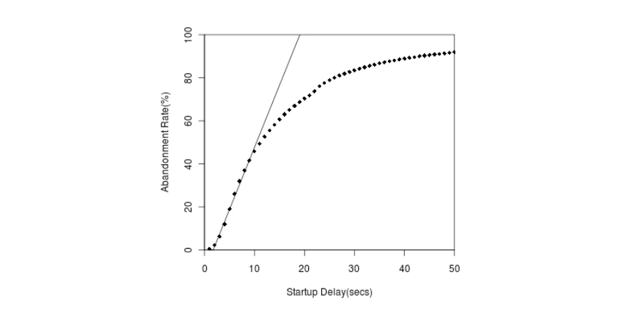

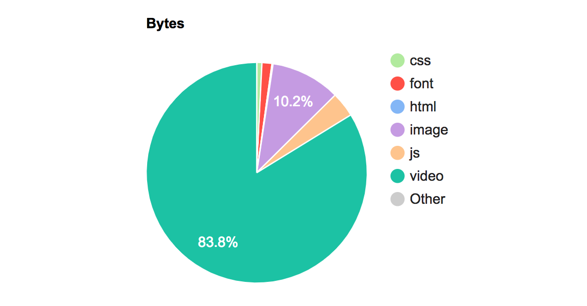

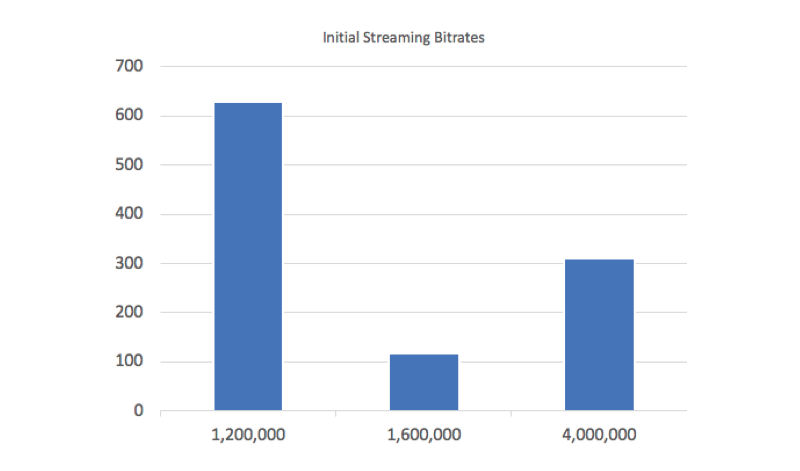


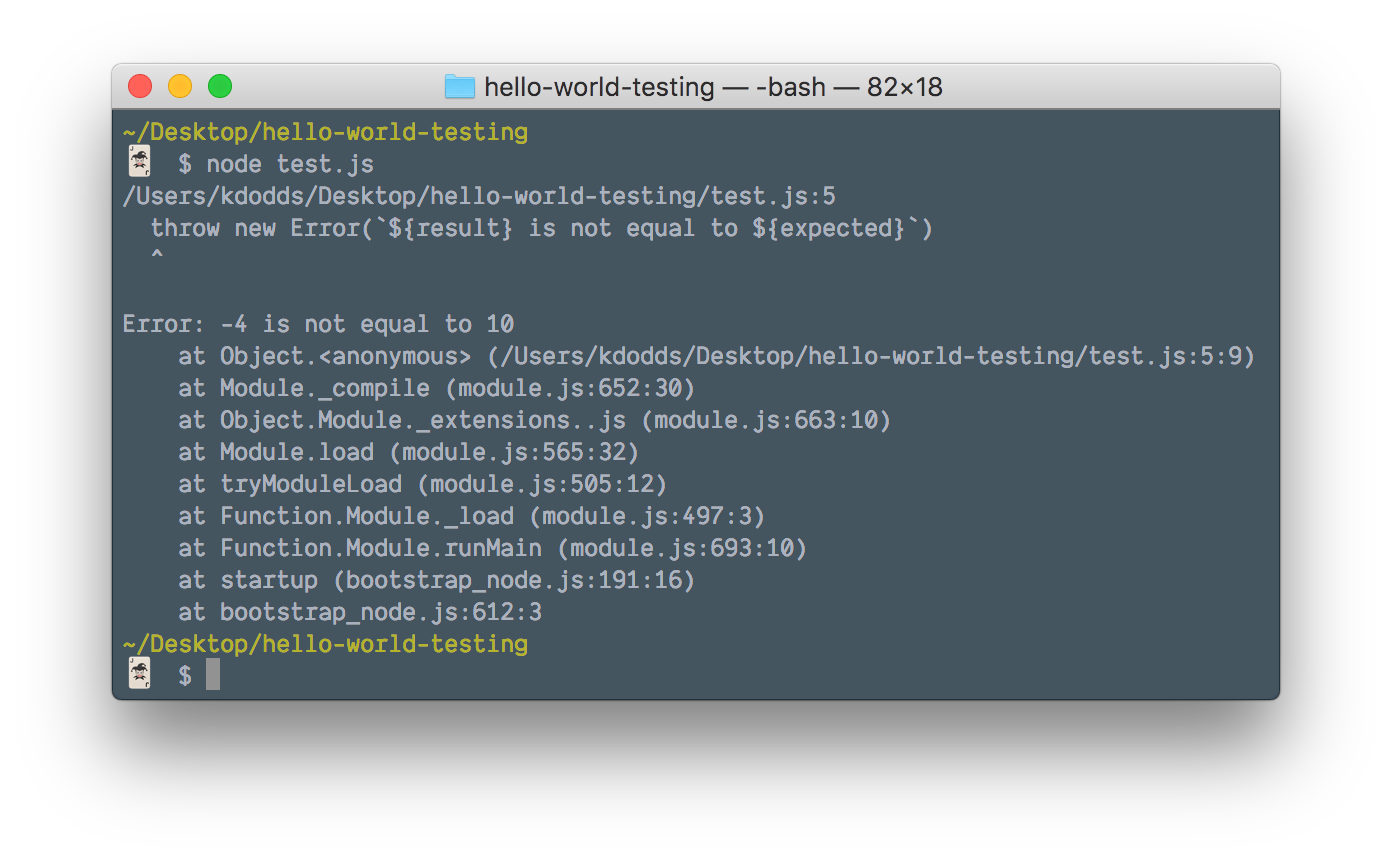
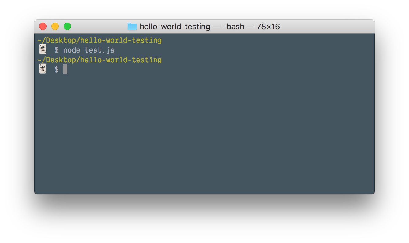


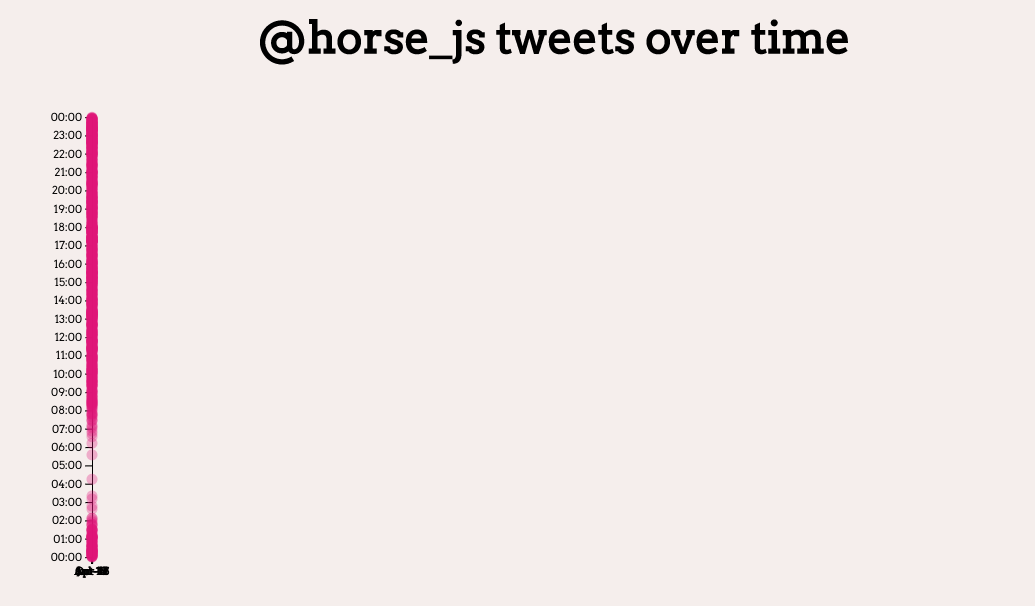
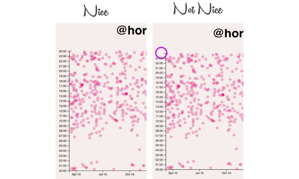
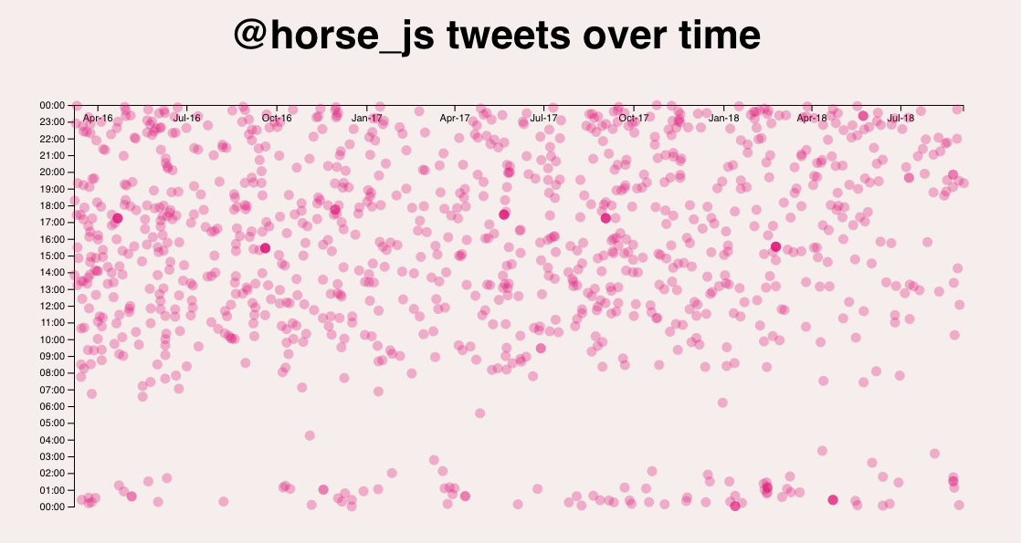

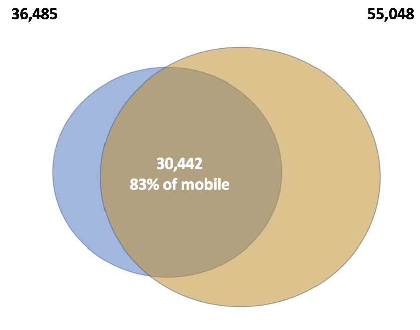
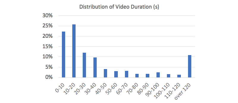
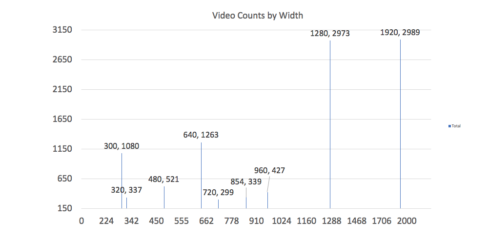
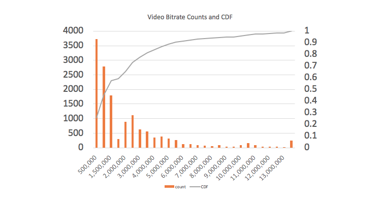
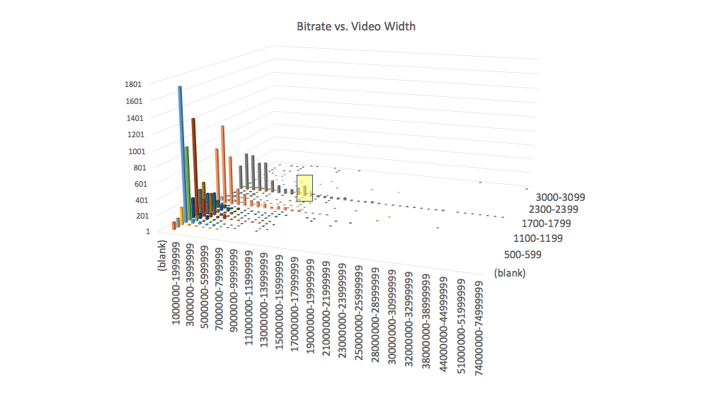
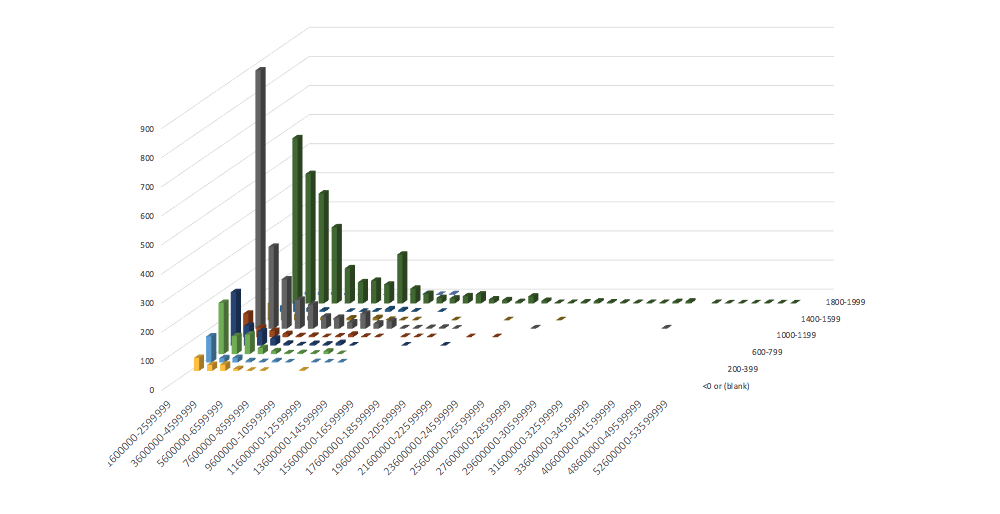


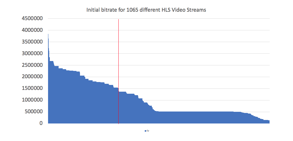

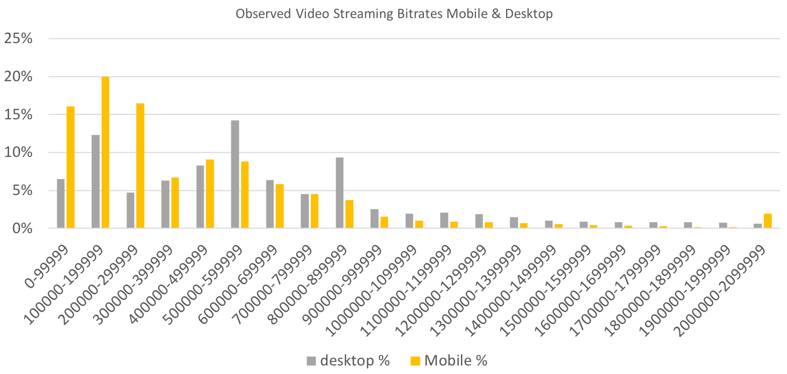


