Use Cases for Flexbox
I remember when I first started to work with flexbox that the world looked like flexible boxes to me. It’s not that I forgot how floats, inline-block, or any other layout mechanisms work, I just found myself reaching for flexbox by default.
Now that grid is here and I find myself working on projects where I can use it freely, I find myself reaching for grid by default for the most part. But it’s not that I forgot how flexbox works or feel that grid supersedes flexbox — it’s just that darn useful. Rachel puts is very well:
Asking whether your design should use Grid or Flexbox is a bit like asking if your design should use font-size or color. You should probably use both, as required. And, no-one is going to come to chase you if you use the wrong one.
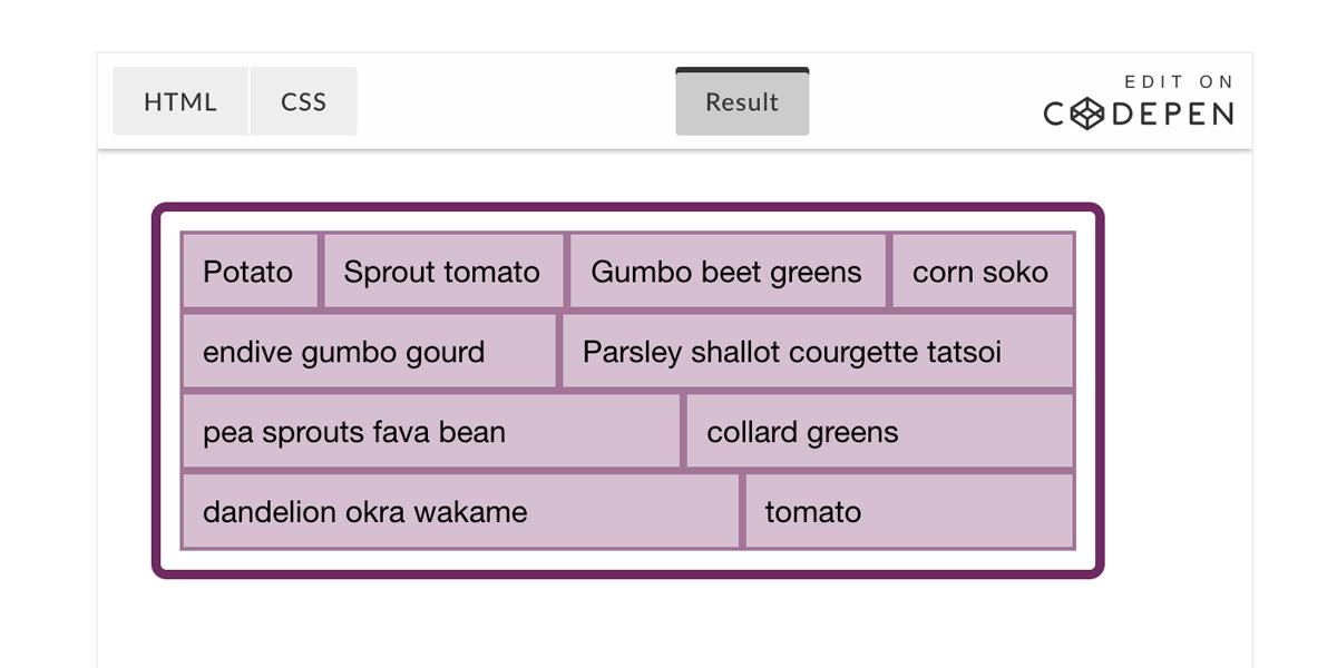
Yes, they can both lay out some boxes, but they are different in nature and are designed for different use cases. Wrapping un-even length elements is a big one, but Rachel goes into a bunch of different use cases in this article.
Direct Link to Article — Permalink
The post Use Cases for Flexbox appeared first on CSS-Tricks.
