Best of 2016: 100 Free Photorealistic Mockups and Renderings for Eye-Catching Presentations

After days and months of hard work, you are finally ready to roll out your new product. You have polished the design, perfected the functionality and refined the user experience. It seems that your beloved application is ready to come into the world and take it by storm. Hang on, how about the presentation?
As any merchant, you should be prepared to stand the competition that is highly intense nowadays. The market is overpopulated with different stuff, so before jumping right into it, you need to establish a solid ground for yourself. Various marketing tricks can help to give a product head start. And the very first thing that you need to do is take care of a proper presentation.
It underlies all the strategies and is responsible for the first impression that is a powerful tool in influencing the decision-making factors. It does not have to be a killer one; neat and clean demonstration will also do the trick. The good presentation will not only express the idea behind the creation but also increase your chances to achieve the success.
Any digital product requires a “wrapper”. When it comes to a mobile application, it is better to be placed within a cell-phone so that it will feel natural. In case of a premium theme for CMS or website, it will look just great within a browser frame or such devices as monitor or tablet. If it is a print, then you can get the most out of realistic renderings of T-shirts, mugs, stationery, etc.
Our today’s list dedicated to 2016 includes numerous high-quality mockups that are ideal for building presentations of digital goods. There are tablets, cell phones, monitor, etc. Enjoy the collection and share your previews.
Devices
Creator: Facebook
License: Declared as Free, no proper license given.
Mockups
Creator: 360mockups
License: Declared as Free, no proper license given.
Apple Devices Mockup

Creator: webhooligans
License: Declared as Free, no proper license given.
Looped Live Mockups

Creator: Lstore Graphics
License: Declared as Free, no proper license given.
The Screens – Free Perspective PSD Mockup Template

Creator: Tran Mau Tri Tam
License: Declared as Free, no proper license given.
iPad Tablet Hand Hold – Free PSD Mockup

Creator: Alexandr Pidvalny
License: Declared as Free, no proper license given.
iPhone 6s Psd Rose Gold Mockup

Creator: Pixeden
License: Free for personal and commercial use.
140+ Large Mockup

Creator: BAIANAT
License: Declared as Free, no proper license given.
3D Web Mockup

Creator: Petr Hradil
License: Declared as Free, no proper license given.
iPhone 6S on Table

Creator: Dinesh
License: Declared as Free, no proper license given.
MacBook Air with iPhone6S

Creator: Dinesh
License: Declared as Free, no proper license given.
iPhone on Workspace

Creator: Dinesh
License: Declared as Free, no proper license given.
iPhone on hand

Creator: Dinesh
License: Declared as Free, no proper license given.
Apple Imac Desktop Mockup Free PSD

Creator: psdfreebies
License: Declared as Free, no proper license given.
MacBook Pro and iPad Mockup Template Free PSD

Creator: psdfreebies
License: Declared as Free, no proper license given.
iPhone7 Mockup

Creator: psdfreebies
License: Declared as Free, no proper license given.
Free PSD Mock Ups Vol. 4-8

Creator: Qeaql
License: Attribution-NonCommercial-NoDerivatives.
PSD Device Comps

Creator: Eric Celedonia
License: Royalty Free.
Apple iPhone SE Mockup PSD

Creator: wellgraphic
License: Declared as Free, no proper license given.
Apple iPad Pro

Creator: wellgraphic
License: Declared as Free, no proper license given.
10 Photorealistic Mockups

Creator: Mockup World
License: Declared as Free, no proper license given.
Responsive Screen Web Mockups

Creator: Vasil Kamarashev
License: Free for personal and commercial use.
Macbook PSD

Creator: Gustav Ågren
License: Declared as Free, no proper license given.
High Res Apple Products PSD mockup

Creator: Mockup Depot
License: Declared as Free, no proper license given.
4K Black and Jet Black iPhone 7 Plus PSD mockup

Creator: Mockup Depot
License: Declared as Free, no proper license given.
4K Google Pixel PSD mockup

Creator: Mockup Depot
License: Declared as Free, no proper license given.
iPhone 7 Mockups

Creator: designer bundle
License: Declared as Free, no proper license given.
Macbook Mockups

Creator: designer bundle
License: Declared as Free, no proper license given.
Food Mockups Set

Creator: designer bundle
License: Declared as Free, no proper license given.
White iPhone Showcase Scene Mockup

Creator: mockup world
License: Declared as Free, no proper license given.
Workspace with Devices Mockup

Creator: mockup world
License: Declared as Free, no proper license given.
iPhone with App Screens Mockup

Creator: mockup world
License: Declared as Free, no proper license given.
Samsung Galaxy S7 Edge Mockup

Creator: Ramotion
License: Declared as Free, no proper license given.
8 Free TheFox iPhone 6 PSD Mock-Ups Template
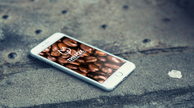
Creator: Tran Mau Tri Tam
License: Attribution-NonCommercial.
Samsung Galaxy S6 Edge Mockup

Creator: Young Lynn
License: Free for personal use.
iPhone7 Mockup

Creator: Samat Odedara
License: Declared as Free, no proper license given.
iPad Photo Mockup

Creator: Creative Studio Form
License: Declared as Free, no proper license given.
Ipad Pro 9.7 Dark Mockup

Creator: Orevuart
License: Declared as Free, no proper license given.
iPhone6 Mockup

Creator: Simon Henke
License: Declared as Free, no proper license given.
Artist Scene Mockup

Creator: Simon Henke
License: Declared as Free, no proper license given.
Free Entertainment Mockup Scene

Creator: Simon Henke
License: Declared as Free, no proper license given.
Multiple Web Screens Perspective PSD Mockup

Creator: graphberry
License: Free for personal and commercial use.
Google Pixel Free

Creator: Georg Bednorz
License: Declared as Free, no proper license given.
HTC 10 Free

Creator: Georg Bednorz
License: Declared as Free, no proper license given.
App Screen Showcase

Creator: graphberry
License: Declared as Free, no proper license given.
Perspective Web Design Mockup

Creator: graphberry
License: Declared as Free, no proper license given.
iPhone7

Creator: Cvijovic Zarko
License: Declared as Free, no proper license given.
Free PSD Mockup iMac Business office

Creator: mockupdeals
License: Declared as Free, no proper license given.
iPad Air PSD Mockup

Creator: Andrej Zitnik
License: Declared as Free, no proper license given.
iPad Air PSD Template

Creator: Andrej Zitnik
License: Declared as Free, no proper license given.
iPhone7 Minimal Mockup

Creator: Santiago Alonso
License: Declared as Free, no proper license given.
Free iPhone Frontal Mockup

Creator: Ramotion
License: Declared as Free, no proper license given.
Floating Screen Mockup

Creator: design lazy
License: Free for personal and commercial use with attribution.
Desk Presentation Mockup

Creator: design lazy
License: Free for personal and commercial use with attribution.
Scene Creator

Creator: design lazy
License: Free for personal and commercial use with attribution.
App Screen/UI Showcase

Creator: design lazy
License: Free for personal and commercial use with attribution.
Mockup Girl with Phone in Forest

Creator: Mocup
License: Declared as Free, no proper license given.
Business Container Mockup

Creator: Mocup
License: Declared as Free, no proper license given.
Standing Visual Branding Mockup PSD

Creator: Rafi
License: Free for personal and commercial use with Attribution.
App Screens Standing Mockup

Creator: Rafi
License: Free for personal and commercial use with Attribution.
IPhone 6s Plus And IPad Pro On The Beach Mockup

Creator: Rafi
License: Free for personal and commercial use with Attribution.
Free Business Card, Smart Phone and Tablet Mock-up PSD

Creator: graphic google
License: Free to use personally and commercially, but link-back is compulsory.
Fascinating Girl Holding iPhone 6 Mock-up PSD

Creator: graphic google
License: Free to use personally and commercially, but link-back is compulsory.
Elegant BlackBerry & Business Card Mock-up PSD

Creator: graphic google
License: Free to use personally and commercially, but link-back is compulsory.
iPhone 6 Hand Hold – Free PSD Mockup

Creator: Alexandr Pidvalny
License: Declared as Free, no proper license given.
Vintage Laptop

Creator: Saqib Ahmad
License: Free for personal and commercial use.
iMac Mockup

Creator: Daniel Cristea
License: Declared as Free, no proper license given.
iPhone 7 & iPhone 7 Plus Flat Mockup Free

Creator: Konstantin
License: Declared as Free, no proper license given.
Samsung Galaxy S7 Flat Mockup

Creator: Konstantin
License: Declared as Free, no proper license given.
Hand Holding Business Card Mockup PSD

Creator: graphicspsd
License: Free for personal and commercial use.
Hand Holding Smartphone PSD Mockup

Creator: graphicspsd
License: Free for personal and commercial use.
Laptop Website Mockup PSD

Creator: graphicspsd
License: Free for personal and commercial use.
Appstore screenshots template for iPhone sizes (Sketch Freebie)

Creator: Evgeniy Loktev
License: Declared as Free, no proper license given.
iPhone Layered UI Mockup

Creator: Carlos Ramos
License: Declared as Free, no proper license given.
Stripe Devices

Creator: Daniel Sofinet
License: Declared as Free, no proper license given.
Apple Watch Mockup

Creator: PSD Graphics
License: Free for personal and commercial use.
Gold iPhone 7 Plus Mockup Free PSD

Creator: PSD Graphics
License: Free for personal and commercial use.
iPad in Hand

Creator: PSD Graphics
License: Free for personal and commercial use.
Macbook Pro Mockup

Creator: Mark Finn
License: Declared as Free, no proper license given.
Chrome Browser Template

Creator: Bryan Horsey
License: Declared as Free, no proper license given.
iPhone6 Vector

Creator: Michael Ciarlo
License: Declared as Free, no proper license given.
The new MacBook minimalist vector mockup

Creator: MAX BRUNEL
License: Declared as Free, no proper license given.
Perspective Business Cards Mockup

Creator: Shaan Suleman
License: CC0 1.0 Universal (CC0 1.0)..
iPhone7 at night

Creator: Emil Guseinov
License: Declared as Free, no proper license given.
Surface Book Mockup

Creator: Anthony Airoldi
License: Declared as Free, no proper license given.
Perspective Business Cards Mockup V2

Creator: Shaan Suleman
License: CC0 1.0 Universal (CC0 1.0)..
iPhone 7 perspective MockUp

Creator: Piotr Wilk
License: Free for personal and commercial use.
iPhone App Perspective Mockup – Vol 5

Creator: Tony Thomas
License: Free for personal and commercial use with attribution.
iPhone7 – Free PSD Mockup

Creator: Tony Thomas
License: Free for personal and commercial use with attribution.
MacBook Pro with Touch Bar Mockup

Creator: Tony Thomas
License: Free for personal and commercial use with attribution.
Nexus 5

Creator: Samat Odedara
License: Declared as Free, no proper license given.
Perspective App Screens Mockup

Creator: pixeden
License: Royalty free for use in both personal and commercial projects.
Apple iPhone 7 Back Cover Case Mock-up PSD File

Creator: Design Bolts
License: Free for personal and commercial usage.
iPad Air 2 Gravity Mockup

Creator: Pixeden
License: Royalty free for use in both personal and commercial projects.
Perspective Business Card Mockup

Creator: graphberry
License: Declared as Free, no proper license given.
Perspective App PSD Showcase Mockup

Creator: graphberry
License: Declared as Free, no proper license given.
30 PSD Mockups

Creator: SmartyBundles
License: Declared as Free, no proper license given.
Elevated Elements Webpage

Creator: EpicCoders
License: Declared as Free, no proper license given.
iPhone7 UI Mockup

Creator: Epic Pxls
License: Declared as Free, no proper license given.
iPhone 7/Galaxy s7 in Male/Female Hand PSD/Sketch mockup

Creator: Tanya S. Mau
License: Declared as Free, no proper license given.