We had free images since years ago. That’s not so very new. But what really is new is the growing professionalisation of these services and their offered material. Was professional photography the domain of commercial stock photo providers for ages, these days the lines start to blur. I personally have turned to looking through the free offers first, and only if I cannot find suitable imagery there, turn back to paid services. This is not only because I don’t have to or want to pay, it’s more because of my experience that the better pictures are with the free providers. Pictures taken with heart-blood, with a fire only an amateur can develop, not the boring standard interpretations of generic topics, photographed in generic ways. Today I want to introduce you to Raumrot and KaboomPics, both of which are brilliant examples of what I just said. If you are looking for high-grade and free stock photos for commercial use, covering a range of popular topics, a visit there is strongly recommended…
You’ve seen this happen a thousand times. An organization struggles with a high level of internal enthusiasm and creative chaos that team leaders don’t know how to handle any more. To bring order into projects, a new product manager is appointed, under huge expectation, and with unclear responsibilities and big goals defined within a very short timeframe. That’s when things usually go south, resulting in failed projects, crushed teams and disappointed clients.
That’s why we’ve teamed up with our author and friend Rian van der Merwe, a senior product manager with a sociology and UX background, to create a new practical book to help product managers in the digital space manage projects effectively — the right way, with the right strategy, in the right time, with the right team. Making It Right is a book about just that: what product management is, what it isn’t, why it’s important, and how to approach it strategically and meaningfully to get things done well. Available today.1
What The Book Is All About
In the startup world, success is defined by the quality and reach of the product. The main purpose of this book is to help product managers who work specifically with digital projects build better — less complex, more focused, less long-winded and more intelligent — products. By featuring lessons learned and warning signs from real-life projects, the book provides a structured framework for strategic product management to help product managers build the right products, at the right time, for the right people with just the right amount of process involved.
The book isn’t concerned with abstract models and theoretical concepts. Based on ideas discovered in actual projects, it explains the roles and responsibilities of product managers in a fast, agile startup environment. It features the characteristics of successful product managers and also provides a framework and practical guidance for product planning and product execution. If your company has to address these issues or you’re looking for a hands-on book to guide you through product management, this is the book for you.
The Structure Of The Book
The book’s structure has two main parts: product planning; and product execution.
Product planning explains how to figure out what to build and when. You’ll learn different ways to gather user needs, business needs, and technical needs. The section breaks down product discovery and looks at why it’s important to define the problem before jumping to product solutions. You’ll understand what goes into a strategic product plan, how to prioritize what problems to work on, and how to create effective, flexible roadmaps for product development.
Product execution gets into the nuts and bolts of shipping the product. You’ll learn how to choose the right problem definition (what problem are you trying to solve?) and how to distinguish between functional and technical specifications (how will the problem be solved?). The section touches on user-centered design, lean UX and how to test product hypotheses through quick, lightweight prototypes.
Finally, the book provides advice on how to establish an efficient working routine with team members through the “build, iterate, QA, release” process, and explains how to measure the success of the solutions being built, and how to feed those findings back into the product roadmap.
This Is What You’ll Learn From The Book
Let’s be honest: product manager is not the most inspiring job title, but it’s a critical position for building a great product and shipping it in time. In fact, it’s not something that everybody can do. Good product managers need expertise and specialized skills that have to be acquired and mastered first. You might not learn them all from this book, but you’ll know exactly what you need and how to apply these skills strategically.
In Getting It Right, you’ll learn:
Roles, responsibilities, characteristics and common tasks of a good product manager,
Where product management fits into an organization and why an executive mandate for PMs is a prerequisite for success,
How to balance user needs, business needs, and technical needs in product discovery,
How product discovery, product roadmaps, and strategic product plans frame the product’s development,
How to redefine business needs by eliminating bad revenue streams and pursuing good revenue streams,
How to avoid, minimize, and pay down technical debt that places strain on your product,
Why many products fail and what the warning signs for failures are,
Why minimum desirable products might be better than minimum viable products,
When prioritizing themes, not projects or features, can help businesses to improve the quality of the product (the Amazon approach),
When product roadmaps fail, when they work well, and how to set up a good one without timelines and release dates,
Tools, techniques, workflows, and strategies for building prototypes quickly with a “design studio” approach.
Practical guidelines and a checklist on how product managers can effectively start working at a new company.
Table Of Contents
CHAPTER
TITLE
DETAILS
Chapter 1
Roles And Responsibilities Of The Product Manager
Summary• What is a product manager, and what do they do every day? This chapter starts by explaining why the product manager role is so important, including some common arguments against the role. Most of the chapter discusses the characteristics of a good product manager, and how they relate to day-to-day activites.
Keywords• product/market fit • common tasks • product management • market-driven approach • characteristics • I-shaped people • feedback process • validation stack • schlep blindness • prerequisite for success • fairness • roles • responsibilities • leadership • collaboration • culture.
Chapter 2
Uncovering Needs
Summary• This chapter introduces the product planning process, and dives deep into the processes of developing a robust understanding of user needs, business needs, and technical needs. The starting point for creating products is — always — needs. Not what we assume would be cool, but what users or the business need to be successful. This chapter explains how to uncover and document those needs.
Keywords user needs • business needs • technical needs • product discovery • exploratory research • design research • assessment research • bad/good revenue streams • dark patterns • product’s life cycle • research • usability • revenue • technical debt.
Chapter 3
Product Discovery
Summary• Uncovering needs is one thing. Figuring out how to turn those insights into a successful product is something else entirely. This chapter discusses why so many products fail, and how to generate and prioritize ideas that won’t fail.
Keywords• usable, useless products • fishbone diagrams • the five ways • personas • customer journey maps • KJ-Method • Kano Model • Amazon’s approach • product market fit • problem definition • strategic product plan • prioritization.
Chapter 4
Product Roadmaps
Summary• Product roadmaps can be controversial, to the point where some believe they shouldn’t even exist. This explains why you can’t live without a roadmap, and how to create flexible, useful plans to iterate towards better products.
Keywords• product roadmap • expectations • elements of a roadmap • product council • release schedule.
Chapter 5
Defining A Product
Summary• This chapter shifts from planning to execution by talking about generating ideas and prototypes to define what you’re going to build. It also discusses “design studio”, a very effective method to get teams involved in the definition process.
Keywords• problem definition • [user] has [problem] when [trigger] • hypothesis testing • design studio • prototyping.
Chapter 6
User-Centered Design And Workflows
Summary• The entire product management process has an undercurrent of user-centered design, so this chapter takes a slight detour to discuss the ins and outs of this design methodology. It also explains how product managers can drive and be involved in the process. The chapter ends with a short discussion on responsive design workflows.
Summary •Specification can be a dirty word, but it doesn’t have to be. This chapter explains what specs are, why they are still important, and how to create specs that are actually used by developers and the rest of the business. The key is to remain flexible, to collaborate and only document what’s needed to understand and build the product.
Summary • This chapter is mainly focused on how product managers work with developers to build and release products once they’re defined. It talks about maker vs. manager culture, and how product managers can help developers be most effective.
Keywords• engineering • development • quality • culture.
Chapter 9
Assess And Iterate
Summary • We often forget to measure what we’ve built. This chapter explains the crucial step of setting up the right success measures and feedback loops to ensure that the right information exists to continue to make product better with each iteration.
Keywords• research triangulation • analytics • A/B testing • features • primacy/newness effects • data • meeting culture • environment.
Chapter 10
Product Management In Agile
Summary • This book is methodology-neutral, but it’s impossible to examine modern product management without discussing how it fits into an agile framework. This chapter discusses how product management relates to product ownership, and how to be a good product owner without losing sight of the larger role.
Keywords• agile • role of the design • “good enough” • right-fidelity specifications • scrum • product ownership • agile UX.
Chapter 11
Getting Started
Summary • Most books end with a summary. This one ends with a call to action. What should a product manager do during the first thirty, sixty and ninety days on the job? The theory is nice, the framework is nice, but how do you actually jump in, and start being a product manager? A few practical guidelines and a roadmap for getting started the right way.
Keywords• first 30 days • strategic product plan • final 30 days • product strategy • product execution.
Author’s Note
Finally, here are a few notes from Rian himself:
“The book came about because I saw a lot of people in organizations perform some of the activities that make up the role of product management. The problem is that very few people take a holistic view of the product, and this is not a role that should be split up into tiny pieces. So, you see marketing people doing some design and research, business analysts doing some spec writing, developers managing the product backlog, and so on.
All this without a person who is responsible for the overall vision, prioritization, and execution of the product. I want to provide a complete framework for product management that is agnostic to whatever development process people use (agile, etc.). This book is my humble attempt to do just that.”
Written by Rian van der Merwe. Reviewed by Francisco Inchauste. Cover design by Francisco Inchauste. Inner illustrations designed by Anna Shuvalova. 190 pages. Available today.
Get the eBook
The eBook is already available5 in PDF, ePUB and Amazon Kindle formats, and of course it’s also provided in the Smashing Library, so if you are a subscriber already, the book is patiently waiting for you in your dashboard. Also, if you have an Amazon Kindle, you can get the eBook on Amazon.com for $0.99 — available only for the next 24 hours thoughget the eBook on Amazon.com for $9.996, and it’s already a bestseller in a few categories. Please notice that if you come outside of the US, you’ll have to go to your country’s Amazon site to buy the book. Sorry about that!
If you’re interested in a printed edition of the book, please submit a form7 and we’ll do our best to make it happen.
So here we go! We’re looking forward to your feedback and your thoughts, and we hope that the book is going to be helpful and valuable for you and to your company. Product management doesn’t have to be boring and made toxic with complex processes — this is why we created the book in the first place. Happy reading, and happy learning!
The „“ element makes it easy to markup input areas for multiple selections. On the downside there are quite a few limitations to it and it sure doesn’t look anywhere near as great as MagicSuggest does. Instead of having boring select lists, MagicSuggest allows us to create beautiful comboboxes capable of multiple selections from both freely entered and prepopulated items.
It’s getting more and more common. Free stock photography is on the rise. We see new services emerge on a monthly basis. Mostly maintained by photographers, aiming to get more exposure or agencies, aiming to prove their quality of work, free stock photo libraries are a benefit for both sides. Getting more exposure and sympathy might potentially help to acquire more paid work, the philosophy of freemium. This assumption is valid and widely successful, so why should it not work for high-grade video content as well. That’s what the creators of Mazwai may have thought. And yes, why shouldn’t it? We all need free HD videos for commercial use from time to time…
You resize the browser and a smile creeps over your face. You’re happy: You think you are now mobile-friendly, that you have achieved your goals for the website. Let me be a bit forward before getting into the discussion: You are losing users and probably money if responsive web design is your entire goal and your only solution for mobile. The good news is that you can do it right.
In this article, we’ll cover the relationship between the mobile web and responsive design, starting with how to apply responsive design intelligently, why performance is so important in mobile, why responsive design should not be your website’s goal, and ending with the performance issues of the technique to help us understand the problem.
Designers and developers have been oversimplifying the problem of mobile since 2000, and some people now think that responsive web design is the answer to all of our problems.
We need to understand that, beyond any other goal, a mobile web experience must be lightning fast. Delivering a fast, usable and compatible experience to all mobile devices has always been a challenge, and it’s no different when you are implementing a responsive technique. Embracing performance from the beginning is easier.
Responsive web design is great, but it’s not a silver bullet. If it’s your only weapon for mobile, then a performance problem might be hindering your conversion rate. Around 11% of the websites are responsive1, and the number is growing every month, so now is the time to talk about this.
According to Guy Podjarny’s research2, 72% of responsive websites deliver the same number of bytes regardless of screen size, even on slow mobile network connections. Not all users will wait for your website to load.
With just a basic understanding of the problem, we can minimize this loss.
Mobile Websites Are From the Past
I’m not saying that you should not design responsively or that you should go with an m.* subdomain. In fact, with social sharing everywhere now, assigning one URL per document, regardless of device, is smart. But this doesn’t mean that a single URL should always deliver the same document or that every device should download the same resources.
Let me quote Ethan Marcotte3, who coined the term “responsive web design”:
“Most importantly, responsive web design isn’t intended to serve as a replacement for mobile web sites.” — Ethan Marcotte
Responsive, Mobile And Fast
We can gain the benefits of responsive design without affecting performance on mobile if we use certain other techniques as well. Responsive web design was never meant to “solve” performance, which is why we can’t blame the technique itself. However, believing that it will solve all of your problems, as many seem to do, would be wrong.
Designing responsively is important because we need to deal with a range of viewport sizes across desktop and mobile. But thinking only of screen size underestimates mobile devices. While the line between desktop and mobile is getting blurrier, different possibilities are still open to us based on the device type. And we can’t decide on functionality using media queries yet.
Some commentators have called this “responsible responsive web design,” while others consider it responsive web design with a modern vision. Without getting into semantics, we do need to understand and be aware of the problem.
While there is no silver bullet and no solutions that can be applied to every type of document, we can use a couple of tricks to improve our existing responsive solutions and maximize performance:
Deliver each document to all devices with the same URL and the same content, but not necessarily with the same structure.
When starting from scratch, follow a mobile-first approach.
Test on real devices what happens when resources are loaded and when display: none is applied. Don’t rely on resizing your desktop browser.
Use optimization tools to measure and improve performance.
Deliver responsive images via JavaScript while we wait for a better solution from browser vendors (such as srcset).
Load only the JavaScript that you need for the current device with conditional loading, and probably after the onload event.
Inline the initial view of a document for mobile devices, or deliver above-the-fold content first.
Apply a smart responsive solution with one or more of these techniques: conditional loading, responsiveness according to group, and a server-side layer (such as an adaptive approach).
Conditional Loading
Don’t always rely on media queries in CSS because browsers will load and parse all of the selectors and styles for all devices (more on this later). This means that a mobile phone would download and parse the CSS for larger screens. And because CSS blocks rendering, you would be wasting precious milliseconds over a cellular connection.
Replace CSS media queries with a JavaScriptmatchMedia query on devices whose context you know will not change. For example, we know that an iPhone cannot convert to the size of an iPad dynamically, so we would just load the CSS for it that we really need.
We can also use feature detection, such as with Modernizr4, to make smarter decisions about the UI and functionality based not only on screen dimension.
Responsiveness According to Group
While we can rely on a single HTML base and responsive design for all screens when dealing with simple documents, delivering the same HTML to desktops and smartphones is not always the best solution. Why? Again, because of performance on mobile.
Even if we store the same document server-side, we can deliver differences to the client based on the device group. For example, we could deliver a big floating menu to screens 6 inches and bigger and a small hamburger menu to screens smaller than 6 inches. Within each group, we could use responsive techniques to adapt to different scenarios, such as switching between portrait and landscape mode or varying between iPhones (320 pixels wide), 5-inch Android devices (360 pixels) and phablets (400 pixels and up).
Server-Side Layer
The last optional part of a smarter responsive solution is the server. Server-side feature detection and decisions are not new to the mobile web. Libraries such as WURFL5 and Device Atlas6 have been on the market for years.
Mixing responsive design with server-side components is not new. Known sometimes as responsive design and server-side components7 (RESS) and sometimes as adaptive design, it improves responsive design in speed and usability, while keeping a single code base for everyone server-side.
Unfortunately, these techniques haven’t gained much traction in the community over the last few years. Just look at any blog or magazine for developers and compare mentions of “RESS” and “adaptive” to “responsive.” There’s a reason for that: We are front-end professionals. Anything that involves the server looks like a problem to us, and we don’t want that.
In some cases, the front-end designer will be in control of a script on the server; in other cases, a remote development team will manage it, and the designer won’t want to deal with the team every time they want to make a small change to the UI. I know the feeling.
That’s why it might be time to think of a new architecture layer in large projects, whereby a front-end engineer can make decisions server-side without affecting the back-end architecture. Node.js is an excellent candidate for this platform, being a server-side layer between the current enterprise back-end infrastructure and the front end.
In this new layer, the front-end engineer would be in charge of decisions based on the current context that would make the experience fast, responsive and usable on all the devices, without touching the back-end architecture.
Responsive Design, Performance And Technical Data
You might have some doubts by this point in the article. Let’s review some technical details to allay your concerns.
Responsive design usually entails delivering the same HTML document to all devices and using media queries to load different CSS and image files. You might have a slightly different idea of what it means, but that is usually how it is implemented.
You might also think that mobile networks today are fast enough to deliver a great experience. After all, 4G is fast, and devices are getting faster.
Well, let’s see some data before drawing conclusions.
Cellular Connections
4G networks are not available everywhere, and even if the whole world was on a 4G network today, the situation might not be what you expect. Less than 3% of mobile phones8 out there are on a 4G connection. Taking only the US, the number of 4G users has reached approximately 22%, and even those lucky users are not on 4G 40% of the time9.
We usually think of mobile network speeds in terms of bandwidth. With 3G, we get up to 5 Mbps; with 4G, we get up to 50 Mbps. But that’s not usually the most important factor in a mobile web browsing experience. While more bandwidth is useful for transferring big files (such as a YouTube video), it doesn’t add much value when you’re downloading a lot of small files and the latency is high and fixed. Latency is the round-trip time that the first byte of every package takes to get to a device after a request.
Cellular networks have more latency than other connections. While the latency on a DSL connection in a US home is between 20 and 45 milliseconds, on 3G it can be between 150 and 450 milliseconds, and on 4G between 100 and 180. In other words, latency is 5 to 10 times higher on a cellular connection than on a home network.
Other issues include the latency when there is a change in radio state, the dead time when a phone turns on the radio to get more data after having been asleep, the lower available memory on average devices and, of course, battery and CPU usage.
Responsive Design on Cellular Networks
Consider a real case. Keynote, a company that offers performance solutions, has published data on the website performance of top Super Bowl 2014 advertisers10. The data speaks for itself: On a wired or Wi-Fi connection, the loading times range from 1 to 10 seconds, while on a cellular connection, the loading times range from 5 to 60 seconds. Think about that: one full minute to load a website being advertised in the Super Bowl!
The same report shows that 43% of those websites offer a mobile-specific version, with an average size of 862 KB; 50% deliver a responsive solution, with an average size of 3211 KB (nearly four times larger); and 7% offer only the desktop version to mobile devices. So, by default, responsive websites are larger than mobile-specific websites.
Of course, responsive design can look different, but, unfortunately, the average responsive website out there looks like these ones of Super Bowl advertisers.
Cloud-Based Browsers
If you still doubt that performance is a problem on the mobile web, consider that browser vendors are creating cloud-based browsers to help users — including the infamous Opera Mini, the Asia-based UC Browser (which commands 11% of the global market share, according to StatCounter13), Amazon Fire’s Silk and now Google Chrome (through a settings option).
These vendors compress every website and resource in the cloud, and then the browser downloads an optimized version to the mobile device. They do it because they know that performance matters a lot to the user’s happiness.
Underestimating the Mobile Web
The web community has always underestimated the importance of mobile browsers. I’m used to hearing people say that the mobile web today is just Safari for iOS and Chrome for Android and that, for responsive design, we need only care about viewports that are 320 pixels wide. It’s far more complex than that.
Today, more than 10 browsers have a market share over 1%. Even if you want to consider only the default browsers on iOS and Android, it’s not so simple. Roughly speaking14, 50% of mobile users browse the web on iOS, 38% on Android, 3% on Windows Phone, 5% with Opera Mini (on various operating systems) and 4% on other platforms.
On Android, 64% of users today browse with Android’s stock browser, which is not the same as Google Chrome and which exists in different versions. Moreover, some of Samsung’s latest Galaxy devices have a version of the Android browser with a customized engine.
In terms of viewport size, we are dealing today with pixel widths of 320, 360, 400 and 540 with Android smartphones alone. My suggestion, then, is never to underestimate the mobile web, and to learn its unique characteristics.
Above-the-Fold Content in 1 Second
On a mobile device, we can consider a website to be fast when content above the fold (i.e. the content that is visible without scrolling) is rendered in 1 second or less. I know, 1 second seems awfully fast — especially considering that at least half of that time is taken up by the cellular connection — but it has been proven to be possible. A 1-second response keeps users engaged with the content, thereby increasing the conversion rate and reducing abandonments.
To achieve a 1-second response time, above-the-fold content needs to be received in one round trip over the transmission control protocol (TCP) — remember that the average 3G connection has almost half a second of latency. Because of a TCP feature known as a “slow start,” that first response should be no more than about 14 KB in order to avoid a second package. This means that at least the HTML and CSS for the above-the-fold content should fit in a single 14 KB HTTP response. If we achieve that, then we’ll have achieved the perception of a 1-second loading time.
This rule is not written in stone and will vary based on your content. However, because content that appears above the fold will usually not be the same on a mobile screen as on a desktop screen, achieving this goal of 1 second with a responsive design is very difficult. It’s possible, but combining techniques makes it much easier.
One HTML for All
A typical responsive design delivers a single HTML document to all devices: televisions, desktops, tablets, smartphones and feature phones. It sounds great, but we live in a world that has cellular and other problems. Your responsive HTML might render correctly on mobile devices, but it’s not as fast as it should be, and that is affecting your conversion rate.
If a single display: none appears in any of your CSS, then your website is not as fast as it could be. On a website that has been designed from scratch to be semantic, then the responsive overload would be almost nil; on a website whose HTML includes 40 external scripts, jQuery plugins and fancy libraries, mostly for the benefit of big screens, then the responsive overload would be at the high end. When the same HTML is used, then the same external resources would be declared for all devices.
This isn’t to say that responsive design alone can’t be done, just that the website won’t be optimized by default. If you are sensitive to performance, then your responsive solution might look different than the usual.
Let’s review Starbucks’ website. Its home page is responsive and looks great in the three viewports we tested (see the screenshots below). But upon checking the internals, we see that all versions load the same 33 external JavaScript files and 6 CSS files. Does a mobile device with 3G latency deserve 39 external files just to get the view shown below?
You might be thinking, “Hey, blame the implementation, not the technique17.” You’re right. This article is not against responsive web design. It’s against aiming for responsiveness in a way that leads to a weak implementation, and it’s against prioritizing responsiveness over performance, as we see with Starbucks. It looks great when you resize the browser, but that’s not all that is important. Performance also matters a lot to mobile users.
If your responsive website has performance problems, then the fault may lie with how you’ve framed the goal. If you have the budget for responsive design, then you must also have the budget for performance.
Loading Resources
Media queries are implemented in different ways, usually as one of the following:
a single CSS file with multiple @media declarations,
multiple CSS files linked to from the main page via media attributes.
In the first case, every device would load the CSS intended for all devices because there would be just one CSS group. Hundreds of selectors that will never be used are transferred and parsed by the browser anyway.
You might think that multiple external files are better because the browser would load the resources based on breakpoints. This is what we’re taught in tutorials in blogs, magazines, books and training courses.
Well, you’d be wrong. All browsers will load all external CSS, regardless of context. The screenshot below shows an iPhone downloading all of the CSS files excerpted above, even ones not intended for it.
18Browser will load all external CSS files, regardless of the context. (View large version19)
Why do browsers download all CSS files? Suppose you have one CSS file for portrait orientation and another for landscape. We wouldn’t want browsers to load CSS on the fly when the orientation changes, in case a couple of milliseconds go by without any CSS being used. We’d want the browser to preload both files. That’s what happens when you define media queries based on screen dimensions.
Can the dimensions of mobile browsers be changed? Mostly not yet, but vendors are preparing their mobile browsers to be resized like desktop browsers, which is why the browsers usually load all CSS declarations regardless of whether their width matches the media query.
While stretchable viewports don’t exist on mobile devices (yet), some viewports resize in certain situations:
when the orientation changes in certain browsers,
when the viewport declaration changes dynamically,
when offset content is added after onload,
when external mirroring is supported,
when more than one app is open at the same time on some Samsung Android devices (in multi-window mode).
Browsers that are optimized for these changes in context will preload all resources that they might need.
While browsers might be smarter about this in the near future, we’re left with a problem now: We are delivering more resources than are needed and, thus, penalizing mobile users for no reason.
Let’s get to the root. The term first appeared in a 2010 post by Ethan Marcotte21, followed by a book with the same name. Ethan defines it as providing an optimal viewing experience across a wide range of devices using three techniques: fluid grids, flexible images and media queries.
Nothing is wrong with that definition. The problem is when we set it as the goal of a website without understanding the broader goals that we need to achieve.
When you set responsive design as a goal, it becomes easy to lose perspective. What is the real problem you are trying to solve? Is being responsive really a problem? Probably not. But do you understand “being responsive” to mean “being mobile-compatible”? If so, then you might be making some mistakes.
The ultimate goal for a website should be “happy users,” which will lead to more conversions, whatever a conversion might be, whether it’s getting a visitor to spread the word, providing information or making a sale. Users won’t be happy without a high-performing website.
The direct impact of performance on conversions, particular in mobile, has been proven many times. If this is the first time you are hearing about this, just check any of Steve Souders22‘ expert books about optimizing web performance.
When you know your goals, you can decide which tools and techniques are best to achieve them. This is when you analyze where and how to use a responsive approach. You use responsive design — you don’t achieve it.
Responsive vs. Users
The New York Times redesigned its website23 a couple of months ago with the goal of keeping “you in mind.” Meanwhile, thousands of other big companies present their new responsive websites with pride.
The New York Times follows responsive design in different ways, but some people complained that it still uses a separate mobile version, instead of adapting the layout based on the same HTML. An article even came out titled “The Latest New York Times Web App Misses the Point of Responsive Design24.”
25The New York Times follows responsive design in different ways. (View large version26)
Who said that responsive web design means supporting all possible screen sizes with the same HTML? Sure, this is a common understanding, but that rule isn’t written anywhere. It’s just our need to simplify the problem that has led to it.
In recent months, companies have said things along the lines of, “We’ve applied a new responsive design, and now our mobile conversions have increased by 100%.” But did conversions increase because the website was made to be responsive, or are users realizing that the website is now responsive and so are happier and convert more?
People convert more because their experience on mobile devices is now better and faster than whatever solution was in place before (whether it was a crude mobile version or a crammed-in desktop layout). So, yes, responsiveness is better than nothing and better than an old mobile implementation. But a separate mobile website with the same design or even a smarter solution done with other techniques would achieve the same conversion rate or better.
Conclusion
“Your visitors don’t give a sh*t if your site is responsive,” — Brad Frost
Brad Frost27 is completely right. Users want something fast and easy to use. They don’t usually resize the browser, and they don’t even understand what “responsive” means.
It’s a bitter truth, and it doesn’t quite apply to all websites. But it’s better than thinking, “We can relax. Our website is responsive. We’ve taken care of mobile.” Sometimes, even when not relevant to the situation, saying that responsive design is “bad for performance28” can be good because it helps to spread the word on why performance is so important.
The New York Times is right: The goal is the user. It’s not a tool or a technique or even the designer’s happiness.
If you have to design an interface it’s almost obvious to think to begin the process by drawing. But is this the best way? I once casually started by writing an imagined human-computer conversation, and only afterwards I continued by drawing.
This changed my way of thinking and I never went back to drawing first. This article will explain the reasons behind my decision.
I have always been a huge admirer of the guys at Basecamp1. Some time ago, I was reading a tweet by Jason Zimdars, one of its designers:
“UI design starts with words.” He wasn’t joking. The comment got a lot of retweets, a lot of favorites. Everyone understood what he meant — except me.
Writing Conversations
When I’ve had to design an interface interaction component, I used to start by sketching possible solutions. (Product design is made up of many layers. See, for example, Jesse James Garrett’s layers3 (PDF) and Intercom’s4. Here, I’m referring to the interaction layer.)
I used to start by using a pattern that I know or by copying other people’s solutions to the problem or to similar problems. Imagine that you have to design a website’s registration form. You could start by “stealing” other designers’ solutions. Or, if you feel confident, you could read the requirements and start to draw.
But I started by drawing.
I once had to design a shopping-cart process for an e-commerce website. I don’t know why, but at the time, before researching possible solutions, I imagined what I do when I go to pay at the supermarket. I wanted to reproduce a similar experience on the web, possibly improving it by exploiting the web’s digital capabilities. I wrote down what happens at a supermarket checkout counter:
Cashier: Hi, do you have a loyalty card?
Me: Yes, please. [I give it to her.]
Cashier: Thanks.
Me: Thank you.
Cashier: Do you need some bags?
Me: Yes, two please.
[And so on.]
I realized that imagining the conversation was much easier than drawing on a white canvas. I’m not sure, but I suppose that is true for most people: Conversation is an intrinsic part of human nature. We have evolved as a talking species.
Also, when I imagine a conversation, I draw from my real-life experience, which is good for design — less abstraction. If a user’s interaction with a computer resembled a real-life experience, then the interface would probably be considered easy to use, wouldn’t it?
Moreover, I pay a lot more attention to words and their meanings when I write than when I draw. The benefit is that when I get around to sketching, I will make fewer mistakes in the copy. Because copy is7 an extremely important8 part of any interface, this is a great side effect of writing out conversations.
A Real Example
While imagining a conversation is easy, imagining a variation of that conversation is also easy. Back to the supermarket example: I can easily imagine the cashier asking me whether I need bags before asking for my loyalty card. It’s easy to imagine the cashier asking me a different question. This may or may not change the sketch of the interface. It wouldn’t matter if it doesn’t change anything — what’s important is that I’ve taken it into consideration. The more variations I can think of, the more confident I will feel that I haven’t missed anything in the final design.
I usually go from product requirements to a list of use cases to a mockup (i.e. a low-fidelity sketch or a high-fidelity wireframe, depending on the situation), which becomes the base of the HTML prototype. Ideally, this process would be linear; in reality, it’s a loop, in which each step provides feedback for me to change something in previous steps.
Because writing enables me to see more variations, it improves the effectiveness of the loop between “use cases” and “sketch.”
Let’s see this in an example. The following conversation comes from an actual project, a web app called Mediaddress, a press office software. It’s an archive of journalists’ addresses. One of the requirements of the project was that people should be able to send emails to one or more recipients.
The use case I was considering was this: A user has mistakenly selected 5 people from a list of 100 and has forgotten to deselect them and instead would like to send an email to the entire list of 100.
Variation 1
Human: I’d like to send an email.
App: Just to the five you’ve selected or to all of them?
Human: All of them.
App: To write the email, would you prefer to use your email program or my editor?
Based on the use case, I’ve written a conversation that can easily be translated into a flow and sketch. Then, I imagined a variation of the conversation, which produced a different flow and sketch. To understand which flow and sketch was better, I compared use cases.
I took the case of the user selecting 5 people from the list but wanting to email the entire list. Was this the most frequent case? I didn’t think so. Wouldn’t optimizing for a user who actually wants to email those 5 people make more sense?
Design consists of trade-offs. We have to always weight the costs and benefits of our options. But I don’t want to get into the details of how I decide which solution is best. I follow many criteria. My point is to show why a written conversation is a useful design tool.
I jump back and forth between written conversation and flowchart and sketch. But the guiding tool is the written conversation. I find it to be the easiest tool to imagine an interaction. The diagrams and sketches (or wireframes) come afterwards. They create order and help me to see the steps clearly. They are also a better tool to communicate with developers and other stakeholders.
To summarize my points:
Imagining a human-computer conversation and then sketching it is easier than drawing the interface directly.
Imagined conversations are drawn from real-life experience, while direct sketching is drawn more from remembered design.
Copy is fundamental to any interface, and writing first and sketching later enables you to concentrate on it at the right time.
Imagining different conversations is easier than imagining different sketches, which makes it easier to come up with more design options.
When I write, I am more creative (because I can imagine more variations), and I tend to copy other people’s solutions less.
What About Jason’s Meaning?
In the end, have I understood what Jason meant by his tweet? Why not ask him directly? I wrote an email asking for his opinion on the method that I’ve laid out. He was very kind to answer me:
So, I read through the article and I think you’ve pretty much figured out what I was trying to say with the tweet. Imagining a conversation between the user and the computer is a neat way to think of it. I do something slightly different in my own work. Instead of thinking about the computer at all, I try to imagine how Iwould explain the feature to a friend. This has the effect of being conversational, clear and helpful. I think it’s especially helpful to not think about computers because it’s so easy to fall into the patterns we’ve all seen before; “computer speak,” which is terse, leaves out words and sounds nothing like anything people actually say. I want my UI to read like I’d say it, and that means natural language and full sentences.
I’ll certainly rewrite many times in the form of sketches and continue to refine all the way through the process. It’s much better to trim and optimize the words than start with too few. That’s why I prefer this method to drawing. When you draw, you think too soon about the layout and the available space and what’s too long to fit on a button. Those are too many constraints to deal with at once. I find it better to get the words just right and then figure out the visual design.
Here’s a quick example. First the computer-speak version you might draw:
“Delete file”
[OK] [Cancel]
Now a version you might actually say:
“Are you sure you want to delete this file?”
[Yes, delete it permanently] or [No, I want to keep it]
That’s a little contrived, but you get the idea. I feel like the computer-speak version is an easy trap to fall in when you draw first. I could certainly whittle the second one down to that if space was extremely limited, but why not start with your best version and then consider any compromises?
Here are the lessons I’ve noted:
“I think it’s especially helpful to not think about computers because it’s so easy to fall into the patterns we’ve all seen before; ‘computer speak,’ which is terse, leaves out words and sounds nothing like anything people actually say.”
“That’s why I prefer this method to drawing. When you draw, you think too soon about the layout… I feel like the computer-speak version is an easy trap to fall in when you draw first.”
“It’s much better to trim and optimize the words than start with too few.”
I followed up with one more question, asking Jason how this method helps him to figure out flow, if it does. I wrote:
Let’s say you have a feature and you start to write. Does writing make you think about the flow or the feature, and because of that you change the flow or the feature? Or is the flow or the feature a separate thinking process? Maybe I would make myself more clear with an example. Imagine a bookmark app:
Me: Save this web address.
Computer: OK.
A second version:
Me: Save this web address.
Computer: Before I save it, do you want to change the title of the page? And do you want to add a short description of the contents of the page? And do you want to tag the page (so that it’s easy to retrieve it later)?
The second version changes the flow. Now, when I want to save a web address, a forms pops up. In the first version, I would just see confirmation feedback.
Here is Jason’s answer:
So, how the flow factors in depends on the situation. Many times features aren’t completely isolated. They fit into existing flows and screens — or at least start from there. So, I may have some idea of the flow already in mind. But I’m always open to improving that if the writing leads me in another direction. But even if it’s something completely new, I’ll start with writing because that helps me figure out the flow. If it takes a lot of steps to explain the flow to your friend, then maybe it needs to be broken up into similar literal steps in software. So, a typical writing sketch might include several blocks of copy as I figure out the flow. I think the important part of the exercise is figuring out how you might think of it in the real world, rather than simply thinking of it purely as a software problem. That leads to fresh insights.
These two emails seem to validate my method. They also give me new insight. Coming from a superior designer, the feedback fills me with joy. I thought I had an original idea, but maybe it was just a side effect of having carefully read what the smart guys at Basecamp have written17. I’m not joking either.
Experiments and side projects are wonderful ways to challenge yourself and explore areas that you wouldn’t usually consider exploring. That’s what Smashing Mystery Riddles1 are for us: little experiments that challenge us to come up with something new, original and a bit crazy—every single time. The ideas are usually a synthesis of the things we discover, stumble upon or try out ourselves—and oh my, they take quite some time to get right.
The most recent riddle2 took quite a lot of time spent fiddling and getting right (and Guillaume, the designer, wasn’t that happy about all the changes that our tests required). The basic idea was simple: as usual, you have a series of animated GIFs containing clues. One animated GIF leads to another, and every animated GIF contains a key (or keys) that have to be discovered. Once you uncover all the keys, you construct a solution and send out a tweet containing that solution. Doesn’t sound too difficult, does it?
3 This is how it all started4 back in November 2013. The key was to change the file name in the URL bar to move between the levels.
Well, it shouldn’t be too easy, either. Obviously we didn’t want everybody to see all the GIFs right away, so finding keys was essential for moving from one level to the next. In the past, we prompted users to change filenames5, search for Twitter handles6, and construct words out of letters7. This time it was all about finding the right hashtags on Twitter. Once you search for just the right hashtag, you should discover a link to the next level; that is, a link to the next animated GIF.
But how did we make it work? Obviously we had a number of keys scattered across the animated GIFs, but we couldn’t just send out tweets with hints for the next level from the same Twitter account—it would be too easy to discover, right? So we needed to distribute the tweets and hashtags—the keys—among many accounts. We could have gone ahead and created a number of anonymous Twitter accounts (in fact, that’s what we did for the second riddle8—and it was damn difficult to find available ones!) but we needed specific Twitter handles for the riddle, and unfortunately most of them weren’t available (for example, 3flowers or 6numbers).
So what could we do? Well, here was an idea: if you have 25 keys to share, what about asking 25 friends and colleagues to each send out a tweet with the hashtag and a link to the next level? It’s quite unlikely that anybody would follow all of your friends at once and therby discover all the keys in their timeline right away. So, that’s exactly what we did. But of course we didn’t want the tweets to be sent out too late or too early, since we wanted to build up the momentum of the riddle. And you can probably see where it’s heading: we depended on 25 people sending a tweet at approximately the same time. And this is where things weren’t quite smooth. The riddle went live at 7pm CET and while most tweets were sent out in time, some weren’t. As a result, we had to pull out all the stops, send a few quick follow-ups and, in the end, relax the rules of the riddle since not all keys could be discovered right away.
To be honest, we kind of anticipated that this could happen. That’s why each level had a few more keys hidden than necessary, just to make sure that nobody got stuck on a level, not able to progress further despite doing everything right. Also, we had to be careful when choosing links leading to different levels, so we distributed a few different link shorteners as well—if you looked specifically for smashed.by links, you wouldn’t be able to find all the critical keys.
But let’s take one step back first and go through the riddle step by step from the very beginning.
Level 1: It Might Get Windy In Whistler
As mentioned above, the partials of the final Twitter hashtag were distributed among the tweets from our friends and colleagues. But these tweets first had to be found using the hashtags retrieved from the animated GIFs. In fact, you had to pay attention to the file name, count objects in the animated GIF (for example, three chairs) and search for them on Twitter (#3chairs). Plus, a tip suggested to watch out for a hint in one of the frames in each GIF. You know what that meant: running diffs or checking the frames in Preview or Photoshop!
9 The first animated GIF of the riddle. The tip wasn’t too obvious: watch out for a hint in one of the frames of the GIF. Large view.10
So how do we start? Well, the first GIF doesn’t look too hard, does it? What have we got here? #1bicycle, #1sign, #1character, #1road, #2wheels, #2trees, #2poles… but it all doesn’t really bring us anywhere. There are two electricity lines and one road line! What about #3lines? No, still nothing!
Ah, wait a second! What about the file name? “It might get windy in Whistler”. Could that be a reference to the #1scarf? Not really. Or perhaps it refers to the area around the scarf? Indeed, the only things we haven’t checked are… those cheeky birds! There’s one bird on the cyclist’s shoulder; two chirping on the cables; two sleeping on the trees; three fluttering in and out; and—ah!—two more birds peeking out of the trees as the bicycle goes by. That makes for #10birds.
But wait a second, we were supposed to look out for hints in one of the frames. Hmm. Could it be that one frame in particular is special? If so, which one would it be? Maybe the number that we’re looking for? Bingo! Can you spot the “10? on the left pillar? That must be our clue! Ten birds? #10birds it is!
11 “10?, the correct number of birds on the first animated GIF, is hidden on the pillars on the 10th frame of the GIF. To find it, you need either a very sharp eye, or a diff between two subsequent GIFs.
Once you search for #10birds on Twitter, you’ll discover a tweet12 from our editor Michel Bozgounov, sent out exactly at the time when the riddle was published:
13 “Trees are green, the sky is blue, #10birds enjoy the summer, and so should you. http://smashed.by/birds14. Find 2 hashtags on the next level.” This sounds like one of the riddle clues!
Initially we wanted to hide another bird behind the red road sign, or brand the bicycle as “BIRDIE”, but these “birds” would have been way too small and difficult to find. Maybe next time?
Alright, #10birds is the first hidden key. Now let’s move to the next level15 and find the two hashtags hidden in the next GIF!
Level 2: Choosing The Name For The Cat
We have to find two hidden hashtags now, so let’s see what we can find. If we read the file name, we know that the guy at the window is trying to come up with a name for the cat—the same cat driving the caged bird crazy.
16 The image file name reads “choosing-the-name-for-the-cat.gif”. Can you work out what name will be chosen in the end? It’s not easy! Large view.17
But, if you keep looking at it, isn’t something going on in the cage? Let’s focus on the cage and check it frame by frame. Following the same logic we applied on the previous level, let’s look through the first ten frames—there aren’t that many objects here, after all. Aha! The fourth frame of the GIF reveals a little “4? sitting in the cage—sneaky!
18 The clue for the second level resides inside the cage on the fourth frame.
Apparently, then, we have to watch out for objects that appear in fours. #1chair, #1table, #1flower, #1cage, #1bird, #1cat, #3apples19—we can safely exclude all of them! There are a few devices on the table—and what’s hidden under the TV screen? A remote control? That would make… #5devices20! Not quite what we are looking for, but apparently that’s a key, too!
21 “A cage is not one of the #5devices, but a remote control certainly is! http://t.co/de3cqWt07522 2 hashtags on the next level — keep going!”
Great! That’s one of the keys. And talking about the TV screen: is it just a distracting wallpaper, or could it be a hint for what we’re looking for? That logo on the TV looks familiar. Isn’t it the Dharma Initiative logo from Lost? Well, if you remember that, you probably remember the Lost numbers23—4 8 15 16 23 42—that Desmond had to type into a machine to keep the island safe (or, to put it slightly differently, to save the world). Could it be that we’re looking for #6numbers? Bingo! Now you can start to feel pretty awesome 😉 That one was hidden fairly well!
24 “The #6numbers that were LOST are the ones that you’ve discovered. http://t.co/DnPBN1Sjs925. 2 hashtags on next level.”
Alright, but what about that “4? that we’ve discovered? All those devices on the table look like they have stickers on them, or not actually stickers but browser logos. And there are four of them—Mozilla Firefox, Chrome, iOS Safari and Chrome Mobile—so doesn’t that make… #4browsers?
26 “Outside the window lies your inspiration, but it’s #4browsers where lies implementation. http://smashed.by/zbrowsers27. 2 hashtags on next level.”
Nailed it!28 But we still haven’t figured out the name of the cat, have we? It really isn’t easy. In fact, our conference organizer Cat received a few emails from people asking her about the cat’s name (that was a bit surprising, and quite clever) but—being the consummate professional she is—she told the truth and informed everyone that she didn’t know. But that was a neat little strategy to try.
Some readers were creative and came up with interesting names—one of them was the idea we abandoned because our testers didn’t come up with it in our tests: since one of the keys on the next level was #7apples, naming the cat Lion as a reference to OS X 10.7 would make perfect sense (heads up, ARothuis6329!). Good one, and definitely worth a little reward.
In fact, the cat’s name was supposed to be Browser and if you counted the number of browsers in the GIF correctly, the hidden key would be #5browsers30. But yes, yes, of course, we knew that it was pretty difficult to guess the name, so we decided not to be too strict about it and accepted #4browsers as well.
Alright! The hidden keys on the second level were #5devices, #4browsers, #6numbers and potentially #5browsers. It was critical to find the first two keys since we knew that not everybody knows or has watched LOST (in fact, some members of our team weren’t very fond of the idea in the first place!).
Level 3: Never Miss The Big Picture
Again, two hashtags have to be discovered, and it doesn’t look like the number of objects is getting smaller from one riddle to the next.
34 “Never miss the big picture.” Could this be a reference to the TV screen or are we actually missing the big picture here? Large view.35
That mysterious character seems to be absorbed with browsing and at the same time enjoying the multiscreen experience watching TV.
The file name says “never miss the big picture”. Could it be a reference to the big TV screen? The football world championship is on, and there are a few fans waving Brazilian flags. Is that a clue or a yet another sneaky distraction? Well, we can find 22 fans on the screen, and since the TV is on, it’s safe to assume that the mysterious guy biting an apple is a fan, too. Are we looking for #23fans?
36 “There are more than #23fans watching the final, you know, but do you see anyone playing? Good catch though! #mystery”
Looks like it’s a dead-end. In fact, it doesn’t look like the twenty-third frame has any hidden hints. What about the other frames? Wait! Did you see that? Isn’t there something happening in the shadow under the desk? Let’s take a closer look!
37 “7? is hidden in the seventh frame on the carpet under the desk. However, there are quite a few objects appearing seven times in the GIF. Have you found them all? 😉 Large view.38
Voilà! But what does it mean? “Never miss the big picture”? Let’s take a look at the picture on the right-hand side. It has two hills and six trees. But there’s another tree on the left-hand wall as well! Are we looking at #7trees?
39 A picture says more than a 1000 words, and #7trees are part of a story, too. smashed.by/utrees40. 2hashtags on the next (final) level.
Yaaaay! Alright, so what about the second hidden hashtag? Now those apples look very suspicious, don’t they? We have three apples on the plate next to the TV screen; one apple is falling down from the tree on the left wall; one apple on the table; one apple in the hand. It makes for #6apples. Doesn’t look right. Ah, isn’t it a Mac? Duh. Alright, #7apples then? Makes sense! It’s like seven-o-rama!
41 “Some apples you can eat, others you can play with. #7apples were to be found. smashed.by/lappels42. 2 hashtags on the next final level.”
But that can’t be it, right? Indeed! What else are we missing? Well, what else have we got? Two books next to the TV screen, ah, what are those paper items on the books? They look like tickets, don’t they? Yes, #2tickets was one of the clues!
Thinking about the file name again, it looks like we kind of missed the big picture… How ironic! Of course, we also have a window, and doesn’t the mysterious character browse between… windows? How many windows do we have? Six! Well, that would make it #7windows, right? Indeed!
43 “Some doors should always remain closed, yet #7windows can probably stay open. smashed.by/fwindows44. 2 hashtags in the next (final) level!”
So here we go, #7trees, #7apples, #2tickets or #7windows. It was critical to discover that final hashtag (which was the hardest) on this level, plus one of the other ones. OK, there is just one level ahead of us — so let’s get to it!
Level 4: Thank God It’s Friday!
Even more objects and two more hashtags! Well, thank God it’s the final level, and apparently it’s Friday, too! So let’s look closely at what we’ve got here. The mysterious character is reading a newspaper with animated ads; we have a sunny weather forecast on TV; the cat (Browser) is playing with a ball; but we also have a calendar on the wall and a car on the shelf. So what could they mean?
Let’s check things one by one. The main animation appears to happen when the guy is reading the newspaper. We have “20% sale” on an ad in the newspaper, but it doesn’t look like #20sale is a clue. Bummer. What about #11lines of text in the newspaper? Still nothing. But when the car drives by and the guy pulls down the newspaper a little, we can see two flowers displayed in the picture with a tree! With a flower right next to the window it would make #3flowers, right?
Right! OK, that wasn’t too difficult. But what about the second hidden hashtag? Now, the cat looks suspicious—but we already tried #1cat on the previous levels, and it wasn’t helpful. There’s a Canadian maple leaf residing on a map, so are we looking for #2maps? Nope. Those sneaky distractions!
We also have berries right next to the map, and they look like… strawberries! In fact, we have exactly twenty strawberries in the cup, so perhaps we are looking for #20strawberries?
Okay, but it was worth the try! Now, let’s check the frames to see if we were looking for all the right things. Well, it doesn’t look like there is anything special hidden in the third frame, but the hint clearly stated to watch out for the file name and for the differences in the frames!
What’s left? Well, the only two missing parts are the calendar and the car in the right corner. But wait! Did you see that? A flash in the calendar?
48 As you move from level to level, the clues are getting smaller and smaller. That “8? in the calendar, appearing on the eighth frame, is difficult to notice! In fact, it stands for the 8th of December 2014, which is a Monday.
Aha! So the clue is “8?. But what exactly does it mean? Are there really any objects in the picture that occur eight times? Or should we be looking for #8december2014 instead? The file name says “Thank God it’s Friday”, so perhaps we are looking for #5december2014. Oh! It all must be a part of the confusing plan! But hang on, let’s get back on track here.
The only other remaining thing is the car. In fact, there are three cars in the image, with five windows, four headlights and… eight wheels! So, is it all about #8wheels?
Alright! Now we’ve got to the bottom of this! The hidden hashtags on the final level are #3flowers, #5december2014 and #8wheels. The last one was the critical one and had to be discovered to pass the level.
Yes! Phew, now you solved the mystery, and as it turns out you really are awesome! The secret hashtag now can be constructed out of all the clues you’ve found and should be tweeted to @smashingmag. Now that was quite a journey, wasn’t it?
Secret Level: Cannot Stop Watching The Game
Not quite, warrior! You might have noticed four days marked on the calendar, and of course they aren’t marked by chance. These are the days when SmashingConf Whistler is going to take place! And if you count the number of days, you’ll end up with… #4days!
50 “These #4days will be the days you’ll never want to end. You’ve discovered a secret level: http://smashed.by/ndays51. 1 hashtag to be found!”
It wasn’t necessary to discover this level, and it was quite difficult to find and crack, but if you did discover it, and found the right idea, you would have earned a reward as well.
52 While the mysterious character has already given up on the game, the cat is still watching. The score is 0–0. Is it your clue? Large view.53
For this level, it was perfectly fine to find something that would make sense: such as #1crazyperson running on the field or #0goals. In fact, Alejandro de Arriba figured it out54, and unfortunately the other hashtags were incorrect.
Alright! Now we are done. We kindly thank everybody who sacrificed the integrity of their Twitter accounts for sending out totally unrelated, weird, confusing and potentially annoying tweets from their thoroughly curated Twitter accounts. It’s much appreciated!
Mystery Solved! And The Winners Are…
As mentioned above, you didn’t have to discover all the secret hashtags, but we were looking specifically at the critical hashtags, so the winner of the riddle would need to get them right. If we bring all hashtags together, we’ll get something like this:
Both formats would work. Some of you were quicker than others. While the previous riddles took approximately an hour to solve, this one was quite easy to crack. Since not all tweets were sent out in time, we had to relax the rules a little. The first correct hashtag was tweeted by @jaicab_5520 minutes after we hit that shiny “Publish” button, with more and more tweets containing the right answer shortly after that. In fact, it turned out that our dear readers are absolutely smashing indeed: #10birds56, #6numbers57 and #7windows58.
The first place was earned by the person who was the quickest to solve the riddle. We allocated prizes to the other lucky winners randomly. The winners can select any prize of their choice (be it a bag, a Smashing Library account, printed books or anything else). And they all get the Smashing Cody Stress-Relief Ball59, too. All winners will be contacted shortly. The winners are:
Jaimie Caballero60 has won a roundtrip to Whistler and the full Smashing package (took 20 mins to find the solution),
Congratulations! And thanks to everyone who participated! We hope we didn’t waste too much of your productive work time (and didn’t cause too many headaches either).
Behind The Scenes
71 Guillaume Kurdjian7372 is a 22-year-old freelance illustrator and animator from Nantes, France. Guillaume likes to experiment with stuff on his computer and climb trees.
Just like in all the previous riddles, we worked with talented Guillaume Kurdjian7372 on a series of animated GIFs74 for the riddle. This time the discussion thread wasn’t very long, but we had quite a number of conversations of how to find digits properly, and how many objects would have to be hidden in the GIFs. This time we ended up with 25 different GIFs, drafts, and ideas that were thrown away, as well as the ones that made it to the final stage.
As usual, all designs were a series of iterations to make the overall riddle not necessarily perfect, but just right. So a big “thank you!” to Guillaume for following through and being so enthusiastic and kind about all the changes made.
So this is it! It was quite a journey, but we hope it was worth it. We are really sorry about all the unproductive hours that you spent solving the riddle. Well, kind of. Now, are you ready for the next round? 😉 Stay tuned!76
Hipster supercharged the already running Vintage trend. Thanks to that we have a plethora of note-worthy, production-usable retro fonts at hand. About half of those we are going to show you today allow commercial use, the other half is for private use only. The information is given right alongside each item of the following article. We hope you enjoy our little collection of 40 free retro fonts for the vintage fan.
Back in the days where CSS was a rumour and content and design were not divided, building a website using tables was perfectly common. With the rise of the semantic web tables were redefined to be used only for their original purpose, structuring data, that was meant to be shown in the form of tables. Furthermore, CSS didn’t bring forward an easy way to structure layouts in rows and columns. Now, with the new CSS Grids rasterized layouts return and they resemble the way of table-based designs quite closely.
Fireworks is an excellent UI design tool; however, Adobe decided to feature-freeze1 it back in 2013 and (at the same time) did not offer any replacement tool to its users. Nevertheless, since Fireworks runs fine today on the latest Mac OS X and Windows OS, and since it still offers a solid UI-design feature set, many designers continue to use it and rely on it daily.
For those of you who are searching for a similar tool, Sketch 3.02 seems to be a pretty good alternative to Fireworks, but it’s still not quite there yet; it’s Mac-only, and while its vector tools are very good and it now has artboards, pages, symbols and styles, it lacks a few of the basic features available in Fireworks. (I’ll talk more about possible alternatives to Fireworks in Part 2 of this series.)
So while we’re looking for alternatives, many of us also have to continue to use Fireworks3, and, as every designer out there knows, Fireworks works best with extensions! This article features some of the most useful (and free) Fireworks extensions that will help you work faster and be more effective with Fireworks; I have tested many of them myself, to be sure that they work flawlessly. In an upcoming article, I’ll be covering many articles and tutorials which I highly recommend that involve UI design and Fireworks, as well as a few freebies, such as editable Fireworks PNG files, templates, styles, Fireworks resource libraries, and so on.
To make the content of Part 1 better organized (and for easier navigation), I have grouped the extensions (commands, command panels and auto shapes) into the following main sections:
When working with prototypes, placeholder text is often used. There are many ways in which you can add some placeholder text to your Fireworks PNG files, but the problem starts when you need to adjust the amount of text (perhaps the layout has changed, or the font size was increased so the text is now too long). This is when the Lorem Ipsum1410 auto shape (created by John Dunning676459524844393530252015) can help you.
Whenever you create a new placeholder text block, the auto shape will add just the right amount of text that will fit the shape you’ve created — no more tedious copying and pasting (or deleting) text to fit the space! Resizing the auto shape (using one of the yellow control handles) or changing the font size will also automatically adjust the amount of text, so you will always have exactly as much text as you need. This auto shape has many basic and advanced settings and could save you some serious amount of time.
The advanced options of the Lorem Ipsum auto shape. (Source16)
(Note: We have covered the use of the Lorem Ipsum auto shape in detail in “Optimizing The Design Workflow With Fireworks Extensions (Part 3),” section “Lorem Ipsum17“.)
Working with UI prototypes… again? Smart Resize1918 (by John Dunning676459524844393530252015) is a really smart auto shape that could be a real time saver during your next project! Basically, this auto shape helps you resize a group of elements without distorting any of them or disrupting your layout.
Let’s suppose you need to “smart resize” a group of objects. Select this group and use menu Commands ? Smart Resize ? Attach; the command will convert your group into a special smart object with the typical yellow resize handles. You can then use these handles to resize the group in any direction, and Smart Resize will resize only elements that extend across more than 50% of the group’s size, and retain the rest of the elements in position relative to the closest edge of the group.
For extra control over how elements in your Smart Resize group scale or are being repositioned, you can set anchor points for each individual object (for example, elements that have their X anchor set to the left will only scale on the right side; the left edge will stay fixed in proportion with the rest of the group).
(Note: We have covered the use of Smart Resize auto shape in “Optimizing The Design Workflow With Fireworks Extensions (Part 1),” section “Smart Resize22“.)
CSS allows a different width and color to be applied to the border on each side of an HTML element, but Fireworks’ vector rectangles are limited to a single border color and border width. The Multi-Border Rectangle2423 auto shape (by John Dunning676459524844393530252015) addresses this limitation, making it easy to mock up CSS-style borders right on the canvas in Fireworks!
The Multi-Border Rectangle auto shapes makes it easy to mock up HTML-style borders. Here’s a quick example: select the auto-shape (1), drag the blue control point on a specific border (2), and the border’s width will be changed without affecting the other borders (3).
Of course, you are not limited to the width of the borders only — you can also change the color of each border separately. To do so, click the crosshair icon next to a border to open its color picker. You can also change the background color of the Multi-Border auto shape, by clicking on the the upper crosshair icon in the middle of the rectangle. And if you need even more control, you can change the border widths and colors numerically, by using the Multi-Border auto shape’s Properties dialog box.
Tables Panel2928 (by John Dunning676459524844393530252015) enables you to quickly mock up HTML-style tables without having to laboriously position each cell or border. Although it’s relatively straightforward to arrange elements in a grid using the alignment and distribution commands in Fireworks, as soon as the table contents change you’ll need to reposition everything manually. The Tables panel automates this tedious process.
Using the Tables Panel, you can easily build and modify tables in Fireworks. (Source112111105104553121)
The Tables Panel is pretty flexible and has many options; with it, you can even insert a table from a text file (tab-delimited or comma-separated text file — *.txt, or *.csv). You can also import a table from a web page (you’ll just need to convert it to tab-delimited or comma-separated text file — *.txt, or *.csv, before importing it).
(Note: We have covered the use of the Tables Panel extension in detail in “Optimizing The Design Workflow With Fireworks Extensions (Part 1),” section “Tables Panel32“.)
For example, you created a button with a text label. Now when you need to increase the width of the button by a few pixels on the right, you would typically select the rectangle and either stretch it to the right using the Scale tool or change its width using the the Properties panel. Then, you will need to also select the text inside the button and repeat the same action, because selecting both and scaling them would have distorted the text and messed up the margins on the side.
With the help of one of the commands in this set, you can simply select both elements, press Alt + right arrow a few times and now your button is wider, and so is the text block; text is not distorted, and the margins between the text block and the button are intact. This is precisely what the Keyboard Resize commands by John Dunning do (and much more)!
Smart Resize commands allow for quick and easy resizing of multiple elements, without any distortion. (Source36)
When you import an image into a Fireworks document, Fireworks doesn’t maintain any link between the source file and the imported element — if the source file changes, you’ll need to find it, re-import it and then delete the previous image in the document. (Other Adobe products in the Creative Suite support the “smart objects” feature, which lets you import objects from one app into another, and when the source object changes, the imported one updates as well.)
The Linked Images3837 extension (by John Dunning676459524844393530252015) makes this process much easier. Let’s say you are working on a website design, and the client hasn’t finalized the logo yet. Open the Linked Images panel, click the “Insert” button to select the current version of the logo (it can be in any image format, supported by Fireworks), and place it in the layout. Later, when the logo has been updated, simply select the imported image and run the “Refresh” command in the panel to reimport the latest version of the source file.
The Linked Images panel has many options and supports all image file formats that Fireworks can currently open, including Fireworks editable PNG (*.fw.png), Photoshop PSD (*.psd), Illustrator AI (*.ai), EPS (*.eps), and all standard “flat” image formats, such as PNG8/24/32, JPEG, GIF, BMP and TIFF.
(Note: We have covered the use of the Linked Images extension in “Optimizing The Design Workflow With Fireworks Extensions (Part 2),” section “Linked Images41“.)
Fill With Background4342 (by John Dunning676459524844393530252015) can save you quite a bit of time, when you’re working with screen mockups. Usually, when creating mockups, you may need to take a screenshot of an existing dialog box or web page and then modify it. You’ll probably also have to paint over existing elements in the screenshot (like a button label, for example, to replace it with new text). So you select a portion of the background pixels in the screenshot, copy them, paste them, stretch them over the element you want to replace, and then flatten the pixels with the original image; it’s quite a tedious process. The Fill With Background command does all of this in just one step!
Fill With Background command (example A): Select the areas of the bitmap that you’d like to fill with background pixels (1), run the Fill With Background command [menu Commands ? Objects ? Fill With Background] (2), and the selection will be automatically filled with a column of pixels copied from just to the left of the selected area (3). Fill With Background command (example B): Select the areas of the bitmap that you’d like to fill with background pixels and run the Fill With Background command (1); the selection will be filled from left to right — which doesn’t work for a vertical gradient — so leave the selection and simply run the command again (2); the command will then switch to filling the selection from bottom to top (3).
There are a few different ways of using the command, and generally it works very well for background patterns that repeat either horizontally or vertically.
Rich symbols are a powerful feature of Fireworks46, but creating them can be quite a complicated process. The Create Symbol From States4745 command (by John Dunning676459524844393530252015) lets you create basic rich symbols containing multiple states in just one step and with no scripting required! The symbols created by this command can switch between displaying different states, controlled by a State menu in the Symbol Properties panel.
An example: When a symbol instance is selected, the Symbol Properties panel will display a single State menu control; you can change this menu to choose which state of the symbol to display. (Source49)
The Insert Grids5150 command (by John Dunning676459524844393530252015) lets you set up a grid for your design in no time; simply set all the parameters — the column width, gutter width, number of columns — and the command then will create a locked layer with the columns, rows and guides spanning the height of your canvas. You can even create “Grid presets” for the layouts that you use most often and later re-use them with a single click of the mouse!
(Note: We have covered the use of Insert Grids command in detail in “Optimizing The Design Workflow With Fireworks Extensions (Part 1),” section “Grids56“.)
No matter how optimized your workflow is, generating assets for the development phase after finishing up your design composites is always a slow task — who likes the process of taking each individual design element and exporting it in the right image format, later to be integrated in a website, application or whatever else you are building?
The Generate Web Assets5857 command (by John Dunning676459524844393530252015) can make this whole process much, much easier and simpler: once you are done with a design (or even while working on it), change the names of the objects that you want to export to the file names you want for them (including the file extensions), then run the Generate Web Assets command (menu Commands ? Export ? Generate Web Assets), define a folder, and presto! all of your assets will magically appear in this folder, with correct file names and in the correct formats.
(Note: We have covered the use of Generate Web Assets command in detail in “Optimizing The Design Workflow With Fireworks Extensions (Part 3),” section “Generate Web Assets61“.)
TweetFire6362 extension (by John Dunning676459524844393530252015) is a cool gadget for all Fireworks + Twitter fans out there. It lets you tweet the image you are currently working on in a few seconds without ever leaving the Fireworks canvas!
TweetFire is very easy to set up. Install the extension and authorize it with Twitter (1), then post your first Fireworks tweet (2); once the tweet is successfully posted, TweetFire will show you a “Success!” message (3). You can even use multiple Twitter accounts.
TweetFire is very easy to use and the authorization step is done only once, when you add a new Twitter account to the TweetFire panel. After that, posting your current image you’re working on in Fireworks (be it a complex vector illustration or a UI design or simply a photo which you have retouched a bit) is only a click away. You can also decide if you’d like to post the full image or the current selection.
FlickrFire6665 (by John Dunning676459524844393530252015) is very similar to TweetFire and (as its name suggests) lets you upload the image you are working on directly to your Flickr account without leaving Fireworks. It has many options — you can set the title of the photo, the description, the tags, if the photo should be public or private, etc. — and again, the authorization process with Flickr is only one step.
Personally, I have tried both TweetFire and FlickrFire and found them very easy and fun to use!
Export Commands71 (by Aaron Beall7672) is a set of commands that allows you to export pages and states to files at the same time, export slices as a single image (or each slice as a separate image), export all styles in one document as CSS styles, and export a selection (or a whole Fireworks PNG file) to SVG file format. (In my opinion, the “Export to SVG” feature is the most important one in this set.)
Export Commands.
(Note: We have covered Export Commands in detail — and specifically, the “Export to SVG” feature — in the article “Optimizing The Design Workflow With Fireworks Extensions (Part 3),” section “Export Commands73“.)
The Path7574 set of commands (by Aaron Beall7672) is a very helpful set if you create a lot of vector artwork in Fireworks — which icon designers and illustrators certainly do. There are more than ten commands in this set, among them: Blend Paths, Convert Strokes to Fills, Deform to Path, Distribute To Points, Divide Paths, Exclude Paths, Fisheye Effect, and a few others.
Deform to Path — with this command, you can arc the bottom of a shape outward or inward as much as you need, or deform a shape based on a selected path:
Convert Stroke to Fill — this command that will be very useful if you do a lot of illustration work in Fireworks and need to treat outlines as filled objects. Convert Stroke to Fill also allows you to simulate gradients on a stroke (similar to how it is done in Illustrator)!
Convert Stroke to Fill command: select an object with a stroke (left), run the command, and the stroke on the object will be converted to an object with a fill (center). You can then apply a gradient to the new object (right). (Source787740)
(Note: We have covered the use of some of the Path commands in detail in “Optimizing The Design Workflow With Fireworks Extensions (Part 2),” section “Path Commands79“.)
Fireworks CS5.1 and older versions support all types of screen color spaces81, incl. RGB/RGBA, HSL and HSV. However, when you need to quickly access and copy a specific color value, it’s easy to do so only for RGB colors in #HEX format. Copy Color To Clipboard8280 (by Matt Stow9083) amends that issue and allows you to copy easily the color value of any object in #HEX or rgb()/rgba() format, with a couple of clicks of the mouse or with easily customizable shortcuts.
84 In Fireworks CS6, it’s easy to copy color values to clipboard, in either #HEX or rgba() format. (See large preview85)
In case you didn’t yet upgrade to Fireworks CS6 (where the option to copy color values with one click was added to the new Color Selection box), this extension could be a nice little helper in your daily design tasks!
You can copy the color values in #HEX or rgb()/rgba() format; the color value can be copied from the color picker, or directly from the fill or stroke of any selected vector object. You can also assign shortcuts to the Copy Color commands, which will make working with them faster.
86 Copy Color commands: You can easily copy any color in either #HEX or rgba() format (toggled via preference). (See large preview87)
Orange Commands9392 (by Ale Muñoz94) is a collection of commands for Adobe Fireworks that can make the life of a web designer easier. They are completely free and open source95, and are regularly updated. From aligning objects, to setting guides around selected objects, to combining two text objects into one — Orange Commands are a collection of small tasks that you would typically perform through a series of steps.
Orange Commands for Fireworks.
The latest version of Orange Commands is 1.7.2 and is available for Fireworks CS3, CS4, CS5/CS5.1 and CS6.
(Note: We have covered the use of Orange Commands in detail in “Optimizing The Design Workflow With Fireworks Extensions (Part 1),” section “Orange Commands96“.)
Currently in Fireworks, you can apply textures (which are pulled from your “Textures” folder) to any vector shape on the canvas. However, the way Fireworks works with textures isn’t very intuitive: you are presented with a simple list with all your textures, and when you mouse over a texture name, a small preview of that texture pops up next to it; but there is no easy way to get to your most commonly textures nor organizing them into groups.
Selecting and applying textures in Fireworks, using the Properties panel.
Here the Texture Panel98 extension (by Matt Curtis) comes to the rescue! This panel:
Sorts textures into lists (groups them),
Displays the textures as thumbnails (plus, you can change the size of the thumbnails),
Allows you to add your own textures easily and refresh the current list, and
Allows you to search for a specific texture, using the built-in search option!
You can get the Texture Panel from Sourceforge99 and read all the details about its use in our article (written by the author of the panel himself), “Using The Texture Panel In Adobe Fireworks100“. If you work a lot with textures in Fireworks, this panel is an absolute must-have!
Using the Texture Panel in Fireworks, you can easily organize and use your textures, and more. (Source101)
One extension which can help you immensely in the task of managing guides, is the Guides Panel103102 (by Eugene Jude), which allows you to add guides to the canvas with precise numerical control.
The panel also gives you the ability to work with selected objects — for example, if you need to place guides through the center of a selected object or around its edges (so you can align objects to it), you can simply select the object and create the guides with the help of the panel.
The Guides Panel: An example of adding guides through the center of a selected object (“Selection” tab). (Source112111105104553121)
(Note: We have covered the use of the Guides Panel extension in detail in “Optimizing The Design Workflow With Fireworks Extensions (Part 1),” section “Guides106“.)
The Gradient Panel provides fine control for manipulating gradients. (Source112111105104553121) The Gradient Direction Editor panel can edit gradients’ angles with precise numeric control. (Source112111105104553121)
Touch Application Prototypes (TAP)114 for Fireworks is an excellent free extension — in fact, it’s more like a full-featured iOS prototyping framework than a simple extension.
TAP + Fireworks allows you to build prototypes for all modern iOS devices.
While its very powerful and allows you to build great iOS prototypes for all modern iOS devices (including the latest iPhone 5/5c, iPad Retina and iPad Mini), the use of the TAP frameworks is a bit complex. Luckily for you, we have covered the use of TAP + Fireworks in the following series of articles by Shlomo Goltz from Cooper115:
This series covers everything you need to know about TAP and Fireworks: from starting to build your wireframes, then moving to the fully-developed design, and then how we can convert the design to a working iOS prototype. There are many solutions out there that help you create an iOS (or Android/Windows 8 Mobile) prototypes, but this is the only one which will allow you to do everything from A to Z inside one application — Fireworks!
While we’re still at the subject of making iOS prototypes with TAP and Fireworks, I should probably also mention Tapotype124123. Tapotype (currently at version 1.01) is a free reference library of transitions which was created specifically for the TAP + Fireworks prototyping workflow. It can help you in the task of making iOS prototypes with the TAP extension and is available for free download125 and use.
Tapotype is free reference library of transitions for TAP + Fireworks. Cubeleft/Cuberight transition example from the Tapotype 1.01 library. (Source126)
Fireworks Annotations Panel128127 extension (by Mariano Ferrario129) will help you increase the efficiency of quickly annotating wireframes and designs, all inside the Fireworks document you’re working on. The panel allows you to add numeric bubbles to your document and associate a corresponding message with each annotation. In addition, you can export your annotated document in multiple file formats: images, HTML, Adobe PDF, TXT, CSV, or XML.
The Annotations Panel extension.
The current version of the Annotations Panel supports Fireworks CS4, CS5/5.1 and CS6. (Please also note that unlike all of the extensions reviewed here, it’s not free but costs only $5.99.)
The Specctr plugin for Adobe Fireworks131 can help both designers and developers during the process of producing specs. Specctr is not free (I think it currently costs $49.00) but there is a completely free Lite Version of it available, too.
The Specctr extension for Adobe Fireworks. (Source132)
Open In Fireworks134 is a nice little add-on for all Mozilla Firefox135 and Adobe Fireworks users out there. As its name suggests, it allows you to simply right-click on any image inside a web page, choose Open In Fireworks option from context menu and the selected image will then instantly open in Fireworks. “Open In Fireworks” is simple and yet it can save you a few extra minutes every day. Personally, I find it quite useful.
And last, but not least, I should mention Project Phoenix141138137, which is a personal project by Linus Lim139. Linus gathered there many extensions that he’s trying to “re-boot” (update) and the list if growing every week! So far, there were released: Font List panel, Super Nudge panel, Auto Save panel, Transform panel, Alignment Guides panel, Perspective Mockups panel, Retina Scaler panel, Used Fonts panel, and many more!
Keep an eye on Project Phoenix because now that Adobe is not planning to add new features to Fireworks, having new features added to this app with the help of commands and panels is even more important.
Project Phoenix is a must-visit place for extensions, if you rely on Fireworks every day!
Conclusion
This was an attempt to provide an overview and list some of the best extensions for Fireworks. (Did I miss any indispensable ones? Let me know in the comments!)
In my next article, I will include some of the best tutorials and articles, but also many freebies (styles, templates, resource libraries, etc.) available for Fireworks. All of these can teach you how to save time and use Fireworks for UI design in a more optimal way. Stay tuned!


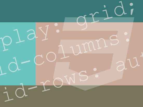


![Copy color values to clipboard [#HEX or rgba()] is one click away in Fireworks CS6.](http://www.smashingmagazine.com/wp-content/uploads/2013/01/copy-hex-rgba-dialog-large-opt.png)


