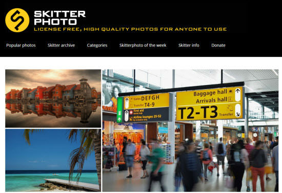
SkitterPhoto offers commercial-use photos of high resolution and quality. If you kindly ask them, they might even give you the RAWs for free. SkitterPhoto is a project by three photographers from the Netherlands. More than 250 images are already in stock. The promise is to add at least one new picture a day. These images then “skitter” through the web, driven by the CC0 license, allowing anyone to use the images freely for any purpose.
Do you remember when apps first appeared for smart phones? The TV commercial for the iPhone 3G’s tag-line, “There’s an app for that,” made it seem like there was an app for anything you’d ever want. It may not have been true at the time, but it certainly is now, especially with the emergence of hybrid app development in the past few years.
Sometimes we stumble upon offers that sound too good to be true. That’s also what our whole editorial office thought when we encountered InkyDeals’ “Colossal Birthday Bundle”. To clarify whether this was most likely just a simple typo we contacted InkyDeals and asked them. No, did they assure us, this is not an error. We are totally serious about this. We really bargain away more than 40 GB of recent resources for the laughable price of under a hundred dollars. We do this to celebrate our third birthday. This is enough reason, isn’t it?! Okay, I answered. Then this is what I am going to tell our readers. But, don’t expect them to believe that…
JotForm, form renovators from sunny California, are taking off. Having been a major player in the form builder business for quite a while now, they decided to add broader design support to their product. And came up with a new tool called “Form Designer”. This tool is just grand. As you’d rightfully expect from your favorite WYSIWYG builder Form Designer is completely intuitive to use, speeding up your workflow and improving your results. Whether you like to code CSS by hand or like to stick with pre-made design elements, Form Designer is there for you. To get Form Designer into the minds of the members of the design community they decided to host a contest with a grand prize of 7,500 dollars for the overall winner and smaller prizes in several categories. In need of Christmas money? Show off your skills and win the contest…
We are accustomed to believe that web design trends as well as their ardent supporters and followers tend to accumulate in the northern hemisphere: Europe, UK, America traditionally are the center of all that is happening. But what about others, extremely remote, pristine, almost unspoiled parts of the world, such as New Zealand. Is it an active and equal participant of the mainstreams? As it turns out, yes it is. In the days of high technology in the Internet era, the geographical location has lost its relevance, allowing to bridge the gap between semi spheres and unite everyone in one virtual space.
Today’s mobile users have increasing expectations, they are intolerant of faults in their mobile experiences1, and they complain about bad mobile experiences on social media and through word of mouth. How do you make sure that your mobile experience meets or exceeds users’ expectations?
One quick way to identify potential problems is to conduct a user experience diagnostic, by having a few mobile specialists look for potential problems with a mobile presence. A diagnostic can be done during design and development to ensure that the mobile website or app adheres to best practices and guidelines. It also serves as a great starting point for a redesign to identify particular opportunities for improvement.
While a diagnostic can be done by a single evaluator, it is more effective when conducted by multiple evaluators with different strengths and backgrounds. These evaluators should be practitioners well versed in principles of user experience (UX) for mobile interfaces and in mobile platform guidelines, and they should not be closely involved with the design itself. A diagnostic is not a replacement for testing with end users, but rather is a quick method in a user-centered design process2.
This article will describe a process you can follow to evaluate a mobile UX, be it for an app or a website accessed on a mobile device. The steps in this process are:
identify users and scenarios,
conduct an evaluation,
conduct a team review,
document and report.
Alongside the explanation of each step, we’ll illustrate the step using the United States Postal Service as an unwitting real-world example.
Identify Users And Scenarios
A mobile UX diagnostic is conducted by expert evaluators who may or may not be active users of the mobile product. To help the evaluators walk a mile in the user’s shoes, select one to three personas based on the target audience, along with scenarios based on common user tasks and goals. Define the boundaries of the evaluation, and make it quick and efficient by asking the following questions:
What should the evaluation focus on?
Is it a website that would be accessed on a mobile device or a mobile app? If it’s an app, which platform?
Which devices do your target users use?
One way to find out is by looking at web traffic and analytics. If that’s not available, then select popular devices based on market share.
Which OS versions are being used?
Base this on the platform and device.
Who are the main competitors of the website or app?
Is any relevant market research available?
This could be industry trends, reports, etc. One example would be Forrester’s Customer Experience Index3.
We’ll evaluate the app for the United States Postal Service (USPS) — “over 2 million downloads!” — on an iPhone 5 running iOS 7.1. We’ll illustrate it through the eyes of Mary Jane, an average residential postal customer. (The persona and scenarios are made up for this article.)
Persona
I will illustrate the evaluation of the USPS Mobile iOS app (“over 2 million downloads!”) on an iPhone 5 running iOS 7.1, through the eyes of Mary Jane, an average residential postal customer (the persona and scenarios were made up for this article).
Mary Jane is a 37-year-old working mother of two, married to a traveling consultant. She has a job with flexible working hours that align with her kids’ school hours, but juggling it all is no easy task. She shops online a lot and has depended on her iPhone for the past five years. Mary rarely sets foot in the post office, instead relying on USPS for her shopping deliveries, occasional bills and frequent mail-in rebates.
Scenarios
Track packages
Mary frequently shops online and gets deliveries to her door. She likes being able to track her packages to make sure she receives everything as expected. She wants to be able to use her phone to check the status of pending deliveries.
Find location
Mary is on her way to pick up her kids from school when she realizes that today is the deadline to postmark one of her rebates. She wants to find a nearby manned post office or a drop-off location with late pick-up hours.
Hold mail
The family takes three to four mini-vacations a year, during which time she places a hold on her mail to prevent any packages from being left at her door in her absence. The family’s anniversary getaway is coming up in a few weeks, and she wants to place a hold on her mail.
Conduct The Evaluation
A best practice is to have two or more evaluators independently conduct the evaluation in three parts:
scenarios and related UX,
rapid competitive benchmarking,
overall UX.
Scenarios and Related UX
The first part involves evaluating the UX using defined scenarios of use, followed by an inspection of other aspects of the UX.
Step 1: Pick a device and OS. Test “glanceability” with a five-second test. Launch the app or website and look at it for five seconds. Then, cover the screen and answer the following: What is being offered, and what can the user do? The app or website passes if your answer closely matches its core offering.
Step 2: Put on your “persona hat” and use the website or app to walk through the scenario. Look for and identify UX issues that the persona might face in the scenario — anything that would slow down or prevent them from completing their tasks. Document the issues by taking screenshots4 and making notes as you go. Where possible, use contextual testing in the field (i.e. outside of the office) to uncover issues that you might not have exposed otherwise (for example, spotty connectivity when using a travel or retail app, or contrast and glare).
Repeat step 2 until every scenario for each persona is completed.
Step 3: Chances are, the scenarios did not cover everything that the website or app has to offer. Switch from your “persona hat” to your “UX specialist hat” to evaluate key areas not yet covered. Use a framework such as the one detailed in “The Elements of the Mobile User Experience85” to organize the evaluation, continuing to document issues and take relevant screenshots. I find that focusing on the problems to be more valuable, unless you are using a scorecard, such as Forrester’s6, or you specifically need to document strengths as well.
For an app, repeat steps 2 and 3 for the other identified platforms and devices to ensure that the app follows the guidelines and conventions of those platforms. For a website, verify that it renders as expected across devices.
For our example, I chose the “Find Location” scenario to evaluate USPS’ app for iOS.
Find Location: Mary is on her way to pick up her kids from school when she realizes that today is the deadline to postmark one of her rebates. She wants to find a nearby manned post office or a drop-off location with late pick-up hours.
Notes for “Find Location” Scenario
Here are some notes jotted down during the evaluation of the app in the “Find Location” scenario. Testing was conducted on USPS’ iOS app, version 3.8.5 (the app was updated 18 December 2013).
When the app launches, a splash screen appears for varying lengths of time (as little as a few seconds to over a minute over public Wi-Fi, simulating the guest Wi-Fi network at her children’s school).
The home screen does not have a logo or prominent USPS branding — just a screen with icons.
The screen titles do not assure Mary that she is heading down the right path. Tapping “Locations” leads to a screen titled “Search,” and the titles of subsequent screens don’t match either (one says “Enter” and then “Refine search”).
The “Location” screen does not have sufficient information, forcing Mary to tap “Show Details” to understand the different options. Why wasn’t this made the default view?
The same icon is used for “Post Offices” and “Pickup Services.”
Locating all services at once is not possible. Mary is forced to look them up one at a time (for example, first looking up “Post Office” locations, then going back and looking up “Approved Providers”).
Location services are not activated for the app, and there is no alert or reminder to turn it on to use the GPS. Mary is under the impression that that functionality does not work.
No option exists to enter a search radius. Results from almost 50 kilometers away are returned.
The location results do not indicate whether a location is open or closed.
When Mary selects a location to view its details, she has to expand the boxes for “Retail Hours” and “Last Collection Time” individually to view that information.
Going back from the “Locations” screen crashes the app. Every. Single. Time. (Even after deleting the app and reinstalling.)
Related UX Notes
The titles used in the app are not user-friendly, but rather oriented around features and functionality. For example, “Scan” (Scan what? Why?); and “Coupons” (Get coupons? No. What coupons can one add? No clue is given.)
Tapping the “Terms of Use” on the home screen results in a confirmation prompt to leave the app (taking users to the mobile website). Really?!
The input field for the ZIP code does not bring up the appropriate numeric keyboard. In the “Supplies” section, the keyboard that appears for the ZIP code is the alphabetical keyboard, not even the alphanumeric one.
Many screens do not have titles (for example, try entering an address for “Supplies”).
The scanning experience is inconsistent. It took a few minutes for one, but was quicker the next time.
The app is missing expected functionality (such as expected delivery date, app notifications and a change-of-address option). The app has fewer features than the mobile website (such as an option to change one’s address).
The screen to track a package has a “Scan” button, instead of the conventional camera icon.
Information is not shared between screens in the app, forcing the user to enter the same information in multiple places (for example, for “Next day pickup,” “Get supplies” and “Hold mail”).
Deleting a scheduled pickup in the app does not cancel the pickup, and no warning message is displayed either.
A minor issue, the “Terms of Use” link on the home screen does not align with the rest of the sentence.
Rapid Competitive Benchmarking
Rapid competitive benchmarking is a quick exercise to compare how your mobile UX stacks up against the competition’s. To do this, pick a couple of primary competitors or services that offer similar functionality, and complete similar scenarios, followed by a quick scan of their functionality. Look for areas where competitors offer a better user experience, and document with notes and screenshots. For a more detailed analysis, compare features to those of key competitors (Harvey Balls7 do a good job of showing the relative completeness of features).
Competitive Benchmarking: Notes for “Find Location” Scenario
UPS:
An option exists to view all types of locations, but with no way to distinguish between them.
Results are displayed only on a map (no list view).
FedEx has the best store-locator experience among the three:
When location services are turned off, the app gives clear instructions on how to turn it on.
A single screen contains both “Use current location” and search by ZIP code, with filters to show one or more types of locations.
Location results can be viewed as a list or map.
Location results show at a glance whether a location is open or closed.
Results show multiple types of locations and identify the type of each location.
Overall UX Feedback
The final step in the individual evaluation is to step back and evaluate the big picture. To do this, review the following:
how the user installs the app or finds the website;
onboarding help if it’s an app,
the cross-channel experience (i.e. comparing the app to the website on different devices),
the cross-device experience,
reviews in app stores (for apps) and social networks (for websites and apps),
comments and feedback received by email (if you have access to this).
Overall UX Notes
When the app first launches, the user is forced to accept the terms and conditions to use the app. (I’ve fought my share of battles with legal departments on this topic as well — and lost many.) However, there are no terms and conditions to accept before using USPS’ mobile website.
The app has no onboarding help when first launched, and no help within either.
Here are the notes about the cross-channel experience (i.e. between the app, mobile website and desktop website):
The logo on the mobile website is low in resolution, with notable pixelation on “Retina” displays.
Branding across the three lack consistency in look and feel.
Carrying over shipment-tracking or any personal information between the three channels is not possible.
The main functionality is not ordered consistently across channels, nor is key functionality available in all three channels.
Touch targets are too close together on the mobile website.
Here are the notes about the cross-device experience:
Branding appears on the home screen of the Android app, but not of the iOS app (even though it is shown in Apple’s App Store).
And here are the notes about reviews in Apple’s App Store (negative feedback abounds):
Location services are inaccurate, and results could be more relevant.
Scanning doesn’t always work.
The app freezes and crashes.
Conduct A Team Review
Conduct a team review session to compare, validate and aggregate the findings of the individual evaluations. Evaluators with diverse skills (for example, visual designer, usability analyst) tend to have different areas of focus when conducting evaluations, even though they are using common personas and scenarios and a common evaluation framework.
During the team review, one evaluator should facilitate the discussion, bringing up each problem, verifying whether the other evaluators identified that issue and are in agreement, and then assigning a level of severity to the problem. The evaluators should also identify possible solutions for these issues. The result would be a consolidated list of problems and potential solutions.
For an extended evaluation, invite other designers to the team review session, maybe over an extended catered lunch meeting or towards the end of the day over pizza and drinks. The other designers should have spent some time prior to the session (at least 30 minutes) familiarizing themselves with the website or app. This will enable everyone to explore the website or app together as a team, identify and discuss problems as they find them, and discuss possible solutions.
One evaluator should set the stage by outlining background information and problems identified. This should be followed by a facilitated review of the website or app (often using a structure like the one outlined in “The Elements of the Mobile User Experience85” to guide the discussion). Assign a team member to document the session, including the problems identified, ideas, questions and solutions.
The evaluation spreadsheet is a nice way to capture and organize problems and recommendations, but communicating the issues visually is easier. I usually create a slide presentation, organized by the article linked to above10. One slide is dedicated to each severe problem, with screenshots and callouts to elaborate. Less severe problems are grouped together according to the screens they appear on. Along with each problem and its impact, list actionable recommendations. For detailed evaluations, also mock up key recommendations that address the problem and incorporate best practices.
Begin the presentation with slides that set the context and explain the methodology and approach. Mention that the evaluation focuses on identifying problems, so that members of the design and development team do not start passing around antidepressants when they see the laundry list of problems they have to painstakingly work on.
Conclusion
A mobile UX diagnostic is not a replacement for testing with actual users, but rather is meant to quickly identify problems with a mobile website or app using trained eyes. A diagnostic will uncover most of the top usability problems11, and because it is relatively inexpensive and quick, it can be conducted at multiple points in a user-centered design process. Diagnostics go a long way to improving a mobile experience, reducing flaws and meeting users’ expectations.
CSS can be used to style and animate scalable vector graphics, much like it is used to style and animate HTML elements. In this article, which is a modified transcript of a talk I recently gave1 at CSSconf EU2 and From the Front3, I’ll go over the prerequisites and techniques for working with CSS in SVG.
I’ll also go over how to export and optimize SVGs, techniques for embedding them and how each one affects the styles and animations applied, and then we’ll actually style and animate with CSS.
Introduction
Scalable vector graphics (SVG) is an XML-based vector image format for two-dimensional graphics, with support for interactivity and animation. In other words, SVGs are XML tags that render shapes and graphics, and these shapes and graphics can be interacted with and animated much like HTML elements can be.
Animations and interactivity can be added via CSS or JavaScript. In this article, we’ll focus on CSS.
There are many reasons why SVGs are great and why you should be using them today:
SVG graphics are scalable and resolution-independent. They look great everywhere, from high-resolution “Retina” screens to printed media.
SVGs have very good browser support4. Fallbacks for non-supporting browsers are easy to implement, too, as we’ll see later in the article.
Because SVGs are basically text, they can be Gzip’d, making the files smaller that their bitmap counterparts (JPEG and PNG).
SVGs are interactive and styleable with CSS and JavaScript.
SVG comes with built-in graphics effects such as clipping and masking operations, background blend modes, and filters. This is basically the equivalent of having Photoshop photo-editing capabilities right in the browser.
SVGs are accessible. In one sense, they have a very accessible DOM API, which makes them a perfect tool for infographics and data visualizations and which gives them an advantage over HTML5 Canvas because the content of the latter is not accessible. In another sense, you can inspect each and every element in an SVG using your favorite browser’s developer tools, just like you can inspect HTML elements. And SVGs are accessible to screen readers if you make them so. We’ll go over accessibility a little more in the last section of this article.
Several tools are available for creating, editing and optimizing SVGs. And other tools make it easier to work with SVGs and save a lot of time in our workflows. We’ll go over some of these tools next.
Exporting SVGs From Graphics Editors And Optimizing Them
The three most popular vector graphics editors are:
Adobe Illustrator is a paid application from Adobe. It is a highly popular editor, with a nice UI and many capabilities that make it the favorite of most designers.
Inkscape is a popular free alternative. Even though its UI is not as nice as Illustrator’s, it has everything you need to work with vector graphics.
Choose any editor to create your SVGs. After choosing your favorite editor and creating an SVG but before embedding it on a web page, you need to export it from the editor and clean it up to make it ready to work with.
I’ll refer to exporting and optimizing an SVG created in Illustrator. But the workflow applies to pretty much any editor, except for the Illustrator-specific options we’ll go over next.
To export an SVG from Illustrator, start by going to “File” ? “Save as,” and then choose “.svg” from the file extensions dropdown menu. Once you’ve chosen the .svg extension, a panel will appear containing a set of options for exporting the SVG, such as which version of SVG to use, whether to embed images in the graphic or save them externally and link to them in the SVG, and how to add the styles to the SVG (by using presentation attributes or by using CSS properties in a element).
The following image shows the best settings to choose when exporting an SVG for the web:
Whichever graphics editor you choose, it will not output perfectly clean and optimized code. SVG files, especially ones exported from editors, usually contain a lot of redundant information, such as meta data from the editor, comments, empty groups, default values, non-optimal values and other stuff that can be safely removed or converted without affecting the rendering of the SVG. And if you’re using an SVG that you didn’t create yourself, then the code is almost certainly not optimal, so using a standalone optimization tool is advisable.
Several tools for optimizing SVG code are out there. Peter Collingridge’s SVG Editor14 is an online tool that you input SVG code into either directly or by uploading an SVG file and that then provides you with several optimization options, like removing redundant code, comments, empty groups, white space and more. One option allows you to specify the number of decimal places of point coordinates.
Peter’s optimizer can also automatically move inline SVG properties to a style block at the top of the document. The nice thing about it is that, when you check an option, you can see the result of the optimization live, which enables you to better decide which optimizations to make. Certain optimizations could end up breaking your SVG. For example, one decimal place should normally be enough. If you’re working with a path-heavy SVG file, reducing the number of decimal places from four to one could slash your file’s size by as much as half. However, it could also entirely break the SVG. So, being able to preview an optimization is a big plus.
Peter’s tool is an online one. If you’d prefer an offline tool, try SVGO17 (the “O” is for “optimizer”), a Node.js-based tool that comes with a nice and simple drag-and-drop GUI18. If you don’t want to use an online tool, this one is a nice alternative.
The following screenshot (showing the path from the image above) is a simple before-and-after illustration of how much Peter’s tool optimizes SVG.
Notice the size of the original SVG compared to the optimized version. Not to mention, the optimized version is much more readable.
After optimizing the SVG, it’s ready to be embedded on a web page and further customized or animated with CSS.
Styling SVGs With CSS
The line between HTML and CSS is clear: HTML is about content and structure, and CSS is about the look. SVG blurs this line, to say the least. SVG 1.1 did not require CSS to style SVG nodes — styles were applied to SVG elements using attributes known as “presentation attributes.”
Presentation attributes are a shorthand for setting a CSS property on an element. Think of them as special style properties. They even contribute to the style cascade, but we’ll get to that shortly.
The following example shows an SVG snippet that uses presentation attributes to style the “border” (stroke) and “background color” (fill) of a star-shaped polygon:
The fill, stroke and stroke-width attributes are presentation attributes.
In SVG, a subset of all CSS properties may be set by SVG attributes, and vice versa. The SVG specification lists the SVG attributes that may be set as CSS properties20. Some of these attributes are shared with CSS, such as opacity and transform, among others, while some are not, such as fill, stroke and stroke-width, among others.
In SVG 2, this list will include x, y, width, height, cx, cy and a few other presentation attributes that were not possible to set via CSS in SVG 1.1. The new list of attributes can be found in the SVG 2 specification21.
Another way to set the styles of an SVG element is to use CSS properties. Just like in HTML, styles may be set on an element using inline style attributes:
And if you want to completely separate style from markup, then you could always link to an external style sheet from the SVG file, using the tag, as shown below:
We mentioned earlier that presentation attributes are sort of special style properties and that they are just shorthand for setting a CSS property on an SVG node. For this reason, it only makes sense that SVG presentation attributes would contribute to the style cascade.
Indeed, presentation attributes count as low-level “author style sheets” and are overridden by any other style definitions: external style sheets, document style sheets and inline styles.
The following diagram shows the order of styles in the cascade. Styles lower in the diagram override those above them. As you can see, presentation attribute styles are overridden by all other styles except for those specific to the user agent.
For example, in the following code snippet, an SVG circle element has been drawn. The fill color of the circle will be deep pink, which overrides the blue fill specified in the presentation attribute.
Most CSS selectors can be used to select SVG elements. In addition to the general type, class and ID selectors, SVGs can be styled using CSS2’s dynamic pseudo-classes23 (:hover, :active and :focus) and pseudo-classes24 (:first-child, :visited, :link and :lang. The remaining CSS2 pseudo-classes, including those having to do with generated content25 (such as ::before and ::after), are not part of the SVG language definition and, hence, have no effect on the style of SVGs.
The following is a simple animation of the fill color of a circle from deep pink to green when it is hovered over using the tag selector and the :hover pseudo-class:
<style>
circle {
  fill: deepPink;
  transition: fill .3s ease-out;
}

circle:hover {
  fill: #009966;
}
</style>
Much more impressive effects can be created. A simple yet very nice effect comes from the Iconic26 icons set, in which a light bulb is lit up when hovered over. A demo of the effect27 is available.
Notes
Because presentation attributes are expressed as XML attributes, they are case-sensitive. For example, when specifying the fill color of an element, the attribute must be written as fill="…" and not fill="…".
Furthermore, keyword values for these attributes, such as the italic in font-style="italic", are also case-sensitive and must be specified using the exact case defined in the specification that defines that value.
All other styles specified as CSS properties — whether in a style attribute or a tag or in an external style sheet — are subject to the grammar rules specified in the CSS specifications, which are generally less case-sensitive. That being said, the SVG “Styling”28 specification recommends using the exact property names (usually, lowercase letters and hyphens) as defined in the CSS specifications and expressing all keywords in the same case, as required by presentation attributes, and not taking advantage of CSS’s ability to ignore case.
Animating SVGs With CSS
SVGs can be animated the same way that HTML elements can, using CSS keyframes and animation properties or using CSS transitions.
In most cases, complex animations will usually contain some kind of transformation — a translation, a rotation, scaling and/or skewing.
In most respects, SVG elements respond to transform and transform-origin in the same way that HTML elements do. However, a few inevitable differences result from the fact that, unlike HTML elements, SVG elements aren’t governed by a box model and, hence, have no margin, border, padding or content boxes.
By default, the transform origin of an HTML element is at (50%, 50%), which is the element’s center. By contrast, an SVG element’s transform origin is positioned at the origin of the user’s current coordinate system, which is the (0, 0) point, in the top-left corner of the canvas.
If were were to rotate both of them by 45 degrees, without changing the default transform origin, we would get the following result (the red circle indicates the position of the transform origin):
What if we wanted to rotate the SVG element around its own center, rather than the top-left corner of the SVG canvas? We would need to explicitly set the transform origin using the transform-origin property.
Setting the transform origin on an HTML element is straightforward: Any value you specify will be set relative to the element’s border box.
In SVG, the transform origin can be set using either a percentage value or an absolute value (for example, pixels). If you specify a transform-origin value in percentages, then the value will be set relative to the element’s bounding box, which includes the stroke used to draw its border. If you specify the transform origin in absolute values, then it will be set relative to the SVG canvas’ current coordinate system of the user.
If we were to set the transform origin of the
and from the previous example to the center using percentage values, we would do this:
That being said, at the time of writing, setting the transform origin in percentage values currently does not work in Firefox. This is a known bug33. So, for the time being, your best bet is to use absolute values so that the transformations behave as expected. You can still use percentage values for WebKit browsers, though.
In the following example, we have a pinwheel on a stick that we’ll rotate using CSS animation. To have the wheel rotate around its own center, we’ll set its transform origin in pixels and percentages:
You can check out the live result on Codepen34. Note that, at the time of writing, CSS 3D transformations are not hardware-accelerated when used on SVG elements; they have the same performance profile as SVG transform attributes. However, Firefox does accelerate transforms on SVGs to some extent.
Animating SVG Paths
There is no way to animate an SVG path from one shape to another in CSS. If you want to morph paths — that is, animate from one path to another — then you will need to use JavaScript for the time being. If you do that, I recommend using Snap.svg35 by Dmitry Baranovskiy, the same person behind the SVG library Raphaël36.
Snap.svg is described as being to SVG what jQuery is to HTML, and it makes dealing with SVGs and its quirks a lot easier.
That being said, you could create an animated line-drawing effect using CSS. The animation would require you to know the total length of the path you’re animating and then to use the stroke-dashoffset and stroke-dasharray SVG properties to achieve the drawing effect. Once you know the length of the path, you can animate it with CSS using the following rules:
You can view the live demo on JS Bin37. Note that you can also write stroke-dasharray: 4000; instead of stroke-dasharray: 4000 — if the two line and gap values are equal, then you can specify only one value to be applied to both.
Sometimes, you might not know the exact length of the path to animate. In this case, you can use JavaScript to retrieve the length of the path using the getTotalLength() method:
var path = document.querySelector('.drawing-path');
path.getTotalLength();
//set CSS properties up
path.style.strokeDasharray = length;
path.style.strokeDashoffset = length;
//set transition up
path.style.transition = 'stroke-dashoffset 2s ease-in-out';
// animate
path.style.strokeDashoffset = '0';
The snippet above is a very simplified example showing that you can do the same thing we did with CSS but using JavaScript.
Jake Archibald has written an excellent article explaining the technique38 in more detail. Jake includes a nice interactive demo that makes it easy to see exactly what’s going on in the animation and how the two SVG properties work together to achieve the desired effect. I recommend reading his article if you’re interested in learning more about this technique.
Embedding SVGs
An SVG can be embedded in a document in six ways, each of which has its own pros and cons.
The reason we’re covering embedding techniques is because the way you embed an SVG will determine whether certain CSS styles, animations and interactions will work once the SVG is embedded.
An SVG can be embedded in any of the following ways:
as an image using the tag:
as a background image in CSS: .el {background-image: url(mySVG.svg);}
as an object using the tag:
as an iframe using an tag: <!-- fallback here ?
using the tag:
inline using the tag: <!-- svg content ?
The tag is the primary way to include an external SVG file. The main advantage of this tag is that there is a standard mechanism for providing an image (or text) fallback in case the SVG does not render. If the SVG cannot be displayed for any reason — such as because the provided URI is wrong — then the browser will display the content between the opening and closing tags.
If you intend using any advanced SVG features, such as CSS or scripting, the then HTML5 tag is your best bet.
Because browsers can render SVG documents in their own right, embedding and displaying an SVG using an iframe is possible. This might be a good method if you want to completely separate the SVG code and script from your main page. However, manipulating an SVG image from your main page’s JavaScript becomes a little more difficult and will be subject to the same-origin policy39.
The tag, just like the tag, comes with a default way to provide a fallback for browsers that don’t support SVG, or those that do support it but can’t render it for whatever reason.
The tag was never a part of any HTML specification, but it is still widely supported. It is intended for including content that needs an external plugin to work. The Adobe Flash plugin requires the tag, and supporting this tag is the only real reason for its use with SVG. The tag does not come with a default fallback mechanism.
An SVG can also be embedded in a document inline — as a “code island” — using the tag. This is one of the most popular ways to embed SVGs today. Working with inline SVG and CSS is a lot easier because the SVG can be styled and animated by targeting it with style rules placed anywhere in the document. That is, the styles don’t need to be included between the opening and closing tags to work; whereas this condition is necessary for the other techniques.
Embedding SVGs inline is a good choice, as long as you’re willing to add to the size of the page and give up backwards compatibility (since it does not come with a default fallback mechanism either). Also, note that an inline SVG cannot be cached.
An SVG embedded with an tag and one embedded as a CSS background image are treated in a similar way when it comes to CSS styling and animation. Styles and animations applied to an SVG using an external CSS resource will not be preserved once the SVG is embedded.
The following table shows whether CSS animations and interactions (such as hover effects) are preserved when an SVG is embedded using one of the six embedding techniques, as compared to SVG SMIL animations40. The last column shows that, in all cases, SVG animations (SMIL) are preserved.
Table showing whether CSS styles, animations and interactions are preserved for each of the SVG embedding techniques.
CSS Interactions (e.g. :hover)
CSS Animations
SVG Animations (SMIL)
No
Yes only if inside
Yes
CSS background image
No
Yes only if inside
Yes
Yes only if inside
Yes only if inside
Yes
Yes only if inside
Yes only if inside
Yes
Yes only if inside
Yes only if inside
Yes
(inline)
Yes only if inside
Yes only if inside
Yes
The behavior indicated in the table above is the standard behavior. However, implementations may differ between browsers, and bugs may exist.
Note that, even though SMIL animations will be preserved, SMIL interactions will not work for an SVG embedded as an image (i.e. or via CSS).
Making SVGs Responsive
After embedding an SVG, you need to make sure it is responsive.
Depending on the embedding technique you choose, you might need to apply certain hacks and fixes to get your SVG to be cross-browser responsive. The reason for this is that the way browsers determine the dimensions of an SVG differs for some embedding techniques, and SVG implementations among browsers also differ. Therefore, the way SVG is handled is different and requires some style tweaking to make it behave consistently across all browsers.
I won’t get into details of browser inconsistencies, for the sake of brevity. I will only cover the fix or hack needed for each embedding technique to make the SVG responsive in all browsers for that technique. For a detailed look at the inconsistencies and bugs, check out my article on Codrops4441.
Whichever technique you choose, the first thing you’ll need to do is remove the height and width attributes from the root element.
You will need to preserve the viewBox attribute and set the preserveAspectRatio attribute to xMidYMid meet — if it isn’t already set to that value. Note that you might not need to explicitly set preserveAspectRatio to xMidYMid meet at all because it will default to this value anyway if you don’t change it.
When an SVG is embedded as a CSS background image, no extra fixes or hacks are needed. It will behave just like any other bitmap background image and will respond to CSS’ background-image properties as expected.
An SVG embedded using an tag will automatically be stretched to the width of the container in all browsers (once the width has been removed from the , of course). It will then scale as expected and be fluid in all browsers except for Internet Explorer (IE). IE will set the height of the SVG to 150 pixels, preventing it from scaling correctly. To fix this, you will need to explicitly set the width to 100% on the .
The same goes for an SVG embedded using an tag. For the same reason, you will also need to set the width of the to 100%:
object {
  width: 100%;
}
Even though has a lot in common with , browsers seem to handle it differently. For it, all browsers will default to the default size for replaced elements in CSS42, which is 300 by 150 pixels.
The only way to make an iframe responsive while maintaining the aspect ratio of the SVG is by using the “padding hack” pioneered by Thierry Koblentz on A List Apart43. The idea behind the padding hack is to make use of the relationship of an element’s padding to its width in order to create an element with an intrinsic ratio of height to width.
When an element’s padding is set in percentages, the percentage is calculated relative to the width of the element, even when you set the top or bottom padding of the element.
To apply the padding hack and make the SVG responsive, the SVG needs to be wrapped in a container, and then you’ll need to apply some styles to the container and the SVG (i.e. the iframe), as follows:
<!-- wrap svg in a container -->
<div class="container">
  <iframe src="my_SVG_file.svg">
    <!-- fallback here -->
  </iframe>
</div>

.container {
  /* collapse the container's height */
  height: 0;

  /* specify any width you want (a percentage value, basically) */
  width: width-value;

  /* apply padding using the following formula */
  /* this formula makes sure the aspect ratio of the container equals that of the SVG graphic */
  padding-top: (svg-height / svg-width) * width-value;
  position: relative;    /* create positioning context for SVG */
}
The svg-height and svg-width variables are the values of the height and width of the , respectively — the dimensions that we removed earlier. And the width-value is any width you want to give the SVG container on the page.
Finally, the SVG itself (the iframe) needs to be positioned absolutely inside the container:
We position the iframe absolutely because collapsing the container’s height and then applying the padding to it would push the iframe beyond the boundaries of the container. So, to “pull it back up,” we position it absolutely. You can read more about the details in my article on Codrops4441.
Finally, an SVG embedded inline in an tag becomes responsive when the height and width are removed, because browsers will assume a width of 100% and will scale the SVG accordingly. However, IE has the same 150-pixel fixed-height issue for the tag mentioned earlier; unfortunately, setting the width of the SVG to 100% is not sufficient to fix it this time.
To make the inline SVG fluid in IE, we also need to apply the padding hack to it. So, we wrap in a container, apply the padding-hack rules mentioned above to the container and, finally, position the absolutely inside it. The only difference here is that we do not need to explicitly set the height and width of after positioning it.
svg {
  position: absolute;
  top: 0;
  left: 0;
}
Using CSS Media Queries
SVG accepts and responds to CSS media queries as well. You can use media queries to change the styles of an SVG at different viewport sizes.
However, one important note here is that the viewport that the SVG responds to is the viewport of the SVG itself, not the page’s viewport!
An SVG embedded with an , or will respond to the viewport established by these elements. That is, the dimensions of these elements will form the viewport inside of which the SVG is to be drawn and, hence, will form the viewport to which the CSS media-query conditions will be applied.
The following example includes a set of media queries inside an SVG that is then referenced using an tag:
<svg xmlns="http://www.w3.org/2000/svg" version="1.1" viewBox="0 0 194 186">
  <style>
    @media all and (max-width: 50em) {
      /* select SVG elements and style them */
    }
    @media all and (max-width: 30em) {
      /* styles  */
    }
  </style>
  <!-- SVG elements here -->
</svg>
When the SVG is referenced, it will get the styles specified in the media queries above when the has a max-width of 50em or 30em, respectively.


