Archive

Archive for November, 2016

Brush Lettering: It Only Gets Better After Practice (Part 1)

November 24th, 2016 No comments

The resurgence of hand lettering, calligraphy, signage, penmanship, or really anything that is graphic and handmade is increasingly difficult to ignore. Along with letters drawn in any of the categories just mentioned, drawing, sketching, sketchnoting, and any hybrid style (combinations of the above) have also been gaining attention among designers, illustrators, and other professionals.

A quick look around social media or simply googling lettering will quickly show impressive and notable work. Last year I deliberately started practicing brush lettering, meaning I had a dedicated time to practice exercises, write out words and practice letterforms.

The post Brush Lettering: It Only Gets Better After Practice (Part 1) appeared first on Smashing Magazine.

Categories: Others Tags:

How to delight your users with subtle animation

November 24th, 2016 No comments

Happy Thanksgiving to all our American readers!

Animation is nothing new in digital interfaces. They have had an interesting history of rising, falling and now rising again in popularity. Subtle animations add personality and empathy into an otherwise dull interface. They make experiences fun, delightful and memorable.

Animation in web design has been around for a long while. They first became popular thanks to the .gif format, and later, .swf. However, with a lot of designs not factoring in usability, animation soon became associated with poor UX.

When Flash was no longer cool and HTML5 became the go-to technology, it was CSS3 that picked up the animation baton; specifically CSS transitions and CSS animations. Simpler implementation and smoother performance than even JavaScript made CSS the ideal tool, and designers have been experimenting with animation in UI ever since.

Adding personality with animation

Having your navigation fade in on load provides for a very nice touch; it shows off that your website is elegant; that’s personality. When you use a taxi app and provide a big tip, there is confetti falling down the screen; that’s fun, quirky and unexpected; that’s personality. Small things like that allow for your visitor to make a personal connection with you.

Optimo’s hats do a pretty nice transition on hover, they tip themselves by way of introduction and make room for the hat’s name. It’s beyond subtle, but above all it is a nice touch, this provides a sense of personality, a sense of delight.

Creating an emotional connection with animation

When there is a personal connection, there is an emotional connection. I am now able to like your company and brand; we are now in a relationship because those subtle animations let me see the people—the humans—behind the computer/the machine/the website. These little touches make a company culture shine through. It’s not that hard to see the people behind the company are friendly and probably easy going; it’s therefore easy to connect with them on a personal and emotional level.

Exciting interest with animation

Frankly, quirky animations are fun; they make your website interesting! What’s more, people love it, they will enjoy it so much they will share it with their friends—whether in conversation or a tweet—and they will remember you.

Soleil Noir’s Dream On website is something else. Everything moves, wiggles and what not; but it works very well for the website as it’s fun and supposed to be interesting. Everything is ever so slightly animated; this makes for an instant positive impression.

Conclusion

Not everything is without its downside. There is a fine line between subtle and too much. Animation can also be annoying for users, especially when an animation is placed on every section of a long single page. I had to wait for content once because I scrolled to the bottom of a page and got ahead of the animation which loaded the sections. That’s not good, it disturbs my workflow, it distracts me, it makes me angry.

It might even be inappropriate for some websites to have these animations; when you are a non-profit who wants to be taken seriously, or perhaps a government taxation website, it’s inappropriate for you to have confetti raining down your page when a user logs in or click on a “pay my income tax” button. This could harm your image, making people distrust you. Make sure your animations, whatever they may be, are appropriate for your audience.


Source

Categories: Designing, Others Tags:

Kanban Boards: Is Pinnery the Better Trello?

November 24th, 2016 No comments
Pinnery: Board Example

Pinnery is the name of a rather new web app that deals with project and task management based on kanban boards. The most popular one of this kind is Trello. Pinnery is an alternative from Germany.

Kanban Boards: Skeuomorphism of Task Management

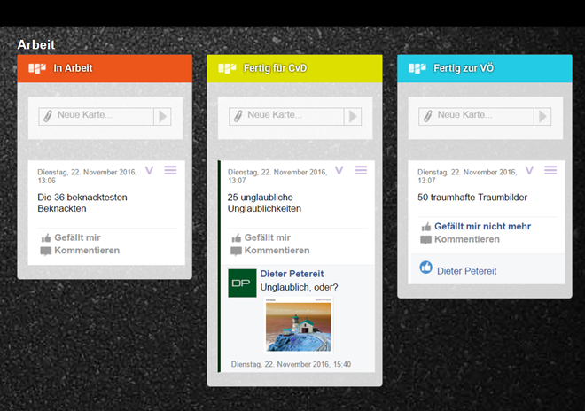
You know kanban boards, don’t you? Yes, you do. That’s what these boards, on which tasks or just about any cardable items are sorted, are called. The progress on a task (card, sticker, you name it) is documented as it travels from list to list until it’s completed. The principle is very simple, and thus, very successful.

Let’s say you’re planning an editorial team;) Set up a kanban board for each author. On this board, there are lists titled “suggestions,” “ordered,” “in progress,” “ready for review by the editor,” and “scheduled.” Additionally, there are lists “declined,” and “published.” Now, the author will make suggestions for articles he’d like to write. These are placed in the suggestion list as single cards.

In the easiest case, you like the suggestion, and you immediately drag it (or its card representative) into the list “ordered.” Now, the author knows that he can start working on it. Once he starts, he’ll drag the card into the list “in progress.” You see where this is going? If you don’t like the suggestion at all, immediately put it into the “declined” list.

This way, both author, and editor are always up to date when it comes to the status of each article. Details are specified on the respective card. Here, you have the option to attach files, define costs, or discuss direction, structure, and other questions regarding the topic in a comment system.

This is our workflow at Noupe. We’ve been using Trello, probably the most popular system of its kind, since early 2012. Each author has a board for the above-explained purposes, and there are additional boards as well, covering things like the magazine’s technical maintenance. This works like some sort of ticket system. Here, errors and required – or desired – changes are noted. Another board deals with strategic questions. The bandwidth of what Trello can cover is massive.

The beautiful thing about the kanban board principle is that it mimics the task flow physically, creating a momentum that is quite motivating. Personally, I prefer this way of working over the despicable ticking off of tasks in tools like Wunderlist and others.

Pinnery: Trello Alternative With Advantages

Now, I came across Pinnery. Pinnery is being developed by the German software company Rowisoft. Rowisoft’s flagship product is the ERP system Rowisoft blue, which is valid proof of expertise in business software development.

Yet, Pinnery is not created to be a Trello rival, so it’s not a typical me-too product. In fact, you can tell that Pinnery was developed by someone who knows a lot about business processes. To me, Trello is more in line with other visually appealing web apps with limited functionality, but high virality. Trello is cool, which is why it’s well-known and famous. Since we’re also using it here at Noupe, it should be clear that I don’t have a substantial issue with its feature set.

Pinnery: Board Example

However, when looking at Trello from the view of an economically oriented project manager, I would not choose this product. In the end, it’s more of an intuitive tool for freelancers and small teams that have to complete tasks together. When it comes to planning and concluding projects, Trello is stretched to its limits.

Here is where Pinnery shines. Next to the identical concept, and the identically easy controls, Pinnery provides more features. Pinnery comes with two functions that I have missed several times while using Trello.

One is the ability to define dependencies between tasks. In a lot of cases, the course of the project is only represented correctly when this can be done. You only get to start task Y once task X is done. Trello doesn’t offer this type of connection.

The other is the option to attach additional sub-boards to each card. This allows for the transparent organization of very large projects. With Trello, you need to put everything on one board or create multiple boards that are not connected to each other. Pinnery is much more professional in that regard.

Pinnery: Listen in Rubrik

Pinnery: Lists in Categories

Another feature that Trello can only pull off via third-party providers is the integrated time tracking next to a target-actual cost comparison. Time units down to the minute can be tracked.

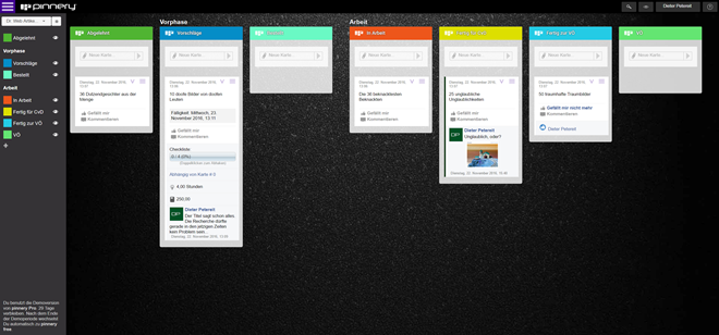
There are a few more small things that I like better about Pinnery as well. For example, you get to categorize your lists, placing subheadings. These let you show or hide board areas, which generally helps you keep an overview much better than when using Trello. Another positive aspect is that Pinnery has a view that displays almost the entire content of the “task” card in the list view. On Trello, you only see the title of the respective card, and you have to access the detail view of the card for every bit of further information.

Pinnery. Full View of a List on the Left, and the Compact View on the Right

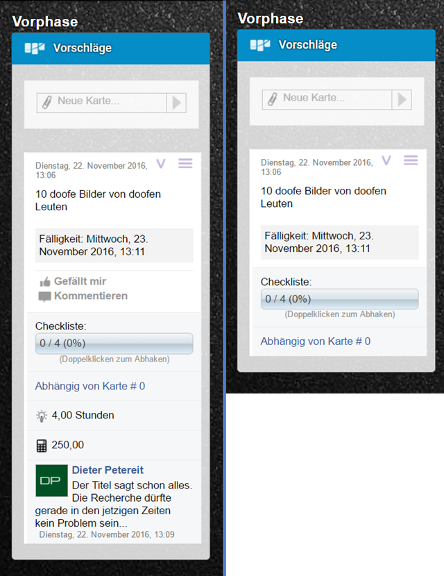
Pinnery: Full View of a List on the Left, and the Compact View on the Right

The creators of Pinnery have a treat for users of Surface tablets. With the respective stylus, they get to turn handwritten notes into cards, with all the other functions that the stylus has to offer.

Trello vs. Pinnery: Both Are not Free With Extended Features

For Trello, a lot of business features are available as well, including the management of users with different rights. For that, Trello charges 9.99 dollars a year per user. With Pinnery, you won’t get all features for free either. Here, you have to drop 6.60 Euro per user each month with annual payment.

First, you start off with a Pro account, granting you access to the full scope of features for 30 days. After these 30 days have passed, you decide if you want to pay for the Pro account, or if the features of the option Pinnery Free are sufficient, which most likely won’t be the case after having looked at this overview.

If you’re currently using a free Trello account without the Dropbox interface, Pinnery Free might actually be sufficient for you. In any case, you should take a look at the competitor.

Last but not least, it is probably better to keep our data in the hands of a German or – let’s say – European provider rather than an American one. It’s possible that this aspect will gain a lot more relevance with the president-elect of the USA.

Conclusion: If you are looking for a professional kanban board system, and are willing to pay for it, Pinnery is definitely one of the services to take a long, hard look at. Regarding functionality, it offers more than the internationally hyped Trello, and it’s cheaper at that. The provider is at least just as stable as Trello’s so that you don’t need to worry about the future more than in other cases. The European data protection is another plus. Pinnery has my unrestricted recommendation.

Categories: Others Tags:

WeTransfer reveals new brand identify and UI

November 23rd, 2016 No comments

WeTransfer is one of the mostly widely admired start-ups of the last decade. In many ways it embodies what we tell our clients to aspire to: a simple idea, solving a common problem, well executed.

What really makes WeTransfer standout is the high-value it places on design; since its launch in 2009, WeTransfer has used design to add interest to what is typically a mundane process: transferring files from one computer to another.

WeTransfer has just further refined that use of design to retain interest, with a full brand and user interface refresh.

Designed in-house, in collaboration with Bold Monday, the new logo is friendlier—it almost smiles at you—and more refined, retaining its character at very small sizes.

Brand colors and typography have also been refreshed. And to match the brand overhaul, the site’s UI has been simplified, with a more usable upload form—the main interface users spend time with.

The company has also dropped the word “transfer” from its branding, suggesting that it may branch out into expanded services in the near future.

WeTransfer’s use of design was already very successful, this excellent refinement acknowledges the brand’s heritage, without being beholden to it.

150+ Christmas and New Years Vector Designs – only $15!

Source

Categories: Designing, Others Tags:

Activity UI Design in Illustrator

November 23rd, 2016 No comments
dansky_activity-ui-in-adobe-illustrator

In this tutorial, we’re going to learn how to design an activity user interface in Adobe Illustrator.

Download Adobe Illustrator.

Read More at Activity UI Design in Illustrator

Categories: Designing, Others Tags:

Enhancing a Comment Form

November 23rd, 2016 No comments

Nice tutorial from Michael Scharnagl in which he takes a perfectly-functional comment form and progressively enhances it with very nice features. Things like custom error messaging, auto-expanding height, and even really fancy stuff like ajax and offline submission.

Direct Link to ArticlePermalink


Enhancing a Comment Form is a post from CSS-Tricks

Categories: Designing, Others Tags:

Does Conversation Hurt Or Help The Chatbot UX?

November 23rd, 2016 No comments

Chatbot fever has infected Silicon Valley. The leaders of virtually every tech giant — including Facebook, Google, Amazon and Apple — proclaim chatbots as the new websites, and messaging platforms as the new browsers. “You should message a business just the way you would message a friend,” declared Mark Zuckerberg when he launched the Facebook Messenger Platform for bots. He and the rest of the tech world are convinced that conversation is the future of business.

But is chatting actually good for bots? Early user reviews of chatbots suggest not. Gizmodo writer Darren Orf describes Facebook’s chatbot user experiences as “frustrating and useless” and compares using them to “trying to talk politics with a toddler.” His criticisms are not unfair.

The post Does Conversation Hurt Or Help The Chatbot UX? appeared first on Smashing Magazine.

Categories: Others Tags:

4 fresh alternatives to the hamburger menu

November 23rd, 2016 No comments

Some say web design has become boring. Current trends and high-end techniques establish the rules for the creatives, playing a low-down trick on the community. Everyone wants to be in the mainstream, and release products that go viral; it means that a million interfaces are likely to have the same features.

Of course, content can save the day. Still, the truth is that a lot of those interfaces are going to look the same.

For several years now, the hamburger menu icon has run the show. It is difficult to call it a “craze” these days; it is shamelessly overused, and feels like a must-have for responsive interfaces. Without a doubt it has benefits: it is handy, compact, and intuitive… but still, it is boring.

I mean, it is just three lines that sit on the right or left upper corner, and that’s all—a primitive glyph that calls to action. There are several options on the wild nowadays. They serve navigation’s primary role, and at the same time look different trying hard not to feel dull. Some of them are a breath of fresh air while others just are well-forgotten old solutions that were revamped.

1. Navigation with vertical lettering

Vertical lettering is a brand-new trend these days. It looks increasingly fresh, and naturally stands out from the usual horizontally-oriented content. What’s more, it takes less space: just a narrow line. Nonetheless, it is visually weighty since it is stretched almost to the height of the screen. Compact, informative and zingy—an ideal solution for contemporary designs.

VR Sessions brings home to us how to implement this type of navigation successfully. The team has turned its navigation 90 degrees, and placed it in a dedicated panel along with the logo. Nice and ingenious.

In the beginning, the Snake River Interiors website features a banal nav bar in the header; however, when you begin to scroll down, it smoothly transforms into the menu with vertical typography that sticks to the left side and follows the visitors. It certainly does the trick here.

2. Menu scattered around the perimeter of the screen

It is not a widely-used solution, and usually, it requires a proper environment, like a centered layout with perceptible gutters around the structure; nevertheless, it is a good way to give some zest to your navigation. Predictably, you may think that this concept is ideal only for small websites that have no more than four inner directories since there are just four corners. Well, that is not exactly correct. Take a look at the front page of Proud and Punch.

Each corner is reserved for its piece of information: logotype, socials, menu icon and quick access to the ‘about’ section. The team has skillfully identified their priorities, and kept everything neat and simple; whereas the team behind the Kygo Life did not limit itself at all, using the free space as effectively as possible. The homepage features lots of stuff that is located on the border of the page: CTAs, navigation indicators, social media, logotype, and some other things, resulting in a nifty design.

3. Ultra-narrow slide-out menu

Sidebars make a return. It is not dramatic, but still pretty perceptible. They are slicker, thinner, more compact and more elegant than before. In point of fact, it is just one ultra-narrow column that houses several elements: logotype, menu icon and depending on artist’s preferences it can be social icons, link to portfolio or standard icon-based pagination of the hero slider. Usually, it is located on the left side and seamlessly integrated. As for behavior, in the majority of cases, it just slides out revealing all the hidden elements like in mobile apps.

The personal portfolio of Maison Ullens features one of these. The homepage is split into two unequal parts. The first one is a sidebar with the logotype and link to the menu and the second one is the primary content area. The solution naturally directs the attention towards the ‘welcome’ area and at the same time unobtrusively establishes a focal point.

4. Soaring vertical menu

You might say, “That’s ancient history.” Much like a horizontal menu, vertical navigation seems to be banal and trivial. However, in the era of the hamburger menu button, it too looks like a craze. It can be used both against the solid color and transparent backgrounds. It can be placed anywhere; but as a rule, it’s paired with the logo.

For example, Linmark; the team utilizes a traditional vertical navigation that is carefully arranged on the right side of the screen. It starts with the type-based logotype and ends with the set of social media links presented as icons. The right side of each slide is intentionally whitened so that the component gets the necessary contrast to hit the optimal readability. The solution feels unusual.

Tvihorf welcomes online visitors with the activated menu that is presented as a conventional vertical navigation where options are carefully arranged line by line. It occupies the leading position, but not dominant. As you may expect, located in the heart of the page, it predictably catches the eye from the first seconds. It looks neat, crisp and subtle, going perfectly well with the logotype and prevailing businesslike atmosphere.

Conclusion

As the saying goes, small details make a big difference; and such a common element of the website design as the menu is capable of enriching the general aesthetic, adding some nice twists to the structure, and enhancing the user experience when it stands out from the crowd. These four types of navigation might not impress your visitors with their incredible dynamic behavior, nor intricate realization.

They will just feel unique, refreshing and original.

150+ Christmas and New Years Vector Designs – only $15!

Source

Categories: Designing, Others Tags:

Good News: WordPress 4.7 Supports Post Type Templates

November 23rd, 2016 No comments
wordpress-plugins

Every user of a “real” CMS knows that it requires a lot of flexibility in displaying different content and that a stiff content corset is unacceptable. WordPress has opened up to this idea, and its version 4.7 finally brings support for post type templates.

Custom Post Types vs. Post Type Templates?

The support for post type templates means that, in the future, theme developers will be able to deliver as many templates as they wish for as many post types as they want to. This is not to be confused with the support for custom post types, which has been around for a while already. Custom post types can be designed as desired as well, but only once per post type.

Post type templates add tremendous flexibility to the look of the post types, without forcing the developer to create a vast number of different custom post types. The functionality matches that of the page templates, which were available from WordPress’ beginning. You always had the option to choose a corresponding template when creating a page, and this will be the same for every single future post as well.

Thus custom post types and post type templates complement each other in an ideal way, making sure that less unpleasant workarounds are necessary to create unique designs.

Post Type Templates: What Could I Use This For?

Those that are using their WordPress for blogging solely might not have an idea as to what this is supposed to be useful for. In fact, an individual blogger should already not have missed anything, especially since custom post types.

Imagine you were involved in a team project, or you were running a commercial WordPress page. Here at Noupe, for example, I could see myself using post type templates to display sponsored posts in a different way than regular ones. Guest posts could also be designed differently to emphasize their character. For sponsored posts, you could remove additional advertisements. Before, (with standard tools) all of this was only possible by bending the functionality of custom post types (or using plugins, or interfering with the PHP).

When thinking about client pages, templates, in conjunction with proper training, are a good way to guide contributors in customer businesses regarding design, thus avoiding the worst possible visual calamities. Comic Sans, we salute you.

When working with landing pages for different, yet similar products, you’ll also be happy with post type templates, as they provide the option to present your portfolio as differently as you find appropriate.

Post type templates are a welcome addition to the options regarding theme design, and soon enough, we won’t be able to imagine not having them. In the future, the quality of new themes will also be measured by the extent to which post type templates are delivered, and how smoothly they are designed to integrate with the overall look and feel.

Categories: Others Tags:

Let’s Encrypt Everything

November 23rd, 2016 No comments

I’ll admit I was late to the HTTPS party.

But post Snowden, and particularly after the result of the last election here in the US, it’s clear that everything on the web should be encrypted by default.

Why?

  1. You have an unalienable right to privacy, both in the real world and online. And without HTTPS you have zero online privacy – from anyone else on your WiFi, from your network provider, from website operators, from large companies, from the government.

  2. The performance penalty of HTTPS is gone, in fact, HTTPS arguably performs better than HTTP on modern devices.

  3. Using HTTPS means nobody can tamper with the content in your web browser. This was a bit of an abstract concern five years ago, but these days, there are more and more instances of upstream providers actively mucking with the data that passes through their pipes. For example, if Comcast detects you have a copyright strike, they’ll insert banners into your web contentall your web content! And that’s what the good guy scenario looks like – or at least a corporation trying to follow the rules. Imagine what it looks like when someone, or some large company, decides the rules don’t apply to them?

So, how do you as an end user “use” encryption on the web? Mostly, you lobby for the websites you use regularly to adopt it. And it’s working. In the last year, the use of HTTPS by default on websites has doubled.

Browsers can help, too. By January 2017, Google Chrome will show this alert in the UI when a login or credit card form is displayed on an unencrypted connection:

But there’s another part of this ecosystem required for encryption to work on websites – the HTTPS certificate. Historically these certificates have been issued by certificate authorities, and they were at least $30 per year, sometimes hundreds of dollars per year. Without that required cash every year, without the SSL certificate that you must re-purchase every year in perpetuity – you can’t encrypt anything.

That is, until Let’s Encrypt arrived on the scene.

Let’s Encrypt is a 501.3(c)(3) non-profit organization supported by the Linux Foundation. They’ve been in beta for about a year now, and to my knowledge they are the only reliable, official free source of SSL certificates that has ever existed.

However, because Let’s Encrypt is a non-profit organization, not owned by any company that must make a profit from each SSL certificate they issue, they need our support:

As a company, we’ve donated a Discourse hosted support community, and a cash amount that represents how much we would have paid in a year to one of the existing for-profit certificate authorities to set up HTTPS for all the Discourse websites we host.

I urge you to do the same:

  • Estimate how much you would have paid for any free SSL certificates you obtained from Let’s Encrypt, and please donate that amount to Let’s Encrypt.

  • If you work for a large company, urge them to sponsor Let’s Encrypt as a fundamental cornerstone of a safe web.

If you believe in an unalienable right to privacy on the Internet for every citizen in every nation, please support Let’s Encrypt.

[advertisement] Find a better job the Stack Overflow way – what you need when you need it, no spam, and no scams.
Categories: Others, Programming Tags: