Archive

Archive for January, 2017

How will a Closed Internet And Net Neutrality Impact Web Design?

January 27th, 2017 No comments

There are two things that enable the Internet to be a truly viable resource for businesses, hobbyists and everyone in between: open Internet access and net neutrality. Unfortunately, net neutrality has been in the crosshairs for many years. Additionally, President Donald J. Trump has spoken out several times in the past about his desire to close parts of the Internet. Not only would this dramatically change life as we all know it but it would also drive up prices and alter the web design industry.

What Does a Closed Internet Look Like?

Nations such as North Korea, Saudi Arabia and China have censored the Internet in a variety of ways. For example, the North Korean government controls every website that the country’s citizens can visit. Of course, only a few thousand of the 25 million residents are able to access the unbelievably dismal total of 28 sites that the government has deemed appropriate for public usage.

China is another example of the dangers of allowing Internet censorship. The Chinese government filters searches, reroutes search terms to propaganda websites and erases all sites and information that don’t match up with their official version of events. In other words, if you’re in China and look up Tiananmen Square Massacre, you’re going to be rerouted to a site that offers a positive viewpoint of the Communist Party.

If all of this sounds uncomfortably similar to the concept of “alternative facts,” it’s time to pay closer attention to President Trump’s numerous comments on closing parts of the Internet. Although he has claimed that this would be done in an effort to block ISIS and other terrorist groups from recruiting via the Internet, he could just as easily flip the switch based on widespread dissent. The Communications Act of 1934 even appears to give Trump the authority to do so without any Congressional approval if he declares the U.S. to be in public peril or under the threat of war.

As you can imagine, a closed Internet would drastically change the number and type of web design projects. Imagine for a moment that you were a web designer in North Korea. You’d have to be employed by the government to get any work at all, and with only 28 sites, there wouldn’t be room for a lot of designers.

This is the most drastic outlook, of course, and the U.S. reality of a closed Internet would probably be more akin to Saudi Arabia’s form of censorship that blocks 400,000 websites. Again, though, this would drastically reduce the need for web designers, and it would also make it necessary to create sites that are controversy free. Long gone would be the days of creative freedom, especially if you’re designing for a client who needs their website to stay up and uncensored. This would likely mean sticking to certain predetermined acceptable parameters for content and design.

What about Net Neutrality?

The U.S. Internet doesn’t need to be closed in order to render it less profitable for web designers and businesses. Net neutrality could be destroyed instead. There have been many battles fought over this concept already, and watchdogs are highly concerned with Trump’s selection of Ajit Pai for the role of Chief Communications Regulator.

Pai is a well-known critic of net neutrality, and he has already indicated that he plans to revisit FCC rules, including Internet regulations. If net neutrality is allowed to be destroyed, Internet providers may be able to openly and freely impose throttling, blocking and even discrimination. How would this impact website designers and the average Internet user? The costs are immeasurable at this point, but it’s clear that everything would become more expensive and cumbersome.

For example, website design and hosting companies such as SquareSpace and GoDaddy currently make the process of building and launching a website affordable for everyone. However, if net neutrality falls apart, small business owners, pop culture enthusiasts and other similar users may end up unable to retain a viable website presence. After all, how can a small business owner compete if traffic to their website is throttled because they or their customers cannot afford a larger high speed access fee?

Many Internet service providers have already been caught purposefully slowing down Internet access in certain cities and to high profile websites. In other words, the technology exists to basically extort business owners into paying more money if they want their site to load in a decent amount of time. When you consider the fact that 47 percent of consumers expect a website to fully load within 2 seconds, time quite literally becomes money. Surveys indicate that 40 percent of users leave sites that aren’t loaded within 3 seconds, and every second of delay causes a 7 percent reduction in conversions.

The Bottom Line for Web Designers

In either scenario, creativity is going to be stifled, as will profits. It’s possible to put some nice unique touches on a site right now without going past the 2 to 3 seconds rule, but what happens if you’re designing for a small business and they already have a 2-second penalty imposed because they’re paying for a slower access speed? Anything beyond the most basic design elements will push them past the 3-second mark, and their profits will plummet.

As a result, more companies will fail and less businesses will need to hire a web designer. Additionally, discount hosting and design providers may no longer be able to turn a profit because so many small businesses and personal sites will become too expensive to maintain at a high enough speed.

It’s a vicious cycle, and it’s poised to push the Internet into the hands of only the richest individuals and most successful companies. Web design would likely become a much more cut-throat industry with fewer openings, and frustrated consumers would seek out major sites that can afford to pay for faster access. It’s unclear at this time if a closed Internet or the death of net neutrality are truly on the horizon in the U.S., but all signs indicate that it’s time to become educated about what these things could mean for web designers and everyone else who relies on the Internet for the source of income.

Read More at How will a Closed Internet And Net Neutrality Impact Web Design?

Categories: Designing, Others Tags:

Real CSS Tweets (Vol. I)

January 27th, 2017 No comments

We be tweetin’ all the time about web design and development stuff. In fact, @Real_CSS_Tricks, the official Twitter account for this site, is largely just an outgoing airhorn for the stuff we publish here and interesting things elsewhere. The human beings that operate this site have their own accounts.

It’s pretty interesting to see which tweets take off! Here’s a list of the most popular tweets in the last year or so.

Wanna see a decent little slider in a handful of lines of code? pic.twitter.com/zOsN4mhRFw

— CSS-Tricks (@Real_CSS_Tricks) October 23, 2016

That one turned into a blog post and demo.


Loads of icons you can make with a single element (and pseudos)https://t.co/s3VyHj2P11 pic.twitter.com/mlIkyjc86w

— CSS-Tricks (@Real_CSS_Tricks) October 16, 2016

I’d say SVG is normally the best fit for this kind of thing, but this is a damn impressive experiment. I like the websites interface in how you can hover over the parts of CSS and it shows you what part of the icon it is.


Some more helpful mini tools:

CSS Peeper: https://t.co/RRbKhut7Ea

Chrome extension that displays styling information about the current site. pic.twitter.com/bs3NtmgI3I

— CSS-Tricks (@Real_CSS_Tricks) December 23, 2016

Always helpful to have a quickie site to snag nice colors.https://t.co/h2Ei8syLEU pic.twitter.com/X0GGXyn5dE

— CSS-Tricks (@Real_CSS_Tricks) April 4, 2016

Reminder that Clippy is an *awesomely helpful* little app for clip-pathhttps://t.co/SZILcdftSZ pic.twitter.com/qcKvcaTO8a

— CSS-Tricks (@Real_CSS_Tricks) April 6, 2016


Demos!

ooOOo fancy. “Aquarelle is a watercolor js effect.”https://t.co/0ycH8fcyRV pic.twitter.com/NKqj0LKZf0

— CSS-Tricks (@Real_CSS_Tricks) January 16, 2017

What a cool way to show nav with what is current visible: https://t.co/u7yHR2QtlP pic.twitter.com/m53rzHD8El

— CSS-Tricks (@Real_CSS_Tricks) January 13, 2017

The Twitter heart explosion animation by @anatudor with:

1 Element
0 Images
0 JavaScripthttps://t.co/9rcDYZwjrY pic.twitter.com/tA7zaMg3xl

— CSS-Tricks (@Real_CSS_Tricks) June 29, 2016


Little bits of code:

Always so satisfying centering stuff with flexbox. pic.twitter.com/uH8u9EQhaw

— CSS-Tricks (@Real_CSS_Tricks) January 11, 2016

Native (!) smooth scrolling:

window.scroll({
top: 2500,
left: 0,
behavior: ‘smooth’
});

Polyfill: https://t.co/I6fHdLzDTT

— CSS-Tricks (@Real_CSS_Tricks) November 2, 2016

This was confusing me, but I think we have it sorted now.https://t.co/uRuiJTA68yhttps://t.co/cvYQA1riU4 pic.twitter.com/lQhba7QEpe

— CSS-Tricks (@Real_CSS_Tricks) January 22, 2016


Stuff right here on CSS-Tricks:

Input Masking :: https://t.co/ee1bRnPPnl pic.twitter.com/xVZUIc8XTr

— CSS-Tricks (@Real_CSS_Tricks) November 30, 2016

Sticky Footer
? ? ? ? ?
Ways!https://t.co/4shCFk12UY pic.twitter.com/VjFmQnK65H

— CSS-Tricks (@Real_CSS_Tricks) May 25, 2016

So. Much. Info. on CSS Grid Layout.https://t.co/lTmSHGztho pic.twitter.com/D0lBxQSQxG

— CSS-Tricks (@Real_CSS_Tricks) March 29, 2016

??


Real CSS Tweets (Vol. I) is a post from CSS-Tricks

Categories: Designing, Others Tags:

9 rules effective “coming soon” pages follow

January 27th, 2017 No comments

A lot of people have the misconception that they have to have a complete website in order to start building leads and actively promoting their business. The truth is, you can generate a lot of buzz about your client’s business and their website, with an effective coming soon page.

What goes into an effective coming soon page? With the right mix of elements, you can have a powerful method for jump starting the success of your client’s website, even while you are in the middle of building it.

1. Use a countdown timer (and make sure it’s accurate)

Letting visitors know that you have a set launch date builds anticipation for your client’s website launch. It also lets them know how far off they are from launch. Keeping their audience in the loop is important if you truly want a successful launch for your client.

2. Collect email addresses

Life is hectic, and especially online, we are constantly being bombarded with information, news, media, email subscriptions, and so much more. People forget things easily. If you set up a coming soon page for your client, be sure to have an email collection form, so you can send an email once the website is ready. You’d be surprised at how many people will show up after a simple email. This initial burst of traffic can make the difference between your client’s site being a success or a total flop.

3. Pre-sell their products or courses

If your client has an established audience prior to launching the site, you can use the coming soon page as a way to offer a presale or early adoption discount on their product or online course. There have been many cases where the additional revenue generated was used to finish a product or course quicker, or improve its quality. It’s important to note that in order for this to work, they should have established trust with their audience prior to attempting this.

4. Promote their social media accounts

Not only can you build their email list, but you can also build their social following using a coming soon page. You can make it a game to give visitors an incentive to follow your client on Twitter or like their Facebook page. You can do things like offer a free e-book in exchange for a follow, or you could host a giveaway, using social promotion as an entry.

5. Make sure the coming soon page reflects their brand

You can help their business build recognition early by instilling their brand throughout the page. Prominently display their logo, and design the page to reflect the personality of their brand. The coming soon page should reflect what their website is about.

6. Use simple, but concise text

Their coming soon page isn’t the place to get too wordy, but it’s a good idea to mention why visitors would want to follow them, or subscribe to an email announcement of their launch. A good example would be if they were a marketing company and their site provided free marketing materials to small businesses. They might say “Launching soon, Company XYZ: Providing Premium quality Marketing Materials to Small Business For Free, Along with free tips and Strategy guides.” Right under that would be a great place to put an email opt-in form.

7. Optimize their opt-in form

A lot of times, it’s not what you say but how you say it. This is especially true with online marketing. Instead of using the normal terminology, like “sign up” or “join now” you can switch things up to make them more inviting:

a. ‘Get access to 10,000 free marketing tips.’

Make it sound like it is a privilege to be a part of what they’re doing. Making it sound like it will benefit them makes them not want to miss out on what your client is doing.

b. ‘Join 23,000 other marketing professionals.’

Make it about inclusion. If they’re a marketing professional, they will feel the need to be a part of this, as a way of validating their own identity.

c. ‘Find out the marketing secrets real experts will never tell you.’

This is another way of making it about inclusion. It piques curiosity and generates a lot of interest. People never want to miss out on information, especially that everyone else will get to know.

8. Video is more engaging: use it when you can!

This is especially true if they’re launching their website centered around a product, service or course. A simple video showcasing their product or service, testimonials, and any other type of persuasive proof can help generate a buzz around their site before it is even built. Accompany this with the tips above, like using their coming soon page to pre-sell their products or services, and they’ll be generating revenue before their site is even finished.

Their video can also be a great way to introduce their new audience to them or their team. You can show brief interviews of each team member. Each person can give a brief bio about themselves and their special skills that they will bring to the table. It can also be a sneak preview of the types of products and services that they will be providing.

9. Provide something enticing or interesting at launch

If they use their coming soon page to gather email addresses and build a buzz around their site before it is launched, when they’re ready to launch they should do something special. Put together a valuable piece of information, a freebie, or something of value that will entice visitors to come back to their site. Then, use a well-designed email blast to everyone who signed up, letting them know they’ll get something nice for coming back to see the newly launched site—all most people need is a little incentive.

Conclusion

Your client’s new website’s coming soon page doesn’t have to be a stagnant, static page. Don’t think of their coming soon page as a placeholder, but more like a buzz-generating marketing tool that prepares their audience for the great things that are about to come from your client and their business. It’s a great way to get their audience excited about what they are doing, without being overly salesy.

Quickly and Easily Create Landing Pages with MotoCMS – only $9!

Source

Categories: Designing, Others Tags:

Web Development Reading List #167: On Team Retreats, Immutable Cache, And Eliminating Clearfix Hacks

January 27th, 2017 No comments

When working in a team, we focus so much on the work, that we often forget that we all have something in common. Something that is so obvious that we underestimate it: we all are human beings. And well, if we want to grow as a team and get better at what we do, we should embrace this fact more. In fact, I just came back from a week-long team retreat where we had team activities, team games, and sessions and discussions about how we can achieve just that.

We figured out how much we value diversity, we realized how different the English language and its words are perceived by people from different countries, and we’ve seen short talks on various topics like work-life-balance but also on technical stuff like Docker or intercepting any computer’s traffic with a Raspberry Zero. So if you have the chance to work in a team, use the opportunity and exchange views and share information with your co-workers. Work is part of your life, so why not make it a lovely part?

The post Web Development Reading List #167: On Team Retreats, Immutable Cache, And Eliminating Clearfix Hacks appeared first on Smashing Magazine.

Categories: Others Tags:

30 Sugar-Sweet Valentine’s Day Icons

January 27th, 2017 No comments

So, you want to give your projects some extra love? With Valentine’s Day coming up soon, we’ve got a fresh new set that consists of a delicious selection — just like a good box of chocolates. Take a peek, and you’ll find icons especially tailored to e-commerce projects (such as shopping carts and price tags), but also some more versatile motifs like a love letter, calendar, and even a WiFi sign that sends off some lovely vibes.

This catchy icon set is available in two different styles — each available in AI, SVG, EPS, Sketch, CSH and PNG formats. Thanks to the creative minds behind Roundicons who created these 30 sugar-sweet icons dedicated just for you to use for all things valentine. Perfect to spread some love, and hopefully, conquer the hearts of your users.

The post 30 Sugar-Sweet Valentine’s Day Icons appeared first on Smashing Magazine.

Categories: Others Tags:

2016 Revisited: The 100 Best Free Icon Packs of the Year

January 27th, 2017 No comments

There is no point in eulogizing and promoting icons since everyone knows that these tiny, in majority cases increasingly plain and simplified pictograms are simply indispensable when it comes to creating web or app interfaces. Can you imagine tab bar navigation without a set of vigilantly crafted well matched compact icons? Or e-commerce theme without a small trolley carriage in the upper right corner? I very much doubt it. These tiny visual cues that unobtrusively portray operations and enhance the site or application, making it friendly and intuitive to us, are just everywhere. So we just could not ignore and bypass them.

If you are currently in search of some icons for your project or artwork then we invite you to take a look at a ton of icons that were released for free during the last year. Some of them are elegant and subtle thanks to the vigilant line style realization; while others are bold, solid and visually heavy thanks to the outstanding flat or vector realization. Some of them are primitive; others are complex and intricate. Our collection covers icons from various categories. Here you will find a perfect pair for a sport, medicine, food, or corporate themed website, personal portfolio or e-store. Actually, there is lots of interesting hidden inside. Examine our compilation to find out more.

The Iconify Collection of 650+ Icons

Creator: VectorIcons
License: Free for personal and commercial use.

Free UI and E–commerce thin line icons


Creator: Rajesh Kumar
License: Declared as Free, no proper license given.

Special Free Pack of Interface Icons


Creator: Darius Dan
License: Free for personal and commercial use.

200 Free Icons


Creator: Jack Wassiliauskas
License: Attribution-NonCommercial-NoDerivatives.

1000+ Free blobs flat icons with two styles


Creator: Baianat ­
License: Attribution-NonCommercial-NoDerivatives.

Color Line Icons


Creator: iconshock
License: Personal use.

Filled Activities Freebie


Creator: Darius Dan
License: License Agreement.

5000 Free File Type / Extension Icons


Creator: onedollargraphics
License: Free for personal and commercial use.

400 Assorted Icons


Creator: Smashicons.com
License: Declared as Free, no proper license given.

Krispicons Flat Modern Icons – Free PSD


Creator: Nitish Kumar
License: Declared as Free, no proper license given.

Set Of Material design avatars


Creator: Oxygenna
License: Declared as Free, no proper license given.

Filling Icons


Creator: Max Kalik
License: Creative Commons.

Individual Version


Creator: Max Kalik
License: Creative Commons.

Users Icons Free PSD


Creator: Anas Ali
License: Declared as Free, no proper license given.

Sweets Pack


Creator: Paula Jenda
License: Declared as Free, no proper license given.

UI icon pack


Creator: Pau Frischke
License: Free for personal and commercial use.

Trending Icon Bundle


Creator: Designer Yash
License: Declared as Free, no proper license given.

Icalicons


Creator: Noe Araujo
License: Declared as Free, no proper license given.

60+ Travel Color Icons


Creator: Icons8
License: Free for personal and commercial use..

Free Technology Icons


Creator: James George
License: Declared as Free, no proper license given.

8bit Remix – character-Set


Creator: Gregory Gasser
License: Declared as Free, no proper license given.

Jordan Icons Dribbbleshot


Creator: Fernando Gonzalez
License: Declared as Free, no proper license given.

UI Icons Free pack – for Sketch in vector shapes


Creator: Marco Lopes
License: Declared as Free, no proper license given.

Supermarket Icons


Creator: The Eyecons
License: Declared as Free, no proper license given.

Cyber Security Icons – Part 2


Creator: The Eyecons
License: Declared as Free, no proper license given.

25 Free Icons


Creator: The Eyecons
License: Declared as Free, no proper license given.

SEO Icon Set – Elegant Style


Creator: GraphicBoat
License: Declared as Free, no proper license given.

Space Icon Set


Creator: Elena de Pomar
License: Declared as Free, no proper license given.

Aurora Icon Pack


Creator: Samuele Bandini
License: Attribution.

Free Food Icons


Creator: Ahmed Hassan
License: Declared as Free, no proper license given.

Landmark Icons


Creator: Wassim
License: Declared as Free, no proper license given.

Birthday Cake Icons


Creator: designer bundle
License: Declared as Free, no proper license given.

100 Free Social Media Icons


Creator: uiconstock
License: Declared as Free, no proper license given.

50 Company Icons


Creator: Yunjung Seo
License: Attribution-NonCommercial-NoDerivatives.

70 Free All Purpose Line Icons


Creator: Paolo Ertreo
License: Declared as Free, no proper license given.

54 Business Icons


Creator: graphic google
License: Free to use personally and commercially, but link-back is compulsory.

Cargo Icon Set


Creator: Rena Xiao
License: Declared as Free, no proper license given.

Free Basic UI Icon Set


Creator: Angela Angelini
License: Free for commercial and personal works.

Camping – Free Icon Set


Creator: Yana Bereziner
License: Attribution-NonCommercial.

25 Bicycle Line Vector Icons


Creator: graphicpear
License: Personal use.

London Icons – Cityset


Creator: Bryn Taylor
License: Declared as Free, no proper license given.

48 Free Linear Icons


Creator: Honcharov Maxim
License: Declared as Free, no proper license given.

Simple Line Icon Set Vector PSD


Creator: TushiT
License: Declared as Free, no proper license given.

Free Flat Line Fashion Icons Pack


Creator: Rafi
License: Free for personal and commercial use.

60 Free Icons


Creator: Vincent Le Moign
License: Declared as Free, no proper license given.

Free Icons


Creator: Tetiana Donska
License: Free for commercial and personal use.

Davi Icons


Creator: Vlad Cristea
License: Free for personal and commercial use.

Hexagon Icon Set


Creator: Bulent Keles
License: Declared as Free, no proper license given.

Camping Line Icons Set2


Creator: memed nur
License: Free for commercial and personal use.

Strategy Icons Set


Creator: Peecheey
License: Free for personal and commercial use.

30 e-Commerce Flat Icons


Creator: Graphiqa Stock
License: Declared as Free, no proper license given.

Online Business And Finance Icons Free PSD


Creator: PSD Freebies
License: Declared as Free, no proper license given.

Futuristic Space and Astronomy Flat Line Icon Set


Creator: ecomm.design
License: Free for personal and commercial use.

The Web Interface Icon Set (70 Icons, SVG & PNG)


Creator: Freepik.com
License: Free for personal and commercial use.

100 Colored Food & Drink Icons


Creator: Icons8.com
License: Free for personal and commercial use.

The Flat & Stroke eCommerce Icon Set


Creator: Freepik
License: Free for personal and commercial use.

LineKing Icons


Creator: Pixel Bazaar
License: Free for personal and commercial use.

160 Icons


Creator: VectorIcons
License: Free for personal and commercial use.

Cartoon Characters vol.


Creator: Netguru
License: Declared as Free, no proper license given.

Flat Line UX And E-Commerce Icon Sets


Creator: Ecommerce Website Design
License: Creative Commons Attribution 3.0 Unported l.

Summer Icon Set


Creator: Printerinks.com
License: Creative Commons Attribution 3.0 Unported.

Months And Seasons Set


Creator: GraphicMama
License: Creative Commons Attribution 3.0 Unported.

Essential Free Icons


Creator: Igor Babariko
License: Free for personal and commercial use.

50 Free Icofactory Line Icons


Creator: iconfactory
License: Free for personal and commercial use.

Social Icons – Free PSD


Creator: Sohail Shahid
License: Declared as Free, no proper license given.

Free Construction Icons


Creator: graphic google
License: Free to use personally and commercially, but link-back is compulsory.

Camcons


Creator: geticonjar
License: Declared as Free, no proper license given.

440 BigMug Icons


Creator: Catalin Fertu
License: Declared as Free, no proper license given.

132 Line Icons


Creator: doonnn
License: Declared as Free, no proper license given.

60 Free iOS icons – Space


Creator: PixelLove
License: Declared as Free, no proper license given.

Free flags of all the countries in the world


Creator: Daftcode
License: Declared as Free, no proper license given.

Luminance, A Black Pixel Icon Set


Creator: Black Pixel
License: Declared as Free, no proper license given.

Free Ecommerce Icon Pack + PSD / AI Freebie


Creator: Intuz
License: CC0.

20 Halloween Flat Icons


Creator: Ramy Wafaa
License: Declared as Free, no proper license given.

Virtual Reality Icons


Creator: Manuela Langella
License: Free for personal and commercial use.

Diwali


Creator: Iconscout
License: Iconscout Basic license.

Kitchen Tools & Appliances Icons


Creator: Brook Wells
License: Free for personal and commercial use.

Yoga Icons


Creator: Juan Sarmiento
License: Free for personal and commercial use.

Houses & Buildings Icons (AI, PDF, SVG, PNG)


Creator: Manuela Langella
License: Free for personal and commercial use.

25 Line Contact Icons Vector Format


Creator: graphicpear
License: Declared as Free, no proper license given.

Color Vector Characters


Creator: Vincent Le Moign
License: Free for personal and commercial use.

Medical Icons Set


Creator: Roll’n’Code
License: Declared as Free, no proper license given.

130 Icons


Creator: Han Wang
License: Declared as Free, no proper license given.

Marine Icon Set


Creator: Florent Lenormand
License: Declared as Free, no proper license given.

Beauty and Spa Icons


Creator: graphicpear
License: Declared as Free, no proper license given.

Line icon set random stuff


Creator: MajorYom
License: Declared as Free, no proper license given.

Free icons Set


Creator: José Polanco
License: Declared as Free, no proper license given.

Docto Icons


Creator: Doctolib
License: Declared as Free, no proper license given.

Few Basic Icons


Creator: Laura Reen
License: Creative Commons (Attribution 3.0 Unported).

100 Pixelicons Free Pack


Creator: pixelicons
License: Declared as Free, no proper license given.

Charticons


Creator: Rudd Fawcett
License: Creative Commons Attribution 4.0 International License.

Ecology Green Line Icons


Creator: Peecheey
License: Free for personal and commercial use.

Spanish Language Free icons


Creator: icons8
License: Declared as Free, no proper license given.

Work Icon Set


Creator: Agung Krisna Wijaya
License: Declared as Free, no proper license given.

BIGU – Icon Set


Creator: Damien LEGENDRE
License: Free to personal and commercial use.

50 Free Icons


Creator: Cort McGinty
License: Declared as Free, no proper license given.

New Year’s Free Mascots


Creator: Yulya
License: Declared as Free, no proper license given.

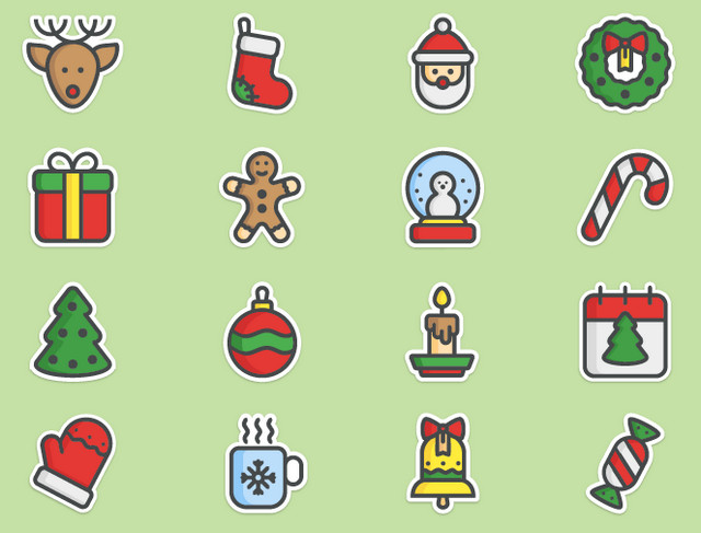
Christmas Stickers


Creator: Kara Sotskaya
License: Free for personal and commercial use.

Circus Icon Set


Creator: NamLy
License: Declared as Free, no proper license given.

Free Icon Set


Creator: Robert Karnovski
License: Free for personal and commercial use.

Categories: Others Tags:

Build Your Next Website with Squarespace

January 26th, 2017 No comments

I’ve been reminded a few times lately how the web is both is a great enabler, allowing people all over the world to share ideas and build businesses, and a pain in the ass.

The other day, I listened to a gentlemen explain to me his unique startup business, a marketplace connecting two groups of people. It will be a real challenge, I thought, reaching all these people on both sides and getting them to understand how his business can help. He was up for the challenge and making great headway. His biggest problem, he said, was his website. ARG! The website should not be the limiting factor here. It should not be the hard part. The website should be the easy part. The hard part is reaching all those people that can make or break this idea.

A few weekends ago I watched a team come together and, highly reluctantly, spend their entire weekend handling frustrating infrastructure work on their website. Migrations gone haywire; upgrades being harder than they should have been. These people work with web tech, but web tech isn’t their business. Their time is better spent building their business, and on the weekend, resting their brains.

I’m not that worried about these folks. They have the expertise and resources to get through. I am worried about all the people out there who don’t. I’m worried about the people who are entrenched in a website setup that is far too complex for them and actively disrupting their work and business.

I wish more people used Squarespace.

With Squarespace, you’re getting a beautifully designed responsive site. You don’t have to worry about upgrades or security. You control everything – you don’t need permission or to call someone to change things on your site. You don’t need to worry about how domain names work, or hosting, or SSL. It makes the website the easy part so you can focus on whatever your hard part is. Plus I’ll worry about you less.

Use the offer code “CSS” at check-out to get 10% off your first purchase.

Direct Link to ArticlePermalink


Build Your Next Website with Squarespace is a post from CSS-Tricks

Categories: Designing, Others Tags:

SVG Map Rollovers

January 26th, 2017 No comments

Over on the Media Temple blog, I take Wikipedia’s SVG map of the United States, add a written list of the state names, and make hover/tap states. Hover/tap the name of the state, highlight the state on the map. Hover/tap the state on the map, highlight the name of the state. Demo.

Direct Link to ArticlePermalink


SVG Map Rollovers is a post from CSS-Tricks

Categories: Designing, Others Tags:

75+ type driven sites

January 26th, 2017 No comments

When we talk about the visual elements of a website, we are usually referring to images: photos, illustrations, icons, possibly the UI. What we tend to forget is that text is visual too. It is, after all, the visual representation of the spoken word. And text, just like images, can be beautiful or ugly, intriguing or dull, striking or bland, in appearance.

The majority of sites out there use purely functional text. In other words, even though the typography might be passable, and the text readable, it is there to be read; any visual interest is picked up by images. However, there are some, rather brave, designers who use type as content and visual interest, and have kept images to bare minimum, or even done away with them altogether. I say brave because it is a difficult approach to get ‘right’, as it pushes users out of their comfort zone and it can produce a very bold, stark look.

some, rather brave, designers use type as content and visual interest

This approach is not simply a case of ditching the use of any images and filling the space up with lots of text. That would be visually off putting, really pretty boring, and definitely not user-friendly. For this style to work, less is definitely more with each text element being very carefully placed on the screen. The type tends to be display, often oversized, although some sites do use body type in the same way, to good effect. In fact, it could be argued that there are two distinct sub genres: large, display type with a more stylish feel and small body type with a very basic, bare bones feel.

Black on white or white on black is fairly standard, but in places color is used to add an extra dimension. In some of these sites, images appear on interaction, or a text animation is triggered to dramatic effect. With many of these examples, a screen shot cannot do them justice, they have to be experienced, and played with.

The obvious examples of text only sites are type collections, and while some might say that they shouldn’t count here I feel they are worth including if they present their content well and in a visually engaging way. (Not all font sites do.)

What stood out to me when putting together this collection is that the majority of sites embracing this approach tend to be for designers/design agencies, or others in creative fields (although there are some notable exceptions, like the NZ cleaners, or the Irish fish & chip shop). Perhaps this is because there is an urge to push the boundaries which usually has to be resisted when producing work for clients, whereas we don’t feel the need to play it safe when it’s about ourselves. The key here is creativity and confidence, it is a bold style that makes a very strong statement. There is no middle ground with this approach; when it misses it misses by a mile, but when it works it really works. Enjoy!

Fullstop newparagraph

Minnix

Jessica Strelioff

Elbow

Context

HTML arrows

Avery review

Edmundo

Graham Hicks

Emile Sadria

Wade Garret

Greater than or equal to

Dua

Jane Smith Agency

Triebwerk

Soulwire

Playground paris

Bronze

Design census

VSCO

TGW studio

b14

Durimel

Jason Briscoe

RSQ

Le top

Other

Aku

This is alcohol

East room

Alejandro Matamala

Megs tailoring

Stemme

Hej

Fictive kin

Geordie Wood

Oak

At your request

Camelot typefaces

Central St. Martins 2016 show

Yields

The Lobster movie

MaisonNue

Grano

Duezero

Second cousins studio

David Prati

Camp quiet

Maximillion McLaughlin

Valentino Borghesi

Arthur Collin

Agenzia indipendente diricerca

Justin Parra

Eugene Lee

Love and money

Maxine Tsang

San Francisco Coffee Finder

Bloomberg design conference 2016

Code united

Superset

Giorgio Favotto

Neobred

Grafik

Fish shop

Mediumextrabold

Design jobs board

Arc

ZZ

Pierre

Vincent Tavano

Hawraf

2016 promo

Danilo Campos

Hours after

Rebecca Lloyd Evans

R-typography

Eli Rousso

Plane site

Frere-Jones type

LAST DAY: Layers Pro Bundle – 4 Powerful WordPress Tools & More – only $39!

Source

Categories: Designing, Others Tags:

All You Need to Know About WordPress Child Themes

January 26th, 2017 No comments
Screenshot Twenty Fifteen Child-Theme

WordPress attracts tons of bloggers that want to handle things on their own. You gain full control, and there is nothing that you couldn’t adjust with a few lines of PHP, CSS, or HTML. On top of that, there are hundreds of small functions regarding the extension of the CMS available on the web. The world of WordPress could be so beautiful if it weren’t for the theme updates. With child themes, these become a lot less scary.

Do you know this problem? You install a theme, adjust it to meet your desires, and you’re satisfied and happy. But then, the next theme update comes around, and all of your changes are gone.

To prevent this from happening to you, this article will teach you how to create and use a child theme.

What’s a Child Theme and What do I Need it For?

Basically, a child theme is the child of a full-fledged, regular theme. It uses the files of the parent theme for display. This includes all template files, the style sheet for the design, the JavaScripts – everything. That’s why both themes have to be in the theme folder wp-content/themes at all times.

All Changes Remain, Even After an Update

A fresh set-up child theme looks exactly like its “parent” theme. This is the starting point for every customization of your design. Here, you can make any change you want, without any dangers, and these changes will remain even after an update of the original theme. That’s the big advantage.

Every WordPress theme that is capable of receiving updates should only be used with a child theme. It’s very simple, and in today’s article, we’ll teach you all the few pitfalls that can come up.

The Preparation for Creating a Child Theme

To create a child design, you need an FTP program, as well as an HTML editor. You can get both for free. To work with the FTP program, you’ll also need the FTP access information for your web host. Your host will provide this information.

  • I can recommend the FTP program “FileZilla” as it’s feature-rich, and free for both Windows, and Mac.
  • The HTML editor I’d recommend is the program “Brackets“. It’s free as well, and due to its many expansions, it can be tailored to your needs.

Of course, there are other, good HTML editors. Thus, we have compiled a list with programs for Windows, and for Mac.

Creating and Using Child Themes

I’ll use WordPress’ popular Twenty Fifteen Standard Theme as an example for the creation of a child theme. You’ll learn to create a child design, use an own stylesheet for the CSS, and to adjust theme files. I will also introduce you to all tripping stones that may come up when working with child layouts.

1 – The Creation and Activation of a Basic Child Theme

A child theme only requires three things: the index to the parent theme, a style.css file, and a functions.php.

First, create a folder on your desktop, and name it “twentyfifteen-child”. Next, please create an empty file named style.css using the HTML editor. Enter the following into the CSS file:

/*
  Theme Name:   Twenty Fifteen Child
  Description:  Twenty Fifteen Child Theme
  Author:       Your Name
  Author URI:   http://yourdomain.com
  Template:     twentyfifteen
  Version:      1.0.0
  Text Domain:  twenty-fifteen-child
  */
/* Enter All of Your Changes at the Bottom */

This Header Defines the Following Things:

  • The name of your theme
  • The description that states that it’s a child theme of the Twenty Fifteen Theme
  • Under Template, you’ll find the “address” that your theme needs in order to be able to display the template files. It’s the name of the parent theme’s theme folder. When creating a child theme for another theme, of course the folder name of your theme has to be included. So, if you need a child theme for the popular “Hueman” theme, this will say “hueman”.
  • Under Text Domain, your child theme finds the translation files, so that the theme will continue to be displayed in the language you chose.

Next, set up an empty file called functions.php. The following has to go into this file:

<?php   /* =============================================================================   The functions.php for Your Child Theme  ============================================================================= */        /**   * This Function is Necessary. It Installs the Parent Theme's CSS   * The CSS of Your Child Theme Will be Installed Automatically.   */   add_action( 'wp_enqueue_scripts', 'tb_theme_enqueue_styles' );  function tb_theme_enqueue_styles() {      wp_enqueue_style( 'parent-style', get_template_directory_uri() . '/style.css' );    }    /* =============================================================================  From This Point Downwards is Where You Can Enter Your Changes  =============================================================================== */

Optional: Create a Preview Image For Your Theme

Each theme has a screenshot, so it is easy to tell apart from the other themes in the dashboard. All you have to do for that is to set up a preview image with the name screenshot.png. This graphic goes into the folder of the child theme. There, it has to be placed within the main index, not into a separate folder.

The recommended size is 880 x 660 pixels. However, it will be displayed in 387 x 290 pixels. The large file size allows the screenshot to be displayed well on retina screens. You may also use other image formats like JPG, or GIF, but PNG is recommended. I have created the following preview image for the child theme:

Feel free to download and use it.

2 – Activating the Child Theme

Now, upload the folder twentyfifteen-child into the theme index (wp-content/themes) of your WordPress, and activate your new child theme under “Design => Themes”.

Now, the child theme is active. Thanks to the new screenshot, it is very easy to find within your theme index. Of course, there have not been any changes made to the design yet, so your adjustments will have to follow.

Das Child-Theme direkt nach der Aktivierung, es sind noch keinerlei Änderungen zu sehen.
The Child Theme Right After the Activation, No Changes to be Seen.

3 – Customizing Child Themes – CSS

Now, write all adjustments into your child theme’s style.css. A few very simple adjustments would be changing the background color, the color, size, and font of the header, and so on. With just a few lines of CSS, we’ve already changed the theme’s design entirely:

/*   
Theme Name:   Twenty Fifteen Child   
Description:  Twenty Fifteen Child Theme   
Author:       Andreas Hecht   
Author URI:   http://techbrain.de   
Template:     twentyfifteen   
Version:      1.0.0   
Text Domain:  twenty-fifteen-child  
*/    

/* Enter All of Your Changes Below */
    
body {      color: #666;      background: #444;  }    
h1.site-title {      font-size: 38px;  }  
h1.site-title a {      color: #900;  }    
#main {      padding-top: 10px;  }    
h2.entry-title {      font-family: Arial, sans-serif;      font-size: 38px;  }    
h2.entry-title a {      color: #900;  }
Das leicht modifizierte Child-Theme
The Slightly Modified Child Theme Already Has a Completely Altered Appearance.

4 – Working With Template Files

Your new theme is fully customizable, you can also use your own templates, or revise the files of the parent theme. WordPress checks the child theme folder for template files first. If there are none, the files from the parent theme will be used.

This means, that a file header.php in the child theme folder is being used, instead of the file in the parent theme. If you want to change the display of a specific file, simply copy it from the parent theme into your child. Now you are able to either change the entire display, or add certain elements only.

Two Examples: Changing Post Images and Static Share Buttons

Example 1: Reversing the Display of the Post Images

Copy the file content.php from your parent into the child folder. The original code of the file in the lines 14 to 27 looks as follows:

<?php     // Post thumbnail.     twentyfifteen_post_thumbnail();  ?>    <header class="entry-header">     <?php     if ( is_single() ) :        the_title( '<h1 class="entry-title">', '</h1>' );     else :        the_title( sprintf( '<h2 class="entry-title"><a href="%s" rel="bookmark">', esc_url( get_permalink() ) ), '</a></h2>' );     endif;     ?>  </header><!-- .entry-header -->

For the fun of it, let’s reverse the code, and insert the post image under the header.

<header class="entry-header">     <?php        if ( is_single() ) :           the_title( '<h1 class="entry-title">', '</h1>' );        else :           the_title( sprintf( '<h2 class="entry-title"><a href="%s" rel="bookmark">', esc_url( get_permalink() ) ), '</a></h2>' );        endif;     ?>  </header><!-- .entry-header -->    <?php     // Post thumbnail.     twentyfifteen_post_thumbnail();  ?>

Of course, our CSS needs some adjustments, so that the final result looks superb.

/*   Theme Name:   Twenty Fifteen Child   Description:  Twenty Fifteen Child Theme   Author:       Andreas Hecht   Author URI:   http://techbrain.de   Template:     twentyfifteen   Version:      1.0.0   Text Domain:  twenty-fifteen-child  */    /* Alle Deine Änderungen fuegst Du unterhalb ein */    body {      color: #666;      background: #444;  }  h1.site-title {      font-size: 38px;  }  h1.site-title a {      color: #900;  }  #main {      padding-top: 10px;  }  h2.entry-title, h1.entry-title {      font-family: Arial, sans-serif;      font-size: 38px;      padding-top: 20px;      margin-bottom: 20px;  }  h2.entry-title a{      color: #900;  }  h1.entry-title {      color: #444  }

Screenshot of the Final Result:

Das Endergebnis mit der umgekehrten Reihenfolge von Bild und Überschrift.
The Final Result With the Reversed Order of Image and Header.

Example 2: Adding Static Share Buttons

This task is also done using the content.php file. You don’t have to place another file in the child folder.

Part 1: The Snippet for the functions.php

<?php    // Copy from here  /**  * Static Share Buttons With Print-Button  * Adjust the URL of Your Facebook-Page. The Second Link From Below.  *  */  function tb_share_buttons() {  ?>  <div class="share-container">  <div class="share-buttons">  <a class="facebook social" title="Bei Facebook empfehlen" href="https://www.facebook.com/sharer/sharer.php?u=<?php echo urlencode(get_permalink($post->ID)); ?>&amp;t=<?php echo rawurlencode(strip_tags(get_the_title())) ?>" target="blank" rel="nofollow"><span>Teilen</span></a>  <a class="twitter social" title="Bei Twitter empfehlen" href="https://twitter.com/intent/tweet?source=webclient&amp;text=<?php echo rawurlencode(strip_tags(get_the_title())) ?> <?php echo urlencode(get_permalink($post->ID)); ?>" target="blank" rel="nofollow"><span>Twittern</span></a>  <a class="googleplus social" title="Bei Google+ empfehlen" href="https://plusone.google.com/_/+1/confirm?hl=de&amp;url=<?php echo urlencode(get_permalink($post->ID)); ?>&amp;title=<?php echo rawurlencode(strip_tags(get_the_title())) ?>" target="blank" rel="nofollow"><span>Google+</span></a>  <a class="fb-like social" href="https://www.facebook.com/TechBrain-552504691587032" target="_blank" rel="nofollow" title="Meine Facebook-Seite Liken"><span>Like</span></a>  <a class="druck social-tooltip" href="javascript:window.print()" title="Beitrag ausdrucken">Drucken</a>  </div>  </div>  <?php }    function tb_fontawesome() {  ?>      <link rel="stylesheet" href="https://opensource.keycdn.com/fontawesome/4.5.0/font-awesome.min.css" type='text/css' media='all' />  <?php }  add_action( 'wp_enqueue_scripts', 'tb_fontawesome' );

The buttons need two functions. Number one creates the buttons, and number two adds the required icon font “Font Awesome” to your header.

Part 2: The CSS

For the buttons to be displayed correctly, we need a bit of CSS. Depending on the theme, the width of the single buttons in line nine may need to be adjusted. I have already done that for our Twenty Fifteen child.

/* =============================================================================   STATIC SHARE-BUTTONS  ============================================================================= */    div.share-buttons.top {margin-top: 0 !important; max-width: 100%; margin-bottom: 15px }  div.share-container {padding-bottom: 20px; border-bottom: 3px solid #eee}  .share-buttons { padding: 10px; margin: 20px 0 0 0; background: #f5f5f5;  max-width: 100%; display: inline-block; overflow: hidden}  .share-buttons a, .share-buttons a:hover { color: #fff !important; text-decoration: none !important; border-bottom: none !important}  .share-buttons a.twitter, .share-buttons a.facebook, .share-buttons a.googleplus, .share-buttons a.druck, .share-buttons a.fb-like { display: block; width: 112px;  font-size: 16px; font-size: 1rem; padding: 6px 0; text-align: center; opacity: 0.7; filter: alpha(opacity=70); color: #fff; float: left; font-family: Arial, sans-serif;}  .share-buttons a:hover, .share-buttons a:active, .share-buttons a:focus { opacity: 1; filter: alpha(opacity=100); text-decoration: none !important; color: #fff !important; border-bottom: none !important}  .share-buttons a.facebook { background: #3e64ad; }  .share-buttons a.twitter { background: rgb(0, 172, 237); }  .share-buttons a.googleplus { background: #cd3627; }  .share-buttons a.fb-like {background: #4267b2}  .share-buttons a.twitter, .share-buttons a.facebook, .share-buttons a.googleplus, .share-buttons a.fb-like { margin-right: 5px; }  .share-buttons a.druck { margin-right: 0;}  a.druck{background:#13475e;}  a.druck:before{content:'f02f';font-family:FontAwesome;font-size:16px;padding-right:8px}  a.facebook:before{content:'f09a';font-family:FontAwesome;font-size:16px;padding-right:8px}  a.twitter:before{content:'f099';font-family:FontAwesome;font-size:16px;padding-right:8px}  a.googleplus:before{content:'f0d5';font-family:FontAwesome;font-size:16px;padding-right:8px}  a.fb-like:before{content:'f164';font-family:FontAwesome;font-size:16px;padding-right:8px}

Part 3: The Correct Placement in content.php

<?php // copy below this line, exchange the section .entry-content ?>    <div class="entry-content">  <?php  /* translators: %s: Name of current post */  the_content( sprintf(      __( 'Continue reading %s', 'twentyfifteen' ),      the_title( '<span class="screen-reader-text">', '</span>', false )  ) );    wp_link_pages( array(      'before'      => '<div class="page-links"><span class="page-links-title">' . __( 'Pages:', 'twentyfifteen' ) . '</span>',      'after'       => '</div>',      'link_before' => '<span>',      'link_after'  => '</span>',      'pagelink'    => '<span class="screen-reader-text">' . __( 'Page', 'twentyfifteen' ) . ' </span>%',      'separator'   => '<span class="screen-reader-text">, </span>',  ) );  ?>  <!-- Die statischen Share-Buttons. Anzeige nur auf single.php -->  <?php if ( is_single() ) : ?>  <?php echo tb_share_buttons(); ?>  <?php endif; ?>  <!-- Ende statische Share-Buttons  -->    </div><!-- .entry-content -->

The correct position is still within the DIV .entry-content, right above the closing

tag.

The Final Result of Our Efforts:

We get these beautifully formatted share buttons with icons for Facebook, Twitter, Google+, the Facebook page, and a button that activates the browser’s print function.

Die statischen Share-Buttons am Ende eines Artikels.
The Static Share Buttons at the End of an Article.

5 – Now, Let’s Get Serious. Including Files

One of the pitfalls when working with child themes. Many clueless beginners fail this seemingly simple task, because the snippets from the web are always meant for independent themes. That’s why they can’t work.

If you want, or have to include a file, the internet will give you the following code:

require_once( get_template_directory() . '/my_included_file.php' );

This small tag tries to load a file from the parent theme. That’s where the child theme’s templates are located. As we overwrite the parent theme’s stylesheet with ours, the following tag has to be used instead:

require_once( get_stylesheet_directory() . '/my_included_file.php' );

The tag above searches for the needed file from the child folder. Thus, always use the get_stylesheet_directory() variant, and you’ll get the desired result.

Check every snippet from the internet, to see if it has been modified for this small difference.

6 – Adding Widget Areas

Additional widget areas are possible without any problems. For example, we could create an area that wasn’t meant to contain widgets – the footer. Add the following code to the functions.php of your child theme:

<?php    //Copy from here  function twentyfifteen_child_widgets_init() {  register_sidebar( array(  'name'          => 'Footer Widget',  'id'            => 'footer-widget',  'description' => __( 'An additional widget area in the footer' ),  'before_widget' => '<div class="footer-widget">',  'after_widget'  => '</div>'  ) );  }  add_action( 'widgets_init', 'twentyfifteen_child_widgets_init' );

Afterward, copy the footer.php from the “Twenty Fifteen” theme folder into your theme folder, and add this small code in beforehand:

<?php if ( is_active_sidebar( 'footer-widget' ) ) :    dynamic_sidebar( 'footer-widget' );    endif;  ?>

At this point in the footer.php the code seems to be in good hands:

<?php  /**  * The template for displaying the footer  *  * Contains the closing of the "site-content" div and all content after.  *  * @package WordPress  * @subpackage Twenty_Fifteen  * @since Twenty Fifteen 1.0  */  ?>    </div><!-- .site-content -->    <footer id="colophon" class="site-footer" role="contentinfo">  <div class="site-info">  <?php if ( is_active_sidebar( 'footer-widget' ) ) :  dynamic_sidebar( 'footer-widget' );  endif;  ?>  <?php  /**   * Fires before the Twenty Fifteen footer text for footer customization.   *   * @since Twenty Fifteen 1.0   */  do_action( 'twentyfifteen_credits' );  ?>  <a href="<?php echo esc_url( __( 'https://wordpress.org/', 'twentyfifteen' ) ); ?>"><?php printf( __( 'Proudly powered by %s', 'twentyfifteen' ), 'WordPress' ); ?></a>  </div><!-- .site-info -->  </footer><!-- .site-footer -->    </div><!-- .site -->    <?php wp_footer(); ?>    </body>  </html>

The Final Result:

Unser zusätzlicher Widget-Bereich im Footer.
Our Additional Widget Area in the Footer.

Child Theme Download

You can download the child theme for Twenty Fifteen that we just created.

The Creation of a Child Theme From an Existing, Modified Theme

It is so much easier to create a child theme from scratch. However, if you have already modified your theme a lot, without having a child theme set up in advance, it’s still possible. You have to transfer all changes into the child theme to make sure that any updates to the parent theme don’t delete any changes.

Read the following steps, and follow them precisely. This is complicated, and hard work with a lot of fiddling.

  1. First, make a backup of your theme. To do so, use your FTP access, and copy the theme folder to your desktop. Then, create a backup of that folder, and save it somewhere else. You’ll use one of the folders to work, while the other one serves as a backup, if everything goes wrong.
  2. Now, create a child theme, following the guide above. A folder, an empty stylesheet, an empty functions.php, and a screenshot.
  3. Get yourself a fresh version of your theme that has not been modified.
  4. Divide your HTML in the center, so that you can display the original file on the left, and the one from the modifed theme on the right. Check every template file to see if you made changes.
  5. Transfer all modifications from the functions.php into the version of your child theme.
  6. The altered files belong into the child theme folder. Also check if you have to swap out get_template_directory() for get_stylesheet_directory(). Further information above.
  7. Now for the part that really is a bit tricky. You have to compare the fresh Style.css function with the file you altered. Maybe your HTML editor has a function that lets you compare the two files, pointing out the differences. That would be helpful. I have never needed this type of function. If it is not available to you, you will have to use your own eyes to compare the files. All changes go into an own style.css file. After that, place it into the child theme folder equipped with all modifications.
  8. When you feel like you have put all altered theme files, and the extended CSS into the child theme folder, load the folder into your theme index wp-content/themes. Make sure that the fresh version of your theme is in there as well.
  9. Log into your WordPress, and make your way to the themes. Use the live preview to check your newly created child theme. If everything is displayed correctly, you’re good. If not, check in which areas you may have overlooked something.
  10. Revise the missing elements.
  11. Then, check the entire website, and all necessary functions again, using the live preview. If everything is fine, activate your child theme, and enjoy it.
  12. Never do this shit again:-)

Conclusion

Now, you’ve gotten to know pretty much all important aspects of creating a child theme, and you also know why you should always use one. As always, you’ll have to look up all other difficulties you may face on Google. Sadly, it’s practically impossible to cover everything in one article, as there are so many problems that can come up during the development of a child theme.

Categories: Others Tags: