As we look deep into 2017, one of the questions on every web developer’s mind ought to be, “What trend will define the web in 2017?” Just three years ago, we were talking about the “Year of Responsive Web Design”, and we’ve all seen how the stakes were raised when Google announced Mobilegeddon (21 April 2015) and started to boost the rankings of mobile-friendly websites in mobile search results.
Today, as our findings indicate, responsive web design is the norm, with 7 out of 10 mobile-optimized websites being responsive, up from 5 last year, which begs the questions: What’s next? Where is it all heading? We solved the screen-size issue and had a great run for a few years — now what?
When I wrote about The Golden Age of x86 Gaming, I implied that, in the future, it might be an interesting, albeit expensive, idea to upgrade your video card via an external Thunderbolt 3 enclosure.
I’m here to report that the future is now.
Yes, that’s right, I paid $500 for an external Thunderbolt 3 enclosure to fit a $600 video card, all to enable a plug-in upgrade of a GPU on a Skull Canyon NUC that itself cost around $1000 fully built. I know, it sounds crazy, and … OK fine, I won’t argue with you. It’s crazy.
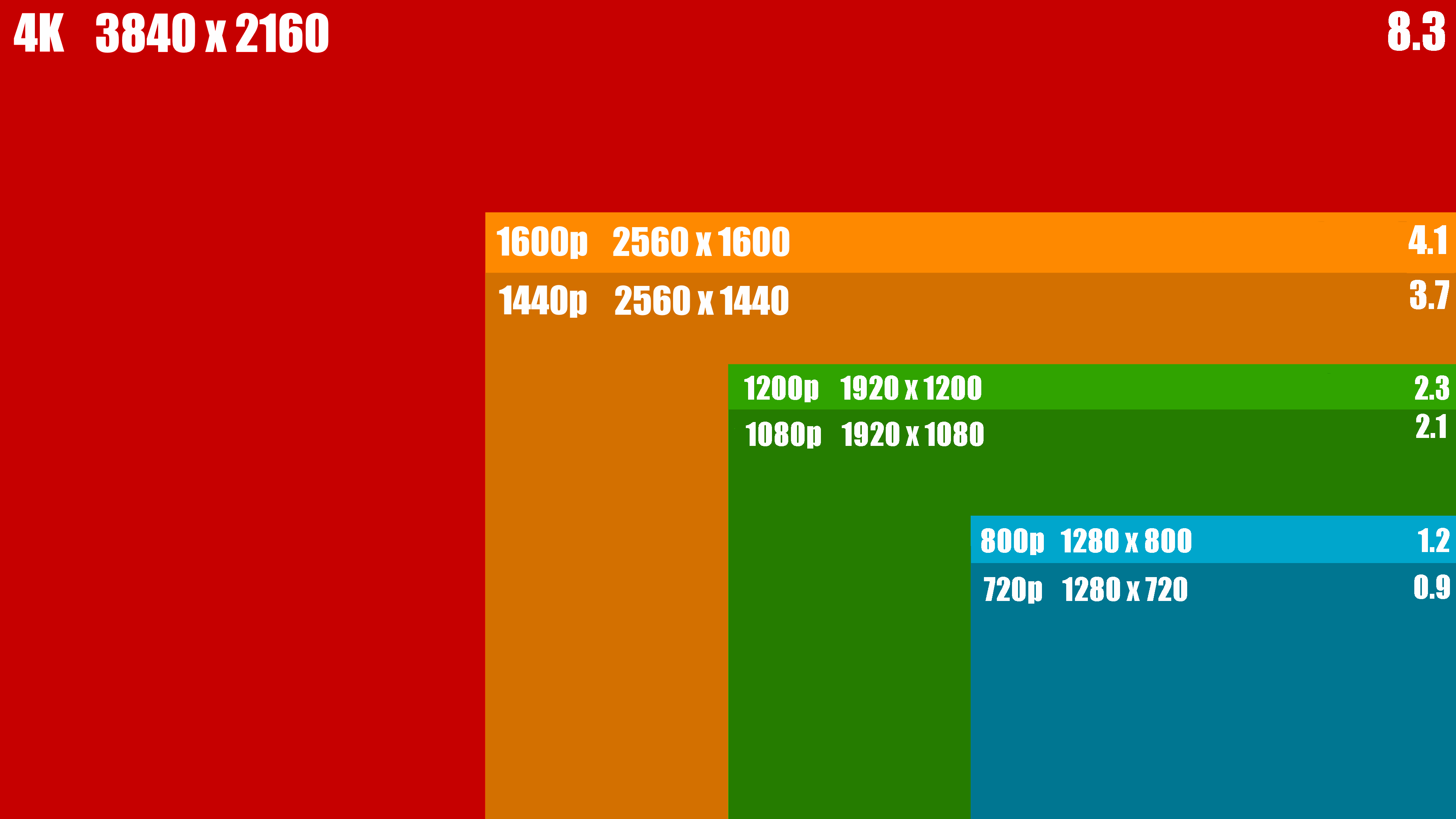
This matters mostly because of 4k, aka 2160p, aka 3840 × 2160, aka Ultra HD.
Plain old regular HD, aka 1080p, aka 1920 × 1080, is one quarter the size of 4k, and ¼ the work. By today’s GPU standards HD is pretty much easy mode these days. It’s not even interesting. No offense to console fans, or anything.
Late in 2016, I got a 4k OLED display and it … kind of blew my mind. I have never seen blacks so black, colors so vivid, on a display so thin. It made my previous 2008 era Panasonic plasma set look lame. It’s so good that I’m now a little angry that every display that my eyes touch isn’t OLED already. I even got into nerd fights over it, and to be honest, I’d still throw down for OLED. It is legitimately that good. Come at me, bro.
Don’t believe me? Well, guess which display in the below picture is OLED? Go on, guess:
@andrewbstiles if it was physically possible to have sex with this TV I.. uh.. I’d take it on long, romantic walks
In my extended review at Reference Home Theater, I call it “the best looking TV I’ve ever reviewed.” But we aren’t alone in loving the E6. Vincent Teoh at HDTVtest writes, “We’re not even going to qualify the following endorsement: if you can afford it, this is the TV to buy.” Rtings.com gave the E6 OLED the highest score of any TV the site has ever tested. Reviewed.com awarded it a 9.9 out of 10, with only the LG G6 OLED (which offers the same image but better styling and sound for $2,000 more) coming out ahead.
But I digress.
Playing games at 1080p in my living room was already possible. But now that I have an incredible 4k display in the living room, it’s a whole other level of difficulty. Not just twice as hard – and remember current consoles barely manage to eke out 1080p at 30fps in most games – but four times as hard. That’s where external GPU power comes in.
The cool technology underpinning all of this is Thunderbolt 3. The thunderbolt cable bundled with the Razer Core is rather … diminutive. There’s a reason for this.
Is there a maximum cable length for Thunderbolt 3 technology?
Thunderbolt 3 passive cables have maximum lengths.
0.5m TB 3 (40Gbps)
1.0m TB 3 (20Gbps)
2.0m TB 3 (20Gbps)
In the future we will offer active cables which will provide 40Gbps of bandwidth at longer lengths.
40Gbps is, for the record, an insane amount of bandwidth. Let’s use our rule of thumb based on ultra common gigabit ethernet, that 1 gigabit = 120 megabytes/second, and we arrive at 4.8 gigabytes/second. Zow.
That’s more than enough bandwidth to run even the highest of high end video cards, but it is not without overhead. There’s a mild performance hit for running the card externally, on the order of 15%. There’s also a further performance hit of 10% if you are in “loopback” mode on a laptop where you don’t have an external display, so the video frames have to be shuttled back from the GPU to the internal laptop display.
This may look like a gamer-only thing, but surprisingly, it isn’t. What you get is the general purpose ability to attach any PCI express card to any computer with a Thunderbolt 3 port and, for the most part, it just works!
Linus breaks it down and answers all your most difficult questions:
Please watch the above video closely if you’re actually interested in this stuff; it is essential. I’ll add some caveats of my own after working with the Razer Core for a while:
Make sure the video card you plan to put into the Razer Core is not too tall, or too wide. You can tell if a card is going to be too tall by looking at pictures of the mounting rear bracket. If the card extends significantly above the standard rear mounting bracket, it won’t fit. If the card takes more than 2 slots in width, it also won’t fit, but this is more rare. Depth (length) is rarely an issue.
There are four fans in the Razer Core and although it is reasonably quiet, it’s not super silent or anything. You may want to mod the fans. The Razer Core is a remarkably simple device, internally, it’s really just a power supply, some Thunderbolt 3 bridge logic, and a PCI express slot. I agree with Linus that the #1 area Razer could improve in the future, beyond generally getting the price down, is to use fewer and larger fans that run quieter.
If you’re putting a heavy hitter GPU in the Razer Core, I’d try to avoid blower style cards (the ones that exhaust heat from the rear) in favor of those that cool with large fans blowing down and around the card. Dissipating 150w+ is no mean feat and you’ll definitely need to keep the enclosure in open air … and of course within 0.5 meters of the computer it’s connected to.
There is no visible external power switch on the Razer Core. It doesn’t power on until you connect a TB3 cable to it. I was totally not expecting that. But once connected, it powers up and the Windows 10 Thunderbolt 3 drivers kick in and ask you to authorize the device, which I did (always authorize). Then it spun a bit, detected the new GPU, and suddenly I had multiple graphics card active on the same computer. I also installed the latest Nvidia drivers just to make sure everything was ship shape.
It’s kinda … weird having multiple GPUs simultaneously active. I wanted to make the Razer Core display the only display, but you can’t really turn off the built in GPU – you can select “only use display 2”, that’s all. I got into several weird states where windows were opening on the other display and I had to mess around a fair bit to get things locked down to just one display. You may want to consider whether you have both “displays” connected for troubleshooting, or not.
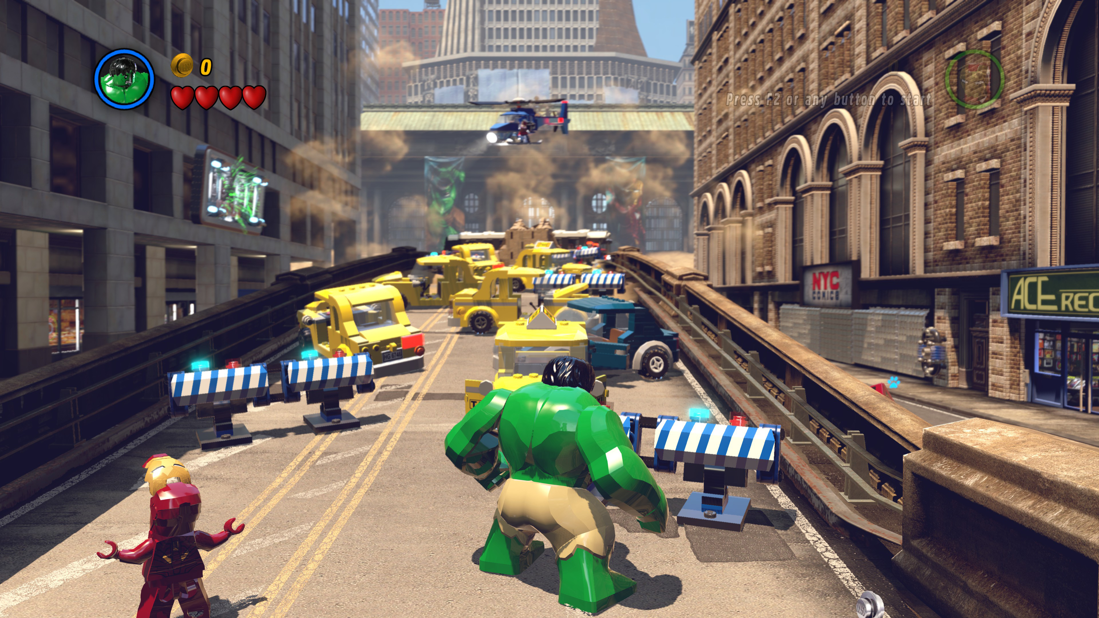
And then, there I am, playing Lego Marvel in splitscreen co-op at glorious 3840 × 2160 UltraHD resolution on an amazing OLED display with my son. It is incredible.
Beyond the technical “because I could”, I am wildly optimistic about the future of external Thunderbolt 3 expansion boxes, and here’s why:
The main expense and bottleneck in any stonking gaming rig is, by far, the GPU. It’s also the item you are most likely to need to replace a year or two from now.
The CPU and memory speeds available today are so comically fast that any device with a low-end i3-7100 for $120 will make zero difference in real world gaming at 1080p or higher … if you’re OK with 30fps minimum. If you bump up to $200, you can get a quad-core i5-7500 that guarantees you 60fps minimum everywhere.
If you prefer a small system or a laptop, an external GPU makes it so much more flexible. Because CPU and memory speeds are already so fast, 99.9% of the time your bottleneck is the GPU, and almost any small device you can buy with a Thunderbolt 3 port can now magically transform into a potent gaming rig with a single plug. Thunderbolt 3 may be a bit cutting edge today, but more and more devices are shipping with Thunderbolt 3. Within a few years, I predict TB3 ports will be as common as USB3 ports.
A general purpose external PCI express enclosure will be usable for a very long time. My last seven video card upgrades were plug and play PCI Express cards that would have worked fine in any computer I’ve built in the last ten years.
External GPUs are not meaningfully bottlenecked by Thunderbolt 3 bandwidth; the impact is 15% to 25%, and perhaps even less over time as drivers and implementations mature. While Thunderbolt 3 has “only” PCI Express x4 bandwidth, many benchmarkers have noted that GPUs moving from PCI Express x16 to x8 has almost no effect on performance. And there’s always Thunderbolt 4 on the horizon.
The future, as they say, is already here – it’s just not evenly distributed.
I am painfully aware that costs need to come down. Way, way down. The $499 Razer Core is well made, on the vanguard of what’s possible, a harbinger of the future, and fantastically enough, it does even more than what it says on the tin. But it’s not exactly affordable.
I would absolutely love to see a modest, dedicated $200 external Thunderbolt 3 box that included an inexpensive current-gen GPU. This would clobber any onboard GPU on the planet. Let’s compare my Skull Canyon NUC, which has Intel’s fastest ever, PS4 class embedded GPU, with the modest $150 GeForce GTX 1050 Ti:
1920 × 1080 high detail
Bioshock Infinite
15 ? 79 fps
Rise of the Tomb Raider
12 ? 49 fps
Overwatch
43 ? 114 fps
As predicted, that’s a 3x-5x stompdown. Mac users lamenting their general lack of upgradeability, hear me: this sort of box is exactly what you want and need. Imagine if Apple was to embrace upgrading their laptops and all-in-one systems via Thunderbolt 3.
I know, I know. It’s a stretch. But a man can dream … of externally upgradeable GPUs. That are too expensive, sure, but they are here, right now, today. They’ll only get cheaper over time.
One important tool for every human, and especially for web workers, is the calendar. A majority of the daily organization is done on them – and not just on a single device such as the paper planner from the old days.
It is important that appointments and tasks are correctly displayed, and kept up to date on every device, such as notebook and smartphone. For Apple users, this is simple, because the Apple operating systems take care of that themselves. But by now, there are good and elaborate solutions for Windows and Android as well. Today, I will introduce you to the best cross-platform solutions, so that you stay organized, and don’t miss any appointments.
Note that I wrote „cross-platform.” This means that you won’t find any apps here that are exclusive to one platform. The minimum precondition to be featured here was the availability of a web app.
Once Upon a Time: Apple’s iCal is Now Called Calendar and Looks a Lot More Modern.
What Makes for a Good Calendar / Taskmanager Solution
Nowadays, the average creative does not work on a single device anymore. Instead, aside from the computer or notebook, smartphones or tablets are used as well. Thus, the first, and most important requirement is a fast and reliable synchronization of appointments and tasks across all used devices. A clear structure is just as important. You have to be able to find your way quickly. It also wouldn’t hurt if there were the option to share appointments and deadlines with others.
We’ve taken a look at a couple of solutions from these points of view. Here are the results:
Sunrise Calendar
Sunrise was a promising solution until it was taken over and discontinued by Microsoft. The servers have been resting since mid-2016. Now, a few features are supposed to be directly integrated into Outlook. I have not seen anything on that as of right now. For the sake of melancholy, I’ll still leave the Sunrise Calendar in this article for a while. (ahe)
Microsoft Outlook
Microsoft Outlook has been a thing for a solid twenty years now, and it has never been free of charge. Ever since Outlook.com replaced the previous free mailers Hotmail and Live Mail, the overall image is differentiated. Outlook as a program is still charged for Windows computers. You can either buy it for about 135 Euro, or rent it with the rest of the Office365 series. If you do that, it will cost you 69 Euro a year, while giving you access to all Office products, as well as one Terabyte of online storage on OneDrive. With Dropbox, storage alone would be more expensive, which was the reason why I switched from Dropbox to OneDrive, by the way.
However, if you don’t want to spend any money, you could also use the Outlook web app just like the mobile apps that are available for Android, iOS, and Windows smartphones. Outlook also integrates Mac and Google calendars, letting you build some type of news and appointment center that works via the web, and on your mobile devices.
Microsoft Outlook for Mobile: Android on the Left, iOS on the Right
I use Outlook as my default mail client on both iOS and Android. I am still not exhausting the software, though. I could also use it to manage my appointments. I also have them integrated, so I get a complete overview in Outlook. The only thing I don’t do is managing them in there, but that’s personal preference. For me, the reason for that is that I use the Google apps on the desktop, so on mobile devices, all I need is a good overview of the data.
On iOS, I mainly use Outlook for its ability to separate the few relevant from the masses of other messages. I have disabled notifications for other messages, making sure that iOS will only notify me when there are important mails. In the other case, using the iOS mail app, I would get a notification every couple of minutes. Annoying.
Microsoft Outlook: Web App
Outlook definitely belongs into our overview. Even the free version provides enough comfort and synchronization options to meet higher standards. By the way, if you also need a desktop version to access the information, you can just use the built-in programs on macOS. Under Windows, use the mail app and start the calendar app from there. All of that works very smoothly. (dpe)
Wunderlist
Wunderlist: Landing Page
Speaking of Microsoft, we might as well take a look at Wunderlist as a cross-platform taskmanager solution. Wunderlist was also swallowed by the company from Redmond, but, at least for now, it didn’t suffer the same fate as the Sunrise app. Instead, the task manager from Berlin is still being operated in the same way as before. Aside from the free version, there is a Wunderlist Pro for 4.49 Euro a month that contains slightly expanded functionalities for powerusers. I have never reached these limits.
Wunderlist shines with its extremely broad platform support since the beginning, and nothing has changed about that. There are native apps for macOS, Windows, Android, iOS, and Windows smartphones. You can also integrate bookmarklets for Chrome, Firefox, and Safari, or install a Chrome extension. Wunderlist is seamlessly integrable into Microsoft’s Outlook.
Wunderlist: No Matter Which App You Use. The Look is Always the Same.
Aside from all the native options, Wunderlist can also be used as a web app – it basically doesn’t get more flexible than that. Especially in conjunction with Outlook, Wunderlist displays all of its strengths to the fullest, but users of other systems and services shouldn’t hesitate to use it either. (dpe)
Kin Calendar
The Kin Calendar is currently in a beta stage which is only accessible via invite. According to the developers, the creation of this solution directly relates to the vanishing of the Sunrise Calendar. Because of that, it is no surprise that Kin strongly orientates itself towards the faded role model in terms of design.
Kin Calendar: Pretty, But Still Very Rudimentary.
At the current moment, Kin is no real alternative to other solutions mentioned in this article, even for people like me, who do have an invite. Sure, Kin looks fantastic. All interactions are smoothly animated, and there are some integrations with services like Trello, or Wunderlist already. Visually, Kin is a stunner. But there’s not much else here yet, and no mobile apps either.
If, however, the speed of innovation should keep going at this pace, Kin may soon rise to become one of the stars of this article. (dpe)
Google Calendar
Google delivers a classic amongst the cross-platform calendar solutions. Google Calendar can be synchronized with Android and iOS perfectly, and even the Mac calendar is usable in conjunction with Google Calendar. Of course, there are apps for both Android and iOS. Additionally, iOS and Mac users can use Google Calendar with their native calendar solutions after a simple configuration. Windows users either get to use the web interface or synchronize Google Calendar with the Thunderbird extension Lightning. The Microsoft solution Outlook is also fully compatible with the Google Calendar.
The good thing is, that users can share their calendars, both publicly and with selected people. One peculiarity is that it’s possible to subscribe to the Google Calendar via feed. Furthermore, you get to embed the calendars in websites, a feature that not a lot of services have to offer. Now, it’s almost natural that you get to invite other people to events. (ahe)
Any.do is not a calendar app, but a task manager. The paid app is easy to use and perfectly synchronizes on all devices. There are apps for Android and iOS respectively, there is a particular extension for Chrome, and a web interface.
The to-do lists can be shared with friends, family members or colleagues. Share the buying list with your partner, plan an event with your friends, or simply keep track of an occupational project. Any.do can be integrated into Gmail via extension, chiming into every email to provide task options. (ahe)
Any.do Cal
Probably due to the large success of the task manager app, the creators of Any.do decided to put out a calendar to go with the task planner. This one has the simple name Cal and seamlessly ties into the look of Any.do.
This video only shows the Android App. However, it is mostly identical to the iOS version both visually and functionally. In contrast to Any.do itself, there is no web app, at least for now. Cal is available for free as well.
The catch is, that Cal is not an actual calendar, but can only be used as the frontend for a calendar that you have set up somewhere else. For example, you get to manage your Google Calendar using Cal. That means, if you don’t use a calendar service yet, Cal is not an alternative for you.
Cal by Any.do: The App is Pretty, No Doubt.
Cal only gets you full utility when using it together with the task manager Any.do, which is why you can, and should, connect the two services. If you don’t do that, Cak will repeatedly annoy you with the recommendation to do it.
When using Cal, it is very clear that the developers’ main focus was the design. This caused decisions that are questionable in some spots. Of course, it looks a lot better when only one day is visible. But sometimes, an overview over an entire week, or at least an agenda view would be a lot more helpful. Cal doesn’t provide either. Instead, you get the most beautiful dialog for adding new appointments on the market. (dpe)
Todoist
Todoist is celebrating its tenth birthday in 2017. By now, almost 50 people are working on the service that recently welcomed its 10 millionth user. Todoist had its own approach from the very beginning, its own idea of task management. I don’t know if, or how often the team has had internal discussions about adding a calendar to the task management. Anyway, this has not happened yet, and after ten years, I wouldn’t expect it to.
So the first thing we notice when looking for a calendar is that there’s no calendar. In Todoist, the display of tasks is generally done in lists. Here, there are time-related lists like “today” and “following seven days”. In there, you’ll also see the days with no tasks assigned to them, so, with a lot of fantasy, you could use this view as a calendar. Of course, how you use Todoist is your thing. You could just enter all appointments as tasks, even though it was not meant to be done that way.
One key strength of Todoist is its extensive platform support. No matter which mobile device you use, there’s an app. Native apps are also available for Windows and macOS, even though the web app was still completely sufficient to me. I don’t use a native Todoist app on desktop devices. Instead, I use the web interface exclusively.
On top of all the apps, there are several extensions available for Todoist, allowing users to integrate Todoist into Gmail or Outlook, for instance. I also like to use the browser extension that allows me to add the website I just visited as a task.
Visually, Todoist is reduced to the absolute minimum, making working with the service very simple and focused. Todoist has been doing everything that is now being preached regarding design for ten years already.
Todoist: Lots of Whitespace and a Clear Design. (Photo: Todoist)
My favorite feature is the option to enter appointments using natural language. For instance, when typing “Tomorrow morning at 8 am”, Todoist will enter the appointment correctly. The same thing goes for setting up returning appointments via “every Monday at 8 am”, for example.
Overall, Todoist offers a matured package that doesn’t leave much to be desired. Of course, this also makes it easy to delegate tasks and manage them in a team. Segmented projects and sub-tasks allow for much higher clarity within complex task relations. All of these features are available for free.
However, if you want to work with comments, or sort tasks via tags and filters, you need a premium account. This one comes in at a reasonable 28.99 Euro a year. You can inform yourself about the different plans here. (dpe)
Jorte
Jorte is a calendar from the land of the rising sun which should explain the playful, corny design to the western eyes. Jorte is available for smartphones under iOS, Android, and Windows, as well as a web app called Jorte Cloud. Regarding the looks, all types of bad taste are supplied, with even a cinnamon-like design being selectable.
Regarding functionality, Jorte orientates itself towards proven concepts from the analog world, such as the idea of a Filofax. The app covers notes, appointments, and tasks all at once, making it an excellent choice for the daily routine. Similarly to Google Calendar, external calendars can be integrated into Jorte, so that you always see when the next school vacation or holiday is, as long as you have publicly available calendars integrated. You can also share your calendars with a team or even publicly. There are no further options, such as e.g. delegation.
While the web app runs smoothly, the mobile apps are what will be the most fun to the fans of this calendar. Here, you get to directly add photos to appointments, while being able to choose from a large variety of different icons and fonts. If you like it…
To turn off the ads in Jorte, you have to pay 3.99 USD a year. If you are a fan of playful designs, you can get a large variety for 1.99 USD a month. If you want to tie Evernot to Jorte, that will cost 2.99 USD a month for the premium plan. (dpe)
SmartDay – Collaborative Appointment and Task Manager
SmartDay by Leftcoastlogic considers itself to be a one-stop shop for appointment and task management of real people. It wants to organize appointments, tasks, notes, and projects alike and comprehensively focuses on collaboration. Thus, comments can be written on each task and every appointment, tasks can be delegated, and projects shared. The smart thing about SmartDay is supposed to be that, if you want to, your tasks can automatically be scheduled inbetween your other appointments.
SmartDay is available for the web as mySmartDay.com. Here, it is free and mainly meant as a synchronization hub for the macOS, iOS, and Android apps. While using the web app is free, you will have to pay 9.99 EUR for the macOS, 4.99 EUR for the iOS, and 3.64 EUR for the Android version. The prices are a one-time payment, not a subscription.
Fruux – Contacts, Calendars & Tasks
Fruux, a startup from Münster in Germany, has set their goal to synchronize everything with everyone in realtime. Thus, fruux is used with the apps that we already know and love. The synchronization solution is not tied to a particular operating system; it is simply meant to work with everything. No matter if you use Windows, Linux, macOS, Android, or iOS. Share your calendar with friends, create a team address book, or work out other things you’d like to share. All information you entrust fruux with is stored on their internal cloud on European servers.
After signing up for the free basic account, you’ll be asked to synchronize your devices and application, which is done pretty quickly and easily. This is only needed once, and after that, fruux takes care of the work and keeps all connected devices synchronous. In general, contacts, calendars, and task lists can be synchronized.
After that’s done, fruux can be used on any device in any place. In the free basic version, it is possible to synchronize two devices.
If you need to synchronize more, or if you want to enjoy fruux’ advantages with your team, you have to choose one of the premium accounts.
The Pro account is affordable at 4 EUR a month. This lets you synchronize up to tem devices or applications. This way, you also get to share things with others as often as you like. (ahe)
Conclusion
Particularly in the area of cross-platform calendars and task managers, there’s a need for development. In my opinion, the best solution in our small test field was the Sunrise Calendar. Unfortunately, it has taken the way of all flesh.
The second app that sets itself apart from the masses is Any.do, which I find very exciting. No costs, and reduced to the basics – but only for task management. However, the app Cal, by the same developer, does an insufficient job at completing the package.
Google Calendar, on the other hand, could use some further development and thought. Google’s designers should take another look at it. Of course, the Google Calendar is not bad regarding functionality, no doubt.
Microsoft Outlook stands out here, as it is possible to integrate it with many services. For example, you could manage your Google Calendar with Outlook.
For appointments, I use the Google Calendar, and for tasks, I use Todoist. What are you using?
Social media has quickly morphed into one of the most important marketing channels. Within a few short years, it has moved from being a mere fad into the most powerful marketing tool on the planet. Facebook, for example, is just over a decade old but no business can afford not to have a Facebook marketing … Continue reading 9 Social Media Marketing Tips to Deliver Better Results
Social media has quickly morphed into one of the most important marketing channels. Within a few short years, it has moved from being a mere fad into the most powerful marketing tool on the planet. Facebook, for example, is just over a decade old but no business can afford not to have a Facebook marketing … Continue reading 9 Social Media Marketing Tips to Deliver Better Results
Social media has quickly morphed into one of the most important marketing channels. Within a few short years, it has moved from being a mere fad into the most powerful marketing tool on the planet. Facebook, for example, is just over a decade old but no business can afford not to have a Facebook marketing
We’ve all been there. You’ve got an element you want to be able to collapse and expand smoothly using CSS transitions, but its expanded size needs to be content-dependent. You’ve set transition: height 0.2s ease-out. You’ve created a collapsed CSS class that applies height: 0. You try it out, and… the height doesn’t transition. It snaps between the two sizes as if transition had never been set. After some fiddling, you figure out that this problem only happens when the height starts out or ends up as auto. Percentages, pixel values, any absolute units work as expected. But all of those require hard coding a specific height beforehand, rather than allowing it to naturally result from the size of the element content.
In this article I mostly speak in terms of height for simplicity, but everything here also applies to width.
If you were hoping I had a magical, complete solution to this problem, I’m sorry to disappoint you. There’s no one solution that achieves the desired effect without downsides. There are, however, multiple workarounds that each come with a different set of advantages and disadvantages, and in most use cases at least one of them will get the job done in an acceptable manner. I’ll outline the major ones, and list out their ups and downs so you can hopefully pick the best one for your situation.
Why hasn’t this problem been fixed at the browser level?
According to the Mozilla Developer Network docs, auto values have been intentionally excluded from the CSS transitions spec. It looks like it’s been requested by a few people, but when you think about it, it makes at least a little sense that it hasn’t been included. The browser process that re-calculates the sizes and positions of all elements based on their content and the way they interact with each other (known as “reflow”) is expensive. If you were to transition an element into a height of auto, the browser would have to perform a reflow for every stage of that animation, to determine how all the other elements should move. This couldn’t be cached or calculated in a simple way, since it doesn’t know the starting and/or ending values until the moment the transition happens. This would significantly complicate the math that has to be done under the hood and probably degrade performance in a way that might not be obvious to the developer.
Technique 1: max-height
If you web search this problem, the max-height approach will probably be mentioned in all of the first five to ten results. It’s actually pretty unideal, but I thought it was worth including here for the sake of comparison.
It works like this: CSS values can only be transitioned to and from fixed unit values. But imagine we have an element whose height is set to auto, but whose max-height is set to a fixed value; say, 1000px. We can’t transition height, but we can transition max-height, since it has an explicit value. At any given moment, the actual height of the element will be the maximum of the height and the max-height. So as long as max-height‘s value is greater than what auto comes out to, we can just transition max-height and achieve a version of the desired effect.
One is obvious, and one is subtle. The obvious disadvantage is that we still have to hard-code a maximum height for the element, even if we don’t have to hard-code the height itself. Depending on your situation, maybe you can guarantee that you won’t need more height than that. But if not, it’s a pretty big compromise. The second, less obvious downside, is that the transition length will not actually be what you specify unless the content height works out to be exactly the same as max-height. For example, say your content is 600px tall, and your max-height is transitioning from 0px to 1000px with a duration of 1 second. How long will it take the element to get to 600px? 0.6 seconds! The max-height will continue transitioning, but the real height will stop changing once it reaches the end of its content. This will be even more pronounced if your transition is using a nonlinear timing function. If the transition is fast at the beginning and slow at the end, your section will expand quickly and collapse slowly. Not ideal. Still, transitions are relatively subjective, so in cases where this technique is otherwise appropriate, it could be an acceptable tradeoff.
Technique 2: transform: scaleY()
If you aren’t familiar with the transform property, it allows you to apply GPU-driven transformations (translate, scale, rotate, etc.) to an element. It’s important to note a couple of things about the nature of these transformations:
They operate on the element’s visual representation as if it were simply an image, rather than a DOM element. This means, for example, that an element scaled up too far will look pixellated, since its DOM was originally rendered onto fewer pixels than it now spans.
They do not trigger reflows. Again, the transform doesn’t know or care about the element’s DOM structure, only about the “picture” the browser drew of it. This is both the reason this technique works and its biggest downside.
Implementation works like this: we set a transition for the element’s transform property, then toggle between transform: scaleY(1) and transform: scaleY(0). These mean, respectively, “render this element at the same scale (on the y axis) that it starts out at” and “render this element at a scale of 0 (on the y axis)”. Transitioning between these two states will neatly “squish” the element to and from its natural, content-based size. As a bonus, even the letters and/or images inside will visually “squish” themselves, rather than sliding behind the element’s boundary. The downside? Since no reflow is triggered, the elements around this element will be completely unaffected. They will neither move nor resize to fill in the empty space.
The advantages and disadvantages of this approach are stark
It will either work very well for your use-case or won’t be appropriate at all.
This mainly depends on whether or not any elements follow the one in question in the flow of the document. For example, something that floats over the main document like a modal or a tooltip will work perfectly this way. It would also work for an element that’s at the bottom of the document. But unfortunately, in many situations, this one won’t do.
Technique 3: JavaScript
Managing a CSS transition in CSS would be ideal, but as we’re learning, sometimes it just isn’t entirely possible.
If you absolutely have to have smoothly collapsing sections, whose expanded size is completely driven by their content, and which other elements on the page will flow around as they transition, you can achieve that with some JavaScript.
The basic strategy is to manually do what the browser refuses to: calculate the full size of the element’s contents, then CSS transition the element to that explicit pixel size.
Let’s deconstruct this a little bit. The first thing to note is that we keep track of whether or not the section is currently collapsed using the data-collapsed attribute. This is necessary so we know what to “do” to the element each time its expansion is toggled. If this were a React or Angular app, this would be a state variable.
The next thing that might stand out is the use of requestAnimationFrame(). This allows you to run a callback the next time the browser re-renders. In this case, we use it to wait to do something until the style we just set has taken effect. This is important where we change the element’s height from auto to the equivalent explicit pixels value because we don’t want to wait on a transition there. So we must clear the value of transition, then set height, then restore transition. If these were sequential lines in the code, the result would be as if they’d all been set simultaneously since the browser doesn’t re-render in parallel to Javascript execution (at least, for our purposes).
The other idiosyncrasy is where we set height back to auto once the expansion has finished happening. We register an event listener with transitionend, which fires whenever a CSS transition concludes. Inside of that event listener, we remove it (since we only want it to respond to the immediately following transition), then remove height from the inline styles. This way, the element size is back to being defined however the normal styles for the page define it. We don’t want to assume that it should remain the same pixel size, or even that it should remain auto sized. We want our JavaScript to perform the transition, and then get out of the way and not interfere more than necessary.
The rest is fairly straightforward. And, as you can see, this achieves exactly the desired result. That said, despite best efforts, there are quite a few ways in which this makes our code more brittle and potentially bug-prone:
We’ve added 27 lines of code instead of 3
Changes to things like padding or border-box in our section element could require changes to this code
CSS transitions on the section, that happen to end while the height transition is still going, could cause height not to be returned to its default value
Disabling transition for one frame could disrupt other transitions on that element which happen to be going at the same time
If a bug ever caused the element’s height style to get out of sync with its data-collapsed attribute, its behavior could have problems
On top of all that, the code we’ve written is procedural instead of declarative, which inherently makes it more error-prone and complex. All that said, sometimes our code just needs to do waht it needs to do, and if it’s worth the tradeoffs then it’s worth the tradeoffs.
Bonus Technique: Flexbox
I call this technique a bonus because it doesn’t technically achieve the desired behavior. It offers an alternate way of determining your elements’ sizes which in many cases may be a reasonable replacement, and which does fully support transitions.
You may want to read about flexbox and flex-grow before reading this section, if you’re not familiar with them already.
Flexbox is an extremely powerful system for managing the way your interface’s sizing adapts to different situations. Many articles have been written about this, and I won’t go into it in detail. What I will go into, is the lesser-mentioned fact that the flex property and others related to it fully support transitions!
What this means, is that if your use case allows you to determine sizing using flexbox instead of your content size, making a section smoothly collapse is as simple as setting transition: flex 0.3s ease-out and toggling flex: 0. Still not as good as being content-based, but more flexible (I know, I know, I’m sorry) than going to and from pixel sizes.
Welcome to another edition of Browser Watch, the regular feature that runs down the latest news and developments among all the most popular and up-and-coming browsers available. Whether you’re a designer, developer or both, you’ll always be kept up to date on everything that’s going in the browser world.
Material Design Extensions Page Part of Latest Chrome Development Release
Google Chrome’s extensions page hasn’t been altered in a while, but that’s recently changed. In essence, the extensions page received a grid-based redesign, so users have an easier time being able to spot at a glance what the extensions have been enabled. Tabs on the left side are for Chrome apps and extensions; the items inside can now be either enabled or disabled courtesy of a Material Design-inspired on/off toggle. To see the extensions page, users will have to activate a flag to see it inside the development build.
Apple Increasing Malware Protection on Chrome for macOS
In a bid to improve security, Apple is improving protection against malware in Chrome; this malware preys on macOS devices on the web. Apple has a two-part plan to combat this malware against macOS users. First, the company recently released the Chrome Settings API for Mac, which came with Chrome 56. Second, Apple is relying on Google’s Safe Browsing Technology to show in-browser alerts when a user wants to visit a known website with questionable security.
Safari Technology Preview 25 Released
Apple has released Safari Technology Preview 25 that comes with bug fixes and improvements to known features. At the one-year anniversary mark, Safari Technology Preview’s latest version includes improvements to:
Resource Timing
Rendering
Media
CSS
WebCrypto
User Timing
Web API
Web Inspector
One of the biggest changes is that Resource Timing is now going to be available by default.
(Safari Technology Preview was intended by Apple to be a place where it could experiment with and test certain features that could eventually be introduced in future, wide releases of Safari.)
Komando.com Says Unheard of Dolphin Browser Rivals Chrome and Firefox
Even if you’re using popular browsers’ mobile versions, chances are that they still take a backseat to their desktop versions when it comes to performance. According to a piece on Komando.com, the Dolphin browser gives both Chrome and Firefox a run for their money when it comes to a mobile-browsing experience. Unlike all other browsers, the Dolphin was specifically designed from its inception to tweak the user experience during mobile browsing.
Apple Safari…Going the Way of Internet Explorer?
While Apple still supports its browser—unlike Internet Explorer, on which Microsoft pulled the plug on a few years ago—reports indicate that Safari is shedding users at an alarming rate. According to a recent report, Safari has lost a significant 19% of its users in only the past two years, which isn’t good if Apple wants Safari to remain competitive with Chrome, Firefox and even upstarts like Vivaldi.
Firefox Debuts Support for WebAssembly
Mozilla’s latest update, Firefox 52, is a one-of-a-kind browser: It is the first browser to support something called WebAssembly, an burgeoning standard that saw its roots in a Mozilla research project. WebAssembly should please video-game fans, as it allows sophisticated apps, such as games, to run faster than ever before inside a web browser. WebAssembly is expected to enable apps that have typically been too complicated to properly run in browsers. That would include 3D video games and scientific visualization, among others.
Brave, the Ad-Blocking Browser, Now Syncs Between Desktops
The new browser from ex-Mozilla CEO Brendan Eich is known for ad-blocking, but now, it’s also one step closer to having another feature that virtually all browsers offer as standard: the ability to sync between computers. Note that users still won’t be able to sync between all devices (read: mobile)—just between desktops. This should help drive a few more users to Brave, as sync support is at least a promising step in the right direction (mobile sync is apparently in the works).
Opera Browser and Instant Page Loading
Instant page loading sounds intriguing, you have to admit. That’s just what’s new in Opera’s latest release, Opera 43. Here’s how instant page loading works: It uses predictive technology to start to load a site in the background prior to the user finishing putting the entire URL into the address bar. This version of Opera is also the fastest yet. This is all part of Opera’s goal to make the browser smarter over time by understanding what sites are attached to URL inputs.
Security Flaw in Microsoft Edge and Internet Explorer?
This time, it’s Google warning users about a serious security flaw in both Edge and Internet Explorer. The security problem pertains to how both of the browsers end up formatting webpages. Ivan Fratric, a well-known Google researcher, initially discovered the flaw late last year, but, unfortunately, Microsoft has not yet patched it. Further, the company hasn’t announced when it’s going to patch the flaw (if at all), thereby leaving millions of users around the globe vulnerable.
Chrome Is Going to Support Virtual Reality
Google is looking to push and surpass the limits of its leading browser by making the newest version of its browser support virtual reality on the web. As a result, it’ll be possible for users to look at virtual reality on any device as well as over any platform. Of course, at the moment, only a handful of sites actually provide virtual-reality content for users. Google, unsurprisingly, is working hard to up this number, just in time for its support of VR on the web.
Every time I use the word “serverless”, which is somewhat regularly lately, as we’ve had a few articles using the term lately and use the concept at CodePen for a variety of things, I get some version of:
CMON BRAH YOU’RE STILL USING “SERVERS”.
And they aren’t wrong. Yes, when you build things on the web, there are always servers involved. Always. Whether it’s some old computer in a church basement, a computer in a rack at some big hosting company, or “The Cloud”, it’s a server.
Chris Wattersons’s classic sticker.
I rolled my eyes at the term the first few times I heard it too. But now I’m hesitant to call it a bad term, in part because it’s really stuck, and there is something to be said for new terms that catch on so strongly. Also in part because it signifies a dramatic change in how you can use servers. It’s different economically, different devops-wise, and different in how you code for them.
To many of us, we’re aware a server is a computer. There are various ways to buy them, but you buy them. Here’s some money, here’s your server. It might be virtual, but it’s still something you’re responsible for. You put software on it. You spin them up and spin them down. You load balance them. You make choices about how much memory and disk space they have. You’re in charge of provisioning and managing them.
What serverless is trying to mean, it seems to me, is a new way to manage and pay for servers. You don’t buy individual servers. You don’t manage them. You don’t scale them. You don’t balance them. You aren’t really responsible for them.
You just pay for what you use. For example, AWS Lambda is free for 1,000,000 requests and then costs $0.0000002 per request after that. Cheap. Just this week Firebase launched “functions” which are essentially a serverless concept, and their $25 a month plan has 2,000,000 requests (along with all the rest of the stuff Firebase gets you).
That doesn’t work for all applications. It works for things in which you can write some code that is designed to take some stuff, do some work, and return some new stuff. You write an API.
You don’t have to go all in with the “serverless” idea. You can, and I imagine most people do, use it for things that make sense to use it for, and use traditional servers for the rest.