As a graphic designer, whether you work freelance or for an agency, you are constantly surrounded by clients. Each of of them come with a folder of expectations and requirements, that’s why we need a bit of organization to make our lives easier. The purpose of this article is to give you a few pointers when it comes to your organization skills. Some of them might sound a little obvious, but it’s typically that advice that people look over the most often.
When you work for an agency, there is a project manager that helps you with organizing your work. The most important thing is to not lose your head trying to keep up. There are many organizational techniques you could use according to your work style.
No matter what kind of work you do, there’s always a lot of information to be filed. I find it helpful to categorize each different topic according to project and date. You’ll be thanking yourself when you have to go back and reference a specific project. You won’t have to go back through weeks or even months of hard work to find that one piece to the puzzle. Instead, it’ll all be laid out, beautifully organized in front of you.
When you’re working on any project, big or small, make copies. Things accidentally get deleted, programs crash, and accidents just happen. In order to avoid a total meltdown, take the few extra seconds it takes to make a copy and safely store it in a backup file.
Possibly the best advice anyone can give you is to invest in an organization software like Trello or Basecamp. It doesn’t have to be fancy, and often times they’re free, but they’re infinitely helpful. At the very least, you could be marking things down with a pen and paper. Let’s take time to look at some of these tools that could actually help you keep things organized as a graphic designer.
1. Trello
We love Trello because it works perfectly for people who work independently, not necessarily in a team. With Trello, you can create boards, lists, cards that help you organize and prioritize your project in a way that doesn’t seem irritating. On top of all that, Trello offers a free version, so it’s easy to get started.
2. Basecamp
Basecamp is a great tool that combines all the tools you need to stay organized in one place. There are plenty of features to help you collaborate, share information, and store data for projects. Although it’s not exactly free, Baecamp is a great solution for your organization needs.
3. Toggl
One of the biggest problems with staying organized is time. Toggl is a great online time tracking tool that will help you combat your time tracking issues, all at a reasonable cost. It has a free trial version, so be sure to check it out.
Again, everyone has their own style. Stick to what helps you stay organized, but don’t be afraid to try new methods every once in a while. In the end there really isn’t a right or wrong recipe. Do whatever it takes to get the project done and stay organized while doing it.
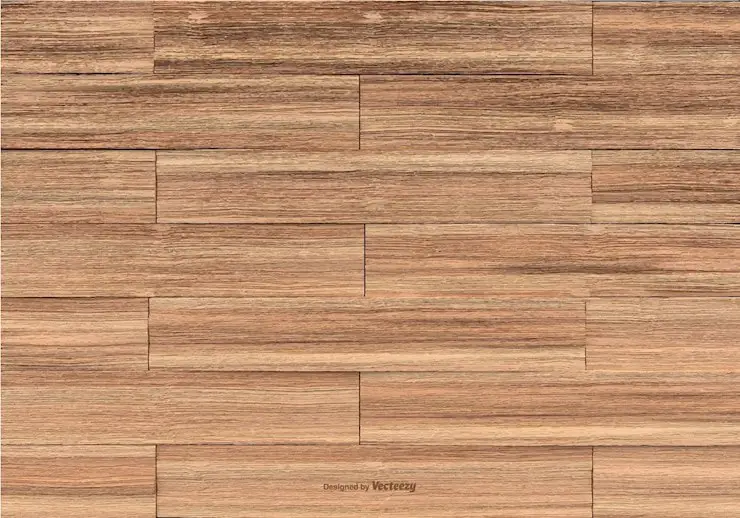
For today’s blog post we are shedding a light on 25 Beautiful Free Wood Textures so that you can see, too, how cool they are! Check them out below!
There are numerous textures available on the web these days. You can choose any texture you need, from paper to fabric. However, it’s quite challenging to find high-quality textures and download them for free. Designers use textures for website design, business cards, flyers, invitations, banners, social media covers, and more.
Let’s talk about why wood textures are cool. For me, a wood texture is cool because when you are on your computer, or on a website, you don’t expect to get natural, rustic vibes. In a way, it takes you away from your computer screen and back out in mother nature. Wood textures are not for any type of projects; it doesn’t make sense for a company that sells car parts to use a wood grain background. But when those particular projects that need the touch of the forest come along, you are able to pull that ace out from your sleeve.
Designers work hard to offer the best quality products, and some of them are so nice that they offer them from free. In this list, we have put together 25 free wood textures you can download and use for free. The collection features marble wood texture, old wood, village wood, weathered wood, pine wood, grain wood, and many more textures.
Hoping that we helped our fellow designers out there, we invite you to share this post with the people who would benefit from it, just like you. Are you a texture creator? We would like to collaborate! Write us an email at webdesignledger.blog@gmail.com and we will help you make your work known.
Web development is a rewarding profession. The rewards are great when developers are able to overcome the challenges. These challenges are usually presented by those large, complex projects. Admittedly, such challenges can be stressful. Even more so when someone is breathing down your neck asking you to do more and do it in less than the usual amount of time.
The person breathing down your neck may be experiencing even more stress than you. He or she may not even realize one of a project manager’s responsibilities. It is to provide the team with the tools they need to get the work done well and on time.
Here’s an opportunity to consider several top tools and services for developers. You might be a programmer or a task team or project manager. Either way, one or more of these products or services could prove to be a genuine time-saver. They can serve as a stress-reducer, or simply make it easier to work through a complex problem.
monday.com is a simple team management tool and platform that’s equally suitable for a team of two or a team of thousands. “Simple” does not infer simplistic, but quite the opposite. monday.com is so easy and intuitive to use that a significant portion of its user base which numbers over 35,000, is made up of non-tech oriented teams.
Monday.com replaces spreadsheet files, whiteboard presentations, and the need for multiple meetings, many of which tend to be excessively long. Instead, users are presented with a colorful, attractive, and easy to navigate UI where project status ranging from high-level planning goals and objectives and specific details related to day-to-day tasks is clearly and logically displayed.
What managers and team members seem to like most about this team management tool is the way its users feel they are part of something big and important and they feel empowered. They also like the ways in which monday.com promotes project transparency and team collaboration, and boosts collective productivity.
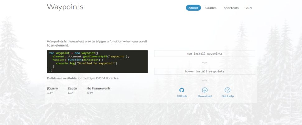
Waypoints provides programmers with a library of tools they can access when adding scrolling animations and interactions to layouts; design features that are much in demand today. This programmer’s library is free to download and contains builds for Zepto, jQuery and one without framework dependencies.
Waypoint provides users with an easy way to trigger a function after having scrolled to an element on a page or layout. In this respect, developers will find the Waypoints library Shortcut section especially useful. Shortcuts features scripts that address common Waypoint uses like Sticky Elements, Scroll, and Inview.
Waypoints is more than a handy developer’s tool. It’s a genuine time-saver, and the solutions it provides gives users added flexibility when faced with complex designs.
When an invoicing and time tracking app’s user base is made up of more than 100,000 large and small businesses, agencies, studios, and freelancers, it would suggest that the authors of this app got more than a few things right.
AND CO can be used on the Web, Android, and iOS platforms. It’s free, and once installed it can run your entire business; or at least the task management part of your business you would prefer to automate in the interest of efficiency, reliability, and cost reduction.
AND CO manages invoicing, time tracking, expense tracking, and payments managing around the clock. Recurrent payments are also automated, and there are additional features that can be utilized to create customized proposals and contracts.
This business-oriented, multi-purpose project management app is best suited for development teams subscribing to Agile methodologies, including Kanban and Scrum. Nutcache centralizes and displays all critical project information from project inception to final billing or worked hours and expenses.
This app is particularly popular with project managers in that it seamlessly integrates financial capabilities with task management features and functionalities.
Outsourcing development activities has many advantages; especially for large, complex projects that require a mix of talent and expertise. The TMS staff is well versed in working with Agile and SCRUM methodologies.
Outsourcing to this service-oriented agency will save you money that would otherwise be spent on salaries, training, overhead, and equipment. You’ll also have the peace of mind knowing TMS will complete the development activity on time.
Tips on How to Become a Better Developer
Achieving super-star status as a programmer is a laudable goal. But it’s something that’s not likely to happen without a lot of hard work. Here are three guidelines to follow to make the journey easier if you allow them to become habits. That should not be difficult as they are not at all complicated and are relatively easy to follow.
Read lots of code – the more the better. Many if not most who succeed in any profession tend to be prolific readers. Reading code written by others allows you to learn valuable lessons. You can discover how they’ve solved problems.
Write lots of code – your own personal code. There are a lot of benefits of writing code for your own personal use. It is that you have complete freedom to experiment with different problem solutions. Performing well for others can increase your marketability. Experimenting on your own can do the same.
Assume the attitude that when you’ve finished a programming job you’re really not finished. Consider the “finished” code to be an initial iteration. Work on it some more to try to make it even better – and it will be better.
Conclusion
Invest time or money in a top-rated tool or service. Like this, you’re at some point likely to ask yourself why you didn’t do so much earlier. By doing so, you could have saved a huge amount of time, kept a failed project on track, or written cleaner code.
Rather than kicking yourself, why not simply enjoy the ride? Give yourself a pat on the back for selecting a tool or service that has made your life as a developer that much easier?
Note the double-colon ::before versus the single-colon :before. Which one is correct?
Technically, the correct answer is ::before. But that doesn’t mean you should automatically use it.
The situation is that:
double-colon selectors are pseudo-elements.
single-colon selectors are pseudo-selectors.
::before is definitely a pseudo-element, so it should use the double colon.
The distinction between a pseudo-element and pseudo-selector is already confusing. Fortunately, ::after and ::before are fairly straightforward. They literally add something new to the page, an element.
But something like ::first-letter is also a pseudo-element. The way I reason that out in my brain is that it’s selecting a part of something in which there is no existing HTML element for. There is no around that first letter you’re targeting, so that first letter is almost like a new element you’re adding on the page. That differs from pseudo-selectors which are selecting things that already exist, like the :nth-child(2) or whatever.
Even though ::before is a pseudo-element and a double-colon is the correct way to use pseudo-elements, should you?
There is an argument that perhaps you should use :before, which goes like this:
Internet Explorer 8 and below only supported :before, not ::before
All modern browsers support it both ways, since tons of sites use :before and browsers really value backwards compatibility.
Hey it’s one less character as a bonus.
I’ve heard people say that they have a CSS linter that requires (or automates) them to be single-colon. Personally, I’m OK with people doing that. Seems fine. I’d value consistency over which way you choose to go.
On the flip side, there’s an argument for going with ::before that goes like this:
Single-colon pseudo-elements were a mistake. There will never be any more pseudo-elements with a single-colon.
If you have the distinction straight in your mind, might as well train your fingers to do it right.
This is already confusing enough, so let’s just follow the correctly specced way.
I’ve got my linter set up to force me to do double-colons. I don’t support Internet Explorer 8 anyway and it feels good to be doing things the “right” way.
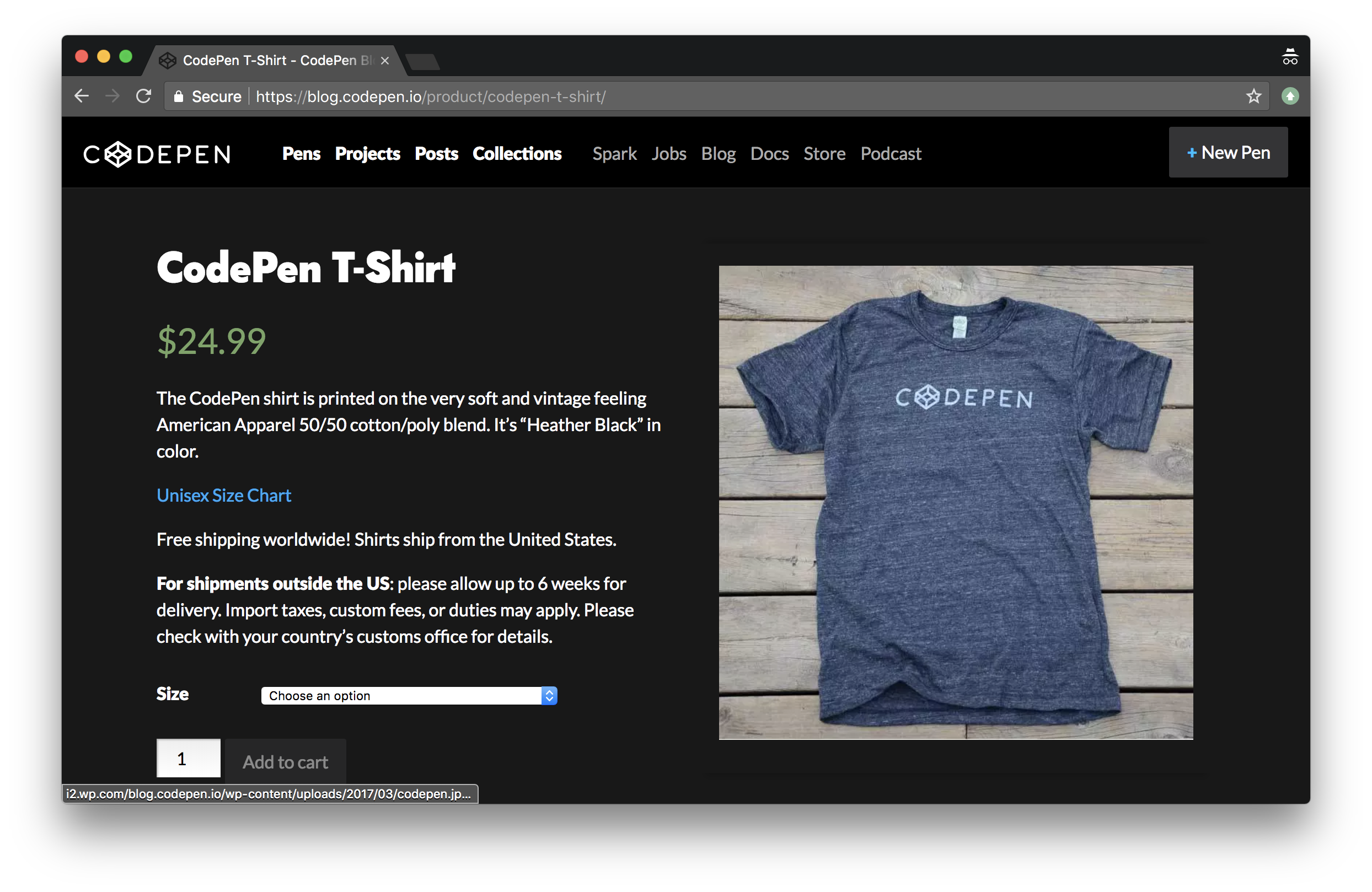
WooCommerce is a powerful eCommerce solution for WordPress sites. If you’re like me, and like working with WordPress and have WordPress-powered sites already, WooCommerce is a no-brainer for helping you sell things online on those sites. But even if you don’t already have a WordPress site, WooCommerce is so good I think it would make sense to spin up a WordPress site so you could use it for your eCommerce solution.
Personally, I’ve used WooCommerce a number of times to sell things. Most recently, I’ve used it to sell T-Shirts (and hats) over on CodePen. We use WordPress already to power our blog, documentation, and podcast. Makes perfect sense to use WordPress for the store as well!
What I think is notable about our WooCommerce installation at CodePen is how painless it was, while doing everything we need it to do. I’d say it was a half-day job with maybe a half-day of maintenance every few months, partially based on us wanting to change something.
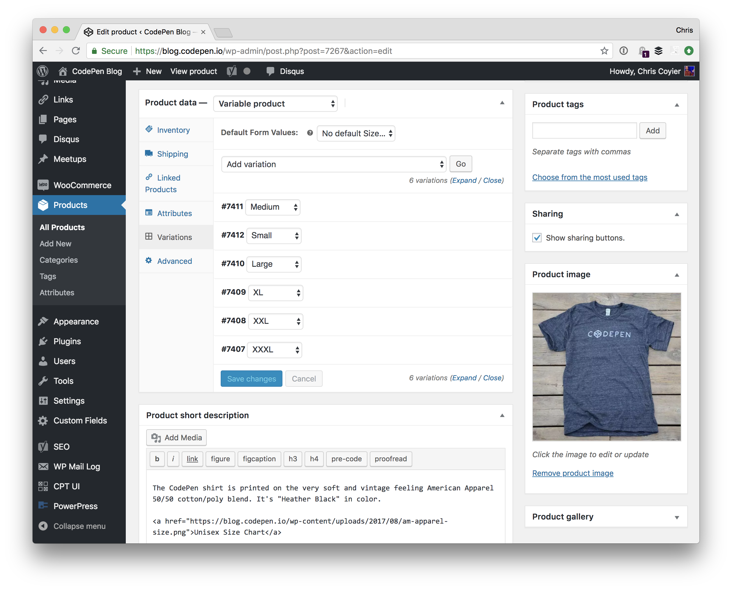
The first step is installing the plugin, and immediately you get a Products post type you can use to add new products. We’re selling a T-Shirt, so that looks like this:
Note the variations in use for size. We even track inventory at the size level so our T-Shirt printing company knows when to re-print different sizes.
What is somewhat astounding about WooCommerce is that you might need to do very little else. You could set a price, flip on the basic PayPal integration and enter your email, publish the product, and start taking orders.
Or, you could start customizing things and do as much or as little as you want:
You could add as many different payment processors as you like. We like using Stripe for credit card processing at CodePen, but also offer PayPal.
You could customize the template of every different page involved, or just use the defaults. At CodePen we have very lightly customized templates for the store homepage and product page.
You could get very detailed with calculating shipping costs, or use flat rates. We use a flat rate shipping cost at CodePen almost as marketing: same shipping cost anywhere in the world!
You could get into integrations, like connecting it with your MailChimp account for further email marketing or Slack account to notify your team of sales.
If you can dream it, you can do it with WooCommerce.
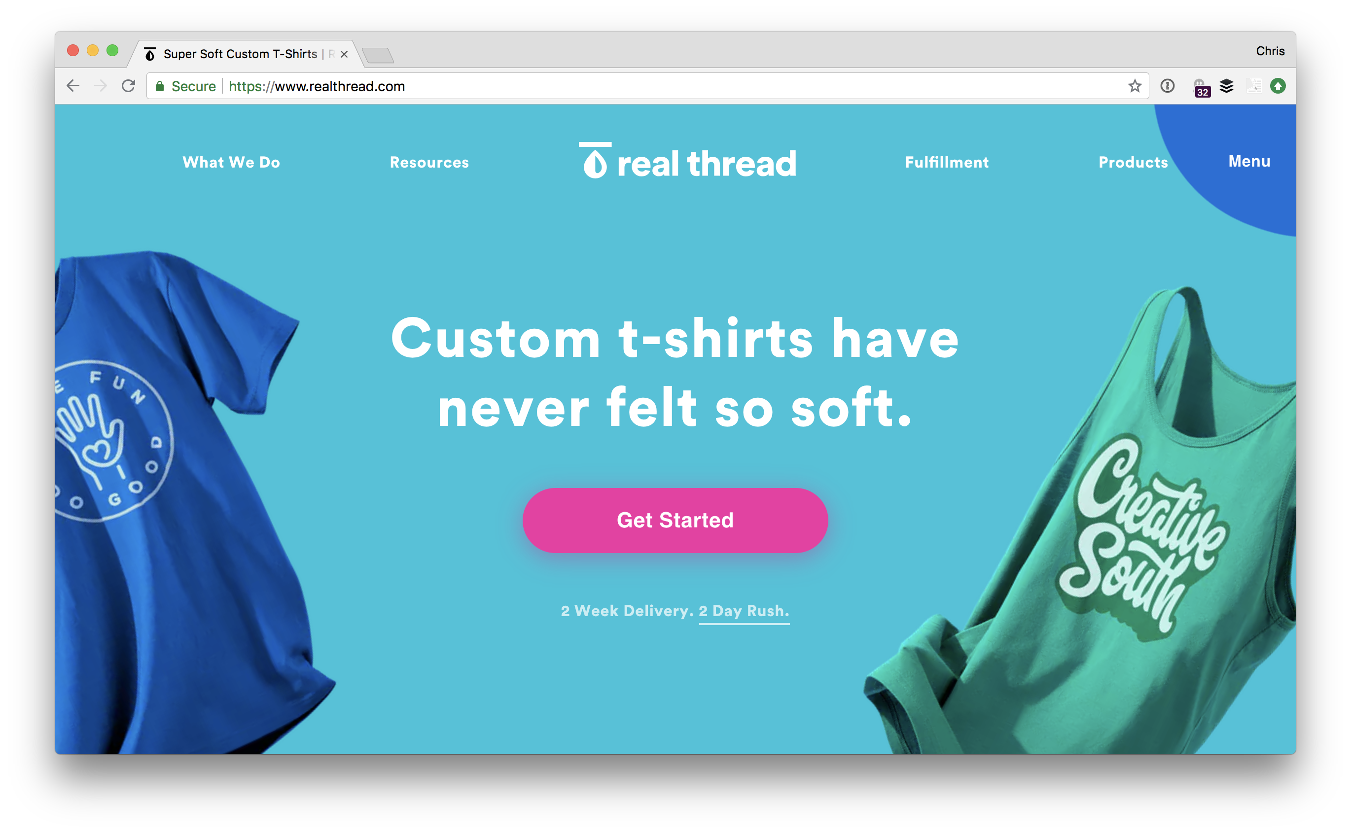
At CodePen, we work with a company called RealThread that actually prints and ships the T-Shirts.
They work great with WooCommerce of course, and the way we set that up is that we use the ShipStationintegration and blast the orders into their account there and they handle all the fulfillment from there. There are all sorts of shipping method plugins though for anything you can think of.
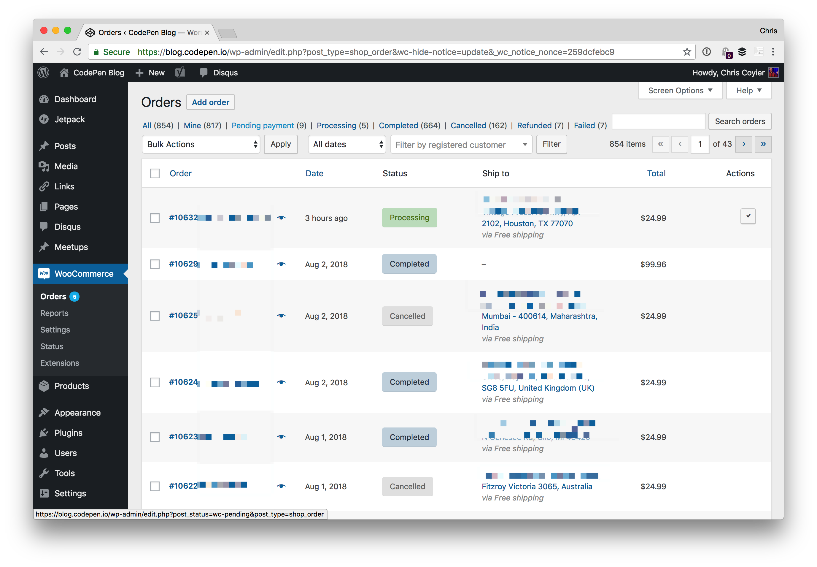
Within WooCommerce, we have a dashboard of all the orders, their status, and even tracking information should we need to look something up.
So essentially:
We use WooCommerce
We use the Stripe plugin to take our credit card payments that way
We use the PayPal plugin to take PayPal payments over Braintree
We use the ShipStation plugin to send orders to that system for our fulfillment company to handle
It was quite easy to set up and works great, and it’s comforting to know that we could do tons more with it if we needed to and support is there to help.
(This is a sponsored article.) The way that product teams work is changing: The software industry is quickly moving to remote work. In the US alone, 43% of employed Americans have spent at least some time working remotely, and that number has steadily increased in recent years. Many successful digital products on the market today were designed and developed by a distributed team. Such teams don’t have an office in the traditional sense. Everyone chooses to work from where they like, both geographically and functionally (in a coworking space, coffee shop, home office, etc.).
While a distributed product team might sound tempting to you, creating an effective design process on such a team requires a lot of effort. Collaboration and communication are two of the most significant challenges distributed teams face. Managing a distributed team requires an understanding of how the individuals on your team operate, as well as requires a digital toolset that makes the team’s operations as efficient as possible. That’s why investing in the right remote tools and technology is so critical for product managers.
If you’re a team manager who is looking to establish a robust design process for a distributed team, then this article for you. You’ll find seven of the most common challenges distributed product teams should overcome and learn how a team-management tool called monday.com (formerly dapulse) can help them with that.
1. Build A Shared Understanding Of A Project’s Goals
When it comes to organizing a work process on a remote team, one of the key goals is to keep the whole team on the same page. Management needs to set goals and make sure everyone on the team understands and accepts them. Building understanding is especially important on remote teams because interaction tend to be more sporadic. Ensure that everyone on the team knows the following:
What are the project’s overall goals? When a team clearly understand’s the product strategy (what they want to build and why), that understanding motivates engagement.
What is expected of them, and how do they fit in the bigger picture? People want to know their role in the process. Even though every team member will be deep in the details when working on a project, understanding the big picture will help them to focus on what’s really important.
What are other people involved in the project doing? Each team member should have visibility on what the other team members are working on.
The more everyone knows, the better they can work as a team.
Visualize The Product Development Process
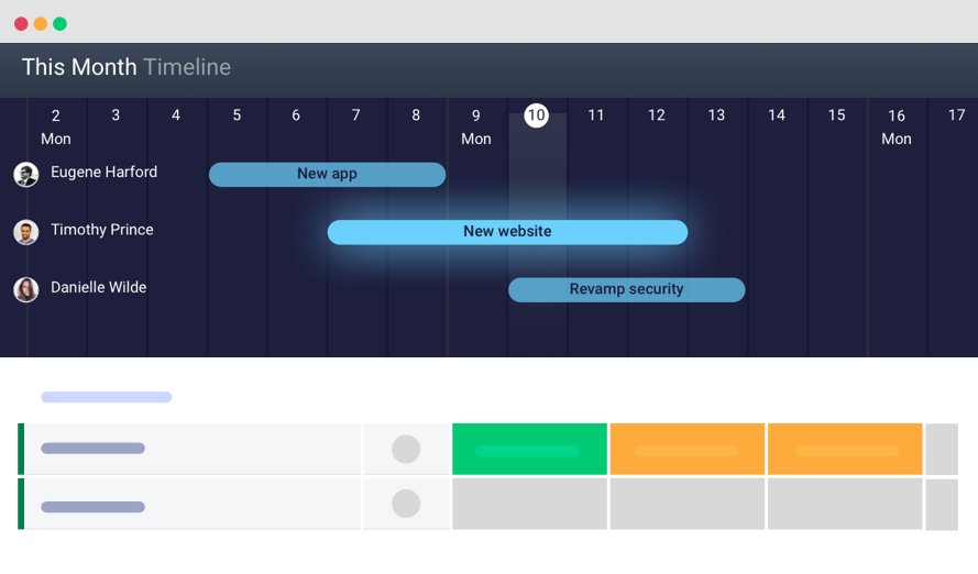
Helping everyone on the team know what is expected of them and when is possible using monday.com’s feature named the “timeline.” The timeline makes tasks more visual — team members will be able to see when each task is scheduled for, how long it will take and how it fits in the entire project. The tool enables you to see not only what tasks your team members are working on, but also how those tasks are distributed over time. It is great for when some activities depend on others (for example, developers are waiting on mockups from designers).
The timeline enables team members to see a high-level roadmap. (Large preview)
2. Manage The Team’s Workload
As anyone who has ever worked on a remote team will tell you, remote working is quite different from working face to face. Many project managers find it hard to manage the team’s workload.
Most product teams use project-tracking software to plan and estimate their work. Usually, a team will prepare all of the work in a task list, in which each task has a text description and a time estimate. The biggest downside of this approach is that it’s not very representative. For example, Kanban boards, used by many product teams today, are not very representative — it’s almost impossible from a glance at the board to understand the order in which tasks should be completed, especially when they have dependencies.
Using a Kanban board might make it hard to see how tasks should be distributed in time. (Image source) (Large preview)
Track Everything Your Team Is Working On
Interaction cost (i.e. the cognitive or physical effort required to complete an action) plays a vital role in the user experience of a product. The more effort required to complete an operation, the less usable the interface becomes for the end user. If the project manager has to switch to different products to see the team’s progress, that will create unnecessary friction and hinder the team from working efficiently.
monday.com assembles and displays progress data in a logical and understandable way. The tool has a feature called a board. The board is where all team members can track everything the team is working on. The main advantage of the board is that it enables product managers to monitor the team’s progress in real time and instantly see who is working on what and see where things stand.
monday.com gives you a clear sense of what needs to get done and who is responsible for what. The board provides in-depth insight into a project and its tasks. (Large preview)
Communicate Current Status
Each team needs a mechanism that makes it easy to understand what’s going on at a glance.
One way to solve this problem is to use color coding for different elements. Color coding speeds up visual search because it allows users to quickly filter a particular object (or objects) by knowing the color associated with it. monday.com uses color coding to indicate the current status of a task. For example, it’s easy to see where things have gotten stuck just by looking at the board and finding all tasks colored in red.
Adding tasks in a project-management tool doesn’t sound very exciting. Generally, the more time it takes, the less happy the product manager will be.
monday.com simplifies the process of data input. Managers can quickly add rows to the board — monday.com calls them pulses. Pulses can be tasks, projects, missions, to-do items, etc. Creating a pulse requires just a few clicks.
After you create a pulse, simply assign it to a team member.
Assign teammates to particular tasks or projects. (Large preview)
Tailor The Platform To Your Needs
There’s no such thing as a universal design process. Every project is different and requires its own design process. A product-management tool should be very adaptive to change; the product team should be able to customize the process according to their needs, without having to put much effort into customization.
monday.com is extremely customizable and lets the user configure almost any option. You can customize monday.com to manage any workflow or process, to address any challenge and to manage basically anything.
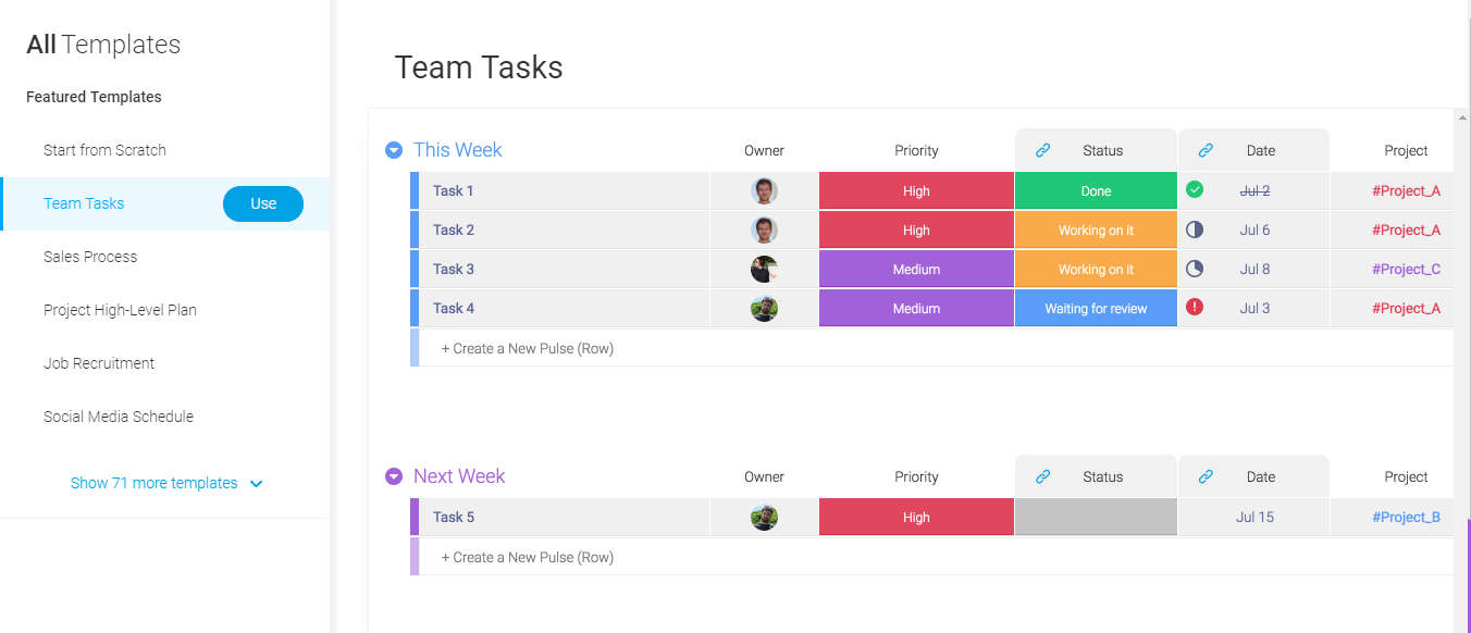
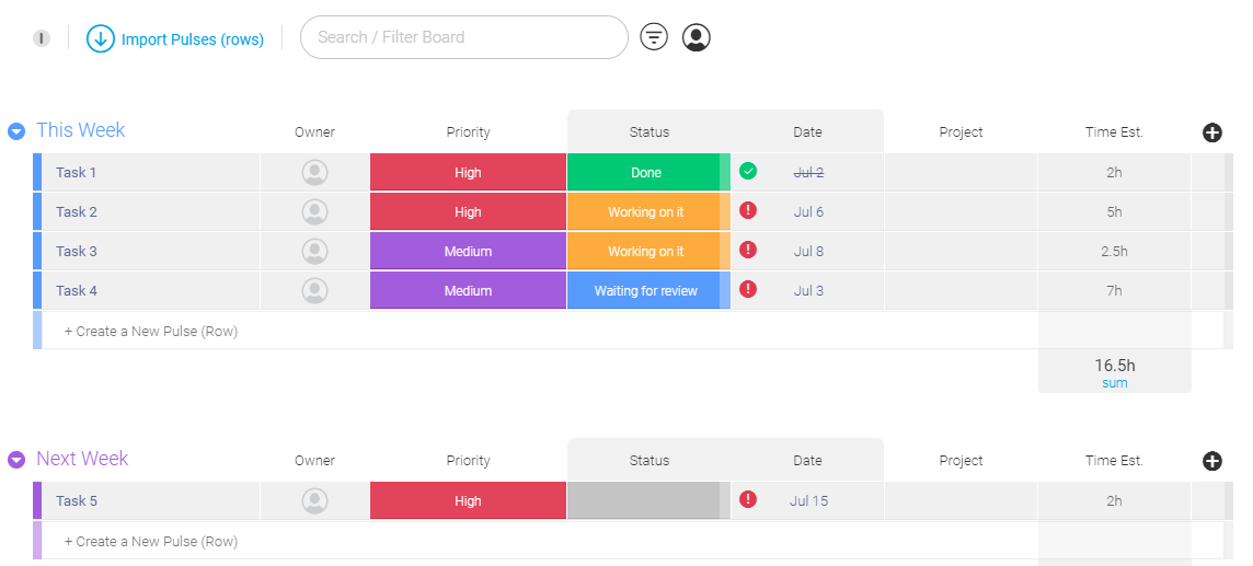
When it comes to creating a board, you don’t need to start from scratch. A multitude of templates allow you to start quickly. For example, the “Team Tasks” template would be very useful for product teams.
Finding the right template for your activity is really simple because all templates are visualized. (Large preview)
After selecting a template for your needs, you can customize it by manipulating different sections. Product teams often need to combine task into groups, whereby each group represents a milestone (for example, “Release 1”, “Release 2”, etc.). Doing this in monday.com is relatively simple. As a board owner, you can have as many groups as you want.
Easy to organize tasks. You can have as many groups as you want. (Large preview)
But it doesn’t stop there. You can use the checklist feature to break down tasks even further. For example, each task can be broken down into smaller to-do steps. This feature is handy when a few activities need to get done before the task can be completed — for example, if a product specification needs to be approved by a few designers before it can be handed over to the development team. The checklist sits within a pulse, in the “Updates” section, and can help create a structure for each pulse.
The checklist sits within a pulse, in the “Updates” section. This feature can help create a structure for each pulse. (Large preview)
Plan The Team’s Workload Visually
Designers, developers and managers often work with compressed timeframes and simultaneous projects. A team must be able to respond quickly to feedback on their product from stakeholders and users. Following the build-measure-learn cycle, a product team should be really flexible; it should be ready to implement feedback from testing sessions and adjust the design process according to the new information. The same level of flexibility should be in all products the team uses.
Using monday.com‘s timeline, it’s possible to make corrections and improve the team’s efficiency. The visual editor makes the process of managing tasks easy. The product manager can see where each project is at each point, and can see and focus on areas of struggle, quickly and effectively.
The timeline makes it possible to see each team member’s capacity over a set period of time (say, the next few weeks), seeing where they have room to take on more work and where they need to delegate tasks to others.
Change the time range in the timeline. The time range is updated in real time. (Large preview)
3. Create Effective Internal Communications
Communication plays a critical role in the design process. When it comes to product design, it’s essential for all team members to be on the same page. Unlike colocated teams, a distributed team won’t have an opportunity to arrange regular face-to-face meetings. When you take out face-to-face interaction, you can’t expect things to just work the same way. Poorly established communication patterns can lead to some team members feeling like they’re working in a vacuum.
Tools matter more in remote work because they are the foundation for communication. The goal is to make sure everyone on the team feels connected.
Centralize All Communication
In today’s world, we communicate with a variety of tools: from traditional email to online messengers such as Skype, WhatsApp, Slack and Facebook Messenger. Having to switch from a task-management tool to another tool for communication can be stressful. Worse, some information can get lost during the transition (for example, an email inbox can fill up to the point that a team member can overlook a critical email).
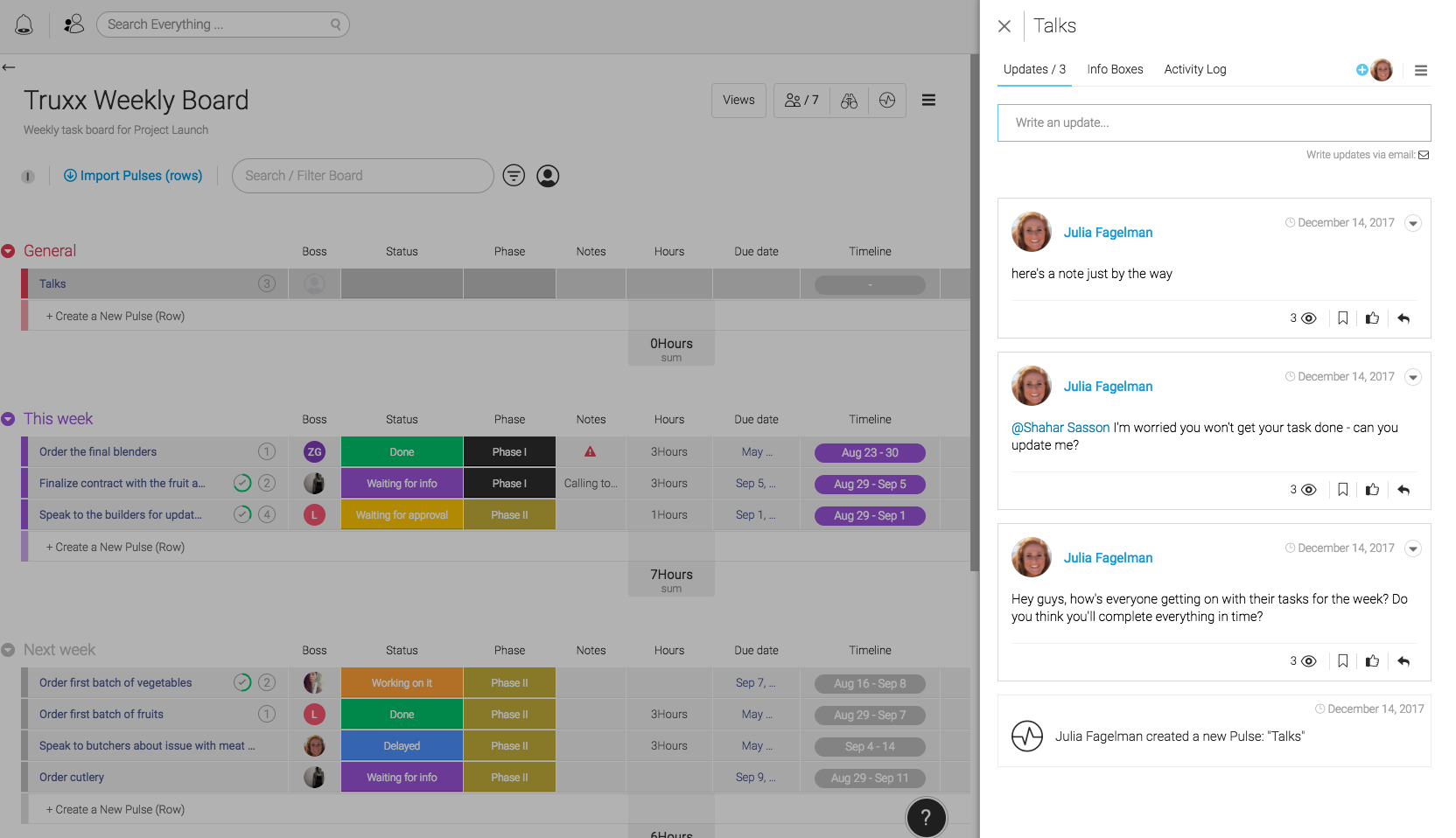
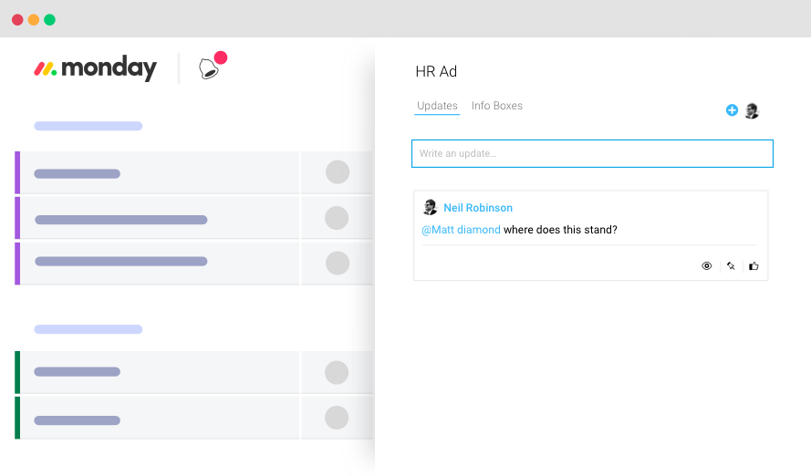
Product teams can use monday.com as a single communication platform for their workplace. And it would be a much better solution because it allows for communication in the context of each task. With monday.com, you no longer need to use email for internal communication. When a team member clicks on a pulse on any board, a box opens to the right of the screen, showing the “updates”. Simply mention a person’s username (“@johndoe”), and send your message. The great thing is that the chat thread stays with that task, so finding a conversation after a while is relatively easy.
Cut Down On Meetings And Optimize Required Meetings
Meetings are an essential part of the communication process. When it comes to reviewing plans and brainstorming on design decisions, there’s no substitute for a meeting. But for a distributed team, the number of potential hours available for real-time meetings can be limited, so it’s essential to make the best use of that time. A distributed team should continually try to reduce their number of meetings and maximize the effectiveness of the time that team members have together.
Take a weekly kickoff meeting as an example. This meeting happens on a Monday, and team members come together to discuss plans for the week. For many teams, such meetings are rarely productive. Quite often, the information shared in a weekly kickoff meeting becomes outdated shortly after the meeting, and team members need to reprioritize tasks.
monday.com saves the team vast amounts of time in meetings. Instead of discussing the plan for the week, the product manager can break down complex tasks into weekly achievable goals. This will help team members plan the week based on what they need to get done.
Share Valuable Resources With The Entire Team, Not Individual Members
Imagine you’ve found a really valuable resource and want to share it with your peers. You tweet about it and send a link to a group chat. You get feedback like, “Awesome resource! Thanks!” from some people in the chat. Shortly after, most of your peers forget about the resource, especially if they can’t use it in the work they’re doing right now. Sad, right? We can do better.
Instead of sending a link to a group chat, share all resources you find on a separate board. monday.com has a template named “Design Inspiration & Resources”. The great thing about this approach is that it’ll be much easier for team members to find a particular resource when they actually need it.
Organize Better Planning And Brainstorming Sessions
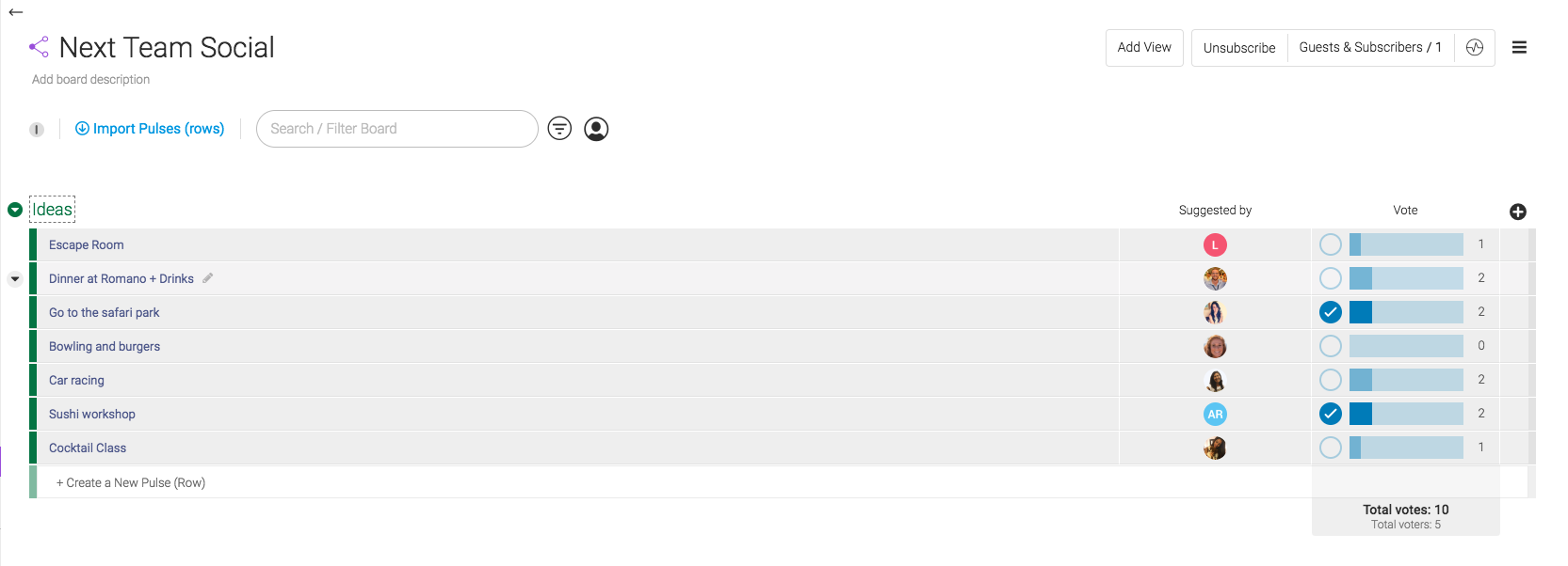
Task prioritization is a typical activity in agile project management. Team members get together, discuss tasks and vote on what to implement in the next sprint.
monday.com incorporates voting. Team members can use the voting column when they want to decide on something together as a team. Simply add a voting column to a board, and team members will be able to cast their vote in one click.
Vote for ideas during brainstorming and planning sessions. (Large preview)
Notify Team Members In Real Time
Fear of missing out (FOMO) is a common problem on distributed teams. When working remotely, team members might be afraid to miss an important piece of information. As a result, they spend a lot of time in communication tools, checking mail and messengers. This can get really distracting. Team members should spend less time in communication tools and more time in tools they use to design (tools for prototyping and development). It’s all too easy to waste the day reading messages and replying.
A communication tool should serve vital information just when team members need it; it should have an effective mechanism of notification. monday.com notifies users via desktop and mobile in real time. The platform has an app for iOS and Android. The app allows team members to stay connected on their phone or tablet and to respond quickly from anywhere. It’s also possible to customize notification rules. For example, you can manage which activity triggers an email.
If your team is distributed across the globe and you need to arrange a meeting, you have to be sure that it won’t happen at awkward hours (such as in the middle of the night). It would be great to see the team members’ working hours.
The work schedule board is a cornerstone of your business operations. Team members in each time zone can commit to the times that work for them. This helps product managers schedule meetings at times that work for everybody.
The work schedule board shows when team members will be online and available for chat. (Large preview)
4. Involve Users In The Design Process
Most commercially successful products were created with a strong focus on the target audience. Designers know that if they want to release a successful product, they need to introduce real users to the design process. User involvement is most efficient and influential in the early stages of product development, because the cost of making changes increases as the system develops. Generally, the earlier you create a strong feedback loop, the better the final product will be.
Share Designs With Users And Gather A Valuable Feedback
The feedback that a product team gets from users is extremely valuable. It can validate that the design team is moving in the right direction.
On monday.com, users can create a board and choose whom to share it with. For example, if you are working with a client, you can set up a board for their project and invite them to work as a guest. The board could include key features you want to work on. As soon as you share the board, the client will get a notification and then can open the board, review the plan and request modifications.
5. Find All Required Information Easily
Documentation is another challenge. Distributed teams don’t have a physically shared space where they can share product documentation. Information might be stored in many different places: email, cloud drives, local computers, etc. It could lead to team members missing an important piece of information and being unaware of it. This leads to fragmented knowledge.
Centralize All Documents
Having all documents in one place is critical to success. monday.com syncs all information in a single accessible hub. All team members can store all relevant discussions in a searchable database. The platform provides an option to upload different types of files simply by dragging and dropping. The next time a designer needs to share a product’s specifications, all they need to do is upload a file to the platform.
Upload all assets by dragging and dropping. (Large preview)
Search Anything And Everything
Anyone who has ever worked with a knowledge base will tell you how critical search functionality is. Without proper search, your chance of finding information decreases significantly.
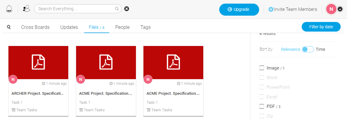
monday.com allows you to quickly find anything your team has ever worked on, including images, updates, projects and assignments. Your work becomes a rich knowledge base.
For example, when you need to find the latest version of a product’s specification, all you need to do is click the search box, select the “Files” tab and enter the project’s name as a search query.
6. Make The Collaboration Tool A Natural Part Of The Team
The platform you choose for team management should feel like second nature. Technology should work for you and your team, not the other way around.
Minimize The Time Required To Learn A Tool
When you introduce a new tool in the design process, one goal should be to have total agreement to work using this tool. This agreement is not always easy to come by because team members are usually skeptical about the next “magical tool that will solve all of their problems”. What’s worse is that they have to spend extra time learning how to use it. Nobody wants to learn new software.
One of the most significant advantages of monday.com is its intuitiveness. Regardless of whether you’ve used a similar app before, monday.com can be picked up with no training. Team members will be able to understand how to use the tool without preparation.
monday.com provides basic onboarding to help users get started. (Large preview)
Scalable
When companies select a collaboration tool, they often think of it as an investment. They want a tool that will scale with the business.
monday.com is suitable for any sized team, from two freelancers working together to thousands collaborating across the globe. The tool scales with you, from simplicity to complexity, with total ease. Also, as your business expands, monday.com makes it painless to shift to a premium version (Standard, Pro or Enterprise) and get more of the platform’s premium features.
Integrate The Platform With Existing Tools
A task-management tool is essential for any team hoping for good results. But the team’s toolbox also needs to support the design process (for prototyping and development) and the collection of design artifacts (for example, on Google Drive or Dropbox). It’s essential that the team-management tool integrates seamlessly with other tools the team uses.
When it comes to integration, monday.com does a lot to be part of the established software ecosystem. It can connect to Dropbox, Zapier, Google Drive and other sharing tools. As a team member, you can attach a mockup file to your updates, sharing it in the context of the tasks it relates to.
monday.com also comes with an open API architecture, which lets developers build their own integrations.
Having the right atmosphere is extremely important. Team leaders should not only be in tune with each person on the team, but should continually look for ways to increase engagement.
Celebrate Successes With Team Members
It’s natural for people to seek acknowledgment. The need for social approval drives us to look for confirmation from people we know (parents, friends, colleagues). When someone recognizes our results by saying something as simple as “Great job!”, we feel motivated to work towards our goals. It’s essential for team players to get acknowledged, especially when working remotely.
monday.com has a few features that help create a sense of acknowledgment. The first one is the thumb-up feature, which is basically a positive reaction to an activity. Most people are familiar with this from social networks. People are used to measuring the effect of a post by the number of likes they get. monday.com allows you to give a thumb up to your teammates’ work.
Another nice feature are the animated GIFs. You can liven up comments with GIFs. monday.com lets you pick from thousands of GIFs when responding to teammates, which will add a bit of personality to your comments.
Last but not least, monday.com has a confetti feature. As soon as a designer completes their last “in progress” task on a board, they will see an animated confetti effect. This subtle detail adds a bit of delight and motivates team members to have an all-green board.
Establishing an effective process on a distributed team is hard. What works for a colocated team won’t necessarily work for a distributed team, and what works for one distributed team won’t necessarily work for another.
Build a remote-friendly work culture by focusing on following priorities:
Prioritize transparency.
Keep important information accessible to everyone.
Stay on top of the team’s activity.
Understand what every member of your team is doing and where the team is in the process at a glance.
Build an effective communication system.
The foundation of distributed teams is communication. Create a healthy system of meetings and habits to keep people communicating.
Lower the barrier to entry.
Choose a team-collaboration tool that will be the least painful for everyone to get on board with. It should be a reference point that brings everything together.
WordPress is the gold standard for website development and launch for businesses. It provides business owners with a way to easily build websites, as well as have a developer tag-in for more advanced custom needs.
One essential element to WordPress website design are plugins. Plugins assist in customizing a site, generate and compile leads, analytics, and much more. In a way, they are the foundation to the ultimate website design.
Whether you’re a designer building out a website for a client, or a business owner ready to launch an online presence, the following WordPress plugins can be valuable.
Speed Booster Pack
Site speed is a major Google ranking factor and important for providing a quality user experience (UX). When a user clicks through to a website, and the page load time is poor, they are likely to abandon the slow site for a competitor.
This makes site speed an absolute priority. WordPress plugin Speed Booster Pack can help. This plugin automates and fixes many common speed issues.
The Speed Booster Pack minimizes clunky scripts, compresses images, optimizes database calls, loads CSS asynchronously, and more to make page load time faster. This is vital, especially now that mobile searches have become the norm.
AMP For WP
While we’re on the topic of mobile search and Google ranking factors, it’s time to think about integrating Accelerated Mobile Pages (AMP) into your website pages. This may seem complicated, given Google’s perpetual changes, but it doesn’t have to be with AMP for WP.
AMP for WP is a WordPress plugin that supports AMP automatically for a site. You simply upload the plugin to your website and you’re ready to capitalize on increased mobile search traffic.
Modula Photo Gallery
Consumers want more visual content and this is leading to website designers and business owners looking for more web page space to place images. Many are using image galleries that come with their WordPress theme, but the customizability is not so great.
To get a customizable experience for the ultimate website design, employ Modula Photo Gallery WordPress plugin. This plugin is great for developers and site managers to showcase aesthetic image galleries to increase visual content, thus increasing user engagement.
Wordfence Security
Website security is important, and site security, malware, and firewall issues have become a real problem for WordPress developers, designers, and business owners. To combat the security threats, you can use Wordfence Security, a plugin that can minimize online risks.
Wordfence Security monitors online attack attempts, malware scanner that blocks requests and malicious code. It also has added features like two´-factor authentication. Keep you or your client’s website a bit safer with this needed plugin.
Everest Forms
Website forms are an essential element to lead generation, whether they are forms for contact information, or a registration opt-in. To get those leads, you need to have an attractive, call to action form that users find non-intrusive and easy to fill out.
Enter Everest Forms, the WordPress plugin that makes generating leads simple, for both website designer and user. The drag-and-drop form creation tool is user friendly. The forms are also optimized for mobile, something vital to providing a stellar user experience.
Google Analyticator
Tracking your WordPress site’s success is essential to growth and success. Google Analytics is one of the best ways to do this, but it can be a confusing process inside Google’s interface.
To make tracking Google Analytics easier, you can use the Google Analyticator plugin. This plugin lets you examine site traffic, downloads, top pages and referrals, keywords, and more. This data can help maximize marketing efforts for greater success.
Jetpack
Jetpack is a WordPress plugin that combines WordPress hosted website functionality with self-hosted sites. This has a lot of benefits, especially since it is in the WordPress family.
When integrating Jetpack into you or your client’s website, you can get timely stats, email subscriptions, social media compatibility, and much more. There are also powerful marketing services with the Jetpack plugin, like SEO tools, PayPal options, and automated social posting.
For more WordPress features, Jetpack is worth a try. Many themes come with Jetpack already enabled, so you may already be enjoying the support already.
Wrapping Up . . .
WordPress website design is an art with multiple variables involved. However, there is always a constant, and that is providing a rich user experience that maximizes website engagement and conversions.
The above plugins are a great place to start, but be sure to explore all the plugins available to WordPress when you need a little more customization during the design process. From widget plugins to aesthetics, there is probably a plugin that you can employ for the perfect design.
The fall of 2018 is closer than ever, and the projects seem to be ready for the harvest season. On the 22nd of September, you need to have your fall fonts in the pantry, and we are here to help you with that.
Although we still have a month of summer when the tropical fonts will still be stars, it’s not too soon to have an idea of what the fall fonts of this year will look like. Luckily for us, many websites offer free fonts, and that’s a reason to celebrate! Here’s a short guide on how to use these stunning free fall fonts:
1. Find a font that fits your project the best. The ones listed below have a lot of potential, so why not give them a go?
2. Sometimes the websites that offer free fonts have their rules for users. Check and see whether a font may be used personally, commercially, or both.
3. Press the download button and don’t look back. Sometimes we spend waaaay to much time deciding upon a font, and we always come back to the first pick.
4. Upload it to your designing tool.
5. Create a design and enjoy a successfully accomplished project.
6. Most important, have fun! It’s that simple.
When designing for a fall project, it’s important to avoid the gloomy, dark vibes some days may give us. Just because the weather is not the friendliest, it doesn’t mean we can’t have fun. Focus on the important event that take place during this season, such as Halloween, Thanksgiving, and try to incorporate those moods into your designs. The designers at Webdesignledger have learned to ask questions and listen closely to the needs of their clients. Sometimes they believe a summery font would work better for their fall sales banner, and they just as well might be right. This is the beauty of creating and imagining things with our heads out of the box. Accept new ideas, have patience, and do the job right.
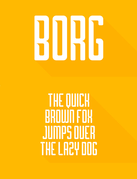
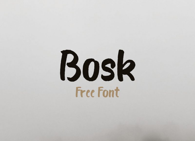
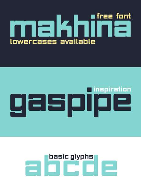
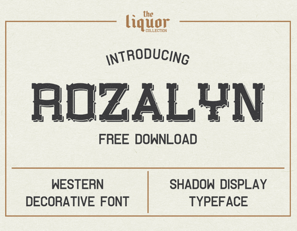
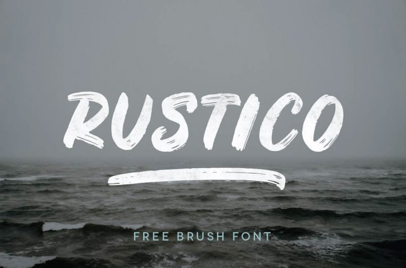
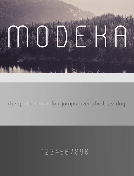
The fall fonts listed below have been carefully selected by our designers, and we believe they have a lot to offer. Let’s get down to business:
Which of the fonts above is your favorite? Are you a font creator? You can have your fonts featured on our blog, all you have to do is email us at webdesignledger.blog@gmail.com. We hope to hear from you soon!
In early 2017, I presented a couple of workshops on the topic of CSS feature detection, titled CSS Feature Detection in 2017.
A friend of mine, Justin Slack from New Media Labs, recently sent me a link to the phenomenal Feature Query Manager extension (available for both Chrome and Firefox), by Nigerian developer Ire Aderinokun. This seemed to be a perfect addition to my workshop material on the subject.
However, upon returning to the material, I realized how much my work on the subject has aged in the last 18 months.
The CSS landscape has undergone some tectonic shifts:
The Atomic CSS approach, although widely hated at first, has gained some traction through libraries like Tailwind, and perhaps influenced the addition of several new utility classes to Bootstrap 4.
The CSS Grid Layout spec has been adopted by browser vendors with surprising speed, and was almost immediately sanctioned as production ready.
The above prompted me to not only revisit my existing material, but also ponder the state of CSS feature detection in the upcoming 18 months.
In short:
? Why do we need CSS feature detection at all?
?? What are good (and not so good) ways to do feature detection?
? What does the future hold for CSS feature detection?
Cross-browser compatible CSS
When working with CSS, it seems that one of the top concerns always ends up being inconsistent feature support among browsers. This means that CSS styling might look perfect on my browsers of choice, but might be completely broken on another (perhaps an even more popular) browser.
Luckily, dealing with inconsistent browser support is trivial due to a key feature in the design of the CSS language itself. This behavior, called fault tolerance, means that browsers ignore CSS code they don’t understand. This is in stark contrast to languages like JavaScript or PHP that stop all execution in order to throw an error.
The critical implication here is that if we layer our CSS accordingly, properties will only be applied if the browser understands what they mean. As an example, you can include the following CSS rule and the browser will just ignore it—?overriding the initial yellow color, but ignoring the third nonsensical value:
To illustrate how this can be used in practice, let me start with a contrived, but straightforward situation:
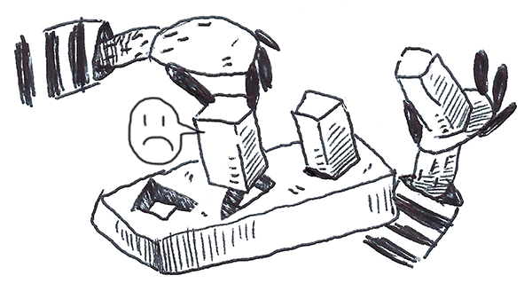
A client comes to you with a strong desire to include a call-to-action (in the form of a popup) on his homepage. With your amazing front-end skills, you are able to quickly produce the most obnoxious pop-up message known to man:
Unfortunately, it turns out that his wife has an old Windows XP machine running Internet Explorer 8. You’re shocked to learn that what she sees no longer resembles a popup in any shape or form.
But! We remember that by using the magic of CSS fault tolerance, we can remedy the situation. We identify all the mission-critical parts of the styling (e.g., the shadow is nice to have, but does not add anything useful usability-wise) and buffer prepend all core styling with fallbacks.
This means that our CSS now looks something like the following (the overrides are highlighted for clarity):
If you’re new to front-end development, you might wonder how on earth does one know the support level of specific CSS properties. The short answer is that the more you work with CSS, the more you will learn these by heart. However, there are a couple of tools that are able to help us along the way:
Can I Use is a widely used directory that contains searchable, up to date support matrices for all CSS features.
Even with all the above at our disposal, learning CSS support by heart will help us plan our styling up front and increase our efficiency when writing it.
Limits of CSS fault tolerance
The next week, your client returns with a new request. He wants to gather some feedback from users on the earlier changes that were made to the homepage—again, with a pop-up:
Once again it will look as follows in Internet Explorer 8:
Being more proactive this time, you use your new fallback skills to establish a base level of styling that works on Internet Explorer 8 and progressive styling for everything else. Unfortunately, we still run into a problem…
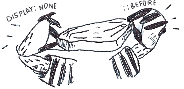
In order to replace the default radio buttons with ASCII hearts, we use the ::beforepseudo-element. However this pseudo-element is not supported in Internet Explorer 8. This means that the heart icon does not render; however the display: none property on the element still triggers on Internet Explorer 8. The implication being that neither the replacement behavior nor the default behavior is shown.
In short, we have a rule (display: none) whose execution should not be bound to its own support (and thus its own fallback structure), but to the support level of a completely separate CSS feature (::before).
For all intents and purposes, the common approach is to explore whether there are more straightforward solutions that do not rely on ::before. However, for the sake of this example, let’s say that the above solution is non-negotiable (and sometimes they are).
Enter User Agent Detection
A solution might be to determine what browser the user is using and then only apply display: none if their browser supports the ::before pseudo-element.
In fact, this approach is almost as old as the web itself. It is known as User Agent Detection or, more colloquially, browser sniffing.
It is usually done as follows:
All browsers add a JavaScript property on the global window object called navigator and this object contains a userAgent string property.
In my case, the userAgent string is: Mozilla/5.0 (Windows NT10.0;Win64;x64) AppleWebKit/537.36 (KHTML, like Gecko) Chrome/67.0.3396.9 Safari/537.36.
Mozilla Developer Network has a comprehensive list of how the above can be used to determine the browser.
If we are using Chrome, then the following should return true: (navigator.userAgent.indexOff("chrome") !== -1).
However, under the Internet Explorer section on MDN, we just get Internet Explorer. IE doesn’t put its name in the BrowserName/VersionNumber format.
Luckily, Internet Explorer provides its own native detection in the form of Conditional Comments.
This means that adding the following in our HTML should suffice:
This means that the above will be applied, should the browser be a version of Internet Explorer lower than version 9 (IE 9 supports ::before)—effectively overriding the display: none property.
Seems straightforward enough?
Unfortunately, over time, some critical flaws emerged in User Agent Detection. So much so that Internet Explorer stopped supporting Conditional Comments from version 10 onward. You will also notice that in the Mozilla Developer Network link itself, the following is presented in an orange alert:
It’s worth re-iterating: it’s very rarely a good idea to use user agent sniffing. You can almost always find a better, more broadly compatible way to solve your problem!
The biggest drawback of User Agent Detection is that browser vendors started spoofing their user agent strings over time due to the following:
Developer adds CSS feature that is not supported in the browser.
Developer adds User Agent Detection code to serve fallbacks to the browser.
Browser eventually adds support for that specific CSS feature.
Original User Agent Detection code is not updated to take this into consideration.
Code always displays the fallback, even if the browser now supports the CSS feature.
Browser uses a fake user agent string to give users the best experience on the web.
Furthermore, even if we were able to infallibly determine every browser type and version, we would have to actively maintain and update our User Agent Detection to reflect the feature support state of those browsers (notwithstanding browsers that have not even been developed yet).
It is important to note that although there are superficial similarities between feature detection and User Agent Detection, feature detection takes a radically different approach than User Agent Detection. According to the Mozilla Developer Network, when we use feature detection, we are essentially doing the following:
? Testing whether a browser is actually able to run a specific line (or lines) of HTML, CSS or JavaScript code.
? Taking a specific action based on the outcome of this test.
We can also look to Wikipedia for a more formal definition (emphasis mine):
Feature detection (also feature testing) is a technique used in web development for handling differences between runtime environments (typically web browsers or user agents), by programmatically testing for clues that the environment may or may not offer certain functionality. This information is then used to make the application adapt in some way to suit the environment: to make use of certain APIs, or tailor for a better user experience.
While a bit esoteric, this definition does highlight two important aspects of feature detection:
Feature detection is a technique, as opposed to a specific tool or technology. This means that there are various (equally valid) ways to accomplish feature detection.
Feature detection programmatically tests code. This means that browsers actually run a piece of code to see what happens, as opposed to merely using inference or comparing it against a theoretical reference/list as done with User Agent Detection.
CSS feature detection with @supports
The core concept is not to ask “What browser is this?” It’s to ask “Does your browser support the feature I want to use?”.
Most modern browsers support a set of native CSS rules called CSS conditional rules. These allow us to test for certain conditions within the stylesheet itself. The latest iteration (known as module level 3) is described by the Cascading Style Sheets Working Group as follows:
This module contains the features of CSS for conditional processing of parts of style sheets, conditioned on capabilities of the processor or the document the style sheet is being applied to. It includes and extends the functionality of CSS level 2 [CSS21], which builds on CSS level 1 [CSS1]. The main extensions compared to level 2 are allowing nesting of certain at-rules inside ‘@media’, and the addition of the ‘@supports’ rule for conditional processing.
If you’ve used @media, @document or @import before, then you already have experience working with CSS conditional rules. For example when using CSS media queries we do the following:
Wrap a single or multiple CSS declarations in a code block with curly brackets, { }.
Prepend the code block with a @media query with additional information.
Include an optional media type. This can either be all, print, speech or the commonly used screen type.
Chain expressions with and/or to determine the scope. For example, if we use (min-width: 300px) and (max-width: 800px), it will trigger the query if the screen size is wider than 300 pixels and smaller than 800 pixels.
The feature queries spec (editor’s draft) prescribes behavior that is conveniently similar to the above example. Instead of using a query expression to set a condition based on the screen size, we write an expression to scope our code block according to a browser’s CSS support (emphasis mine):
The ‘@supports rule allows CSS to be conditioned on implementation support for CSS properties and values. This rule makes it much easier for authors to use new CSS features and provide good fallback for implementations that do not support those features. This is particularly important for CSS features that provide new layout mechanisms, and for other cases where a set of related styles needs to be conditioned on property support.
In short, feature queries are a small built-in CSS tool that allow us to only execute code (like the display: none example above) when a browser supports a separate CSS feature—and much like media queries, we are able to chain expressions as follows: @supports (display: grid) and ((animation-name: spin) or (transition: transform(rotate(360deg)).
So, theoretically, we should be able to do the following:
@supports (::before) {
  input {
    display: none;
  }
}
Unfortunately, it seems that in our example above the display: none property did not trigger, in spite of the fact that your browser probably supports ::before.
That’s because there are some caveats to using @supports:
Secondly, you will see that in the above example our @supports (transform: scale(2)) and (animation-name: beat) condition fires correctly. However if we were to test it in Internet Explorer 11 (which supports both transform: scale(2) and animation-name: beat) it does not fire. What gives? In short, @supports is a CSS feature, with a support matrix of its own.
CSS feature detection with Modernizr
Luckily, the fix is fairly easy! It comes in the form of an open source JavaScript library named Modernizr, initially developed by Faruk Ate? (although it now has some pretty big names behind it, like Paul Irish from Chrome and Alex Sexton from Stripe).
Before we dig into Modernizr, let’s address a subject of great confusion for many developers (partly due to the name “Modernizr” itself). Modernizr does not transform your code or magically enable unsupported features. In fact, the only change Modernzr makes to your code is appending specific CSS classes to your tag.
This means that you might end up with something like the following:
That is one big HTML tag! However, it allows us do something super powerful: use the CSS descendant selector to conditionally apply CSS rules.
When Modernizr runs, it uses JavaScript to detect what the user’s browser supports, and if it does support that feature, Modernizr injects the name of it as a class to the . Alternatively, if the browser does not support the feature, it prefixes the injected class with no- (e.g., no-generatedcontent in our ::before example). This means that we can write our conditional rule in the stylesheet as follows:
.generatedcontent input {
  display: none
}
In addition, we are able to replicate the chaining of @supports expressions in Modernizr as follows:
Since Modernizr runs in JavaScript (and does not use any native browser APIs), it’s effectively supported on almost all browsers. This means that by leveraging classes like generatedcontent and csstransforms, we are able to cover all our bases for Internet Explorer 8, while still serving bleeding-edge CSS to the latest browsers.
It is important to note that since the release of Modernizr 3.0, we are no longer able to download a stock-standard modernizr.js file with everything except the kitchen sink. Instead, we have to explicitly generate our own custom Modernizr code via their wizard (to copy or download). This is most likely in response to the increasing global focus on web performance over the last couple of years. Checking for more features contributes to more loading, so Modernizr wants us to only check for what we need.
So, I should always use Modernizr?
Given that Modernizr is effectively supported across all browsers, is there any point in even using CSS feature queries? Ironically, I would not only say that we should but that feature queries should still be our first port of call.
First and foremost, the fact that Modernizr does not plug directly into the browser API is it’s greatest strength—it does not rely on the availability of a specific browser API. However, this benefit comes a cost, and that cost is additional overhead to something most browsers support out of the box through @supports—especially when you’re delivering this additional overhead to all users indiscriminately in order to a small amount of edge users. It is important to note that, in our example above, Internet Explorer 8 currently only stands at 0.18% global usage).
Compared to the light touch of @supports, Modernizr has the following drawbacks:
In the majority of cases, Modernizr needs to be render blocking. This means that Modernizr needs to be downloaded and executed in JavaScript before a web page can even show content on the screen—increasing our page load time (especially on mobile devices)!
In order to run tests, Modernizr often has to actually build hidden HTML nodes and test whether it works. For example, in order to test for support, Modernizr executes the follow JavaScript code: return !!(document.createElement('canvas').getContext && document.createElement('canvas').getContext('2d'));. This consumes CPU processing power that could be used elsewhere.
The CSS descendant selector pattern used by Modernizr increases CSS specificity. (See Harry Roberts’ excellent article on why “specificity is a trait best avoided.”)
Although Modernizr covers a lot of tests (150+), it still does not cover the entire spectrum of CSS properties like @support does. The Modernizr team actively maintains a list of these undetectables.
Given that feature queries have already been widely implemented across the browser landscape, (covering about 93.42% of global browsers at the time of writing), it’s been a good while since I’ve used Modernizr. However, it is good to know that it exists as an option should we run into the limitations of @supports or if we need to support users still locked into older browsers or devices for a variety of potential reasons.
Furthermore, when using Modernizr, it is usually in conjunction with @supports as follows:
If ::before is not supported, our CSS will fallback to the default HTML radio select.
If neither transform(scale(2)) nor animation-name: beat are supported but ::before is, then the heart icon will change to black instead of animate when selected.
If transform(scale(2), animation-name: beat and ::before are supported, then the heart icon will animate when selected.
From that moment on, the web community was split in two by an intense debate between those who see CSS as an untouchable layer in the “separation of concerns” paradigm (content + presentation + behaviour, HTML + CSS + JS) and those who have simply ignored this golden rule and found different ways to style the UI, typically applying CSS styles via JavaScript. This debate has become more and more intense every day, bringing division in a community that used to be immune to this kind of “religion wars”.
However, I think exploring how to apply feature detection in the modern CSS-in-JS toolchain might be of value as follows:
It provides an opportunity to explore how CSS feature detection would work in a radically different environment.
It showcasesfeature detection as a technique, as opposed to a specific technology or tool.
With this in mind, let us start by examining an implementation of our pop-up by means of the most widely-used CSS-in-JS library (at least at the time of writing), Styled Components:
This is how it will look in Internet Explorer 8:
In our previous examples, we’ve been able to conditionally execute CSS rules based on the browser support of ::before (via Modernizr) and transform (via @supports). However, by leveraging JavaScript, we are able to take this even further. Since both @supports and Modernizr expose their APIs via JavaScript, we are able to conditionally load entire parts of our pop-up based solely on browser support.
Keep in mind that you will probably need to do a lot of heavy lifting to get React and Styled Components working in a browser that does not even support ::before (checking for display: grid might make more sense in this context), but for the sake of keeping with the above examples, let us assume that we have React and Styled Components running in Internet Explorer 8 or lower.
In the example above, you will notice that we’ve created a component, called ValueSelection. This component returns a clickable button that increments the amount of likes on click. If you are viewing the example on a slightly older browser, you might notice that instead of the button you will see a dropdown with values from 0 to 9.
In order to achieve this, we’re conditionally returning an enhanced version of the component only if the following conditions are met:
What is intriguing about this approach is that the ValueSelection component only exposes two parameters:
The current amount of likes
The function to run when the amount of likes are updated
<Overlay>
  <Popup>
    <Title>How much do you like popups?</Title>
    <form>
      <ValueInterface value={liked} change={changeLike} />
      <Button type="submit">Submit</Button>
    </form>
  </Popup>
</Overlay>
In other words, the component’s logic is completely separate from its presentation. The component itself will internally decide what presentation works best given a browser’s support matrix. Having the conditional presentation abstracted away inside the component itself opens the door to exciting new ways of building cross-browser compatible interfaces when working in a front-end and/or design team.
Here’s the final product:
…and how it should theoretically look in Internet Explorer 8:
Additional Resources
If you are interested in diving deeper into the above you can visit the following resources:


