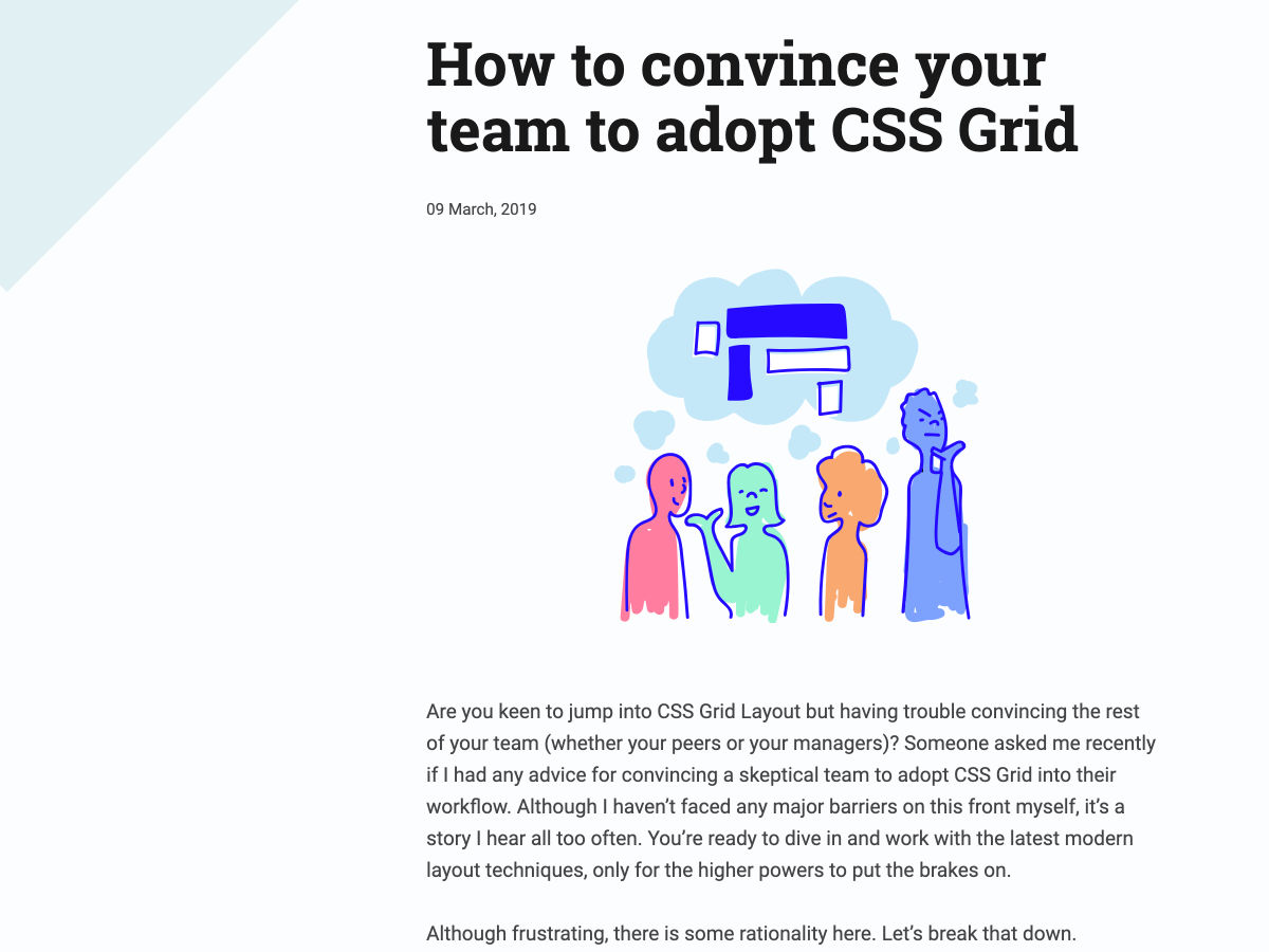
Archive

Archive for March, 2019

Simple & Boring

March 25th, 2019 No comments

Simplicity is a funny adjective in web design and development. I’m sure it’s a quoted goal for just about every project ever done. Nobody walks into a kickoff meeting like, “Hey team, design something complicated for me. Oh, and make sure the implementation is convoluted as well. Over-engineer that sucker, would ya?”

Of course they want simple. Everybody wants simple. We want simple designs because simple means our customers will understand it and like it. We want simplicity in development. Nobody dreams of going to work to spend all day wrapping their head around a complex system to fix one bug.

Still, there is plenty to talk about when it comes to simplicity. It would be very hard to argue that web development has gotten simpler over the years. As such, the word has lately been on the tongues of many web designers and developers. Let’s take a meandering waltz through what other people have to say about simplicity.

Bridget Stewart recalls a frustrating battle against over-engineering in “A Simpler Web: I Concur.” After being hired as an expert in UI implementation and given the task of getting a video to play on a click…

I looked under the hood and got lost in all the looping functions and the variables and couldn’t figure out what the code was supposed to do. I couldn’t find any HTML being referenced. I couldn’t see where a link or a button might be generated. I was lost.

I asked him to explain what the functions were doing so I could help figure out what could be the cause, because the browser can play video without much prodding. Instead of successfully getting me to understand what he had built, he argued with me about whether or not it was even possible to do. I tried, at first calmly, to explain to him I had done it many times before in my previous job, so I was absolutely certain it could be done. As he continued to refuse my explanation, things got heated. When I was done yelling at him (not the most professional way to conduct myself, I know), I returned to my work area and fired up a branch of the repo to implement it. 20 minutes later, I had it working.

It sounds like the main problem here is that the dude was a territorial dingus, but also his complicated approach literally stood in the way of getting work done.

Simplicity on the web often times means letting the browser do things for us. How many times have you seen a complex re-engineering of a select menu not be as usable or accessible as a ?

Jemery Wagner writes in Make it Boring:

Eminently usable designs and architectures result when simplicity is the default. It’s why unadorned HTML works. It beautifully solves the problem of presenting documents to the screen that we don’t even consider all the careful thought that went into the user agent stylesheets that provide its utterly boring presentation. We can take a lesson from this, especially during a time when more websites are consumed as web apps, and make them more resilient by adhering to semantics and native web technologies.

My guess is the rise of static site generators — and sites that find a way to get as much server-rendered as possible — is a symptom of the industry yearning for that brand of resilience.

Do less, as they say. Lyza Danger Gardner found a lot of value in this in her own job:

… we need to try to do as little as possible when we build the future web.

This isn’t a rationalization for laziness or shirking responsibility—those characteristics are arguably not ones you’d find in successful web devs. Nor it is a suggestion that we build bland, homogeneous sites and apps that sacrifice all nuance or spark to the Greater Good of total compatibility.

Instead it is an appeal for simplicity and elegance: putting commonality first, approaching differentiation carefully, and advocating for consistency in the creation and application of web standards.

Christopher T. Miller writes in “A Simpler Web”:

Should we find our way to something simpler, something more accessible?

I think we can. By simplifying our sites we achieve greater reach, better performance, and more reliable conveying of the information which is at the core of any website. I think we are seeing this in the uptick of passionate conversations around user experience, but it cannot stop with the UX team. Developers need to take ownership for the complexity they add to the Web.

It’s good to remember that the complexity we layer onto building websites is opt-in. We often do it for good reason, but it’s possible not to. Garrett Dimon:

You can build a robust, reliable, and fully responsive web application today using only semantic HTML on the front-end. No images. No CSS. No JavaScript. It’s entirely possible. It will work in every modern browser. It will be straightforward to maintain. It may not fit the standard definition of beauty as far as web experiences go, but it will work. In many cases, it will be more usable and accessible than those built with modern front-end frameworks.

That’s not to say that this is the best approach, but it’s a good reminder that the web works by default without all of our additional layers. When we add those additional layers, things break. Or, if we neglect good markup and CSS to begin with, we start out with something that’s already broken and then spend time trying to make it work again.

We assume that complex problems always require complex solutions. We try to solve complexity by inventing tools and technologies to address a problem; but in the process, we create another layer of complexity that, in turn, causes its own set of issues.

— Max Böck, “On Simplicity”

Perhaps the worst reason to choose a complex solution is that it’s new, and the newness makes it feel like choosing it makes you on top of technology and doing your job well. Old and boring may just what you need to do your job well.

Dan McKinley writes:

“Boring” should not be conflated with “bad.” There is technology out there that is both boring and bad. You should not use any of that. But there are many choices of technology that are boring and good, or at least good enough. MySQL is boring. Postgres is boring. PHP is boring. Python is boring. Memcached is boring. Squid is boring. Cron is boring.

The nice thing about boringness (so constrained) is that the capabilities of these things are well understood. But more importantly, their failure modes are well understood.

Rachel Andrew wrote that choosing established technology for the CMS she builds was a no-brainer because it’s what her customers had.

You’re going to hear less about old and boring technology. If you’re consuming a healthy diet of tech news, you probably won’t read many blog posts about old and boring technology. It’s too bad really, I, for one, would enjoy that. But I get it, publications need to have fresh writing and writers are less excited about topics that have been well-trod over decades.

As David DeSandro says, “New tech gets chatter”. When there is little to say, you just don’t say it.

You don’t hear about TextMate because TextMate is old. What would I tweet? Still using TextMate. Still good.

While we hear more about new tech, it’s old tech that is more well known, including what it’s bad at. If newer tech, perhaps more complicated tech, is needed because it solves a known pain point, that’s great, but when it doesn’t…

You are perfectly okay to stick with what works for you. The more you use something, the clearer its pain points become. Try new technologies when you’re ready to address those pain points. Don’t feel obligated to change your workflow because of chatter. New tech gets chatter, but that doesn’t make it any better.

Adam Silver says that a boring developer is full of questions:

“Will debugging code be more difficult?”, “Might performance degrade?” and “Will I be slowed down due to compile times?”

Dan Kim is also proud of being boring:

I have a confession to make?—?I’m not a rock star programmer. Nor am I a hacker. I don’t know ninjutsu. Nobody has ever called me a wizard.

Still, I take pride in the fact that I’m a good, solid programmer.

Complexity isn’t an enemy. Complexity is valuable. If what we work on had no complexity, it would worth far less, as there would be nothing slowing down the competition. Our job is complexity. Or rather, our job is managing the level of complexity so it’s valuable while still manageable.

Santi Metz has a great article digging into various aspects of this, part of which is about considering how much complicated code needs to change:

We abhor complication, but if the code never changes, it’s not costing us money.

Your CMS might be extremely complicated under the hood, but if you never touch that, who cares. But if your CMS limits what you’re able to do, and you spend a lot of time fighting it, that complexity matters a lot.

It’s satisfying to read Sandi’s analysis that it’s possible to predict where code breaks, and those points are defined by complexity. “Outlier classes” (parts of a code base that cause the most problems) can be identified without even seeing the code base:

I’m not familiar with the source code for these apps, but sight unseen I feel confident making a few predictions about the outlying classes. I suspect that they:

  1. are larger than most other classes,
  2. are laden with conditionals, and
  3. represent core concepts in the domain

I feel seen.

Boring is in it for the long haul.

Cap Watkins writes in “The Boring Designer”:

The boring designer is trusted and valued because people know they’re in it for the product and the user. The boring designer asks questions and leans on others’ experience and expertise, creating even more trust over time. They rarely assume they know the answer.

The boring designer is capable of being one of the best leaders a team can have.

So be great. Be boring.

Be boring!

The post Simple & Boring appeared first on CSS-Tricks.

Categories: Designing, Others Tags:

How To Find And Make The Most Of The Unplanned User Journey

March 25th, 2019 No comments
Google Analytics dashboard showing Exit Pages

How To Find And Make The Most Of The Unplanned User Journey

How To Find And Make The Most Of The Unplanned User Journey

Ben Christine

2019-03-25T12:30:35+01:002019-03-25T17:35:16+00:00

Fallbacks can be defined as an alternative plan that may be used, and in the context of user journeys, they would be an alternative path to the expected or planned user behavior. So, when we think about our sites and apps, we build them with a particular plan in mind to achieve a particular goal by taking a particular route and to experience a particular experience.

If you are experienced in building products, you will know that users have a tendency to do things you didn’t plan for, and that’s alright because we can’t possibly understand all of their needs and intention. This is why fallbacks are so valuable.

Over the years, we have tried and tested many tools at Venture Harbour to help us get better feedback loops. Our products have needs which require different types of tools to reveal all kinds of insights. From heatmaps and visitor recording tools (like Hotjar and Fullstory) to analytics platforms like Google Analytics and Amplitude.

These tools are great and help us accomplish a lot, but they only go so far. We now need to get deeper insights that can only be achieved by implementing fallbacks to your user journeys.

To start, we need to be thinking about what alternative behaviors or routes our users might experience that we didn’t see coming. Here are three common fallbacks:

  • Dead Ends
    The user’s journey has come to an end, and there are no clear or onward steps. The goal would be to offer the next steps to the user and track those choices.
  • Grey Areas
    The user is interacting with your site or app, but we have little or no understanding of what is going on, or why they are doing what they are doing. The goal is to shed light on those areas to learn about what might be happening.
  • Errors
    The user is presented with an error message that gives insufficient context. The goal here is to offer context by interacting with the user to gain feedback from them.

Let’s dive into some examples from the wild in which feedback loops are missing from popular fallbacks. Then, I will follow up with ideas of how that feedback loop might look and work in those fallbacks.

Note: Just so you know, these are mockups based on real-world scenarios.

Turning Dead Ends Into Feedback Goldmines

Dead ends in a user flow are common. One way of discovering them is by analyzing your Exit Pages in your analytics tracking tool, like Google Analytics. This will highlight common exit pages on your site or app and give you a starting point to start investigating.


Google Analytics dashboard showing Exit Pages
Google Analytics is a great free tool to get some deep insights into your sites. (Large preview)

Now we need to be asking the simple question:

“Why are users leaving at these points?”

Take a look at the actual pages these exits are happening on and start considering at what point in the process of using your app or site the user is at when they hit this dead end. Are they just getting started, are they mid-flow, or are they close to achieving a particular goal in the journey? These considerations will help you paint a better picture of the user’s situation and possible reasons.

Example: Dead Ends In Search

A very common dead end is with search when you are searching for something and you are shown that “No Results” page. Businesses are starting to really invest in these pages, and you will find that you would normally be shown some sort of a result — especially on e-commerce sites.

When searching for anything, we should at least return some sort of result. When we don’t have an actual result to show, then we need to creatively think about how to capitalize on these scenarios. This can take the form of a question or a common action that could have possibly been the intention of the user’s search in the first place.

Below is an example of a dead-end search:


Generic dead-end search results page
Dead-end search results are very common in many user journeys. (Large preview)

In this case, what can we find out from the user that we don’t already know to help us improve their experience and help us learn? What questions could we be asking them? What could we provide the user at this point, now that they haven’t found what they are after?

This particular scenario is interesting, and I thought of a couple of ideas on how to get information from the user to help us improve our app and provide them with the next step.

As shown below, we start off by telling the user that what they are looking for isn’t available now, but could be in the future. In return, we can get some feedback on what they had hoped to do or find instead:


Generic dead-end search results page with smart next steps
We can easily guide users out of dead ends with smart next steps. (Large preview)

We could then provide the user with a next step by offering them a filter that will help them find an alternative and subsequently inform us of what category of extension they were searching for, which we could then review and work out what categories we should be investing time in. With this information collated from the user, we can start to build up a knowledge base of what users might expect in these scenarios and begin to suggest smarter categories and suggestions to the end user in the future. That way, we can provide them with a much better user experience.

Example: Natural Dead Ends

Dead ends can also happen as a natural order of your site or app. There might be scenarios in which users are met with a page that lacks content and no onward step due to the system not having had time to process data. Or maybe the data has not been created yet, as illustrated below:


Generic dead end processing pages
What might seem to be the nature of an app can be a loss to the user. (Large preview)

So now what we want to do is make sure of two things:

  1. The user should understand why and what’s going on;
  2. Engage the user while they wait for the data.

Below is a friendly, valuable and useful fallback for both the user and for ourselves. The user is offered notifications to be sent to their email address — along with a month’s subscription free of charge! In return, we get to inform users when to come back to the app: happy users with a free month, and extra data on the users themselves. It’s always best when everyone wins!


Generic engaging processing page
Take every opportunity to engage and guide your users. (Large preview)

Over time, we can start to understand if the majority of users do or do not want to have certain features, and whether they prefer to start turning them on by default or removing them completely. Also, information from surveys can help grow our understanding of users’ expectations of the app, and help us shape it to fit users’ needs.

Recommended reading: How To Improve Your Design Process With Data-Based Personas

Convert Grey Areas Into Insights

What I mean by ‘grey areas’ are areas that lack insight and clarity on what users might be doing or why users are making particular decisions. These are normally areas that aren’t of high priority to the site/app but are part of the key user journey. The more data we have through the user journey, the better we can understand the whats, whys and hows of users’ actions.

Example: Understanding Your “Other”

It is quite common practice to label something as ‘other’ when there isn’t a clear fit. Below is an example of this kind of UI, and as we analyze this scenario, it is clear that the only insight we have is that we know that the user is labeling this as a ‘other’ type, and that leaves us with little understanding of what it is or what they intended it to be.


Generic dropdown with other option
The “Other” option is too common. (Large preview)

Of course, we could investigate a little more about what is being labelled as ‘other’ and find some common lines, but we wouldn’t know what the user might have intended by labelling it that.

So, how can we change this scenario from being just another ‘other’ answer to something that is informative and useful to both user and us? An approach I would suggest is a little more complex but will make the experience a lot more engaging.

We want to allow users to either choose their option by clicking on the option that they know they want or by searching for what they think they are looking for. Why is this helpful? Well, when it comes to naming options, we might name them in quite a different way compared to how the user might have in mind. But if we still can’t offer the user an answer they’re looking for, then we should start a conversation with them by showing them a question and a text box, and ask them what it is that they are looking for and why. (Perhaps also add a line that we will follow up with them and find a solution to their needs.)


Generic dropdown with smart search and feedback tool
Take away the “Other” option and replace it with smart feedback loops. (Large preview)

As we start to find common threads in the searches and responses we get, we can start to adjust the search to serve the user the option the most likely need, and we can also build new features as demand increases, too.

Example: Understand You Instant Search

Another grey area below is one example of myself using an instant search while looking for some keywords that are not associated with anything I have in my account.


Generic instant search grey area
Instant searches are common these days, and they can be so undervalued. (Large preview)

From this experience, I asked myself the following questions:

  • What’s the takeaway from this scenario?
  • Can I find out how common this scenario is?
  • What is the user trying to achieve?
  • How can we help them get to where they want?

Below is the ‘No Results’ results window with a feedback loop to help us learn about the users’ needs. The search results are populated in a way which can bring insights into the users’ needs, and provide us with at least some clarity into what exactly it is that they are searching for with the ‘search in’ option.


Generic instant search with feedback and common call-to-actions
Adding interesting next steps and common call-to-actions will give users a sense of what to do next.(Large preview)

A few ways to engage your users would be:

  • Offer common actions on your site or app for the user to create the content that they are looking for;
  • Provide the option of them receiving a notification once the thing they had been looking for becomes available (this is a nice way to bring the user back at a later stage);
  • Allow them to give straightforward feedback because sometimes talking to someone will solve everything (and a conversation is the best source of feedback).

We can learn and get smarter with the results we get from this feedback loop, as long as we start providing smarter category suggestiony to our users. Over time, personalized habits can be learned for individual users and we can start to suggest options that are more likely to resonate with that user because of their past actions and searches.

Make Your Errors Messages A Strength

Whether we choose to accept it or not, errors do happen. When they happen, we should know about them, but sometimes we can cater for errors in a generic way which doesn’t help us or the user.

An example of this is when the user could be interacting with your site or app where they are saving some sort of data to your system, but for some reason, the connection is lost and the process fails. There is little to diagnose what is going on or what has happened but we know there was an error. Standard procedure is to inform the user that an error has occurred and possibly to try again.


Sometimes we have an incline of what's happened, giving the user a few options can help us learn what's a common issue.
No one wants to see error messages, especially ones that give us little guidance. (Large preview)

When we know little about the issue on our end, or that it could have been caused by a handful of things, then this is a great opportunity to get back some feedback from the user about what’s going on. I think this is the most simple fallback to implement, but one that I see the least of.

A typical scenario would be when something is being automatically saved while you are using the site or app. This is a growing scenario especially with mobile connections; understanding that your site is used by users on-the-go or on a mobile connection is a great insight, and we should try to gather that information as much as possible.


Generic website/app error message with single feedback loop
Adding character will encourage users to give feedback. (Large preview)

Or you could make it even simpler for the user. If you already have an idea of what the issue may be and would like to get a better idea of how often it has happened to the user, then serve them with options but still allow them to tell you what they’ve experienced. Once you have that information, you can then start investing your time in possible new features to help resolve those given issues and hopefully find yourself not having to show an error message at all.


Sometimes we have an incline of what's happened, so giving the user a few options can help us learn what's a common issue
No one wants to see error messages, especially ones that give us little guidance. (Large preview)

Something important to remember is that a fallback doesn’t have to be a permanent feature, but it can be a temporary one to help you figure out what to ask or what to build next. It requires a little bit of investment and time to collect data, but these can be seen as test running in areas of your user journey that you have never looked into before, and will only add to the understanding of your users and their needs.

With all of this said, fallbacks in an ideal world would never exist. If you are working on a brand new project or reworking your user flow, set yourself the challenge of creating a flow where a user would never encounter scenarios like these. Consider how to prevent a user from ever searching for something that doesn’t exist. Track and analyze all areas of your user journey to understand each of their steps and formulate ways where an error message would never be shown.

Recommended reading: A/B Testing For Mobile-First Experiences

Where Are Fallbacks Costing You?

Fallbacks will look different depending on your product, as you will be asking different questions and offering different options, but they will all play a valuable role in exposing yourself and the users to better options and understanding.

What Next?

Why not take a few hours to look at your user journeys and document where the grey areas are, as well as look for dead ends and error messages that (still) exist in your product.

Here are some guides to get you started:

  • Dead Ends
    Start exploring your analytics and — if you aren’t already — get comfortable in there. The exit pages are normally tracked by default and will provide you with great insights to what stage your users are leaving the site. Think about where your users will be in their journey and consider the kind of needs they might have at those points.
  • Grey Areas
    If you haven’t already, map out your user journey and start highlighting areas that you might have questions about. Consider the points in which your users are making decisions and think about the options you are giving them. Remember the “Other” option and think about where there might be any that are quite generic. Start tracking those options to see how often they are chosen, then start exploring the ways to get feedback from the users on what they want.
  • Errors
    You can quickly work out where an error might be shown on your app. With a site/app that is saving, updating and working in real time, errors are possibly a key part to your system. Start by figuring out which area is most used, which could result in where errors are most frequently seen. Invest in the error messages there and start gathering feedback on why those are being shown — both from your system but also the user. I would also recommend creating a default error message with a feedback loop that would be used across the site for any new feature so that you will start learning from those errors from day one.

Happy fallback building!

(cc, ra, il)
Categories: Others Tags:

20 Freshest Web Designs, March 2019

March 25th, 2019 No comments

Welcome to our roundup of the best websites launched (or relaunched with major updates) in the last four weeks.

This month’s offering sees the end of Winter and the beginning of Spring, and many sites this month reflect that change with rich colors. To counter that, there’s some high-contrast black and white work on show. You’ll also find innovative uses of images and video. Enjoy!

Takahisa Mitsumori

A leading exponent of digital music, Takahisa Mitsumori is a Japanese musician now based in Berlin. His simple site blends minimalist Japanese graphic design, with a Swiss Design approach to create an intriguing visual interpretation of his sounds.

Rejina Pyo

A lot of designers acknowledge the merits of negative space, but how many truly embrace the concept? Rejina Pyo’s site is an exemplary example of how to use white space to frame images, giving the whole site a modern, sophisticated look.

The Nue Co.

With so much color on the web in recent months, its startling when you encounter a black and white, high-contrast approach. The Nue Co. uses a little subtle color in its product images, but the whole site is mostly black and white, and all the more impactful for it.

Zhee-Shee Production

Illustration is a huge trend for 2019, but so many designers are following the same patterns, resulting in derivative work. But not Zhee-Shee Production, whose charming, witty illustrations manage to straddle corporate interests, and pop culture.

Lune Croissanterie

Some people take themselves far too seriously, and Lune Croissanterie may fall into that trap. The Melbourne-based company isn’t a shop, or a factory, it’s an experience dedicated to the perfection of the croissant. It’s the most committed pastry site I’ve ever seen.

Bruegel: Once in a Lifetime

This magnificently animated site for an exhibition of works by Pieter Bruegel the Elder, takes enormous liberties with the Flemish master’s artwork, but wonderfully captures the spirit of his anarchic, surprising, and honest depictions of everyday life.

Uenoland

Uenoland is a design conference taking place in Brooklyn from the 2nd to the 4th of May. Its one-page site has a design-centric Medium feel, with on-trend illustrations, and a clear type hierarchy. One of the few times when over-indulging design trends is an appropriate approach.

Fluff

Fluff Casual Cosmetics are on a mission to make you, look like you. Its daring approach is designed to appeal to a much younger audience than many cosmetics companies, and its use of programmatic animation, and moving videos perfectly target that demographic.

66 Nord

Take a trip to the poles with 66 Nord, a travel company specializing in trips to the arctic and antarctic circles. There are options from Russia to Alaska, and the site’s incredible photography does an outstanding job of selling these awe-inspiring vacations.

Oficina Penadés

Brutalism has been hanging around for a while now, and as design trends go, it’s a little hard to swallow. The industrial quality of the style can be jarring and inaccessible. However in the case of Oficina Penadés’ site, it perfectly encapsulates the work on show.

Tuesday Bassen

Sometimes what a site needs to lift it out of the ordinary and into the realms of greatness, is a bold choice of typeface. Tuesday Bassen is one such site; the simple Shopify-powered store for the LA-based brand is delightful thanks to some great art direction, and that beautiful branding.

Stardust

Stardust uses a carefully considered gradient to mimic the look of the sky at dawn. The positive visual reinforcement of its message plays out beautifully as you scroll. And check out that clever, animated hamburger menu—it’s explained, and then tucked away.

Hachem

We’ve been living in a white and grey, with a touch of blue, world for so long that when we see color it hits us right between the eyes. Hachem is an art supplies store, so you’d expect some creative daring, and the hues and lettering on display deliver exactly that.

German Shible Tattooing

The exciting thing about web design right now, is that we’re leaving behind the era of cold, minimal design, and infusing our work with personality. I love the bold, some might say eclectic, font pairings on German Shible Tattooing. Don’t forget to tap that tiger’s nose.

Hinderer & Wolff

Designers often make the mistake of thinking that effective UX means eschewing fancy 3D effects, but not so! Simple to understand products, and especially luxury products, benefit from some bells and whistles. Hinderer & Wolff’s impressive site is a joy to explore.

Goodwell Co.

Goodwell Co. is dedicated to replacing the plastic dental care products that fill landfill sites, with sustainable products that are good for the environment. Its site is simple, to convey its simple message, and the positivity of the message is reinforced with color.

London Terrariums

Brilliantly employing the split screen trend, the site for London Terrariums scrolls through text on the right of the screen, while fading images in and out on the left side. It’s a simple and effective approach to presenting a minimal amount of content engagingly.

Jinn & Co.

The fullscreen macroscopic video of Jin & Co.’s artisanal confections is more than enough to sell the desirable candy. The inclusion of broad spectrum hemp oil explains the purse-busting price tag, but they sure do look good, especially the mango-guava and lychee jellies.

Les Animals: 2019 Wishes

This site is a lovingly created set of wishes illustrated and animated for 2019. Alongside the charming visuals, you’ll also find the sort of careful interaction design that you would expect from a digital agency of this calibre. It’s a joy to use.

Aida

Just because you’ve reached the age where nibbles are more common at your parties than shots, doesn’t mean you shouldn’t party hard. Aida is a NY-based party food and accessories company with a fun, morning-after style of art direction.

Add Realistic Chalk and Sketch Lettering Effects with Sketch’it – only $5!

Source

Categories: Designing, Others Tags:

Podcasts on The Great Divide

March 24th, 2019 No comments

Nick Nisi, Suz Hinton, and Kevin Ball talk about The Great Divide in JS Party #61, then I get to join Suz and Jerod again in episode #67 to talk about it again.

Dave and I also got into it a bit in ShopTalk #346.

Direct Link to ArticlePermalink

The post Podcasts on The Great Divide appeared first on CSS-Tricks.

Categories: Designing, Others Tags:

Popular Design News of the Week: March 18, 2019 – March 24, 2019

March 24th, 2019 No comments

Every week users submit a lot of interesting stuff on our sister site Webdesigner News, highlighting great content from around the web that can be of interest to web designers.

The best way to keep track of all the great stories and news being posted is simply to check out the Webdesigner News site, however, in case you missed some here’s a quick and useful compilation of the most popular designer news that we curated from the past week.

Note that this is only a very small selection of the links that were posted, so don’t miss out and subscribe to our newsletter and follow the site daily for all the news.

I Used the Web for a Day on Internet Explorer 8

HTML Periodic Table

Killed by Google

The Bottleneck Nobody Talks About

Google Maps Web Starts Getting a Material Design Makeover

Mock

An Introduction to Web Components

Everything You Need to Know About Loading Animations

iMac Gets a 2x Performance Boost

Eight Tips for Improving Contact Form Conversions

Top 18 Free CSS3 Resources to Build Fast, Lightweight Websites

Building Accessible Websites and Apps is a Moral Obligation

The Books I Recommend to Designers

Cutting the Interface for Good

How to Convince your Team to Adopt CSS Grid

Typography in Design Systems

This Resume Does not Exist

Google Unveils New Gaming Platform, Stadia

How to Scale your Web Design Business

A Look at an Original iPhone Prototype

Consistency and Drudgery in UI Design

Ways to Look at the Color Black

3 Methods to Influence and Change Users’ Behavior

Who was Garamond, Anyway? The History Behind 5 Classic Typefaces

How Art Direction will Help You Create Masterful Web Interfaces

Want more? No problem! Keep track of top design news from around the web with Webdesigner News.

Add Realistic Chalk and Sketch Lettering Effects with Sketch’it – only $5!

Source

Categories: Designing, Others Tags:

Deal: Download 30 Images From DepositPhotos for Just $19

March 23rd, 2019 No comments

In an increasingly competitive market, every freelancer and agency needs a way to stand out from the crowd. One of the simplest options is to commit to only ever working with quality assets; not least high-quality stock images.

Quality stock images help your design stand out by reducing the high cost of art direction. Stock images can be used for banners, background images, to add a human touch to otherwise impersonal user experiences; often, they’re used less in production sites, and instead used as visual placeholders when pitching designs to clients. However you use them, the key is to ensure that you have a reliable, professional-grade source.

DepositPhotos has one of the largest libraries of stock images online, with over 100 million premium quality images; perfect for designers looking to supplement their existing toolbox. With so many to choose from, it’s all but certain you’ll find the ideal shot. You’ll even find high-quality vector illustrations available, so you can embrace 2019’s illustration trend. All DepositPhotos images are royalty-free, meaning that there’s no geographic or time limit on using them, and they’re good to go in personal or commercial projects.

This incredible deal from our sister site, MightyDeals.com, gives you 30 downloads for just $19; that’s an amazing saving of $131, or 87% off the regular retail price!

Crucially the downloads are not time-limited, and there’s no monthly quota. Simply purchase this deal, and then use the credits to download the images you need, when you need them.

Not only does this deal mean you’ll be paying just $0.63 per image, but you can even download the new “super” size image, DepositPhotos’ largest ever format.

There are many places to grab stock images from, but why compromise your designs when you can download professional images at such a vastly reduced price?

Head over to MightyDeals to grab this awesome offer today.

Add Realistic Chalk and Sketch Lettering Effects with Sketch’it – only $5!

Source

Categories: Designing, Others Tags:

All About mailto: Links

March 22nd, 2019 No comments

You can make a garden variety anchor link () open up a new email. Let’s take a little journey into this feature. It’s pretty easy to use, but as with anything web, there are lots of things to consider.

The basic functionality

<a href="mailto:someone@yoursite.com">Email Us</a>

It works!

But we immediately run into a handful of UX issues. One of them is that clicking that link surprises some people in a way they don’t like. Sort of the same way clicking on a link to a PDF opens a file instead of a web page. Le sigh. We’ll get to that in a bit.

“Open in new tab” sometimes does matter.

If a user has their default mail client (e.g. Outlook, Apple Mail, etc.) set up to be a native app, it doesn’t really matter. They click a mailto: link, that application opens up, a new email is created, and it behaves the same whether you’ve attempted to open that link in a new tab or not.

But if a user has a browser-based email client set up, it does matter. For example, you can allow Gmail to be your default email handler on Chrome. In that case, the link behaves like any other link, in that if you don’t open in a new tab, the page will redirect to Gmail.

I’m a little on the fence about it. I’ve weighed in on opening links in new tabs before, but not specifically about opening emails. I’d say I lean a bit toward using target="_blank" on mail links, despite my feelings on using it in other scenarios.

<a href="mailto:someone@yoursite.com" target="_blank" rel="noopener noreferrer">Email Us</a>

Adding a subject and body

This is somewhat rare to see for some reason, but mailto: links can define the email subject and body content as well. They are just query parameters!

mailto:chriscoyier@gmail.com?subject=Important!&body=Hi.

Add copy and blind copy support

You can send to multiple email addresses, and even carbon copy (CC), and blind carbon copy (BCC) people on the email. The trick is more query parameters and comma-separating the email addresses.

mailto:someone@yoursite.com?cc=someoneelse@theirsite.com,another@thatsite.com,me@mysite.com&bcc=lastperson@theirsite.com

This site is awful handy

mailtolink.me will help generate email links.

Use a to let people craft the email first

I’m not sure how useful this is, but it’s an interesting curiosity that you can make a do a GET, which is basically a redirect to a URL — and that URL can be in the mailto: format with query params populated by the inputs! It can even open in a new tab.

See the Pen
Use a to make an email
by Chris Coyier (@chriscoyier)
on CodePen.

People don’t like surprises

Because mailto: links are valid anchor links like any other, they are typically styled exactly the same. But clicking them clearly produces very different results. It may be worthwhile to indicate mailto: links in a special way.

If you use an actual email address as the link, that’s probably a good indication:

<a href="mailto:chriscoyier@gmail.com">chriscoyier@gmail.com</a>

Or you could use CSS to help explain with a little emoji story:

a[href^="mailto:"]::after {
  content: " (📨↗️)";
}

If you really dislike mailto: links, there is a browser extension for you.

https://ihatemailto.com/

I dig how it doesn’t just block them, but copies the email address to your clipboard and tells you that’s what it did.

The post All About mailto: Links appeared first on CSS-Tricks.

Categories: Designing, Others Tags:

Starbucks Will Redesign its Packaging to Fight Against Pollution

March 22nd, 2019 No comments
Starbucks

The international coffee chain Starbucks will make the change to an eco-friendly packaging design that allows its customers to recycle the packaging of the products.

Starbucks makes a change

Starbucks sells about 4 billion glasses per year. Each and every one of the drinks offered by the company are distributed through these disposable containers that significantly damage the environment. Only 10% of the material that composes them is recycled, so the margin of improvement that the company seeks can be very remarkable.

CHENGDU, SICHUAN PROVINCE, CHINA – 2015/09/13: Coffee cup on table in a Starbucks cafe. Starbucks is streamlining the ordering process so customers are able to get that cup of coffee faster than usual. (Photo by Zhang Peng/LightRocket via Getty Images)

Each year, an estimated 600 billion paper and plastic cups are distributed globally*, and though Starbucks cups only account for an estimated 1 percent of that total, we are invested in finding a more sustainable solution. We have made substantial progress to reduce the impact of waste generated in our stores through cup innovation and improved packaging design, advocacy for local recycling infrastructure, and offering reusable cups.

– Starbucks Headquarters

The international coffee chain, like food giants such as McDonald’s , Coca-Cola or Nestlé , has joined the investment platform for sustainable consumer goods NextGen Consortium. Through the enactment of the NextGen Cup Challenge last autumn , more than 500 participants from 50 different countries have presented innovative design proposals. After months of rigorous evaluation, the number has been reduced to 12 projects, which, in addition to being able to be selected to change the appearance of Starbucks packaging, opt for a prize of one million euros.

Starbuck packaging

New packaging

These finalist projects are divided into three large groups. The first one is related to the initiatives to create a new design for the lining of the cups. One of the selected ones was from the company Footprint US, which has created new containers based on 100% recyclable fiber. The second one is the group that studies the work with new materials, a category in which only Solublue has been selected, which has created a biodegradable plant-based cup. The third and last group is the one that has created reusable containers, among which we can highlight CupClub, which aims to create cups that are returned to Starbucks after use.

Our goal: Double the recycled content, recyclability and compostability, and reusability of our cups and packaging by 2022.

Despite all the proposals and the great commitment to eco-friendly packaging , we still have to wait a few years for the change to be real and our coffees to be respectful with the environment.

Starbucks – providing global solutions since 1997

Although this is a massive leap in the production process, one that could literally change the way products are made for years to come, it’s not their first run-in with eco-friendly products.

Back in 1997, Starbucks introduced the now widely used cup sleeve. Yep, the little cardboard sleeve that goes around your cup and pretty much any coffee shop was invented first by the people at Starbucks. It may seem a little counterintuitive, but it was actually a very green solution to the impractical practice of double cupping. Back in the day, people used to just use two cups in order to absorb the heat.

And, the push to change the impact of plastic cups and lids didn’t stop there.

In 2006, Starbucks developed paper cups manufactured with 10 percent post-consumer recycled fiber, the first cup of its kind in the food packaging industry to be approved by the U.S. Food and Drug Administration in 2006. We also introduced a more recyclable cup lid in 2016 which allowed the cup to be more widely accepted.

– Starbucks HQ

What’s next?

It’s very clear that Starbucks both as one of the most well known coffee brands in the world, and a food industry powerhouse is concerned for the environment. As time goes on, I imagine that we will see lots of changes come out of Starbucks HQ, more particularly, ones that positively affect our planet.

Only time will tell if these changes will actually make a change. Starbucks and the other companies mentioned are a great start to this ever growing problem, but it will take all of us being a little more cautious with our choices to reverse the damage that we’ve already done.

Read More at Starbucks Will Redesign its Packaging to Fight Against Pollution

Categories: Designing, Others Tags:

How to improve your website’s user experience with a few quick changes

March 22nd, 2019 No comments
improve your website's user experience

Considering a large number of websites existent on the Internet, you can tell how complicated it is to stand out from the rest and make users remember their experience with your site in particular.

Most modern websites choose simple visuals and interactive elements to generate a response from users.

Web designers are currently putting more attention on how a website is built instead of how it looks. The user experience is the one detail that can entirely influence the bounce rate on a website.

Good user experience will lead to a smaller exit rate and a visible increase in conversion rates or recurrent users. Achieving a user experience that is as close as possible to perfection represents a competitive advantage that everyone should strive for at the moment.

So, what exactly is user experience?

It’s not the easiest thing to define user experience because it includes so many factors that its limits are uncertain. User experience often referred to as UX, is the behavior that a user displays when he interacts with a certain website. UX includes both website design and form design.

To make it clearer, UX has to do with how the user perceives a website and how easy utilizing this website is. When user experience is improved, people will return to spend more time on this site, thus encouraging brand interaction.

What are the expectations of today’s users?

Now that you understand what user experience is, it’s time to figure out how you can improve it. In order to make a website better in terms of UX, you need to know what users expect in the first place. Here are some elements to consider:

The website’s speed

website speed

Speed is a critical factor when discussing user experience. No one would enjoy a slow website, no matter how well it is built visually wise. Even though encountering a website that is too slow to use is quite a rare situation, it’s best to adopt speed improvement approaches whenever you have the chance.

If a user notices that the website doesn’t load at all within a few seconds from accessing it, his first reaction would be to choose another one instead. The result? A huge bounce rate that will affect your conversion rate.

The navigation menu

TMS Outsource

People must be able to find what they are looking for rapidly. A complicated navigation menu won’t lead anywhere.

On the other hand, a clear menu that offers users relevant information will increase the chance to convert users. Pay attention to how you built your website’s navigation.

Design elements

Image source

Visuals do have an important role in user experience, but it is not the most important. A website that has been designed by following the latest trends and that is overall eye-pleasing will definitely return positive results.

A website that features low-quality visuals won’t be appreciated and users might never come back, even though your website was relevant for their searches. As in any other case, the first impression matters.

Responsiveness

Another factor that you can’t ignore is responsiveness. Keeping in mind that there are millions of phone-only users in the world, you should make your website mobile-friendly.

Your website should be accessible from all sorts of devices, regardless of their size. Non-responsive websites are often left within a couple of seconds.

How can you improve your website’s user experience?

Now that you know what expectations people have, see what you can do to improve your website’s user experience:

Keep it clean

Image source

Simple designs are much more appreciated than complex ones. The main purpose of a website is to help the user find what he is looking for. Smooth user experience is based on keeping the website’s structure clean. Crowding the website with all sorts of elements will only slow it down and confuse the user, which is exactly what you want to avoid.

The website’s usability is deeply related to how simple it is. The navigation menu should be intuitive and responsive. A navigation menu that is impossible to use will lead to bad user experience, thus making the website unnecessary to visitors. Using familiar web design elements and simple navigation systems, such as tabbed or header navigation should do the job just fine.

Use CTAs

Remember that the purpose of good user experience design is to make people return to the website. This won’t happen if they don’t find the website relevant for their needs. To help users find exactly what they want, you should use Call-To-Action elements (CTAs).

These elements will give users some directions so that they can reach the location they expect to find on the website much easier and faster. When creating CTAs, make sure to get informed about color psychology and hierarchy design.

These small details can make a huge difference in the long run. Placing the CTAs strategically will determine whether they will be effective or not. As the name says it, you need to make use of action verbs that encourage users to do something. Try to generate an emotional response through the message that you incorporate through the CTAs.

White space is appreciated

White space is often overlooked, even though it can be very helpful. Some blank space offers users a moment to process the information they see while giving the website an airy look. As many web designers stated, white space can make a tremendous difference in terms of user experience.

It can boost the conversion rate, simply by delimitating content better and giving users the chance to find what they want in an easier manner. White space can also be used to highlight something to make it pop up in the user’s eyes when he first enters the website.

Deal with errors

Considering the latest advancements in terms of search engine algorithms, you might be surprised to hear that soft 404 errors are now one reason why your website will go down the drain.

If your website works, but some links or options on it send users to 404 error pages, you need to solve the issue as quickly as possible. There is nothing worse than a frustrated visitor who is eager to find something on your website and he ends up staring at a blank page.

Fix the errors to provide users with an undisrupted journey on your site. Soft errors are not worth the consequences, which means you should take your time to check out each option on your website and fix any error that appears along the way.

Use headings

Using headings makes the content easier to skim through. As mentioned before, time is a very precious resource of people who browse the web, so there is no wonder why they won’t read your whole content word by word. Just make sure to deliver the key points and make the user assimilate them as fast as possible. One method to do that is through well-designed headings.

Use animations

Animations can slow down a website if they are not optimized properly, but they can also change the entire game. Interaction is an important part of UX design, and you can’t skip it just because it might be inconvenient.

Animations are micro-interactions that help people become more familiar with a website in a shorter period of time. Furthermore, animations stir curiosity, especially if they are changed once in a while. This could contribute to a user’s desire to come back to a website in the future. Give your website the proper feel by choosing an animation-based UX design.

Use hyperlink differentiation

Adding links to content is a great way to make it feel genuine and informed. As a publisher, your main goal is to make people click the links you’ve inserted into the text.

To encourage this behavior, use hyperlink differentiation. This means that the links you use should stand out from the rest of the text. Use other colors, underlining, italic, bold or whatever option may look good for your website.

Use images

Using your own high-quality images instead of using stock photos has a great impact on users. Because most people surf the Internet quite often, they can all recognize a stock photo when they see it. Such images simply do not express professionalism or uniqueness.

Find your personal style and use your own images when building a website. Generic images won’t contribute to good user experience, but personal images will so make your choice wisely.

Be consistent

Keeping consistent with your content publishing and website choices is another matter that contributes to the user experience. Your website’s visitors will get used with a certain tone, style, and information quality. In order to provide visitors with the quality they expect, stay consistent and try to maintain your website on the same line. Otherwise, users can get confused and lose their trust in the website.

Categories: Others Tags:

Advanced Tooling for Web Components

March 22nd, 2019 No comments

Over the course of the last four articles in this five-part series, we’ve taken a broad look at the technologies that make up the Web Components standards. First, we looked at how to create HTML templates that could be consumed at a later time. Second, we dove into creating our own custom element. After that, we encapsulated our element’s styles and selectors into the shadow DOM, so that our element is entirely self-contained.

We’ve explored how powerful these tools can be by creating our own custom modal dialog, an element that can be used in most modern application contexts regardless of the underlying framework or library. In this article, we will look at how to consume our element in the various frameworks and look at some advanced tooling to really ramp up your Web Component skills.

Framework agnostic

Our dialog component works great in almost any framework or even without one. (Granted, if JavaScript is disabled, the whole thing is for naught.) Angular and Vue treat Web Components as first-class citizens: the frameworks have been designed with web standards in mind. React is slightly more opinionated, but not impossible to integrate.

Angular

First, let’s take a look at how Angular handles custom elements. By default, Angular will throw a template error whenever it encounters an element it doesn’t recognize (i.e. the default browser elements or any of the components defined by Angular). This behavior can be changed by including the CUSTOM_ELEMENTS_SCHEMA.

…allows an NgModule to contain the following:

  • Non-Angular elements named with dash case (-).
  • Element properties named with dash case (-). Dash case is the naming convention for custom elements.

Angular Documentation

Consuming this schema is as simple as adding it to a module:

import { NgModule, CUSTOM_ELEMENTS_SCHEMA } from '@angular/core';

@NgModule({
  /** Omitted */
  schemas: [ CUSTOM_ELEMENTS_SCHEMA ]
})
export class MyModuleAllowsCustomElements {}

That’s it. After this, Angular will allow us to use our custom element wherever we want with the standard property and event bindings:

<one-dialog [open]="isDialogOpen" (dialog-closed)="dialogClosed($event)">
  <span slot="heading">Heading text</span>
  <div>
    <p>Body copy</p>
  </div>
</one-dialog>

Vue

Vue’s compatibility with Web Components is even better than Angular’s as it doesn’t require any special configuration. Once an element is registered, it can be used with Vue’s default templating syntax:

<one-dialog v-bind:open="isDialogOpen" v-on:dialog-closed="dialogClosed">
  <span slot="heading">Heading text</span>
  <div>
    <p>Body copy</p>
  </div>
</one-dialog>

One caveat with Angular and Vue, however, is their default form controls. If we wish to use something like reactive forms or [(ng-model)] in Angular or v-model in Vue on a custom element with a form control, we will need to set up that plumbing for which is beyond the scope of this article.

React

React is slightly more complicated than Angular. React’s virtual DOM effectively takes a JSX tree and renders it as a large object. So, instead of directly modifying attributes on HTML elements like Angular or Vue, React uses an object syntax to track changes that need to be made to the DOM and updates them in bulk. This works just fine in most cases. Our dialog’s open attribute is bound to its property and will respond perfectly well to changing props.

The catch comes when we start to look at the CustomEvent dispatched when our dialog closes. React implements a series of native event listeners for us with their synthetic event system. Unfortunately, that means that controls like onDialogClosed won’t actually attach event listeners to our component, so we have to find some other way.

The most obvious means of adding custom event listeners in React is by using DOM refs. In this model, we can reference our HTML node directly. The syntax is a bit verbose, but works great:

import React, { Component, createRef } from 'react';

export default class MyComponent extends Component {
  constructor(props) {
    super(props);
    // Create the ref
    this.dialog = createRef();
    // Bind our method to the instance
    this.onDialogClosed = this.onDialogClosed.bind(this);

    this.state = {
      open: false
    };
  }

  componentDidMount() {
    // Once the component mounds, add the event listener
    this.dialog.current.addEventListener('dialog-closed', this.onDialogClosed);
  }

  componentWillUnmount() {
    // When the component unmounts, remove the listener
    this.dialog.current.removeEventListener('dialog-closed', this.onDialogClosed);
  }

  onDialogClosed(event) { /** Omitted **/ }

  render() {
    return <div>
      <one-dialog open={this.state.open} ref={this.dialog}>
        <span slot="heading">Heading text</span>
        <div>
          <p>Body copy</p>
        </div>
      </one-dialog>
    </div>
  }
}

Or, we can use stateless functional components and hooks:

import React, { useState, useEffect, useRef } from 'react';

export default function MyComponent(props) {
  const [ dialogOpen, setDialogOpen ] = useState(false);
  const oneDialog = useRef(null);
  const onDialogClosed = event => console.log(event);

  useEffect(() => {
    oneDialog.current.addEventListener('dialog-closed', onDialogClosed);
    return () => oneDialog.current.removeEventListener('dialog-closed', onDialogClosed)
  });

  return <div>
      <button onClick={() => setDialogOpen(true)}>Open dialog</button>
      <one-dialog ref={oneDialog} open={dialogOpen}>
        <span slot="heading">Heading text</span>
        <div>
          <p>Body copy</p>
        </div>
      </one-dialog>
    </div>
}

That’s not bad, but you can see how reusing this component could quickly become cumbersome. Luckily, we can export a default React component that wraps our custom element using the same tools.

import React, { Component, createRef } from 'react';
import PropTypes from 'prop-types';

export default class OneDialog extends Component {
  constructor(props) {
    super(props);
    // Create the ref
    this.dialog = createRef();
    // Bind our method to the instance
    this.onDialogClosed = this.onDialogClosed.bind(this);
  }

  componentDidMount() {
    // Once the component mounds, add the event listener
    this.dialog.current.addEventListener('dialog-closed', this.onDialogClosed);
  }

  componentWillUnmount() {
    // When the component unmounts, remove the listener
    this.dialog.current.removeEventListener('dialog-closed', this.onDialogClosed);
  }

  onDialogClosed(event) {
    // Check to make sure the prop is present before calling it
    if (this.props.onDialogClosed) {
      this.props.onDialogClosed(event);
    }
  }

  render() {
    const { children, onDialogClosed, ...props } = this.props;
    return <one-dialog {...props} ref={this.dialog}>
      {children}
    </one-dialog>
  }
}

OneDialog.propTypes = {
  children: children: PropTypes.oneOfType([
      PropTypes.arrayOf(PropTypes.node),
      PropTypes.node
  ]).isRequired,
  onDialogClosed: PropTypes.func
};

…or again as a stateless, functional component:

import React, { useRef, useEffect } from 'react';
import PropTypes from 'prop-types';

export default function OneDialog(props) {
  const { children, onDialogClosed, ...restProps } = props;
  const oneDialog = useRef(null);
  
  useEffect(() => {
    onDialogClosed ? oneDialog.current.addEventListener('dialog-closed', onDialogClosed) : null;
    return () => {
      onDialogClosed ? oneDialog.current.removeEventListener('dialog-closed', onDialogClosed) : null;  
    };
  });

  return <one-dialog ref={oneDialog} {...restProps}>{children}</one-dialog>
}

Now we can use our dialog natively in React, but still keep the same API across all our applications (and still drop classes, if that’s your thing).

import React, { useState } from 'react';
import OneDialog from './OneDialog';

export default function MyComponent(props) {
  const [open, setOpen] = useState(false);
  return <div>
    <button onClick={() => setOpen(true)}>Open dialog</button>
    <OneDialog open={open} onDialogClosed={() => setOpen(false)}>
      <span slot="heading">Heading text</span>
      <div>
        <p>Body copy</p>
      </div>
    </OneDialog>
  </div>
}

Advanced tooling

There are a number of great tools for authoring your own custom elements. Searching through npm reveals a multitude of tools for creating highly-reactive custom elements (including my own pet project), but the most popular today by far is lit-html from the Polymer team and, more specifically for Web Components, LitElement.

LitElement is a custom elements base class that provides a series of APIs for doing all of the things we’ve walked through so far. It can be run in a browser without a build step, but if you enjoy using future-facing tools like decorators, there are utilities for that as well.

Before diving into how to use lit or LitElement, take a minute to familiarize yourself with tagged template literals, which are a special kind of function called on template literal strings in JavaScript. These functions take in an array of strings and a collection of interpolated values and can return anything you might want.

function tag(strings, ...values) {
  console.log({ strings, values });
  return true;
}
const who = 'world';

tag`hello ${who}`; 
/** would log out { strings: ['hello ', ''], values: ['world'] } and return true **/

What LitElement gives us is live, dynamic updating of anything passed to that values array, so as a property updates, the element’s render function would be called and the resulting DOM would be re-rendered

import { LitElement, html } from 'lit-element';

class SomeComponent {
  static get properties() {
    return { 
      now: { type: String }
    };
  }

  connectedCallback() {
    // Be sure to call the super
    super.connectedCallback();
    this.interval = window.setInterval(() => {
      this.now = Date.now();
    });
  }

  disconnectedCallback() {
    super.disconnectedCallback();
    window.clearInterval(this.interval);
  }

  render() {
    return html`<h1>It is ${this.now}</h1>`;
  }
}

customElements.define('some-component', SomeComponent);

See the Pen
LitElement now example
by Caleb Williams (@calebdwilliams)
on CodePen.

What you will notice is that we have to define any property we want LitElement to watch using the static properties getter. Using that API tells the base class to call render whenever a change is made to the component’s properties. render, in turn, will update only the nodes that need to change.

So, for our dialog example, it would look like this using LitElement:

See the Pen
Dialog example using LitElement
by Caleb Williams (@calebdwilliams)
on CodePen.

There are several variants of lit-html available, including Haunted, a React hooks-style library for Web Components that can also make use of virtual components using lit-html as a base.

At the end of the day, most of the modern Web Components tools are various flavors of what LitElement is: a base class that abstracts common logic away from our components. Among the other flavors are Stencil, SkateJS, Angular Elements and Polymer.

What’s next

Web Components standards are continuing to evolve and new features are being discussed and added to browsers on an ongoing basis. Soon, Web Component authors will have APIs for interacting with web forms at a high level (including other element internals that are beyond the scope of these introductory articles), like native HTML and CSS module imports, native template instantiation and updating controls, and many more which can be tracked on the W3C/web components issues board on GitHub.

These standards are ready to adopt into our projects today with the appropriate polyfills for legacy browsers and Edge. And while they may not replace your framework of choice, they can be used alongside them to augment you and your organization’s workflows.

The post Advanced Tooling for Web Components appeared first on CSS-Tricks.

Categories: Designing, Others Tags: