Are you searching for ways to drive more traffic to your WordPress blog? Have you thought about creating fresh content to boost traffic and user engagement?
If you already have a lot of content, all you need to do is update and improve it to earn more traffic. Consider using these seven tips to increase WordPress blog traffic by updating your content.
1. Have a regular posting schedule
The first tip is to simply blog more frequently. Brands that post blogs regularly tend to grow their audience much quicker than those who don’t. No worries if your website mostly consists of static content. Adding a Blog or News section can beneficial for everybody. Here are some useful ideas for crafting a compelling company’s blog:
Create an effective and attention-grabbing title. You can use blog name generators that suggest the most relevant blog names based on the keywords you enter.
Use different types of articles such as tutorials, how-to guides, listicles, checklists, industry news, inspirational stories, product reviews, FAQs, beginner guides, and step-by-step guides.
Make content that is comprehensible and resonates with your audience.
Keep the topics fresh and up-to-date.
2. Use keywords
Use keywords in your website’s tagline, content, and tags. When drafting your keywords, don’t think about how search engines will consider them, but rather what users should google for your content to pop up. Use these tips to do proper keyword research:
Learn the actual search phrases (and their variations) that users Google.
Find the most popular content on the topic and see the keywords they’re using.
Optimize keywords for your customers, not for search engines.
Use long-tail keywords, phrases that are very specific to the topic of your blog.
When you create high-quality educational content that is helpful to your readers, you naturally improve your SEO. Frequent blogging positively helps SEO efforts, too. Updating your blog regularly allows search engines to see the activity of your website.
Avoid using too many keywords and don’t overspam. Extensive use of keywords can make your content clumsy and hard-to-read. Moreover, Google may consider your content keyword staffed and lower down your site’s ranking.
3. Use appropriate tags and headlines
You can group related posts together using tags. Tags allow readers to see quickly what a post is about and find related blogs. When you attach appropriate tags and categories to your post, users can find them in the WordPress Reader. Be careful not to use too many tags, though. If you use more than 15 tags or categories, your post might not get featured in the Reader.
Creating traffic boosting headlines is another effective strategy. Headlines help your customers to determine whether they want to read your blog or not. They are also used by search engines when they evaluate and rank content based on headlines. Keep your headlines short – from 7 to 9 words is a good range. Don’t try to stuff your headline with keywords, use them naturally. Cathy headlines usually contain numbers and power words (such as new, free, instant, etc.)
4. Manage comments
Read and manage comments on your blogs. A good comment management strategy allows you to boost your engagement and traffic. As a website moderator, your number one priority should be creating and maintaining a safe environment for your site’s visitors. Identify and control blog comment spam. Off-topic remarks, profanity, and repeating messages distract readers and have the potential to cut down engagement. Try using SMS verification plugins to avoid loads of bots’ comments. Another option is to research and install WordPress anti-spam plugins.
5. Employ internal and external links
Another way to drive more traffic to your posts is through linking. Internal links are links within a post that lead a user somewhere else on your website. Internal links make your website look more user-friendly and useful. When you have a lot of well-thought internal links within your content, your website becomes much easier to navigate through and more engaging. Also, internal links make people stay on your website longer. The more time they spend exploring your content, the more they familiarize themselves with your brand. And finally, internal linking boosts SEO by helping search engines to better index your website.
External links, on the other hand, lead to a site outside of your own domain. Linking to other well-trusted and reliable sources can build relationships, increase your reach, and your digital footprint. It also is an indicator that you care about your readers since you help them to explore the subject more.
Don’t forget to always check links and get rid of the dead ones regularly.
6. Update graphic content
Images, infographics, and graphs can be traffic boosters, too. Replace stock images and create original visual content that supports your narrative. Likely, there are so many resources to create original graphics. When you add a screenshot, make sure it displays the latest version of the website. Visual elements make your blog more engaging and easier to read.
7. Share your content
Use social media as a platform to alert customers about your new content and drive more traffic. To make it easier, you can set up an automatic share of new blogs to Facebook, Twitter, and LinkedIn. There is also a feature to re-share your content if you have a Premium or Business WordPress account. Reddit is another useful platform to spread out your content. You can also send out blog updates in your weekly newsletter via email.
Bottom line
Starting a blog in WordPress is not much of a problem these days. The challenging part is driving more traffic to your blog. Likely, the content itself can be created and updated in a way that’ll boost your site’s engagement and traffic. When crafting your blog post, use traffic boosting links, keywords, tags, and headlines. Post blogs regularly and create them with your readers in mind. Don’t forget to constantly improve your SEO. The more users visit your website, the higher your rank in search results. Make sure you follow these to skyrocket your blog’s traffic!
?Does adding multiple CTAs to your web pages just confuse your users? That’s a heavily debated question in the digital design space.
Some web designers believe that multiple CTAs give visitors more choice on how they convert. Others feel that leads can only handle a single CTA at a time without getting overwhelmed and abandoning ship.
So, what’s the truth?
Well, that depends. Every consumer has unique browsing habits, and different people act uniquely depending on the situation. That means that how you choose to use CTAs will depend on a lot of different things, including the client you’re working with.
While it’s true that multiple CTA buttons could lead to decision paralysis for leads, there’s also a chance that an extra CTA could keep someone moving further down the buying funnel if they’re not yet ready to purchase.
Perhaps the question isn’t “Should a web page have a single CTA?” but “When and why should a web page have just one CTA?”
A call to action is a button or link that tells the user on your website what to do next.
When a potential customer scrolls to the bottom of your landing page or home page, they might see a CTA telling them to “Create an Account”, “Buy Now”, or “Download Here”. CTAs are all about one thing: action.
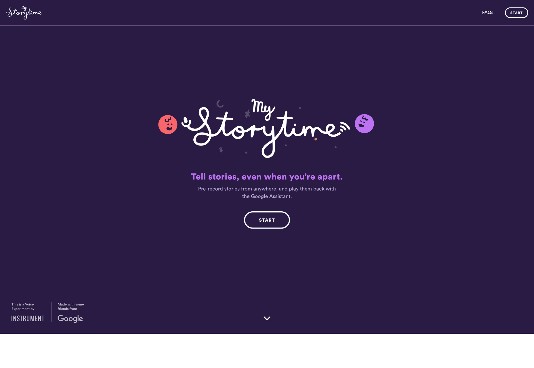
The mystorytime.com website simply uses the CTA “Start” on its homepage:
Regardless of the end goal of your CTA, the goal is always to drive conversions. For instance, you might be encouraging:
Awareness: “Learn More”, “Find out how”
Consideration: “Download Now”
Decision: “Contact us”, “Book a Demo”
Retention: “Become a Member”, “Sign up Now”
Advocacy: “Share your Thoughts”
The most important thing to remember about CTAs is that every one of your marketing assets should have one. Without a CTA, you’re not pushing your customers to the next stage in their buying journey – which means that you have a roadblock on your path to conversions.
Think of it this way, WordStream found that a single CTA in an email increases clicks by 371%, and sales by up to 1617%. You want those kind of results for your web pages too!
Different Web Pages Require Different Numbers of CTA
Just because every web page should have a CTA, doesn’t mean that it’s a good idea to use the same strategy for everything.
Each asset in your digital portfolio, from your home pages to your landing pages plays a role in the customer journey. While some assets, like your homepage, need to give your audience members plenty of choice, others should be as focused as possible.
Let’s look at how many CTAs are appropriate for the different pages on your website.
Homepage CTAs
A homepage is going to have multiple CTAs because it’s the first page introducing customers to your brand and whatever you have to offer.
The people who visit a company or client’s homepage won’t necessarily have a single goal in mind. Some of them will want to learn more about a brand, while others will want to check out your client’s products.
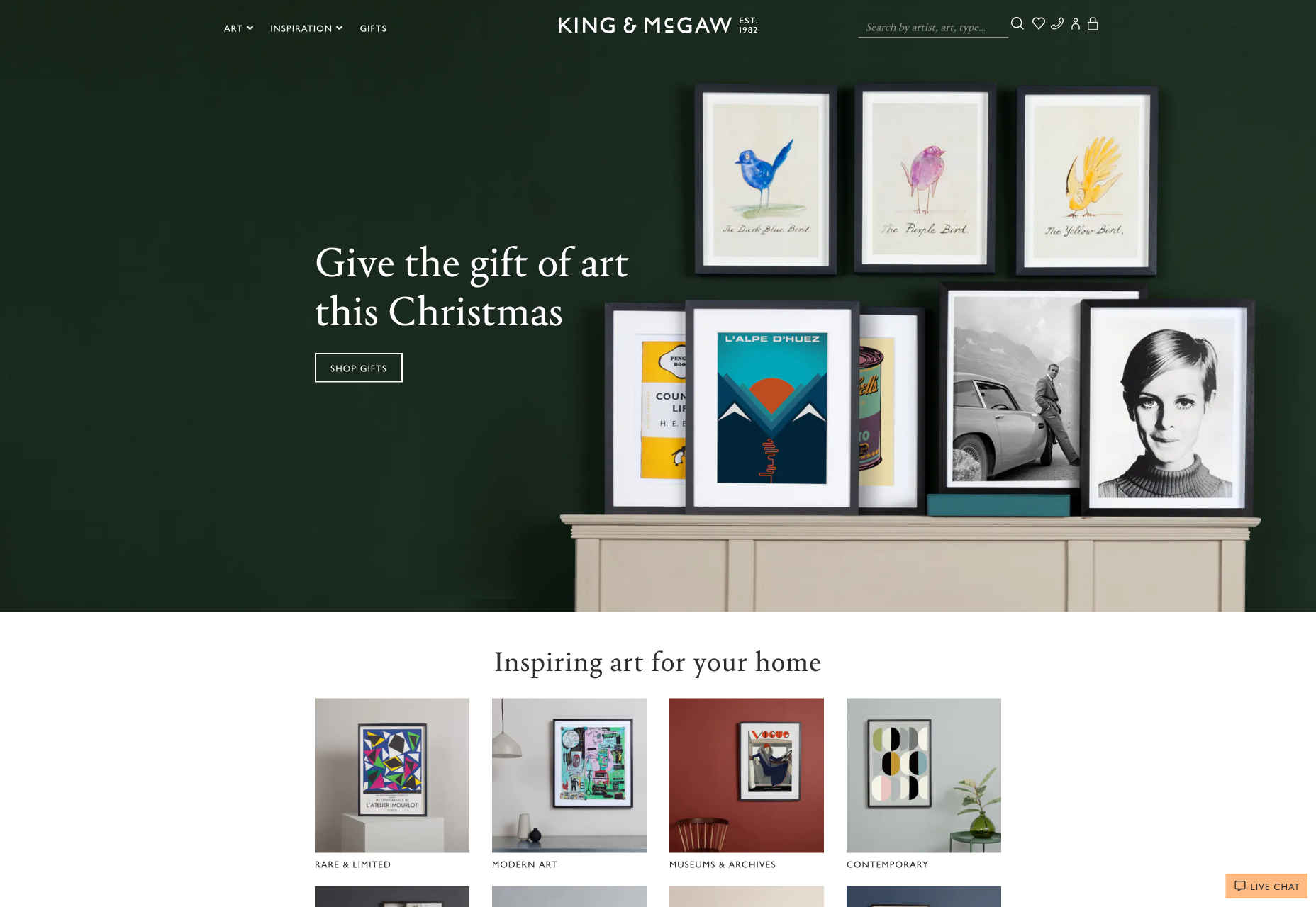
Take a look at the King and Mcgaw homepage, for instance, there are plenty of options to click on:
With a homepage, you want to give customers as much freedom as possible. They’re at a stage in their buyer journey where they don’t want to be pushed into a single decision.
Sure, some customers might arrive on your website and decide to immediately buy something, but it’s not likely. Give leads a chance to enter a journey of nurturing with your client business before you push them into doing too much, too fast.
Product Page CTAs
Most product pages will have at least a couple of CTAs available, because there’s a chance that your site will have more than one kind of visitor. On the one hand, you could have a buyer that wants to add your product to their basket and continue browsing; On the other hand, you might have a lead that just wants to check out straight away.
Depending on the kind of product that your client is selling, you might even have people visiting a website’s product pages that just want to talk to a customer service rep. There are plenty of product pages out there that include a link to the contact page.
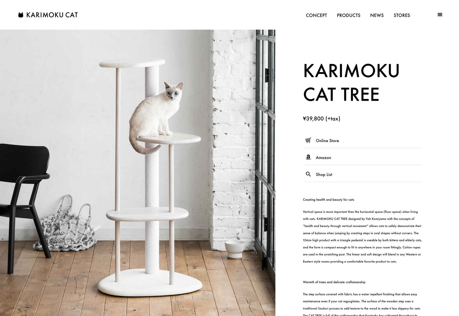
Check out this page from Karimoku Cat for instance. It comes with a link to both a product page, and an Amazon page, so customers can choose how they want to continue their journey.
Support Page CTAs
Support or contact pages on a website will also probably have a number of CTAs.
After all, most businesses don’t just give their customers the option to call a service rep when they have problems today. Instead, they might want you to design a page where users can answer their own questions through an FAQ, reach a chatbot, or connect with other users in a forum.
The onwards.agency support page comes with access to an email address for users, a phone number, and links to Google Maps, Twitter, and Instagram:
As a designer, you can choose whether to present those links as buttons, or just basic hyperlinks for customers to click on.
Landing Page CTAs
Now here’s where everything starts to change.
While many of the web pages on a site can get away with having more than one CTA button, your dedicated landing pages can’t.
A landing page isn’t just another part of a client website website, it’s focused strategy intended to drive specific action from a customer. Because of this, most landing pages should only stick with a single CTA that tells the audience member exactly what they want to do next. That’s the case with this simple Squeeze page here:
When your clients put a lot of time, effort and focus into getting their users to arrive on a certain page, it’s your job as a designer to make sure that they stay there. Focus on a specific conversion request that keeps the visitor focused.
If you do decide to place an extra CTA on a landing page, make sure it’s something that will drive a similar outcome to the fundamental call to action. For instance “Buy now” could be accompanied by “Enquire today”.
Choosing The Right Number of CTAs for Any Page
There’s a common belief in the digital design world that you should only ever design a web page around a single call to action. However, that’s just not the case.
While some pages should definitely have a single focus – others shouldn’t.
A single call to action is the best route for dedicated pages where you want your customers to do one thing and nothing else. Squeeze pages, landing pages and lead capture pages often perform better the more focused they are.
If a customer has clicked on an add or an email link to arrive at your landing page, there’s a good chance that they’re already ready to convert. There are other pages on a site that might require a single CTA too. For instance, a particular service page might just offer the option to send an inquiry to a team.
However, there is room in website design for multiple CTAs too.
A home page, store pages, and even contact pages might include more than one CTA button – and that’s okay.
It’s all about adhering to the experience your client needs at different stages in the buying cycle when they’re trying to reach their customer.
Augmented reality (AR) has been having a wider impact across all areas of the web.
Social media has been the one to experience the impact the most. Social media is one of the most preferred marketing channels these days. Customers’ lives are influenced by social media sites up to a great extent.
Marketers are finding numerous ways to change and evolve to meet their customer expectations. With advancements in technology, consumer needs and expectations change, and it is important that marketers are ready to face the changing consumer desires.
AR has already become one of the latest tools that are being applied to marketing and sales, in a very short span of time. With this, all customers need to do is tap into their mobile device, where they will enjoy the customized experience that their brands have in store for them.
Before we find out how Augmented reality can be applied to marketing, it is important to understand what AR is.
People often confuse AR with VR, which is entirely different from the former. However, both might exhibit similar features; VR comprises designing a new environment, representing or imitating the real and fictional environments. It is more like time travel – where you can either travel back in time or travel ahead of time – into the future, which is unpredictable – and unfurl a whole lot of surprises.
But with AR, you get to view the real world virtually, which is projected using computer-infused augmentations. This projection is intended at providing users with a seamless experience. Remember the experience offered by the IKEA app, allowing shoppers to view IKEA products in an amazing graphics environment.
Well, the difference here is that with VR, the users get to see an environment generated by the computer, while with AR, a real-world focus is available – where elements are introduced to enhance the user experience.
Here are different ways in which AR can be implemented in your marketing strategies:
1. Customer is the king
The customer was, is, and will always be the king. Do you know what the modern-day customer yearns for? It is to try products before they make a purchase decision. Samples of mobile devices, test drives, and even trial rooms for putting on dresses, etc. have been introduced as one of the sales strategies these days. Shopping or sales experiences that are inclined toward the augmentative plane is the trend these days.
Let us deeply examine some interesting examples. How simple it would be if you could try on makeup and even dresses, without having to be present in the shop physically. With AR, the shopper can now try on a number of products, before they finally decide which one meets their expectations and needs.
The advancements in the field of technology have been such that, investors, experts, stakeholders, businesses, and AR developers are coming up with new applications of AR. A number of social media platforms are marketing using AR technology, for example, Facebook’s and Apple’s AR applications. A number of industries have been experimenting with AR technology. Reputed brands, including L’Oreal, have already started implementing sales strategies that let customers try on make-up items.
Also, the dressing room is another area where businesses are implementing AR. Initially, customers used to carry dozens of clothing to try in the dressing rooms, with the staff barging in to rearrange rejected items, the task used to be daunting. But with AR, a virtual fitting room is the answer to all the dressing room woes.
2. Social media
Social media is already a platform to sell and buy. With the application of AR, shopping becomes an amazing experience altogether. Just like shopping via websites, people are not required to be physically present in a store. All they have to do is visit the virtual store, try on the items, and then place an order online.
3. Participating in events
What a delight it would be to attend a live event from your home, dressed in your favourite pyjamas. A number of brands and businesses are implementing this technology to reach out to their people. All you have to do is download the respective AR app and start connecting.
4. Videos
This is in continuation of the event participation that we discussed earlier. Using interactive AR videos, businesses can now reach out to their audiences. These videos could be demo videos (guiding customers through a step-by-step process on how the product works) or in some cases, where a service is being sold, it would help people understand the kind of experience the service will shower them with.
5. AR could influence targeting patterns
Most of the SEOs are working with many tools on ensuring their keywords rank high on the search engines. But going forward, we might have to put up with scenarios where the bid for each keyword would be higher. This means a careful planning strategy would be required for keyword selection and bidding. As AR enters the scene, searches, that were more keyword- and demographic-centered, will now focus more on images. So search engines would have to work in that direction.
6. Change in website designs
These days, we say websites that are capable of taking the user on a tour of their content. We have websites in 2D, 3D, but we do not know what the future driven by technologies, such as AR and VR, will hold. There would need to be a paradigm shift from the way content is presented now to how it needs to be presented in AR and VR. The experience would be the key to the consumer’s heart.
Such kind of upcoming changes will make the marketer’s job even more challenging.
Conclusion
It is high time that marketers along with developers also embrace AR and introduce it into their strategies to help take their sales targets to the next level.
Brian Rinaldi interviewed a variety of folks, asking them the same questions about JAMstack development and the landscape recently:
Raymond Camden: I think we will see better competition from the bigger players.
Gift Egwuenu: I’m also looking forward to more job openings on the JAMstack.
Bryan Robinson: If you find yourself jumping through too many hoops, it might be time to explore a monolith architecture again.
Me: Blah blah blah, read the other ones from smart people 🙂
Tara Manicsic: there are more examples of enterprise applications creating more reliable user experiences, faster response times, and cutting their costs.
Scrum is the most popular project management methodology in the world with over 72% of teams using Scrum or a scrum-hybrid. Chances are good that if you work in web development you are using Scrum in some form.
A current trend in Scrum is the “Sprint 0” or its more artsy cousin the “Design Sprint”. Much has been written about whether these are true sprints (they are not) but less has been said about why they exist in the first place, why they so stubbornly stick around, and what alternatives exist.
I personally love Scrum and I’m always on the lookout for ways to incrementally improve how I implement it. In this article, I’d like to share the methods I have incorporated into my workflow and one I find helpful when merging UX/UI and development, as well as creating stronger project visions.
A few quick definitions before we get started:
Sprint 0
The initial effort of a team to create the guiding documents required for scrum projects: a vision, a product backlog, and product release estimates.
Design Sprint
The initial effort of a team to create a guiding design for the rest of the release.
Why Sprint 0 And The Design Sprint Exist
It’s all well and good to say, “Sprint 0 is not a real sprint, don’t do it.” But these sprint-ish adaptations exist for a reason. Many teams adopt them because their project has an unmet need beyond the immediate scope of Scrum. My observation is that Sprint 0 and design sprints are most often used to address the following situations:
Lack of a strong guiding vision;
Lack of design integration into the development work flow.
The Scrum process assumes a clear vision has been developed and communicated by the product owner. But raise your hand if you’ve worked on projects where the vision is either weak, wrong, or invisible. Me too! Sprint 0 is an attempt by the development team to fill in the vision gap. It’s not the worst idea, so what’s the problem? From an agile perspective, Sprint 0 isn’t iterative, doesn’t utilize the talents of the whole team, and delivers nebulous results. And before you point out, “Hey, the real problem here is that scrum teams shouldn’t have to do the product owner’s job,” I actually believe a cross-disciplinary agile team is one of the best environments to develop a strong, realistic vision and goals.
I propose a more agile method of building vision that I’ve used successfully in no-handoff projects. I will explore both situations where these sprint-like adaptations are used and describe how this alternative first sprint better supports the agile workflow.
Vision And The Prototype Sprint
In the first situation, where there is a lack of strong vision, the guiding documentation or ideas are too weak to truly begin a Scrum project. For any process (Scrum included), you need direction before starting the journey. Agile is great for figuring out the best way to reach a goal, but generating the initial vision is not within its scope. In fact, missing from Scrum altogether is a description of the required vision for the development process to begin. Whether it’s really Scrum or not, Sprint 0 is just a web team on the front lines, using the tools they have, trying to figure out what they need to do before they start doing it.
The real drawback of Sprint 0 is that building the guiding document for the project at the time when you have the least information provides low value to the development process that follows.
Guiding project visions that don’t align with the iteratively emerging reality either need to go through the expensive process of another Sprint 0, or more often simply get ignored.
A better alternative is the prototype sprint: a first sprint that engages the entire team while actually building out the initial prototype itself.
The Prototype Sprint Vision Process
Brainstorming ideas are translated into a low visual fidelity, working prototype as quickly as possible. The prototype is written in a functional front-end HTML and CSS framework, i.e. the shared language of the team. Not everyone can understand a spec sheet or a vision statement. Everyone can understand a website and communication is easier and incorporates a wider array of disciplines.
By the end of the first sprint, the prototype is ready for initial testing across several fronts including general usability, accessibility, and mobile responsiveness. On my teams, this is a valid and important done increment. The prototype sprint also produces an initial product backlog. As backlog items get completed in future sprints the prototype gains in fidelity. The prototype is not throwaway code — it’s foundational.
In some projects, a written vision is generated as the prototype is produced. But in many projects, the prototype is the vision. It speaks in the shared language of the team and is, of course, never out of step with the product.
Example
The example below is of a working prototype for an e-commerce app, completed from the rough outline in the initial RFP. Rough as it is, it was instrumental in focusing the team’s energies in a productive direction, leapfrogging many potential distractions and pitfalls to focus on functional criteria.
An initial prototype will often result in changes to the requirements, which are simply best guesses until held up to the light of user experience. As an example, one of the insights we gained from the prototype sprint shown above is that the pricing and ‘buy’ button were originally much too low on the page. The initial request was to place them below product info and above recommendations, but a functional prototype quickly showed that hierarchy was not very functional.
Another functional that came to light was that the gallery images were originally requested to be large and stretch the full width of the page. Rather than laying out hypothetical reasons to stakeholders why that wouldn’t work the prototype was able to demonstrate the issues in a shared language the whole team understands. In a power session with stakeholders, we quickly reorganized this page to a universally agreed-upon hierarchy.
Because the prototype is born accessible and responsive we can begin testing on multiple devices and technologies right away. Though the design (if it can even be called that at this early stage) is intentionally kept low fidelity it was immediately apparent that the year switcher messaging on desktop was too big on mobile and interfering with usability (left). We quickly updated the prototype to use a smaller switcher in the header (right).
Mobile landing page with changes to mobile switcher (Large preview)
A few other issues came quickly to light during this prototype sprint:
The client, after clicking through the functional navigation, immediately realized they had missed a major functional component in their spec: a blog. This affected the estimate and timing but we were able to adjust quickly.
It was evident to the UI team that the pricing display was overly complex and confusing. We explored other possibilities with the client and were able to rapidly prototype and user test several solutions during the prototype sprint.
Instead of the vision potentially being an impediment or becoming outdated as soon as development begins, in a prototype sprint the vision and functional criteria are developed together and support one another. And because the vision is generated by the team there is no handoff to the team and handily avoids that risky period in the development process.
Design And The Prototype Sprint
In the second situation — a lack of integration of design with development — is often when you will see a “design sprint” used. I find this direction even more counterproductive than a Sprint 0. The challenges of integrating design into a complex development process are real but a design sprint is a self-defeating approach. The design sprint is a bandaid for the symptom — the challenge of building integrated teams — but doesn’t address the underlying issue — the challenge of understanding and meeting user needs. Front-loading design into one sprint avoids the challenge of integration, but the benefits of an integrated and incremental design process and the window it opens to understanding and reaching users is entirely lost.
The prototype sprint I use in no-handoff projects is a productive and fully agile alternative to the design sprint. It is collaborative and merges both UI/UX and development from the earliest stages of the project. Even the most experienced design team can benefit from the involvement of other disciplines and, critically, it ensures code and design goals are not at cross-purposes.
Often the design sprint is also expected to flesh out vision. This is a desperate move based on a vague but insightful understanding that the design process is better equipped to generate vision than development. However, a design-generated vision is a poor substitute for a real, collaborative, team-wide effort.
The poor designers are saddled with generating an end product to kickstart development without the cross-disciplinary information necessary to make that effort truly valuable. Though a designer with technical knowledge and more experience will have a better chance of getting this right it is still very risky. With no potentially shippable product at the end of the phase to test against the guesswork continues into development. If the design didn’t hit the mark, or if the specs change, it can result in long delays as it goes back to the design team. Agile is at its core a risk management process, and we can do better than starting our agile projects with an inherently risky design sprint.
The Prototype Sprint Design Process
The most important change from a more traditional design sprint is that during the prototype sprint the team goes straight from paper to the prototype and skips the use of Sketch, InVision, Photoshop, or other digital layout programs. They act as a visual crutch at this stage, appearing to introduce value very quickly (because good designers make good-looking things), but the real value of a high-fidelity mockup this early is very low, while the potential danger it introduces — wedding stakeholders to the wrong solutions — is high.
These tools are best at high-fidelity flat mockups but the initial prototype is neither high fidelity nor flat. Whiteboard and pencil and paper let the teamwork through ideas quickly without being wedded to them. Then get that thinking into a functional prototype as soon as possible.
Every team member, including designers, should become familiar with and be able to work on the prototype directly during lo-fi phases. But if that’s not possible (or it’s a longer-term goal and you need to move forward now), then a paired approach where a designer and developer work side by side is good. Sketches can be described by the designer and interpreted by the developer together, broadening their shared understanding of each viewpoint.
Example
The example below shows our process distilling an in-depth analysis of an existing website directly into a functional prototype. It allowed the findings of the report to be evaluated in a native web setting, a very different experience from intellectually analyzing recommendations in a print document:
Resource site analysis and resulting prototype (Large preview)
Also, unlike the in-depth analysis document (as helpful as it was) the functional prototype is free from jargon and uses a shared verbal and visual language that everyone can understand. It opens the conversation on visual display to all team members and disciplines.
Our main question while building this template was how much design detail to include. Because we had a rich document full of analysis to draw from we could have taken the prototype further. But, keeping in mind that visuals can quickly (and unintentionally) move from the realm of idea to the realm of fact, we kept the layout non-committal and distilled the document to just its essential elements and meaning.
Internal testing got us into the ballpark of a more user-focused solution, leapfrogging over many potential issues, but we consciously avoided making any refined design decisions this early in the process. It’s important to continually weigh all ideas and suggestions, including the client’s, against known data and to remember that our pool of knowledge is smaller at this point than it will be at any other stage of the project.
Another reason it’s critical to keep the initial prototype lo-fi and not include any “design” elements is that team buy-in can be derailed by irrelevant visual elements that elicit unintended visceral reactions. We stay away from color and don’t even include the client logo (instead use a blank space or a light gray box as a placeholder). The conversation must be continually guided towards functional criteria like content hierarchy, accessibility, usability, language, and meaning. Reassure the team that the “fun stuff” will come but not at this early stage.
In fact, an important goal of a successful prototype sprint is to make as little upfront design decisions as possible. Successful design is fed by user experience so allow time for emerging project knowledge to inform the UI.
When Is The Prototype Sprint Complete
The sprint is complete when the prototype and accompanying artifacts are approved by the full team (including the client), and the prototype is deemed ready for initial usability and accessibility testing.
An early functional prototype brings to life the project vision through scale (number of pages, scope of navigation and other main UI elements), future complexity (placeholder content with useful descriptors, possibly some early functionality coded), and identifying needs (specific technologies needed, where they will be deployed, any dependencies). Decisions regarding tools, working environment, and code stack will be made with the input of the entire team.
Reaching this done increment can take as little as one day for a seasoned team with a responsive client but typically lasts about one week and no more than two weeks. Prototype sprints should move at a quick pace and going over the two-week time frame can be a red flag. It may mean there are other issues at play.
Some Common Issues To Look Out For During A Prototype Sprint
A few common issues to look out for when implementing the prototype sprint include:
Embrace the value of low fidelity and avoid emphasis on the visuals. Be vigilant about this point as teams who are new to this approach might need help and reassurance as they move beyond “where’s the logo” and focus on deeper questions of functionality and hierarchy.
A different facet of the above, also be vigilant about not getting attached to your own design/layout ideas. It’s helpful to remember during prototype sprints that nothing precious is being generated and to remain detached from the end results. Also, its yet another reason to keep the prototypes minimal and, frankly, rather ugly. It serves the purpose of keeping users detached.
Early process buy-in from leadership is critical. Because the entire team is involved your client, your boss, and the developers all need to support and nurture the process with their engagement, creativity, and time. Don’t be a lone cheerleader, your whole team needs to wave their pom-poms!
Poor communication is the Achilles heel of all teamwork. The prototype sprint won’t solve persistent communication issues but it will bring them to the fore sooner as the entire team dives into a collaborative workflow almost immediately. Any already existing communication issues will come up early and often in a prototype sprint as you work towards consensus and your first done increment. Embrace the opportunity for improving communication and engage the whole team in finding solutions.
Pick the right front-end framework. If you don’t have one already you might need to try out various front end frameworks before you find one that clicks with your team’s workflow. I recommend looking into minimal frameworks like Fomantic or Bulma and not getting bogged down by bells and whistles. However, the right framework is always the one that works for your team.
The UI/UX team needs to develop a comfort level with and access to the front end framework. Ideally, they will work directly on the prototype, avoiding unnecessary handoff and the need for translation from one medium to another (i.e. from Sketch to the prototype). If your front-end team do not have familiarity with CSS and HTML, then a paired approach (with one designer and one programmer working together on the framework) also works well.
Last but not least, remember that you’ll get better and faster as a team! Running a productive prototype sprint is a skill that grows with practice.
What Happens Next
The done increment of the first sprint — the functional, low fidelity prototype — sets the stage for all the sprints that follow. With a working prototype user testing for usability, accessibility, and responsiveness can begin right away, ensuring future sprints are informed by UX.
The prototype sprint is a great start to any scrum process, but in my projects, our next step is to move to a dual-track workflow where UI/UX works a half or whole sprint ahead of development doing discovery and visually updating the prototype to reflect new insights.
The prototype organically develops and becomes increasingly more refined, fed by UX research and realistic functional needs. That information, not available during the prototype sprint, only incrementally emerges as the project progresses. UI/UX and development feed into each other’s workflows through the dual-track agile process.
There is no handoff of design to development to be built, or a developed app to design to skin. Instead, the prototype sprint engages the entire group from the start and forms a strong foundation for a collaborative agile workflow throughout the project.
The guiding vision that results from a prototype sprint won’t be perfect and will likely change as more is learned, but the recognition that we know less at the beginning than at any other phase of a project is at the heart of the agile workflow. When we apply this same philosophy to the emergence of the project vision and design through a prototype sprint what results is an actionable done increment, genuinely useful artifacts, shared buy-in, and a pattern of teamwork and collaboration that can be sustained throughout the project.
A Note About Agency Settings
If you work at an agency you might be thinking this approach will be a hard sell. Unfortunately, you are probably right. Many agencies are inherently un-agile and actively strive for total project handoff, often with official signoff and carefully documented repercussions to making changes down the road. Advocating for a prototype sprint in a non-agile organization is a non-starter: it’s just not in their DNA. Once an organization embraces agile and cross-discipline teams then they can easily consider if the no-handoff prototype sprint will enhance their process.
Conclusion
Sprint 0 and design sprints address real challenges many scrum teams face: lack of vision, lack of integrated design, or both. They are understandable and logical responses, but they don’t provide high value or contribute to strong agile teams.
Replacing them with a prototype sprint is a practical way to address the drawbacks of Sprint 0 and design sprints while simultaneously laying the groundwork for stronger agile collaboration during future sprints.
A prototype sprint utilizes the talents of the entire team, generates the necessary vision, results in the team’s first done increment, and avoids project handoff. Through this process, teams build shared ownership of the project vision and a stronger foundation for cross-disciplinary cooperation in the agile spirit.
Now that the early concerns surrounding Gutenberg have subsided it is clear that the new editor for WordPress is actually an excellent resource for web designers. Especially if you are not the most confident coder.
Gutenberg and its block plugins are an intuitive way to build your website and ensure it looks as good as your carefully laid out plans promised to be.
Before we go through some of the best Gutenberg plugins, here are some advantages of using the block editor:
Intuitive and flexible. Gutenberg consists of blocks which are easy to manoeuvre around the page as you create your layouts. It is also simple to add different types of content such as headings, images and calls to action which are available as Gutenberg blocks.
Great for non-coders. Gutenberg’s blocks approach and integrated plugins mean it is straightforward for beginners to design and implement their website. In fact, you can add complex features without any HTML or CSS.
Designers with coding experience will benefit too. Coders will love how much time they will save designing their pages using Gutenberg. The variety of blocks available and the ease of implementing them allows programmers to build websites quickly and concentrate on the more demanding tasks.
An excellent alternative to page builders. Rather than rely on third-party page builders which can bloat your website, WordPress’ new core editor is more streamlined and is guaranteed to work seamlessly. In addition,
Reusable blocks. If you have created any customizations in a block that you like they can be reused quickly by either copying the blocks or the code.
Integrated with lots of great plugins. Gutenberg can call on a number of excellent plugins to enhance your website.
And on the subject of great Gutenberg plugins let’s check out 10 of the best and how they will help you design your websites:
Toolset’s new blocks plugin allows you for the first time to add dynamic content to your website without using coding.
For example, imagine you run a travel website and have designed a template for your trips. When you click on a trip to Rome you will want to see different information to the post about New York – even if it has the same template. This is possible thanks to Toolset and its dynamic content.
Toolset offers the following blocks with dynamic capabilities:
Heading
Single field
Image
View
Button
Content template
Form
Map
Audio
Conditional
Container
Countdown
Fields and Text
Progress indicator
Repeating field/gallery
Social share
Star rating
Video
Toolset also has a couple of unique blocks. Use the Container Block to style groups of blocks together including the padding, font and background. In addition, the Conditional Block allows you to display or hide blocks based on conditions. For example, on a cooking website, you might want a block to appear telling users that a recipe takes less than 30 minutes to cook.
One of the most important considerations for a web designer is their ability to design content quickly. That’s why Ultimate Addons is a great option.
With Ultimate Addons’ array of 20+ blocks you can add important elements quickly without the need to create them for scratch. For example, in just a couple of clicks, you can add and design a call to action, blockquotes, testimonials and much more.
Here is the full list of blocks:
Table Of Contents
Advanced Columns
Advanced Heading
Blockquote
Call To Action
Contact Form 7 Styler
Content Timeline
Google Map
Gravity Form Styler
Icon List
Info Box
Marketing Button
Multi Buttons
Post Layouts
Post Timeline
Price List
Sections
Social Share
Team
Testimonials
Ultimate Addons also provides more than 20 free starter sites which you can use for inspiration to see what you can achieve using its blocks.
Similar to Ultimate Addons, Atomic Blocks is a great option for adding important features quickly. However, Atomic Blocks also provides pre-designed page sections which will further speed up the website building process.
Its Section and Layout block provides a number of pre-designed sections which you can arrange to create uniqute page layouts for testimonials, contact pages, landing pages and much more.
And if you really need to save time Atomic Blocks provides entire page layouts for your website.
Additional blocks include:
Section & Layout Block
Advanced Columns Block
Newsletter Block
Pricing Block
Post Grid Block
Container Block
Testimonial Block
Inline Notice Block
Accordion Block
Share Icons Block
Call-To-Action Block
Customizable Button Block
Spacer & Divider Block
Author Profile Block
Drop Cap Block
Atomic Blocks offers demos for each of its blocks and even provides its own integrated theme.
Kadence Blocks is an excellent choice if you want to create content that is usually only possible through third-party page builders.
For example, the Row Layout block is a great resource not only for adding columns to your designs but also for editing how the columns appear for different screen sizes. Furthermore, the same block can be used for padding, backgrounds, vertical-alignment and all other types of styling.
Another small but important feature Kadence Blocks offers is the ability to change the default max-width for pages and posts on a page by page setting. This is important because Gutenberg only offers a 650px max-width for the content editor which is not ideal if you’re creating content for pages that don’t have a sidebar.
While Gutenberg is an excellent editor it is still young enough to be missing some crucial features. Advanced Gutenberg’s set of blocks aims to fill in some of those design gaps.
Indeed, one key necessity is control over what editors can and can’t edit. With Advanced Gutenberg you can create profiles and individually activate or disable some of the user tools for each profile.
Other important features include the ability to instantly add login and register forms, contact forms and even a block to display your latest WooCommerce products.
Here is the full list of blocks:
Column manager with pre-defined layouts
Latest post slider and latest post slider
Latest WooCommerce product slider and latest product slider
Advanced Button block
Contact form block
Advanced List block
Map block
Advanced Table block
Accordion block
Tabs block
Testimonial block
Contact Form block
Email Opt-In block
WordPress login block
WordPress register block
Counter block
Advanced Image block
Advanced Image block
Advanced Video block
Social links block
Activate lightbox effect in Gutenberg image galleries
Display image information as lightbox caption in galleries
CoBlocks styles itself as the last page builder you will ever need and it offers an alternate page builder experience to the third-party plugins you usually rely on with the old WordPress editor.
CoBlocks replicates a page builder approach by offering features including a Typography Control Panel to set custom fonts, line heights, weights and transformations. Another example is the Row block which provides a responsive grid system so you can choose how many columns you like, the type of layout, your margins configuration and many other edits.
Here’s the full list of what CoBlocks calls its page building blocks:
Stackable is a good option for those looking for precision design tools to display their website in the exact way they want. It is one of the easiest Gutenberg plugins to get into straight away if you are a casual website designer.
That’s because Stackable offers detailed block settings such as a built-in gradient tint for color settings, background options for blocks including single tint, gradient tint for video and controls for block dimensions, spacing and alignment.
Along with this wide range of design settings, Stackable also comes with a premium version with hover, image box effects, three-layer separators and much more.
Otter Blocks is another option for designers looking for pre-built Gutenberg templates that you can import with one click.
Thanks to Otter Blocks, it is easy to build pages for various types of websites such as e-commerce, blogs, business and many others. Otter Blocks comes with a number of blocks including the Section Block which you can use to build your columns and design separate layouts for your pages.
Similar to a number of the other Gutenberg plugins, Getwid’s blocks will extend the ones provided by Gutenberg and makes it easier to design templates – even providing pre-built options.
However, Getwid stands out by the sheer number of blocks it offers, more than 40, with some unique block extensions.
For example, the Advanced Spacer Block gives you an adjustable spacer to separate your blocks and adjust it depending on the platform your user is on. Furthermore, the Image Hotspot Block can be used to place animated markers over images to provide a more interactive experience.
Besides these blocks, Getwid offers a host of others. Here are just some of them:
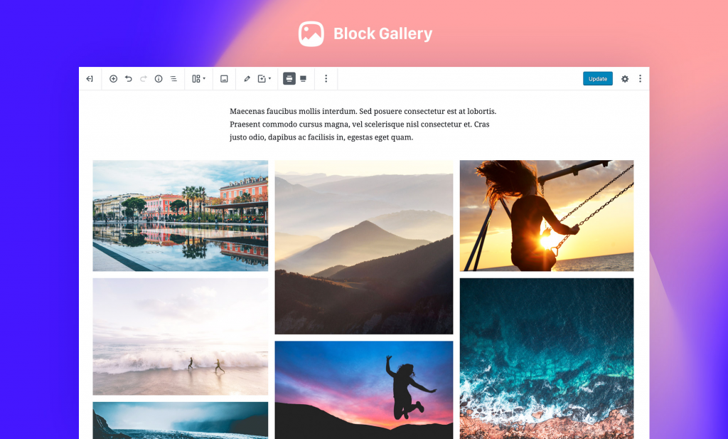
Block Gallery provides a unique set of blocks tailored towards web designers looking to create websites for people who have content to promote whether it is themselves, artists, writers or anyone else.
If you are looking for an easy way to build galleries then this is the Gutenberg plugin for you. Block Gallery allows you to drop your images in the gallery block, customize the display settings and publish. Not only that, but you can browse the different types of galleries and change the whole design with just one click.
Block Gallery offers three blocks to build your galleries:
Carousel
Masonry
Stacked
Conclusion
As we have seen this year Gutenberg is constantly improving and adding new blocks and features all the time. As we head into 2020 we expect to see Gutenberg become the editor of choice for web designers – especially those with little coding experience.
Even if Gutenberg lacks any design elements, however, then these Gutenberg plugins should fill in the gaps and enhance your web design experience.
It doesn’t matter if you are a newcomer or you are in the path of becoming a Developers for Plugin Development, WordPress widgets are those magical powers that provide with the right spell to everyone for creating a website in WordPress.
“WordPress Widgets comes in the form of a handy tool that tends to make it easy for users to customize a WP based website.”
In general terms, widgets are termed as one of the smallest applications that tend to have restricted functionality which can be established and executed within the web page with the help of the users. Likewise, a WordPress widget is a meagre standalone piece of code that tends to add amazing types of content or functionality to the website.
Thus WordPress tends to come with a handful of built-in widgets that the user can use right away. WordPress themes and plugins have the tendency to add their own widgets as well.
In this article, we are maintaining to distribute some of the most useful and Best WordPress Widget Plugin for your website’s that would not only improve user experience but would also help in growing the business.
Best WordPress Widget Plugin to Grow your Business
WordPress Widget Plugin is termed as the independent blocks of content that are added in the widget areas, which tends to be provided by the themes. These are the tools that tend to add a few specific functionalities or maybe the features to a WordPress website. Here are some of the most common and best plugins for widgets that would be suitable for your website.
1. WP Call Button
If you have a business website that requires communication with the customer 24*7, then this is the right widget for you. As mobile traffic starts to boom, more and more users find it really convenient to just contact the business for more data and information. WP Call Button is one of the best widgets for WordPress that permits the user to easily add or tap to “call now” button that is there on the WordPress site.
Not only this, but the user has the authority to use and to add a sticky button that would allow them to scroll or maybe use the widget to show the call button in the sidebar.
It tends to operate with any form of landline or mobile phone number, but it is mostly recommended that professional business phone service is opted and make it certain that they never miss a call.
2. Social Count Plus
Today everything is about numbers. There are some popular websites that tend to show a social follower count in the sidebar. This is because it tends to show credibility to the website, and thus tends to add social proof.
Social Count widgets are one amongst many tools that tend to be considered as best WordPress widgets that tends to add this feature on the website. It displays social media follower counts on the sidebar. This widget tends to display the number of followers then, and not the number of times the article is shared on the website.
3. WP Mail SMTP
If you are attending for the totality of the best WordPress transactions email plugins them, WP Mail SMTP is the one for you, and thus it is considered as one of the best widgets for WordPress. This is a free plugin that helps the user to configure and reconfigure the wp_mail() PHP function that tends to utilize proper SMTP provider. In other words, the widget tends to make sure that any mail that is supposed to send out from the provider and the WordPress site is delivered in a recipient’s box as they should.
WP Mail SMTP tends to fix the email deliverability by the power of re-configuring WordPress to use as a proper SMTP provider while sending the emails. It tends to bring together all the SMTP provider into one plugin so that the user doesn’t have to use for a separate plugin.
Therefore if you choose the best developers for plugin developmentthen they should be aware of the simple task that would take place to operate this widget.
4. Yoast SEO
A lot of people and WordPress Website Development Company get confused on the type of plugin that they should use for SEO. The answer to this question is always the same – YOAST!
Yoast SEO is one of the most popular and widely used widgets. It tends to help in creating an automatic update to XML sitemap for websites like Google. The user needs to check out the content’s search snippet so that they are able to see what the people on the web are searching about. This makes and provides the user with a green light on the fact that when their content being optimized.
The user can add meta tags, set canonical URLs (to avoid duplicate content) and integrate Google search controls so that the website owner can witness how indexing is done on the site. Therefore, for adequateWordPress Development the user can choose Yoast SEO and help the website in bringing the traffic.
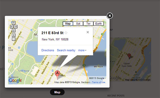
5. Google Map Widget
One of the easiest ways to add maps to the site’s sidebar is by utilizing Google Map Widgets. This is one of the simplest widgets that tends to allow the user to display a Google map on the widgets. When the user tends to click on the map, a large map opens in a light-box pop-up.
It is regarded as one of the several advantageousWordPress widgets that are there for the business that tends to display the address and the location on the website. If the user wishes to integrate a widget that would present the customers with directions, then this is the tool for you.
6. AdSanity
Promoting your product with the help of ads has been long adopted from the time people and WordPress Development Company started setting up their business. Therefore, AdSanity is one of the best and widely used widgets. It allows the users to easily display the ads that are anywhere in this website and thus it appears with a widget that tends to display ads in the blog’s sidebar automatically. Thus, considered as best WordPress sidebar widgets Adsanity is the need for the hour. If the user is planning to support the website that is there with the banner ads or affiliated market, then and sanity is the widget for you. It would help the user with maximum ad space, and thus it tends to generate more revenue.
7. Smush
Every website owner wants that their website should contain images that are not only graphically high but should be appealing to the eyes as well. Such cases lead to the heavy compulsion of images. Therefore, to make it lightweight, and still be as graphically accurate as you desire – Smush is one of the plugins that is meant for you. This is done to make the performance of your website and loading time according to the way you desire.
Smush is one of the top WordPress widgets with best image optimization between the pictures by doing it automatically and uploading them on the media library. Not only this, but this widget resize, optimizes and compresses all the images. It does it without actually sacrificing the image quality; this is done to make the website operate at an optimal level and ranking of the search results.
8. RafflePress
Today, many influencers and website owner tend to attract customers by providing them with giveaways and things in contests. RafflePress is one of the best WordPress giveaways and content plugins. This is the type of widget that tends to create viral giveaways and contests and is set up by many WordPress Web Development company. This is done to get a lot of traffic and customers with subscribers. It allows the site owner to operate a giveaway and thus add a sidebar widget.
The user also has the authority to construct a standalone landing page for a giveaway and thus promote it across various social profiles. The users should know that RafflePress is the plugin that is not free. If you are seeking for a free version and popular widgets for WordPress, then you should go for RafflePress Lite.
9. Pretty Links
If you are one of those that rarely compromise with quality, then this is the right widget for you. There is no mystery to the fact that some of the best WordPress widgets and best sidebar widgets for WordPress for affiliate links are Affiliate Royale, Thirsty Affiliates and of course Pretty Links. Focusing entirely on Pretty Links, this is the widget that tends to alternatively shortens the link and tends to make the links look clean and good. This is done to make it easy for the users to track and locate the website. The better your affiliate links are then more your URL’s would be shared and promoted ahead. It is great for the users and the participants that are into affiliate market youing. This allows them to add, click and locate for social media. Thus, Hire WordPress developers that are able to operate this widget easily.
10. Login LockDown
If you have come till the end of this article and read about the HTML to WordPress Services, then you would be aware of the fact by now that securing your website has to be the no one priority of all the users out there. Username and Password are one among the security things that are vital for a website, but to carry out some extra precautions the website owner can take the help of Login LockDown. This is a plugin that helps to secure your important data and information. The widget helps to limit the number of logins attempts a user can make while they try to login to the website. The widget provides the user with the utmost three attempts within the time span of 5 minutes. The site will then automatically lock the users out of the website for at least an hour. Not only this but the widget also records the IP address and the timespan of every failed login attempt. Thus, it isn’t wrong if it is stated that it is the best widgets for website.
In a Nutshell
Before you start tohire WordPress Developersknow that WordPress and its various widgets tend to evolve with new updates and features constantly. New versions are released, and developers constantly launch new and updated versions. Widgets allow your blog or website to be more effective and functional. This above list has been provided to our customers and audience to make their work easy, there are many more widgets that would help you with the website, but these widgets are the most widely used widgets.
We assume that this article has presented you with insights on all the necessary widgets that you need and require. If you have any difficulties related to the above topic, then you can write to us in the comment section below. Our experts and professionals would try to solve them and provide you with aid as quickly as possible.
I absolutely love the design of the Sandwich site. Among many beautiful features are these headlines with rainbow underlines that move as you scroll. It’s not scroll-jacking — it’s just a minor design feature that uses scroll position to enact a little movement.
To draw the rainbows themselves, we could use a linear gradient with hard-stops, the same kinda concept as drawing stripes in CSS. That’s a big ol’ chunk of CSS, which is fine, but I see they’ve opted for a background-image instead. Here’s that as an SVG, which is 661 bytes (tiny tiny). We can make it look like an underline by setting the background-size to limit the height and position it along the bottom with background-position.
We’ll do it on an inline element so the underline breaks where the words break:
To animate it, we move the background-position-x. Not a particularly performant thing to animate, but we’re not really animating it anyway — it’s just moving based on scroll position. Rather than manually manipulate the background-position-x, we’ll set it with a custom property, then manipulate the custom property with JavaScript.
background-position-x: var(--scrollPos);
Updating that variable while the page scrolls is easy peezy:
window.addEventListener("scroll", e => {
  let scrollTop = document.body.scrollTop ? document.body.scrollTop : document.documentElement.scrollTop;
  let newPos = scrollTop + "px";
  document.documentElement.style.setProperty('--scrollPos', newPos);
});
See that kinda janky line where I’m either using document.body or document.documentElement? That’s a stupid cross-browser thing where the “scrolling element” is different in Safari versus everything else.
While doing this I learned that you can use document.scrollingElement instead to avoid the pain there. I’ll leave a comment in the code about that, but leave the original line for posterity.
When we’re thinking about choosing colors in design, we’re always thinking about accessibility. Whenever colors touch, there is contrast and, if we’re talking about the color contrast of text, it needs to be high enough to be readable. This benefits people with a variety of visual disabilities, but also everyone appreciates easily readable text.
Let’s look at the color contrast considerations of just a single paragraph!
A link in a paragraph is probably set in another color to distinguish it as a link.
This link color has insufficient color contrast.
Focusable elements, like links, need to have focus styles as well. By default, we’ll probably get a fuzzy blue outline, so we’ll need to check that that has sufficient color contrast. And if we customize it, that customization will need good color contrast as well.
We’ll also need a hover state for mouse users. Here, I’ll use a background effect that covers about half the text. When you do something like that, the effect needs to be strong enough to be noticeable on hover, and the contrast needs to work on both backgrounds.
It’s not ultra common, but you can style :visited links as well. The styling is somewhat limited (you can’t change opacity or background, for example, because it’s a security concern), but you can change the color. If you do that, it also needs proper contrast. Perhaps we could yank the color differentiation away with color: inherit; to somewhat de-emphasize the link but still indicate it.
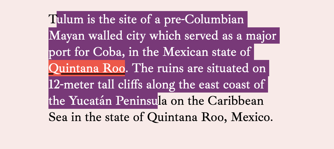
Another thing to consider is people highlighting text. On my machine, I have it set up to highlight in an orange color by default (it’s normally a light blue on macOS).
Hopefully, the link colors hold up under any highlight color choice a user might have. They tend to be very light shades.
The text selection colors on macOS Catalina
You can control text selection color through CSS as well with ::selection { background: purple; }. If you’ve done that, you have to check all your colors again to make sure you’ve gotten sufficient contrast.
You can try to take measures into your own hands by changing both color and background.
But note that the link inside the text has lost some of its contrast here. We could keep going down the rabbit hole by setting new colors on a::selection and every other element that has its own colorations within the text.
I’d say a good rule of thumb is to go very light if you’re going to do a custom highlighting color and then not do any further customizations specifically for the selected text.
The idea for this post came from some bug reports I’ve gotten from people reporting that links are hard to read on this site when highlighting text, then focusing a link. I tried fixing it by getting more elaborate, but there are limits to what you can do.
I recently read Ethan Muller’s Designing for Design Systems post and he makes a similar point about contrast, but across a color spectrum rather than across contexts. For example, your blue link color might work just fine on a few of your design system colors, but not so much on others.
There are a couple things that might help with this.
The generic advice of “every time you declare a background-color, declare a color” might help.
I’ve used parent-level classes like on-light to change colors of things broadly inside light-colored containers.
I’ve used a Sass mixin to help make it easier to change links and the link states, so I’m more apt to do it when changing backgrounds.
@mixin linkStyleText($linkColor) {
  a {
    // Update generic link styles with $linkColor
    &:hover,
    &:focus {
      // Also change the hover/focus styles, probably by altering $linkColor programatically
    }
  }
}

.variation {
   background: $someNewBGColor;
   linkStyleText($someNewLinkColor)
}
Well, thanks for coming on this journey with me. It just occurred to me that color contrast isn’t quite as simple as checking a single link color on a background to make sure it passes. There might be a dozen or more things to check depending on how many things you colorize in your body copy.
The font in these screenshots is Ibarra Real Nova, which was just recently released on Google Fonts.
Should I use WordPress or React hooks?
Should I use D3 or CSS?
Should I use Markdown or JSON?
Can I use flexbox in Gatsby?
Can I use custom properties in Jekyll?
Should I use HTML or the cloud?
How do I add dark mode to my Vue site?
These are tongue-in-cheek, but there is a point to be made here. It’s one challenge to understand a technology, and another challenge to understand how technologies fit together.
While some of the combinations of technologies above might seem confusing, you’re lucky that you know enough to find them confusing. That means you understand the technologies enough that you know they aren’t relevant either/or choices or that they do or don’t have anything that prevents them from going together.
I see this kind of confusion fairly often in beginners, and it’s really nothing to be ashamed of. It’s all part of the process.
I also see this type of confusion with readers of this site, because we often write about pretty base-level web technologies and don’t get into how they might then fit into different abstractions, like JavaScript frameworks or CMSs. For example, check out this post about building a slider. It doesn’t even touch JavaScript; it’s just vanilla HTML and CSS.
Perhaps an experienced front-end developer will understand they can use this slider code just about anywhere, as it doesn’t depend on anything else. But there are also developers who will be like it’s not in JSX so I can’t really use it. Or, is it on npm? I’ve forever had people ask me if some of the ideas and techniques they find here on the site would be usable on their WordPress site.
So, how would you use this slider code on a WordPress site? Well, as it’s just HTML and CSS, you could use the HTML in any of your templates, put the CSS in your site’s stylesheet, and it will work. But perhaps you’d like to manage the slides somehow within WordPress itself rather than editing template files. Maybe you have a custom post type of “Slide” then a custom page that outputs the content of those posts within the divs of the slider. Much more complicated, but essentially the same idea. If you wanted the slider to work in React, it’s probably a matter of changing some class attributes to className and putting the CSS wherever you do styling for your React site. We often stay with the base level technologies on CSS-Tricks because it makes things more generically useful, but it’s still interesting and another skill to learn how to port concepts to other technologies.
Lemme take a crack at those questions above.
Should I use WordPress or React hooks?
WordPress is a CMS you would choose to help you build out structured content and likely to build the entire site. You could build a site with React, and that’s getting more and more popular, but it’s still not that common. React is a way to build the front end of sites with components built in JavaScript to help with templating and logic. React hooks are a way to share functionality between components. So, this question isn’t an either/or — you can do both or either.
Should I use D3 or CSS?
CSS is used on all websites to do styling. D3 is a JavaScript library for doing data visualization. There is some crossover because you could, for example, build a bar chart with just HTML and CSS, or build that same bar chart in D3. But generally, D3 is doing very fancy drawing that CSS isn’t capable of, and CSS is doing layout of elements on a site that SVG (what D3 outputs) isn’t capable of.
Should I use Markdown or JSON?
Markdown is a language for writing content that compiles to HTML. For example, you might write a blog post in Markdown because it’s cleaner to write and look at and sort of discourages you getting to fancy with HTML in a place you shouldn’t. JSON is a format for storing data in a format that a lot of programming languages, particularly JavaScript, have an easy time dealing with. JSON has a nested key/value pair syntax that is fairly intuitive. You could put Markdown within JSON if it was useful to store the data in that way. There is some interesting crossover in that there are special varieties of Markdown that can have metadata as part of the file, called Front Matter. This Front Matter data is also in a key/value pair format, although a bit of a different syntax. Still, these are generally pretty different technologies. An API would commonly return JSON, but not Markdown, and you’d commonly blog in Markdown, not JSON.
Can I use flexbox in Gatsby?
Sure. Flexbox is a CSS thing and Gatsby is a React framework. Gatsby doesn’t care what CSS you use on the site. Since Gatsby is React-based, there is a whole world of CSS-in-JS libraries that might also be in use, so if you’re having trouble, it might be something related to that. For example, if the styling is being set via a JavaScript object format, you might have to use something like flexGrow instead of flex-grow, and the like.
Can I use custom properties in Jekyll?
Jekyll is a Ruby-powered static site generator, largely for producing blogs out of Markdown files. Much like Gatsby doesn’t care about your CSS, Jekyll doesn’t either. Custom properties are a CSS thing, so you are free to use them in your CSS that, in turn, is a part of your Jekyll site.
Should I use HTML or the cloud?
“The cloud” has a somewhat nebulous meaning, but generally refers to servers attached to the internet. And not just a single server, but a large network of them with a strong ability to scale and have redundancy. HTML is the base language of websites. Every website starts with a request for the HTML from a web server. They relate in that cloud-based servers might serve up those requests for HTML files! But they aren’t an either/or thing. You might write HTML that is served by a server that isn’t particularly “cloudy,” and you might use a cloud server for something unrelated to HTML (like storing large data files).