Archive

Archive for December, 2020

The 7 Best Email Outreach Tools in 2020

December 24th, 2020 No comments

The rumor that cold outreach is dead has been circulating the web for years now and yet cold email conversion rates continue to remain high with the average ROI being $38 to every $1 invested- that is a 3800% ROI.

Of course, the success of your outreach campaign depends on a multitude of factors whether that is a high open-rate or a good subject line. For example, did you know that A/B testing your subject line can increase your open rates by 49%?

Image Source

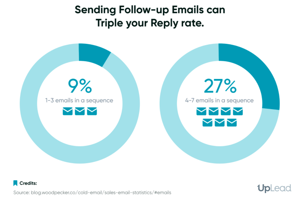
According to Convince and Convert, 35% of email recipients open the email based on the subject line alone. Small yet significant changes such as a good subject line or following up at the right time can be what convinces someone to hit reply to one of your emails.

This is where having the right email outreach software comes in. You want a piece of software that will allow you to monitor the way your campaign is performing (with analytics) and allow you to make changes to the campaign to see better results.

This is very different compared to email marketing software and it is easy to get the two mixed up since a lot of online communities tend to recommend email marketing tools and outreach tools as if they are interchangeable. They are not.

Email marketing tools help you reach out to people who have subscribed to your email list via an opt-in form. This means that you have already built a relationship with them and are simply fostering that relationship.

Email outreach software, on the other hand, is software that you use to cold outreach to prospects for the first time. It includes features like analytics, reporting, A/B testing emails, and more to help you convert emails into leads.

7 Email Outreach Software Options Worth Considering:

These are some of my favorite email outreach tools for everyone from a freelancer who is trying to grow their passive income to a marketing team with ten people running things behind the scenes.

#1 Mailshake

I highly recommend Mailshake to anyone who is looking for a great outreach tool that can work seamlessly with other software you want to tie into your outreach process. You can tie your calls, emails, and social media outreach together under one platform which makes every campaign much easier.

Here is what a campaign creation process looks like from the inside-

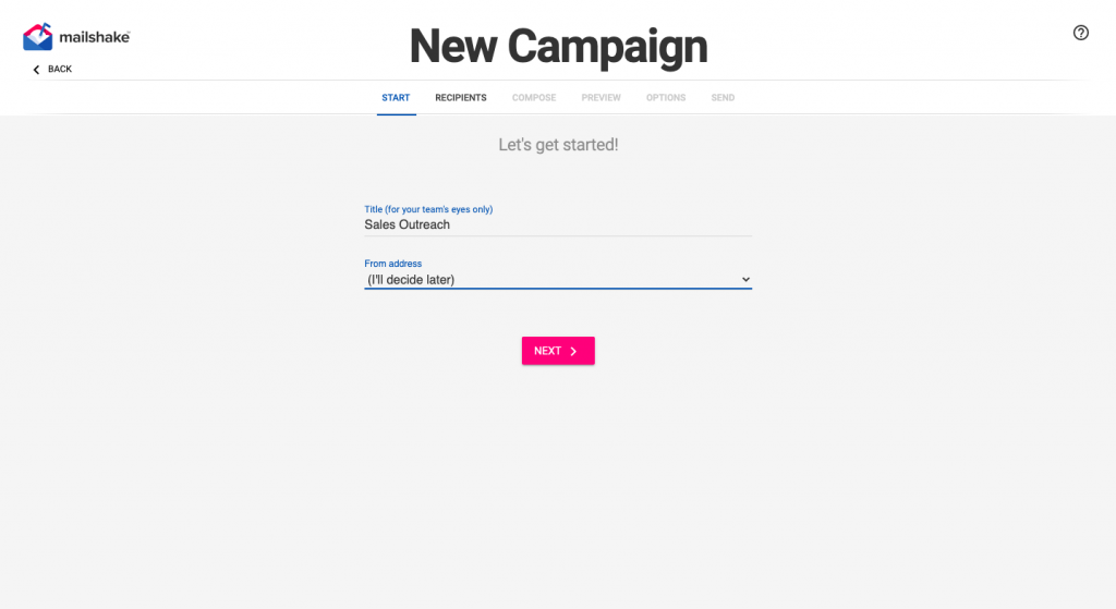
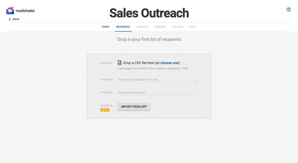
You decide what to call your campaign and what email address you want to send each email from. After that, you can create a list of recipients to reach out to by either adding a CSV file with their names and other contact information or using an existing list you have already uploaded. You can also manually add the email addresses.

Now that you have got a list of people you want to reach out to you can begin creating your email. Mailshake has ways of making that much easier for you such as the ability to insert text replacements which means you can personalize an email template for every email you send out.

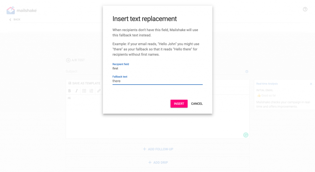
You can also add fallback texts such as ‘there’ if you do not have the name of the person to auto-add. Once you are done creating your initial outreach email, you can create follow-ups that will automatically send out a few days later based on your preferences (I personally see the best results spacing out each follow-up by 3-4 days).

Mailshake even allows you to track opens (how many times the person opened your email) and which links within your email they clicked. This helps you better understand what is interesting to your ideal customer.

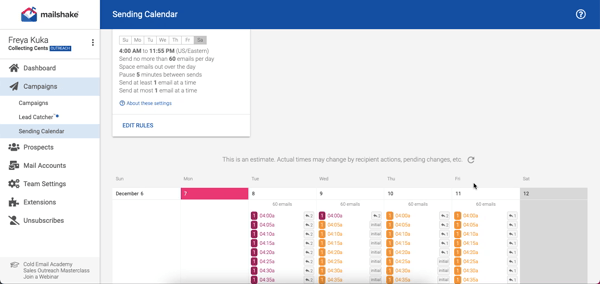
Another feature I love is how clearly they show you when everything is going out through your sending calendar. Here is a look at mine-

Essentially, Mailshake is a great tool to depend on if you are solely focused on email outreach and want the right tool to get you the best results. The pricing is pretty affordable and fair with the base package that focuses only on email outreach priced at $59 per month and the sales outreach package priced at $99 per month.

The sales outreach package is more suitable for marketing teams that include phone dialing and social selling as part of their outreach process.

#2 SalesHandy

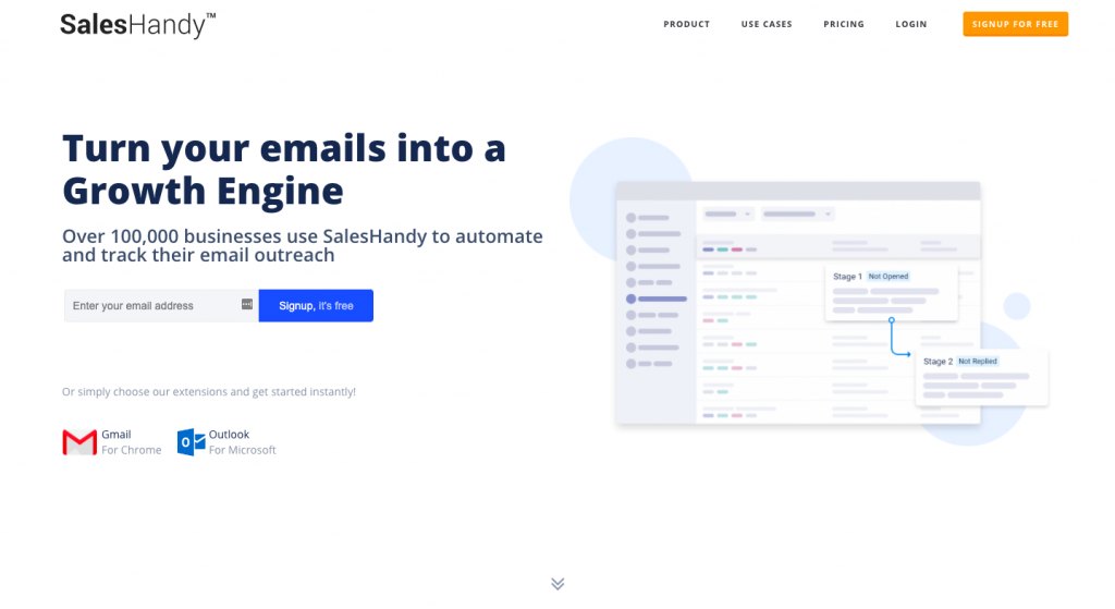
Mailshake is great for me personally but I have had plenty of people ask me if I know of any options that are more affordable for absolute beginners or bloggers who want to scale their growth without spending $60 every single month.

Well, say hello to SalesHandy. A far more flexible pricing plan that starts at $9 for their regular plan and even a free plan for those in need of simply the bare essentials is what makes SalesHandy an option everyone can get behind.

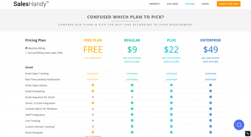
However, this option does not come with the amount of personalization that Mailshake gives you. I also find Mailshake’s dashboard to give me better analytics and a better view of what is working and what isn’t.

For example, Mailshake allows me the ability to A/B test emails while SalesHandy does not.

#3 Prospect.io

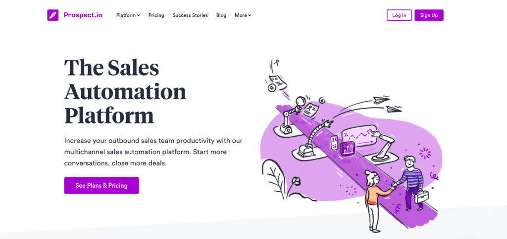
Prospect dives a little deeper into email outreach while also diving a little deeper into your pockets. It is worth it for most marketing teams though- especially those teams that need to outreach at scale and can do with some extra help.

The key difference between Prospect and the tools we have covered so far is Prospect’s extra email finder feature. This feature essentially eliminates the need for email finder tools such as Hunter or FindThatLead that increase your overall monthly expenses in the long run.

So, indirectly you will save the extra money you spend on Prospect by eliminating the need to pay for an email finder tool like Hunter. Of course, some people may simply prefer using a separate tool for finding emails or may just prefer Hunter or FindThatLead’s algorithm. That comes down to preference.

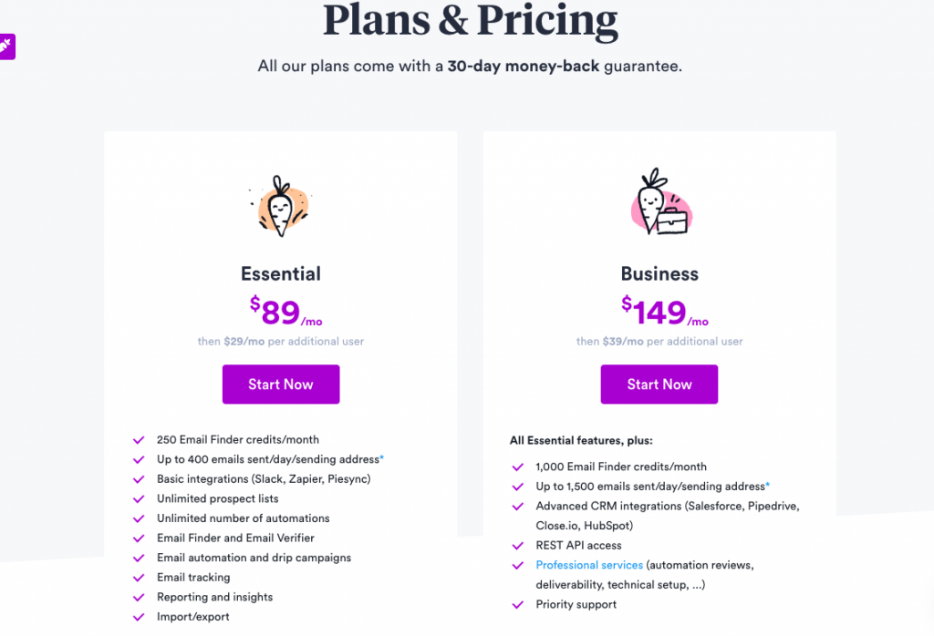
It is also important to note that Prospect only gives customers 250 email finder credits in its essential plan ($89 per month) and 1,000 email finder credits in the Business plan ($149 per month). In comparison, Hunter gives you 500 searches for $49 per month (base plan) and FindThatLead gives you 5,000 for $49 per month (Growth Plan).

Apart from the email finder, their other features are pretty similar to competitor tools. They offer personalized emails, drip campaigns, automation, CRM integrations with companies like close.io and HubSpot, email tracking, and reporting among other features.

#4 Reply.io

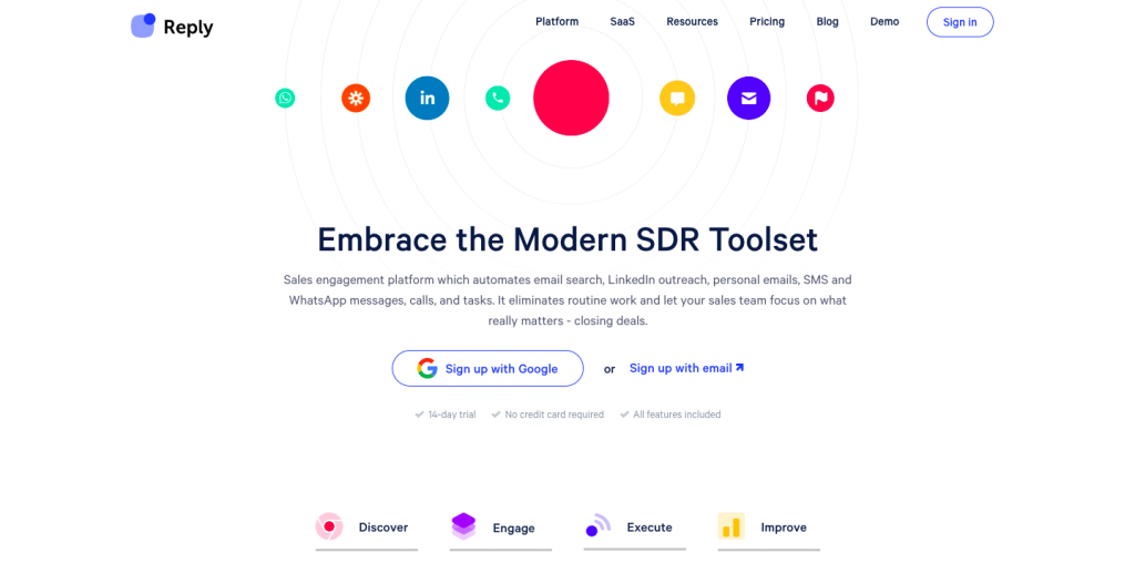
Reply.io is more of an all-in-one outreach solution since it focuses on outreach via LinkedIn, calls, messages, WhatsApp, etc. alongside email outreach. Even their pricing plans are broken down by the number of people you can reach out to every month rather than channels of outreach.

So, if you are only interested in email outreach, this option does not make a whole lot of sense. When it comes to features, you can expect the basics- email tracking, adding follow-ups, scheduling campaigns, etc.

However, where reply.io shines is the additional features. Namely, email search and LinkedIn integration.

The integration with LinkedIn integration allows you to pull contact details from LinkedIn directly into the app. The email search feature is also pretty neat because we are normally stuck using a separate email finder tool. You can try the free plan with 200 credits and then choose to go for one of the paid plans if you like how it works.

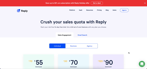
Lastly, pricing for the email outreach software starts at $70 per month per user and you can reach out to a 1000 contacts. After that, plans go up to $120 depending on how many contacts you want to reach.
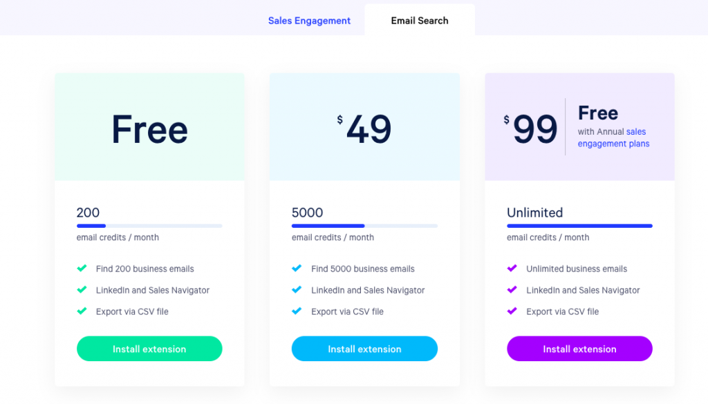
#5 Snov.io

Snov.io is an often-overlooked email outreach assistant that deserves more attention. The pricing is great, it has every feature under the sun, and the dashboard is pretty visually appealing as well. They even have an email verify feature that helps you make sure the emails you are reaching out to are legit and won’t end up being undeliverable.

The email finder tool also comes with an additional chrome extension that you can use to find emails for every domain you visit. This is a simple, well-priced option for email outreach that includes everything you are going to need to nab some great leads.

#6 Outreach.io

Outreach.io helps with more than just email outreach and is best suited for teams and sales management for companies. You have features like a phone dialer and the ability to sync up with your company’s CRM software. Once you track activity via email, social, or call; you can also set up online meetings through Outreach.

The last step of managing the opportunity or deal that comes through finding a new lead can also be done via the same software. All in all, this is a great solution for teams that are targeting a few contacts every month hoping to close some big-ticket deals.

#7 Autopilot

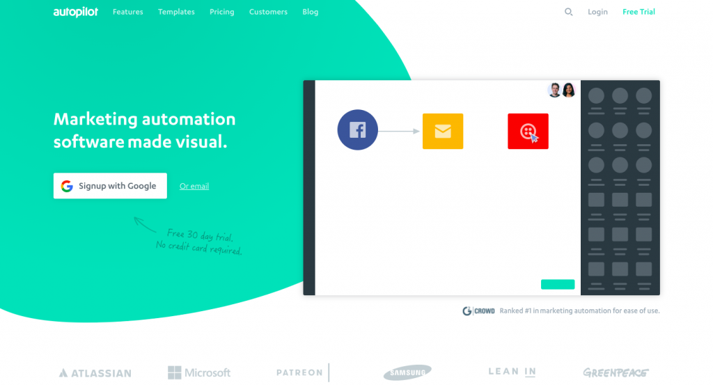
Autopilot is one of the most customizable outreach software options I can find. Some of the features Autopilot has that helps it stand out include-

  • The ability to capture new leads from your website. This can be from a landing page or a blog post, for instance.
  • Activity tracking allows you to see when customers have filled a form, visited a page, or opened one of the emails you sent out.
  • The ‘outcome wheel’ allows you to change the next step of the outreach process for any individual client based on how they responded.
  • A free 30-day trial lets you test out everything.

The ability to share your view with team members and work on responding to a client together makes this great for big companies.

What can email outreach be used for?

Now that you know what the market is offering you, let us talk about what an outreach email can be used for and what the end goal of an outreach campaign normally is.

Services or Products Provided By Your Team

A lot of outreach campaigns’ end goal is to get the responder to invest in a service or tool. Your service could be pretty much anything-

Forms or Surveys

If you are looking for more data on a subject, there is no better way to do it than to send out a simple form to the right people. The form can include a few easy to answer questions that will help you gain some valuable data on the subject.

You can use a free service like Jotform to create the survey you need.

An Auction

An outreach campaign can lead to an auction on your site wherein you are trying to sell something to the highest bidder (you can use a WordPress auction plugin to get this set up). This will allow you to reach out to interested parties before the auction starts and build up as much excitement as possible.

A Consultation

A big-ticket sale may need more customer management before you can ask for a sale. So, keeping this in mind, some outreach emails could simply lead to a consultation form as in the case of Brian White’s attorney practice.

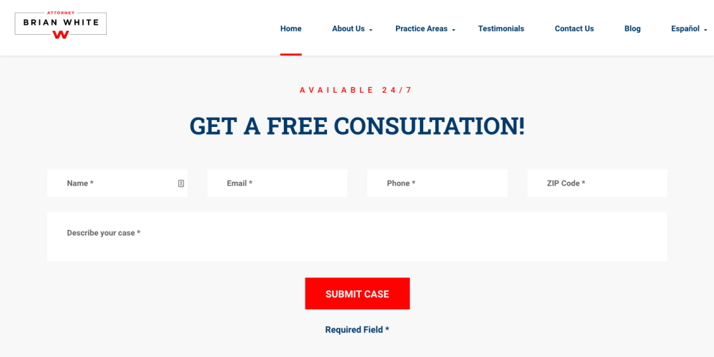
This type of form can work for pretty much any consulting business from an attorney’s practice to a social media consulting company. The point is you are bringing your lead further down your sales funnel and the first step is outreach.

Things to keep in mind when crafting your email outreach template

It takes a whole lot of A/B testing to create an email outreach template that works and increases your conversion rates. It is a constant learning process and that can be exhausting which is why keeping a few basic tips in mind when creating your template can help you jump forward in the process.

Here are some things I would recommend-

  • If you are reaching out to a company or blog, do not pretend like you have been a big fan of their work for ages. I personally roll my eyes whenever someone sends me an email saying they have followed my blog for ages because I know enough about my blog’s audience to know it isn’t people writing to me for favors. Do not mention you have used their service or read their work if you have not. People can normally tell that you haven’t.
  • Consider greeting them enthusiastically. Even something as simple as an exclamation mark after the traditional ‘Hi ‘ could be helpful.
  • Bolden any important bits of your email so people can skim through it.
  • Personalize your email as much as you can. This could mean mentioning them by name or mentioning their company’s name within the email. No one likes replying to a forwarded message.
  • Think about how you can help them instead of how they can help you. If you are asking someone if you can guest post on their website, let them know you are open to adding a quote of theirs in one of your future pieces.
  • Lastly, sign off with a good email signature that lets people contact you easily if they need to. Here is mine-

Best,

Freya, personal finance blogger
Collecting Cents
You can also reach out to her on Twitter or Facebook.


Hopefully, these simple tips can help you craft your first outreach email so you can start seeing your efforts pay off sooner.

Wrapping it up

A lot of people tend to get into remote work of some sort thinking that is the end of outreach and human contact but that is simply not the case (sorry introverts!). You need to network, get to know people within your industry, and build relationships- even with people miles away.

If you want to do that at scale (which you should be doing), you cannot possibly expect to do it manually. A good outreach software will help you save time, connect with the right people, and give you enough information to show you what is working.


Photo by Austin Distel on Unsplash

Categories: Others Tags:

20 Email Design Hacks To Increase Your Conversions

December 24th, 2020 No comments

Check your email inbox right now. How many new promotional emails did you receive over the past 24 hours? And more importantly, how many of these emails convinced you to click through or purchase an offer?

Any business navigating the digital world knows just how crucial email marketing is to grow a brand and boost sales. Though email allows ventures to have a direct line to their target market, most readers would only give it around three seconds of their time, if at all.

The key is to pounce on that little window of opportunity to hook the audience and make them want to click the call-to-action button. Unfortunately, not a lot of marketers realize this. They focus solely on sending emails and staying on schedule without giving much weight to the visual design.

Here are 20 email design hacks to help you polish up email templates that spark interest and convert.

1. Clean Layout

Using a cluttered layout might be the first step to losing your audience. For one, poorly-designed emails can make the message more confusing. In addition to that, a messy layout can also be too taxing to digest visually. If this is the case, the reader may simply hit the back button instead of trying to understand your offer.

2. Complement the Copy

When it comes to email marketing, the visual design should complement the copy. For instance, if your copy is formal, you should use an equally austere design style. If the copy has a casual tone, on the other hand, the visuals should communicate the same feel.

3. Use Color Psychology

Color design psychology tells us that various hues evoke specific meanings and feelings. For instance, red may evoke a sense of urgency and excitement. So, it can be an excellent color to use for limited-time offers. On the other hand, green is often associated with “go,” encouraging the reader to click on a call-to-action button.

4. Think Twice About Templates

It might seem convenient to use email templates available online, but hold your horses! Using a generic template may not be the best idea if you’re trying to build a brand. Instead, take the time to design your own or, better yet, have a professional do it for you.

5. Personalize Emails

The simple effort of setting your email to reflect the reader’s name can make a huge difference in how they’ll perceive the letter. In fact, a study says including the recipient’s name in the email can boost sales leads by up to 31 percent.

6. Segmentize Your Market

Different market segments have different preferences. With that in mind, you can boost your campaign’s effectiveness by using different email designs or copies to target various audience groups.

7. Prioritize the Subject Line

The subject line can make or break a marketing email. That said, it should be a part of your game plan. Just think about it – you won’t likely open an email if it seems like just another promo offer you can do without.

8. Think Like a Journalist

Journalists use an inverted pyramid structure when writing news stories. How does it work? Simple – they provide the most important info first, then the additional details, and close with the background info. Since readers will only spend a few seconds on your email, you might as well give them the gist of the offer right away.

9. Provide a Virtual Customer Experience

Just how delicious are the baked goods you’re offering? How relaxed will they be when they use the bath set you’re selling? Let your audience know! You can do this by using photos or videos that visualize and provide a virtual experience to your readers.

10. Apply Basic Design Aesthetics

It pays to know your way around basic design aesthetics to come up with a good marketing email. Yes, you’d want to break the mold and stand out from the rest. However, there’s a difference between breaking the rules to be creative and simply not knowing the rules in the first place.

11. Emphasize the Incentive

Are you offering a free weekly newsletter with healthy recipes? Or a special discount for members? Make sure to emphasize your incentive from the get-go. By doing so, you help reduce your reader’s mental load and fix on the offer you’re making.

12. Focus on Exclusivity

Everyone wants to feel special. That said, it’s best to make your audience feel that you’re holding a special spot for them by emphasizing that the offer is exclusive to email recipients.

13. A/B Test

A/B testing is an efficient way to know what works and what doesn’t. Indeed, it’s ideal to test elements such as email copies, images, visuals, and call-to-action buttons to gear your email for success.

14. Be Consistent

Your email should be consistent with your branding. From message tone to visual assets, the transition from the email to your website or landing page should look seamless. In short, your email and the landing page shouldn’t seem like they’re for different brands.

15. Minimize the Risk

Encourage your audience to trust you by including trust badges in your email design. This may consist of seals like “100% Money Back Guarantee” or logos that show payments system providers you’re partnering with.

16. Keep the Copy Short and Sweet

No one likes reading long emails, more so if it’s a promotional email. Clearly, it’s vital to keep the copy not only short but also punchy and direct to the point.

17. Opt for Professional Design

This is simply non-negotiable. It only takes one poorly-designed email to make a client or prospect unsubscribe. Without a doubt, professional design is surely worth it. If you can’t afford to hire an in-house designer, getting an unlimited design package from service providers like Penji is an excellent solution. You can get all the designs you need at a flat monthly rate so that you can stay on top of your campaign.

18. Don’t Forget Your Socials

Statistics tell us that Americans spent an average of two hours and three minutes on social media in 2019. That said, linking your social media accounts in your email gives readers more channels to interact with your brand.

19. Include a Time Element

There are a few techniques that boost conversion more than creating a sense of urgency. If your campaign involves a limited-time offer, make sure to emphasize it well in your email. If possible, include a countdown timer or even a line that tells the reader how much time they have left to opt-in.

20. The CTA is Your Secret Weapon

The call-to-action button tells the reader that it’s time to make a decision. Would they want to engage with your brand more or not? That said, it’s crucial to word your CTA right. Instead of the usual “Get Started,” you may want to explore more specific wording such as “Get My 5% Off.”


Photo by NordWood Themes on Unsplash

Categories: Others Tags:

Custom Styles in GitHub Readme Files

December 23rd, 2020 No comments

Even though GitHub Readme files (typically ./readme.md) are Markdown, and although Markdown supports HTML, you can’t put or tags init. (Well, you can, they just get stripped.) So you can’t apply custom styles there. Or can you?

  1. You can use SVG as an (anywhere).
  2. When used that way, even stuff like animations within them play (wow).
  3. SVG has stuff like for textual content, but also for regular ol’ HTML content.
  4. SVG support tags.
  5. Your readme.md file does support with SVG sources.

Sindre Sorhus combined all that into an example.

That same SVG source will work here:


The post Custom Styles in GitHub Readme Files appeared first on CSS-Tricks.

You can support CSS-Tricks by being an MVP Supporter.

Categories: Designing, Others Tags:

Continuous Performance Analysis with Lighthouse CI and GitHub Actions

December 23rd, 2020 No comments

Lighthouse is a free and open-source tool for assessing your website’s performance, accessibility, progressive web app metrics, SEO, and more. The easiest way to use it is through the Chrome DevTools panel. Once you open the DevTools, you will see a “Lighthouse” tab. Clicking the “Generate report” button will run a series of tests on the web page and display the results right there in the Lighthouse tab. This makes it easy to test any web page, whether public or requiring authentication.

If you don’t use Chrome or Chromium-based browsers, like Microsoft Edge or Brave, you can run Lighthouse through its web interface but it only works with publicly available web pages. A Node CLI tool is also provided for those who wish to run Lighthouse audits from the command line.

All the options listed above require some form of manual intervention. Wouldn‘t it be great if we could integrate Lighthouse testing in the continuous integration process so that the impact of our code changes can be displayed inline with each pull request, and so that we can fail the builds if certain performance thresholds are not net? Well, that’s exactly why Lighthouse CI exists!

It is a suite of tools that help you identify the impact of specific code changes on you site not just performance-wise, but in terms of SEO, accessibility, offline support, and other best practices. It’s offers a great way to enforce performance budgets, and also helps you keep track of each reported metric so you can see how they have changed over time.

In this article, we’ll go over how to set up Lighthouse CI and run it locally, then how to get it working as part of a CI workflow through GitHub Actions. Note that Lighthouse CI also works with other CI providers such as Travis CI, GitLab CI, and Circle CI in case you prefer to not to use GitHub Actions.

Setting up the Lighthouse CI locally

In this section, you will configure and run the Lighthouse CI command line tool locally on your machine. Before you proceed, ensure you have Node.js v10 LTS or later and Google Chrome (stable) installed on your machine, then proceed to install the Lighthouse CI tool globally:

$ npm install -g @lhci/cli

Once the CLI has been installed successfully, ru lhci --help to view all the available commands that the tool provides. There are eight commands available at the time of writing.

$ lhci --help
lhci <command> <options>

Commands:
  lhci collect      Run Lighthouse and save the results to a local folder
  lhci upload       Save the results to the server
  lhci assert       Assert that the latest results meet expectations
  lhci autorun      Run collect/assert/upload with sensible defaults
  lhci healthcheck  Run diagnostics to ensure a valid configuration
  lhci open         Opens the HTML reports of collected runs
  lhci wizard       Step-by-step wizard for CI tasks like creating a project
  lhci server       Run Lighthouse CI server

Options:
  --help             Show help  [boolean]
  --version          Show version number  [boolean]
  --no-lighthouserc  Disables automatic usage of a .lighthouserc file.  [boolean]
  --config           Path to JSON config file

At this point, you‘re ready to configure the CLI for your project. The Lighthouse CI configuration can be managed through (in order of increasing precedence) a configuration file, environmental variables, or CLI flags. It uses the Yargs API to read its configuration options, which means there’s a lot of flexibility in how it can be configured. The full documentation covers it all. In this post, we’ll make use of the configuration file option.

Go ahead and create a lighthouserc.js file in the root of your project directory. Make sure the project is being tracked with Git because the Lighthouse CI automatically infers the build context settings from the Git repository. If your project does not use Git, you can control the build context settings through environmental variables instead.

touch lighthouserc.js

Here’s the simplest configuration that will run and collect Lighthouse reports for a static website project, and upload them to temporary public storage.

// lighthouserc.js
module.exports = {
  ci: {
    collect: {
      staticDistDir: './public',
    },
    upload: {
      target: 'temporary-public-storage',
    },
  },
};

The ci.collect object offers several options to control how the Lighthouse CI collects test reports. The staticDistDir option is used to indicate the location of your static HTML files — for example, Hugo builds to a public directory, Jekyll places its build files in a _site directory, and so on. All you need to do is update the staticDistDir option to wherever your build is located. When the Lighthouse CI is run, it will start a server that’s able to run the tests accordingly. Once the test finishes, the server will automatically shut dow.

If your project requires the use of a custom server, you can enter the command used to start the server through the startServerCommand property. When this option is used, you also need to specify the URLs to test against through the url option. This URL should be serveable by the custom server that you specified.

module.exports = {
  ci: {
    collect: {
      startServerCommand: 'npm run server',
      url: ['http://localhost:4000/'],
    },
    upload: {
      target: 'temporary-public-storage',
    },
  },
};

When the Lighthouse CI runs, it executes the server command and watches for the listen or ready string to determine if the server has started. If it does not detect this string after 10 seconds, it assumes the server has started and continues with the test. It then runs Lighthouse three times against each URL in the url array. Once the test has finished running, it shuts down the server process.

You can configure both the pattern string to watch for and timeout duration through the startServerReadyPattern and startServerReadyTimeout options respectively. If you want to change the number of times to run Lighthouse against each URL, use the numberOfRuns property.

// lighthouserc.js
module.exports = {
  ci: {
    collect: {
      startServerCommand: 'npm run server',
      url: ['http://localhost:4000/'],
      startServerReadyPattern: 'Server is running on PORT 4000',
      startServerReadyTimeout: 20000 // milliseconds
      numberOfRuns: 5,
    },
    upload: {
      target: 'temporary-public-storage',
    },
  },
};

The target property inside the ci.upload object is used to configure where Lighthouse CI uploads the results after a test is completed. The temporary-public-storage option indicates that the report will be uploaded to Google’s Cloud Storage and retained for a few days. It will also be available to anyone who has the link, with no authentication required. If you want more control over how the reports are stored, refer to the documentation.

At this point, you should be ready to run the Lighthouse CI tool. Use the command below to start the CLI. It will run Lighthouse thrice against the provided URLs (unless changed via the numberOfRuns option), and upload the median result to the configured target.

lhci autorun

The output should be similar to what is shown below:

✅  .lighthouseci/ directory writable
✅  Configuration file found
✅  Chrome installation found
⚠️   GitHub token not set
Healthcheck passed!

Started a web server on port 52195...
Running Lighthouse 3 time(s) on http://localhost:52195/web-development-with-go/
Run #1...done.
Run #2...done.
Run #3...done.
Running Lighthouse 3 time(s) on http://localhost:52195/custom-html5-video/
Run #1...done.
Run #2...done.
Run #3...done.
Done running Lighthouse!

Uploading median LHR of http://localhost:52195/web-development-with-go/...success!
Open the report at https://storage.googleapis.com/lighthouse-infrastructure.appspot.com/reports/1606403407045-45763.report.html
Uploading median LHR of http://localhost:52195/custom-html5-video/...success!
Open the report at https://storage.googleapis.com/lighthouse-infrastructure.appspot.com/reports/1606403400243-5952.report.html
Saving URL map for GitHub repository ayoisaiah/freshman...success!
No GitHub token set, skipping GitHub status check.

Done running autorun.

The GitHub token message can be ignored for now. We‘ll configure one when it’s time to set up Lighthouse CI with a GitHub action. You can open the Lighthouse report link in your browser to view the median test results for reach URL.

Configuring assertions

Using the Lighthouse CI tool to run and collect Lighthouse reports works well enough, but we can go a step further and configure the tool so that a build fails if the tests results do not match certain criteria. The options that control this behavior can be configured through the assert property. Here’s a snippet showing a sample configuration:

// lighthouserc.js
module.exports = {
  ci: {
    assert: {
      preset: 'lighthouse:no-pwa',
      assertions: {
        'categories:performance': ['error', { minScore: 0.9 }],
        'categories:accessibility': ['warn', { minScore: 0.9 }],
      },
    },
  },
};

The preset option is a quick way to configure Lighthouse assertions. There are three options:

  • lighthouse:all: Asserts that every audit received a perfect score
  • lighthouse:recommended: Asserts that every audit outside performance received a perfect score, and warns when metric values drop below a score of 90
  • lighthouse:no-pwa: The same as lighthouse:recommended but without any of the PWA audits

You can use the assertions object to override or extend the presets, or build a custom set of assertions from scratch. The above configuration asserts a baseline score of 90 for the performance and accessibility categories. The difference is that failure in the former will result in a non-zero exit code while the latter will not. The result of any audit in Lighthouse can be asserted so there’s so much you can do here. Be sure to consult the documentation to discover all of the available options.

You can also configure assertions against a budget.json file. This can be created manually or generated through performancebudget.io. Once you have your file, feed it to the assert object as shown below:

// lighthouserc.js
module.exports = {
  ci: {
    collect: {
      staticDistDir: './public',
      url: ['/'],
    },
    assert: {
      budgetFile: './budget.json',
    },
    upload: {
      target: 'temporary-public-storage',
    },
  },
};

Running Lighthouse CI with GitHub Actions

A useful way to integrate Lighthouse CI into your development workflow is to generate new reports for each commit or pull request to the project’s GitHub repository. This is where GitHub Actions come into play.

To set it up, you need to create a .github/workflow directory at the root of your project. This is where all the workflows for your project will be placed. If you’re new to GitHub Actions, you can think of a workflow as a set of one or more actions to be executed once an event is triggered (such as when a new pull request is made to the repo). Sarah Drasner has a nice primer on using GitHub Actions.

mkdir -p .github/workflow

Next, create a YAML file in the .github/workflow directory. You can name it anything you want as long as it ends with the .yml or .yaml extension. This file is where the workflow configuration for the Lighthouse CI will be placed.

cd .github/workflow
touch lighthouse-ci.yaml

The contents of the lighthouse-ci.yaml file will vary depending on the type of project. I‘ll describe how I set it up for my Hugo website so you can adapt it for other types of projects. Here’s my configuration file in full:

# .github/workflow/lighthouse-ci.yaml
name: Lighthouse
on: [push]
jobs:
  ci:
    runs-on: ubuntu-latest
    steps:
      - name: Checkout code
        uses: actions/checkout@v2
        with:
          token: ${{ secrets.PAT }}
          submodules: recursive

      - name: Setup Hugo
        uses: peaceiris/actions-hugo@v2
        with:
          hugo-version: "0.76.5"
          extended: true

      - name: Build site
        run: hugo

      - name: Use Node.js 15.x
        uses: actions/setup-node@v2
        with:
          node-version: 15.x
      - name: Run the Lighthouse CI
        run: |
          npm install -g @lhci/cli@0.6.x
          lhci autorun

The above configuration creates a workflow called Lighthouse consisting of a single job (ci) which runs on an Ubuntu instance and is triggered whenever code is pushed to any branch in the repository. The job consists of the following steps:

  • Check out the repository that Lighthouse CI will be run against. Hugo uses submodules for its themes, so it’s necessary to ensure all submodules in the repo are checked out as well. If any submodule is in a private repo, you need to create a new Personal Access Token with the repo scope enabled, then add it as a repository secret at https://github.com///settings/secret. Without this token, this step will fail if it encounters a private repo.
  • Install Hugo on the GitHub Action virtual machine so that it can be used to build the site. This Hugo Setup Action is what I used here. You can find other setup actions in the GitHub Actions marketplace.
  • Build the site to a public folder through the hugo command.
  • Install and configure Node.js on the virtual machine through the setup-node action
  • Install the Lighthouse CI tool and execute the lhci autorun command.

Once you’ve set up the config file, you can commit and push the changes to your GitHub repository. This will trigger the workflow you just added provided your configuration was set up correctly. Go to the Actions tab in the project repository to see the status of the workflow under your most recent commit.

If you click through and expand the ci job, you will see the logs for each of the steps in the job. In my case, everything ran successfully but my assertions failed — hence the failure status. Just as we saw when we ran the test locally, the results are uploaded to the temporary public storage and you can view them by clicking the appropriate link in the logs.

Setting up GitHub status checks

At the moment, the Lighthouse CI has been configured to run as soon as code is pushed to the repo whether directly to a branch or through a pull request. The status of the test is displayed on the commit page, but you have click through and expand the logs to see the full details, including the links to the report.

You can set up a GitHub status check so that build reports are displayed directly in the pull request. To set it up, go to the Lighthouse CI GitHub App page, click the “Configure” option, then install and authorize it on your GitHub account or the organization that owns the GitHub repository you want to use. Next, copy the app token provided on the confirmation page and add it to your repository secrets with the name field set to LHCI_GITHUB_APP_TOKEN.

The status check is now ready to use. You can try it out by opening a new pull request or pushing a commit to an already existing pull request.

Historical reporting and comparisons through the Lighthouse CI Server

Using the temporary public storage option to store Lighthouse reports is great way to get started, but it is insufficient if you want to keep your data private or for a longer duration. This is where the Lighthouse CI server can help. It provides a dashboard for exploring historical Lighthouse data and offers an great comparison UI to uncover differences between builds.

To utilize the Lighthouse CI server, you need to deploy it to your own infrastructure. Detailed instructions and recipes for deploying to Heroku and Docker can be found on GitHub.

Conclusion

When setting up your configuration, it is a good idea to include a few different URLs to ensure good test coverage. For a typical blog, you definitely want to include to include the homepage, a post or two which is representative of the type of content on the site, and any other important pages.

Although we didn’t cover the full extent of what the Lighthouse CI tool can do, I hope this article not only helps you get up and running with it, but gives you a good idea of what else it can do. Thanks for reading, and happy coding!


The post Continuous Performance Analysis with Lighthouse CI and GitHub Actions appeared first on CSS-Tricks.

You can support CSS-Tricks by being an MVP Supporter.

Categories: Designing, Others Tags:

7 UX Principles to Apply to Your SEO

December 23rd, 2020 No comments

User experience is one of the most important aspects of web design, but many experts overlook that UX doesn’t just apply to web pages. User experience as a concept encompasses all aspects of end-user interaction with a company.

That means you need to discover the right UX strategies for everything from your homepage to your email marketing and even your listings on Google.

Today, we’re going to explore some of how you can apply UX principles to your client’s image on search engines.

Why Your Search Engine Listing Matters

Let’s start with the basics: 89% of customers start their purchasing process with a search engine. That means that whether you’re creating a portfolio to sell your services or building a website for a client, the first connection a customer has with your design isn’t on the homepage.

Most of the time, you’re driving a specific experience for an end-user before you even realize it. Before you can wow an audience with a beautiful site design or an amazing CTA offer, you need to convince them to click on your Google link.

When you invest in user experience, you think carefully about the journey that an end-user goes through when interacting with a brand. This often means considering things like the user’s intent, their needs, and their pain points.

Those same principles apply to create an impressive search engine listing.

UX on a website is all about giving your audience what they need in an informed, and strategic manner; UX in the search engine results works the same way.

How to Make Your Search Listing Stand Out with UX

So, how do you begin to apply the principles of UX to your Google Search results?

It’s much easier than you’d think.

Step 1: Show Immediate Value

Delivering an excellent experience on a website often means providing end-users with the information they need as quickly as possible. Imagine designing a landing page; you wouldn’t want your audience to scroll forever to find what they need. Instead, you’d make sure that the value of the page was immediately obvious.

When creating an image for your search engine listing, you’ll need to take the same approach. This often means thinking carefully about two things: your headline and your meta description.

Around 8 out of 10 users say that they’ll click a title if it’s compelling. That means that before you do anything else to improve your SEO strategy, you need to make sure that your web page’s title is going to grab your audience’s attention.

The best titles deliver instant value. These titles tell the audience exactly what they’re going to get when they click onto the page. The promise drives action, while clarity highlights the informed nature of the brand.

The great thing about using an excellent title for a page is that it doesn’t matter where you’re ranked on the search results. Whether you’re number 2 or number 5, your customers will click if they find something they want.

It’s just like using a CTA on a landing page. Make sure your titles are:

  • Informative — show your audience value immediately;
  • Optimized for mobile — remember, your audience might not see your full title on some screens; this means that you need to make the initial words count;
  • Easy to read — keep it short, simple, and clear, speak the end-users’ language.

Step 2: Build Trust with Your URLs

Trust factors are another essential part of good UX.

When you’re designing a website for a new brand, you know that it’s your job to make visitors feel at ease. Even in today’s digital world, many customers won’t feel comfortable giving their money or details to a new company.

Within the website that you design, you can implement trust symbols, reviews, and testimonials to enhance brand credibility. On search engines, it all starts with your URL.

Search-friendly URLs that highlight the nature of the page will put your audience’s mind at ease. When they click on a page about “What is SEO” in the SERPs, they want to see an URL that matches, not a bunch of numbers and symbols

Use search-friendly permalink structures to make your listing seem more authoritative. This will increase the chances of your customer clicking through to a page and make them more likely to share the link with friends.

Once you decide on a link structure, make sure that it stays consistent throughout the entire site. If a link doesn’t appear to match the rest of the URLs that your audience sees for your website, they may think they’re on the wrong page. That increases your bounce rate.

Step 3: Be Informative with Your Meta Description

To deliver excellent UX on a website, you ensure that your visitor can find all of the answers to their most pressing questions as quickly as possible. This includes providing the right information on each page and using the correct navigational structure to support a visitor’s journey.

In the SERPs, you can deliver that same informative experience with a meta description. Although meta descriptions often get ignored, they can provide a lot of value and help you or your client make the right first impression.

To master your meta descriptions:

  • Use the full 160 characters — make the most of your meta description by providing as much useful information as you can within that small space;
  • Include a CTA — just as CTAs help to guide customers through the pages on a website, they can assist with pulling in clicks on the SERPS; a call to action like “read about the” or “click here” makes sense when you’re boosting your search image;
  • Focus on value — concentrate on providing your customers with an insight into what’s in it for them if they click on your listing.

Don’t forget that adding keywords to your meta description is often helpful too. Keywords will boost your chances of a higher ranking, but they’ll also show your audience that they’re looking at the right result.

Step 4: Draw the Eye with Rich Snippets

You’ve probably noticed that the search engine result pages have changed quite a bit in the last couple of years. As Google strives to make results more relevant and informative, we’ve seen the rise of things like rich snippets. Rich snippets are excellent for telling your audience where to look.

On a website, you would use design elements, like contrasting colors and animation, to pull your audience’s attention to a specific space. On search engines, rich snippets can drive the same outcomes. The difference is that instead of telling a visitor what to do next on a page, you’re telling them to click on your site, not a competitor’s.

When Google introduced rich snippets, it wanted to provide administrators with a way of showcasing their best content. Rich snippets are most commonly used today on product pages and contact pages because they can show off reviews.

Install a rich snippet plugin into your site if you’re a WordPress user or your client is. When you enter the content that you need into the website, use the drop-down menu in your Rich snippet tool to configure the snippet.

Ideally, you’ll want to aim for the full, rich snippet if you want to stand out at the top of the search results. Most featured snippets have both text and an image. It would help if you aimed to access both of these by writing great content and combining it with a relevant image.

Step 5: Provide Diversity (Take Up More of the Results)

As a website designer or developer, you’ll know that different people on a website will often be drawn to different things. Some of your visitors might immediately see a set of bullet-points and use them to search for the answer to their question. Other visitors will want pictures or videos to guide them. So, how do you deliver that kind of diversity in the SERPS?

The easiest option is to aim to take up more of the search result pages. Google now delivers a bunch of different ways for customers to get the answers they crave. When you search for “How to use Google my Business” on Google, you’ll see links to blogs, as well as a list of YouTube Videos and the “People Also Ask” section.

Making sure that you or a client has different content ranking pieces for the same keywords can significantly improve the experience any customer has on the search engines. Often, the process of spreading your image out across the SERPs is as simple as creating some different kinds of content.

To access the video’s benefits, ask your client to create YouTube videos for some of their most commonly asked questions or most covered topics. If you’re helping with SEO marketing for your client, then make sure they have an FAQ page or a way of answering questions quickly and concisely on articles, so they’re more likely to appear in “People Also Ask”:

Step 6: Add Authority with Google My Business

Speaking of Google My Business, that’s another excellent tool that’s perfect for improving UX in the search results. GMB is a free tool provided by Google. It allows business owners to manage how information appears in the search results.

With this service, you can manage a company’s position on Google maps, the Knowledge Graph, and online reviews. Establishing a company’s location is one of the most important things you can do to help audiences quickly find a business. Remember, half of the customers that do a local search on a smartphone end up visiting the store within the same day.

Start by setting up the Google Business listing for yourself or your client. All you need to do is hit the “Start Now” button and fill out every relevant field offered by Google. The more information you can add to Google My Business, the more your listing will stand out. Make sure you:

  • Choose a category for a business, like “Grocery store”;
  • Load up high-quality and high-resolution images;
  • Ensure your information matches on every platform;
  • Use a local number for contact;
  • Encourage reviews to give your listing a five-star rating.

Taking advantage of a Google My Business listing will ensure that your audience has all the information they need to make an informed decision about your company before they click through to the site. This means that you or your client get more warm leads and fewer people stumbling onto your website that might not want to buy from you.

Step 7: Use Structured Data Markup to Answer Questions

If you’re already using things like rich snippets in your Google listings, you should also have a structured schema markup plan. Schema markup on Google tells the search engines what your data means. This means that you can add extra information to your listings that will guide your customers more accurately to the support they need.

Providing additional schema markup information to your listings gives them an extra finishing touch to ensure that they stand out from the competition. You might add something like a “product price” to a product page or information about the product’s availability.

Alternatively, you could provide the people who see a search result with other options. This could be an excellent option if you’re concerned that some of the people who might come across your listing might need slightly different information. For instance, you can ask Google to list other pages along with your search results that customers can “jump to” if they need additional insights.

Baking structured data into your design process when you’re working on a website does several positive things. It makes the search engine’s job easier so that you can ensure that you or your client ranks higher. Additionally, it means that your web listings will be more thorough and useful.

Since UX is all about giving your audience the best possible experience with a brand, that starts with making sure they get the information they need in the search results.

Constantly Improve and Experiment

Remember, as you begin to embed UX elements into your search engine listings, it’s important to be aware of relevant evolutions. Ultimately, the needs of any audience can change very rapidly. Paying attention to your customers and what kind of links they click on the most will provide you with lots of valuable data. You can use things like Google analytics to A/B test things like titles, pictures, featured snippets, and other things that may affect UX.

At the same time, it’s worth noting that the Google search algorithms are always changing. Running split tests on different pages will give you an insight into what your customers want. However, you’ll need to keep an eye on the latest documentation about Google Search if you want to avoid falling behind the competition.

Like most exceptional UX aspects, mastering your SERP position isn’t a set it and forget it strategy. You’ll need to constantly expand your knowledge if you want to show clients that you can combine UX and SEO effectively.

It’s easy to forget that there’s more to UX than making your buttons clickable on mobile devices or ensuring that scrolling feels smooth. For a designer or developer to deliver wonderful UX for a brand, they need to consider every interaction that a company and customer have. Most of the time, this means starting with the way a website appears when it’s listed on the search engines. Getting your SEO listing right doesn’t just boost your chances of a good ranking. This strategy also improves your reputation with your audience and delivers more meaningful moments in the buyer journey.

Featured image via Unsplash.

Source

Categories: Designing, Others Tags:

“Yes or No?”

December 22nd, 2020 No comments

Sara Soueidan digs into this HTML/UX situation. “Yes” or “no” is a boolean situation. A checkbox represents this: it’s either on or off (uh, mostly). But is a checkbox always the best UX? It depends, of course:

Use radio buttons if you expect the answer to be equally distributed. If I expect the answer to be heavily biased to one answer I prefer the checkbox. That way the user either makes an explicit statement or just acknowledges the expected answer.

If you want a concrete, deliberate, explicit answer and don’t want a default selection, use radio buttons. A checkbox has an implicit default state. And the user might be biased to the default option. So having the requirement for an explicit “No” is the determinig factor.

So you’ve got the checkbox approach:

<label>
  <input type="checkbox">
  Yes?
</label>

Which is nice and compact but you can’t make it “required” (easily) because it’s always in a valid state.

So if you need to force a choice, radio buttons (with no default) are easier:

<label>
  <input type="radio" name="choice-radio">
  Yes
</label>
<label>
  <input type="radio" name="choice-radio">
  No
</label>

I mean, we might as well consider another a range input too, which can function as a toggle if you max it out at 1:

<label class="screen-reader-only" for="choice">Yes or No?</label>
<span aria-hidden="true">No</span>
<input type="range" max="1" id="choice" name="choice">
<span aria-hidden="true">Yes</span>

Lolz.

And I suppose a could force a user choice too, right?

<label>
  Yes or no?
  <select>
    <option value="">---</option>
    <option value="">Yes</option>
    <option value="">No</option>
  </select>
</label>

I weirdly don’t hate that only because selects are so compact and styleable.

If you really wanna stop and make someone think, though, make them type it, right?

<label>
  Type "yes" or "no"
  <input type="text" pattern="[Yy]es|[Nn]o">
</label>

Ha.

CodePen Embed Fallback

The post “Yes or No?” appeared first on CSS-Tricks.

You can support CSS-Tricks by being an MVP Supporter.

Categories: Designing, Others Tags:

Edge Everything

December 22nd, 2020 No comments

The series is a wrap my friends! Thanks for reading and a big special thanks to all the authors this year who shared something they have learned. Many authors really swung wide with thoughts about how we can be better and do better, which of course I really love.

  • Adam showed us logical properties and, through their use, we’re building layouts that speak the language of the web and are far more easily adaptable to other written languages.
  • Jennifer told us that even basic web skills can make a huge difference for organizations, especially outside the tech bubble.
  • Jake used TypeScript as a literal metaphor that may be good, or not, to apply to ourselves.
  • Miriam defended the genre of CSS art. Not only is it (more than) OK to be a thing, it can open up how we think and have practical benefits.
  • Jeremy had lots of luck building with the raw languages of HTML, CSS, and JavaScript, and in doing so, extended the life of his projects.
  • Natalya released our tension, telling we can and should waste our time, since this year is all wrong for creativity and productivity anyway.
  • Geoff had an incredibly salient point about CSS. Since everything is relative, think about what it’s relative to.
  • Mel showed us that there are a variety of interesting sources of open-source-licensed imagery.
  • Kitty gave us permission to stop chasing the hype.
  • Matthias paid homage to the personal website.
  • Ire said that the way websites are built didn’t change all that much this year, and ya know what, it didn’t have to.
  • Eric opened the door to other accessibility professionals to have their say. There are some bright spots, some of which came ironically from the pandemic, but the fight is far from over.
  • Kilian blamed our collective feeling of being behind on the idea that we think the newfangled is much more widely used than it is. The old is dependable, predictable, and crucially, the vast majority of what we’re all doing anyway.
  • Shawn demonstrated that each of us has our own perspective on what is old and new based on when we started. We can’t move our “Year Zero”, but we can try to see the world a bit more like a beginner.
  • Manuel told us that keeping up isn’t a game we need to play, but it is worth learning things about the languages that we already “know”, as there are bound to be some things in there that will surprise you.
  • Andy said that every solution to a problem he faces is solved by simplification.
  • Erik thinks one of the keys to great design is great fonts.
  • Eric went on a journey of web standards, browsers, and security and not only learned a lot but got some important work done along the way.
  • Cassidy is seeing old ideas come back to life in new contexts, which makes a lot of sense considering we’re seeing the return of static file hosting as a fresh and smart way to build websites.
  • Eric shared a trick that your neighborhood image compression algorithm can’t really help with: indexing colors. If your PNG can look good with a scoped color palette, you’ll have tremendous file size saving there even before it is optimized.
  • Kyle is changing his bet from everything changing to things being more likely to stay the same.
  • Brian learned to be OK with not knowing everything. Focus on one thing can mean understanding less about others, but that’s the nature of life and time.
  • Lea has the numbers on web technology usage on a very wide slice of the internet. Her findings echo what many others in this series are saying: there is a lot more old tech out there than new.
  • Jeremy compared video games and the constraints they face (and thrive from) to the constraints we face on the web (which are many).

If I had to pick the biggest major thread that people latched on to (with absolutely zero prompting), I’d say it’s the idea that the web is full of old technology and that’s not only OK but good. There is no pressing need to learn new things, which haven’t always settled out, and can bring more complexity than is necessary.


I’ll do one myself here.

I’m going with the concept of “the edge”. I definitely didn’t understand what that word meant before this. I’m not entirely sure I have it right, but my understanding is it means global CDNs, but with more capability. We’ve long known CDN’s are good, and that we should serve all our static asset (like images) from them. An image served from a physical server 50 miles away arrives at your browser a lot faster than a server 2,000 miles away, because physics.

Well serving images from CDNs is great, but we’re starting to serve more from them. A Jamstack site might serve literally everything from a global CDN, which is an obvious performance win.

And yet, we still need and use servers for some things. A website may need to have a logged-in user, which then pulls a list of things from database which that user owns. A classic single-origin server can do that. Like I literally buy a server from some company to do this work, and while that’s all virtualized, it’s still a physical computer in one physical location (like how AWS has regions like us-west-1).

But there is a (relatively) new alternative to buying a server: serverless. You don’t have to buy a server, you can run your code as a serverless (a “cloud function”, like AWS Lambda). I think this is awesome (cheap, fast, secure, easy) but, believe it or not, these cloud functions still have a single physical location they run from. I think that’s weird, but I imagine that’s what helps keep it cheap in these early easy. That’s changing a bit, and cloud functions are starting to be available (wait for it) at the edge.

As I write, Lambda@Edge is about 3?? the cost of Lambdas in one particular region.

I definitely want my cloud functions to be run on the edge. If I do, it’s better for literally everyone in terms of performance. Right now, I just have to decide if I can afford it. But as time has proven, costs in this market trend downward even as capability increases. I think we’re trending toward a world where all cloud functions are always running at the edge at all times.

Extend that thinking a little further, it’s all-edge-all-the-time. All my static assets are at the edge. All my computing is at the edge. All my data storage is at the edge. The web will always need physical infrastructure, but as the world is more and more covered in that infrastructure, I’m hoping that the default way to develop for the web becomes edge-first.

Oh and if there is a team that is going to go build out infrastructure in Antarctica, can I come? I really wanna go there.


The post Edge Everything appeared first on CSS-Tricks.

You can support CSS-Tricks by being an MVP Supporter.

Categories: Designing, Others Tags:

Recognizing Constraints

December 22nd, 2020 No comments
SNES Cartridge for Secret of Mana

There’s a “C” word in web development that we don’t give enough attention to. No, I’m not talking about “continuous integration”, or even “CSS”. The “C” word I’m talking about is “constraints”. Understanding constraints is a vital part of building software that works the best it can in its targeted environment(s). Yet, the difficulty of that task varies based on the systems we develop for.

Super Nintendo games were the flavor of the decade when I was younger, and there’s no better example of building incredible things within comparably meager constraints. Developers on SNES titles were limited to, among other things:

  • 16-bit color.
  • 8 channel stereo output.
  • Cartridges with storage capacities measured in megabits, not megabytes.
  • Limited 3D rendering capabilities on select titles which embedded a special chip in the cartridge.

Despite these constraints, game developers cranked out incredible and memorable titles that will endure beyond our lifetimes. Yet, the constraints SNES developers faced were static. You had a single platform with a single set of capabilities. If you could stay within those capabilities and maximize their potential, your game could be played—and adored—by anyone with an SNES console.

PC games, on the other hand, had to be developed within a more flexible set of constraints. I remember one of my first PC games had its range of system requirements displayed on the side of the box:

  • Have at least a 386 processor—but Pentium is preferred.
  • Ad Lib or PC speaker supported—but Sound Blaster is best.
  • Show up to the party with at least 4 megabytes of RAM—but more is better.
Software box for Hexen

If you didn’t have a world-class system at the time, you could still have an enjoyable experience, even if it was diminished in some ways.

Console and PC game development are great examples of static and variable constraints, respectively. One forces buy-in of a single hardware configuration to participate, while the other allows participation on a variety of hardware configurations with a gradient of performance outcomes.

Does this sound familiar?

Web developers arguably have the most difficult set of constraints to contend with. This is because we have to reconcile three distinct variables to create fast websites:

  1. The network.
  2. The device.
  3. The browser.

With every year that passes, I gain more understanding of just how challenging those constraints are to work within. It’s a lesson I learn repeatedly with every project, every client, and every new technology I evaluate.

Coping with the constraints the web imposes is a hard job. The part of me that abhors how much JavaScript we ship has difficulty knowing where to draw the line of when too much is too much. Developer experience has a role in our day-to-day work, and we need just enough of it to grease the skids, but also without tanking the user experience. Because, as our foundational documents tell us, users are first in line for consideration.

So what did I learn this year?

The same thing I relearn every year, just in a subtly different way every time: there are costs and trade-offs associated with our technology choices. This year I relearned—in clear and present fashion—how our technology choices can lock us into architectures that can both harm the user experience if we don’t step lightly and become increasingly difficult to break out of when we must.

Another thing I learned is that using the platform is hard work. Yet, the more I use it, the stronger my grasp on its abstractions becomes. Direct use of the platform isn’t always the best or most scalable way to work, but using it on a regular basis instead of installing whatever package scratches whatever itch I have right this second helps me to understand how the web works at a deeper level. That’s valuable knowledge that pays off over time, and your ability to build useful abstractions becomes more difficult without it.

Finally, I learned yet again this year that our constraints are variable. It’s acceptable if some things don’t work as well as they should everywhere—but we need to be very mindful of what those things are. How acceptable those lapses in our responsibility to the public depends on the function we serve. If it’s a remotely crucial function, we need to proceed with the utmost care and consideration of users. If this year of rising unemployment and remote learning has taught us anything, the internet is for more than commerce.

My hope is that the web becomes more adaptive in 2021 than it has been in years past. I hope that we start to have the same expectations for the user experience that we did when we were kids playing PC games—that an experience can vary in its fidelity in order to accommodate slower systems—and that’s a perfectly fine thing for the web. It’s certainly more flexible than expecting everyone to cope with the exact same experience, whether they’re on an iPhone 12 or an Android Go phone.


The post Recognizing Constraints appeared first on CSS-Tricks.

You can support CSS-Tricks by being an MVP Supporter.

Categories: Designing, Others Tags:

WooCommerce on Mobile

December 22nd, 2020 No comments

Whether you use the eCommerce features on WordPress.com or use WooCommerce on your self-hosted WordPress site (like we do), you can use the WooCommerce mobile app. That’s right WooCommerce has native apps for iOS and Android. They’ve just released some nice upgrades to both, making them extra useful.

Perhaps you know we use WooCommerce around here. We use it to sell some physical products like posters that get mailed to you, as well as for MVP Supporter memberships that give you access to things like our book and features like no ads.

Here’s a little behind the scenes look at some of the useful screens from the WooCommerce mobile app for our store (iOS app):

The top new feature is being able to add products.

There are all sorts of reasons you might want to do this, but imagine this one. Say you’re a ceramic artist (did you know that was my undergrad focus?) and you’ve just opened a kiln full of wonderful work. You’re the kind of artist who makes a living from what you do, so you’re going to sell all these new pieces.

Maybe in the past you’d take some notes on paper about what the pieces are, what you want to charge for them, etc. Then you take some photos. Then, next time you’re at the computer, you go to your store and get them posted. With this latest WooCommerce update, you could get them posted without even leaving the studio.

Photo from Emily Murphy’s blog

Get your photos (probably right from your phone), create the product in the WooCommerce app, price it, describe it, and get it published immediately.

When orders come in, you’ll know, because you can get a push notification (if you want) and can manage the process of fulfilling the order right there. You can basically run your business life right from your phone or tablet. In addition to adding products, you can:

  • View and modify orders in real-time
  • Monitor customer reviews and baseline stats
  • Confirm order statuses and make edits when needed
  • Enable push notifications to stay constantly up-to-date
  • Switch WooCommerce stores on the fly

If you’re interesting in another look, Aaron Douglas wrote up the latest release on the WooCommerce blog (adding products was the #1 requested feature!).


The post WooCommerce on Mobile appeared first on CSS-Tricks.

You can support CSS-Tricks by being an MVP Supporter.

Categories: Designing, Others Tags:

Deploying a Serverless Jamstack Site with RedwoodJS, Fauna, and Vercel

December 22nd, 2020 No comments

This article is for anyone interested in the emerging ecosystem of tools and technologies related to Jamstack and serverless. We’re going to use Fauna’s GraphQL API as a serverless back-end for a Jamstack front-end built with the Redwood framework and deployed with a one-click deploy on Vercel.

In other words, lots to learn! By the end, you’ll not only get to dive into Jamstack and serverless concepts, but also hands-on experience with a really neat combination of tech that I think you’ll really like.

Creating a Redwood app

Redwood is a framework for serverless applications that pulls together React (for front-end component), GraphQL (for data) and Prisma (for database queries).

There are other front-end frameworks that we could use here. One example is Bison, created by Chris Ball. It leverages GraphQL in a similar fashion to Redwood, but uses a slightly different lineup of GraphQL libraries, such as Nexus in place of Apollo Client and GraphQL Codegen, in place of the Redwood CLI. But it’s only been around a few months, so the project is still very new compared to Redwood, which has been in development since June 2019.

There are many great Redwood starter templates we could use to bootstrap our application, but I want to start by generating a Redwood boilerplate project and looking at the different pieces that make up a Redwood app. We’ll then build up the project, piece by piece.

We will need to install Yarn to use the Redwood CLI to get going. Once that’s good to go, here’s what to run in a terminal

yarn create redwood-app ./csstricks

We’ll now cd into our new project directory and start our development server.

cd csstricks
yarn rw dev

Our project’s front-end is now running on localhost:8910. Our back-end is running on localhost:8911 and ready to receive GraphQL queries. By default, Redwood comes with a GraphiQL playground that we’ll use towards the end of the article.

Let’s head over to localhost:8910 in the browser. If all is good, the Redwood landing page should load up.

The Redwood starting page indicates that the front end of our app is ready to go. It also provides a nice instruction for how to start creating custom routes for the app.

Redwood is currently at version 0.21.0, as of this writing. The docs warn against using it in production until it officially reaches 1.0. They also have a community forum where they welcome feedback and input from developers like yourself.

Directory structure

Redwood values convention over configuration and makes a lot of decisions for us, including the choice of technologies, how files are organized, and even naming conventions. This can result in an overwhelming amount of generated boilerplate code that is hard to comprehend, especially if you’re just digging into this for the first time.

Here’s how the project is structured:

├── api
│   ├── prisma
│   │   ├── schema.prisma
│   │   └── seeds.js
│   └── src
│       ├── functions
│       │   └── graphql.js
│       ├── graphql
│       ├── lib
│       │   └── db.js
│       └── services
└── web
    ├── public
    │   ├── favicon.png
    │   ├── README.md
    │   └── robots.txt
    └── src
        ├── components
        ├── layouts
        ├── pages
        │   ├── FatalErrorPage
        │   │   └── FatalErrorPage.js
        │   └── NotFoundPage
        │       └── NotFoundPage.js
        ├── index.css
        ├── index.html
        ├── index.js
        └── Routes.js

Don’t worry too much about what all this means yet; the first thing to notice is things are split into two main directories: web and api. Yarn workspaces allows each side to have its own path in the codebase.

web contains our front-end code for:

  • Pages
  • Layouts
  • Components

api contains our back-end code for:

  • Function handlers
  • Schema definition language
  • Services for back-end business logic
  • Database client

Redwood assumes Prisma as a data store, but we’re going to use Fauna instead. Why Fauna when we could just as easily use Firebase? Well, it’s just a personal preference. After Google purchased Firebase they launched a real-time document database, Cloud Firestore, as the successor to the original Firebase Realtime Database. By integrating with the larger Firebase ecosystem, we could have access to a wider range of features than what Fauna offers. At the same time, there are even a handful of community projects that have experimented with Firestore and GraphQL but there isn’t first class GraphQL support from Google.

Since we will be querying Fauna directly, we can delete the prisma directory and everything in it. We can also delete all the code in db.js. Just don’t delete the file as we’ll be using it to connect to the Fauna client.

index.html

We’ll start by taking a look at the web side since it should look familiar to developers with experience using React or other single-page application frameworks.

But what actually happens when we build a React app? It takes the entire site and shoves it all into one big ball of JavaScript inside index.js, then shoves that ball of JavaScript into the “root” DOM node, which is on line 11 of index.html.

<!DOCTYPE html>
<html lang="en">
  <head>
    <meta charset="UTF-8" />
    <meta name="viewport" content="width=device-width, initial-scale=1.0" />
    <link rel="icon" type="image/png" href="/favicon.png" />
    <title><%= htmlWebpackPlugin.options.title %></title>
  </head>

  <body>
    <div id="redwood-app"></div> // HIGHLIGHT
  </body>
</html>

While Redwood uses Jamstack in the documentation and marketing of itself, Redwood doesn’t do pre-rendering yet (like Next or Gatsby can), but is still Jamstack in that it’s shipping static files and hitting APIs with JavaScript for data.

index.js

index.js contains our root component (that big ball of JavaScript) that is rendered to the root DOM node. document.getElementById() selects an element with an id containing redwood-app, and ReactDOM.render() renders our application into the root DOM element.

RedwoodProvider

The component (and by extension all the application pages) are contained within the tags. Flash uses the Context API for passing message objects between deeply nested components. It provides a typical message display unit for rendering the messages provided to FlashContext.

FlashContext’s provider component is packaged with the component so it’s ready to use out of the box. Components pass message objects by subscribing to it (think, “send and receive”) via the provided useFlash hook.

FatalErrorBoundary

The provider itself is then contained within the component which is taking in as a prop. This defaults your website to an error page when all else fails.

import ReactDOM from 'react-dom'
import { RedwoodProvider, FatalErrorBoundary } from '@redwoodjs/web'
import FatalErrorPage from 'src/pages/FatalErrorPage'
import Routes from 'src/Routes'
import './index.css'

ReactDOM.render(
  <FatalErrorBoundary page={FatalErrorPage}>
    <RedwoodProvider>
      <Routes />
    </RedwoodProvider>
  </FatalErrorBoundary>,

  document.getElementById('redwood-app')
)

Routes.js

Router contains all of our routes and each route is specified with a Route. The Redwood Router attempts to match the current URL to each route, stopping when it finds a match and then renders only that route. The only exception is the notfound route which renders a single Route with a notfound prop when no other route matches.

import { Router, Route } from '@redwoodjs/router'

const Routes = () => {
  return (
    <Router>
      <Route notfound page={NotFoundPage} />
    </Router>
  )
}

export default Routes

Pages

Now that our application is set up, let’s start creating pages! We’ll use the Redwood CLI generate page command to create a named route function called home. This renders the HomePage component when it matches the URL path to /.

We can also use rw instead of redwood and g instead of generate to save some typing.

yarn rw g page home /

This command performs four separate actions:

  • It creates web/src/pages/HomePage/HomePage.js. The name specified in the first argument gets capitalized and “Page” is appended to the end.
  • It creates a test file at web/src/pages/HomePage/HomePage.test.js with a single, passing test so you can pretend you’re doing test-driven development.
  • It creates a Storybook file at web/src/pages/HomePage/HomePage.stories.js.
  • It adds a new in web/src/Routes.js that maps the / path to the HomePage component.

HomePage

If we go to web/src/pages we’ll see a HomePage directory containing a HomePage.js file. Here’s what’s in it:

// web/src/pages/HomePage/HomePage.js

import { Link, routes } from '@redwoodjs/router'

const HomePage = () => {
  return (
    <>
      <h1>HomePage</h1>
      <p>
        Find me in <code>./web/src/pages/HomePage/HomePage.js</code>
      </p>
      <p>
        My default route is named <code>home</code>, link to me with `
        <Link to={routes.home()}>Home</Link>`
      </p>
    </>
  )
}

export default HomePage
The HomePage.js file has been set as the main route, /.

We’re going to move our page navigation into a re-usable layout component which means we can delete the Link and routes imports as well as Home. This is what we’re left with:

// web/src/pages/HomePage/HomePage.js

const HomePage = () => {
  return (
    <>
      <h1>RedwoodJS+FaunaDB+Vercel 🚀</h1>
      <p>Taking Fullstack to the Jamstack</p>
    </>
  )
}

export default HomePage

AboutPage

To create our AboutPage, we’ll enter almost the exact same command we just did, but with about instead of home. We also don’t need to specify the path since it’s the same as the name of our route. In this case, the name and path will both be set to about.

yarn rw g page about
AboutPage.js is now available at /about.
// web/src/pages/AboutPage/AboutPage.js

import { Link, routes } from '@redwoodjs/router'

const AboutPage = () => {
  return (
    <>
      <h1>AboutPage</h1>
      <p>
        Find me in <code>./web/src/pages/AboutPage/AboutPage.js</code>
      </p>
      <p>
        My default route is named <code>about</code>, link to me with `
        <Link to={routes.about()}>About</Link>`
      </p>
    </>
  )
}

export default AboutPage

We’ll make a few edits to the About page like we did with our Home page. That includes taking out the and routes imports and deleting Link to={routes.about()}>About.

Here’s the end result:

// web/src/pages/AboutPage/AboutPage.js

const AboutPage = () => {
  return (
    <>
      <h1>About 🚀🚀</h1>
      <p>For those who want to stack their Jam, fully</p>
    </>
  )
}

If we return to Routes.js we’ll see our new routes for home and about. Pretty nice that Redwood does this for us!

const Routes = () => {
  return (
    <Router>
      <Route path="/about" page={AboutPage} name="about" />
      <Route path="/" page={HomePage} name="home" />
      <Route notfound page={NotFoundPage} />
    </Router>
  )
}

Layouts

Now we want to create a header with navigation links that we can easily import into our different pages. We want to use a layout so we can add navigation to as many pages as we want by importing the component instead of having to write the code for it on every single page.

BlogLayout

You may now be wondering, “is there a generator for layouts?” The answer to that is… of course! The command is almost identical as what we’ve been doing so far, except with rw g layout followed by the name of the layout, instead of rw g page followed by the name and path of the route.

yarn rw g layout blog
// web/src/layouts/BlogLayout/BlogLayout.js

const BlogLayout = ({ children }) => {
  return <>{children}</>
}

export default BlogLayout

To create links between different pages we’ll need to:

  • Import Link and routes from @redwoodjs/router into BlogLayout.js
  • Create a component for each link
  • Pass a named route function, such as routes.home(), into the to={} prop for each route
// web/src/layouts/BlogLayout/BlogLayout.js

import { Link, routes } from '@redwoodjs/router'

const BlogLayout = ({ children }) => {
  return (
    <>
      <header>
        <h1>RedwoodJS+FaunaDB+Vercel 🚀</h1>

        <nav>
          <ul>
            <li>
              <Link to={routes.home()}>Home</Link>
            </li>
            <li>
              <Link to={routes.about()}>About</Link>
            </li>
          </ul>
        </nav>

      </header>

      <main>
        <p>{children}</p>
      </main>
    </>
  )
}

export default BlogLayout

We won’t see anything different in the browser yet. We created the BlogLayout but have not imported it into any pages. So let’s import BlogLayout into HomePage and wrap the entire return statement with the BlogLayout tags.

// web/src/pages/HomePage/HomePage.js

import BlogLayout from 'src/layouts/BlogLayout'

const HomePage = () => {
  return (
    <BlogLayout>
      <p>Taking Fullstack to the Jamstack</p>
    </BlogLayout>
  )
}

export default HomePage
Hey look, the navigation is taking shape!

If we click the link to the About page we’ll be taken there but we are unable to get back to the previous page because we haven’t imported BlogLayout into AboutPage yet. Let’s do that now:

// web/src/pages/AboutPage/AboutPage.js

import BlogLayout from 'src/layouts/BlogLayout'

const AboutPage = () => {
  return (
    <BlogLayout>
      <p>For those who want to stack their Jam, fully</p>
    </BlogLayout>
  )
}

export default AboutPage

Now we can navigate back and forth between the pages by clicking the navigation links! Next up, we’ll now create our GraphQL schema so we can start working with data.

Fauna schema definition language

To make this work, we need to create a new file called sdl.gql and enter the following schema into the file. Fauna will take this schema and make a few transformations.

// sdl.gql

type Post {
  title: String!
  body: String!
}

type Query {
  posts: [Post]
}

Save the file and upload it to Fauna’s GraphQL Playground. Note that, at this point, you will need a Fauna account to continue. There’s a free tier that works just fine for what we’re doing.

The GraphQL Playground is located in the selected database.
The Fauna shell allows us to write, run and test queries.

It’s very important that Redwood and Fauna agree on the SDL, so we cannot use the original SDL that was entered into Fauna because that is no longer an accurate representation of the types as they exist on our Fauna database.

The Post collection and posts Index will appear unaltered if we run the default queries in the shell, but Fauna creates an intermediary PostPage type which has a data object.

Redwood schema definition language

This data object contains an array with all the Post objects in the database. We will use these types to create another schema definition language that lives inside our graphql directory on the api side of our Redwood project.

// api/src/graphql/posts.sdl.js

import gql from 'graphql-tag'

export const schema = gql`
  type Post {
    title: String!
    body: String!
  }

  type PostPage {
    data: [Post]
  }

  type Query {
    posts: PostPage
  }
`

Services

The posts service sends a query to the Fauna GraphQL API. This query is requesting an array of posts, specifically the title and body for each. These are contained in the data object from PostPage.

// api/src/services/posts/posts.js

import { request } from 'src/lib/db'
import { gql } from 'graphql-request'

export const posts = async () => {
  const query = gql`
  {
    posts {
      data {
        title
        body
      }
    }
  }
  `

  const data = await request(query, 'https://graphql.fauna.com/graphql')

  return data['posts']
}

At this point, we can install graphql-request, a minimal client for GraphQL with a promise-based API that can be used to send GraphQL requests:

cd api
yarn add graphql-request graphql

Attach the Fauna authorization token to the request header

So far, we have GraphQL for data, Fauna for modeling that data, and graphql-request to query it. Now we need to establish a connection between graphql-request and Fauna, which we’ll do by importing graphql-request into db.js and use it to query an endpoint that is set to https://graphql.fauna.com/graphql.

// api/src/lib/db.js

import { GraphQLClient } from 'graphql-request'

export const request = async (query = {}) => {
  const endpoint = 'https://graphql.fauna.com/graphql'

  const graphQLClient = new GraphQLClient(endpoint, {
    headers: {
      authorization: 'Bearer ' + process.env.FAUNADB_SECRET
    },
  })

  try {
    return await graphQLClient.request(query)
  } catch (error) {
    console.log(error)
    return error
  }
}

A GraphQLClient is instantiated to set the header with an authorization token, allowing data to flow to our app.

Create

We’ll use the Fauna Shell and run a couple of Fauna Query Language (FQL) commands to seed the database. First, we’ll create a blog post with a title and body.

Create(
  Collection("Post"),
  {
    data: {
      title: "Deno is a secure runtime for JavaScript and TypeScript.",
      body: "The original creator of Node, Ryan Dahl, wanted to build a modern, server-side JavaScript framework that incorporates the knowledge he gained building out the initial Node ecosystem."
    }
  }
)
{
  ref: Ref(Collection("Post"), "282083736060690956"),
  ts: 1605274864200000,
  data: {
    title: "Deno is a secure runtime for JavaScript and TypeScript.",
    body:
      "The original creator of Node, Ryan Dahl, wanted to build a modern, server-side JavaScript framework that incorporates the knowledge he gained building out the initial Node ecosystem."
  }
}

Let’s create another one.

Create(
  Collection("Post"),
  {
    data: {
      title: "NextJS is a React framework for building production grade applications that scale.",
      body: "To build a complete web application with React from scratch, there are many important details you need to consider such as: bundling, compilation, code splitting, static pre-rendering, server-side rendering, and client-side rendering."
    }
  }
)
{
  ref: Ref(Collection("Post"), "282083760102441484"),
  ts: 1605274887090000,
  data: {
    title:
      "NextJS is a React framework for building production grade applications that scale.",
    body:
      "To build a complete web application with React from scratch, there are many important details you need to consider such as: bundling, compilation, code splitting, static pre-rendering, server-side rendering, and client-side rendering."
  }
}

And maybe one more just to fill things up.

Create(
  Collection("Post"),
  {
    data: {
      title: "Vue.js is an open-source front end JavaScript framework for building user interfaces and single-page applications.",
      body: "Evan You wanted to build a framework that combined many of the things he loved about Angular and Meteor but in a way that would produce something novel. As React rose to prominence, Vue carefully observed and incorporated many lessons from React without ever losing sight of their own unique value prop."
    }
  }
)
{
  ref: Ref(Collection("Post"), "282083792286384652"),
  ts: 1605274917780000,
  data: {
    title:
      "Vue.js is an open-source front end JavaScript framework for building user interfaces and single-page applications.",
    body:
      "Evan You wanted to build a framework that combined many of the things he loved about Angular and Meteor but in a way that would produce something novel. As React rose to prominence, Vue carefully observed and incorporated many lessons from React without ever losing sight of their own unique value prop."
  }
}

Cells

Cells provide a simple and declarative approach to data fetching. They contain the GraphQL query along with loading, empty, error, and success states. Each one renders itself automatically depending on what state the cell is in.

BlogPostsCell

yarn rw generate cell BlogPosts


export const QUERY = gql`
  query BlogPostsQuery {
    blogPosts {
      id
    }
  }
`
export const Loading = () => <div>Loading...</div>
export const Empty = () => <div>Empty</div>
export const Failure = ({ error }) => <div>Error: {error.message}</div>

export const Success = ({ blogPosts }) => {
  return JSON.stringify(blogPosts)
}

By default we have the query render the data with JSON.stringify on the page where the cell is imported. We’ll make a handful of changes to make the query and render the data we need. So, let’s:

  • Change blogPosts to posts.
  • Change BlogPostsQuery to POSTS.
  • Change the query itself to return the title and body of each post.
  • Map over the data object in the success component.
  • Create a component with the title and body of the posts returned through the data object.

Here’s how that looks:

// web/src/components/BlogPostsCell/BlogPostsCell.js

export const QUERY = gql`
  query POSTS {
    posts {
      data {
        title
        body
      }
    }
  }
`
export const Loading = () => <div>Loading...</div>
export const Empty = () => <div>Empty</div>
export const Failure = ({ error }) => <div>Error: {error.message}</div>

export const Success = ({ posts }) => {
  const {data} = posts
  return data.map(post => (
    <>
      <header>
        <h2>{post.title}</h2>
      </header>
      <p>{post.body}</p>
    </>
  ))
}

The POSTS query is sending a query for posts, and when it’s queried, we get back a data object containing an array of posts. We need to pull out the data object so we can loop over it and get the actual posts. We do this with object destructuring to get the data object and then we use the map() function to map over the data object and pull out each post. The title of each post is rendered with an

inside

and the body is rendered with a

tag.

Import BlogPostsCell to HomePage

// web/src/pages/HomePage/HomePage.js

import BlogLayout from 'src/layouts/BlogLayout'
import BlogPostsCell from 'src/components/BlogPostsCell/BlogPostsCell.js'

const HomePage = () => {
  return (
    <BlogLayout>
      <p>Taking Fullstack to the Jamstack</p>
      <BlogPostsCell />
    </BlogLayout>
  )
}

export default HomePage
Check that out! Posts are returned to the app and rendered on the front end.

Vercel

We do mention Vercel in the title of this post, and we’re finally at the point where we need it. Specifically, we’re using it to build the project and deploy it to Vercel’s hosted platform, which offers build previews when code it pushed to the project repository. So, if you don’t already have one, grab a Vercel account. Again, the free pricing tier works just fine for this work.

Why Vercel over, say, Netlify? It’s a good question. Redwood even began with Netlify as its original deploy target. Redwood still has many well-documented Netlify integrations. Despite the tight integration with Netlify, Redwood seeks to be universally portable to as many deploy targets as possible. This now includes official support for Vercel along with community integrations for the Serverless framework, AWS Fargate, and PM2. So, yes, we could use Netlify here, but it’s nice that we have a choice of available services.

We only have to make one change to the project’s configuration to integrate it with Vercel. Let’s open netlify.toml and change the apiProxyPath to "/api". Then, let’s log into Vercel and click the “Import Project” button to connect its service to the project repository. This is where we enter the URL of the repo so Vercel can watch it, then trigger a build and deploy when it noticed changes.

I’m using GitHub to host my project, but Vercel is capable of working with GitLab and Bitbucket as well.

Redwood has a preset build command that works out of the box in Vercel:

Simply select “Redwood” from the preset options and we’re good to go.

We’re pretty far along, but even though the site is now “live” the database isn’t connected:

To fix that, we’ll add the FAUNADB_SECRET token from our Fauna account to our environment variables in Vercel:

Now our application is complete!

We did it! I hope this not only gets you super excited about working with Jamstack and serverless, but got a taste of some new technologies in the process.


The post Deploying a Serverless Jamstack Site with RedwoodJS, Fauna, and Vercel appeared first on CSS-Tricks.

You can support CSS-Tricks by being an MVP Supporter.

Categories: Designing, Others Tags: