If you already have a good idea of what you want a new website to look like, the next step would be to decide on the tools you’ll need to put into play to turn that vision into a reality.
Tools enable you to present its content in ways that will engage and captivate its audience and gain their trust.
Tools that will make your website perform flawlessly in all respects.
That is why choosing the right WordPress theme to get the job done is so important. You want a theme that features the page building tools and design aids that make your task far easier than anticipated.
The following 12 top WordPress themes and plugins have been selected with those purposes in mind. They will not only get the job done for you but do it better than most of the other website-building tools in the marketplace are capable of doing.
The choice is up to you. Whatever that choice may be, it should prove to be a winner.
1. BeTheme
A website-building toolkit that can boast of 40+ core features sounds like a pretty good-sized toolkit, and BeTheme is just that. In fact, this popular (200,000 sales) theme is the biggest WordPress theme of them all.
It’s unlikely you will need to put every one of these core features to use for your next project, but some will be essential, such as –
The Muffin Builder page builder, Admin Panel, and Shortcode Generator combine to make BeTheme easy to use, give you a ton of flexibility, and enable you to build your website without any need for coding.
Be’s library of shortcodes together with the many Header, Footer, and Grid options, and the new Header Builder extends your design options even more.
The Layout Generator will come in handy if you want to start a page from scratch.
You’ll love what may be the most important core feature of them all; Be’s selection of 600+ customizable pre-built websites. They cover most industry sectors and website types plus a variety of business niches.
Click on the banner to learn more.
2. Total Theme
Designed with excellence in mind, Total features an exceptional selection of tools and design aids to work with. Total is also well-known for its speed, ease of use, and the flexibility it offers its users.
Since you can disable any feature you want to, you won’t be distracted by or bothered with those you don’t intend to use.
Total’s 40+ quick import demos and one-of-a-kind theme cards are designed to get your projects off to a rapid start.
The Dynamic Template function is a driving force behind this WordPress theme’s remarkable flexibility.
You’re given a wealth of design options to work with, thanks to the live customizer and the advanced theme panel.
Total is a WordPress plugin and WooCommerce friendly.
Click on the banner to learn more.
3. Avada Theme
When a WordPress theme has the distinction of being the #1 best seller of all time, you can safely assume that those who created it got it right. Avada‘s 450,000+ sales can’t easily be ignored.
Look closer, and you’ll see some of the many reasons behind Avada’s popularity.
There’s an impressive selection of one-click import demos, pre-built websites, and a wealth of supporting design elements.
The Fusion drag and drop builder and Fusion page and theme options enable designers to create complex websites without resorting to coding.
5-star support and free updates ensure users that they will always be able to follow the latest design trends and create websites as they envision them.
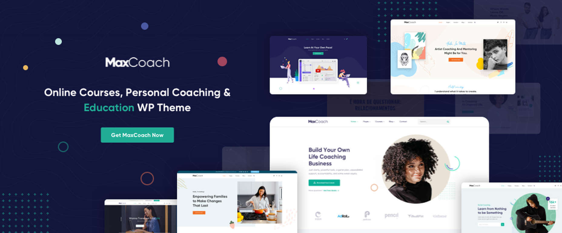
MaxCoach is a specialty tool that enables web designers to create an online distance learning and/or tutoring platform. This LearnPress theme was last year’s #1 coaching theme, and it will most likely be so in 2021 as well.
The platform is learner-centric
MaxCoach’s design is modern, trendy, and unique
Elementor is the drag and drop page builder of choice
Visit the site to see for yourself why this specialty theme has generated so much interest.
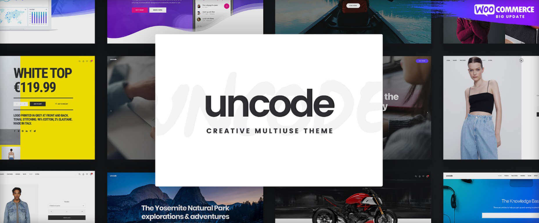
The Uncode multi-use WordPress theme is ideal for entrepreneurs, creative individuals, agencies, and small businesses.
Its 80.000+ sales to date have made it a ThemeForest best-seller.
Features include a unique WooCommerce Custom Builder you can use to give site visitors a supreme shopping experience.
Viewing Uncode’s showcase of user-built websites is a must. Click on the banner to visit the site and prepare to be impressed.
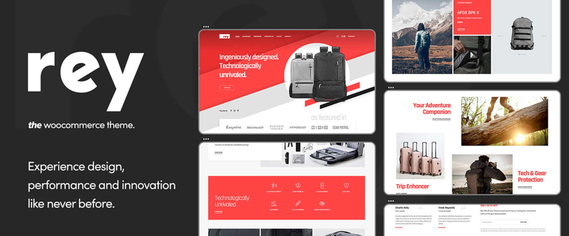
7. Rey Theme
This highly modular popular theme is definitely worth a close look. It is simply one of the most innovative website building tools you’re likely to find on the market today,
Rey’s features include a library of professionally-designed templates and an imposing selection of WooCommerce site-building tools
It is easy to set up and easy to use
You will be more than satisfied with Rey’s robust performance
Rey has built-in SVG support and is user and developer-friendly.
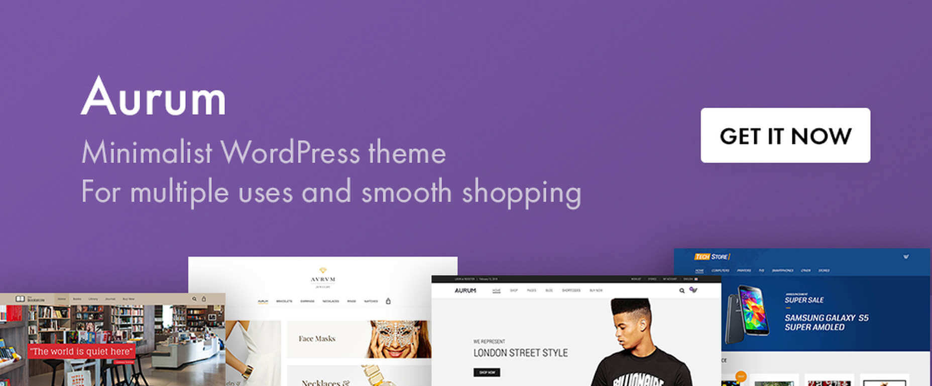
8. Aurum – Minimalist WordPress Theme
With this multiuse minimalist WordPress theme at your fingertips, you’ll be able to create an online store that will give shoppers a fully satisfying shopping experience.
With Aurum, you can design megamenus to accommodate huge selections of products
Aurum’s page load times are super-fast, and Aurum’s pages are responsive to every screen size
Popular plugins are included, and all the popular WordPress plugins are supported
Click on the banner and check it out.
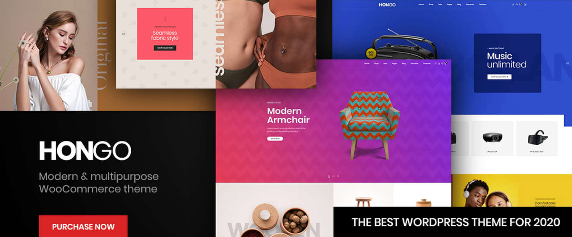
9. Hongo – Modern & Multipurpose WooCommerce WordPress Theme
Its trendy selections of creative design elements and ready-to-go store demos make Hongo an ideal choice for company, blogging, and eCommerce websites.
Premium plugins and WPBakery custom shortcodes are among the most popular of Hongo’s website-building features
This multipurpose theme also features an attractive selection of product-related tools that include product compare, quick view, wish lists, and product filter
You can expect and receive exceptional user support.
10. XStore – The Most Customizable WooCommerce Theme Ever
With its $39 price tag, XStore gives you more value for your money than you’ll find in any other WooCommerce theme.
For starters, there are 100+ good-to-go shops
A full Ajax shop is another popular feature
As is XStore’s single product page builder and its selection of product filters and display features
Check XStore out if you’re looking for a way to create an awesome online store in no time at all.
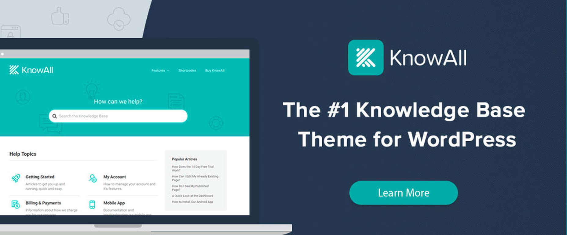
11. KnowAll – Knowledge Base Theme
Have you ever come across a FAQ page you really liked? It doesn’t happen often.
Visitors that can’t find a good answer might decide to make a phone call (and be placed on hold). That answer is OK, but additional information would be more helpful.
With AI-based KnowAll, customers get answers 24/7, and they can search for other relevant information. They will be happier customers, which is obviously good for business.
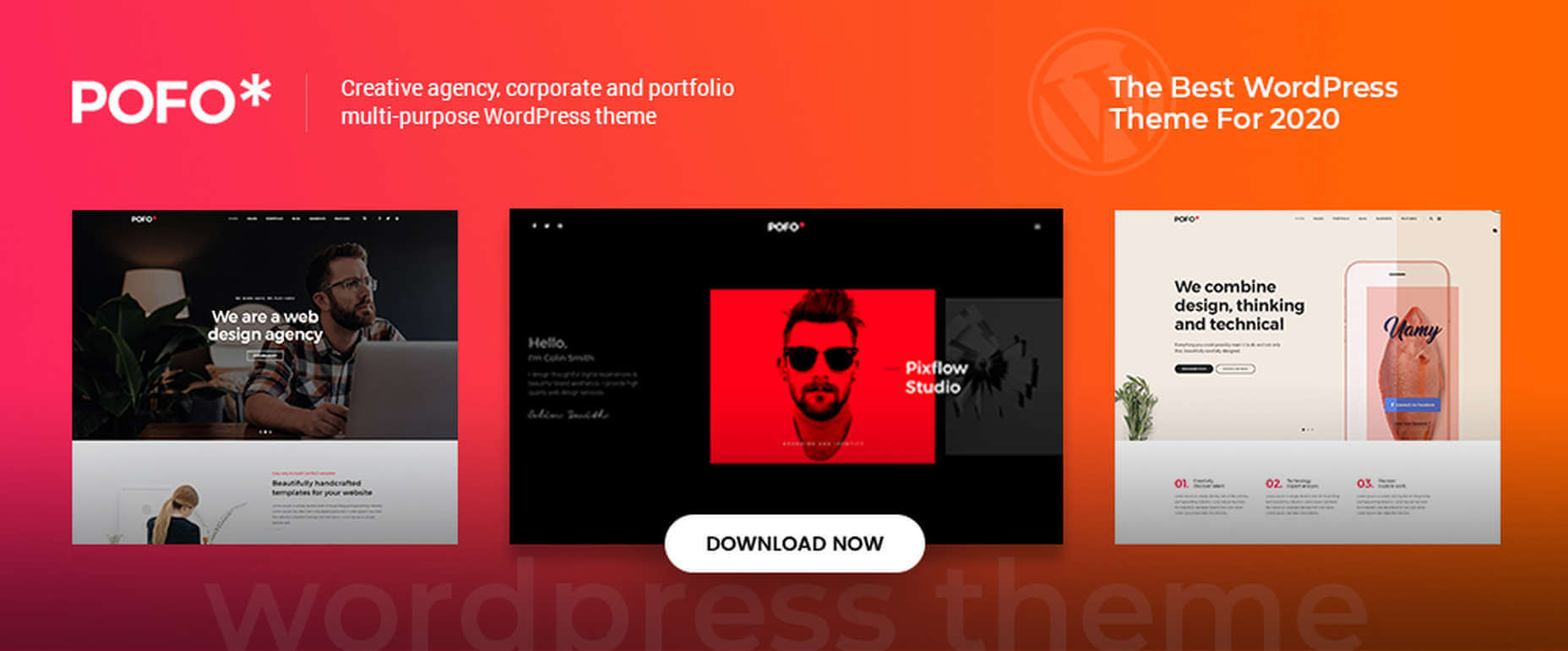
12. Pofo – Creative Portfolio, Blog, and eCommerce WordPress Theme
Bloggers, creatives, agencies, and those looking to create an eCommerce site should give Pofo a good, hard look.
Pofo is fast, flexible, SEO optimized, and packed with useful features that include:
Trendy selections of pre-built design elements, ready-to-go home pages, and one-click import demo pages.
Premium plugins, including Revolution Slider and the WPBakery page builder.
Detailed online documentation is provided, and you’ll be more than pleased with this theme’s customer support.
A modern, fast-loading, and smoothly performing theme is what you need. It will help you create a website that will have a significantly positive impact on your business’ growth.
Themes like those presented here can do just that by enabling you to give your website the professional touch you’re looking for. You can do it without having to rely on a single line of code.
These 12 top WordPress themes are modern, trendy, and easy to work with. Trying to find the “best” of the bunch could admittedly be somewhat daunting. But, you can take comfort in the fact that you really can’t make a wrong or bad choice.
The shift to virtual-only engagement in 2020 has been a major challenge for every sector of the economy, from small startups to large businesses to nonprofit organizations alike. Your own organization has almost certainly rolled out a variety of new tactics for communicating with donors, constituents, partners, or customers.
Take a note from the nonprofit sector, where organizations that have always depended on events and on-the-ground interaction had to quickly and dramatically change course. Maintaining donor engagement over time has always been important for nonprofits, but the pandemic and the 2020 year-end season (a time when most organizations see huge influxes of new donors) have made staying in touch with donors more mission-critical than ever before.
eCommerce and retail businesses face similar challenges this time of year. How do you keep new contacts engaged with your brand or mission after the year-end energy fades away? In an uncertain economy, actively growing those new relationships will be essential in 2021.
At DNL OmniMedia, we specialize in all things nonprofit tech. We’ve been on the frontlines helping organizations of all shapes and sizes adapt to the new challenges of the virtual era, so we’ve seen what works for keeping donors engaged from a distance. Let’s dive in.
Use your engagement data to drive more interactions.
Your organization’s data should be your first stop when refining your approach to engagement. How you collect, organize, and use your data will greatly impact your ability to maintain and grow your relationships with donors.
Simply put, without a solid data management process in place, it becomes much harder to actively learn from your wins and mistakes.
Every time your organization interacts with a donor, that data should be collected in a dedicated profile in your database or constituent relationship management system (CRM). As you begin tracking these interactions more thoroughly, distinct patterns and paths will emerge, which you can then use to steer donors towards new opportunities to engage with your organization.
This strategy is related to the concept of moves management. For nonprofits, this typically refers to the process of tracking your interactions with prospective major donors to help understand the trajectory of the relationship and learn the best moments to ask for large gifts. Broaden this concept out to include donor engagement more generally, and you’ve got a winning strategy for 2021. Here’s an example:
A new donor gives a small online gift to your year-end campaign.
They open your automated thank-you email.
You send a follow-up email encouraging them to opt into your main newsletter.
The donor regularly opens your newsletter and clicks through to other content.
You encourage the donor to engage with your nonprofit in a new way, like by attending a virtual event.
The donor stays engaged with your messages and opportunities over time.
You successfully ask the donor to set up a monthly recurring donation for 2021.
At each stage in this journey, your organization can log new data, giving you a complete picture of the donor’s path towards increased giving and long-term engagement. Multiply this over your entire donor base, and you can learn some invaluable insights, including:
The most common donor journeys with your organization
The most effective channels or types of campaigns for acquiring engaged donors
The least effective strategies for engaging donors or common pain points where donors become disengaged
For instance, if you see that your organization struggles to keep email subscribers engaged over time, you can dig deeper to find out exactly what’s going wrong and where. Maybe the answer will be to create new, more targeted email streams based on what’s been proven to work for engaging specific segments of your donor base.
To begin strengthening your approach to engagement data and more actively using it to guide your strategies, you’ll have to work with an integrated toolkit. All of your software should generate and provide engagement data when donors interact with it, with the data ideally flowing directly into your integrated CRM system. Check out the Team DNL guide to nonprofit data management for a crash course on this process.
Expand your virtual engagement offerings and marketing tactics.
If you want to keep more donors engaged with your organization over time, expanding the range and number of opportunities to interact with them is a no-brainer.
With the shift to virtual-only engagement and reliance on live streaming, it’s actually easier than ever for nonprofits to get creative and combine digital tactics in brand new ways. Some of the most successful virtual engagement offerings for nonprofits fall into these categories:
Virtual peer-to-peer campaigns. Let your supporters fundraise on your behalf, and anchor the campaign with a compelling theme, useful resources, and a range of virtual events from kick-off to grand finale.
Casual virtual events. Small-scale virtual gatherings have become a time- and cost-effective way to keep donors engaged. Community discussions, book clubs, virtual classes, and more have all been popular.
Large-scale virtual events.Major virtual fundraising events have proven to be viable alternatives to in-person galas and auctions. You’ll just need the right tech and gameplan for getting donors excited and raising money in the lead-up to the event.
Digital advocacy campaigns. For missions related to public issues, advocacy campaigns are an ideal way to boost engagement and mobilize supporters through a range of digital channels.
To promote any type of new virtual campaign or event, we highly recommend taking a multichannel marketing approach. This strategy involves using all of your marketing outlets (email, social media, your website, and more) to actively generate more engagement and funnel more supporters towards taking a target action.
For instance, when promoting a large-scale virtual event, use email to invite your supporters and keep them updated as the event approaches. In those emails, direct readers to special announcements and sneak-peeks on social media, and create blog posts on your website to highlight the event’s purpose and goals. At each of these touchpoints, encourage readers to register and stay engaged with your event leading up to the big day.
When implementing a multichannel marketing strategy, though, keep these key considerations in mind:
Prioritize user experience. A frustrating or clunky experience on any of your marketing outlets could cause supporters to tune out. Mobile responsiveness is especially key. Make sure your website and emails look and work well on screens of all sizes.
Maintain consistent branding. Brand consistency is key to maintaining user engagement, particularly when you’re aiming to boost results across multiple channels. Your website, emails, and social media graphics should all accurately reflect your nonprofit’s brand.
Meet supporters where they already are. Understand how your supporters already prefer to engage with your nonprofit, and then rely on those outlets to anchor your strategy. Mobile responsiveness plays a key role here, as well, since the majority of web traffic now comes through mobile devices.
Combining these best practices to promote a virtual campaign or event will be a winning strategy.
For example, let’s say your nonprofit is conducting an advocacy campaign. You could sporadically promote a petition via email and social media. However, to really maximize engagement, you should create a comprehensive strategy combining multichannel tactics, coherent branding, and a variety of virtual engagement opportunities, all anchored in a user-friendly advocacy app that meets supporters on the devices they’re already using.
Heading into 2021, boosting and maintaining engagement will be essential. This is particularly true if your organization sees any kind of increase in activity around the year-end season. Don’t let all that new engagement go to waste!
By making it easier for your own team to learn from your performance and creating more potential touchpoints with supporters, you’re sure to see engagement benefits going forward. Best of luck!
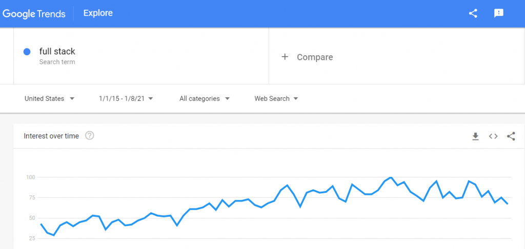
Welcome the new year 2021 with emerging full-stack development trends so that your business stays at the forefront of markets with the latest technologies. Though the pandemic disturbed the market in 2019-2020, now, it is time you take the steering in your control.
Full-stack development has helped you grow and expand your business. You do not have to hire separate front-end and back-end developers. With this said, you get to save your project funds and add enhanced coordination to your project.
In the last 5 years, the graph showing the full-stack development trends is steep uphill. Entrepreneurs are keen on hiring full-stack developers, and these skilled personas have the potent to transcend your business and take it to destined heights.
For those of you who aren’t much aware of what is full-stack development? This is for you:
“Fullstack development is the union of frontend and backend development- the two branches of web development. The experts who are equipped with both the frontend and backend development skills are the fullstack developers.”
The Evolution of Modern Fullstack
It all began with the historical combinations of frontend and backend technologies that worked well for complete web development. Some of the renowned and famous Fullstack Technologies of the past are:
LAMP stack- Linux OS, Apache HTTP server, MySQL database, and PHP.
MERN stack- Mongo DB, Express.js, React, and Node.js.
WAMP stack- Windows OS, Apache2, MySQL, and PHP.
MAMP stack- macOS, Apache/Nginx, MySQL/Maria DB, and PHP/Perl/Python.
XAMPP stack- cross-platform, Apache, MariaDB, PHP, and Perl
LAMP stack- Linux OS, Nginx, MySQL/MongoDB, and PHP.
MEAN stack- MongoDB, ExpressJS, AngularJS,and Node.js.
JAMStack- Javascript, APIs, and Markup
Entrepreneurs have been using fullstack, which is suitable for their business app requirements. Some web technologies went old school and extinct over time, such as photoshop, AJAX, SASS/SCSS, Georgia, Illustrato, BEM naming, and more. The technologies that prevailed for complete web development are HTML, CSS, Javascript, and some basic database knowledge. More recently, fullstack developers have adopted javascript modules and object-oriented javascript.
7 Full-stack Development Trends
1. Language Trends
Fullstack developers should use the widely available, used, and trending languages to be adaptive for developing hybrid applications. Choose a language that has vast community support, like Javascript. In the case of fall-ups, you will be backed-up by any kind of help.
Node.js and Angular are the most popular frameworks, libraries, and programming languages on the StackOverflow survey. Next on the trending list are React, .NET core, spring, and so on. If you are a fullstack developer, then staying updated with the latest programming language trends is beneficial. It will help you stay in demand.
If you are an entrepreneur, then keep looking for such fullstack developers and be assured that your project development will be nothing but the best.
2. Low-code Development
There can be nothing as pleasing as web development with minimal coding. Developers enable web development by dragging and dropping features over the model logic. The low-code development benefits the entrepreneurs as they can explain their projects to the clients easily.
However, complex web development is not quite possible with low-code development, but fullstack developers are learning to integrate IoT, AI, and blockchain technologies with low-code development.
Fullstack developers should enrich their skill-set with this highly enticing fullstack development trend.
3. Artificial Intelligene
Modern-day businesses are incomplete without artificial intelligence. Today, AI has put the power of automation in machines- machines can do every task that a human can accomplish. Along with AI, you should also learn big data, software engineering, and UI design.
As a fullstack developer has this knowledge, they will understand your AI project needs and come up with sage solutions. Domains such as healthcare, manufacturing, eCommerce, logistics, transportation, etc., are now using AI for its inexplicable benefits.
For an AI fullstack developer, here is the tech-stack to learn:
Programming skills- Python, Go, PHP, Java, and Scala
Database- MySQL, Postgres, MongoDB, Oracle, Cassandra, or HBase
Framework knowledge- Django, Flask, Laravel, Hibernate, Hadoop, or Spark
Mixed reality is a combination of augmented reality and virtual reality. Everything that you can perceive with your imagination and eyes will be possible in 3D augmentation. Future beholds an immense scope for mixed reality and multimedia apps.
Entrepreneurs can invest in talented AR/VR full-stack developers if they want to bring an outstanding app.
Fullstack development stack for AR/VR is:
iOS- ARKit
Android- ARCore
5. IoT
Internet of things has diminished the globe size by interconnecting digital devices and making your life easy and automated. Experts call IoT the Industrial Revolution 4.0, and hence, to excel your business forefront in the upcoming generation, IoT is the ultimate choice.
When incorporating IoT into your business app, you must ensure that your IoT developers can synchronize their devices with the application. A fullstack developer will be the ideal fit for your IoT project because they will have the hardware and software knowledge that your IoT app demands.
For an IoT fullstack developer, the tech-stack needs to learn:
Database- NoSQL, SQL Queries, Data Modeling, JDBC, and Cloud
Other- Rest API, Microservices Architecture
6. Blockchain
Finance, banking, ERP, and more such industries are drifted towards blockchain technology for its commendable aspects of security, distribution, transparency, speed, and immutability.
In the commencing 5 years, the blockchain technology market will grow upto 39 billion US dollars. If you have thought of a finance app or any project on the blockchain, hiring fullstack developers will be the best decision. Fullstack developers will have all-round knowledge and experience with cryptocurrencies, Etherium, and Bitcoin.
Your blockchain-oriented application will demand keen expertise on decentralized apps, web3 architecture, developer tools, and more, provided by fullstack developers efficiently.
Take a look at the blockchain fullstack developer tech-stack:
Web technologies- HTML, CSS, Javascript, and Java
Framework- AngularJS or BackboneJS, and Rest API
Database- MySQL and RDBMS knowledge
Other- Single page apps, MVC framework, test-driven development
7. IT Outsourcing
The pandemic has made remote work familiarized, and industries, especially IT entrepreneurs, are getting used to the outsourcing culture. The merits of cost-saving, better performance, full control, dedicated developers, and fast development have pinned entrepreneurs to hire talented offshore staff over in-house hiring.
Full-stack developers are much in demand because they have a wholesome knowledge and experience to look after a web project’s complete development. Entrepreneurs get the benefit of two separate frontend developers and backend developers in a fullstack developer.
With these Full-stack development trends of 2021, get set ready with the aim of hiking your business by hiring a Full-stack development company and avail leveraging benefits.
If you are looking to learn how to automate the sales funnel as a WordPress marketer, then you are reading the right article. This article will tell you about what a sales funnel is, why do you need WordPress for it and how do you make a sales funnel through WordPress.
What is the sales funnel?
So what exactly is a sales funnel? Sales funnels are the steps that people complete when they are looking to buy stuff online. Different types of sales funnel can be found on the internet. Probably the most common type of sales funnel is the Self Liquidating offer or SLO funnel. Creating a sales funnel will not be an easy task, however, its importance is quite significant for any e-commerce business. A good sales funnel could lead to a higher number of sales and could help the business market their product even better. An interesting sales funnel will attract potential customers.
Why WordPress?
Now that you know about the sales funnel, you must be wondering about WordPress. The reason why you should make your sales funnel on WordPress is because of its variety. WordPress gives you the most flexibility on how you would want to control your sales funnel. Even though other services are not too bad either, they are not nearly as good as WordPress.
How to make sales funnel?
There are some preparations you need to make before using WordPress to automate the sales funnel. Make sure you have a domain and web hosting. Next, you need to choose a theme for WordPress. We recommend using a lightweight theme, so the sales funnel is easy to use for people.
1. Plugins and payment gateway
The first thing you would want to do while building a sales funnel is to choose plugins. We recommend choosing a plugin that suits the e-commerce website style. When you choose an e-commerce plugin, it usually also solves up the payment gateway issue. This way you would not have to worry about customer payments and setting up a payment gateway all by yourself. For contacting your customers automatically you can also choose a plugin for sending SMS messages.
2. Page building
The next thing you would want to do is install a page builder. Page builders like Elementor can work sufficiently. After opening Elementor, you can start building different pages for your sales funnel. A good sales funnel usually has several pages. These include a landing page, a thank you page, and one or more pop-ups.
To create the landing page, go to pages, then select add new, then select edit with Elementor. This will open the page building edit screen. You can make your landing page from the beginning or just use a template available.
The next page you would want to create is the ‘thank you’ page. This page’s purpose is just to thank the people who took the desired action on the landing page. To add this page, use the Elementor’s button feature from the menu and add it to your page.
You can also add a pop-up page and the sales page. To add the pop-up page, navigate to templates in the Elementor, then choose pop-ups, and click add new. The sales page is added the same way the landing page and thanks you page is added.
3. Optional features:
There are some other features that you may want to add to your sales funnel to make it more interesting. These features are optional and can be omitted as per your choice. The first one is setting up A/B testing. This is just like normal testing. You would make two types of landing and thank you pages. Then you can test to see which one works better. This feature can be used to optimize your sales funnel.
The second optional feature is to set up analytics for your page. This feature can be really helpful for your sales funnel. You can take help from Google analytics which is free of cost and easy to use. After creating an account, go to Tag manager and add a new account for your sales funnel. Two codes are then generated by the Tag manager. The first code is supposed to be placed in the heading of the sales funnel.
To do this, just copy the code and go to Theme editor, Appearance in WordPress. Next, you need to select the header.php file and paste this code only after the tag. Finally, select and copy the second code and paste it after the tag. The analytics would start working after you refresh the page. All the data would be tracking now.
4. Create a funnel
To build the sales funnel, you need to install a funnel builder. One of the more famous funnel builder plugins is CartFlow. You need to first open the plugin, then navigate to CartFlows, then select flows. Now you can finally start linking all the pages you created with the sales funnel.
To add pages, click on the add new option, then select the Create Your button. You would want to add the landing page first, then the thank you page, followed by any other pop up or sales page. This is how you create a sales funnel using WordPress.
5. WP engine:
Creating a sales funnel with WordPress is pretty simple and effective to use. It gets the job done easily. However, you may also require a good hosting engine for your sales funnel. One of those is the WP engine. With this, your sales funnel will be complete.
With this, you now know how to create a sales funnel just by using WordPress. Hopefully, this article covered all your doubts on how to use WordPress to make sales funnel and how different features can be used.
ESM, meaning ES Modules, meaning JavaScript Modules. Like, import and friends.
Browsers support it these days. There is plenty of nuance, but as long as you’ve dropped IE, the door is fairly open.
Before ESM, the situation for JavaScript projects was:
We’ve got packages we need to use from npm.
We’ll install them from npm ahead of time with our package.json, npm install and whatnot.
We’ll write import statements that are invalid ESM for some reason (developer convenience, I guess) and assume we’re importing packages from a local node_modules folder.
Our bundler will know what to do with those invalid imports.
This is all OK, because word on the street is that bundling is still required for performance, and it does other stuff we want anyway, like run Babel and friends.
Now that we can count on ESM more, the story is shifting somewhat, and all of those things are being questioned.
What if we didn’t have to npm install?
What if we don’t need a bundler?
What if performance is fine, between HTTP/2+, global CDNs, browsers doing fancy things, etc.?
What if maybe we shouldn’t be compiling code so much because we’re down-compiling too much?
That React (with JSX), being written just as it normally is, and there was no npm install, no node_modules directory, and no build step. But, still a dev server and reloading. So light. Very refreshing.
I just listened to a recent Toolsday episode where Una and Chris chatted with Jason Miller about WMR, which I hadn’t heard of until then. It feels very spiritually similar to Snowpack/Skypack. With WMR, you get to use npm packages without having to install them, or write with things like JSX, TypeScript or CSS Modules, and get a bunch of dev conveniences, like a server, hot reloading, etc.
Something is clearly in the water here, and I think that something is a leaning into ESM.
Even on the Node.js side, ESM is happening. Here’s Sindre Sorhus, who has over 1,000 npm packages(!):
At the end of April 2021, Node.js 10 will be end-of-life, which means that package maintainers can target Node.js 12. This Node.js version has full support for JavaScript Modules, also known as ESM.
He’s planning to move almost all of those 1,000 packages to ESM in 2021. Not a “dual” setup where you output multiple different formats… just ESM, and he’s encouraging everyone to do the same. I would think this momentum toward direct ESM usage in the browser builds heavily when the npm ecosystem is doing the exact same thing.
Netlify Edge Handlers are in Early Access (you can request it), but they are super cool and I think they are worth wrapping your brain around now. I think they change the nature of what Jamstack is and can be.
You know about CDNs. They are global. They host assets geographically close to people so that websites are faster. Netlify does this for everything. The more you can put on a CDN, the better. Jamstack promotes the concept that assets, as well as pre-rendered content, should be on a global CDN. Speed is a major benefit of that.
The mental math with Jamstack and CDNs has traditionally gone like this: I’m making tradeoffs. I’m doing more at build time, rather than at render time, because I want to be on that global CDN for the speed. But in doing so, I’m losing a bit of the dynamic power of using a server. Or, I’m still doing dynamic things, but I’m doing them at render time on the client because I have to.
That math is changing. What Edge Handlers are saying is: you don’t have to make that trade off. You can do dynamic server-y things and stay on the global CDN. Here’s an example.
You have an area of your site at /blog and you’d like it to return recent blog posts which are in a cloud database somewhere. This Edge Handler only needs to run at /blog, so you configure the Edge Handler only to run at that URL.
You write the code to fetch those posts in a JavaScript file and put it at: /edge-handlers/getBlogPosts.js.
Now, when you build and deploy, that code will run — only at that URL — and do its job.
So what kind of JavaScript are you writing? It’s pretty focused. I’d think 95% of the time you’re outright replacing the original response. Like, maybe the HTML for /blog on your site is literally this:
With an Edge Handler, it’s not particularly difficult to get that original response, make the cloud data call, and replace the guts with blog posts.
export function onRequest(event) {
  event.replaceResponse(async () => {
    // Get the original response HTML
    const originalRequest = await fetch(event.request);
    const originalBody = await originalRequest.text();

    // Get the data
    const cloudRequest = await fetch(
      `https://css-tricks.com/wp-json/wp/v2/posts`
    );
    const data = await cloudRequest.json();

    // Replace the empty div with content
    // Maybe you could use Cheerio or something for more robustness
    const manipulatedResponse = originalBody.replace(
      `<div id="blog-posts"></div>`,
      `
        <h2>
          <a href="${data[0].link}">${data[0].title.rendered}</a>
        </h2>
        ${data[0].excerpt.rendered}
      `
    );

    let response = new Response(manipulatedResponse, {
      headers: {
        "content-type": "text/html",
      },
      status: 200,
    });

    return response;
  });
}
(I’m hitting this site’s REST API as an example cloud data store.)
It’s a lot like a client-side fetch, except instead of manipulating the DOM after request for some data, this is happening before the response even makes it to the browser for the very first time. It’s code running on the CDN itself (“the edge”).
So, this must be slower than pre-rendered CDN content then, because it needs to make an additional network request before responding, right. Well, there is some overhead, but it’s faster than you probably think. The network request is happening on the network itself, so smokin’ fast computers on smokin’ fast networks. Likely, it’ll be a few milliseconds. They are only allowed 50ms of execution time anyway.
I was able to get this all up and running on my account that was granted access. It’s very nice that you can test them locally with:
netlify dev --trafficMesh
…which worked great both in development and deployed.
Anything you console.log() you’ll be able to set in the Netlify dashboard as well:
The Beazley Design of the Year for 2020 has just been awarded to US architecture firm Rael San Fratello & Colectivo Chopeke for their Teeter-Totter Wall project, a series of luminous pink seesaws built into the US-Mexico border wall in July 2019.
The 74 shortlisted entrants for the prize range from a poster for vegan burgers to a parody of Pantone’s Color of the Year. Most were self-consciously political.
As design has grown in stature, so has its ability to amplify the opinions that employ it. Most of us will never work on an actual political campaign. Still, there is little doubt that the design teams for both the Obama campaign in 2008 and the Ocasio-Cortez campaign in 2018 were significant factors in the resulting electoral success. And it isn’t just visual design, user experience across a platform has implications; last week, Twitter finally suspended the account of the outgoing US president, a decision that left CEO Jack Dorsey lamenting the platform’s “failure…to promote healthy conversation.”
As designers, our understanding of user experience — particularly the psychology of user experience — has grown immensely in the last decade. We’re very good and persuading people to do things, and that ability is a commodity, saleable to the highest bidder. As such, it is capable of undermining basic democratic principles by skewing debate and exerting disproportionate influence.
We frequently talk about Black Hat and White Hat techniques in the tech industry, but the truth is, almost all designers spend their days looking for ways to manipulate an audience.
When that manipulation extends into political events, do designers have an ethical responsibility to maintain an independent balance, just as we expect reputable journalists to?
Designers are — for now, at least — human beings. We have all of the prejudices, biases, and philosophies of any other human being. Do we have an obligation to use our skills to promote our ideals, or an obligation to resist doing so?
Over the last six years or so, I’ve been using these things I’ve been calling “type patterns” in my web design work, and they’ve worked out pretty well for me. I’ll dig into what they are and how they can make their way into CSS, and maybe the idea will click with you too and help with your day-to-day typography needs.
If you’ve used print design desktop software like QuarkXPress, Adobe InDesign, or CorelDraw, then imagine this idea is an HTML/CSS translation of “paragraph styles.”
When designing a book (that spans hundreds of pages), you might want to change something about the heading typography across the whole book (on the fly). You would define how a certain piece of typography behaves in one central place to be applied across the entire project (a book, in our example). You need control of the patterns.
Most programs use this naming style, but their user interfaces vary a little.
When you pull up the pane, there’s usually a “base” paragraph style that all default text belongs to. From there, you can create as many as you want. Paragraph styles are for “block” level-like elements, and character styles are for “inline” level-like elements, such as bold or unique spans.
The user interface specifics shouldn’t matter — but you can see that there are a lot of controls to define how this text behaves visually. Under the hood, it’s just key: value pairs, which is just like CSS property: value pairs
Once defined, the styles can be applied to any piece of text. The little + (next to the paragraph style name below) in this case, means that the style definition has changed.
If you want to apply those changes to everything with that paragraph style, then you can “redefine” the style and it will apply project-wide.
When I say it like that, it might make you think: that’s what a CSS class is.
But things are a little more complicated for a website. You never know what size your website will be displayed at (it could be small, like on a mobile device, or giant, like on a desktop monitor, or even on monochrome tablet, who knows), so we need to be contextual with those classes and have then change based on their context.
Styles change as the context changes.
The bare minimum of typographic control
In your very earliest days as a developer, you may have been introduced to semantic HTML, like this:
<h1>Here's some HTML stuff. I'm a heading level 1</h1>
<p>And some more. I'm a paragraph.</p>

<h2>This is a heading level 2</h2>
<p>And some more pragraph stuff.</p>
And that pairs with CSS that targets those elements and applies styles, like this:
You can write rules that target the headers and style them in descending order, so they are biggest > big > medium, and so on.
Headers also already have some styles that we accept as normal, thanks to User Agent styles (i.e. default styles applied to HTML by the browser itself). They are meant to be helpful. They add things like font-weight and margin to the headers, as well as collapsing margins. That way — without any CSS at all — we can rest assured we get at least some basic styling in place to establish a hierarchy. This is beginner-friendly, fallback-friendly… and a good thing!
As you build more complex sites, things get more complicated
You add more pages. More modules. More components. Things start to get more complex. You might start out by adding unique classes and styles for every single little thing, but it’ll catch up to you.
First, you start having classes for special situations:
<h1 class="page-title">
  Be <span class='super-ultra-magic-rainbow'>excellent</span> to each other
</h1>

<p class="special-mantra">Party on, <em>dudes</em>.</p>

<p>And yeah. I'm just a regular paragraph.</p>
Then, you start having classes everywhere (most CSS methodologies even encourage this):
<header class="site-header">
  <h1 class="page-title">
    Be <span class='ultra-magic-rainbow'>excellent</span> to each other
  </h1>
</header>

<main class="page-content">
  <section class="welcome">
    <h2 class="special-mantra">Party on <em>dudes</em></h2>

    <p class="regular-paragraph">And yeah. I'm just regular</p>
  </section>
</main>
Newcomers will try and work around the default font sizes and collapsing margins if they don’t feel confident “resetting”them.
This is where people start trying out margin-top: -20px… and then stuff gets whacky. As you keep writing more rules to wrangle things in, it will feel like you are “fixing” things instead of declaring how you actually want them to work. It can quickly feel like you are “fighting” the CSS cascade when you’re unaware of the browser’s User Agent styles.
A real-world example
Imagine you’re at your real job and your boss (or the visual designer) gives you this “pixel perfect” Adobe Photoshop document. There are a bunch of colors, layout, and typography.
You open up Photoshop and start to poke around, but there are so many pages and so many different type styles that you’ll need to take inventory and gather what styles can be combined or used in combination.
Would you believe that there are 12 different sizes of type on this page? There’s possibly even more if you also take the line-height into consideration.
It feels great to finish a visual layout and hand it off. However, I can’t tell you how many full days I’ve spent trying to figure out what the heck is happening in a Photoshop document. For example, sometimes small-screens aren’t taken into consideration at all; and when they are, the patterns you find aren’t always shared by each group as they change for different screen types. Some fonts start at 16px and go up to 18px, while others go up to 19px and become italic. How can spot context changes in a static mockup?
Sometimes this is with fervent purpose; other times the visual designer is just going on feel and is happy to round things up and down to create reusable patterns. You’ll have to talk to them about it. But this article is advocating that we talk about it muchearlier in the process.
You might get a style guide to reference. But even that might not be specific enough to identify contexts.
Let’s zoom in on one of those guidelines:
We get more content direction than we do behavior of the content in different contexts.
You may even get a formal, but generic, style guide with no pixel sizes or notes on varying screen sizes at all!
Don’t get me wrong: this sort of thing is defintely a nice thought, and it might even be useful for others, like in some client meeting or something. But, as far as front-end development goes, it’s more confusing than helpful. I’ve received very thorough style guides that looked nice and gave lots of excellent guidelines for things like font sizes, but are completely mismatched with the accompanying Photoshop document. On the other end of the spectrum, there are style guides that have unholy amounts of specifics for every type of heading and combination you could ever imagine — and more.
It’s hard to parse this stuff, even with the best of intentions!
Early in your development career, you’d probably assume it’s your job to “figure it out” and get to work, writing down all the pixels and trying your best to make sense of it. Go get ‘em!
But, as you start coding all the specifics, things can get a little overwhelming with the amount of duplication going on. Just look at all the repeated properties going on here:
You might take the common declarations and apply them to the body instead. In smaller projects, that might even be a good way to go. There are ways to use the cascade to your advantage, and others that seem to tie too many things together. Just like in an Object Oriented programming language, you don’t necessarily want everything inheriting everything.
Things will work out OK. Most of the web was built like this. We’re just looking for something even better.
Dealing with design revisions
One day, there will be a meeting. In that meeting, you’ll find out that the client and the visual designer decided to change a bunch of the typography. Now you need to go back and change it in 293 places in the CSS file. If you get paid by the hour, that might be great!
As you begin to adjust the rules, things will start to conflict. That rule that worked for two things now only works for the one. Or you’ll notice patterns that could now be used in many more places than before. You may even be tempted to just totally delete the CSS and start over! Yikes!
I won’t write it out here, but you’ll try a bunch of different things over time, and people usually come to the conclusion that you can create a class — and add it to the element instead of duplicating rules/declarations for every element. You’ll go even further to try and pull patterns out of the visual designer’s documents. (You might even round a few 19px down to 18px without telling them…)
.standard-text { /* or something */
  font-family: serif;
  font-size: 16px; /* px: up for debate */
  line-height: 1.4; /* no unit: so it's relative to the font-size */
  letter-spacing: 0.02em; /* em: so it's relative to the font-size */
}

.heading-1 {
  font-family: sans-Serif;
  font-size: 30px;
  line-height: 1.5;
  letter-spacing: 0.03em;
}

.medium-heading {
  font-family: sans-Serif;
  font-size: 24px;
  line-height: 1.3;
  letter-spacing: 0.04em;
}
Then you’d apply the class to anything that needs it.
<header class="site-header">
  <h1 class="page-title heading-1">
    Be <mark>excellent</mark> to each other
  </h1>
</header>

<main class="page-content">
  <section class="welcome">
    <h2 class="medium-heading">Party on <em>dudes</em></h2>

    <p class="standard-text">And yeah. I'm just regular</p>
  </section>
</main>
This way of doing things can be really helpful for teams that have people of all skill levels changing the HTML. You can plug and play with these CSS classes to get the style you want, even if you’re the new intern.
It’s really helpful to separate the idea of “layout” elements (structure/parents) and the idea of “modules” or “components.” In this way, we’re treating the pieces of text as lower level components.
The key is to keep the typography separate from the layout. You don’t want all.medium-heading elements to have the same margins or colors. It’s going to depend on where they are. This way you are styling based on context. You aren’t ‘using’ the cascade necessarily, but you also aren’t fighting it because you keep the techniques separate.
.site-header {
  padding: 20px 0;
}

.welcome .medium-heading { /* the context — not the type-pattern */
  margin-bottom: 10px;
}
This is keeping things reasonable and tidy. This technique is used all over the web.
Working with a CMS
Great, but what about situations where you can’t change the HTML?
You might just be typing up a quick CodePen or a business-card site. In that case, these concerns are going to seem like overkill. On the other hand, you might be working with a CMS where you aren’t sure what is going to happen. You might need to plan for anything and everything that could get thrown at you. In those cases, you’re unable to simply add classes to individual elements. You’re likely to get a dump of HTML from some templating language.
So, if you can’t work with the HTML what can you do?
<article class="post cms-blog-dump">
  <h1>Talking type-patterns on CSS-tricks</h1>
  <p>Intoduction paragraph - and we'd like to style this with a slightly different size font then the next (normal) paragraphs</p>
  <h2>Some headings</h2>
  <h2>And maybe someone accidentally puts 2 headings in a row</h2>
  <ol>
    <li>and some <strong>list</strong></li>
    <li>and here</li>
  </ol>

  <p>Or if a blog post is too boring - then think of a list of bands on an event site. You never know how many there will be or which ones are headlining, so you have to write rules that will handle whatever happens.
</article>
You don’t have any control over this markup, so you won’t be able to add classes, meaning that the cool plug-and-play classes you made aren’t going to work! You might just copy and paste them into some larger .article { } class that defines the rules for a kitchen sink. That could work.
What other tools are there to play with?
Mixins
If you could create some reusable concept of a “type pattern” with Sass, then you could apply those in a similar way to how the classes work.
@mixin my-useful-rule { /* define the mixin */
  background-color: blue;
  color: lime;
}

.thing {
  @include my-useful-rule(); /* employ the mixin */
}

/* This compiles to: */
.thing {
  background-color: blue;
  color: lime;
}
/* (just so that we're on the same page) */
Less, Sass, Stylus and other CSS preprocessors all have their own syntax for this. I’m going to use Sass/SCSS in these examples because it is the most common at the time of writing.
@mixin standard-type() { /* define the mixin */
  font-family: Serif;
  font-size: 16px;
  line-height: 1.4;
  letter-spacing: 0.02em;
}

.context .thing {
  @include standard-type(); /* employ it in context */
}
You can use heading-1() and heading-2() and a lot of big-name style guides do this. But what if you want to use those type styles on something that isn’t a “heading”? I personally don’t end up connecting the headings with “size” and I use the patterns in all sorts of different places. Sometimes my headings are “mean” and “stout.” They can be piercing red and uppercase with the same x-height as the paragraph text.
Instead, I define the visual styles in association with how I want the “voice” of the content to come across. This also helps the team discuss “tone” and other content strategy stuff across disciplines.
For example, in Jason Santa Maria’s book, On Web Typography, he talks about “type for a moment” and “type to live with.” There’s type to grab your attention and break up the page, and then those paragraphs to settle into. Instead of .standard-text or .normal-font, I’ve been enjoying the idea of organizing styles by voice. This is all that type that a user should spend time consuming. It’s what I’d likely use for most paragraphs and lists, and I won’t set it on the body.
This idea of “voices” helps me keep things meaningful because it requires you to name things by the context. The name heading-1b, for example, doesn’t help me connect to the content to any sort of storytelling or to the other people on the team.
Now to style the mystery article. I’ll be using SCSS syntax here:
But it’s not that easy, is it? No. It’s a little more complicated because you don’t know what might be above or below each other — or what might be left out, because articles aren’t always structured or organized the same. Those CMS authors can put whatever they want in there! Three
elements in a row? You have to prepare for lots of possible outcomes.
To see the regular CSS you can always “View Compiled” in CodePen.
CodePen Embed Fallback
Some people are really happy with the lobotomized owl approach (* + *) but I usually end up writing explicit rules for “any
that comes after a paragraph” and getting really detailed. After all, it’s the written content that everyone wants to read… and I really only need to dial it in one time in one place.
I’ll be honest… I love Stylus. I love writing it, and I love using it for examples. It keeps people on their toes. It’s so fast to type in CodePen! If you already have your own little framework of styles like this, it’s insane how fast you can build UI. But! The tooling has fallen behind and at this point, I can’t recommend that anyone use it.
I only add it here because it’s important to dream. We have what we have, but what if you could invent a new way of writing it? That’s a crucial part of the conversation too. If you can’t describe what you want, you wont get it.
We’re here: Type Patterns
Can you see where all of this is going?
You can use these “patterns” or “mixins’ or “whatever” you want to call them and plug and play. It’s fun. And you can totally combine it with the utility class idea too (if you must).
.calm-voice {
  @include calm-voice();
}
<p class="calm-voice">Welcome to this code snippet!</p>
Style guides
If you can start to share a common language and break down the barriers between “creatives” and “coders,” then everyone can work with these type patterns in mind from the start.
Sometimes you can simply publish a style guide as a “brand” subdomain or directly on the site, like at /style-guide. There are tons of these floating around on the web. The point is that some style guides are standalone, and others are built into the site itself. Wherever they go, they are considered “live” and they allow you to develop things in one place that take effect globally, and use the guide itself as a sort of artifact.
By building live style guides with type patterns as a core and shared concept, everyone will have more fun and save time trying to figure out what each other means. It’s not just for big companies either.
Sometimes you don’t know what the content will be. That means CMS stuff, but also logic. What if you have a list of bands and events and you are building a module full of conditional components? There might be one band… or five… or two co-headliners. The event might be cancelled!
When I was trying to work out some templating ideas for Ticketfly, I separated the concerns of layout and type patterns.
CodePen Embed Fallback
Variable sized font patterns
Some patterns change sizes at various breakpoints.
I used to do something like this and it had a few yucky side effects. For example, what if you plug and play based on the breakpoints and there are sizes that conflict or slip through?
But now you have to make sure that they both have the same properties and that they don’t conflict with or bleed through to others! And think about the new variable font options too. Sometimes you’ll want your heading to be a little less heavy on smaller screens or a little taller to work with the space.
Aren’t you duplicating style rules all over the place?
Yikes! You caught me. I care way more about making the authoring and maintaining process pleasurable than I care about CSS byte size. I’m conflicted though. I get it. But I also think that the solution should happen somewhere else in the pipeline. There’s a reason that we don’t write machine code by hand.
Sometimes you have to examine a programming pattern closely and really poke at it, trying it in every place you can to prove how useful it is. Humor me for a movement and look at how you’d use this type pattern and other mixins to style a common “card” interface.
CodePen Embed Fallback
In a way, type patterns are like the utility class style of Bootstrap or Tailwind. But these are human readable. The patterns are added in the CSS instead of the HTML. The concept is the same. I like to think that anyone could look at the living style guide and jump into a component and style it. What do you think?
It is creating more CSS though. Those kilobytes are stacking up. But I think we should work towards something ideal instead of just “possible.” We can probably build something that works this out at build time. I’ll have to learn more about the CSSOM and there are many new things coming down the pipeline that could make this possible without a preprocessor.
It’s bigger than just the CSS. It’s about the people.
Having a set of patterns for type in your project allows visual designers to focus on their magic. More and more, we are building fast and in the browser. Visual designers focus on feel and typography and color with simple frameworks, like Style Tiles. Then developers can organize the data, resource structures and layouts, and everyone can work at the same time. We can have clearer communication and shared understanding of the entire process. We are all UX designers.
When living style guides are created as a team, there’s a lot less need for pixel-pushing. Visual designers can actually spend more time thinking and trying ideas in prototypes, and less time mocking out unnecessary production art. This allows you to work on your brand as a whole and have one single source of truth. It even helps with really small sites, like this.
Gold Collective style guide
InDesign and Illustrator have always had “paragraph styles” and “character styles” for this reason, but they don’t take into account variable screen sizes.
Toss in a few padding type sizes/ratios, some colors and some line widths. It doesn’t have to really be “pixel perfect” but more of a collection of patterns that work together. Colors as variables and maybe some $thick, $thin, or $pad*2 type conventions can help streamline design patterns.
You can find your inspiration in the graphics program, then jump straight to the live style guide. People of all backgrounds can start playing with the styles in a CodePen and dial them in across devices.
In the end, you’ll decide the details on real devices — together, as a team.
The 2020 year was very challenging for startups and SMEs, but Top App Development Trends 2021 can help you improve business productivity and growth in the upcoming years.
The apps built using trending technologies can offer leading features and functionalities, ultimately helping you develop a user-friendly application.
Let’s move further and read about application trends.
App Development Trends 2021
Here I have stated the top 8 application development trends. These trends will help your firm forecast market analysis, risk, recording data, and more.
1. AR & VR Offering Real Look
Augmented Reality (AR) & Virtual Reality (VR) are transforming the user experience by offering real appearance in the mobile app. In 2021 AR and VR will change the user’s way of thinking, making it more widespread.
Image Source: Statista
Have you ever had difficulty imagining how the new piece of furniture or other items will fit and look in the interior? If yes, try using AR mobile apps to virtual place the digital furniture in a room.
Both Virtual Reality and Augmented Reality allow users to imagine the new world and technology without entering into it. AR/VR has great potential to be used in multiple industries such as healthcare, eCommerce, entertainment, and more.
2. Artificial Intelligence (AI) help Humanity
Automated face recognition is no more a new feature as now it became a standard. Funny stickers and automatic filters available on Snapchat and Instagram are some of the finest examples of AI-based apps. Machines are able to identify images and process the natural language by including the AI-powered features in the applications.
Additionally, AI provides business users with robust insights. Due to these benefits, big brands such as Facebook, Google, eBay, IBM started adopting Artificial Intelligence and Machine Learning. This will be one of the more growing application development trends in upcoming years.
3. Blockchain Technology a modern Approach
Blockchain offers decentralized app development solutions that expand transparency and reduces unauthorized entry, utilizing robust security customs.
It is one of the ideal apps trends or financial divisions such as currency exchanges, banks, and more. A PWC survey reveals that 84% of worldwide companies are actively involved in Blockchain technologies.
The BlockChain technology is customarily seen only in a cryptocurrency context and is transforming the interest of tech giants. Microsoft, a famous software company, has launched its blockchain-based framework known Coco which ultimately supported blockchain adoption in the business sector and made it the latest mobile app technology.
4. Internet Of Things (IoT) Everything You Need
Internet of Things (IoT) uses sensors to catch data and maintain connectivity to transfer information over the internet. The accelerated adoption of IoT based apps made this technology one of the latest mobile development trends.
According to IDC reports spending on IoT is anticipated to rise up to $745 billion in 2020 and exceed $22 billion by 2022.
Amazon Alexa or Google Home, Apple Watch, internet-connected baby monitors are the IoT devices example. The usage of such devices is increasing extensively, observing this, I can say that in 2021 and upcoming years, IoT usage in software and app development will definitely increase. Availingapplication development services can help you integrate IoT into the application in a better way.
5. Chatbots A Useful Support
Chatbots are digital applications contact parts that mimic the human conversation way to support users to meet their demands. Different sorts of chatbots are there; some are virtual assistants like Google Assistant, Siri, Alexa, Bixby, and other chatbots you can find on websites, web apps, etc.
Supporting various factors, Chatbots became one of the top-most mobile app development trends in 2021. One aspect is the interactive conversational tone and experience that they proffer. Chatbot mobile apps provide an exceptional interface to allow users to get in touch with businesses in a seamless, human-like manner even in the absence of humans’.
6. Beacon Technology Leading Solution
Beacon Technology is not a new technology, but now it came into focus as now businesses started utilizing it. This mobile app development trend helps businesses target patrons uniquely. Beacons are conveying gadgets that can connect with a smartphone or other gadgets obtainable in their range. They help corporations transfer notifications concerning special offers, nearby hotels, and more.
For businesses like shops and restaurants, Beacon technology integration can be extremely beneficial. Apple’s iBeacons and Google Beacon are very famous integrated location-based services.
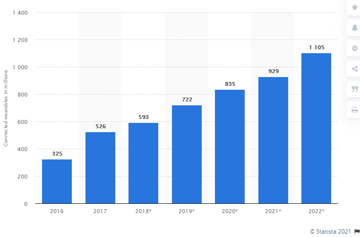
7. Wearable Device a Smart Gadgets
Wearable smart devices became a hot trend, particularly considering the increasing interest in healthcare. In the COVID-19 pandemic year, the smartwatches and other wearables devices connected with a mobile app to track health factors and support diagnostic mean usage increased.
The market for wearables is steadily rising. As per Statista, the number of connected wearable devices worldwide is projected to reach more than 1 billion by 2022. Apple, Huawei, and Samsung are very popular for launching excellent wearable devices.
5G technology is one of the latest mobile app development trends, which will increase the action and responsiveness of wireless interfaces. With the help of the 5G technology trend, the total number of data that is transferred over the wireless broadband bonds can move at tremendous rates of 20 Gbps speed.
According to Statista, Globally by 2024, there will be around 1.9 billion 5G subscriptions.
Conclusion
Different industries use apps for executing various tasks like buying, selling, promoting service, and more. But if I talk about enterprise growth in 2021 or upcoming years, then startups, SMEs and large enterprises should concentrate on using top app development trends in 2021. This will not only help corporations in making a final decision but will also help in expanding business productivity.
Making the right use of the latest app trends in application development is not simple, but it can be simplified by availing custom application development services from top-notch IT outsourcing companies. This will help businesses create innovative web or mobile applications in a less time frame.
Customer support is integral to any business. Happy and satisfied customers convert into loyal customers, and loyal customers open the scope of improved sales and ROI.
So making customers happy and satisfied is necessary. How can you make your customers happier? The solution is simple, but it needs effort from your side. Being for them at any time is the key solution. When a customer purchases or subscribes to a product or service from your company, they often need help to get used to the product and services.
Even before they buy the product or service, they sometimes need an expert assistant to share their requirements for choosing the perfect product that totally fits into their requirements. Ideal customer support begins with presale assistance and continues till the customer stops using the product or services.
How can you make your customer support more effective?
Usually, customers raise queries and concerns through email, phone calls, chat, social media platforms, and so on. These queries from multiple platforms need to be gathered in a single place for their efficient management.
If there is no single platform for handling tickets from multiple resources, you may miss some emails and queries through chat. A missed query may be a message for urgent help required for your loyal customer.
Skipping queries will make your loyal customers unhappy, and they may switch from your brand to some other brand or to your competitor. Hence, treating each and every customer is important and necessary.
Satisfying the existing customers is one of the best methods to attract new customers. How? If existing customers are happy, they will recommend your products and services to other people. Even though there are excellent marketing strategies available nowadays, people trust word of mouth more than any other social media or advertising.
In accordance with the expansion of your business, you may be required to handle more customers. Increased customers will result in an increased number of tickets. You might have hired more in-house agents to deal with customers or you may be outsourcing to manage tickets.
But, it will be a bit challenging if multiple agents handle the customer service at the same time without a proper system. The same email may be opened and taken care of by multiple agents at the same time, and they may get confused about each other who dealt with which query. There can be so many confusing situations and it may affect the agents’ performance, thereby bringing down the quality of your customer service.
How can you make it in a systematic way?
The best way is to adopt a help desk system! You can find many help desk systems and plugins in the market with unique feature sets.
There are so many benefits of using a helpdesk system that they are extremely favorable to agents. An ideal help desk system streamlines by accepting tickets from various resources, assigning them to an agent, and provides proper alerts and notifications to handle the tickets effectively. Also, you can integrate knowledge base articles to reduce the tickets, and keep track of all tickets and agent details in a single platform.
Some help desk systems also generate analysis reports to measure the performance of the overall customer support system as well as agents. As these systems gather all agents and tickets in a single platform, the admin can track how many tickets received, the number of solved tickets by an agent, the pending tickets, solved ones, etc.
Tracking the performance will always help to understand where your position is in the market, the reason for reduced and improved sales, and will get an insight into the areas that need improvements.
But, is there any way to get a third-party help desk system that completely satisfies your business requirements? If you get a perfect one that suits your business domain and environment, would it be compatible with your website platform?
If the help desk system does not provide all features you require, there is no use in adopting it on your website. Hence, it is better to use tailor-made systems. But, is that budget-friendly if you go for a complete custom made system by consulting a developer?
The right solution is to go for an open-source help desk system!
What is an open-source help desk system?
Open source help desk system is a customer support system that is built in a collaborative public manner and released under a license in which the copyright owner grants the rights to use, change, and tweak the software according to the requirements of the user. The main advantage of an open-source help desk system is, they are highly customizable for any business environment.
Why Open source help desk system is important for your website?
As we have already discussed the benefits of help desk systems, you might have got an idea now.
Since you can download the source code, you can tweak the system to include the required specifications seamlessly. You can either use the system the way it is and can add new features when new requirements arise as and when needed.
When you consider having a custom help desk system with the required set of features, choosing an open-source help desk system and tweaking it based on your business domain will be the right choice.
Which is the best open source help desk system in the market?
You could be a blogger, entrepreneur, eCommerce store owner, or focusing on any business domain, this superior help desk system will help you to make it fit into your work environment.
The key features of this open-source help desk systems are as follows.
Works well on any website platform
No need to worry about the compatibility issues that may happen with your website platform such as WordPress, Shopify, Wix, etc. The expert team of this help desk system will be there to make it fit into any platform without compromising the performance.
Exceptional ticket management system
Ticket management is an unavoidable specification in any help desk system. This open-source help desk system is released from the family of WSDesk, one of the top-notch ticketing plugins for WordPress websites. Hence it already contains features such as exceptional ticket management, advanced features for agents, various triggers and notifications, IMAP and Google OAuth integrations, and many more.
Open for third-party integrations
It is important to add third-party tools and extensions to improve the customer support experience. You will require to add a live chat, option to charge for support, and integrate your social media platforms, etc. For any kind of integrations, you can discuss it with the developer team and configure it in your system.
Extreme customization
Customization can be simple or complex based on your domain, profession, and other business requirements. You can apply any kind of customization to make the help desk system in the way you wish. If you need a total revamp on the system that needs complex coding, their team is also open for that as well.
Single platform for ticket handling
You can receive queries from different email IDs from customers by converting them as tickets using IMAP services. And if you require to convert a chat in your live chat to tickets and pass it to the system, they will help you out to configure that as well. This platform can be made as a single platform to manage all tickets that receive from multiple channels.
Expert assistance and consultation
The expert team of the Open Source HelpDesk & Customer Support Ticketing System is available 24/7 to solve any kind of issues you may encounter. If there are any technical glitches, bugs, any other data breach issues, etc., you can contact them immediately.
If you want to set up knowledge base articles that integrate with your helpdesk system in order to reduce the number of tickets you receive, you can configure it accordingly with the help of them. These knowledge base articles will be listed to customers when they try to raise a ticket with a similar topic. This will make the customers proactive on approaching issues as well as reduce the tickets.
Interesting pricing plans
According to your requirements and the number of tickets you receive in a day, you can choose a subscription plan. They have basically 3 plans such as Starter, Pro, and Ultimate. The plan starts at $79 per month.
If you need a managed hosting plan to completely focus on your business without concentrating on the support system, you can choose their managed hosting plan. Your data will be secured in their hands and no need to worry about frequent system upgrades and maintenance.
Wrap up
This awesome open source help desk system will help you to boost your sales and uplift the quality of your customer services with customized features. Happy and satisfied customers are always an asset to every business.