Archive

Archive for April, 2021

Float an Element to the Bottom Corner

April 19th, 2021 No comments

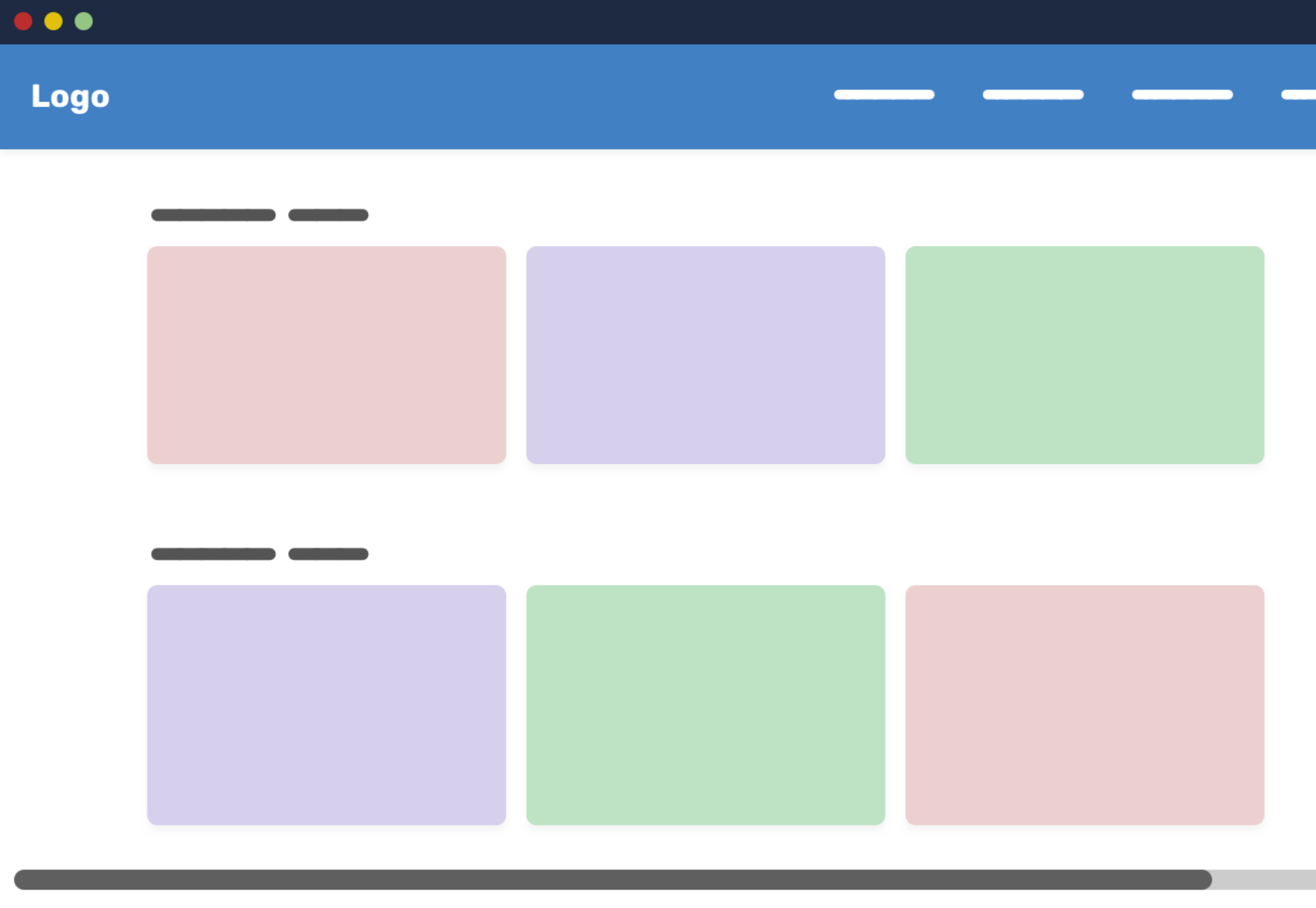
Need to lay out an element to the right or the left, such that text wraps around it? That’s an easy task for the float property. But what about if you also want to push that element (let’s call it an image) to one of the bottom corners while we’re at it? Sounds a bit tricky, right? We probably need JavaScript?

Nope, few lines of (tricky) CSS can do it! Here’s the CSS-only solution that will make your image to stick to the bottom corner, regardless of the size and content.

Resize the wrapper element and see the magic at work:

CodePen Embed Fallback

Let’s dissect the code.

Markup and layout

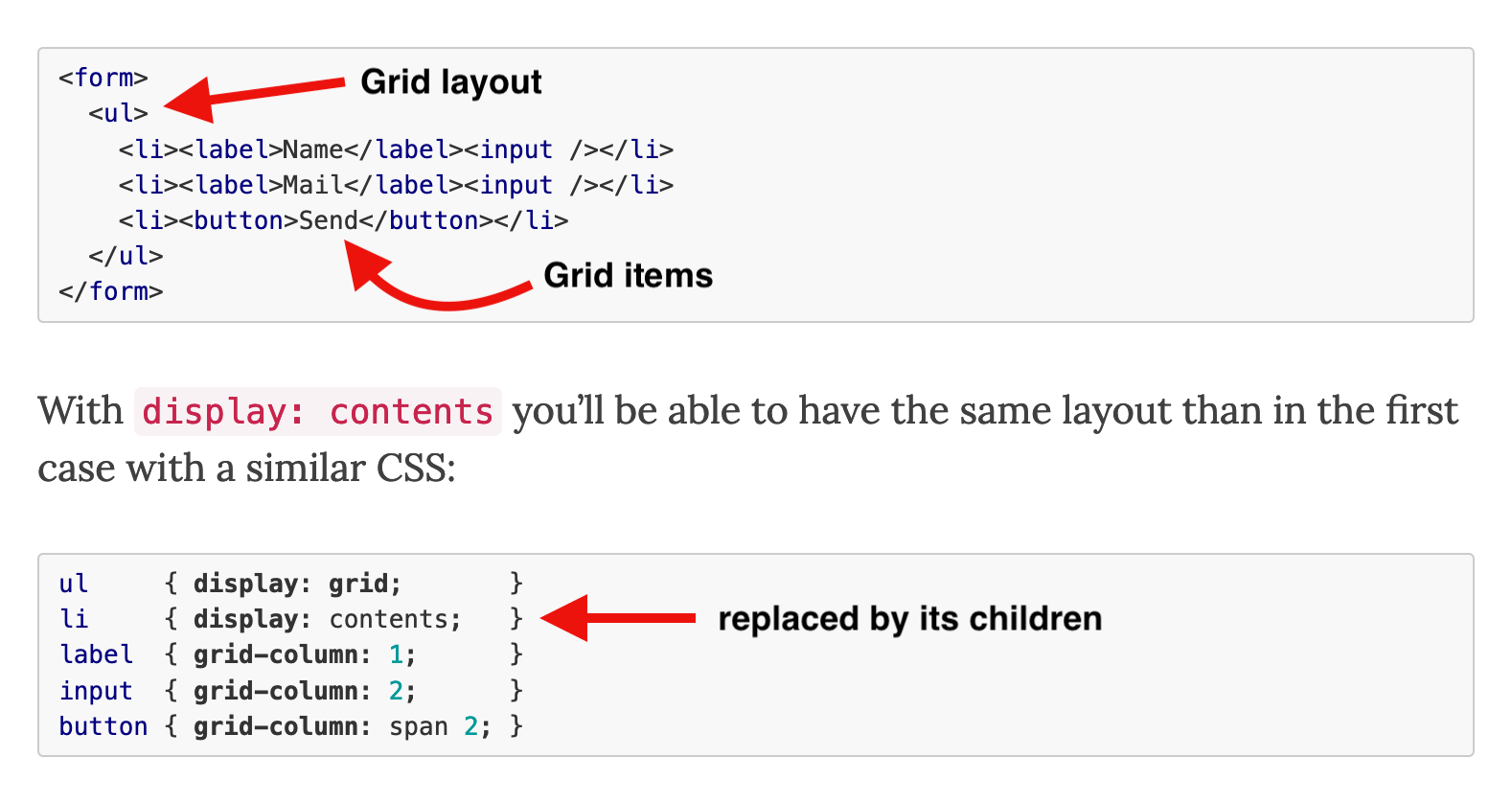
We’ll need a wrapper element to contain everything, and we’ll be using flexbox on it. Flexbox allows us to rely on the default stretch alignment to be able to later use height: 100%.

<div class="wrapper">
  <div class="box">
    <div class="float"><img></div>
    Lorem ipsum dolor ...
  </div>
</div>
.wrapper {
  display: flex;
}

.float {
  float: right;
  height: 100%;
  display: flex;
  align-items: flex-end;
  shape-outside: inset(calc(100% - 100px) 0 0);
}

The .box within the .wrapper is our flex item. We don’t need any particular CSS applied to the box. It defines the height of the wrapper and, at the same time, is stretched to the same height. This behavior will give us a “reference height” that can be used by the child elements.

From the specification:

If the flex item has align-self: stretch, redo layout for its contents, treating this used size as its definite cross size so that percentage-sized children can be resolved.

The keyword is the definite which allows us to safely use a percentage (%) height inside the box element.

Now for the floated element

Our .float element will take the entire height next to the text content, thanks to the height calculation we detailed above. Inside this element we push the image to the bottom using flexbox alignment.

The image is floated to the right but the free space above it prevents the content from wrapping around it.

Now for the real trickery, using the shape-outside property. Here’s how MDN defines it:

The shape-outside CSS property defines a shape—which may be non-rectangular—around which adjacent inline content should wrap. By default, inline content wraps around its margin box; shape-outside provides a way to customize this wrapping, making it possible to wrap text around complex objects rather than simple boxes.

In other words, shape-outside sets the way content flows around an element’s bounding box.

It takes a number of values. One of those is the inset() function which, again, according to MDN:

Defines an inset rectangle. When all of the first four arguments are supplied they represent the top, right, bottom and left offsets from the reference box inward that define the positions of the edges of the inset rectangle.

So, with shape-outside: inset(calc(100% - X) 0 0) we can create an inset rectangle that starts exactly at the top of the image. And the top is equal to 100% - X, where X is the image height and 100% is the height of the .float element. This allows the text to wrap within the free space on the top of the image. This is responsive, plus we can easily switch between left and right (by adjusting the float property)

That’s it! The only major caveat is that you need to know the image height.

Want more?

We can extend this concept a little further to account for fancier situations. For example, we can float the image to the right, but pin it to the middle of the box with justify-content: center: and also adjust our inset rectangle to the middle by changing the shape-outside from inset(calc(100% - X) 0 0) to inset(calc(50% - X/2) 0 0)

CodePen Embed Fallback

We can also float two images at both bottom corners:

CodePen Embed Fallback

Nothing complex here. I am simply using the same floating element twice, once on the right, and again on the left. And why stop at two corners when we can place images at all four corners:

CodePen Embed Fallback

The same basic idea is at play here, but we’re are also relying on the common float feature for the top images. However, you’ll notice that this is where the concept starts to break down a bit, and we get some unwanted overflow depending on the size of the containing box. We can make the height of the .float element greater than 100% and apply somewhat “magic numbers” that smooth things out by adjusting the padding and margin of the images.

Did you know that shape-outside accepts radial-gradient() as a value? We can use that to place rounded images like below:

CodePen Embed Fallback

The transparent part of the gradient is the free space where the text can go. You may have noticed that we applied a border-radius to the image as well. The shape-outside property will simply affect the .float element and we need to manually adjust the shape of the image to follow the shape defined by shape-outside.

While we’re at it, let’s combine this with our earlier example that pins the image to the vertical center of the box using justify-content: center:

CodePen Embed Fallback

Another radial-gradient() and also another border-radius configuration.

We could have used a linear-gradient() instead to make a triangular shape for the wrapping area:

CodePen Embed Fallback

This is the same idea that we used for the radial-gradient(). The big difference is that we’re using clip-path instead of border-radius to cut our image.

And, since we did it for the others, let’s use the justify-content: center idea to pin the image to the vertical center of the box’s right edge:

CodePen Embed Fallback

We used a conic-gradient() in the above demo with shape-outside to define the triangular shape and clip-path to get a similar shape on the image

All of these examples can still be optimized using less of code in the case that the image is decorative (when it’s not needed inside the HTML for SEO purposes). Let’s replace the .float element with a pseudo-element and apply the image as background instead:

CodePen Embed Fallback

We’re using mask to show just the portion of the image that we need and, guess what, it uses the same value as shape-outside! So, all we had to do is define one value for the shape.

That’s it!

There are a lot of possibilities here to place not just rectangles in corners, but any kind of shape at any position, using largely the same code structure. We only need to:

  • Adjust the shape-outside property to define the shape
  • Apply some styling to the image to follow the previously defined shape or apply the same value to mask in case we are using the pseudo element version

Then everything holds it place, even in responsive designs.


The post Float an Element to the Bottom Corner appeared first on CSS-Tricks.

You can support CSS-Tricks by being an MVP Supporter.

Categories: Designing, Others Tags:

America’s Best (and Worst) Cities for Graphic Designers – [Infographic]

April 19th, 2021 No comments

We don’t have to remind anyone about the dramatic changes we all experienced in 2020. What we can tell you though, is that digital design and creative industries are going to benefit from the shift towards digital.

Regardless of industry, every business will need to update and define its digital presence and designers can help with branding, website design, marketing, and much more.

In a new study from moveBuddha, they’ve uncovered the best and worst cities across the US for graphic designers measured by job opportunity, median salary, and spending power.

Minneapolis is the #1 Best Major City – Beating out hot cities like NYC, San Francisco, and even L.A.
This metric suggests which cities offer the best work-life balance.

Walla Walla, WA is the best city by spending power, here with only 3.25 hours of work, designers earn $100 of spending power. By comparison, in Duluth, MN to earn the same spending power requires 5.10 hours of time on the job.

Remember, graphic design skills are always evolving.
Graphic design skills are evolving and interlaced with newer jobs in high demand such as digital design. So here’s the good news, the job outlook from BLS predicts an 8% growth in employment for web developers and digital designers. Always be thinking about ways to build and bolster your skillset and keep your design mind fresh (here are some great reads we recommend) and flexible as times change.

Check out the full study from moveBuddha here:  America’s Best (and Worst) Cities for Graphic Designers.

Categories: Others Tags:

HIPAA rules for healthcare app development

April 19th, 2021 No comments
HIPAA rules for healthcare app development

The mobile health market looks set to grow substantially over the next few years. After a welcome boost during the global COVID-19 pandemic, there’s demand for novel and innovative healthcare apps. Because most mobile health solutions handle sensitive patient data, they must comply with the relevant data protection legislation, including the Health Insurance Portability and Accountability Act (HIPAA).

What is HIPAA?

HIPAA, which became law in 1996, regulates the use and disclosure of sensitive patient information to protect its integrity and security. When developing a healthcare app that will handle protected health information (PHI), developers must carefully follow HIPAA guidelines to ensure full compliance. HIPAA breaches can lead to costly penalties — both financially and professionally — so app developers must minimize the risk of noncompliance.

This post will summarize the key rules that must be followed when developing a healthcare app.

Who needs to be HIPAA compliant?

Understanding complex HIPAA regulations is challenging, particularly if you’re unfamiliar with them, so where exactly do you start? Before developing your healthcare app, it’s crucial to determine whether you need to comply with HIPAA rules. 

Put simply, if your healthcare app collects, stores, manages, or distributes PHI, then it must comply with HIPAA regulations. PHI, or personally identifiable information, includes things such as demographic data, medical history, and clinical results. 

HIPAA rules may not apply to apps where the user inputs their own, non-PHI data, and the data isn’t accessed by the app maker or its business associates. An example of this is a fitness tracker that monitors activity, body weight, and heart rate. 

What rules apply when developing a HIPAA-compliant app?

App developers must follow four distinct rules to make their app compliant:

  • The Privacy Rule
  • The Security Rule
  • The Enforcement Rule
  • The Breach Notification Rule

While all of these rules are important, the primary focus during the development of a healthcare app should be on the HIPAA Privacy and Security Rules. To comply with these rules, app developers need to implement the required technical, physical, and administrative safeguards to assure the safety and security of PHI. 

App developers will also need to make sure a Business Associate Agreement (BAA) is in place with any third-party service providers that will be accessing PHI to ensure their compliance with HIPAA. 

How can you ensure HIPAA compliance?

You’re probably wondering what you need to consider on your path to HIPAA compliance. Here, we summarize the steps you should take as you develop your healthcare app:

Ensure you understand HIPAA compliance

Make sure you understand your roles and responsibilities in adhering to HIPAA regulations. As an app developer, you may not have any experience with HIPAA, so consider consulting a compliance expert. 

Implement adequate security features 

Technical safeguards must be implemented to protect data. While HIPAA regulations don’t specify the security features to include, following industry best practices will set you on the right track.

Strict access control, such as unique user authentication, needs to be built into the app to ensure that only authorized users can access it. Biometric authentication using fingerprint or facial ID can make an app user-friendly while protecting data integrity. 

If public access is available, controls need to be in place to make sure only relevant data is displayed to the patient and that PHI cannot be altered or accessed in any other way; this includes system admins.

All PHI should be fully encrypted both in transit and at rest. Incorporate an automatic logoff feature in your app to eliminate the risks associated with users forgetting to sign out, an all too regular occurrence. Only necessary PHI should be stored and disclosed, and it should be appropriately disposed of when no longer needed.

Physical safeguards protect the integrity of the backend infrastructure and mobile devices used to access the app. These safeguards may include data center access controls, 24-7 security, locked server racks, CCTV, and environmental protections such as redundant power and cooling. 

HIPAA requires that PHI be available at all times, and the easiest way to achieve this is with 100 percent uptime guarantees.

Administrative safeguards refer to internal policies and procedures that are put into place to maintain data integrity. Policies and procedures should highlight how PHI can be stored, accessed, and disclosed. The development team (or anyone responsible for updating the app) should be appropriately trained in the correct handling of PHI.

Regularly test and maintain the security of your app

Regular testing should be performed to highlight any vulnerabilities in the security of your app. By routinely updating your app, you’ll be able to deal with any security issues that arise. Public-facing apps need to be impenetrable; perform external vulnerability testing to ensure the app can’t be exploited.

Monitor user activity through audit logging

Effective audit logging will enable the intelligent monitoring of user activity and provide near real-time reporting of suspicious events. IPS platforms and SIEM products can intelligently alert you of any deviations from the norm, which could be caused by malicious activity.

Deploy HIPAA-compliant third-party hosting solutions

By using a HIPAA-compliant hosting provider, you can save time and money associated with building the necessary infrastructure, taking the stress out of compliance. HIPAA-compliant infrastructure-as-a-Service (IaaS) solutions will adhere to all of the necessary HIPAA requirements, providing you with a ready platform on which to build your healthcare app. Remember that any third-party service provider must sign a BAA.  

Developing a HIPAA-compliant healthcare app is a complicated process, and it can take time to get your head around the intricacies of HIPAA compliance. By carefully researching the legalities involved before starting development, you’ll save yourself a lot of money and headaches down the line. 

Categories: Others Tags:

Popular Design News Of The Week: April 12, 2021 – April 18, 2021

April 18th, 2021 No comments

Every day design fans submit incredible industry stories to our sister-site, Webdesigner News. Our colleagues sift through it, selecting the very best stories from the design, UX, tech, and development worlds and posting them live on the site.

The best way to keep up with the most important stories for web professionals is to subscribe to Webdesigner News or check out the site regularly. However, in case you missed a day this week, here’s a handy compilation of the top curated stories from the last seven days. Enjoy!

5 Web Design Trends That Unfolded In 2021

Mobile First Is Over, Welcome To Mobile In Mind

CSS Is, In Fact, Awesome

Overflow Issues In CSS

Remove Background From Image

Kaboom.js

Swipey Image Grids

natto

Getting Started With Crypto As A Designer

30 Inspiring Web Design Concepts With 3D Graphics

A Collection Of Hand-Lettered Marvel Superhero Logos

How To Actually Test UIs

Design Trend: We’re Still In Love With Gradients (And They Keep Evolving)

Design Systems 101

9 Tips For Better Live Logo Design

Source

The post Popular Design News Of The Week: April 12, 2021 – April 18, 2021 first appeared on Webdesigner Depot.

Categories: Designing, Others Tags:

Comics for Designers #441

April 17th, 2021 No comments

Every month we feature a set of comics created exclusively for WDD.

The content revolves around web design, blogging and funny situations that we encounter in our daily lives as designers.

These great cartoons are created by Jerry King, an award-winning cartoonist who’s one of the most published, prolific and versatile cartoonists in the world today.

So for a few moments, take a break from your daily routine, have a laugh and enjoy these funny cartoons!

Can’t sleep


Too hungry!


Wireless revenge

Source

The post Comics for Designers #441 first appeared on Webdesigner Depot.

Categories: Designing, Others Tags:

Wix Vs WordPress: 3rd Round Knockout

April 16th, 2021 No comments

Over the last fortnight one site builder has gone toe-to-toe with another, as Wix launched a marketing campaign aimed at attracting WordPress users, and instead attracted universal ire.

First, Wix sent out expensive headphones as gifts to key WordPress “influencers” in an attempt to lure them to the platform. Second, they produced a series of adverts that instead of promoting their own product, tried to imply that WordPress is so bad you’ll need mental health counselling to cope with it; it’s been widely frowned upon, but am I alone in thinking they’re not a million miles away from Apple’s anti-Windows adverts? No, I’m not.

Then, Wix made an attempt to go viral with an uncomfortable video in which a character portraying “WordPress” releases a “secret” message warning the community of “fake news” supposedly due to be released by Wix. The language and the styling is clear: WordPress is unhip daddio.

Unlike WordPress, Wix is a publicly owned company, it has an obligation to its shareholders to maximize its revenue. Had Wix targeted WordPress’ many failings, that would have been fair game. Had they gone after Shopify, or Webflow, or Squarespace, or one of the many other site builders on the market no one would have blinked an eye. Wix’s error wasn’t going after WordPress, or even the tactics used to do so, Wix’s mistake was in attacking the very community it was attempting to court.

I’m not a big fan of WordPress. I’ve built around a dozen sites in it over the years and we’ve never got along, WordPress and I. But I am a big fan of the ethos of WordPress; who doesn’t love free, open source software, built by volunteers?

The holy grail of marketing is transforming customers into evangelists — individuals who will bare their chests, paint their face with woad, and charge headlong onto social media at the merest hint of a perceived slight. You can’t buy them. It’s a loyalty that has to be cultivated over years, and requires more give than take. WordPress has those evangelists, people who see their careers in web design as intertwined with the CMS. No amount of free headphones is going to convert them to a closed system like Wix.

The irony is that Wix’s approach stemmed from the WordPress community itself. If it is going to celebrate “powering 40% of the Web” then it has to expect to make itself a target. If you’re an antelope, you don’t douse yourself in bbq sauce and strut around the waterhole where the lions like to hang out.

If the row rumbles on, it will eventually end in an apology and a promise from Wix to “do better.” But the truth is, all Wix did was confuse a community of people trying to build websites, with a competing business.

This time next year, Wix will still be recovering from the damage to its reputation, and WordPress will be telling us it powers 110% of the Web.

Source

The post Wix Vs WordPress: 3rd Round Knockout first appeared on Webdesigner Depot.

Categories: Designing, Others Tags:

Platform News: Using :focus-visible, BBC’s New Typeface, Declarative Shadow DOMs, A11Y and Placeholders

April 16th, 2021 No comments

There’s a whole lot of accessibility in this week’s news, from the nuances of using :focus-visible and input placeholders, to accessible typefaces and a Safari bug with :display: contents. Plus, a snippet for a bare-bones web component that supports style encapsulation.

Now may be a good time to start using :focus-visible

The CSS :focus-visible pseudo-class replaces :focus as the new way to create custom focus indicators for keyboard users. Chrome recently switched from :focus to :focus-visible in the user agent stylesheet and, as a result of that change, the default focus ring is no longer shown when the user clicks or taps a button.

When switching from :focus to :focus-visible, consider backwards compatibility. Your keyboard focus indicators should be clearly visible in all browsers, not just the ones that support :focus-visible. If you only style :focus-visible, non-supporting browsers will show the default focus ring which, depending on your design, “may not be sufficiently clear or visible at all.”

button {
  background: white;
}

button:focus-visible {
  outline: none;
  background: #ffdd00; /* gold */
}

A good way to start using :focus-visible today is to define the focus styles in a :focus rule and then immediately undo these same styles in a :focus:not(:focus-visible) rule. This is admittedly not the most elegant and intuitive pattern, but it works well in all browsers:

  • Browsers that don’t support :focus-visible use the focus styles defined in the :focus rule and ignore the second style rule completely (because :focus-visible is unknown to them).
  • In browsers that do support :focus-visible, the second style rule reverts the focus styles defined in the :focus rule if the :focus-visible state isn’t active as well. In other words, the focus styles defined in the :focus rule are only in effect when :focus-visible is also active.
button:focus {
  outline: none;
  background: #ffdd00; /* gold */
}

button:focus:not(:focus-visible) {
  background: white; /* undo gold */
}

The BBC created a more accessible typeface

The BBC created their own custom typeface called Reith (named after the BBC’s founder Sir John Reith). Their goal was to create a font that supports multiple languages and is easier to read, especially on small devices. The font was tested with mixed-ability user groups (dyslexia and vision impairment) and across different screen sizes.

We [the BBC] were using Helvetica or Arial. We also had Gill Sans as the corporate typeface. These typefaces were designed a hundred years ago for the printed page [and] don’t perform well on today’s modern digital screens.

Reith Sans can bee seen in use on BBC Sport

Note: If you’d like to inspect Reith Sans and Reith Serif in Wakamai Fondue, you can quickly access the URLs of the WOFF2 files in the “All fonts on page” section of the Fonts pane in Firefox’s DOM inspector on BBC’s website.

display: contents is still not accessible in Safari

The CSS display: contents value has been supported in browsers since 2018. An element with this value “does not generate any boxes” and is effectively replaced by its children. This is especially useful in flex and grid layouts, where the contents value can be used to “promote” more deeply nested elements to flex/grid items while retaining a semantic document structure.

Source: Manuel Rego Casasnovas

Unfortunately, this feature originally shipped with an implementation bug that removed the element from the browser’s accessibility tree. For example, applying display: contents to a

    element resulted in that element no longer mentioned by screen readers. Since then, this bug has been fixed in Firefox and Chrome (in the latest version).

    View on CodePen

    In Chrome and Firefox, the screen reader informs the user that the “Main, navigation” contains a “list, 2 items.” In Safari, the latter part is missing because the

      and

    • elements are not present in the accessibility tree. Until Apple fixes this bug in Safari, be careful when using the contents value on semantic elements and test in screen readers to confirm that your pages are accessible in Safari as well.

      Set opacity when overriding the color of placeholder text

      Accessibility experts recommend avoiding placeholders if possible because they can be confused for pre-populated text and disappear when the user starts entering a value. However, many websites (including Wikipedia and GOV.UK) use placeholders in simple web forms that contain only a single input field, such as a search field.

      The subscription form for the CSS-Tricks newsletter uses a placeholder in the email field

      Placeholders can be styled via the widely supported ::placeholder pseudo-element. If your design calls for a custom color for placeholder text, make sure to specify both color and opacity. The latter is needed for Firefox, which applies opacity: 0.54 to ::placeholder by default. If you don’t override this value, your placeholder text may have insufficient contrast in Firefox.

      .search-field::placeholder {
        color: #727272;
        opacity: 1; /* needed for Firefox */
      }
      The placeholder text on eBay’s website is lighter in Firefox and doesn’t meet the minimum contrast requirement of 4.5:1

      Declarative shadow DOM could help popularize style encapsulation

      One of the key features of shadow DOM is style encapsulation, wherein the outer page’s style rules don’t match elements inside the shadow tree, and vice versa. In order to use this feature, you need to attach a shadow DOM tree to an element (usually a custom element, like ) and copy the element’s template (usually from a element in the DOM) to the element’s newly created shadow DOM.

      These steps can only be performed in JavaScript. If you’re only interested in style encapsulation and don’t need any dynamic functionality for your element, here is the minimum amount of JavaScript required to create a custom element with a shadow DOM:

      customElements.define(
        "my-element",
        class extends HTMLElement {
          constructor() {
            super();
      
            // find <template id="my-template"> in the DOM
            let template = document.getElementById("my-template");
      
            // make a copy of the template contents…
            let content = template.content.cloneNode(true);
      
            // …and inject it into <my-element>’s shadow DOM
            this.attachShadow({ mode: "open" }).appendChild(content);
          }
        }
      );

      For an example of style encapsulation, see Miriam Suzanne’s element on CodePen. The scoped styles are located in the element in the HTML pane. Notice how this CSS code can use simple selectors, such as article, that only match elements inside ’s shadow DOM.

      JavaScript may soon no longer be required to create this type of style encapsulation in modern browsers. Earlier this week, Chrome became the first browser to ship Google’s Declarative Shadow DOM proposal. If it becomes a standard, this feature will also make it possible to use Shadow DOM in combination with server-side rendering.


      The post Platform News: Using :focus-visible, BBC’s New Typeface, Declarative Shadow DOMs, A11Y and Placeholders appeared first on CSS-Tricks.

      You can support CSS-Tricks by being an MVP Supporter.

Categories: Designing, Others Tags:

Not Your Typical Horizontal Rules

April 16th, 2021 No comments

The default browser style for


is so weird. It’s basically:

border-style: inset;
border-width: 1px;

The default border-color is black, but the border doesn’t actually look black, because the inset border “adds a split tone to the line that makes the element appear slightly depressed.”

If I kick up the border-width to 40px you can see it more clearly:

I often reset an


to be “just a line” and it always gets me because I’ll try something, like height: 1px with a background at first, but that’s not right. The easier way to clear it is to turn off all the borders then only use border-top or border-bottom. Or, turn off all the borders, set a height, and use a background.

Annnyway… Sara has some of the nicest horizontal rules in town on the current design of her site, and she’s written it all up. Guess what? They aren’t even


elements! It turns out the only styling hook you have is CSS, which wasn’t as adaptive as Sara needed, so she ended up with a

(TIL!) and inline SVG.

The best way to get the full flexibility of an SVG is by inlining it. But the 


 element is content-less — it has no opening and closing tags within which you can place other elements.

The only way to work around the limitations of 


 while preserving semantics for screen reader users is to use a div and provide the semantics of an hr using ARIA.

Direct Link to ArticlePermalink


The post Not Your Typical Horizontal Rules appeared first on CSS-Tricks.

You can support CSS-Tricks by being an MVP Supporter.

Categories: Designing, Others Tags:

How to Choose the Perfect Logo Design for Your Business

April 16th, 2021 No comments

Logo designing is no walk in the park; there are a few, in fact, many peculiarities that the designer must be aware of before selecting the final logo for the brand.

Your logo is the brand’s identity, do not let an amateur jeopardize your brand identity to save some bucks. You may end up paying a lot more later if your designer messes up your logo. Can you let a lousy logo define your brand? You cannot, right? So let the experts do this job, and you can focus on other business areas. 

When you have finally chosen your brand name, it’s time you choose the logo that explains what your brand is all about. It is not as easy as it sounds. For people to know, a logo is a combination of symbols and letters used uniquely and consistently to create an identity for the brand, service, or product. The logo has a slight edge over the brand name as it is one of the primary forms of marketing. The designing experts need to be quite careful while designing it as it reflects your product or service branding.

If you are a small business owner who just started working on a business with no design capabilities, you have no other option than to rely on the experts for this job. However, the job is not done here; even after you have appointed a designer to do this job for you, there are a few things that you need to take care of. Following aspects of logo design will help you choose the suitable logo for your brand that will create a long-lasting brand identity for your product/ service.

Without any further ado, let’s educate you about some logo design tips and tricks to help you create your company’s perfect brand personality.

1. Choose the right font

Nothings black and white here; you need to choose the grey line here and see what font goes with your brand. Is your brand more of a quirky type? Do you want your brand to have a serious voice or a light-hearted voice? What aura do you want your brand to create? You need to answer a lot of questions before you select the font for your logo. 

If your brand is more of a formal and professional type, you may need a bit formal font like Times New Roman or Calibri. On the other hand, for the quirky brand, you can go with Comic Sans. 

There is no denying the fact that typography is one essential part of the overall design. Not only your brand communication is dependent on it, but its whole personality also relies on it. Many organizations believe there is a direct relationship between the fonts they use and their company’s profits. One example is White Mountain Footwear; after redesigning their font, they noticed a whopping 20% increase in their sales. 

2. Get the perfect shades

You may not know it yet, but colors in logos are not just there to look good or complement the design. They have a completely different meaning and vibe when they are in the logo. For example, the yellow color in the logo means happiness and warmth; the perfect example is the McDonald logo, how just by looking at it, we are reminded of its happy meals. 

Colors have a lot of brand personality; you would be surprised to know that 80% of the customers think their brand recognition has increased due to the correct usage of the colors. If you want to exhibit excitement, boldness, and youth, there is no better color for you than red. The various shades of orange represent cheerfulness, confidence, and friendliness. Green shows growth, peace, and health. Blue educes strength, trust, and dependability. Lastly, if you are looking to give a calm and peaceful vibe, then what can be better than the classic combination of white and black.

In case you want to go a little colorful and use multiple hues in your logo, you must go for similar shades only, such as reds and pinks. On the other hand, if you are looking for the accent color, then go for the color that contrasts with your main palette, as it is pretty compelling.

Pro tip: For more color inspiration, visit Pinterest. Also, keep an eye on your competitors as well!

3. Decide your image style

We all are aware that logos represent the brand; it says a lot about how your potential customer sees your brand. Make sure the logo rightly represents you and your business. In case your business is all about money and finances, you must choose a high-tech, conservative or modern logo. A light-hearted and quirky logo would just take away the serious aspect of your business. You need something that builds your business’s credibility; therefore, be thoughtful while choosing your brand logo. 

A regular light-hearted logo can go with the bakeshop or a food café. Be as creative as you can if you own such a business. The bottom line is, while you are choosing the image style, you must keep your organization’s philosophies and company’s profile in your mind. 

No one design fits everyone’s marketing criteria; you have to look for the one that suits yours. Classic, retro/ vintage, fun/ quirky, and modern/ minimalistic are a few of the many designs and image styles you can choose from.

Pro tip: Most brands are religiously following the mantra of “Less is more” today, so you better jump on this bandwagon as it is one elegant trend going on today.

4. Be direct with your designer

Now that you have decided on all the important elements of your logo, it’s time you communicate with your logo designer. A wrong message would turn into a lousy logo; make sure you are mentioning all the details. However, stay open to more suggestions, it may take a little bit of trust, but expert opinions always help. You must know you are dealing with an expert; he/ she knows this job better than you and can give you better recommendations.

Give all the details that you have, even the minute ones you think are not necessary. It gives the designer a complete understanding of how you want your logo to be. It may sound cliché to you, but the best designs indeed happen when you and your designer work in collaboration.

Wrapping up!

The brand logo should be instantly recognized, communicate your brand’s message, and is unique. A valuable logo effortlessly fits in with the brand’s identity and looks professional. To reach this professional level, you must ensure you follow all the tips and tricks mentioned above before selecting your brand’s logo. 


Photo by Slidebean on Unsplash

Categories: Others Tags: