Archive

Archive for May, 2021

A New Way To Reduce Font Loading Impact: CSS Font Descriptors

May 25th, 2021 No comments

Font loading has long been a bugbear of web performance, and there really are no good choices here. If you want to use web fonts your choices are basically Flash of Invisible Text (aka FOIT) where the text is hidden until the font downloads or Flash of Unstyled Text (FOUT) where you use the fallback system font initially and then upgrade it to the web font when it downloads. Neither option has really “won out” because neither is really satisfactory, to be honest.

Wasn’t font-display Supposed To Solve This?

The font-display property for @font-face gave that choice to the web developer whereas previously the browser decided that (IE and Edge favored FOUT in the past, whereas the other browsers favored FOIT). However, beyond that it didn’t really solve the problem.

A number of sites moved to font-display: swap when this first came out, and Google Fonts even made it the default in 2019. The thinking here was that it was better for performance to display the text as quickly as you can, even if it’s in the fallback font, and then to swap the font in when it finally downloads.

I was supportive of this back then too, but am increasingly finding myself frustrated by the “hydration effect” when the web font downloads and characters expand (or contract) to fill in the next space. Smashing Magazine, like most publishers, makes use of web fonts and the below screenshot shows the difference between the initial render (with the fallback fonts), and the final render (with the web fonts):

Now, when put side by side, the web fonts are considerably nicer and do fit with the Smashing Magazine brand. But we also see there is quite some difference in the text layout with the two fonts. The fonts are very different sizes and, because of this, the screen content shifts around. In this age of Core Web Vitals and Cumulative Layout Shifts being (quite rightly!) recognized as detrimental to users, font-display: swap is a poor choice because of that.

I’ve reverted back to font-display: block on sites I look after as I really do find the text shift quite jarring and annoying. While it’s true that block won’t stop shifts (the font is still rendered in invisible text), it at least makes them less noticeable to the user. I’ve also optimized by font-loading by preloading fonts that I’ve made as small as possible by self-hosting subsetted fonts — so visitors often saw the fallback fonts for only a small period of time. To me, the “block period” of swap was too short and I’d honestly prefer to wait a tiny bit longer to get the initial render correct.

Using font-display: optional Can Solve FOIT And FOUT — At A Cost

The other option is to use font-display: optional. This option basically makes web fonts optional, or to put differently, if the font isn’t there by the time the page needs it, then it’s up to the brwoser to never swap it. With this option, we avoid both FOIT and FOUT by basically only using fonts that have already been downloaded.

If the web font isn’t available then, we fall back to the fallback font, but the next page navigation (or a reload of this page) will use the font — as it should have finished downloading now. However, if the web font is that unimportant to the site, then it might be a good idea to just remove them completely — which is even better for web performance!

First impressions count and to have that initial load without web fonts altogether seems a little bit too much. I also think — with absolutely no evidence to back this up by the way! — that it will give people the impression, perhaps subconsciously, that something is “off” about the website and may impact how people use the website.

So, all font options have their drawbacks, among with the option to not use web fonts at all, or using system fonts (which is limiting — but perhaps not as limiting as many think!).

Making Your Fallback Font More Closely Match Your Font

The holy grail of web font loading has been to make the fallback font closer to the actual web font to reduce the noticeable shift as much as possible, so that using swap is less impactful. While we never will be able to avoid the shifts altogether, we cab do better than in the screenshot above. The Font Style Matcher app by Monica Dinculescu is often cited in font loading articles and gives a fantastic glimpse of what should be possible here. It helpfully allows you to overlay the same text in two different fonts to see how different they are:

Unfortunately, the issue with the font style matching is that we can’t have these CSS styles apply only to the fallback fonts, so we need to use JavaScript and the FontFace.load API to apply (or revert) these style differences when the web font loads.

The amount of code isn’t huge, but it still feels like a little bit more effort than it should be. Though there are other advantages and possibilities to using the JavaScript API for this as explained by Zach Leatherman in this fantastic talk from way back in 2019 — you can reduce reflows and handle data-server mode and prefers-reduced-motion though that (note however that both have since been exposed to CSS since that talk).

It’s also trickier to handle cached fonts we already have, not to mention differences in various fallback styles. Here on Smashing Magazine, we try a number of fallbacks to make the best use of the system fonts different users and operating systems have installed:

font-family: Mija,-apple-system,Arial,BlinkMacSystemFont,roboto slab,droid serif,segoe ui,Ubuntu,Cantarell,Georgia,serif;

Knowing which font is used, or having separate adjustments for each and ensuring they are applied correctly can quickly become quite complex.

A Better Solution Is Coming

So, that’s a brief catch-up on where things stand as of today. However, there is some smoke starting to appear on the horizon.

Excited for the CSS “size-adjust” descriptor for fonts: reduce layout shifts by matching up a fallback font and primary web font through a scale factor for glyphs (percentage).

See https://t.co/mdRW2BMg6A by @cramforce for a demo (Chrome Canary/FF Nightly with flags) pic.twitter.com/hEg1HfUJlT

— Addy Osmani (@addyosmani) May 22, 2021

As I mentioned earlier, the main issue with applying the fallback styling differences was in adding, and then removing them. What if we could tell the browser that these differences are only for the fallback fonts?

That’s exactly what a new set of font descriptors being proposed as part of the CSS Fonts Module Level 5 do. These are applied to the @font-face declarations where the individual font is defined.

Simon Hearne has written about this proposed update to the font-face descriptors specification which includes four new descriptors: ascent-override, descent-override, line-gap-override and advance-override (since dropped). You can play with the F-mods playground that Simon has created to load your custom and fallback fonts, then play with the overrides to get a perfect match.

As Simon writes, the combination of these four descriptors allowed us to override the layout of the fallback font to match the web font, but they only really modify vertical spacing and positioning. So for character and letter-spacing, we’ll need to provide additional CSS.

But things seem to be changing yet again. Most recently, advance-override was dropped in favor of the upcoming size-adjust descriptor which allows us to reduce layout shifts by matching up a fallback font and primary web font through a scale factor for glyphs (percentage).

How does it work? Let’s say you have the following CSS:

@font-face {
  font-family: 'Lato';
  src: url('/static/fonts/Lato.woff2') format('woff2');
  font-weight: 400;
}

h1 {
    font-family: Lato, Lato-fallback, Arial;
}

Then what you would do is to create a @font-face for the Arial fallback font and apply adjustor descriptors to it. You’ll get the following CSS snippet then:

@font-face {
  font-family: 'Lato';
  src: url('/static/fonts/Lato.woff2') format('woff2');
  font-weight: 400;
}

@font-face {
    font-family: "Lato-fallback";
    size-adjust: 97.38%;
    ascent-override: 99%;
    src: local("Arial");
}

h1 {
    font-family: Lato, Lato-fallback, sans-serif;
}

This means that when the Lato-fallback is used initially (as Arial is a local font and can be used straight away without any additional download) then the size-adjust and ascent-override settings allow you to get this closer to the Lato font. It is an extra @font-face declaration to write, but certainly a lot easier than the hoops we had to jump through before!

Overall, there are four main @font-face descriptors included in this spec: size-adjust, ascent-override, descent-override, and line-gap-override with a few others still being considered for subscript, superscript, and other use cases.

Malte Ubl created a very useful tool to automatically calculate these settings given two fonts and a browser that supports these new settings (more on this in a moment!). As Malte points out, computers are good at that sort of thing! Ideally, we could also expose these settings for common fonts to web developers, e.g. maybe give these hints in font collections like Google Fonts? That would certainly help increase adoption.

Now different operating systems may have slightly different font settings and getting these exactly right is basically an impossible task, but that’s not the aim. The aim is to close the gap so using font-display: swap is no longer such a jarring experience, but we don’t need to go to the extremes of optional or no web fonts.

When Can We Start Using This?

Three of these settings have already been shipped in Chrome since version 87, though the key size-adjust descriptor is not yet available in any stable browser. However, Chrome Canary has it, as does Firefox behind a flag so this is not some abstract, far away concept, but something that could land very soon.

At the moment, the spec has all sorts of disclaimers and warnings that it’s not ready for real-time yet, but it certainly feels like it’s getting there. As always, there is a balance between us, designers and developers, testing it and giving feedback, and discouraging the use of it, so the implementation doesn’t get stuck because too many people end up using an earlier draft.

Chrome has stated their intent to make size-adjust available in Chrome 92 due for release on July 20th presumably indicating it’s almost there.

So, not quite ready yet, but looks like it’s coming in the very near future. In the meantime, have a play with the demo in Chrome Canary and see if it can go a bit closer to addressing your font loading woes and the CLS impact they cause.

Categories: Others Tags:

Which are the Types of Business Models for EdTech Apps?

May 25th, 2021 No comments

When it comes to developing an edtech app, there exist layers of confusion:

  • What should the edtech app do?
  • How should the edtech app make money?
  • Who will be the target audience for the edtech app?
  • Freemium or sponsored?
  • Top-down or bottom-up?

It is natural to put on the over-analytical hat to ensure that all dimensions of the edtech app point towards profitability. To help you get in the right direction with your edtech app, we have compiled a list of the best business models for contemporary edtech apps.

This article will help you understand the exclusive details required for developing an edtech app from the ground up.

Types of Business Models for EdTech Apps

A business is not only an instrument to make more than you can spend. It is a channel to solve an existing problem with a creative solution. The successful edtech businesses have known and implemented their businesses on this fact.

Take, for instance, Udemy.

There was a massive opportunity for a portal with a professional yet affordable skill development program. So, the online course marketplace for eLearning caught the attention and is thriving like crazy. Considering this principle, let’s identify the crucial elements required for building an edtech business.

As per my research, an edtech business model should have the following:

  • Better Access
  • Measurable Outcomes
  • Personalized Content
  • Adaptive Delivery
  • Affordability
  • Better Efficiency

Taking the criteria as mentioned above, I’ve put the best business models with a vast prospective for profit:

Freemium Business Model

Incorporating a freemium business model means offering a basic version of the web app/mobile app for free to students, teachers, and parents and encourage these stakeholders to buy the premium version with attractive features.

The edtech app can be a dedicated online classroom platform that can replace video-conferencing apps. Teachers can schedule the classes and share the timelines with students. Students can log in to the portal and access the code to join the class at the scheduled time. The edtech app will also have multiple features for teachers to encourage a conducive learning environment with assignment creation and review, real-time sharing of feedback, and quiz creation.

You can either implement the freemium business model through limited features or limited time. Let’s show you an example of how you can launch an edtech app with limited features.

How to Make Money using the Freemium Business Model?

  1. Free Account: Students and teachers can start with a free version of the edtech app. The basic version should allow teachers and students to interact. You can set the limit based on the number of students per class while the teacher takes an online class. In addition to this, students should be able to chat with teachers separately and resolve their queries. Again, you can set a limit to free chats.
  2. Premium Plan: Students and teachers can switch to the premium versions with interesting features facilitating more ease and interactiveness. Teachers can accommodate more students in their classes by opting for the premium version. In addition to this, parents can have a one-on-one interaction with teachers to stay updated about their children’s progress.
  3. Education Institution-wide Plan: You can make money through a special plan for an educational institution. Under this plan, all the teachers, students, admin, and parents can enjoy special educational access with multiple features for collaboration.

If you want to launch an edtech app on a trial basis, you can offer all the features for free for a limited time.

On-demand Business Model for EdTech App

An on-demand business model is one of the surefire ways to run a profitable business. The success rate of the on-demand economy is high. You can develop a tutor-on-demand app, wherein tutors can list themselves on the portal. On the user end, students will be able to use different keywords from the search bar to find a good tutor, who can assist them with a topic.

Each of the tutors will have a different per-hour rate. Before confirmation, tutors will provide an estimation about the charge for the session. When the student confirms, the link will be generated for the session and shared with tutors and students.

How to Make Money Using the On-demand Tutor App?

  1. Commission Model: This is the most popular revenue model in the Uber-like apps. As per the revenue model, the payment made by the student is held by the admin. After the session, the admin charges a certain commission and then releases the payment. The ideal commission ratio is a 75-25 cut, wherein you receive one-fourth of the payment.
  2. Verification of Tutors: When tutors register themselves on the portal, they need to pay a service charge for using the in-built tools and functionalities. Upon making the payment, tutors can begin receiving the teaching requests from students.
  3. Cancellation Charges: When a student cancels the session, you can charge a certain amount as a cancellation charge. To have a tutor-centric approach, you can pass on the part of the cancellation charge to the tutor.
  4. Besides this, six more revenue streams are possible.

eLearning Marketplace

In order to understand the working of an eLearning marketplace, think of an eCommerce website/ application. Similar to an online store, the marketplace will have multiple recorded courses listed on the platform for students to explore and purchase.

An eLearning marketplace is nothing but an app like Udemy or Coursera. Tutors can use the learning management system and tutoring tools from the platform and create courses. Upon approval, the admin can list courses on the edtech app. Students will have different dashboards and search modules to look up for courses. They can read the description of courses and make payment to purchase them.

How to Make Money using the eLearning Marketplace?

  1. Commission Model: The tutor can earn 97% of the total price if the student has purchased the course due to his reputation or marketing. If the student gets onboard through the marketing program of the platform, you can own 50% of the earnings.
  2. Featured Courses: Using the model of featured course, tutors pay for better discoverability. You can list their courses in a special section for better sales opportunities.
  3. Subscription Model: When a tutor has listed multiple parts of the same topic, you can create a bundle of the courses and offer a subscription to students. Using the subscription model, students can avail of certain discounts on the courses.

SWOT Analysis of the EdTech Industry

In order to be a part of the edtech industry, it is a good practice to know it to the fullest and then plan your entry. The edtech industry is densely crowded, with multiple businesses and more startups joining the bandwagon. However, there are numerous unexplored corners in the industry, which makes space for new players.

Strength: Rather than launching a school or a university, you can simply reach out to a broad pool of students using the edtech app. The incorporation of new technologies enables better interactiveness, collaboration, and security.

Weakness: Low awareness about online learning in developing and underdeveloped countries.

Opportunities: Expansion and brand recognition are easy across boundaries. The digital business in the education sector runs at a relatively low cost than the traditional education system.

Threats: If the system is not developed with the standard security protocols, there are chances of malware attacks.
There are numerous COVID-19-induced opportunities to power up your edtech business. All you need to do is pick up a business model and chart out a plan to develop an edtech app.

Categories: Others Tags:

proxy-www

May 24th, 2021 No comments

I like a good trick. What if… a URL was… a promise… that fetched said URL?

www.codepen.io.then((response) => {
  console.log(response);
});

That’s what @justjavac did with JavaScript Proxys. A clever trick, that. Don’t @ me about the practicality. Trick, folks.

Direct Link to ArticlePermalink


The post proxy-www appeared first on CSS-Tricks.

You can support CSS-Tricks by being an MVP Supporter.

Categories: Designing, Others Tags:

20 Best New Websites, May 2021

May 24th, 2021 No comments

This month we have several examples of brutalism used to good effect as a foil to showcase products and/or work. By contrast, at the other end of the scale, we have brands who have chosen to go more of an immersive experience route, using full-screen images, sound, animation, and even VR.

Both are valid approaches, depending on the content. The former tends to work better as a backdrop for artwork, photography, and artisanal craft goods — acting as a virtual gallery space — while the latter is better for consumer goods and experiences, particularly food, drink, and accommodation.

There is, of course, a whole range in between these extremes, and we’ve got that covered too. Enjoy!

Grainne Morton

A simple layout, soft pastel colors, and clear navigation provide an excellent backdrop for Grainne Morton’s handmade jewelry creations.

Gage Hotel

Good photography and a heritage-inspired color scheme give the Gage Hotel’s site a luxury feel.

Tejidos Roca

Tejidos Roca is a fabric manufacturer, and the design of their site uses a circle motif to bring rolls of fabric to mind.

La Passation Synerghetic 2021

Synerghetic is part of the Junior Enterprises Europe scheme – a network of businesses run by students. This year they are not holding the usual handover ceremony, so Synerghetic created this rather fun little digital celebration instead.

Redwood Empire

For Earth Month, Redwood Empire Whiskey has created a microsite promoting a competition styled to match their bottle labels.

Gabriel Cuallado

This site focusing on Spanish photographer Gabriel Cullado’s life and work features some great transitions and good use of horizontal scrolling.

Ombia Studio

In Ombia Studio’s site, atmospheric photographs stand out in a minimal layout. There is a sense of almost gallery curation here.

Headup

Headup uses a pleasing color scheme and geometric graphics to create a welcoming but businesslike approach.

the Figo

Spherical curves and line animations create interest in this site for boutique hotel, the Figo.

Boon Market

Boon Market is about promoting a toxin-free and waste-free lifestyle, and their site reflects this with its use of simple type and soft colors.

Unspoken Agreement

Unspoken Agreement’s website has a quietly confident feel, with clean lines and some pleasing type.

hnst

Another brutalist-inspired design here, but the use of bright red makes it fresh in hnst’s take on the style.

InteriorLAB

Part minimalist, part glossy magazine, InteriorLAB have succeeded in making the simple feel luxurious.

Bowmore Experience

Bowmore has opted for immersive video and visually beautiful images to present their limited-edition Timeless whisky range.

Oly Sheet

There is a slightly old-school start-up feel to Oly Sheet’s website, but it is still appealing with fresh, spring colors and well-organized content.

Aalto University

Aalto University has provided a pretty in-depth tour of its campus here. The navigation is clear, and the information is presented in ideal-sized chunks — enough detail, but not too much at once.

Wisr

Wisr features a Heath Robinson style machine that ‘runs’ as the user scrolls down the page. It provides a bit of interest (no pun intended) to the not very exciting subject of personal loans.

Rudl und Schwarm

Bright colors, cute, but not too cutesy, illustration, some nice scrolling, and transition effects are used really well on Rudl und Schwarm. And it’s got bees; bees are good.

Dr. Maul

This site for Dr. T. Maul manages to take orthodontistry past the usual image of uncomfortable wiring, elastic bands, and ‘train tracks and make it seem just a little more glamorous.

My Drink

There is a slightly vintage feel to this site for My Drink with its cocktail illustration. The blue text on grey is soothing without being bland.

Bonus Site: Imperial Style Guide

And finally not new, but a bonus in honor of May 4th, the Imperial style guide. Well, the Web would get boring if it was serious all the time.

Source

The post 20 Best New Websites, May 2021 first appeared on Webdesigner Depot.

Categories: Designing, Others Tags:

11 Customer Service Phrases That Can Make or Break Your eCommerce Brand

May 24th, 2021 No comments

Customer service can definitely make or break your business, especially if you are an eCommerce brand.

There are different channels for providing customer support now with social media leading as the preferred mode for people to interact with brands. According to a report by Zendesk, 3 out of 5 customers state that customer service was a defining factor in deciding their loyalty towards a brand. So it is no surprise that every brand wants to empower its customer support team to be adept at providing exceptional customer service.

Good customer support and the right communication can define the customer service and experience that you provide, as a brand. Here are a few phrases that customer support executives should avoid using when interacting with a customer: 

1. I can’t help you with this

You know you have heard this from a customer service representative more times than you would like. This phrase may suggest that the customer support is being unhelpful without providing the customer any context, which can be detrimental to their perception of your service quality.

When a customer calls up support with an issue, even if it is out of your scope, politely explain it to them and be on the call with them, till you redirect them to a person who can provide a solution. According to experts, the phrase – ‘I cannot help you’ should be eliminated from the customer service lexicon. 

2. We have never faced such an issue before

When a customer is angry or upset and calling you regarding an issue that they are facing, they are usually looking for your expertise to resolve the issue. Even if you use this phrase to reassure the customer, it has the exact opposite effect, wherein the customer is now alarmed that you have no experience dealing with such an issue before. 

As a customer service representative, you can consider taking a different approach to reassure the customer that such issues are rare and are not likely to happen again. This sounds honest and optimistic, and the customer is likely to receive it in a better way. 

3. Can I call you back?

This is a no-brainer. No one likes to hear this phrase – let alone a customer who is looking for support on an issue they are facing. 

Many businesses fail to realize that customers do not like to get cut off mid-call and made to wait for a call to resolve their issue. Usually, customers prefer leaving a website inquiry or email for issues that are not urgent, and call customer support only when they need their issue to be addressed as soon as possible. So you should never use this phrase unless you absolutely have to. Even in that situation, you must first explain to the customer why you need extra time to resolve the issue and politely ask them as to when you can call them back again. 

4. You are mistaken

Once again, never should a customer representative use this phrase with a customer who is already displeased with the brand. Anyone who has worked in customer service already knows the cardinal rule – the customer is always right. 

Customer support executives should never use this phrase or say anything that might be interpreted as mean or disrespectful. This means that you should avoid correcting them or finding faults in their statements (even if they are mistaken) because there is nothing that you are likely to achieve by doing so. You should patiently listen to their concerns and be solution-oriented in your approach. 

5. Please visit our help center instead 

Redirecting a customer to a different channel of support without even attempting to solve their problem is another great example of what not to do. Maybe the help center does have helpful information that will give customers all the information they need. Even then, you should access that information and guide the customer with the process so that you do not seem unhelpful.

If you want the customer to know about the self-service options that are available for them, then the end, mention that they can refer to the help center for any such queries in the future to get an immediate solution. Trust us, they will appreciate it. Here is a great example: 

Source

6. I am unable to find your account information

Nothing can send a customer over the edge than calling up customer support for an issue and hearing this phrase. It can make your support team look disorganized and unprepared. The way brands operate today, the only way you could find yourself using this phrase too much is if you do not have customer service software for your support team.

If you do have such software in place and your support executives are still using this phrase, then it is bad news. It suggests that your customer support team is not using the software correctly. You should ensure that your customer support representatives know how to use the customer service software to extract necessary data. You can conduct manual training or use a digital adoption platform to ensure that your employees are utilizing all the features of the enterprise software that you have in place. 

Now that you know what not to say to your customers, here are a few positive phrases that you should use very often when you are speaking to them:

7. I appreciate you bringing this to our attention

It is easy for customer support to drive an angry customer over the edge, especially if they use any of the bad phrases that have been mentioned above. But it is also that much easier to set a positive and optimistic tone for the call right at the beginning. As soon as the customer expresses their issue, appreciate them for bringing it to your attention. 

Simple enough, right? 

What it does is, create an impression in the customer’s mind that you regard this issue as an opportunity to serve, and not just a problem that you need to get rid of. Customers can easily read annoyance in your tone, so by using such phrases, you can reassure them that their feedback is valuable to you.

8. I can definitely help you with this issue

Remember how we discussed that you should never say you can’t help the customer with an issue. The onus of a customer support team is to always acknowledge the customer issues, and reassure them that they will be solved, before proceeding to offer a solution. This phrase is what you should use as long as the resolution is within your scope. Even if it is not, use this phrase anyway to defuse customer’s anxiety right away and then guide them to the right channel for a solution.

Saying you can surely help them with their issue, establishes a sense of optimism and confidence in even the most aggravated customers. It also shows the customer that the conversation is heading in a positive direction. 

9. Your business/patronage means a lot to us

You know you have heard this a lot. So have we.

But using this classic phrase is always a good idea when a customer is truly angry with your brand. In such situations, the customer may be feeling dissociated and unsure about your brand, which is why this phrase is the perfect way to make sure that they feel valued. Even otherwise, you should show gratitude to customers often, and ensure that they know that their business is important to you, regardless of the value. 

Here is a simple example:

Source

10. I understand

Unfortunately, empathy is a diminishing trait in customer service teams these days. You can blame automated responses and bots all you want, but you always knew the thumb rule: keep reassuring the customer that you are on the same team. 

Here is an example of what empathy in customer service can accomplish:

Source

It is common for customers to feel belittled or ignored if they only receive the standard template responses, however genuine you make them sound. Instead, use this phrase to reassure the customer that you are aware of the trouble that they are experiencing and that you are eager to help them find a solution. 

11. Thank you

If we were not clear before, we will say it again – keep showing gratitude and thank customers often. If not anything else, it goes a long way in making sure that your customer knows how much they are appreciated, and would want to stay associated with you. Saying thank you often is a great way to pave the way for a long-term association with the customer through customer support calls. 

Customers are Humans too

More often than not, customer support executives forget that they are dealing with a human on the other end. Mechanical replies without context, and being curt does not help as much as listening properly and being empathetic does. By using the right words and by eliminating the bad phrases from your lexicon, you can build an exceptional customer support experience. 


Photo by Berkeley Communications on Unsplash

Categories: Others Tags:

Popular Design News of the Week: May 17 2021 – May 23, 2021

May 23rd, 2021 No comments

Every day design fans submit incredible industry stories to our sister-site, Webdesigner News. Our colleagues sift through it, selecting the very best stories from the design, UX, tech, and development worlds and posting them live on the site.

The best way to keep up with the most important stories for web professionals is to subscribe to Webdesigner News or check out the site regularly. However, in case you missed a day this week, here’s a handy compilation of the top curated stories from the last seven days. Enjoy!

25 Ridiculously Impressive HTML5 Canvas Experiments

Elder.js, The New Kid On The Block

Glassmorphism CSS Generator

How to Optimize Site Performance

Tint: A Better Color Picker

See Google’s Expressive New Design Language

svg-loader: A Different Way to Work With External SVG

How To Create, Edit And Animate SVGs All In One Place With SVGator 3.0

3 Questions for a Monthly Self-Evaluation

UI vs UX Design: Which Career Is For You?

Source

The post Popular Design News of the Week: May 17 2021 – May 23, 2021 first appeared on Webdesigner Depot.

Categories: Designing, Others Tags:

Should DevTools teach the CSS cascade?

May 21st, 2021 No comments

Stefan Judis, two days before I mouthed off about using (X, X, X, X) for talking about specificity, has a great blog post not only using that format, but advocating that browser DevTools should show us that value by selectors.

I think that the above additions could help to educate developers about CSS tremendously. The only downside I can think of is that additional information might overwhelm developers, but I would take that risk in favor of more people learning CSS properly.

I’d be for it. The crossed-off UI for the “losing” selectors is attempting to teach this, but without actually teaching it. I wouldn’t be that worried about the information being overwhelming. I think if they are considerate about the design, it can be done tastefully. DevTools is a very information-dense place anyway.

Direct Link to ArticlePermalink


The post Should DevTools teach the CSS cascade? appeared first on CSS-Tricks.

You can support CSS-Tricks by being an MVP Supporter.

Categories: Designing, Others Tags:

CSS Hell

May 21st, 2021 No comments

Collection of common CSS mistakes, and how to fix them

From Stefánia Péter.

Clever idea for a site! Some of them are little mind-twisters that could bite you, and some of them are honing in on best practices that may affect accessibility.

Why “CSS Hell”?

It’s a joke idea I stole from HTMHell. I hope adding some fun and sarcasm to learning might help raising awareness of how !important a good CSS code is.

Direct Link to ArticlePermalink


The post CSS Hell appeared first on CSS-Tricks.

You can support CSS-Tricks by being an MVP Supporter.

Categories: Designing, Others Tags:

Top 5 e-Commerce Site Powered by Magento in 2021

May 21st, 2021 No comments

Due to the pandemic, the customers are likely to purchase from online e-commerce websites as the stores are continuously winning the heart of their customers with amazing service facilities. The arrival of online shopping and social media marketing becomes very normal for every business plan, either small or large. 

The no. of e-commerce support websites and online shopping is expanding with every passing day and the retailers are selling their product successfully on these e-commerce websites and increasing their business. Although we can’t deny that during the pandemic e-commerce development companies were at their peak. 

The expansion of online stores leads to the birth of many e-commerce website platforms. You may have seen many platforms for this field and all these platforms provide the same sort of features but a little change makes them different from each other.

Now if we are talking about the e-commerce website platform then you must be familiar with Magento, a fantastic platform for every kind of business that is famous all over the world with quality products. In this article, we took a glimpse of the 5 best Magento sites that will surely help your website to grow. Before we start let us grab some amazing facts about Magento.

Why is Magento popular among all the platforms?

Magento is the most prevalent e-commerce website CMSs for every kind of business with more than 1 lakh users. The reason for its remarkable popularity is because it offers you distinct solutions to their problems such as your business needs, Enterprises, and Small business versions. Magento also conveys various certificate programs for their developers. Along with this Magento provides some specific features to their site to gain suitable traffic from their customers. 

Magento is a serious website in the market of e-commerce platforms that mainly focus on easy navigation, enhanced customer engagement, improved conversion rates, and overall e-commerce development for managers of the store. 

With the expansion of various e-commerce websites, Magento has also grown in the last 10 to 20 years. As it is growing so fast with worldwide products with a variety of audiences all around the world. And now we are going to talk about the best site in Magento. Keep scrolling to know more. 

1. Mophie

If you are looking for the best mobile battery case then don’t wander here and there. Mophie is popular for the different kinds of best mobile phone battery cases. This was founded by Shawn Dougherty and Daniel Huang in 2005. Its parent organization is Zagg. 

Along with this is also popular for innovative ideas regarding the battery cases such as it designed the juicy pack case which was the first certified phone case by the best phone company Apple. The battery cases of mophie are very convenient for the customers, as they are available in versatile designs and also save power. 

With help of Mophie, you can charge your phone and laptops at any time with a strong battery backup. There is a special gadget for cleaning known as UV sanitizer and a wireless charging facility. This tool will help you to clean extra data and junk files from your phones smoothly.  

2. Cowshed

If you are very conscious about your skin and hair and continuously taking treatments in order to take good care of your body and skin. You must have listened to the spa and various bath products. All the spa and bath products such as shampoos, body wash, soaps, oil extracts, and many more things come under Cowshed. 

The cowshed is the hometown of various organic, aromatic, extraction of plants’ oil, and many more. Not only this but Cowshed also stores the essential oils of various plants that reinvigorate your mind, body, and soul. This e-commerce website is winning the hearts of their customers by providing them organic and qualified products all over the world. 

3. Teatox

This is popular for the amazing aromatic and healthy tea beverages. Teatox is the place where the magic of taste and aroma transpires. Each and every product of Teatox is 100% organic and grown naturally without any pesticides, additional flavors, colors, and sweeteners. 

The tea leaves of teatox arrive straight from the tea garden that will release your stress and turn your soul into a refreshing and fitter version of you. This company is worldwide famous for its 100% pure and fresh products. This site mainly focuses on the quality of the product. 

4. Harvey Nicholas

This site is based on a British department chain. This store was founded by Benjamin Harvey in 1831 in London, United Kingdom. The parent organization of Harvey Nicholas is Dickson Concepts with locations. It is specialized in fashion sales of men, women, children, and other age groups. 

As well as the sales of beauty products, packet foods, and alcoholic beverages such as wine. For people who are looking for a classy British makeover, the flagship store of Knightsbridge is a boon for such people. This site will offer you the trendiest British attires to their customers. 

5. Fred Perry

Fred Perry is another British-based fashion wear site. This brand was founded by Fred Perry who was the former famous British Tennis player and table tennis player, in 1952. Along with the British fashion trends, it also provides the most trendy sports and casual wear for women, men, and children. And also provide the best footwear for every size. 

The parent organization of Fred Perry is Hit Union Co. Limited. The products of this site may be very expensive but they will give the best experience of your classy clothes and footwear. 

The Final Words

In this article, we read about some best sites of the Magento e-commerce website that will help you to create an amazing platform to grow your online business. Here we have provided the best e-commerce international store that provides the best and trendy clothes and footwear worldwide. If you are also eager to grow your business all over the globe then start a business with Magento the best e-commerce website development. 


Photo by Fabiola Peñalba on Unsplash

Categories: Others Tags:

Building A Rich Text Editor (WYSIWYG) From Scratch

May 21st, 2021 No comments

In recent years, the field of Content Creation and Representation on Digital platforms has seen a massive disruption. The widespread success of products like Quip, Google Docs and Dropbox Paper has shown how companies are racing to build the best experience for content creators in the enterprise domain and trying to find innovative ways of breaking the traditional moulds of how content is shared and consumed. Taking advantage of the massive outreach of social media platforms, there is a new wave of independent content creators using platforms like Medium to create content and share it with their audience.

As so many people from different professions and backgrounds try to create content on these products, it’s important that these products provide a performant and seamless experience of content creation and have teams of designers and engineers who develop some level of domain expertise over time in this space. With this article, we try to not only lay the foundation of building an editor but also give the readers a glimpse into how little nuggets of functionalities when brought together can create a great user experience for a content creator.

Understanding The Document Structure

Before we dive into building the editor, let’s look at how a document is structured for a Rich Text Editor and what are the different types of data structures involved.

Document Nodes

Document nodes are used to represent the contents of the document. The common types of nodes that a rich-text document could contain are paragraphs, headings, images, videos, code-blocks and pull-quotes. Some of these may contain other nodes as children inside them (e.g. Paragraph nodes contain text nodes inside them). Nodes also hold any properties specific to the object they represent that are needed to render those nodes inside the editor. (e.g. Image nodes contain an image src property, Code-blocks may contain a language property and so on).

There are largely two types of nodes that represent how they should be rendered –

  • Block Nodes (analogous to HTML concept of Block-level elements) that are each rendered on a new line and occupy the available width. Block nodes could contain other block nodes or inline nodes inside them. An observation here is that the top-level nodes of a document would always be block nodes.
  • Inline Nodes (analogous to HTML concept of Inline elements) that start rendering on the same line as the previous node. There are some differences in how inline elements are represented in different editing libraries. SlateJS allows for inline elements to be nodes themselves. DraftJS, another popular Rich Text Editing library, lets you use the concept of Entities to render inline elements. Links and Inline Images are examples of Inline nodes.
  • Void Nodes — SlateJS also allows this third category of nodes that we will use later in this article to render media.

If you want to learn more about these categories, SlateJS’s documentation on Nodes is a good place to start.

Attributes

Similar to HTML’s concept of attributes, attributes in a Rich Text Document are used to represent non-content properties of a node or it’s children. For instance, a text node can have character-style attributes that tell us whether the text is bold/italic/underlined and so on. Although this article represents headings as nodes themselves, another way to represent them could be that nodes have paragraph-styles (paragraph & h1-h6) as attributes on them.

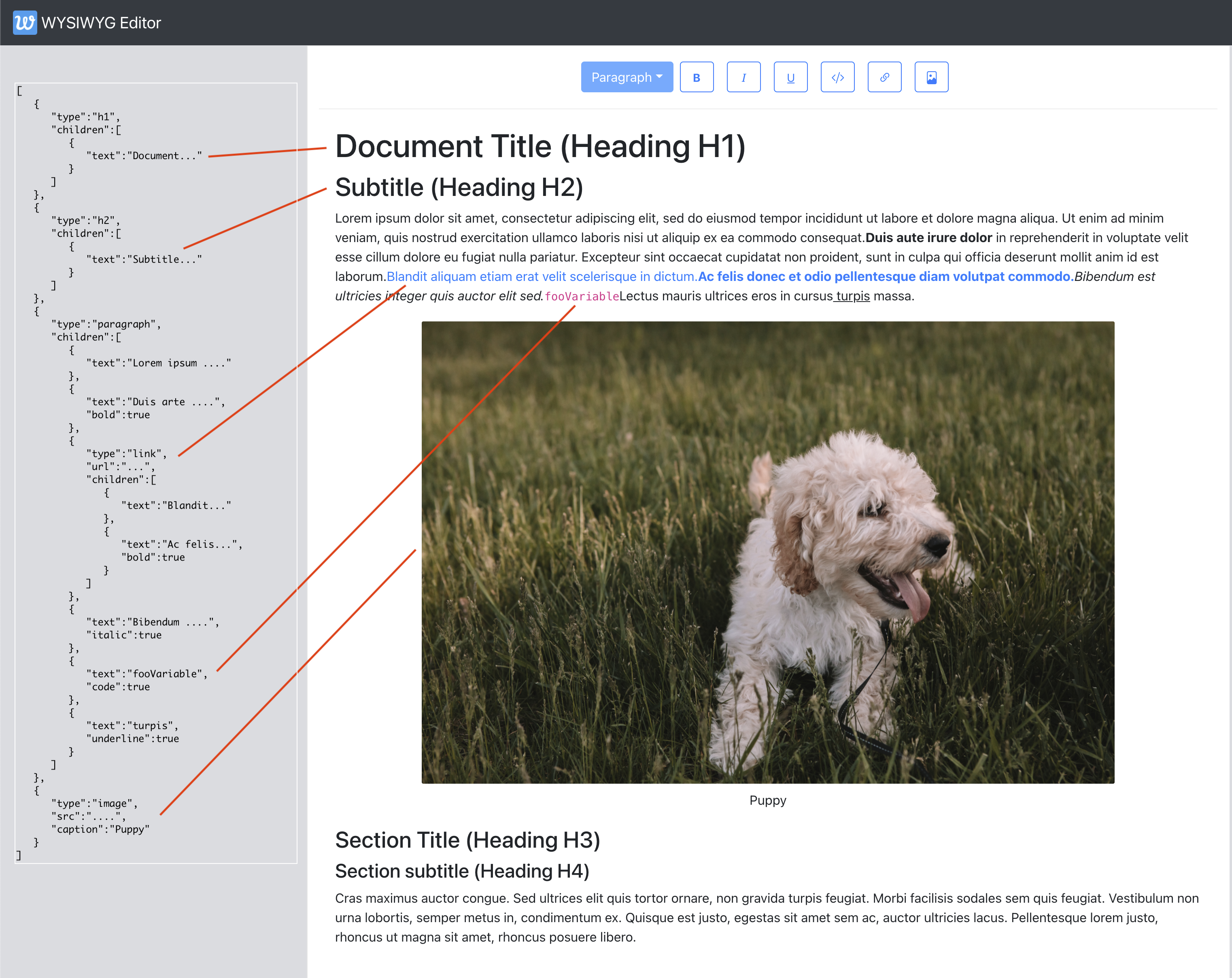
Below image gives an example of how a document’s structure (in JSON) is described at a more granular level using nodes and attributes highlighting some of the elements in the structure to the left.

Some of the things worth calling out here with the structure are:

  • Text nodes are represented as {text: 'text content'}
  • Properties of the nodes are stored directly on the node (e.g. url for links and caption for images)
  • SlateJS-specific representation of text attributes breaks the text nodes to be their own nodes if the character style changes. Hence, the text ‘Duis aute irure dolor’ is a text node of it’s own with bold: true set on it. Same is the case with the italic, underline and code style text in this document.

Locations And Selection

When building a rich text editor, it is crucial to have an understanding of how the most granular part of a document (say a character) can be represented with some sort of coordinates. This helps us navigate the document structure at runtime to understand where in the document hierarchy we are. Most importantly, location objects give us a way to represent user selection which is quite extensively used to tailor the user experience of the editor in real time. We will use selection to build our toolbar later in this article. Examples of these could be:

  • Is the user’s cursor currently inside a link, maybe we should show them a menu to edit/remove the link?
  • Has the user selected an image? Maybe we give them a menu to resize the image.
  • If the user selects certain text and hits the DELETE button, we determine what user’s selected text was and remove that from the document.

SlateJS’s document on Location explains these data structures extensively but we go through them here quickly as we use these terms at different instances in the article and show an example in the diagram that follows.

  • Path
    Represented by an array of numbers, a path is the way to get to a node in the document. For instance, a path [2,3] represents the 3rd child node of the 2nd node in the document.
  • Point
    More granular location of content represented by path + offset. For instance, a point of {path: [2,3], offset: 14} represents the 14th character of the 3rd child node inside the 2nd node of the document.
  • Range
    A pair of points (called anchor and focus) that represent a range of text inside the document. This concept comes from Web’s Selection API where anchor is where user’s selection began and focus is where it ended. A collapsed range/selection denotes where anchor and focus points are the same (think of a blinking cursor in a text input for instance).

As an example let’s say that the user’s selection in our above document example is ipsum:

The user’s selection can be represented as:

{
  anchor: {path: [2,0], offset: 5}, /0th text node inside the paragraph node which itself is index 2 in the document/
  focus: {path: [2,0], offset: 11}, // space + 'ipsum'
}`

Setting Up The Editor

In this section, we are going to set up the application and get a basic rich-text editor going with SlateJS. The boilerplate application would be create-react-app with SlateJS dependencies added to it. We are building the UI of the application using components from react-bootstrap. Let’s get started!

Create a folder called wysiwyg-editor and run the below command from inside the directory to set up the react app. We then run a yarn start command that should spin up the local web server (port defaulting to 3000) and show you a React welcome screen.

npx create-react-app .
yarn start

We then move on to add the SlateJS dependencies to the application.

yarn add slate slate-react

slate is SlateJS’s core package and slate-react includes the set of React components we will use to render Slate editors. SlateJS exposes some more packages organized by functionality one might consider adding to their editor.

We first create a utils folder that holds any utility modules we create in this application. We start with creating an ExampleDocument.js that returns a basic document structure that contains a paragraph with some text. This module looks like below:

const ExampleDocument = [
  {
    type: "paragraph",
    children: [
      { text: "Hello World! This is my paragraph inside a sample document." },
    ],
  },
];

export default ExampleDocument;

We now add a folder called components that will hold all our React components and do the following:

  • Add our first React component Editor.js to it. It only returns a div for now.
  • Update the App.js component to hold the document in its state which is initialized to our ExampleDocument above.
  • Render the Editor inside the app and pass the document state and an onChange handler down to the Editor so our document state is updated as the user updates it.
  • We use React bootstrap’s Nav components to add a navigation bar to the application as well.

App.js component now looks like below:

import Editor from './components/Editor';

function App() {
  const [document, updateDocument] = useState(ExampleDocument);

  return (
    <>
      <Navbar bg="dark" variant="dark">
        <Navbar.Brand href="#">
          <img
            alt=""
            src="/app-icon.png"
            width="30"
            height="30"
            className="d-inline-block align-top"
          />{" "}
          WYSIWYG Editor
        </Navbar.Brand>
      </Navbar>
      <div className="App">
        <Editor document={document} onChange={updateDocument} />
      </div>
    </>
  );

Inside the Editor component, we then instantiate the SlateJS editor and hold it inside a useMemo so that the object doesn’t change in between re-renders.

// dependencies imported as below.
import { withReact } from "slate-react";
import { createEditor } from "slate";

const editor = useMemo(() => withReact(createEditor()), []);

createEditor gives us the SlateJS editor instance which we use extensively through the application to access selections, run data transformations and so on. withReact is a SlateJS plugin that adds React and DOM behaviors to the editor object. SlateJS Plugins are Javascript functions that receive the editor object and attach some configuration to it. This allows web developers to add configurations to their SlateJS editor instance in a composable way.

We now import and render and components from SlateJS with the document prop we get from App.js. Slate exposes a bunch of React contexts we use to access in the application code. Editable is the component that renders the document hierarchy for editing. Overall, the Editor.js module at this stage looks like below:

import { Editable, Slate, withReact } from "slate-react";

import { createEditor } from "slate";
import { useMemo } from "react";

export default function Editor({ document, onChange }) {
  const editor = useMemo(() => withReact(createEditor()), []);
  return (
    <Slate editor={editor} value={document} onChange={onChange}>
      <Editable />
    </Slate>
  );
}

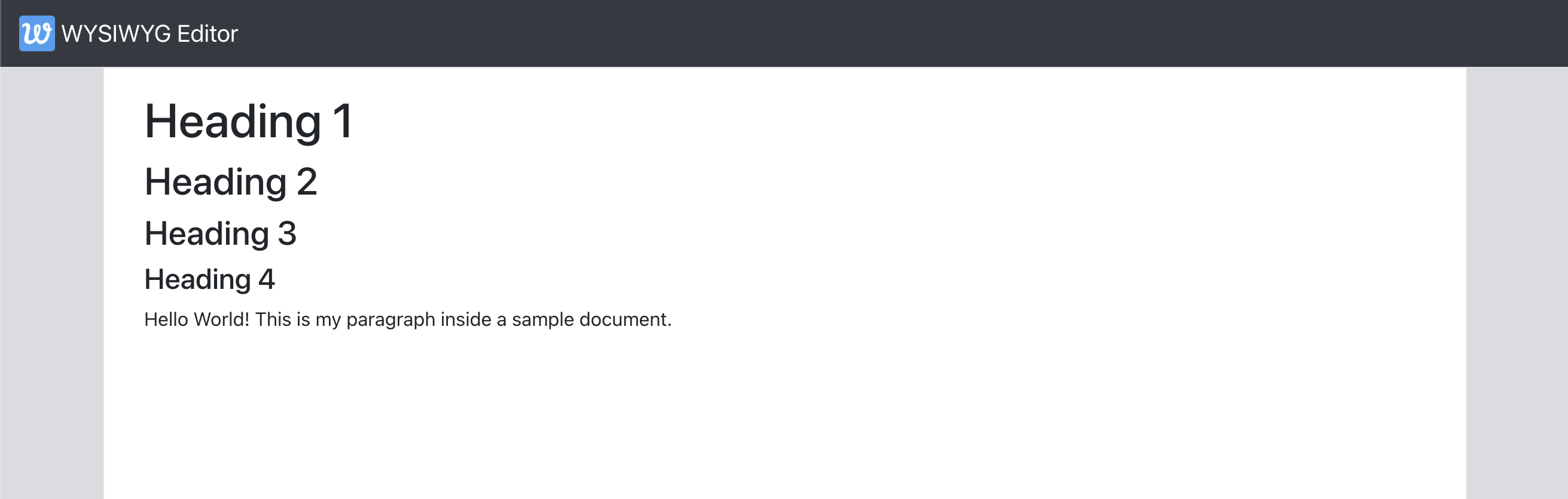
At this point, we have necessary React components added and the editor populated with an example document. Our Editor should be now set up allowing us to type in and change the content in real time — as in the screencast below.

Character Styles

Similar to renderElement, SlateJS gives out a function prop called renderLeaf that can be used to customize rendering of the text nodes (Leaf referring to text nodes which are the leaves/lowest level nodes of the document tree). Following the example of renderElement, we write an implementation for renderLeaf.

export default function useEditorConfig(editor) {
  return { renderElement, renderLeaf };
}

// ...
function renderLeaf({ attributes, children, leaf }) {
  let el = <>{children}</>;

  if (leaf.bold) {
    el = <strong>{el}</strong>;
  }

  if (leaf.code) {
    el = <code>{el}</code>;
  }

  if (leaf.italic) {
    el = <em>{el}</em>;
  }

  if (leaf.underline) {
    el = <u>{el}</u>;
  }

  return <span {...attributes}>{el}</span>;
}

An important observation of the above implementation is that it allows us to respect HTML semantics for character styles. Since renderLeaf gives us access to the text node leaf itself, we can customize the function to implement a more customized rendering. For instance, you might have a way to let users choose a highlightColor for text and check that leaf property here to attach the respective styles.

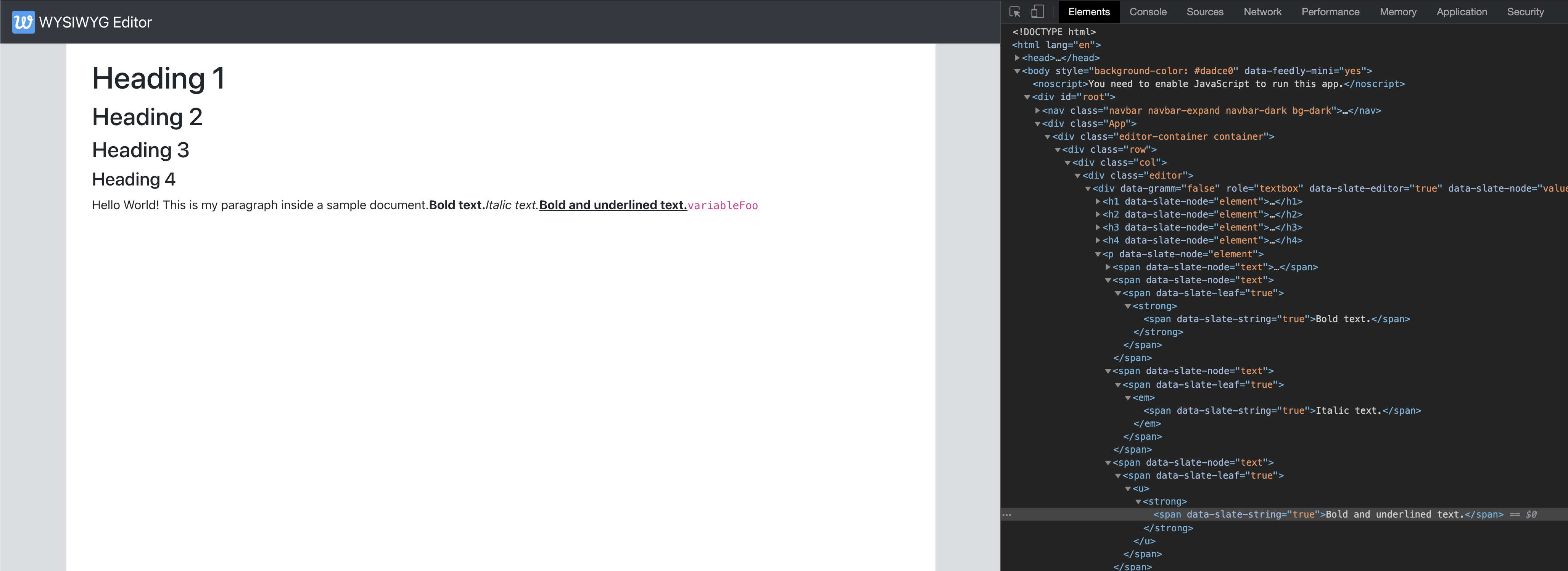
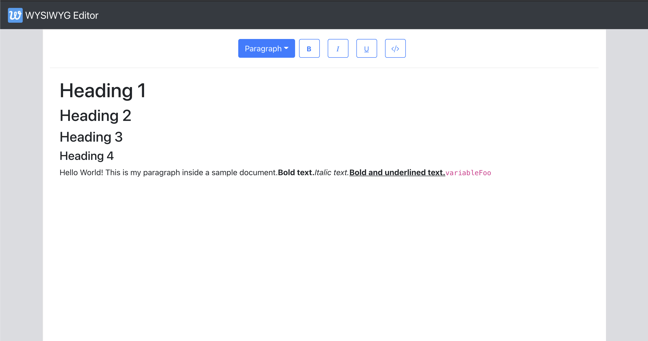
We now update the Editor component to use the above, the ExampleDocument to have a few text nodes in the paragraph with combinations of these styles and verify that they are rendered as expected in the Editor with the semantic tags we used.

# src/components/Editor.js

const { renderElement, renderLeaf } = useEditorConfig(editor);

return (
    ...
    <Editable renderElement={renderElement} renderLeaf={renderLeaf} />
);
# src/utils/ExampleDocument.js

{
    type: "paragraph",
    children: [
      { text: "Hello World! This is my paragraph inside a sample document." },
      { text: "Bold text.", bold: true, code: true },
      { text: "Italic text.", italic: true },
      { text: "Bold and underlined text.", bold: true, underline: true },
      { text: "variableFoo", code: true },
    ],
  },

Adding A Toolbar

Let’s begin by adding a new component Toolbar.js to which we add a few buttons for character styles and a dropdown for paragraph styles and we wire these up later in the section.

const PARAGRAPH_STYLES = ["h1", "h2", "h3", "h4", "paragraph", "multiple"];
const CHARACTER_STYLES = ["bold", "italic", "underline", "code"];

export default function Toolbar({ selection, previousSelection }) {
  return (
    <div className="toolbar">
      {/* Dropdown for paragraph styles */}
      <DropdownButton
        className={"block-style-dropdown"}
        disabled={false}
        id="block-style"
        title={getLabelForBlockStyle("paragraph")}
      >
        {PARAGRAPH_STYLES.map((blockType) => (
          <Dropdown.Item eventKey={blockType} key={blockType}>
            {getLabelForBlockStyle(blockType)}
          </Dropdown.Item>
        ))}
      </DropdownButton>
      {/* Buttons for character styles */}
      {CHARACTER_STYLES.map((style) => (
        <ToolBarButton
          key={style}
          icon={<i className={`bi ${getIconForButton(style)}`} />}
          isActive={false}
        />
      ))}
    </div>
  );
}

function ToolBarButton(props) {
  const { icon, isActive, ...otherProps } = props;
  return (
    <Button
      variant="outline-primary"
      className="toolbar-btn"
      active={isActive}
      {...otherProps}
    >
      {icon}
    </Button>
  );
}

We abstract away the buttons to the ToolbarButton component that is a wrapper around the React Bootstrap Button component. We then render the toolbar above the Editable inside Editor component and verify that the toolbar shows up in the application.

Here are the three key functionalities we need the toolbar to support:

  1. When the user’s cursor is in a certain spot in the document and they click one of the character style buttons, we need to toggle the style for the text they may type next.
  2. When the user selects a range of text and click one of the character style buttons, we need to toggle the style for that specific section.
  3. When the user selects a range of text, we want to update the paragraph-style dropdown to reflect the paragraph-type of the selection. If they do select a different value from the selection, we want to update the paragraph style of the entire selection to be what they selected.

Let’s look at how these functionalities work on the Editor before we start implementing them.

Adding A Link Button To The Toolbar

Let’s add a Link Button to the toolbar that enables the user to do the following:

  • Selecting some text and clicking on the button converts that text into a link
  • Having a blinking cursor (collapsed selection) and clicking the button inserts a new link there
  • If the user’s selection is inside a link, clicking on the button should toggle the link — meaning convert the link back to text.

To build these functionalities, we need a way in the toolbar to know if the user’s selection is inside a link node. We add a util function that traverses the levels in upward direction from the user’s selection to find a link node if there is one, using Editor.above helper function from SlateJS.

# src/utils/EditorUtils.js

export function isLinkNodeAtSelection(editor, selection) {
  if (selection == null) {
    return false;
  }

  return (
    Editor.above(editor, {
      at: selection,
      match: (n) => n.type === "link",
    }) != null
  );
}

Now, let’s add a button to the toolbar that is in active state if the user’s selection is inside a link node.

# src/components/Toolbar.js

return (
    <div className="toolbar">
      ...
      {/* Link Button */}
      <ToolBarButton
        isActive={isLinkNodeAtSelection(editor, editor.selection)}
        label={<i className={`bi ${getIconForButton("link")}`} />}
      />
    </div>
  );

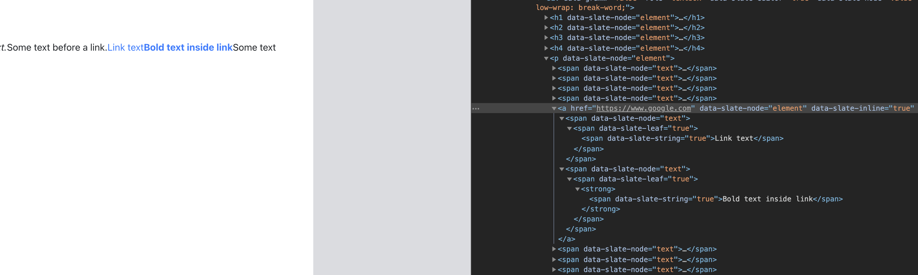
If we had to do this by ourselves, we’d have to figure out the range of selection and create three new nodes (text, link, text) that replace the original text node. SlateJS has a helper function called Transforms.wrapNodes that does exactly this — wrap nodes at a location into a new container node. We also have a helper available for the reverse of this process — Transforms.unwrapNodes which we use to remove links from selected text and merge that text back into the text nodes around it. With that, toggleLinkAtSelection has the below implementation to insert a new link at an expanded selection.

# src/utils/EditorUtils.js

export function toggleLinkAtSelection(editor) {
  if (!isLinkNodeAtSelection(editor, editor.selection)) {
    const isSelectionCollapsed =
      Range.isCollapsed(editor.selection);
    if (isSelectionCollapsed) {
      Transforms.insertNodes(
        editor,
        {
          type: "link",
          url: '#',
          children: [{ text: 'link' }],
        },
        { at: editor.selection }
      );
    } else {
      Transforms.wrapNodes(
        editor,
        { type: "link", url: '#', children: [{ text: '' }] },
        { split: true, at: editor.selection }
      );
    }
  } else {
    Transforms.unwrapNodes(editor, {
      match: (n) => Element.isElement(n) && n.type === "link",
    });
  }
}

If the selection is collapsed, we insert a new node there with Transform.insertNodes that inserts the node at the given location in the document. We wire this function up with the toolbar button and should now have a way to add/remove links from the document with the help of the link button.

# src/components/Toolbar.js
      <ToolBarButton
        ...
        isActive={isLinkNodeAtSelection(editor, editor.selection)}       
        onMouseDown={() => toggleLinkAtSelection(editor)}
      />

If the text ’ABCDE’ was the first text node of the first paragraph in the document, our point values would be —

cursorPoint = { path: [0,0], offset: 5}
startPointOfLastCharacter = { path: [0,0], offset: 4}

If the last character was a space, we know where it started — startPointOfLastCharacter.Let’s move to step-2 where we move backwards character-by-character until either we find another space or the start of the text node itself.

...

  if (lastCharacter !== " ") {
    return;
  }

  let end = startPointOfLastCharacter;
  start = Editor.before(editor, end, {
    unit: "character",
  });

  const startOfTextNode = Editor.point(editor, currentNodePath, {
    edge: "start",
  });

  while (
    Editor.string(editor, Editor.range(editor, start, end)) !== " " &&
    !Point.isBefore(start, startOfTextNode)
  ) {
    end = start;
    start = Editor.before(editor, end, { unit: "character" });
  }

  const lastWordRange = Editor.range(editor, end, startPointOfLastCharacter);
  const lastWord = Editor.string(editor, lastWordRange);

Here is a diagram that shows where these different points point to once we find the last word entered to be ABCDE.

Note that start and end are the points before and after the space there. Similarly, startPointOfLastCharacter and cursorPoint are the points before and after the space user just inserted. Hence [end,startPointOfLastCharacter] gives us the last word inserted.

We log the value of lastWord to the console and verify the values as we type.

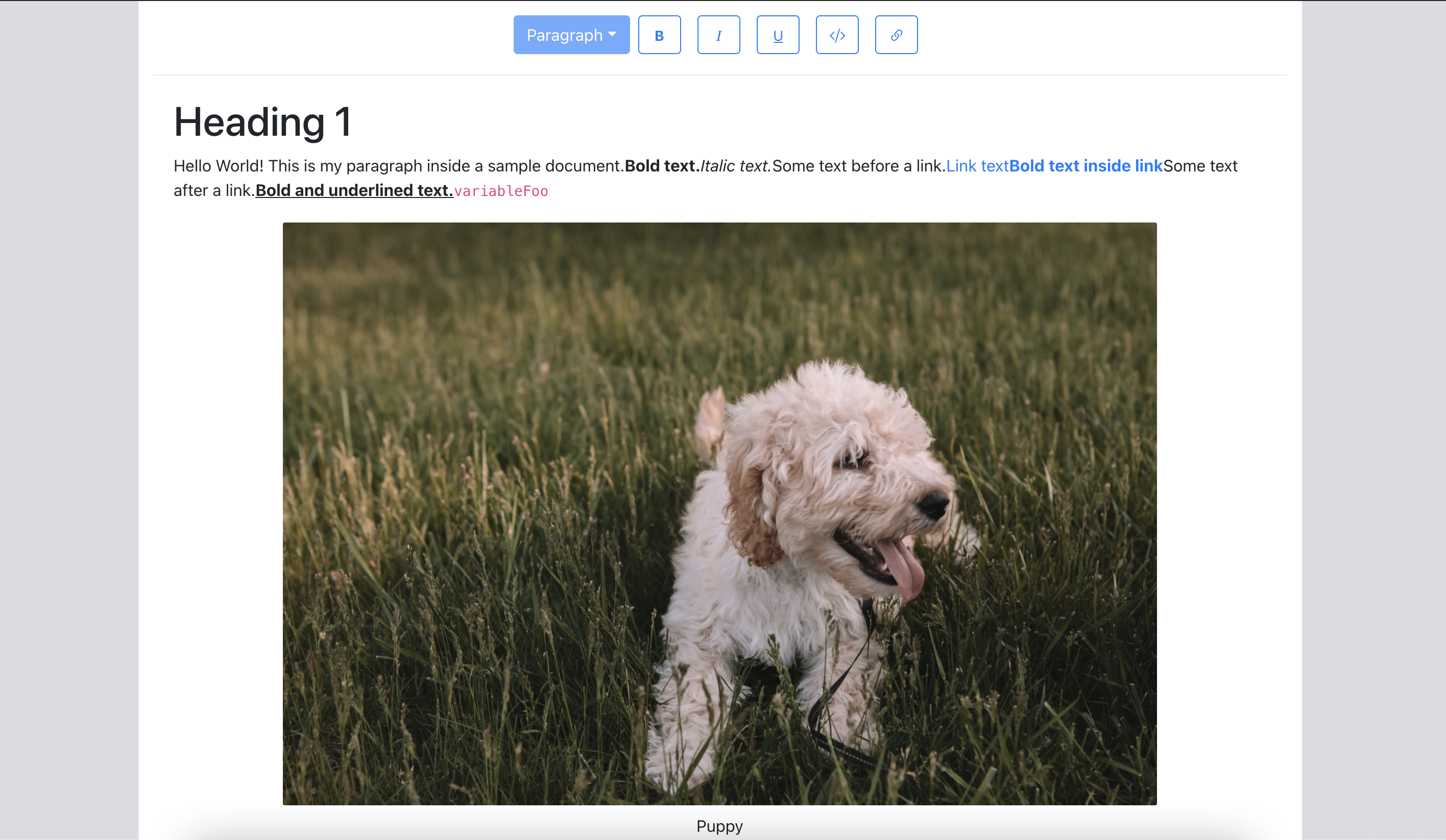
Now let’s focus on caption-editing. The way we want this to be a seamless experience for the user is that when they click on the caption, we show a text input where they can edit the caption. If they click outside the input or hit the RETURN key, we treat that as a confirmation to apply the caption. We then update the caption on the image node and switch the caption back to read mode. Let’s see it in action so we have an idea of what we’re building.

Let’s update our Image component to have a state for caption’s read-edit modes. We update the local caption state as the user updates it and when they click out (onBlur) or hit RETURN (onKeyDown), we apply the caption to the node and switch to read mode again.

const Image = ({ attributes, children, element }) => {
  const [isEditingCaption, setEditingCaption] = useState(false);
  const [caption, setCaption] = useState(element.caption);
  ...

  const applyCaptionChange = useCallback(
    (captionInput) => {
      const imageNodeEntry = Editor.above(editor, {
        match: (n) => n.type === "image",
      });
      if (imageNodeEntry == null) {
        return;
      }

      if (captionInput != null) {
        setCaption(captionInput);
      }

      Transforms.setNodes(
        editor,
        { caption: captionInput },
        { at: imageNodeEntry[1] }
      );
    },
    [editor, setCaption]
  );

  const onCaptionChange = useCallback(
    (event) => {
      setCaption(event.target.value);
    },
    [editor.selection, setCaption]
  );

  const onKeyDown = useCallback(
    (event) => {
      if (!isHotkey("enter", event)) {
        return;
      }

      applyCaptionChange(event.target.value);
      setEditingCaption(false);
    },
    [applyCaptionChange, setEditingCaption]
  );

  const onToggleCaptionEditMode = useCallback(
    (event) => {
      const wasEditing = isEditingCaption;
      setEditingCaption(!isEditingCaption);
      wasEditing && applyCaptionChange(caption);
    },
    [editor.selection, isEditingCaption, applyCaptionChange, caption]
  );

  return (
        ...
        {isEditingCaption ? (
          <Form.Control
            autoFocus={true}
            className={"image-caption-input"}
            size="sm"
            type="text"
            defaultValue={element.caption}
            onKeyDown={onKeyDown}
            onChange={onCaptionChange}
            onBlur={onToggleCaptionEditMode}
          />
        ) : (
          <div
            className={"image-caption-read-mode"}
            onClick={onToggleCaptionEditMode}
          >
            {caption}
          </div>
        )}
      </div>
      ...

With that, the caption editing functionality is complete. We now move to adding a way for users to upload images to the editor. Let’s add a toolbar button that lets users select and upload an image.

# src/components/Toolbar.js

const onImageSelected = useImageUploadHandler(editor, previousSelection);

return (
    <div className="toolbar">
    ....
   <ToolBarButton
        isActive={false}
        as={"label"}
        htmlFor="image-upload"
        label={
          <>
            <i className={`bi ${getIconForButton("image")}`} />
            <input
              type="file"
              id="image-upload"
              className="image-upload-input"
              accept="image/png, image/jpeg"
              onChange={onImageSelected}
            />
          </>
        }
      />
    </div>

As we work with image uploads, the code could grow quite a bit so we move the image-upload handling to a hook useImageUploadHandler that gives out a callback attached to the file-input element. We’ll discuss shortly about why it needs the previousSelection state.

Before we implement useImageUploadHandler, we’ll set up the server to be able to upload an image to. We setup an Express server and install two other packages — cors and multer that handle file uploads for us.

yarn add express cors multer

We then add a src/server.js script that configures the Express server with cors and multer and exposes an endpoint /upload which we will upload the image to.

# src/server.js

const storage = multer.diskStorage({
  destination: function (req, file, cb) {
    cb(null, "./public/photos/");
  },
  filename: function (req, file, cb) {
    cb(null, file.originalname);
  },
});

var upload = multer({ storage: storage }).single("photo");

app.post("/upload", function (req, res) {
  upload(req, res, function (err) {
    if (err instanceof multer.MulterError) {
      return res.status(500).json(err);
    } else if (err) {
      return res.status(500).json(err);
    }
    return res.status(200).send(req.file);
  });
});

app.use(cors());
app.listen(port, () => console.log(`Listening on port ${port}`));

Now that we have the server setup, we can focus on handling the image upload. When the user uploads an image, it could be a few seconds before the image gets uploaded and we have a URL for it. However, we do what to give the user immediate feedback that the image upload is in progress so that they know the image is being inserted in the editor. Here are the steps we implement to make this behavior work –

  1. Once the user selects an image, we insert an image node at the user’s cursor position with a flag isUploading set on it so we can show the user a loading state.
  2. We send the request to the server to upload the image.
  3. Once the request is complete and we have an image URL, we set that on the image and remove the loading state.

Let’s begin with the first step where we insert the image node. Now, the tricky part here is we run into the same issue with selection as with the link button in the toolbar. As soon as the user clicks on the Image button in the toolbar, the editor loses focus and the selection becomes null. If we try to insert an image, we don’t know where the user’s cursor was. Tracking previousSelection gives us that location and we use that to insert the node.

# src/hooks/useImageUploadHandler.js
import { v4 as uuidv4 } from "uuid";

export default function useImageUploadHandler(editor, previousSelection) {
  return useCallback(
    (event) => {
      event.preventDefault();
      const files = event.target.files;
      if (files.length === 0) {
        return;
      }
      const file = files[0];
      const fileName = file.name;
      const formData = new FormData();
      formData.append("photo", file);

      const id = uuidv4();

      Transforms.insertNodes(
        editor,
        {
          id,
          type: "image",
          caption: fileName,
          url: null,
          isUploading: true,
          children: [{ text: "" }],
        },
        { at: previousSelection, select: true }
      );
    },
    [editor, previousSelection]
  );
}

As we insert the new image node, we also assign it an identifier id using the uuid package. We’ll discuss in Step (3)’s implementation why we need that. We now update the image component to use the isUploading flag to show a loading state.

{!element.isUploading && element.url != null ? (
   <img src={element.url} alt={caption} className={"image"} />
) : (
   <div className={"image-upload-placeholder"}>
        <Spinner animation="border" variant="dark" />
   </div>
)}

That completes the implementation of step 1. Let’s verify that we are able to select an image to upload, see the image node getting inserted with a loading indicator where it was inserted in the document.

Moving to Step (2), we will use axois library to send a request to the server.

export default function useImageUploadHandler(editor, previousSelection) {
  return useCallback((event) => {
    ....
    Transforms.insertNodes(
     …
     {at: previousSelection, select: true}
    );

    axios
      .post("/upload", formData, {
        headers: {
          "content-type": "multipart/form-data",
        },
      })
      .then((response) => {
           // update the image node.
       })
      .catch((error) => {
        // Fire another Transform.setNodes to set an upload failed state on the image
      });
  }, [...]);
}

We verify that the image upload works and the image does show up in the public/photos folder of the app. Now that the image upload is complete, we move to Step (3) where we want to set the URL on the image in the resolve() function of the axios promise. We could update the image with Transforms.setNodes but we have a problem — we do not have the path to the newly inserted image node. Let’s see what our options are to get to that image —

  • Can’t we use editor.selection as the selection must be on the newly inserted image node? We cannot guarantee this since while the image was uploading, the user might have clicked somewhere else and the selection might have changed.
  • How about using previousSelection which we used to insert the image node in the first place? For the same reason we can’t use editor.selection, we can’t use previousSelection since it may have changed too.
  • SlateJS has a History module that tracks all the changes happening to the document. We could use this module to search the history and find the last inserted image node. This also isn’t completely reliable if it took longer for the image to upload and the user inserted more images in different parts of the document before the first upload completed.
  • Currently, Transform.insertNodes’s API doesn’t return any information about the inserted nodes. If it could return the paths to the inserted nodes, we could use that to find the precise image node we should update.

Since none of the above approaches work, we apply an id to the inserted image node (in Step (1)) and use the same id again to locate it when the image upload is complete. With that, our code for Step (3) looks like below —

axios
        .post("/upload", formData, {
          headers: {
            "content-type": "multipart/form-data",
          },
        })
        .then((response) => {
          const newImageEntry = Editor.nodes(editor, {
            match: (n) => n.id === id,
          });

          if (newImageEntry == null) {
            return;
          }

          Transforms.setNodes(
            editor,
            { isUploading: false, url: `/photos/${fileName}` },
            { at: newImageEntry[1] }
          );
        })
        .catch((error) => {
          // Fire another Transform.setNodes to set an upload failure state
          // on the image.        
        });

With the implementation of all three steps complete, we are ready to test the image upload end to end.

With that, we’ve wrapped up Images for our editor. Currently, we show a loading state of the same size irrespective of the image. This could be a jarring experience for the user if the loading state is replaced by a drastically smaller or bigger image when the upload completes. A good follow up to the upload experience is getting the image dimensions before the upload and showing a placeholder of that size so that transition is seamless. The hook we add above could be extended to support other media types like video or documents and render those types of nodes as well.

Conclusion

In this article, we have built a WYSIWYG Editor that has a basic set of functionalities and some micro user-experiences like link detection, in-place link editing and image caption editing that helped us go deeper with SlateJS and concepts of Rich Text Editing in general. If this problem space surrounding Rich Text Editing or Word Processing interests you, some of the cool problems to go after could be:

  • Collaboration
  • A richer text editing experience that supports text alignments, inline images, copy-paste, changing font and text colors etc.
  • Importing from popular formats like Word documents and Markdown.

If you want to learn more SlateJS, here are some links that might be helpful.

  • SlateJS Examples
    A lot of examples that go beyond the basics and build functionalities that are usually found in Editors like Search & Highlight, Markdown Preview and Mentions.
  • API Docs
    Reference to a lot of helper functions exposed by SlateJS that one might want to keep handy when trying to perform complex queries/transformations on SlateJS objects.

Lastly, SlateJS’s Slack Channel is a very active community of web developers building Rich Text Editing applications using SlateJS and a great place to learn more about the library and get help if needed.

Categories: Others Tags: