We can update the URL in JavaScript. We’ve got these APIs:
// Adds to browser history
history.pushState({}, "About Page", "/about");

// Doesn't
history.replaceState({}, "About Page", "/about");
JavaScript is also capable of replacing any content in the DOM.
// Hardcore
document.body.innerHTML = `
  <div>New body who dis.</div>
`;
So with those powers combined, we can build a website where we navigate to different “pages” but the browser never refreshes. That’s literally what “Single Page App” (SPA) means.
But routing can get a bit complicated. We’re really on our own implementing it outside these somewhat low-level APIs. I’m most familiar with reaching for something like React Router, which allows the expression of routes in JSX. Something like this:
A looks through its children and renders the first one that matches the current URL.
So it’s a little bit like a RegEx matcher with API niceties, like the ability to make a “token” with something like :id that acts as a wildcard you can pass to components to use in queries and such.
This is work! Hence the reason we have libraries to help us. But it looks like the web platform is doing what it does best and stepping in to help where it can. Over on the Google webdev blog, this is explained largely the same way:
Routing is a key piece of every web application. At its heart, routing involves taking a URL, applying some pattern matching or other app-specific logic to it, and then, usually, displaying web content based on the result. Routing might be implemented in a number of ways: it’s sometimes code running on a server that maps a path to files on disk, or logic in a single-page app that waits for changes to the current location and creates a corresponding piece of DOM to display.
While there is no one definitive standard, web developers have gravitated towards a common syntax for expressing URL routing patterns that share a lot in common with regular expressions, but with some domain-specific additions like tokens for matching path segments.
const p = new URLPattern({
  pathname: '/foo/:image.jpg',
  baseURL: 'https://example.com',
});
We can set up a pattern like that, and then run tests against it by shooting it a URL (probably the currently navigated-to one):
let result = p.test('https://example.com/foo/cat.jpg');
// true

result = p.exec('https://imagecdn1.example.com/foo/cat.jpg');
// result.hostname.groups.subdomain will be 'imagecdn1'
// result.pathname.groups[0] will be 'foo', corresponding to *
// result.pathname.groups.image will be 'cat'
I would think the point of all this is perhaps being able to build routing into SPAs without having to reach for libraries, making for lighter/faster websites. Or that the libraries that help us with routing can leverage it, making the libraries smaller, and ultimately websites that are lighter and faster.
This is not solid tech yet, so probably best to just read the blog post to get the gist. And use the polyfill if you want to try it out.
And speaking of the web platform showing love on SPAs lately, check out Shared Element Transitions which seems to be re-gaining momentum.
Over the last couple of years, customers have come to hold high expectations from businesses they interact with. Before committing to a brand and making a purchase, they compare alternatives, look for reviews online, and ask those around them for recommendations.
As such, it is becoming increasingly difficult to acquire new customers. Brands must, therefore, adopt effective generation strategies to bring in relevant leads and ultimately convert them into paying customers. Incessant and flashy advertising no longer works. You need to focus on the quality of your content, personalization, optimization, visibility, and value.
Your product could be revolutionary, best in class, and it may deliver excellent value for money, but if your business does not have a well-thought-out lead generation strategy in place, it is bound to fail. Another business with a better lead generation strategy in place could easily outperform you even if it happens to have an inferior product or service.
Given below are six foolproof lead generation strategies you can adopt to widen your reach and acquire new customers.
Create Quality Blog Content
By creating high-quality, detailed, and engaging blog content, your business can establish itself as an expert in its niche. To create the desired impact, make sure your blogs include focus keywords, strong calls-to-action, and links to other important landing pages and social media channels. To ensure a steady flow of traffic, post new blogs consistently, ideally twice or thrice a week. Also, optimize your blogs for search engines so that they rank higher in the Google search result pages, directing new leads to your business.
Allowing users to access premium blog content such as eBooks or eGuides in exchange for their email address or other contact information is also an effective way of generating leads. The contact information should then be placed into the CRM and sales database so that sales representatives can reach out to users later through other communication channels and try to convert them into paying customers.
If there are any older blogs that proved successful in driving traffic to your website in the past, you should update or repurpose them. But you should remember that content is not limited to blog posts. Focus on creating white papers, in-depth studies, podcasts, graphics, and videos too.
This is a great way for you to generate new leads, but even existing customers will find the content useful. If existing customers find your blog content informative, they are more likely to share it with their peers, generating more leads for your business.
Referral Partnerships
This method works best for small businesses, particularly in the SaaS space. Two small businesses offering complementary products or services can help each other with lead generation through referral partnerships. To determine who to integrate with to enhance the overall experience for your customer, you can ask your customer base for insight about which products or services they use regularly that are complementary to yours.
Offer Discount Coupons
Potential customers will readily sign up for your mailing list if you offer them an incentive for doing so, such as an assured discount coupon for their first order. Once you get prospects to sign up, you establish direct communication with them. You can then offer them rewards such as coupons for seasonal discount offers, coupons for free trials, and free samples, etc. This will make purchase and product adoption much more likely.
Offer Free Trials
If your business offers services on a subscription basis, free trials can be a very effective lead generation strategy. In this limited duration, usually a week or a month, users can understand how your service works, and determine the value add. Also, whenever users sign up for a free trial, they have to provide relevant information including their contact details. When the free trial expires, you can use this information to convince customers to upgrade.
Offer Limited-Time Deals
We have already discussed how discounts can be used as incentives to generate leads. But this strategy can be made more effective if you offer these discounts for a limited time or as part of a flash sale. If possible, give users a timer where they can see exactly how long they have to sign up before the offer expires. With the added urgency, users are far more likely to sign up instantly to claim their discount.
Personalize Email Marketing Campaigns
Personalized emails generate more leads and substantially higher revenue than non-personalized emails. You should group prospects by name, expressed interest, and purchase history. Include the recipient’s name in the greeting line of your email. To increase the total number of clicks, make sure multiple links are present throughout the email.
Tracking the success of email campaigns is important if you intend to drive more leads with each ‘send’. You can do this by comparing your open and click rates with industry averages. By monitoring to check which links within the email are being clicked more often, you can learn the habits of your prospective customers, which will allow you to be more effective.
If you want to grow your business, lead generation should be a focus. To facilitate higher conversion and retention rates, make sure the leads generated are relevant and genuine. Relevant leads will prevent your business from spending more than necessary on its marketing and ad campaigns.
The lead generation strategies discussed above can be used by businesses of all sizes and across all industries. But for best results, you should test them out and make modifications wherever necessary, to make them work for your business and its particular product/service and customer base.
Even with the most effective strategies in place, you cannot generate leads instantly. But you should not be discouraged. Dedicating time and resources to acquire genuine and relevant leads will pay off in the long run.
In contrast to all the possibilities of the online Internet, the Internet of Things (IoT) is a material concept. In other words, it is something that we can touch, pick up, and move around, but it possesses digital intelligence and is designed to help us all.
It’s amazing how much effort is put into IoT software development so that it, in turn, could make our lives easier. This is something of a paradox.
The phenomenon is represented by many different kinds of things, from smartwatches and teapots that help us in everyday life, to automobiles and giant industrial machinery. Their task is to minimize or eliminate human interaction in the process of exchanging data between things and the Internet. Thanks to the Internet of Things, humanity can use freed-up time more productively.
What is the Internet of Things Now
The Internet of Things works like this: an item contains a sensor or software that receives information, then transmits it to a server for the purpose of exchanging data over the Internet. Because the gadget is constantly interacting with the network and other gadgets, there are still certain rules that must be adhered to.
Top Tips For IoT Website Design and Development Process
Take care of the interface
All users have an increasing number of connected gadgets, including the Internet of Things. It is difficult for them to interact if the patterns on all of the devices don’t belong to the same interface. The critical point is to implement an adaptive design for as many browsers, operating systems, and devices as possible.
Note that the techniques now being used to make the web experience easier for people with disabilities are also going to make content accessible to artificial intelligence, personal assistants, and other voice technologies. Using WAI-ARIA and other technologies at the very beginning of the project will result in fewer edits you will need to make in the future. These techniques are extremely helpful for people with disabilities, plus it’s good practice.
Engage Operational Efficiency
As in any other consumer field, Internet of Things users prefer low cost and high efficiency. Practice shows that it is better to use low-code languages to operate the devices because of hardware limitations. Devs should be mindful about the practice of complex languages, where one improves the efficiency of the other.
Increase Speed and Reliability
Globally, the speed and performance of the Internet of Things depend on the wireless network. Every year users consume increasingly more mobile and wi-fi traffic. In this case, mobile networks must take care of higher throughput and device response speed. 5G in this regard has certainly won the battle against 4G, and wi-fi 6 is one of the best among wireless fidelity.
In the future, the Internet of Things will generate even more amounts of data, which, in addition, have different characteristics from those of the traditional communication model (audio, video data), which makes it necessary to seriously consider upgrading the already existing communication, processing and storage systems. The transfer of data from the Internet of Things devices to the server must be affected not only by the quality of the connection but also by such parameters as the energy dependence of Things, special routing protocols, and information compression methods. The presence of these features brings new intermediate stages for data processing.
Guard Personal Data and Security
The biggest drawback of the Internet of Things is the flawed security of both the gadgets themselves and the information about their owners. When integrating security into IoT software development solutions, one should think about audio and video recognition or authentication. Thank God we have already had examples such as fingerprint authentication or facial recognition. Based on the shortcomings of these features developers have every chance to improve them.
Consider Testing
The testing process is very important. The testers use special simulators, which can imitate the functioning of network hubs and IoT devices. As a result, the cost of the equipment can be reduced.
The current types of testing for the IoT are as follows:
usability testing
network connectivity testing
benchmark testing
security testing
However, the classic approach to testing network devices and active network equipment can no longer be used to test the Internet of Things. The question of such testing is still open. By applying an insufficient testing strategy, companies risk having problems with their business applications.
Conclusions About the Future Web Development of the IoT
If we compare the development of the Internet of Things, it is already a lot more complex and requires more integration and interaction than the web development we are used to.
Developers have to be careful about selecting software engineers who can efficiently handle this huge amount of data, interactive interfaces, as well as the security of users and their data. The Internet of Things gadgets have a bit of a security gap at the moment.
Web devs have to pay a lot of attention to certain key areas. Pages need to adapt and remain readable on very small displays. New rules and standards for the display of text will be created.
Moreover, we should not forget about the screens that display the Internet. Such devices are already tablets, smartphones, voice assistants, smart TV, smartwatches, etc., but we are sure that progress is not going to stop at this point.
The first things that come to mind are smart car panels, smart mirrors, smart windows, or even smart glasses. When it comes to displays, developers need to be one step ahead and consider all the features of the new shape or color range of such displays.
Every day design fans submit incredible industry stories to our sister-site, Webdesigner News. Our colleagues sift through it, selecting the very best stories from the design, UX, tech, and development worlds and posting them live on the site.
The best way to keep up with the most important stories for web professionals is to subscribe to Webdesigner News or check out the site regularly. However, in case you missed a day this week, here’s a handy compilation of the top curated stories from the last seven days. Enjoy!
There could be a whole article written about the many flavours of Tailwind, but broadly speaking those flavours are:
1. Stock tailwind, ie. no changes to the configuration, 2. Tailwind that heavily relies on @apply in CSS files but still follows BEM or some other component organization, 3. Tailwind UI, and 4. heavily customizing Tailwind’s configuration and writing custom plugins.
The way you use some particular technologies can be super different from how someone else does, to the point they share little resemblance, even if they share the same core.
Bootstrap is similar. You can link up Bootstrap off a CDN, the entire untouched built version of everything it offers. You can download the Sass/JavaScript source files, include them in your own project, and bring-your-own build process. This gives you the ability to customize them, but then that complicates the upgrade path. Or you could use Bootstrap from a package manager, meaning you’re referencing the source files from your own build process, but never touching them directly. Either way, if you’re using the source, you can then do things like customize it (change colors, fonts, etc.), and even trim down what parts of it you want to use.
React is similar. Vue is similar. You can link them up right off a CDN and use them right in the browser with no build process. Or they can be at the heart of your build process, and pulled from npm. Or they can be the foundation of a framework like Next or Nuxt.
When you multiply the fact that any given single technology can be used so many different ways with how many different technologies are in use on any given project, it’s no wonder why developer’s experience on projects is so wildly different and you hear a lot of people talking past each other in debate.
Frontity’s official website itself is a very interesting production-level use case that demonstrates how to successfully link the WordPress Block Editor to Frontity’s framework.
So what I’m going to do is walk you through the steps to create a Frontity site in this article, then follow it up with another article on using and customizing Frontity’s default Mars theme. We’ll start with this post, where we’ll cover the basics of setting up a headless WordPress site on the Frontity framework.
This is not an expert guide but rather a headless WordPress site enthusiast’s journey toward learning the Frontity experience. For a more detailed and authoritative guide, please refer to Frontity’s documentation. frontity doc.
Prerequisites and requirements
Because Frontity is a React-based framework, I’d recommend that you have a working knowledge of React, and JavaScript with ES6 features. Frontity’s tutorial doc details some additional requirements, including:
In the decoupled mode (see below) Frontity fetches REST API data from a WordPress PHP server and returns the final HTML to users as an isomorphic React App (used in the custom theme). In this mode, main domain points to Frontity whereas sub-domain pointing to WordPress site.
In the embedded mode, the Frontity theme package (an Isomorphic React App) replaces the WordPress PHP theme via a required Frontity Embedded Mode plugin. The plugin makes an internal HTTP request to the Frontity/Node.js server to retrieve the HTML pages. In this mode, the main domain points to WordPress where both the site visitors and content editors use the same domain, while Frontity uses the secondary domain (i.e. sub-domain).
Frontity’s built-in AMP feature generates a stripped down version of HTML pages for faster server-side-rendering thus overcoming multiple WordPress requests. It provides a more dynamic static site experience that is fast and has built-in server extedability that could be further improved using a Serverless Pre-redendering (SPR) (also called stale-while-revalidate cache) technique through KeyCDN and StackPath.
To start our project, we need to install a Frontity project site and a WordPress installation for the data source endpoint. In the following sections, we will learn how to set up our Frontity site and connect it to our WordPress installation. The Frontity quick start guide is a very handy step-by-step guide and following guide allows us to set up our Frontity project.
First, check if Node.js and npm is already installed in your machine. If not, download and install them.
#! check node -- version
node --version
V14.9.0 #! output if installed
#! check npm version
npm --version
6.14.7  #! output if installed
#! to upgrade npm to latest version
npm install npm@latest -g
Step 1: Creating a Frontity project
Let’s run the following command using the Frontity CLI to create a new my-frontity project.
### creating a frontity project
npx frontity create my-frontity
The above code produces the following output.
Step 2: Select the Frontity mars-theme
Frontity provides two themes, twentytwenty-theme and mars-theme. For starters, Frontity recommends selecting the mars-theme and provides the following output:
If you answer the prompt for e-mail, a valid email address should be entered. I found it useful to enter the email for the first time so I can stay in contact with Frontity developers, but thereafter I didn’t see any use.
Step 3: Frontity project installation
The Frontity server installs the project and its dependencies. If successfully installed, the following output should be displayed:
Step 4: Change directory and restart development server
To get into the project folder, change directory with the following command and start the server to view the newly-created project:
### change dir to project folder
cd my-frontity
The Frontity development server can be started with the following command:
### start development server with npx
npx frontity dev

### starting dev server with yarn
yarn frontity dev
When the development server successfully completes, the project can be viewed at http://localhost:3000 and should display the following screen in the browser:
The above screenshot shows a completed Frontity powered WordPress site front-end with mars-theme. The site is not connected to our own site yet which we will discuss in the next section.
Section 2: WordPress site installation
We need a WordPress site for our data source. We can either use an already installed site or install a fresh test site on your local machine. For this project, I install the latest version of WordPress in my machine with Local and imported theme test data which includes test data for block editor styling as well.
In recent versions of WordPress, the WordPress REST API is built right into WordPress core, so we can check whether it is publicly extending our wp-content data by appending /wp-json to our site URL (e.g. http//mytestsite.local/wp-json). This should return the content in JSON format. Then we are good to proceed.
Select pretty permalinks
One other condition Frontity requires in our WordPress installation is that the pretty permalinks (post name) needs to be activated in Settings > Permalinks.
Section 3: Connecting the Frontity project to WordPress
To connect our WordPress site to frontity project, we should update the frontity.settings.js file:
// change source URL in frontity.settings.js
const settings = {
  ...,
  packages: [
    ...,
    {
      name: "@frontity/wp-source",
      state: {
        source: {
          // Change this url to point to your WordPress site.
          api: "http://frontitytest.local/wp-json"
        }
      }
    }
  ]
}
Please take note that while updating the URL to our WordPress install, we need to change the state.source object name from url to api (highlighted above) and save the file with our updates. Restart the development server, and we will see that the Frontity site is now connected to our own WordPress site.
In the screenshot above, you will notice that the menu items (Nature, Travel, Japan, About Us) are still displayed from the Frontity demo site, which we will fix in the next step.
Step 1: Updating our menu in Frontity site
WordPress treats menus items as private custom post types and are visible only to those who are logged into WordPress. Until the WordPress REST-API Version 2 is released, menu items are not exposed as visible endpoints, but registered menus can be extended using WP-REST-API V2 Menu plugin.
Because menu items are changed infrequently, Frontity Mars theme menu items are often hard-coded in the frontity.settings.js file to be store as state and then exported to the index.js file. For this demo project, I created the WordPress site menu as described in the frontity Mars theme with category and tags.
Next, let’s add our menu items to frontity-settings.js file as described in the Frontity Mars theme.
Let’s save our updates and restart development server as before. We should be able to see menu items (Block, Classic, Alignment, About) from our own site in the header section.
Lines 13-16 define whether we would like to show the featured image on the list (e.g. index page) or on post (e.g. single page).
Step 2: Frontity project folder structure
Our frontity-demo project (we changed project folder name from my-frontity) should contain two files, package.json and frontity.settings.js, and both node_modules/ and packages/mars-theme folders.
A brief descriptions of the files/folders as described in the Frontity doc:
node_modules: where the Frontity project dependencies are installed (aren’t meant to be modified).
packages/ : a folder with mars-theme installed. The theme folder contains src folder which contains custom packages, and maybe some core packages from Frontity that can be edited and customized as desired. Everything in Frontity is a package.
frontity.setiings.js: This is most import file where the basic setup for our app is already populated. Currently these set up are Frontity default but any desired settings and extension are configured in this file. For example, data source URL (e.g. WordPress site URL), and required packages and libraries to run the project are defined under Frontity state package.
package.json: file where the dependencies needed for your app to work are declared.
We’ll get into Frontity theme packages and other dependencies, but in a later article since they warrant a deeper explanation.
Step 3: Modifying styles
Frontity uses the popular CSS-in-JS library Emotion for styling its component. Frontity’s default mars-theme is styled with styled components available from @emotion/syled. Styled components is very similar to CSS. Later in other sections, we will deep-dive into styling frontity project and with a use case example of modifying the entire mars-theme’s styling.
For now let’s do a quick demonstration of changing the color of our site title and description. The header and description styles are defined as Title and Description styled components at the bottom of the header.js component. Now let’s change title color to yellow and the description color to some sort of aqua (left panel). We see the changes reflected in our site header.
Section 4: Deploying the site to Vercel
Frontity lists three popular hosting service providers for hosting a Frontity project, including Vercel, Moovweb XDN, and Heroku. However, in practice it appears that most Frontity projects are hosted at Vercel, as Chris writes, “it’s a perfect match for Vercel.“ Frontity highly recommends Vercel and has prepared a handy step-by-step deployment guide.
Step 1: Create a production version of frontity project
While developing our Frontity project, we develop with the npx frontity dev command. For deployment, we should create a production version of the project from the root of our Frontity project.
#! create production version of project
npx frontity build
This createsa build folder “containing both our Frontity project (isomorphic) React app and Frontity (Node.js) server and the content will be used by the command npm frontity serve.”
Step 2: Create an account at Vercel
First, we should create a Vercel account following this signup form, which we can do using our GitHub credentials. We should login from our Frontity projects root folder in the terminal:
#! login to vercel
npx vercel login
Step 3: Create vercel.json file
To deploy our site to Vercel, we need the following vercel.json file at the root of our project:
Finally, let’s deploy our project using the vercelcommand from the root of our project folder:
#! deployment vercel
npx vercel
Next, we are asked brief deployment-related questions:
Wrapping up
If you have been reading my other articles on WordPress headless sites using Gatsby’s framework, I have had an admirable but frustrating experience, primarily because of my own technical skills to learn and maintain advanced frameworks as a one-man team. Then I came across the Frontity React Framework while reading an article on CSS-Tricks.
As we learned from this and Chris’ article, creating a headless WordPress site with Frontity is pretty simple, all things considered. I am very impressed with its easy setup, streamlined UI, plus it appears to be a better option for less tech-savvy users. For example, you get all of the WordPress content without writing a single query.
In a follow-up article, we will do a deep dive on the default Frontity Mars theme and learn how to customize it to make it our own.
Landing pages are crucial for conversions. User-friendly landing pages rank higher in the search engines and generate the maximum leads.
Interestingly, user behavior changes every year, and new website design trends should be kept in mind to continue acquiring sales from your existing landing pages.
If your high-performing landing pages in 2019 have suddenly started underperforming in 2021, then it is a clear indication that your landing pages need a strategic revamp to record higher conversions.
Landing page revisions are necessary for reduced bounce rate, more visitor time on the page, and better user actions.
This article will discuss some of the top web design trends of 2021 that brands have adopted to revamp their landing page designs. You can learn from the trends and apply your own custom design intelligence to redesign your landing pages for 2022 and convert the maximum number of visitors.
Let’s begin…
Why Landing Page Design Is Crucial For Conversions
Landing pages are the first stop on your consumers’ online buying journey and the first chance to put an impression.
People on the internet are becoming less patient. It takes only about 50 milliseconds for a visitor to form an opinion about a brand and decide whether they want to stay or leave the website.
Convincing modern customers to buy products or fill up query forms on a landing page is not easy with traditional website elements.
In 2021, it is now harder to impress visitors landing on your website than in 2019. Keeping in mind the audience of 2021 and beyond, an ideal landing page should be user-friendly, engaging, innovative and should encourage users to take action.
Here are some of the top reasons why landing page design is so crucial for conversions:
You get barely 7 seconds to create a strong impression. It is a time span in which visitors roughly scan the page and make their decisions.
Considering the above stats, it can be easily said that a landing page has to be impressive and quick enough to impact the visitors positively.
7 High Converting Landing Pages & Lessons You Can Learn From Each
Below are some of the best high-converting landing pages, which were just updated recently in 2021. For each page, we list a lesson you can learn to inspire your next design revision in 2021 and ahead:
Example #1 – Replace Boring Customer Info Forms With An Interactive Quiz
Conversion Measured By: Leads fill out a form if they are interested
Redesign focus: Improve the quantity and quality of leads
Solution: Substitute online form with an interactive quiz
In 2019 and even 2020, many businesses were practicing the trend of including a customer form on their landing pages as a call to action to initiate a quick customer action.
The customer information form was useful for businesses because it helped them generate quick leads. However, at the same time, there was no real reason pushing the customer to fill in the lead forms especially if it consisted of more than 2-3 fields.
Nextiva used its creativity to replace boring lead forms with interactive quizzes. In its 2021 page design, the company added a quiz for visitors to participate in.
The aim is to have interactive pages to keep visitors engaged and persuade them to stay on the page.
Here are the comparisons of both the designs:
2019
2021
Key Takeaways:
The 2021 landing page now has a free Unified Communications Readiness Quiz that allows business owners to fill the form interactively. Adding a quiz with the number of pages mentioned at the top tells the user how many steps are left to complete the quiz, making their waiting time easier.
The background image is replaced with communication icons to simplify the message of the kind of services they offer.
The page looks neater and appears to be easier to scan at a glance.
Example #2 – Emphasize Strong Visuals and Copy that Stresses on Product Details
Western Rise, a clothing eCommerce company, realized the importance of having impressive images and detailed product information on its landing page.
The 2021 page replaced ordinary product images with strong visuals of the models wearing Western Rise clothing. Also, the product image includes extensive product details, which were missing on the older page.
Here is a clear comparison of the 2019 vs. 2021 landing pages of Western Rise:
2019
2021
Key Takeaways:
The new landing page has a powerful headline – Performance Clothing for Travel, Work, and Play. In just a couple of words, the brand tells everything about itself. ‘Performance Clothing’ is their unique selling proposition (USP) that tells the customers that their product is durable. Besides, the caption ‘Travel, Work, and Play’ tells what the product is about. Modern customers like products that fulfill a particular need, and Western Rise made it easier for the users to realize the importance of their products which fulfilled their specific needs.
The bold visuals in the new page capture contemporary shots of the models that put a strong impression on the audience. Every image is clicked mindfully to explain the style and quality of the Western Rise clothing line.
The products displayed on the new page include every minor detail and feature that often other clothing brands ignore, such as the specialty of the product, occasions to wear, and weight other than colors, fabric, fitting, etc.
Example #3 – Use Strong Social Proof To Increase Conversions
Conversion Measured By: Online registration or an inbound call
Major redesign focus: Improve the number of signups
Solution: Add strong social proof
It is a known fact that social proof on sales pages is essential for increased conversions. But in 2021, the importance of social proof has gone too far.
Aura is an identity theft protection service that aims to build trust with its prospective customers when they first browse their landing page. Take a look at how Aura displays customer reviews above the fold to catch user’s attention.
Unlike others, Aura combined the rating stars and the review to prove customer satisfaction and emphasize their expertise in the field.
BONUS:
Another example of using strong social proof is the Exploding Topics newsletter landing page.
Exploding Topics is a newsletter with a pro subscription for content marketers and anyone interested in trending topics about any topic. It’s an excellent example that uses a lot of social proof on landing pages that give something away for free, like a weekly newsletter or an eBook.
If you could notice, the latest landing page below has multiple forms of social proof on a single page. First, they feature a list of brands that trust Exploding Topics. Secondly, they quote Wired Magazine founder Kevin Kelly’s feedback, followed by the logos and tweets praising the newsletter.
Key Takeaways:
Exploding Topics uses several different types of social proof that appeal to different demographics.
Their “trusted by” logos of world-renowned companies stand out to potential B2B subscribers.
Kevin Kelly’s quote is catching the attention of tech-savvy readers.
Despite packing the page with social proof, the opt-in form is still well above the fold. It is the best landing page practice that applies to nearly all pages.
The landing page uses actually embedded tweets (not screenshots), which help demonstrate that the tweets are legit.
While Exploding Topics have smartly used social proof on its page, the ideas of leveraging social proof are not limited to this only.
Example #4 – Focus On Visually Appealing Above the Fold Content
Major redesign focus: Improve the number of purchases
Solution: Improve Above The Fold Content
Above the fold content greatly impacts customer’s decision-making. Perfect Keto lacked that appeal on its 2019 landing page design.
Hence, the 2021 design was revamped with better visuals and more professional looks.
The 2021 page received major changes in above-the-fold content, such as the top menu bar with the brand name not losing the user’s attention anymore and an additional menu bar giving a quick overview of what the brand offers.
The older page did have many social proofs, but those were limited to customers only. The 2021 design also highlighted the publications where the brand appeared, which proved exceptional in building customer trust.
Take a look at the two landing pages of Perfect Keto in 2019 and 2021:
2019
2021
Key Takeaways:
The 2021 landing page heading is more compelling because it clearly conveys what their product is all about. The older page was missing the actual purpose of the product.
An additional section on the new page to educate customers about the Keto diet and how to start it helps visitors understand the product even better.
The inclusion of a product image above the fold attracts user attention and makes the product trustworthy. People now know what they will be buying right at first sight of the page.
The new page proudly displays the products featured in the publications, such as Women’s Health, Healthline, Reader’s Digest, and Popsugar, which again helped customers trust the brand.
The page also features a video of the Perfect Keto founder that is brilliantly working in gaining visitor’s attention and faith.
Example #5 – Make The Call to Action More Compelling
Major redesign focus: Improve the number of registrations through the website
Solution: Make The CTA More Compelling
Zendesk did a clever job by replacing the sign-up form with a single button. On the older page, it was unclear to the user if the company has a trial option for free unless they move to linked pages. Such confusions often resulted in traffic bounces.
Adding the start free trial button on the 2021 page makes it easier for the users to understand that the product comes with a free trial. At the time, it helps the user take quick action.
Similarly, the ‘Get started’ button at the top was replaced with ‘Free trial’ with the same intention.
Moreover, chat support was added to guide users at any stage of the buyer journey. Live chats are vital to help visitors better understand the product and move a step ahead in the customer journey.
Take a look at below two images:
2019
2021
Key Takeaways
The CTA buttons have more actionable text and look more prominent.
The color choice for the button is in contrast with the background but matches the page theme.
The older page missed sales support, which is included in the new page for a better customer experience.
The tabs in the menu bar were reduced to four to make the page simple to use for users.
Example #6 – Use Contrast To Highlight Specific Copy On The Page
Major redesign focus: Improve the number of signups
Solution: Use contrast around important copy on the page
GetResponse focuses on attracting visitors’ attention towards the offerings from their business. Starting from above the fold section, the landing page highlights the texts that are important and need the visitors’ attention.
The infographic on the landing page is the next thing that promises to grab user attention while beautifully describing how this website builder works and is useful to the user.
Key Takeaways:
The text highlighted on the landing page draws the user’s attention towards what the business has to offer or unique selling points.
The infographics briefly explain the working of the tool in an easy-to-understand manner.
The Yellow color is used prominently on the landing page to attract user attention and persuades users to try the tool by listing its advantages.
Summary
Landing pages provide the first opportunity to create an impression in the minds of the consumers. A well-structured and mindfully designed page sets the right tone for your brand message and encourages users to choose your business.
However, the strategy for landing pages needs innovations from time to time for better results. The examples and tips shared above prove how landing pages in 2019 have seen significant improvement in 2021.
In the coming year, use these ideas to create landing pages that influence customer decisions and encourage them to take quick actions.
The problem, as best I understand it, is that --bg was never declared on either of the divs. It can use--bg, because it was declared higher up, but by the time it is being used there, the value of it is locked. Just because you change some other property that --bg happens to use at the time it was declared, it doesn’t mean that property goes out searching for places it was used and updating everything that’s used it as a dependency.
Ugh, that explanation doesn’t feel quite right. But it’s the best I got.
The solution? Well, there are a few.
Solution 1: Scope the variable to where you’re using it.
Now that --bg is declared on both divs, the change to the --color-1 dependency does work.
Solution 2: Comma-separate the selector where you set most of the variables.
Say you do the common thing where you set a bunch of variables at the :root. Then you run into this problem. You can just add extra selectors to that main declaration to make sure you hit the right scope.
This is not a good plan. I overheard a chat recently in which a medium-sized site experienced a 500ms page rendering delay because every draw to the page needed to compute all the properties. It “works” but it’s one of the rare cases where you can cause legit performance problems with a selector.
Solution 4: Introduce a new “default” property and fallback
All credit here to Stephen Shaw who’s exploration on all this is one of the places I saw this confusion in the first place.
Let’s go back to our first demonstration of this problem:
A way to overide a part of the gradient background
So we’re gonna do it this way:
html {
  --color-1: red;
  --color-2: blue;
}
div {
--bg-default: linear-gradient(to right, var(--color-1), var(--color-2));
background: var(--bg, var(--bg-default));
}
Notice that we haven’t declared --bgat all. It’s just sitting there waiting for a value, and if it ever gets one, that’s the value that “wins.” But without one, it’ll fall back to our --bg-default. Now…
If I set --color-1 or --color-2, it replaces that part of the gradient as expected (so long as I do it on a selector that touches one of the divs).
Or, I can set --bg to reset the entire background to whatever I want.
Feels like a nice way to handle things.
CodePen Embed Fallback
Sometimes there are actual bugs with CSS custom properties. This isn’t one of them. Even though it sort of feels like a bug to me, apparently it’s not. Just one of those things you gotta know about.
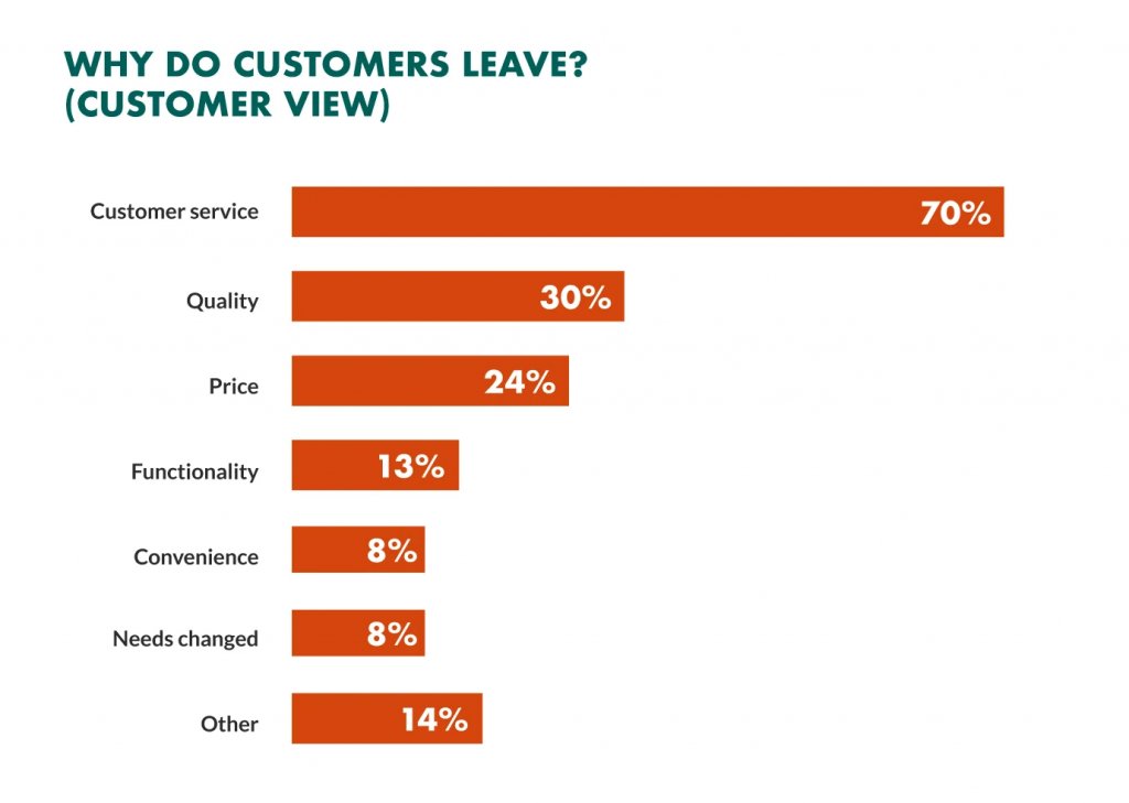
About 44% of businesses focus on customer acquisition, while only 18% focus on customer retention.
This lack of focus on customer retention has led to considerable losses in Saas and the eCommerce industry. It is estimated that such industries lose about 1.6 trillion dollars every year because of higher churn rates. A certain amount of churn rate is unavoidable in any business. However, there are always ways to reduce it.
Customer extension is all about earning customer loyalty, and you cannot earn loyalty in a day. You need to earn it day by day. Here’s our guide to reduce churn rate and increase customer satisfaction for your business. Before we move on, let’s understand what churn rate is.
What is the churn rate?
The number of customers who leave your business within a limited period measures customer churn, also known as attrition rate. The formula to calculate churn rate is:
Churn Rate% = Number of customers lost /Total no. of customers x 100
The acceptable churn rate for Saas-based companies lies between 3-5%. So, if your company’s churn rate goes above this, you have a reason to worry.
What are the reasons for the high churn rates in companies?
The reasons for a person leaving your product or service are often unique and personal to each customer. However, they often fall under some basic categories, which are:
Price: Price is often a common factor that turns customers into other options. If your product or service has a very high price range than your competitors, you are bound to lose clients quickly.
User experience: User experience is a crucial factor in customer retention and satisfaction. If your product or service doesn’t provide the desired user experience to your customers, they will look for other options.
Customer experience: How you interact with your existing customers and engage with them plays a vital role in increasing customer loyalty and chances of customer retention.
How to reduce the customer churn rate for your business?
Here are twelve tried and tested ways to help you reduce your customer churn rate successfully.
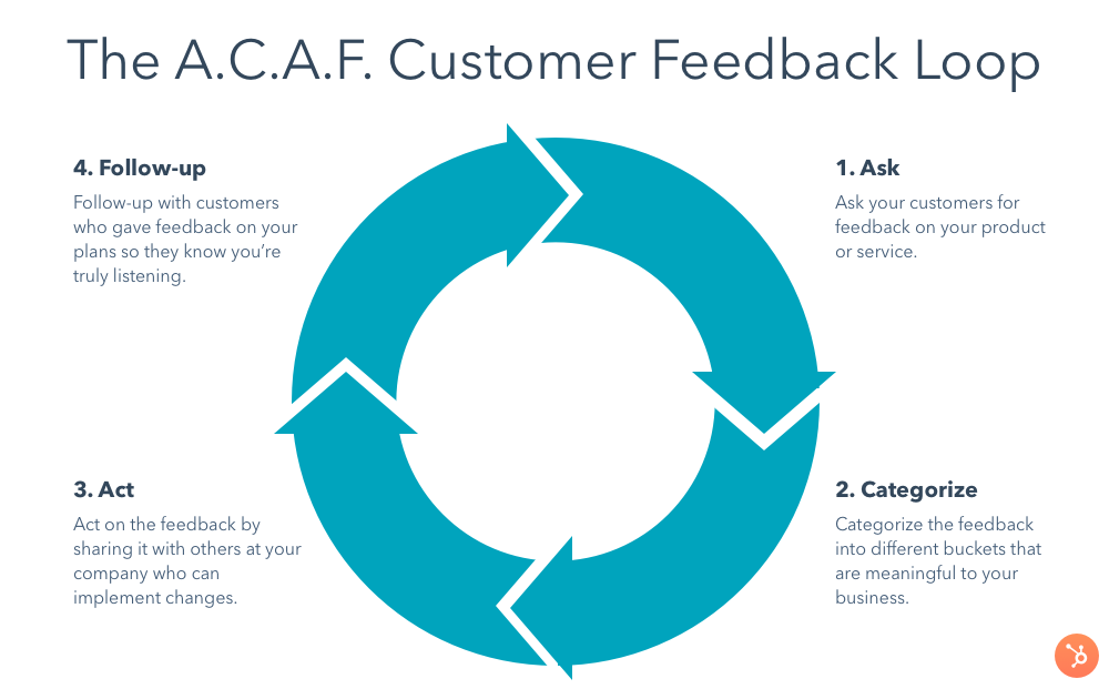
1. Identify the cause
For every problem, the resolution starts at finding the cause. And with a customer churn rate, the best place to start is the customers. To identify the causes of churn rate, start by:
Getting customer feedback: Customer feedback is a great way to know how customers feel about your products, services, and user experience.
Communicate with your customer success team: Your customer success team interacts with customers regularly and will have the best knowledge about customer expectations and problems. Connect with them regularly to know customer issues.
2. Increase your product quality
Studies show that 77% believe what makes them loyal to a product is its quality. So an increase in your product or service’s quality can significantly increase your client retention rates. Focus on enhancing the quality of your product by adding features that make your product more user-friendly and reliable. Add features more customers are looking for by understanding the feedback and customer complaints.
3. Create a roadmap for new products
Finding new customers is very challenging for businesses. Creating a roadmap that describes how the product should be used and benefit the customer can significantly increase sales chances.
Another critical point here is that an existing customer is 60% more likely to try your new product than a new one and is also a better source of revenue. Therefore, showing these roadmaps as videos, tutorials, webinars, etc., to existing customers can benefit even more.
4. Identify high-risk customers
There is always a certain number of customers for every business who are more likely to leave than others. Identifying and reaching out to these high-risk customers and making them stay through various tactics is one of the best ways to reduce your churn rate. The best way to identify high-risk customers is to look for those complaining about something and didn’t receive a satisfactory resolution. Or the other ones are those you have not reached out to in a long time.
5. Enhance your customer experience
Customer experience is one of the most crucial factors to improve when improving your customer churn rate. No matter how good your product is, if the customer experience is poor, they will eventually look for better options. Some ways to elevate your customer experience include:
Make your product or service as user-friendly as possible.
Personalize your product or service according to customer behavior and traits.
Keep track of significant customer service metrics to identify what is lacking in the overall experience and add better experiences.
Set up a grievance hearing and customer support platform and act on them.
Loyalty cannot be bought and has to be earned. However, that doesn’t mean we should not appreciate it. Find out the customers who have been loyal to your brand for a certain period and reward them for their loyalty with your loyalty programs. It will encourage them to stay with you longer and act as an incentive for relatively new customers to stay longer to earn the loyalty rewards.
Analyze what is common among these loyal customers and what will encourage them to stay longer the most. Sometimes it can be a money incentive other times. It can be privileged rights to a particular service, choose what motivates them the most.
7. Target the right audience
You must find the right customers in the first go to reduce the churn rate. The right audience is the one that values the services you provide and understands their importance. In contrast, a customer looking for just a short-term solution or a free offer will probably stop when that ends, no matter how good your retention strategies are.
Therefore, research thoroughly for the right audience at the beginning to avoid these churns.
8. Measure your churn metrics
Like every other business strategy, client retention strategies should also have a performance measurement mechanism. Set these measurement mechanisms and measure them at set time intervals, such as monthly or quarterly, to know how well your strategies work. Change your strategy according to the progress rates you see through these mechanisms.
9. Educate your customers
One of the most common reasons for customer dissatisfaction and attraction is that customers believe they should get more than what you provide as per your initial sales pitch. This confusion often causes high churn rates. To avoid that from happening, take the following measures:
Be transparent about your offering at every stage of campaigning and canvassing.
Use easy-to-understand language when communicating with clients.
Explain every feature and benefit of your product and service clearly.
Provide educational materials such as FAQs, videos, tutorials, and tours to potential and existing customers.
10. Get a competitive edge
Get a competitive edge against your competition by flaunting your USP in front of the customers. Also, provide consistency and higher quality in your services.
It will help them realize they are not just paying for a service they can get anywhere easily, but for an overall experience that won’t be the same anywhere else. Use your best reps to deal with demanding clients who are likely to leave quickly. They can explain to the leaving clients what they will miss out on if they leave.
11. Be consistent with feedback
Many businesses look for feedback about product reviews at the early stages of the relationship with the clients. However, they stop giving that much attention to older clients, leading to dissatisfaction and increased churn rates. Therefore, always be regular and prompt with the feedback and resolve any issues.
Start offering long-term contracts after the trial period ends. It will give customers the time to see the benefits of your services in action. And also reduce the risk of sudden dismissal of projects and increase churn rates.
Wrapping up
Churns are an unavoidable part of any business. However, an unending strive for excellence and putting customer satisfaction above anything else can help you a long way in reducing the attrition rate for your business to a bare minimum. Decreasing the churn rate is not just about the loss of revenue or growth prospects but a loss of reputation in the market. Therefore, it is prime time we focus on minimizing it.
[Kend C. Dodds]: […] ask anybody who’s done regular, old CSS and they’ll tell you that “I don’t know if it’s okay for me to change this, so I’m gonna duplicate it.” And now we’ve got – at PayPal (this is not made up) we had 90% unused CSS on the project I was using, because everybody was afraid to touch the old stuff. So we just duplicated something new and called it something else. And you might just say that we’re bad at CSS, but maybe CSS was bad at us, I don’t know… [laughter]
[Emma Bostain]: Well, that’s why styled-components and CSS-in-JS was so pivotal; it was like “Oh, hey, we can actually encapsulate all of this logic inside the component that it’s touching and don’t have to worry about bleeding code anymore.” It’s so much easier to delete things, and add things, and all of those things.
[Kend C. Dodds]: Yeah, you’re precisely right. That was the problem that those things were made to solve.
Audio clip:
I’ve heard this exact story before several times, usually from large companies. Lots of developers, typical developer turnover… nobody knows what CSS is actually used and what isn’t because that is a very hard problem.
That’s one of the reasons I sometimes like component-based-styling solutions (CSS-in-JS, if you’re nasty). Not because I love complex tooling. Not because I like JavaScript syntax better than CSS. Because of the co-location of styles and componentry. Because nobody is afraid of the styles anymore — they are tightly coupled to what they are styling. It’s not needed on every project, but if you’re building with components anyway (an awfully nice way to architect front-ends that doesn’t require JavaScript), you might as well style this way.
For this reason, I’m excited that “scoped styles” are making a bit of a comeback in standards discussions.
I remember an ancient idea (that maybe even shipped in browsers for a minute?) where you’d just chuck a block right in the HTML and whatever the parent was, the styles were scoped to that parent. That was so cool, I wish we could have that again.
But it seems like the newer stuff (here’s Miriam’s original proposal) has some more clever stuff that that basic concept doesn’t cover — like being able to set a lower-boundary in addition to an upper-boundary, making it possible to scope “donut-shaped” styles in the DOM (a Nicole Sullivan term). Whatever happens, shadow DOM-free scoped styles with zero tooling is huge.