Archive

Archive for November, 2021

Everything you need to Know about Visual Marketing

November 23rd, 2021 No comments

Visual marketing is the use of videos, images, infographics, gifs, and other visual elements to promote a product or service. The use of visual content for marketing has been on the rise for quite some time now, and it’s not hard to understand why.

For starters, the human brain processes visual data much faster than any other form of data. In fact, studies from the University of Minnesota show that our brains process images 60,000 times faster than text. That makes visuals a crucial element in the modern digital space where marketers compete with tons of distractions for consumers’ attention.

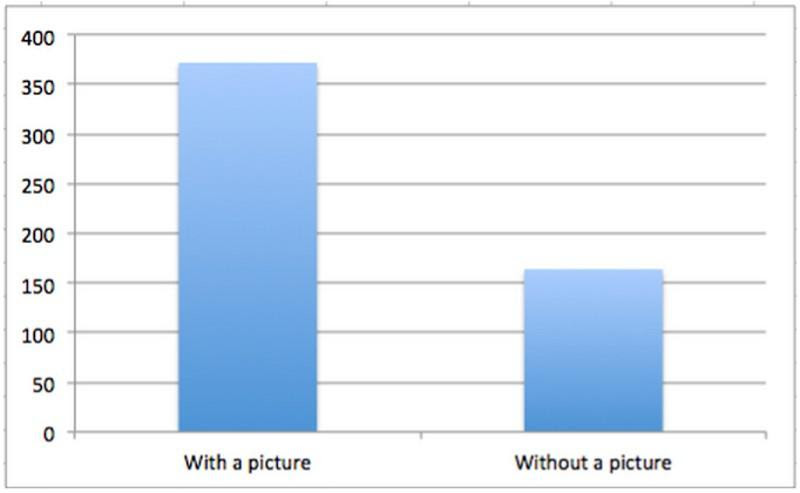
Additional research also shows that visual content generates more engagements than non-visual content. And this is seen on virtually all digital platforms. For example, a 2015 report by Buzzsumo showed content with visuals generates 2X more engagements on Facebook than content without any visuals.

Source

Lastly, people love visuals for the simple fact that they make content more appealing to the eye. That’s why smart content marketers break up their blog posts with an image after every few hundred words. The simple technique keeps readers engaged long enough to consume the message and hopefully perform the desired action.

It’s, therefore, clear that you need to add visuals to your digital marketing strategy. So here are five key items you need to know about visual marketing:

1. Visual search

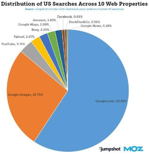
In 2017, image searches accounted for 26.79% of all searches done In the US. To give you some perspective, Google image search was only second to Google.com. That means it outperformed other search engines like Bing, Yahoo, and DuckduckGo.

Source

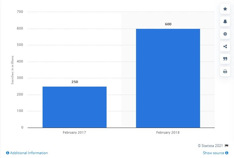
In addition to Google image searches, consumers are also using Pinterest Lens for image searches. In February 2017, approximately 250 million image searches were done through Pinterest Lens. The figure increased by 140% to hit 600 million in February 2018.

Source

These numbers show that visual search is a big deal, and your business should take advantage of it. But how exactly can you do that?

First, you need to understand how image searches work. Visual search engines use machine learning and AI to analyze the keywords or images used in the search query. They then search the internet to identify and serve relevant results.

If you want the search engine to present your images, optimize the metadata of your visual content. That means writing better alt texts and tags. 

It’s also helpful if you can be super specific in your descriptions. For instance, instead of writing “male jacket,” use something like “male black jacket” or “ black denim jacket for men.” These descriptions make it easy for search engine bots to match your content with search queries.

Besides writing enhanced alt texts and tags, you can also optimize your images for visual search in the following ways:

  • Use high-quality images
  • Optimize visual title with relevant keywords
  • Optimize image size
  • Write descriptive file names
  • Create an image sitemap

In summary, give your images some context with specific descriptions to increase their visibility. Make sure the description targets keywords that are relevant to the audience you want to attract. Lastly, use high-resolution images that are attractive to prospects.

2. Master the art of social selling

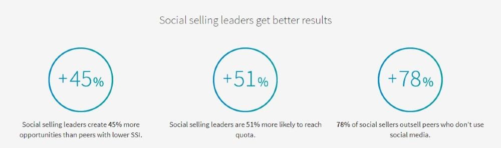
Social selling is the use of social media to connect and build meaningful relationships with prospects. Social selling can generate data that’ll enhance your overall CRM workflow. It also drives more sales and raises brand status.

Source

So how do you get started with social selling? First, you need to know where your audience hangs out. As you probably already know, different social media platforms attract different types of consumers. 

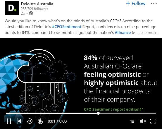
For example, LinkedIn sets itself apart as a platform for professionals. That means social selling on LinkedIn is a great idea for B2B businesses and anyone else selling products to professionals.

For example, Deloitte uses short videos to create powerful and engaging content for its vast audience of professionals. Most followers will readily interact with these videos instead of long paragraphs full of nothing but text.

Source

Aside from LinkedIn, Facebook is a powerful social selling platform for both B2C and B2B companies. Facebook Jobs has made the network a thriving market for job seekers and recruiters. It also comes in handy for workers looking for ways to upskill themselves and increase their value in the job market.

At Focus on Force, we use Facebook video ads to promote our Salesforce Certification Score Checker service. Below is a screenshot of one of our ads.

Why is video a popular social selling medium? 

First, they are more shareable than text-only content or static images. Second, videos catch and hold the user’s attention more effectively. Third, they allow you to cover topics in depth. That’s important on social media, where most people don’t want to read long essays.

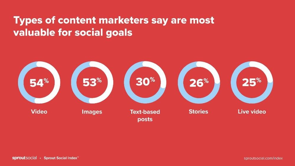
It’s no wonder that marketers say video is the most valuable type of content on social media.

Source

Here are some additional tips to get you started with social selling:

  • Understand your target audience
  • Create engaging content that provides real value to your audience
  • Interact with your followers
  • Post frequently
  • Use contests to build your following
  • Consider partnering with influencers
  • Adopt the right social media marketing tools
  • Consider running paid ads

Remember to measure and track your metrics. Look at the data and identify content that generates the most engagements and double down on it. That doesn’t mean you should ignore posts that are performing poorly. No, analyze such posts to identify why they’re producing poor results, then adjust strategy appropriately.

3. Create engaging content

Just because users prefer visual content doesn’t mean any visuals can give you the engagements and traffic you want. Consumers still value quality content. 

Therefore, don’t just focus on creating visual content. Create visual content that is super interactive. Your videos and images to be educational or entertaining, all while aligning with your brand message.

KFC understands the power of engaging content all too well. Check this out:

Source

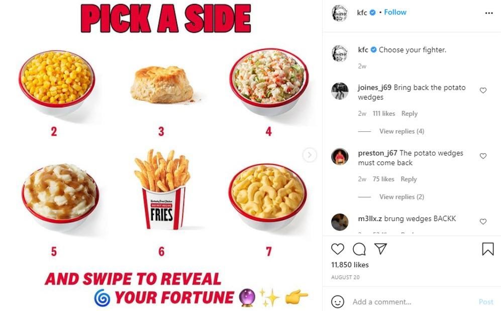
The post piques the reader’s curiosity. Almost everyone coming across the post will want to see what their favorite KFC meal says about them, so they’ll swipe to the next post. That results in higher engagements.

Use a similar approach to create visual content that encourages users to interact with your brand. And it doesn’t have to be on social networks alone. You can employ the same tactic in your marketing emails, blog posts, and other channels.

If you’re targeting leads at the bottom stages of your sales funnel, you’ll need to provide slightly different types of content. You want to provide resources that people would find engaging and which aids conversions. At Focus on Force, we rely heavily on customer testimonials and interviews.

Here is an example of one such interview.

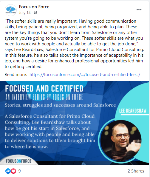
The graphic for the post provides a synopsis of the interview and highlights the interviewee. The copy provides more context to the story.

Using this type of content in your visual marketing campaigns gives your customers a human face. A nice bonus is that you’ll often find friends and professional acquaintances of the person sharing your story. That helps increase the reach of your content.

4. Make use of augmented reality

Augmented reality is quickly becoming an integral part of visual marketing. That’s especially true in the eCommerce industry.

Through this technology, online stores give potential customers an interactive shopping experience. It helps buyers see how well a product looks on them without physically touching it.

Ikea is one of the big brands using this technology:

Source

In addition to showing how good the furniture would look in the room, the AR application also shows the user whether the furniture would fit in a certain space or not.

5. Utilize user-generated content

User-generated content (UGC) is a powerful tool in visual marketing. Research shows that UGC generates five times more sales than professionally created content. 

Source

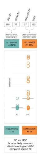
UGC outperforms branded content because the latter suffers from customer skepticism. Consumers believe that brands exaggerate visuals to make products look more appealing than they are. On the other hand, user-generated content is more authentic since it comes from real and impartial customers.

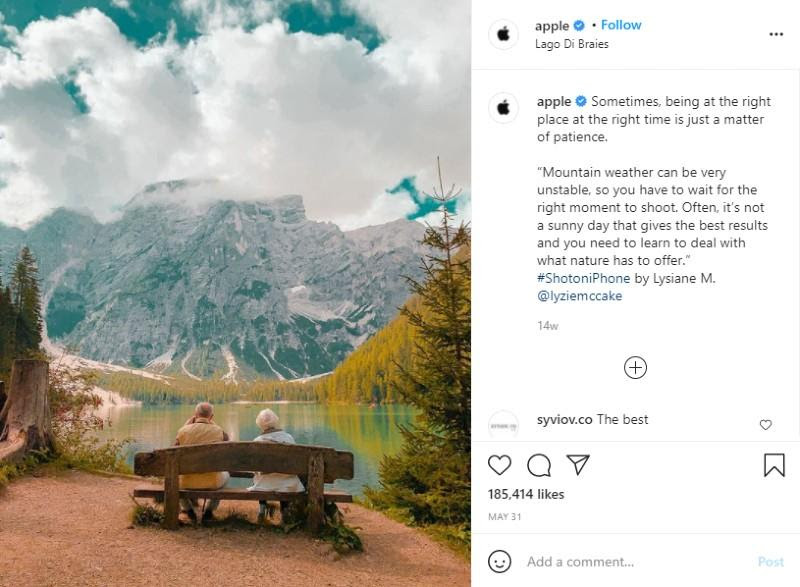
Apple does a great job of using UGC. The company’s Instagram page is made up of content created by random users of their products. The content generates incredible engagements.

Source

Therefore, UGC should be a top priority in your visual marketing campaigns. Aside from generating more sales, UGC can also boost your brand reputation since it centers on customer experiences.

Wrapping Up

Visual marketing is an essential element of any digital marketing strategy. Just look at the top brands, from Nike to coca-cola, and you will notice a consistent theme – they’re all taking full advantage of visuals. And so should you.

So, optimize your content for visual searches and make images part of your social selling strategy. Keep in mind that customers still value useful content. Therefore, create images that are helpful to your audience. If you have an eCommerce store, use augmented reality to enhance the customer experience.

Finally, take full advantage of user-generated content. Customers trust it more than branded content because it comes from people who have used your product. Using UGC will help your potential customers see themselves using your services to solve their problems.

Categories: Others Tags:

On User Tracking and Industry Standards on Privacy

November 22nd, 2021 No comments

Inspired by Eva PenzeyMoog’s new book, Jeremy highlights the widespread user tracking situation in this industry:

There was a line that really stood out to me:

The idea that it’s alright to do whatever unethical thing is currently the industry norm is widespread in tech, and dangerous.

It stood out to me because I had been thinking about certain practices that are widespread, accepted, and yet strike me as deeply problematic. These practices involve tracking users.

And ends with zero minced words:

We should stop stop tracking users because it’s wrong.

I take notice here, as I’m largely complicit when it comes to some degree of user tracking. For example, I have Google Analytics on this site. And pertinent to the topic: I have for well over a decade. I mention that not to prove that it’s OK, but almost to question it more, because it’s such a widespread long-term industry standard that is rarely questioned.

Because I have Google Analytics¹ on this site, I can take zoomed-out looks at the long-term traffic on this site. Here’s a 10-year period:

I realize that even this screenshot of a chart may be abhorrent to some, as it was collected from users who did not explicitly consent.

Or I can see how year-over-year mobile traffic on this site has gone down nearly 6%.

Weird.

I don’t send any personal information to Google Analytics. I don’t know who did what — I can only see anonymous aggregate data. Not only is it literally against Google policy to do so:

The Analytics terms of service, which all Analytics customers must adhere to, prohibits sending personally identifiable information (PII) to Analytics (such as names, social security numbers, email addresses, or any similar data), or data that permanently identifies a particular device.

… but I have a much clearer ethical line in my head there — that’s not something I’m comfortable with. Even when I’ve implemented user tracking that does tie a particular user to a particular action, it’s still anonymized such that it’s impossible for me to tell from using that tool who has done what.

But I understand that even this “anonymous” tracking is what is being questioned here. For example, just because what I send is anonymous, it doesn’t mean that attempts can’t be made to try to figure out exactly who is doing what by whoever has that data.

Switching the focus to email, I do use MailChimp to send the email newsletter on this site, and I haven’t done anything special with the settings to increase or decrease how much tracking happens when a newsletter is sent. As such, I can see data, like how many people I send to, how many open it, and how many clicks happened:

As I write this, I’m poking around in the reporting section to see what else I can see. Ughghk, guess what? I can literally see exactly who opened the email (by the person’s email address) and which links they clicked. I didn’t even realize that until now, but wow, that’s very super personally identifiable analytics information. I’m going to look into how I can turn that off because it does cross an ethical line for me.

There is also a brand new mini-war happening with email tracking (not the first, as I remember the uproar when Gmail started proxying images through their own servers, thus “breaking” the accuracy tracker pixel images). This time, it’s Apple doing more aggressive blocking, and companies like MailChimp having to tell customers it is going to mess with their analytics:

Apple Mail in macOS Monterey
Warning on the MailChimp reporting screen

I’m interested not just in the ethical concerns and my long-time complacency with industry norms, but also as someone who very literally sells advertising. I can tell you these things are true:

  • I have meetings about pricing where the decisions are based on the historical performance of what is being sold, meaning impressions and clicks.
  • The vast majority of first conversations between bag-of-money-holding advertisers and publishers like me, the very first questions I’m asked are about performance metrics.

That feels largely OK to me. When I go to the store to buy walnuts, I want to know how many walnuts I’m going to get for my dollar. I expect the store to price the walnuts based on normal economic factors, like how much they cost and the supply/demand for walnuts. The advertising buyers are the walnut buyers — they want to know what kind of performance an ad is likely to get for their dollar.

What if I said: I don’t know? I don’t know how many people see these ads. I don’t know how many people click these ads. I don’t know where they are from. I don’t know anything at all. And more, you aren’t allowed to know either. You can give me a URL to send them to, but it cannot have tracking params on it and we won’t be tracking the clicks on it.

Would I lose money? I gotta tell you readers: yes. In the short-term, anyway. It’s hard enough to land advertisers as it is. Coming off as standoffish and unwilling to tell them how many walnuts they are going to get for their dollar is going to make them roll their eyes and move on. Long-term, I bet it could be done. Tell advertisers (and the world) up front, very clearly, your stance on user tracking and how it means that you don’t have and won’t provide numbers via tracking. Lean on supply and demand entirely. Price spots at $X to start. If other people have interest in the spot, raise the price until it stops selling, lower the price if it does. I bet it could be done.

To be honest, I’m not ready to tip my apple cart yet. I have a mortgage. I have employees to pay. I absolutely do not have a war chest to dip into to ride out a major income shortage. If I lost most of my advertising income I would just… fail. Close up shop. Be forced to make other dramatic life changes to deal with it. And I just don’t want to. It doesn’t feel like rolling the dice, because that implies I might win big. But if I were to take a hardline stance with advertisers, telling them that I provide zero data, “winning big” is merely getting back to the baseline for me.


I write all this just to help me think about it. I don’t want to sound like I’m being defensive. If I come across that way, I’d blame my own inertia for following what have felt like industry standards for so long, and being indoctrinated that those practices are just fine. I don’t feel like I’m crossing major ethical boundaries at the moment, but I’d rather be someone who questions myself and takes action when appropriate rather than tying a bandana over my eyes.

  1. I have tried other analytics services, like Plausible, that are more specifically privacy-focused.

The post On User Tracking and Industry Standards on Privacy appeared first on CSS-Tricks. You can support CSS-Tricks by being an MVP Supporter.

Categories: Designing, Others Tags:

CSS “decorations”

November 22nd, 2021 No comments

A reader wrote to me the other day asking about this bit of CSS they came across in Wikipedia’s Common.css:

.mw-collapsible-leftside-toggle .mw-collapsible-toggle {
  /* @noflip */
  float: left;
  /* @noflip */
  text-align: left;
}

What’s that @noflip business? That’s what they are calling a “CSS decorator” and I think that’s a fine term for it. Really they are just CSS comments, but clearly there is more going on here as those look like programmatic statements that have functionality.

Without some kind of CSS processing, those comments will do nothing. Off the top of my head, I’m not 100% sure what CSS processor is in use here, but I think it’s reasonable to assume that when it runs, it produces a “right-to-left” stylesheet that turns float: left into float: right and text-align: left into text-align: right.

I think it’s worth noting that it’s probably smarter these days to use the natively supported text-align: start so that you don’t have to rely on CSS processing and alternate stylesheets to help you. I don’t think there is a “logical” equivalent for float, unfortunately, but there may be a way to refactor the layout (using grid?) such that “flipping” is unnecessary. Although, wrapping elements around an element is pretty unique to float, so there might not be a simple alternative here.

Searching around a little, it seems like the source of /* @noflip */ is CSSJanus.

The repo suggests it’s made by Wikimedia, so I think that’s a solved case. It looks like the tech has made it’s way to other things, like a plugin for styled-components, a plugin for Sublime Text, and Salesforce even used it in their design system.

There is another processor called css-flip (archived, from Twitter) that looks like it did the exact same thing, and the README shows just how many properties might need this:

background-positionbackground-position-xborder-bottom-left-radiusborder-bottom-right-radiusborder-colorborder-leftborder-left-colorborder-left-styleborder-left-widthborder-radiusborder-rightborder-right-colorborder-right-styleborder-right-widthborder-styleborder-top-left-radiusborder-top-right-radiusborder-widthbox-shadowcleardirectionfloatleftmarginmargin-leftmargin-rightpaddingpadding-leftpadding-rightrighttext-align transition transition-property

It would have hugely surprised me if there wasn’t a PostCSS plugin for this, and a little searching turned up postcss-rtl, but alas, it’s also been deprecated by the owner.


This all started with talking about “CSS decorators” though, which I guess we’re defining as “CSS comments that have processor directives in them.” The one I personally use the most is this:

/* prettier-ignore */
.cool {
  linear-gradient(
    to left,
    pink
    pink 20%
    red  20%
    red
  )
}

I love Prettier, but if I take the time to format a bit of CSS myself for readability, I’ll chuck a /* prettier-ignore */ on the previous line so it doesn’t mess with it.

Do you use any CSS decorators in your codebases?


The post CSS “decorations” appeared first on CSS-Tricks. You can support CSS-Tricks by being an MVP Supporter.

Categories: Designing, Others Tags:

20 Best New Websites, November 2021

November 22nd, 2021 No comments

Welcome to this month’s round up of what has caught our eye on the web. As it’s November we’re going to help chase those winter blues away with some color.

Color does so much of the heavy lifting in visual design. It can create a mood, reinforce a brand identity, establish a hierarchy, differentiate sections, highlight type or reduce it; color even makes a statement by its absence.

Good use of color isn’t just about getting the most appropriate color scheme for the subject, it’s also about how much color to use, and where to use it. In this collection we’ve included a range of use examples from bright and full of color, to restrained with subtle tones. Enjoy!

Toboggang

There’s a pleasing UPA cartoon feel to the colors and type in this compact portfolio site.

On

On digital technology studio keep things simple with a black on light blue, and infinite scrolling.

re_

A pleasing mix of reds, greens, pinks, and golds liven up a simple grid layout for re_ package free grocery store.

LA Art Box

This site for LA Art Box makes great use of horizontal scrolling and animated transitions.

JYZ Design

Strong color and geometric shapes create a vibrant feel for JYZ Design’s company site.

Hyperframe

Hyperframe’s site takes on board the ‘show, don’t tell’ theory by cleverly using on scroll animation to demonstrate its product’s major selling point.

Rebecca Atwood

Rebecca Atwood’s site combines product shots with a color scheme that reflects the aesthetic of her designs.

Natural Paint Co.

For any paint company, displaying the available colors is a central function of their site. Natural Paint Co. do a really nice job of this with an interactive picker that changes the background color of the window.

Piaule Catskill

Beautiful photography and minimal text do a great job of selling the experience of Piaule Catskill cabins, and the horizontal scrolling on desktop adds extra focus. I found myself looking up flights to New York…

Rose Delights

There is a vintage, hand made quality to the mix of video and photographs on Rose’s home page, that creates a sense of warmth. The transparent mail list sign up is nicely non-invasive.

Voila

This site for Voila instant coffee creates a modern feel with fresh pastel colors balanced by a grounding dark blue.

Chiwawa

Wrestling masks, skeletons and lots of tone on tone color makes this a lively and appealing site for Chiwawa cantina.

HI(NY)

Keeping the rest of the design elements minimal here allows the movement of content areas not become cluttered and fussy feeling.

Think Tank Team

The divided square motif on the Think Tank Team homepage is a nice visual metaphor for building blocks coming together to create a whole.

Just Egg

Lots of yellow, and food close ups in the what part of Just Egg’s site is bold and confident. But the how section with its scrolling animation is the really good bit.

Moooi Paper Play

Although not a standalone site, this is a very pleasing animation centred around a particular product from Moooi.

Maersk Upside

Logistics giant Maersk have added a more user-friendly and visually engaging section to their corporate site, with use cases and real case studies.

Sol’ace

The color palette for Sol’ace furniture is has been carefully chosen to reflect the idea of luxury and natural materials.

Terra

A good mixture of standalone product shots and styled photographs works well here. The navigation options–shop by type, material or collection–have been well thought out too.

Thanxiety

And finally, for our readers in the US, Thanxiety is a carefully chosen collection of conversation topics to help avoid any uncomfortable silences, or family rows, around the dinner table at Thanksgiving. (And maybe the rest of us could use it on other holidays…)

Source

The post 20 Best New Websites, November 2021 first appeared on Webdesigner Depot.

Categories: Designing, Others Tags:

Popular Design News of the Week: November 15, 2021 – November 21, 2021

November 21st, 2021 No comments

Every day design fans submit incredible industry stories to our sister-site, Webdesigner News. Our colleagues sift through it, selecting the very best stories from the design, UX, tech, and development worlds and posting them live on the site.

The best way to keep up with the most important stories for web professionals is to subscribe to Webdesigner News or check out the site regularly. However, in case you missed a day this week, here’s a handy compilation of the top curated stories from the last seven days. Enjoy!

The 9 Best XAMPP Alternatives for Hosting your Website Locally

Exciting New Tools for Designers, November 2021

Why Developers are so Divided Over WordPress

Step-by-Step Guide: How to Design a Website Homepage

How to Build F and Z-Patterns Using HTML and CSS

UX Design Psychology Tricks for Design Excellence

What if Phones were Actually Designed for Hands?

Dddoodle – Collection of Fun Hand-Drawn Illustrations in SVG Format

Layout Patterns – Collection of Layout Patterns Built Using CSS

22 Impressive Web Design Concepts for Various Business Objectives

Source

The post Popular Design News of the Week: November 15, 2021 – November 21, 2021 first appeared on Webdesigner Depot.

Categories: Designing, Others Tags:

Reimagine Atomic CSS

November 19th, 2021 No comments

I’m not the biggest fan of Atomic CSS myself. I don’t like all the classes. I like to express my styles in CSS because I find CSS… good. But I appreciate that a lot of people seem to like it, and it does have some clear advantages, like the fact that the generated stylesheet is generally smaller than hand-rolled CSS authored other ways—plus, the available classes are like guardrails that ensure more consistent usage in a design system.

I also appreciate that innovation is happening in this space. It seems to have gone from:

Here’s a billion classes you can use, but hey, at least the CSS is still fairly small and won’t change!

To:

Yes, that, but we’re going to strip away the ones you aren’t using.

And now:

We’re going to generate the stylesheet on the fly based on what you do use.

Anthony Fu breaks down this history nicely in “Reimagine Atomic CSS” where he then throws his hat in the ring taking things one step further with UnoCSS. I can’t say I fully understand it all, but it looks like it can do anything that its predecessors can do but more, largely via rule configurations. It’s also fast (based on vite), and I’m always a fan of fast tools—especially where the goal is a tightly authored feedback loop.

It looks rather complex to me and seems to have limited integrations. I’m not a fan of the bit that turns styles into arbitrary HTML attributes. If they were, like, JSX props, that’s fine. But I think HTML attributes that go all the way to the DOM are dangerous and should be data-* scoped.

At the same time, I always like it when people think through problems and share their thought processes for solving them like Anthony has done here. Plus, there is a playground and that’s fun.

To Shared LinkPermalink on CSS-Tricks


The post Reimagine Atomic CSS appeared first on CSS-Tricks. You can support CSS-Tricks by being an MVP Supporter.

Categories: Designing, Others Tags:

Coding Font Game

November 19th, 2021 No comments

A tournament bracket UI where you pick your favorite between two coding fonts and your choices are whittled down all the way to a final winner. A clever way to suss out your own taste and arrive at a choice.

(P.S. We have our own little coding fonts website to showcase some high-quality favorites.)

Wenting Zhang documented in a newsletter that she built it the whole thing with Retool, meaning she had to write very little code directly, and instead used pre-built components. That’s kind of the point of Retool. It’s like a UI library with existing components for building stuff out quickly, but it goes the extra mile in connecting to your own data.

Five years ago, if I wanted to build this coding font game, I would have had to spend days or weeks hand-coding it in React or other frameworks. But since then, I have discovered no code and low code apps which are essentially libraries of pre-existing informational or functional things. They can be powered by a database or an API, and the interaction layer is standard, often with minimal customization needs.

The two bits of code shared in that post look… pretty complicated. So, in this case, it’s a “low code” thing where those bits of code really hone in on the core functionality and experience, but a lot of the rest of the more mundane and boilerplate code is avoided. Seems compelling to me. In the end, the whole “game” is an pointing to the Retool widget thing.


The post Coding Font Game appeared first on CSS-Tricks. You can support CSS-Tricks by being an MVP Supporter.

Categories: Designing, Others Tags:

Creative Problem Solving for UX Designers

November 19th, 2021 No comments

It’s normal to pull up sharp in front of a problem; after all, if there was a known solution, it wouldn’t be a problem. But knowing that it’s normal, doesn’t make encountering problems any less frustrating. So how do we avoid sitting in front of a UX problem for hours, achieving nothing?

That’s what creative problem solving is all about.

In this post, we’ll explore creative problem solving, and how it can help you as a UX designer. Then we’ll analyze how you can solve UX problems in a few, easy-to-remember steps. By the end of this article, you’ll have all the tips you need for UX problem-solving.

What is Creative Problem Solving?

Creative problem solving is a term developed by Alex Osborn, the founder of the Creative Education Foundation. In a nutshell, this term is about overcoming challenges in our work lives through innovative solutions. But, of course, such solutions vary by profession.

For UX designers, creative problem solving is about solving UX problems with efficient tactics, that work. And that’s precisely why UX problem solving is so essential because following a specific method can help us avoid getting stuck.

Whether you are a newbie or an experienced designer, you are probably focused on projects that require you to solve problems. If you have never had a problem before, you must be a superhero; for us mere mortals, here are the steps we need to follow to solve a UX problem:

UX Problem Solving in 5 Easy Steps

Delivering a great UX solution is influenced by two key parameters: user research and creative problem-solving. Suppose you have done your user research and are currently looking for an original solution to a problem. In this case, the methodology below will be handy:

1. Identify the UX Problem

I know this may sound obvious, but think about it. How many times have we lost days because we didn’t identify the real problem? If you are solving the wrong problem, it does not matter if your solution is original and innovative.

That’s why the first thing you need to do is think about the problem. Ask yourself what the real problem is, and then get to work solving it. Identifying the problem may take some time, but it will prove beneficial to your project in the long run.

2. Clarify the UX Problem

Now that you have identified the UX problem, it’s time to demystify it. In this step, you could create a user journey plan. It does not have to be perfect; some low-fidelity sketches are more than enough.

Set a timer and start visualizing your solution on paper. Remember, sketching is not about perfection or fine details. Once you have created a customer journey you are happy with, it’s time to move on to the next step.

3. Use Analytics

UX design isn’t about design per se. It’s also about numbers and data. This is why analytics are critical to UX problem-solving. Once you have gathered some data from users and competitors, it’s time to create patterns. This will help you better understand the problem and change your drafts accordingly.

Numbers and data alone can help you a lot if you combine them with an original idea. However, facts alone are not enough, and your original story will not be compelling without them. So what’s better than combining them?

4. Use Your Feedback

So you have come up with an innovative solution to the UX problem. You have successfully combined this idea with essential data. Unfortunately, your work is not yet done. 

The next step is equally important. Once you have polished your ideas, you should share them with colleagues and/or customers.

It’s not easy to get feedback for your UX mapping, but it’s very constructive and will ultimately make you a better designer.

5. Solve the Problem

The last step is also the most fun. Once you have listened to people’s feedback, you can redesign your original solution. Then you are just one step away from solving the UX problem. Now it’s time to digitally redesign your idea.

This is the step where fine details matter. Creating a high-fidelity wireframe is not easy, but most UX designers have the knowledge and tools to get it done.

UX Problem Solving: Useful Tips and Tricks

Be Methodical

In my opinion, this is the most useful tip when it comes to UX problem-solving. You do not always have to be in a hurry. In the early stages of a project, try not to get distracted by other problems. Focus on finding the real problem.

Once you are sure you have found it, you can move on to finding the best solution. Then move on to the next step and so on. It becomes clear that being methodical is a brilliant tactic.

UX Problem Solving is All about the Ecosystem

UX problem solving is not about fine details. So try to care less about the design and more about the ecosystem you want to create. That will help you gather all the data you need, from user opinions to analytics.

Low-Fidelity vs. High-Fidelity Wireframes

Starting with sketches and low-fidelity wireframes is a brilliant thing to do. Whenever I have tried to start a project directly with high-fidelity wireframes, I have gotten bogged down in details.

For this reason, pen and paper should be your best friends in UX problem-solving. Sketches help you explore different approaches and get the feedback you need.

Explore Different Tools/Approaches

When it comes to solving a UX problem, there is usually one efficient solution. But that is not always the case. In most cases, we have to consider different alternatives and identify more than one critical interaction.

For this reason, feedback is also crucial for UX problem-solving. Your colleagues and customers will help you find the best method. Try to accept criticism and be open when listening to feedback. This way, you will ensure that you will find the best possible solution.

Wrap Up

Solving a UX problem is not easy. However, if you identify the real problem and illustrate different approaches, you will be on the right track. Also, do not neglect to use the data and feedback you collect. The more tools you have in hand, the better UX designer you will be.


Featured image via Unsplash.

Source

The post Creative Problem Solving for UX Designers first appeared on Webdesigner Depot.

Categories: Designing, Others Tags:

PHP Date and Time Recipes

November 18th, 2021 No comments

Dealing with dates and times is one of those things that can frustrate programmers a lot. At the same time, they are fundamental to software development, used from everything from meta and how things are ordered to time-based triggers and lots in between.

Dates and times are prone to errors too. Handle them incorrectly, and they can confuse end-users and fellow programmers alike.

This is a quick guide to dealing with dates and times specifically in the PHP programming language. It’s meant to be a reference to the most common needs you’ll have, like formatting and adjusting dates. It’s simple, but it’s likely going to cover 80% of your needs.

Table of contents

This research is brought to you by support from Frontend Masters, CSS-Tricks’ official learning partner.

Need front-end development training?

Frontend Masters is the best place to get it. They have courses on all the most important front-end technologies. Interested in going full-stack? Here’s your best bet:


Get the current date and time

One thing to know is that the dates and times can be represented in three forms: a timestamp (i.e. epoch time), a DateTime object, and a string.

First up, a recipe to get the current date and time:

<?php

$now = new DateTime();
var_dump($now);

// object(DateTime)#1 (3) {
//   ["date"]=>
//   string(26) "2021-10-13 22:25:11.790490"
//   ["timezone_type"]=>
//   int(3)
//   ["timezone"]=>
//   string(12) "Asia/Jakarta"
// }

This provides a DateTime object that can be used to create a date and time string:

<?php

$now = new DateTime();
echo $now->format("Y-m-d"); // 2021-10-13
echo $now->format("Y-m-d h:i:s A"); // 2021-10-13 10:10:31 PM

Intuitively, you know that Y refers to the year, m refers to the month, d refers to the day of the month, and so on. The full list of the parameters can be found in the PHP manual, but I’ll drop some of the most common ones here for reference.

Day of the month
d Day of the month. two digits with leading zeros 01 – 31
j Day of the month without leading zeros 1 – 31
S Includes the English suffix. stndrdth (e.g. 1st2nd3rd4th)
Weekday
D Abbreviated textual representation of a day, in three letters Sun – Sat
l A full textual representation of a weekday. Sunday – Saturday
Month
F A full textual representation of a month, such as January or March January – December
M Abbreviated textual representation of a month, in three letters Jan – Dec
m Numeric representation of a month, with leading zeros 01 – 12
n Numeric representation of a month, without leading zeros 1 – 12
Year
Y A full numeric representation of a year, 4 digits E.g. 1999 or 2003
y A two digit representation of a year E.g. 99 or 03
Time
A Uppercase Ante Meridiem and Post Meridiem AM or PM
g 12-hour format of an hour without leading zeros 1 – 12
h 12-hour format of an hour with leading zeros 01 – 12
i Minutes with leading zeros 00 – 59
s Seconds with leading zeros 00 – 59

The DateTime object can be converted to a timestamp:

<?php

$now = new DateTime();
echo $now->getTimestamp(); // 1634139081

But we can also get the current time in timestamp without constructing a DateTime object:

<?php

echo time(); // 1634139081

Construct a DateTime object of a specific time

What if we want to construct a DateTime for a particular time, like July 14th, 2011? We can pass a formatted string date to the constructor:

<?php

$date = new DateTime("2011-07-14");
var_dump($date);

// object(DateTime)#1 (3) {
//   ["date"]=>
//   string(26) "2011-07-14 00:00:00.000000"
//   ["timezone_type"]=>
//   int(3)
//   ["timezone"]=>
//   string(12) "Asia/Jakarta"
// }

The constructor accepts other formats as well:

<?php

$date = new DateTime("14-07-2011");
var_dump($date);

// object(DateTime)#1 (3) {
//   ["date"]=>
//   string(26) "2011-07-14 00:00:00.000000"
//   ["timezone_type"]=>
//   int(3)
//   ["timezone"]=>
//   string(12) "Asia/Jakarta"
// }

But be careful with an ambiguous format, like this:

<?php

$date = new DateTime("07/14/2011");
var_dump($date);

// object(DateTime)#1 (3) {
//   ["date"]=>
//   string(26) "2011-07-14 00:00:00.000000"
//   ["timezone_type"]=>
//   int(3)
//   ["timezone"]=>
//   string(12) "Asia/Jakarta"
// }

You might think that everyone should be familiar with an American date format. But not everyone is and it might be interpreted differently. Not PostgreSQL.

CREATE TABLE IF NOT EXISTS public.datetime_demo
(
  created_at date
);

insert into datetime_demo (created_at) values ('07/12/2011');

select created_at from datetime_demo; /* 2011-12-07 */

You may have thought that would return July 12th, 2011, but it was December 7th, 2011, instead. A better way is to use an explicit format:

<?php

$date = DateTime::createFromFormat('m/d/y', "10/08/21");
var_dump($date);

//object(DateTime)#2 (3) {
//  ["date"]=>
//  string(26) "2021-10-08 16:00:47.000000"
//  ["timezone_type"]=>
//  int(3)
//  ["timezone"]=>
//  string(12) "Asia/Jakarta"
//}

What if we want to construct a DateTime object from a timestamp?

<?php

$date = new DateTime();
$date->setTimestamp(1634142890);
var_dump($date);

//object(DateTime)#1 (3) {
//  ["date"]=>
//  string(26) "2021-10-13 23:34:50.000000"
//  ["timezone_type"]=>
//  int(3)
//  ["timezone"]=>
//  string(12) "Asia/Jakarta"
// }

We don’t have to create a DateTime object if we want to convert a timestamp object to a formatted date string:

<?php

echo date("Y-m-d h:i A", time()); // 2021-10-14 04:10 PM

Timezones

We can create a DateTime object that includes timezone information, like if we’re dealing with Pacific Standard Time, Eastern Daylight Time, etc.

<?php

$timezone = new DateTimeZone("America/New_York");
$date = new DateTime("2021-10-13 05:00", $timezone);
var_dump($date);

// object(DateTime)#1 (3) {
//   ["date"]=>
//   string(26) "2021-10-13 05:00:00.000000"
//   ["timezone_type"]=>
//   int(3)
//   ["timezone"]=>
//   string(16) "America/New_York"
// }

// Eastern Daylight Time, for example: New York
$date = new DateTime("2021-10-13 05:00 EDT");
var_dump($date);

// object(DateTime)#2 (3) {
//   ["date"]=>
//   string(26) "2021-10-13 05:00:00.000000"
//   ["timezone_type"]=>
//   int(2)
//   ["timezone"]=>
//   string(3) "EDT"
// }

$date = new DateTime("2021-10-13 05:00 -04:00");
var_dump($date);

// object(DateTime)#1 (3) {
//   ["date"]=>
//   string(26) "2021-10-13 05:00:00.000000"
//   ["timezone_type"]=>
//   int(1)
//   ["timezone"]=>
//   string(6) "-04:00"
// }

There are three ways to create a DateTime object with timezone information. The timezone_type accepts different values for each one.

But say we want to convert a date and time that’s displayed in New York’s timezone to display Jakarta’s timezone instead?

<?php

$newYorkTimeZone = new DateTimeZone("America/New_York");
$date = new DateTime("2021-11-11 05:00", $newYorkTimeZone);
echo $date->format("Y-m-d h:i A"); // 2021-11-11 05:00 AM
$jakartaTimeZone = new DateTimeZone("Asia/Jakarta");
$date->setTimeZone($jakartaTimeZone);
echo $date->format("Y-m-d h:i A"); // 2021-11-11 05:00 PM

When it’s 05:00 AM in New York, it’s 05:00 PM in Jakarta on the same day. Jakarta is 12 hours ahead of New York on November 11th 2021. But one month earlier, Jakarta is only 11 hours ahead of New York as shown below:

<?php

$newYorkTimeZone = new DateTimeZone("America/New_York");
$date = new DateTime("2021-10-11 05:00", $newYorkTimeZone);
echo $date->format("Y-m-d h:i A"); // 2021-10-11 05:00 AM
$jakartaTimeZone = new DateTimeZone("Asia/Jakarta");
$date->setTimeZone($jakartaTimeZone);
echo $date->format("Y-m-d h:i A"); // 2021-10-11 04:00 PM

PHP handles Daylight Saving Time for you automatically.

Localization

This is a common way to display date and time in the United States:

<?php

$now = new DateTime();
echo $now->format("m/d/Y h:i A"); // 10/14/2021 03:00 PM

But someone in France might prefer something more common to their locale. C’est horrible, they’d complain. For one, nobody puts the month before month day, except the U.S. Second, France doesn’t use AM or PM — they use the 24-hour format (e.g. 14:00 instead of 2:00 PM) like the military. This is how you make a French local happy.

<?php

$now = new DateTime();
echo $now->format("d/m/Y H:i"); // 14/10/2021 15:00

But this requires an intimate knowledge about a specific country or area. Instead, we can localize the date. To localize a date in PHP, first check for support for a particular language.

In this example, we’re using the French. In Ubuntu, install the French language pack:

$ sudo apt-get install language-pack-fr

Use the strftime() function to localize a date:

<?php

setlocale(LC_TIME, "en_US.UTF-8"); // Check for U.S. English support
echo strftime("%x %X"); // 10/14/21 03:37:59 PM
setlocale(LC_TIME, "fr_FR.UTF-8"); // Check for French support
echo strftime("%x %X"); // 14/10/2021 15:37:31

All of the parameters for strftime are documented in the PHP manual.

Time travel

Let’s do time travel to the past and the future. First, let’s get acquainted with DateInterval:

<?php

$interval = new DateInterval("P4M1W2DT2H5M");

// P 4M 1W 2D T 2H 5M
//
// P = Period interval (years, months, weeks, days)
// 4M = 4 months
// 1W = 1 week
// 2D = 2 days
//
// T = Time interval (hours, minutes, seconds)
// 2H = 2 hours
// 5M = 5 minutes

The P and T are to separate period interval and time interval. Here’s how we can travel to the future:

<?php

$date = new DateTime("2021-10-14");
$interval = new DateInterval("P2D"); // 2 days
$futureDate = $date->add($interval);
echo $futureDate->format("Y-m-d"); // 2021-10-16

And here’s how we go back in time:

<?php

$date = new DateTime("2021-10-14 10:00");
$interval = new DateInterval("PT6H"); // 6 hours
$pastDate = $date->sub($interval);
echo $pastDate->format("Y-m-d H:i"); // 2021-10-14 04:00

If we want to time travel with the name of the weekday, we can combine the strtotime() function and the setTimestamp() method of a DateTime object:

<?php

$nextTuesday = strtotime("next tuesday");
$date = new DateTime("2021-10-14");
$date->setTimestamp($nextTuesday);
echo $date->format("Y-m-d"); // 2021-10-19

See the full list of strtotime() parameters in the PHP docs.

Recurring dates and times

It’s a common feature in calendar apps to set a reminder that repeats every so often, like every two days or every week. We can use DatePeriod to represent a period of time:

<?php

$start = new DateTime("2021-10-01");
$end = new DateTime("2021-11-01");
$interval = new DateInterval("P1W"); // 1 week
$range = new DatePeriod($start, $interval, $end);

// Starting from October 1st 2021 (inclusive), jump every 1 week
// until November 1st 2021 (exclusive)
foreach ($range as $date) {
  echo $date->format("Y-m-d") . "n";
}

// 2022-10-01
// 2022-10-08
// 2022-10-15
// 2022-10-22
// 2022-10-29

How many days ago?

You know how services like Twitter will show that someone posted X number of minutes/hours/days/etc. ago? We can do the same thing by calculating how much time has elapsed between the the current time and when that action occurred.

<?php

$date = new DateTime("2022-10-30");

$date2 = new DateTime("2022-10-25");
$date3 = new DateTime("2022-10-10");
$date4 = new DateTime("2022-03-30");
$date5 = new DateTime("2020-03-30");

function get_period_ago($endDate, $startDate) {
  $dateInterval = $endDate->diff($startDate);

  if ($dateInterval->invert==1) {
    if ($dateInterval->y > 0) {
      return $dateInterval->y . " years agon";
    } if ($dateInterval->m > 0) {
      return $dateInterval->m . " months agon";
    } if ($dateInterval->d > 7) {
      return (int)($dateInterval->d / 7) . " weeks agon";
    } if ($dateInterval->d > 0) {
      return $dateInterval->d . " days agon";
    }
  }
}

echo get_period_ago($date, $date2); // 5 days ago
echo get_period_ago($date, $date3); // 2 weeks ago
echo get_period_ago($date, $date4); // 7 months ago
echo get_period_ago($date, $date5); // 2 years ago

After getting the DateInterval object from the diff() method, make sure that the $startDate variable is in the past by checking the invert property. Then check the y, m, and d properties.

The full list of DateInterval object properties can be found here in the PHP docs.

Where do you go from here?

Now you have a little cheatsheet of common PHP recipes for when you find yourself working with dates and times. Need to get the current date and time? Maybe you need to format a date a certain way, or include the local timezone, or compare dates. All of that is right here!

There are still more methods and functions about date and time that we haven’t discussed, of course — things like calendar-related functions and whatnot. Be sure to keep the PHP Manual’s Date and Time section close by for even more use cases and examples.


The post PHP Date and Time Recipes appeared first on CSS-Tricks. You can support CSS-Tricks by being an MVP Supporter.

Categories: Designing, Others Tags:

Zero Trickery Custom Radios and Checkboxes

November 18th, 2021 No comments

Except (obligatory sad trombone) in Safari:

Safari

We’re so close to having some very simple CSS to accomplish the main use-case for custom checkboxes and radios. But no cigar, that is, unless you can bring yourself to just not care about the Safari UI (it is still perfectly functional, after all).

If you do need to give up and go for a completely custom design, Stephanie Eckles has got you covered:

I feel like half of all “custom-designed radio buttons and checkboxes” do two things:

  1. Make them bigger
  2. Colorize them

I always think of SurveyMonkey for having big chunky radios and checkboxes. And indeed, just poking at their interface quickly, even internally, the app uses has those all over the place:

SurveyMonkey’s implementation appears to be pseudo-elements on a element with icon fonts and such.

I think it’s worth noting that if that’s all you are doing, you might be able to do that with zero CSS trickery. Just… make them bigger and colorize them.

Like…

input[type="radio"],
input[type="checkbox"] {
  width: 3em;
  height: 3rem;
  accent-color: green;
}

That’ll chunk those suckers up and colorize them pretty good!

Firefox
Chrome

Except (obligatory sad trombone) in Safari:

Safari

We’re so close to having some very simple CSS to accomplish the main use-case for custom checkboxes and radios. But no cigar, that is, unless you can bring yourself to just not care about the Safari UI (it is still perfectly functional, after all).

If you do need to give up and go for a completely custom design, Stephanie Eckles has got you covered:

In related news, I always think of a “toggle” UI control as a set of 2 radio buttons progressively enhanced, but it turns out

Categories: Designing, Others Tags: