Archive

Archive for August, 2022

Aftermath of Healthcare Industry Post the Technology Revolution

August 22nd, 2022 No comments

A fact to understand! — As society evolves, the need to update medical services increases too. But for this, everything comes into consideration — the shift in healthcare workers, fluctuations in drug producers, and the evolving needs of patients.

A senior healthcare professional said,20 years from now, fatal diabetes and cancer could join the defeatable polio group! This is what every leading healthcare app development company has to work on.”

In my imagination, this could look like… the upcoming technological advancements will make us switch from smart wearable devices to invisibly embedded sensors. If you feel that the devices on your wrists or the apps on your smartphone are a wonder, you have no idea what the future holds for the healthcare field! Every leading healthcare app development company is doing its best to create devices that make operations seamless. These healthcare trackers, wearables, and sensors are present, and there is still a lot that the coming generations will witness ahead of this.

Today, approximately 133 million Americans are coping with chronic health conditions – ongoing and generally not curable diseases.

As our society is evolving, our healthcare requirements will naturally demand better. Well, if you too have been wondering what the future holds for this industry, this article is definitely for you.

Evolving Tech Trends in the Medical Industry

The medical industry has embraced most technology updates with open arms. And to be honest, these are not just buzzwords in the market but reasonable solutions to the current health-based problems.

There have been simultaneous transformations with the emergence of Cloud Computing In healthcare space. Peeping into a few of the many tech trends that will affect the healthcare industry in the time to come:

Artificial Intelligence (AI)

Artificial Intelligence is playing its role in just about every domain. And obviously, it has made its mark in the healthcare industry too. By the end of the next decade, AI will access human data to reveal disease patterns, care, and treatment.

Psychologists believe that the hospitalization experience plays an essential role in the speed of patients getting better. Adding more to this, the staff experiences impact them in providing better care to the patients at their facility.

Virtual Reality (VR)

Virtual Reality surgeries were only a sight to watch in fiction cinema films. However, virtual reality is all about great experiences.

As a matter of fact, the market growth of VR in hospitals is projected to go upto USD 6.20 million by 2029.

VR has helped plan, treat, and diagnose serious illnesses like addiction, autism, phobias, anxiety, and depression.

We trust calculators more than the human mind. Similarly, expert surgeons have shifted to using medical apps and robotic arms and machines for performing precise moves in surgeries. It makes the patients secure and boosts the doctor’s confidence.

Skilled and experienced doctors are adapting to the Virtual Reality game today, and the students are being trained to use such gadgets in educational institutions.

Augmented Reality (AR)

The AR is all about the improved sense of disease understanding. This implies that the diagnosis will be detailed and accurate if the disease is understood in-depth. An apt treatment process will follow this.

At the intersection of healthcare and technology, health-tech innovators have a unique place in the Future of Health, but they face some challenges.

Medical Tricorder

The palm-sized gadget is the Almighty of the medical field. Scientists are still doing further R&D to improve the performance and reliability of this device.

It is an all-inclusive device to calculate the ECG, heart rate, oxygen saturation, temperature, blood pressure, and many other levels.

3D Printing in Clinics

Have you ever heard of 3D print arts? Well, now health professionals can scan and take 3D prints of human bio tissues, artificial limbs, pills, and blood vessels. Interesting, isn’t it?

This will help them better diagnose and discuss, take expert opinions, and prepare your future reference directory.

The New Nanotechnology

This phase of the 21st century is the dawn of the nanomedicine age. The nanoparticles and nanodevices will soon aid in successful drug delivery systems, as cancer treatment tools or as tiny surgeons.

These devices can be controlled and managed via smartphone commands. According to the knowledge, they automatically relay and display diagnostic information.

Evergreen Robotics

Without a doubt, robotics is one of the fastest-growing fields today. These come with touch sensors, cameras, and microphones. Not only have these robots become assisting companions to doctors during surgeries, but also, these pharma robotics are capable of undergoing surgeries alone.

Ever since 2019, exoskeleton surgeries have taken the heat in the market. These structures look just like a human body, withheld the patient and performed the surgery.

Genome Sequencing

Genome sequencing means finding, tracing, and analyzing the DNA sequence of an organism. These tests help in finding a lot of results. The testee can derive the following results from the tests:

  • Drug sensitivity
  • Multifactorial
  • Monogenic medical conditions (single-gene)
  • Family history

Nutrigenomics, nutrition cross-field, dietetics, and genomics are already greatly benefiting from genome sequencing technology. Very soon, this will become affordable for individuals to try out.

Silico Drug Trials

Until now, current technology and biological understanding combined didn’t give favorable outcomes. However, it has been a while since these helped generate individualized computer simulations used in developing or regulatory evaluation of a medical product.

Also, this trend has completely transformed drug development procedures. Silico drug trials are ruling the pharmaceutical landscape. Most facilities have set their foot in adopting this trend.

Conclusion

The old and a few present-day systems also are not very efficient in giving the results. Consistency is everything. Moreover, the healthcare industry is not something that can afford A&B Testing. The device has to provide sureshot results or perform precisely as the command assigned because human lives are not revivable. 

There is a high amount of emphasis being paid to human health today. The focus of these advancing technologies is to minimize the health issues in hospitals. After achieving this, their focus will be on reducing the health issues in the patient’s homes.

The post Aftermath of Healthcare Industry Post the Technology Revolution appeared first on noupe.

Categories: Others Tags:

20 Best New Websites, September 2022

August 22nd, 2022 No comments

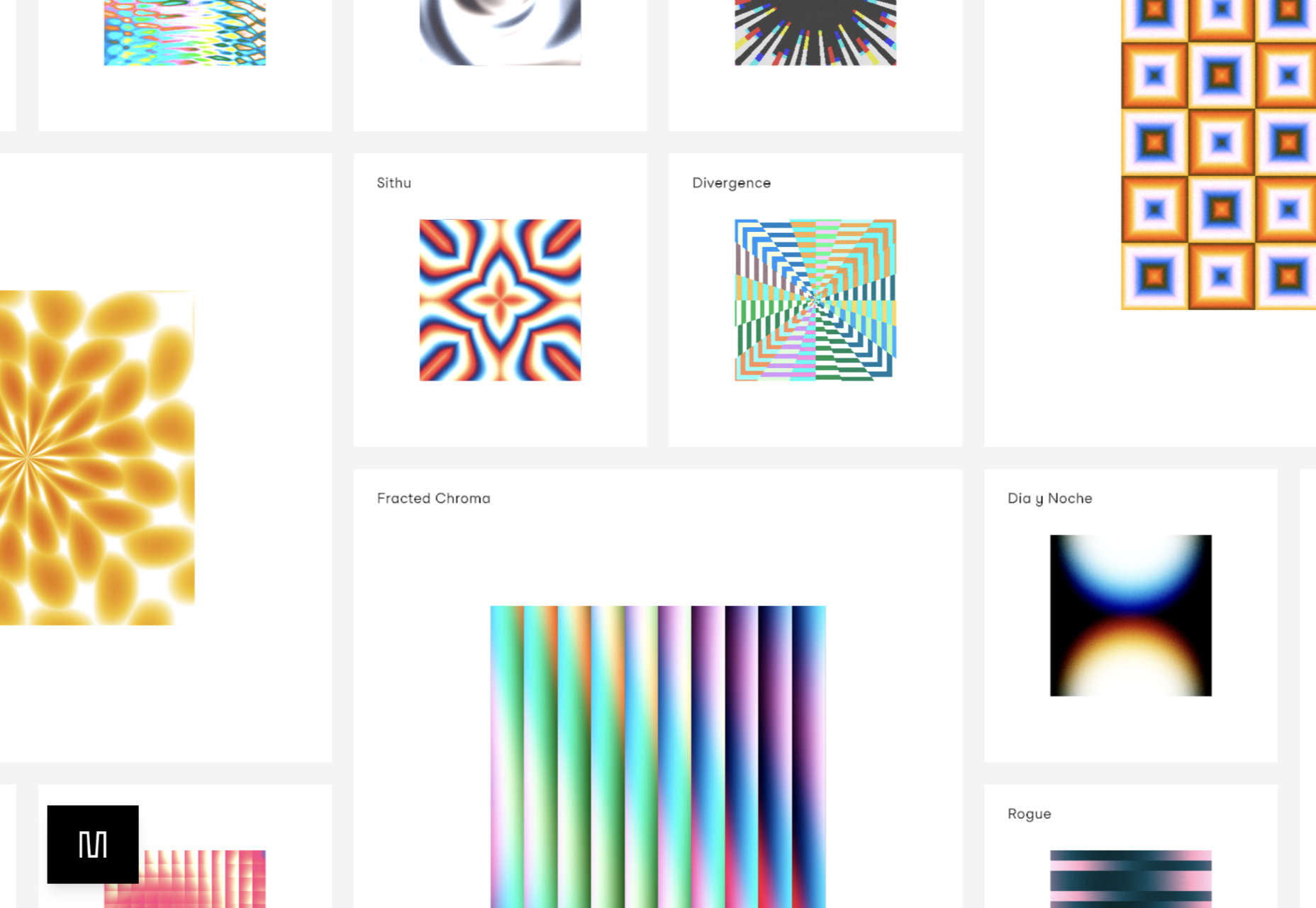
This month we’re seeing websites that are very conscious of the design trends they’re following. Designers are making conscious choices to adopt styles, and opting out when it doesn’t suit the site. What we end up with is a crop of sophisticated, well-designed websites that use style as a technique to further their aims.

Here are the sites that caught our eye this month, enjoy!

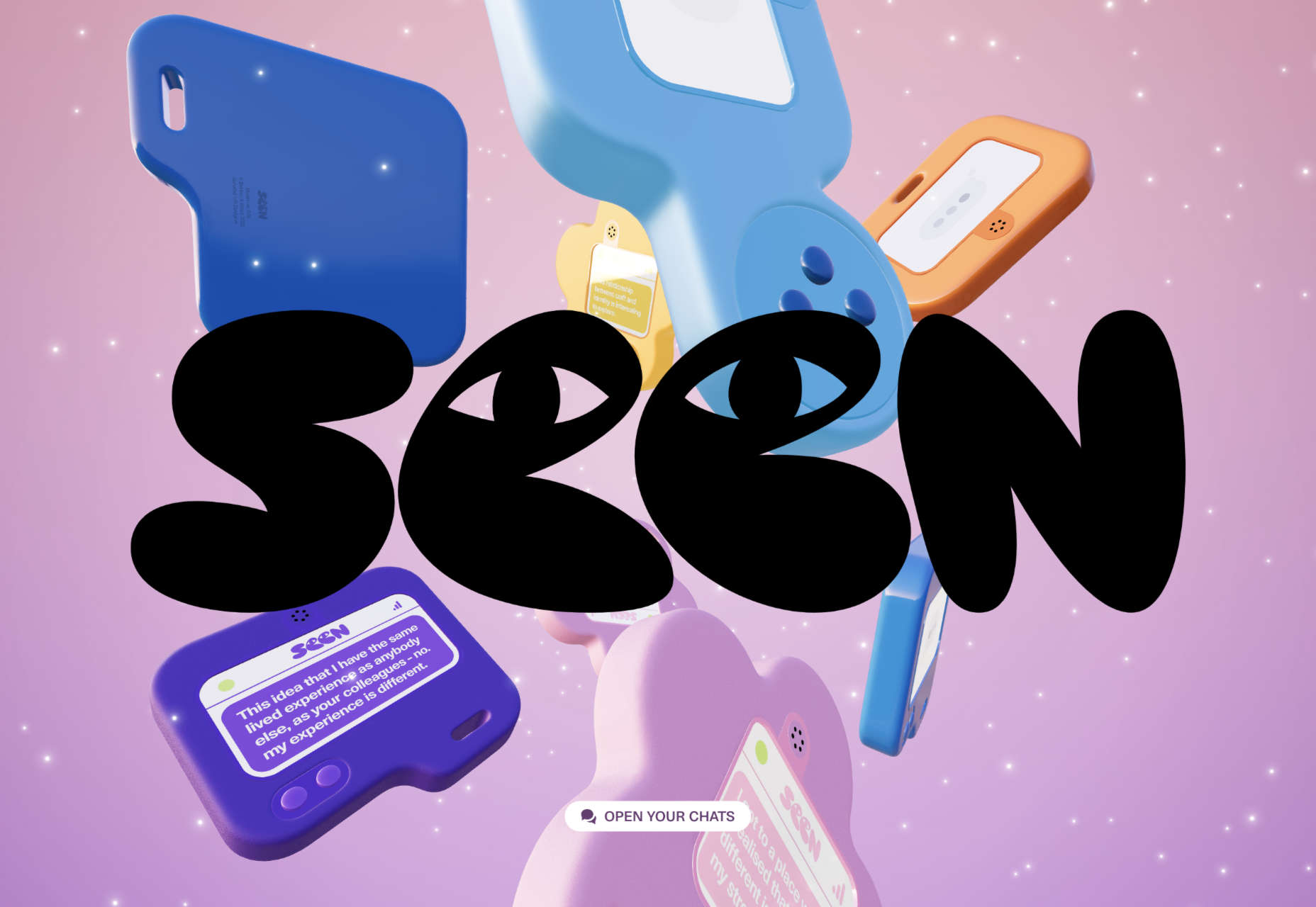
Seen

Seen uses conversations to explore themes surrounding ethnicity and racism in creative fields. Displaying these conversations as online chats creates a sense of intimacy.

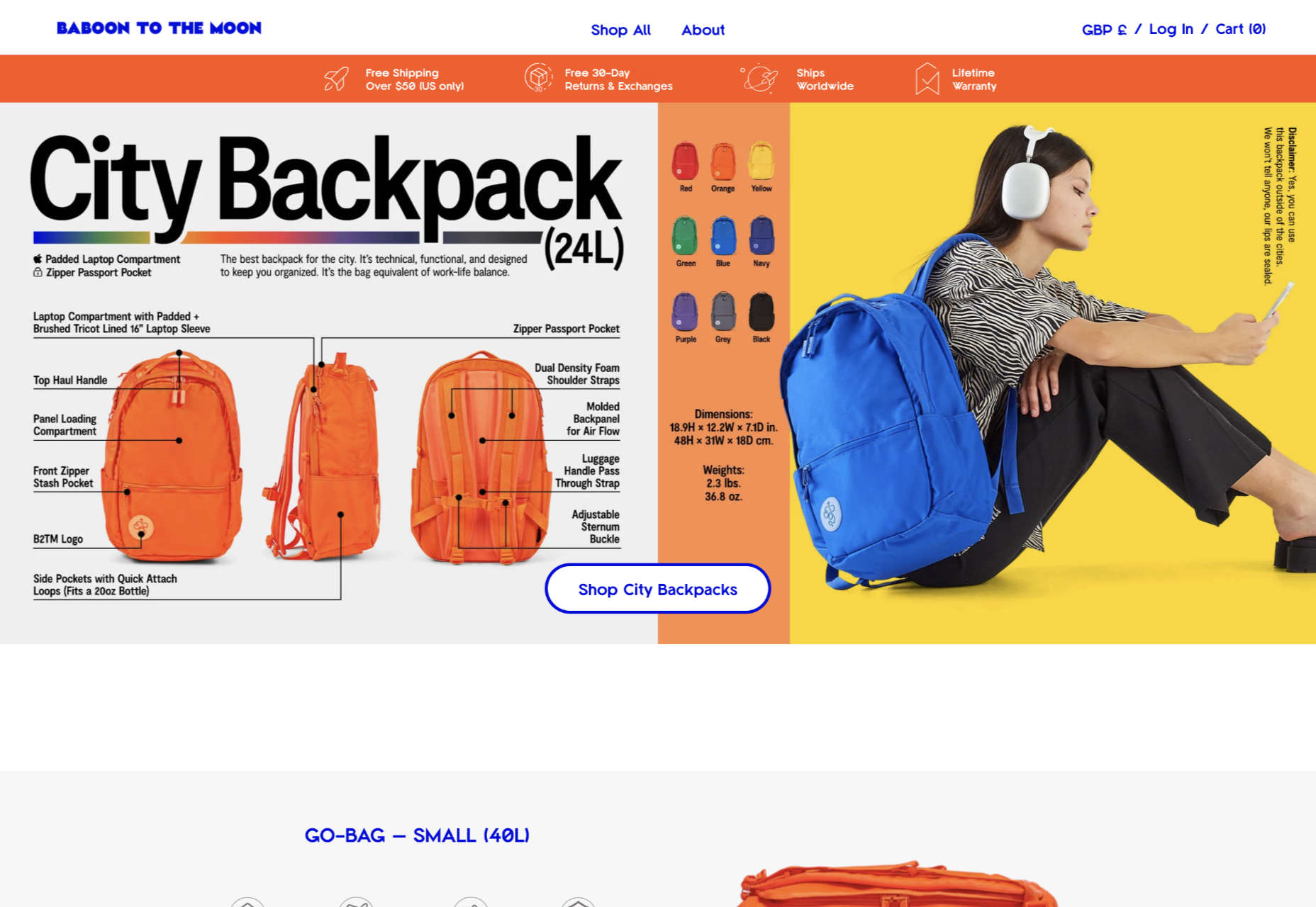
Baboon to the Moon

There is a lot of color in Baboon to the Moon’s product shots, so the rest of the site is kept simple, with good clear navigation too.

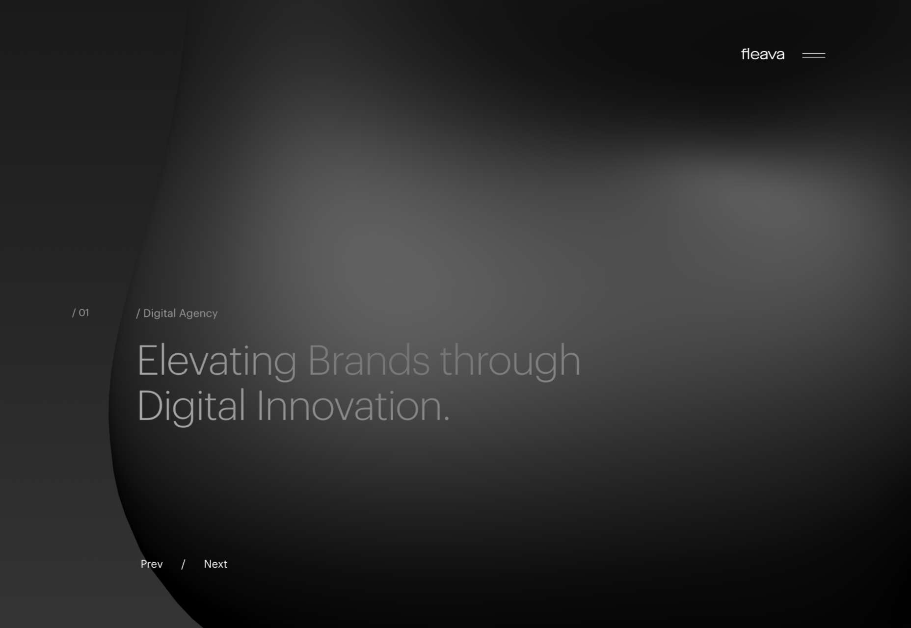
Fleava

There is a strong sense of luxury to digital agency Fleava’s glossy brochure portfolio site.

Baunfire Portfolio Review 2022

This site for Baunfire digital agency’s creative networking event is bold, personable, and fun.

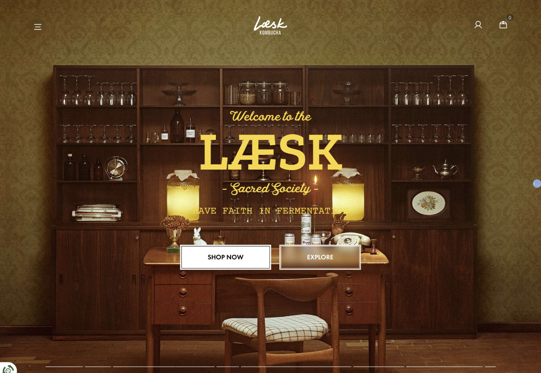
Laesk Kombucha

There is more than a touch of Wes Anderson’s style to this site for Laesk Kombucha; somewhere just out of sight is Bill Murray in a red beanie.

Viso Haus

Viso Haus doesn’t do anything hugely groundbreaking here with their brutalist-style portfolio site, but they do it very well.

Mario Carillo

Artist/programmer Mario Carillo has opted for a minimal approach, allowing the work to do the talking.

Symbol

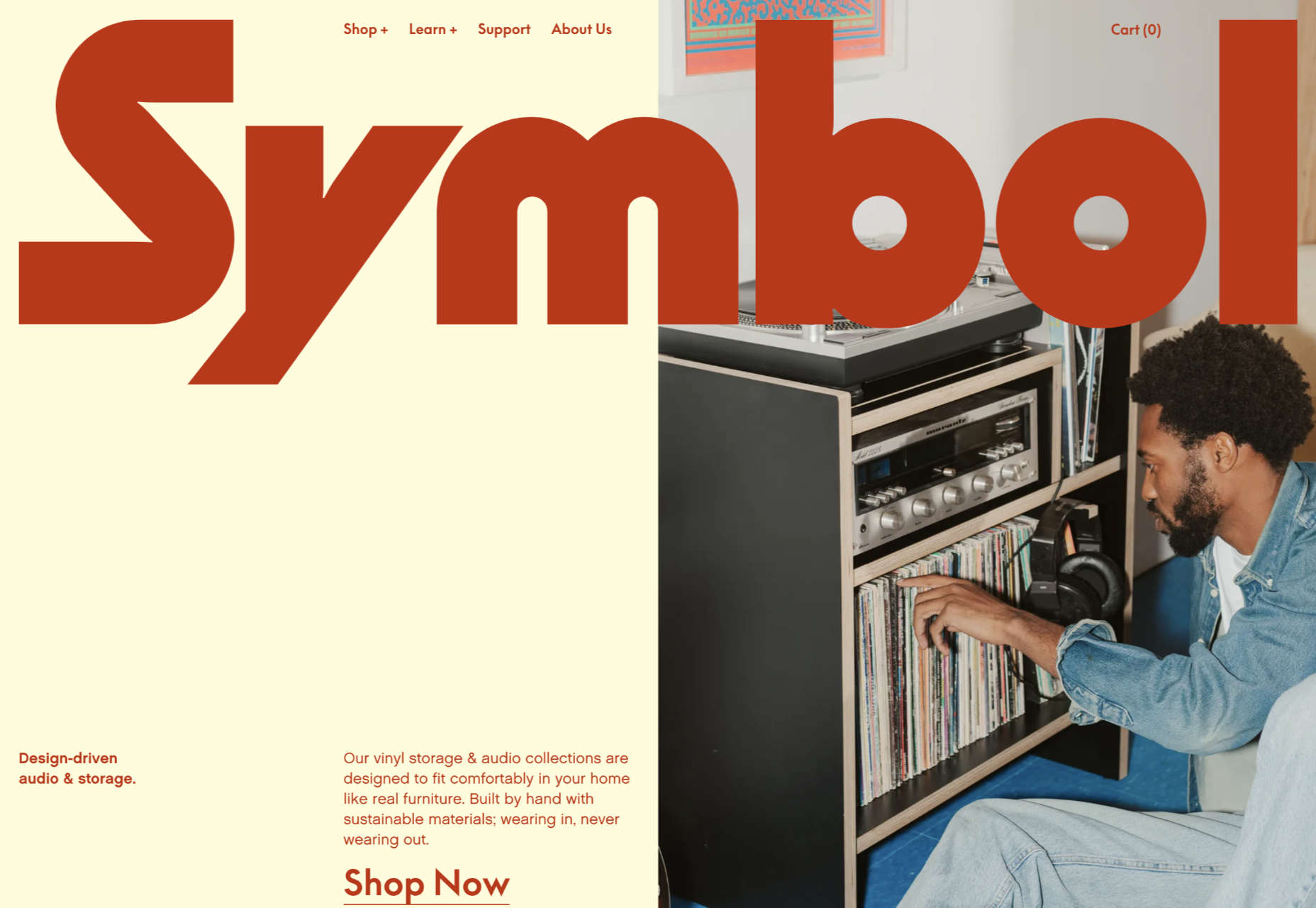
There is a warmth to Symbol’s site, created by the color tones and combinations used here.

Contekst

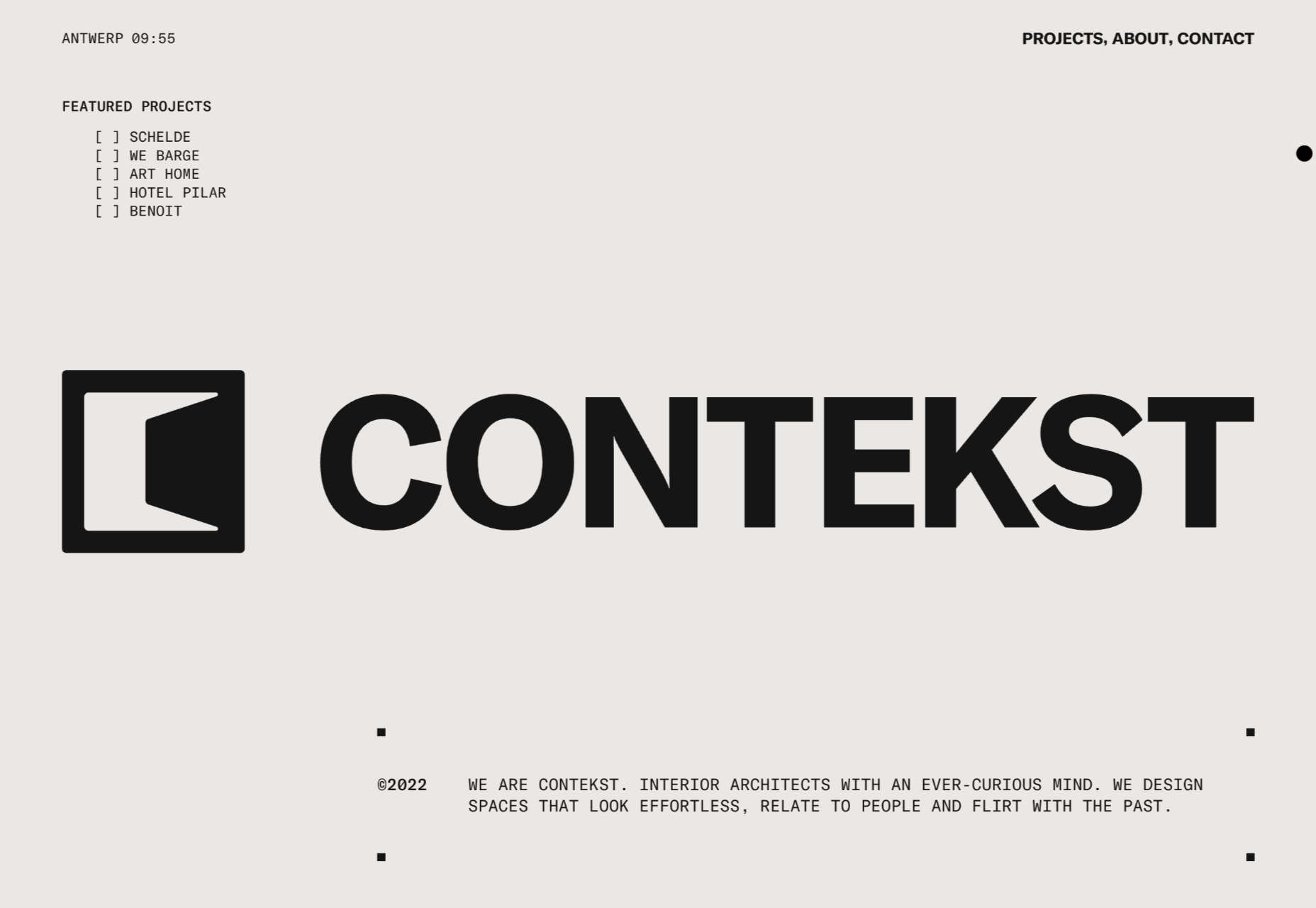
Interior architects Contekst favor a brutalist visual style for their site, but with some nice little animated extras.

Arcane Type Fair

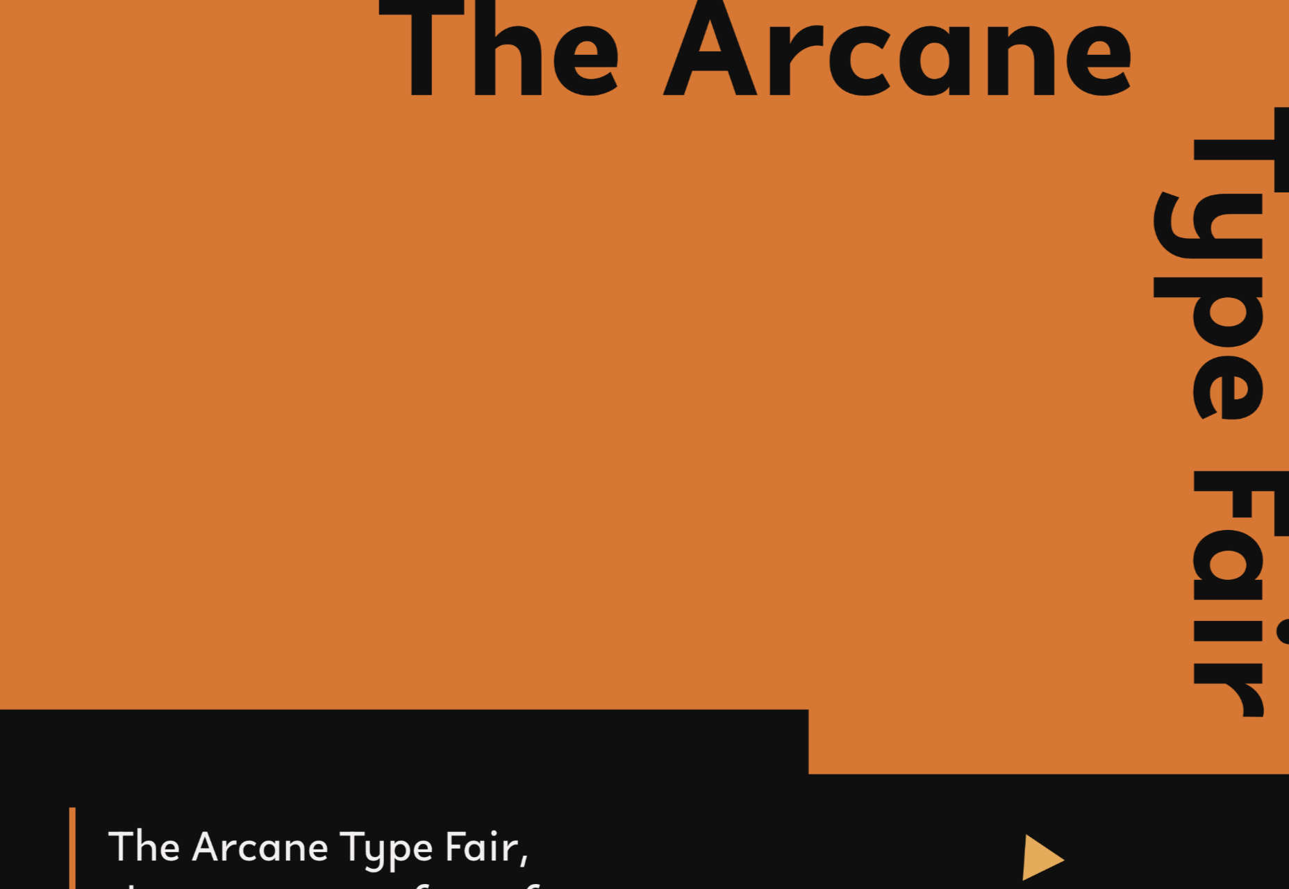
No, you haven’t missed the font lover’s answer to Comic Con: the Arcane Type Fair is fictitious and a clever showcase for Rain Foundry’s Conacher typeface.

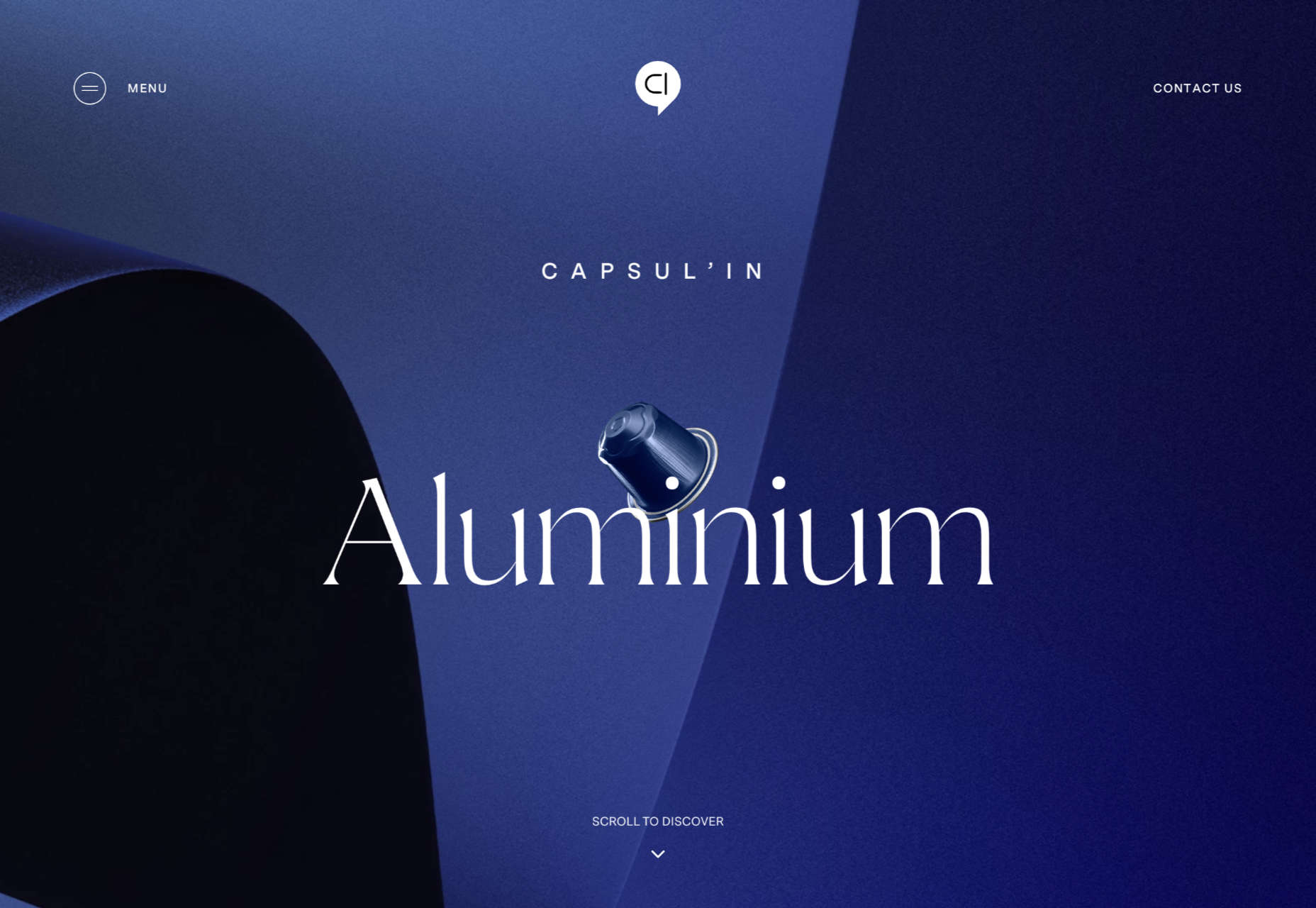
Capsul’in Pro

With lovely scrolling animation and soothing colors, this site for Capsul’in Pro manages to turn coffee pods into objects of desire.

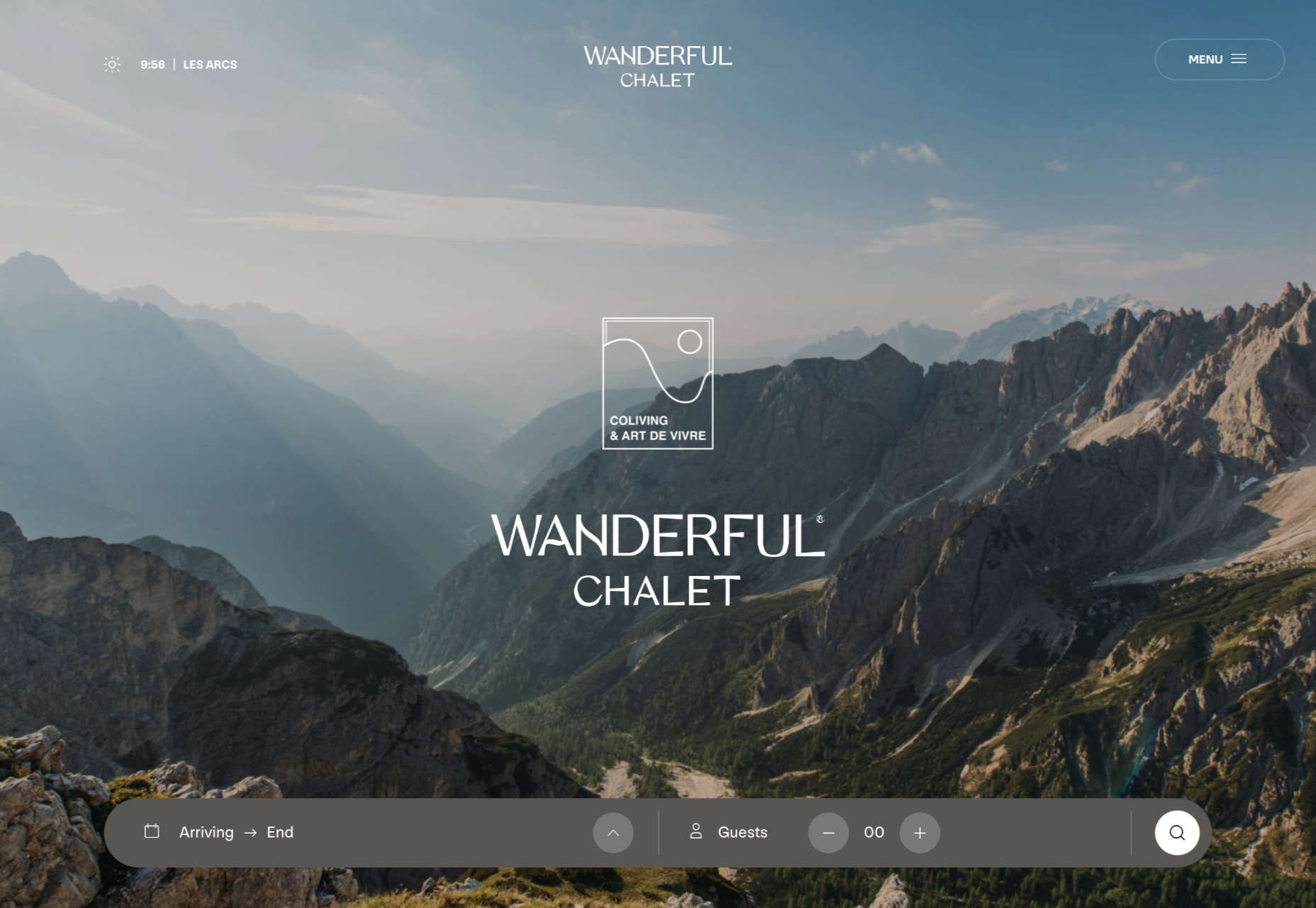
Wanderful Chalet

Random illustrations and a quirky display type add character to Wanderful Chalet’s brochure site.

Stone Cycling

Bricks made from rubbish don’t sound like the most exciting thing ever, but this site evokes a lovely clean feel: like an old building gleaming in the sunlight after all the soot has been scraped off it.

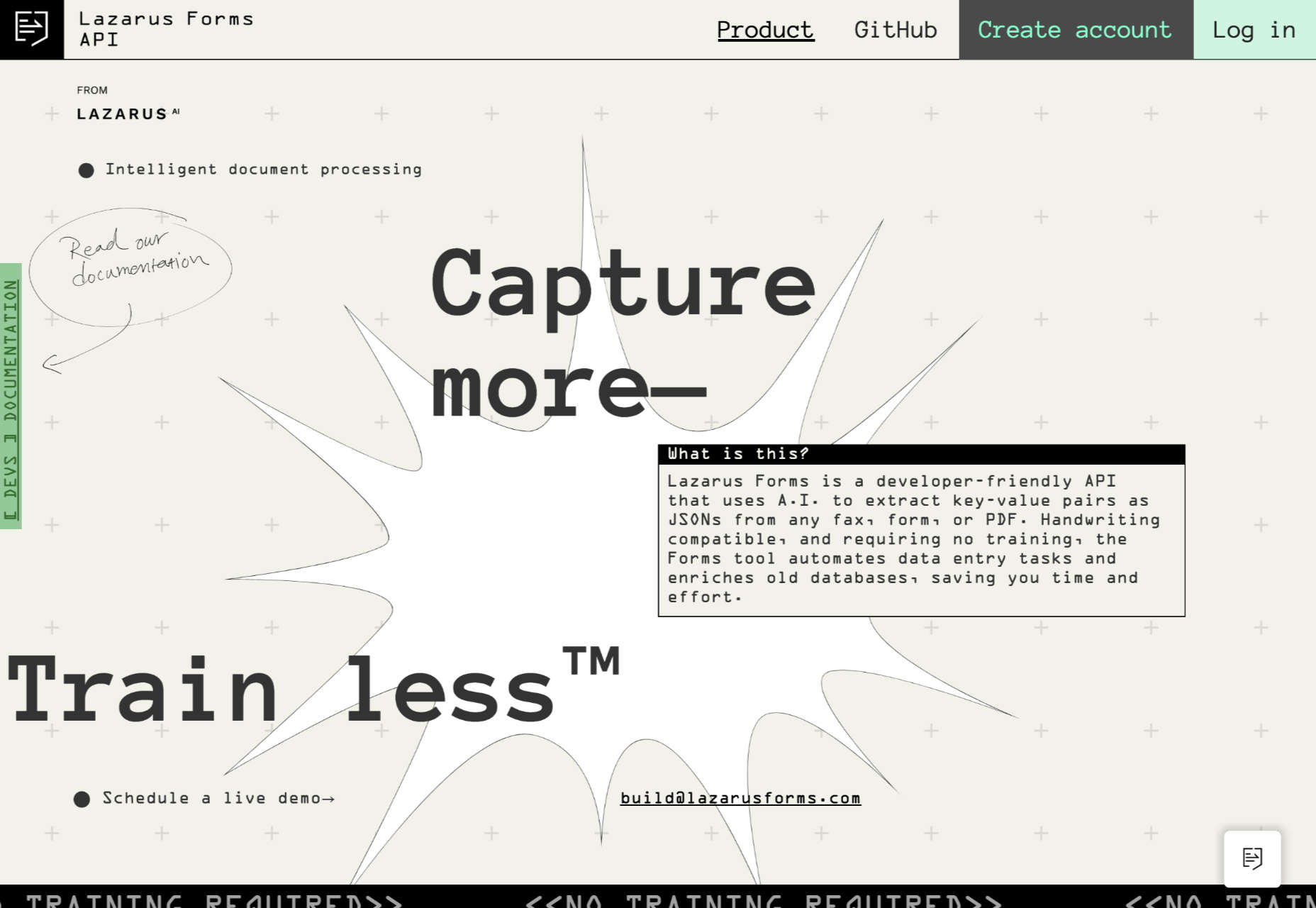
Lazarus Forms

Lazarus Forms is an API for AI document processing. This site succeeds in being transparent in its explanation without being overly technical and pleasing visually.

Nathan Riley

An excellent example of masonry combined with variable scrolling speeds creates tension in digital artist Nathan Riley’s portfolio.

Evi O. Studio

Sometimes the simplest things, like this full-screen image transition for Evi O. Studio’s portfolio, can be so well done it’s an absolute pleasure to scroll through.

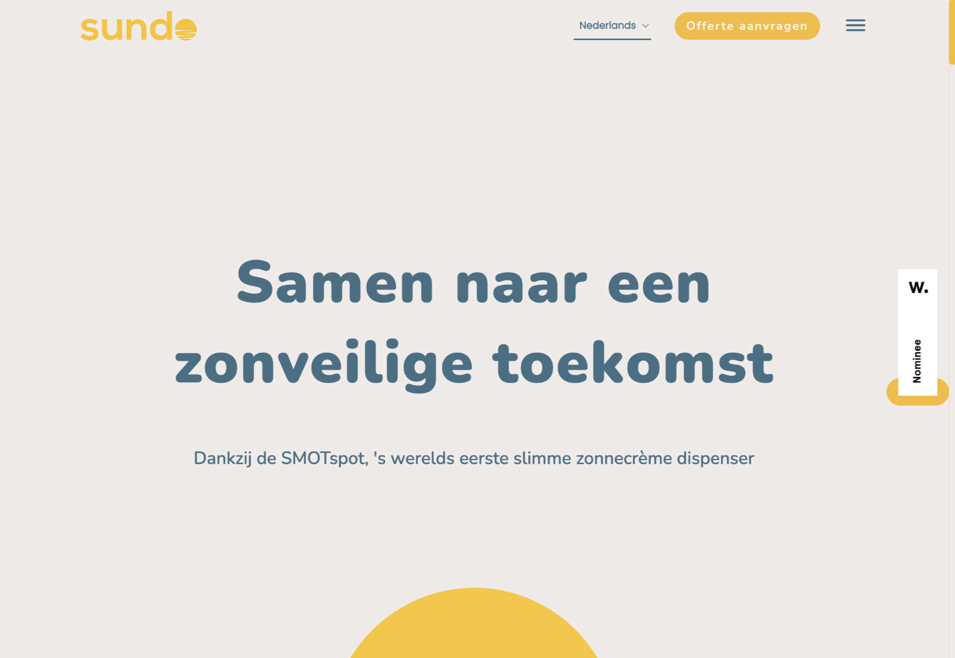
Sundo

Sundo has created SMOTSpots – smart sunscreen dispensers for public areas. The tone of the site is suitably utilitarian with a soft edge.

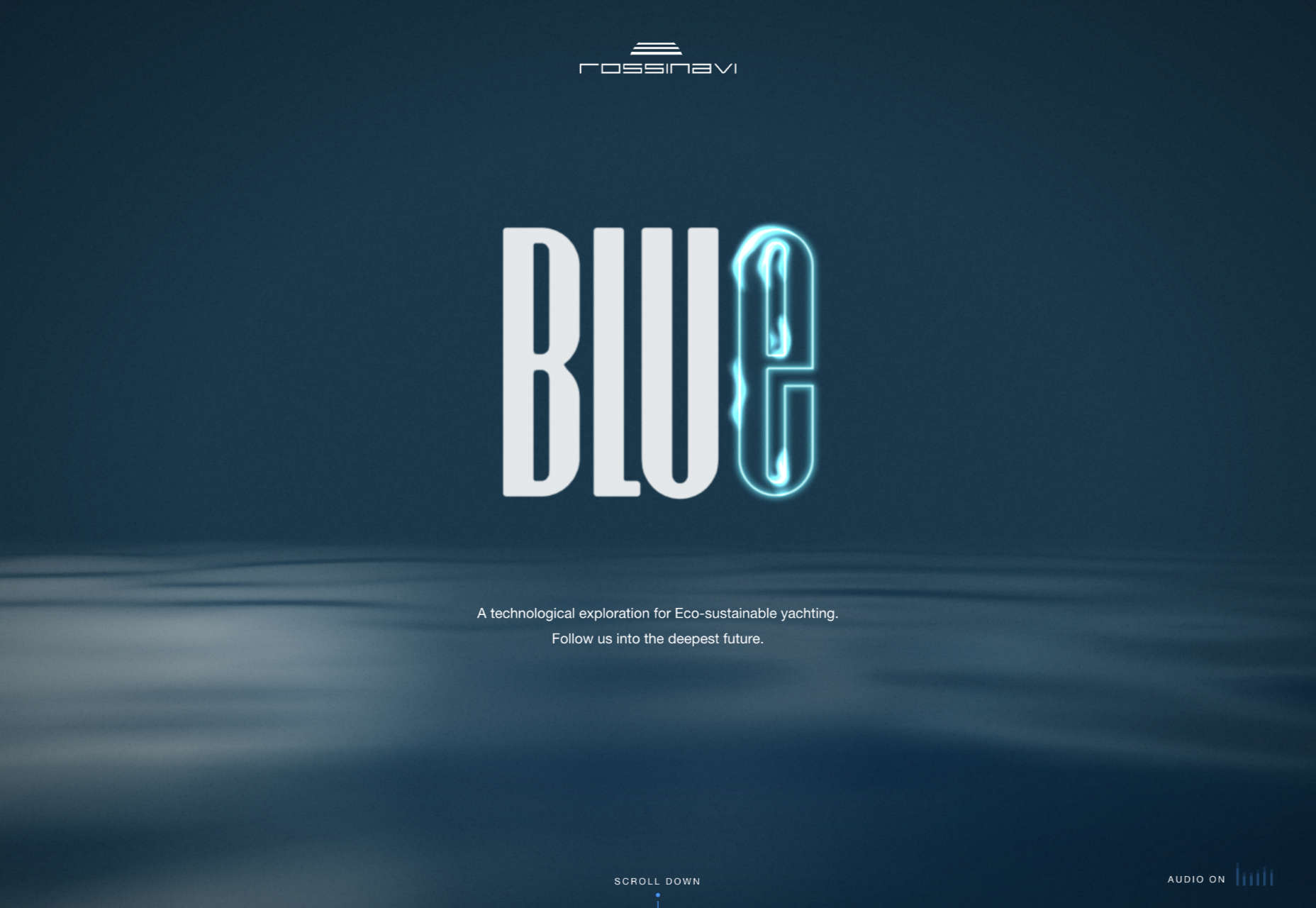
Blue

The Blue experience from Rossinavi luxury boat builders is a pleasing immersive microsite showcasing their new hybrid-electric boats.

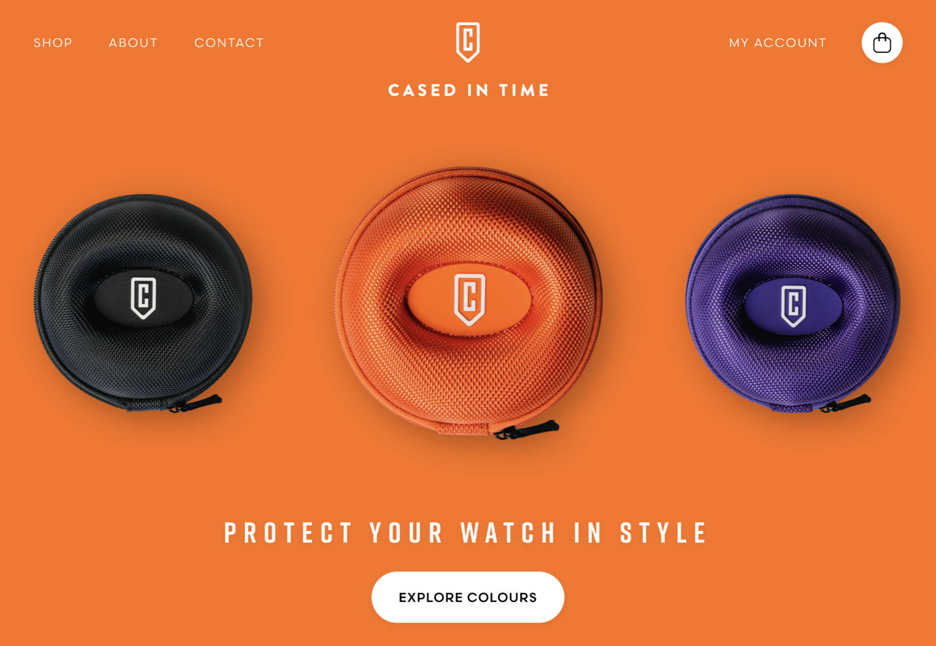
Cased in Time

This site is an excellent example of how to make a single product commerce site that doesn’t feel lacking in content.

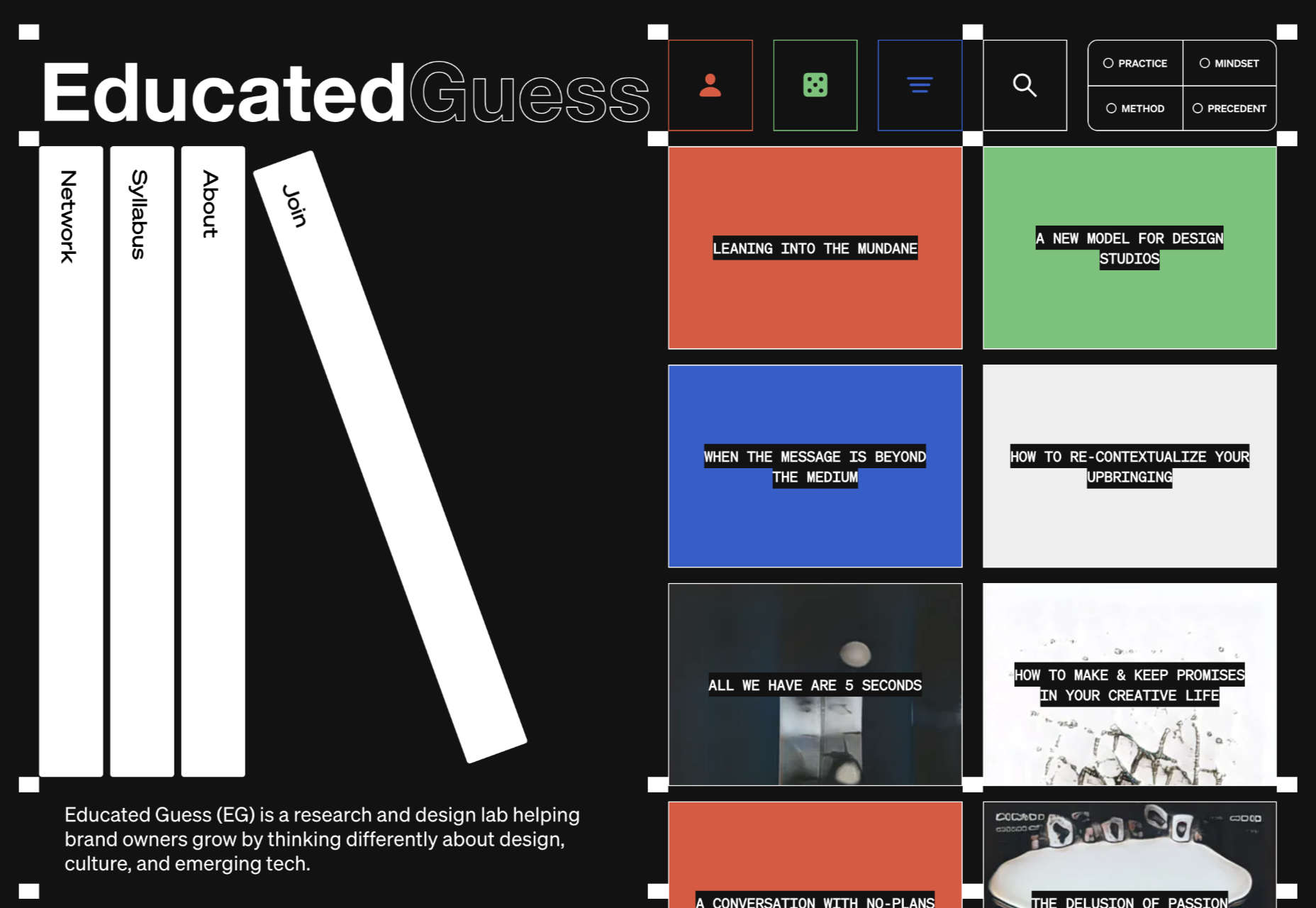
Educated Guess

Educated Guess is a podcast for creatives by creatives. The accompanying website is pleasing to use, easy to navigate, and allows the user to focus on the content.

Source

The post 20 Best New Websites, September 2022 first appeared on Webdesigner Depot.

Categories: Designing, Others Tags:

Secrets of Successful Software Development Outsourcing?

August 22nd, 2022 No comments

Businesses don’t always have the resources to hire their own software development team. In such cases, outsourcing IT companies take over the development of individual software solutions. We will tell you how to find such partners and entrust them with your project.

When is outsourcing necessary?

When a businessman has a project idea but no “hands” for its implementation, they turn to out-of-staff IT professionals for help. This may happen in the following cases:

  • If a company does not specialize in software development, it is unprofitable for it to build an IT department from scratch in terms of time and money. Business owners are handling this job over to more experienced IT partners like Andersen providing outsourced IT support.
  • If a company needs to enter the market faster. Outsourcing software development companies can offer experienced specialists upon customer request. If an entrepreneur tries to solve the problems of finding, hiring, and training employees on their own, this can significantly delay the implementation of a project. If you wish to make yourself known faster and beat competitors in time, every day counts.
  • If it is vital to save the budget. Rates of in-house specialists are usually higher than those of developers from offshore outsourcing software development companies. Third-party vendors have their own libraries, out-of-the-box solutions, and a robust IT infrastructure that speeds up development and saves time and money. In addition, ordering software from a third-party company frees the customer from organizational costs for renting a room, utility costs, and so on. 
  • If there are no dedicated experts on the staff. Some projects require knowledge of rare technologies that staff members do not possess (artificial intelligence, machine learning, augmented reality, DevOps, and so on). If your company does not need such experts permanently, order a product from an outsourcing software development company.

Why is it more profitable to outsource a software development project?

Today, outsourcing is becoming a common practice that helps companies to concentrate on business goals, solve performance problems, improve service quality, and obtain maximum profit.

  • With outsourcing, you can find professionals in any country for a smaller amount. Sometimes the benefit reaches 40-60% since hourly rates of developers in different locations can differ dozens of times.
  • Outsourcing makes it easier to introduce new technologies and implement solutions that are beyond the capabilities of full-time employees. Thus, you don’t have to waste time on training new staff members. You can involve an experienced IT specialist from another country in a distributed team.
  • Outsourcing software development companies have experience in managing projects from start to finish, which takes the burden off customers and allows them to focus on business value. If there is a strict deadline, an IT service provider can schedule work and choose the staff to carry out everything on time without sacrificing software quality.

Popular outsourcing models

Traditionally, businesses opt for outsourcing to hire an entire software management team or individual specialists. There are three models of custom software development:

  • Project-based outsourcing. The bottom line is that an external team leads a project completely, from the beginning to the end, guided by the requirements, budget, and deadlines provided to it. The customer can partially participate in the creation of an application and supervise the progress of work.
  • Dedicated team. A client contacts a third-party supplier to hire individual experts needed for their project. The customer develops software on their own, but they may not have narrow specialists or advanced professionals. Thus, they don’t have to search and hire an expert for one year. It is more convenient to opt for outsourcing.
  • Staff augmentation. A provider offers a customer a special team (developers, designers, testers, project managers, and so on), while the client takes responsibility for the main processes. That is, this company pays for office rent, software licenses, equipment and utilities, employee training, and benefits. The client manages the software development project and distributes responsibilities within the team.

Being aware of the business problems to be solved, an entrepreneur will choose the appropriate outsourcing model.

Things to consider before outsourcing a project

Before handing over your custom software development project, you need to determine several points.

If you have your specialists, check out how busy they are and whether they specialize in the technologies needed to implement your project.

If you are planning to outsource development to a third-party vendor, calculate the project budget. As a rule, the benefit from cooperation with IT outsourcing companies reaches 25-60%. Therefore, it is quite possible to find foreign specialists with different budgets. But keep in mind that it is not always possible to get the best quality for a lower cost.

Custom software development is not a magic solution for every project. It will be successful if both a customer and its IT partner are deeply involved in the joint work and respect each others’ needs.

Source

Steps to take when outsourcing a project

Step 1. Determine your project goals and objectives.

A project without a goal is bound to fail. You cannot effectively monitor its success, effectiveness, and completion if you don’t understand what you are implementing. You must understand the purpose of the project, its users, and its competitors. This way you can protect yourself from bad decisions, obscure characteristics, performance, and unrealized business values.

Step 2. Choose a location for outsourcing

The global outsourcing market is divided into Western and Eastern Europe, the USA, and Asia. In these regions, there is a significant discrepancy in the rates of specialists: from 25 to 100 dollars per hour. The cheapest development can be offered by Ukraine, Poland, and other countries in Eastern Europe.

Step 3. Narrow your search by choosing an outsourcing software development company

The search for partners should start with studying the top IT software developers in the region. You can easily find them in rankings made by Clutch, GoodFirms, Awwwards, and others. For an initial acquaintance, you can study a company’s website to get an idea of ????its experience, implemented projects, tech stack, etc.

Step 4. Contact the companies you have chosen.

If the customer has found several companies and does not know which one to choose, they should see if any of them worked on similar projects. This will speed up the development process, as the firm will be able to offer specialists who are familiar with the required technologies.

During the initial contact with an IT provider, you should clarify a number of issues on the project cost, the necessary specialists and their competencies, the pricing model, development methodology, and so on, and agree on a joint meeting to discuss important issues. Choose an IT outsourcing company with a clear and transparent approach to cooperation. Thus, you will get a partner seeing eye to eye with you. Such a provider will be committed to the final result which is high-quality software.

Source

Step 5. Recruit a project team

Depending on the goals of a project, its scope, and timing, an IT outsourcing company will offer several working resources capable of fulfilling all customer requirements. Typically, a project team consists of a Business Analyst, a Project Manager, several developers, and testers. The project may also involve IT architects, DevOps engineers, cybersecurity experts, automated testers, and so on.

All these issues are discussed with the customer within the framework of the pricing model and budget, which are previously agreed upon. The client can hire both the entire team of an IT outsourcing company and specific specialists that they lack in their own staff or a distributed team.

The agreements reached are reflected in the following documents: SLA, SRS, KPI, NDA, etc. 

Conclusion

You’ll understand if you can successfully outsource software development to a third-party vendor only after carefully studying the needs of your company, its budget, and other issues that are important to your business. The very fact that this format of work is cheaper than in-house development speaks in its favor. And this is not the only advantage of custom software development.

The post Secrets of Successful Software Development Outsourcing? appeared first on noupe.

Categories: Others Tags:

How can a Customer Success Platform Help you get the Perfect Health Score??

August 22nd, 2022 No comments

Customer account health is a data-driven metric to identify whether your customer is getting value or not. According to a popular survey, maintaining a customer health score was more predominant in organizations with a less than 5% gross churn rate. Although the survey doesn’t identify a lucid correlation between customer health scores and revenue generated through upselling or cross-sell. 

However, it shows a big impact on forecasting renewals and having a better clarity on the CSM role. A study has also found that 46% maintain a customer health score to forecast churn or renewals.

Defining an ideal Customer Health Score requires taking consideration into various elements. The traditional form of Health Score was calculated as a single score that eventually failed to demonstrate the accuracy of the customer’s health at a given point. A single customer health score is a bluff. As health never comes in one shape and form. There have to be multiple dimensions to health. Multiple dimensions when considered together provide an accurate Customer Health score. Various dimensions of it should comprise-

What are the assorted dimensions of Customer Health?

1. Financial Health: Gives an account of the purchase history, overdue invoices, purchased license, canceled license, etc.

2. Relationship Health: It measures how frequently contact has been established through touchpoints. Like, the frequency of communication of the CSMs with clients, and their rapport with the stakeholders.

3. Product Adoption Health: It simply measures the Product’s Stickiness. As example, the Adoption of the core features, active login days of the client, hoe frequently your product is getting used.

4. Service Health: Defines a transparent idea about the effectiveness with which your support team handles customer issues. For example, the number of tickets raised, and the number of tickets resolved. Therefore the happiness quotient of the client.

5. External Factors:
 Positive confidence tags, for example, If the customer is driving a case study with you, if they have referred anyone, etc.

A better form of Customer Success Technology will allow you to live the customer’s data at every interaction from product usage to the financial status of an account, and the high-level risk count, to extend the efficiency and therefore the effectiveness of your customer support system. However, there are a few elements that you need to consider while setting up the Customer Health Score. To jot down, the best practices include-

  • Monitoring the correct metrics, i.e., don’t mix support signals with product adoption signals
  • Measuring leading indicators with short lookup windows
  • Having an easy risk strategy, i.e., the poor score should be broad and should take into account each churn signal separately.
  • Acting on poor leading metrics till health score is good
  • Regularly refresh your configurations (recommended periodically every 3 months) on the idea of new learnings.

Major Reason why Customer Health Score fails?

Most often Customer Success teams don’t put much attention to the look-back period while calculating the account health. This could be a significant reason where the major problem arises. Let’s take an example.  Imagine you have set up a customer health score for which an account to be in good health, the customer has to mark certain touchpoints in the customer journey. For example, they should have started doing more campaigns, should have started adding new users, or whatever your technology enables your customers to do. In this scenario, the look-back period could be one day, one month, 90 days, or perhaps a year that may entirely depend on the type of problem your product is solving.

Now, the key point, you should note here is that the longer the look-back period, the more likely you’re to get a false positive. For example, if the customer was using the product effectively in a look-back period of 90 days. Certainly, in the 90th day you might still be getting very good health of that account whereas, in the last 89 days, the customer might have simply stopped logging in. So you should keep the look-back period, as narrow as possible in order to avoid false positive results.

The key to putting in a successful health score is to balance the look-up period as short as possible. A typical approach is about two weeks, but it can very well depend from customer to customer.

What is the solution?

A very basic thing to know here is that there are various dimensions to the overall Customer Health than having information on how your customer adopts your product. Lots of CSMs remain in the misconception of using only product adoption as the key metric to decide the health score. We should consider other dimensions like Relationship, Service, Financial and Subjective opinions/External factors that may act as leading indicators as mentioned above. To craft an effective and accurate Health score, one has to consider various metrics of Health Score that are important to your company, product, and customers.

Some of them are mentioned below:

  • Overall Product Usage
  • Product Upgrades and Renewals
  • Community Engagement
  • Marketing Engagement
  • Frequency of website visit
  • Customer Support Calls
  • Customer Feedback
  • Product feedback
  • Survey results

The new age technologies like AI (Artificial Intelligence) and ML (Machine Learning) are enabling advancements to reduce the pain and effort of a CSM in many ways. In fact, this technology is helping to predict and draw a perfect health score for customers.
AI and ML technology will help you draw a health score that is significantly reliable to give actionable insights to improve customer experience.

The post How can a Customer Success Platform Help you get the Perfect Health Score?? appeared first on noupe.

Categories: Others Tags:

What Makes A Great Toggle Button? (Case Study, Part 1)

August 22nd, 2022 No comments

In this first part of a two-part article, we will analyze the characteristics of effective toggle buttons. These characteristics serve as visual cues for helping users recognize which of the button’s options is actively switched on. We have conducted a comprehensive research study with real users to evaluate the effectiveness of visual cues from a variety of categories. As part of our experiment, we assessed how the perception of visual cues changes if the user has more time to observe them.

In the second part, we discuss our results: which cues work better than others, which are the best, which are the worst, and why. Certain findings challenge some of the traditional beliefs in toggle button design. Finally, we present a list of best practices for how to create optimal toggle buttons based on our discoveries.

The problem of how to design an effective toggle button that shows the selected option clearly is a long-term open question among UI/UX designers. In this article, we discuss a study that we’ve conducted to find the final answers to the following questions:

  • What does a good, clear and readable toggle button look like?
  • What visual characteristics of a toggle button make it error-proof and prevent confusion and frustration of users?

First, we’ll talk a bit about toggle buttons themselves, when it’s the right time to use them, and which principles to bear in mind while doing so.

Let’s discuss a common scenario: imagine you’re buying an airline ticket. You pick the date and your destination when you suddenly come across something like this next to your ticket details:

If you’re confused about whether your ticket lets you come back home, don’t worry, you’re not the only one. The marvelous piece of UI seen above is called a toggle button.

What Are Toggles?

A toggle button. As the name suggests, it refers to a control used for switching (or toggling) between two or more states or options. Both its name and function are part of a skeuomorphic metaphor, meaning they’re based on something older and more familiar. In this case, a physical forerunner. To better understand the basis of a digital toggle button, let’s talk about the qualities of a physical toggle — the common light switch.

  1. As you can see, there are two states that a light switch can be in: on or off, with nothing in between. Similarly, a digital toggle is a control with two (or sometimes more) mutually exclusive states with one of them always set as the default value.
  2. You can see the result of interacting with a light switch straight away as the lightbulb will immediately light up or go dark. In the same way, a well-designed toggle should perform a visible change in the system — you should get direct feedback without the need to press another (Save or Submit) button.

When To Use A Toggle Button?

In short, when designing a toggle button, for the sake of your users, it’s good to hold on to these basic principles:

  • Use them only when they have an immediate effect, without any Save or Submit.
  • Apply them when the setting has a default value.

In other cases, a checkbox or a group of radio buttons may be the better option.

Toggle Switch vs. Toggle Button

There are two ways in which you can use a toggle-type element. For binary options (mostly on/off, as discussed above), you can go with a toggle switch. It’s very simple. You just activate or deactivate a function.

A toggle button is a suitable solution for switching between opposing (even multiple) options. It’s composed of two or more buttons next to each other. The selected button needs to “highlight” in some manner to signify the toggled state.

The goal is to design toggle buttons distinct enough to signal the difference in visual weight between selected and unselected options. At the same time, the buttons should be alike enough to be perceived as two (or more) parts of the same whole. The challenge is to make evident which button is active.

With toggle switches, it’s relatively simple. With a direct label present (on/off), you can read the toggle state quite easily. However, toggle buttons don’t contain the text “on” or “off.” Their label stands for explaining the state’s quality rather than showing the state itself.

Thus, when reading toggle buttons, users have to rely on other visual cues. Which, when not used right, can do more harm than good. One thing is for sure, though, the state that’s currently active should be emphasized, not the possible command for changing it. This brings us to the main focus of this article. There’s a hot question going around among UI and UX designers: How to make a good toggle switch?

When we asked this question ourselves, we found there were no general rules founded on solid user research. This is why we’ve conducted our own case study to remedy this.

Case Study: Data-based Approach To Designing Clear And Effective Toggle Buttons

With enough experience and some usability testing, you can ensure your toggle design isn’t an issue. But what if you could just tell right away what will or won’t work based on comprehensive research and cold hard data? Further, what design features help users distinguish which toggle option is the active one? How do you combine visual cues, such as colors, text size, and frames, to make the state of toggles instantly recognizable? In our study, we’ve explored the field of visual cues and focused on the question of which design characteristics signal that a button in a toggle pair is active or not.

Visual Cues

Visual cues are aspects of elements on a website that draw the user’s attention and provide information about how to use the design. They help users spot clickable features, distinguish between active or inactive states, and introduce the possibilities presented to them by a website. The signal they send should be clear and easily readable.

Research Path To Designing Toggles

Although how to design toggle buttons is a commonly discussed topic among designers, there are (to our knowledge) no clear guidelines on picking the most effective visual cues for toggle buttons. Therefore, we have decided to look closely at specific ways to highlight the active button in a toggle pair.
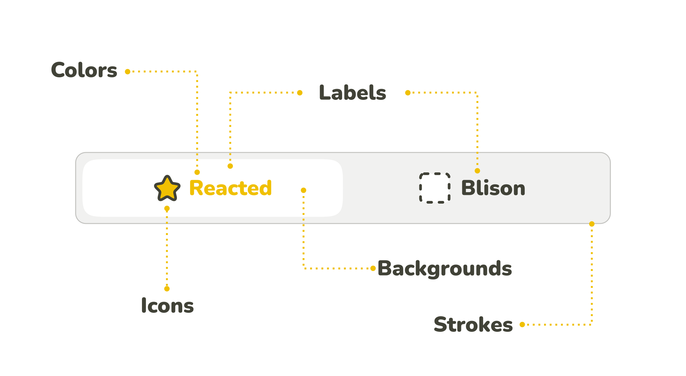
The anatomy of toggle buttons can usually be described as a combination of label, filling, outline, and sometimes a specific icon, whereas not all of these components have to be present at the same time. Each of them can be emphasized somehow (can stand as a visual cue), and there are many different ways to combine them together.

Standalone Visual Cues

To start from the base, we focused on standalone visual cues concerning each of the button’s possible components: label, filling, frame, and icons. Based on our assumptions of how these components influence the perception of an active/inactive button, we have formulated several specific research questions.

To test our assumptions, we have designed a set of toggle buttons that individually represent our research question for the visual cues. We wanted only one visual cue in focus on each toggle button to shape the user’s perception of an in/active state of the button. Therefore the visual cue should be the only thing that differentiates the buttons.

When designing the toggles for the study, we came across one challenge: what labels to choose? Of course, we wanted to replicate the real-life experience on the web, but at the same time, we didn’t want participants to be influenced by a particular verbal meaning. Therefore, we needed to choose the labels carefully.

The first idea was to use “Option A/Option B,” but since letters A and B implicitly imply alphabetical order, this would mean risking having a subconscious effect on the participant’s choice. Similarly, using words with meaning such as “Cat/Dog” could mean an individual preference would play its part — a cat or dog lover’s subconscious may get involved, etc.

To prevent the label’s meaning from affecting the selection, we have finally decided to label the buttons with nonsensical words without any clear associations: “Racted” and “Blison”. This way, only visual characteristics can affect the users’ perception of the button’s active and inactive state. Even if users didn’t determine a toggle’s state, they would need to choose the answers randomly instead of defaulting to another cognitive pattern.

Without further ado, here is the list of visual cues and our research questions related to them.

Label

With the label as a visual cue, we consider its key properties, such as its thickness, text size, and color.

Research question 1: Bold text

We assume that the button with the emboldened label will be perceived as active rather than the regular text.

Research question 2: Text size

When two buttons with labels differing in the size of the text inside are next to each other, we expect that the one with the larger label will be perceived as active. We also expect that the larger the difference is, the easier it will be to determine the active state.

Research question 3: Contrast of inverted colors in text labels

Contrasting colors are good for distinguishing between options. However, if you need to emphasize one of them, and therefore you need one of them to have more visual weight, it’s not that convenient. Inverted colors evoke equal options.

We expect the combination of inverted black and white to be perceived as equal options. The same would be the case with other inverted colors, such as blue and orange, seen in the figure below. Therefore, we assume participants won’t be consistent in determining which button signals the active state.

For this study, we presume the buttons with darker text colors (black and blue) to be considered active. Their darkness could evoke emphasized buttons, but as mentioned, we mainly expect inconsistency.

It needs to be said that for people with color vision deficiency, contrast and colors, in general, are insufficient cues. We mustn’t forget that according to the NHS (National Health Service), about 8 % of men suffer from daltonism, which means they can’t rely on color cues and will need more than just a color to determine the button’s in/activation.

Research question 4: Cultural perception of red vs. green in text labels

Even though it raises the same concerns as the research question above, since red and green are contrasting colors, there is a culturally determined consensus about this specific pair. In western cultures, the color green is associated with the “on” (or active/open) state, while the color red is associated with the “off” (inactive/closed) state. We expect this phenomenon will manifest in the test.

Research question 5: Color vs. black/white in text labels

When combining colors and black/white, we expect the colored label to be perceived as a signal of activation because it carries more visual weight.

Research question 6: Primary color vs. neutral colors (shades of gray) in text labels

The principle is the same as with research question 5. Neutral colors carry less visual weight. Therefore our expectation is that the colored label will signal an active state.

Research question 7: Different saturation of the same color in text labels

Our assumption is that the more saturated the color is, the more visual weight it carries. Therefore, a more intense color is expected to evoke the button’s activation.

Filling

The filling or the background of the toggle is all about color combinations. We assume that many of the same principles seen with label colors also apply here.

Research question 8: Contrast of inverted colors in background

The relationship between inverted colors of the button filling is analogical to the one between inverted colorations of toggle text. Since inverted colors carry the same visual weight, we expect the contrasting colors to be confusing. Which button is active will not be clear. Therefore, we expect the responses to be inconsistent.

For this research, we have labeled the buttons with darker filings as active since the darker shade could be perceived as the active state (however, we still expect the responses to be mostly inconsistent).

Research question 9: Cultural perception of red vs. green in background

Since red and green are a specific case of contrasting colors (due to our western cultural perception of this pair, rather than color inversion), we assume that the green button will be perceived as the active one.

Research question 10: Different saturations of the same color in background

As we stated with label colorations, color saturation carries a visual weight. We assume that the more saturated color will be perceived as the activation signal. In the case of a neutral color such as gray, we expect the higher value (from the HSV color model) of the filling to function as a clue.

We expect this effect to be more evident with more saturated colors (in this case, orange) than neutral colors (gray) since saturated colors carry more visual weight.

Research question 11: Saturated and grayscale colors in background

We expect that since the button filled with the saturated (yellow) color carries more visual weight, it will be perceived as emphasized. Therefore, it will signal an active state when standing opposite a grayscale-colored button.

Additionally, we predict that the distinction will be easier to make with the combination of yellow and less saturated gray because of the more evident contrast.

Research question 12: Inverted design of buttons

A common way to design toggles is to invert the color of the background with the color of the text. The problem with this visual cue is that both buttons in the pair carry a part of it: on the left, there’s the colored filling, and on the right, there’s the colored text. The blue filling might have a stronger visual weight, but we expect the distinction between the active and inactive button to be more difficult for users to interpret consistently than some other visual cues, such as color saturation.

Outline

This category of research questions focuses on the presence/absence of an outline, as well as on its placement. Although outlines can differ in several aspects, such as color or thickness, these are parallel to visual cues, which are already covered in categories Label and Filling. Hence we have dedicated this category to determine the effect of an outline in general, as well as some cues which are outline-specific.

Regarding the color, we have discussed its impact in the previous sections, and we expect the effect to be analogical when used on the outline.

Research question 13: Highlighted outline of the active button

We expect the button with a highlighted outline to be perceived as the active one.

This one may seem obvious, but it never does any harm to check up on it or compare its effectiveness to other visual cues.

Research question 14: Inactive button coincides with the background

This is a hybrid between background and border-based visual cues. It attempts to improve a saturated vs. grayscale background color cue, as seen in RQ11, by making it clearer that the gray-colored button is blending into the background while the colored active button is separated from it. Our concern, however, is that when the outline is missing, and the inactive button coincides with the background, it may be harder for participants to decide about the active state, since the inactive button may not be perceived as a button at all.

Research question 15: Embossed vs. debossed button

Making something embossed is a common way to highlight something on a website. However, should we follow the guidance of making toggle buttons resemble physical buttons, then, in this case, it should be the other way around. The button that’s pushed (aka debossed) is active. Therefore, to verify whether this is true, we hypothesize that the button that’s pushed in will be perceived as “on,” while the button which is embossed and hence isn’t pushed in will be perceived as “off.” This pushed look should be even stronger when supported with a shadow effect.

However, the embossed button appears more “in your face,” which might signal its activation as well. We expect the distinction to be inconsistent.

Icons

Icons provide yet another way to highlight an active button. Can they possibly outweigh all the other visual cues? To confirm the effectiveness of the icons, the designs in this research question category abandon all of the other visual stimuli in favor of including icons.

Research question 16: Check sign

We expect the presence of a check sign on one button to evoke an active state.

Research question 17: Radio button

One possibility of designing toggle buttons is to combine them with radio buttons. Radio buttons usually stand by themselves and are used in different contexts from toggle buttons. However, their signature radio button circles are an easy and clear mechanism for communicating selection, which could be used to emphasize the active side of a toggle.

We expect the button with the filled radio button to appear as active.

Testing The Effectiveness Of Standalone Visual Cues

We verified our assumptions in a quantitative online study. We needed to support our findings with a reliably good amount of hard data and the online research with UXtweak tools was an easy way to get them. We used two versions of UXtweak’s Five Second Test. UXtweak allows you to adjust the display time of the Five Second Test to your needs, so we ran one test where we showed the toggles to participants for 5 seconds and another one where we did the same for 20 seconds. We did this to see whether there would be a difference in results when the participants had more time to think about the toggles before they made decisions and answered questions.

We designed two variants of every tested toggle button, where either the left button (Racted) or the right button (Blison) was designed as active. We then split these variants randomly into two groups. One-half of the participants completed the research with stimulus group A while the second half was presented with group B. We did this to negate the effect of whether the visual cue was on the left or the right side.

Five Second Test

In the Five Second Test, the participants were shown toggle button designs one by one. Their task, given to them before each stimulus, was to first look at a toggle button for 5 seconds, then answer some questions. The same two questions were always asked. This is the first one:

“Which option was turned on?”

The answer was given via a radio button group, the available options being Racted (left) and Blison (right) for easy identification.

We considered several wordings of how this question should be formulated during our study’s design. Although this might seem marginal, the wrong wording could affect the participant’s understanding of the task and, with it, the whole study. For example, consider one of the other proposals: “Which button was pushed?” When you look at the designs, usually it’s the active button that is more visually expressive, highlighted in some way.

The psychology of perception of 2D pictures, specifically the atmospheric perspective principle, states that we perceive the objects which are less saturated and somehow blurred as further from us than the more visible ones. And if we’d asked which button was pushed, which in accordance with the physical world means further from us, we could get exactly the opposite answers than needed.

The second question aimed to verify the level of certainty about why the toggle option is currently active:

“How sure do you feel about your answer?”

Participants could answer on 5 points Likert scale, starting at “Not sure at all” and ending with an “Absolutely sure.” This gave us additional information about the clarity of the visual cues. Since some answer to a first question was required to continue, having a secondary means of comparing visual cues was useful in case the number of participants who picked the expected answer was the same in both.

To make sure that the instructions were understood correctly, in the first warm-up task (which wasn’t analyzed later), we asked participants one more question: “Which option have you chosen? The one that was…”, following with two answer options: “On” and “Off.” This question made the participants think about what they were supposed to do, and it verified whether they would perform the study how they were meant to.

Twenty Second Test

Analogically to the Five Second Test, the participant’s task was to look at the designs for a limited amount of time, although this time, the period was 20 seconds. We decided to conduct this variant of the study as well to check whether the performance gets better with more time to observe the designs.

The time period was the only thing different from the 5-second variant.

Questionnaire During The Study

At the beginning of the study, each participant was asked to fill in a small survey to help us profile the participants. We were interested in:

  • The age of the participants,
  • Their gender,
  • Their highest achieved level of education,
  • The frequency at which they browse the web,
  • The purpose of why they browse the web most,
  • A self-evaluation of their skills as a web user.

Having this data would let us understand the composition of our user sample but also search for detailed insights, such as whether the frequency of web browsing corresponds to the performance in the test or whether the perception of toggles is age-dependent (younger people who are more active online may have more experience with using them).

After the test was completed, we gave the participants an opportunity to leave us a message in a post-study question.

Participants

In total, we aimed to collect 100 responses to represent the general population. This data background would allow us later to generalize our findings during the interpretation of results.

For recruitment, we used UXtweak’s User Panel, which was perfect for an online unmoderated study with the need for a large number of participants. With the User Panel, we could comfortably order the participants and select some characteristics they should possess. We involved people from 16 to 75 years old, and we selected English-speaking countries’ participants (Canada, USA, GB, and Australia) to run the recruitment since our study was designed in English.

Results

Stay tuned for Part 2 to learn about our findings and how to make your toggle buttons clear to everyone at first sight!

Related Reading on Smashing Magazine

Categories: Others Tags:

How to Start a Web Design Agency in 28 Days: Week Three

August 19th, 2022 No comments

Two weeks ago, you started a web design agency. Last week you began to define your agency by choosing clients, setting red lines, and writing your elevator pitch.

This week, we will implement some practical solutions before problems occur. Remember one task per day; it’s a marathon, not a sprint.

Day Fifteen: Terms of Service

In the rush of excitement surrounding a new project, it’s too easy to skip the preliminaries and jump into work. Before you know it, you’re halfway through the job, and it’s too late to set terms.

Your terms of service document is a formal statement of the terms under which you agree to work. This document is best prepared by a legal professional with experience in your jurisdiction, but you can write it yourself with a bit of guidance. Fortunately, as a web design agency, you’re not supplying physical products, which simplifies the document considerably.

You should include a statement limiting your liability. You need to assert your intellectual property rights. Unfortunately, you also need to include details of what happens when a client fails to pay an invoice.

Write the document in clear, friendly language. Don’t use marketing speak, and do not try to disguise anything onerous. A good client will respect you for being upfront in a professional manner.

Your terms of service should be on your website and sent to potential clients alongside any quote — I know some people who send their terms in the same PDF as the quote, so the client can’t overlook them.

Day Sixteen: Project Management

Project management is probably the most crucial skill you’ll have to master. Meeting deadlines, bringing in enough work to cover the bills, and not pulling all-nighters depend on effective project management.

A huge and ever-growing number of apps promise to help you with project management. We have a list here of some of the best. However, if you already have a tool you use to manage your work that you’re comfortable with, consider sticking with it. Do not fall back on a notes app or a pen and paper.

Remember: organizing your work days is not billable. The more you can automate this process, the better.

Day Seventeen: Quotes & Invoices

Up until now, we’ve deliberately done one thing per day. Today, we will do two because they’re so closely related.

There are all kinds of business documents that pass money back and forth between companies, for example, purchase orders or credit notes. For a small web design agency, you’ll need two: a quote document and an invoice document.

Invoices are documents requesting payment and providing the details for payment. Quotes are previews of an expected invoice.

Some people like to have a receipt document that they send out to acknowledge payment. However, in my experience, sending a hand-written email is better; it’s an excellent opportunity to personalize your communication and foster a good relationship.

There are legal requirements that vary by jurisdiction, but an invoice typically includes: your trading name; the invoice number — an incrementing number code; your tax code if you have one; your address; the time the client has to pay — “Net 14,” meaning the total amount within 14 days is standard; the date issued; the client’s name and address; a list of services provided together with the rate for each service and the total; the pre-tax total; the total amount of tax; the total; and most importantly a way of paying.

Back on day two, you contacted your tax department to determine your liabilities. You may or may not have to charge sales tax or VAT. Always include the amount of tax on your invoice, even if the total is $0, so it’s clear whether or not it has been charged.

A quote document is virtually identical to an invoice, except that you remove the payment requests. You should also add a note stipulating how long the quote is valid — 3 months is standard.

Plenty of services will create these documents for you as part of an accounting system. For example, Xero, FreshBooks, or Bloom. Even PayPal will allow you to send invoices. If you prefer, you can create your own quotes and invoices and send them as PDFs — this option is best if you want total control over your documents’ design, but it will take longer, and it’s worryingly easy to make a mistake.

Day Eighteen: Social Media

Start today by researching social media accounts. Look at the list of target businesses you made on day eight; which social media channel do they use the most? For example, if the niche you picked on day three is restaurants, they probably use Instagram. If you chose retirement communities, they probably use Facebook.

Once you have a clear picture of your clients’ channels, pick one (yes, 1) and register an account.

Social media is a significant drain on your time and provides considerably less return on investment than you might expect. So, choose one service that your prospective clients use and start building your profile. It’s far better to invest your time and effort in a place your clients will notice you than to spread yourself too thin.

Day Nineteen: Domain & Hosting

It’s another two-task day. We’ve grouped these together because domains and hosting are frequently rented together.

Back on day nine, you selected your tech stack. You’ll be building your own site with the technology you offer clients, so it’s important to ensure your hosting enables this. If you intend to develop with WordPress, you need WordPress hosting. If you intend to build with Wix, you need a Wix account. If you’re planning on offering any kind of web app, you probably need Netlify.

Whatever you choose, choose something appropriate for your tech stack. The only exception is if you plan to specialize in a niche service like Shopify, which is entirely inappropriate for an agency portfolio.

There are endless debates over whether or not you should register a domain with the same company that hosts your site. Everyone seems to know someone who knows someone who registered a domain, and then something improbable happened to cause them to lose the domain that wouldn’t have happened if they’d hosted separately.

Back in the real world, simplicity is a gift you give yourself. Choose a reputable company, register a good domain, host in the same place, and let their support sort out your DNS for you — many good hosts will even give you free domain rental for a year to entice you to take up their hosting.

Good hosting is reliable, with plenty of room to grow. If it can be cheap too, that’s a bonus. It’s common to start with bottom-end(ish) shared hosting and expand to a VPS (Virtual Private Server) at some point in the future.

Day Twenty: Email

Despite the massive growth in messaging apps over the last decade, email is still your most important business tool.

Depending on the hosting you set up yesterday, email inboxes may have been included. If not, you’ll need to set up a separate email provider.

You’ll need a general email address. Traditionally this has been info@, but hi@, hey@, hello@, and ciao@ are a little more friendly.

You need a personal email address that’s just for you. For example, I use ben@.

You also need a separate account for finances that you can use for invoicing and services like Stripe and PayPal. accounts@ or billing@ are fine.

Finally, you’ll need to set up a catch-all email forwarder for all the times people guess your email, mistype your email or assume you used info@. Forward those emails to your general address.

Once that’s done, set up an email signature for each account. Include your logo, contact details, and the social media address you set up a couple of days ago.

Finally, update your email address with your hosting company, social media account, and business accounts.

Day Twenty-One: Rest

That’s it for this week. So shut down your machine, go outside, ride a bike, go on a hike, learn to skateboard, and relax with family and friends.

We’re approaching the sharp end of this process, and next week will be busy, so do whatever you do to recharge your batteries.


Featured image via Pexels.

Source

The post How to Start a Web Design Agency in 28 Days: Week Three first appeared on Webdesigner Depot.

Categories: Designing, Others Tags:

Things To Know Before Building An Mobile App

August 19th, 2022 No comments

With the amount of mobile apps growing rapidly since its creation there are many possibilities that your app could not be noticed. The process of creating a mobile app is not only about making things happen for your developers.

Mobile apps, like every other business procedure should be planned strategically, planned and designed to serve the needs of users.

Before making the process of developing an application for mobile devices it is crucial to assess the outcome before you start. To do this it is recommended to take a look at these factors prior to committing to the whole process of app development for mobile devices..

Do you need to develop an app?

The advances within the environment for development that creates an advanced mobile platform make the news every year. What we overlook is how versatile and powerful an identity system for mobile phones is today.

Beyond that it is important to be thinking about important issues like whether or not apps generate more revenue? What can it do for you to achieve your long-term goals for business? Be sure to ask all the important questions before investing your time and money in the creation of your application.

Selecting the right platform

The rational debate on selecting the right platform for your app is a bit confusing. 

There is also a numerous types of application software available and you should choose the one which best fit in your niche.

When you’re deciding, however, make the option between Android, iOS, React Native, Windows and think of a unified UI you can tailor to your app. Additionally, you can select between native or hybrid development depending on your business needs.

The selection of the right mobile app development strategy is vital to its development success. If you wish to keep your speed with this rapid mobile app market development, you must select the most suitable platform for your application.

If you wish your application to only work on an operating system that is specific to it, like iOS, Android, or web, you could opt for native app development.

Hybrid Application

With web technologies that are multi-platform, like HTML5, CSS and Javascript. Additionally, Hybrid Apps are easy to build and provide fast access.

If you’re looking for interaction, regular use and offline compatibility and offline compatibility, then a hybrid application could be a good fit for your needs. It offers attractive benefits in both the native app as well as the web-based app development methods.

Native Application

Native applications are specifically created to work with a single operating system. They are not compatible with each and every mobile device. For instance, Android apps are developed by using one of the two options: JAVA or Kotlin. In contrast, Objective C or Swift is developed for applications that are designed specifically for iPhone as well as iPad.

This decision will not only impact the app’s developers, it also influences the flexibility and scope of the application. The necessary coding that goes to create mobile apps will further determine the usefulness and flexibility of the apps you create.

Conduct market research

Prior to starting any task it is always recommended to conduct R&D. Making an app is not any different. Conducting thorough market research allows you gain valuable insight on the market situation and your competition.

It can help you understand the different strategies and the mistakes made by your opponents. You can take the lessons learned from these mistakes and develop an improved strategy. Make sure you include the opinions of users when conducting your study. Ask your audience for what they’d like to hear; assess the true demand and take all the necessary steps to satisfy them.

What are the chances?

The development of a cutting-edge mobile application has many advantages for business owners. The mobile application lets you combine different strategies to attract clients, and ultimately boost the amount of money you earn. Furthermore, mobile apps provide greater accessibility and a great user experience by using the user-friendly interface.

Apart from that, mobile applications can be a powerful method to lower your marketing expenses. It is a great way to promote new products, notify users about special offers, and invite users back to increase the usage of the application. Additionally it is quick costs little and has a greater reach.

Know your users

Making your App without knowing your intended customers is like firing shots in the darkness. It is crucial to understand the requirements of your customers since the success of your app would be entirely dependent on its success. Your app will not make it to the smartphone of the user in the event that it does not solve their issue or provide value.

User feedback is always beneficial Get feedback and opinions from users and be aware of what they’re searching for. Set your goals in line with clients’ requirements and you’ll have no reason to stop your application. This way you will be able to increase the number of downloads for your app.

Pick the right firm for app development

The concept behind the App is yours entirely and you are able to create your app’s designs by making use of different application builders like ColdFusion Builder, Appy Pie, Apple store connect or Interface Builder, or built on a completely different data model.

The App Builder includes low-level programming an integrated, high-performance mobile app development platform where developers can build applications according to your preferences for user interface.

But, the way you execute it depends on the App Development company you select. The company that develops mobile apps firm has a major role in making your app usable, attractive and easy to use.

It is essential to examine and understand every essential below points before settling on an organization for development:

  • Examine all the available technologies that are available, the skills to code and the app creation process
  • Check out the company’s Case Studies to get an idea of the kinds of apps offered by companies.
  • Contact the companies they previously collaborated with previously.
  • Remember the Time-Zone to ensure effective communication

It is essential that your developer has good understanding of the best design for your app to ensure the most enjoyable customer experience. Your developer must take into account the usefulness of a suitable visual design that is appropriate for the app you are developing.

Developers of mobile app creators have to design the application in a manner that users can carry out its intended tasks without assistance.

Give your reasons for creating an application

It might seem like the easiest question to address. But, since you’re obliged to inform developers of your application, you in first need to explain the particular purpose of your app.

Determining the differences between web and mobile services is crucial. There should be a plan of clarity on the distinct ways you provide the services via an app rather than the website.

It is crucial to have a clear idea of how for the development of an application. Furthermore, it should be in sync with the goals of the business and how it will achieve the same.

Develop an app that’s minimum viable

It is vital to test your app on devices that you want to test it on before it goes on the marketplace. MVP is an app version that only includes the most important functions.

MVPs are similar to beta testers. They allow you to review your app in a concise manner. They allow you to comprehend what the app is all about in a specific manner.

Performance

After constructing the application’s MVP then it’s time to evaluate the app’s performance. This is now more crucial more than ever before. If you can monitor the proper indicators to measure how your smartphone application and eliminate any major issues in it. As a result you can be sure that your app functions seamlessly on any mobile device.

To gauge the performance of an app it is necessary to look at different parameters, including the KPIs for user engagement, UI/UX user growth rate, optimization of the app store organic conversion rate etc. Beyond that it is also important to examine your app’s position within Google Play Store or the Apple App store. Google Play store and the Apple app store in order to monitor its performance over a certain time.

Security measures

When you have analyzed the performance of your app then you have to determine the security measures you will take if you’ve got a mobile app that requires sensitive data from a non-technical person to function. This also includes the data required to be collected, as well as how it’s utilized.

Mobile application security has become an essential issue that shouldn’t be overlooked. Furthermore, your actual users data is your most valuable resource. Therefore, make sure you have procedures in place to collect and manage the true user information, as well as manage any security risk that might arise.

Learn how to earn money from an app

Before creating a mobile app You must discover how to make money from your app. There are several strategies to consider, including private ads within your app to earn money on a the basis of pay-per-click or per page.

It is also important to decide whether you’ll charge users for downloading or integrating an in-app purchases into your strategy. It is possible to opt with a freemium model in the beginning.

Free banner ads are built into every template. The process begins automatically when the application has reached 1000 installs. Then, you can add your advertisement code to the application, and then go on to earn revenue from affiliate advertising.

Calculating the cost of creating an app

Many factors are involved in the price of developing mobile apps. The factors that are involved must be thoroughly assessed prior to setting the budgetary limits.

Apart from the crucial element of establishing the platform which we already discussed above, there are other sub-elements which require you to take certain strategically-aligned decisions.

  • Determine whether users must or are required to sign in. This is where you must make the an important decision to integrate login to social media platforms such as Facebook and Twitter.
  • Specifically define the requirements for users who wish to create a profile for themselves within an application. In this scenario the user will be required to enter their personal information in a public agreement for access.
  • If you intend to integrate apps with your site the process requires you to develop the API (Application Programming Interface). This is that your apps interact with one another.
  • Determining the standard of design for mobile applications is just as important as the utility of it.

The apps you create can be plain or basic but you could also expand it and make it appear stunning enough to allow your users to improve their user experience.

The factors mentioned above are broken into different phases of mobile app development and each comes with costs. The chart below shows the breakdown of the costs associated with app development in each of these phases.

Technically speaking, the price of app development is dependent on hourly costs. The rates differ from firm to company and the location plays an important factor in determining the cost of creating a mobile application.

The standards used by the industry for the development of mobile applications on major markets are as follows;

  • The US and Canadian-based companies cost between $50-$250 per hour.
  • Australian agencies for app development offer their services for between $50-$150.
  • Western European and UK-based app developers are charging between $35 and $170.
  • Eastern Europeans (that’s where we are) are pretty content with a range of $20-$150.
  • Indian rates of $25 to $50 per hour are attractive enough.
  • The cost of these services is contingent on characteristics, the complexity and mobile platforms.
  • One must consider the servers behind when determining the price of creating mobile applications. In general, back-end services can cost more.
  • The price of creating an app that is basic from India is typically between $8,000 – $12000.
  • It is also advisable to put a few dollars set aside for upgrades, marketing, as well as maintenance.

An app creator for mobile devices will usually have fees that are:

  • UX/UI design that is accountable for the creation of the visual content that is integrated in the application.
  • The Project Manager who is responsible to communicate with clients and work with app developers in actualizing the milestones set for them.
  • The business developer who is accountable for coordinating directly with Project Manager in order to fulfill the duties of the director, while supervising the development process.

Marketing is an app

It’s equally crucial to promote your app the people you want to target. It is important to get your feet on the app store, and also to influence users by telling them that there’s something crucial coming their way. Be sure to conduct A/B tests to ensure that your conversions are effective.

Marketers are often enticed by frequently used methods like carrying out SEO tasks for app markets or social media-based marketing. It is better to learn the technique of mobile marketing hack and ensure that you have the right tools for your company.

Conclusion

Keep these points in the forefront of your thoughts when you are developing a mobile app will reduce the risk of your app becoming vulnerable. However developing mobile apps is more of a strategic decision than a technical decision, which is why it should be embedded in the company’s values and goals.

The post Things To Know Before Building An Mobile App appeared first on noupe.

Categories: Others Tags:

6 Ways to Measure the Success of a Presentation

August 19th, 2022 No comments

Finally, after spending tons of hours and putting in relentless efforts preparing for your presentation, you just delivered it and breathed a sigh of relief. But was your presentation genuinely successful?

Well, if you assume those occasional waves of laughter and smiles, nodding heads, and questions from the audience as signs of your presentation’s success, you have misinterpreted success. All these clues indicate an engaging presentation, not necessarily a successful one!

Most presenters consider an engaging presentation a successful one, but there are several other factors apart from the engagement that reveal whether you have come through with flying colors or not. So, instead of making assumptions, you must apply a thoughtful approach to know whether you hit the mark or missed it. 

In this blog post, we have included some ways to help you measure the success of your presentation. Give it a read!

1. Notice the Behavior of the Audience

What was the behavior of your audience when you were delivering your speech – were they looking infuriated, dozing off, checking the time again and again, tapping their feet, avoiding eye contact with you, whispering to one another, or looking down at their tablet or phone? All these signs imply that your presentation is in a danger zone.

Contrary to this, if they were listening to you carefully, making eye contact with you, participating in interactions, asking questions, and looking enthusiastic, all these signs point out that your audience enjoyed your session and found it insightful.

2. Observe the Quality of Questions

Most occasional and seasoned presenters break out in a cold sweat about being asked questions during or after their presentations. But questions are essential. So, don’t feel relieved when there is no question at the end of your presentation. 

The quality of questions indicates how well your audience absorbed your information and how well they resonated with your overall presentation. On-topic and well-informed questions reveal that your slideshow has been an effective catalyst in transforming the thinking of viewers. Opposite to it, ill-informed and off-topic questions indicate that you failed to engage the audience and make them understand your message.

3. Conduct a Quick Survey

A quick and short survey just after the completion of your presentation will help you get better insights into your presentation’s success. You can include open-ended, yes-no, and multiple-choice questions in the survey, such as:

  • How did you find the presentation – engaging, compelling, inspiring, or disappointing, confusing, boring?
  • What’s your level of satisfaction with this presentation?
  • Is there anything that you disliked about the session?
  • What did you learn and take away from this session?
  • Would you like to attend and participate in one of my upcoming presentations?
  • Would you like to tell your colleagues and friends about this presentation?

Such a survey will give your audience a platform to share their valuable feedback and provide you with a big picture idea of how well your presentation met the audience’s expectations. Even if you fail to hit the big time with this presentation, the survey will guide you to prepare for the next gig.

4. Post-Presentation Interaction

How does your audience react as soon as you wrap up your presentation – do they rush to the door to get out or come up to you to thank you for the insights you shared?

If you have really made an impression through your talk, they would surely indulge in meaningful conversations with you. If you hear something like ‘You were the best speaker of the event,’ ‘Well done! Your presentation was good,’ or  ‘Your story took me to my memorable old days,’ means you succeeded in connecting with the audience at a deeper emotional and personal level. Further, an increase in your blog subscribers, Twitter followers, and invitations to deliver a speech at other events are the mark of a successful presentation.

5. Are Your Objectives Met?

Every presentation has a specific mission and purpose, and you talk to your audience for a reason. You want them to take a particular action after completion of the presentation – be it to subscribe to your company’s e-newsletter, follow the company’s LinkedIn or Twitter page, drop an email to you for more information, download a PDF, or give you a call for scheduling a meeting for further discussion.

And if you succeed in changing the audience’s perceptions and encouraging them to take the action that you want them to do, you can conclude that your presentation was impactful.

6. The Impact of Your Message Beyond the Day of the Presentation

The audience forgets most presentations within a couple of hours. But if they remember your talk for a longer period, you have made a lasting impression on them.

For example, you are delivering a sales presentation with an aim to convert at least 30% of the audience into buyers of your brand’s car. Obviously, they are not going to buy it instantly as soon as your presentation is over. They will take a couple of days to think about it. And, if they remember your presentation during the process of decision-making and say, ‘YES! We are going to buy it from you,’ it means you have hit the jackpot.

The Bottom Line

Indeed, getting in front of a mass audience, delivering your talk, and convincing them that it is worthwhile takes guts. Even the most experienced speakers feel nervous when it comes to presenting in public. However, some novice speakers assume that not having butterflies in their stomachs and not having sweaty palms while giving the presentation is a huge success. If you also hold a similar notion, it’s high time to redefine your presentation success parameters. Remember, a successful presentation is one that connects with the audience at an emotional level, turns them into active participants, and encourages them to take the action that you want them to do.

Hope you find this blog post informative. Do you know other criteria to measure the success of a presentation? Do share with us!

The post 6 Ways to Measure the Success of a Presentation appeared first on noupe.

Categories: Others Tags:

When Do You Use CSS Columns?

August 18th, 2022 No comments

That ain’t rhetorical: I’m really interested in finding great use cases for CSS multi-column layouts.

The answer seems straightforward. Use columns when you want to split any content into columns, right? Here is generally the sort of example you’ll find in articles that show how CSS mutli-column layouts work, including our very own Almanac:

CodePen Embed Fallback

Right on. But is this an actual use case? Mmmmmaybe. If the text is relatively brief, then perhaps it’s a nice touch. That’s how I sold it to myself when redesigning my website a few years ago. It’s not that way today, but this is what it looked like then:

But an entire long-form article split into columns? I love it in newspapers but am hesitant to scroll down a webpage to read one column, only to scroll back up to do it again.

I suppose we can use it to place two elements side-by-side, but flexbox is way more suited for that. Plus, a limitation prevents us from selecting the columns to size them individually. The columns have to be the same width.

One thing columns have going for them is that they are the only CSS layout method that fragments content. (That is, unless we’re counting CSS Regions… what happened to those, anyway?!) So, if you wanna split a paragraph up into columns, it’s already possible without additional wrappers.

When else might you need to split a continuous block of content into columns? I remember needing to do that when I had a big ol’ unordered list of items. I like the way lists can make content easy to scan, but long lists can make one side of the page look super heavy. Let’s say, for example, that we were listing out all the post tags for CSS-Tricks in alphabetical groups. A multi-column layout works beautifully for that:

CodePen Embed Fallback

Go ahead and try resizing the viewport width. Three columns are defined but the number will change based on the amount of available space. Gotta love all that responsive goodness without the media query work!

I was working on a demo for the :left pseudo-class and reached for columns because it’s a great way to fragment things for printing demos. So, I guess there’s another use case. And while making a demo, I realized that a multi-column layout could be used to create a masonry grid of items, like an image gallery:

CodePen Embed Fallback

But what else? Are we limited to short paragraphs, long lists, and free-flowing grids?


When Do You Use CSS Columns? originally published on CSS-Tricks, which is part of the DigitalOcean family. You should get the newsletter.

Categories: Designing, Others Tags:

10 Ways to Improve Your Office’s Work Environment

August 18th, 2022 No comments

The world works much different than it did a few years ago. In the aftermath of the COVID-19 pandemic, there are many options for making employment more flexible. 

Whether your employees are remote or in the office five days a week, fostering a positive environment is critical. In fact, statistics show that happy employees are 12% more productive than the average worker. 

Everyone reaps the benefits of a great work environment, and the good news is, it’s possible to create regardless of the format. Here are tips for every employment setup.

The In-Office Experience

Relaxation may not be the first thing that comes to mind when you think about work, but it should be. It’s important for workers to feel comfortable in the workplace, especially when it comes to highly creative employees. These are ideas you can adopt right away.

Establish Social Zones

Most people are naturally social creatures, even in the workplace. After all, many employees spend more time with their co-workers than they do with their own family members. It helps to create special areas to foster camaraderie and connection. 

Perhaps your office has a deck or patio where you can place tables and chairs for people to enjoy lunch together. Don’t be afraid to think outside of the box. A pingpong table in the break room? Corn hole in a low-traffic hallway? Nothing is off limits. 

Just be sure to keep socialization in an area that won’t disturb other workers when they’re busy. 

Provide a Variety of Workspace Options

Give your employees the choice between a cubicle or an open format. You may even want to consider standing desks for those who prefer to stretch their legs while completing their tasks. 

Employees love to customize their personal workspace, so encourage them to decorate their desk in a way that helps them express their personality. From family photos to artwork and mementos, it will help them feel more at home at the office. 

Plus, the decor could serve as a great conversation starter among teammates.  

Embrace Natural Lighting 

There’s nothing like vitamin D when it comes to boosting positivity and employee well-being. If you have the option, rely on windows for natural sunlight and fresh air, when weather permits. This is one of the best ways to avoid an office that feels dark or depressing. 

If you don’t have the luxury of adding windows to your space, lighting technology has luckily come a long way. Invest in overhead lights or even desk lamps that use bulbs designed to mimic natural daylight.

Declutter to Promote Focus

The minimalist movement is all about a tidy and stress-free way of living. Less clutter naturally leads to more productivity because there’s less to clean up. What’s more, people can think more clearly when you remove distractions. 

Storage is key to cleaning and removing clutter. Provide plenty of file cabinets, drawers, and other spaces to store personal and work-related items.

If you want to take it a step further, look for cord organizers and charging stations to ensure a clean aesthetic. 

Create Special Moments

Certain occasions can bring people together. It can be as simple as bringing a cake to celebrate someone’s birthday or allowing employees to bring their pets to work. This allows everyone to get to know each other better and provides something to look forward to. 

The Remote Model

Many teams have transitioned to a fully remote model of work. Although this often presents challenges, many employees love the flexibility, as well as the comfort of working from home. Here are ways to embrace the work-from-home model and make it better.

Provide Opportunities to Connect

If your team works from home, but you all live in the same city that’s friendly to remote workers, try to plan events that provide time for everyone to connect. Whether it’s a happy hour or a team-building community service event, it can be helpful to get everyone together a few times a year. Besides helping newcomers put faces to names, it will also help your team feel more cohesive while collaborating.

Be Flexible 

One of the primary reasons people love remote work is because it provides flexibility. Busy parents can take their kids to school before logging on for the day. Avid runners can spend their lunch breaks jogging around the neighborhood. Many employees seek remote work to avoid losing minutes, or even hours, to a commute. 

Embrace this with your employees, and be respectful of nontraditional work hours and lifestyles. Employees think diversity, equity, and inclusion in the workplace is important, and it helps strengthen the team as whole. 

Foster Mentorship

Encourage your teammates to act as mentors to each other, even outside of work. In other words, have co-workers help each other through major life events.

Whether they’re searching for their perfect first home with a stellar office area or they’re listing their home on the market so they can have more space, offer advice and recommendations when you can. This can help foster better connections and create a mutually beneficial personal and professional environment.

Focus on Communication

The effectiveness of remote work depends upon great communication skills. Your team should find various ways to stay in touch. 

For many companies, direct messaging apps are handy for facilitating quick questions or making small talk. This helps everyone maintain a clean and concise email inbox that isn’t bogged down with endless emails. Plus, it improves response time for brief reminders. 

Offer Praise and Encouragement 

When you’re working with people in person, it’s easy to pop into their office or cubicle and say thanks or give credit where it’s due. Unfortunately, this can fall by the wayside with remote work. 

Don’t forget to go out of your way to show appreciation for your colleagues. A simple thank you note can go a long way when someone has taken the time to help you. This promotes a healthy and positive work environment.

The post 10 Ways to Improve Your Office’s Work Environment appeared first on noupe.

Categories: Others Tags: