Archive

Archive for the ‘Programming’ Category

There is no longer any such thing as Computer Security

September 21st, 2018 No comments
its-cybersecurity-yay

Remember “cybersecurity”?

Mysterious hooded computer guys doing mysterious hooded computer guy .. things! Who knows what kind of naughty digital mischief they might be up to?

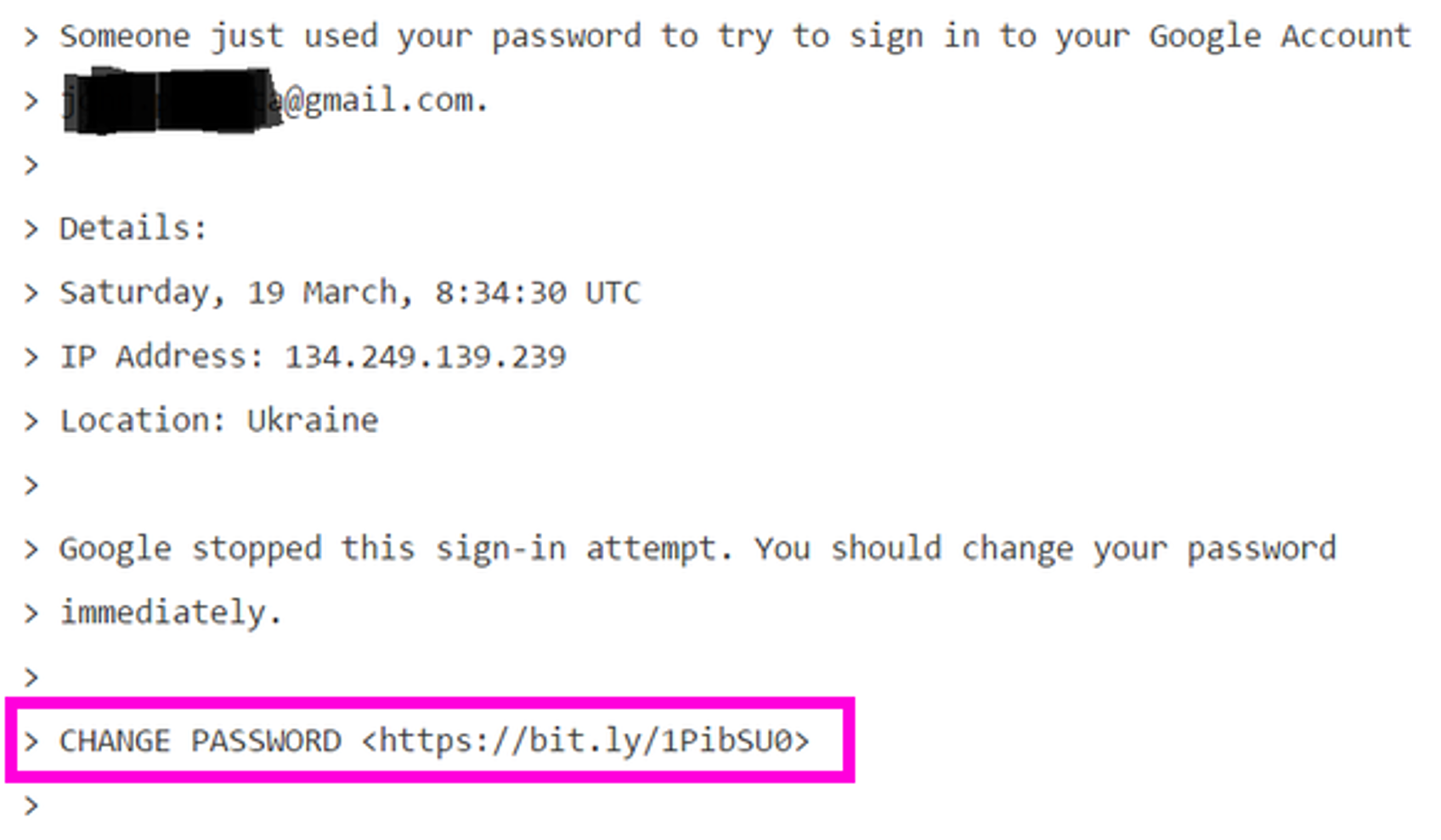
Unfortunately, we now live in a world where this kind of digital mischief is literally rewriting the world’s history. For proof of that, you need look no further than this single email that was sent March 19th, 2016.

podesta-hack-email-text

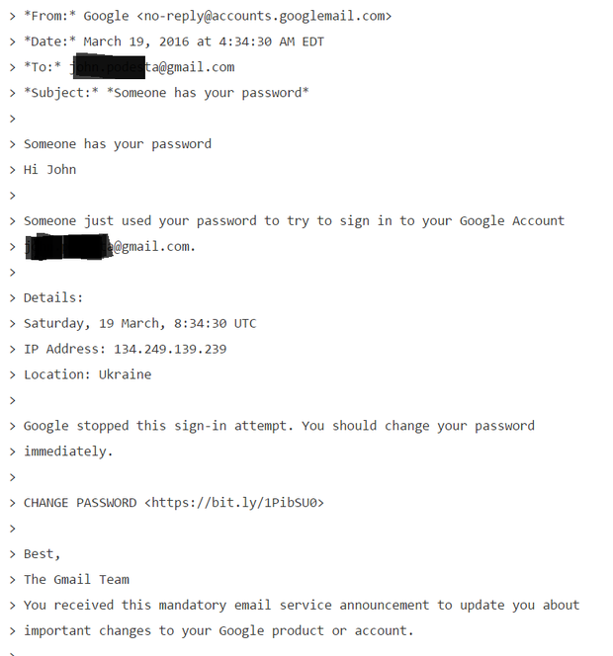
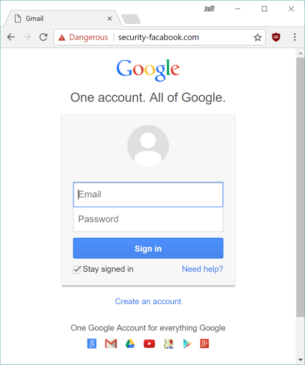
If you don’t recognize what this is, it is a phishing email.

This is by now a very, very famous phishing email, arguably the most famous of all time. But let’s consider how this email even got sent to its target in the first place:

  • An attacker slurped up lists of any public emails of 2008 political campaign staffers.

  • One 2008 staffer was also hired for the 2016 political campaign

  • That particular staffer had non-public campaign emails in their address book, and one of them was a powerful key campaign member with an extensive email history.

On successful phish leads to an even wider address book attack net down the line. Once they gain access to a person’s inbox, they use it to prepare to their next attack. They’ll harvest existing email addresses, subject lines, content, and attachments to construct plausible looking boobytrapped emails and mail them to all of their contacts. How sophisticated and targeted to a particular person this effort is determines whether it’s so-called “spear” phishing or not.

phishing-vs-spear-phishing

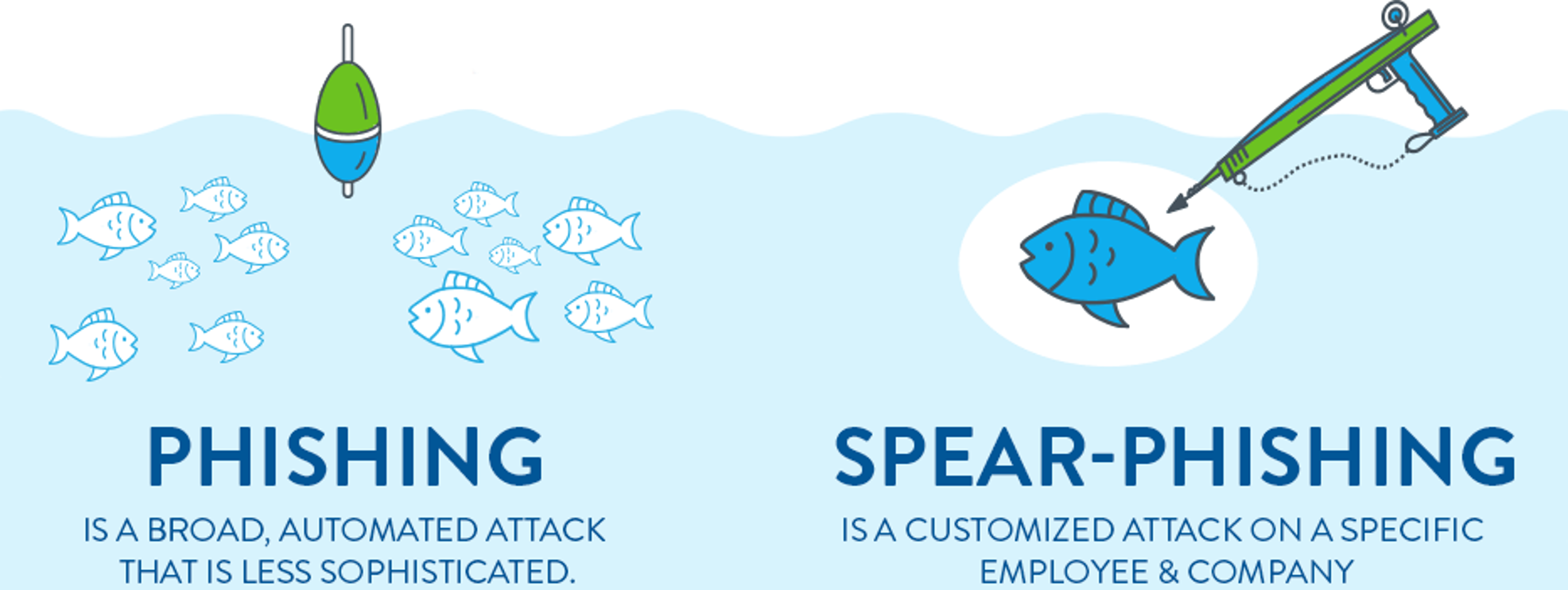
In this case is it was not at all targeted. This is a remarkably unsophisticated, absolutely generic routine phishing attack. There is zero focused attack effort on display here. But note the target did not immediately click the link in the email!

podesta-hack-email-link-1

Instead, he did exactly what you’d want a person to do in this scenario: he emailed IT support and asked if this email was valid. But IT made a fatal mistake in their response.

podesta-it-support-response

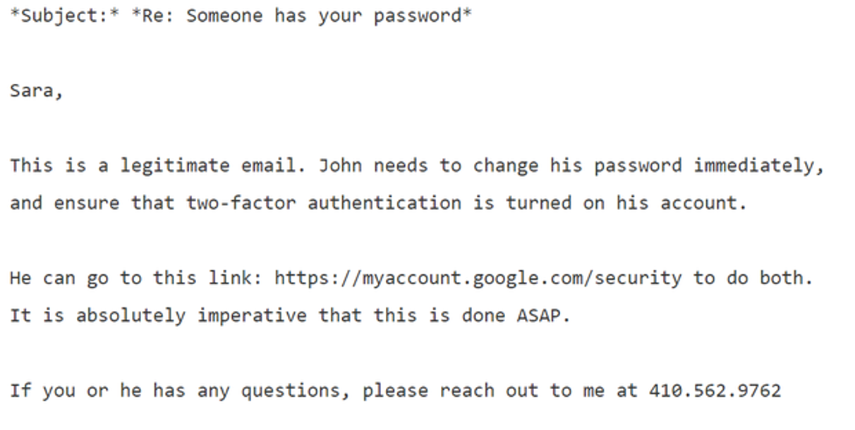
Do you see it? Here’s the kicker:

Mr. Delavan, in an interview, said that his bad advice was a result of a typo: He knew this was a phishing attack, as the campaign was getting dozens of them. He said he had meant to type that it was an “illegitimate” email, an error that he said has plagued him ever since.

One word. He got one word wrong. But what a word to get wrong, and in the first sentence! The email did provide the proper Google address to reset your password. But the lede was already buried since the first sentence said “legitimate”; the phishing link in that email was then clicked. And the rest is literally history.

What’s even funnier (well, in the way of gallows humor, I guess) is that public stats were left enabled for that bit.ly tracking link, so you can see exactly what crazy domain that “Google login page” resolved to, and that it was clicked exactly twice, on the same day it was mailed.

bitly-podesta-tracking-link

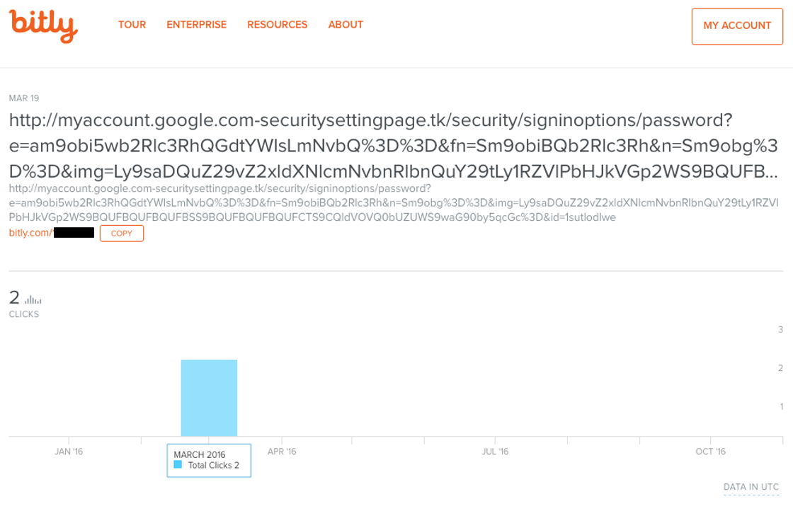
As I said, these were not exactly sophisticated attackers. So yeah, in theory an attentive user could pay attention to the browser’s address bar and notice that after clicking the link, they arrived at

http://myaccount.google.com-securitysettingpage.tk/security/signinoptions/password

instead of

https://myaccount.google.com/security

Note that the phishing URL is carefully constructed so the most “correct” part is at the front, and weirdness is sandwiched in the middle. Unless you’re paying very close attention and your address bar is long enough to expose the full URL, it’s … tricky. See this 10 second video for a dramatic example.

Quick phishing demo. Would you fall for something like this? pic.twitter.com/phONMKHBle

— Mustafa Al-Bassam (@musalbas) September 9, 2018

(And if you think that one’s good, check out this one. Don’t forget all the unicode look-alike trickery you can pull, too.)

I originally wrote this post as a presentation for the Berkeley Computer Science Club back in March, and at that time I gathered a list of public phishing pages I found on the web.

nightlifesofl.com
ehizaza-limited.com
tcgoogle.com
appsgoogie.com
security-facabook.com

Of those five examples from 6 months ago, one is completely gone, one loads just fine, and three present an appropriately scary red interstitial warning page that strongly advises you not to visit the page you’re trying to visit, courtesy of Google’s safe browsing API. But of course this kind of shared blacklist domain name protection will be completely useless on any fresh phishing site. (Don’t even get me started on how blacklists have never really worked anyway.)

google-login-phishing-page

It doesn’t exactly require a PhD degree in computer science to phish someone:

  • Buy a crazy long, realistic looking domain name.
  • Point it to a cloud server somewhere.
  • Get a free HTTPS certificate courtesy of our friends at Let’s Encrypt.
  • Build a realistic copy of a login page that silently transmits everything you type in those login fields to you – perhaps even in real time, as the target types.
  • Harvest email addresses and mass mail a plausible looking phishing email with your URL.

I want to emphasize that although clearly mistakes were made in this specific situation, none of the people involved here were amateurs. They had training and experience. They were working with IT and security professionals. Furthermore, they knew digital attacks were incoming.

The … campaign was no easy target; several former employees said the organization put particular stress on digital safety.

Work emails were protected by two-factor authentication, a technique that uses a second passcode to keep accounts secure. Most messages were deleted after 30 days and staff went through phishing drills. Security awareness even followed the campaigners into the bathroom, where someone put a picture of a toothbrush under the words: “You shouldn’t share your passwords either.”

The campaign itself used two factor auth extensively, which is why personal gmail accounts were targeted, because they were less protected.

The key takeaway here is that it’s basically impossible, statistically speaking, to prevent your organization from being phished.

Or is it?

techsolidarity-logo

Nobody is doing better work in this space right now than Maciej Ceglowski and Tech Solidarity. Their list of basic security precautions for non-profits and journalists is pure gold and has been vetted by many industry professionals with security credentials that are actually impressive, unlike mine. Everyone should read this list very closely, point by point.

Everyone?

Computers, courtesy of smartphones, are now such a pervasive part of average life for average people that there is no longer any such thing as “computer security”. There is only security. In other words, these are normal security practices everyone should be familiar with. Not just computer geeks. Not just political activists and politicians. Not just journalists and nonprofits.

Everyone.

It is a fair bit of reading, so because I know you are just as lazy as I am, and I am epically lazy, let me summarize what I view as the three important takeaways from the hard work Tech Solidarity put into these resources. These three short sentences are the 60 second summary of what you want to do, and what you want to share with others so they do, too.

1) Enable Two Factor authentication through an app, and not SMS, everywhere you can.

google-2fa-1

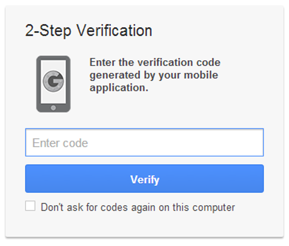
Logging in with only a password, now matter how long and unique you attempt to make that password, will never be enough. A password is what you know; you need to add the second factor of something you have (or something you are) to achieve significant additional security. SMS can famously be intercepted, social engineered, or sim-jacked all too easily. If it’s SMS, it’s not secure, period. So install an authenticator app, and use it, at least for your most important credentials such as your email account and your bank.

Have I mentioned that Discourse added two factor authentication support in version 2.0, and our just released 2.1 adds printed backup codes, too? There are two paths forward: you can talk about the solution, or you can build the solution. I’m trying to do both to the best of my ability. Look for the 2FA auth option in your user preferences on your favorite Discourse instance. It’s there for you.

(This is also a company policy at Discourse; if you work here, you 2FA everything all the time. No other login option exists.)

2) Make all your passwords 11 characters or more.

It’s a long story, but anything under 11 characters is basically the same as having no password at all these days. I personally recommend at least 14 characters, maybe even 16. But this won’t be a problem for you, because…

3) Use a password manager.

If you use a password manager, you can simultaneously avoid the pernicious danger of password re-use and the difficulty of coming up with unique and random passwords all the time. It is my hope in the long run that cloud based password management gets deeply built into Android, iOS, OSX, and Windows so that people don’t need to run a weird melange of third party apps to achieve this essential task. Password management is foundational and should not be the province of third parties on principle, because you never outsource a core competency.

Bonus rule! For the particularly at-risk, get and use a U2F key.

In the long term, two factor through an app isn’t quite secure enough due to the very real (and growing) spectre of real-time phishing. Authentication apps offer timed keys that expire after a minute or two, but if the attacker can get you to type an authentication key and relay it to the target site fast enough, they can still log in as you. If you need ultimate protection, look into U2F keys.

u2f-keys

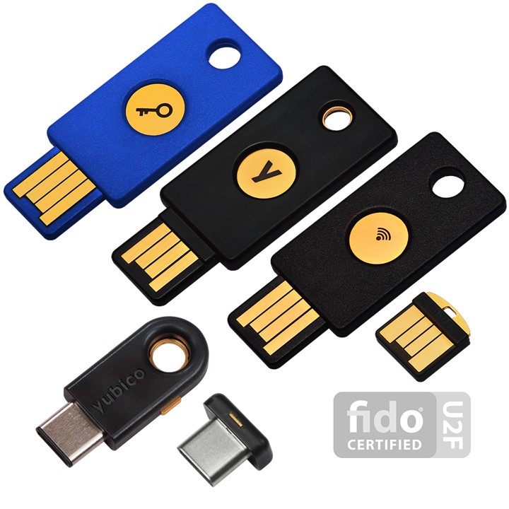
I believe U2F support is still too immature at the moment, particularly on mobile, for this to be practical for the average person right now. But if you do happen to fall into those groups that will be under attack, you absolutely want to set up U2F keys where you can today. They’re cheap, and the good news is that they literally make phishing impossible at last. Given that Google had 100% company wide success against phishing with U2F, we know this works.

In today’s world, computers are now so omnipresent that there is no longer any such thing as cybersecurity, online security, or computer security – there’s only security. You either have it, or you don’t. If you follow and share these three rules, hopefully you too can have a modicum of security today.

Categories: Others, Programming Tags:

To Serve Man, with Software

December 31st, 2017 No comments
software is eating the world, Marc Andreessen

I didn’t choose to be a programmer. Somehow, it seemed, the computers chose me. For a long time, that was fine, that was enough; that was all I needed. But along the way I never felt that being a programmer was this unambiguously great-for-everyone career field with zero downsides. There are absolutely occupational hazards of being a programmer, and one of my favorite programming quotes is an allusion to one of them:

It should be noted that no ethically-trained software engineer would ever consent to write a DestroyBaghdad procedure. Basic professional ethics would instead require him to write a DestroyCity procedure, to which Baghdad could be given as a parameter.

Which reminds me of another joke that people were telling in 2015:

Donald Trump is basically a comment section running for president

Which is troubling because technically, technically, I run a company that builds comment sections.

Here at the tail end of 2017, from where I sit neither of these jokes seem particularly funny to me any more. Perhaps I have lost the capacity to feel joy as a human being? Haha just kidding! … kinda.

Remember in 2011 when Marc Andreeseen said that “Software is eating the world?”

That used to sound all hip and cool and inspirational, like “Wow! We software developers really are making a difference in the world!” and now for the life of me I can’t read it as anything other than an ominous warning that we just weren’t smart enough to translate properly at the time. But maybe now we are.

I’ve said many, many times that the key to becoming an experienced software developer is to understand that you are, at all times, your own worst enemy. I don’t mean this in a negative way – you have to constantly plan for and design around your inevitable human mistakes and fallibility. It’s fundamental to good software engineering because, well, we’re all human. The good-slash-bad news is that you’re only accidentally out to get yourself. But what happens when we’re infinitely connected and software is suddenly everywhere, in everyone’s pockets every moment of the day, starting to approximate a natural extension of our bodies? All of a sudden those little collective social software accidents become considerably more dangerous:

The issue is bigger than any single scandal, I told him. As headlines have exposed the troubling inner workings of company after company, startup culture no longer feels like fodder for gentle parodies about ping pong and hoodies. It feels ugly and rotten. Facebook, the greatest startup success story of this era, isn’t a merry band of hackers building cutesy tools that allow you to digitally Poke your friends. It’s a powerful and potentially sinister collector of personal data, a propaganda partner to government censors, and an enabler of discriminatory advertising.

I’m reminded of a particular Mitchell and Webb skit: “Are we the baddies?”

On the topic of unanticipated downsides to technology, there is no show more essential than Black Mirror. If you haven’t watched Black Mirror yet, do not pass go, do not collect $200, go immediately to Netflix and watch it. Go on! Go ahead!

? Fair warning: please DO NOT start with season 1 episode 1 of Black Mirror! Start with season 3, and go forward. If you like those, dip into season 2 and the just-released season 4, then the rest. But humor me and please at least watch the first episode of season 3.

The technology described in Black Mirror can be fanciful at times, but several episodes portray disturbingly plausible scenarios with today’s science and tech, much less what we’ll have 20 to 50 years from now. These are very real cautionary tales, and some of this stuff is well on its way toward being realized.

Programmers don’t think of themselves as people with the power to change the world. Most programmers I know, including myself, grew up as nerds, geeks, social outcasts. Did I ever tell you about the time I wrote a self-destructing Apple // boot disk program to let a girl in middle school know that I liked her? I was (and still am) a terrible programmer, but oh man did I ever test the heck out of that code before copying on to her school floppy disc. But I digress. What do you do when you wake up one day and software has kind of eaten the world, and it is no longer clear if software is in fact an unambiguously good thing, like we thought, like everyone told us … like we wanted it to be?

Months ago I submitted a brief interview for a children’s book about coding.

I recently recieved a complimentary copy of the book in the mail. I paged to my short interview, alongside the very cool Kiki Prottsman. I had no real recollection of the interview questions after the months of lead time it takes to print a physical book, but reading the printed page, I suddenly hit myself over the head with the very answer I had been searching my soul for these past 6 months:

Jeff Atwood quote: what do you love most about coding?

In attempting to simplify my answers for an audience of kids, I had concisely articulated the one thing that keeps me coming back to software: to serve man. Not on a platter, for bullshit monetization – but software that helps people be the best version of themselves.

And you know why I do it? I need that help, too. I get tired, angry, upset, emotional, cranky, irritable, frustrated and I need to be reminded from time to time to choose to be the better version of myself. I don’t always succeed. But I want to. And I believe everyone else – for some reasonable statistical value of everyone else – fundamentally does, too.

That was the not-so-secret design philosophy behind Stack Overflow, that by helping others become better programmers, you too would become a better programmer. It’s unavoidable. And, even better, if we leave enough helpful breadcrumbs behind for those that follow us, we collectively advance the whole of programming for everyone.

I apologize for not blogging much in 2017. I’ve certainly been busy with Discourse which is actually going great; we grew to 21 people and gave $55,000 back this year to the open source ecosystem we build on. But that’s no excuse. The truth is that it’s been hard to write because this has been a deeply troubling year in so many dimensions — for men, for tech, for American democracy. I’m ashamed of much that happened, and I think one of the first and most important steps we can take is to embrace explicit codes of conduct throughout our industry. I also continue to believe, if we start to think more holistically about what our software can do to serve all people, not just ourselves personally (or, even worse, the company we work for) — that software can and should be part of the solution.

I tried to amplify on these thoughts in recent podcasts:

Community Engineering Report with Kim Crayton
Developer on Fire with Dave Rael
Dorm Room Tycoon with William Channer

Software is easy to change, but people … aren’t. So in the new year, as software developers, let’s make a resolution to focus on the part we can change, and keep asking ourselves one very important question: how can our software help people become the best version of themselves?

Categories: Others, Programming Tags:

10 Must-Have User Interface Design Tools

November 21st, 2017 No comments
GitHub User interface components for Prototype.js

Every designer wants to deliver high quality, valuable experiences for the users. but designing a good user interface is a very challenging task. To succeed, it is necessary to have many web user interface resources and building blocks. Many User Interface resources allow you as a web designer to access and create a good User Interface. In this article, you’ll find a list of User Interface Design tools which you can use.

LivePipe UI

LivePipe UI is a really nice toolkit that you can use to ease your work process. This is a suite of high-quality widgets and controls for web 2.0 applications built using the Prototype JavaScript Framework. Everything is well tested, highly extensible and fully documented.

iPhone Mockup

iPhone Mockup lets you create a user interface for an iPhone app in a very easy and interactive manner. This toolkit will make the process of designing mockups fun and creative. It’s very useful for UI designers or app designers.

DesignerVista

DesignerVista Mockup Tool User Interface Design Tools

DesignerVista is powerful, easy to use GUI mockup design tool to quickly design GUI Mockups for Desktop, Web and Mobile Applications. This toolkit comes with many great features such as Flowchart and UML Mockup, Look and Feels ( Sketch, Native, Office Ribbon and Custom Look and Feels ) and much more.

Gliffy

Gliffy _ Online Diagram and Flowchart Software

Here’s another useful toolkit. This one is called Gliffy and it is easy to use and requires no complicated software manuals. You can simply drag-and-drop shapes from an extensive library and point-and-click your way to format. With Gliffy you can work from any place and with anyone without worrying about software or browser compatibility. With this toolkit, you will achieve consistent results with custom templates, logos and shape libraries which your entire team can create, edit and share. Gliffy integrates with Confluence, JIRA, and Google Drive so you can collaborate easily on your company’s chosen platform.

Wireframe Magnets

Wireframe Magnets (DIY Kit) user interface

In this link, you will find an extremely useful toolkit, called Wireframe MAgnets or DIY magnet template. This toolkit is based on the Konigi wireframe stencils and it includes 3 sheets of elements that will definitely be useful in whiteboard prototyping. All you have to do is simply download the toolkit, which is free, and print the PDFs onto magnet sheets. You can also laminate them but that is optional. The last step is cutting them out.

Patternry

Start Building Consistent Web Interfaces _ Patternry

By using Patternry, you’ll find an efficient way to build, manage and share living style guides and design systems. This is an awesome front-end resource that contains design patterns, HTML & CSS, wireframes, images, links, and more. Patternry makes it easy for your designers and developers to start sharing their work and build consistent Web apps faster. With it, you can build all sorts of things, starting from a simple style guide to a complete pattern library with all its design elements and code.

User Interface Design Framework

GUI Desgn Framework - Free Vector Icons, GUI elements for Web Designers

In this link, you will find an awesome app that helps you design faster and easier. This app was specially created for the wireframing process and it can be used to create better mockup deliverables with Illustrator and to easily customise the vectors GUI elements to your own needs. In this example, you will find 200 graphic styles for buttons, headers, and blocks, 260 vector icons for creating wireframes and web design and hundreds of vector elements for designing interfaces.

Fontawesome

Font Awesome, the iconic font and CSS toolkit

In this link, you will find a massive collection of scalable vector icons that you can easily customise using CSS. Font Awesome is a pictographic language of web-related actions that will come in really handy. This toolkit doesn’t even require JavaScript. Each graphic element is fully scalable which means it will look great at any size. The toolkit is also free to use in both personal and commercial projects. Download this toolkit as soon as possible and find out all the benefits of using it in your projects.

Mockingbird

Website wireframes_ Mockingbird

The Mockingbird is an online tool that makes it easy for you to create, link together, preview, and share mockups of your website or application. Get your ideas out of your head and straight into your web project which is now easier to get done. With this toolkit you will be able to easily drag and drop UI elements to the page, to rearrange and resize them and much more. This feature lets you go from a simple idea to a mockup within minutes. Another cool feature will let you link multiple mockups together and preview them interactively. In this way, you will get a hint of the feel and flow of your app. There’s plenty of things you can do with this toolkit, all of which will help your creative process. You can share links to your clients and teammates and they can edit wireframes with you in real time.

Dojo

Dojo Toolkit User Interface Design Tools

The Dojo Toolkit is a cross-browser 2D vector graphics API which will make things easier for you and your project. The toolkit enables the development of rich graphics web applications on both desktop and mobile devices. You won’t have to deal with the browsers’ native graphics technologies anymore. The toolkit is also very well documented. In this link, you will find documentation and examples for every part of it. You even have step-by-step guides and highly detailed tutorials that focus on using Dojo to develop web apps. All in all, this toolkit would look wonderful in your resource library. It will save you time and it provides everything you need to build a web app. This toolkit brings utilities, UI components and more into one place!

The post 10 Must-Have User Interface Design Tools appeared first on Web Design Blog | Magazine for Designers.

Categories: Others, Programming Tags:

10 Must-Have User Interface Design Tools

November 21st, 2017 No comments
GitHub User interface components for Prototype.js

Every designer wants to deliver high quality, valuable experiences for the users. but designing a good user interface is a very challenging task. To succeed, it is necessary to have many web user interface resources and building blocks. Many User Interface resources allow you as a web designer to access and create a good User Interface. In this article, you’ll find a list of User Interface Design tools which you can use.

LivePipe UI

LivePipe UI is a really nice toolkit that you can use to ease your work process. This is a suite of high-quality widgets and controls for web 2.0 applications built using the Prototype JavaScript Framework. Everything is well tested, highly extensible and fully documented.

iPhone Mockup

iPhone Mockup lets you create a user interface for an iPhone app in a very easy and interactive manner. This toolkit will make the process of designing mockups fun and creative. It’s very useful for UI designers or app designers.

DesignerVista

DesignerVista Mockup Tool User Interface Design Tools

DesignerVista is powerful, easy to use GUI mockup design tool to quickly design GUI Mockups for Desktop, Web and Mobile Applications. This toolkit comes with many great features such as Flowchart and UML Mockup, Look and Feels ( Sketch, Native, Office Ribbon and Custom Look and Feels ) and much more.

Gliffy

Gliffy _ Online Diagram and Flowchart Software

Here’s another useful toolkit. This one is called Gliffy and it is easy to use and requires no complicated software manuals. You can simply drag-and-drop shapes from an extensive library and point-and-click your way to format. With Gliffy you can work from any place and with anyone without worrying about software or browser compatibility.  With this toolkit, you will achieve consistent results with custom templates, logos and shape libraries which your entire team can create, edit and share. Gliffy integrates with Confluence, JIRA, and Google Drive so you can collaborate easily on your company’s chosen platform.

Wireframe Magnets

Wireframe Magnets (DIY Kit) user interface

In this link, you will find an extremely useful toolkit, called Wireframe MAgnets or DIY magnet template. This toolkit is based on the Konigi wireframe stencils and it includes 3 sheets of elements that will definitely be useful in whiteboard prototyping. All you have to do is simply download the toolkit, which is free, and print the PDFs onto magnet sheets. You can also laminate them but that is optional. The last step is cutting them out.

Patternry

Start Building Consistent Web Interfaces _ Patternry

By using Patternry, you’ll find an efficient way to build, manage and share living style guides and design systems. This is an awesome front-end resource that contains design patterns, HTML & CSS, wireframes, images, links, and more. Patternry makes it easy for your designers and developers to start sharing their work and build consistent Web apps faster. With it, you can build all sorts of things, starting from a simple style guide to a complete pattern library with all its design elements and code.

User Interface Design Framework

GUI Desgn Framework - Free Vector Icons, GUI elements for Web Designers

In this link, you will find an awesome app that helps you design faster and easier. This app was specially created for the wireframing process and it can be used to create better mockup deliverables with Illustrator and to easily customise the vectors GUI elements to your own needs. In this example, you will find 200 graphic styles for buttons, headers, and blocks, 260 vector icons for creating wireframes and web design and hundreds of vector elements for designing interfaces.

Fontawesome

Font Awesome, the iconic font and CSS toolkit

In this link, you will find a massive collection of scalable vector icons that you can easily customise using CSS. Font Awesome is a pictographic language of web-related actions that will come in really handy. This toolkit doesn’t even require JavaScript. Each graphic element is fully scalable which means it will look great at any size. The toolkit is also free to use in both personal and commercial projects. Download this toolkit as soon as possible and find out all the benefits of using it in your projects.

Mockingbird

Website wireframes_ Mockingbird

The Mockingbird is an online tool that makes it easy for you to create, link together, preview, and share mockups of your website or application. Get your ideas out of your head and straight into your web project which is now easier to get done. With this toolkit you will be able to easily drag and drop UI elements to the page, to rearrange and resize them and much more. This feature lets you go from a simple idea to a mockup within minutes. Another cool feature will let you link multiple mockups together and preview them interactively. In this way, you will get a hint of the feel and flow of your app. There’s plenty of things you can do with this toolkit, all of which will help your creative process. You can share links to your clients and teammates and they can edit wireframes with you in real time.

Dojo

Dojo Toolkit User Interface Design Tools

The Dojo Toolkit is a cross-browser 2D vector graphics API which will make things easier for you and your project. The toolkit enables the development of rich graphics web applications on both desktop and mobile devices. You won’t have to deal with the browsers’ native graphics technologies anymore. The toolkit is also very well documented. In this link, you will find documentation and examples for every part of it. You even have step-by-step guides and highly detailed tutorials that focus on using Dojo to develop web apps. All in all, this toolkit would look wonderful in your resource library. It will save you time and it provides everything you need to build a web app. This toolkit brings utilities, UI components and more into one place!

The post 10 Must-Have User Interface Design Tools appeared first on Web Design Dev.

Categories: Others, Programming Tags:

10 Must-Have User Interface Design Tools

November 21st, 2017 No comments
GitHub User interface components for Prototype.js

Every designer wants to deliver high quality, valuable experiences for the users. but designing a good user interface is a very challenging task. To succeed, it is necessary to have many web user interface resources and building blocks. Many User Interface resources allow you as a web designer to access and create a good User Interface. In this article, you’ll find a list of User Interface Design tools which you can use.

LivePipe UI

LivePipe UI is a really nice toolkit that you can use to ease your work process. This is a suite of high-quality widgets and controls for web 2.0 applications built using the Prototype JavaScript Framework. Everything is well tested, highly extensible and fully documented.

iPhone Mockup

iPhone Mockup lets you create a user interface for an iPhone app in a very easy and interactive manner. This toolkit will make the process of designing mockups fun and creative. It’s very useful for UI designers or app designers.

DesignerVista

DesignerVista Mockup Tool User Interface Design Tools

DesignerVista is powerful, easy to use GUI mockup design tool to quickly design GUI Mockups for Desktop, Web and Mobile Applications. This toolkit comes with many great features such as Flowchart and UML Mockup, Look and Feels ( Sketch, Native, Office Ribbon and Custom Look and Feels ) and much more.

Gliffy

Gliffy _ Online Diagram and Flowchart Software

Here’s another useful toolkit. This one is called Gliffy and it is easy to use and requires no complicated software manuals. You can simply drag-and-drop shapes from an extensive library and point-and-click your way to format. With Gliffy you can work from any place and with anyone without worrying about software or browser compatibility.  With this toolkit, you will achieve consistent results with custom templates, logos and shape libraries which your entire team can create, edit and share. Gliffy integrates with Confluence, JIRA, and Google Drive so you can collaborate easily on your company’s chosen platform.

Wireframe Magnets

Wireframe Magnets (DIY Kit) user interface

In this link, you will find an extremely useful toolkit, called Wireframe MAgnets or DIY magnet template. This toolkit is based on the Konigi wireframe stencils and it includes 3 sheets of elements that will definitely be useful in whiteboard prototyping. All you have to do is simply download the toolkit, which is free, and print the PDFs onto magnet sheets. You can also laminate them but that is optional. The last step is cutting them out.

Patternry

Start Building Consistent Web Interfaces _ Patternry

By using Patternry, you’ll find an efficient way to build, manage and share living style guides and design systems. This is an awesome front-end resource that contains design patterns, HTML & CSS, wireframes, images, links, and more. Patternry makes it easy for your designers and developers to start sharing their work and build consistent Web apps faster. With it, you can build all sorts of things, starting from a simple style guide to a complete pattern library with all its design elements and code.

User Interface Design Framework

GUI Desgn Framework - Free Vector Icons, GUI elements for Web Designers

In this link, you will find an awesome app that helps you design faster and easier. This app was specially created for the wireframing process and it can be used to create better mockup deliverables with Illustrator and to easily customise the vectors GUI elements to your own needs. In this example, you will find 200 graphic styles for buttons, headers, and blocks, 260 vector icons for creating wireframes and web design and hundreds of vector elements for designing interfaces.

Fontawesome

Font Awesome, the iconic font and CSS toolkit

In this link, you will find a massive collection of scalable vector icons that you can easily customise using CSS. Font Awesome is a pictographic language of web-related actions that will come in really handy. This toolkit doesn’t even require JavaScript. Each graphic element is fully scalable which means it will look great at any size. The toolkit is also free to use in both personal and commercial projects. Download this toolkit as soon as possible and find out all the benefits of using it in your projects.

Mockingbird

Website wireframes_ Mockingbird

The Mockingbird is an online tool that makes it easy for you to create, link together, preview, and share mockups of your website or application. Get your ideas out of your head and straight into your web project which is now easier to get done. With this toolkit you will be able to easily drag and drop UI elements to the page, to rearrange and resize them and much more. This feature lets you go from a simple idea to a mockup within minutes. Another cool feature will let you link multiple mockups together and preview them interactively. In this way, you will get a hint of the feel and flow of your app. There’s plenty of things you can do with this toolkit, all of which will help your creative process. You can share links to your clients and teammates and they can edit wireframes with you in real time.

Dojo

Dojo Toolkit User Interface Design Tools

The Dojo Toolkit is a cross-browser 2D vector graphics API which will make things easier for you and your project. The toolkit enables the development of rich graphics web applications on both desktop and mobile devices. You won’t have to deal with the browsers’ native graphics technologies anymore. The toolkit is also very well documented. In this link, you will find documentation and examples for every part of it. You even have step-by-step guides and highly detailed tutorials that focus on using Dojo to develop web apps. All in all, this toolkit would look wonderful in your resource library. It will save you time and it provides everything you need to build a web app. This toolkit brings utilities, UI components and more into one place!

The post 10 Must-Have User Interface Design Tools first appeared on WebDesignDev.

The post 10 Must-Have User Interface Design Tools appeared first on WebDesignDev.


10 Must-Have User Interface Design Tools was first posted on November 21, 2017 at 9:40 am.
©2022 “WebDesignDev“. Use of this feed is for personal non-commercial use only. If you are not reading this article in your feed reader, then the site is guilty of copyright infringement. Please contact me at jc@ventureupwards.com

Categories: Others, Programming Tags:

The Existential Terror of Battle Royale

November 5th, 2017 No comments
pubg-steam-stats-nov-2017

It’s been a while since I wrote a blog post, I guess in general, but also a blog post about video games. Video games are probably the single thing most attributable to my career as a programmer, and everything else I’ve done professionally after that. I still feel video games are one of the best ways to learn and teach programming, if properly scoped, and furthermore I take many cues from video games in building software.

I would characterize my state of mind for the last six to eight months as … poor. Not only because of current events in the United States, though the neverending barrage of bad news weighs heavily on me, and I continue to be profoundly disturbed by the erosion of core values that I thought most of us stood for as Americans. Didn’t we used to look out for each other, care about each other, and fight to protect those that can’t protect themselves?

In times like these, I sometimes turn to video games for escapist entertainment. One game in particular caught my attention because of its meteoric rise in player count over the last year.

That game is Player Unknown’s Battlegrounds. I was increasingly curious why it was so popular, and kept getting more popular every month. Calling it a mere phenomenon seems like underselling it; something truly unprecedented is happening here. I finally broke down and bought a copy for $30 in September.

After a few hours in, I had major flashbacks to the first time I played Counter-Strike in 1998. I realized that we are witnessing the birth of an entirely new genre of game: the Battle Royale. I absolutely believe that huge numbers of people will still be playing some form of this game 20 years from now, too.

steam-top-games-by-player-count-nov-2017

I’ve seen the Japanese movie, and it’s true that there were a few Battle Royale games before PUBG, but this is clearly the defining moment and game for the genre, the one that sets a precedent for everyone else to follow.

It’s hard to explain why Battlegrounds is so compelling, but let’s start with the loneliness.

Although you can play in squads (and I recommend it), the purest original form of the game is 100 players, last man standing. You begin with nothing but the clothes on your back, in a cargo aircraft, flying over an unknown island in a random trajectory.

battlegrounds-cargo-plane

It’s up to you to decide when to drop, and where to land on this huge island, full of incredibly detailed cities, buildings and houses – but strangely devoid of all life.

playerunknown-battleground-drop

What happened to everyone? Where did they go? The sense of apocalypse is overwhelming. It’s you versus the world, but where did the rest of the world go? You’ll wander this vast deserted island, scavenging for weapons and armor in near complete silence. You’ll hear nothing but the wind blowing and the occasional buzzing of flies. But then, suddenly the jarring pak-pak-pak of gunfire off in the distance, reminding you that other people are here. And they aren’t your friends.

battle-royale-vista

the dread of never knowing when another of the 100 players on this enormous island is going to suddenly appear around a corner or over a hill is intense. You’ll find yourself wearing headphones, cranking the volume, constantly on edge listening for the implied threat of footfalls. Wait, did I hear someone just now, or was that me? You clench, and wait. I’ve had so many visceral panic moments playing this game, to the point that I had to stop playing just to calm down.

pubg-combat

PUBG is, in its way, the scariest zombie movie I’ve ever seen, though it lacks a single zombie. It dispenses with the pretense of a story, so you can realize much sooner that the zombies, as terrible as they may be, are nowhere as dangerous to you as your fellow man.

Meanwile, that huge cargo airplane still roars overhead every so often, impassive, indifferent, occasionally dropping supply crates with high powered items to fight over. Airstrikes randomly target areas circled in red on the map, masking footfalls, and forcing movement while raining arbitrary death and terror.

pubg-map

Although the island is huge and you can land anywhere, after a few minutes a random circle is overlaid on the map, and a slowly moving wall of deadly energy starts closing in on that circle. Stay outside that circle at your peril; if you find yourself far on the opposite side of the map from a circle, you better start hunting for a vehicle or boat (they’re present, but rare) quickly. These terrordome areas are always shrinking, always impending, in an ever narrowing cone, forcing the remaining survivors closer and closer together. The circles get tighter and deadlier and quicker as the game progresses, ratcheting up the tension and conflict.

Eventually the circle becomes so small that it’s impossible for the handful of remaining survivors to avoid contact, and one person, one out of the hundred that originally dropped out of the cargo plane, emerges as the winner. I’ve never won solo, but I have won squad, and even finishing first out of 25 squads is an unreal, euphoric experience. The odds are so incredibly against you from the outset, plus you quickly discover that 85% of the game is straight up chance: someone happens to roll up behind you, a sniper gets the drop on you, or you get caught in the open with few options. Wrong place, wrong time, game over. Sucks to be you.

pubg-vehicle-shooting

You definitely learn to be careful, but there’s only so careful you can be. Death comes quickly, without warning, and often at random. What else can you expect from a game mode where there are 100 players but only 1 eventual winner?

There haven’t been many Battle Royale games, so this game mode is a relatively new phenomenon. If you’d like to give it a try for free, I highly recommend Fortnite’s Battle Royale mode which is 100% free, a near-clone of PUBG, and quite good in its own right. They added their Battle Royale mode well after the fact; the core single player “save the world” gameplay of building stuff and fighting zombie hordes is quite fun too, though a bit shallow. It also has what is, in my opinion, some of the most outstanding visual style I’ve ever seen in a game – a cool, hyperbolic cartoon mix of Chuck Jones, Sam & Max, and Cloudy with a Chance of Meatballs. It’s also delightfully diverse in its character models.

fortnite-battle-royale

(The only things you’ll give up over PUBG are the realistic art style, vehicles, and going prone. But the superb structure building system in Fortnite almost makes up for that. If nothing else it is a demonstration of how incredibly compelling the Battle Royale game mode is, because that part of the game is wildly successful in a a way that the core game, uh, wasn’t. Also it’s free!)

I didn’t intend for this to happen, but to me, the Battle Royale game mode perfectly captures the zeitgeist of the current moment, and matches my current state of mind to a disturbing degree. It’s an absolutely terrifying experience of every human for themselves, winner takes all, with impossible odds. There are moments it can be thrilling, even inspiring, but mostly it’s brutal and unforgiving. To succeed you need to be exceedingly cautious, highly skilled, and just plain lucky. Roll the dice again, but know that everyone will run towards the sound of gunfire in hopes of picking off survivors and looting their corpses. Including you.

Battle Royale is not the game mode we wanted, it’s not the game mode we needed, it’s the game mode we all deserve. And the best part is, when we’re done playing, we can turn it off.

Categories: Others, Programming Tags:

10+ Incredible Examples of Responsive Web Design

August 30th, 2017 No comments
Sony USA Responsive Web Design

With more people surfing the web from their mobile devices, designers and developers have been trying to figure out the best way to cater to visitors on both mobile devices and computers. When internet capable phones first began gaining popularity the method was to have two separate sites, a mobile site and a “full” site. But that would limit the mobile viewers’ experience because the site would be so basic it would cause you to wonder if it was coded by chisel and stone. That was then, now everyone is jumping on the “Responsive Web Design” bandwagon and finding it to be a rather happy median.

I like sites that maintain their appearance, at least to some degree, all the way down the resolution latter. But I also understand that specific industries and target audiences come in to play. In some industries, a person may only be viewing a site from their mobile device to find that companies contact info. In those instances, it is probably best that’s what they get from your mobile sized home page as soon as it loads, you can always include links at the bottom to everything else. I would encourage you to help your clients figure out what’s best for them, and keep all monitor sizes and internet browsing devices in mind as you’re developing your next project.

Responsive web design refers to a site that is developed to degrade nicely across multiple screen sizes and resolutions, from the largest Mac display down to the minutest mobile device. It also works wonders on frame size, square or widescreen, as well as window size, as not everyone prefers their browser to be full screen. There are three key factors to developing a responsive website, flexible layouts, flexible images, and media queries. Let’s take a look at 10 excellent examples of responsive web design.

Sony

Sony is a big brand that has embraced responsive web design. You’ll notice there’s not much of a difference between the widescreen and traditional square screen versions other than everything looks a little more compact on the square screen. But if you start with it out wide and squeeze your browser window in, you’ll notice that the main image actually resizes itself to a smaller version. It resizes itself again once you get down towards mobile device width as well.

Gravitate Design

It’s no surprise that a design studio such as Gravitate Design features a responsive website design on their own site. Whether you are a freelancer or a large design studio, you always want your website to display the full extent of your design prowess and knowledge. I really like Gravitate’s site not only because it’s responsive but because it’s very clean and simple. Their color palette compliments itself nicely and they didn’t go overboard on shadowing, borders or putting all their content in boxes.

Spark Box

Sparkbox Responsive Web Design

Spark Box is another web design studio that knows a good thing when they see it and doesn’t hesitate to implement it on their own site. One thing I really like about their website is how they use the width when they have it, but gracefully adjust when they don’t have it. Their little text blurb to the right of the monitor icons on the home page is a great example. It doesn’t look out of place aligned to the right in widescreen mode, nor does it look out of place centered underneath in square mode and mobile mode.

Food Sense

Food Sense Responsive Web Design

Food Sense is another great example of responsive web design. They use the width when they have it, but when they don’t they adjust without losing any of the clean look or flow to the site. The only unfortunate thing about the site is that once you leave their widescreen parameters you lose their latest tweet and Facebook plug that’s on the side column under the navigation. They still have links to both social networks in the footer, so it’s not a huge deal. But still would have been nice to see those features appear elsewhere in the skinnier designs.

Warface

 Freelance UI Responsive Web Design

Warface is the real deal. It’s creative, extremely fluid and if you stretch and squeeze the width you’ll notice that it’s not one flat image, but in fact, several stacked on top of each other.

Clean Air Challenge

Clean Air Communte Challenge Responsive Website

Last week I talked about sites with parallax scrolling and this Clean Air Challenge site just barely missed making my list. The site itself isn’t totally parallax scrolling, just the clouds in the background are. However, the site is an excellent example of responsive web design. Another aspect of this site that I liked was that the only images that you lose once you hit the mobile sized version of the site is the repeat of the main navigation icons that appear in the footer.

Sasquatch Music Festival

Sasquatch! Responsive Website

Sasquatch is an annual music festival in my neck of the woods featuring some big name artists. When I came across their site and saw that it’s as fun to look at as the bands they book are to listen to, I was quite excited. This site sticks out from a lot of the others for me because of all the colors, images, icons and overall sense of style it has to offer. A lot of the responsive websites I come across seem to be heavy on text, light on imagery, and only two or three colors throughout the site.

Andersson-Wise

Andersson-Wise Responsive Website

Andersson-Wise is an Austin, Texas based architect and design firm. Antialiasing jQuery scripts help this site maintain its responsiveness, regardless of how big your display is, this site will keep up. A very simple, modern, clean and classy look, perfect for an architect and design firm.

The Cacao Trail

El Sendero del Cacao Responsive Website

I can only imagine that The Cacao Trail website is almost as enjoyable to navigate as the actual trail is. You lose the main image on this site as soon as you go from widescreen down to a more traditional sized monitor, which I don’t mind as the image doesn’t really do too much for me and it would certainly save you a lot of load time on a mobile device. I do like how the main navigation links enlarge once you hit the mobile sized version, it can get to be a bit of an annoyance trying to touch tiny words to navigate a site on your touch screen mobile device.

Alsacreations

Agence web de qualité Responsive Website

Alsacreations took another interesting approach to their responsive web design. Rather than worrying about keeping all aspects and elements of their site intact between different resolutions, they simply focused on what was important and dropped the bells and whistles. From widescreen to square they dropped their image slider, then from square to mobile, they dropped all elements except their “About” blurb and their email form while including links to everything else.

Yoke

yoke Responsive Website

Yoke is a fluid site thanks to a bit of javascript and its WordPress platform. A well organized and structured layout keeps all of the animations and imagery from giving the site a cluttered look but keeps the site looking fun and creative.

Spigot

Responsive Web Design & Content Strategy from Park City,

Spigot Design is yet another design firm who showcase their responsive abilities on their own website. The overall look and layout of the site is very clean, almost minimalist, but a decent amount of color and creativity provide a nice balance and accent where it’s needed.

The post 10+ Incredible Examples of Responsive Web Design appeared first on Web Design Blog | Magazine for Designers.

Categories: Others, Programming Tags:

10+ Incredible Examples of Responsive Web Design

August 30th, 2017 No comments
Sony USA Responsive Web Design

With more people surfing the web from their mobile devices, designers and developers have been trying to figure out the best way to cater to visitors on both mobile devices and computers. When internet capable phones first began gaining popularity the method was to have two separate sites, a mobile site and a “full” site. But that would limit the mobile viewers’ experience because the site would be so basic it would cause you to wonder if it was coded by chisel and stone. That was then, now everyone is jumping on the “Responsive Web Design” bandwagon and finding it to be a rather happy median.

I like sites that maintain their appearance, at least to some degree, all the way down the resolution latter. But I also understand that specific industries and target audiences come in to play. In some industries, a person may only be viewing a site from their mobile device to find that companies contact info. In those instances, it is probably best that’s what they get from your mobile sized home page as soon as it loads, you can always include links at the bottom to everything else. I would encourage you to help your clients figure out what’s best for them, and keep all monitor sizes and internet browsing devices in mind as you’re developing your next project.

Responsive web design refers to a site that is developed to degrade nicely across multiple screen sizes and resolutions, from the largest Mac display down to the minutest mobile device. It also works wonders on frame size, square or widescreen, as well as window size, as not everyone prefers their browser to be full screen. There are three key factors to developing a responsive website, flexible layouts, flexible images, and media queries. Let’s take a look at 10 excellent examples of responsive web design.

Sony

Sony is a big brand that has embraced responsive web design. You’ll notice there’s not much of a difference between the widescreen and traditional square screen versions other than everything looks a little more compact on the square screen. But if you start with it out wide and squeeze your browser window in, you’ll notice that the main image actually resizes itself to a smaller version. It resizes itself again once you get down towards mobile device width as well.

Gravitate Design

It’s no surprise that a design studio such as Gravitate Design features a responsive website design on their own site. Whether you are a freelancer or a large design studio, you always want your website to display the full extent of your design prowess and knowledge. I really like Gravitate’s site not only because it’s responsive but because it’s very clean and simple. Their color palette compliments itself nicely and they didn’t go overboard on shadowing, borders or putting all their content in boxes.

Spark Box

Sparkbox Responsive Web Design

Spark Box is another web design studio that knows a good thing when they see it and doesn’t hesitate to implement it on their own site. One thing I really like about their website is how they use the width when they have it, but gracefully adjust when they don’t have it. Their little text blurb to the right of the monitor icons on the home page is a great example. It doesn’t look out of place aligned to the right in widescreen mode, nor does it look out of place centered underneath in square mode and mobile mode.

Food Sense

Food Sense Responsive Web Design

Food Sense is another great example of responsive web design. They use the width when they have it, but when they don’t they adjust without losing any of the clean look or flow to the site. The only unfortunate thing about the site is that once you leave their widescreen parameters you lose their latest tweet and Facebook plug that’s on the side column under the navigation. They still have links to both social networks in the footer, so it’s not a huge deal. But still would have been nice to see those features appear elsewhere in the skinnier designs.

Warface

 Freelance UI Responsive Web Design

Warface is the real deal.  It’s creative, extremely fluid and if you stretch and squeeze the width you’ll notice that it’s not one flat image, but in fact, several stacked on top of each other.

Clean Air Challenge

Clean Air Communte Challenge Responsive Website

Last week I talked about sites with parallax scrolling and this Clean Air Challenge site just barely missed making my list. The site itself isn’t totally parallax scrolling, just the clouds in the background are. However, the site is an excellent example of responsive web design. Another aspect of this site that I liked was that the only images that you lose once you hit the mobile sized version of the site is the repeat of the main navigation icons that appear in the footer.

Sasquatch Music Festival

Sasquatch! Responsive Website

Sasquatch is an annual music festival in my neck of the woods featuring some big name artists. When I came across their site and saw that it’s as fun to look at as the bands they book are to listen to, I was quite excited. This site sticks out from a lot of the others for me because of all the colors, images, icons and overall sense of style it has to offer. A lot of the responsive websites I come across seem to be heavy on text, light on imagery, and only two or three colors throughout the site.

Andersson-Wise

Andersson-Wise Responsive Website

Andersson-Wise is an Austin, Texas based architect and design firm.  Antialiasing jQuery scripts help this site maintain its responsiveness, regardless of how big your display is, this site will keep up.  A very simple, modern, clean and classy look, perfect for an architect and design firm.

The Cacao Trail

El Sendero del Cacao Responsive Website

I can only imagine that The Cacao Trail website is almost as enjoyable to navigate as the actual trail is. You lose the main image on this site as soon as you go from widescreen down to a more traditional sized monitor, which I don’t mind as the image doesn’t really do too much for me and it would certainly save you a lot of load time on a mobile device. I do like how the main navigation links enlarge once you hit the mobile sized version, it can get to be a bit of an annoyance trying to touch tiny words to navigate a site on your touch screen mobile device.

Alsacreations

Agence web de qualité Responsive Website

Alsacreations took another interesting approach to their responsive web design. Rather than worrying about keeping all aspects and elements of their site intact between different resolutions, they simply focused on what was important and dropped the bells and whistles. From widescreen to square they dropped their image slider, then from square to mobile, they dropped all elements except their “About” blurb and their email form while including links to everything else.

Yoke

yoke Responsive Website

Yoke is a fluid site thanks to a bit of javascript and its WordPress platform.  A well organized and structured layout keeps all of the animations and imagery from giving the site a cluttered look but keeps the site looking fun and creative.

Spigot

Responsive Web Design & Content Strategy from Park City,

Spigot Design is yet another design firm who showcase their responsive abilities on their own website.  The overall look and layout of the site is very clean, almost minimalist, but a decent amount of color and creativity provide a nice balance and accent where it’s needed.

The post 10+ Incredible Examples of Responsive Web Design appeared first on Web Design Dev.

Categories: Others, Programming Tags:

10+ Incredible Examples of Responsive Web Design

August 30th, 2017 No comments
Sony USA Responsive Web Design

With more people surfing the web from their mobile devices, designers and developers have been trying to figure out the best way to cater to visitors on both mobile devices and computers. When internet capable phones first began gaining popularity the method was to have two separate sites, a mobile site and a “full” site. But that would limit the mobile viewers’ experience because the site would be so basic it would cause you to wonder if it was coded by chisel and stone. That was then, now everyone is jumping on the “Responsive Web Design” bandwagon and finding it to be a rather happy median.

I like sites that maintain their appearance, at least to some degree, all the way down the resolution latter. But I also understand that specific industries and target audiences come in to play. In some industries, a person may only be viewing a site from their mobile device to find that companies contact info. In those instances, it is probably best that’s what they get from your mobile sized home page as soon as it loads, you can always include links at the bottom to everything else. I would encourage you to help your clients figure out what’s best for them, and keep all monitor sizes and internet browsing devices in mind as you’re developing your next project.

Responsive web design refers to a site that is developed to degrade nicely across multiple screen sizes and resolutions, from the largest Mac display down to the minutest mobile device. It also works wonders on frame size, square or widescreen, as well as window size, as not everyone prefers their browser to be full screen. There are three key factors to developing a responsive website, flexible layouts, flexible images, and media queries. Let’s take a look at 10 excellent examples of responsive web design.

Sony

Sony is a big brand that has embraced responsive web design. You’ll notice there’s not much of a difference between the widescreen and traditional square screen versions other than everything looks a little more compact on the square screen. But if you start with it out wide and squeeze your browser window in, you’ll notice that the main image actually resizes itself to a smaller version. It resizes itself again once you get down towards mobile device width as well.

Gravitate Design

It’s no surprise that a design studio such as Gravitate Design features a responsive website design on their own site. Whether you are a freelancer or a large design studio, you always want your website to display the full extent of your design prowess and knowledge. I really like Gravitate’s site not only because it’s responsive but because it’s very clean and simple. Their color palette compliments itself nicely and they didn’t go overboard on shadowing, borders or putting all their content in boxes.

Spark Box

Sparkbox Responsive Web Design

Spark Box is another web design studio that knows a good thing when they see it and doesn’t hesitate to implement it on their own site. One thing I really like about their website is how they use the width when they have it, but gracefully adjust when they don’t have it. Their little text blurb to the right of the monitor icons on the home page is a great example. It doesn’t look out of place aligned to the right in widescreen mode, nor does it look out of place centered underneath in square mode and mobile mode.

Food Sense

Food Sense Responsive Web Design

Food Sense is another great example of responsive web design. They use the width when they have it, but when they don’t they adjust without losing any of the clean look or flow to the site. The only unfortunate thing about the site is that once you leave their widescreen parameters you lose their latest tweet and Facebook plug that’s on the side column under the navigation. They still have links to both social networks in the footer, so it’s not a huge deal. But still would have been nice to see those features appear elsewhere in the skinnier designs.

Warface

 Freelance UI Responsive Web Design

Warface is the real deal.  It’s creative, extremely fluid and if you stretch and squeeze the width you’ll notice that it’s not one flat image, but in fact, several stacked on top of each other.

Clean Air Challenge

Clean Air Communte Challenge Responsive Website

Last week I talked about sites with parallax scrolling and this Clean Air Challenge site just barely missed making my list. The site itself isn’t totally parallax scrolling, just the clouds in the background are. However, the site is an excellent example of responsive web design. Another aspect of this site that I liked was that the only images that you lose once you hit the mobile sized version of the site is the repeat of the main navigation icons that appear in the footer.

Sasquatch Music Festival

Sasquatch! Responsive Website

Sasquatch is an annual music festival in my neck of the woods featuring some big name artists. When I came across their site and saw that it’s as fun to look at as the bands they book are to listen to, I was quite excited. This site sticks out from a lot of the others for me because of all the colors, images, icons and overall sense of style it has to offer. A lot of the responsive websites I come across seem to be heavy on text, light on imagery, and only two or three colors throughout the site.

Andersson-Wise

Andersson-Wise Responsive Website

Andersson-Wise is an Austin, Texas based architect and design firm.  Antialiasing jQuery scripts help this site maintain its responsiveness, regardless of how big your display is, this site will keep up.  A very simple, modern, clean and classy look, perfect for an architect and design firm.

The Cacao Trail

El Sendero del Cacao Responsive Website

I can only imagine that The Cacao Trail website is almost as enjoyable to navigate as the actual trail is. You lose the main image on this site as soon as you go from widescreen down to a more traditional sized monitor, which I don’t mind as the image doesn’t really do too much for me and it would certainly save you a lot of load time on a mobile device. I do like how the main navigation links enlarge once you hit the mobile sized version, it can get to be a bit of an annoyance trying to touch tiny words to navigate a site on your touch screen mobile device.

Alsacreations

Agence web de qualité Responsive Website

Alsacreations took another interesting approach to their responsive web design. Rather than worrying about keeping all aspects and elements of their site intact between different resolutions, they simply focused on what was important and dropped the bells and whistles. From widescreen to square they dropped their image slider, then from square to mobile, they dropped all elements except their “About” blurb and their email form while including links to everything else.

Yoke

yoke Responsive Website

Yoke is a fluid site thanks to a bit of javascript and its WordPress platform.  A well organized and structured layout keeps all of the animations and imagery from giving the site a cluttered look but keeps the site looking fun and creative.

Spigot

Responsive Web Design & Content Strategy from Park City,

Spigot Design is yet another design firm who showcase their responsive abilities on their own website.  The overall look and layout of the site is very clean, almost minimalist, but a decent amount of color and creativity provide a nice balance and accent where it’s needed.

The post 10+ Incredible Examples of Responsive Web Design first appeared on WebDesignDev.

The post 10+ Incredible Examples of Responsive Web Design appeared first on WebDesignDev.


10+ Incredible Examples of Responsive Web Design was first posted on August 30, 2017 at 3:17 pm.
©2022 “WebDesignDev“. Use of this feed is for personal non-commercial use only. If you are not reading this article in your feed reader, then the site is guilty of copyright infringement. Please contact me at jc@ventureupwards.com

Categories: Others, Programming Tags: