Today, WordPress has released the first release candidate1 (RC) for the upcoming 4.0 version. According to the official version numbering2, WordPress 4.0 is no more or less significant than 3.9 was or 4.1 will be. That being said, a new major release is always a cause for excitement! Let’s take a look at the new features the team at WordPress has been working on for us.
Installation Language
Since I’ve always used WordPress in English, it took me a while to realize how important internationalization is. 29% of all WordPress.com installations3 use a non-English language which is huge and not that far from more than a quarter of all installations. Version 4.0 makes it much easier to get WordPress to speak your language. In fact, the first installation screen asks you to choose your native tongue. Nice!
This is a big step up from either having to download in your own language, or grabbing language files manually and modifying the config.
Embed Previews For URLs
Embedding content into posts has also become a much nicer process. One of my irks with the visual editor used to be that it wasn’t visual enough. Not that long ago, you just got a grey box in place of a gallery or other media/embed items. The “Smith” release took care of galleries and 4.0 is taking care of a host of other items. If you paste a YouTube URL in text mode, it will render as a video in visual mode. How handy is that?
I find this a lot more pleasing to work with — I see exactly what I’m going to get. The media modal’s insert from the URL feature is getting the same upgrade. As soon as you’ve entered a URL, the video will load — playable and all! The good news is that it works with all the services you’d expect, from Vimeo to Twitter, Hulu and Flickr. Scott Taylor (who is a core contributor working on this) has kindly gathered some test URLs. I recommend checking out Trac ticket4 to find out more in this regard.
Media Section Grid
The media section now has a grid view by default. This isn’t a groundbreaking coding feat by any measure, but it does introduce a sleeker UI which is perhaps a glimpse of what is coming up in the future.
While this is a minor change, it does give you a way better overview of your media files than the default view of 20 images in a list.
Plugin Discovery And Installation
In my opinion, the plugin “Add New” page got a much needed makeover. The top navigation looks a lot like the new navigation in the media section — another indication of a slightly more modern interface creeping into the system. Plugins in the list view are displayed in a much more visual fashion, and it looks like it’s time for developers to start making thumbnails! While the plugin details screen could use a makeover as well, I’m sure this is a work in progress and will be explored further.
Better Post Editing
One feature I’m particularly happy with is how the editor height has been changed to use screen real estate better. Mark Jaquith painted a great picture5 of the problem:
“The post editor feels like it has been relegated to a box of medium importance on the edit/compose screen.”
This one is a bit difficult to capture in a screenshot, so here’s a quick video of it in action:
UI Improvements For Widget Customization
It’s great that widgets have been included in the theme customizer. Usually, if you had more than five to six widgets, things became a bit too crowded. Fortunately, the new WP version has now put all widgets into a sub-section of the customization screen. This essentially minimizes them when not needed — a welcome UI improvement for sure!
Join The Fun
As always, the latest development versions can be tried out pretty easily. By installing the WordPress Beta Tester6 plugin you can update to the latest beta builds or nightlies and play around with the brand new features.
If you happen to find any bugs, you can add them to the WordPress Trac7 and you can even fix them and contribute to the core! WordPress is a community project, and every little bit helps!
Conclusion
While I agree that WordPress 4.0 isn’t the same leap as 3.0 was, I disagree with this being a problem. Instead of adding more and more features, the team is consolidating existing features and working hard to bring us a better user experience.
The features above will actually affect how I use the day-to-day features of WordPress in a positive way. While I may not be able to post from my Google Glass (partly because I don’t have one), the ability to use WordPress better is far more important.
Many of today’s hottest technology companies, both large and small, are increasingly using the concept of the minimum viable product (MVP) as way to iteratively learn about their customers and develop their product ideas.
By focusing on an integral set of core functionality and corresponding features for product development, these companies can efficiently launch and build on new products. While the concepts are relatively easy to grasp, the many trade-offs considered and decisions made in execution are seldom easy and are often highly debated.
This two-part series, looks into the product design process of Dropbox’s Carousel and the product team at UXPin shares our way of thinking about product design, whether you’re in a meeting, whiteboarding, sketching, writing down requirements, or wireframing and prototyping.
Part 1 is about the core user, their needs and Dropbox’s business needs, and it breaks down existing photo and video apps. Part 2 will cover Carousel’s primary requirements, the end product, its performance and key learnings since the launch.
The Carousel MVP
It’s been reported1, that Dropbox wants Carousel, its new mobile photo and video gallery app, to be “the go-to place for people to store and access their digital photos [and videos],” to be the “one place for all your memories.” In effect, Carousel allows you to access all of your photos and videos stored in a Dropbox account on any device, unifying them in a single interface that automatically sorts files by time and location.
More specifically, the app launched with several key features:
Backing up
It integrates directly with Dropbox’s file storage to save all photos and videos taken on your mobile phone.
Viewing
A cloud-based media gallery displays all of your photos and videos without taking up local storage on your phone.
Sharing
It offers many ways for you to share photos and videos with others, primarily by sending links to view them in Carousel.
Discussing
A new chat thread is created for every group of people with whom you share a collection of pictures or videos.
2Carousel screenshots of backup, viewing, sharing & discussing. (View large version3)
Since launching, Carousel has received polarizing reviews. Amidst this uproar of praise and feature requests, we’ll go over how any product or design team could arrive at the same initial release — a critical exercise, especially in a market as crowded as the one for photo apps. First, we’ll summarize what Carousel is, then break down part of the design process for this MVP, and then compare the UI and UX to existing design patterns such as Apple’s Photos, Instagram, Google+, Camera+, Flickr, Facebook, Picturelife and Dropbox Photos itself.
You can be sure that the product team’s meetings sounded a little like this:
“Photos are hot.”
“People store a lot of photos on Dropbox.”
“So, let’s build a mobile gallery.”
“Want to copy Apple’s Photos but integrate it with Dropbox?”
“Sure, but we also need to copy Facebook Messenger because we’re social, too.”
“OK, draw some sketches, make some wireframes, create the final mockups and build a high-fidelity prototype.”
“Ready to ship to 275 million users?”
“Launch!”
Now that we have an idea of what Carousel is, let’s consider how the team might have gone about designing the app.
Core Users
Carousel clearly targets consumers, both young and old, rather than professionals or enterprises. No question about that. This is clear from the interface and the visual design choices4, marked by a youthful montage of two personas, Nora and Owen (yes, they have names), who we see growing up.
5Carousel’s core users: Nora and Owen, your everyday consumer. (View large version6)
Users needs
A lot of decisions need to be made here because the market already has literally hundreds of apps for taking and managing photos. A few of the main use cases for these photo apps are:
taking photos (i.e. with the camera);
editing photos (with filters or advanced editing);
backing up and syncing across devices;
viewing;
managing (tagging, arranging, moving, deleting or hiding);
sharing (privately or publicly);
discussing (privately or publicly).
Clearly, a lot of user needs could be met by the first version of the product. But where to start? Francine Lee, now a UX researcher at Dropbox, took an initial stab at answering this question with a guerilla usability test7 on Dropbox’s existing solution, Dropbox photos. I’m going to take her work a few steps further.
Business Goals
In general, Dropbox cares about the growth and monetization of its core business. This is what most companies, hot or not, care about.
Specifically, the company wants to continue growing its overall user base (whether those users come from the main Dropbox app or from Carousel), driving new users to its main service of backing up and syncing files, upselling them on larger plans, and keeping everyone as engaged and happy as possible.
Carousel was built to help Dropbox grow.
So, how does this overlap with users’ needs and, ultimately, with the solution that needs to be designed and built?
Existing Design Patterns And Their Gaps
Let’s look at relevant products and design patterns that satisfy both user and business needs, as well as identify any gaps that Carousel might fill. If you’re interested in learning more, check out UXPin’s ebook Mobile UI Design Patterns8.
We’ll review a few existing mobile photo galleries and other design patterns to understand why Dropbox’s Carousel looks so similar to Apple’s native Photos app as well as Instagram’s direct-messaging feature, which, not coincidentally, is similar to Facebook’s Messenger app. Beyond the fact that Apple has made it nearly impossible9 for third-party developers to build a better app, we believe that Dropbox has taken this path for many reasons. And we have much inspiration to take from Instagram.
Because Carousel targets the average consumer, we’ll also look at media-gallery applications that target this user base with a strong mobile presence — after all, eyeballs and engagement are going in the direction of mobile. As such, we didn’t look as much into desktop and web-first apps such as iPhoto, Picasa and Unbound or into power-user applications.
Instead, we’ll focus on Apple’s Photos, Instagram, Google+, Camera+, Flickr, Facebook, Picturelife and Dropbox Photos itself. In “The Best Photo Apps for Keeping Your Memories in the Cloud10,” The Verge analyzes existing solutions in depth and validates our focus on these types of products in evaluating Carousel’s MVP.
Given that Loom, a popular photo and video gallery app, was acquired by Dropbox14 within a week after Carousel launched and then decommissioned a month later in May 2014, we did not include it in this discussion. Everpix also recently went out of business15, so we cannot mention much about it either. To give you an idea of how competitive this space is, Everpix was giving away a free two-year trial just for downloading the desktop app, uploading some photos and linking it to a smartphone.
A demo video of the leading photo application. (Image credit: Loom.com16)
Taking Photos
Below are screenshots of Instagram, Apple’s Camera and Flickr.
They all provide roughly the same functionality (including filters), and all allow users to save copies of photos to their phone’s camera roll, which Dropbox already seamlessly backs up and syncs to the cloud when users opt in. Users don’t need any more options for taking photos, so building this into Carousel’s initial functionality wouldn’t make sense for Dropbox.
17Interface for taking photos in Instagram, Apple Camera, and Flickr Mobile Apps, respectively. (View large version18)
Not only does a camera not belong in Dropbox’s core user experience today, but it wouldn’t complement the myriad of other digital cameras out there. By not building camera functionality into Carousel, Dropbox both minimizes development risks and plays nice with the majority of the market for capturing photos and videos, both apps and hardware alike. It just wants the picture once you’ve taken it.
Editing: Filters and Advanced Editing
Below are screenshots of Apple’s Photos, Instagram and Camera+.
As you can see, you’ll also have to consider a myriad of photo- and video-editing options. Enough reasonable solutions seem to be on the market. Again, most of these products allow users to save original and edited copies to their phone’s camera roll, which Dropbox already seamlessly backs up and syncs to the cloud when users opt in.
19Filters and advanced editing in Apple Photos, Instagram, and Camera+ Mobile Apps, respectively. (View large version20)
Because capturing and editing photos are usually a part of the same workflow, Dropbox has the same reason for not providing this in the initial version of Carousel: It just wants the picture once you’ve taken it. In addition to this reason, users also theoretically cannot edit photos until they store them on Dropbox. Because one of Dropbox’s primary objectives with Carousel is to increase the number of photos that new and existing users store on Dropbox, what users do thereafter is less important and is potentially a distraction from saving all of their photos and moving on.
Backing Up and Syncing
Below are screenshots of Google+, Apple’s Photos, Facebook, Dropbox and Carousel.
Unfortunately, most camera and photo-editing apps still require users to save photos to the camera roll before backing up and syncing. This multi-step process of safely backing up photos and videos and then clearing the camera roll to save space is not only time-consuming when done at the last minute, but also stressful because there is always the worry that something hasn’t synced properly. Beyond the potential for improvement in tying together the processes of capturing and backing up media, current cloud solutions have some additional design problems.
On iOS, separating the option to back up the camera roll from the option to upload new photos to the photo stream across all devices could be confusing. In fact, I still barely understand the difference. Google+ also confuses this experience because users might presume they can edit these settings in Google Drive, which they can’t. Google essentially forces users to share images on its publicly skewed social media website, Google+, with no clarity on the privacy settings for this content. While Google+ does offer auto-enhance and “Auto Awesome” — whatever that means — users might go over their data limits or their phone’s battery might die from uploading so many videos or photos over cellular data.
Facebook, on the other hand, has learned its lesson here and clearly makes media syncing private until the user does something. It also provides some granularity in the settings so that users can sync in the background with peace of mind. And users have a clear option to use Facebook for cloud storage, like Dropbox — obviously, Dropbox is interested in enabling this by default because this is its core business and product value, unlike Facebook.
21Settings in Google+, Apple Photos, and Facebook Mobile Apps, respectively. (View large version22)
Dropbox takes care of these use cases elegantly and, as we’ll see, has completely migrated these settings for photos over to Carousel so that users can get to the right place even if they try to edit these settings in Dropbox’s main app.
Below are screenshots of Apple’s Photos, Facebook, Instagram and Picturelife.
At a basic level, these apps all present photos and videos according to the time and location in which they were shot (sometimes even the building) and in groups and in enlarged individual views. However, this can get confusing when users toggle between views, especially in Apple’s Photos, which has albums, collections and moments, with little or no visual cue of how they relate to each other or what they even mean in the first place — I, for one, still have no idea. This becomes increasingly problematic when users delete photos from their camera roll periodically to save storage space, because there isn’t an easy way to view backed-up media in iCloud.
Facebook is a much simpler solution but, like many cloud-based galleries, has issues with loading speed when the user scrolls quickly because it’s not a native app. Also, accessing these photos is not as simple as it should be — photos are still a secondary experience. On other other hand, Instagram is a photo-first app, but the viewing functionality is limited and extremely cluttered by supporting data (likes, comments, timestamps, etc.).
Compared to the alternatives, Picturelife stands apart with its sheer breadth of options for viewing the media not only in your phone’s camera roll but in 10 popular galleries and social networks, including Dropbox, Facebook, Flickr, Foursquare, Google+, Instagram, Shutterfly, Smugmug, Tumblr and Twitter. Switch easily between timeline, places, faces, memories, favorites, screenshots and albums. Within each album, sort by album name, date taken, date modified, date created or number of pictures. Most importantly, users can use free-form search to find what they’re looking for.
The primary drawback to so many options is that getting lost in the myriad of photos you’ve taken is easy. Moreover, by syncing so many galleries and networks, many of which have reposted images, users will likely see many duplicates. Nevertheless, this product probably enables you to find any image more quickly than any other solution to date.
Below are screenshots of Apple’s Photos, Facebook and Picturelife.
This is where many media galleries and camera apps diverge. Management workflows (tagging, arranging, moving, deleting, hiding) are incredibly diverse, and each app seems to prioritize its own variation. At a basic level, most apps enable users to move media between folders, to use a preset viewing filter to stay organized automatically and to delete photos. These actions can typically be done at the level of picture, selected group or album. However, apps vary widely in how they enable users to hide media, duplicate media, save copies and originals, export to other applications, comment, change meta data, unduplicate, and even link media galleries and social networks.
Apple’s Photos, for instance, enables users to easily select one or more media files and move them between albums or delete them. Likewise, entire albums may be deleted. And a subset of Apple’s photo stream can sync locally, and third-party apps may store copies in Photos as well. However, you can’t manage these accounts from Photos directly. Any other advanced functionality for managing media doesn’t exist. It’s pretty basic.
Facebook provides similar functionality. However, slightly more can be done on a mobile phone, including tagging people, liking media files, and viewing all cloud-stored album-organized media that include tags of the user or that are synced from a phone. While the experience of viewing all synced media in the mobile app is sluggish, the user at least isn’t limited to the local storage on their mobile device. In any case, Facebook is still a limited solution.
Picturelife, by contrast, seems to have it all. Users can either touch and hold an image to see resizing options via drag-and-drop gestures or use a standard vertical menu to favorite photos, add them to albums, hide, delete, comment and more. The flexibility of the viewing options makes managing photos and videos effortless. However, a big drawback is that users can’t select multiple images to add them to a new album or to move them.
Below are screenshots of Google+, Apple’s Photos and Picturelife.
Sharing a single piece or a group of media publicly is baked into every photo and video application we looked at. Whether they share directly from their photo gallery of choice or save to their camera roll in order to share later on another platform, users have options. That being said, how users add, remove and view media before sharing, how they engage with it once shared, where exactly they may share and how they add and remove people to share with vary widely. More importantly, in recent years certain applications give users the option to share media privately with a select audience — a common activity in chat and email clients.
Google+ is designed rather well to let users switch seamlessly between sharing a single photo, a selection of photos or an entire album, whether through Google+ itself or by saving directly to the phone’s camera roll. However, users will be sharing photos on Google’s network with “public” recipients as the default. If they want to send to individual recipients, they get a very limited subset of contacts to scroll through — and only within Google’s network — or a search box or preorganized list of contacts, which likely isn’t updated or properly maintained, especially compared to Facebook’s smart lists. Facebook is similar to Google in that it primarily lets you share media publicly with varying degrees of privacy. While Facebook Messenger’s integration of the camera roll into the private chatting experience is nice, users have no real way to send photos from a Facebook album directly to a private audience in chat.
Apple offers far greater flexibility with sharing on almost any social network, as well as through SMS and email. However, users get little assistance with selecting recipients and no additional organization of this sharing history, especially if they’ve ever shared across more than one channel. Users are also generally forced to share media publicly on social websites but can share privately through more traditionally private channels such as SMS and email.
Picturelife, on the other hand, provides clear flexibility in sending media to a person or group through the phone’s address book or posting to one or more popular social networks. Each option is emphasized equally, so the user can decide how they want to share their photos and videos. Oddly enough for a mobile solution, the way of selecting contacts is extremely sluggish and seems to only offer email options and no SMS option.
Below are screenshots of Apple’s Photos, Facebook and Instagram.
While all of the limitations on posting publicly are due to the sharing limitations mentioned above, the designs to support private discussion are rather distinct from the designs for public discussion and seem to vary widely based on the product’s priorities.
For example, on iOS, users can share multiple photos at once and include anyone in their address book (which is usually anyone with an email address or phone number), but they can’t add more people to the conversation on the fly or reply to a subset of recipients in a separate conversation or view their full media history in a consolidated display (because photos and videos are kept separate).
Meanwhile, Facebook allows users to add new recipients, effectively creating a new chat. Additionally, Facebook more clearly displays the various ways users can communicate with recipients, not just by text, photo and video, but with audio and emojis; and the option to choose an existing photo or video or create a new one is obvious at a glance. However, users can only chat with people they’re connected with on Facebook, not anyone in their address book.
Instagram, on the other hand, makes it very easy to switch between private and public discussions. When users post to their followers to have a public discussion, they can also post to popular websites such as Facebook, Twitter, Tumblr and Flickr to continue the conversation there. Alternatively, they can send a direct message to anyone they’re connected with on Instagram. Again, they’re limited to the social network itself, but this is a dramatic improvement over many of the social alternatives.
Now that we thoroughly understand Carousel’s core users, their general needs, Dropbox’s business needs and what exists on the market, it’s time to get something done.
In part 2 of this series, we’ll detail the product’s primary requirements, summarize Carousel’s state at launch and its performance in the market, and highlight key learnings since the launch. Hopefully, this will help you to design your own MVP, however you like to do that — with whiteboards, sketches, Balsamiq, Photoshop, UXPin or something else.
Drawing with the HTML element Canvas doesn’t leave much to be desired. Complex shapes and animations are possible, the feature set is quite impressive. Yet we need to combine several methods when it comes to e.g. create a shape, rotate it and fill it with a color. The JavaScript library Fabric.js simplifies the possibilities Canvas has to offer and adds functionality to het work done faster. Animations and interactions are created and applied in next to no time.
Scrolling effects have been around in web design for years now, and while many plugins are available to choose from, only a few have the simplicity and light weight that most developers and designers are looking for. Most plugins I’ve seen try to do too many things, which makes it difficult for designers and developers to integrate them in their projects.
Not long ago, Apple introduced the iPhone 5S, which was accompanied by a presentation website1 on which visitors were guided down sections of a page and whose messaging was reduced to one key function per section. I found this to be a great way to present a product, minimizing the risk of visitors accidentally scrolling past key information.
I set out to find a plugin that does just this. To my surprise, I didn’t find a simple solution to integrate in my current projects. That is when One Page Scroll was born.
What Is One Page Scroll?
One Page Scroll is a jQuery plugin that enables you to create a single-scroll layout for a group of sections on a page with minimal markup.
I will explain how I built this plugin, right from its inception through to planning, testing and finally putting the code out there for free.
Note: Before building this plugin, I was aware of the controversy over “scroll-hijacking,” whereby a website overrides the native scrolling behavior of the browser to create its own interaction, which confuses some visitors. One Page Scroll would inevitably go against this principle, so I decided to come up with ways to ease the frustration. One good thing about the plugin is that developers may set a fallback that reverts scrolling from its “hijacked” state to its native behavior for certain screen sizes. This way, developers can maintain the high performance and quality of their websites on low-power devices, such as smartphones and tablets. Other than that, you can also control the length of the animation that takes the visitor from one section to the next, thus allowing you to avoid the slow transition seen on Apple’s iPhone 5S website2.
What Is Its Purpose?
As mentioned, most of the plugins that I found offer way too many unnecessary features, making them difficult to integrate. The purpose of this plugin is to solve this issue. The plugin had to:
be simple to use,
be easy to integrate,
require minimal markup,
do one thing well (i.e. scroll a page the way the iPhone 5S website does).
1. To The Drawing Board
I started by visualizing the plugin as a whole. It should enable visitors to scroll through each section of the page individually. To do that, I needed a way to disable the browser’s default scrolling behavior, while stacking each section in order and moving the page manually when the scrolling is triggered.
After that, I broke the concept down into small tasks, trying to come up with a solution to each task in my mind. Here is a list of the functions and tasks that I came up with:
Prepare the layout and position the sections.
Disable the browser’s default scrolling behavior with CSS by applying overflow: hidden to the body tag. Position each section in sequence, while calculating and attaching all of the necessary information and classes.
Set the manual scrolling trigger.
Detect the scrolling trigger using jQuery, and then determine the direction, and then move the layout using CSS.
Add features.
Add responsiveness, looping, mobile swipe support, pagination, etc.
Test across browsers.
Make sure the plugin runs fine in all modern browsers (Chrome, Safari, Firefox, Internet Explorer 10) and on the most popular operating systems (Windows, Mac OS X, iOS and Android 4.0+).
Open-source the plugin.
Create a new repository, structuring it and writing instructions on how to use the plugin.
Widen support.
Explore other ways to increase support of the plugin.
2. Building The Foundation
Now that I had visualized the whole concept, I began to build the plugin with this template:
The template starts off with a !function($) { … }($) module, which provides local scoping to the global variable for jQuery. The purpose of this function is to reduce the overhead for the jQuery lookup ($) and prevent conflicts with other JavaScript libraries.
The defaults variable at the top holds the default options for the plugin. So, if you don’t define any options, it will fallback to these values.
The $.fn.onepage_scroll function is the main function that initiates everything. Don’t forget to replace onepage_scroll with your own function name if you are creating your own.
Disabling the scrolling behavior can be done easily by adding overflow: hidden to the body tag via CSS through a plugin-specific class name. Coming up with a plugin-specific class naming convention is important to avoid conflicts with existing CSS styles. I usually go with an abbreviation of the plugin’s name, followed by a hyphen and a descriptive word: for example, .onepage-wrapper.
Now that all of the fundamentals are laid out properly, let’s build the first function.
3. Prepare The Layout And Position The Sections
Let’s get to the most interesting part: working out the calculation and instantly dropping all of my effort later in the process. I thought I needed to position each section in sequence by looping through each one and then positioning them, so that they do not overlap with each other. Here’s the snippet I came up with:
This snippet loops through each presented selector (sectionContainer is defined in the defaults variable), applies position: absolute and assigns each one with the correct top position that it needs to align properly.
The top position is stored in the topPos variable. The initial value is 0 and increases as it loops through each one. To make each section a full page and stack up correctly, all I had to do was set the height of each section to 100% and increase the topPos variable by 100 every time it loops through a section. Now, each section should stack up correctly, while only the first section is visible to visitors.
This might seem easy, but it took me a couple of hours to implement and to see how reliable it is, only to realize in the next step that I did not need any of this at all.
4. Manual Trigger And Page Transformation
You might think that the next step would be to move each section to its new position when the scrolling is triggered — I thought so, too. As it turns out, there is a better solution. Instead of moving every single section every time the user scrolls, which would require another loop through and another calculation, I wrapped all of the sections in one container and used CSS3’s translate3d to move the whole wrapper up and down. Because translate3d supports percentage-based values, we can use our previous top position calculation to move each section into the viewport without having to recalculate it. Another benefit is that this gives you control over the timing and easing settings of your animation.
As you may have noticed, this solution makes the positioning snippet illustrated in the previous step unnecessary because the wrapper that we’ve introduced makes each section stack up correctly without any extra styling required.
5The first solution you come up with is not always the most efficient, so make sure to leave time for experimentation. (View large version6)
Now, all we have to do is detect the direction of the user’s scrolling and move the wrapper accordingly. Here’s the code to detect the scrolling direction:
function init_scroll(event, delta) {
   var deltaOfInterest = delta,
   timeNow = new Date().getTime(),
   quietPeriod = 500;

   // Cancel scroll if currently animating or within quiet period
   if(timeNow - lastAnimation < quietPeriod + settings.animationTime) {
      event.preventDefault();
      return;
   }

   if (deltaOfInterest < 0) {
      el.moveDown()
   } else {
      el.moveUp()
   }
   lastAnimation = timeNow;
}

$(document).bind('mousewheel DOMMouseScroll', function(event) {
   event.preventDefault();
   var delta = event.originalEvent.wheelDelta || -event.originalEvent.detail;
   init_scroll(event, delta);
});
In the snippet above, first I bind a function to the mousewheel event (or DOMMouseScroll for Firefox), so that I can intercept the scrolling data to determine the direction of the scrolling. By binding my own init_scroll function in these events, I’m able to pass the available wheelData to init_scroll and detect the direction.
In a perfect world, all I would have to do to detect and move each section is retrieve the delta from the wheelData variable, use the value to determine the direction and perform the transformation. That, however, is not possible. When you are dealing with a sequencing animation, you must create a fail-safe to prevent the trigger from doubling, which would cause the animation to overlap. We can use setInterval to sort this problem out by calling each animation individually, with its own time set apart to create a sequence. But for precision and reliability, setInterval falls short because each browser handles it differently. For example, in Chrome and Firefox, setInterval is throttled in inactive tabs, causing the callbacks not to be called in time. In the end, I decided to turn to a timestamp.
In the snippet above (extracted from the previous one), you can see that I have assigned the current timestamp to the timeNow variable before the detection, so that it can check whether the previous animation has performed for longer than 500 milliseconds. If the previous animation has performed for less than 500 milliseconds, then the condition would prevent the transformation from overlapping the ongoing animation. By using a timestamp, instead of setInterval, we can detect the timing more accurately because the timestamp relies on the global data.
The moveUp and moveDown are functions that change all attributes of the layout to reflect the current state of the website. Data such as the current index, the name of the current section’s class and so on are added in these functions. Each of these functions will call the final transform method to move the next section into the viewport.
Above is the transform method that handles the movement of each section. As you can see, I’ve used the CSS3 transformation to handle all of the manipulation with JavaScript. The reason I did this in JavaScript, rather than in a separate style sheet, is to allow developers to configure the behavior of the plugin — mainly the animation’s timing and easing — through their own function calls, without having to go into a separate style sheet and dig for the settings. Another reason is that the animation requires a dynamic value to determine the percentage of the transition, which can only be calculated in JavaScript by counting the number of sections.
5. Additional Features
I was reluctant to add features at first, but having gotten so much great feedback from the GitHub community, I decided to improve the plugin bit by bit. I released version 1.2.1, which adds a bunch of callbacks and loops and, hardest of all, responsiveness.
In the beginning, I didn’t focus on building a mobile-first plugin (which I still regret today). Rather, I used a simple solution (thanks to Eike Send7 for his swipe events) to detect and convert swipe data into usable delta data, in order to use it on my init_scroll function. That doesn’t always yield the best result in mobile browsers, such as custom Android browsers, so I ended up implementing a fallback option that lets the plugin fall back to its native scrolling behavior when the browser reaches a certain width. Here’s the script that does that:
First, I’ve defined a default variable to activate this fallback. The responsiveFallback is used to determine when the plugin should trigger the fallback.
The snippet above will detect the browser’s width to determine whether the responsive function should run. If the width reaches the value defined in responsiveFallback, then the function will unbind all of the events, such as swiping and scrolling, return the user to the top of the page to prepare for realignment of each section, and then reenable the browser’s default scrolling behavior so that the user can swipe through the page as usual. If the width exceeds the value defined, then the plugin checks for a class of disabled-onepage-scroll to determine whether it has already been initialized; if it hasn’t, then it is reinitialized again.
The solution is not ideal, but it gives the option for designers and developers to choose how to handle their websites on mobile, rather than forcing them to abandon mobile.
6. Cross-Browser Testing
Testing is an essential part of the development process, and before you can release a plugin, you must make sure that it runs well on the majority of machines out there. Chrome is my go-to browser, and I always start developing in it. It has many benefits as one’s main development browser, but your personal preference might vary. For me, Chrome has a more efficient inspection tool. Also, when I get a plugin to work in Chrome, I know that it will probably also work in Safari and Opera as well.
I mainly use my Macbook Air to develop plugins, but I also have a PC at home to check across platforms. When I get a plugin to work in Chrome, then I’ll test manually in Safari, Opera and (lastly) Firefox on Mac OS X, followed by Chrome, Firefox and Internet Explorer (IE) 10 on Windows.
The reason I test only these browsers is that the majority of users are on them. I could have tested IE 9 and even IE 8, but that would have prevented me from releasing the plugin in time with the launch of the iPhone 5S website.
This is generally not a good practice, and I’ll avoid doing it in future. But the good thing about making the plugin open-source is that other developers can help patch it after its release. After all, the purpose of an open-source project is not to create the perfect product, but to create a jumping-off point for other developers to extend the project to be whatever they want it to be.
8Don’t forget to test on mobile devices before launching your plugin. (View large version9)
To ease the pain of cross-browser testing, every time I complete a plugin, I’ll create a demo page to show all of the features of the plugin, and then I’ll upload it to my website and test it, before sharing the plugin on GitHub. This is important because it enables you to see how the plugin performs in a real server environment and to squash any bugs that you might not be able to replicate locally. Once the demo page is up and running on my website, I’ll take the opportunity to test the plugin on other devices, such as phones and tablets.
With these tests, you will have covered the vast majority of browsers out there and prepared the plugin for the real world.
7. Open-Sourcing Your Plugin
When you think the plugin is ready, the final step is to share it on GitHub. To do this, create an account on GitHub, set up Git10 and create a new repository11. Once that is done, clone the repository to your local machine. This should generate a folder with your plugin’s name on your local machine. Copy the plugin to the newly created folder and structure your repository.
Repository Structure
How you structure your repository is all up to you. Here’s how I do it:
The demo folder consists of working demos, with all required resources.
The minified and normal versions of the plugin are in the root folder.
The CSS and sample resources, such as images (if the plugin requires it), are in the root folder.
The readme file is in the root directory of the generated folder.
Readme Structure
Another important step is to write clear instructions for the open-source community. Usually, all of my instructions are in a readme file, but if yours require a more complex structure, you could go with a wiki page on GitHub. Here is how I structure my readme:
Introduction
I explained the purpose of the plugin, accompanied by an image and a link to the demo.
Requirements and compatibility
Put this up front so that developers can see right away whether they’ll want to use the plugin.
Basic usage
This section consists of step-by-step instructions, from including the jQuery library to adding the HTML markup to calling the function. This section also explains the options available for developers to play with.
Advanced usage
This section contains more complex instructions, such as any public methods and callbacks and any other information that developers would find useful.
Other resources
This section consists of links to the tutorial, credits, etc.
8. Widening Support
This plugin doesn’t really need the jQuery library to do what it does, but because of the pressure to open-source it in time for the iPhone 5S website, I decided to take a shortcut and rely on jQuery.
To make amends, and exclusively for Smashing Magazine’s readers, I have rebuilt One Page Scroll using pure JavaScript (a Zepto version is also available). With the pure JavaScript version, you no longer need to include jQuery. The plugin works right out of the box.
The process of building support for libraries can seem daunting at first, but it’s much easier than you might think. The most difficult part of building a plugin is getting the math right. Because I had already done that for this one, transforming the jQuery plugin into a pure JavaScript one was just a few hours of work.
Because the plugin relies heavily on CSS3 animation, all I had to do was replace the jQuery-specific methods with identical JavaScript methods. Also, I took the opportunity to reorganize the JavaScript into the following standard structure:
Default variables
This is essentially the same as the jQuery version, in which I defined all of the variables, including the default variables for options to be used by other functions.
Initialize function
This function is used for preparing and positioning the layout and for the initialization that is executed when the onePageScroll function is called. All of the snippets that assign class names, data attributes and positioning styles and that bind all keyboard inputs reside here.
Private methods
The private method section contains all of the methods that will be called internally by the plugin. Methods such as the swipe events, page transformation, responsive fallback and scroll detection reside here.
Public methods
This section contains all of the methods that can be called manually by developers. Methods such as moveDown(), moveUp() and moveTo() reside here.
Utility methods
This section contains all of the helpers that replicate a jQuery function to speed up development time and slim down the JavaScript’s file size. Helpers such as Object.extend, which replicates the jQuery.extend function, reside here.
I ran into some annoyances, such as when I had to write a method just to add or remove a class name, or when I had to use document.querySelector instead of the simple $. But all of that contributes to a better, more structured plugin, which benefits everyone in the end.
Rebuilding the Plugin in Zepto
The reason why I decided to support Zepto, despite the fact that it only supports modern browsers (IE 10 and above), is that it gives developers a more efficient and lightweight alternative to jQuery version 2.0 and above, with a more versatile API. Zepto’s file size (around 20 KB) is considerably lower than jQuery 2.0’s (around 80 KB), which makes a big difference in page-loading speed. Because websites are being accessed more on smartphones, Zepto might be a better alternative to jQuery.
Rebuilding a jQuery plugin with Zepto is a much easier task because Zepto is similar to jQuery in its approach to the API, yet faster and more lightweight. Most of the script is identical to the jQuery version except for the animation part. Because Zepto’s $.fn.animate() supports CSS3 animation and the animationEnd callback right off the bat, I can take out this ugly snippet:
With Zepto, you can animate with CSS3 without having to define all of the CSS styles or bind the callback yourself. Zepto handles all of that for you through the familiar $.fn.animate() method, which works similar to the $.fn.animate() method in jQuery but with CSS3 support.
Why Go Through All the Trouble?
Because jQuery has become many people’s go-to library, it has also become increasingly complex and clunky and at times performs poorly. By providing versions for other platforms, you will increase the reach of your plugin.
Going back to the foundation will also help you to build a better, more compliant plugin for the future. jQuery and other libraries are very forgiving of minor structural problems, like missing commas and $(element) — the kinds of things that have made me a little lazy and could compromise the quality of my plugins. Without all of these shortcuts in pure JavaScript, I was more aware of what’s going on in my plugin, which methods are affecting performance and what exactly I can do to optimize performance.
Even though JavaScript libraries such as jQuery have made our lives easier, using one might not be the most efficient way to accomplish your goal. Some plugins are better off without them.
Conclusion
There you have it, the process I went through to build One Page Scroll. I made many mistakes and learned from them along the way. If I were to develop this plugin today, I would focus more on mobile-first and would add more comments to the code so that other people would be able to extend the plugin more easily.
Without the support of design and development communities such as GitHub, StackOverflow and, of course, Smashing Magazine, I wouldn’t have been able to create this plugin in such a short time. These communities have given me so much in the past few years. That is why One Page Scroll and all of my other plugins14 are open-source and available for free. That’s the best way I know how to give back to such an awesome community.
I hope you’ve found this article useful. If you are working on a plugin of your own or have a question or suggestion, please feel free to let us know in the comments below.
High school. I won’t lie: I did not have the highest grades in my graduating class. Some classes and lessons were so poorly designed and delivered that I would frequently become frustrated and fatigued and would ultimately shut down. The contents of the lessons would just wash over me. The experience wasn’t pleasant, and the results were obvious from my transcripts.
But I did well in a few classes. The major difference was the teaching style. Currently, I am a user experience (UX) and user interface (UI) designer of mobile and web applications. In a way, like a teacher, I need to present information in an easily understandable way to new visitors. I need to consider how my students (end users) consume the information that I provide. So, reflection on my high-school experience serves a purpose (aside from painful fashion memories).
A Trip Down Memory Lane
My environmental science and algebra classes stand out as good sources of answers as to what does and doesn’t work when learning new lessons. I remember the former class as being a very positive experience. I would want to use an application or website the same way I learned from my environmental science teacher: simply and intuitively.
On the other hand, my algebra teacher taught the class like an application or website that I would have great difficulty using, the kind that I would spend half of my mental energy trying to learn how to use, rather than learning about what I came for. Let’s compare my two experiences:
Algebra
It start off well. The chalkboard was clean and organized as the teacher wrote a problem and worked out a solution. “OK, I’m getting this.” Then slowly the chalkboard became cluttered as he added another problem somewhere else on the board. Then another. Then another, never erasing old problems to clear up space. The board became cluttered and busy. His pace sped up. I was still hung up on a problem from 10 minutes ago and I was losing my grasp. I looked up from my notebook at a chalkboard that now looked like a lesson in quantum mechanics, rather than simple algebra equations. I felt frustrated, defeated. I retained almost nothing. I gave up and checked out.
1
Environmental science
Again, it started off well. My teacher helped this process continue by putting a lot of effort into organizing her materials and lesson plans. She used the overhead projector often. This forced her to display one visual at a time, which I definitely preferred. She passed out print-outs of the visuals towards the end of class, so that we did not get distracted by what was on our desk, but rather focused on and absorbed the lesson. My teacher had a unique way of tying together real-world examples that supported what she was teaching. The subject matter didn’t feel as abstract to me this way. I was able to retain almost all of the information. This way of giving real-world examples and sharing stories that the audience can directly relate to can be useful in creating a great experience.
My experience in algebra class is what educational psychologists2 would call a heavy “cognitive load3.” This is the stress, anxiety and affected learning that happens to a student when content is presented in an overwhelming and excessive way. The student is weighed down and most likely turned off by whatever they were originally interested to discover, learn or find.
It’s obvious that my science class, like a well-planned and well-executed website or app, was by far a more educational and enjoyable experience. The teacher designed her lessons in a way that helped the students avoid cognitive overload and maintain the focus needed to learn.
So, now that I’ve learned something about myself, how can I apply these findings to UX design?
Understand And Know Your Audience
Teachers and UX Designers Are Alike
Teachers are not very different from UX designers. A teacher’s responsibility, like a UX designer’s, is to present content in a format known as instructional design4. In other words, teachers and UX designers must both perform an audience analysis to be aware of their population as a whole. Teachers must understand the students’ curriculum level, goals, skills, learning styles, skill gaps and attention spans to make lesson plans work in everyone’s favor and close any skill gaps that may exist. They need to understand how much information their students can handle and when to deliver that information.
Audience analysis brings to light important insights, such as the students’ goals, frustrations, likes and dislikes. Teachers, like UX designers, decide which content is relevant and how to visually present it. Then, they design a lesson plan that meets their students’ needs without overwhelming their current abilities. The same goes for UX designers as they begin a prototype or wireframe.
Students and End Users Are Also Alike
What happened to me in high-school algebra happens to users on websites, web apps and mobile apps every day. A user will visit a website or try out an application that is designed in such a way that they at once become overwhelmed with content and features that are too quickly displayed. Very often the user will not be able to retain the information and will simply get frustrated and leave the site or app. That’s the worst case for a business that wants to retain and convert users.
For the purpose of this article, I’ll loosely compare students with end users. Unlike users of applications, students do not have the option to try out a teacher or class and decide to move on to another if the first doesn’t meet their needs; however, students and end users do both need to absorb new information from an outside source, process it and ultimately retain it.
Understand Your Subject And Content Types To Minimize Cognitive Overload
Intrinsic Cognitive Load
“Intrinsic” here refers to the complexity that is inherent in certain tasks or materials. In plain terms, some lessons and content are harder to consume than others, and the more complex the content, the more likelihood of cognitive overload.
My algebra class would have been better had the teacher presented one problem at a time, explained the solution at an even pace, cleared the board and then presented the next problem. Print-outs of what was on the board could have been handed out, helping to eliminate the distraction of trying to recreate those problems and solutions in a notebook.
Extraneous Cognitive Load
This form of content consists of superfluous elements, such as an infographic that isn’t necessary for the text it accompanies and that requires the user to do extra mental processing, which can lead to cognitive overload. Or perhaps text is being used when an infographic is called for instead; for example, by explaining in words what a square is when a drawing would get the point across more quickly.
My environmental science class avoided this because the teacher omitted the unnecessary or cumbersome content in our textbooks and provided simple examples and explanations of complex ideas.
How To Avoid Cognitive Overload
Let’s put this into practice and review some ways of avoiding overwhelming your users when they visit your website or app. Below are some tips and examples on how to avoid cognitive overload when designing.
1. Simplify
Audit all of your content and remove anything that isn’t absolutely required for your user to realize their goal. This means auditing the content itself, the amount of content (see point 2 below), as well as the layout, design, graphics and typography (see point 6). Distractors5 and extraneous elements will most likely lead not to increased stimulation, but to cognitive overload.
Decorative graphics might seem to make content more interesting, but they require extra mental processing and will increase the cognitive load. If the content doesn’t support the instructional goal, then remove it. Use your judgment, and be mindful of branding and design aesthetics that the targeted audience would expect.
Good example: A great example is TED106‘s redesign. Using the Wayback Machine7 I accessed the 2013 version8 of TED, and the simplification is easy to see.
9 A good example of simplification can be seen in this year’s redesign (right) of TED106‘s website. (View large version11)
Working with the design firm Huge12, TED audited its website’s content, listened to its users and developed an experience that feels much more personalized and exploratory. TED got away from bombarding the user with many types of navigation and filters. It picked only those that are necessary, giving the interface more breathing room and allowing for larger and cleaner typography, as well as larger and more vibrant images from its talks.
The redesign has been a great success, with more visits, more awards and more participation. It’s a perfect example of how simplicity can draw in the user and help them orient themselves and not be frightened by the density of content.
2. Bite-Sized Information
If the content is too complex and the layout too dense and clustered, then the user might not be able to, or even want to, process the information effectively. Breaking complex content into smaller chunks13 and enabling the user to control their consumption of this content will help them process the information more effectively.
Good example: The designers at Teehan + Lax14 do an outstanding job of chunking information. They set a high standard for how to lay out a lot of content, while keeping a nice rhythm, intuitive content breakers (including visuals and block quotes) and great design elements (such as typography and color).
Teehan + Lax does this particularly well with its case studies. Intrinsically complex, the case studies are easy and enjoyable to
read because the designers have chunked the well-written content with large typography, interesting parallax scrolling effects and animations, and stunning graphics and colors. The case study of Prismatic17 illustrates just this.
Bad example: Y&R’s “About Us18” page is an example of intrinsically dense content that’s made even more difficult to consume.
The page is much too dense with content and cluttered with distractors. Comparing it to Teehan + Lax, you should be able to see the difference that well-implemented chunking makes.
Using a grid for a copy-heavy subject was a risky decision that makes this page appear cluttered. The actual “About Us” content is buried beneath large boxes of related articles and quick links to sections below. The type is too small and its alignment and width change three times on the page. Too many seemingly random and busy images appear that don’t support the text. And the “Related Content” links, much like the images, are too many in quantity and seem randomly placed. All of these distractors force the user to orient themselves and understand the page’s layout before actually learning about Y&R and its culture.
3. Be Creative
Present information in different ways. Because the web is visual, try to present content graphically, through images or graphs. This is a great way to exploit the user’s different processing methods, freeing up their mind as they consume content, which in turn reduces their cognitive load. Most importantly, design the visuals in a meaningful way and not with such unorthodoxy that they become frustrating to use.
Good example: Well-produced annual reports creatively merge gorgeous infographics, photographs and illustrations to capture and hold the reader’s attention. Even though they’re digital now, they uphold the principles forged by their printed forefathers. Philips’ annual report for 201321 is a fine example of bite-sized headlines and facts, undistracting photographs, simple infographics and well-paced layouts, helping the user absorb information without being turned off.
Philips’ designers and writers introduce great creative elements along with standard tactics (including chunking). The information architecture is set up so that users can find new articles through “Read More” links, rather than everything being squeezed into one space.
Bad example:GE’s annual report for 201224 is similar to Phillip’s in that the website is a vertical-scrolling storyboard with parallax effects. Unfortunately, it is not as effective in preventing cognitive overload. It starts off well, but as soon as the user arrives at the “Letter to Shareowners,” the volume of text clearly becomes overwhelming. Even with the infographics and pictures, the small text demands that shareowners absorb a lot. If the content could not have been made less complex, then perhaps more editing, auxiliary navigation, clear headings and section dividers would have made it easier to digest.
25 GE has award-winning designs, and its annual report26 starts off great but gets very dense with the “Letter to the Shareowners,” giving the reader way too much to absorb. (View large version27)
4. Keep the Story Interesting and Free of Redundancy
It’s easy for designers and content strategists to get boxed into templates. Templates are great for many reasons. They make writing, designing and development easier, especially when you’re dealing with multiple content types (such as products and company departments). They also indicate to the user what to expect from page to page.
On the other hand, they can become repetitive. When every page is based on the same template, unique storylines are lost because everything becomes homogenous. This can create apathy in the user for the brand. To counter this, make high-level pages visually unique, and tell a story from the top of the page to the bottom to capture and hold interest.
Good example: Apple shows how product pages can adhere to an overall template and design style yet not come across as repetitive or uninspired. The pages for MacBook Air28, MacBook Pro29 and iMac30 all have the same secondary navigation, photography and typographic style, but within each product area lies a distinct and fresh layout. This engages the user and prevents cognitive overload.
31 Each product in Apple’s32 Mac line has its own layout, while still adhering to an overall design style and template. (View large version33)
Bad example: Granted, Sony has a much larger catalog of products than Apple, and the case for adhering more closely to a template for its product pages is much greater. With Sony’s product page template34, pages become easy to produce, write, develop and update in bulk. Nevertheless, the story gets lost, and the products are homogenized. The user can easily read and understand the content, but the excitement is lost. That excitement and energy, exemplified by Apple, captures the user’s attention and focus (two of the main ingredients in the process of learning).
35 Sony’s36 product pages all adhere to the same template and layout, making it easy for users to read and understand the content but losing the excitement and the story. (View large version37)
5. Make It Multimedia
People learn better when words and graphics are combined — that is, when graphics on their own would not be self-explanatory. Just be sure to make the relationship between the two very clear, whether by embedding the text in the graphic or by showing the elements in close proximity.
Good example:Airbnb4038 is a great example of multimedia done right. Videos of lifestyle vignettes rotate on its home page, under the powerful headline “Welcome Home.” People tend to be drawn in by video, so this approach (which includes persisting the headline) works well as a branding vehicle.
Bad example: Another apartment-sharing company, HomeAway4442, does not engage its users as well as Airbnb. HomeAway has a single static image and headline — no movement, no energy to the content, which forces the user to expend extra energy to orient themselves and figure out what’s marketing and what’s relevant. While the layouts of both websites are similar and well designed, any extra energy the user has to exert is a negative.
43 HomeAway4442‘s home page has a single static image and headline, lacking any movement or energy and not engaging the user to the fullest. (View large version45)
6. Follow Basic Design Principles
Any good designer instinctively understands the following principles, but we’ll mention them anyway because they are extremely relevant to the presentation of content and the user’s experience:
Make the typography big.
Choose readable font faces.
Employ summaries and headings.
Make the layout clear.
Use generous white space.
Clarify with examples.
Good example: Big Human46‘s redesign of Time5047‘s completely adaptive website is a perfect example of superb design considerations. Like the other good examples above, Time’s redesign is a lesson in the principles listed above. The website is easy to read, in large part due to the white space, the well-sized typefaces (Franklin Gothic and Georgia) and adherence to a vertical as well as a baseline grid. As a result, the intrinsic complexity of the content does not feel overwhelming. The user can easily parse the headlines, blurbs and sections. Quite a few options are presented to the user, but done in a way that minimizes cognitive overload.
Bad example: The New York Post5148 struggles with what Time does so well. The layout is a grid of uninspiring images that are hard to view because they are overlaid with a condensed typeface that is hard to read (Founders Grotesk). The lack of white space makes the content difficult to navigate and read. The layout in general is conducive to cognitive overload. With the abundance of photos, repetitive typeface styles and minimal white space, the user will most likely not respond well to the presentation and shut down.
49 Time5047‘ website is clear, with readable typefaces and plenty of white space. The New York Post5148 lacks clarity with its condensed typeface and meager white space. (View large version52)
Prevent Cognitive Overload To Be A Successful UX Designer And Teacher
My old science teacher could have probably become a solid UX designer. She knew her target audience, and she knew how to connect with them. Her lesson plans were clean and thoughtful, designed around intrinsically complex material. She provided helpful visuals and supporting documentation to help her students retain the material.
Following these six rules when designing a website or lesson plan will minimize cognitive overload and keep your users (or students) easily informed and happy. Simplify and chunk complex information, eliminate extraneous content to reduce repetitiveness, and follow the basic design principles above.
If I could, I would invite you to contact my science teacher with any design questions or comments you may have. Unfortunately, we are no longer in contact, so you are stuck with me. Please post any questions or comments you have below.
Do you know which platforms and email clients to focus on when creating an email newsletter for yourself or a client? Using the data from over 22 billion email subscribers, we determined what designers should prioritize, both this year and beyond.
In this article, we’ll interpret the numbers from our “Email Marketing Trends401” report to help designers like you make informed decisions about what works and what doesn’t in email newsletters. Here are some of the things we’ll cover:
Which email clients and platforms should we be supporting now?
Does responsive design matter for email (even though we’re still coding with tables)?
Should we learn all of the email workarounds or just use existing builders and frameworks?
“Beyond the click” matters. Are your landing pages letting you down?
What should we prioritize in an email newsletter project?
Email: Is It Still All Table Layouts?
If you send email newsletters or have done even a cursory amount of design or coding for them, then you’ll know that CSS support in email clients is, well, broken. For the longest time, designers have avoided using even the most common CSS properties, in the fear that straying from the dullest table-based layout would result in significant rendering differences between email clients, including Outlook and Gmail.
However, some clients are more broken than others. And if you have the benefit of a lot of subscribers who read their email on, say, an iOS device, then you can probably create very web-like experiences in the inbox. A usage report for email clients2 can certainly guide you in this decision, as can some of the data we’ve collected.
A Look At The Numbers
Given the amazing volume of email that Campaign Monitor3 sends on behalf of its customers, we were able to collect and analyze data from over 6 million email campaigns and 22 billion(!) email recipients. In particular, we looked at opens across mobile, desktop and webmail clients; year-over-year trends; and patterns of click-through rates (CTR) based on opens by device.
4Data is based on 1.8 billion opens from nearly 22 billion email recipients; 9% of opens occurred in an undetectable environment. (View large version5)
Some of what we found came as no surprise. As expected, mobile devices dominated market share across 2013 and 2014. Less obvious is what mobile’s upward trend means to designers who want to create a great email experience on all platforms — and, of course, get more opens and clicks in the process.
What We Can Learn?
Given our extensive experience in email design, we’ve rolled our findings into three practical tips that you can apply when building your next email campaign — and, not to mention, any landing pages. Without any further hesitation, here they are.
1. As With the Web, Design for Mobile First
In recent years, the market share of email clients has seriously shifted. In turn, designers have had to adapt to changes in email behavior. For example, desktop email clients dominated until early 2012, and now mobile devices are the natural environment for reading email. This means that playing it safe with a fixed-width, one-column layout isn’t enough anymore — we need to focus on making our content not only compelling, but easy to read and easy to navigate on a small screen. Responsive design for email6 is no longer a luxury, but a necessity.
If you zoom in on mobile market share, one thing jumps out: Nearly 90% of all mobile opens occur on Apple’s iOS devices. While this data is skewed by the fact that, unlike many Android email clients, iOS displays images by default (thereby registering more opens), it still shows how readily people consume email on iPhones and iPads.
7Data based on 780,479,174 mobile opens across 2,164,665 campaigns in 2013. (View large version8)
iOS’ dominance has a wonderful upside. It means that many email designers (particularly those with a high percentage of iOS users) can get really adventurous with creating web-like experiences for mobile. For example, Panic9 now regularly integrates SVG animation, web fonts and responsive design in its campaigns:
10Panic integrates SVG animation, web fonts and responsive design in its campaigns. (View large version11)
The lesson here is to ensure that any CSS techniques you use degrade gracefully in less-capable email clients. What looks amazing in Mail might be unusable in Outlook.
Also, in case you’re wondering, switching to a mobile-friendly email newsletter template does yield results. DEG Digital’s redesign for Crocs12 resulted in a 16% higher reading engagement overall and 8% more clicks, while recent tests by SitePoint13 show that the responsive version of its “Versioning” newsletter14 received 16% more clicks than the previous template.
My Smashing Magazine article15 from 2011 is still a great primer on tailoring the email experience to mobile devices. We also have the more recent “Guide to Responsive Email Design16” to get you up to speed. That being said, almost every decent email-marketing service has a visual builder for creating mobile-ready newsletters — ours is called Canvas and is well worth a look17.
2. But Desktop and Webmail Clients Will Not Die
Given that mobile email readership is so far in the lead, is it even worth worrying about what’s happening in webmail or desktop email clients? Yes. While 87% of clicks happen when a reader opens an email for the first time, mobile readers who open an email a second time from their desktop are 65% more likely to click through in a given email, which goes to show that “email triage” is very much a real phenomenon.
18Mobile readers who open an email a second time from their desktop are 65% more likely to click through in a given email. (View large version19)
So, where do opens occur? Outlook 2007+ (as distinct from Outlook.com) accounts for 56% of all desktop opens and nearly 16% of total opens in any environment. Unfortunately, that the majority of desktop opens happen in different editions of Outlook doesn’t make life any easier for designers. Each edition of Outlook has its own rendering challenges20, which regularly require VML workarounds (for example, when applying background images21). As backwards as it sounds, newer versions of Outlook for Windows are more difficult to work with than older ones: 2000 and 2003 render HTML email using Internet Explorer, whereas 2007, 2010 and 2013 use Microsoft Word (thus, the VML tomfoolery).
Refreshingly, Apple’s Mail (which, thanks to WebKit, offers excellent CSS support) has a 33% share of email clients. And, of all email clients, it tends to throw up the fewest rendering problems.
The webmail scene perhaps saw the biggest market share dip last year, but it still accounts for 22% of opens recorded. Looking at other email clients in Microsoft’s stable, Outlook.com (previously Hotmail) accounts for nearly half of all opens in this group. In comparison, Gmail and Yahoo Mail each has an almost 25% share of the webmail market, tying them for second place.
Like the desktop Outlooks, Gmail in particular has some quirks in its CSS support that can be problematic for designers. For starters, Gmail still strips CSS styles22 from the head element of HTML emails, making tools such as CSS Inliner23 a necessary resource (in case your email platform doesn’t have a tool like this built in).
In the end, if you’re coding newsletters from scratch, then learn the different rendering quirks across email clients — for your own sanity.
3. Go Beyond the Click
Almost no one runs an email campaign that doesn’t link to something. So, landing pages should be considered a part of the overall experience. While in some cases, people are willing to view email on two or more platforms, the same isn’t necessarily true with landing pages. A poor mobile experience can have a big impact on bounce rates24. If your email newsletter is meant to generate online sales and yet 41% of subscribers can’t effectively navigate your pages via a mobile device, then you’re potentially losing a lot of revenue.
Looking at it positively, optimizing your website for mobile could have a positive impact not only on your email campaigns, but on your website and business overall. For instance, e-commerce is particularly tricky to get right on mobile devices. However, following a redesign using its ResponsiveJS framework, 5th Finger observed25 that one client measured a 54% increase in checkout conversions on smartphones and a 24% increase on tablets in less than 14 weeks.
The good news is that a lot of landing-page builders (such as Unbounce29), frameworks (such as Zurb Foundation30) and CMS themes (looking at you, WordPress31) focus on making mobile browsing pleasurable. These resources have been developed to do most of the hard work of building a responsive website: adapting navigation elements and forms to be usable, making text readable and scaling images.
In addition to the tools that handle the practical side of responsive design, designers also have formidable resources on the theory, including some great eBooks from Smashing Magazine32. So, regardless of whether you’re more comfortable building out of the box, coding or simply telling a designer what to do, you can provide a good post-click experience for email recipients.
Where Do We Go From Here?
One thing we know about email marketing is that technology is shifting all the time. Knowing and adapting to your subscribers’ email usage — and understanding how they consume your content — is critical to the success of your email campaigns.
33Email client usage by environment from 2011 to 2014. Note that the yellow represents “undetectable” devices, which increased dramatically from Q4 onwards because Google’s decision to cache email images34 affected detection of both Gmail’s webmail and mobile email clients. (View large version35)
If we look at device trends, a few things are clear:
Design mobile-first.
Now that the majority of opens occur on mobile devices (and will continue to do so for the foreseeable future), designers have to move on from a fixed-width, table-based approach to email design. Instead, look at how to create better experiences using CSS, responsive layouts, web fonts and more. In the future, we may even start to use flexbox to create pleasing layouts across a variety of inboxes!
But get comfortable with workarounds for desktop and webmail clients.
Sadly, these email clients aren’t going away anytime soon. With 16% of all opens still occurring across Outlook’s desktop clients and an additional 15% being shared between Outlook.com and Gmail alone, both desktop and webmail clients are still very much in use — and will likely continue to be very broken. If working with VML isn’t your cup of tea, you have some great email builders to choose from, such as Canvas36. These tools have a lot of insider knowledge built in and are a great starting point for a mobile-ready campaign.
Think beyond the click.
You probably don’t run email campaigns in isolation, so review the experience around them. On a mobile device, is it easy to subscribe, click through in a newsletter and then complete a goal (such as creating an account or purchasing an item on your website)? If 41% of your subscribers consume mail on a mobile device, then making all post-click interactions as easy as possible is critical.
Prioritize testing.
Finally, the email client landscape is as fragmented as ever. Our “Guide to CSS Support in Email37” shows that the 18 email clients (split across three environments) all have very different levels of CSS support. If you’re designing and building an email campaign from scratch, then you probably won’t be able to get things “just right” in the most common email clients among your subscribers. So, put time into real-life device testing38, or invest money in virtual tests, such as the ones found in many email platforms and via services such as Litmus39.
Now that we’ve looked at what’s trending, it’s over to you. What kinds of email open trends are you seeing, and are they having an effect on how you design and send email campaigns? We’d love to hear your experiences in the comments below.
Many modern software development best practices draw on influences from the industrial era and concepts like specialization, where individuals with specialized skills worked in an assembly line to mass-produce physical products. These practices from the world of manufacturing have come to influence how things are done when designing and building software products as well.
Lean thinking is one of the latest approaches software development companies have adopted to maximize value and reduce wasted effort and resources. It does so by breaking down an objective into a series of experiments. Each experiment starts with a hypothesis that is tested and validated. The output of each experiment informs the future direction. This is similar to the idea of “sprints” in the agile world, where the overall product roadmap is divided into smaller and meaningful bodies of work.
Designers are by no means immune to these shifts toward a more iterative style of creation. Nowadays, rather than design being something that’s done once at the beginning of an engagement and then never touched again, a product’s design must be flexible and adjust to changing conditions. Approaches like design thinking tend to be lean by nature. There is a huge opportunity, however, to take this notion even further and align design to the new ways digital products are being built and improved on. Let’s look first at the current approach towards design and how it has an impact on the product.
Limitations Of Current Design Approaches
Traditionally, the design process has focused on figuring out the upfront effort to define the big picture and the core design language. This core design language then informs and guides the detailed design for various modules or features. There are two downsides to this:
Initial Investment and Timeline
Product development is dependent on the initial design direction in traditional software development, which means development has to wait for the initial design work to be completed before it can start.
Predicting Future Needs
It’s more difficult to change a product once the initial design direction has been set. Making amendments based on market changes, customer feedback, and other new information becomes ?costlier.
Business leaders and product managers may become reluctant to invest in additional design activities in this scenario. They may trade effort that should be spent on research and testing for more development work in order to accelerate time to market. This can have a negative impact on the quality of the product. Further, the risk-taking ability of the team declines significantly. Once the design is presented it is considered to be final, and it cannot be changed easily, so the team gravitates toward proven models instead of being able to explore innovative new ideas.
Design Sprints Can Help
The issues mentioned above can be resolved if the process can be modified such that the design direction evolves over a period of time instead of being fully defined up front. Such a process will allow product teams to start developing sooner and allows the design direction to be adjusted based on new learning and ideas.
This is very similar to the way agile software engineering uses sprints to divide the overall product vision into smaller sets of goals. Design, too, can have sprints.
So, what is a design sprint? Very simply these are one to three-week sprints, focused on solving specific design problems.
You will notice that the process is not very different from the regular design process, but it is condensed in a way that it could be done from start to finish in about two weeks.
Team Setup
?This process works well when there are multiple team members focusing on a given design problem. Having multiple people benefits in two ways. One, it allows for doing things in parallel. Second, the collaboration leads to more ideas and quick evaluations of those ideas. Let’s look at each of the steps in more detail below.?
Preparation
During the preparation step the team establishes a common understanding of the problem statement as well as the related data and assumptions. Just like software engineering, design sprints are also based on product priorities and a product roadmap so that they remain aligned to overall business goals.?? You can use tools like the Business Model Canvas or its modified version – the Lean Canvas – to get to a good understanding of a business very quickly.
5Business Model Canvas (See larger version6)
Another interesting tool I found recently is Javelin Experiment Board. With this approach, the team brainstorms who the customers are (left side) and then prioritizes (the right side). Similarly, they work on identifying the problems and the riskiest assumptions that need to be tested. All these together lead to the definition of experiments that the team needs to run. The process allows the team to quickly narrow down the goals into very actionable items.??
Kick-off and Research
The kick-off and research step is where having a larger team becomes really useful. Each member of the team can have a thirty-minute talk with three people. With four people doing this in parallel, the team can complete twelve interviews in ninety minutes. Counting some extra time between the interviews and the fact that it’s quite unlikely that all interviews will happen in parallel, I schedule half a day for this activity.??
By doing only three interviews or observations per person and keeping each as just thirty minutes, it reduces the need for remembering or documenting. In my experience the thirty-minute interview is long enough that I can find patterns across multiple interviews. Longer conversations can bring more insight, but remember you can do that in future sprints, equipped with even more knowledge that will be gained between now and the next sprint.??
The research sessions make use of tools like empathy maps to capture the insights. Empathy maps provide a simple but very effective structure to capture research findings. The researchers record what the users said and did, and from that they try to figure out what the users were thinking and feeling. These are the “Say,” “Do,” Think,” and “Feel” sections below. From these the team extracts key insights and further details the problem statement.
????Empathy maps are just one example. The specific research technique to apply depends on the goal and the problem. A great place to start for techniques is the IDEO Method Cards App11.
Analysis
Soon after the research step, get the team together for an analysis of what they found. The longer the time in between, the greater the chance of forgetting some information and the more you’ll have to rely on documentation. ??During this analysis section, each person presents his or her research findings. The team discussionn helps achieve a common understanding of the research findings and priorities of the problem statements.
Ideation?
So now we have a prioritized list of problem statements, and a better understanding of the users, the team can focus on generating solution ideas. At the same time, ideation cannot be a one-time activity, so over the next three days keep a loop of ideation and some detail design. Overall, within the three days the team should be able to come up with clear design direction. This could be rough sketches or high-level wireframes.?
You can use techniques like Crazy 8s to quickly come up with a lot of ideas. The technique requires each team member to sketch eight ideas in five minutes. Only use thick markers, to avoid focusing on too many details. This is a simple and fun exercise. ??
You can then use dot-voting to quickly identify the good ideas that the team sees most value in. Dot-voting is a simple process where each team member is given a certain number of votes (represented by paper dots), and they go through and vote on the design ideas. They may put all their dots on one idea or spread them out as they desire. After this, the team looks at the most popular ideas and works its way down to least popular ideas to identify key trends that seem promising.????
Prototyping
?The next three days in the sprint are dedicated to detailing out the design to a level that can help validate the design direction. Think of prototypes as a visual way to ask questions. Think of the questions you want to ask, and optimize the prototype for those questions. This means some areas of prototypes would be more detailed than the other, and that’s OK as you want to spend time on more value-added activities.??
Validation
?The last step is validation. Just the way we did research with multiple people in parallel, multiple team members can also do the testing with several users. This allows for testing to be completed in as little as one day.
Notice a few things? that should be present in any design sprint:
Collaboration
?The idea is to bring creative energy and diversity together to focus on the problems. Activities like filling a Business Model Canvas, or Crazy 8s ideation with dot-voting allows the team to actively collaborate and work towards a single direction. This leads to new and innovative solutions that are relevant to the problem at hand.
Reduced Handover Friction
?Through more collaboration, we reduce the requirement for documentation. For example, the team does small thirty-minute interviews during the research step and then comes together and discusses soon after, instead of going off and documenting the research in a black box.
Focus
?The team moves from one activity to the next within the same problem statement, each time moving closer to the solution. With little time lag between, it keeps everyone tightly focused on solving the right problems.
This is just one of the ways to apply it. Outfits like Google Ventures also use this concept successfully for their portfolio companies. They do a one-week sprint, but it excludes all research and initial information gathering. Their process looks like the following:
Jake Knapp wrote an excellent post on Google Ventures’ design sprint process18 for anyone interested in reading more about the approach they have tailored specifically for startups.
Another real-world example of design sprints in action comes to us ?from the Nordstorm Innovation Lab. A few years ago they did an experiment where they went into a Nordstrom’s and set up a complete design and development operation right there. They took a product idea/problem area to solve and ran through the entire process in the store, rapidly prototyping and validating an iPad application over the course of the week. See the video embedded below for more.
As you can see, the core idea remains the same, but there is flexibility to change it as needed. Each sprint may include all or only some parts of the design process – research, ideation, and prototype to validation.
It’s initially a difficult concept to enact but it’s a powerful one when implemented correctly. And the difficulty is less in applying it but more in internalizing and adopting that mindset.
Design Sprint Benefits
So what are some key benefits, or the value of designing via design sprints?
Momentum. You can quickly move from one problem to the next in these sprints. You will see ?the momentum building.
Minimized waste. Reducing documentation and increasing collaboration, this process minimizes the activities that do not directly contribute to product development.
Enhances design thinking. By working on smaller problems, one is able to explore many ?different ideas and apply design thinking in a more thorough manner.
Encourages innovation. Design sprints allow for exploration and risk-taking not otherwise seen in the product development space.
It’s important to note that the structure of the design sprint does not have to remain the same throughout the product life cycle. As the product design moves along, the structure should be modified to align with the changing needs. For example, the need for generative research may go down after a large enough body of knowledge has been created. Usability testing also may not be relevant for some sprints, if the design is based on previously validated ideas. The goal of design sprints is not to build a rigid design structure, but to define an approach that allows the entire design process to be more adaptable.
Bringing It All Together
You might be wondering about the overall design direction. Won’t focusing on a few small problems at a time lead to an inconsistent design? This is where what we call the product mindset becomes very critical. The product mindset requires you to take a long-term perspective of the overall product life cycle and the business value. In the short term, small inconsistencies and inefficiencies in design can and will likely crop up, but in the long run they would be ironed out.
This is something to keep an eye on as sprints are being planned and the design progresses. Software engineering sprints have a concept of code refactoring, where the engineers, after every few sprints, revisit the code and refactor it to improve the quality of the code, reduce duplication, increase encapsulation, etc. Similarly, a design refactoring exercise should be undertaken on a regular basis. It is important that everybody on the team, especially the product owner, understands this and that this is included in the product planning. During refactoring, the inconsistencies are reduced and the design direction is realigned.
How To Get Started
If you have never explored applying lean or agile practices to design, the core challenge is in adopting a different mindset. Instead of focusing on finding a perfect solution up front that would just scale to any future requirement, take a longer-term perspective that the perfect design will evolve over a period of time, with regular learning and iterations. The mindset will strengthen as you apply these concepts and see the value. To start with, just take this is an experiment that you are running to test the idea.
Identify a project where you think design sprints may be able to help. This could be a project where:
Complexity is very high
There are a lot of unknown requirements
Time is limited and you need to show results fast
Talk to your team about the idea of design sprints and the value it can potentially deliver. It is important that the entire team supports the initiative. Establish the team’s role in the process, especially emphasizing greater collaboration and reduced documentation.
The next step is to define the scope and goal for your first design sprint. To do this, look at the product backlog or equivalent of that in your organization, and work with the product manager or business stakeholders to identify the highest priority goals. Identify something that you feel can be addressed within one week. The reason for keeping it to one week is to keep the effort short enough that you can run the experiment without a lot of investment.
With the priority identified, set up a working session with your team. Start by explaining the new process, then talk about the identified priorities and the rationale behind selecting them. Set up the plan for the remaining week.
If this works, then repeat it. If something doesn’t work, then tweak it to your requirements and then try again.
These concepts are new, and change can be difficult. But as product designers, our role is to build value for our products and the people using those products. The tool we use is design. As the development landscape changes, we also need to adapt our methodologies to more closely align to the changing landscape and to continually deliver that value effectively.
New HTML5 elements and new JavaScript APIs allow us to create complex applications for the browser. Part of any modern application are one or more dialogue windows. These require users to confirm the execution of certain actions or simply issue a message. With the new „“ element we can now markup these windows using pure HTML5.
Low Poly is a growing trend. More and more websites make use of modified imagery, most commonly in backgrounds. Low Poly is no rocket science. Basically it is just a special form of mosaic. But instead of using rectangle shapes Low Poly uses polygonal forms. As triangular shapes are the most common, the trend is also known as Triangulation. In the following article we will introduce you to a variety of web services and apps that will enable you to generate these trendy shapes in no time.
Our industry is a great one. It’s filled with a lot of awesome people building a lot of inspiring things and constantly seeking out ways to express just how much they love doing so. We’ve had blogs and podcasts, and right now hosting conferences is the big thing. Ever more people are organizing conferences, arranging meetups and creating memorable experiences. It’s fantastic to see.
Nothing compares to a good conference: the atmosphere of being immersed in a crowd of people who share the same passion as you, the lessons you learn and advice you take in, and the friends you get to meet and the new ones you make. You leave a good conference re-energized — full of zeal for your job and bursting with fresh ideas.
That’s exactly what I wanted to create with HybridConf1, and I am proud that we achieved it in our first outing last year. Our guests learned, shared stories, made lasting friendships — even a relationship or two — and undoubtedly had a good time. I felt like I had succeeded in giving back to the community some of the same experiences that I so value from conferences of the past. This year, we’ve switched cities, but our goal is the same: to bring people together in one place where they can discover and share and then leave full of positivity towards the great community we have the privilege to be a part of.
Since starting HybridConf, I’ve been fortunate enough to receive countless pieces of advice from other conference organizers. The advice has been invaluable to me, so I wanted to pay it forward with this article and help more of you succeed, too.
Make Sure That Organizing A Conference Is Right For You
Before delving into a list of tips, I should say that running a conference is incredibly hard, much more than you can possibly imagine, so make sure that it’s really right for you before you start.
If you are going to run a conference, then you will need to be prepared for many late nights, big money worries, a roller coaster of emotions and a prolonged period when your loved ones, social life and free time take a back seat. There’s no escaping that. It’s a huge responsibility and one that will take up a lot of your time, both in physical labor and in constant worrying. It really is a massive amount of work, especially for those of us (like me) who do this on top of a day job. Sometimes it feels insurmountable.
Then, there is the stress from money, because — let’s not beat around the bush here — putting on a conference of a certain size can be very expensive. Add to that the worry of not really being able to control exactly how well the big day goes. You just have to plan and organize and sell as well as you can and keep your fingers crossed. Considering all of this thoroughly, therefore, and whether you really want to commit this much time and brainpower is really important.
Organizing a conference is a lot of fun, but requires a lot of hard work, too. (Image credit: James Seymour-Lock62)
One of the best ways to counteract the stress is to have a really clear understanding of why you’re doing this in the first place. You need to have a solid reason that you can believe in and that will drive you forward and help you to make a lot of the decisions along the way. My reason was that I was tired of so many UK conferences featuring the same speakers with the non-divergent opinions. After complaining about it on Twitter for so long, I decided that I had to just stop complaining and try to fix it. So, I took the opportunity to make the type of conference that I would want to attend myself.
So, with all of that being said, if you’ve read this far and still want to put on a conference, high five to you! I’m very glad I haven’t scared you away, because later I’ll talk about all of the wonderful rewards that this stress and hard work bring you.
Learn How To Run A Great Conference
This section shares my top tips for getting started with your conference and staying organized along the way.
1. Figure Out The Theme
Having some kind of unifying idea is important. It could be relatively broad and high level — like ours, which was to bring designers and developers together — or much narrower, such as Break’s theme of removing the barriers between different specializations of design, or perhaps a conference focused on a particular technology. JavaScript conferences do incredibly well, in part due to the language being the hottest topic in the industry and because such conferences have such a sharp focus.
The question isn’t whether a theme is right for a potential attendee, but rather whether there is one at all. Having a theme helps to unify your ideas, to get appropriate speakers, and to sell and market to the right people. It will also help you to come up with a name. Pick something simple, punchy and on topic. A mission statement will also help you to stay on track and attract your target audience. Here was ours:
“We care a lot about this industry and we couldn’t find a conference that matched our wants or needs. We wanted something that was both welcoming and awe-inspiring. We wanted a conference where the talks were fresh, and you’d not seen most of the speakers before. We wanted a place where we talked about all aspects of the web, in an easy-to-understand way for even the most novice attendee, yet where seasoned attendees still had lots to learn. Thus, HybridConf was born. We spent almost a year of intense hard work, tears and sleepless nights to help empower people in their goals. We hope you join us and celebrate that the people (including you!) make this industry great.”
2. Get A Business Partner, Or Three
Running a conference is a lot of work and emotionally very tiring. Some days you wake up literally paralyzed by fear; other days, you feel invincible. You need to find someone who you can rely on to understand when you get stressed, who can pick up work when you are feeling overwhelmed, who gets excited by your great ideas and who curbs your enthusiasm a bit when you go overboard. Of course, you should provide the same values to your partners. Finding someone you trust to share this experience will be the biggest help you can get.
3. Think About Speakers Very Early On
We chose to hand-pick our speakers. I already had in mind a lot of people who I thought were doing cool stuff and would have something interesting and original to say, so I approached them personally and asked. Speaking experience wasn’t a consideration; I didn’t care whether they were a seasoned pro or a first-timer — and people were incredibly shocked when we revealed who our first-timers were. An open call for proposals might make more sense for you and is a great option. Just make sure that whichever way you choose, you do it early. Good speakers get snapped up really far in advance, so if you want your top choices, secure them as soon as possible.
Try to see whether a desired speaker has any mutual friends. If so, ask the friend to introduce you. Explain your mission to the prospective speaker and see whether it’s a match for them. Our mission, to better the industry, was something many people could get behind. Be honest here. For the people with whom we didn’t have mutual connections, we asked them on Twitter whether emailing them was OK — being respectful goes a long way, and most people are OK with email. Try to capture everything in one email, so that they have enough information to make an informed decision. Make sure to explain the mission, the date, the theme, any compensation you can offer and anything else you feel relevant.
4. Determine Whether You Can Pay Speakers
Although for most conferences it is good practice and a very worthy aim3 to pay the speakers for their time and efforts, we knew from the beginning that, for the first year at least, paying fees to the speakers would not be possible – we simply couldn’t afford to while keeping our ticket costs low enough to be accessible. However, we pledged to cover all of their expenses, including flight, hotel, other travel and a speakers’ dinner. While we couldn’t pay them for their time, we felt that they should not have to incur any costs for coming.
This year, we decided to share revenue with speakers. If we make a profit, they will receive a percentage of it; if we don’t, then we will pay all of their expenses as before but they won’t get anything on top. This protects us, and it gives them a nice bonus if we do well.
Figure out what you can afford from the beginning. If you can afford to pay the speakers (or if that is a higher priority for you than other costs), then great; if you can’t, then be honest and say so when you invite people to speak. Many people are still very happy to come without expecting a fee. The important thing is to be open from the beginning and not to promise to pay for something that you won’t be able to afford in the end.
You’ll also have to consider a lot of things to take great care of your speakers leading up to and during the event. Dermot Daly has a lot of great advice4 on this.
5. Pick A Comfortable Venue
Last year, we had wanted to hold HybridConf in the Coal Exchange, an old historic building in Cardiff Bay; unfortunately, they had to close for some repairs, and we had to find a new venue. In the end, we chose Cineworld. It doesn’t have the cool history of the original venue, but you know what it does have? Comfortable seats. And guess what one of the main things everyone talked about was? How comfortable the seats were compared to other conferences.
Your guests are going to be sitting in one place for the better part of eight hours. Pick somewhere butt-friendly. The venue will also have a big effect on the overall feel. The theme you’ve chosen will inform a lot of your decisions. Do you want a spotlight on the speakers or warm lighting over everyone? We chose the former because we didn’t want people to have any problem understanding the speakers. Do you mind whether people use their laptops? Lower lighting deters that. Do you want to provide an area for people to work if needed? So many decisions will affect the overall feel. Use your best judgement — you should know what attendees want more than anyone.
6. Think About Feeding Guests
We choose to cater. We provide lunches, snacks, tea and coffee and this year breakfast as well. It’s a personal choice and obviously it affects the cost, but we like to do it because we think it makes it easier to mingle, and it takes the stress out of having to find a restaurant and people to eat with. If you do want to provide food, just find a good caterer and let them do what they do best. Many venues have a dedicated caterer or a shortlist that they work with. Figure out in advance the cost per person, the type of food you want to provide (hot or cold, buffet or sit-down) and any special requests (last year we wanted to include some Welsh food). Then, just meet the caterer and they’ll try to meet your requirements.
7. Live In Your Spreadsheet
Our spreadsheet had at least 20 tabs. We had tabs for income, expenses, the schedule, accommodation, contact details, the speakers’ food preferences at the speakers’ dinner, and many more things. We had tables for best- and worst-case scenarios, and we updated them constantly. With a spreadsheet, all of the vital information was in one place, and we always knew how we were doing. You can never write down too much or be too organized. Combining the spreadsheet with a great ticketing solution helps, too. Our ticketing solution, Tito5, breaks down sales and provides reports as much as we need — it was a godsend for us.
8. Nail Down A Cancellation Policy
When we got our first request for a refund, I must admit I was a bit taken aback. We’d tried to cover all of our bases and, naively, hadn’t considered that we might encounter this problem. I asked others what they do, and they all gave me the same answer: Allow guests to resell their tickets, but don’t offer refunds. The truth is that we spend the money from ticket sales quickly, and a ticket that someone wants refunded is often from an earlier batch, which means you’ve lost the chance to sell it again. We believe in fairness, so if you don’t refund one person, then refunding another person would not be right, even if you think the other person has a good reason. Splitting hairs about what counts as a good reason just leads to complication and misunderstanding. So, we keep a strict no-refund policy. You may choose to do things differently, and I commend you if you do — no way is easy.
9. Leverage Your Network
One of the biggest perks of being in this industry is that most of us have a lot of contacts. Use them. Ask them to promote you, whether on Twitter, on their blogs or at their own events. Ask whether they have contacts in the sponsorship department at their company. Ask them for an introduction to a speaker whom you would love to have. Ask them for advice if they’ve already run their own event. From our experience, most people are only too happy to help.
Attending a conference will help you meet folks in your industry. So, what are you waiting for? (Image credit: James Seymour-Lock62)
10. Hire A Technical Team
Last year, we decided quite late to hire a company to handle all of the lighting, audio and visuals. The extra cost was high, but having professionals organize all of the equipment, set it up and be on hand to make sure it works all day was totally worth it. Some of the most common things that go wrong are minor technical issues — microphones not working, laptops not connected to the projector — so having a skilled person there to fix issues as soon as they arose was invaluable. The time saved and peace of mind was far more valuable than the cost.
Paul Campbell’s post on reducing conference awkwardness7 walks through a few potential audio-visual pitfalls, with some great tips on avoiding them.
11. Organize The Printing
Different items take different lengths of time to print. Badges might need only a week’s notice, while lanyards and banners might need a month’s. Start looking for printers, and talk to them well in advance. If your designs are done, let them know when the printing is needed, and give estimates on the quantities, following up closer to the conference with more accurate figures. Also, print a little more than you think you’ll need; ensuring that everyone has materials is worth overspending slightly.
Double-check everything. Murphy’s Law is in full effect when you’re running an event. Last year, knowing that our materials were a rush job, the printer took our address from our email footers. It was a billing address, and no one was at that address to pick up the printing packages. So, during the pre-conference drinks, we had to drive an hour away just before the sorting office closed to pick them up — or else no one would have gotten their name badges!
12. Appoint An Excellent Head Volunteer
Last year, our head volunteer was Andrew Nesbitt. He had experience with organizing meetups and is just generally awesome at sorting stuff out and getting stuff done (not to mention, giving excellent last-minute talks!). Having a great head volunteer means that you don’t have to worry about silly little things on the day of. You can concentrate on making sure everyone is having a good time. Hopefully, you’ll even have a chance to relax and enjoy yourself, which is important.
13. Expect To Lose Money
At least expect to lose money at first. Running a conference is by no means a get-rich-quick scheme. It’s a lot of work for a very small amount of money, if you’re lucky. If you’re not lucky and you don’t get it right, the worst-case scenario will bankrupt you. There are ways to minimize risks, though. Setting up a corporation in certain countries, such as the UK and US, is a great way to protect yourself from personal risk. If you think you might have some money left over at the end, chances are you won’t. However, operating at a loss is still very rewarding as long as you are prepared for it; there are many more rewards than just the money to be made. If you do make money, that’s a great bonus, something to be proud of, and a perfect foundation on which to build a sustainable business and to put on an even better event next year.
14. Prepare, Prepare, Prepare, Then Pray
No matter how much you prepare, you can only hope that everything goes right in the end. Something will go wrong at some point — I guarantee it. Plenty of things went wrong for us, although, fortunately, all of the big problems happened during preparation, and only a couple of minor, easily fixable hiccups occurred on the day. Minimize risks by planning as much as possible as early as possible; in the end, you can’t do much more than hope for the best. Keep in mind, too, that almost nothing is unsolvable. Most things can be fixed with a lot less hassle than you might think, and often guests will not notice, care or remember that something hasn’t gone precisely according to plan.
15. Get Feedback
When the event is finished, send out a survey with a prize for a random entry. Give people an incentive to tell you what they think. Find out what you can do better with the next one.
Discover The Rewards Of Putting On Your Conference
After all of this talk of stress and hard work, I would be remiss to skip the rewards at the end for a job well done. The amount of effort you put in will make you feel incredibly accomplished when it all comes together. While HybridConf has caused me the most anguish in my life, it is also the thing I am most proud of in my life. Sometimes I think I’m mad for wanting to run a conference a second time, but when I think back to the event last year and the amazing feedback we got from our guests, I remember why it is all so worth it.
Nothing really compares to what we felt at the end of the conference last year. After two days of wonderful, insightful talks, Cameron Moll gave the closing keynote8 and brought the whole audience to tears with his inspiring examples of how technology can do real good in the world. At the end of his talk, he thanked us for putting on the event, and the applause that followed was overwhelming. The culmination of eight months of hard work in something that so many people enjoyed brought up every emotion at once: intense happiness, amazement that we had actually pulled it off, pride, relief, disbelief, exhaustion.
We had to pause for a moment just to stand and take it all in. It was a moment we would never get to experience again, and it demanded to be savored. It was just a minute, but I will remember that minute for the rest of my life. Whenever I get overwhelmed from organizing HybridConf this year, I will step back and remember that moment. With all of the stress involved, it’s very easy to forget that you are creating something awesome, memorable and life-changing — both for you and your guests. Taking time to enjoy it is imperative because you’ll sure as hell miss it when it’s gone.
That’s it! I hope this has given you some ideas and has excited you to put on an event, rather than make you want to run away! If you want advice on specific aspects of organizing a conference, Jesper Wøldiche’s handbook9 goes through plenty of topics.
We spent eleven months of the year for just two days, and it was one of the hardest things we’ve ever had to do. But seeing people smile and inspired by what we created was an amazing experience, one that will last with us for the rest of our days and that, in the end, was worth it.


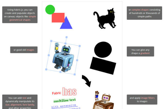


