Archive

Archive for August, 2014

Targeting Mobile Users Through Google AdWords

August 14th, 2014 No comments
Mobile bid modifier

“Know your audience” has stood as a fundamental marketing principle since long before the web. When advertising online, you need to take into account one of the most basic factors of the audience you are reaching: what devices they are using.

The most popular online advertising platform, in use by marketers of all sizes, is Google AdWords. Up until early 2013, AdWords allowed advertisers to set up separate campaigns to target mobile devices. Best practice generally entailed targeting mobile, desktop and sometimes tablet users in unique campaigns.

Then, in a bold move to push the importance of mobile usability (some would say to drive up its own revenue), Google announced it would no longer allow campaigns to target by device, as part of what it called “enhanced” campaigns. Pay-per-click (PPC) managers made outcries about Google’s forced decision1 to remove control from advertisers, even cautioning people against upgrading immediately2 as the option became available to do so.

A year later, the dust has settled somewhat as advertisers have adapted to the new campaign format. With the ability create device-specific campaigns gone, they’ve modified tactics with their campaign structure and bidding strategy to best reach people across multiple devices.

Why should you care about who’s using a mobile device and who’s not? First of all, people often behave differently when browsing on a phone versus a desktop. In reviewing data from a site that received just over three million sessions over the past year, users spent an average of 2:42 when coming from desktop and 1:16 from mobile. That shows mobile sessions dropping off after about half as long as desktop sessions. A smartphone user might not care to spend time sifting through an extensive product inventory, instead just wanting a number to call or immediate directions to a location.

Secondly, costs can vary widely by device. A study by Marin Software3 shows that the average cost per click on mobile was 26% lower than the desktop average in 2013. Also, the average cost per lead or sale might be more or less on mobile. Advertisers who take this information into account will see the need to control bids by device in order to maintain their target costs for leads.

Thirdly, visits from mobile might provide more or less value to a particular advertiser. For example, the owner of an e-commerce website might find that desktop users put more items in their carts and spend more on average.

Fourthly, you might want to drive mobile users to different pages than desktop users. Especially if your website is not responsive, you might have separate URLs for mobile. While a responsive website is ideal, your agency might be forced to work with a client’s existing website when running an ad campaign.

So, how do you build a campaign that targets only mobile devices via AdWords? The short answer is you can’t. However, a number of workarounds are available.

First, let’s look at a couple of AdWords features that focus spending on mobile: bid modifiers and mobile-preferred ads.

AdWords Features To Target Mobile

Use Bid Modifiers

Enhanced campaigns introduced a feature called bid modifiers, which allow you to increase or decrease bids by a percentage for ads appearing on mobile devices. A number of PPC professionals have suggested using bid modifiers to focus a campaign’s spend on mobile placement. You could set a low general bid and increase the mobile bid modifier to 300%, the maximum percentage allowed.

To set a bid modifier, go to the “Settings” tab in your desired campaign and select “Devices.” You’ll then see statistics broken down by device and the option to change the percentage for mobile.

4
Setting a mobile bid modifier. (View large version5)

However, this technique will not completely exclude desktop searches. In a test across multiple accounts, Brad Geddes found6 that about 19% of searches still end up occurring on desktop.

Create Mobile-Preferred Ads

Another option is to create mobile-preferred ads. When you build an ad in AdWords’ interface, selecting a check box enables you to mark the ad as mobile-preferred. Such ads are an opportunity to customize messaging specifically to people on mobile devices. We’ve improved both clickthrough rates and conversion rates by using phrases like “Call now” in mobile-specific ads, because searchers can click-to-call from a phone.

To create a mobile-preferred ad, just click the check box for “Mobile” under “Device preference” when making an ad via the web interface.

7
Creating a mobile-preferred ad. (View large version8)

However, even these ads are not guaranteed to appear only on mobile or to prevent standard ads in the same ad groups from showing up on mobile. PPC Hero put this to the test9 and found that a number of desktop impressions still occurred with mobile-preferred ads.

Use Smartphone-Specific Ad Sizes

When running display campaigns, the 320 × 50-pixel mobile leaderboard ad size will appear specifically in a smartphone browser or app. You can even create animated ads in this format to get more attention. If you want to run them on mobile devices that don’t support Flash, AdWords offers an option to convert the Flash files to HTML5 when uploading them.

This ad size is great for driving branding, because it takes up an extremely visible portion of a mobile screen, often on top. Clickthrough rate tends to be high. In one campaign, I saw an average of a 0.5% higher clickthrough rate on these mobile ads than the standard desktop sizes (a pretty significant difference for display ads). Be aware, however, that people often unintentionally tap these ads on a touch device, especially while playing games. If you are encountering a high bounce rate from these ads, then consider excluding mobile apps. Bryant Garvin has written about a quick and easy way to do this10.

We’ve looked at some options available in AdWords to focus on mobile. Next, let’s consider another platform that allows for more granular targeting at the device level than AdWords.

Direct People To Proper Pages

While a responsive website is the ideal option, if you do have a separate mobile website, make sure that users who are coming from mobile devices will see the proper page. One of the worst mistakes you could make is to forward all mobile visitors to a generic home page. I’ve audited campaigns whose ads were set up to very carefully link to very specific inventory items, only to completely lose all of that value because no equivalent pages existed on mobile. Make sure that individual product and service pages forward to their respective mobile versions.

AdWords also lets you use ValueTrack parameters11 in ad-destination URLs to specify mobile and desktop versions. People who click on ads will be directed to the proper page based on the device being used.

Try Bing Ads

While Google might have removed the capability to target separate campaigns at mobile devices or tablets, Bing still allows you to segment by device; you can still create a mobile-only campaign to reach searchers on Bing and Yahoo. While Bing-powered search accounts for a much smaller volume than Google, I’ve found that allotting a portion of spend to Bing Ads to be valuable for many clients, with less competition, as well as a generally lower cost for leads. For one particular client with a limited budget, we found that the cost per lead averaged about $20 less in Bing Ads than AdWords; so, we shifted money over, resulting in a stronger return on investment from their ad spend.

To set a Bing Ads campaign to serve only on mobile, go to the “Campaign Settings” tab. Under “Advanced Targeting Options,” select “Device” to choose the devices on which to run your campaign. You can also set bid modifiers here, as in AdWords.

Bing Ads Mobile Campaign12
Creating a mobile-only campaign in Bing Ads. (View large version13)

Don’t Forget The Experience After The Ad!

Getting the right people to click on your ad is only the first step. Their experience on your website after the click is crucial to whether they actually contact you or make a purchase. Also, realize that landing-page quality contributes to AdWords’ quality score, a factor that affects how high you have to bid for clicks and where your ads show up in search results.

Responsive website example14
Example of a responsive website scaling to multiple device sizes. (View large version15)

A responsive design will adapt your website’s size to mobile devices and is, in fact, Google’s stated preference. Make sure that your website’s design takes into account which devices users are on, how they arrived on a particular page and what paths they need to take to convert.

Start Reaching Your Audience On Mobile

By using the techniques mentioned, I’ve succeeded in keeping costs per lead down, as well as focusing spend on areas where a campaign is seeing the best results. While we do live in a cross-device world, paying attention to the results from different devices leads to smarter PPC campaign management. For example, in the same AdWords account, I’ve seen campaigns in which mobile costs per lead average higher than on desktop, along with other campaigns in which mobile costs per lead average lower. Taking this information into account, we can customize the bid modifiers for mobile by campaign, instead of keeping them at a generic number across the board, to help control spend.

Working with businesses that provide local services, I’ve also seen immense success both in including a click-to-call extension as well as using mobile-preferred ads to focus messaging on calls. Some clients I’ve worked with see just as many leads come from phone calls directly from ads as through website form submissions. Again, the fact that a user on a phone is likely to take advantage of a simple click-to-call option gives us the option to customize an ad campaign targeted at mobile searchers.

Ultimately, there is no one-size-fits-all solution to targeting your audience by device. But whether you’re just starting to advertise online or are a veteran AdWords user, you can likely do more to reach the ever-growing pool of mobile users. Take the time to segment messaging, and target with the knowledge that people behave differently on different devices. Keep track of the value of leads received based on device to determine how much spend to allot to mobile and how much to desktop. Of course, test these tactics to see what works best for you and your brand, and tailor advertising to your users when they visit from mobile devices.

Additional Resources

(al, ml)

Footnotes

  1. 1 http://www.ppchero.com/google-to-force-you-to-go-mobile-with-enhanced-campaigns/
  2. 2 http://searchengineland.com/should-you-upgrade-to-adwords-enhanced-campaigns-148240
  3. 3 http://www.marinsoftware.com/resources/whitepapers/impact
  4. 4 http://www.smashingmagazine.com/wp-content/uploads/2014/04/mobilemodifier800.jpg
  5. 5 http://www.smashingmagazine.com/wp-content/uploads/2014/04/mobilemodifier800.jpg
  6. 6 http://searchengineland.com/highlights-of-the-smx-advanced-session-on-ppc-enhanced-campaigns-best-practices-163472
  7. 7 http://www.smashingmagazine.com/wp-content/uploads/2014/04/mobilead800.jpg
  8. 8 http://www.smashingmagazine.com/wp-content/uploads/2014/04/mobilead800.jpg
  9. 9 http://www.ppchero.com/do-mobile-preferred-ads-actually-prefer-mobile/
  10. 10 http://www.getfoundfirst.com/blog/how-to-exclude-mobile-apps-google-display-network-gdn/
  11. 11 http://adwords.blogspot.com/2013/03/new-valuetrack-parameters-for-enhanced.html
  12. 12 http://www.smashingmagazine.com/wp-content/uploads/2014/04/bingads800.jpg
  13. 13 http://www.smashingmagazine.com/wp-content/uploads/2014/04/bingads800.jpg
  14. 14 http://www.smashingmagazine.com/wp-content/uploads/2014/05/responsive800px.jpg
  15. 15 http://www.smashingmagazine.com/wp-content/uploads/2014/05/responsive800px.jpg
  16. 16 http://www.marinsoftware.com/resources/whitepapers/impact
  17. 17 http://searchenginewatch.com/article/2302961/5-Google-AdWords-Enhanced-Campaign-Tips-for-Efficiency-Better-Performance
  18. 18 http://searchengineland.com/how-to-determine-your-mobile-geo-bid-multipliers-for-enhanced-campaigns-152291
  19. 19 http://leve.rs/blog/optimizing-bid-adjustments-for-mobile-ads/
  20. 20 http://www.ppchero.com/why-you-cant-manage-adwords-without-a-multi-device-strategy-in-2013/

The post Targeting Mobile Users Through Google AdWords appeared first on Smashing Magazine.

Categories: Others Tags:

Typography Without Limits: 40 Fresh Adobe Illustrator Text Effects

August 14th, 2014 No comments

Wondering how to start working with Adobe Illustrator without getting overwhelmed by its endless possibilities? Then begin your acquaintance from tutorials that are aimed to fill the gaps of your knowledge. Nothing can be compared to this kind of educational material, especially when devoted graphic designers reveal their secrets and techniques. Of course, there are a considerable number of tutorials that cover everything from creating user interface templates to drawing character designs, and it is really difficult to make up your mind in which sphere to plunge in. However if you want to slowly but surely move in this direction, you should take your first steps with tutorials concerning text effects. These, at least as a rule, resort to simpler solutions based on basic tools and standard techniques. Besides, spending neither more nor less than an hour of your time you will be able to convert a plain lettering into something eccentric and innovative, having restyled the original typography completely. You can find tutorials that will help you obtain impressive results from a simple type by enlivening it with various mind-blowing yet easy-to-repeat effects. Ready? Let’s go…

Categories: Others Tags:

A Closer Look At Personas: A Guide To Developing The Right Ones (Part 2)

August 13th, 2014 No comments
There are many ways to filter out and focus on people who are relevant to a project.

How can designers create experiences that are custom tailored to people who are unlike themselves? As explained in part 11 of this series, an effective way to gain knowledge of, build empathy for and sharpen focus on users is to use a persona. This final part of the series will explain an effective method of creating a persona.

There are myriad ways to integrate user-centered thinking into the creative process of UX design, and personas are one of the most effective ways to empathize with and analyze users. There is no one right way to develop a persona, but the method I will share here is based on processes developed, field-tested and refined over the years at the interaction design agency Cooper2. This process follows a logical order that begins with knowing nothing (or very little) about users and ends with a refined and nuanced perspective of users that can be shared with others.

1. Identify Your Users

Before you can learn from people, you need to decide whom to learn from. You could create a screener based on demographics and psychographics to determine who to observe and talk to and who not to.

3
There are many ways to filter out people and focus on those who are relevant to a project. A combination of factors usually determines the criteria of a screener. (Image: Steamfeed4) (View large version5)

Traditional research on market segmentation is a good place to start. If a user base is already established, then you might have a source of data on demographics; if there is no such source, then you could send out surveys to current users to obtain more information. If you have no user base (which will be the case if your company is new), then find out more about the users of your competitors or of similar companies or products.

2. Decide What To Ask

The most common way to learn from users is to interview and/or observe them. An interview script or research protocol will ensure that you obtain the same information from all research subjects, so that the data set is homogeneous. The process of developing a script or protocol forces you to think about what you will need to learn from research participants. Interviews and observation aren’t just about acquiring raw data, but about gaining a thorough understanding of participants and their perspectives.

Learning everything about participants is impossible within the limited time available for interviews and observation, so try to ask the most advantageous questions and observe the most relevant behavior. To determine what information is most needed, think of your knowledge gaps, which details would best inform your design decisions, what your team members are curious about, and what would give the team a common frame of reference regarding the participants’ needs and goals.

The questions and areas of observation need not be exhaustive at this stage, because the goal is to gain a fundamental understanding of users, from which the team can extrapolate in future and answer new questions on their own. By thoroughly understanding users, team members should be able to put on the persona’s shoes and walk in uncharted territory. Users won’t have a seat at the table during the product’s development, but a persona created from the right kind of information is the best proxy. By capturing the essence of their perspectives from asking the right questions, you will be able to create a persona that brings their voice into the conversation.

The exact questions you ask will vary according to the project’s goals, the types of people being interviewed or observed, and the time constraints. No matter what you ask, though, keep the following in mind:

  • Ask primarily open-ended questions.
  • Ask participants to show more than tell.
  • When possible, ask for specific stories, especially about anything you cannot observe.

Don’t be afraid to ask seemingly naïve questions either because you’ll want to find out as much as possible. (Naïve questions are never stupid; they show an eagerness to learn, and they establish a non-authoritative tone in the interview, which is great for building rapport with participants.) Following these guidelines will result in a rich set of answers and a firm foundation on which to build a persona.

6
Ask roughly the same questions of all research participants. A script will help with consistency. (Image: Sams Weitz7) (View large version8)

You could create your own interview script from the following template, which I have used in many enterprise software design projects. I have found it quite useful as a jumping-off point in new projects.

Overview

  • Give us a little background on your job.
  • How and why did you take on this job?
  • How long have you been working in this capacity?
  • Why do you work for this company and not another?
  • Tell me a bit about your industry and your role in it.

Domain Knowledge

  • What skills are required to do your job?
  • How do you stay up to date and get information on your industry and profession?

Goals

  • What are your responsibilities in your job?
  • How do you define progress or success in your job?
  • How do you measure progress or success?

Attitudes and Motivations

  • What are the most enjoyable parts of your job?
  • What do you value most?
  • Do you have any external (i.e. extrinsic) or internal (i.e. intrinsic) motivations for doing a good job (such as rewards, promotions, perks)?

Processes

  • Describe a typical workday. What do you do when you first get into the office? What do you do next?
  • How do you do [a certain task]?
    • How long does this task typically take?
    • Where would you start?
    • What would you do next?
    • Can you show me how you do that?
  • What activities take up most of your time?
  • What activities are most important to your success?
  • Of the things you do during a typical workday, are any of those processes or tasks mandated by your company or industry?
  • What processes have you developed on your own?
  • Have you learned to work better from your colleagues?

Environment

  • How is your office organized to help you accomplish your tasks or goals?
  • Show me how you use your office to accomplish your tasks or goals?

Pain Points

  • What are the most difficult, challenging, annoying or frustrating aspects of your job?
  • After a typical workday, what about your job (if anything) is still on your mind? (In other words, what issues keep you up at night?)

Tools and Technology

  • What traditional (i.e. analogue) tools do you use to accomplish tasks in your job?
  • What digital tools do you use to accomplish tasks in your job?
  • Where do any of your tools fall short? (What do you need them to do that they don’t do or don’t do well?)

Mental Models

  • What kinds of people do well in your position? Why?
  • Describe a process and how it has changed or not changed over time.

Relationships and Organizational Structure

  • Besides clients and customers, who else do you interact with in your work?
  • Who do you report to?
  • Who reports to you?
  • How often do you collaborate with others?
  • How do you collaborate?

Projecting Into the Future

  • If we came back in [x number of] years to have this conversation again, what would be different?
  • If you could build your ideal experience, what would it be?

Wrapping Up

  • Have we missed anything?
  • Is there anything you want to tell us?
  • Is there anything you want to ask us?

3. Get Access To Users

This step will largely determine how effective your personas are. Finding an adequate number of people will determine whether your personas are an accurate and useful representation of the research participants. Experts recommend finding anywhere from just 5 to around 30 participants per role. The exact number isn’t important, as long as trends and patterns emerge. These number might seem too small to be of any reliable use, but the data set isn’t intended for statistical analysis, but rather for qualitative analysis that will inform the design process.

Trends are often observable from just five people. Build on that to gain a deeper understanding. The number of participants does not matter as much as whether you gain new information from interviews and observation. The law of diminishing returns applies here; at a certain point, new interviews or further observation will elicit little to no new information because all relevant patterns have been unearthed and the researcher has reached a level of understanding known to ethnographers as “verstehen9.” At this point, no more research is needed.

The benefit of observation in addition to interviews is that a relatively small number of participants is needed for it. If you can’t find enough people on your own or with help from people you know, then consider a recruiting agency.

10

4. Gain An Understanding Of Users

The majority of the process of creating personas is usually spent interviewing and observing people. Collaborate with another team member so that they capture anything in the interview or observation session that you might miss. You and your colleague should be physically present with the research participants, in a location that makes the most sense for the project. In a suitable location, participants tend to provide more detailed and accurate information and are less likely to behave unnaturally.

Observing/Interviewing people in person and in a context relevant to the project yields the most useful data.11
Observing and interviewing in person and in a location relevant to the project will yield the most useful data. Also, capturing information in multiple ways, such as by taking notes and recording audio, will ensure accuracy. (Image: Interactions12) (View large version13)

Direct, unfiltered interaction with participants is critical at this stage in order to gain empathy with the people you will be designing for. Being there in person is not always feasible, but try to do it whenever possible. If you can’t do that, then consider the next best thing: interviewing people who have had direct interaction with users. Personas created from secondhand information are called provisional personas14. The perspectives will be secondhand, filtered and biased, but they’re better than nothing and you’ll have somewhere to start your research.

Empathy is important to understanding users holistically, and direct interaction is the only way to inform the heart as well as the mind. I’m not one to get touchy-feely for its own sake, but when you are able to empathize with users firsthand, they you’re better able to tap into their intuition and act on inklings that you otherwise would not have. Firsthand exposure is paramount.

5. Analyze The Data

The analysis stage is the most complicated because you must compare multiple variables of behavior and attitudes among many research participants. It requires some practice, and it gets much easier with experience. To find out more in depth, look at the descriptions in the Fluid project15, or consider reading Designing for the Digital Age16.

After learning about research participants directly or indirectly, you will need to make sense of it all by finding patterns in the data. In short, for each group of participants with the same role (for example, a group of doctors), you would rank each participant against a number of attributes of behavior and attitude, determining which participants have similar attribute rankings in order to discover common traits among them. Each group of similar participants would then serve as the source of a persona.

Personas are not just “roles,” although they might seem to be at first. Roles are great for segmenting and grouping similar users together for analysis, but roles are not personas. Roles are defined largely by the tasks people perform, rather than by how they perform those tasks or how they feel about accomplishing the tasks. Usually, two or more personas are required to represent the range of behavior within a role.

For instance, if you are designing medical software to be used by doctors, nurses, technicians and patients, then you would want to interview people in all four roles; however, when analyzing their responses, you would compare doctors to doctors, not doctors to technicians. Their roles might overlap somewhat, but don’t muddy the water by combining data from multiple roles. Compare participants with the same role; otherwise, large differences will obscure smaller differences between participants.

You can represent most of the observed behaviors and attitudes as a spectrum (for example, from low to high or sad to happy). Each spectrum should be discrete and divided into four levels.

In this sample spectrum, low and negative attributes are on the left, and high and positive attributes are on the right17
In this sample spectrum, low and negative attributes are on the left, and high and positive attributes are on the right. (View large version18)

On each spectrum, participants can be given a score of 1, 2, 3 or 4 (similar to the Likert scale19). The even number prevents a neutral score (for example, a score of 3 out of 5 would provide little value in creating a persona). Some variables are difficult or impossible to represent on a spectrum; in this case, don’t force it, and instead express the variable as a multiple-choice question.

08-spectrum-continuum-opt-50020
(View large version21)
07-spectrum-multiplechoice-opt

To determine how many spectra to analyze, go over the responses to the interview questions and note any distinct behavior or differences in attitude. Fewer than 5 spectra is usually too few, and over 20 is too many, so aim for somewhere in between. If you have trouble deciding which spectra to use, look back at the categories of questions in the interview script shown earlier, and determine which categories most effectively group and differentiate research participants. Motivations and goals, frequency and duration of tasks, and attitudes towards tasks are good places to start.

After you’ve listed 5 to 20 variables for a role, place each research participant on each spectrum, as shown below.

07-spectrum-multiplechoice-opt

When placing each participant on a spectrum, keep in mind that the data is all relative at this point. The fact that Whitney does more surgeries than Doug, who does fewer than Elliot, is more important than who is a 2 rather than a 3 or 4 on the scale.

Once you’ve mapped all research participants on the spectra, it is time to identify patterns. This part might seem overwhelming, especially if you have researched many people. Start small by finding two people who tend to have the same scores on various spectra. This pattern analysis is similar to that of a semantic differential22 or a multivariate affinity diagram23.

In this example, out of five spectra used to describe the doctors interviewed, Tiffany and Sam appeared in the same place three times, similar places one time, and disparate places one time.24
(View large version25)

Of the five spectra above that describe the doctors interviewed, Tiffany and Sam appear in the same place three times, in similar places one time, and in disparate places one time. As far as we’re concerned, Tiffany and Sam are similar people and should be represented by one persona. Looking further, Dan and Elliot also have similar or the same placement on the spectra, too, but their placement differs from that of Tiffany and Sam. Dan and Elliot should be represented by a different persona from Tiffany and Sam.

This researcher has created five variables to compare the doctors who were interviewed and has mapped all of the participants to those spectra. If Tiffany and Sam tend to appear in the same or similar places in a lot of the spectra, then they probably constitute a pattern that will eventually help to describe a persona. Most of the time, the patterns that you find among participants will not apply to every single one of the spectra, because almost all patterns are imperfect.

This is not a problem; as long as participants match on a majority of the spectra, the pattern is valid. Repeat this process until you have discovered all of the patterns that represent groups of similar users. If done correctly, you will have compared a lot of the participants to each other, and the result should look something like the graph above (the color blue denotes the first pattern found).

Grouping similar research participants together can be a laborious process, but it is worth every minute.
Grouping similar participants together can be laborious, but it is worth every minute. Consider collaborating with other researchers to benefit from multiple perspectives and to discuss points of ambiguity or confusion. (Image: Vijay Kumar26) (View large version27)

This is where the difference between roles and personas comes into play. Even though the researcher interviewed many people who had the role of doctor, the participants had distinct patterns of responses, which will result in multiple personas with the role of doctor. Each unique pattern of behaviors and attitudes among participants should be represented by a unique persona.

6. Synthesize A Model Of Users

Now that you have groups of research participants who can be represented by different personas, decide how to describe those personas. During the interview and observation process, you might have heard responses or noticed behaviors that meaningfully characterize each research group. These common, average or dominant traits need to be captured in each persona.

These personas are characterized by only a few key attributes that were derived from user interviews and/or observations.28
These personas are characterized by only a few key attributes derived from interviews or observation. This deliverable conveys a clear and concise vision of the designer’s users. (Image: Bolt | Peters29) (View large version30)

7. Produce A Document For Others

There is no one right way to create a persona document, but essential elements will need to be included. An effective persona document that communicates a model of users to others typically consists of the following:

  • name,
  • demographic,
  • descriptive title,
  • photograph,
  • quote,
  • a day-in-the-life narrative,
  • end goals (explicit and tacit).
An example of a persona document that clearly communicates and summarizes research data.31
(Image: krizzeldibi32) (View large version33)

The persona document above clearly summarizes the research data. The main elements are the “Key Goals” and the “Day in the Life,” which are common to all well-made persona documents. Other elements, such as the “Quick Take on Fred” were included because of project requirements. Each project you work on will dictate a certain approach to producing persona documents.

A robust persona really only needs seven pieces to help everyone on the team understand the essentials about a user. Other elements are usually added to a document to paint an even more vivid picture, such as needs and wants, responsibilities, motivations, attitudes, pain points (i.e. problems, frustrations or road blocks), notable behavior, and design imperatives (i.e. things that a design must do to satisfy this user).

You could add a myriad of other things to a persona document, but more isn’t always better. The document is usually one page, a limitation that forces you to focus on the essential elements, without distraction or fluff. If you can’t fit everything on one page, then consider a supplemental document of some sort. Just remember that, while you’ve been immersed in the data, others will usually only see the one page. If it’s much longer, people probably won’t read it all, let alone remember the information. Keep things as brief as possible, and focus on the most salient points.

If you’re looking for a jumpstart on creating persona documents, I highly recommend the persona poster by Christof Zürn34. The poster organizes and formats all of the important information that you’ll need to create an amazing one-page deliverable.

8. Socialize The Personas

By sharing the persona documents with others, you’re disseminating the knowledge that you’ve gained throughout this whole process. Consider presenting the personas to others in an engaging way, and give everyone the one-pager as a takeaway after the presentation.

Though low in information density, these engaging persona posters a great reminder of who the personas are, and what they are like.35
Though low in information-density, these engaging posters are a great reminder of who the personas are and what they are like. (Image: MailChimp36) (View large version37)

The process outlined in this article is thorough and rigorous. It is based on years of refinement at Cooper and tweaked to my purposes. That being said, feel free to customize the process to fit your needs. Some parts can be simplified and even skipped after you’ve gained some experience. This is not the only way to create personas, but it is a great place to start. I hope you’ve found the process helpful.

Additional Resources

(cc, al, il, ml)

Footnotes

  1. 1 http://www.smashingmagazine.com/2014/08/06/a-closer-look-at-personas-part-1/
  2. 2 http://www.cooper.com/
  3. 3 http://www.smashingmagazine.com/wp-content/uploads/2014/08/01-segmentation-opt.jpg
  4. 4 http://www.steamfeed.com
  5. 5 http://www.smashingmagazine.com/wp-content/uploads/2014/08/01-segmentation-opt.jpg
  6. 6 http://www.smashingmagazine.com/wp-content/uploads/2014/08/02-interview-opt.jpg
  7. 7 http://www.samsweitz.com/research/
  8. 8 http://www.smashingmagazine.com/wp-content/uploads/2014/08/02-interview-opt.jpg
  9. 9 http://copernicusconsulting.net/the-essence-of-qualitative-research-verstehen/
  10. 10 http://www.smashingmagazine.com/wp-content/uploads/2014/08/03-network-opt.jpg
  11. 11 http://www.smashingmagazine.com/wp-content/uploads/2014/08/04-cooper-observation-opt.jpg
  12. 12 http://interactions.acm.org/blog/view/designers-toolkit-a-primer-on-capturing-research
  13. 13 http://www.smashingmagazine.com/wp-content/uploads/2014/08/04-cooper-observation-opt.jpg
  14. 14 http://www.slideshare.net/TheConartist/provisional-persona-workshop-10
  15. 15 http://wiki.fluidproject.org/display/fluid/Persona+Creation
  16. 16 http://www.amazon.com/Designing-Digital-Age-Human-Centered-Products/dp/0470229101
  17. 17 http://www.smashingmagazine.com/wp-content/uploads/2014/08/05-spectrum-generic-opt.jpg
  18. 18 http://www.smashingmagazine.com/wp-content/uploads/2014/08/05-spectrum-generic-opt.jpg
  19. 19 http://en.wikipedia.org/wiki/Likert_scale
  20. 20 http://www.smashingmagazine.com/wp-content/uploads/2014/08/08-spectrum-continuum-opt.jpg
  21. 21 http://www.smashingmagazine.com/wp-content/uploads/2014/08/08-spectrum-continuum-opt.jpg
  22. 22 http://en.wikipedia.org/wiki/Semantic_differential
  23. 23 http://en.wikipedia.org/wiki/Affinity_diagram
  24. 24 http://www.smashingmagazine.com/wp-content/uploads/2014/08/09-spectra-patterns-opt.jpg
  25. 25 http://www.smashingmagazine.com/wp-content/uploads/2014/08/09-spectra-patterns-opt.jpg
  26. 26 http://www.amazon.com/101-Design-Methods-Structured-Organization/dp/1118083466/
  27. 27
  28. 28 http://www.smashingmagazine.com/wp-content/uploads/2014/08/11-sketch-opt.jpg
  29. 29 http://boltpeters.com/clients/dolby/
  30. 30 http://www.smashingmagazine.com/wp-content/uploads/2014/08/11-sketch-opt.jpg
  31. 31 http://www.smashingmagazine.com/wp-content/uploads/2014/08/12-cook-opt.jpg
  32. 32 http://krizzeldibi.wordpress.com/2012/07/02/personas/
  33. 33 http://www.smashingmagazine.com/wp-content/uploads/2014/08/12-cook-opt.jpg
  34. 34 http://creativecompanion.wordpress.com/2011/05/05/the-persona-core-poster/
  35. 35 http://www.smashingmagazine.com/wp-content/uploads/2014/08/13-dualposters-opt.jpg
  36. 36 http://blog.mailchimp.com/new-mailchimp-user-persona-research/
  37. 37 http://www.smashingmagazine.com/wp-content/uploads/2014/08/13-dualposters-opt.jpg
  38. 38 http://www.smashingmagazine.com/2014/08/06/a-closer-look-at-personas-part-1/
  39. 39 http://www.slideshare.net/TheConartist/what-are-personas-and-how-to-use-them-a-presentation-by-shlomo-goltz
  40. 40 http://www.slideshare.net/TheConartist/provisional-persona-workshop-10
  41. 41 http://creativecompanion.wordpress.com/2011/05/05/the-persona-core-poster/

The post A Closer Look At Personas: A Guide To Developing The Right Ones (Part 2) appeared first on Smashing Magazine.

Categories: Others Tags:

WordPress for Admins: 40 Essential Tutorials on Performance, Security, SEO and More

August 13th, 2014 No comments

WordPress is the most widely used blogging engine and CMS worldwide. As an admin of one or more such sites, you will want to keep a close focus at three critical topical areas: Performance, Security and SEO. We did some research to present you the 40 best tutorials that will give you a thorough and solid knowledge about each of these important areas. That’s what we came up with…

Categories: Others Tags:

A Better 404 Page

August 12th, 2014 No comments
Setting up the Google's Custom Search API.

A lot of funny 404 pages have been shared recently: carefully crafted memes, funny GIFs, even the odd interactive game. But if the 404 doesn’t help your visitors, then what’s the point?

A visitor could find themselves on a 404 page for one of many reasons: a mistyped address, a bad link from somewhere else, a deleted page or content that has moved elsewhere. While you can prevent errors from moved pages with redirects, you can’t control people’s mistakes.

Being Helpful

People who land on your website are looking for its content, usually via a link. They would have clicked that link expecting one thing, so why show them a hand-drawn panda? Instead, your 404 page should get them to where they need to be.

This problem isn’t new, and we’ve seen a lot of ideas on how to handle it. Showing a search form or linking to the home page is reasonable. Yet those are passive solutions that don’t solve the visitor’s problem. A more direct approach would be to guess where the visitor intended to go and suggest that page.

Suggesting The Right Page

One way to suggest the right page is to search for it yourself and present the result. Luckily, we don’t have to write a search engine to do this (although, if you have one handy, good for you!). Instead, we can use Google’s Custom Search API1.

We can use Google’s Custom Search API to suggest the right page.

Google’s Custom Search API is a tool for searching within an individual website. When set up, it enables you to retrieve what it considers to be the best match from your website. It does need a search phrase, though. So, to give Google something to search with, we’ll use the path of the URL that the user is currently on.

Caveat: Limits Abound

Before jumping into the “how to” part, it’s worth noting that the free tier for this API has a limit of 100 calls per day. You might want to go light on the testing while working on it. I managed to burn through the 100 calls in less than an hour, and I had to wire part of it together without seeing the result till the next day.

While someone with a small website might be fine with this limit, paid upgrades are available. Google’s API documentation mentions a price of $5 per 1000 queries2 and up to 10,000 queries per day.

Setting Up

Before using the Custom Search API, we need to let Google know who we are and get some access keys.

Search Engine ID

We need to go through a few steps before we can fly through those 100 API requests. First, register your site-specific search engine3.

  • Select “Add.”
  • Input your website’s URL (yoursite.com) in “Sites to search.”
  • Hit “Create.”

You now need to find your “Search engine ID.” Click “Edit” on the search engine that you created, then the “Search engine ID” button. Take note of that code!

4
Setting up the Google’s Custom Search API. (View large version5)

Developer API Access

Next, go to the Developers Console6.

If you don’t yet have a project, select the “New Project” option and fill in the form.

Under “APIs,” activate the “Custom Search API” by switching the “Off” button to “On.” Then, select “Credentials,” then “Create New Key,” and choose the “Browser Key” option. Take note of the API key!

7
(View large version8)

JavaScript

Armed with both a search engine ID and an API key, you can now start hitting the API. The code below requires jQuery9. It does some AJAX JSON stuff, so I’d rather lean on the framework to ensure that it works across browsers.

Before creating functions, we should consider the environment that our code will run in. Because we’re writing JavaScript on the front end, our code might run alongside other plugins and scripts. So, let’s build a little space to cleanly separate our functions from everything else:

function createCustomSearch() {
// Private variables and methods here
}

Within our customSearch object, we can define methods and variables safely away from the global context. First, let’s set up some variables to use later:

function createCustomSearch() {
  // Some private variables for this object
  var context = this;
  var dialog = document.querySelector('dialog');
  // Your keys
  var engineID = 'YOUR_ENGINE_ID';
  var apiKey = 'YOUR_API_KEY';
}

Replace the keys with those we generated earlier.

Initially, we establish a local context by storing this in a variable. We’ll use this to access a showDialog method later.

Trying A Search

First, we’ll add a method that tries a custom search:

function customSearchConstructor() {
  // Some private variables for this object
  var context = this;
  var dialog = document.querySelector('dialog');
  // Your keys
  var engineID = 'YOUR_ENGINE_ID';
  var apiKey = 'YOUR_API_KEY';
  this.trySearch = function(phrase) {
    var queryParams = {
      cx: engineID,
      key: apiKey,
      num: 10,
      q: phrase,
      alt: 'JSON'
    }
    var API_URL = 'https://www.googleapis.com/customsearch/v1?';
    // Send the request to the custom search API
    $.getJSON(API_URL, queryParams, function(response) {
      if (response.items && response.items.length) {
        console.log(response.items[0].link);
      }
    });
  };
}

This trySearch method takes a phrase and sends it along with your keys as a request to Google’s API. The response is then checked, and the first link that it finds will be logged to the console. You would call it like so:

var customSearch = new customSearchConstructor();
customSearch.trySearch('cat');

Assuming that your website contains pages about cats (and whose doesn’t?), you should see something logged in your console.

Getting The Search Phrase

Next, we’ll write some code to get the path from the URL of the page. This path will become the search phrase.

$(document).ready(function() {
  var customSearch = new customSearchConstructor();
  var path = window.location.pathname;
  var phrase = decodeURIComponent(path.replace(//+/g, ' ').trim());
  customSearch.trySearch(phrase);
});

Within the jQuery ready method, we’ll pick up the pathname part of the current URL and create a search phrase from it. We’ll decode the URI, replace any forward slashes with spaces, and send the result to the trySearch method.

Replacing Strings With JavaScript

One handy thing to know is how to replace a global regular expression in JavaScript. This one is a set of matches separated by pipes:

//+/g

The first and last forward slashes (/) are there to contain the expression. Within it, we escape a backslash character (/) so that it is treated as an actual character. The + will match any instances of multiple slashes, and the g then tells it to replace every instance in the string.

Showing The Redirect

In my first version, I had the page redirect immediately. That was fun but not a great experience for the visitor. The page would load, flicker and jump elsewhere.

An alternative approach is to present the option as an overlay and as a link that the visitor can click. This way, the visitor better understands what has happened and sees a clear way to proceed. And they will have the option not to proceed if the result doesn’t suit them.

Other Approaches

Showing a single result is one way to go about this, but it would be worth considering more than the first result. If you wish to give the visitor more options, then your 404 page could show all of the returned pages as a set. Depending on the quality of the results from the custom search, this might be better.

For this example, let’s assume that the first result returned is always the most relevant, and we’ll present a single option in the form of a dialog overlay.

Also, consider cases in which no results are returned. Ensure that your 404 page contains some helpful message or content.

Starting A Dialog

If we find a result, let’s show it as a modal that prompts the user. To help with this, we’ll be able to use the new dialog10 element11 in the near future. Originally intended for dialogue from movies, the element is back and can now show any content that needs to be popped up in front of other content. In other words, we now have a native HTML5 modal element.

Let’s define the dialog in HTML:

<dialog>
  <h2>
    Hey, is this what you meant?
    <span class="suggestion"></span>
    <span class="nope">No thanks</span>
  </h2>
</dialog>

Polyfill For Older Browsers

Before calling the JavaScript that will show and hide this dialog, we need to consider older browsers. The dialog element is very new and so isn’t supported everywhere. To fix this, we can use the helpful polyfill provided by Google12.

This polyfill requires a little JavaScript. The following external script will need to be called before we create the dialog:

<script src="https://cdn.rawgit.com/GoogleChrome/dialog-polyfill/master/dialog-
polyfill.js"></script>

This script includes a registerDialog method that wraps the dialog selector with a few handy functions that reproduce the native API. We can use it in our customSearch object:

function createCustomSearch() {
  …
  var dialog = document.querySelector('dialog');
  // Apply the polyfill
  dialogPolyfill.registerDialog(dialog);
  …
}

Showing And Hiding

We now have a dialog element, with extra methods added by the registerDialog polyfill. Let’s add some methods to show and hide the element:

function createCustomSearch() {
  …
  this.showDialog = function (url) {
    var suggestedLink = $('');
    // Verify that the suggested URL is from this domain
    var hostname = new RegExp(location.host);
    if (hostname.test(url)) {
      suggestedLink.attr('href', url);
      suggestedLink.text(url);
      $('dialog .suggestion').html(suggestedLink);
      dialog.showModal();
    }
  };
  this.hideDialog = function () {
    dialog.close();
  };
}

We’ve got two methods here. The first, showDialog, takes a URL, places it in the dialog element, and calls the showModal method provided by the polyfill.

To protect ourselves, we’re verifying the URL. Because we’re expecting this script to return another page from the same website, we verify that the returned URL’s host name and the local website’s host name are the same.

The URL is then used to generate an anchor, which we place in the dialog HTML.

The second method, hideDialog, hides the modal using its own close method.

Styling The Dialog

Lastly, let’s add some style. The default modal style is a bit too boxy. We’ll make it subtler and give it a dark background with some CSS:

dialog {
  display: none;
  position: absolute;
  top: 0;
  right: 0;
  left: 0;
  text-align: center;
  color: #fff;
  border: none;
  background: none;
}

dialog[open] {
  display: block;
}

dialog[open]:before {
  position: fixed;
  z-index: -1;
  top: 0;
  right: 0;
  bottom: 0;
  left: 0;
  content: '';
  background: rgba(0,0,0,.8);
}

dialog span {
  display: block;
}

dialog span.suggestion {
  font-size: 1.75em;
  line-height: 2.5em;
}

dialog h2 {
  line-height: 1.5em;
  padding-top: 2em;
}

dialog a {
  padding: .25em;
  border-radius: .25em;
  background: rgba(200,200,255,.9);
}

dialog .nope {
  font-size: .75em;
  cursor: pointer;
  color: #aaa;
}

We’re referring directly to the dialog in this CSS. For more flexibility, you might prefer to refer to it by a class.

Tweak the various styles to fit your design. The main goal of this CSS is to define how the dialog looks, and have it display: block when given the class of open. The other styles, from position to color, are entirely up to you.

Wiring In The Search

Next, we need to adjust that trySearch method from earlier to use the dialog. We do this by placing the showDialog method call within the JSON response callback. Here’s the full script:

// <![CDATA[
function customSearchConstructor() {
  // Some private variables for this object
  var context = this; // Keeps the parent context available so that we can call local methods
  var dialog = document.querySelector('dialog');
  // Apply the polyfill
  dialogPolyfill.registerDialog(dialog);
  // Your keys
  var engineID = 'YOUR_ENGINE_ID';
  var apiKey = 'YOUR_API_KEY';
  this.trySearch = function(phrase) {
    var queryParams = {
      cx: engineID,
      key: apiKey,
      num: 10,
      q: phrase,
      alt: 'JSON'
    }
    var API_URL = 'https://www.googleapis.com/customsearch/v1?';
    // Send the request to the custom search API
    $.getJSON(API_URL, queryParams, function(response) {
      if (response.items && response.items.length) {
        context.showDialog(response.items[0].link);
      }
    });
  };
  this.showDialog = function (url) {
    var suggestedLink = $('');
    // Verify that the suggested URL is from this domain
    var hostname = new RegExp(location.host);
    if (hostname.test(url)) {
      suggestedLink.attr('href', url);
      suggestedLink.text(url);
      $('dialog .suggestion').html(suggestedLink);
      dialog.showModal();
    }
  };
  this.hideDialog = function () {
    dialog.close();
  };
}
$(document).ready(function() {
  var customSearch = new customSearchConstructor();
  var path = window.location.pathname;
  var phrase = decodeURIComponent(path.replace(//+/g, ' ').trim());
  customSearch.trySearch(phrase);
  $('dialog .nope').click(function() {
    customSearch.hideDialog();
  });
});
// ]]>

Live Demo

You can see this code in action on my 404 page13. Typing something like …/mac/plus/article/ will result in a 40414 that recommends the CSS Mac Plus blog.

Fallbacks And Other Strategies

API limits aside, it’s possible that a match isn’t found for the mistyped URL. In this case, showing the visitor some helpful content would be a good idea. Depending on your website, you could show recent articles or recently updated pages or perhaps even a custom search box.

Google’s Custom Search Engine15 gives us the option to get some embedding code. Select your existing engine and then the “Get code” button to find this. Whatever content you decide to show as a fallback, it will be better for your visitors than showing a funny picture. It might not be as much fun, but it will help visitors find what they need.

I hope you’ve enjoyed this article. If you want to share it, please double-check that the URL is correct. Or don’t. I’m sure it’ll be fine.

Front page image credits: OpenSource.com16

(ds, il, al)

Footnotes

  1. 1 https://developers.google.com/custom-search/
  2. 2 https://developers.google.com/custom-search/json-api/v1/overview
  3. 3 https://www.google.com/cse/manage/all
  4. 4 http://www.smashingmagazine.com/wp-content/uploads/2014/08/02_new_engine_form-large-opt.jpg
  5. 5 http://www.smashingmagazine.com/wp-content/uploads/2014/08/02_new_engine_form-large-opt.jpg
  6. 6 https://console.developers.google.com/project
  7. 7 http://www.smashingmagazine.com/wp-content/uploads/2014/08/04b_api_key-large-opt.jpg
  8. 8 http://www.smashingmagazine.com/wp-content/uploads/2014/08/04b_api_key-large-opt-500×169.jpg
  9. 9 http://jquery.com/
  10. 10 http://updates.html5rocks.com/2013/09/dialog-element-Modals-made-easy
  11. 11 https://developer.mozilla.org/en-US/docs/Web/HTML/Element/dialog
  12. 12 https://github.com/GoogleChrome/dialog-polyfill
  13. 13 http://hop.ie/smashing/404/
  14. 14 http://hop.ie/mac/plus/article/
  15. 15 https://www.google.com/cse/
  16. 16 https://www.flickr.com/photos/opensourceway/6554315319/

The post A Better 404 Page appeared first on Smashing Magazine.

Categories: Others Tags:

Revised Vintage: Collection of Free Stuff to Awaken Your Inner Hipster

August 12th, 2014 No comments

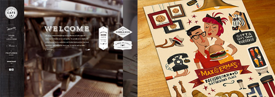
The members of that subculture that is easily and uniquely recognizable by its Ray Ban glasses, skinny jeans/trousers, almost antique Holga photocamera, shaggy haircuts and deep love to vintage are called Hipsters. They are those who truly appreciate old-fashioned stuff and successfully manage to stay away from mainstream trends, while at the same time, look very stylish and voguish. Conquering the real world, they have finally reached the online universe by affecting various spheres of design including print graphic material and website looks. Thanks to its eccentric and offbeat appearance, the retro style has got a second wind. Just take a look at the website of Morgan Street Cafe or Max & Erma’s Illustrated Menu Cover made by Peter Donnelly, they simply exude of originality and sophistication as well as seize attention by professionally-crafted intricate appearances.

Categories: Others Tags:

Mobile Onboarding: A Beginner’s Guide

August 11th, 2014 No comments
Guide users towards each gesture and the expected result.

Nowadays, displaying onboarding screens to first-time users has become a common practice in mobile apps. The purpose of these onboarding screens — also referred to as walkthroughs — is to introduce the app and demonstrate what it does.

Given that these are often the first set of screens with which users interact, they also set the users’ expectations of the app. Therefore, it is essential that those involved in creating the product — product managers, designers, developers — take the time to evaluate whether onboarding is necessary for the app and, if so, to determine the best way to implement it.

In this article, we’ll provide some good tips on how to approach onboarding, some common implementations, alternative techniques, as well as resources to help you provide the best experience for users.

To Onboard Or Not To Onboard?

In recent years, we’ve seen plenty of discussion on the usefulness of onboarding in mobile apps. A popular argument against1 onboarding is that if an app needs it, then it is fundamentally flawed, lacking the cardinal elements of simplicity and user-friendliness. While this line of thought does have logic, it’s too sweeping a conclusion.

The digital design world has plenty of rules and best practices, which is good. These rules save designers and developers from having to reinvent the wheel every time they work on a product. More importantly, they save users from stressing out whenever they use a new app; instead, they can rest assured knowing that the editing function will be represented by a pencil icon and that a “thumbs up” icon means “like.” Rules are good.

But the reality is that every app is unique in what it does, how it does it and who uses it. These variations make onboarding a reliable, pragmatic and user-friendly feature in certain instances. Let’s consider some use cases.

Use Case 1: Unfamiliar Interaction

If you are releasing an app that supports interaction methods that most users would not have been exposed to on a regular basis — particularly a gesture-driven app — then onboarding is essential. Gesture-driven apps are still in the experimental and exploratory phase. As such, developers need to guide users on how to interact with them, clearly presenting each gesture and its corresponding function.

For example, the alarm clock Timely, indicates to the user that tapping a particular part of the screen will add or subtract five minutes from the clock.

2
Timely3 guides users to each gesture and the expected result. (View large version4)

Use Case 2: Empty State

An app whose default state is empty and requires users to go through one or more steps to populate it with content is also well suited to onboarding. Even if the onboarding process consists of just one step, the guidance will reassure users that they are doing the right thing.

5
Feedly356 shows users how to retrieve their first batch of content. (View large version7)

Use Case 3: Suite of Products

If your app is part of a suite of products — say, with desktop and web companions — then onboarding could greatly improve the user’s experience, especially if the mobile app doesn’t have all of the functionality of the other versions. This is especially important in complex business apps, many of which have a variety of user roles, each with specific access rights and security restrictions.

Very often the web and desktop versions will support full functionality (such as for creating, viewing, editing and deleting content), while the mobile app limits it (such as viewing only). In such cases, a brief presentation explaining what the app does would help existing users understand how the mobile app fits into the suite of products.

Use Case 4: Personal Information

If your app relies on personal information (such as age, weight, gender, marital status), then collect and store this information via onboarding. Guide the user step by step so that they are clear on why this information is being requested. And be sure to allow the user to change this information whenever they want (usually from the settings screen).

Tell users why their personal information is needed and guide them.8
Fitbit9 tells users why their personal information is needed and guides them. (View large version10)

Even if your app doesn’t fit any of the examples above, your users might still benefit from onboarding. Keep in mind that anyone who interacts with a product will at least want to know how the product will benefit them. You can present this information in onboarding, as we’ll discuss later in the section on function-oriented onboarding.

Sure, our primary responsibility is to design products that are intuitive and easy to use. However, we shouldn’t dismiss onboarding because when it provides value to the user, it makes for a much more pleasant experience.

Which Technique to Use?

These three techniques are the most common:

  • benefits-oriented onboarding,
  • function-oriented onboarding,
  • progressive onboarding.

We’ll look at each in turn and review some general guidelines for implementing them.

Technique 1: Benefits-Oriented Onboarding

This is pretty self-explanatory. With this technique, you present the benefits (i.e. the value) of the app, communicating one or more of the following to the user:

  • What does the app do?
  • How can the user integrate it into their life?
  • What value will this integration provide?
Highlight what the user will gain from using your app.11
Evernote Food1412 highlights what the user will gain from using the app. (View large version13)

When implementing this technique, consider the following principles:

Present a Maximum of Three Key Benefits

This number is not based on hard science, but because the point is to give the user a quick overview of the app, three is a safe number (excluding the title screen). This way, the user gets to learn about the app without getting bored or slowed down by too much information.

Apply the “One Slide, One Concept” Rule

Think back to presentations from which you retained the most information. The slides with a clear, focused message probably had the greatest impact on you and were the most memorable. The same goes for onboarding screens. The “one slide, one concept” rule helps the user to focus on and digest every little piece of information. Presenting everything at once would be visually noisy and distract the user from your key message.

Prioritize, Prioritize, Prioritize

Resist the urge to show off everything cool about your app. Always return to your user data and remind yourself of the problem that the user is facing and what they need. Then, figure out how to reassure them through onboarding that the app does indeed answer their need.

Use Consistent Vocabulary

Evernote Food1412, mentioned above, uses verbs to quickly grab attention and communicate its key benefits. The approach is effective, efficient and succinct. If you can’t boil things down to a few high-impact verbs or adjectives, then a short phrase or two would suffice. Just be sure to stick with it all the way through. A harmonious and coherent presentation, both in visuals and terminology, will help to kick off the user’s experience on a positive note.

Use clear, brief descriptions to communicate your app's benefits and value.15
NYT Now16 uses clear, brief descriptions to communicate its benefits and value. (View large version17)

Onboard Before Registration

Because onboarding is meant to be an overview, present it before the user signs up for or logs into the service. Once they decide to log in, the user will be ready to explore the app and should not be interrupted by reminders on the benefits of the app.

Keep It Brief

Perhaps you’re wondering whether onboarding really is necessary. After all, doesn’t it just repeat the description in the app store? Not at all. App store descriptions come in all shapes and sizes, whereas onboarding has to be succinct and, as such, focus on the absolute essentials. In addition, many people skip the app store description, preferring instead to dive right into the experience. So, a brief presentation once they’re engaged with the app could help them understand what the app does.

What Not to Do

Readability18 is a wonderfully practical app that, unfortunately, is inconsistent across platforms. This is particularly evident in the onboarding in the Android version, which makes several missteps:

  • The user has to digest a total of seven slides and corresponding messages.
  • The text for some slides runs a bit long. For example, the slide about sharing could have been simplified by showing icons of the social networks on which content may be shared.
  • One slide encourages the user to install a Firefox plugin, which seems misplaced given that it’s a mobile platform. Plus, the previous slide already tells the user that “Readability is a web and mobile app.” Onboarding in the mobile app should not serve as a catch-all for marketing the full suite of products, but rather should be relevant to the mobile platform.
Avoid having too many slides and content; keep the content relevant to the platform.19
Avoid many slides, and keep the content relevant to the platform. (View large version20)

Technique 2: Function-Oriented Onboarding

Another option is to forgo a presentation on benefits and to focus instead on the app’s key functionality. This is sometimes referred to as coach marks21. If you take this approach, communicate the following:

  • What is the key functionality (for example, how to get started or what actions are most common);
  • When to use the functionality (for example, when viewing search results);
  • How to use the functionality (for example, tapping or swiping left).
Introduce key functions immediately.22
Carousel23 introduces key functionality immediately. (View large version24)

When putting together function-oriented onboarding, keep the following in mind:

Don’t Explain the Obvious

Since the dawn of the Internet, from desktop apps to the web to mobile apps, the “x” has consistently represented closing, exiting or cancelling. So, unless that icon has a different purpose in your app, including it in your onboarding won’t provide any value to users.

Don't show obvious actions.25
Adobe Kuler26 doesn’t show obvious actions. (View large version27)

Three Slides, One Function Per Slide

If you are explaining the functionality in a slideshow, then follow the same principle that we covered with benefits-oriented onboarding: a maximum of three slides (excluding the title slide), presenting one function per slide.

Help the User Get Started

If your app is empty by default, focus on this in your onboarding. Don’t let the user face a blank screen the first time they open the app. Include a quick note to show them how to get started, so that they don’t wonder — even if only for a second — whether the blank screen is a bug or a feature.

Reassure users by telling them how to get going.
Spendee28 reassures users by telling them how to get started. (View large version29)

Onboard Before Log-In or Sign-Up

As with the last technique, onboard users before they sign up for or log into your service.

What Not to Do

Photography showcase app 500px3230 boasts some amazing content and a rich set of functionality to go along with it. However, the onboarding process for the iPhone app commits some faux-pas:

  • The navigation bar and its functionality are showcased. Telling users that they can navigate via the navigation bar falls under the category of obvious.
  • Some slides show buttons such as for liking, favoriting and sharing. All three of these functions are represented by icons that are universally associated with them, so explaining them in the onboarding is unnecessary. Let’s suppose, for the sake of argument, that a portion of 500px’s target audience is not familiar with these icons. In this case, progressively onboarding these users by presenting the functions in context would better serve them (for example, when the user is viewing a picture and might want to “like” it).
  • One slide shows the “flow,” a timeline that showcases the activity of people whom the user is following. Because you can only benefit from the flow once you have followed others, progressively onboarding the user by telling them about this feature after they’ve followed at least one person would have been better.
Avoid showing several functions on a single slide, save details for later.31
500px3230 could have avoided showing several functions on a single slide, saving some details for later. (View large version33)

Technique 3: Progressive Onboarding

In general, people learn best by doing. This probably explains the popularity of progressive onboarding, which is a true walkthrough in that it presents information to users as they use the app. For example, when the user is on the dashboard, they would see only dashboard-related information; when they’re viewing search results, they would be shown only functions related to search results.

Display hints as user goes through app.34
Feedly356 displays hints as users go through the app. (View large version36)

Here are a few things to keep in mind when progressively onboarding:

Save for Complex Workflows

If your app has a fairly complex workflow or handles complex tasks (such as finances), then progressive onboarding is a good choice. You would feed the user information only when it’s appropriate and logical in the workflow, giving the user time to digest it.

Use for Hidden Functionality

When developing mobile apps, we’re always focused on efficiently using the small screen, which sometimes requires menus and functions to be hidden, visible only via, say, a double tap or long press. In this case, walk the user through those hidden functions.

For example, take the app Pocket3937, shown below. In it, functions are available for each item in the reading list, but the user has to swipe left in order to access them. Because the user has to populate the app with content, a nice touch would have been to wait until the user has added at least one item to the reading list, and then immediately point out that a left swipe reveals the hidden functions.

Progressive onboarding could have been used to point out hidden functions.38
Pocket3937 could have progressively onboarded users by pointing out hidden functionality. (View large version40)

Ideal for Gesture-Driven Apps

If your app is strictly gesture-driven, then this hands-on approach is best. Getting the user to take action over time as functionality is introduced will help the information stick.

13-solar-opt-50041
Solar42 presents each gesture and helps the user learn by doing. (View large version43)

Make It Persistent

For gesture-driven apps, provide a shortcut to a list of gestures and their corresponding actions, perhaps in the settings screen.

Remember that the more gestures you have, the more the user has to memorize. And the more gesture-driven apps a user has installed on their device, the more confused they can get, trying to remember the difference between a double-tap in one app and a double-tap in another. Making the information permanently accessible adds an extra layer of comfort.

Provide permanent, quick access to the list of gestures in case user needs a reference.44
Beats Music45 provides permanent, quick access to a list of gestures. (View large version46)

What Not to Do

Because progressive onboarding complements a user’s exploration of an app, the biggest risk is that incessant hints as the user moves from screen to screen will ruin the experience of an otherwise wonderful app. So, take even greater care with this technique to show only the most useful information.

Also, avoid highlighting features on every screen. Give the user some breathing room so that they get some satisfaction from exploring your app. A walkthrough is not a substitute for poor design. It should simply enhance the experience.

Alternative Solutions

The techniques presented above are the most popular. But you do have other options to play with!

Alternative 1: Hybrid

A hybrid approach — blending one, two or all three techniques — is sometimes viable, as Flink47 shows:

ombine benefits and functions onboarding if necessary.48
Flink combines onboarding techniques. (View large version49)

Alternative 2: Video

Video onboarding is used in some apps and is worth looking into. This can be taken in different directions, with some videos being more practical, like a tutorial, while others are basically advertisements. As with videos on websites, playing them automatically would be invasive and jarring for the user. And the user might be in a public space, where blasting sound from a mobile device would be inappropriate.

Use the power of sound and visual to present your product.50
Fifty-Three uses the power of sound and visuals to present its app Paper51. (View large version52)

Alternative 3: Sample Data

Providing some sample data for the user to play with might also be worthwhile. This is particularly helpful in apps that handle sensitive data, such as finances and human-resources data. If the app is preloaded with sample data, the user will feel comfortable experimenting, making mistakes and learning how the app works, and they will feel better prepared to input real data.

Give users sample data to manipulate and learn how your app works.
Xero53 gives users sample data to learn how the app works. (View large version54)

Conclusion

The guidelines and examples in this article will jumpstart your onboarding project; however, as always, the user is at the heart of all of this. So, as you evaluate which technique to use, remember to revisit your personas, user scenarios and any user data you have, whether from analytics or market research.

If you’re still unsure about which technique to go with, test one or two techniques on users and analyze the feedback to see what works and what doesn’t. No solution is one-size-fits-all, so, as always, use the data on hand to make the most informed decision.

As you take your first steps, monitor what other developers are doing. The following websites provide a variety of onboarding patterns to draw inspiration from:

If you’re interested in platform-specific guidelines, then check out Apple’s59 and Google’s60.

(cc, ml, al, il)

Footnotes

  1. 1 http://blog.maxrudberg.com/post/38958984259/if-you-see-a-ui-walkthrough-they-blew-it
  2. 2 http://www.smashingmagazine.com/wp-content/uploads/2014/07/01-timely-opt.jpg
  3. 3 https://play.google.com/store/apps/details?id=ch.bitspin.timely
  4. 4 http://www.smashingmagazine.com/wp-content/uploads/2014/07/01-timely-opt.jpg
  5. 5 http://www.smashingmagazine.com/wp-content/uploads/2014/07/02-feedly-umano-opt.jpg
  6. 6 https://play.google.com/store/apps/details?id=com.devhd.feedly&hl=en
  7. 7 http://www.smashingmagazine.com/wp-content/uploads/2014/07/02-feedly-umano-opt.jpg
  8. 8 http://www.smashingmagazine.com/wp-content/uploads/2014/07/03-fibit-opt.jpg
  9. 9 https://itunes.apple.com/en/app/fitbit/id462638897?mt=8
  10. 10 http://www.smashingmagazine.com/wp-content/uploads/2014/07/03-fibit-opt.jpg
  11. 11 http://www.smashingmagazine.com/wp-content/uploads/2014/07/04-evernote-food-opt.jpg
  12. 12 https://play.google.com/store/apps/details?id=com.evernote.food&hl=en
  13. 13 http://www.smashingmagazine.com/wp-content/uploads/2014/07/04-evernote-food-opt.jpg
  14. 14 https://play.google.com/store/apps/details?id=com.evernote.food&hl=en
  15. 15 http://www.smashingmagazine.com/wp-content/uploads/2014/07/05-nytnews-opt.jpg
  16. 16 https://itunes.apple.com/us/app/nyt-now/id798993249?mt=8
  17. 17 http://www.smashingmagazine.com/wp-content/uploads/2014/07/05-nytnews-opt.jpg
  18. 18 https://play.google.com/store/apps/details?id=com.readability&hl=en
  19. 19 http://www.smashingmagazine.com/wp-content/uploads/2014/07/06-readability-opt.jpg
  20. 20 http://www.smashingmagazine.com/wp-content/uploads/2014/07/06-readability-opt.jpg
  21. 21 http://mobilepatterns.wikispaces.com/Coach+Marks
  22. 22 http://www.smashingmagazine.com/wp-content/uploads/2014/07/07-carousel-opt.jpg
  23. 23 https://itunes.apple.com/fr/app/carousel-by-dropbox/id825931374?mt=8
  24. 24 http://www.smashingmagazine.com/wp-content/uploads/2014/07/07-carousel-opt.jpg
  25. 25 http://www.smashingmagazine.com/wp-content/uploads/2014/07/08-adobe-kuler-opt.jpg
  26. 26 https://itunes.apple.com/app/adobe-kuler/id632313714
  27. 27 http://www.smashingmagazine.com/wp-content/uploads/2014/07/08-adobe-kuler-opt.jpg
  28. 28 https://play.google.com/store/apps/details?id=com.cleevio.spendee&hl=en
  29. 29 http://www.smashingmagazine.com/wp-content/uploads/2014/07/09-spendee-opt.jpg
  30. 30 https://itunes.apple.com/en/app/500px-discover-photos-from/id471965292?mt=8
  31. 31 http://www.smashingmagazine.com/wp-content/uploads/2014/07/10-single-slide-opt.jpg
  32. 32 https://itunes.apple.com/en/app/500px-discover-photos-from/id471965292?mt=8
  33. 33 http://www.smashingmagazine.com/wp-content/uploads/2014/07/10-single-slide-opt.jpg
  34. 34 http://www.smashingmagazine.com/wp-content/uploads/2014/07/11-feedly-opt.jpg
  35. 35 https://play.google.com/store/apps/details?id=com.devhd.feedly&hl=en
  36. 36 http://www.smashingmagazine.com/wp-content/uploads/2014/07/11-feedly-opt.jpg
  37. 37 https://itunes.apple.com/us/app/pocket-save-articles-videos/id309601447?mt=8
  38. 38 http://www.smashingmagazine.com/wp-content/uploads/2014/07/12-pocket-opt.jpg
  39. 39 https://itunes.apple.com/us/app/pocket-save-articles-videos/id309601447?mt=8
  40. 40 http://www.smashingmagazine.com/wp-content/uploads/2014/07/12-pocket-opt.jpg
  41. 41 http://www.smashingmagazine.com/wp-content/uploads/2014/07/13-solar-opt.jpg
  42. 42 https://itunes.apple.com/en/app/solar-weather/id542875991?mt=8
  43. 43 http://www.smashingmagazine.com/wp-content/uploads/2014/07/13-solar-opt.jpg
  44. 44 http://www.smashingmagazine.com/wp-content/uploads/2014/07/14-beats-music-opt.jpg
  45. 45 https://itunes.apple.com/en/app/beats-music/id781817640?mt=8
  46. 46 http://www.smashingmagazine.com/wp-content/uploads/2014/07/14-beats-music-opt.jpg
  47. 47 https://itunes.apple.com/en/app/flink-mode-street-des-meilleures/id798552697?mt=8
  48. 48 http://www.smashingmagazine.com/wp-content/uploads/2014/07/15-flink-opt.jpg
  49. 49 http://www.smashingmagazine.com/wp-content/uploads/2014/07/15-flink-opt.jpg
  50. 50 http://www.smashingmagazine.com/wp-content/uploads/2014/07/16-paper-opt.jpg
  51. 51 https://itunes.apple.com/en/app/paper-by-fiftythree/id506003812?mt=8
  52. 52 http://www.smashingmagazine.com/wp-content/uploads/2014/07/16-paper-opt.jpg
  53. 53 https://play.google.com/store/apps/details?id=com.xero.touch&hl=en
  54. 54 http://www.smashingmagazine.com/wp-content/uploads/2014/07/17-xero-opt.jpg
  55. 55 http://www.pttrns.com/
  56. 56 http://www.mobile-patterns.com/
  57. 57 http://uxarchive.com/
  58. 58 http://www.pinterest.com/
  59. 59 https://developer.apple.com/library/ios/documentation/UserExperience/Conceptual/MobileHIG/StartingStopping.html
  60. 60 https://developers.google.com/live/shows/6727337534029824

The post Mobile Onboarding: A Beginner’s Guide appeared first on Smashing Magazine.

Categories: Others Tags:

Action-packed: 40 After Effects Tutorials for Beginners and Pros

August 11th, 2014 No comments

After Effects, Adobe’s tool for Hollywood-esque special effects, comes with that familiar Photoshop look, but is supercharged with a timeline and animation capabilities. Even 3D objects can be imported. All in all this gives us enough options to create stunning composings for movies and TV. Delve right in with these 40 After Effects tutorials for video editors and effects specialists. Even as a pro you’ll learn something new from the following list. Ambitioned beginners should be able to follow, too. See for yourself…

Categories: Others Tags:

Learning More About Creativity And Innovation From LEGO

August 8th, 2014 No comments
lego_fig01-preview-opt

Many companies and design agencies tend to look at the design and creativity stage from a narrow perspective. Usually, the design team is locked inside the ideas room with no contact with the rest of the world until it delivers the idea that gets approved by the client or project manager.

Once a project goes into crisis mode and stress increases, creativity is given an even more limited role in the project. This can be a result of the high cost of developing creative concepts or a lack of confidence that creative people are able to handle pressure and provide help at this critical stage of the project.

Additionally, generic models of the development process do not focus much on innovation and creativity, whether partially or holistically, leading enterprises such as BT, Microsoft, Starbucks, Xerox, Yahoo and others to provide the proof that an innovative design process can lead to a competitive position in the market — see “Eleven Lessons: Managing Design in Eleven Global Companies1” (PDF).

Over the last century, many incidents have provided examples that innovation and creativity can play an essential role for an organization in the midst of crisis. Creativity and innovation in such cases take a broader role outside of the ideas room. They can be applied to redesign a company’s structure and devise a more innovative process that leads to products that meet both creativity and business needs.

One interesting example of this is LEGO, the world-famous toy manufacturer. By studying its crisis, lasting from 1993 to 2004, we’ll answer two main questions: Can creativity and innovation help an organization in its time of crisis? And can studying cases such as LEGO’s reveal a model for the broader role of creativity in an organization for other enterprises to follow?

2
LEGO bricks (Image: Wikipedia3)

The History: The Rise Of The Toy-Making Giant

LEGO is a leading company4 in the toy-making industry and the sixth-largest enterprise in the field. In case you didn’t know, the word “lego” is an abbreviation of two Danish words, “leg godt,” which means “play well.” In Latin, the word means “I put together.” The Danish company was founded in 1932 by Ole Kirk Kristiansen, whose small carpentry workshop failed at providing wood supplies, according to David Robertson and Bill Breen in their book Brick by Brick5.

Kristiansen switched from the workshop business to wooden toys, which succeeded in the market at the time. Then, he bought an injection-molding machine and started to create toys using plastic materials, which also did well in the market. After Kristiansen passed away, ownership of the company went to his son, Kjeld Kirk Kristiansen. Brick-toy manufacturing was launched in 1958, giving the company more ways to compete and opening the door to unlimited building capabilities.

6
Pull-along wooden duck by LEGO from around 1955 (Image: Brick Fetish7)

By 2006, revenue reached £717 million, following an 11% increase from the previous year. The company has 5,000 employees around the world, and its main facilities are located in LEGOLAND in Denmark. The company has 12,500 warehouses and more than 11,000 suppliers. In addition to the production location in LEGOLAND, production sites are located in Switzerland, Czech Republic, the US and South Korea. The LEGO design team consists of 120 people in Denmark and 15 others in Slough, UK.

lego_fig03-preview-opt8
LEGOLAND Germany (Image: LEGOLAND9)

Since the start of the company, LEGO has maintained a clear vision of “inventing the future of play.” While achieving this vision has been a matter of hard work and continual research into its customers and how to provide innovative products, repeatedly returning to this vision has been a key element that helped to save LEGO’s ship from sinking, as we’ll see later in this article.

The Problem: LEGO’s Hard Times

Before 1993, LEGO had faced some general troubles with sales but did not experience any hard times, as sales and revenues continued to rise. After a catastrophic period between 1993 and 2004, sales grew again and reached £163 million in net profit in 2008, with sales increasing by 51% in the UK, with an increased market share of 2.2 to 3.3%.

The question is what really happened between 1993 and 2004 to cause sales and, subsequently, revenue to drop off a cliff? And what did LEGO do to retrieve its position in the market and, furthermore, to increase sales and revenue more than expected?

Between 1993 and 2004, two major problems collided. The first occurred between 1993 and 1998, when LEGO toys were already on every shelf and the company had reached its natural growth cycle. In order to keep growing, the company produced more products, but sales did not increase. Subsequently, costs went up and hindered profits (see “How LEGO Stopped Thinking Outside the Box and Innovated Inside the Brick2110”).

In response to this loss, the company laid off 1,000 employees, and Kjeld Kirk Kristiansen stepped aside, saying, “Maybe I’m not the right person to lead this company in the next generation.”

The new president for the company, Poul Plougmaan, understood that the company was operating very differently than before. After analyzing the market and its consumers, he discovered that kids were continually getting smarter. Added to this, new competitors had entered the market, such as Toys “R” Us and Walmart, with powerful strengths. And many toymakers had moved their production to China in order to decrease manufacturing costs.

The Analysis: Outside the Box, Outside the Business

As a company built on innovation to meet customer expectations and market demands, LEGO first responded to financial crisis by inventing new products, hoping that they would lead to new opportunities. LEGO collaborated with production companies behind famous movies and characters such as Star Wars and Harry Potter to create new bricks that children would buy based on their passion for the movies rather than for LEGO itself.

lego_fig04-preview-opt11
LEGO Star Wars and Harry Potter (Image: Lego12)

Some of these products, such as Star Wars, did well in the market and appeared to be saving the company from sinking, while other products were a big failure, such as Galidor. While this innovative thinking might have appealed to LEGO at the time, it had two main pitfalls:

  • The new products were not actually solving the company’s problem because they were focusing on consumer passion for other movies and characters, instead of LEGO products themselves.
  • The themed products were a short-term success, because once a movie grew old, no one would buy the theme again.

As a result of venturing into these new innovative product areas, LEGO found itself outside the business while trying to get back on track. Furthermore, the new products diminished the market for consumers seeking original LEGO bricks.

These new products were one reason for the company’s second fall in 2003. Once sales for its two main themes, Star Wars and Harry Potter, started to fall, company sales went off another cliff.

The solution to the first drop highlighted another situation that needed to be studied. LEGO’s problem was not its innovation, but rather the connection between its innovation and its business goals. When innovation gets out of control, it disconnects from the company’s strategy, leaving a gap between business and creativity, leading to sales losses.

The Solution: Relinking Creativity and Business

The short answer to how LEGO solved its market problem was simply by thinking inside the box again. It returned to its ordinary brick themes, such as racing cars, police stations and schools. These products allowed children to reuse the bricks again and again. Buying a new brick set would actually add to the previous one. This is one of LEGO’s key marketing strengths and something consumers really want.

lego_fig05-preview-opt13
LEGO overcame the crisis by returning to the original bricks. (Image: Brick Fetish14)

Behind this conclusion were new innovations in the process itself. Unlike many companies that lock creativity inside the thinking room, LEGO strongly believes in expressing creativity not only in its products but in its production process. To understand how creativity and innovation helped to solve LEGO’s problem, we need to learn more about the role of design strategy in LEGO’s manufacturing process.

Design for Business

LEGO is one of the few companies that has had a clear vision of the role of creativity within its organization. LEGO developed a design process model known as “Design for Business” (D4B) to ensure the continual linkage between innovation and its business plan. D4B also shifts the strategy for innovation from being product-focused to being company-focused.

D4B focuses on defining creativity and design within an organizational strategy. For example, it links the company’s objectives and design strategy in order to achieve these corporate goals. Also, D4B provides for more collaboration between teams to improve the innovation process. It required a number of processes and tools to ensure that innovation was better presented and discussed. According to Design Management Europe’s award poster for LEGO15 (PDF), these tools and methods are divided into being innovation-related and design-related — understandable given that design is the roadmap that turns creativity into innovation.

While the D4B model provided a unique management process, allowing for design and innovation to be more holistically integrated in the organization, a gap still existed between the marketing strategy and creative team. This gap was one of the causes of LEGO’s dramatic fall by the end of the 1990s. We can trace it back to the creative team thinking differently from the company’s initial vision.

LEGO’s Shared Vision

D4B was part of a seven-year strategy named “Shared Vision” established in 2004. The new vision was to rebuild the company’s brand identity as a creative toy-manufacturing enterprise. In this strategy, the marketing department was asked to provide a wider vision of innovation and creativity in the product development process. This vision ensures that both the creative side and business side share the same aims and fully understand LEGO’s business strategy and how to achieve strategic goals using the other team’s resources.

As mentioned, LEGO’s problem was not its creativity but in the disconnect between its creativity and corporate strategy. The business and creative teams were working in silos, each having authority to innovate on whatever it wanted. While LEGO struggled with this problem, many companies do not position design and creativity correctly within their business and strategy. Perhaps the problem was acute for LEGO because it is a creativity-based company.

The Shared Vision strategy is the link between business and creativity and puts the process of innovation in its correct place in the organization. It brought the creative team out of its silo and connected it to the company’s business goals, allowing it to create under the umbrella of a company-wide strategy. The move brought LEGO’s strategy back to life, with products that met both creativity and business needs.

The Result: LEGO Goes On

While the Shared Vision strategy is a seven-year initiative, it has already affected the company’s sales and revenue. In 2006, LEGO was named the world’s sixth-largest toy maker, with revenue at £717 million, an 11% increase from the previous year. Net profit for 2006 was £123.5 million, a jump of 6.5% over 2005.

This dramatic increase in revenue is a result of a number of procedures, including the application of the Shared Vision strategy with the D4B design process, in addition to a reduction in costs (the company reduced its fixed costs by 33%).

Conclusion

The story of LEGO is an important and rare lesson for designers and design strategists on the true importance of design and creativity in an organization. It also indicates that many current business models do not put design and creativity in their right place in the organizational process. As a result, many of those business models can lead to failure, especially for a company that depends so heavily on creativity and innovation, like LEGO.

In many companies, designers and design managers are not invited to help conceive the corporate strategy, and this is one of the essential problems that led LEGO off a financial cliff and into bankruptcy. Rather, putting design and innovation in the right place can lead a company to achieve its business goals and overall strategy.

How does your company or the company you work at deal with creativity and innovation? Please share your thoughts in the section comment below — I’d love to hear them!

References

(al, il)

Footnotes

  1. 1 http://www.designcouncil.org.uk/sites/default/files/asset/document/ElevenLessons_Design_Council%20%282%29.pdf
  2. 2 http://www.smashingmagazine.com/wp-content/uploads/2014/07/lego_fig01-large-opt.jpg
  3. 3 http://en.wikipedia.org/wiki/Lego
  4. 4 http://aboutus.lego.com/en-us/lego-group/the_lego_history
  5. 5 http://www.amazon.com/Brick-Rewrote-Innovation-Conquered-Industry/dp/0307951618/ref=sr_1_1?ie=UTF8&qid=1404826095&sr=8-1&keywords=Brick+by+Brick
  6. 6 http://www.smashingmagazine.com/wp-content/uploads/2014/07/lego_fig02-large-opt.jpg
  7. 7 http://brickfetish.com/toys/duck.html
  8. 8 http://www.smashingmagazine.com/wp-content/uploads/2014/07/lego_fig03-large-opt.jpg
  9. 9 http://www.legoland.dk/en/About-LEGOLAND/LEGOLAND-Parks/
  10. 10 https://knowledge.wharton.upenn.edu/article/how-lego-stopped-thinking-outside-the-box-and-innovated-inside-the-brick/
  11. 11 http://www.smashingmagazine.com/wp-content/uploads/2014/07/lego_fig04-large-opt.jpg
  12. 12 http://www.lego.com
  13. 13 http://www.smashingmagazine.com/wp-content/uploads/2014/07/lego_fig05-large-opt.jpg
  14. 14 http://brickfetish.com/sets/700/700_3_1950.html
  15. 15 http://www.dmeaward.com/wp-content/uploads/2013/07/LEGO.pdf
  16. 16 http://aboutus.lego.com/en-us/lego-group/the_lego_history
  17. 17 http://www.amazon.com/Brick-Rewrote-Innovation-Conquered-Industry/dp/0307951618/
  18. 18 http://www.dmeaward.com/wp-content/uploads/2013/07/LEGO.pdf
  19. 19 http://www.designcouncil.org.uk/sites/default/files/asset/document/ElevenLessons_Design_Council%20(2).pdf
  20. 20 http://www.ft.com/intl/cms/s/0/05806aa4-f819-11df-8875-00144feab49a.html
  21. 21 https://knowledge.wharton.upenn.edu/article/how-lego-stopped-thinking-outside-the-box-and-innovated-inside-the-brick/

The post Learning More About Creativity And Innovation From LEGO appeared first on Smashing Magazine.

Categories: Others Tags:

Boring Work Made Easy: Free Templates for Creating Manuals

August 8th, 2014 No comments

Whichever boring and insipid creating a manual usually is, whether you are a developer/manufacturer or an end-user, you simply cannot do without one. Perspective of poking a finger in the sky in order to figure out how to employ the product as well as leaving your arduous piece of work without a detailed description does not sound great at all. So like it or not, manuals are integral parts of our life.

Categories: Others Tags: