Archive

Archive for December, 2015

20 Free Retro and Vintage Fonts

December 22nd, 2015 No comments
governor.jpg

Awww, vintage and retro style designs are simply awesome. By using various design elements such as textures, patterns and brushes to add an aged or used appearance designers can easily pull of timeless look. To compliment retro/vintage appearance it’s also important to use proper typography from the time period you are trying to represent.
To help you out, I’ve rounded up 20 perfect free retro and vintage fonts to use in your designs.

Habana

Parisian

Parisian

Deftone Stylus

Deftone Stylus

Matchbook Typefaces

Matchbook Typefaces

Airstream

Airstream

Governor

Governor

Blue Plate Special

Blue Plate Special

Louisianne

Louisianne

Bellerose

Bellerose

Kelvinized

Kelvinized

Stone Island

Stony Island

Tall Deco

Tall Deco

Diner Regular

Diner Regular

Dymaxion Script

Dymaxion Script

Seaside Resort

Seaside Resort

Bazar Medium

Bazar Medium

Chi-Town

Chi-Town

East Market

East Market

Highlands

Highlands

Pompadour Numerals

Pompadour Numerals

Your Turn To Talk

I’m hoping that you found at least one new font to add to your collection. Which ones you like most? Let us know in the comment section below.

Read More at 20 Free Retro and Vintage Fonts

Categories: Designing, Others Tags:

40 Premium PSD Templates for 2016

December 22nd, 2015 No comments
27-travel-agency-psd-template

PSD templates can be quite useful for web designers of all skill levels. When using one you are able to start your project with a ready-to-go layout and a pack of UI elements, instead of a blank Photoshop window. Such templates can be easily transformed into HTML, and later – into themes for various content management systems. Today we want to introduce you to 40 handpicked PSD templates for all possible topics and website types.

You can use them together with external UI kits, icon sets, fonts, and background, creating your own unique designs much faster and easier. In the collection below we are sure you will find the layout that will perfectly fit your current or one of your future projects.

1. Ramirez Construction Co.

Price: $11

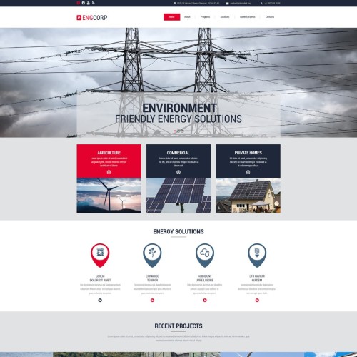
Ramirez Construction Co. is a business-like PSD template designed by TemplateMonster for industrial websites. Its layout includes a lot of elements necessary to build a company website: Google Map, client logos, thematic round feature icons, testimonial blocks, and more. Its layered structure will allow you to edit each element separately.

2. IT Company

2-it-company-psd-template

Price: $11

This PSD template will make a great landing page due to its conversion-optimized homepage layout. It features extremely clean flat design of all elements, large icons with long shadows, blocks with inclined borders, and a number of additional details such as progress bars.

3. Design

3-web-design-pds-template

Price: $11

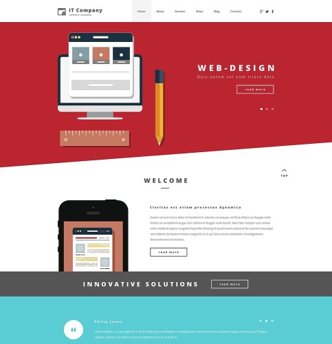
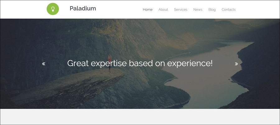
This layered PSD template is a fusion of creativity and minimalism. It focuses on extraordinary typography and colorful mosaic patterns. This design is suitable for web design and advertising agencies that want to stand out from the crowd.

4. Gitex

4-financial-psd-template

Price: $11

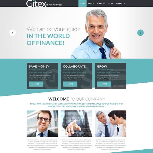
Gitex is a perfect choice for business websites and corporate blogs. In the package you will find layered Photoshop files of all of its numerous pages. Btw, this design is also available as a WordPress theme. Maybe you remember Monstroid, a multipurpose WP theme that we reviewed a while back, the thing is that Gitex is one of the best Monstroid child themes. So you can either get Gitex as a PSD template or a WordPress theme.

5. Mobile Store

5-mobile -store-psd-template

Price: $11

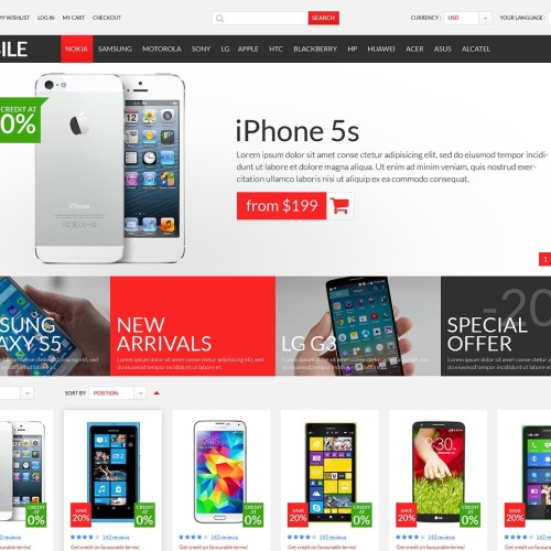
PSD templates for eCommerce are generally much more complex than ones for common websites, and this Mobile Store is no exception. It includes all possible user interface elements needed to design an effective eCommerce store: discount badges, functional buttons, feature icons, and so on. Feel free to edit them in order to create your own unique store design.

6. Medicamus

6-medical-pds-template

Price: $11

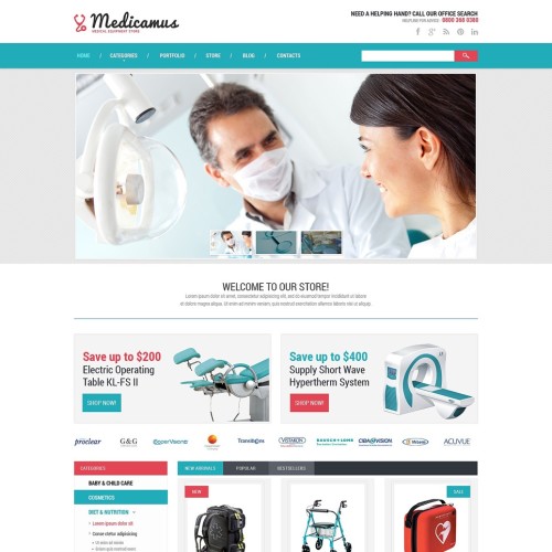
Medicamus is another eCommerce PSD template, this time – for medical stores. Its flat design with an esthetically perfect combination of colors inspires trust and confidence. This template features a complex accordion sidebar menu that can be used in a store of any size.

7. ProIndustry

7-industrial-psd-template

Price: $11

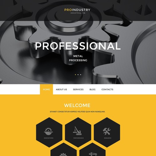
ProIndustry is a modern-looking template that uses hi-end design solutions. It has been created using page-wide images, including one in the header. Its layout offers extraordinary hexagonal effects with a “strong” and manly look, semi-transparent menus, and ghost buttons.

8. Trucky

8-transportation-psd-template

Price: $11

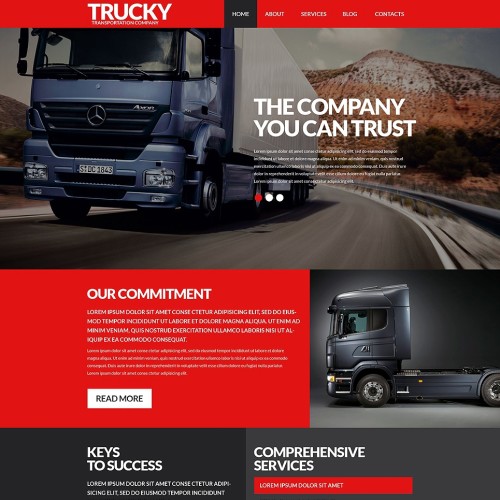
Another great PSD template designed with interleaving plain and photography blocks. A continuous series of such blocks enriched with text content is sure to attract your visitors’ attention. This template is recommended for transportation and other car-related websites.

9. Travel

9-travel-website-psd-template

Price: $11

This one is a layered PSD template built in line with the latest web design trends. Similar to many other designs in this collection it includes a lot of transparent elements that add a feel of lightness, and accentuate your content.

10. Appartments

10-real-estate-psd-template

Price: $11

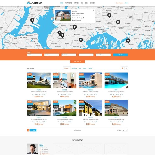
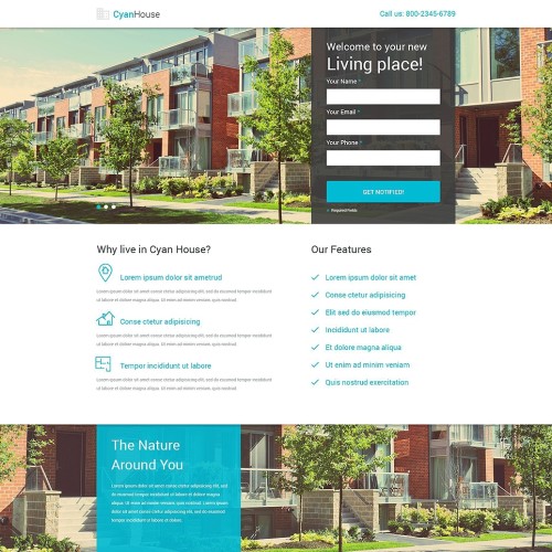
This template has been specifically laid out to suit the needs of real estate companies. It features a complex system of badges and search bars; various tabs, supplementary icons, and feature blocks. Its minimalist light design will allow you to modify it with ease.

11. Xurni

11-architecture-psd-template

Price: $11

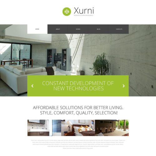
Refresh your design with Xurni – a layered PSD template for interior design and furnishing websites, also available as a WordPress theme. It includes easily editable flat design elements such as buttons, arrows, menu items, and social media buttons. It will suit middle-sized portfolio websites and online stores selling furniture or offering interior design services.

12. Dental Clinic

12-dentist-psd-template

Price: $11

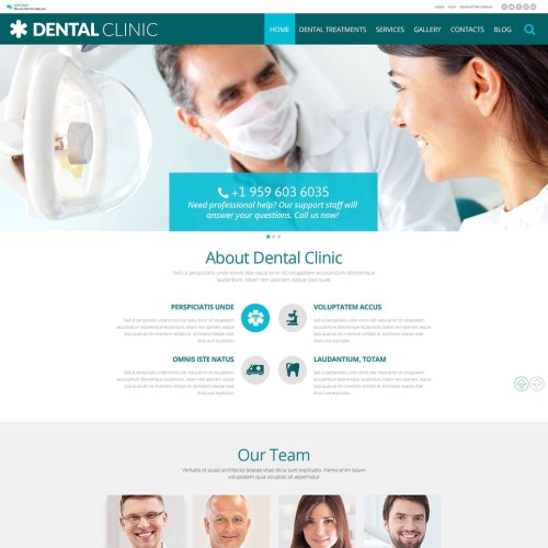
Use this PSD template to build a professional medical website. The icons included in the package have been designed specifically for this topic, so implementing them will be a breeze even for a novice designer. Its homepage is a long scrolling page packed with all kinds of layout elements aimed at increasing conversion and adding extra functionality.

13. Wegy

13-wegy-psd-template

Price: $11

With this easily editable PSD template you receive an ultimate tool that will help you create almost any website you can imagine. It comes with a full range of pre-made pages for business, eCommerce and blogging. Please note: this layout is also available as a Joomla template.

14. EngCorp

14-energy-psd-template

Price: $11

This PSD template with a smart combination of colors is utterly multipurpose. It provides space for sliders, social media buttons, company feature blocks, newsletter subscription forms, and much more. Creative buttons implemented in the template will liven up the design of your future website.

15. HR Staffing & Recruiting

15-hr-psd-template

Price: $11

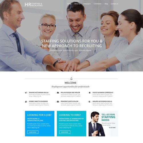
HR Staffing & Recruiting is a layered PSD template that also exists in the form of a WordPress theme. It’s a purely business design with a strict functional layout and minimalist outline buttons. This means that it is devoid of heavy design elements, and is, therefore, very easy to edit.

16. TV Channel

16-media-magazine-psd-template

Price: $11

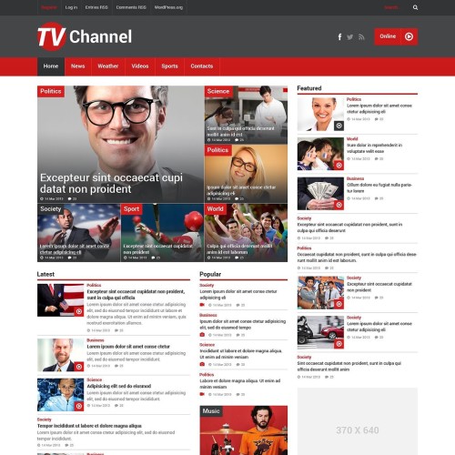
TV channel provides you with a readymade tool to create your own media portal. Its feature-rich layout is designed to display multiple categories and posts in the most space-efficient way. This type of website is particularly difficult to design from scratch, so this template will be a life-saver for you.

17. Mentax

17-heavy-industry-psd-template

Price: $11

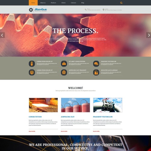
If you want to design a professional-looking website for a large construction company, Mentax is always a good choice. Its layout has been designed in order to place all the important information about a company on its homepage. Some pleasant additions such as wide parallax images will only add charm to its solid design.

18. Tom Cooper

18-photographer-psd-template

Price: $11

To create a stylish portfolio website with an unusual layout use this professional PSD template. It is a page-sized scrolling design with minimalist interface that totally relies on the background image. Just replace the image – and you will completely change its look. Yes, it’s that simple.

19. Robert Adams

19-personal-page-psd-template

Price: $11

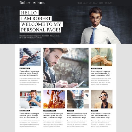
This personal website template will perform best as a foundation for business portfolio websites. It features a boxed layout, and thanks to the professional-looking serif fonts, has the look of a newspaper. This template can be used for a company website as well.

20. Exdesimo

20-landscape-design-psd-template

Price: $11

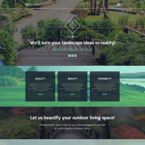
Pay special attention to this exterior design template. It focuses heavily on imagery and semi-transparent content blocks. Such a combination will make your website look outstanding regardless of its topic. Another point worth mentioning here is a trendy vintage X-logo that adds a handcrafted touch to the design.

21. Your App

21-landing-page-psd-template

Price: $11

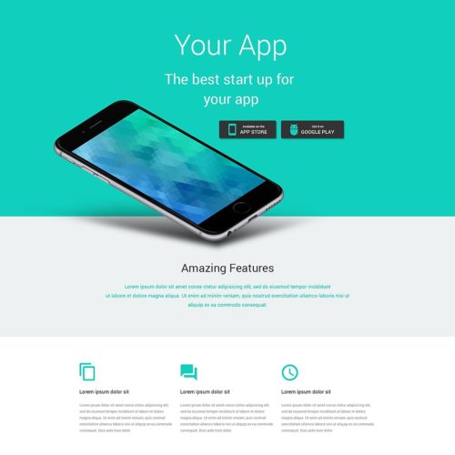
If you are looking for a modern design to present your mobile app or online service, look no further than this layered PSD template for landing pages. It is sustained in one color, and will highlight your unique branding. Its elements are enhanced with slight shadows to add a sense of depth.

22. Bread Bakery

22-bakery-psd-template

Price: $11

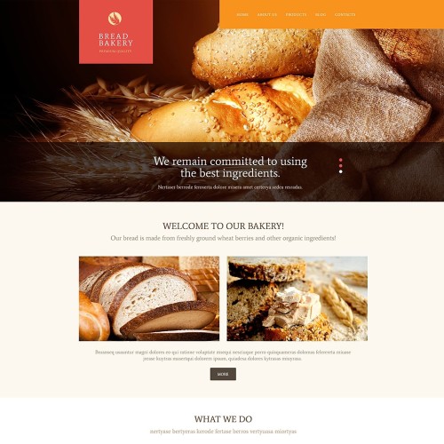
This deluxe PSD template with a right-aligned menu and beautiful handcrafted icons will let you build a superb website without having to lay it out from scratch. Of course, this template is not solely for bakery websites. If you show some imagination you can adapt it to a wide range of topics. For example, it can be used to design a business website for an agricultural company.

23. Dallas Co

23-corporate-psd-template

Price: $11

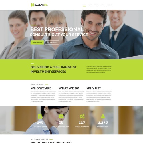
Dallas. Co is a solid design created to perform as an effective landing page with any CMS, or just as an HTML template. It is one of those templates that will serve as a great landing page out of the box, without any need for additional customization.

24. Repair Theme

24-it-psd-template

Price: $11

The PSD template you are looking at is a flat website design for technology companies. Whether you are making a website for a hosting provider, a SEO specialist, or an Internet café, it is guaranteed to fit your project. Even if you are not fully satisfied with its color palette, don’t forget that you can change it with a couple of clicks in your Photoshop.

25. Business Consultant

25-business-consultancy-psd-template

Price: $11

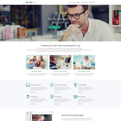
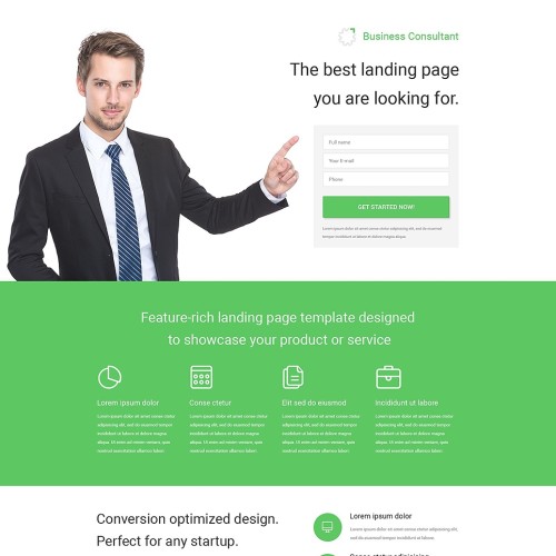
Crafted with conversion in mind this Business template is another design that just works toward your success. Under a simple above-the-fold area you will find all kinds of design and marketing solutions that will turn your (or your client’s) casual visitors into customers and devoted fans.

26. CyanHouse

26-home-rental-psd-template

Price: $11

This sleek template with outline icons and a wide choice of various forms and fields is all you need to design a marketplace or a social media website. You will love its pixel-perfect outline icons, embossed parallax blocks and well thought out item previews with lots of additional functions.

27. Travel Guide

27-travel-agency-psd-template

Price: $11

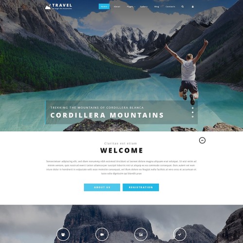
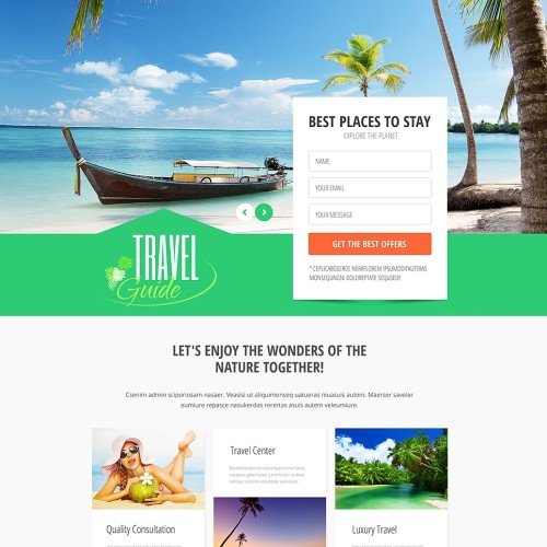
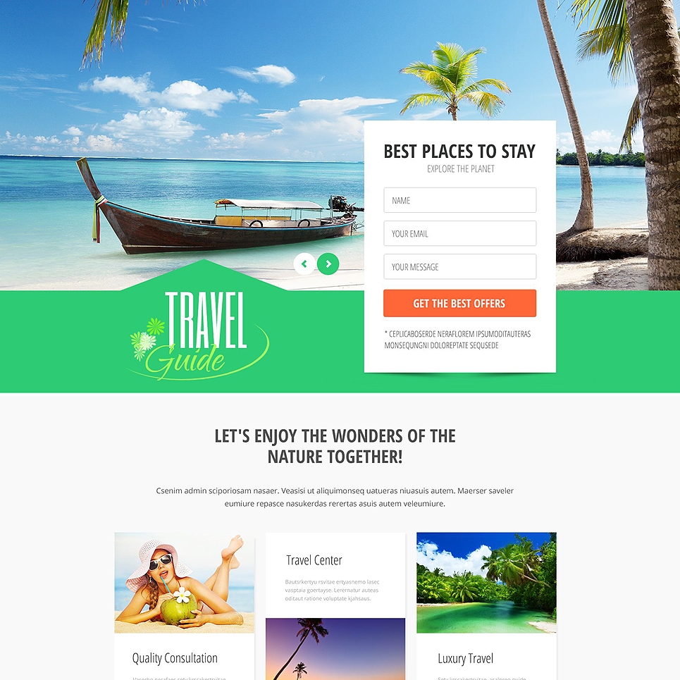
To design a website for travel agencies use, this layered PSD template with colorful price charts and social media buttons fits the bill. It looks extremely fresh and light, what else do you need for a website that sells pleasure and relaxation?

28. Securax

28-security-psd-template

Price: $11

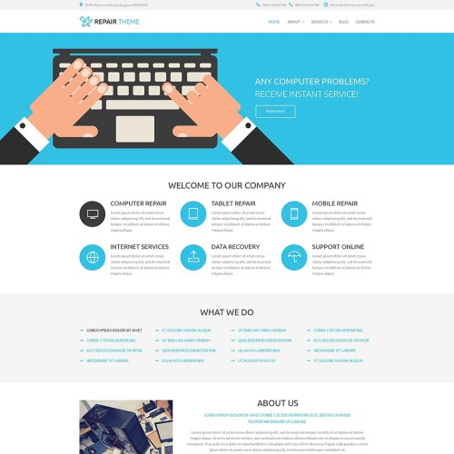
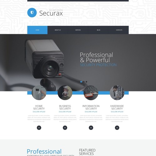
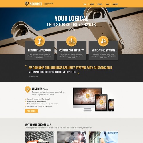
With a simple layout based on the combination of square and round flat elements, Securax provides a readymade solution for websites dealing with all things tech. Be it a website of a hosting provider, or a store selling security systems, with Securax it will look professional and robust.

29. Liam Hamilton

29-photo-portfolio-psd-template

Price: $11

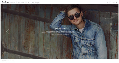
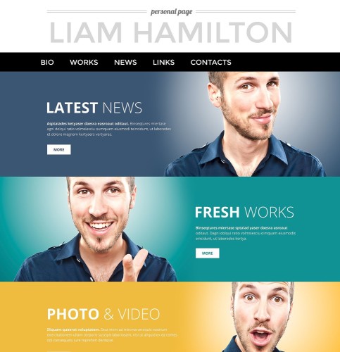
The design of this Liam Hamilton portfolio template is exemplary when it comes to a harmonious blend of visual appeal and great usability. It utilizes a large all-caps font, following one of today’s latest design trends. Its extensive gallery capabilities are specifically aimed at photographers and videographers.

30. Jobs Finder

30-recruiting-psd-template

Price: $11

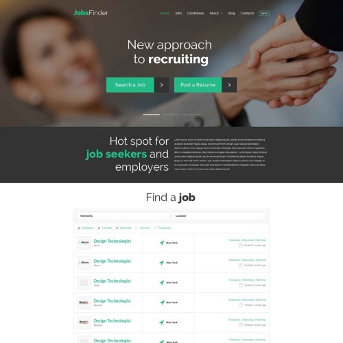
Give a try to this PSD template. It will help you design of a top-notch job finding portal in no time. The number of design elements included is amazing. Here you will find price charts, feature icons, circular progress bars, various buttons and topic-specific details. See for yourself.

31. High School

31-education-psd-template

Price: $11

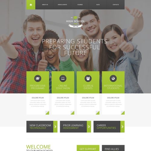
The next on our list is a layered PSD website template for education. It is designed in such a way that it can be used both for school and university websites with equal effectiveness. This design powers one of Monstroid child themes, so you may use it for your WordPress website right off the bat.

32. Securex

32-security-services-psd-template

Price: $11

This design will fit technology-oriented websites of any size and complexity. It stands out of the crowd with its unique material design icons with long shadows. The layout has been optimized to highlight the strength of your company’s services, in order to increase sales.

33. Clothing

33-clothing-store-psd-template

Price: $11

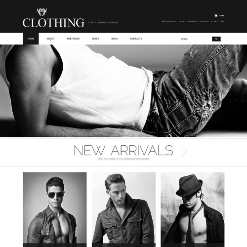
Clothing is an elegant and rich-looking PSD template created to become a background for boutiques and clothing company websites. You can turn it into a website and use as-is, without modifying at all. But if you still want to edit it, it will be very easy thanks to its layered structure.

34. Wedding Store

34-wedding-store-psd-template

Price: $11

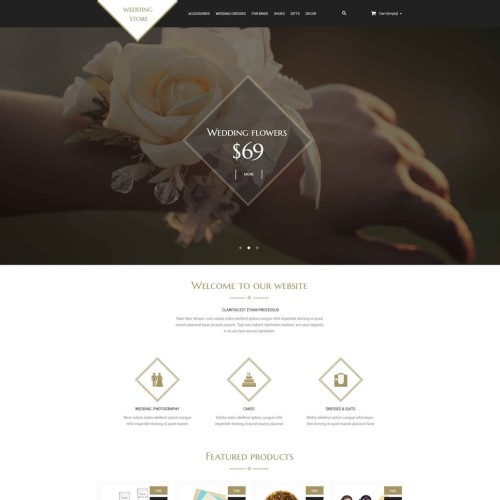
This template with a luxurious look is intended to be used as a foundation for online wedding stores. The peculiar feature of this design is extensive usage of diamond-shaped elements. They are represented just everywhere throughout the layout: in the logo, in feature icons, social media buttons, and even in price tags.

35. Fashion

35-portfolio-psd-template

Price: $11

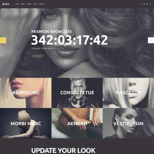
Use this template to design fashion stores, photography and art portfolios, or any other websites that rely strongly on imagery. It uses a combination of handwritten and headline fonts to emphasize its creative nature. The dark background and cheerful yellow elements make it suitable for music and night club websites.

36. Foodhouse

36-restaurant-psd-template

Price: $11

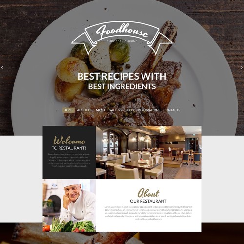
Now we suggest that you have a look at this layered PSD template for restaurants and elite food delivery services. Its retro-touched look perfectly conveys the atmosphere of a real brick and mortar restaurant with a rich history. Its extraordinary typography and color palette will complement the unique image of your website.

37. Obrus

37-obrus-industrial-psd-template

Price: $11

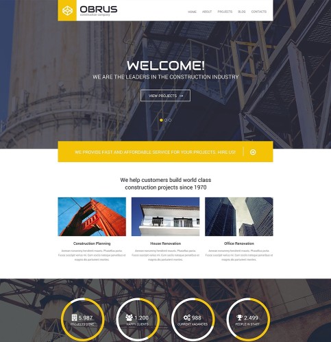
Here is a well-designed template for industrial and business websites. You can also see it at work as a Monstroid child theme with the same name. Its popularity speaks for itself: thanks to clean design and rich functionality it is one of Monstroid’s bestselling sub-topics.

38. Creo Furniture

38-furniture-psd-template

Price: $11

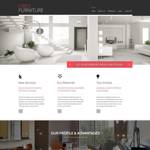
Creo Furniture combines flat sleek flat design and versatile portfolio options to deliver a modern look and perfect usability. With its slightly feminine color palette it looks elegant and refined, making it perfect for all kinds of interior design websites.

39. Twingoo

39-business-psd-template

Price: $11

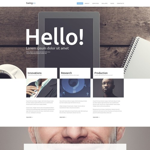
Twingoo is a great design featuring content sections that stand out from each other by being presented against different backgrounds. Its narrow top menu can be easily redesigned by replacing a logo with your own, and changing the color of buttons. This PSD template can be used for business websites, or online portfolios of creative agencies.

40. Web Development

40-web-development-psd-template

Price: $11

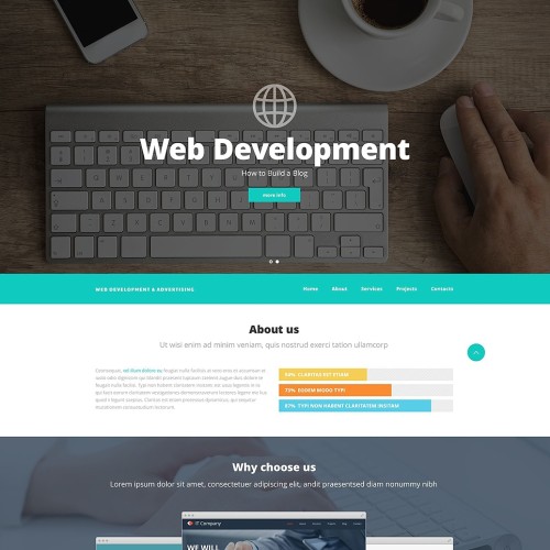
The last PSD template we would like to present to you today is a design for web development studios. Its basic color is turquoise – one of the most balanced, and therefore, most appealing colors in the spectrum. The template’s UI kit includes colorful progress bars, outline icons, and other elements to help you with designing your perfect website.

***

You can buy any of the templates mentioned above for as little as $11. Check out the entire collection, and let us know if we missed any cool design that you want to be listed here.

We hope this article motivated you, and boosted your inspiration. Good luck with your creative endeavors!

Read More at 40 Premium PSD Templates for 2016

Categories: Designing, Others Tags:

Optimizing Your Design For Rapid Prototype Testing

December 22nd, 2015 No comments

Product teams in startups and mid-sized and large companies are all implementing usability testing and prototyping as a way to de-risk product development. As the focus shifts from engineering to prototyping, it is becoming increasingly important for anyone who creates prototypes to understand the differences between a prototype and a product build.

Optimizing Your Design For Rapid Prototype Testing

By optimizing the prototyping process, you can produce mockups that deliver the most actionable user insights, while being as efficient as possible with design time. Regardless of which prototype tools you use or whether you test wireframes, clickable mockups or coded prototypes, what’s most important to focus on is what you want to test and what you want to learn from it.

The post Optimizing Your Design For Rapid Prototype Testing appeared first on Smashing Magazine.

Categories: Others Tags:

MotoCMS Giveaway: Get 1 of 3 Responsive Web Templates

December 22nd, 2015 No comments
major picture

Website development is considered to be a complex process, requiring a lot of investment, effort and time. Different minds have to work together in order to implement a web project on behalf of a client who doesn’t have a clue about website design and code writing.

But there is one snag… Your enterprise is a losing battle, if you are not involved in it one hundred per cent. Of course, you may present your own strategy to the professionals, where you tell them about the vision you have for your website. But the web development industry’s specific character and a lack of specified knowledge will create a barrier between you and your web developers, negating all the odds of starting up a top-of-the-range website for your online
business. Not even mentioning wasted funds.

major picture

So what is the alternative? Here are a few suggestions:

MotoCMS Responsive Website Builder

MotoCMS is a company that has a knack for building ready-made websites that has equal functionality, but lower cost. Its website template collection contains many ready-made web designs for every purpose and intent. No matter what your intentions are, you will definitely find the desirable website among dozens of categories.

Try Your Chances

Do you want to have a stunning website with no charge? Participate in this contest! MotoCMS is giving away 3 website templates for free. This is not a joke. Leave a comment with the item number of the desired website template, starting from 22 December through to 29 December. Choose one of responsive website templates and wait for your prize! The lucky winner will be chosen by random selection on 30 December. Only one comment can make you an owner of a perfectly made, responsive website. It’s definitely worth a try!

Before making your choice, read below about the other awesome benefits that you can get by entering this competition, along with a lightning fast and good-looking web design powered by MotoCMS website builder.

Personalize Your Website

Would you like to edit your website design without professional assistance? Not a problem at all. With a purchase of any website template powered by MotoCMS you get the built-in admin panel – an easy-to-use website builder, providing your website full customization. A broad spectrum of integrated widgets and tools will help you to transform your website’s appearance, even if you are not familiar with web design and programming.

motocms responsive website builder

Set Colors

Among the tools that are provided in the admin panel powered by MotoCMS responsive website builder, this one deserves special mention. Color Picker is the finest way to create your website’s color palette in one place. Based on the five main colors, when applied to your website, Color Picker creates more than twenty five tones for a website owner to choose from, to create the best color set for his website. On top of that, there are additional color sections available, including five other unique hues to pick from.

color picker tool

Optimize Social Media

Currently social media is one of the most important aspects of the Internet. One can not only find new friends or read the latest news, but it’s also very beneficial for online business. Create social media accounts and connect them with your website by drag-and-dropping Facebook Feed, Twitter Timeline or Pinterest board widgets. Add Social Links and Social Buttons for users to share and like your website.

social network widgets

Appeal to Search Engines

People often use search engines to find a web resource they need. A proper search engine optimization strategy will raise your website rankings and push it to the top of the search results. The MotoCMS admin panel allows users to set basic SEO settings in a few clicks. Write page titles, descriptions and keywords and optimize URLs. Check the No-index, No-follow and Hide Canonical boxes to enable these features.

Transfer Your Data

Before adding your personal content to your website, upload it to Media Library. Just drag-and-drop needed items to the required area of this excellent file manager and they will be ready for use in a second. Create new folders to structure uploaded files like photos, videos, audios, archives, documents and other. Check and edit file properties as well. Keep in mind that the maximum upload file size is 2 MB.

motocms responsive website builder file manager

Make It Responsive

Responsiveness is a key element of web design. This trend put mobile devices in the same league as desktops. Your responsive website template from MotoCMS will be appreciated by smartphone and tablet users, due to its superb mobile version. Your website template layouts will be automatically adjusted to all modern mobile devices’ screen resolutions, keeping your website’s original look.

24/7 Tech Support

Seeking for advice? Contact the 24/7 customer support service provided by MotoCMS. Talk to a professional and get an instant response on the topic of your interest. If you are pushed for time, set a phone call yourself and wait for a timely callback. Alternatively you can type a message in the live chat and receive a reply immediately.

E-commerce Plugin

Here is a special offer for everyone who intends to start up an online store. After adding the E-commerce plugin to your website template, click the “Store” button in the admin panel to initiate the work of your online shop. Access your daily and monthly analytics, displayed on a diagram. Receive orders and check their status. Create product catalogs and set discounts with promo-codes. Look through your customers’ contact information and trace their actions in your online store. Payment, tax, design and other properties are also available for setup.

Blog

Are you looking for a website with a blog functionality? MotoCMS website templates collection contains a bunch of made-up websites that will help you to begin successful blogging career. Write and edit posts, play with layout design, set backgrounds, change text style, pick different images and buttons presets, set published posts amount, enable or disable comments. Choose your website with a blog among the website templates that we’re showcasing below. Take your part in the giveaway by writing a comment with a number of the desired design.

Conclusion

A ready-made website template is the best solution to save you time and money, when building your own online business. Create your website with MotoCMS and you will have the ability to manage your website without leaving the web browser. If you are not convinced yet, take a look at the following collection of MotoCMS responsive website templates. Try any template free for 14 days and see for yourself. All the changes made in the trial version of the chosen web design may be saved after it’s purchased. Also don’t forget to leave your comment below to get your reward. You have time until 29 December!

Responsive Business Web Template

ready made website for corporation

Business Web Page Template

responsive site design

Financial Consultants Website

business site template

Read More at MotoCMS Giveaway: Get 1 of 3 Responsive Web Templates

Categories: Designing, Others Tags:

December 2015: Ten Free WordPress Plugins to Revamp Your Blog

December 22nd, 2015 No comments

This monthly article on new free WordPress plugins is always fascinating to me. More often than not, there are absorbing plugins among them. I have found exciting features since I run this series. You can revamp your blog in no time and offer functionality to your readers (and yourself) that make your blog stick out of the thousands of others. That’s why I dug deep into the newest plugins of this month to present you the ten most interesting ones.

1 – Contact Us Page

Creating an appealing contact page is easy using the Contact Us Page plugin. The generated page contains a map presentation, social media buttons, and a contact form. Via shortcode, the contact area can be integrated anywhere.

Contact us page PluginContact us page Plugin

  • Developer: devmatte
  • Work in progress: Yes
  • Latest version from: 15.12.2015
  • Costs: free on WordPress.org
  • License: GNU GENERAL PUBLIC LICENSE
  • Compatibility problems with other plugins: unknown
  • Developer Homepage: unknown
  • Download on WordPress.org

2 – Output Desk Live Chat

Output Desk Live Chat is a feature-rich plugin to create a live chat. This can be useful for online shops, but is generally usable for all types of websites that offer support in any way, for example, premium WordPress theme developers, software developers with their own sale sites or something similar.

Output Desk Live ChatOutput Desk Live ChatOutput Desk Live Chat

  • Developer: Srimax
  • Work in progress: Yes
  • Latest version from: 15.12.2015
  • Costs: free on WordPress.org
  • License: GNU GENERAL PUBLIC LICENSE
  • Compatibility problems with other plugins: unknown
  • Developer Homepage: unknown
  • Download on WordPress.org

3 – Browser and Operating System Finder

Browser and Operating System Finder

The plugin adds the browser name and the operating system to the element as a class. That is useful for developers when, for example, a responsive website doesn’t look the way it is supposed to on some devices. That allows you to directly address these devices or operating systems.

  • Developer: aftabmuni
  • Work in progress: Yes
  • Latest version from: 15.12.2015
  • Costs: free on WordPress.org
  • License: GNU GENERAL PUBLIC LICENSE
  • Compatibility problems with other plugins: unknown
  • Developer Homepage: unknown
  • Download on WordPress.org

4 – EU Cookie Consent

eu-cookie-consent

EU Cookie Consent fulfills the minimum standards of the EU data protection law. A plugin of that kind is mandatory when using Google Adsense ads. The shown message can be edited, the colors chosen and the position on which the message will appear can also be adjusted.

eu-cookie-consent

  • Developer: Robert Simpson
  • Work in progress: Yes
  • Latest version from: 15.12.2015
  • Costs: free on WordPress.org
  • License: GNU GENERAL PUBLIC LICENSE
  • Compatibility problems with other plugins: unknown
  • Developer Homepage: unknown
  • Download on WordPress.org

5 – AmpedSense – AdSense Split Tester

This plugin is great for people that use Google Adsense ads on their website. Often, Google ads don’t lead to the desired results. AmpedSense can potentially improve the financial results significantly, as you can test where the ads should be placed for optimum results. Split tests allow for the best possible placement of ads on your website.

Adsense Split TestAdsense Split TestAdsense Split TestAdsense Split Test

  • Developer: Shane Labs
  • Work in progress: Yes
  • Latest version from: 15.12.2015
  • Costs: free on WordPress.org
  • License: GNU GENERAL PUBLIC LICENSE
  • Compatibility problems with other plugins: unknown
  • Developer Homepage: unknown
  • Download on WordPress.org

6 – iMinify

iMinify

iMinify is another plugin to compress HTML source code, CSS, and JavaScript files. The settings are rudimentary. A thorough test will have to show how good this plugin really is. It’s a good thing that there is another plugin of this kind now, as not every plugin that compresses HTML and other data works well with every website.

  • Developer: iLen
  • Work in progress: Yes
  • Latest version from: 14.12.2015
  • Costs: free on WordPress.org
  • License: GNU GENERAL PUBLIC LICENSE
  • Compatibility problems with other plugins: unknown
  • Developer Homepage: unknown
  • Download on WordPress.org

7 – Responsive Embed Videos

responsive-embed-videos

Responsive Embed Videos assures a responsive integration of videos in an article or a page. It only works well on websites that don’t already have such an integration of videos. Using shortcodes, every video on YouTube or Vimeo can be turned responsive.

  • Developer: Thomas K
  • Work in progress: Yes
  • Latest video from: 14.12.2015
  • Costs: free on WordPress.org
  • License: GNU GENERAL PUBLIC LICENSE
  • Compatibility problems with other plugins: unknown
  • Developer Homepage: unknown
  • Download on WordPress.org

8 – Social Icons

Social Icons

Another plugin to display the popular »Follow us on” buttons. It creates a widget for the sidebar, in which the social networks that the reader can follow the website owner on will be presented. You can choose between four different types of buttons.

Social IconsSocial Icons

  • Developer: ThemeGrill
  • Work in progress: Yes
  • Latest version from: 14.12.2015
  • Costs: free on WordPress.org
  • License: GNU GENERAL PUBLIC LICENSE
  • Compatibility problems with other plugins: unknown
  • Developer Homepage: Social Icons Demo
  • Download on WordPress.org

9 – WordPress Video Overlay Ads

wordpress-video-overlay-ads

This plugin allows you to position HTML of any kind over a video before playing it. You could either deposit HTML based ads or implement a Like button for your Facebook page. Or you could come up with even more ideas.

video-overlay-ads-1video-overlay-ads-2

  • Developer: ensar
  • Work in progress: Yes
  • Latest version from: 14.12.2015
  • Costs: free on WordPress.org
  • License: GNU GENERAL PUBLIC LICENSE
  • Compatibility problems with other plugins: unknown
  • Developer Homepage: unknown
  • Download on WordPress.org

10 – StickyAdmin

stickyAdmin

Sticky Admin is a plugin that allows you to adjust the WordPress admin area to your needs both visually and functionally. The surface can be edited using 25 preset themes. Furthermore, the colors can also be altered so that the admin surface is adjusted to fit the color scheme of the used theme. The navigation can also be edited in type and position. An Ajax search feature is available, and the surface is prepared for the plugins bbPress, buddyPress, MultiSite, WPML, and WPMU.

  • Developer: dorian.tudorache
  • Work in progress: Yes
  • Latest version from: 14.12.2015
  • Costs: free on WordPress.org
  • License: GNU GENERAL PUBLIC LICENSE
  • Compatibility problems with other plugins: unknown
  • Developer Homepage: unknown
  • Download on WordPress.org

Conclusion

Once again, there’s a plugin for me as well this month. I’ll definitely try the »AmpedSense – AdSense Split Tester” plugin. I also like »StickyAdmin”. I think the »iMinify” plugin is worth testing as well. Which plugin of this month do you like the most?

Want more? Take that collection from last month and that one from the month before.

(dpe)

Categories: Others Tags:

A Guide for SVG Support in Email

December 22nd, 2015 No comments

We’ve talked about SVG quite a bit here on CSS-Tricks, but one area we haven’t quite touched on is email. Now that browser support for SVG is all in the green, it would be easy to assume that we can start using SVG everywhere. However, if you’ve worked with email before, you may know that it often follows way behind the web as far as feature support. You know, kinda the way California looks at North Dakota with trends: just a few years behind. 🙂

This article takes a deep dive into four different ways SVG can be used, and compares support for those methods across several of the most popular email applications. Let’s see where we get the most support.


SVG as Image Tag

Using SVG as a straight-up tag is like placing any other image file onto a screen, except we’re referencing an SVG file instead something like a JPG or PNG:

<img src="my-image.svg">

Here’s the support for this technique:

AOL Web Outlook 2013 Outlook
.com
Yahoo! Mail (OSX) Mail (iOS) Gmail Gmail (iOS) Gmail (Android) Android
Yes No Yes Yes Yes Yes No No Yes No

Total support: 60%

SVG as Inline HTML

In this test, we’re plucking the code for the SVG file right out of Illustrator and plopping it directly into the email’s HTML:

<svg version="1.1" xmlns="http://www.w3.org/2000/svg" xmlns:xlink="http://www.w3.org/1999/xlink" viewBox="-227 241 225.3 224.1" style="enable-background:new -227 241 225.3 224.1;" xml:space="preserve">
    <path class="dice-1" d="M-132,241h-72.3c-12.4,0-22.6,10.2-22.6,22.6V336c0,12.4,10.2,22.6,22.6,22.6h72.3c12.4,0,22.6-10.2,22.6-22.6
    v-72.3C-109.4,251.2-119.6,241-132,241z M-195.3,340.5c-7.5,0-13.6-6.1-13.6-13.6c0-7.5,6.1-13.6,13.6-13.6
    c7.5,0,13.6,6.1,13.6,13.6C-181.8,334.4-187.9,340.5-195.3,340.5z M-195.3,286.2c-7.5,0-13.6-6.1-13.6-13.6
    c0-7.5,6.1-13.6,13.6-13.6c7.5,0,13.6,6.1,13.6,13.6C-181.8,280.1-187.9,286.2-195.3,286.2z M-168.2,313.3
    c-7.5,0-13.6-6.1-13.6-13.6c0-7.5,6.1-13.6,13.6-13.6s13.6,6.1,13.6,13.6C-154.7,307.3-160.7,313.3-168.2,313.3z M-141.1,340.5
    c-7.5,0-13.6-6.1-13.6-13.6c0-7.5,6.1-13.6,13.6-13.6c7.5,0,13.6,6.1,13.6,13.6C-127.5,334.4-133.6,340.5-141.1,340.5z
     M-141.1,286.2c-7.5,0-13.6-6.1-13.6-13.6c0-7.5,6.1-13.6,13.6-13.6c7.5,0,13.6,6.1,13.6,13.6C-127.5,280.1-133.6,286.2-141.1,286.2
    z"/>
    <path class="dice-2" d="M-24.3,347.5h-72.3c-12.4,0-22.6,10.2-22.6,22.6v72.3c0,12.4,10.2,22.6,22.6,22.6h72.3
    c12.4,0,22.6-10.2,22.6-22.6v-72.3C-1.7,357.7-11.9,347.5-24.3,347.5z M-87.6,447c-7.5,0-13.6-6.1-13.6-13.6
    c0-7.5,6.1-13.6,13.6-13.6c7.5,0,13.6,6.1,13.6,13.6C-74.1,441-80.1,447-87.6,447z M-60.5,419.9c-7.5,0-13.6-6.1-13.6-13.6
    c0-7.5,6.1-13.6,13.6-13.6s13.6,6.1,13.6,13.6C-46.9,413.8-53,419.9-60.5,419.9z M-33.4,392.8c-7.5,0-13.6-6.1-13.6-13.6
    s6.1-13.6,13.6-13.6s13.6,6.1,13.6,13.6S-25.9,392.8-33.4,392.8z"/>
</svg>

The support is a lot less than I expected:

AOL Web Outlook 2013 Outlook.com Yahoo! Mail (OSX) Mail (iOS) Gmail Gmail (iOS) Gmail (Android) Android
No No No No Yes Yes No No No Yes*

*Overflows the container

Total support: 25% (counting Android as partial support)

You might have noticed that I assigned classnames for each path. If you were hoping the CSS properties for SVG are also supported for those email clients that recognize inline SVG, well, you’re in luck. They are, across the board.

fill

Mail (OSX) Mail (iOS) Android
Yes Yes Yes

stroke

Mail (OSX) Mail (iOS) Android
Yes Yes Yes

SVG as CSS background Image

We can use SVG as a background image in CSS:

.my-element {
  background-image: url("my-image.svg");
  background-repeat: no-repeat;
}
AOL Web Outlook 2013 Outlook.com Yahoo! Mail (OSX) Mail (iOS) Gmail Gmail (iOS) Gmail (Android) Android
Yes No No Yes Yes Yes No No No No

Total support: 40%

Note that some email applications are known to strip CSS from the document . In these cases, it is a best practice to inline our styles in addition to including them in the .

Also, CSS backgrounds are a bit unpredictable if we’re dealing with a responsive design. Keeping the width and height proportional to each other would be tricky, and probably more hassle than it’s worth.

SVG as Object Embed

Embedding SVG as an is a lot like embedding a media file, like audio or video. The benefit—aside from retaining some styling control with CSS—is that a fallback image can be set where SVG is not supported:

<object style="width:100%;" type="image/svg+xml" data="my-image.svg">
  <img src="my-image.jpg">
 </object>
AOL Web Outlook 2013 Outlook.com Yahoo! Mail (OSX) Mail (iOS) Gmail Gmail (iOS) Gmail (Android) Android
No No Yes* Yes* Yes Yes No No Yes Yes

* with fallback
overflows the container

Total support: 55% (with partial support for Mail OSX)

Image Tag with CSS Hack

The results here aren’t very encouraging. I mean, the the best support is 60% and that’s kinda crappy. But, what if we tried combining a couple of different techniques to get something provides us better support?

Here’s the trick. First, we’ll add one image tag for the SVG and one for a backup JPG:

<!-- Image: SVG -->
<img src="my-image.svg">
<!-- Image: JPG -->
<img src="my-image.jpg">

If we were to stay with this, we would have a situation where some email applications display two images and others display one with a broken image symbol. Yuck.

Let’s hide that JPG for the email applications that do support SVG. No, Modernizr does not work for email, but we do know that Gmail and a few other applications ignore any CSS that is in the document . We can use that to our advantage by adding a classname to the JPG image element and hiding it with CSS:

<!-- Image: SVG -->
<img src="my-image.svg">
<!-- Image: JPG -->
<img class="no-showy" src="my-image.jpg">
/* Hide this everywhere, except for those that can't read this code */
.no-showy {
  display: none;
}

Now we’re on a roll! We have accomplished the feat of hiding the JPG in all email applications, except Gmail. If we stop here, however, here’s how Gmail renders the code:

That darn broken image!

Ack, so close. Now we need to hide that broken image tag where the SVG should go. Let’s do a couple of things:

  • Add a height and width of zero to the SVG
  • Add a classname to the SVG that resizes it

In other words:

<!-- Image: SVG -->
<img class="showy" width="0" height="0" src="my-image.svg">
<!-- Image: JPG -->
<img class="no-showy" src="my-image.jpg">

Removing the width and height of the SVG inline has the same effect as hiding it. Then, we use the CSS document hack by adding a class that changes those dimensions back to a full-size image for the email applications that support SVG:

/* Resize an element that has a width and height of zero to full size */
.showy {
  height: 100% !important;
  width: 100% !important;
}

/* Hide this everywhere, except for those that can't read this code */
.no-showy {
  display: none;
}

Let’s pull it all together:

/* Resize an element that has a width and height of zero to full size */
.showy {
  height: 100% !important;
  width: 100% !important;
}
<!-- Image: SVG -->
<img class="showy" width="0" height="0" src="my-image.svg">
<!-- Image: JPG -->
<img class="no-showy" src="my-image.jpg">

Our support starts to look a heck of a lot better:

AOL Web Outlook 2013 Outlook.com Yahoo! Mail (OSX) Mail (iOS) Gmail Gmail (iOS) Gmail (Android) Android
Yes* Yes Yes* Yes* Yes* Yes* Yes Yes Yes Yes*

* SVG
JPG

Holy crap, we’re at 100%! Well, close anyway. You can check out a public Litmus test here which showing all the methods in a single email.

Is it all SVG? No, but it is nice to be able to say we can use SVG with a responsible fallback.

My biggest takeaway…

…is that email is still in the Wild West of front-end development. I would personally feel like using SVG is a gamble, but knowing there is a workaround is reassuring, even if it does mean an extra layer of work.

That said, knowing your audience is likely the determining factor for whether SVG can and should be used in email. For example, a developer of iOS apps who knows that customers consume email on an OSX or iOS device might feel really good about using SVG. Many email marketing providers (like MailChimp and Campaign Monitor) make this information easy to find with analytics. Campaign Monitor also has a pretty handy report on the popularity and market share of email applications that is worth checking out.


A Guide for SVG Support in Email is a post from CSS-Tricks

Categories: Designing, Others Tags:

How Google’s changes will affect your designs

December 22nd, 2015 No comments

A large number of new websites — perhaps even the overwhelming majority of them — have started to take on a really familiar look. I’m sure you know what I’m talking about.

There is a navigation bar at the top of the screen — usually inverse in color to the rest of the page — followed by a huge carousel of images (both in terms of physical size and the number of images it contains), often some kind of hideous Google AdSense advertisements, and then finally, if we’re lucky, there will be some actual content to read before we have to reach for the scroll wheel.

Google doesn’t like it!

Get your content above the fold

The problem with making users have to scroll past these huge carousel graphics at the top of the design, after perhaps waiting for it all to load, is that it unfairly hijacks the bounce rate analytics for your site. Those analytics are not just there to help you, they are also connected to the formula Google uses to rank pages.

So if users seem to be lingering for a long time on your site, it makes your site seem to be more useful and popular than it probably really is. On the other hand, sites that really do provide useful content may have their rank negatively affected by having a higher official bounce rate than your site. In consequence, Google is rewarding sites that actually do place useful content above the fold. It does not mean that they will take aggressive action against sites that do waste space at the top of the page, but there is an advantage to getting useful information presented as early as possible on the page, so that users can quickly decide if your content is relevant to their needs.

This is another one of those paradoxes that designers have created for themselves by failing to discourage clients from being copy-cats. Business owners are often short-sighted when it comes to understanding the importance of originality; and there is a tendency to think that if a design (and sometimes even content) works at company X, it should be used at company Y as well.

Of course, this is foolish thinking; but it is remarkably pervasive. Designers are sometimes guilty of even encouraging it, because they think it saves them work. Well, perhaps it is unfair to use the word “designer” to describe these people, because they don’t actually do any real design. But, that is how they are labeling themselves. I think it discredits real designers. The trouble is that clients don’t know the difference.

Google gets serious about mobile support

Another thing that Google is now pushing quite aggressively is “mobile-friendliness”. It could be argued that now Google is a browser vendor and OS vendor, they’ve lost neutrality; but that’s kind of beside the point. It’s their search engine, and they make the rules.

When you manually index a site with Google these days, they will nag you constantly if they find that it needs more mobile-friendliness. This is not a bad thing… it’s good to know when improvement is possible, and to be given helpful advice on how to implement that improvement. What would be a bad thing, however, is if Google insists that mobile-friendliness is compulsory, and imposes a ranking penalty for non-compliance. That would be a problem, because not every site is intended to be viewed on a mobile device. The good news is that — for the moment at least — it doesn’t seem like Google will take that path.

Keep in mind that Google wants more people using Android, so they have a very strong incentive to try to make sure as many sites as possible are catering to the needs of Android users. What is clear, is that Google’s latest update is going to massively affect search results on a device-specific, location-specific level. So if your website isn’t supporting mobile devices, then you can expect users of those devices will not see your site listed above competitors in the search results.

Even though Google has said that it is not going to directly penalize sites who don’t provide “mobile-friendliness”, there are many reasons why I don’t think we can trust this advice.

The main one is that with Google potentially listing competing websites higher in search results on mobile devices, and with more people using mobile devices, we can expect to see the rankings of desktop-only sites fall through natural attrition. This means that more users going to competitor’s sites will cause Google to think that those sites are more popular than yours, even though Google creates the conditions under which that can happen.

There is one other crucial problem with the “mobile-friendliness” issue, which is exactly where the line gets drawn. Some sites, such as the MCDU Emulator site, support tablet displays but not cell phones. Tablets are mobile devices and so are cell phones, but they have enormously different abilities. If Google classifies both types into a single category, that means search results on tablets will be impacted negatively even if you support tablets. This is not fair to the users and not fair to the site owners, but as long as that single category exists, that is what we’ll have to contend with.

What you will need to do

These may seem like small changes, and for many designers they are not going to have a major impact; but you must not overlook the fact that the clients who will eventually own the websites don’t usually understand what it’s all about. They’ll make demands of you that go against what you know, and you will have to try to educate them.

While the following are basic best practices that everyone should already be doing without having to be hit with a stick by Google, the incredible majority of sites are not actually doing so, therefore it is necessary to spell out that the following things are what you should be doing when you create a new site:

  • Always approach from a responsive design point-of-view.
  • Try to support all display types natively.
  • If you can’t do the above due to the nature of your content, use mobile-only columns.
  • When using mobile-only columns, show the users what they are missing!
  • Use image carousels appropriately.
  • Try to put at least some relevant content above the fold.
  • Stop using regurgitated templates. Design something fresh for every site. That’s what your job is, anyway!

Following the above steps is a good way to keep ahead of Google, but just as importantly also the best way to build any new website. Making these changes is the easy part.

Now the hard part of the challenge is getting your clients to understand why the changes are needed!

Featured image, SEO image via Shutterstock.

Nexa Script with 6 Font Styles – only $17!

Source

Categories: Designing, Others Tags:

Top 10: Free WordPress Themes of December 2015

December 21st, 2015 No comments
Kotha

December brings us some fresh and free WordPress themes. That might not be surprising considering December is the single most important month for all the givers out there. Have you been waiting for a new design to deliever your content in, waiting time is over now. As usual we have looked for the most beautiful themes of the past month. As always, all the themes in our top 10 are responsive, meaning they adapt to any screen resolution. This time all are prepared for translation which makes it easy for you to fully localize them.

1 – Kotha

Kotha is a theme for personal blogs and has a very appealing design. It provides three additional widgets, is Retina-ready and prepared for the popular shop extension WooCommerce. The colours of the theme can be adjusted individually.

  • Created by: ShapedTheme
  • License: Free for personal and commercial use | GNU General Public License
  • Prepared for translation: Yes
  • Demo: Kotha Demo
  • Download on WordPress

2 – The Monday

The Monday

The Monday was developed especially for companies and freelancers. There are many features to discover. For example, header as well as footer areas can be defined individually. Colours and typography can be adjusted.

3 – TheShop

TheShop Theme

TheShop is an online shop theme for the popular shop system WooCommerce. It offers a clear, minimalist presentation of the offered products. Font and colours can be altered and a special landing page with a slider is included as well.

  • Created by: athemes
  • License: Free for personal and commercial use | GNU General Public License
  • Prepared for translation: Yes
  • Demo: TheShop Demo
  • Download on WordPress

4 – SKT Construction Lite

SKT-Construction

SKT Construction Lite is a business theme for construction businesses, but it can also be used in other industries. It offers an extended contact area, a map presentation, animated sections, custom backgrounds and colours.

5 – Newton

Newton Theme

The retro blog theme Newton comes with two sidebars and an appealing colour scheme. If you want a truly individual theme, this is the theme for you.

  • Created by: Michael Van Den Berg
  • License: Free for personal and commercial use | GNU General Public License
  • Prepared for translation: Yes
  • Demo: Newton Demo
  • Download on WordPress

6 – Pro Blogg

Pro Blogg Theme

A blog and photo theme for friends of minimalism. Pro Blogg is suitable for portfolios as well and provides a slider on the landing page to present media content in the best way possible. An important extra are the social network buttons in the header. Did I mention the customisable logo?

  • Created by: DessignThemes
  • License: Free for personal and commercial use | GNU General Public License
  • Prepared for translation: Yes
  • Demo: Pro Blogg Demo
  • Download on WordPress

7 – Findcools

Findcools

Findcools suits personal blogs well. You can also use it for portfolios. It comes with three preset colour schemes that can be further edited using the theme customiser.

8 – Portfolio Gallery

Portfolio-Gallery

The Portfolio Gallery theme obviously focuses photos. That’s why you can use it for a photo blog or as a portfolio theme. Colours and backgrounds of the theme can be altered.

9 – Iwata

Iwata Theme

Iwata is the latest theme by Anders Norén, the swedish webdesigner and WordPress beautifier. It’s a pure blog theme that supports custom background and link colours, as well as the obligatory header to adjust the blog to your personal needs.

  • Created by: Anders Norén
  • License: Free for personal and commercial use | GNU General Public License
  • Prepared for translation: Yes
  • Demo: Iwata Demo
  • Download on WordPress

10 – Shamrock

Shamrock

Shamrock is a very appealing and lovingly desgined blog theme. It provides custom colours, social media buttons and the WordPress post formats. The theme is prepared for the ContactForm7 plugin.

Find More Recent Themes Here:

(dpe)

Categories: Others Tags:

The case for drag ‘n’ drop web design

December 21st, 2015 No comments

In the beginning, everyone designed in the browser. This is because we literally did not have any other options. A text editor and a browser were the only tools we had.

HTML itself was pretty basic. We didn’t even get tables until a few years after we had the first browser. When we finally did, it didn’t take long for people to start making layouts with them. Sure, they were designed for tabular data, but rules and standards are made to be horribly broken, right?

A few years, transparent .gif files, and PSDs later, the usual web design setup looked like this:

A designer would make an interface that looked pretty in Photoshop. It might be usable. On the other hand, it might have navigation text that blended in with the background a little too well. The important thing was that it looked kinda 3D with a lot of gradients and drop shadows.

Then someone (maybe the designer, maybe their coder buddy) would slice up that basic interface, painstakingly rebuild it all with tables, and make sure it worked in IE6, at least.

Can anybody remember what happened when a client wanted a main navigation link to change, and the navigation was composed entirely of images?

In time, we switched from tables to CSS. Then many of us switched from mocking everything up in Photoshop to designing in the browser again. The circle was closed. The old was new again. IE6 was cast into the fires of Mount Doom.

Good times.

The other design tools

I began designing websites somewhere in the middle of all that, when people were moving into Photoshop, but we also had Dreamweaver, Frontpage, and other plagues designed to punish the sinners.

I was a kid. I didn’t know any better. I didn’t know how HTML and CSS worked. I also didn’t know that:

Anything a web design app can do, code can do better

Simply put, no visual web design application will ever offer the sheer flexibility that comes from writing the HTML and CSS yourself. Writing your own HTML and CSS allows you to try new techniques, write the least code to the greatest effect, and generally just make better websites.

Those apps wrote terrible code, actually

It’s not just that you can make better websites by learning to write HTML and CSS. Those old programs, FrontPage, Dreamweaver, all of them, were known for writing particularly awful code. It was bloated, slow, almost impossible to make sense of when you switched to a text editor.

They were unwieldy

Even discounting the underlying markup and styling, the software was terrible to use, especially if you don’t know how HTML and CSS work in the first place. You know how in old versions of Word, badly placing one image in your document could screw up the placement of all other elements?

Imagine that, but not knowing how to fix it, because deleting the image didn’t seem to put everything back where it was before. Add being lost in the interface to all of that, and it was just a bad experience.

But then they got better

When apps like Macaw, Webflow, Webydo, and others first came out, I was very, very skeptical. And why wouldn’t I be? I’d been burned before. Besides, I had just gotten away from using Photoshop for everything, and I learned a lot by designing in the browser.

But recently, I’ve had reason to look more closely at these new apps, and examine the sites made with them. Against all of my reservations, I’m changing my mind.

The code got a lot better

While I stand by what I wrote a few paragraphs up, the code really has improved. Years of experience and standards-based development have gone into these apps. No one wants to go back to the old ways.

It’s not perfectly optimized code. But then, it doesn’t need to be. No one is going to build the new Wikipedia with Macaw or Webydo. The market for these apps is made up of small-to-medium-sized businesses that just need a decent promotional site.

Unless they get hit by thousands of visitors every day, less-than-perfect code won’t matter much.

They’re bringing the canvas back

I derive inspiration from a variety of places, but a clean, blank canvas is one of the best. It’s just so loaded with possibilities, with potential solutions. I sit, I stare, and then I start clicking.

Or at least, that’s how I did it back when I mocked everything up in Photoshop. Designing a site with code makes it a bit harder to iterate quickly like that. I sometimes have a hard time letting go of something I just put half an hour of CSS into.

Drag ‘n’ drop iteration is just faster.

They’re good for beginners

Frontpage kicked off my career. I would never have gotten started in web design if I hadn’t had a (comparatively) easy GUI to get me started. I mean sure, to get the most out of something like Webflow, you still need to know the basics of HTML and CSS, but they make a great place to start learning those things.

And this industry needs something like that for the next generation of beginners.

Conclusion

In many ways, it is the age of the visual site creator. Newbies quite frankly don’t want to learn Git, Gulp, NodeJS, or even open a terminal, really. They want to put a message on their web page and be done with it. On top of that, fewer customers are seeing the point in paying a thousand dollars or more for a simple promotional site.

It’s time to take advantage of these tools for those who can’t afford the money or time for specialized web design and development. The tools are ready, and so is the market.

And that’s okay by me.

Featured image, web design tools image via Shutterstock.

1-Year Access to 5500+ Icons in the Infinite Icon Library – only $19!

Source

Categories: Designing, Others Tags:

Reimagining Single-Page Applications With Progressive Enhancement

December 21st, 2015 No comments

What is the difference between a web page and a web application? Though we tend to identify documents with reading and applications with interaction, most web-based applications are of the blended variety: Users can consume information and perform tasks in the same place. Regardless, the way we approach building web applications usually dispenses with some of the simple virtues of the readable web.

Reimagining Single-Page Applications

Single-page applications tend to take the form of runtimes, JavaScript executables deployed like popup shops into vacant elements. They’re temporary, makeshift and not cURL-able: Their content is not really there without a script being executed. They’re also brittle and underperforming because, in service of architectural uniformity and convenience, they make all of their navigation, data handling and even the basic display of content the responsibility of one thing: client-side JavaScript.

The post Reimagining Single-Page Applications With Progressive Enhancement appeared first on Smashing Magazine.

Categories: Others Tags: