Archive

Archive for March, 2016

Natural Evolution: Surreal CMS Dynamizes Static Websites

March 30th, 2016 No comments

Content managements systems are an essential part of modern web development. Depending on the system, the installation and configuration can be more or less extensive and time-consuming. Especially with smaller projects, effort is often in no relation to utility, which is why these often end up as a static website instead. Surreal CMS allows you to add almost all features of a content management system to any finished static website, without much effort and while being easy to use.

Find CMS Bliss Via FTP

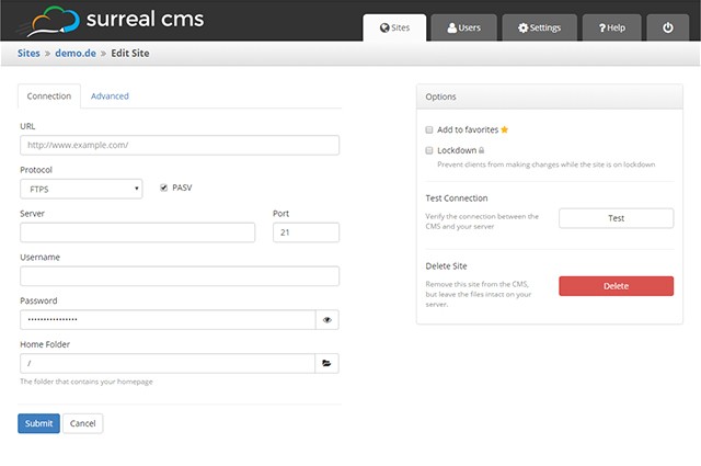
The principle of Surreal CMS is as simple as it gets: After registration, add an existing, static website by entering its FTP credentials, and choosing the folder in which the website’s files are stored.

surreal-cms_connection
Entering the FTP Access Information

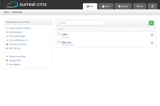
Apart from regular FTP protocol, SFTP and FTPS are supported as well. Access to Amazon S3 is also possible. This is useful for everyone that hosts on Amazon’s cloud storage. Afterwards, Surreal CMS gives you access to all files. On a list, you can choose which of the HTML documents you want to make editable.

Defining Editable Areas

To prevent that all content of an HTML document can be altered, you need to define editable areas. To do so, the class “editable” will be added to all elements that you want the user to be able to edit. In Surreal CMS’ rich text editor, you will then be able to alter these areas. For example, when making a container element like “

” editable, you can add headlines, lists, and text, as well as images.

surreal-cms_site
Managing your Website in Surreal CMS

However, you can also make block elements like “

” or “

” editable. In this case, you can only alter the elements’ contents, but you can’t add any further block elements.

In any case, the formatting of the content is adapted from your website. Thus, headlines and other content is displayed in the editor in the same way it is displayed on the website.

The class “uneditable” allows you to choose certain areas within an editable area that are not supposed to be editable. The class “editable-text” also gives you the option to restrict the editing of content to pure text. Instead of the rich text editor, a simple input field is then displayed.

Editing Content, Adding Media

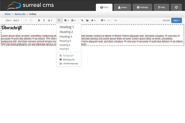
As mentioned before, an extensive rich text editor that can be used to edit text in a similar fashion to other content management systems, is available. Headlines, lists, charts, as well as bold and italic formattings are supported.

surreal-cms_rte
Rich Text Editor

Of course, you can also add links and images. Surreal CMS provides file management, which you can use to upload images, documents, and other media, like videos, and implement them into the website. While doing that, you can set a default folder, in which e.g. all images will be stored automatically.

On integrating images into a website, you can scale them freely. Surreal CMS will create accordingly scaled files. The class “editable gallery” enables you to define an area for an image gallery. Here, you add as many images as you want to, which will open a full-size image when clicked. The size of the thumbnails is defined by additional data attributes.

surreal-cms_image
Simple Upload and Integration of Images

The whole thing also works in combination with popular JavaScript galleries such as Lightbox or Fancybox.

HTML5 videos are also supported. Here, choose up to two different formats and a preview image. Surreal CMS takes care of the markup of the respective source code.

Creating Templates

Like every proper content management system, Surreal CMS doesn’t only offer the editing of existing sites, but also the creation of new ones. To transfer existing layouts to new sites, you create templates.

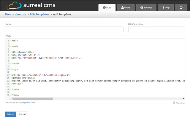
surreal-cms_templates
Template Creation

These are not just simple HTML documents in which the website’s layout is defined plus editable areas. You can save multiple templates and choose one of them for each new site.

When templates are changed afterwards, this doesn’t affect the websites on which these templates have already been applied to. That’s because Surreal CMS generates static HTML documents on the base of the template, which will exist independently from the template after its creation.

Including Files

In contrast to other content management systems, Surreal CMS doesn’t create a menu automatically. However, when your server, or provider supports PHP, you can integrate fixed content such as navigation, header, and footer via PHP or SSI.

Having your HTML files run through the PHP parser – can be set via “.htaccess” -, you can easily integrate PHP files via “include()”. This eases the handling of templates, as you only need to define the PHP inclusions, and the design is identical on all sites, even when altering the included files later on.

User and Right Management

Creating users and distributing rights is just as easy as the editing of content. To create a user, assign a name and an email address. After that, choose a website and determine the pages the user will gain access to.

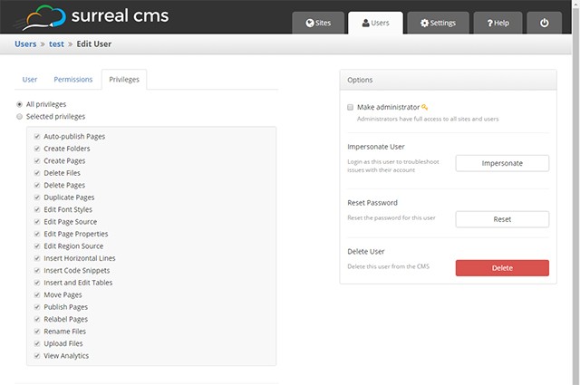
surreal-cms_user
User and Right Management

You can also choose which rights a user will receive, for each user separately. There’s a list on which you decide whether a user may create pages, edit or delete them, and whether pages made by him will be published or not.

You can also allow or ban the uploading of files as well as the integration of source code. When you created users and distributed all rights, Surreal CMS automatically sends them a welcome mail with the access information.

You can choose the content of the welcome mail yourself, using a template. This allows you to send a tailored mail with the access information to your customers, for example.

surreal-cms_revisions
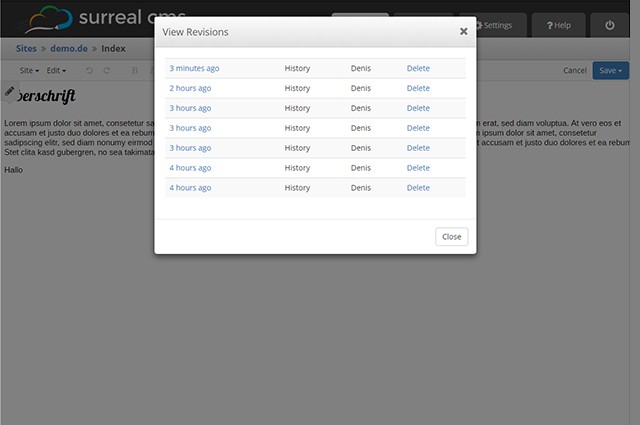
Simple Recovery Thanks to Revisions

Surreal CMS sets up server-side revisions of altered content. This way, you can quickly recover original content.

Custom Branding and Costs

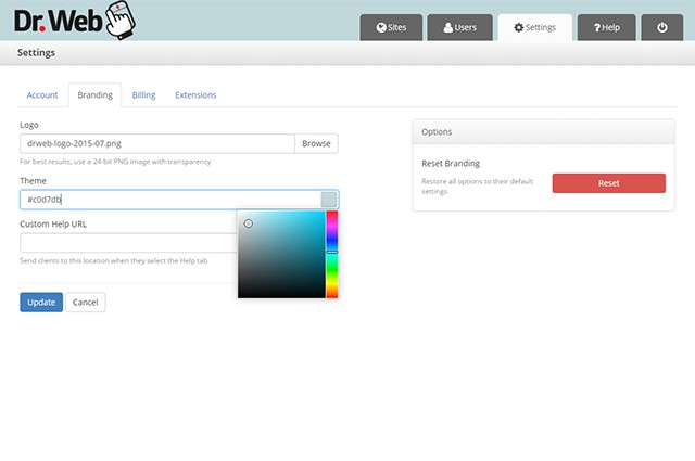
Surreal CMS is mainly targeted to web designers and developers that want to offer a simple CMS to their customers. Thus, you can customize the appearance of the backend. Replace the logo with your own, or change the backend’s color. You could even place your own support area.

surreal-cms_branding
Custom Branding is Possible

As Surreal CMS runs via the domain “edit-content.com”, it will not be evident that a third-party system is being used. This allows you to adjust everything to fit you and your company, improving customer retention.

A two-weeks trial access is provided, allowing you to test Surreal CMS. After that, you’ll need to pay 10 dollars a month for up to five websites to manage. In total, there are seven plans. For 100 dollars a month, an unlimited amount of web projects is available.

Conclusion

Surreal CMS connects the advantages of classic content management systems with the advantages of static websites. You are entirely free when it comes to design and technology. You are not limited by any restrictions that come with other CM systems, and you also don’t need to deal with template creation in WordPress, or TYPO3’s Typoscript configuration.

But the two biggest advantages of Surreal CMS are, for one, that you can easily add a content management system to a static website. This is done quickly and in a totally uncomplicated way. Especially for existing websites that you are supposed to make editable on customer request, Surreal CMS is something you should definitely give a go.

The second advantage is, that the website also runs without Surreal CMS. If you ever decide to forgo Surreal CMS, your website will keep running as usual. This doesn’t work with other content management systems or homepage building kits.

Talking about homepage building kits: Surreal CMS is not directed to ambitioned amateurs that don’t have a budget for the outsourcing of their website designs. Surreal CMS is clearly directed towards designers that want or need to dynamize their customer’s websites.

(dpe)

Categories: Others Tags:

How To Make A Physiology-Friendly Application For The iPad

March 30th, 2016 No comments

If you’ve ever had to move your iPad from one hand to the other just to tap a button you couldn’t reach, then you may have already guessed why we began this study in our UX lab.

How To Make A Physiology-Friendly Application For The iPad

Our Mail.Ru Group’s UX lab team carries out many usability studies of our apps for smartphones and tablets. We address users’ needs by introducing features in our products. We carefully test all of the functions to ensure users notice and understand them well. Nevertheless, this was the first time we had looked at the physiological aspect of our app’s usage.

The post How To Make A Physiology-Friendly Application For The iPad appeared first on Smashing Magazine.

Categories: Others Tags:

ShortPixel’s Alex Florescu: Breaking Down Image Optimization

March 29th, 2016 No comments
shortpixel-chaplin
ShortPixel, Progressive Image Optimization

ShortPixel, Progressive Image Optimization

It’s possible there isn’t another group of people who care about optimization, more than the good folks over at ShortPixels. Between Ionut Croltoru, Simon Dudulca, and Alex Florescu, ShortPixel has more than thirty years of experience behind it. ShortPixel is a Word Press plugin that allows designers to optimize their images, therefore allowing them to optimize their pages in Word Press.

Their Twitter reads like a progress report, constantly letting their users and fans know about their latest improvements, and achievements. Image Optimization may not be the trend now, but with increases in the move to cloud based server options, optimization on every level becomes a critical factor. Alex, who designed the compression API, took time to speak to us about the boons and benefits of Image Optimization, and how it can improve even the core functions of your website.

How does Image Optimization

impact current design trends?

I would expect that having images that take less space, can allow designers to use more of of their available page.

For those who are unaware, what is the purpose of

Image Optimization, and what kind of

impact can it have for your website?

Most of the time images used on any given web pages aren’t optimized. That means that while they look good they are much bigger that optimal even though sometimes they were saved for web in Photoshop, for example.

The purpose of Image Optimization is to keep the visual aspect untouched but reduce the size of the images. This positively impacts the page speed of websites which sometimes can be twice as fast.

Having a faster loading website is good for the end user but it is also good for SEO purposes. Many people may not know this, but page speed is one of the bigger factors affecting their Google ranking.

What are the biggest benefits someone can see

from the use of Image Optimization?

Usually the main benefits are speedier websites that lead to lower bounce rates, increased conversions, and more visitors as the site ranks better in search engine.

shortpixel-berries

For those looking at getting their feet wet, what are the

first steps to take in beginning to learn about

Image Optimization?

There are many resources on the web but one may want to read about it more this here. It’s also crucial to be able to live test how much a website can be optimized, so we offer our own compression test. To upload some images and see how much they can be optimized and how the compressed image looks like, we have made our online image compression available for everyone to use.

What further developments can we expect image optimization to make in the future?

I would expect that image optimization becomes ubiquitous in the following couple of years as it becomes more and more important. It should also become more and more accessible as it is now for WordPress users for example.

shortpixel-chaplin

For designers, what can Image Optimization

do for them and their projects?

Image Optimization can lead to happier clients when their sites load faster and will attract more visitors. This is especially true in our experience for WordPress users. They choose a web design by the way it looks but later they may discover that unless they use an image optimization plugin like ShortPixel the site will start loading slow and the whole experience be sub par.

Designers can take care of delivering an initial design with all the images optimized, but they can also educate their clients in using tools to make sure all the website images are properly optimized.

From my experience, this attention to detail leads generally to happier customers which in turn leads to more referring customers

Read More at ShortPixel’s Alex Florescu: Breaking Down Image Optimization

Categories: Designing, Others Tags:

Google redesigns Adwords for mobile-first

March 29th, 2016 No comments

One more Google service has officially been redesigned, and it’s about time. That’s right, Google is redesigning their entire Adwords platform.

It’s been around eight years since the last redesign, and a lot has changed since then. The mobile market has exploded, for one. Therefore, Adwords needs to reflect that, both in its user interface, and in the data it presents to users.

So Google went and interviewed hundreds of its own customers to see what they wanted out of their product. Adwords is a huge source of income for Google, so they really want to get this right. They’re not just, say, taking away the reverse chronological timelines on a widely used service even though their users keep begging them not to (see Twitter and Instagram)…they’re smarter than that.

So what’s changing? The user interface has traditionally focused entirely on the ad words that people have bought, and provides little context at first glance. The new version is intended to provide an overview of how each campaign is doing at first glance. Then, if you want more details, you’ll be able to click through, of course.

The other big change is that the interface will be built with, you guessed it, Material Design. They’re doing this with every service, so it’s no surprise. And it is good news. Whatever you think of the aesthetics, Material Design does lend itself to better usability, when it is implemented correctly.

This will result in a better experience all around, though users on mobile devices should see the biggest changes—consider the fact that the last iteration of Adwords was developed before we even had the first iPad.

Naturally, few users currently have access to the new version. They intend to keep iterating their new design for the next year, slowly rolling out access to all users, and taking feedback along the way.

And that’s why, out of all the companies who know way too much about each of us, Google is by far the most user-friendly.

Create Typographic Images with TypoPainter – only $9!

Source

Categories: Designing, Others Tags:

9 Reliable Services for Coding Your Designs

March 29th, 2016 No comments
1

If you prefer to let others do your coding, for whatever reason, but you’re not quite sure where to turn for assistance, we have a solution. We’ve located nine of the top service providers on the market that are capable of delivering pixel-perfect, W3C compliant code that will meet your requirements down to the smallest detail. These developers can be counted on to get things right when converting web designs into awesome looking, high-performing, and fully functional websites, web or mobile apps, or email templates.

Most of these developers accept web designs in any of the common formats. All of them are quite affordable, they will give you quick turnaround, and they provide excellent support. Several of these developers offer a range of services, others are more specialized in their offerings. Whatever your coding needs, you will find the perfect solution here.

Sketch to HTML by Xfive.co

Sketch to HTML by Xfive.co is an excellent choice if you are looking for a premium coding service that can offer perfect solutions for converting your Sketch designs to HTML/CSS/JS pages. Xfive also converts designs to the more popular content management systems, if that is your preference.

This coding service is not only for the benefit of Sketch designers. If you use PSD, INDD, or AI, the Xfive team will be more than happy to do your conversion work for you.

Once you submit your design, in whatever standard format you may be using, the Xfive team will review it and communicate back to you any questions, concerns, or suggestions they may have. This team wants your project to be a successful one just as much as you do, and they can and will make that happen. The team also stands ready to assist you with whatever ongoing maintenance or support activity you may require. Sketch to HTML by Xfive.co is definitely deserving of its place among the top 2016 coders.

PSDgator

2

PSDgator is a small team of developers that really does like doing cool stuff on the web. While their team may be small in size, their accomplishments are many.

PSDgator will take your Photoshop, Sketch, or Illustrator design and convert it into pixel-perfect, performance-optimized code. Their specialty is Responsive PSD to HTML5/CSS3 conversion, and jQuery and WordPress themes.

Just forward your design any standard format, and the green gator team will review it and advise you of any questions or suggestion they might have.

Once everyone is on the same page, they will be off and running, and you will receive the deliverable in a very short time. PSDgator also specializes in mobile responsive coding, plugin development, and software maintenance. PSDgator is a great choice if you are looking for a coding team that has a rock-solid reputation.

Chop-Chop

3

Chop-Chop has been in the hand coding and pixel whispering business since 2010. The team’s mission in life is what any top coding team’s mission should be; to help designers and agencies build great websites.

Their high-quality workmanship, their professional approach to development, and the care and respect they show their clients and customers are reasons enough to include them in our selection of top coders for 2016.

The Chop-Chop team of hand-coding enthusiasts works hard to ensure your PSD, AI, INDD, PNG, or Sketch file designs are flawlessly converted to high-quality, pixel-perfect, responsive markup.

When they receive your design, they will communicate any questions or recommendations they have, and await your permission to begin coding. If, after all is said and done, you are not satisfied with the results, Chop-Chop will refund your money.

htmlBoutique

4

htmlBoutique offers premium Front-end, WordPress and Email development. They accept designs in all standard formats and convert them into W3C compliant, pixel perfect code. Nothing new so far? Here is how they are different from the other services we have listed.

Firstly, no up-front payment is required. Secondly, you get a fast first preview within 1 business day.

Thirdly, the end product is completely tailored to the client’s needs. On top of that, a dedicated manager will be there for you for the entire process and will make sure you are completely satisfied with the end result. Sounds good, right?

Direct Basing

5

The Direct Basing team is one of the premium slicing and coding operations in existence. In the 8+ years they have been in business, they have successfully completed over 12,500 conversion projects for nearly 3,000 worldwide clients.

Unless you genuinely look forward to coding your own designs, it would make sense to let the Direct Basing team do it for you.

They will not only get the job done right the first time, but they will make certain you are kept in the loop from start to finish in the event there are changes, questions, or recommendations.

PSD2HTML®

6

Founded in 2005, PSD2HTML® is the most reliable and fast PSD to HTML and web development partner. Their team can help you with HTML5/CSS3 markup, CMS implementation, newsletter templates, responsive layout, fancy JavaScript effects, and much more.

Thanks to loads of additional options they offer you can create exactly the website you need. The quality of the code PSD2HTML® delivers is simply second to none.

Their markup is always well-structured, optimized and compatible with all modern browsers and devices. Be sure to check out some code samples and examples of their projects on their portfolio page.

Netlings

7

The Netlings professionals can convert your web designs to markup, web or mobile apps, websites, emailers, and more. Letting them do the conversion work frees up time you can devote to your own specialty, web design.

Handing coding over to the professionals, even if you have programming experience yourself, can be a great way to increase your productivity and hone your design skills. You will like the services Netling offers, and the superior level of support they offer their clients and customers.

EmailCraft

8

EmailCraft is a great team specializing in HTML email template coding. If you want to send stunning custom newsletters, transactional or promo emails, they are definitely the best choice. They are fast, reliable and seriously obsessive about quality.

They manually test every email template on 37 popular email clients and on 12 physical mobile devices. Crazy! EmailCraft will also help you with responsive newsletters, MailChimp and Campaign Monitor support and more.

PSD2WP

9

PSDtoWP is a professional WordPress development service. Submit your designs along with the necessary details and let them do their WordPress thing.

The PSDtoWP team will slice your creative concepts and hand-code them into a SEO semantic, fast-loading, cross-browser and device compatible HTML5/CSS3 code.

After you approve it, they’ll start working on the WordPress theme implementation. If you need any post-production support, no problem! PSDtoWP will be here to help. They offer the first 30 days of support for free.

Wrapping it up

Whether you’ve been searching for a development team that offers a range of conversion options, or one that specializes in one or two areas of wed development, you should have no problem at all finding what you are looking for here.

These nine coding service providers are some of the best in the business at what they do. They are easy to work with, they offer great turnaround, and they guarantee satisfaction.

Read More at 9 Reliable Services for Coding Your Designs

Categories: Designing, Others Tags:

Let’s Learn ES2015

March 29th, 2016 No comments

The following is a guest post by Ryan Christiani. Ryan is a teacher at HackerYou and has been working on a video series called Let’s Learn ES6. He offered to put some of that together into a tutorial format, which I thought was perfect as we haven’t covered ES2015 much here on CSS-Tricks.

What’s in a name?

As of June 2015, the largest addition to the JavaScript language was finalized. The official name is ECMAScript 2015, sometimes referred to as “ES6”, or now more commonly known as “ES2105”. It is the culmination of years of work and features.

Moving forward, there will be ECMAScript 2016, which will likely be referred to as “ES7” or “ES2016”. The plan is to have incremental yearly releases.

Most browsers have started to implement the ES2015 features, but support varies between them. You can see the current browser compatibility for this implementation using this table.

Tools like Babel allow us to write new ES2015 code today and perform a task called transpiling (much like preprocessing) to convert the code into a earlier version of JavaScript that has greater browser support. This is similar to how Sass works; initially writing your code in Sass syntax, and then a preprocessor compiles to standard CSS.

Overview

In this article we will look at a few features that are now available to use as developers.

We will look at new keywords like let and const, how to create template literals to make concatenation easier, the new arrow function syntax, spread operator and rest parameters! Here’s a table of contents:

  1. let and const
  2. Template Literals
  3. Arrow Functions
  4. Spread Operators
  5. Rest Parameters

These additions can help make writing JavaScript a real joy!

let and const

let and const are two new keywords that are now available in ES2015. They are used to declare variables, however there is one key feature these variables share that sets them apart from var: they create block scoped variables.

When you use the var keyword to create a variable it is function scoped, and it is local only to that function. This means it is available within the function it was created in and any function nested inside of that one. But it is NOT available outside of there. If you used var to define a variable outside of any function it would be available globally.

One common issue we will run into with function scoped variables is the for loop.

for (var i = 0; i < 10; i++) {
  console.log(i);
}
console.log(i); // Will print out 10;

It is common to declare a variable inside of the for loop with the intent of it being bound to just that for loop however that is not that case. If you run the above code you will see the i variable is available outside of the for loop.

If you want to use let or const you will have to enable strict mode for your JavaScript file first. By adding 'use strict' at the top of your document you enable a restricted variant of JavaScript.

'use strict';

Strict mode is a way to opt into a version of JavaScript that fixes some mistakes in the language, turning them into errors. It also prohibits syntax that will likely be defined in the future! For example, in strict mode, you cannot make a variable with the name of let. For more information on strict mode, check out the MDN page on the topic.

A “block” in JavaScript is anything between { }. So when we talk about block scope, that means that any variables defined in curly brackets will only exist in that block!

var is function scoped, so creating a variable inside of a block with var will make it available outside of the block as well.

{
  var user = "Ryan";
}
console.log(user); // Ryan

When you define a variable with the let keyword it will create a new variable only within the { } or block.

{
  let user = "Ryan";
}
console.log(user); // Uncaught ReferenceError: user is not defined

This defines and binds a variable only to the block in which it is in! If we take look at the for loop example again, and replace var with let

for (let i = 0; i < 10; i++) {
  console.log(i);
}
console.log(i); // Uncaught ReferenceError: i is not defined 

Now it works as intended. The const keyword behaves the exact same way, with one exception. Once the base value is defined, it can never be redefined. It is a read-only value.

const person = 'Ryan';
person = 'Kristen'; // Uncaught TypeError: Assignment to constant variable.
console.log(person);

The browser will throw an error if you try to reassign a value to a variable defined with const. That being said, you can do something like this.

const person = {
  name: 'Ryan'
};
person.name = 'Kristen';

console.log(person); // {name: 'Kristen'}

Using const does not create an immutable value, the value stored on the person variable is still an object, however we have just changed a property inside of it. If you are looking to lock an object down, look at Object.freeze().

When to use let and when to use const

There is a bit of debate going on right now about when to use let vs const. The general rule of thumb is that if you know the value will not be redefined throughout your program, go with const, if you need a value that might change, go with let. Letting the browser know that a variable will be constant throughout the program will allow it to make certain adjustments, and this could increase performance!

Template Literals

In ES2015 there is a new way to define a string, and it comes with some added benefits. Currently if you want to define a string, you can use '' or "".

let name = "Ryan";
let job = 'Instructor';

If you want to concatenate strings together you can use the + operator.

let name = "Ryan";
let job = "Instructor";
let sentence = name + " works at HackerYou as an " + job;
console.log(sentence); // "Ryan works at HackerYou as an Instructor"

As the amount you need to concatenate grows, this pattern gets pretty tedious and unruly. Enter template literals!

To create a template literal string, we use the backtick ` in place of the quotes.

let name = `Ryan`;
let job = `Instructor`;

They behave exactly the same as a regular string literal, but there is one difference. With a template literal, concatenation becomes a lot easier.

let name = `Ryan`;
let job = `Instructor`;
let sentence = `${name} works at HackerYou as an ${job}`;
console.log(sentence); // "Ryan works at HackerYou as an Instructor"

Notice the ${} syntax inside of the string? This is a template placeholder. It allows us to template out our strings, and the browser will replace the ${} expression with the proper value at runtime. This makes concatenating large strings a lot more enjoyable.

These new placeholders also allow you to carry out expressions inside!

const price = 9.99;
const shipping = 3.99;

const message = `Your total with shipping will be ${price + shipping}.`;

console.log(message); // Your total with shipping will be 13.98.

Multi line

One last thing to look at with template literals is how they can handle multi line strings. With a regular string if you wanted to have it span more than one line, you would have to do something like this.

const multi = "This is a n multiline string";
console.log(multi);

Including the n or new line character will force text to go to a new line. If you tried to just put the text on two lines, like this:

const multi = "This is a 
multiline string";
console.log(multi);

It would throw an error Uncaught SyntaxError: Unexpected token ILLEGAL. However with template literals we CAN do just that and add line breaks wherever we’d like!

const multi = `This is a 
multiline string`;
console.log(multi);

This allows us to organize our markup in a way that is considerably cleaner!

const person = {
  name: 'Ryan',
  job: 'Developer/Instructor'
};

const markup = `
  <div>
    <h2>${person.name}</h2>
    <h3>${peron.job}</h3>
  </div>
`;

Arrow Functions

Arrow functions are a new syntax for creating functions in ES2015. This does not replace the function() {} syntax that we know and love, but we will be seeing it more and more as the go-to function syntax.

const add = (a, b) => {
  return a + b;
};

The core part of the syntax is the lack of the function keyword when defining a new function. Instead we have the => or fat arrow. You can call the function just as you would any other.

add(2, 3); // 5

There are actually a few ways you can define the arrow function. For example, if the function simply returns a value and there is nothing else in the function body, we can remove the {} and the return keyword.

const add = (a, b) => a + b;

The return here is implicit, meaning that it is implied as opposed to us having to explicitly add return to our block. If the function only had one parameter you can actually leave the () off the definition of the function.

const add5 = a => a + 5;

If there are no parameters to be used in the function, empty parenthesis are used as a placeholder.

const eight = () => 3 + 5;

Or there is a new pattern emerging where people will use a _ as a placeholder in place of the empty parenthesis.

const eight = _ => 3 + 5;

Arrow functions and functional programming

Because the syntax for the arrow function is so small, and most operations in functional programming require very few operations in the function’s body. This syntax is a perfect match for this programming style!

// Without Arrow functions
const numbers = [3,4,5,6,7,8];
const doubleNumbers = numbers.map(function(n) {
  return n * 2;
});

// With arrow functions
const numbers = [3,4,5,6,7,8];
const doubleNumbers = numbers.map( n => n * 2 );

The syntax allows you to make this nice and simple operation into one line!

The this keyword

One place to be cautious of when working with arrow functions is how they handle the this keyword. Consider a method on an object.

const person = {
  firstName: "Ryan",
  sayName: function() {
    return this.firstName;
  }
}
console.log(person.sayName()); // "Ryan"

Inside of the sayName method, the this keyword is bound to the person object. So running the method will produce Ryan. With an arrow function, the this keyword is lexically scoped. This means that the scope of the function will be bound based on where it was defined. The value of this then refers to the parent scope.

const person = {
  firstName: "Ryan",
  sayName: () => {
    return this.firstName; 
  }
}
console.log(person.sayName()); // undefined

In this example, if we changed the sayName method from an anonymous function to an arrow function it will return undefined! The this will be bound lexically, and in this case it will be the window object, on which there is no firstName property. There will be cases where you might want to have that be the correct result! Take a look at this example.

const person = {
  firstName: 'Ryan',
  hobbies: ['Robots', 'Games', 'Internet'],
  showHobbies: function() {
    this.hobbies.forEach(function(hobby) {
      console.log(`${this.firstName} likes ${hobby}`);
    });
  }
};
person.showHobbies();

Running this will produce Uncaught TypeError: Cannot read property 'firstName' of undefined. The this in the callback function for our .forEach() method is bound to nothing(in strict mode, in non strict it will be the window). But if we change the callback to an arrow function we can use the lexically bound this to get the value we want!

const person = {
  firstName: 'Ryan',
  hobbies: ['Robots', 'Games', 'Internet'],
  showHobbies: function() {
    this.hobbies.forEach(hobby => {
      console.log(`${this.firstName} likes ${hobby}`);
    });
  }
};
person.showHobbies();

The this inside of our forEach will be bound to the person object!

Spread Operators

Sometimes we want to do something with an array that we can’t! For example let’s assume we have an array of numbers that we want to find the max of. Math.max seems like the right method for this.

const numbers = [39, 25, 90, 123];
const max = Math.max(numbers);
console.log(max); // NaN

Math.max is a method that takes a comma separated list of values and will return the highest! Sadly we can not pass an array to it. There is a way to get around this though, we can use a method called .apply that takes an array and calls a function as if we had passed them in as a list.

const numbers = [39, 25, 90, 123];
const max = Math.max.apply(null, numbers);
console.log(max); // 123

The first argument in .apply is the value we would like to set the this value for when we call Math.max, in this example we provide null. The second argument is the array we would like to apply to the function. This could be a little confusing, what if there was an easier way to do this?

Enter the Spread Operator

In ES2015 there is the spread operator. The syntax looks like this:

...numbers

What this tool does is spread out, or disperse the elements from the array! It will expand them in place. We can change the above .apply method call to look something like this now.

const numbers = [39, 25, 90, 123];
const max = Math.max(...numbers);
console.log(max); // 123

Spread will expand the array in place and pass the elements in as if it were a comma separated list.

Using the spread operator to concat

You can also use the spread operator to concatenate arrays together! Since spread expands arrays, we can expand arrays in arrays!

const numbersArray1 = [3, 4, 5, 7, 8];
const numbersArray2 = [9, 6, 10, 11];
const concatArray = [...numbersArray1, ...numbersArray2];
console.log(concatArray); // [3, 4, 5, 7, 8, 9, 6, 10, 11]

Rest Parameters

The spread operator allows us to pass an array of arguments into a function. On the flip side of that, rest parameters allows us to gather the parameters passed to our functions! Just like the spread operator the rest parameter syntax also involves the ... at the beginning of a variable name.

Let’s look at an example of this. Imagine we have a function that takes any number of arguments and returns the sum, add(2, 3, 4, 5, 6, 7) would return 27.

const add = function() {
  const numbers = Array.prototype.slice.call(arguments);
  return numbers.reduce((a,b) => a + b);
};
add(2, 3, 4, 5, 6, 7);

Without rest parameters, we would have to use the arguments keyword, and call Array.prototype.slice.call(arguments). What in the world does Array.prototype.slice.call(arguments) mean?! arguments is an Array-LIKE object, meaning it is not an actual array but, is a collection of the arguments passed to a function. However, if we wanted to use an Array method like .reduce() on arguments, we would need to do some fiddling.

JavaScript is built up from a bunch of objects. All of these objects have a parent object that they inherit their methods and properties from. They do this via the .prototype property. Arrays have the .slice method that we can use to create an actual array from our arguments value. Using .call we can call the .slice method from the prototype with arguments as the context to create an array….whoa that is a lot.

Enter rest parameters!

const add = function(...numbers) {
  return numbers.reduce((a, b) => a + b);
};
add(2, 3, 4, 5, 6, 7);

WOW! That was a lot easier. Rest parameters create an actual array from the arguments passed to a function, so we can use methods like .reduce on it. This allows us the freedom to perform similar tasks much easier!

It is important to point out that you can mix and match with rest parameters and the spread operator. Consider a function that takes a multiplier as the first argument, and then will multiply any value after it by that number.

const multi = (multiplier, ...numbers) => {
  return numbers.map(n => n * multiplier);
}

We define the function with a parameter for the multiplier and use rest parameters to collect however many arguments get passed to this function!

JavaScript moving forward

There are a ton of features in ES2015 that we did not go over here, but hopefully this gives you a good basis of some useful new syntax and additions to the language! If you want to learn more, check out my video series Let’s Learn ES6 on YouTube, as well as letslearnes6.com were you can find out about a book I am writing on ES6.


Let’s Learn ES2015 is a post from CSS-Tricks
Categories: Designing, Others Tags:

How to work with SVG icons

March 29th, 2016 No comments

Solid basics of an SVG icon system in this guide from Florens Verschelde, mixed with some good tricks: the two-color trick, pre-loading the sprite, and using custom properties for unlimited color variations. Also an interesting bit about using multiple methods for sprite insertion:

I like mixing both methods, building two sprites:

  1. A small one with essential icons (e.g. main icons used in the page header), to be inlined on each page. Target size: 5KB or less.
  2. A bigger one with all the project’s icons, kept as an external file. Target size: 50KB or less.

“Critical Icons”, as it were.

Direct Link to ArticlePermalink


How to work with SVG icons is a post from CSS-Tricks

Categories: Designing, Others Tags:

Why I don’t use CSS preprocessors

March 29th, 2016 No comments

Roger Johansson:

I don’t feel the “problems” CSS preprocessors intend to solve are serious enough to warrant the cost, i.e. to me the solution is worse than the problem.

The volume of the chorus in favor of preprocessing (I sing tenor) is so loud, I suspect it’s drowning out a decent size group of people who prefer not to use them.

In a surprise twist ending though, Roger does say he likes some forms of CSS processing, but does it directly on the source CSS itself.

Direct Link to ArticlePermalink


Why I don’t use CSS preprocessors is a post from CSS-Tricks

Categories: Designing, Others Tags:

Will AMP really speed up your website?

March 29th, 2016 No comments

There’s been a lot of talk lately about AMP (Accelerated Mobile Pages). From February 24th onward, Google search results began to include links to mobile-page versions that were built with this open-source project. When Google begins openly backing a technology, you know that it’s going to be a big thing, but what exactly is AMP?

AMP is all about the mobile user experience. Specifically, the initiative is meant to make mobile pages faster than ever before, which is a surefire way to improve the UX. Ideally, AMP proponents want to be able to create mobile content only once—and then already have it load immediately everywhere else.

As with all new initiatives, we need to separate the truth from the hype…

Making your sites faster

Since Google’s public push in favor of AMP last year, many high-profile companies who publish on the web have also begun to back AMP. Some of these names include the BBC, the Wall Street Journal, the Guardian, Twitter, Pinterest, the New York Times (itself in the middle of an ad-wars controversy), and Buzzfeed. Naturally, they want to be on the bandwagon because they’re saying to themselves that any initiative that Google supports is bound to impact our SEO rankings.

However, is it really worth it for these companies to support AMP at this time? Does AMP deliver on its promise to make your site faster?

if you already understand UX…AMP may not prove to make such a big difference after all

To begin to answer that question, we have to put it in context: If you’re comparing your site to a media-rich site that only has average optimization, then it’s likely. Yet if you’re comparing your site to one featuring minimal design and good optimization, then the jury’s still out. In other words, it’s case-sensitive.

If you’ve been one of those early AMP fans who’s already bought into its apparent speed, consider the following: AMP isn’t a new type of technology. Why, even Google admits that AMP was created out of already existing Internet technologies, for the purpose of creating lightweight pages. So, no, there isn’t anything exactly revolutionary about it. Understanding this will help in putting into proper perspective the speed hype surrounding AMP.

So if you already understand UX intimately and know how to integrate the latest performance enhancements into your site design and development, then AMP may not prove to make such a big difference after all.

What exactly is AMP?

This open-source project was born from discussions between tech companies and publishers about the need to better mobile UX for everyone involved with content: consumers, publishers, creators and users.

AMP, it’s important to point out, isn’t a radically new kind of HTML. In fact, as the Project explains, AMP are like other HTML pages, the only difference being a limited set of permissible, technical functionality that’s governed and defined by the AMP spec. AMP will load in any app web view or modern browser, just like ordinary HTML pages, but speed’s a priority due to different, architectural approaches.

AMP also promises greater speed because of the reduced amount of code. For example:

  • You have less than 50 kb of CSS
  • You don’t need your own JavaScript (there’s no JS-powered tabs, alerts, tooltips or modals)
  • You don’t have code for various ad providers and analytics services

All this boils down to lighter pages, which in turn means faster speeds and loading times.

Then, there are AMP’s custom elements that put a priority on loading and optimization. What happens is the content on any AMP page that’s above the fold will load first. After you’ve viewed this content, that’s when the remainder below the fold begins loading in earnest. Other times, AMPs can be loaded prior to users landing on it, which makes loading seem all the faster.

There are different methods that help AMP do these things. They are:

  • Lazy loading
  • Preconnecting
  • Prefetching
  • Prerendering

Interestingly, you can also optimize your non-AMP pages separately for each of these speed-boosting optimizations.

So, again, not using AMP doesn’t mean that you can’t design and tweak your site for speed.

Finally, AMP makes page layout more efficient. How so? Media needs to always have its width and height properties specified when added to an AMP page. While it’s still a possibility to have both responsive and resizable images, AMP’s going to know how exactly to lay out a page prior to loading said media. End users then don’t have to wait as long since images aren’t first loaded, then recalculated, and then rendered.

Only faster in some cases

The truth of the matter is that AMP will only make your site faster in some, specific situations. It all depends on the site’s tech considerations, but also the needs of the business that the site supports.

not using AMP doesn’t mean that you can’t design and tweak your site for speed

Here’s when AMP can make your site faster:

  • If your site is so media-rich that it will automatically benefit from the optimized loading processes
  • If you want AMP to be in charge of optimizing your site’s speed and performance instead of you handling it yourself

So to be perfectly clear, it’s not AMP in and of itself that automatically makes your sites faster. Instead, it’s really that AMP provides the techniques and approaches to make your sites faster. Again, while you can make your sites faster using your own optimization processes, AMP simply provides speed and performance optimization in a neat and handy package.

What you have to know

For all of its fanfare, especially from Google, AMP is still in its infancy, which is a significant reality. This means that it’s still evolving, and people are far from being able to say with 100% certainty what it can only be used for. In other words, its impact for your search rankings, its performance, and even the demands of using AMP could still change abruptly.

Although it’s not the magic bullet to instantly cure all slow-loading site issues, or even the only solution, it’s still worthwhile for designers and developers to spend some time with it. At the very least, AMP serves as a wellspring of potentially new and effective ideas that designers can harness to meaningfully improve page load times across the entire web.

The fact that Google has rolled out AMP into its search results pages also provides an opportunity for early user feedback. It’s going to be very interesting to see what the early adapters of this initiative think about the improvement, if any, to the UX of mobile pages. If the results are good, and AMP leads to more traffic and income for big-name sites, you can bet that it’s going to get a bigger push from Google and others than ever. If the opposite happens, then AMP may well not ever get off the ground in any meaningful way.

Featured image uses Agustin secret’s speed image.

Create Typographic Images with TypoPainter – only $9!

Source

Categories: Designing, Others Tags: