Archive

Archive for May, 2016

How to Use the Repeat Grid Tool in Adobe XD

May 25th, 2016 No comments
Learn How to Use the Repeat Grid Tool in Adobe XD

In this tutorial, we’re going to learn how to use the repeat grid tool in Adobe Experience Design CC (Adobe XD).

The Steps (1-9)

1. Create a new document by selecting iPhone 6 from the Start Screen.

2. Select the Rectangle Tool and draw a landscape-orientated rectangle in the upper part of your screen, and give this shape a fill colour of your choice.

3. With the Rectangle Tool still selected, hold Shift to draw a square, and again, give this shape a fill colour of your choice.

repeat-grid-tool-adobe-xd-1

4. Select the Text Tool, click anywhere on the artboard, and start typing some title text.

5. Duplicate this layer by going to Edit > Duplicate, move this under your title text, reduce the size, and insert some text of your choosing.

6. Repeat Step 4 and type your CTA (call-to-action) text here. For example, it might say ‘Read More’. Make this text prominent in order to grab your users’ attention, and position this under the text created in Step 5.

repeat-grid-tool-adobe-xd-2

7. With your mouse, drag over all of the elements created in Steps 2-6, and then click the Repeat Grid button in the Property Inspector on the right-hand side.

8. Notice the green border that appears around your content? Select the bottom slider and drag this down to repeat your content so that it fills the screen.

9. When using the Repeat Grid Tool, Adobe XD automatically creates a gutter (spacing) in between the different objects that are being repeated. By selecting and clicking inside this space (the gap in between objects) you will see some pink guides appear, that allow you to adjust the gutter spacing. For this tutorial, reduce the spacing here to around 10-30 pixels.

repeat-grid-tool-adobe-xd-3


Download Adobe Experience Design CC (Adobe XD).

Read More at How to Use the Repeat Grid Tool in Adobe XD

Categories: Designing, Others Tags:

Custom Fonts in Modern Web Design

May 25th, 2016 No comments
alias

In 2015, two major American craft beer companies were at odds over a font design. Lagunitas, known for their signature IPA, and heavily recognized for the graphics on their labels, including font style, sued Sierra Nevada. Sierra Nevada, already a regional competitor, had just come out with the Hop Hunter, also an IPA, and their branding included a font that was just a tad too similar for Lagunitas’ liking. Although the case was eventually dropped, the turbulence demonstrated not only how heated craft beer enthusiasts can be, but also the huge role fonts play in brand recognition.

beer-bottle

Even though we’ve been basking in the convenience of the digital age for a generation or two, designers still spend hundreds of hours designing custom fonts that are then carefully protected under licenses — and rightfully so.

In the last few years, the use of these custom-designed fonts has grown in popularity. Free from the bygone limitations of “web safe” fonts, website designers and developers have found effective ways of implementing custom fonts in projects, an essential design tool that allows us to present typography that matches a customer’s branding while increasing the legibility of the site. What many people don’t realize though, is that crafting customized font files, aside from looking pretty, also greatly enhance the site’s usability. We’ve found that by creating files that contain custom vector art and iconography using font files, we can avoid performance degradation, improving not only the appearance, but the functionality of the site as well.

Acquiring Your Fonts

Even with the invention of the printing press, typography was a surprisingly physical task. Typesetters would spend hours carefully placing each letter and space, a new set for every font size and style, a fresh coat of ink for each color and resetting for each page needed — imagine how much of a backache distributing even this short of an article would have been. Because it warranted a large amount of time and skill, professionals were hired to design and produce font families for specific purposes depending on their clients’ needs.

Although less physically demanding, perhaps, harnessing the fonts needed for a website can be a challenging task. In order to properly employ custom fonts for web development, although there are no tile sets or ink types to keep track of, there are still a number of format, file, license and hosting specifications we have to take into consideration.

Format and File Types — A file format is a standard way that font information is stored for the computer to read. The two types of file formats we work with are TTF (TrueType Font) and OTF (OpenType Font). OTF is our preferred format because OTF files don’t require anti-alias hinting, leading to smaller file sizes. The way a font is distributed is determined by the font file types. There are six different types, but we’ve found the most success working with a WOFF, (Web Open Font Format) paired with a TTF or OTF file.

Licensing — One thing that has probably changed the least since printing press days is the amount of effort it takes to create a custom font, which is why it is important for the designer to protect their work under a license. Much like a copyright, these licenses are legally binding and may result in legal action or fees if a font is used in violation of their terms. Although there are many variations of licenses for web use, these are the common categories to be aware of when acquiring fonts you do not already own:

1. Open Source. Otherwise known as “free,” many open source fonts have been released for any use, including modifications, with no limitations on page views.

2. One-time purchase. By paying a license fee to the creator of the font or a reseller, we can use it on a website for an unlimited or estimated number of monthly views.

3. Subscription. Pay a fee to the creator or reseller per period of time or number of uses, (such as page loads) then pay-as-you-go for further use. TypeKit, Typography.com, and FontSpring are examples of this model — but using a third-party source like this has its flaws. If they go out of business or change their business model, your company is left with the consequences.

Hosting — Many websites use fonts hosted by a third party, such as Google Fonts or TypeKit, which is less work for developers because the licensing and hinting are already dealt with by that third party service. However, using a third party means there is less or no optimization of the font files available. By allowing another company to host our fonts, we would sacrifice the ability to remove unnecessary glyphs leading to substantially larger files. Additionally, when a font is hosted on a third party server, every time the site is loaded, that server must be running and perform well for the site to load properly, making the site more vulnerable to problems.

We opt to host our clients’ font files ourselves, which then allows our developers more freedom to fine-tune performance and provides less exposure to potential problems for our clients.

Applying Your Fonts

Much like the IPA label on our bottle of Lagunitas beer earlier, the fonts used in your website projects can enhance, or completely encompass, a company’s brand, establishing uniqueness against a client’s competitors — in some cases something worth defending with a trademark. After acquiring the license for the font files you want, there are some application techniques that will improve their appearance and performance to fit your project.

Editing the glyph set. The glyph, a single shape of a particular font, can be anything from the letters A-Z, a-z, symbols (= + & %), the Greek alphabet and even a variety of icons used throughout a website. For example, the icons in our footer are glyphs in our custom font set:

footer-icons

Preparing a typeset for a printing press involved thousands of tiny lead characters, organized in trays by font size and style. Even in the digital age, it is common for a single font file to contain upwards of 1,300 glyphs, most of which will go unused on a single website. Unlike those tiny lead characters tucked away in their drawers, however, the virtual space today’s extra characters use compromises the loading performance of the site. Loading all these unnecessary glyphs wastes memory and bandwidth and slows the rendering and experience; at the high end of the spectrum, a single font can demand more than 1MB, which balloons the time required to load the page. Some fonts, especially ornate “display” fonts used for titles, have high levels of complexity in each glyph and it becomes necessary for us to edit those files to save bandwidth. As an example, we recently stripped a pizza glyph, among others, from a font being used for a header.

outpost-inventory
Custom fonts and glyphs in the interface inventory for Outpost Restaurant. Not only can we choose a preferred font style, but embed Bison and Moose iconography into font files as well.

Various optimization techniques are possible, including editing individual glyphs to reduce their complexity, but we focus our efforts on reducing the number of glyphs in a font to remove sets of glyphs that are not used by the languages we’re supporting or ones that won’t be used by the site (e.g. pizza glyph). We’re often able to reduce our custom font sets to collectively weigh in under 80 KB, with 150 KB as an upper target for projects that require more fonts or have fewer images to slow down the page load.

Anti-aliasing. Another part of properly applying custom fonts to your website is anti-aliasing. Anti-aliasing can improve the appearance of your fonts, especially for larger point sizes and when zooming in a window. Techniques vary depending on your screen, browser and operating system, but the main idea is to display glyphs so that they’re smooth and crisp by blending the colors on a square grid. In the case of a black letter “a” for example, the black edge pixels would be smoothed by the interpolation of grey pixels so that it appears smooth and sharp on-screen even if you zoom in close.

alias

Different browsers and operating systems anti-alias fonts differently and at the CSS level browsers provide some control over how this can be handled.

For one example of CSS anti-aliasing in action (and the hiccups you may encounter), consider Apple’s web-browser, Safari. By default, Safari renders text with the CSS syntax -webkit-font-smoothing: subpixel-antialiased. This looks great in most scenarios — it produces sharp, legible text. But whenever the text is set to be transparent, animated, or transformed by certain transitions, Safari defaults to -webkit-font-smoothing: antialiased instead as it uses the computer’s GPU to accelerate performance. The result is undeniably jarring: a flicker effect as the text’s rendering type changes. The workaround is easy: if you specify -webkit-font-smoothing: antialiased from the start on any text that is affected, there is no flicker when a transition or animation begins. By being aware of this and other browser font-rendering quirks, we can ensure consistency and performance in our designs.

Customized Iconography

In addition to editing font files to contain only the glyphs necessary for our projects, we also extend the glyph set of our font files to contain custom vector art and iconography. We use the program Glyphs (another popular program is Font Lab) to create custom icons for our sites. Creating icons and saving them in an OTF allows us to use that vector art at any resolution or color without wasting the bandwidth by including a new image (as we’d need to with a .jpg or .png).

While you can render a font in any color using a CSS color attribute, the most appealing alternative for custom iconography is SVG, which allows for multi-colored icons. SVG files are scaleable and require separate files for each color variation. For that reason SVGs are required for vector-based images such as logos that are not monochromatic.

svg-mobyle

The logo we designed for Goin Mobyle is an SVG file, allowing us more freedom for variations in color and size.

Although surpassed in raw performance by font-icons, which typically have smaller file-sizes, SVG files are just another way we improve the branding, aesthetics, and functionally, of our clients’ websites.

Conclusion

Although the process has certainly changed since the days of the printing press, the efforts necessary to properly design and implement fonts have not lost importance. There are companies that we recognize solely by their brand’s font and, as proved by the Lagunitas-Sierra Nevada legal spat, sometimes shoulder some serious monetary worth. Developing custom font files in web development is an effective way to include ideal typography and produce unique vector art to more accurately meet the needs of the client. It also decreases the number of requests required when loading a page, improving the overall performance of their site. Web typography that is well thought-out and crafted is one of those subtle but unmistakable clues that improves user experience and shows customers that they are dealing with a professional organization.

Read More at Custom Fonts in Modern Web Design

Categories: Designing, Others Tags:

Planning to build a Website? Discover Ten Best Multipurpose WP Themes

May 25th, 2016 No comments
1

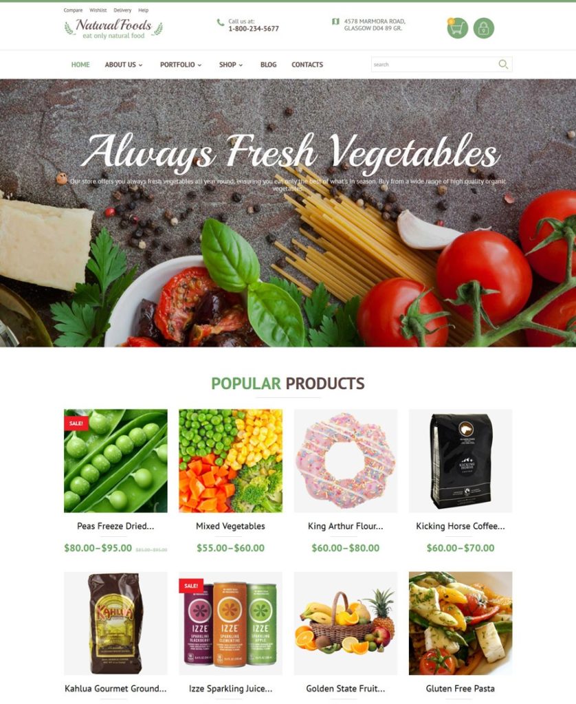
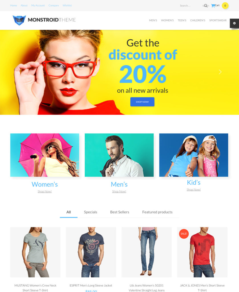
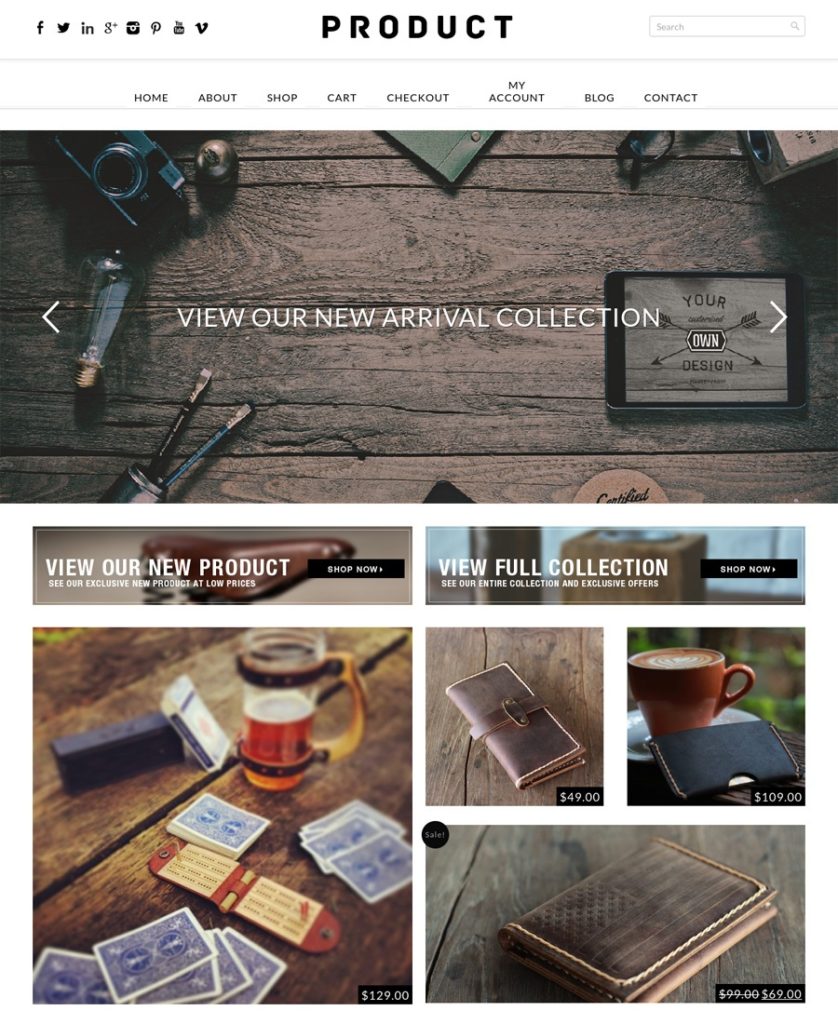
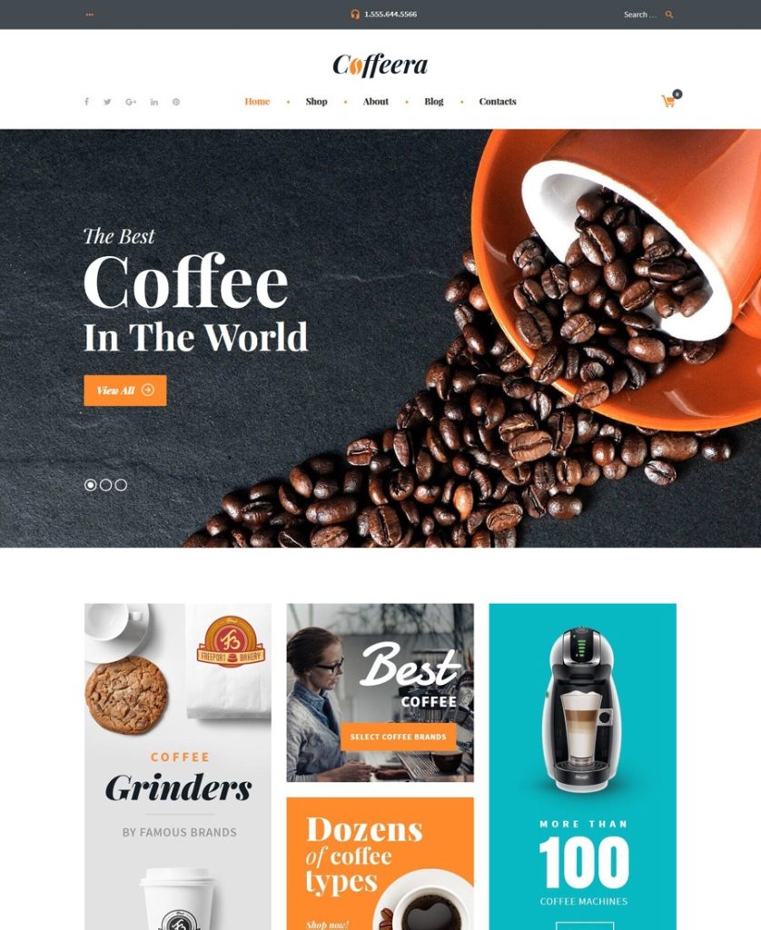
As a web designer, you naturally look for tools that offer the best solutions to your design needs. Your clients’ needs and requirements can be all over the map, or at least appear to be. Your choice can, therefore, be that of investing in several specialty WP themes in an effort to cover all the bases, or seeking out a single multipurpose theme that’s capable of doing the same thing.

In order for a multipurpose theme to meet the diverse challenges you may often have to face, it needs to be flexible – ultra-flexible in fact. The 10 multipurpose themes presented here meet that challenge.

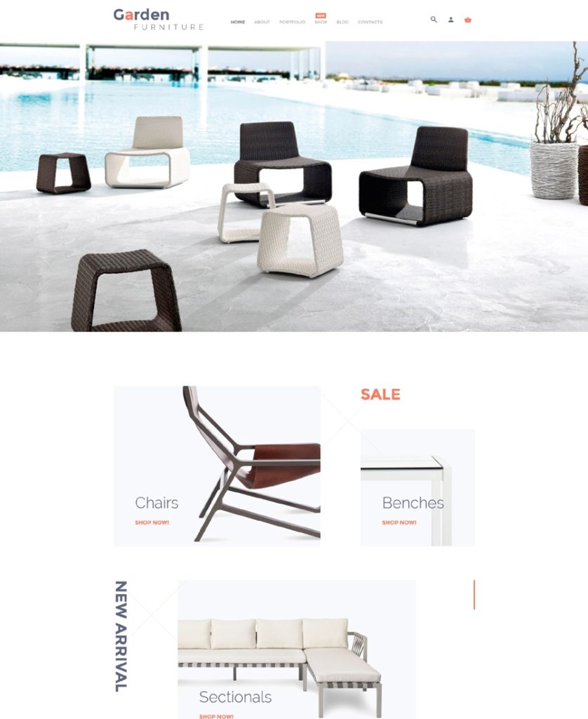
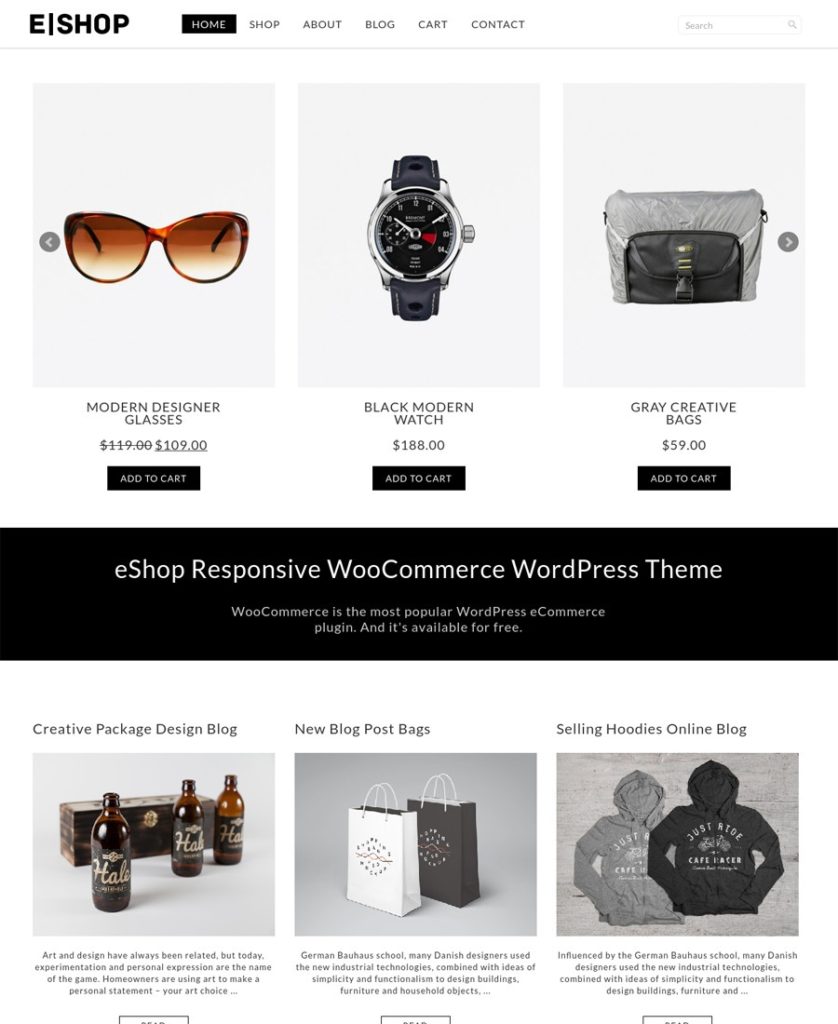
Even those listed as e-commerce-oriented have the features and flexibility needed to design high-performance websites of other types and for other niches. Visit the different websites and check out the niche-oriented themes, the pre-built layouts, and the design concepts offered. Examine the features each of these products bring to the table.

See if a given theme is WooCommerce ready, responsive, and if it’s right for the size of your website(s), and if you can easily make changes once a website is online.

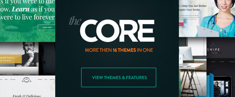
The Core – Responsive Multi-Purpose Theme

The Core is a massive multipurpose WP theme. It consists of 16 different themes, plus an assortment of cool website-building features. The Advanced Visual Builder, a wealth of ready-to-use shortcodes, 700+ fonts, and multiple header, footer, and slider options making it easy to build almost anything you want to; and do so faster than ever.

The individual demos are hand-built, complex themes, designed to perfectly fit in with the industry or niche they’re intended for. When you purchase The Core, you’ll receive new demo releases as they appear. Just watch the live demo, and you’ll see how easy it is to auto-install demo content.

The Core is responsive, retina, translation, and WooCommerce ready. Animations are readily available to give your websites an extra dash of pizzazz, custom Google Maps are also ready to be put to use, and there is even a module dedicated to saving your work in the unlikely event of a system crash.

As you would naturally expect with a premium theme, The Core is well documented, and the user support is superb.

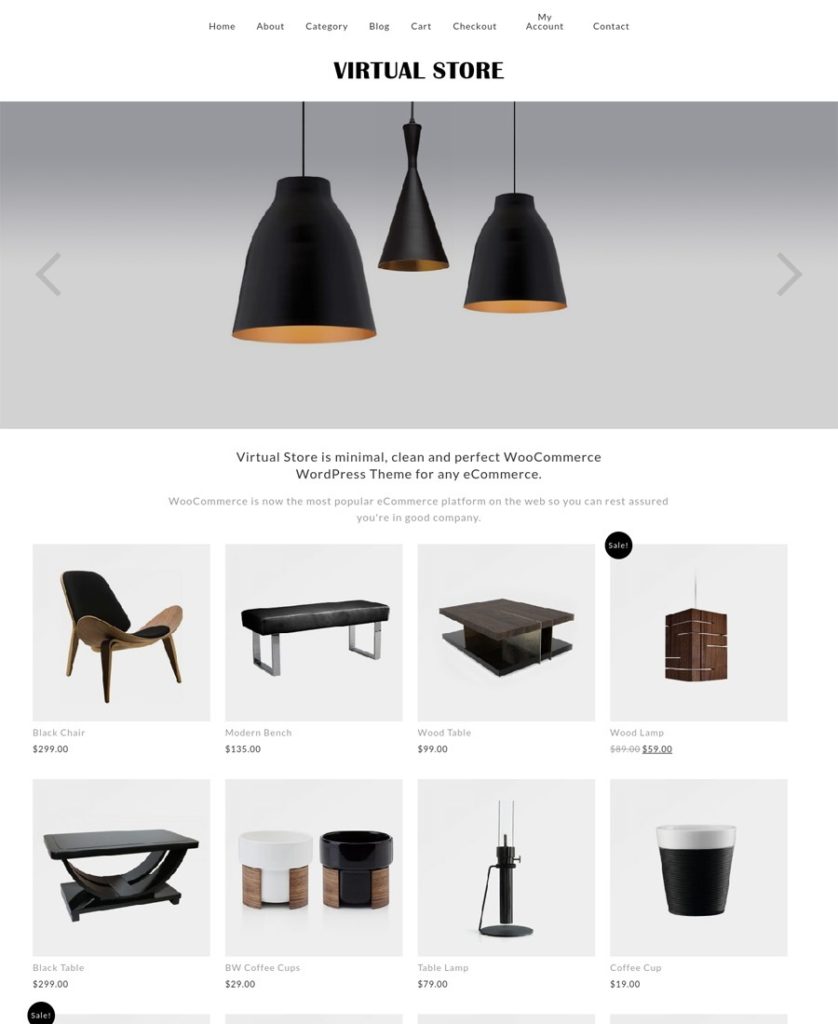
BeTheme – Responsive Multi-Purpose WordPress Theme

2

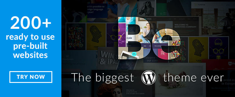
Be Theme is another good-sized website-building tool. It is, in fact, the biggest WordPress theme ever, with its more than 200 pre-built websites, 40 core features, and a dynamic world-wide user base. Be is also an extremely flexible theme, a necessity for any theme designed to accommodate the diverse design requirements you often find yourself confronted with.

Be’s high-powered combination of Muffin Builder 3, the Muffin Options Panel, and the Shortcode Generator makes it easy to build even the most detailed website pages easily, and without any need whatsoever to use code. Another core feature, the Layout Configurator makes building a page when starting from a blank canvas a simple task, thanks to the header options, grid systems, and other available options

There are plenty of video tutorials to get you up to speed, and Be’s support team is second to none when it comes to prompt, friendly, and professional service.

.

The 7 – the Most Customizable Theme on the Market

3

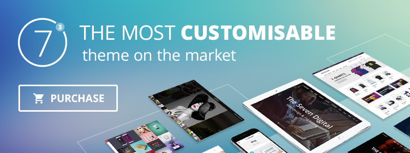
Because of its impressive flexibility and design element customizing capabilities, The7 is definitely deserving of its place among the 10 best multipurpose WP themes. This is, in fact, the most customizable theme on the market today, due in large part to its more than 630 theme options.

These theme options, when combined with an enhanced Visual Composer, the Design Wizard, and a library of 25 professional-grade website designs, make The7 a super-flexible WordPress theme as well.

The7 Design Wizard deserves a little extra attention. This useful tool saves you multiple steps by doing much of your design work automatically. Choose a layout header, upload your logo, specify your background, font, and color settings, and sit back and let the Wizard automatically complete your web page design. This is just one example of how this theme enables you to build pro-grade websites without ever touching a line of code.
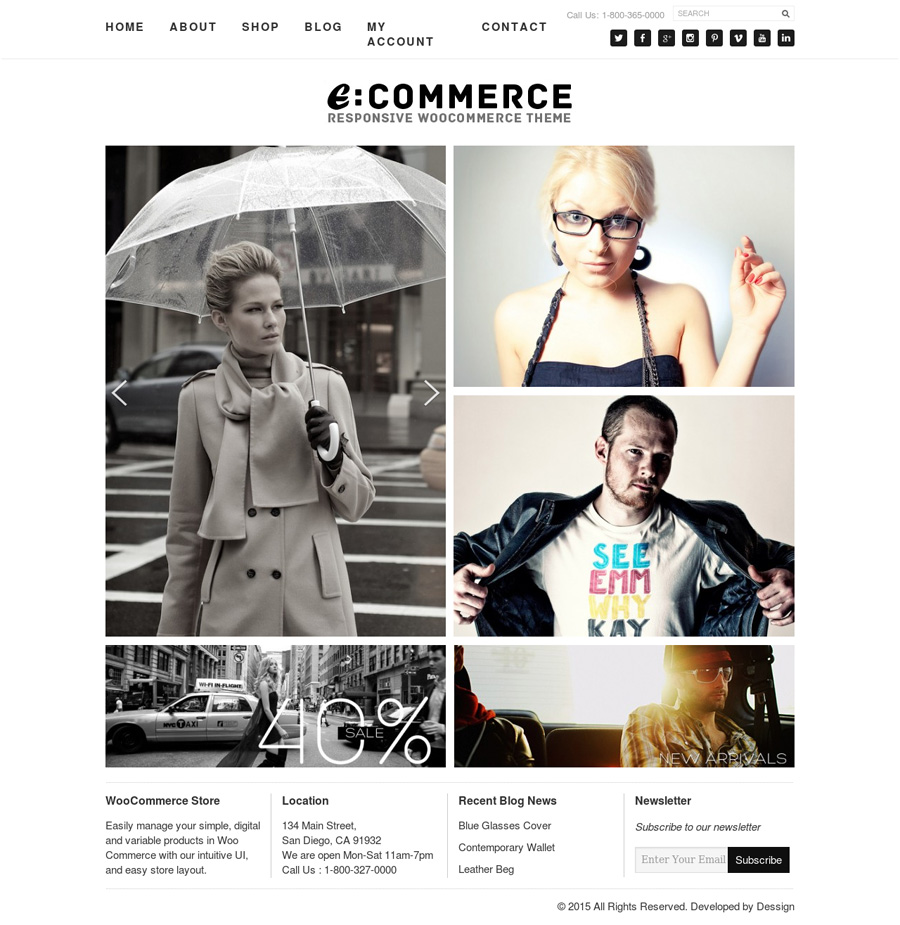
Divi

4

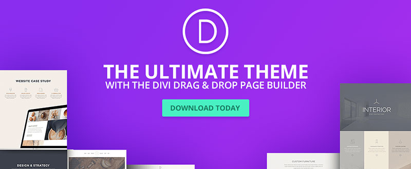
If you’ve ever received a box filled with an assortment of goodies as a Christmas present, you’ll understand your feelings when you open up a Divi WordPress Theme package. The Divi package is filled with features galore dedicated to helping you build one unique and awesome website after another.

Divi is advertised as being both smart and flexible. It’s smart because its authors relied heavily on feedback and suggestions from other theme users in the design and development of Divi. Its flexibility is due in large part to its 46 content modules that you can mix and match like building blocks. If you’ve ever had fun playing with building blocks, you’ll love Divi.

Uncode – Creative Multiuse WordPress Theme

5

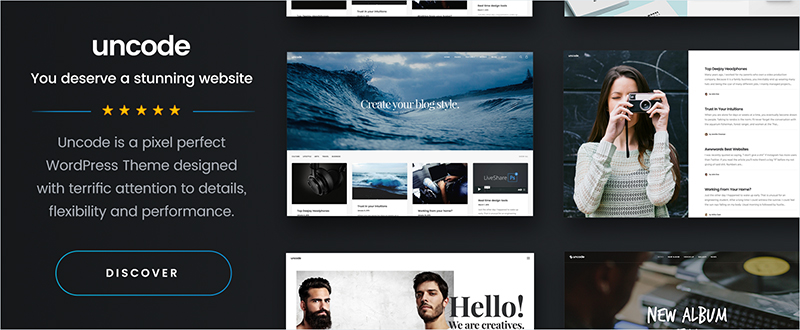
As a web designer, you know the importance of being organized. Uncode’s website is like that. Its concepts and features are carefully categorized; giving you a quick picture of what’s inside the box.

Concepts refer to Uncode’s homepage layouts, and the name fits. These homepage concepts have been neatly placed in 5 common categories, Classic, Creative, Portfolio, Blog, and Shop. The same is true with Uncode’s 30+ design features and its 22 special pages.

Main features include an enhanced version of Visual Composer, an innovative Grid System, and an Adaptive Images features that go a step beyond responsive.

Enfold

6

Pick one of the specialty Enfold Demos, or stick with the Default Demo. The latter is a multipurpose demo; the others represent specific website niches or types. It may not matter since you can select elements from any demo while building your website. The license also allows you to use the demo images as if they were your own.

There is a host of interactive elements to select from too, so what these features do for you, is to give you a super-flexible WP theme with which to build your websites.

Kallyas – Responsive Multi-Purpose WordPress Theme

7

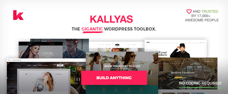
Drag and drop the page elements you’ve selected, edit, select your settings, and save. It’s that easy to build a website using Kallyas. You can even save the pages that turn out to be especially attractive, which probably will be most of them, for later use or as templates. No coding is necessary, and there are more than 150 pre-built elements to get you on your way.

Searching through 150 of anything to find what you want can take time. Kallyas has addressed the problem with its Live Search feature that allows you to find exactly the pre-built element you want in seconds.
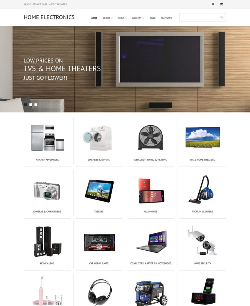
Shopkeeper

8

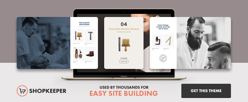
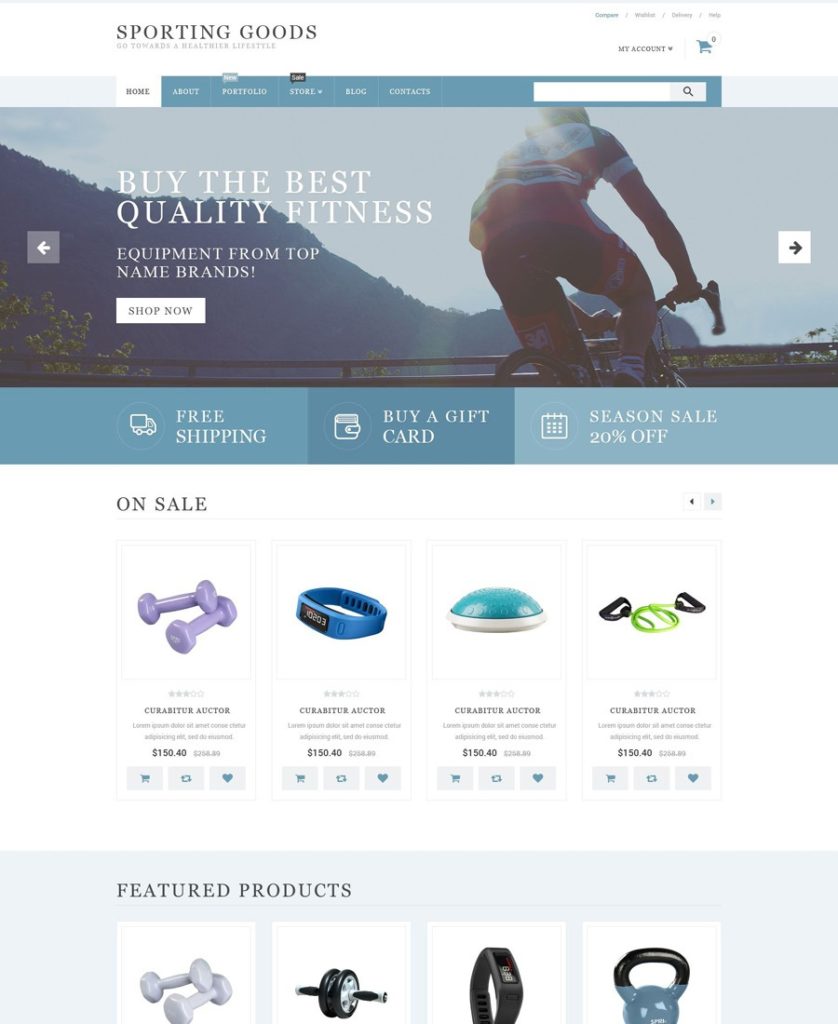
If you have an e-commerce store in mind, you’ll love Shopkeeper. While there are a number of WP themes that help you design great product displays, this theme goes an extra step or two. It includes the tools you need to run a business. These include features that allow you to manage inventory, arrange for shipping your products, help with cataloging, and arranging payments.

Shopkeeper is nevertheless a multipurpose theme. Among its many classical website-building features, you’ll find built-in portfolio functionality and attractive blog masonry layouts.
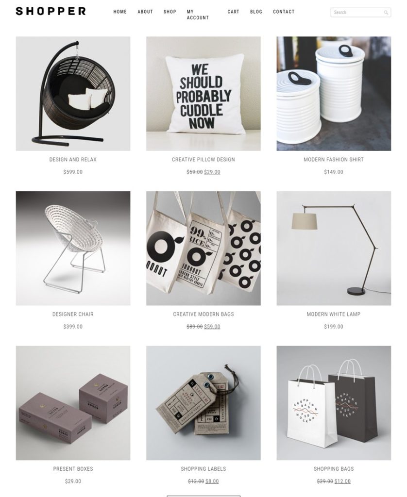
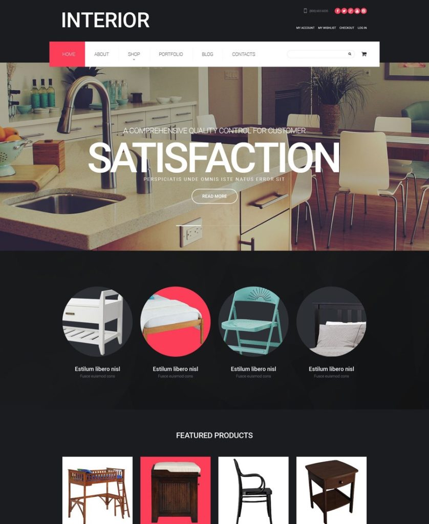
Merchandiser

9

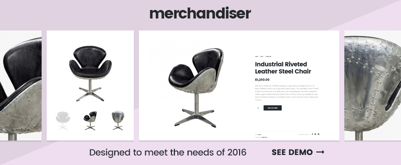
Merchandiser is a minimalist theme. It didn’t get that way simply because of a belief that the fewer the number of features, the better the product; although for this theme that happens to be the case. Merchandiser’s authors took into consideration the true needs of online shop owners.

They based this theme’s features on user feedback from other themes, generally feedback addressing speed, simplicity, and unnecessary complexity. The end result – a minimalist theme. Merchandiser gives you the features you need, and it doesn’t load you down with features you have little use for – an innovative design approach that yielded an innovative theme.
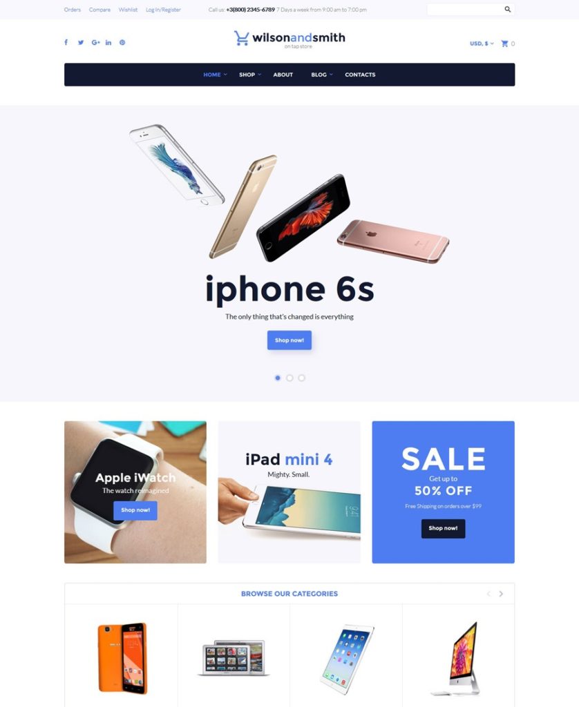
X Theme

10

X Theme is ThemeForest’s fastest-selling theme. Given ThemeForest’s outstanding product line of WP themes, it would seem there must be more than a few things that are special about X; as is indeed the case. The X Theme package includes 22 free extensions (plugins), it includes a modern, innovative, front-end page builder in Cornerstone, and it includes a comprehensive and extremely useful library of shortcodes.

X Theme is also responsive and retina ready, as you would expect. You will also receive a valuable bonus if you purchase X, consisting of access to an impressive library of online marketing videos.

Conclusion

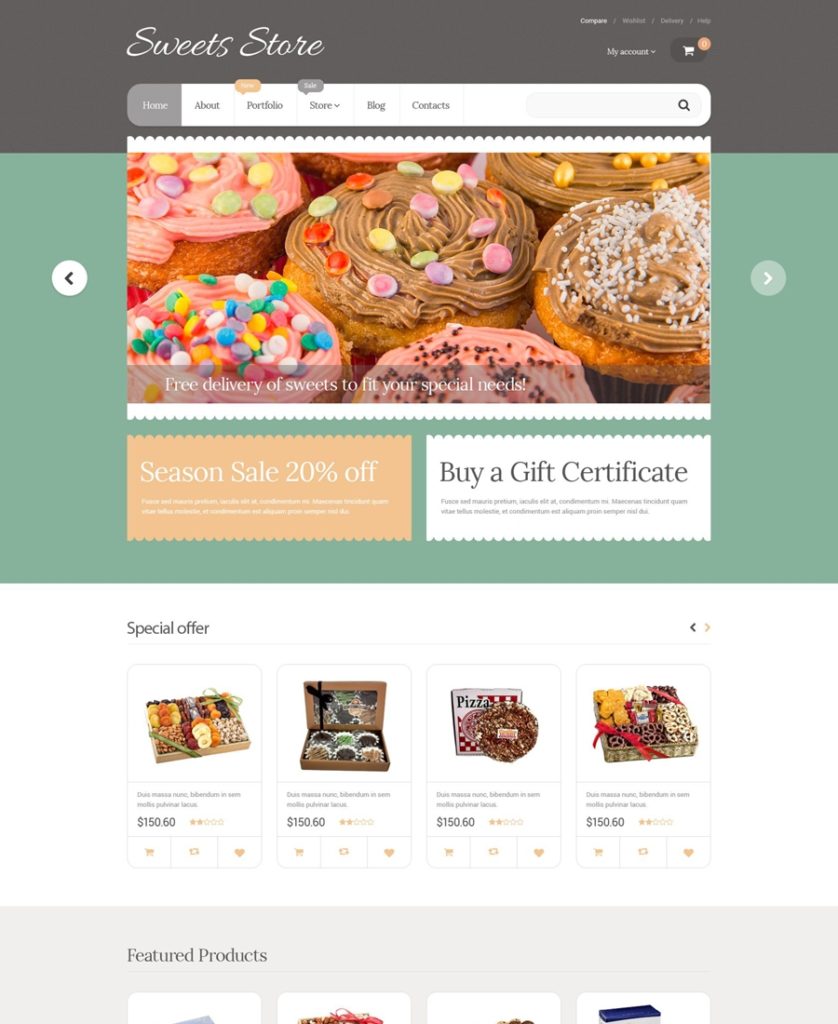
While we haven’t touched on pricing, it’s enough to say that each of these multipurpose themes is very affordable, and each of them would make a sound investment. While Shopkeeper and Merchandiser are more e-commerce oriented, they are, like the others in this list, genuinely multipurpose as far as website building is concerned.

Common threads that run through all 10 of these themes are flexibility, customizability, and ease of use. Top performance could be added as well. Check out the various websites and you’ll get a better idea of what these multipurpose themes offer. You’ll be impressed.

Read More at Planning to build a Website? Discover Ten Best Multipurpose WP Themes

Categories: Designing, Others Tags:

Sticky Footer, Five Ways

May 25th, 2016 No comments

A brief history, if you will.

The purpose of a sticky footer is that it “sticks” to the bottom of the browser window. But not always, if there is enough content on the page to push the footer lower, it still does that. But if the content on the page is short, a sticky footer will still hang to the bottom of the browser window.

There is negative bottom margins on wrappers

There was a wrapping element that held everything except the footer. It had a negative margin equal to the height of the footer. That was the basis of this one.

<body>
  <div class="wrapper">

      content

    <div class="push"></div>
  </div>
  <footer class="footer"></footer>
</body>
html, body {
  height: 100%;
  margin: 0;
}
.wrapper {
  min-height: 100%;

  /* Equal to height of footer */
  /* But also accounting for potential margin-bottom of last child */
  margin-bottom: -50px;
}
.footer,
.push {
  height: 50px;
}

See the Pen Sticky Footer with calc(); by Chris Coyier (@chriscoyier) on CodePen.

This one required an extra element inside the content area (the “.push“), to ensure that the negative margin didn’t pull the footer up and cover any content. The push was also clever because it very likely didn’t have any bottom margin of it’s own. If it did, that would have to be factored into the negative margins, and having those two numbers not in sync doesn’t look quite as nice.

There is negative top margins on footers

This technique did not require a push element, but instead, required an extra wrapping element around the content in which to apply matching bottom padding to. Again to prevent negative margin from lifting the footer above any content.

<body>
  <div class="content">
    <div class="content-inside">
      content
    </div>
  </div>
  <footer class="footer"></footer>
</body>
html, body {
  height: 100%;
  margin: 0;
}
.content {
  min-height: 100%;
}
.content-inside {
  padding: 20px;
  padding-bottom: 50px;
}
.footer {
  height: 50px;
  margin-top: -50px;
}

See the Pen Sticky Footer with Negative Margins 2 by Chris Coyier (@chriscoyier) on CodePen.

Kind of a wash between this technique and the previous one, as they both require extra otherwise unnecessary HTML elements.

There is calc() reduced height wrappers

One way to not need any extra elements is to adjust the wrappers height with calc(). Then there is not any overlapping going on, just two elements stacked on top of each other totaling 100% height.

<body>
  <div class="content">
    content
  </div>
  <footer class="footer"></footer>
</body>
.content {
  min-height: calc(100vh - 70px);
}
.footer {
  height: 50px;
}

See the Pen Sticky Footer with calc(); by Chris Coyier (@chriscoyier) on CodePen.

Notice the 70px in the calc() vs. the 50px fixed height of the footer. That’s making an assumption. An assumption that the last item in the content has a bottom margin of 20px. It’s that bottom margin plus the height of the footer that need to be added together to subtract from the viewport height. And yeah, we’re using viewport units here as another little trick to avoid having to set 100% body height before you can set 100% wrapper height.

There is flexbox

The big problem with the above three techniques is that they require fixed height footers. Fixed heights are generally a bummer in web design. Content can change. Things are flexible. Fixed heights are usually red flag territory. Using flexbox for a sticky footer not only doesn’t require any extra elements, but allows for a variable height footer.

<body>
  <div class="content">
    content
  </div>
  <footer class="footer"></footer>
</body>
html {
  height: 100%;
}
body {
  min-height: 100%;
  display: flex;
  flex-direction: column;
}
.content {
  flex: 1;
}

See the Pen Sticky Footer with Flexbox by Chris Coyier (@chriscoyier) on CodePen.

You could even add a header above that or more stuff below. The trick with flexbox is either:

  • flex: 1 on the child you want to grow to fill the space (the content, in our case).
  • or, margin-top: auto to push the child away as far as it will go from the neighbor (or whichever direction margin is needed).

Remember we have a complete guide for all this flexbox stuff.

There is grid

Grid layout is even newer (and less widely supported) than flexbox. We have a complete guide for it too. You can also fairly easily use it for a sticky footer.

<body>
  <div class="content">
    content
  </div>
  <footer class="footer"></footer>
</body>
html {
  height: 100%;
}
body {
  min-height: 100%;
  display: grid;
  grid-template-rows: 1fr auto;
}
.footer {
  grid-row-start: 2;
  grid-row-end: 3;
}

This demo should work in Chrome Canary or Firefox Developer Edition, and can probably be backported to the older version of grid layout for Edge:

See the Pen Sticky Footer with Grid by Chris Coyier (@chriscoyier) on CodePen.


Sticky Footer, Five Ways is a post from CSS-Tricks

Categories: Designing, Others Tags:

5 clients that will destroy your design business

May 25th, 2016 No comments

Have you ever had a customer from hell? The kind of customer who abuses you, spending as little as they possibly can while trying to squeeze as much free work out of you as possible?

You’re not alone.

At some point, most creative professionals (e.g. designers, developers, copywriters, etc.) will run into the customer from hell. These are the customers who, once they’re inside your business, bring in 20 percent of your income and 80 percent of your headaches.

Customers today are abusive, entitled and demanding… right? Actually no…

Customers as a whole are patient, kind and understanding. When they buy into you, into your business, they’re game changers. These customers have the power to literally change your business for the better, over night. I just mentioned the customer from hell though. Am I talking out both sides of my mouth? Not at all: The customers from hell? They aren’t customers…they’re predators.

Customers from hell? They aren’t customers…they’re predators.

These customers come in five deadly flavors, but their goal is the same. Take as much as they can from you, give as little as they can in return. Ruthless and simple. What’s not so simple is how they find you.

Most people have serious misconceptions about these predators. Their mistaken ideas keep them in the dark, which is exactly what these thirsty bloodsuckers want. Most of us recognize these predators when they’re in our business, but by then it’s too late.

If you’re clueless about them, you’re clueless about how they work — which means you can’t stop them, especially if you believe in these myths:

  • It’s a customer service issue: “If we’re just able to keep them happy we won’t have a problem.”
  • All customers are basically good: “If we’re good to them they’ll be good to us.”
  • Make customers the priority: “Put customers first and they’ll reward you” or “the customer is always right.”

So what’s the problem then? What attracts them to your business?

Marketing. Haphazard marketing sucks these predators in. The term “marketing” means anything you’re doing to close new clients. Your emails, proposals, blog posts, forum posts, anything.

And the worst part?

Most freelancers have no idea their marketing attracts the wrong customer. But how? Are these predators all the same? Should you work with them or weed them out? Knowing who you’re fighting dictates how you fight.

Let’s start with the first predator.

1) The Arranger (manipulates deals, circumstances and events)

These predators want any project, any circumstance to be win/lose in their favor. If you have an agreement they’ll change the terms and conditions. They demand options that don’t exist and push for concessions that really only benefit them.

The Arranger looks for two things:

  • Freelancers afraid to lose their business. Every project is an amazing opportunity when there aren’t enough clients. Arrangers use this fear to wear you down, chipping away at you until you’re psychologically exhausted.
  • An unhealthy desire to be flexible. Need this 300 page site in 48 hours? Sure! Established freelancers use a “take it or leave it” philosophy. Arrangers use “flexible freelancers” as cheap labor.

2) The Corrupter (a dirty, rotten liar)

They’ll say or do anything to get what they want. They’ll lie to you or about you. They’ll steal from you, turn customers and vendors against you, use entrapment – nothing is off limits for them.

The Corrupter looks for two things:

  • Fear of Conflict. The Corrupter loves to cross the line. They’ll invade your boundaries, cross ethical and moral lines and provoke fights. Carefully monitoring your response. A fear of conflict tells them it’s okay to steam roll over you.
  • Unfair exchange. Give Corrupters a discount, concession or deal and they keep pushing. Put conditions or limits on what you’re willing to give them and they become vicious.

3) The Disrupter (demands control)

These predators require special treatment. They want to be in charge. They refuse to use your product or service as intended. They demand your co-workers, partners or employees ignore your requests. For Disrupters, control is everything.

Marketing that attracts The Disrupter:

Disrupters target freelancers with strong “peace keeping” or “fun loving” temperaments. Prefer to avoid conflict or focus on having fun? Disrupters demand you do things their way.

Messages like “have it your way”, “designed around you” and “you’re the boss” are lightning rods that attract The Disrupter.

If you’re a freelancer with a strong perfectionist or control temperament, you’re much harder to control. Focus on “keeping the peace” to win a customer and you’re theirs.

4) The Slanderer (punishes you with shame and guilt)

The Slanderer is a professional troll. They’ll provoke you. Imply that you’ve let them down. They’ll bully you, spread gossip and pick fights—they want you to explode.

When you do they have the justification they need to demand discounts, ask for free products and “renegotiate” contracts: “Why do you charge 10x as much for the same service?” “I gave you a chance when no one else would. Is this how you repay me?” “My company pays your bills.” “How do you justify not including that feature? That’s robbery!”

Marketing that attracts The Slanderer:

As a freelancer you’re unique. That’s obvious to you but it’s something customers can’t see. What’s worse, your uniqueness needs to accomplish two clear goals.

  • Something customers care about. Your uniqueness solves customer problems or attracts them in some way.
  • They’re willing to pay for it. It tells you that customers value your work and they’re willing to take a risk with you.

Marketing pieces that say things like “we guarantee your satisfaction”, “we never stop working for you” or “our customers are number one” attract slanderers.

They see this lack of uniqueness as potential desperation. They believe there’s nothing special about you as a freelancer. So they’ll remind you over and over in different ways, until they’re able to get what they want.

5) The Schemer (exploits loopholes)

Agreements were created for them. They’re incredibly resourceful; they’ll find a way over, under, around or through your boundaries. Don’t do spec work? “You should have told me.” Offer a 30 day money back guarantee? They’ll use your rules against you. They’ll squeeze out 60 days of free work, then on day 59 ask for a full refund.

Marketing that attracts The Schemer:

Do you make promises or commitments to your customers? Offer extras, incentives or bonuses to get customers to work with you? Schemers look for incomplete policies and procedures.

If you’re a designer and you don’t offer source files, state that specifically. Do you create single use websites or can your customers turn around and resell your work? State your boundaries clearly, then prepare to defend them.

Defending your business starts with awareness

Want to protect your business from these nightmare predators? Learn to recognize the symptoms. When you’re aware of the problem it’s easier to spot the solution. But what then? Do you show these predators the door? It depends. If you don’t have a strategy or plan in place to deal with these predators it’s a good idea to show them the door.

What if you need the money?

Or, you have a plan to deal with these predators? It’s rare, but some of them can be converted into all-stars. It requires all of the ingredients I mentioned earlier and the strength to stand up to anything they throw at you.

But it can be done.

If you’re in a situation where you need the money or you have to work with a predator? Here’s a few ways to protect yourself.

  • Get paid up front. Get 50 to 75 percent of the project paid up front. Get paid via credit or debit card, so you control when you’re paid. Bill them weekly or bi-weekly to minimize potential damage if they decide not to pay.
  • Make your agreement ironclad. Make it non-negotiable. Predators sign it as-is or you walk. Add in clauses where the agreement auto renews indefinitely or until you cancel. Give yourself the ability to walk away at any time.
  • Close the loopholes. Find all of the loopholes in your marketing, in your policies and procedures. Then close them.
  • Freeze everything when they step out of line. Did they give you a faulty credit card? Stop working. Asking for something questionable or unethical? Stop working.

Walking away is ideal; have a strategy in place if you can’t. Predators don’t have to take you for a ride. You can provide the help they need and survive to tell the story. Manipulation and abuse doesn’t have to be an option you accept.

The customer from hell is a predator

Predators are abusive, entitled and demanding. They choose their victims carefully. They’ll do their best to spend as little as possible while simultaneously squeezing as much free work out of you as they can. You don’t have to be their next victim.

You have the power. Now you’re aware of their attacks, you know where they’ll strike. That awareness acts as a vaccine, giving you the knowledge you need to protect your business and your customers. But only if you choose your customers carefully.

Fashion Forward with the Revista Font Family of 26 fonts – only $15!

Source

Categories: Designing, Others Tags:

Google AdWords: Successful Campaigns for Beginners

May 25th, 2016 No comments
Google AdWords Basics

In contrast to search engine optimization, Google advertising offers a clear time advantage with its AdWords offer: Once an AdWords campaign is set up and online, conversions and leads can already be gained from day one. As soon as the (good!) campaign is online, users can see it immediately after entering the respective keywords.

Thus, Google AdWords is an excellent opportunity to boost sales in a short period for both small and large businesses alike. However, mistakes that heavily limit the campaign’s success, and can make it more expensive than it needs to be, are easily made, especially by inexperienced AdWords users. For this reason, we’ve accumulated some tips in our recent blog article, which allow you to optimize your existing campaigns, or improve the setup of new campaigns from the start.

Empathize With Your Target Group!

Who do you want your ads to reach? Determine in advance, which target groups you want to aim your campaign at, and base the following actions on that decision. Only then, the respective keywords can be found, and the best possible ad texts can be written. For that reason, you should always keep the viewers that you want to address in mind, both before the launch of the campaign, and during the entire campaign lifespan, so that you can conduct optimizations accordingly, and to increase, or keep up your ROI.

Google AdWords: Find the Right Keywords!

Which goods or services does your business offer, and for which of these do you want to be found on Google? Good and, above all, relevant keywords are a must for your AdWords campaign. However, when it comes to the selection and collection of your search terms or phrases, you need to pay attention to a few important things, to get the most out of your marketing budget.

Short and general keywords are often faced with a lot of competition, as well as a high click price, and on top of that, they often don’t exactly display the product range of a particular business. Instead, especially with a small to medium sized budget, it is recommended to choose phrases that give a description of goods or services, and with that, address users that are already in the final stage of decision making. This increases the chances of users clicking the ad, and purchasing a product, significantly.

Before setting up a campaign, extensive keyword research is key (here, the Keyword Planner by Google can help you), to find relevant and suitable keywords for your business. When your company is a local business, it also makes sense to add the name of the city to the keyword, like Jeweler NYC or Nail Studio Detroit, for instance.

Google AdWords also allows you to add keywords with different keyword options which can be booked using certain symbols. As the keyword options influence the display of the ads, using them is highly recommended. Here, you can distinguish between the following options:

  • Broad match: Keywords and phrases that are added into the campaign without additions have the attribute Broad match. This means, that your ads are also displayed when a user searches terms that are different from your keywords. This includes abbreviations, typos, as well as synonyms or supplements.
  • Broad match modifier: When adding a plus (+) to keywords, this can limit their range slightly. Thus, ads are not displayed for synonyms, for example, when the term carries a +.
  • Phrase match: If you add quotes to keywords or phrases, they are saved with the option Phrase match. Then, they are only displayed when the order of the terms of your keyword phrases matches the one in the user’s search requests. Nonetheless, the amount of words before or after this phrase is unlimited.
  • Exact match: If you enclose your keywords in square brackets, they are assigned to the option Exact match. Then, your ads are only displayed when the user enters the exact words, with no exceptions.

Aside from the keyword options mentioned above, there’s also the option to refine your campaign with negative keywords.

Add Negative Keywords!

Notepad with words PPC pay per click concept and marker.Whenever a user clicks your AdWords ad, it costs you money. Thus, it is important to design a campaign as precisely as possible, and only to display it for keywords that are fitting, and, in the best case, lead to a conversion. Here is where the negative keywords come into play. Negative keywords are words or phrases for which you don’t want the ads to be displayed at all. That’s logical, as the click on your add because of such a keyword would only result in wasted money.

Because you as a business want to sell your goods or services, you can exclude keywords like free, cost less, for nothing, and so on right from the start, for which there’s a separate slider. While doing so, also choose the keyword option “Broad match” for the list of negative keywords, to make sure that combinations of said words don’t lead to the display of your ads. For other phrases, the option “Exact match” is recommended, as it allows you to exclude specific word combinations.

Evaluate the Search Requests!

Do you know for which words your ads are actually displayed in the end? Although your campaign already has relevant, as well as negative keywords, it can always happen that an ad is shown for a wrong search phrase, which causes unnecessary costs. For that reason, it is recommended to check the user’s search requests on a regular basis, and to filter and save negative (or positive) keywords.

Write Appealing Ad Texts!

Generate more attention by directly addressing your target audience with the ad texts, making them curious about your products and services. Empathize with the user to get a feel for what he expects.

AdWords_Anzeige
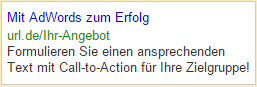
The ad texts are rather important when it comes to leading the users to your page, which is why it should be written in an appealing, brief, and grammatically correct way. For this, there are three lines available: Heading (25 characters), as well as two lines of text (35 characters each), which you should make as much use of as possible.

To do that, it is smart to include the keyword that the user entered in the Google search engine in the ad, as he will then gain the impression that he will find just what he was looking for on your page. Google offers the option to implement a keyword placeholder, which automatically integrates the search term when the ad is displayed.

Google AdWords: To Success With Know-how and Time

With the presented advice, you can optimize your campaign significantly, so that in the future, your conversions should become better. However, there are other important aspects that can’t be missing in a good AdWords campaign. It requires know-how and time (!), as only with regular control, and continuous adjustments of keywords, ads and so forth, you can achieve a sustainably successful campaign result.

(dpe)

Categories: Others Tags:

A Guide To Personal Side Projects

May 25th, 2016 No comments

Personal side projects are a cornerstone of creative growth and discovery. While they might not always result in financial gain, the long-term benefits are often much more useful. Benefits such as personal growth, creative exploration and generation of professional opportunities are some of the reasons to engage in them.

A Guide To Personal Side Projects

In this article, we’ll explore these benefits, as well as learn how to decide on a project and how to effectively manage our time (using my recently launched project an an example). Finally, for inspiration, we’ll look at some great examples of personal projects.

The post A Guide To Personal Side Projects appeared first on Smashing Magazine.

Categories: Others Tags:

Stylelint: The Style Sheet Linter We’ve Always Wanted

May 25th, 2016 No comments

Everyone wants a clean, consistent code base, no matter the language. Developers are accustomed to setting up linters in programming languages such as JavaScript and Python, but they rarely use a linter for style sheets. In this article, we’ll look at stylelint, a linter for style sheets.

Stylelint: The Style Sheet Linter We've Always Wanted

We will also learn why linting a style sheet matters, how stylelint brings order to a style sheet and how we can avoid errors. Finally, we will learn how to use stylelint and start linting as soon as possible. Let’s start with why linting is important.

The post Stylelint: The Style Sheet Linter We’ve Always Wanted appeared first on Smashing Magazine.

Categories: Others Tags:

Simplifying E-Commerce with Adobe Muse

May 24th, 2016 No comments
Muse For You - Paypal Shopping Cart Widget - Adobe Muse CC

Not only does Adobe Muse allow you to build websites without knowing any code you can now integrate a shopping cart with the PayPal Shopping Cart Widget from Muse For You.

Since the inception of the web e-commerce websites have become a major part of how we buy items. Web designers and developers are always looking for new ways to integrate shopping carts into their website. We have seen a number of different e-commerce platforms come onto the scene. Platforms like Shopify, WooCommerce, Etsy, Sellfy, Gumroad, and many more. Along with these platforms payment methods such as PayPal have become hugely popular. More and more online users are using PayPal to pay for items online. With PayPal you can pay with your PayPal account, bank account, debit or credit card. This allows web designers and developers to easily add e-commerce to their website with simple to use PayPal buttons.

Let’s dive a little bit deeper at some of the e-commerce platforms mentioned above. Shopify has become very popular and uses its own type of code called liquid to edit and modify templates. It is quite extensive and is a bit of a learning curve. WooCommerce requires the installation of WordPress and afterwards you can integrate WooCommerce into your WordPress template. Etsy, Sellfy, and Gumroad are great but they don’t include a website, so you get the shopping cart but with no website. They also take a fee for each sale.

Some of these alternatives are great, but what if I wanted to create a simple e-commerce website that looks great without having to learn new code or install WordPress and go through all the steps to integrate WooCommerce into WordPress? That is where Adobe Muse comes in. Adobe Muse allows you to easily create a website with total creative freedom, and now with the PayPal Shopping Cart Widget from Muse For You you can easily include a shopping cart into your Adobe Muse website. Adobe Muse has its own built-in PayPal buttons that allow you to easily add e-commerce to your website. You can use these buttons to create products on your website, and with the shopping cart widget users can add their products to a PayPal shopping cart.

Muse For You - PayPal Shopping Cart Widget - Adobe Muse CC

Example of the PayPal Shopping Cart Widget from Muse For You.

Muse For You - Paypal Shopping Cart Widget - Adobe Muse CC

With the PayPal Shopping Cart Widget all you need to do is add the widget to your Adobe Muse website and you instantly have a shopping cart. Any PayPal buttons you use will work with the shopping cart and if the user clicks on a buy button the product gets added to the shopping cart. You can set the shopping cart to save so if the user leaves the website the shopping cart will be saved and the user can continue shopping next time they come back to the website. You can also have the shopping cart reset on the page so that if the user leaves the page the next time they come back the shopping cart will be reset and they can start from the beginning. This works great if you want to set a page that resets the shopping cart after a user has finished a purchase. After the user has added all the items to the cart they can simply checkout with PayPal and complete their purchase.

What is also great about the PayPal Shopping Cart Widget is that it is completely customizable. You can customize the color and the text of the shopping cart to match your website. If you are looking to create a simple, and beautiful website with a shopping cart look no further. Adobe Muse does not require any code to build the website and all you need to do is drag and drop the PayPal Shopping Cart Widget onto your Adobe Muse website, and you now have an e-commerce website. I’ve titled the following video PayPal Shopping Cart Widget (view at top). The video shows you just how much you can do with the widget and how to add it to your Adobe Muse website.

I will be sharing my knowledge of Adobe Muse via my weekly blog post on WebDesignerLedger.com. I invite you to check back weekly for news and updates on Adobe Muse :). Happy Musing.

Read More at Simplifying E-Commerce with Adobe Muse

Categories: Designing, Others Tags:

30 WordPress eCommerce Themes to Build Stunning WordPress Shops

May 24th, 2016 No comments
4-fairy-style-gpl-wordpress-theme

There are several ways to launch eCommerce sites in order to sell your products online, and building WordPress shops with WordPress eCommerce themes (like WooCommerce themes) is one of the simplest and the most cost-efficient of them. The main benefit of WooCommerce is that it is very easy to use thanks to the WordPress polished dashboard and file structure.

If you are ready to become an online entrepreneur, take a look at this collection featuring professional WordPress eCommerce themes of the highest quality that we’ve handpicked for you.

1. FairyStyle

Demo | More Info

If you want to launch a WordPress shop selling clothes and accessories, consider this eCommerce WordPress theme. It is built in accordance with cutting-edge web design trends and techniques, offering your visitors unmatched user experience and smooth checkout, and ensuring high conversion rates for your store. In fact, Fairy style is a GPL WordPress theme meaning you can use it to build more than one eCommerce site.

***

2. Natural Foods

5-natural-foods-wordpress-theme

Demo | More Info

This responsive WooCommerce theme will be a perfect fit for online stores selling healthy food, natural cosmetics and bio additives. It features bold outline frames, which effectively highlight the products on mouse hover. This theme includes Ajax-powered product preview, which is intended to make the shopping process more streamlined and convenient for your customers.

***

3. Monstroid

1-monstroid-ecommerce

Demo | More Info

One of the remarkable aspects of Monstroid WordPress theme is its integration with WooCommerce plugin together with a ready-to-use set of pages for online stores. Monstroid is a multipurpose WordPress theme by TemplateMonster, so you can choose whether to use only its eCommerce section, or to make your store a part of a bigger website that includes blogs, forum boards and landing pages. This theme is not just versatile – you can literally change any element of its layout in order to get a totally unique-looking design. Actually, it could be a great solution for building stylish WordPress shops.

***

4. Product

26-product-woocommerce-theme

Demo | More Info

If you prefer product-first store designs, this WooCommerce theme is what you need. It maintains the perfect balance between minimalism and product imagery, providing great usability and extensive possibilities for conversion rate optimization.

***

5. Coffeera

2-coffeera-woocommerce-theme

Demo | More Info

With its clean lines, tastefully chosen fonts and juicy banners this WordPress eCommerce theme looks and feels like a freshly printed magazine. There is a dedicated marketing block on its homepage, which contains social media buttons and a newsletter form with customizable call-to-action text. This theme is fully compatible with the GPL license, so you can modify it to your liking and use for an unlimited number of WordPress shops.

***

6. Virtual Store

24-virtual-store-wordpress-ecommerce

Demo | More Info

This responsive WooCommerce theme is a great choice for interior and furniture online shops. Its simplistic design with a completely white background and borderless images will provide perfect visual exposure, even for products made in a black and white palette.

***

7. Wilson & Smith

3-wilson-gpl-woocommerce-theme

Demo | More Info

Wilson & Smith is a responsive WooCommerce theme for tech stores. It features a classic blue-and-white color palette, which instills a feeling of calmness, and encourages your customers to make a purchase. This theme is also GPL-compatible, so you can use it to build multiple WordPress shops.

***

8. eCommerce

25-e-commerce-wordpress-theme

Demo | More Info

Here is a trendy WooCommerce theme designed, initially, for fashion stores. It’s not only stylish, but also offers a wide choice of sharing buttons for every popular social media network. The core part of the homepage is an image block with masonry grid layout, which contains banners, category previews, and even a slider.

***

9. Home Electronics

6-home-electronics-ecommercce-theme

Demo | More Info

Home Electronics is a stylish, minimalist WordPress WooCommerce theme for tech-oriented stores. Its stands out because of its multifunctional product previews with well-thought-out navigation, which allow your customers to add a product to the cart, their wish list, a comparison chart, or open its details with one click.
***

10. Shopper (Free WordPress eCommerce theme)

23-shopper-woocommerce-theme

Demo | More Info

Shopper is a free eCommerce theme for WooCommerce stores. Its minimalist layout is based on a well-aligned grid, which creates a feeling of symmetry and orderliness. As with other minimalist themes featured in this article, it can be customized by just replacing the logo.

***

11. Tech 7

7-tech-7-woocommerce-template

Demo | More Info

Use this responsive WooCommerce theme to build an online store with a professional design inspired by websites of top computer hardware manufacturers. Its outstanding visual features include CSS-powered animations, parallax scrolling effect, responsive sliders, and many more. The navigation of this theme is represented by an informative sticky top menu, and is complemented by a back-to-top button.
***

12. iShopp

29-ishopp-online-store-theme-wp

Demo | More Info

iShopp is a beautiful multipurpose WooCommerce theme with a static photo background, which can be changed in two clicks. It has a classic two-column layout with a left sidebar, and can easily be customized by picking another color in the dashboard.
***

13. Fishing Online Store

8-fishing-online-store-woocommerce

Demo | More Info

This Fishing WooCommerce theme will be a great solution for WordPress shops offering fishing equipment. Its most notable visual feature is the support of background videos. Have a look at the demo: just under the welcoming message you will see a looped video, which can easily be replaced with your own footage.

***

14. Grid Commerce

30-grid-commerce-wordpress-theme

Demo | More Info

This WooCommerce theme is, perhaps, the most simplistic one in our collection today, which doesn’t mean it lacks charm. Grid Commerce has pixel-perfect design, is coded with valid XHTML and CSS, and can be used on an unlimited number of domains.

***

15. Sporting Goods

9-sport-wordpress-ecommerce-theme

Demo | More Info

Use this responsive eCommerce WordPress theme to establish an online store selling sport and fitness equipment. Its feature-rich layout includes such components as Google Maps, blog post previews and newsletter subscription forms. Product previews and menu items are improved with labels such as ‘new’ and ‘sale’.
***

16. Luxury Linen

10-luxury-linen-wp-theme

Demo | More Info

Luxury Linen is a stylish image-focused WooCommerce theme intended for interior design eCommerce stores. Its visually impactful homepage layout was designed to grab your customers’ attention immediately by using responsive sliders, large category banners and beautiful hover animations.
***

17. Twelve Watches Store

11-watches-store-wp-template

Demo | More Info

With the help of this splendid WooCommerce theme with large background images, you can easily set up an online store selling clothes and accessories. Its clean product previews, expressive banners and fresh color palette will present your goods in the best possible way.
***

18. Mobile WooCommerce Theme

12-mobile-woocommerce-theme

Demo | More Info

This WooCommerce theme was designed specifically for WordPress shops that sell smartphones, computers and other hi-end gadgets. Its basic eCommerce functionality is complemented by such additional features as interactive Google Maps and Live Chat.
***

19. Gameedion

13-gameedion-wp-template

Demo | More Info

Build a popular online tech store using this responsive eCommerce WordPress theme. It is extremely easy to install and operate thanks to the detailed documentation provided. The theme’s design is based mainly on soft colors, with the exception of some call-to-action elements highlighted with bright hues.
***

20. Online Travel Shop

14-travel-wordpress-template

Demo | More Info

Use this stunning WooCommerce theme to add eCommerce functionality to your travel company’s website. With its help you will be able to automate orders with ease, and save time and resources for other activities. Free live chat is also at your disposal, so you can provide support and answer customers’ questions in real time.
***

21. 6 Gear

15-auto-car-wordpress-theme

Demo | More Info

This is a comprehensive design solution for large WordPress shops with lots of product categories. 6 Gear will be a perfect fit for any WooCommerce-based e-shop selling car parts, tools or hardware, due to its multipurpose design. Online sellers will also benefit from the integrated functions of this theme such as product reviews, add to wish list, add to compare, and Quick View.
***

22. SOLD (Free WordPress eCommerce theme)

22-sold-woocommerce-free-theme

Demo | More Info

This simple, yet effective, free WooCommerce theme is all about large full-page images. Its homepage is almost entirely occupied by a slider, which you can use to promote your top offers. Despite the horizontal orientation of this template, it features a sticky top menu, so you can add as much content to your product pages, as you want, without affecting the usability.

***

23. Interior

16-interior-woocommerce-theme

Demo | More Info

This responsive WooCommerce theme was designed for all kinds of WordPress shops related to interior design, furniture and home design. It has an extraordinary dark background, which makes it easier to highlight your product photography. Other remarkable design features of this theme include ghost buttons, parallax scrolling effect and sticky menu bars.
***

24. Book Shop

17-book-shop-wp-theme

Demo | More Info

Book Shop is a neat WooCommerce theme designed with a touch of vintage style (as can be seen in its grunge-looking background). Its boxed layout is combined with a full-width top menu bar, ensuring great readability and optimized navigation. The theme possesses advanced social media features represented by various widgets such as Facebook, Like Box and Twitter Feed.
***

25. Large Grid

27-large-grid-woocommerce-theme

Demo | More Info

This is an ultra minimalist eCommerce WordPress theme with a layout based on a seamless responsive masonry grid. With this theme you don’t have to worry about the arrangement of your products and banners: just add them – and the grid will do the rest.

***

26. Fishing Store

18-fishing-store-woocommerce

Demo | More Info

This WooCommerce theme is a great example of functionality-first eCommerce design. It features two fully-fledged inventory menus: a sticky one at the top of the layout, and one in the sidebar. Thus, your customers will be able to reach any page of your store at any moment.
***

27. Bike Store

19-woocommerce-ecommerce-bike-store

Demo | More Info

This neat eCommerce WordPress theme is suitable for a wide range of online stores. Its clean layout and stylish hand drawn background will help you with creating a visually appealing showcase of your products. You can easily customize this theme by placing your own logo and contact info.
***

28. Sweets Store

20-sweets-store-wp-theme

Demo | More Info

Created using best flat design techniques, this responsive eCommerce theme will provide a perfect background for an online sweets store. As every other theme on this list, it’s 100% compatible with the WooCommerce plugin. The theme features pleasing to the eye product previews with rounded corners, pastel colors and creative script fonts.

***

29. Garden Furniture

21-furniture-wordpress-theme

Demo | More Info

This incredibly creative WooCommerce theme is the embodiment of user-friendly minimalism. Although there is plenty of white space throughout its layout, the design is very easy to navigate thanks to the unique on-hover animations, which indicate the active elements of the page. This theme is also fully responsive and optimized for touch screens.

***

30. E-Shop

28-eshop-woocommerce-theme

Demo | More Info

This responsive WooCommerce theme can be used to build different types of online shops. It’ll fit your needs whether you’re running a small family store or a big eCommerce site with a wide range of products. The theme has a very simple layout structure, allowing your visitors to pay maximum attention to each product presented on the homepage.

Final Words

These are some of the most technically advanced WordPress eCommerce themes (WooCommerce themes, to be exact), which will enable you to launch your online store in a matter of hours (if you have already prepared all the necessary content for it, of course). And if you know more trendy WordPress themes, please share them in the comments to this post. Let’s prove that building stunning WordPress shops can be easy and inexpensive.

Read More at 30 WordPress eCommerce Themes to Build Stunning WordPress Shops

Categories: Designing, Others Tags: