Archive

Archive for August, 2016

Can Software Make You Less Racist?

August 25th, 2016 No comments

I don’t think we computer geeks appreciate how profoundly the rise of the smartphone, and Facebook, has changed the Internet. It’s something that really only happened in the last five years, as smartphones and data plans dropped radically in price and became accessible – and addictive – to huge segments of the population.

People may have regularly used computers in 2007, sure, but that is a very different thing than having your computer in your pocket, 24/7, with you every step of every day, integrated into your life. As Jerry Seinfeld noted in 2014:

But I know you got your phone. Everybody here’s got their phone. There’s not one person here who doesn’t have it. You better have it … you gotta have it. Because there is no safety, there is no comfort, there is no security for you in this life any more … unless when you’re walking down the street you can feel a hard rectangle in your pants.

This is a an addiction that is new to millions – but eerily familiar to us.

From “only nerds will use the Internet” to “everyone stares at their smartphones all day long!” in 20 years. Not bad, team :-).

— Marc Andreessen (@pmarca) January 16, 2015

The good news is that, at this moment, every human being is far more connected to their fellow humans than any human has ever been in the entirety of recorded history.

Spoiler alert: that’s also the bad news.

Nextdoor is a Facebook-alike focused on specific neighborhoods. The idea is that you and everyone else on your block would join, and you can privately discuss local events, block parties, and generally hang out like neighbors do. It’s a good idea, and my wife started using it a fair bit in the last few years. We feel more connected to our neighbors. But one unfortunate thing you’ll find out when using Nextdoor is that your neighbors are probably a little bit racist.

I don’t use Nextdoor myself, but I remember Betsy specifically complaining about the casual racism she saw there, and I’ve seen it mentioned several times on Twitter by people I follow. They’re not the only ones. It became so epidemic that Nextdoor got a reputation for being a racial profiling hub.

Social networking historically trends young, with the early adopters. Facebook launched as a site for college students. But as those networks grow, they inevitably age. They begin to include older people. And those older people will, statistically speaking, be more racist. I apologize if this sounds ageist, but let me ask you something: do you consider your parents a little racist? I will personally admit that one of my parents is definitely someone I would label a little bit racist. It’s … not awesome.

The older the person, the more likely they are to have these “old fashioned” notions that the presence of black people on your block is inherently suspicious, and marriage should probably be defined as between a man and a woman.

In one meta-analysis by Jeffrey Lax and Justin Phillips of Columbia University, a majority of 18–29 year old Americans in 38 states support same sex marriage while in only 6 states do less than 45% of 18–29 year olds support same-sex marriage. At the same time not a single state shows support for same-sex marriage greater than 35% amongst those 64 and older

The idea that regressive social opinions correlate with age isn’t an opinion; it’s a statistical fact.

Support for same-sex marriage in the U.S.

18 - 29 years old    65%
30 - 49 years old    54%
50 - 64 years old    45%
65+ years old        39%

Are there progressive septuagenarians? Sure there are. But not many.

To me, failure to support same-sex marriage is as inconceivable as failing to support interracial marriage. Which was not that long ago, to the tune of the late 60s and early 70s. If you want some truly hair-raising reading, try Loving v. Virginia on for size. Because Virginia is for lovers. Just not those kind of lovers, 49 years ago. In the interests of full disclosure, I am 45 years old, and I graduated from the University of Virginia.

Anyway, the good news is that you’re more connected with your neighbors than ever before. But you may also find out some regressive things about your neighbors that you’d never have discovered in years of traditional daily routine of polite waves, hellos from the driveway, and casual sidewalk conversations.

To their immense credit, rather than accepting this status quo, Nextdoor did what any self-respecting computer geek would do: they changed their software.

Now, when you attempt to post about a crime or suspicious behavior …

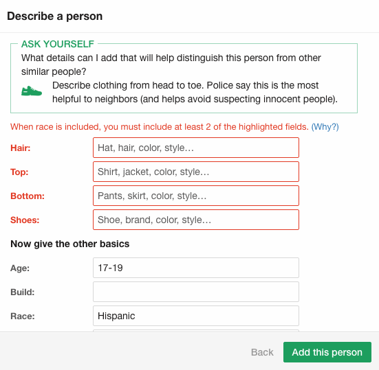
… you get smart, just in time nudges to think less about race, and more about behavior.

The results were striking:

Nextdoor claims this new multi-step system has, so far, reduced instances of racial profiling by 75%. It’s also decreased considerably the number of notes about crime and safety. During testing, the number of crime and safety issue reports abandoned before being published rose by 50%. “It’s a fairly significant dropoff,” said Tolia, “but we believe that, for Nextdoor, quality is more important than quantity.”

I’m a big believer in designing software to help nudge people, at exactly the right time, to be their better selves. And this is a textbook example of doing it right.

Would using Nextdoor and encountering these dialogs make my aforementioned parent a little bit less racist? Probably not. But I like to think they would make that parent stop for at least a moment and consider the importance of focusing on the behavior that is problematic, rather than the person. This is a philosophy I promoted on Stack Overflow, I continue to promote with Discourse, and I promote daily to my three kids. You never, ever judge someone by what they look like. Look at what they do.

If you were getting excited about the prospect of validating Betteridge’s Law yet again, I’m sorry to disappoint you. I believe software, properly designed software, can not just help people generally be more civil to each other, but can also help people – maybe even people you love – behave a bit less like racists online.

[advertisement] At Stack Overflow, we help developers learn, share, and grow. Whether you’re looking for your next dream job or looking to build out your team, we’ve got your back.
Categories: Others, Programming Tags:

Create Dots Along Spiral Path in Illustrator

August 24th, 2016 No comments
Dansky_How to Create Progressively Larger Dots Along a Spiral Path in Adobe Illustrator

In this tutorial, we’re going to learn how to create progressively larger dots along a spiral path in Adobe Illustrator.

The Steps (1-9)

1. Create a new document 800×800 pixels.

2. Left-click and Hold on the Line Segment Tool to reveal the dropdown menu and select the Spiral Tool.

progressively-larger-dots-spiral-path-1

3. Left-click anywhere on the artboard to draw a spiral shape, using Alt and Cmd/Ctrl to adjust the line spacing and complexity of the spiral.

progressively-larger-dots-spiral-path-2

4. Next, select the Ellipse Tool and hold Shift to draw a small circle with a Black Fill. Centrally position this circle on the inner-most tip of the spiral.

5. Repeat Step 4 instead with a larger circle, and place this larger circle on the outer-most tip of the spiral.

progressively-larger-dots-spiral-path-3

6. Hold Shift to select the two circles and go to Object > Blend > Blend Options. Enter 30 as the number of Specified Steps, and select Align to Path as the Orientation. Go to Object > Blend > Make, to see the additional circles added, connecting the two circles.

progressively-larger-dots-spiral-path-4

7. Select everything on the artboard and go to Object > Blend > Replace Spine to position all 30 circles along the ‘spine’ of the spiral.

progressively-larger-dots-spiral-path-5

8. Double-click on either the smallest or largest circle (created in Steps 4-5) to go inside the Blend Group, whereby editing either of these original shapes, will affect all of the other 30 Specified Steps in between.

9. The number of Specified Steps can also be edited further, by going to Object > Blend > Blend Options, and adjusting the settings as necessary.

progressively-larger-dots-spiral-path-6

Download Adobe Illustrator.

Read More at Create Dots Along Spiral Path in Illustrator

Categories: Designing, Others Tags:

Create Dots on Spiral Path in Illustrator

August 24th, 2016 No comments
Dansky_How to Create Progressively Larger Dots Along a Spiral Path in Adobe Illustrator

In this tutorial, we’re going to learn how to create progressively larger dots along a spiral path in Adobe Illustrator.

The Steps (1-9)

1. Create a new document 800×800 pixels.

2. Left-click and Hold on the Line Segment Tool to reveal the dropdown menu and select the Spiral Tool.

progressively-larger-dots-spiral-path-1

3. Left-click anywhere on the artboard to draw a spiral shape, using Alt and Cmd/Ctrl to adjust the line spacing and complexity of the spiral.

progressively-larger-dots-spiral-path-2

4. Next, select the Ellipse Tool and hold Shift to draw a small circle with a Black Fill. Centrally position this circle on the inner-most tip of the spiral.

5. Repeat Step 4 instead with a larger circle, and place this larger circle on the outer-most tip of the spiral.

progressively-larger-dots-spiral-path-3

6. Hold Shift to select the two circles and go to Object > Blend > Blend Options. Enter 30 as the number of Specified Steps, and select Align to Path as the Orientation. Go to Object > Blend > Make, to see the additional circles added, connecting the two circles.

progressively-larger-dots-spiral-path-4

7. Select everything on the artboard and go to Object > Blend > Replace Spine to position all 30 circles along the ‘spine’ of the spiral.

progressively-larger-dots-spiral-path-5

8. Double-click on either the smallest or largest circle (created in Steps 4-5) to go inside the Blend Group, whereby editing either of these original shapes, will affect all of the other 30 Specified Steps in between.

9. The number of Specified Steps can also be edited further, by going to Object > Blend > Blend Options, and adjusting the settings as necessary.

progressively-larger-dots-spiral-path-6

Download Adobe Illustrator.

Read More at Create Dots on Spiral Path in Illustrator

Categories: Designing, Others Tags:

Google moves to restrict advertising

August 24th, 2016 No comments

Do you hate it when ads straight up block access to the content you want to see? Well Google does too! No, really. Starting now, Google will be penalizing sites that use interstitial ads on mobile devices.

Why aren’t they doing this on desktop devices? I assume this is our punishment for not all switching to Chrome OS already.

But seriously, this is good news for users, and it’s going to annoy a lot of advertisers. Google is specifically targeting interstitial ads that need to be dismissed before you can see or interact with the rest of the site. So we’re talking about page redirection ads, those annoying modal windows that pop up when you load the page, those annoying modal windows that pop up in the middle of an article, and so on.

Not only can they be annoying to see, they can be annoying to get rid of. They often make the little “X” icons so small, and it’s too easy to accidentally tap on the ad instead of dismissing it.

Now, Google seems to be okay with very small interstitial ads. Think of those tiny floating banners that show up at the bottom of your phone’s screen sometimes. Those are apparently ok. So are popups that are used for legal reasons, like verifying someone’s age [and here, the author snorted in amusement], or telling them that the website uses cookies [and here, the author felt hungry].

So, good news for everyone except evil advertisers, right?

So, good news for everyone except evil advertisers, right? Well, here’s something to consider: in many ways, Google is becoming the arbiter of good design, at least when it comes to ads.

Once upon a time, their rules were all about preventing people from using unethical SEO “hacks” that allowed them to dominate the rankings for their search terms, and even for terms that had nothing to do with what they were selling. That was, and still is a good thing. Not only do these rules more or less keep things fair, they actually simplify the process of SEO.

Recently, though, Google has begun to punish people for doing stuff with ads that is definitely irritating, and probably counterproductive, but not specifically morally or ethically wrong. Do we really want Google defining what a good design is? On the one hand, I’ve often joked about embracing our new Googly Overlords with open arms. You could definitely see this as Google just lending the users a helping hand. We’ve been saying for a long time that interstitial ads are not great, and many have yet to listen.

With this update, Google is going to make them listen.

On the other hand, Google is a corporation. I’m pretty sure the three-hundred-and-sixty-seventh rule of aquisi… I mean… capitalism… is that corporations are not your friend. Now, they probably won’t penalize sites that aren’t built with Material Design, or anything like that, but we do have to wonder how far they will go.

At least we should be asked to sign up for fewer newsletters three seconds after loading a page.

Master WordPress, Drupal, Joomla, Coding and SEO with 2900+ OSTraining Video Courses – only $44!

Source

Categories: Designing, Others Tags:

eCommerce Themes That Are Perfect For Building a Shop

August 24th, 2016 No comments
1xstore

You can choose a multipurpose theme that has all the features you need to build an online store, or you can select a theme that is specifically oriented toward the eCommerce genre. You’ll find both types here, and all are premium themes. No matter which theme you may choose, you can’t just sit back and let it do all of the work. There are a few things you should take into account, if you want your eCommerce venture to be a rousing success.

  • There’s nothing wrong with innovation; but you don’t want to be overly clever when designing an online store. Don’t make your customers have to think. They know what they want, and it’s your job to help them find it.
  • Keep your homepage banner relatively simple. You don’t have to devote a huge amount of resources toward building it. Let your home page speak for itself.
  • Keep your product displays consistent. It’s OK to copycat what other stores do. Customers always feel more comfortable when they find themselves in familiar surroundings.
  • Always use a responsive theme. Half or more of your store’s visitors are probably shopping from mobile devices. Don’t let them slip through the crack.
  • Select a fast, lightweight theme if you want to sell a product. That will not be a problem, if you choose one of the following seven.

XStore-Responsive WooCommerce Theme

XStore’s authors took the first law of usability – “Don’t make people think.” – to heart when they designed and developed this premium eCommerce theme. XStore literally guides you by the hand as you are building your online store, making it easy for you to extend the first law of usability into the workings of your website.

The tools, settings, and pages you need are all there. Each of 27 demos has a modern, somewhat minimalist look. Innovative features abound; but the emphasis is definitely on presenting a familiar look to your store’s visitors.

XStore is responsive, retina ready, and RTL and WPML ready as well; so there’s really no limit to the size of the customer base you can reach out to. Visual Composer and Slider Revolution plugins are included, and XStore is of course 100% WooCommerce compatible.

The level of user support is what is to be expected with a premium theme – great. A video tutorial is included to give you any help you may need with install or settings. More video tutorials are being added as we speak.

Merchandiser

2merchandiser

Merchandiser has all the features you need to build the perfect online store, and none of the features that you have no use for. In other words, this premium eCommerce theme is a minimalist theme, both in design, and in terms of fast and efficient performance.

Its guiding philosophy – simplicity is the ultimate in sophistication – is a philosophy well worth adapting to your web-building ventures. Merchandiser makes it easy for you to do just that.

The Theme Customizer provides you with all of the flexibility you need, while the popular Visual Composer drag and drop page builder enables you to turn out high-quality work at a rapid clip. Merchandiser also offers several online shopping features your store’s visitors will appreciate. You can sell anything online, including setting up an affiliate store, when using this eCommerce theme.

Woutique

3wooutique

Woutique is not a WooCommerce compatible theme; it’s a WooCommerce theme. As such, every one of WooCommerce’s widgets have been put into play. So has each of the WooCommerce plugin’s key components, including product categories and descriptions, cart, checkout, and user account sections.

Everything you need is here, plus Woutique is a free download. Whether you are a long- time web designer, or relatively new to the game, this WooCommerce product is worth a try.

KLEO – Pro Community Focused, Multipurpose Theme

4kleo

Although KLEO can definitely be called a multipurpose theme, it has a number features than makes it an excellent choice for eCommerce website builders. Among the key features of KLEO, in addition to its excellent selection of demos, are the 24 plugins that come with the package. Some of the usual WP plugins are included, but you’ll also find a number of plugins, including WooCommerce, that are specifically directed at helping a web designer build an online shop.

Uncode – Creative Multiuse WordPress Theme

5uncode

Massive options, special pages, interactive features, and its collection of 30 homepage concepts all combine to make Uncode one of the most exciting eCommerce themes on the market. The Advance Grid system pushes layout design to the cutting edge, while the Adaptive Images feature makes Uncode super-responsive. An enhanced version of the popular Visual Composer builder is included in the package.

If a WP theme capable of building anything you can think of is on your shopping list, Uncode is a solid choice, and a good investment.

Divi

6divi

Divi has a number of things going for it that has made it a top-selling theme, including the impressive Divi Builder. Another feature users particularly like is this themes 46 customizable content blocks, which make it oh-so-easy to put a page together. Or, an entire online store for that matter; since several of these content blocks directly address eCommerce needs, Divi is another superb multipurpose WP theme that would be an ideal choice for building your online store, quickly, and down to the most minute details.

Merchant WordPress Theme

7merchant

Merchant is super-responsive, it’s translation ready, and it’s super flexible. It’s also modern, and hip. Its Easy Layout Creator is more than just a name. Ease of use is this eCommerce theme’s trademark. Build your online shop, or display your products or services in an awesome portfolio. Merchant also has the features you need to publish an online product catalog.

Merchant features an excellent support forum that’s loaded with information on everything from optimizing your use of WordPress, to tying in to social media.

***

Picking an eCommerce theme from seven of the very best isn’t necessarily an easy task, but at least you can’t make a poor choice. It may be that a multipurpose theme will suit you best, or it may be the other way around, where selecting a theme more heavily oriented toward building eCommerce sites would make better sense.

Either way, any one of these themes will be a good investment. Just make sure to keep in mind the eCommerce web-building tips offered up front. These eCommerce themes are capable of producing awesome, super-responsive, pixel-perfect online stores, but it’s up to you to ensure your users don’t have to think.

Read More at eCommerce Themes That Are Perfect For Building a Shop

Categories: Designing, Others Tags:

Trusting SSL Locally on a Mac

August 24th, 2016 No comments

I run most of my production sites with forced SSL, including CSS-Tricks. But locally, I’ve avoided getting SSL working properly. I’ve always avoided it, perhaps because it’s not immediately obvious how to do it. It’s also not that big of a deal since it’s just local traffic. But hey, might as well make local work as close to production is possible eh?

I’ve had situations come up where it was actually quite important and affected development. Like a native PHP function that worked differently on HTTPS than HTTP. More commonly, I was working on HTTP locally and an asset was loaded over HTTPS and thus failed (needed manual approval of the insecure certificate).

1) Locally Signed SSL Certificate through MAMP

I get frustrated with MAMP a lot, but it’s still working for me after all these years. Perhaps someday I’ll move to a Docker thing or something. But as yet-another small testament to MAMP, it makes SSL fairly easy to turn on. Click over to the SSL tab and check the SSL checkbox, and generate a self-signed certificate:

I don’t know why the entries are in “error red”. It just started doing that, even though things seemingly work fine. Squint.

Note there are two entries here for my domain `css-tricks.dev`. That’s because one is SSL and one is not. That’s how you have to do it in MAMP if you want to serve content on that domain through both HTTP and HTTPS.

Now the site will serve over HTTP, but you’ll get this classic beauty:

No browser is a fan:

You can click past it generally, acknowledging the risks involved (there is no real risk locally) but then you still get the nasty insecure warning:

Trusting the Local Certificate through Keychain

The trick to trusting that local certificate happens at the system level through the program Keychain Access.

When you create the local certificate through MAMP, you were prompted to save it somewhere. Wherever you did that, find it, and drag the certificate into Keychain.

If you can’t remember where that certificate is because you created it like 100 years ago, you can get Chrome to give you a copy of it.

  1. Click the red warning exclamation point thing in the URL bar
  2. Click “View Details” in the SSL warning area
  3. It will show you a certificate information dropdown thing like this:

From there, you can click-and-drag the certificate icon out to wherever you want a copy. Then drag it into Keychain Access.

Then double-click the certificate in Keychain Access and expand the “Trust” area. You can adjust the “When using this certificate” option to “Always Trust”.

3) Have Happy Local Trusted SSL


Trusting SSL Locally on a Mac is a post from CSS-Tricks

Categories: Designing, Others Tags:

What the heck is the event loop anyway?

August 24th, 2016 No comments

In 2014, Philip Roberts gave a great talk at JSConf EU, walking through the event loop and breaking down what JavaScript is doing under the hood for those of us without CS degrees. I came across this talk the other day in my Twitter stream, and really enjoyed it. Even though it’s a couple years old, it has stood the test of time and remains a great resource.

Direct Link to ArticlePermalink


What the heck is the event loop anyway? is a post from CSS-Tricks

Categories: Designing, Others Tags:

5 ways feel like a design rock star, working as a roadie

August 24th, 2016 No comments

There are many reasons to love being a web designer. Personally, my favorite part is the creative process. I love taking ideas and creating something with them. Whether it’s the initial design of a site, or taking that design and implementing it with code, there’s a creative rush that really makes me excited to share it with the world.

But, as we find out sooner or later, web design is not always fun. Sometimes, you’re stuck with work that seems light years away from what you want to do (and what you do best). I know from experience that it’s easier to feel overwhelmed while doing mundane, repetitive tasks. And no, you’d rather not see me when I’m overwhelmed.

How, then, do you keep your wits about you when performing soul-sucking tasks? Is it a matter of living in some sort of fantasy world or simply acknowledging the reality? Let’s look at some ways to stay on top of your game, even when you’re less-than-thrilled.

1. Recognize the necessity

Have you ever mumbled to yourself, “What a waste of my time…”? Let’s face it: There are times when you’ll have to deal with projects that seem completely unnecessary (to you, at least). It’s a natural reaction to feel that you could be doing something more meaningful in that moment.

It’s a natural reaction to feel that you could be doing something more meaningful in that moment

This is when you could easily sink into a bit of despair, and let the thought of all this meaningless work ruin your day. But come on now, you’re better than that.

Part of the problem (at least, from what I’ve experienced) is that it’s easy to think that, as an expert, you know best. And perhaps you do. But we also must acknowledge that whether we’re web designers, world leaders, or parents, not everyone is going to listen to us all the time.

Instead, take an open-minded look at the situation. Recognize the fact that the boss/client felt this was important enough to be done. You don’t have to necessarily agree with that analysis, but it is your duty to carry it out.

At the very least, you can take pride in what you’re doing and know that it does mean something to someone.

2. Dive right in

When you’re faced with a task that you really aren’t excited about, you may want to put if off for as long as possible. While “delaying the pain” may seem like a good plan, you’re probably hurting yourself more in the long run.

The longer you delay the task, the more you have to sit there with it in the back of your mind. Instead, crank up your favorite music and commit yourself to getting it done. Attack the project with confidence and purpose.

If it’s a longer term project, you can certainly find time to do other things to break the monotony. Even better: go outside for a bit and enjoy nature. You’ll feel refreshed and ready to dive back in to work.

3. Make it a game

I’ve had mountainous piles of repetitive tasks that have made both my wrists (and soul) hurt. If it’s a project that will take days or weeks to finish, I can actually find myself with a bit of Stockholm syndrome when it’s all done. This type of work can almost feel insurmountable if you don’t put it in perspective.

When faced with something like this, challenging yourself (in a fun way) can help you plow through. For example, if you’re working on something extremely repetitive, see how many times you can repeat the task in a minute or other interval. Maybe it sounds a bit like counting holes in the ceiling tiles, but it can help to make something insanely boring a bit more tolerable.

it can help you to develop a more efficient process for getting things done

Another beneficial aspect of this practice is that it can help you to develop a more efficient process for getting things done. It’s during those repetitive tasks that an idea can suddenly show up that saves you precious time.

Finding ways to make things fun (no matter how silly) will improve your mood and might even improve your work.

4. Find perspective

Turn on the news for any length of time and it’s easy to see that our problems can be miniscule compared to what others face. Even so, it can be hard to think about that when you’re overwhelmed or just plain bored out of your mind.

In all honesty, it’s something I’ve struggled with over the years. Sometimes, I’ll get annoyed at work and think, “What right do I have to feel this way? I’m not terminally ill, I’m not a refugee and I’ve got it pretty good.”

The truth is that we all have our own personal hell. And it’s probably not too realistic to be in a perpetually sunny mood when it comes to work (even if you love what you do). So you can reserve the right to be a little grumpy when tasked with something you’d rather not do.

The truth is that we all have our own personal hell

The key here is to put it in perspective. I recently heard a radio interview with a top executive. Their advice on the subject was (and I’m paraphrasing): Take a look at your situation and then think about how you’ll feel about it six months from now. Will you even remember it by then?

The point is, take the work at face value. Don’t assign more meaning to it than what’s really there. That advice has actually helped me get through some things that normally would have sent me running for the bag of candy (or worse)! As it turns out, most things won’t be remembered much beyond their immediate past.

5. Remember the good stuff

Remember earlier when we discussed the reasons we love being web designers? It’s never a bad time to think about what drew you to this vocation. Thankfully, it’s the good stuff that endures. The other challenges are just temporary.

So the next time you are faced with some work that just might drive you crazy:

  • Know that, in someone’s eyes, the work is necessary (and you don’t have to agree).
  • Find a way to challenge yourself and make the task more fun.
  • Get right to work on it with a vengeance.
  • Realize that it’s okay to get annoyed, just don’t wallow in self pity.
  • Remember that you have a pretty awesome career.

It’s not always easy and it takes practice. But, if you follow the steps above, you really can learn to better deal with even the most mundane work.

Master WordPress, Drupal, Joomla, Coding and SEO with 2900+ OSTraining Video Courses – only $44!

Source

Categories: Designing, Others Tags:

Better Blogging, Easier Reading: Optimizing Blog Content

August 24th, 2016 No comments
home-office-336373_640

Only very few people read an article online word by word. Studies have shown that only 16 percent of internet users read entire articles. Thus, the best advice I can give you is to make your content scannable. This assures that your website’s visitors have an easy time receiving information.

Make your content scannable. The easier it is to grasp your posts’ content, the more time people will spend on your website.

The average web user will barely spend any time on a blog when he got there via Google. You might have already noticed that in your Google Analytics statistics. On top of that, the average visitor will only grasp 60 percent of the things he reads.

This is not a good basis for content that is not optimized. Visitors are looking for keywords, specific terms, interesting subheadings, and visual tips.

Studies have proven that it is arduous to read text on a screen, which is why it’s done about 25 percent slower than reading a piece of paper. Thus, scanning content is a technique that us writers should focus on the most.

Further Information:

Techniques to Make Your Blog Scannable

Here are a few tips that you can use to create scannable content.

1 – Create List Posts

One particular format of blog articles that works especially well is the list format. If you have been writing for a while, and if you have written plenty of list articles already, you’ll be able to trace this back in your statistics. Lists make visitors assume that they will get what they are looking for in very few steps.

hand-565588_640

The only thing you should pay attention to is a semi-proper formatting of the ennumeration’s HTML output. The list items shouldn’t “stick” together, but should have a little room below each one, like a normal paragraph.

2 – The Formatting

Use bold font for important aspects, apply italic font to emphasize statements. Experiment with the alignment of small text areas.

Also make sure to use a proper font size. Many readers are easily frustrated by small writing. Also test backgrounds of different colors in certain places.

3 – Use Quotes and Colored Boxes to Gain Attention

The idea behind it is to loosen up a text desert, and to convey relaxation to the reader. That’s why you should use quotes in your text, or colorful boxes for important statements. These are true eye catchers that will draw the attention to themselves.

This will also make the readers happy as they will be able to find the solution faster if you make smart use of these areas.

Quotes do a Great Job at Loosening Up a Text Desert, and They Are True Eye Catchers

4 – Subheadings

Good subheadings are a good way to mellow your texts, and do something for the search engine optimization at the same time by using the tags. Good subheadings are written in a way that makes readers curious, but doesn’t give too much information.

These headings help your readers to find the interesting parts of your texts, and receive the desired information faster.

5 – Use Images

Intelligent use of images can get your posts a lot of attention. They are able to emphasize or highlight certain aspects. Using high-quality images can make your articles appear more professional, as well as awaken interest.

banner-1165973_640

There’s almost nothing worse than having endless text deserts in front of you that you have to fight through to receive the desired information.

6 – Use Short Paragraphs

Short paragraphs make texts more concise and allow for easier perception of the content. Users easily get lost in long paragraphs. So let’s make it simple and break down our texts into short sections.

As a rule of thumb, you could set your goal to be “one idea per paragraph”.

7 – Get to the Point

hole-1072915_640

Many bloggers bury the important information in a desert of unnecessary text sections. They simply don’t get to the point, but constantly beat around the bush. Sometimes, I tend to do so as well. That’s why it’s crucial to read your texts again, and to simply cross out everything that’s not of importance.

Webtexts should be short and brief. You’ll find more people that want to read this type of content.

(dpe)

Categories: Others Tags: