Every week we feature a set of comics created exclusively for WDD.
The content revolves around web design, blogging and funny situations that we encounter in our daily lives as designers.
These great cartoons are created by Jerry King, an award-winning cartoonist who’s one of the most published, prolific and versatile cartoonists in the world today.
So for a few moments, take a break from your daily routine, have a laugh and enjoy these funny cartoons.
Feel free to leave your comments and suggestions below as well as any related stories of your own…
Doctor font
Tomato, tomatho
Not so clean office
Can you relate to these situations? Please share your funny stories and comments below…
A version of this article was first posted on Jeremy’s blog. It was Jeremy’s idea to repost here to spread the good word about WebP and the performance benefits. Something he knows about as an author of an (upcoming) web perf book.
We’ve all been there before: You’re browsing a website that has a ton of huge images of delicious food, or maybe that new gadget you’ve been eyeballing. These images tug at your senses, and for content authors, they’re essential in moving people to do things.
Except that these images are downright huge. Like really huge. On a doddering mobile connection, you can even see these images unfurl before you like a descending window shade. You’re suddenly reminded of the bad old days of dial-up.
This is a problem, because images represent a significant portion of what’s downloaded on a typical website, and for good reason. Images are expressive tools, and they have the ability to speak more than copy can. The challenge is in walking the tightrope between visually rich content, and the speedy delivery of it.
The solution to this dilemma is not one dimensional. Many techniques exist for slimming down unruly images, and delivering them according to the capabilities of the devices that request them. Such a topic can easily be its own book, but the focus of this post will be very specific: Google’s WebP image format, and how you can take advantage of it to serve images that have all the visual fidelity your images have now, but at a fraction of the file size. Let’s begin!
What is WebP, and Why Should I Even Care?
WebP is an image format developed and first released by Google in 2010. It supports encoding images in both lossless and lossy formats, making it a versatile format for any type of visual media, and a great alternative format to both PNG or JPEG. WebP’s visual quality is often comparable to more ubiquitous formats. Below is a comparison of a lossy WebP image and a JPEG image:
Can you tell the difference? (Hint: the WebP version is on the right.)
In the above example, the visual differences are nearly imperceptible, yet the differences in file size are substantial. The JPEG version on the left weighs in at 56.7 KB, and the WebP version on the right is nearly a third smaller at 38 KB. Not too bad, especially when you consider that the visual quality between the two is comparable.
So the next question, of course, is “what’s the browser support?” Not as slim as you might think. Since WebP is a Google technology, support for it is fixed to Blink-based browsers. These browsers make up a significant portion of users worldwide, however, meaning that nearly 70% of browsers in use support WebP at the time of this writing. If you had the chance to make your website faster for over two thirds of your users, would you pass it up? I think not.
It’s important to remember, though, that WebP is not a replacement for JPEG and PNG images. It’s a format you can serve to browsers that can use it, but you should keep older image formats on hand for other browsers. This is the nature of developing for the web: Have your Plan A ready for browsers that can handle it, and have your Plan B (and maybe Plan C) ready for those browsers that are less capable.
Enough with the disclaimers. Let’s optimize!
Converting your Images to WebP
If you’re familiar with Photoshop, the easiest way to get a taste for WebP is to try out the WebP Photoshop Plugin. After you install it, you’ll be able to use the Save As option (not Save For Web!) and select either WebP or WebP Lossless from the format dropdown.
What’s the difference between the two? Think of it as being a lot like the differences between JPEG and PNG images. JPEGs are lossy, and PNG images are lossless. Use regular old WebP when you want to convert your JPEG images. Use WebP Lossless when you’re converting your PNGs.
When you save images using the WebP Lossless format with the Photoshop plugin, you’re given no prompts. It just takes care of everything. When you choose regular old WebP for your lossy images, though, you’ll get something like this:
The WebP Lossy Configuration Dialogue
The settings dialogue for lossy WebP gives more flexibility for configuring the output. You can adjust the image quality by using a slider from 0 to 100 (similar to JPEG), set the strength of the filtering profile to get lower file sizes (at the expense of visual quality, of course) and adjust noise filtering and sharpness.
My gripe with the WebP Photoshop plugin is two-fold: There isn’t a Save for Web interface for it so that you can preview what an image will look like with the settings you’ve chosen. If you wanted to save a bunch of images, you’ve have to create a batch process. My second gripe probably isn’t a hurdle for you if you like batch processing in Photoshop, but I’m more of a coder, so my preference is to use something like Node to convert many images at once.
Converting Images to WebP with Node
Node.js is awesome, and for jack-of all-trades types such as myself, it’s less about the fact that it brings JavaScript to the server, and more that it’s a productivity tool that I can use while I build websites. In this article, we’re going to use Node to convert your JPEGs and PNGs to WebP images en masse with the use of a Node package called imagemin.
imagemin is the Swiss Army Knife of image processors in Node, but we’ll just focus on using it to convert all of our JPEGs and PNGs to WebP images. Don’t fret, though! Even if you’ve never used Node before, this article will walk you through everything. If the idea of using Node bugs you, you can use the WebP Photoshop plugin and skip ahead.
The first thing you’ll want to do is download Node.js and install it. This should only take you a few minutes. Once installed, open a terminal window, and go to your web project’s root folder. From there, just use Node Package Manager (npm) to install imagemin and the imagemin-webp plugin:
npm install imagemin imagemin-webp
The install may take up to a minute. When finished, open your text editor and create a new file named webp.js in your web project’s root folder. Type the script below into the file:
var imagemin = require("imagemin"),    // The imagemin module.
  webp = require("imagemin-webp"),   // imagemin's WebP plugin.
  outputFolder = "./img",            // Output folder
  PNGImages = "./img/*.png",         // PNG images
  JPEGImages = "./img/*.jpg";        // JPEG images

new imagemin().src(PNGImages).dest(outputFolder).use(webp({
  lossless: true // Losslessly encode images
})).run();

new imagemin().src(JPEGImages).dest(outputFolder).use(webp({
  quality: 65 // Quality setting from 0 to 100
})).run();
This script will process all JPEG and PNG images in the img folder and convert them to WebP. When converting PNG images, we set the lossless option to true. When converting JPEG images, we set the quality option to 65. Feel free to experiment with these settings to get different results. You can experiment with even more settings at the imagemin-webp plugin page.
This script assumes that all of your JPEG and PNG images are in a folder named img. If this isn’t the case, you can change the values of the PNGImages and JPEGImages variables. This script also assumes you want the WebP output to go into the img folder. If you don’t want that, change the value of the outputFolder variable to whatever you need. Once you’re ready, run the script like so:
node webp.js
This will process all of the images, and dump their WebP counterparts into the img folder. The benefits you realize will depend on the images you’re converting. In my case, a folder with JPEGs totaling roughly 2.75 MB was trimmed down to 1.04 MB without any perceptible loss in visual quality. That’s a 62% reduction without much effort! Now that all of your images are converted, you’re ready to start using them. Let’s jump in and put them to use!
Using WebP in HTML
Using a WebP image in HTML is like using any other kind of image, right? Just slap that sucker into the tag’s src attribute and away you go!
<!-- Nothing possibly can go wrong with this, right? -->
<img src="img/myAwesomeWebPImage.webp" alt="WebP rules." />
This will work great, but only for browsers that support it. Woe betide those unlucky users who wander by your site when all you’re using is WebP:
WHAT HAPPENED
It sucks, sure, but that’s just the way front end development is, so buck up. Some features just aren’t going to work in every browser, and that’s not going to change anytime soon. The easiest way we can make this work is to use the element to specify a set of fallbacks like so:
This is probably your best best for the broadest possible compatibility because it will work in every single browser, not just those that support the element. The reason for this is that browsers that don’t support will just display whatever source is specified in the tag. If you need full support, you can always drop in Scott Jehl’s super-slick Picturefill script.
Using WebP Images in CSS
The picture gets more complex when you need to use WebP images in CSS. Unlike the element in HTML which falls back gracefully to the element in all browsers, CSS doesn’t provide a built-in solution for fallback images that’s optimal. Solutions such as multiple backgrounds end up downloading both resources in some cases, which is a big optimization no no. The solution lies in feature detection.
Modernizr is a well-known feature detection library that detects available features in browsers. WebP support just so happens to be one of those detections. Even better, you can do a custom Modernizr build with only WebP detection at https://modernizr.com/download, which allows you to detect WebP support with very low overhead.
When you add this custom build to your website via the tag, it will automatically add one of two classes to the element:
The webp class is added when the browser supports WebP.
The no-webp class is added when the browser doesn’t support WebP.
With these classes, you’ll be able to use CSS to load background images according to a browser’s capability by targeting the class on the tag:
That’s it. Browsers that can use WebP will get WebP. Those that can’t will just fall back to supported image types. It’s a win-win! Except…
What About Users with JavaScript Disabled?
If you’re depending on Modernizr, you have to think about those users who have JavaScript disabled. Sorry, but it’s the way things are. If you’re going to use feature detection that can leave some of your users in the dark, you’ll need to test with JavaScript disabled. With the feature detection classes used above, JavaScript-less browsers won’t even show a background image. This is because the disabled script never gets to add the detection classes to the element.
To get around this, we’ll start by adding a class of no-js to the tag:
<html class="no-js">
We’ll then write a small piece of inline script that we’ll place before any or tags:
This will remove the no-js class on the element when parsed.
So what good does this do us? When JavaScript is disabled, this small script never runs, so the no-js class will stay on the element. This means we can can add another rule to provide an image type that has the widest support:
This covers all our bases. If JavaScript is available, the inline script is run and removes the no-js class before the CSS is parsed, so the JPEG is never downloaded in a WebP-capable browser. If JavaScript is indeed turned off, then the class is not removed and the more compatible image format is used.
Now that we’ve done all of this, these are the use cases we can expect:
Those who can use WebP will get WebP.
Those who can’t use WebP will get PNG or JPEG images.
Those with JavaScript turned off will get PNG or JPEG images.
Give yourself a hand. You just learned how to progressively use WebP images.
In Closing
WebP is a versatile image format that we can serve in place of PNG and JPEG images (if it’s supported.) It can yield a substantial reduction in the size of images on your website, and as we know, anything that results in transferring less data lowers page load time.
Are there cons? A few. The biggest one is that you’re maintaining two sets of images to achieve the best possible support, which may not be possible for your website if there’s a huge set of imagery that you need to convert over to WebP. Another is that you’ll have to manage a bit of JavaScript if you need to use WebP images in CSS. Another notable one is that users who save your images to the disk may not have a default program set up to view WebP images.
The takeaway is that the relatively low effort is worth the savings you’ll realize, savings that will improve the user experience of your website by allowing it to load faster. Users browsing via mobile networks will benefit especially. Now go forward and WebP to your heart’s content!
Jeremy Wagner is a web developer, author and speaker living in the Twin Cities. He is the author of Web Performance in Action, an upcoming title from Manning Publications. Check him out on Twitter: @malchata
Twitter wants to be your everything. In the grand tradition of social networks since time immemorial (read: the mid-‘90s?), Twitter is putting a greater emphasis on its messaging feature, and trying to become your primary “portal” in the process. It wants to be the way you talk to people, and not just your colleagues.
Amongst the many different Twitter-related buttons that you can put on your site, you can now also use a button that takes people to a dialog that allows them to send a Direct Message (DM) on Twitter. It’s already being tested on the customer support accounts of a few different brands, and that’s an indicator of this feature’s target audience.
Announcing our new Message button. Now people can easily slide into your DMs from your website. Get yours now! https://t.co/ash9ouvgzu
Twitter is already, in many ways, the place to go when you want some online support, or just want to complain about how it’s been a week and your new router/microwave/cellphone still isn’t working. While Facebook’s business pages are often used for much the same thing, tweets are “doubly public”, which is great for someone who really wants to complain. This messaging feature, however, gives brands a way to funnel people straight into a somewhat more private conversation, while still communicating with them on a platform that they already use.
It is also reasonable to assume that Twitter is using this feature to compete with Facebook. While nearly all Facebook users use the chat feature to talk to friends, Facebook has been pushing for brands and businesses to use the chat as well. They’ve redesigned their business pages to emphasize messaging, the integrated chat bots for businesses, and more.
For many people who actually use both services, Facebook is how they talk to friends and family, Twitter is how they talk to the world. Now both services are angling to be the way people do business online.
Man, LinkedIn had an opportunity there, and they really dropped the ball.
In the last few years, I’ve seen a lot of code. As a freelancer working on multiple big projects with a lot of people, you’ll inevitably see all varieties of code styles. But I also realized how much writing JavaScript changed over the past years.
Having learned JavaScript before ES6 was there, a great mentor (Hans Christian Reinl) taught me the most important lesson: Always write clean, understandable code. Avoid ternary operators, declare variables in one place, make functions as simple as possible. Basically things that so many JavaScript style guides also advise. But with the growing adoption of ES6/ES2015, I also saw an increase of code where most of these principles (except for keeping functions small) are ignored.
Once again, just like every month, I took a look into the official theme index to pick the ten coolest free WordPress themes of the month. Many pretty themes were published, so I’m certain that you’ll find a new layout for your website among them. Enjoy ten hand-picked WordPress themes of August 2016.
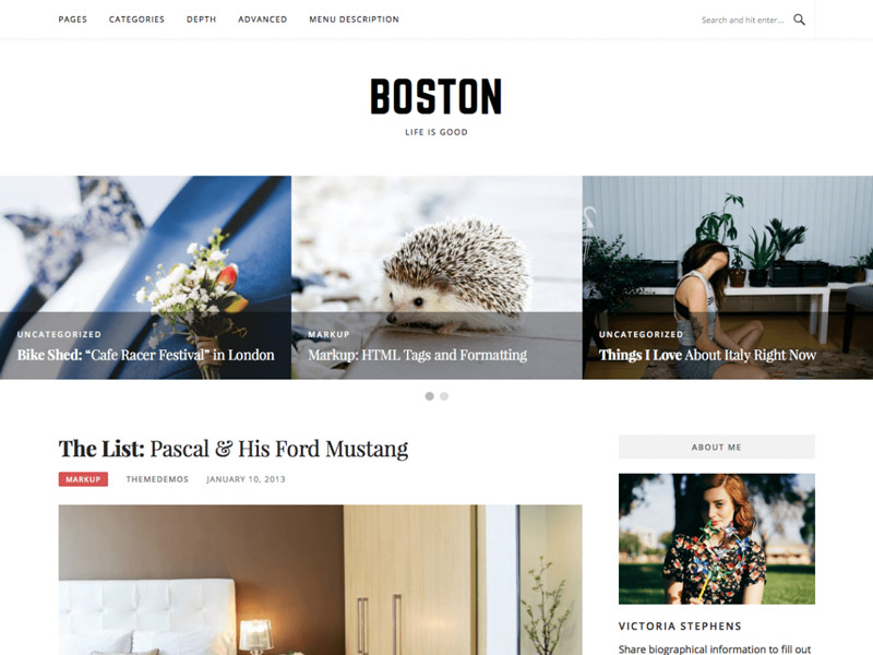
Boston is a pure blogging theme that was optimized for speed and SEO. The background is the only customizeable option. A demo is not available yet, however, the WordPress preview can be used for that.
Created by: WPStash
License: Free for private and commercial purposes | GNU General Public License
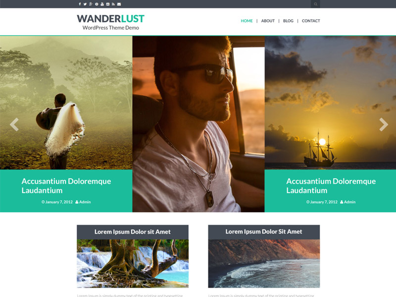
Wanderlust is a theme that was designed specifically for hikers, travellers, and other people that like a good voyage. However, it should work for all blogs that work with large format photos. Colors and the logo can be adjusted, and the social media links were kept in mind as well.
Created by: protravelblogs
License: Free for private and commercial purposes | GNU General Public License
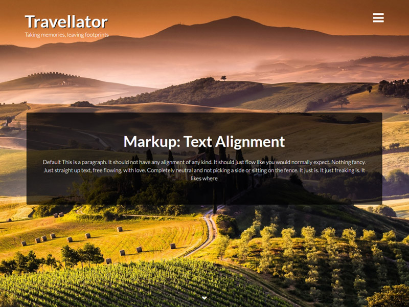
Travellator is a lovingly designed theme for globetrotters and travellers. Of course, it also suits websites that focus on the presentation of large format photos. The logo, the colors, social network links, as well as the Favicon are customizeable.
Created by: protravelblogs
License: Free for private and commercial purposes | GNU General Public License
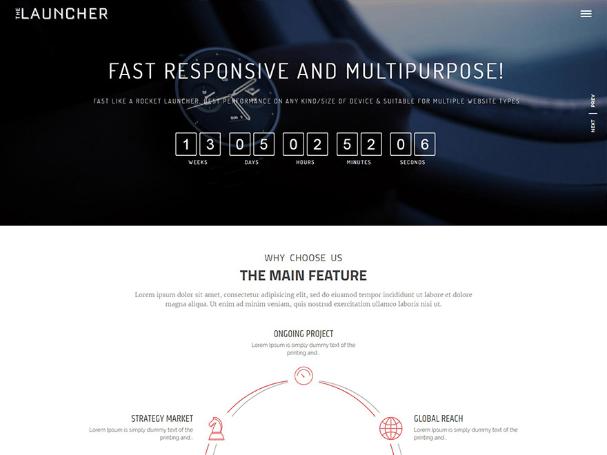
The Launcher is a one-page theme with many customization options that let you create “coming soon” pages with a counter. On top of that, it’s also suitable for the construction of landing pages and any kind of one-page websites. It is very adjustable and comes with lots of features, like a slider and countdowns, for instance.
Created by: protravelblogs
License: Free for private and commercial purposes | GNU General Public License
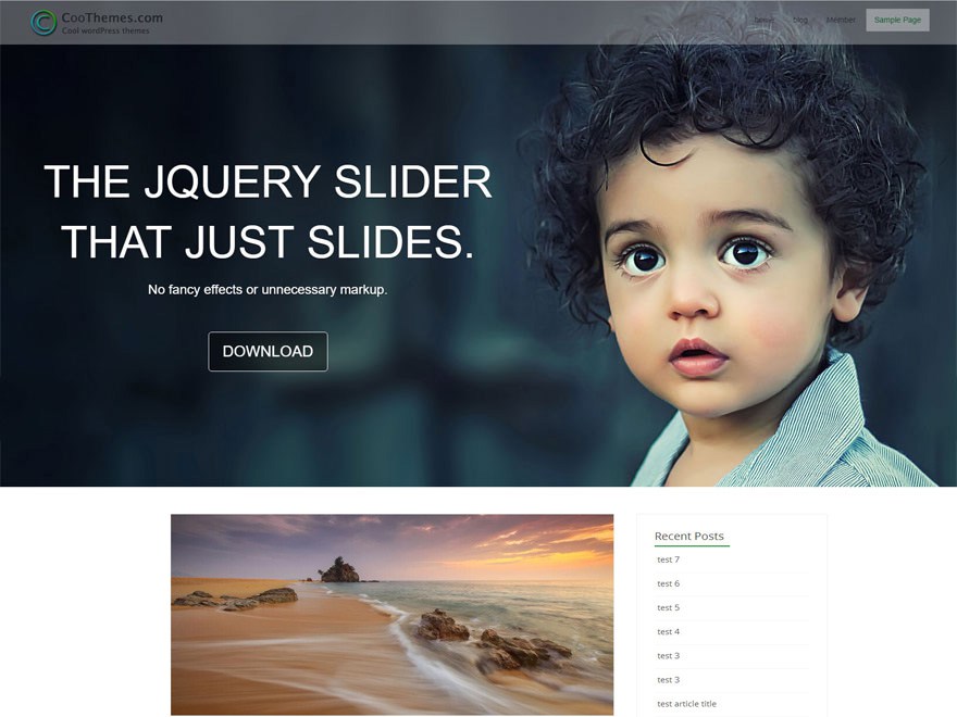
Acool is to be considered a business or corporate theme. Background, header, colors, slider, and the links for social networks can be customized. A portfolio area is available as well.
Created by: coothemes
License: Free for private and commercial purposes | GNU General Public License
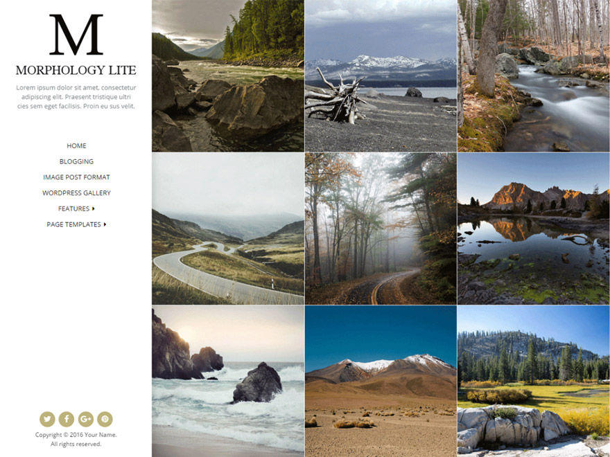
Morphology Lite offers a lot for being a free theme. It should be suitable for portfolios, personal blogs, as well as any type of creative business. The design should also work as a website for photographers. It offers custom color choice, four blog styles, adjustable sidebars, special templates, custom backgrounds, and much more.
Created by: Shaped Pixels
License: Free for private and commercial purposes | GNU General Public License
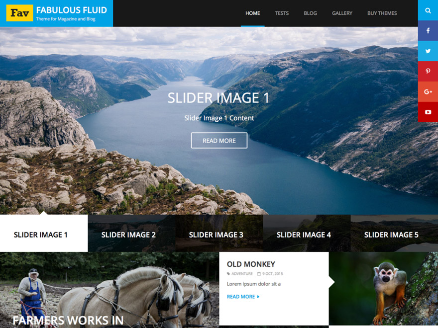
Fabulous Fluid is a theme for personal blogs, photographers, other creatives, and many more areas of application. It provides a couple of widgets, an adjustable layout, custom colors and fonts, unique grids, a slider, share buttons, breadcrumb navigation, and a lot more.
Created by:Catch Themes
License: Free for private and commercial purposes | GNU General Public License
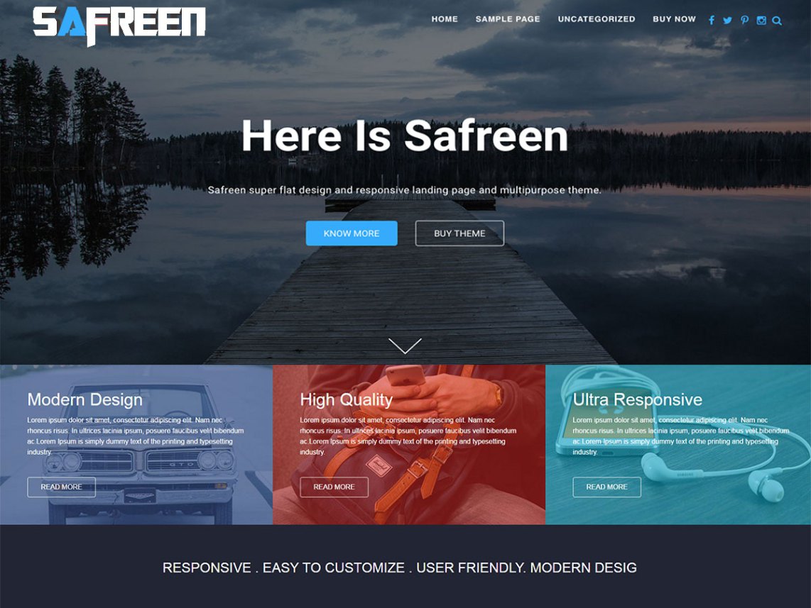
Safreen considers itself a multi-purpose theme. Not only does it come with an appealing design, but it also offers a bunch of theme options. Colors and fonts can be chosen, and plenty of widgets make for a detailed customization to fit your personal needs.
Created by: Imon Hasan
License: Free for private and commercial purposes | GNU General Public License
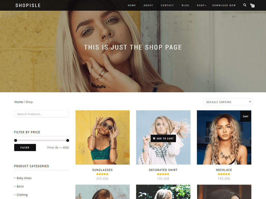
Shop Isle is a dedicated theme for online shops based on the popular WooCommerce plugin. The theme provides a full-fledged and appealing shop layout for many types of products. You’re able to alter the header, background, as well as the colors.
Created by: Codeinwp
License: Free for private and commercial purposes | GNU General Public License
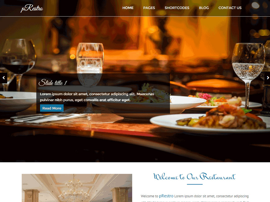
pRestro is a theme with a lovingly design made for restaurants, cafés, bistros, and anything similar. The design offers a full-screen slider, an adjustable background, and a couple of unique widgets.
Created by: themesware
License: Free for private and commercial purposes | GNU General Public License
The background-attachment property has never seemed all that useful to me. I have always looked at it as some sort of old school design trick from the GeoCities days to get a repeating background to stay in place during scroll.
Turns out a background with a fixed position can be much more useful than that. Adding the single line background-attachment: fixed; to an element can actually give us some power for making smooth, graceful transitions between content in a way that adds to the user experience without any other dependencies, like Javascript or intense animations.
The Faux Slide Deck
Making a presentation? A single page broken up into “slides” is pretty straightforward:
Remember when classrooms had overhead projectors and teachers would have to create what they called transparencies to present layered information? We can do the same!
We do advertising here on CSS-Tricks! We like it. It’s part of the wheel of life on the web. Products and services co-existing with publishers in a global ecosystem, where everyone focuses on what they are good at.
We actually try to make advertising better here. Nothing obtrusive, no garbage products or services, no tracking, sponsors are marked as such. Besides allowing us to sleep at night, it makes the advertising more effective.
One of the most effective types of advertising here is sponsored posts. I can work with you directly on the post to help get at the heart of how your product or service could benefit us front end developers and designers around here. You should book one.
Brutalism in web design is raw, rough, unpolished and everything that today’s standard of the aesthetically beautiful website isn’t. It goes way beyond minimalism (which will still be beautiful when designed properly) into a bare-knuckle and extremely stripped-down design that’s been called downright ugly by some.
In short, it’s a design trend that just isn’t supposed to do well in today’s best practice of usable-meets-modern…yet it is. At the very least, brutalism is making designers and everyone else take note in a way that’s very unexpected, given the irony of how this purposeful design choice is a throwback to the brutish design that did well in post-World War II Europe, where the need to rebuild inexpensively lead to cold, stark buildings that stood out like a sore thumb.
The fact that brutalism in web design is on many people’s radars now is also indicative of pushback from some design circles against today’s pretty web that’s obsessed with the harmony of colors, shapes, lines and design elements.
Where did brutalism come from?
To fully understand brutalism in web design, we have to realize that its roots go back decades, to architecture and industrial design. It was very popular from the 1950s to approximately the mid-1970s and was popular with both institutional and government buildings, which is perhaps no surprise given that both types of buildings are sometimes associated with harshness, coldness and a certain kind of ugliness that’s far from comforting and easy on the eyes.
In fact, brutalism as a word comes from the French for “raw,” which is another apt way of describing sites that are stripped-down and have no frills or aesthetic concern.
Some people may call Brutalism a design trend, others consider it anti-design. The concept applied to web design only came to the fore recently, with the popularity of brutalistwebsites.com, a site devoted to showcasing the movement.
Brutalist websites going viral
The trend was first picked up by Hacker News, but was quickly taken up by news sites including the Washington Post and CBC.
Pascal Deville, creative director at a Zurich ad agency, started brutalistwebsites.com to show that designers and developers can still create engaging sites without having to use the long list of design best practices that many want to follow in today’s web. From this philosophy, we glean another insight into the approach of brutalism: It’s a sort of rebellion against the conventional way many designers approach designing for the web today.
Interestingly, Deville makes the point that brutalism doesn’t just apply to the design of a site—it also applies to the backend work. In other words, to him, brutalism is just as much about the way a site is built, so if a site is a rougher, handmade, HTML site, that qualifies as brutalism, too.
Brutalism is therefore a design and development approach that touches on all aspects of the site-creation process. Your site’s not really brutalist if it just has a really rough and raw look, but its code uses dozens of libraries. Similarly, your site can’t qualify as brutalist if it was handmade, but it has a very polished and attractive look that promotes all the best practices of corporate design.
Well-known sites employing brutalism
It might seem that Brutalism in web design is a relatively new trend, but actually it’s been a thing all along; it’s just that design journalists have now started taking it seriously. There are actually some well-known sites that have been proud standard bearers of this design choice for quite some time.
Apple’s WWDC16
The website for Apple’s 2016 Developers’ Conference had what some would argue is a brutalist design scheme. This represents a further distancing from the old excesses of skeuomorphism. The site features:
a lot of negative (white) space;
very plain typeface that’s designed to mimic lines of code;
very few on-page elements overall.
Serge Khineika’s Bio Page
Serge Khineika is a UX and web designer whose professional website has a very raw and crude appearance. Interestingly, it as a very neat scrolling effect that reveals more edits, doodles and page elements as you scroll down. His site has the following brutalist elements:
an enormous amount of white space;
a very basic font style;
one black-and-white picture;
graphics meant to resemble old-school edits with a pen and paper.
37signals
Basecamp is a web-application company that used to be known as 37signals. The 37signals site is another memorable example of brutalism in web design since it was so stripped-down and bare-bones that it went way beyond minimalism just to the very bare necessities. Here’s what made its old site a study in brutalism. It features:
a lot of white and negative space;
ultra-simplistic typeface;
very basic illustrations and graphics;
very little text.
Y Combinator’s Hacker News
It’s highly appropriate that the site that caused the brutalism in web design trend to go viral, is also a brutalist site in and of itself! Hacker News is a no-frills, no-gimmicks site that delivers a raw, line-by-line page of trending topics with barely any color or consideration to aesthetics:
lots of white or negative space (even if part of it functions as a border);
very small typography that’s so hard to read users have to practically squint;
very simple navigation menu and footer;
only three colors on the site.
Brutalism as a design choice
Brutalism in web design has been around for a long time, but it’s really exploded into the public eye in recent months. If we broaden things past web design and go into architecture, then this design approach has been around since the 1950s.
What the body of evidence around brutalism makes clear, though, is that it is a design choice, above all else. It’s a knowing rejection of everything that’s attractive, easy on the eyes, and comfortable; and instead supports stark, raw ugliness in a sort of rebellion against design best practices that are meant to make us feel at ease and gives us something aesthetically pleasing.
As a result, brutalism is compelling, if for nothing else than to provide an alternative to the safe confines of design conventionalism.
There is UI animation, and then there is good UI animation. Good animation makes you go “Wow!” — it’s smooth, beautiful and, most of all, natural, not blocky, rigid or robotic. If you frequent Dribbble or UpLabs, you’ll know what I am talking about.
With so many amazing designers creating such beautiful animations, any developer would naturally want to recreate them in their own projects. Now, CSS does provide some presets for transition-timing-function, such as ease-in, ease-out and ease-in-out, which add some level of smoothness and realism, but they are very generic, aren’t they? How boring would it be if every animation on the web followed the same three timing functions?
Those that work with WordPress are familiar with this problem. The internal search function is not the best. So an obvious idea is looking for plugins that fix just that. Today, I’ll show you ten of these WordPress plugins. This way, you’ll be able to provide a better WordPress search for your readers.
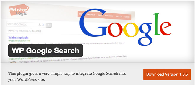
WP Google Search integrates the popular Google search function for websites into your blog. If you want to try the Google search before the installation, start a search here on Noupe, as we’re using Google.
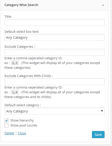
The plugin lets you create a search in which you get results from specific categories. You can also exclude categories and subcategories. It is possible to place a standard category.
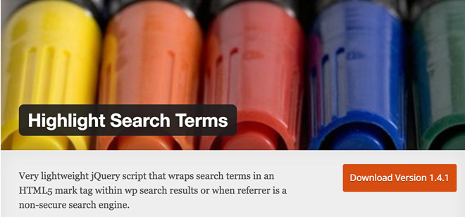
A lightweight jQuery script makes sure that the found search terms are highlighted in color. This lets the searcher see if the shown results are relevant, or if they don’t correspond with the entered search request. Useful.
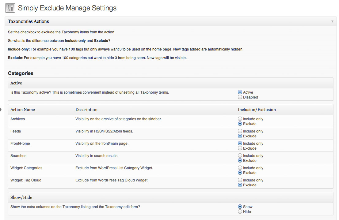
Simply Exclude allows you to determine in which taxonomies or post types users are allowed to search. You get to choose whether you want to include or exclude results from authors.
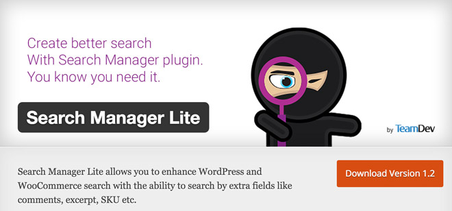
The Search Manager expands the search function of WordPress and, if available, WooCommerce. Within WordPress, the plugin also allows the user to search through the comments, tags, categories, and excerpts.
On WooCommerce, you get to search in the short description, product comments, product categories, and within the SKUs.
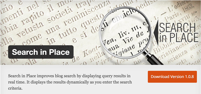
Search in Place extends the internal WordPress search by the option to display real-time search results. As soon as someone searches for something, the results are shown during the search process.
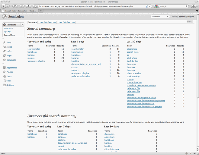
Search Meter adds a tracking of search terms entered by the user to the internal WordPress search. If you ever wanted to know what your visitors search for, you’ll get to do just that with this plugin. It creates detailed statistics for the latest search requests, as well as for the past days, weeks, and months. This could prove to be very useful.
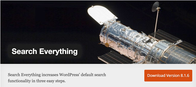
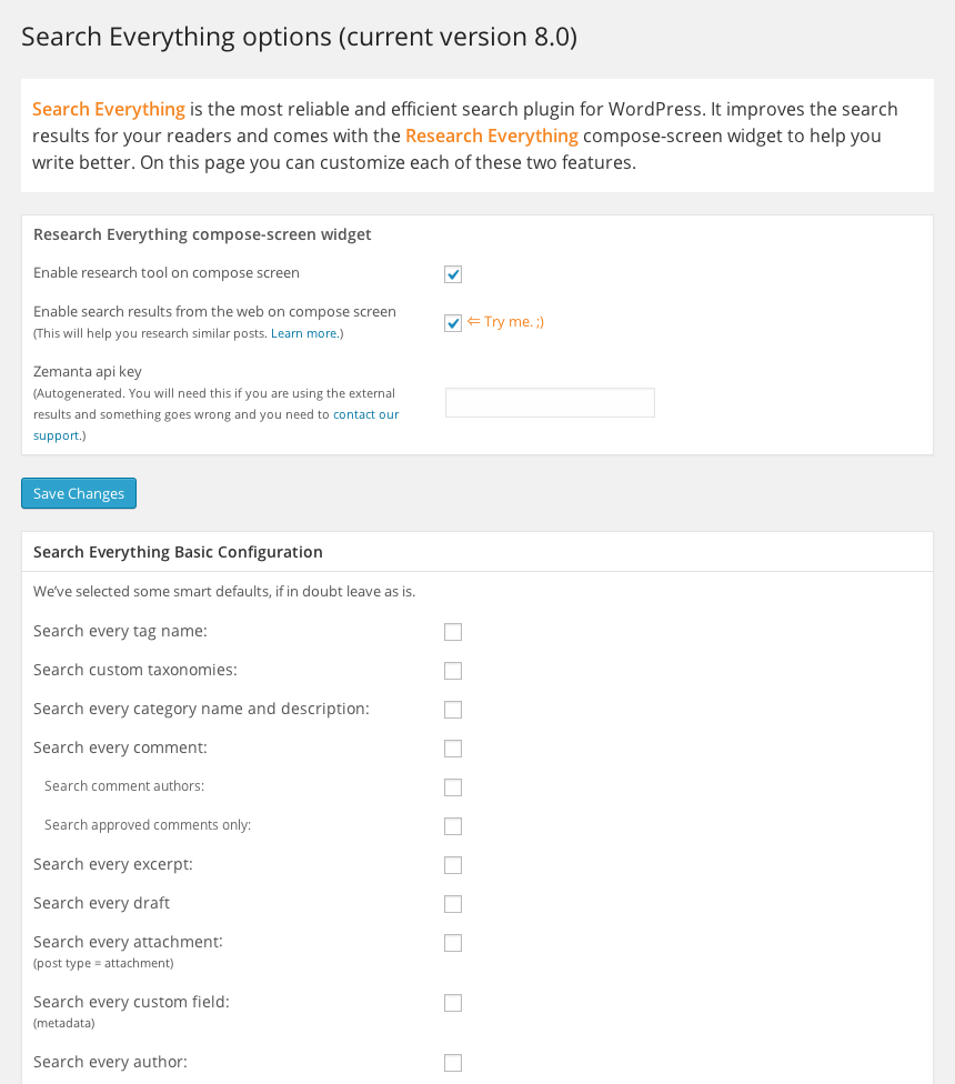
Search Everything is a powerful plugin that provides plenty of functions. Firstly, it offers the so-called search highlighting, which will mark the found search terms in color. It can search every page, every day, every post, custom taxonomies, all categories, comments, drafts, excerpts, attachments, and so on.
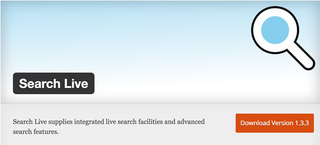
Another plugin that displays results while the user is typing the search request in the search form. There are two unique things about this plugin: Firstly, the live search also shows the article pictures in the results. Secondly, there’s a shortcode that you can use to have a search box displayed wherever you want to.
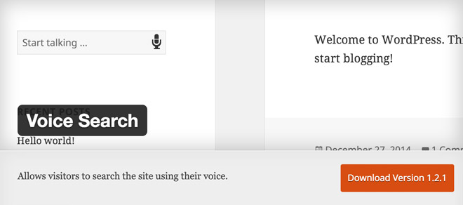
Is this plugin a part of the future of websites? Voice Search is some type of Siri for WordPress and allows users to conduct a search using their voice. Unfortunately, only Chrome is supported so far. However, both desktop and mobile are supported.
Conclusion
Today, we’ve found a couple of interesting plugins for you. Voice Search is outstanding. I’ll definitely try it out. Search Meter seems to be a good pick for larger blogs, as it might allow you to write articles according to users’ search requests. Which plugin do you like?


