Selling WordPress themes is one of the most reliable ways to make money online as a WordPress theme developer. Unlike offering WordPress theme development service, selling themes let you open a steady stream of passive online income.
In fact, if you’ve been a freelancing for a while, you’ll know that working on client projects is not always fun. At times, the job can be tedious especially if you’re not good at dealing with various clients. Besides that, you’ll also need to spend a significant amount of time for hunting down new clients.
And those hours you put in for finding new clients are typically non-billable.
On the other hand, you can find many successful examples of making a full-time income by selling WordPress themes. But that doesn’t mean that selling is easy. Ideally, it is going to be tougher than making a living by offering freelance development services.
But in the long run, it is going to be more profitable than working on freelance projects.
In this post, I’ll explain everything you need to know about selling WordPress themes for profit.
Preparation
Before jumping in to start creating an excellent theme to sell, you’ll need to research the market and brainstorm different selling options.
To get a plan, try to find answers for the following questions.
What kind of theme should you create? In what niche/category?
Where to sell your themes?
Who are your ideal customers?
How to sell your theme to masses?
Sell WordPress themes- Freemium model
It’s true that WordPress is the CMS of the choice of most websites out there, but that doesn’t guarantee that the theme you create will gain traction amongst WordPress users. As thousands of awesome WordPress themes are available in the market, it is harder to sell a premium theme especially if you’re just starting out as a premium seller.
One of the ways to gain traction amongst the users is to create a free WordPress theme at first. It may take some time to gain an initial traction, but once you took off, you can release a premium theme with premium features and support.
Leverage the community of WordPress official theme directory
First things first- create a WordPress theme and submit it to the WordPress official theme directory. WordPress.org allows you to add a link to your theme’s homepage right from the free theme page.
Once your theme started gaining traction, you can expect a significant amount of traffic to your website from the theme page.
Create a landing page and a demo site: Create a landing page specifically for selling your premium theme. For a quick solution, you may consider installing any of the landing page plugins on your website. You’ll also need to create a demo site so that users can figure out how it looks like.
Track onsite behavior: Install a free plugin like Leadin to track the onsite behavior of your potential customers. This plugin also tells you more details about them like what pages they’ve visited, when they return and what social networking sites they are on. The more data you have, the better marketing decision you can make to convert free users into customers.
Create a membership site: Aside from selling premium themes, you can even entice your potential customers to join your premium membership site. This can be a premium club for accessing all of your premium themes with dedicated support.
Promote your premium theme: One of the best things about freemium business model is that you can promote your premium theme within the free theme. That means as long as your customer is using your theme, you’ll be able to promote premium themes.
Sell on marketplaces
Selling your premium themes on a crowded marketplace is probably the easiest way to make a living as a seller. Unlike freemium model, you don’t need to offer anything for free. All you need to do is to start creating products and list it on marketplaces.
Below are a few popular premium WordPress themes marketplaces.
Themeforest is one of the best premium marketplaces for buying and selling WordPress themes. You can find a lot of Themeforest success stories out there similar to that of Ivar Rafn. In his first year as a WordPress theme seller, Ivan has made $97000 in sales by launching 4 premium WordPress themes and one HTML template.
All you need to do is to create a premium theme and launch it in the marketplace. Of course, you’ll need to ensure that your product is adhering to the quality guidelines of the marketplace. The design is the most important part. In order to get accepted, you’ll need to make it unique in terms of visual hierarchy, typography, semantics, etc.
The downside is that Themeforest is saturated. Unless you create something innovative, you can’t expect many sales to roll in. However, there is still room for more themes. Take a look at the categories list and create a theme in a category where competition is low.
Alternatively, you can upload your work on other less crowded marketplace and check if it helps you bring in more sales.
Sell on your own website
One of the biggest advantages of selling your theme on your website is that you get full control on what you sell and are not restricted by Terms of Services of any third-party platforms. In addition, you can keep all of your profits without sharing it with the marketplaces.
While selling on your own website is definitely more rewarding, you should look at the whole picture before jumping in to start selling on your own website.
The exposure you get from a marketplace is priceless, which you can’t achieve by selling your products on your own especially if your theme isn’t revolutionary or if you don’t have a strong reputation or big audience in place.
Below are a few tips to follow before you start selling on your own website
Grow a user base: If you’re looking forward to self-hosted selling, you’ll need to have a solid user base at first. You can grow your user base by leveraging one of the community-powered theme marketplaces before rolling out a self-hosted selling platform.
Create a marketing plan: ‘If you build it, they’ll come’ strategy could be disastrous. Instead, have a solid marketing plan and stick to it.
Do you plan to start creating premium themes? Which one is your favorite business model? Share your thoughts with us in the comments section.
Virtual reality has become a thing again! All of the usual suspects are involved: HTC, Microsoft, Samsung, and Facebook, among others, are all peddling their respective devices. These predictable players shouldn’t be having all the fun, though!
You make websites. You know a bit of Javascript. You have a mobile device. You can have a slice of this virtual pie too! WebVR is here, and it’s not that difficult to learn. If you already know the basics of three.js, you might be surprised at how simple it is to get it going. If you haven’t ever used three.js, this will be a fun way to learn it.
I’ve been making websites for quite a while, but only in the last couple of years have I explored the use of front-end technologies for more than just websites. Having spent some time using tools such as canvas and three.js, my mind has been opened to the wonderful potential this side of the web can offer us as developers (and artists!).
Polyop – Ceremony. Music video created with three.js and WebVR controls
I’ve taken the path of making trippy visuals with Javascript and am now one-third of audio-visual techno act, Polyop, because of it. As part of a vinyl release, we’ve created a 360 degree music video built with three.js and webVR controls. I’d thought I’d share with you the basic concepts I picked up while developing it.
But I don’t have those fancy goggles
There’s no denying that not having the kit seems like a barrier to entry. However, you don’t need any sort of extra hardware for most of this tutorial so you can still have fun moving your phone around exploring the 3D world you’ll create.
To play with the VR portion of this tutorial, you’ll want some sort of VR Viewer. The cheapest way to do this is to buy a headset that turns your mobile phone into a VR headset, you simply slot it your phone in and away you go. These headsets range from a £3 to £50 so have a look around to see what best suits you and your budget. “Google Cardboard” is the term you’ll hear about these types of devices.
What we’ll be making
Here’s a demo. All the source code for the steps we’ll be taking is available on GitHub too.
If you’re viewing on a mobile or tablet, you can look around by moving the device. If you’re on a laptop, you have to click and drag. If you have a VR Viewer for your phone, there’s an option to go into actual VR mode by clicking on the “start VR” button.
Those who have some experience with three.js may want to skip this part and head straight for the VR stuff.
Three.js has become the web dev’s favorite library for creating 3D scenes. Don’t let that extra dimension scare you; it’s not so difficult to get going! Before we even think about VR, we’re going to make a simple 3D world that has a bunch of cubes, slowly spinning.
If you’re new to three.js I recommend taking a look at the “creating a scene” tutorial included in the documentation. It goes into a little more detail than I will, and you’ll have a spinning cube up and running in no time. Otherwise feel free to jump straight in here, we’ll still be going quite slow.
Setup
Firstly we need to set up a document with the three.js library included. You can install with Bower, npm, or keep it simple and get the file from a CDN.
Please note that the three.js API changes from time to time. This tutorial has been created with r82 and while it’s always good to use the newest version of any library, for our purposes it may make sense to use the same version used in the examples.
<!DOCTYPE html>
<html lang="en">

  <head>
    <title>WebVR Tutorial</title>
    <meta name="viewport" content="width=device-width, user-scalable=no, minimum-scale=1.0, maximum-scale=1.0, shrink-to-fit=no">
    <style>
      body {
        margin: 0;
      }
    </style>
  </head>

  <body>
    <script src="lib/three.js"></script>
    <script>
      // All scripts will go here
    </script>
  </body>

</html>
Now we need to set up the scene, the camera, and the renderer. The scene acts as a container for all objects to go inside. The camera is one of those objects and gives us a point of view from inside the scene. The renderer takes the view from the camera and paints it onto a canvas element.
// Create the scene and camera
var scene = new THREE.Scene();
var camera = new THREE.PerspectiveCamera( 75, window.innerWidth / window.innerHeight, 1, 10000 );

// Create the renderer
var renderer = new THREE.WebGLRenderer();

// Set the size of the renderer to take up the entire window
renderer.setSize( window.innerWidth, window.innerHeight );

// Append the renderer canvas element to the body
document.body.appendChild( renderer.domElement );
We’ll also need to tell the renderer to render the scene:
// Render the scene
renderer.render( scene, camera );
For now on, you should make sure this rendering happens last in your code. Later we’ll be firing it every frame inside of an animate() function.
At this point, your scene should be rendering with a canvas element on the page, but all you’ll see is black.
Let’s add a cube to the scene
It comprises of a geometry and a material, held together in a mesh:
// Create cube
var material = new THREE.MeshNormalMaterial();
var geometry = new THREE.BoxGeometry( 50, 50, 50 );
var mesh = new THREE.Mesh( geometry, material );

// Add cube to scene
scene.add(mesh);
Now you should see a cube being rendered, yay!
Let’s make lots of cubes by wrapping the code in a for loop:
var cubes = [];

for (var i = 0; i < 100; i++) {

  var material = new THREE.MeshNormalMaterial();
  var geometry = new THREE.BoxGeometry( 50, 50, 50 );
  var mesh = new THREE.Mesh( geometry, material );

  // Give each cube a random position
  mesh.position.x = (Math.random() * 1000) - 500;
  mesh.position.y = (Math.random() * 1000) - 500;
  mesh.position.z = (Math.random() * 1000) - 500;

  scene.add(mesh);

  // Store each mesh in array
  cubes.push(mesh);

 }
You’ll notice that I’ve also given each cube a random position by changing their position property. X,Y and Z refers to their positions along each axis. Our camera is at position (0,0,0), in the center of the scene. By giving each cube a random position along each axis (between -500 and 500), the cubes will be surrounding the camera in all directions.
I’ve also stored each cube’s mesh in an array, which will allow us to animate them. We need to create an animate() function that will fire every frame:
function animate() {

  requestAnimationFrame( animate );

  // Every frame, rotate the cubes a little bit
  for (var i = 0; i < cubes.length; i++) {
    cubes[i].rotation.x += 0.01;
    cubes[i].rotation.y += 0.02;
  }

  // Render the scene
  renderer.render( scene, camera );

}
The animate() function iterates through the cubes array and updates the rotation property of each mesh. It will constantly loop every frame because we’re calling it recursively using requestAnimationFrame. You’ll also notice I’ve moved renderer.render() inside this function, so that the scene is being rendered every frame too.
Make sure you call animate() somewhere in the script to start the animation loop.
That’s our scene done! If you’re struggling, have a look at the source code for this step, I’ve tried my best to include descriptive comments. You’ll notice I’ve rearranged the code slightly from the snippets in this article, along with a better use of variable names.
Time to get virtual
Before we get started, it’s good to know what we’re actually playing with! The WebVR website sums it up very well:
At the moment the API only works in special browser builds, which may be fun to play with, but are lacking an audience. Luckily for us, however, the WebVR Polyfill swoops in to save the day. It makes your VR creations available on mobile devices via Google Cardboard (or similar viewers), while also allowing users to view the same content without a VR viewer. You should know that the polyfill doesn’t support any other VR devices, such as the Oculus Rift or HTC Vive.
To use the polyfill, include the script in your page, before all other scripts. The next two parts to this tutorial won’t work if you don’t have it included.
Controls
A critical component to any virtual reality experience is capturing the motion of the user and using that information to update the orientation of the camera in the virtual scene. We can achieve this in three.js with the VRControls constructor. VRControls doesn’t come built with the library but as an extra you can find in the repository. You should include it in a separate script tag after the three.js library.
You’ll be surprised at how simple it is to implement. Firstly, create the controls, passing in the camera:
var controls = new THREE.VRControls( camera );
This now means that the controls will be affecting the camera, which is essentially just an object in the scene like any other mesh. You could use these controls to rotate a cube rather than the camera if you wanted to.
In your animate() function you’ll also need to tell the controls to update every frame:
controls.update();
And that’s it! If you look at what you’ve made using a mobile device, you should be able to “look around” the scene by moving the device. On a laptop without these capabilities, you’ll have to click and drag with the mouse, this click and drag fallback is an extra bonus we get with the WebVR polyfill.
At this point you may already be satisfied with what you’ve created. Looking around using the motion of your device is super fun and opens up all sorts of possibilities for making something cool. When making the interactive video for Polyop, I felt this behavior was immersive enough and chose not to introduce the stereoscopic feature.
However I promised actual VR and so that’s what you’re hear for! The final piece of the puzzle is to get three.js to render two separate images, one for each eye. We’ll do this using the VREffect constructor. Just like you did with VRControls, include the script and away we go. First we need to define the effect:
effect = new THREE.VREffect(renderer);
effect.setSize(window.innerWidth, window.innerHeight);
We define a new VREffect, passing in the renderer. From now on we don’t need to deal with the renderer, it will be dealt with by VREffect. That’s why we’re now setting the size of the effect instead of the renderer. Importantly, we need to swap out the way we render in the animate function:
effect.render( scene, camera );
We’re now telling the effect to render, not the renderer. At the moment nothing will have changed. The VREffect simply takes in the renderer you give it and renders as normal when you tell it to. To get the stereoscopic effect we’re looking for; we need to do a little more.
Firstly, we need to search for any connected VR devices. Because we’re using the WebVR Polyfill, all we get is one “device” connected, which will be Google Cardboard. Here’s how we get it:
var vrDisplay;
navigator.getVRDisplays().then(function(displays) {
    if (displays.length > 0) {
     vrDisplay = displays[0];
   }
});
navigator.getVRDisplays returns a promise function which will be invoked once it has finished looking for devices. In this instance, we take the first and only item in the displays array and define it globally as vrDisplay so we can use it elsewhere. If we weren’t using the polyfill, there might be more than one device in the array, and you’d probably want to add in some user functionality to choose between them. Luckily today we don’t have to accommodate for little Johnny and his fifty different VR devices.
Now we have our single device defined as vrDisplay, we need to fire it up! The method to do this is requestPresent, and we’ll give it the canvas element we’re rendering to.
To avoid abuse of the webVR API, it is required that you wrap any calls of requestPresent in an event listener. This one fires on the click of a button element with an ID of “startVR”.
The last thing we need to do is make sure everything renders properly after a resize of the renderer. This happens not just when the screen size changed but when we switch in and out of VR mode.
// Resize the renderer canvas
function onResize() {
effect.setSize(window.innerWidth, window.innerHeight);
  camera.aspect = window.innerWidth / window.innerHeight;
  camera.updateProjectionMatrix();
}

// Resize the renderer canvas when going in or out of VR mode
window.addEventListener('vrdisplaypresentchange', onResize);

// Resize the renderer canvas if the browser window size changes
window.addEventListener('resize', onResize);
The onResize() function resets the size of the effect (and therefore the renderer) while also updating some properties of the camera.
Congratulations! You’ve officially entered cyberspace. What to do with your new powers?
Why not build on the work we’ve already done today? Perhaps try and transform the scene into something a little more aesthetically pleasing by using lighting and different geometries/materials? Maybe you could even try making the objects bounce to music using the Audio API? To give you an idea, here’s one I made earlier.
Web surveys are important tools that websites and businesses can use to gauge important feedback from their site visitors and customers. Web surveys are also somewhat unsung elements of a site because their role is primarily to collect data instead of being a main feature.
In e-commerce, and in any business really, determining what your customers want is largely based on directly asking them. Plus, doing so will also give you amazing insight into the user experience—what’s working, what’s not, and what could and should be improved!
So, as you see, using web surveys offers a lot of benefits. Of course, designing them properly has a lot to do with whether or not they’re successful for any site.
We’re going to skip the part about defining your survey’s objective and being clear on the type of feedback you want since that’s a given for any successful survey. Rather, we’ll only focus on the survey-design aspect.
1) The use of images
You probably have a belief in your head that a web survey should be mostly just a bunch of rote lines all up and down the webpage, with each line asking a question. While that’s definitely the classic or old-school idea of a survey…designing it in such a stark and empty fashion won’t do any wonders for its conversion rate!
Using images throughout your survey—intelligently spaced and breaking up different sections—has been proven to influence the conversion rate, but also other, very important survey behaviors.
Survey Monkey ran an interesting experiment tied in to the 2015 UK elections. They had three treatments of their survey design, each with three, unique images—which was the only constant variation in the design (they phrased the question of who respondents wanted as PM differently in two of three designs). They wanted to determine how the click and completion rates were affected.
The images they used were:
The entrance to 10 Downing Street (where the British PM lives).
A color-coded map of the UK, colored by party representation.
Rosettes (ribbons for military decoration).
The map image performed the best in terms of the click rate, which was 9.3%. The Downing Street entrance did the worst with only 5.9%, and the rosettes has 8.2%.
On the completion rate side, the images didn’t really affect this stat, as both the map and Downing Street images had a completion rate of 89.9% while the rosettes did a bit better with 90.9%.
This makes a lot of sense, as images have been proven to affect the conversion rates of sites. On the web, using images in your design always leads to better results.
So when you’re designing surveys, don’t just include images, but think carefully about the ones you’re using. In surveys, they should relate somehow to respondent characteristics for maximum impact.
2) Understanding the limitations of mobile
When it comes to mobile, surveys are a double-edged sword. On one hand, more people are now using mobile than desktop, so more people than ever will be taking your survey on their smartphones. Unfortunately, the survey user experience is just worse on mobile for a number of reasons.
The big problem is time. Surveys on mobile take users anywhere from 11% to 50% longer to complete than those on desktop. Users and customers today value speed more than anything in UX, so the length of time for survey completion on mobile is definitely a big cause of friction.
This slowness boils down to three reasons in particular:
Server connections on mobile are just slower than high-speed, desktop Internet.
The smaller screen sizes of mobile make it harder to read and get through survey questions.
Users are just more distracted on their smartphones, particularly when attempting to do surveys in transit.
What can be done about this slow mobile speed?
For starters, don’t use matrix questions, which are those multiple questions shown on a grid. You’ve seen them anytime you’ve ever had to answer a survey question, but they aggravate the UX by forcing users to scroll up and down and left and right. Doing all of this on a small smartphone screen is clearly a nuisance. Instead, forego multiple choice questions and answers with more direct questions that only require a yes or no answer from users (and, therefore, no need for a grid).
Keep the length of your surveys relatively short to increase completions.
Of course, remember to always test your survey across various devices: iOS, Android and desktop.
Above all: Design for user experience
Designers and developers are always taught to first design for the user experience. Designing a web survey can be a tad tricky since you’re not dealing with a conventional page, but it’s a great chance nonetheless to apply all that you know about designing for great UX.
The Laboratory for Automation Psychology and Decision Processes at the University of Maryland provides a set of helpful guidelines in web-survey design. The basic principles all have to do with presenting the survey in a user-friendly way.
Some helpful pieces of design advice include:
Putting your logo at the top left of the page and the navigation menu vertically, on the left side of the page.
All questions and answers should be left-aligned.
The response format should be positioned to the left of all response categories.
Besides these, it’s always a good idea to use design elements that encourage easy reading since your users/survey respondents will be scanning the length of the page to read the questions and, hopefully, complete the entire survey.
Further good practices include:
Using enough white space between the individual questions so users can focus on one question at a time without feeling like they have to squint or try hard to guess what the question is asking.
Using a size of font that’s easily readable on the web, especially on smaller screens for mobile; according to research from UXmatters, that would at least be 4-point for small mobile devices and 6-point for bigger mobile devices.
Using, if possible, numbers and/or bullet points to further break up the questions into smaller, more easily digestible chunks of text that’s easier to skim.
Overall, the web survey you design should be a joy to move through and answer—not a detestable chore that your users won’t finish.
Points to consider
Web surveys can be an effective tool to get feedback from users, readers, clients and consumers of any given site. The catch is that they have to be designed for usability, so the respondents don’t abandon the survey before completion. You want good, usable data from any survey that you create!
So remember some important guidance:
Definitely use images, but be choosy and only use those relevant to survey respondents.
Always design your survey for mobile since more and more people use mobile even to answer surveys these days.
Follow basic UX principles to ensure survey readability and usability.
When designing a landing page to promote a product or service online, you’re ultimately pointing users toward one goal. That goal most often relates to generating business via sales or leads. You may want users to purchase a product immediately, or you may simply want them to sign up for a mailing list. Whatever the goal, you want to ensure that every piece of the user experience works toward fulfilling that goal.
If you don’t yet have goals in mind, start by defining goals. Are you seeking to generate a 10% increase in qualified leads? Are you looking to build sales by 20%? Establishing clear key performance indicators based on what will benefit your business will ultimately help you understand how to properly approach a landing page.
On St. Nicholas’ day 2016, the newest version 4.7 of the popular WordPress CMS was released. As I run all my projects via WordPress, I first installed the update on the project where a crash would have been the most bearable. But only good things happened.
Those that have been using WordPress since 2005, like me, know that not all updates in the more than 10-year long history went smoothly. More than once, I’ve blown pages out of the web because I dared to load an update. In the first years of Automattic offering the automatic update, I backed away from it. Only for about two years now, have I been able to click “update” in the backend without attacks of sweating.
Although all the changes over the past years made sense and drove the product forward, they really didn’t impress me. This may be due to my subconscious bias. I’m just not able to make use of deep changes to core features that I don’t even understand. If there are changes to design features, however, I’ll be excited right away. And the new version 4.7, named after the jazz singer Sarah “Sassy” Vaughan, did just that.
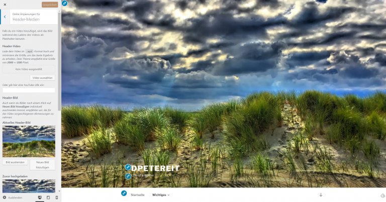
New Default Theme and Improved Customizer
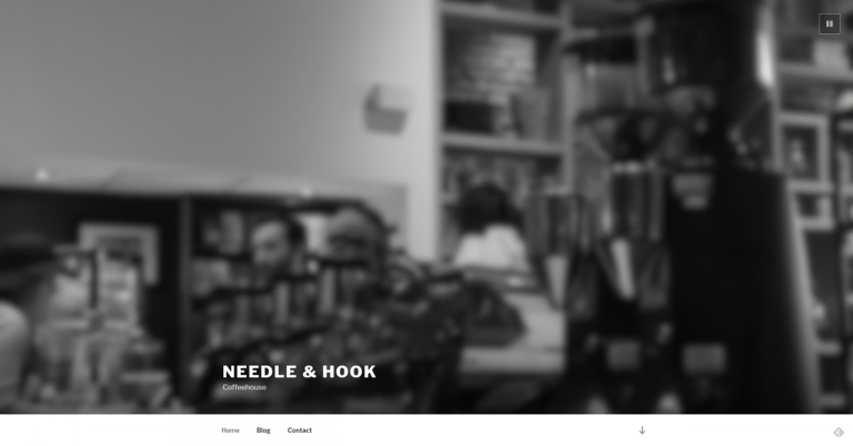
The new improvements to the Theme Customizer in combination with the new default theme “Twenty Seventeen” are what fascinates me. The new theme actually requires the latest version and is not downwards compatible to previous ones. This has a lot to do with the fact that it supports the recent changes in the Theme Customizer, which makes it the best foundation for your own design efforts with WordPress 4.7. If you want to see the theme in action, surf over to 2017.wordpress.net.
Needle & Hook: The Official Demo for Twenty Seventeen (Screenshot: Noupe Magazine)
When looking at the demo, the first thing you’ll notice is the video in hero size used as the header. Now, you can use MP4 videos as headers very comfortably, via the Customizer. But that’s far from all the news, as the customizer has basically been turned into the new pivot for the construction of your website, and is not just a small tool for the customization of individual elements anymore.
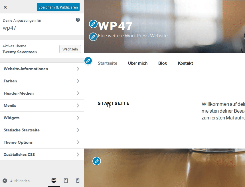
Using the new Customizer, you can concentrate on building menus with pages that don’t even exist yet. Set them up as empty files from within the Customizer. This way you don’t have to interrupt your workflow, letting you build your desired navigation menu first, and add the content later.
The adjustment of elements that cannot be changed via the customizer can now be made using an area for custom CSS. In many cases, this also makes it unnecessary to set up a child theme, as the custom CSS remains even after theme updates. It is saved in a Custom Post Type named custom_css, and remains connected to the respective theme. Now, you won’t lose it, even if you switch themes frequently.
To allow you to tweak your new project’s design before adding custom content, future themes will come with starter content, which you can remove before publishing the theme. Overall, the new customizer is made to let you play a bit first. All changes are immediately displayed in live preview, but not in the frontend. This way, you get to experiment for as long as you wish, as your design efforts will only become visible once you click “publish.” Small editing icons next to the elements you are allowed to alter, take you directly to the respective panels upon clicking them. To assure that you won’t lose changes made to the layout even after working for a longer time, the system will automatically save the project’s state, just like it does with posts.
Post Type Templates, PDF Thumbnails, and More
A couple of days ago, we wrote a small article covering another very useful change made in version 4.7. It’s about Post Type Templates that now provide the functionality of Page Templates for posts as well. You can find more detailed information in the mentioned article.
PDF files uploaded to the media library will now receive a thumbnail preview, to make them easier to identify. Here, the first page of the document will be used for display. Thus, you should pay attention to what you set as your PDF covers from now on.
International multi-author projects, like us, will be happy that the backend language can now be defined on the user level. All languages installed in WordPress can be chosen. You’ll probably have to help with that.
REST-API: Content Endpoints Bring the Headless Web Closer
At first glance, this seems like an unremarkable change. Upon closer observation, however, the new content endpoints in the REST API are quite significant. From now on, it’s possible to access any content of a WordPress installation externally. This allows for an entirely new generation of apps. Content can be integrated into other projects in any desired way. These are the first steps in the direction of the headless web, a web that doesn’t need a browser anymore. If you are interested in that topic, you may want to read this respective article for t3n (German).
Those were my highlights of the new WordPress 4.7. Of course, my list is not even close to complete. If you want to know everything, I recommend reading the WordPress blog post; that deals with even more details.
If you are a designer, your core job is to focus on designing websites for your clients and handing over the complete, hosted website, to the user. It is not your job to manage the server nor is it your responsibility to get tangled in the intricacies of hosting websites. So who should you trust in such circumstances? It is simple: A Managed Cloud Hosting Platform.
With that said, finding a good Cloud Hosting Platform service is not easy anymore. Cloud Hosting is gaining great popularity day by day, and every other hosting firm is taking part in this Cloud Hosting business.
As there are numerous options available in the market, designers, and designing agencies hesitate to experiment with new Cloud Hosting Platforms. Professional people are not really into moving their application to another service because no one wants to risk their work and data.
In spite of all these practices, I thought out of the box and experimented with a managed cloud hosting platform about which I had heard a lot from some people. Apart from the word-of-mouth, I also read reviews of this platform. It is a relatively new service, based in Barcelona; it is known as Cloudways. However, once on board, I did not feel the service is new as the service was professional and seems like they know what they are doing. I am sure, as a design agency, you will be wondering how my experience with Cloudways was? To answer this question, let’s get to know about Cloudways in detail.
Launch Your First Cloud Server
By going through Cloudways blog and reading all the reviews regarding Cloudways, I was more than convinced that this managed cloud hosting platform should be given a chance. To make things better, Cloudways offers a free trial period of up to fourteen days. I feel these are more than enough to test out the platform and experience the offered services.
The process was simple; I just had to provide an email and choose a password to sign into Cloudways. After signing in, the process of launching a server and choosing an application is smooth as well.
Choosing an Application
Cloudways offers more than twelve applications on their platform, and all of them are deployable in one click. These applications include WordPress, WooCommerce, Magento, PHP stack, and other prominent web applications.
As I was working on a WordPress website, I chose WordPress for this particular instance.
Give Your App a Name
After you are done with choosing your application, you have to give a name to your app, server, and project folder. Don’t worry; you can rename all these parameters later as well.
Pick Your Cloud Infrastructure
Cloudways is managed cloud platform that lets you host on different popular cloud infrastructures. Currently, Cloudways offers five market-leading cloud server infrastructure providers:
For the purpose of this review, I chose DigitalOcean as it offers a trial period of 14 days and because it is the fastest growing cloud provider.
Give Your Server Some Space and Speed
Scaling your server was never this easy. Just slide the bar and scale up your server in a second. Moreover, you don’t have to worry about the wrong size of your server because you can always add more space to your server and other performance functionalities later too.
Pro Tip: Cloudways also offer an auto-scalable cloud infrastructure in the form of Kyup. This basically takes away all your worries related to your server’s traffic or a sudden influx of traffic.
For starting, I would recommend you to choose a minimum of 1GB server size. Why? Because with the 1GB plan, you you would be able to gauge the whole service in full throttle, including the support. It is a win-win situation as it is a Free Trial and you are not charged.
Select Your Server’s Location
Decide upon your target audience and choose your server’s location carefully as your server should be located nearest to your target audience. Currently, Cloudways offers eight locations for DigitalOcean.
You Are Ready to Launch
Click on launch button and wait for 7 to 10 mins. Cloudways will now set up your server by optimizing and configuring it accordingly.
That was like a walk in the park. It was simple, crisp, and minimal effort was required. From a designer’s perspective, I feel relaxed that I didn’t have to go through the hassles of a complex UI just to launch a server.
When launched, the following screen appears. By the looks of it, the Platform looks appealing and user-friendly. Let’s dive in a bit into the functions the Platform offers.
Too much to grasp? Here is a video to get you started with the Cloudways Platform.
Server’s Dashboard
The trip to Cloudways does not end here as there is a whole dashboard for doing different tweaks and tips to your server. The dashboard is user-friendly, so you don’t have to worry if you are an IT professional or a learning beginner. Each function of the server is located separately on your left, and all the main tabs are placed on the top.
This orderly placement of options makes it easy for a user to locate what function he wants to work on.
Server Management
Server Management takes care of all your needs regarding server modification. All primary functional related options are included in this tab. Some of the distinctive features are Master Credentials, Settings, and Packages, Security, Vertical Scaling, Backups, etc.
Master Credentials
Master Credentials is a tab containing all the confidential information you need to access your server and application. These credentials include access details of your SSH, SFTP keys, public IP, Username, and Password. It also includes an SSH Terminal which is launched through the browser. However, if you are not familiar with all these, you need not get your hands dirty.
Security
Keeping all the servers behind a sophisticated firewall, Cloudways cares more for your security. Its security features include Free SSL Certificates by Let’s Encrypt and adding more value to its security; Cloudways has HTTP/2 enabled on its platform which means all your data is secure behind complex protocols that aren’t easy to breach.
Backup
Backup is an exciting feature offered by Cloudways. You can always save backups of your server on daily, weekly, and monthly basis by setting up the backup frequency and backup retention rate. Moreover, by enabling a local backup feature, you can always create the latest backup of your application.
Application Management
Cloudways takes care of your server and application needs separately. Application Management tab deals with all settings regarding your chosen application. Various offerings of Application Management tab includes Access Detail, SSL Certificate, Deployment via Git, Migrator tools, etc.
Access Detail
This tab includes all the necessary information used to interact with your application plus it also has access to Cloudways database manager. Other information includes credentials of SSH/SFTP and admin panel. You can use this tab to access your WordPress admin panel.
Deployment via Git
Git is like an open arena for developers where they can share, experiment and experience their code. Since Cloudways wants you to share and experience your work globally, its platform supports code deployment through Git. You just have to generate SSH keys and put your desired version over the cloud.
Migrator Tools
In case if you are already thinking of moving to Cloudways, but are scared of migrating your WordPress, then you can always opt for their automated WordPress migrator tool. You can always migrate your application without any second thought because their team of engineers will look after your application from the start till the end, avoiding any malfunction. Oh, by the way, if you are using any other application, your first migration is free.
Pricing Plans
Pricing is one of the main concerns among most of the people and keeping this fact alive; Cloudways has pricing plans that caters to every audience. Their pricing plans start from $7 per month. Notably, I chose their plan of $17 per month which offers 1GB of RAM, 1 Core processor, 30GB of storage with 2TB of bandwidth. What is important to note here is that they are based on the Pay As You Go method, meaning, you only pay for the amount of server resources you use.
24x7x365 Support
Another major feature for Cloudways that caught my eye is their live chat support that is always there to guide you if you are stuck at some point. Moreover, they have their always updated knowledge base that is filled with simple, image-rich, tutorials that make it easier for a beginner to get accustomed to the operations of the Platform.
Ready to Fly?
Now that you know all about Cloudways and their lucrative offerings, I would recommend this amazing Cloud hosting platform to all designers regardless of whether they are professionals or beginners. Why? Here is a quick (brief) recap of what they offer:
User-friendly Platform with quick access to all your applications
24x7x365 Support
999% Uptime Guarantee
50% reduction in page load times owing to ThunderStack caching recipe
1-click operations for multiple server and application functions
Real-time monitoring of 15+ server performance metrics
HTTP/2 support with improved Varnish UI for better security and performance
However, there are few pointers to note that Cloudways lacks upon:
Many providers give the option of Domains within their panels. Cloudways does not, which makes it a hassle to register a domain from other providers and then point to Cloudways.
They have 24x7x365 online support. However, there is no option of a telephone support. There are some instances when you can get things done over the phone, instead of waiting in the queue to get your query resolved.
These are only some of the cons I found while exploring Cloudways. The rest of the features are all good, and up to date, including an innovational managed cloud hosting chatbot, CloudwaysBot, that notifies about server updates on preferred notification channels.
I signed up for their trial period and so can you to experience all the awesomeness. Give this platform a shot and let me know your opinion about their service.
A well-established logo makes it easy for people to find what they’re looking for, and this level of recognition also typically makes consumers feel more comfortable with the product or brand in question. Despite this, some popular businesses made the decision to redesign their logo in 2016. As always, there were some new designs that really knocked it out of the park. Unfortunately, there were just as many that left us shaking our heads and questioning who greenlit such an atrocious final result.
1. Instagram – WORST
The new Instagram logo hits you over the head with bright, garish colors. It also fails to stand out as an instantly recognizable camera in the same way that the first logo did. This isn’t the most awful redesign of all time or anything quite that drastic. Overall, though, this redesign is ugly and fails to advance Instagram’s brand in a positive way.
2. Kodak – BEST
Kodak’s redesign recalls the beloved and instantly recognizable logos that the company utilized from 1971 to 2005. Additionally, it shows a bold confidence that is missing from most corporate logos. The final result is nostalgic, yet modern at the same time. It is extremely rare for a company to sign off on a logo with vertically-stacked type, but it works really well for Kodak. This is a great example of honoring the past while still moving ahead into the future.
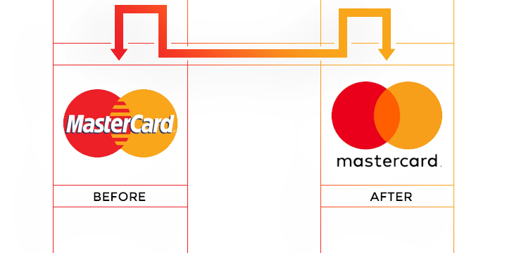
3. Mastercard – BEST
This new logo isn’t exactly groundbreaking, but that’s part of its charm. The redesign keeps the company’s roots while still modernizing everything. It actually feels like the company’s attempt to remain recognizable but also look hipper and less corporate. They didn’t exactly stick the landing on the hipness concept, but the overall look and feel is a big improvement from the past.
4. Pandora – WORST
A frequently quoted line from “Jurassic Park,” slightly modified, helps describe this change: Your graphic designers were so preoccupied with whether or not they could, they didn’t stop to think if they should. Sadly, this new logo isn’t even exciting, dangerous or dynamic like the dinosaurs in “Jurassic Park.” Instead, it’s flat, boring and feels pointless. It would have been better to stick with the old bland logo because at least that came with some brand recognition.
5. Subway – WORST
What does a company do when trying to rebrand after public outrage about a major spokesperson controversy? Apparently, they very weakly redesign their logo so that it looks like a slightly different version of the same basic idea. Changing the font and removing the black outline doesn’t make the Subway name stand out more or seem more appealing. All it does is call attention to the fact that the company is trying to remove itself from the stink of Jared Fogle’s illegal activities.
6. Taco Bell – WORST
Yet again, a major, well-known company took a boring approach with their new design. Taco Bell’s redesign is clearly meant to appeal to millennials while retaining the easy brand recognition of their old look. However, the font choice is horrible, and the varying tones of purple are an eyesore.
7. U.S. Soccer Federation – BEST
The previous logo for the U.S. Soccer Federation had numerous issues, not the least of which was using blue stripes instead of red. The new logo fixes this issue and goes much more simplistic for a clean, easy to look at result that is fiercely patriotic. The only issue with this new effort is that if you’re not a soccer fan, you probably wouldn’t know that this logo is meant to represent a sports federation because there’s no longer any reference to soccer.
8. Bud Light – BEST
This redesign is one of the best logo changes of the year. Long gone are the overly cluttered cans with the large and boring font. Instead, these cans now have a more sophisticated aesthetic, which is almost certainly meant to attract a more diverse consumer base. It’s hard to know if Bud Light’s efforts will work without alienating their core base, but the logo is definitely nicer to look at. Now they just need to redesign the drink itself to match this new level of sophistication.
9. Peace Corps – BEST
The old Peace Corps logo attracted attention with its patriotic color scheme, but it didn’t flow very well. The new design has a much better visual flow that creates the sensation of movement. Making the dove the central focal point of a non-profit organization that seeks to peacefully help people around the world is also a nice and appropriate touch.
10. The Metropolitan Museum of Art – WORST
The old logo had its flaws and probably needed to be revamped. However, the weird and visually unappealing option that was chosen is highly unlikely to inspire people to visit the internationally renowned museum. Also, deciding to officially rebrand with the nickname New Yorkers use, The Met, seems just as odd of a decision as the new logo.
11. Meetup – WORST
Meetup’s previous logo was simple, to the point and easily illustrated the website’s entire concept. Changing that look to one that’s nothing more than a quirky take on the name isn’t an improvement. In fact, the font choice isn’t very appealing, and this design appears to be aimed at only one very specific audience. Everyone else is likely to be alienated by the new logo.
12. The Rail Park – BEST
This Pennsylvania-based nonprofit’s redesign showcases how to incorporate all aspects of a company’s identity into one logo without making it feel cluttered. They have a tree to help quickly establish the park aspect of their work, but the same tree can also be seen as railroad tracks, which ties in the rest of this group’s proposed underground park and recreation path.
13. Houston Ballet – BEST
This is a great example of how to transition from a boring logo to a design that truly pops. The implied movement in the redesign is perfect for a group that makes a living by moving on stage. The new font choice also beats the previous effort by leaps, bounds and allegros.
14. Milwaukee Bucks – BEST and WORST
Want to see what a dynamic and powerful logo redesign looks like? The Milwaukee Bucks new logo definitely fits this description. Unfortunately, it also fits the description of looking so similar to another logo that the Bucks are now facing legal action. That’s right, everyone; Jagermeister is very unhappy with the Bucks new logo, and it looks like they just might have a legitimate claim.
15. Uber – WORST x 2
Uber unveiled a new logo and app icon this year, and both of them fell flat. First off, the so-called new logo is just a very minimal update to what already existed, and it doesn’t do much to improve upon the branding consumers have gotten used to. The more egregious change was with the app icon, though, which now looks like a credit card security chip.
16. MetLife – WORST
MetLife has drastically switched identities with this new logo. The problem isn’t that they fired Snoopy and the Peanuts crew. Instead, the major issue is that the redesign feels harsh and unapproachable. Of course, maybe they simply decided to go for a more truthful representation of what it’s typically like to work with an insurance company.
17. Vevo – WORST
Music is emotive, and the old Vevo logo helped capture this. Unfortunately, the new redesign strips away the fun and emotive vibe in favor of a more corporate-friendly image. This is far from an improvement and may not go over well with music fans, especially the younger ones.
18. Florida Panthers – BEST
Replacing a logo after 23 years is no small task, but the design put together by Reebok does an admirable job. Gone is the in your face aggressiveness of the past. In its place, there’s a regal panther that looks fantastic and much more modern on merchandise.
19. Tronc – WORST
This is by far one of the worst redesigns of the year. Not only did the respected Tribune Publishing Company change their name to the insipid Tronc but they went from a solid, dependable news logo to something that looks like an advertisement for a kid’s movie about robots. This is absolutely terrible, and everyone behind this design should feel ashamed.
As you can see, 2016 had a lot of hits and misses. Whether you agree or disagree with these choices, we can all be thankful there are so many designs worth talking about.
A well-established logo makes it easy for people to find what they’re looking for, and this level of recognition also typically makes consumers feel more comfortable with the product or brand in question. Despite this, some popular businesses made the decision to redesign their logo in 2016. As always, there were some new designs that really knocked it out of the park. Unfortunately, there were just as many that left us shaking our heads and questioning who greenlit such an atrocious final result.
1. Instagram – WORST
The new Instagram logo hits you over the head with bright, garish colors. It also fails to stand out as an instantly recognizable camera in the same way that the first logo did. This isn’t the most awful redesign of all time or anything quite that drastic. Overall, though, this redesign is ugly and fails to advance Instagram’s brand in a positive way.
2. Kodak – BEST
Kodak’s redesign recalls the beloved and instantly recognizable logos that the company utilized from 1971 to 2005. Additionally, it shows a bold confidence that is missing from most corporate logos. The final result is nostalgic, yet modern at the same time. It is extremely rare for a company to sign off on a logo with vertically-stacked type, but it works really well for Kodak. This is a great example of honoring the past while still moving ahead into the future.
3. Mastercard – BEST
This new logo isn’t exactly groundbreaking, but that’s part of its charm. The redesign keeps the company’s roots while still modernizing everything. It actually feels like the company’s attempt to remain recognizable but also look hipper and less corporate. They didn’t exactly stick the landing on the hipness concept, but the overall look and feel is a big improvement from the past.
4. Pandora – WORST
A frequently quoted line from “Jurassic Park,” slightly modified, helps describe this change: Your graphic designers were so preoccupied with whether or not they could, they didn’t stop to think if they should. Sadly, this new logo isn’t even exciting, dangerous or dynamic like the dinosaurs in “Jurassic Park.” Instead, it’s flat, boring and feels pointless. It would have been better to stick with the old bland logo because at least that came with some brand recognition.
5. Subway – WORST
What does a company do when trying to rebrand after public outrage about a major spokesperson controversy? Apparently, they very weakly redesign their logo so that it looks like a slightly different version of the same basic idea. Changing the font and removing the black outline doesn’t make the Subway name stand out more or seem more appealing. All it does is call attention to the fact that the company is trying to remove itself from the stink of Jared Fogle’s illegal activities.
6. Taco Bell – WORST
Yet again, a major, well-known company took a boring approach with their new design. Taco Bell’s redesign is clearly meant to appeal to millennials while retaining the easy brand recognition of their old look. However, the font choice is horrible, and the varying tones of purple are an eyesore.
7. U.S. Soccer Federation – BEST
The previous logo for the U.S. Soccer Federation had numerous issues, not the least of which was using blue stripes instead of red. The new logo fixes this issue and goes much more simplistic for a clean, easy to look at result that is fiercely patriotic. The only issue with this new effort is that if you’re not a soccer fan, you probably wouldn’t know that this logo is meant to represent a sports federation because there’s no longer any reference to soccer.
8. Bud Light – BEST
This redesign is one of the best logo changes of the year. Long gone are the overly cluttered cans with the large and boring font. Instead, these cans now have a more sophisticated aesthetic, which is almost certainly meant to attract a more diverse consumer base. It’s hard to know if Bud Light’s efforts will work without alienating their core base, but the logo is definitely nicer to look at. Now they just need to redesign the drink itself to match this new level of sophistication.
9. Peace Corps – BEST
The old Peace Corps logo attracted attention with its patriotic color scheme, but it didn’t flow very well. The new design has a much better visual flow that creates the sensation of movement. Making the dove the central focal point of a non-profit organization that seeks to peacefully help people around the world is also a nice and appropriate touch.
10. The Metropolitan Museum of Art – WORST
The old logo had its flaws and probably needed to be revamped. However, the weird and visually unappealing option that was chosen is highly unlikely to inspire people to visit the internationally renowned museum. Also, deciding to officially rebrand with the nickname New Yorkers use, The Met, seems just as odd of a decision as the new logo.
11. Meetup – WORST
Meetup’s previous logo was simple, to the point and easily illustrated the website’s entire concept. Changing that look to one that’s nothing more than a quirky take on the name isn’t an improvement. In fact, the font choice isn’t very appealing, and this design appears to be aimed at only one very specific audience. Everyone else is likely to be alienated by the new logo.
12. The Rail Park – BEST
This Pennsylvania-based nonprofit’s redesign showcases how to incorporate all aspects of a company’s identity into one logo without making it feel cluttered. They have a tree to help quickly establish the park aspect of their work, but the same tree can also be seen as railroad tracks, which ties in the rest of this group’s proposed underground park and recreation path.
13. Houston Ballet – BEST
This is a great example of how to transition from a boring logo to a design that truly pops. The implied movement in the redesign is perfect for a group that makes a living by moving on stage. The new font choice also beats the previous effort by leaps, bounds and allegros.
14. Milwaukee Bucks – BEST and WORST
Want to see what a dynamic and powerful logo redesign looks like? The Milwaukee Bucks new logo definitely fits this description. Unfortunately, it also fits the description of looking so similar to another logo that the Bucks are now facing legal action. That’s right, everyone; Jagermeister is very unhappy with the Bucks new logo, and it looks like they just might have a legitimate claim.
15. Uber – WORST x 2
Uber unveiled a new logo and app icon this year, and both of them fell flat. First off, the so-called new logo is just a very minimal update to what already existed, and it doesn’t do much to improve upon the branding consumers have gotten used to. The more egregious change was with the app icon, though, which now looks like a credit card security chip.
16. MetLife – WORST
MetLife has drastically switched identities with this new logo. The problem isn’t that they fired Snoopy and the Peanuts crew. Instead, the major issue is that the redesign feels harsh and unapproachable. Of course, maybe they simply decided to go for a more truthful representation of what it’s typically like to work with an insurance company.
17. Vevo – WORST
Music is emotive, and the old Vevo logo helped capture this. Unfortunately, the new redesign strips away the fun and emotive vibe in favor of a more corporate-friendly image. This is far from an improvement and may not go over well with music fans, especially the younger ones.
18. Florida Panthers – BEST
Replacing a logo after 23 years is no small task, but the design put together by Reebok does an admirable job. Gone is the in your face aggressiveness of the past. In its place, there’s a regal panther that looks fantastic and much more modern on merchandise.
19. Tronc – WORST
This is by far one of the worst redesigns of the year. Not only did the respected Tribune Publishing Company change their name to the insipid Tronc but they went from a solid, dependable news logo to something that looks like an advertisement for a kid’s movie about robots. This is absolutely terrible, and everyone behind this design should feel ashamed.
As you can see, 2016 had a lot of hits and misses. Whether you agree or disagree with these choices, we can all be thankful there are so many designs worth talking about.
Back by popular demand! It’s difficult to keep track of all of the great talks and conferences happening in our industry. Sometimes you may find out too late that an event is taking place, and it’s a real shame when it’s an something you might have attended. We’ve compiled this list so you can see what’s happening, both in your hometown, and abroad. This list will be updated throughout the year.
Date: May 4-5 Location: Sydney Date: May 8-9 Location: Melbourne Date: May 12 Location: Brisbane Theme: Responsive Web Development Link: http://www.webdirections.org/respond16/
There are a lot of conferences that will be around this year that don’t yet have dates or an updated site. Here is a list of some of them to watch out for, we’ll be updating them as details come in. If you are the organizer of one of these conferences, please fill out the form below to provide us with details.
Clarity Conf
RWD Summit
CSS Conf AU
Space City JS
JSConf Uruguay
Industry Conf
HTML5DevConf
CSSConf Budapest
JSConf Budapest
Valio Con
Port80
CSSconf Nordic
CSS Day + HTML Special
Code (AU)
CascadiaJS
CSSConf Argentina
React Rally
JS Conf Iceland
Nebraska JavaScript Conference
Reasons to be Creative
Nightly Build
Full Stack Fest
ReactNext 2016
From the Front
NCDevCon
FrontTalks
Mirror Conf
CSS Conf
LibertyJS
View Source Berlin
Full Stack Toronto
CSS Dev Conf
Front Porch
Empire Node
Mixin Conf
SassConf
View Source Seattle
Graphical Web
ELA Conf
Nodevember
CSS Conf Asia
JS Conf Asia
JS Kongress Munich
CSS Conf AU
JS Conf AU
Ampersand
dotCSS
dotJS
CSSDay.io
Add a Conference
If you don’t see your conference listed here or have more details to add, please fill out this form. Please understand that we might gather responses before updating it, so you may need to wait a little bit before your changes are reflected in the post.
User interface design is a hot topic these days and for good reason. In a world where digital experiences are such a large part of our lives, the value of a quality user experience is higher than ever. Not only is it important now, but the quality of user interfaces is bound to be even more important in the future given the tremendous growth of mobile, digital, and the Internet of Things.
From web sites, to displays in our cars, to thermostat controls in our homes, user interfaces of all types make up much of our daily experience.Taking into account that users are becoming more experienced with digital displays and are expecting better experiences than they were willing to put up with just a few short years ago, it is imperative that businesses carefully consider the quality of the experience they create for their customers.
But what makes a quality user interface?
1) Simplicity
Great user interfaces tend to be nearly invisible. They are not made up of gaudy adornments or unnecessary elements. A quality user interface is made up of necessary elements that are logical and concise. While you are working on the design of your interface, ask yourself “Does the user really need this to compete their task?” before adding features and content. Limit your interface to the items that are essential for the user. Don’t add items just to feed your ego, but rather, focus on the quality of the user experience.
One company that does a great job with this concept is Maaemo. On this Norwegian restaurant’s website the very first thing you see is the option to book a table, other options are hidden behind a hamburger menu to avoid clutter. No time is wasted scanning through complicated navigation trying to figure out where to go to book a table.
2) Clarity
Clarity is one of the most important attributes of any user interface. Keep in mind that your user interface exists for the sole purpose of facilitating users interacting with your system. To do this it must clearly communicate with users. If users can’t figure out how to use your interface easily they will become frustrated and abandon the experience.
To help improve clarity, create clear and concise labels for buttons and actions. You want to keep your messaging simple to improve the experience as well. The easier your labels, navigation and content is to read, the easier it is for users to understand what to do.
Remember though that the first attribute was simplicity; you want to keep that in mind with your labels, definitions and explanations. Avoid cluttering up your interface with lengthy explanations.Your users will not read or appreciate them and they will only get in the way of the user experience.
It is better if you can explain a feature in one word instead of two. Save your users the reading time and cognitive strain by keeping your labels and messages concise. While keeping text both clear and concise may require some effort, it is well worth it to improve the user experience of your user interface.
3) Consistency
With your user interface, you will want to maintain consistency throughout the entire experience. Consistent interfaces will allow your users to rely on and develop usage patterns that will improve the experience. People crave consistency and you should give your users the opportunity to be proven correct when they rely on it.
They want an experience where if they learn to do something, they will be able to rely on it working the same way on other screens. Maintain language, layout and design throughout your interface. By doing so you make it easier on your users to understand how things will work, increase their efficiency and improve the user experience.
4) Familiarity
One of the goals of UX design is to make an interface intuitive for users. Let’s consider what intuitive means when it comes to user interfaces, if your interface is intuitive, it can be naturally understood by users. To do this, it is important that you leverage familiarity in your design.
Your interface will feel familiar if users don’t have to think how to use it because they already understand it. When users are familiar with something, they know what to expect and don’t have to think about what to do. Because of this, work to identify areas of your design where you can leverage familiarity to make interacting with your system easier for your users.A current example of this would be the hamburger icon seen on so many apps these days. Any time you see this icon you instantly know where the menu is and you don’t have to stop and look for the menu and think about what you are supposed to do. It comes naturally because you are familiar with this icon.
The Born Shoes web site helps illustrate this concept. Familiar icons are placed in a familiar position making it easy for visitors to know what to do.
5) Visual Hierarchy
One attribute that is often overlooked but is important to a quality UI is designing your interface so that it allows users to focus on what is important. If you try to make everything look important you just create information overload and reduce the quality of the user experience. The contrast between the different sizes, colors and placements of elements should work together to give a clear understanding of your interface and what a user should do. A well designed visual hierarchy reduces the appearance of complexity and helps users accomplish their tasks.
The Budnitz Bicycles website shows how the use of color can help create a visual hierarchy that draws users to a particular section of their web site. Here their shop button stands out and guides visitors.
6) Efficiency
Your user interface is how a user will get to where they want to go and do what they want to do. A quality user interface allows users to perform tasks with speed and ease, in other words, it operates with efficiency.One of the best ways to improve the efficiency of your interface is through task analysis.
To perform a task analysis, consider the activities and tasks users are most likely to perform and then streamline the process to make each as quick and easy as possible for users. Consider carefully what functions it needs and what goals users are trying to achieve. Rather than just creating a list of where users can navigate, consider what your users are going to want to do and help facilitate those activities through your design.
Mulberry provides an excellent example of this with their website over the holidays. Anticipating visitors looking for holiday gifts they allow users to shop for gifts without having to work to do so.
7) Responsiveness
When it comes to the responsiveness of an interface, you should consider a couple different forms of responsiveness. To begin with, a responsive interface is fast. You want your interface, and the system behind it, to work fast. Users easily become frustrated having to wait for a web site to load for instance.
In fact, these days if your web site hasn’t loaded in three seconds you will start losing visitors quickly as they just start hitting the back arrow on their browser. According to Kissmetrics, 40% of people will abandon a website that takes more than 3 seconds to load and as more time passes even more users will hit the back arrow. Mobile apps and web sites that load and operate quickly improve the user experience.
Additionally, when you think about responsiveness you should also think about your interface responding to users. Your user interface should provide feedback to the users. Let your users know what is happening and that their effort to engage with the interface has been understood. For instance, create a response to let them know they have pushed a button successfully or create a progress bar to let users know the next screen is loading so they don’t assume it is stuck. These types of feedback improve the user experience and reduce errors.


