Archive

Archive for January, 2018

How To Make A Drag-and-Drop File Uploader With Vanilla JavaScript

January 15th, 2018 No comments

It’s a known fact that file selection inputs are difficult to style the way developers want to, so many simply hide it and create a button that opens the file selection dialog instead. Nowadays, though, we have an even fancier way of handling file selection: drag and drop.
Technically, this was already possible because most (if not all) implementations of the file selection input allowed you to drag files over it to select them, but this requires you to actually show the file element.

Categories: Others Tags:

What’s New for Designers, January 2018

January 15th, 2018 No comments

Start 2018 by deleting some of those old tools from your computer that you never use in favor of some fresh, new options. While old favorites can be great for a while, there are so many great new elements out there that can streamline your workflow, or help add more creative spark to projects.

If we’ve missed something that you think should have been on the list, let us know in the comments. And if you know of a new app or resource that should be featured next month, tweet it to @carriecousins to be considered!

Let’s Enhance

Do you ever have an image that is just too small for what you need? Let’s Enhance is here to solve that problem. The free tool allows you to upload an image—just drag and drop—and it will remove JPEG artifacts and upscale by up to four times the original size without losing any quality. (And it actually works!) State of the art neural networks are used to help removed image noise and imagines missing details for images that look totally natural.

Design Principles

The open-source Design Principles project is a collection of resources that are the basis for good projects. According to the curator, “Design Principles help teams with decision making. A few simple principles or constructive questions will guide your team towards making appropriate decisions.” You can browse more than 1,000 principles and examples already in the database or submit your own.

Hexi-Flexi

Hexi-Flexi is an SCSS component built on the CSS grid layout that creates a lattice of hexagons. Without JavaScript, you can customize the number of shapes, cells and rows to fit your design or content. It also supports auto-populating backgrounds.

Snippetnote

Snippetnote is a note-taking app that allows you to copy snippets for later. You can copy private snippets and change the layout as needed. Notes are available offline and in a drag and drop interface that’s easy to use. The interface is streamlined and simple without ads or social prompts.

Manta

Manta is a simple invoice-building app for Mac, with sleek design and customizable templates. Users can drag and drop items in invoice fields, include an SVG logo for better printing, and export invoices to a PDF or email format. (Plus, it’s a totally free-to-use invoice tool if you are looking for a simple product to streamline billing, which can be great for freelancers.)

Sketch Elements

This free iOS user interface elements kit has everything you need for your next app project. The kit includes 35 screen designs, 45 icons and 175 symbols. Plus, every element can be further customized so that your project feels unique. The kit is made for Sketch 48 or later.

Minimalist Icons

Themeisle has a set of free, minimalist vector icons that you can download and use in a number of projects. Each icon comes in a line-drawn, colorless style with a variety of options. The pack includes more than 100 icons.

StatusTicker

Keep up with the status of critical services in one location. Get real-time notifications that you can see on screen or have them emailed or messaged to you. The ticker supports more than 145 services.

Instagram.css

Looking for Instagram-style images for your projects? Instagram.css is a complete set of Instagram filters in pure CSS.

Epic Spinners

These simple CSS-only loading animations are fun and functional. Just grab the code and you are ready to use them.

Buy Me a Coffee

It’s like Kickstarter for creatives. Buy Me a Coffee allows you to showcase work and ask supporters for a small donation to fund the project.

Keepflow

Keepflow is a team-based project management tool for design freelancers and agencies. Currently in pre-launch beta, the software is designed to help you onboard clients and then manage a project – from an information-gathering questionnaire to the final product.

Tutorial: Using SVG to Create a Duotone Effect

CSS-Tricks has an excellent new tutorial that helps you navigate the world of SVG and create a trendy design element at the same time. The tutorial breaks down how to create a duotone effect in both the traditional manner using Adobe Photoshop and with SVG filter effects.

Product Manual

Product Manual is a collection of resources that help you build and understand the process of creating great products. The website is packed with resources by category—you can also add your own—so that every project can start here.

One Year of Design

Pixels collected a pretty cool collection of great website designs from 2017 all in one place. The retrospective is a nice bit of design inspiration.

CopyChar

Need a special character? Rather than digging through typefaces or struggling to remember keyboard shortcuts, use CopyChar to click and add a special character right to your clipboard. Special character options include everything from letters and punctuation to math and numbers to symbols, arrows and emoji.

Dulcelin

Dulcelin is a simple script that’s available free for personal use. It has a nice structure that’s readable and comes with a set of 177 characters.

Kabrio

Kabrio is a fun sans serif with the added bonus of having multiple corner options for typeface styles. The alternate variant features slightly rounded corners, that become even more round in the soft variant. Abarth features cut corner for a more mechanical, cold look. Each variant has seven weights and italics.

Promova

Promova is a blocky sans serif that would make a nice display option for website projects. The typeface includes regular and italic styles with wide character sets. The type family includes upper-and lowercase letters and is highly readable.

Studio Gothic

Studio Gothic is a nice sans serif with a rounded feel. The free version includes Extra Bold Italic and the Alternative Regular variations. The pair have an extensive character set and would work nicely for a variety of project types.

Sunshine Reggae

Sunshine Reggae is a lowercase typeface with a brush-stroke handwriting style. The limited font includes just 26 lowercase characters without any extras or frills, but it can make a fun display option.

50+ Premium WordPress Themes from ThemeFuse – only $49!

Source

Categories: Designing, Others Tags:

Google Fonts You Should Use in 2018

January 15th, 2018 No comments

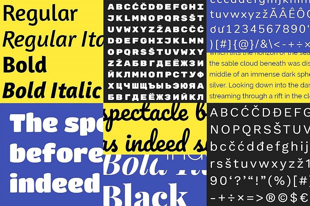
Like almost everything else in graphic and web design, fonts are frequently exposed to trends. The number of fonts grows constantly – including Google Fonts – so finding something new is always easy. The following fonts and font combinations are the ones you should try in one of your next projects in 2018.

Big Headings With Serifs

Depending on the zeitgeist and the technological development, some fonts are bigger and some are smaller. In terms of headings, especially large headings have been trending for a while now. Instead of plain sans serif fonts like “Helvetica”, serif fonts are becoming more and more popular, as they provide more elegance and sleekness for the design.

“Playfair Display”

Thus, the “Playfair Display” is a great pick for this kind of headings. Especially the bold italics give your oversized headings a special flair. In contrast to that, there’s the “Raleway“. It’s a sans serif font, but it’s much more customized and concise than other sans serifs.

“Raleway” With “Playfair Display” in the Heading

Massive, Sans Serif, Yet Playful

However, massive sans-serif fonts will also dominate the web design of 2018. To increase the massiveness even further, headings are often written in all caps. A good example for that is the “Rubik Mono One“, which is only available as an upper case font as it is.

“Rubik Mono One”

The brute feeling of this very bold font is relieved by the slightly rounded edges. These fonts are also great to add gradients or background graphics.

For the running text, a good complementary font would be another sans serif one, like the classic “Open Sans”.

“Anton”

An alternative to “Rubik Mono One” is the “Anton“, which seems to be even more massive due to its slim tracking and thick line width. It can be loosened a bit by adding a background graphic. As the font leaves little white space, detailed images can also work as the background, instead of a font color.

Sans Serif With a Handwritten Flair

Handicraft is trending as it is. This is shown by the “Craft” movement, which started out with “Craft” beer, but has now expanded to different products. In terms of typography, fonts with a handwritten flair to them are on the rise as well.

“Titan One”

The “Titan One“, for example, is a sans serif font with a handwritten touch, due to its curves and different stroke widths, making it a good choice for craft products.

“Pacifico”

For those that want to go even further into the handwriting style, I recommend the “Pacifico“, which is an actual handwritten font. Due to the somewhat thick stroke width, it is more suitable for headings.

Once again, the “Open Sans” compliments both the “Titan One” and the “Pacifico”, making it a good additional font for the running texts.

“Amaranth”

The “Amaranth” looks like a handwritten font as well and can be read in all four classic versions. Thus, it’s suitable for running texts as well.

Solid Sans Serif Fonts Beyond “Open Sans”

It doesn’t always have to be fancy, big, and spectacular. Sometimes, a modest sans serif font is just what you’re looking for. You’re not forced to fall back to classics like “Arial”, “Helvetica”, or newer, but not trendy “Roboto” and “Open Sans”, either.

“Work Sans”

The “Work Sans” ranging from “Thin” to “Black”, is impressively simple, yet fresh and modern. The font is very easy to read and looks great in both very small and very large font sizes.

“Nunito”

The “Nunito” is another well-elaborated font, which covers everything from “Thin” to “Black” in 14 different versions. The rounded edges give the font a slick look. It’s easy to read as well. In order for the rounded edges to stand out, it can also be used as a heading.

As a Tribute to Popular Styles: Classicism and Art Déco

People like to quote and reinterpret popular things. The same goes for fonts.

“Vidaloka”

If you like something classicistic, you’ll enjoy the “Vidaloka“. This font is reminiscent of the “Bodoni”, a classic font from the 19th century. However, the “Vidaloka” is less stiff but has the contrasting stroke width that the fonts of that time are known for.

The “Vidaloka” harmonizes well with the sans serif font “Lato”.

“Poiret One”

The “Poiret One” looks similar to the art déco style, with its subtle lines, the curves, and the slightly tilted horizontals, giving off a playful and elegant vibe at the same time.

Conclusion

There is no lack of variety in new fonts – but finding the right font is not always easy – and I’m sure this year will bring us many interesting websites with fonts in the foreground which will be both dominant and playful. They will be joined by many universal fonts for daily use, suitable for almost any purpose.

Categories: Others Tags:

Popular Design News of the Week: January 8, 2018 – January 14, 2018

January 14th, 2018 No comments

Every week users submit a lot of interesting stuff on our sister site Webdesigner News, highlighting great content from around the web that can be of interest to web designers.

The best way to keep track of all the great stories and news being posted is simply to check out the Webdesigner News site, however, in case you missed some here’s a quick and useful compilation of the most popular designer news that we curated from the past week.

Note that this is only a very small selection of the links that were posted, so don’t miss out and subscribe to our newsletter and follow the site daily for all the news.

Best WordPress Design Trends for 2018

5 Typography Trends for 2018

Coke’s New Font is Design at its Worst

Company Tricks People into Swiping Instagram Ad with Fake Strand of Hair

Golden Ratio. Bring Balance in UI Design

Gradient Cards – A Simple and Beautiful List of Editable Gradients

The 7 Best Design Case Studies of 2017

Goodbye IPod, and Thanks for all the Tunes

I’m Harvesting Credit Card Numbers and Passwords from your Site. Here’s How.

Inboxer – A Clean, Open-source Desktop Client for Google Inbox

Spotify for Developers

So your Website is Slow? Let’s Fix That.

Building Our Sketch Library

Low Poly Art – A Free Collection

Beginner’s COurse: JavaScript for the Web

Designers, Here is Why You Want to Limit You Tools

Simple Mockups – Minimalistic Devices Mockup Pack for Sketch & Photoshop

Workplace Hygiene in Sketch

How to Fix Facebook – Before it Fixes Us

5 UX Books that’ll Change How You Think About Design

How to Use Variable Fonts on the Web

Inspiration Feed: The New Designspiration

Challenge: To Create an Illustration Style

The 8 Greatest Ideas of CES 2018

A UX Career is a Business Career

Want more? No problem! Keep track of top design news from around the web with Webdesigner News.

LAST DAY: Get the Elegant RUFINA Font Family – only $17!

Source

Categories: Designing, Others Tags:

Comics of the Week #423

January 13th, 2018 No comments

Every week we feature a set of comics created exclusively for WDD.

The content revolves around web design, blogging and funny situations that we encounter in our daily lives as designers.

These great cartoons are created by Jerry King, an award-winning cartoonist who’s one of the most published, prolific and versatile cartoonists in the world today.

So for a few moments, take a break from your daily routine, have a laugh and enjoy these funny cartoons.

Feel free to leave your comments and suggestions below as well as any related stories of your own…

Shot of tolerance

Liquid inspiration

The multitasker

Can you relate to these situations? Please share your funny stories and comments below…

Beautiful Handwritten Madelyn Script Family – only $17!

Source

Categories: Designing, Others Tags:

New flexbox guides on MDN

January 12th, 2018 No comments

MDN released a comprehensive guide to Flexbox with new and updated materials by Rachel Andrew. The guide includes 11 posts demonstrating layouts, use cases and everything you could possibly want or need to know on the topic. All of the related Flexbox properties are nicely and conveniently attached to the table of contents, making this extremely easy to use.

In this post, Rachel adds helpful thoughts and context about Flexbox. Her comment on Flexbox initially being treated as a silver bullet solution for all our layout issues struck me:

Prior to Grid shipping, Flexbox was seen as the spec to solve all of our layout problems, yet a lot of the difficulty in using Flexbox is when we try to use it to create the kind of two-dimensional layouts that Grid is designed for. Once again, we find ourselves fighting to persuade a layout method to do things it wasn’t designed to do.

Guilty as charged. I remember being so eager to ditch floats and learn a new syntax that I treated Flexbox as a square peg trying to be fit into a round hole. That definitely bit me on at least one project.

Most importantly about this guide is that it forms a sort of trifecta of reference materials on layout specifications provided by CSS: Flexbox, Grid and other Box Alignment properties.

Oh, and while we’re on the topic, we have Flexbox and Grid guides right here on CSS-Tricks. You can never learn too much, right?

Direct Link to ArticlePermalink


New flexbox guides on MDN is a post from CSS-Tricks

Categories: Designing, Others Tags:

Third-Party Scripts

January 12th, 2018 No comments

Trent Walton:

My latest realization is that delivering a performant, accessible, responsive, scalable website isn’t enough: I also need to consider the impact of third-party scripts. No matter how solid I think my prototype is, it doesn’t absolve me from paying attention to what happens during implementation, specifically when it comes to the addition of these third-party scripts.

I recently had a conversation with a friend working on quite a high profile e-commerce site. They were hired to develop the site, but particularly with performance in mind. They were going the PWA route, but were immediately hamstrung by third-party scripts. One of them, apparently unavoidably, couldn’t be HTTPS, meaning the site was immediately disqualified from being a PWA. They could still do a good job in many other areas, but right and left their great performance work was slaughtered by third-party scripts. I don’t envy being in that position.

It’s often the fault of “tag managers.” There are a bunch of them out there. Here’s a marketing pitch for one of them:

Marketers want tag management that’s simple, reliable, and integrates easily with existing systems … You’ll launch programs faster, so you can make swifter decisions.

In other words, “Give your marketing team the ability to add whatever third-party JavaScript they want quickly without having to go through your normal deployment process.” I can understand why they are needed in some organizations, but it still sends chills up my spine.

Third-party scripts could conceivably be a part of a design style guide. Right alongside your buttons and modals could be a list of the third-party scripts in place on a site. Brad Frost:

The idea is that someone (or as Trent points out, some *thing*) could hypothetically crawl through all the included scripts on a site, and display them in the in style guide alongside all the color swatches, icons, UI components, etc. After all, they affect the end user experience just as much (if not more) than all those other design elements. You can visually weight them based on how gnarly they are and thus have thoughtful conversations with your team — especially those folks are carelessly chucking in all these performance-damning scripts — about the pros and cons of each script that gets included.

Third-party scripts are probably the #1 cause of poor performance and bad UX on the web. It’s no wonder things like AMP exist. The fact that it disallows third-party scripts is probably the largest contributor to it making sites fast. Controversial as hell, though, in its other choices.

As fate would have it, third-party JavaScript is even more dangerous than it ever has been, thanks to Spectre and Meltdown. Jorgé:

Q: Is JavaScript vulnerable in my browser?
A: Yes, browsing a web can give access to third parties to your machine’s memory beyond the browser.

?

More on Third-Party JavaScript

If you, like Trent, are planning to bone up on your third-party JavaScript chops, here’s a bunch of stuff from other developers in the past few years digging into it all. Some of this is targeted at you being the deliverer of the third-party JavaScript.

Third Party JavaScript (In the Third Person) Slides by Alex Sexton

Presentation slide

View Presentation


On Third-Party Javascript – The Principles by Gergely Nemeth

When serving third-party JavaScript applications the size of it and the cache policy are crucial, as both not just affect the time your users have to wait to see the application, but also your monthly bills.

See also: Writing third-party Javascript the integration part in a nutshell.

Read Post


Third-Party Javascript by Ben Vinegar and Anton Kovalyov


Things to Know (and Potential Dangers) with Third-Party Scripts by Yaphi Berhanu

The web is full of third-party scripts. Sites use them for ads, analytics, retargeting, and more. But this isn’t always the whole story. Scripts can track your behavior, your preferences, and other information.

Read Post


I’m harvesting credit card numbers and passwords from your site. Here’s how. by David Gilbertson

My goal is simply to point out that any site that includes third party code is alarmingly vulnerable, in a completely undetectable way.

Read Post


Ain’t No Party Like A Third-Party JS Party by Rebecca Murphey

You thought you had the hang of this whole JavaScript thing, but now you’re in the world of third-party JavaScript, where all you control is a single script tag and where it’s all but impossible to dream up every hostile environment in which your code will be expected to work. “It works on my machine” has never rung quite so hollow. In this talk, we’ll take a look at some of the delightful bugs we’ve had to solve at Bazaarvoice while working on the third-party JavaScript app that collects and displays ratings and reviews for some of the world’s largest retailers.

Watch Video

(Subscription required)


3rd Party Javascript Management Cheat Sheet

The invocation of 3rd party JS code in a web application requires consideration for 3 risks in particular:

  1. The loss of control over changes to the client application,
  2. The execution of arbitrary code on client systems,
  3. The disclosure or leakage of sensitive information to 3rd parties.

Read Post


Third-Party Scripts is a post from CSS-Tricks

Categories: Designing, Others Tags:

Air Lookout Is The Side Project That Changed My Design Process Forever

January 12th, 2018 No comments

In February of 2015, I began working on an iOS app called Air Lookout. The goal of the app was to simplify and remove any obfuscation of air quality information. After over a year of working nights and weekends, the total net income since it launched in 2016 has been less than $1,000. Even with those numbers, I would relive every hour of work.
The one thing that I can’t place a monetary value on is how the experience of creating Air Lookout has completely changed my mind on the process of design and development for every project I have worked on since.

Categories: Others Tags:

7 Great Uses of Gamification in Web Design

January 12th, 2018 No comments

Gamification as a concept has been around just long enough for a number of experts to come out of nowhere. There was a brief moment where everybody wrote an article or five about it, and then it more or less became the preserve of “gamification experts” and business blogs.

The thing is, we should still be thinking about it. Buzzword or not, it’s often incredibly effective.

So, for the beginners: gamification is the practice of putting game-like features, mechanics, and sometimes UI elements into your website or app.

In this article, we’re taking a look at several different forms of gamification, and how they’ve been implemented across the Internet. You’ll probably have seen some of these before, but you might not have thought of these as game-like features. Also, I’m sticking to websites and web apps (you almost have to try to find a mobile app that doesn’t have some form of gamification).

1. Habitica

Game elements: experience points, levels, upgrades, gear, and more.

Habitica is probably the single most direct application of game design principles and mechanics that I’ve seen in a web app. Why? Because it basically is a game. Well, the app’s stated purpose is to help you form new good habits, and kick bad ones.

They attempt to do this through the rather direct application of roleplaying game mechanics. Spend time on your new habit, you get points. Succumb to old habits, lose points. Enough points gets you upgrades, and so on.

2. Zurb

Game elements: object finding, achievements.

Zurb is probably the best example of game mechanics implemented in a site that is more “site” than app. Simply put, you go looking for cows, which are hidden all over the site. There’s a page where you can track all of the cows you’ve found. It’s probably the most fun way of getting users to read or skim through every page that I’ve seen to date.

3. LinkedIn

Game elements: competition, completion.

Okay, you might not think of this as a “game mechanic” but LinkedIn (and almost every other social media site out there) implements a mechanic designed to encourage you to complete your profile. It treats filling out each part of your profile a bit like an achievement, and gives you a status bar to show just how full (or not full) the profile is.

It’s designed to trigger your “completionist” instinct on one level. Also, these sites often state that people with fuller profiles are more successful at networking. On the one hand, it’s good advice. On the other, it hits your competitive instincts a little bit.

They’re subtler aspects of game design, but they do fit the theme.

4. Klout

Game elements: competition.

Pretty much all social media is gamified to a limited extent, but Klout takes it quite a few steps further. In fact, it takes the rampant popularity contest that is social media, and adds a numerical value to everyone’s popularity.

It drives interaction by allowing you to connect all of your social media accounts, showing you how much more popular industry leaders in your fields of interest are than you, and giving you ways to easily post and boost content to raise your number.

5. Zoho Motivator

Game elements: competition (hard mode).

Zoho Motivator is a cheerfully-named tool from the Zoho online office suite. It takes data from Zoho’s CRM tool to measure how each of a company’s salespeople is doing. It calculates leads generated, potentials created, and sales completed. And then it pits them all against each other in a friendly competition.

Well, depending on the corporate environment, that could be friendly competition, or a cutthroat race to see who can get the most sales by any means possible. Forget the problems inherent in the world of social media. This is where I start to wonder if we shouldn’t be a bit more careful with how we use gamification.

6. Interland

Game elements: quizzes, puzzles, platforming, and more.

Interland is almost cheating, as far as examples go. It’s literally a site filled with educational mini-games designed to teach Internet safety and courtesy to new Internet users, and is primarily directed at children. This is, perhaps, not an approach that can be used for most sites. For educational sites, though, I’d say it’s pretty effective. Learning through play is a proven concept.

7. Quizzes in general

Game elements: quizzes (heh), competition.

Following that last example, it would be wrong of me to ignore one of the oldest forms of gamification on the web: the online quiz. Some of the most famous applications include Facebook quizzes, Buzzfeed quizzes, and quizzes from The Oatmeal (some of which may be NSFW—or life). For a clean quiz example, try this literary guide to Britain.

While the quizzes themselves usually don’t drive business-related interaction directly (though they can), they are often used quite effectively as marketing tools. I dare say that Buzzfeed and The Oatmeal especially owe their success in part to the viral quality of quizzes.

Bonus: Purely visual gamification

Game elements: purely visual.

Lastly, we have an example of sort-of-gamification that doesn’t require much input on the part of the user. You just have to scroll. I’m talking about Robby Leonardi’s interactive resume, a site that looks and feels a lot like a side-scrolling platformer.

I don’t know if this really counts as gamification, but it sure is pretty.

Beautiful Handwritten Madelyn Script Family – only $17!

Source

Categories: Designing, Others Tags:

Universal Principles Of User Experience Design

January 12th, 2018 No comments

(This is a sponsored article.) As designers working in an ever-changing field, it’s important that we develop an understanding of the timeless design principles that underpin everything we do. In the second article in my series for Adobe XD, I’ll explore the foundations that enable us to establish some universal principles of UX.
These principles, which should sit at the heart of everything we design and build, are critical and will stand the test of time:

Categories: Others Tags: