There are plenty of resources and resource collections. There are so many that it’s hard to stay on top of things. This is where the new Resourcy comes into play.
Collection-collection From Argentina
Argentina is not really a country that you’d relate to web innovations. Nonetheless, it is up to date regarding web development, dealing with problems and situations similar to ours for the most part.
Janva, the developer of today’s newcomer Resourcy, lives and works in Buenos Aires. On Twitter, he or she has only been active three times, although the account has been created over four years ago.
Around Christmas 2017, Janva’s new project Resourcy got featured on Producthunt and received a certain level of publicity. According to its self-description, Resourcy is a collection of collections with resources on design, development, marketing, freelancing, startups, and more.
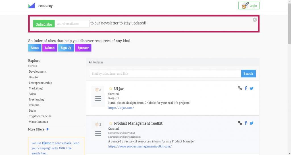
Resourcy: Landing Page. (Screenshot: Noupe)
The theme scope seems somewhat random to me, as the topics also cover cryptocurrencies, and “miscellaneous.” On top of the crude categorization, there’s also the design, which can either be called brutalistic or, “the nineties have called and wanted their design back.” Horrible might be a fitting description, too.
Regarding Content, Resourcy is Wide and Deep
But, let’s not get scared off by looks. Regarding the content, the collection-collection has quite a bit of quality. The segment design contains up-to-date entries, and so does the development area. In the latter, there is an extraordinary amount of content on the topic of artificial intelligence. That alone made the visit worthwhile to me.
Janva has subdivided the main individual topics, allowing you to click deeper into the collection. In most cases, there are at least two layers. For instance, in the category development, you can dive into the topic web. In there, the collection is divided even further, into frontend, backend, and CMS.
Aside from the filtering via categories and subcategories, Resourcy makes use of tags that list up compilations across multiple categories. Janva adds the tags “submissions,” “curated,” or “recommendations” to each entry, allowing you to tell how the entries ended up in there. If you don’t want to click your way through the collections, the free text search on the landing page is the most interesting approach.
For registered users, there seems to be some upvoting option, although this is not properly documented anywhere. However, I didn’t want to register just on a guess, without actually knowing the benefits, so I can’t speak on that.
Every resource collection has its own URL so that you could link it right away. It is also possible to share the entries on Facebook or Twitter. Calling up the direct URL makes little sense otherwise, as the individual view doesn’t offer any information that you can’t see in the list view.
Conclusion: Still Better Than Google
I added Resourcy to my bookmarks just because of the collection character. The sustainable user value will have to prove itself over the following weeks and months. As the Google results are continuing to worsen, we are reliant on offers such as Resourcy when looking for specific information or inspiration.
On this occasion: Congratulations to the content marketing freaks. You have watered down the Google index in no time.
For a beginner, accessibility can be daunting. With all of the best intentions in the world, the learning curve to developing compliant, fully accessible websites and apps is huge. It’s also hard to find the right advice, because it’s an ever-changing and increasingly crowded landscape.
I’ve written this post to give you some tips on small things that can make a big difference, while hopefully not affecting your development process too much.
Let’s dive in!
Document Structure and Semantics
It probably doesn’t come as much of a surprise that structuring your HTML in an organized, semantic way will make a big difference. Screen readers rely on a well-structured document in order to follow a coherent narrative, so make sure that you’re using the elements that the HTML5 spec provides responsively and effectively.
Let’s look at three specific things that can help ensure a well-structured and semantic document.
Use a Single Element
A good example of building a responsible, semantic document structure is only using one element. This should serve as a signpost for the most important content of the page for your user.
Add an ID to it and offer a skip link in your main
like so:
<header role="banner">
  <h1>Your main page title</h1>
    <a href="#main-content">Skip to the main content</a>
 </header>

<!-- Further down the document -->
<main id="main-content">
  <!-- Put your main body of content in here and other really important stuff -->
</main>
This little trick should help your screen reader users out in a big way, because they can go ahead and skip the fancy bits and dive right into your important content. It’s also great for keyboard users for the same reason.
Another nice touch is to add a :focus style to the skip link that makes it visible. Try pressing your tab key on GitHub.com. Pretty neat, right?
Use Elements Appropriately
So, elements are a pain in the butt to style right? That doesn’t mean you should attach your JavaScript events to a
or an though. You see, when you use a , you get keyboard events for free. You’re also helping screen reader users out because it’ll announce the element correctly. Check out this example:
If a user focused on that button and hit the enter key, that event would fire. That makes both yours and the users’ lives a bit easier. Well worth it, right?
It’s really common for screen reader users to navigate a page by using the heading structure. That means we should help them out and create a nice hierarchy for them. Let’s take a look at a standard blog post:
<main id="main-content">
  <article>
      <!-- The page title is up in the main <header> in this instance -->
      <h2>My awesome blog post</h2>
      <p>Vestibulum id ligula porta felis euismod semper.</p>
      <p>Vestibulum id ligula porta felis euismod semper.</p>

      <h3>A sub-section of this post</h3>
      <p>Vestibulum id ligula porta felis euismod semper.</p>

      <h4>A sub-section of the sub-section</h4>
      <p>Vestibulum id ligula porta felis euismod semper.</p>
  </article>
</main>
With that sample, the user can navigate to the start of “My awesome blog post” and then have the ability to skip to sub-sections and nested sub-sections easily. They can also skip back up. It’s just a nice way of helping them consume the content you’ve produced as easily as possible.
It can be recommended that a page has a single
element, even though the W3C HTML5 spec says you can have many. I personally agree with the use of a single , but you can have many, as long as you follow a nice structure and hierarchy. That’s the key here.
Get Your Color Contrast Right
To be WCAG 2.0 AA compliant, you need to have a contrast ratio of 4.5:1 for normal text. This is your paragraphs, buttons, navigation, etc. You need to go for a ratio of 3:1 for larger text, such as headings. I’d say this should be your minimum as it’s incredibly achievable with tools such as Tota11y, Contrast and the WebAim contrast checker. You can still get plenty of color balance and variation in your design too.
The reason that contrast is so important is because there’s so much variation in environment that you probably don’t even consider, such as bright sunlight and poor quality displays. Add this to a visual impairment or, say, a migraine and you’re potentially causing problems for your users.
Getting the contrast right will have a huge, positive effect across a wide spectrum of your users.
Responsible Text Labels
We’ve all built out a list of items with a non-descriptive, but visually appealing “More” button, right? More what though? We need to be more responsible with this and provide some context.
One way to achieve this is by visually hiding descriptive text with CSS and hiding the non-descriptive text from screen readers. It’s tempting to use display: none;, but screen readers can ignore elements with that set, so we need to be more creative. I use something like this little helper:
With this CSS in place, we can do something like this:
<a href="/link-to-your-page">
  <!-- This is hidden from a screen reader, but visible visually -->
  <span aria-hidden="true">More</span>

  <!-- This is visible to a screen reader, but visually hidden -->
  <span class="visually-hidden">Continue reading: "Your post title here"</span>
</a>
A sighted user will only see “More” and a screen reader user will hear “Continue reading: ‘Your post title here.'” Both sets of users are happy.
You can also achieve the above by using an aria-label on the tag. This will override the text within for a screen-reader:
<a href="/link-to-your-page" aria-label="Continue reading: 'Your post title here'">
  More
</a>
Small Typography Tweaks With a Big Impact
It’s always worth remembering that people with a visual impairment or learning difficulty could be trying to read your content, so some small tweaks to your typography can go a long way.
A body of content such as an article should be sized at 16px (or equivalent unit) at a minimum. It’s also worth increasing your line-height to around 1.5 too. Space between lines can help readers with dyslexia to understand your content better. The combination of size and space is also great for older people and/or short-of-sight people. Even small summaries and aside content should be at least 12px (or equivalent unit). Anything smaller than that will alienate users who struggle to read.
Another trick is to highlight key words and phrases if your content is quite complex. This not only benefits users who are slightly slower at processing content but it also helps people who like to scan over an article, like I do.
Lastly on this section, I’d advise you to be careful with your font choices. Fonts with complex ligatures and decorative elements can be really distracting, so maybe limit the usage of those to key, large headings only. It’s also been advised that sans-serif fonts are better for readers with dyslexia. Check out this article for more on that and other text formatting tips.
Enhance Keyboard Support
There are a few little tweaks you can do to help users who primarily use their keyboard to navigate your website.
Say you’ve got a little button that shows a dialogue when you click it. You should attach an event to the escape key that hides it. Here’s a sample snippet:
document.addEventListener('keyup', (evt) => {
  if(evt.keyCode === 27) {
    // Run whatever code hides your dialogue
  }
});
Another tweak you can do for our keyboard-navigating buddies is not hiding focus from them. Browsers give us focus states for free with outline. I know it can look ugly, but hot-damn it’s useful for keyboard users. If you want to get rid of that blue glow, I get it—just please use the :focus pseudo selector to add an obvious state change to it instead. Here’s a sample:
.your-element {
  background: red;
}

.your-element:focus {
  outline: none; /* Reset the default */
  box-shadow: 0 0 0 3px black; /* A very obvious state change */
}
Don’t Rely on Color Alone to Communicate State Changes
Let’s end on a really important one. Color shouldn’t be relied upon alone to communicate state changes. Take this scenario as an example:
You’ve got a button that posts a form. You wrote some neat JavaScript that makes it go grey while it sends the data. It then either turns green or red, depending on what the status is.
For a colorblind user, this is a nightmare. To them, the button may have barely changed enough for them to notice, so they may just keep clicking and clicking while getting really frustrated. This isn’t ideal.
So, instead of relying on color, let’s enhance that with a status message that supports the button’s state on response.
That sample is a great way to quickly communicate to the user that something has changed and the use of color, text and iconography clearly communicates that change. Disabling the button whilst the response is processed is also a great help to the user.
Wrapping Up
These little tips should make a big difference to your users, and I hope you dive into your projects and implement some of them.
If you’re a front-end developer following the evolution of single page applications (SPA), it’s likely you’ve heard of Elm, the functional language that inspired Redux. If you haven’t, it’s a compile-to-JavaScript language comparable with SPA projects like React, Angular, and Vue.
Like those, it manages state changes through its virtual dom aiming to make the code more maintainable and performant. It focuses on developer happiness, high-quality tooling, and simple, repeatable patterns.
An online shop’s shipping methods or rates have a significant impact on decreasing cart abandonment rates and driving up additional sales. Customers are just as attracted by low shipping rates, fast shipping options, and good packaging, as they are enticed by competitive market rates of products.
Ecommerce sites that have not yet mastered the complexities of shipping are unable to reach their full sales potential. Many new business owners grossly underestimate the importance of shipping cost, which can have the most impact on the overall expense it takes to get a product moving. Moreover, these online shops risk their business being run down as a result of the costs due to shipping mistakes eating into their profits.
Fortunately, with a little research and careful planning most of these mistakes are easy to identify and avoid. Avoiding the 10 common shipping mistakes listed below can help any online shop owner become a savvy e-retailer.
1. Not Letting Customers Choose a Shipping Option
Customers enjoy having multiple shipping options since every customer is likely to have different delivery expectations. Some may have an important event, like an anniversary or birthday, just around the corner so they will prioritize fast shipping to get the ordered gift on time. Others may be more interested in saving some extra bucks through free shipping. Your shop will automatically become undesirable if it does not provide suitable shipping options to accommodate customers with specific parcel arrival time or shipping cost preference.
Customers are always on the lookout for the most economical and discounted product. Providing further discount via free shipping serves as an excellent incentive for these customers to proceed with the cart checkout. If, your store completely ignores free shipping, it can significantly increase cart abandonment rates and overall drive down your sales conversions. Remember, your competition can always steal away your customers by offering them a more economical solution (with free shipping included).
2. Ignoring Customer Feedback
Customer feedback/reviews can make or break an online store. Consumer reviews not only help other potential customers to gauge their expectations with your online store, but their feedback can also help you modify your business methods and policies for greater efficiency. For instance, if customers are constantly complaining about delivery delays, then it’s time to upgrade to a better or higher-end shipping package/service provider. On the other hand, if your parcels are always delivered ahead of their delivery schedule then you can safely downgrade to a more economical shipping option and save on those shipping costs.
3. Using The Wrong Packaging
Packaging is a critical feature of the entire shipping process – from encasing consumer products into a box/bag to delivering it to the customer’s doorstep. Packaging not only serves to protect the product from damage during transportation, but it also contributes towards building your brand reputation. The type of packaging used also serves as an indicator for how much you’ll be charged by the shipping carrier.
In the past, delivery services were charged based on parcel weight alone. However, today’s carriers charge on basis of whichever description fits best, either by package weight or its corresponding dimensional weight. New store owners often make the mistake of underestimating the shipping cost of dimensionally large, but otherwise lightweight items. Sometimes business owners also try to save on shipping costs by placing items in inappropriately sized boxes or skip protection like bubble wrap. This can result in damaging the item during transportation. A good estimate is to leave around two-inches of spacing for protection to secure the item.
4. Estimating Shipping Expenses
Sometimes shop owners are neglectful of the DIM weight pricing and pack the items in whatever box is at hand; even if it’s slightly bigger in size. This can generate overhead shipping costs as such business owners are likely to break their shipping budget. Pay close attention to the sub-charges included in the shipping carrier’s package such as fuel surcharges, weekend delivery, residential delivery and recipient’s signature. If these services are not important or relevant to the customer base, there is really no benefit to paying for these additional shipping costs.
5. Not Keeping Track of Shipping Supplies
Suppose you’re effectively managing store inventory, but if no one is keeping track shipping supplies then it will be very difficult to ship out items to customers on time. Moreover, by keeping an eye on the shipping supplies, you can effectively establish re-order points at the right time and ensure that your supplies stores are never depleted.
6. Being Unprepared For Changes In Shipping Package
Shipping carriers make changes to their package prices and shipping policies annually. Most of the time, these changes happen at the beginning of the year, but they can also occur in mid-year. So it’s best to frequently get in touch with your shipping carrier to remain updated about any relevant alterations.
7. Manually Managing the Shipping Process
Creating shipping labels while simultaneously managing shipping demands can be a strenuous job. All of this stress can be easily avoided by automating the shipping process with the help of ecommerce shipping software. Try to take full advantage of the shipping software—create customized invoices and package delivery slips to give your product packaging a more professional feel.
8. Overlooking Customer Address Validation
The address registered by the customer may be wrong and should always be validated by the business owner. If this is neglected, the item will be shipped to the wrong address or returned to the business warehouse. As a result, the customer will be unhappy and may demand a refund or a new piece to be sent via expedited shipment. Businesses pay heavily for this mistake as this not only damages brand image, but the business owner will have to pay out of their own pocket for the second shipment. This mistake can be easily avoided, especially if your business uses some notable shipping software since they have built-in address verification features.
9. Failure to Audit Shipping
Many new business owners are often surprised to discover that parcels are delivered late at much higher rate than they anticipated. In such cases, there is a mechanism in place that ensures some compensation for the affected business owners, but still many fail to avail this. Shipping carriers do not voluntarily offer a refund for late shipments. However, if a business owner has done proper auditing of shipments and makes a request for refund for late delivery with proof, their request will be easily met. Moreover, auditing shipping and carrier bills can help business owners to check for duplicate receipts, invoice mistakes and other shipping failures.
Final Thoughts
If you pay close attention to shipping details and avoid these common mistakes, then your business can effectively source products in such a manner that it generates comfortable profit margins. However, if you are not successful the first time around, you can always play around with different package delivery services, shipping software, and carriers to find the right combination for your business.
Merely providing valuable information to your website visitors is not enough these days. You’ll also want them to engage actively. To achieve this, you’ll have to provide ways for them to interact. Today we will show you a one-stop shop named GetSiteControl for all your interaction needs.
The Contact Form is Not the Only Interaction You Need
The first thing that crosses your mind when it comes to user interaction might be the inevitable contact form. If you think a bit longer, you might also find the collection of email addresses, e.g. for newsletter purposes, worthwhile. And it is likely that at least one of the two already sit on your website somewhere trying to serve you well. The contact form might send you emails from the site to your inbox, while the subscriber form will likely be attached to one of the bigger newsletter providers in the likes of MailChimp or AWeber.
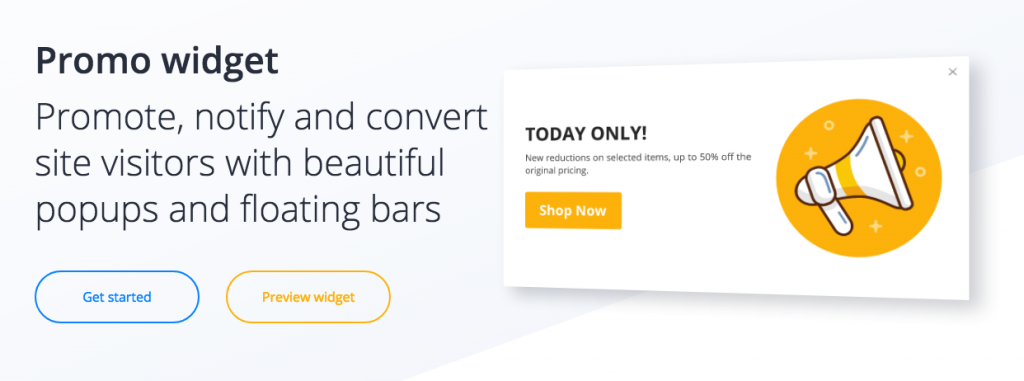
Promo Widgets Made Easy. (Screenshot: Noupe)
If you think you got everything settled that way, think again. Is that really all you need? Let me throw some cues at you.
Think of the EU cookie notice. How do you settle that?
What about new posts, products, updates or changes? Wouldn’t it be an excellent way to announce them prominently in the site header?
So you run a discount. Let your visitors know about it without making them search.
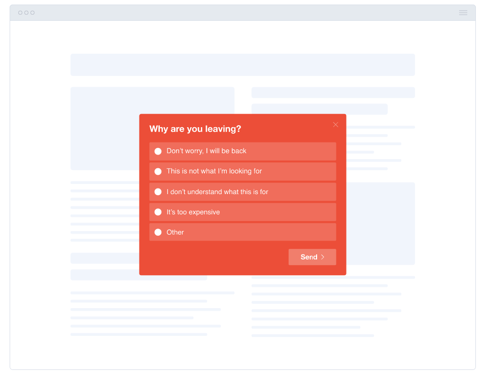
The visitor is just about to leave your site. Wouldn’t it be good to catch him with an offer he cannot refuse before he’s gone? Or at least ask him a few questions to help you improve?
Don’t bury your social profiles somewhere in the textual desert. Use a prominent follow widget to trigger engagement. You could also implement social shares this way.
Have you ever thought about providing online support or even live chat that integrates with your Slack? Chances are that customers would love that.
Introducing GetSiteControl
As good as all of this may sound, wouldn’t it be tedious to find solutions for all these use cases and a quadrillion of service providers invade your site? Yes, it would. But there is a simpler way.
The fairly young Cypriotic company by the name of GetWebCraft offers a solution that integrates all of the above, including contact and subscriber forms, including a whole lot of third-party integrations into one product. I am talking about GetSiteControl, a hosted solution for all your interaction needs.
Ever Thought About Asking Your Visitors Why They Want to Leave? (Screenshot: Noupe)
GetSiteControl is a Software as a Service (SaaS) that works with each and every website out there as long as you have the possibility to add a small JavaScript snippet to it. Should your website run on WordPress, things are even easier as the installation of their free plugin from the backend of your site will do the trick. On their extensive HowTo section, you will most likely find guides on how to install the snippet even for the more CMS out there while the smallest common denominator will always be that JavaScript.
All the widgets run smoothly on mobile also. Lately, Google imposed restrictions on mobile popups to only be allowed in “a reasonable size.” GSC took that hint and implemented an option to let you limit your widget size to 30 percent of the screen real estate on mobile. They definitely care about the success of their customers.
Once you connect your site and GetSiteControl, all the heavy lifting will be done from the GetSiteControl Dashboard. Your site is solely the display for all the widgets you create. Your command central is the mentioned Dashboard.
All the various widgets that collect user data for you save that data in spreadsheets within GetSiteControl. These spreadsheets are available for download in CSV which is the most common data exchange format I know. Even more convenient than that is the wide range of third-party integrations that GetSiteControl (GSC) offers. Instead of saving all the data in spreadsheets and handling them one way or the other later you can as well have GSC store the data right where it finally belongs.
Are your newsletters served by MailChimp? Connect GSC with it and have it store addresses directly there. Are you using Slack anyway? Connect Slack and GSC and offer Live Chat or online support right from within your preferred chat solution.
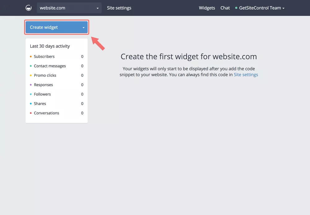
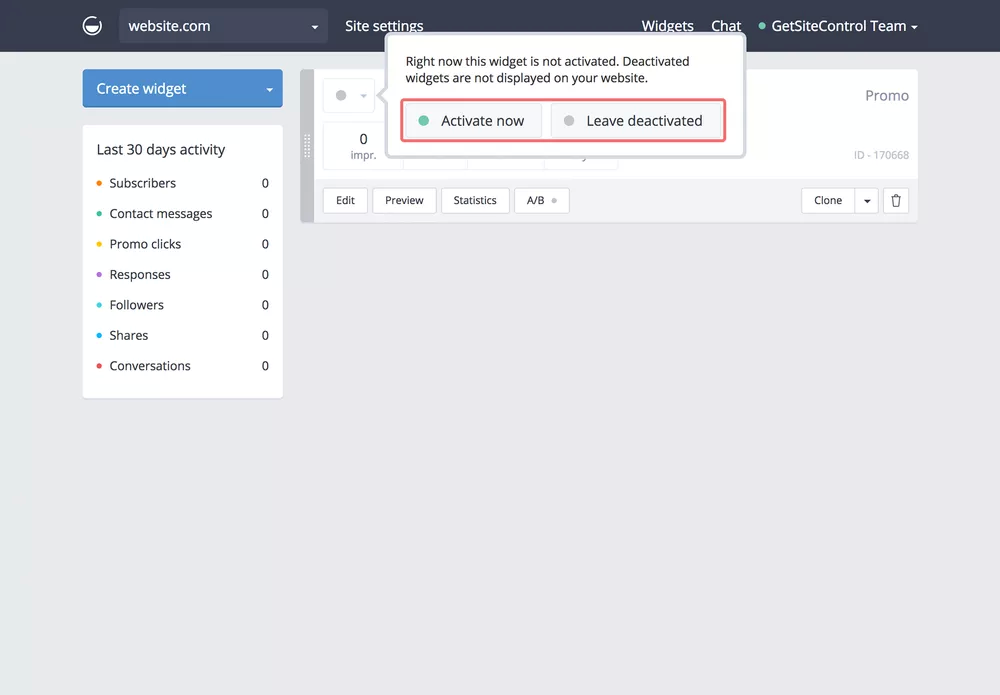
Create and Configure Your First Widget
Creating and configuring a widget is easy. All the steps are more or less self-explanatory, and even the behavior settings (triggers and such) are comprehensible without needing a degree in computer sciences.
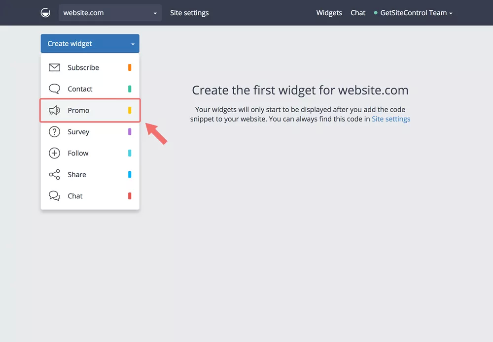
You start by clicking “Create widget” from the main screen of your Dashboard:
Select the widget you want to create by clicking on it. For our run-through we choose “Promo”:
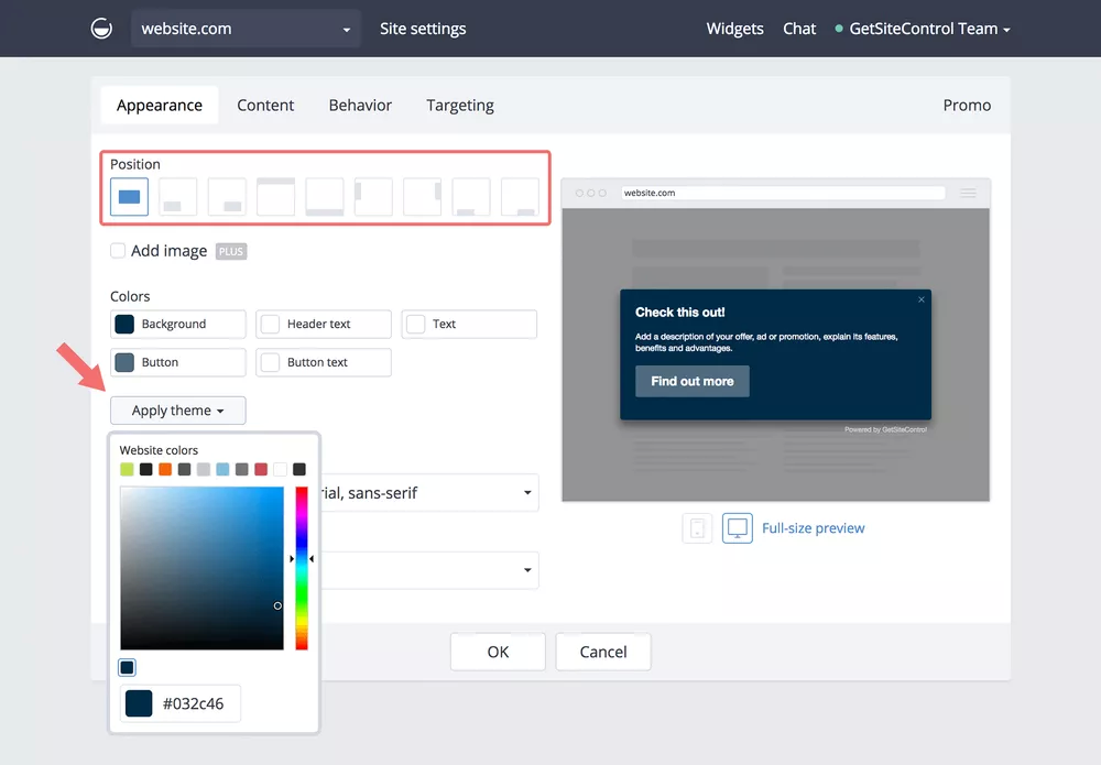
Now you are in edit mode with the widget being previewed on the right side of the editor window. The left-side options allow you to alter the visual appearance to your liking. A tabbed navigation lets you change to other options such as the behavior of your widget. But let’s stick with the tab “Appearance” for now.
This tab lets you modify the colors freely, align them with a color theme or the given website colors. You also define the position of the widget from here. Users of the paid version can add a custom image.
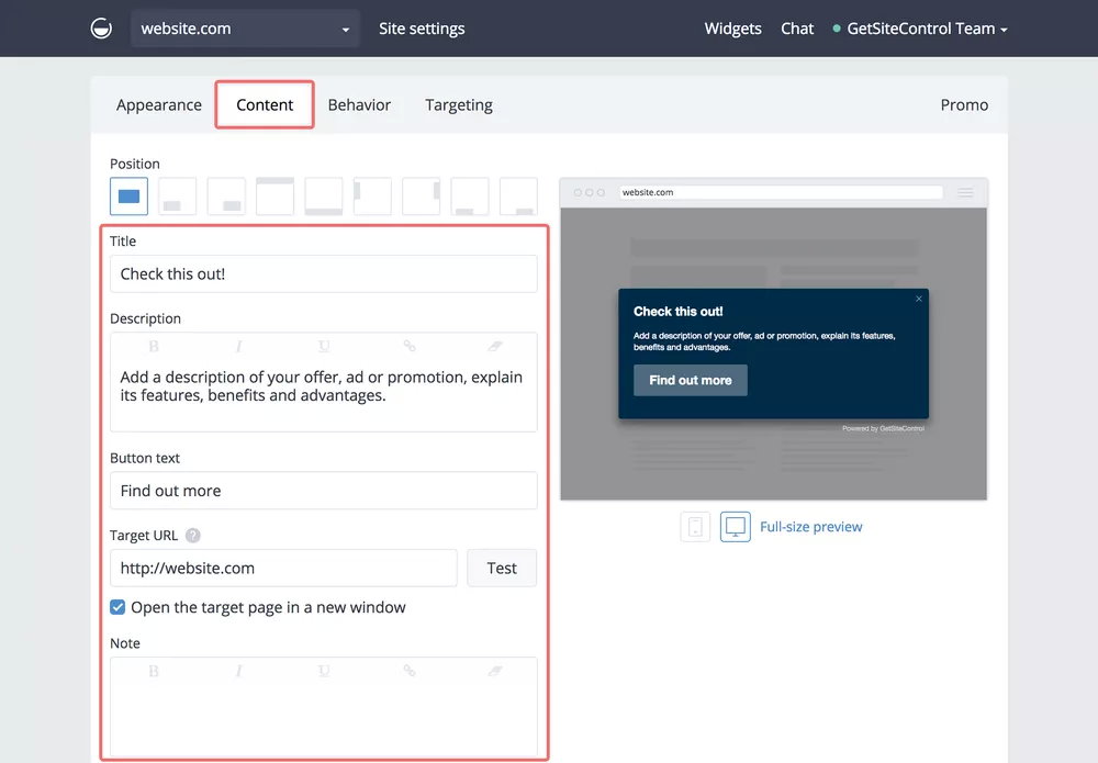
The tab “Content” gives you access to the textual content of your widget. Specify all the wonderful marketing snippets and add your target URL.
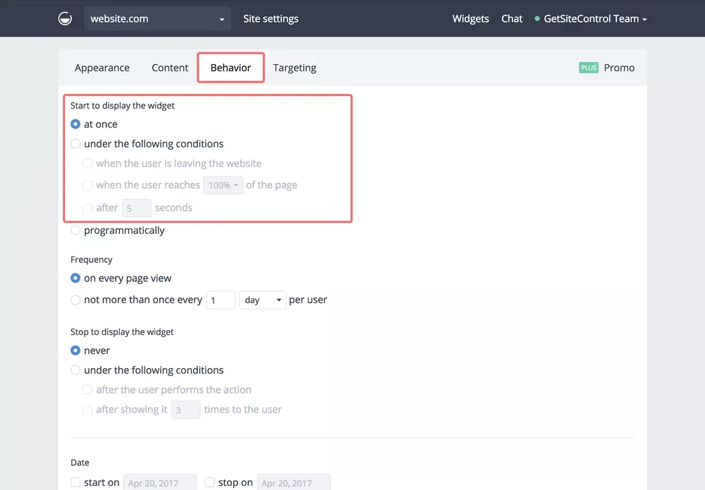
After that step, your widget is generally ready to go. Yet, it is likely that you do not want the widget to fire off at every page view, so let’s look at the tab “Behavior” to round off your first widget.
Figuring out the consequences of each of the settings in “Behavior” is not rocket science either. From here you finetune the conditions that have to be met for a widget to get displayed. These include the time when the visitor is about to leave your page or after he has reached X percent of the page scrolling through it as well as some more.
Note, that these behavior settings are available only in the paid plans.
After having set the desired behavior, return to the main screen of the Dashboard and don’t forget to activate your newly defined widget.
Now explore the other widgets to outfit your website with a full set of interactive features. GSC has a whole slew of helpful tutorials to guide you even through the deepest waters.
The Pricing Model of GetSiteControl
GSC is available in three flavors. You can choose between the Free, the Plus and the Pro plans. The Free plan is free forever with no strings attached but comes with some limitations. The Plus plan is perfect for mid-size websites that are maintained by a single administrator, and the Pro plan is the one for sites that are run by whole teams where each team member needs individual access to GSC’s widgetry.
Let’s sort this out in a little more detail.
The Free Plan
The smallest plan allows you to run GSC on one site with you as the only administrator and not more than 50,000 monthly views. Still, all the widgets are available, but you cannot connect them to third parties such as MailChimp and others. You will have to live with the GSC branding and link back to their site, and you will not be able to use triggers such as Exit Popups and others.
The Plus Plan
The Plus plan might be the perfect fit for most freelancers. The Plus plan comes in at 19 USD for one site and 500,000 monthly views. All the features including integrations and triggers are in place, and you can add sites as needed. That way you could control all your clients’ sites from within the same dashboard. Adding sites makes the individual site fee cheaper. From three sites up you pay a monthly 13 USD per site.
The Pro Plan
The Pro plan takes out the bandwidth restriction entirely and adds the possibility to assign more than one user to an account. With individual usage rights, you could set up teams for individual sites while still maintaining all sites from the same place. The Pro plan sets you back 29 USD per site (20 USD from three sites up) and 9 USD per user. This plan marks the top end of the pricing table.
Conclusion: Fair Pricing and Fairer Featureset
To put it frankly, you cannot go wrong with GetSiteControl. For the given range of interactions, prices are more than fair. Besides that, the service is pretty robust. I haven’t experienced any outages or other errors.
The feature set leaves not much to be desired and is definitely covering more needs than you thought you had. The improvement of your site cannot be prevented, as hard as you might try. I recommend you check the service for yourself. As you can always switch back and forth between all of the plans, just start with the Free one, create some widgets and see where this will lead you. I would bet it is the road to success.
The W3C has completed its second round of HTML5 recommendations for implementation. The entire announcement is worth a read because there are interesting tidbits that provide more context and personnel changes within W3C, but the highlights of this recommendation are nicely summed up:
Many of the features added integrate other work done in W3C. The Payment Request API promises to make commerce on the Web far easier, reducing the risks of making a mistake or being caught by an unscrupulous operator. New security features such as Content Security Policy protect users more effectively, while new work incorporated from ARIA helps developers offer people with disabilities a good user experience of their applications.
There are also semantic changes to HTMl elements that are worth noting:
Clarifications and bug fixes bring the HTML Recommendation closer to what has been deployed recently. The definition for the main element has been updated to support modern responsive design patterns, the style element can be used inside the body element. Numerous constraints on code have been loosened, while where necessary for interoperability or security a few have been carefully reinforced.
And, spoiler alert! HTML 5.3 is officially in its first public working draft.
How about bringing an attractive, engaging website online? This would be a great way to get a business off to a great start in 2018. A website’s ability to bring in traffic is not enough, however.
If it isn’t responsive, those who rely on mobile devices can easily be turned off by what they see (or are unable to see).
Having a responsive website is, therefore, a “must”. The good news is that ThemeForest offers thousands of responsive themes. Yet, who wants to sift through thousands of themes to find the best fit for a given project?
You really want to be able to narrow your choices down to a much smaller number of providers. That’s what we’ve done for you.
These aren’t just any WordPress theme providers. With these 10, you’ll get the greatest value for your money.
Every new web-building project has its unique challenges, whether they arise from a set of unusual client requirements or the difficulty in finding a theme that’s a good fit for a given business or business niche.
Be Theme has you covered with its selection of 300+ pre-built websites. Your business may be an accounting firm, a sports club, and auto dealership, or a bistro. A one-page website may make the most sense, or a website featuring an awesome portfolio for a creative individual or agency could be what’s needed. It doesn’t matter.
Each pre-built website is responsive and customizable, so if you find a template that’s a close fit, you can easily make adjustments to create a perfect fit.
A pre-built website can be installed with a single click. From that point on, building a website is an easy task thanks to powerful tools like the Muffin Builder, the Options Panel, and a host of additional features to help you along the way, plus there’s no need for coding.
Kalium is also well worth considering. This is especially true if you’re looking for a multi-purpose Website theme. Kalium has all the layouts, shortcodes, and design elements you’re ever likely to need. The demo sites make it easy to get a website-building project off to a quick start.
While Kalium’s page-building features were created with the professional web designer in mind, this WordPress theme is delightfully easy to use. Even if you happen to be a first-time user, you can still create an engaging website or blog, an awesome portfolio, or a ready-to-go online store from one of the many shop layouts, in minutes.
In addition to home-page demos, you’ll find a nice selection of demos for your landing pages as well.
If you choose Kalium, you’ll be adding an award-winning ThemeForest best seller to your website-building toolkit.
If you can imagine it, you can build it. That’s Pro’s claim; and this game-changing WordPress theme definitely has what it takes to live up to that claim. Designed with creative professionals, and those who aspire to be, in mind, Pro utilizes an easy to work with the modular approach, coupled with an extensive array of design elements, free extensions, and more.
There’s no need for coding, and if you prefer, you can do your design work with Pro directly from your browser. With the Header Builder, you can create anything from the most basic headers, to those that will blow your mind. The Content Builder’s optimized workflow capabilities can make you a poster child for productivity, and you can use the Footer Builder’s features to demonstrate that footers can be things of beauty.
To repeat. If you can imagine it, you can build it.
If you have a news-oriented website in mind, one featuring a magazine format, a blog or a publishing website, the Envato-authored Newspaper theme will be an excellent choice.
This theme’s layouts are responsive and retina ready, and its 48+ demos cover everything from food, fitness, and lifestyle to art, law, and beauty; each of which can be highly customized. Moreover, it has a frontend page builder, an intelligent ad system, and premium widgets.
Uncode is a pixel-perfect theme you’ll find ideal for building awe-inspiring portfolios. It will appeal to artists, creative web designers, and bloggers. Uncode is packed with everything you need, including a tailored version of Visual Composer, so you don’t have to worry about writing code.
A key feature is the centered mobile menu that ensures your website will look great on mobile devices.
Starting with its selection of 70+ beautiful design concepts, TheGem doesn’t stop there. This amazing one page/multipage-ready multipurpose theme features more than 200 creative page templates (demos), shortcodes, widgets, multiple header and footer options, unlimited layout possibilities, and much more.
Smart tools, such as the latest Visual Composer, plus the intuitive GUI, make website, blog, and portfolio building easy; with no coding required. TheGem could be called the “Swiss Army knife” of WordPress themes.
The Core’s website demos address key business, corporate, non-profit, and creative niches, making you feel as if you own a host of different WordPress themes instead of one. This flexible theme provides you with a host of layouts and design options, it’s responsive, and it requires no coding.
There are plenty of tutorials, and if you have a question or need help, The Core’s user support is rock solid.
If you are a realtor, or your client is one, or represents a real estate agency, Houzez is a love affair in the making. Not only does this responsive WP theme’s attractive layouts conform to industry standards, but its other features and functionalities, including advanced property search, payment options and membership options, combine to make Houzez a complete package.
All the design elements you’ll need are there too.
If launching a successful online store is your goal, you might as well use a WordPress theme that’s dedicated toward that goal. XStore is just such a theme.
With this minimalist, responsive theme, with its selection of 70+ customizable good-to-go shops, it’s easy to create a fully-functioning, eye-popping online store that’s guaranteed to get you off to a great start.
This is the only all-in-one solution for creating an online directory on the market. The Listing Pro Directory WordPress theme is the #1 best-selling ThemeForest theme of its type, having accounted for more than 3000 units sold in less than 6 months.
With Listing Pro, you don’t have to worry about coding, or any need for paid plugins. Everything you’ll need comes with the package.
Summing Up
Pick one of these 10 best responsive WordPress themes, and you can be assured of getting off to a good start in 2018.
They have the features and functionalities you need to get a project underway. Also, they have everything needed to help you maintain your momentum until you’re ready to go online.
If you looking for a multipurpose website builder, you find the best ones here. The same goes for the case when you opt for one that addresses a specific niche.
In experience design, friction is anything that prevents users from accomplishing their goals or getting things done. It’s the newsletter signup overlay covering the actual content, the difficult wording on a landing page, or the needless optional questions in a checkout flow. It’s the opposite of intuitive and effortless, the opposite of “Don’t make me think.”
Having said that, friction can still be a good thing sometimes. In game design, for example, friction is actually required.
Using a living style guide (LSG) to drive development is a practice that is gaining a lot of popularity because it has many advantages, including code efficiency and UI consistency. But, how can you create one? What should you include? And where do you even start? In this tutorial I will delve into the nitty-gritty details of creating a living style using DocumentCSS.
The Beauty of Living Style Guides
Similar to a standard style guide, a living style guide provides a set of standards for the use and creation of styles for an application. In the case of a standard style guide, the purpose is to maintain brand cohesiveness and prevent the misuse of graphics and design elements. In the same way LSGs are used to maintain consistency in an application and to guide their implementation. But what makes a LSG different and more powerful is that much of its information comes right from the source code, making it easy and efficient to reflect the evolving state of an application.
Even today it’s mind blowing to learn that you can use the source code of your application for building your style guide.
If you look at the examples below you will see the common denominators of a LSG are:
A list of the elements that are documented
Succinct documentation with code snippets and interactive UI demonstrations
Lonely Planet Style Guide
Sales Force Style Guide
Another key element of a LSG is that you can use a style guide generator to automate the process. A style guide generator will use your application source code to feed the bulk of your LSG documentation and watch for any changes made in your code, taking care of updating your style guide documentation as your application changes.
Style Guide Generators
There are many flavors to choose from, depending on the code language that you want to document or your project setup. Here are some places to look for options:
For this tutorial I will be showing you how you can use DocumentCSS to create your LSG. This tool created by Bitovi is open source and can be used in any project to document CSS (preprocessors like Less and SASS are supported as well). If you are interested in documenting Javascript and other languages, you can easily do it with DocumentCSS, as this tool is a subset of DocumentJS. I won’t be covering that part in this tutorial, but it’s good to keep in mind.
Planning Your Style Guide
Before diving into creating your LSG the first step is planning what will be in it. Like any good website, a well structured Information Architecture (IE) is the key.
So let’s get started by using the following set of designs of our sample app called “Vintage Shop” and observe the persistent elements in the UI:
Vintage Shop Mockups
At this point I recommend starting with larger groups of elements, such as the navigation, the cart or the forms. For example, we’ll separate our design into these three groups: the steps indicator, the mini cart, and the products in the cart:
With these larger groups of elements, you can start going into more detail and identify the “styles” that persist. For example, there is a convention for the typography in general, and more specifically for the headings, the subheadings, and the links vs. regular text. The color of the buttons also persists across the pages.
Putting it all together, let’s write down these groups using a diagram:
Taking a deeper look into these groups you can fine tune them and turn them into categories that you can use in your style guide as it grows. For example:
“Elements” is a very vague term that could refer to any HTML element, so a better name for this group could be “Components” or “Modules. These are still broad terms but are more specific in the nature of the type of elements that would cover.
“Primary vs Secondary” buttons could be part of “Base Elements”, and the color aspect of it could go inside of a “Color Palette” category.
Additionally, you can think about a category where you can include more generic information about your style guide. A good example of that would be a “Guides” section where you could describe how to contribute to the style guide or a “Branding” section where you can include guidelines about your brand that should be kept in mind when designing and implementing your app.
With this in mind, here’s what the diagram would look like:
You can see how this diagram takes the shape of a site map, which is basically what you want to use as a plan when creating your living style guide.
Now, dive into the designs and sketch up your own site map, including as many categories as you think would be useful for the future. You can get ideas from other style guides (styleguides.io/examples is a great resource). Once you are done, check this more comprehensive version and compare.
Creating Pages in a Living Style Guide
While the bulk of your LSG documentation will come from special comments that you add to the source code, you can also create standalone pages where you can host other types of content that are not specific to the code (think of design principles, accessibility guidelines, or pull request guidelines). This gives you the advantage of centralizing your documentation in one place: your application living style guide.
You could almost think of the living style guide as the “game rules” of your app. Inside of “the rules” is all the information that is needed on how to “play” the game: The building blocks and the rules for creating and making building new blocks. Including how other members of your team can contribute to it and help maintaining it as a living document.
Yas! Believe it. You can have all of your docs consolidated in one single place!
With this in mind, let’s get started by installing the sample application that we will use for this tutorial.
Installing the Sample Application
The installation process has 3 steps:
1. Installing Node
First, make sure you have Node installed. You will need at least version 6.
2. Installing the App
Then, download this zip file: sgdd-tutorial.zip to your Desktop and unzip it. This is important as another location would break the install commands.
Then open the terminal and enter the following command:
cd ~/Desktop/vintage-shop-sgdd-tutorial && npm install
It will take a few seconds to install the app and its dependencies.
3. Running the App
Once the installation is done enter the following commands:
npm run develop
In a new tab enter: npm run document
Now, let’s break this down:
npm run develop
Starts a server where you can see your app running at: http://localhost:8080. You will see in the terminal:
And in the browser:
npm run document
Generates the living style guide at http://localhost:8080/styleguide. You can add the flag -- -w to this command to watch for changes in your code and then generate an update in the living style guide, like this:
npm run document -- -w
Switching to the browser you should see:
The generated living style guide uses DocumentCSS, so let’s take a look at how does this work.
How does DocumentCSS Work?
DocumentCSS is a static site generator. This means it looks for specially formatted comments in your code and creates a static website. This site is called “static” because it remains unchanged until a command (in this case documentjs) is run again. This workflow works well for generating a living style guide as changes to your stylesheets are also changes to the Living Style Guide static site.
To build a living style guide, DocumentCSS does the following:
Reads through files specified in its configuration (for this tutorial it will be looking at .less and .md files)
Looks for comments that uses special “tags” (like @page, @stylesheet or @styles.
Generates html files and connects them to build the site.
With this in mind let’s jump into using DocumentCSS to create a new page in the LSG.
Creating a Page
To begin, first open the sample application in your code editor. You should see the following file structure:
Drill down into src , and find base/markdown. Here you will find pages that already exist in the style guide. Create a new markdown file and name it “about” (with the extension .md). Your file structure should now look like this:
Inside of this new file, add the tag @page followed by two strings:
@page about about
Now let’s break this down:
@page
The tag @page declares the file as a page and tells DocumentCSS that the information in this file should be displayed as a page in the style guide. This serves to differentiate it from stylesheets, javascript, or other types of files in your documentation.
about
This is the unique name for the page and is used as a reference to other tags. So keep it short, lowercase and simple as it will be used as the url for the page. For our example, the url for our new page will be: http://localhost:8080/styleguide/about.html
About
This is the title of the page that will be used for display purposes in the generated site. Here you can use multiple words with spaces or other characters.
To view the newly created page run documentjs in the terminal again (unless you have it watching for changes), and then go to http://localhost:8080/styleguide/about.html to view the new page.
The next step is to add your page to the navigation. For this add a second line to your file as follows:
@page about About@parent index
The tag @parent allows to specify a parent for your document. In this case we want the “About” page to show under the home section. Now, you can rerun the docs and see the page appear below the “Welcome” link:
And if you click on the “Welcome” link, you can access the start page:
Now we are good to add content to this page using markdown or html. To finish the exercise, let’s add the following dummy content:
@page about About
@parent index
## Hello World!
This is the first page of my style guide. Here I can add any type of content that shouldn't live with the code. Like who are the main contributors of the style guide or contact info.
For example here's an animated gif inside of an `iframe`:
<iframe class="giphy-embed" src="https://giphy.com/embed/3o7TKMt1VVNkHV2PaE" width="480" height="480" frameborder="0" allowfullscreen="allowfullscreen"></iframe>
And here’s the output:
Documenting a Stylesheet in a Living Style Guide
The heart of creating a LSG is the ability to put your documentation right where it belongs: in the source code. Chances are that you are already documenting your code, which is a great opportunity to take it to the next level by using a style guide generator that can turn those comments into an organized site, letting others (and yourself from the future) know why and what has been done in the code.
Yourself from the future after reading the docs you wrote in the past.
Documenting a Stylesheet
Documenting a stylesheet follows a similar pattern to documenting a page, but in this case the documentation will go inside of a comment, right next to the code (that’s the beauty!).
To get started open the stylesheet: buttons-custom.less.
Inside of this file, and inside of a comment block, add the tag @stylesheet followed by two strings:
/**
@stylesheet buttons.less Buttons
*/
Note that the documentation comment needs to start with /** for the parser (in this case JSDoc) to recognized it.
Now let’s break this down:
@stylesheet
The tag @stylesheet declares the file as a stylesheet and tells DocumentCSS that the information in this file should be displayed a such in the style guide. This serves to differentiate it from other types of documents, like pages, components, and models, among others (read here about the full list of document types).
buttons.less
This is the unique name for the stylesheet and is used as a reference to other tags. While you can use any type of name, I recommend using the name of the stylesheet file, as this will help finding the file when referencing the documentation. Do keep in mind that this will affect the url of your document. For this example the url will be: http://localhost:8080/styleguide/buttons.less.html
Buttons
Similar to creating a page, this is the title of the stylesheet that will be used for display purposes in the generated site. Here you can use multiple words with spaces or other characters.
To view the newly created page run the following command unless you have it watching for changes):
Note that in this case we have added .base to specify this page should appear under the group “Baseline” shown in the sidebar (you can also create groups in your subnav! We will dig into that in a little bit).
Re-running the docs and refreshing the page should look like this:
Now for the meaty part! With our page in place we can do a few things:
We can add an overall description for the doc
We can add all sorts of content using both markdown or plain HTML
And best of all, we can add demos for our code
Let’s add a quick description and a demo for our buttons doc:
/**
  * @stylesheet buttons.less Buttons
  * @parent styles.base
  * @description
  * Global style definitions for all button elements.
  * @iframe src/base/bootstrap-custom/buttons/buttons-custom.html
  */
Rerun the docs, and :
As you can see the @iframe tag allows to add an iframe with a demo to your doc. This demo is really just a simple html file with a script tag that imports the CSS of your app at run time.
The only thing required in this file is the script tag, which should be the same for any demo that you create in this app. The rest of the code is the markup with the styles that you want to show in the demo.
Additionally you can use the tag @demo to also show the snippet of code used in it. Like this:
/**
  * @stylesheet buttons.less Buttons
  * @parent styles.base
  *
  * @description
  * Global style definitions for all button elements.
  * @demo src/base/bootstrap-custom/buttons/buttons-custom.html
  */
Which will output like this:
Demos credit goes to Bootstrap Docs where we snap the code from.
Now, before you go bananas with this, there are a couple of more goodies that you can take advantage of:
Creating Style Sections
Creating Stylesheet Groups
Creating Style Sections
To create a style section you can use the tag @styles. This tag is sweet because it allows you to break down your stylesheet doc into sensible chunks that you can talk about and understand better.
For instance, in our example, we have styles for defining buttons in general, regardless of the markup that is used ( either a vs tag). And then we have definitions of color. With the @styles tag we can break the color definitions into their own section, not only to talk about them separately, but to be able to hyperlink to that section directly.
This is how it works. In the same file buttons-custom.less, we are going to add the tag @styles right after the first block of styles and before the color variables. Here’s how it should look like:
/**
* @stylesheet buttons.less Buttons
* @parent styles.base
*
* @description
* Global style definitions for all button elements.
* @demo src/base/bootstrap-custom/buttons/buttons-types.html
*/.btn{display: inline-block;
...}/**
* @styles buttons-colors Button Colors
*
* @description
* Buttons can be displayed in the following colors:
* @demo src/base/bootstrap-custom/buttons/buttons-color.html
*/@btn-default-color: #333;
There are a couple of things to point at here:
I updated the first demo to show only the button types.
I added a new comment block using the @styles tag. Here I gave it a unique name button-colors and the title of Button Colors. I also gave it a @description and added a@demo for it that only shows the button colors.
I personally find this super useful because you can point people to a specific section in the style guide, vs saying: “is in x page, under x section, then you need to scroll…and blah, blah, blah“. Instead you can provide a direct link to it, and end of the story.
Creating Stylesheet Groups
Additionally, you can also create sections or groups in the sidebar of the style guide. For this, open the file styles.md, located in the markdown directory.
You will notice here a new tag called @group.
@page styles Styles
@group styles.theme 0 Theme
@group styles.base 1 Baseline
The styles shown in this section show how elements are styles with definitions from the Bootstrap framework, in addition to any customizations made for this specific project. Therefore they will be available for use in any part of the application.
Now let’s break down the second line:
@group
The @group tag allows you to create a section in the sidebar that appears under the parent section. For example, the groups: “Theme” and “Baseline” will appear under the parent section of “Styles”.
styles.theme
This is the unique name for the group. A good practice to follow here is to use the name of the parent section, in this case “Styles” as a namespace. In this way, if you want to create another group with the same name, but under a different section, the name of the group will remain unique.
0
This is the order in which the group should appear, which starts with 0. If no order is assigned, then the list of groups will be shown in alphabetical order.
Theme
This is the actual name that will show in the sidebar, so you can use multiple words with spaces and other characters.
To see groups in action, let’s add a new group as follows:
@page styles Styles
@group styles.theme 0 Theme
@group styles.base 1 Baseline
@group styles.forms 2 Forms
The styles shown in this section show how elements are styles with definitions from the Bootstrap framework, in addition to any customizations made for this specific project. Therefore they will be available for use in any part of the application.
Finally, let’s add an existing doc under this new section. For this open the file forms-custom.less:
And on line 3, replace styles.base for styles.forms.
/**
  * @stylesheet forms-custom.less Form Elements
  * @parent styles.forms
  **/
Then run the docs and refresh the browser. You will now see the “Form Elements” doc under the group “Forms” in the sidebar.
At this point, if you have been following along you should now have a running Living Style Guide, and a well thought-out plan to create a LSG that you can use as a baseline for other projects.
The web is becoming increasingly complex. Design from a purely visual perspective is barely relevant. The topics that will set the trends in 2018 are different.
Conventional web design pretty much only exists in email newsletters. As if the nineties were not over yet, fixed definitions and tables are still used as layout frameworks. As a veteran, one can quickly become wistful. Nowadays, the design is more development than visual design, and the functionality is a lot more important than pure looks.
Thus, I don’t see our designs advancing in 2018 from a visual point of view, as minimalism has been established for years, and is unlikely to ever vanish due to the steadily growing mobile web usage. As a result, I don’t expect brand new trends and believe that trends we can already see will just increase in popularity. Examples being:
Bold, Flat Colors
Somehow, your design needs to stand out from the others. This results in a trend for bold colors. The term is a good description of what it’s about. Colors are used with such strong contrasts, that it almost takes courage to do so.
Mixing is possible as well, as long as the harmony of the overall image remains intact. The recently presented Mondrianism is an excellent example for that.
Soft and Complex Micro-Interactions
Regular readers might get the idea that micro-interactions are one of my favorite topics. In fact, there are tons of releases on the topic elsewhere (in German language).
Briefly summarized, micro-interactions are the essential interface elements between your visitors and your goals. As websites become increasingly similar, the micro-interactions are what sets you apart. Read the linked articles to learn more.
For 2018, I expect micro-interactions to become more complex regarding their visual presentation, and to feel even more seamless than they already do. This takes skillful animation and experienced handling of the related data transfer.
Individual Illustrations and SVG
SVG as a vector format is excellent for responsive websites, meaning it is excellent for all sites that are being developed now and in the future. Since the display does not have to be calculated based on pixels, SVG is equally sharp and crisp in all resolutions. Additionally, the SVG support in browsers is no longer a brake shoe.
While the aesthetic and technological quality of images used in web design has increased significantly, also due to the increasing number of professional free photo providers, this circumstance boosts the effect of uniformity, instead of reducing it.
Because of that, and the above-mentioned advantages of SVG, illustrations are increasingly popular with designers and their clients. A custom illustration suits the minimalistic designs, while still being different from the competition next door. This can’t really be said for photos.
Thus, in 2018, many designers will use illustrations. Depending on the demand, this is even cheaper than holding your own photo sessions. And all of us had to learn drawing as it is. Those who didn’t, collaborate with an illustrator.
More Authentic Photos
Since there is no lack of good photos, it will be hard to stand out. Of course, this also brings up the question if that is even necessary. If you conclude that you have to differentiate yourself via images, you won’t get around a different approach as it is.
Taking more authentic photos sounds like a plausible piece of advice. However, what does that mean? My advice is to consider pictures as stories. What you’re doing is storytelling with image material. Your photos don’t just show the product in a professional way; they tell a story that can but doesn’t have to be related to the product.
Authenticity does not always require professional (and expensive) settings, and can also be achieved with a smartphone camera. It all depends on what you want to present, and why.
More Interesting Typography
The future of typography is colorful. The so-called color fonts are responsible for this, and we posted an in-depth article on them here. Some even claim that colorful fonts dominate designs more than images ever did. Aside from the color fonts, we can also look forward to using variable fonts.
It’s Getting Colorful, Baby. (Photo: Pixabay.com)
Variable fonts can be manipulated in real time. Instead of multiple versions, like “thin” or “bold,” resulting in multiple files for marginal changes, variable fonts offer everything at once. If you want to learn more about that, I recommend reading this article.
Virtual and Augmented Reality
Both VR and AR are nothing new. Here at Noupe, we touched upon this topic ten years ago already. The rapid technologic progress is the reason why this has only now become the near future. Current smartphones are the ideal platform for experiments with augmented reality. Just recently, the AR stickers in the Pixel 2’s Google Camera impress the masses. Pokemon Go also continues to be profitable.
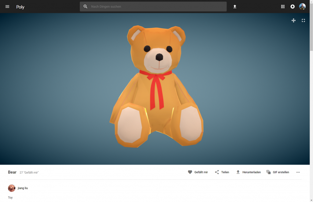
Google Poly: 3D Objects From the Building Kit
Google supports designers and helps them get into VR/AR with its Poly platform, which we presented here. If you ask me, I think – of the two – AR has more potential, and I expect it to have a faster and more significant impact on the mass market. VR will remain a niche topic for a while.
Progressive Web Apps Instead of Native Apps
The trend away from native apps and towards progressive web apps (PWA) should continue as well. Around the same time last year, I wrote a more in-depth (German language) article on the topic here. This post has lost nothing of its currency.
Progressive web apps are web offers usable on mobile, which progressively adapt to the abilities of the device and browser they are used on. The more potent the device and the browser, the more performant the app. For the creation, open web standards are used exclusively. However, progressive web apps cannot access all device functions yet, making them unfit for some application cases. As PWA live and die by the browser support, every year is a new chance.
Speech as a Search Tool
With an expanded definition of design, SEO is moved into the focus as well. Here, we experience a veritable trend towards speech search. More and more users don’t use individual keywords for the conventional Google search, and instead, use entire sentences via different speech assistants.
Nice can, mostly used as a speaker. (Photo: Amazon)
Thus, there is no way to avoid preparing our content for this new way of searching. I told you everything you need to know about it in this article.
Conversational Interfaces
Conversation is a synonym for communication. At least, it’s its original form. As a result, we are very experienced with it and are accordingly natural when dealing with it. If we can solve something with a conversation, we will automatically prefer this form over all other options.
Thus, it only makes sense that “conversational” user interfaces are the future. The fact that “Conversational Interfaces” are not the default yet doesn’t prove that we do have something against it. In the past, the technological options just were not sufficient to realize a clean and functional interface. Once again, the progress comes in handy.
More on conversation interfaces, like Alexa and Co., as well as the increasingly more popular chatbots, can be found right here (in German language).
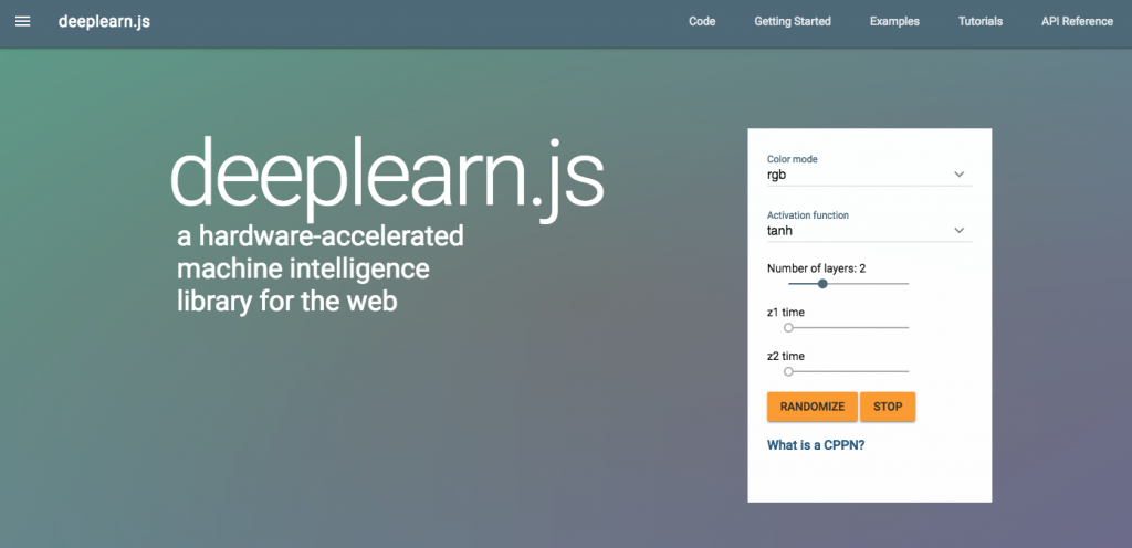
Artificial Intelligence
For the sake of completion, the buzz topic of the year shouldn’t be left out. I don’t think that elements of AI will be reflected in the everyday design or everyday development. Nonetheless, we shouldn’t lose track of the progress. Projects such as Google’s Deeplearn.js lower the entry level. Let’s talk about that at the end of 2018…


 :
:


 For the sake of completion, the buzz topic of the year shouldn’t be left out. I don’t think that elements of AI will be reflected in the everyday design or everyday development. Nonetheless, we shouldn’t lose track of the progress. Projects such as Google’s