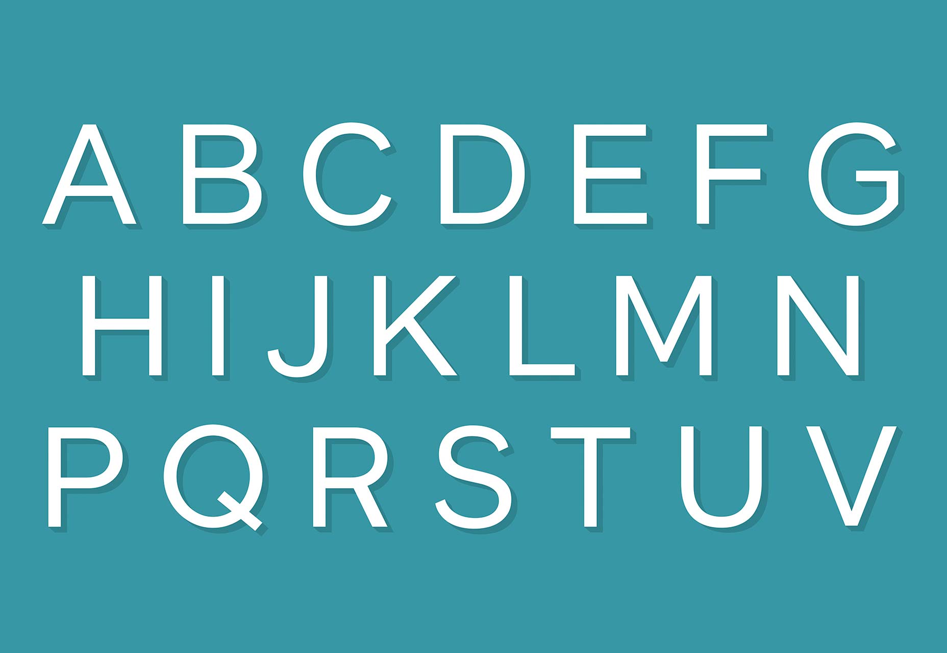
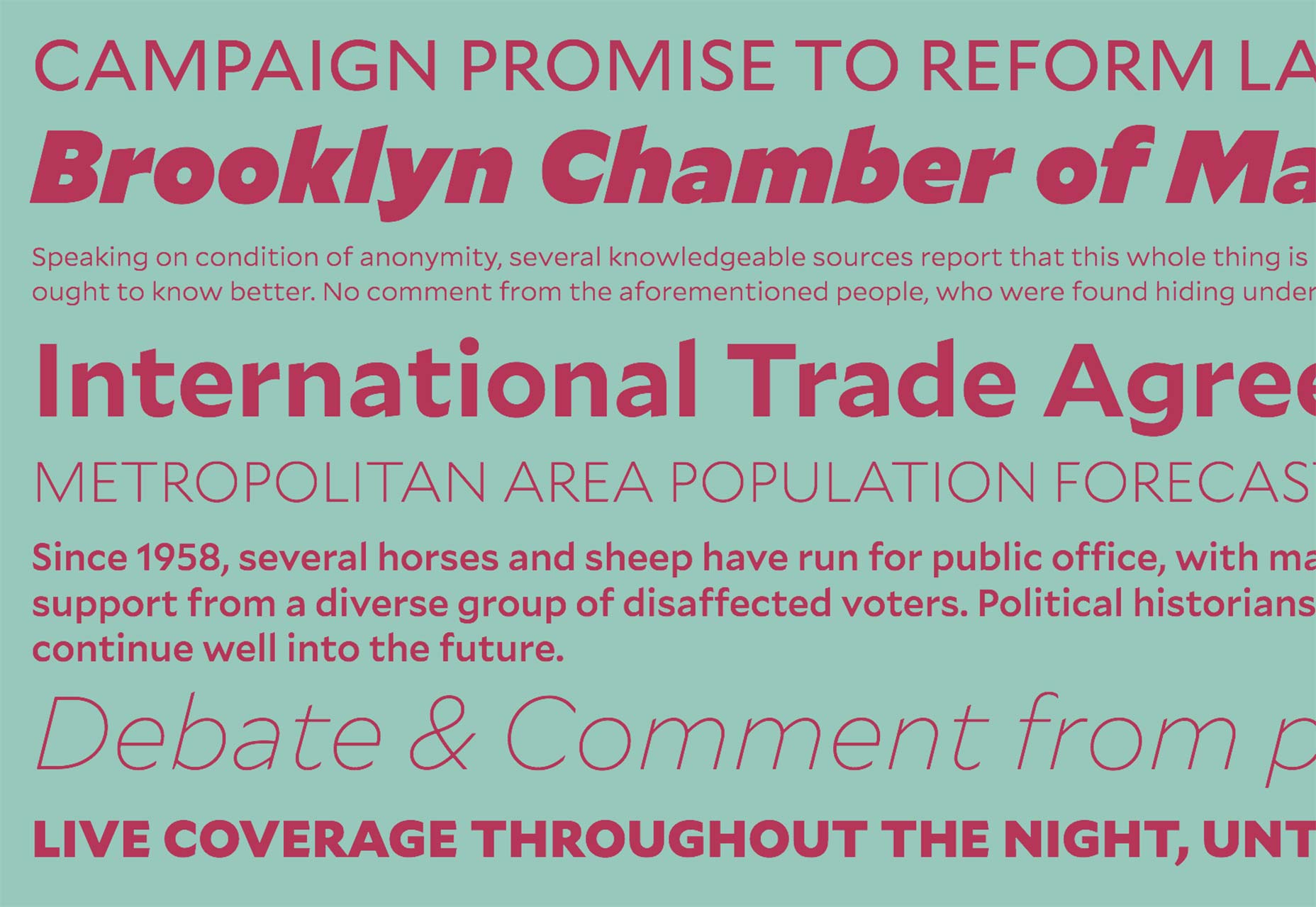
The typeface Gotham is one of the most popular sans-serifs in circulation. Designed at the turn of the millennium by Tobias Frere-Jones for the Hoefler & Co. type foundry, it is based on the basic letterforms that Frere-Jones saw in use on buildings around Manhattan, in signage and architectural lettering.
The quintessentially American feeling in the design has resulted in the typeface’s use in countless branding projects—Barack Obama’s presidential campaign, the National September 11 Memorial & Museum, and Saturday Night Live, as well as many other household names have adopted Gotham.
Described by Hoefler & Co. simply as, “What letters look like” it’s the typeface’s modernity, honesty, and assuredness that make it so popular.
As with many typefaces, with great popularity comes great overuse. Designer’s immediately took to Gotham, and it started to become a highly predictable choice. If you want to capture the spirit of Gotham, but would like a little more exclusivity, there are some excellent free alternatives, we’ve collected some of them here. Enjoy!
1. Montserrat
Designer Julieta Ulanovsky named Monserrat after the neighbourhood in Buenos Aires in which she works. It was inspired by local architectural signage just as Gotham was. The marginally wider letterforms of Montserrat give it a relaxed feel that Gotham can’t muster.
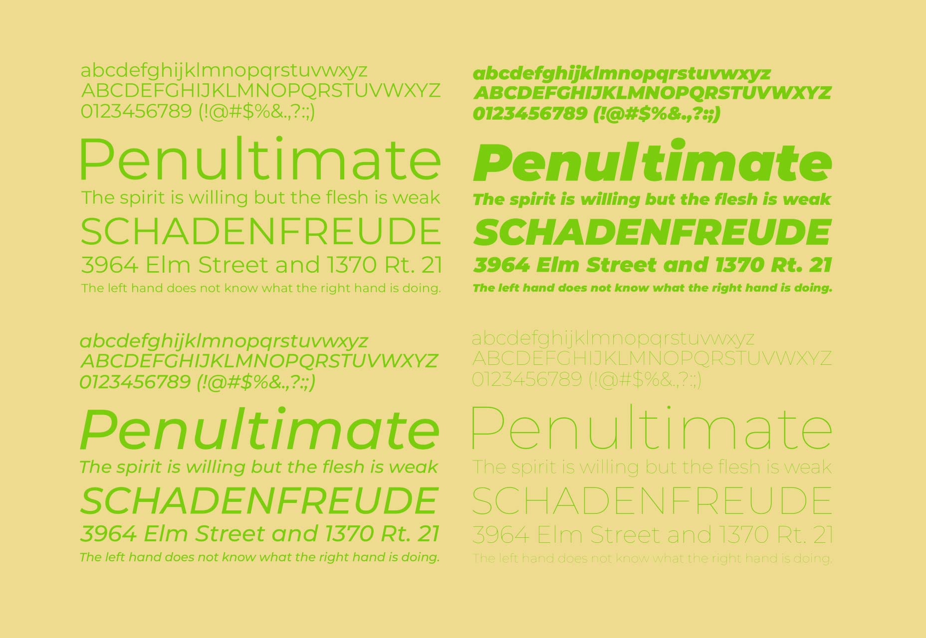
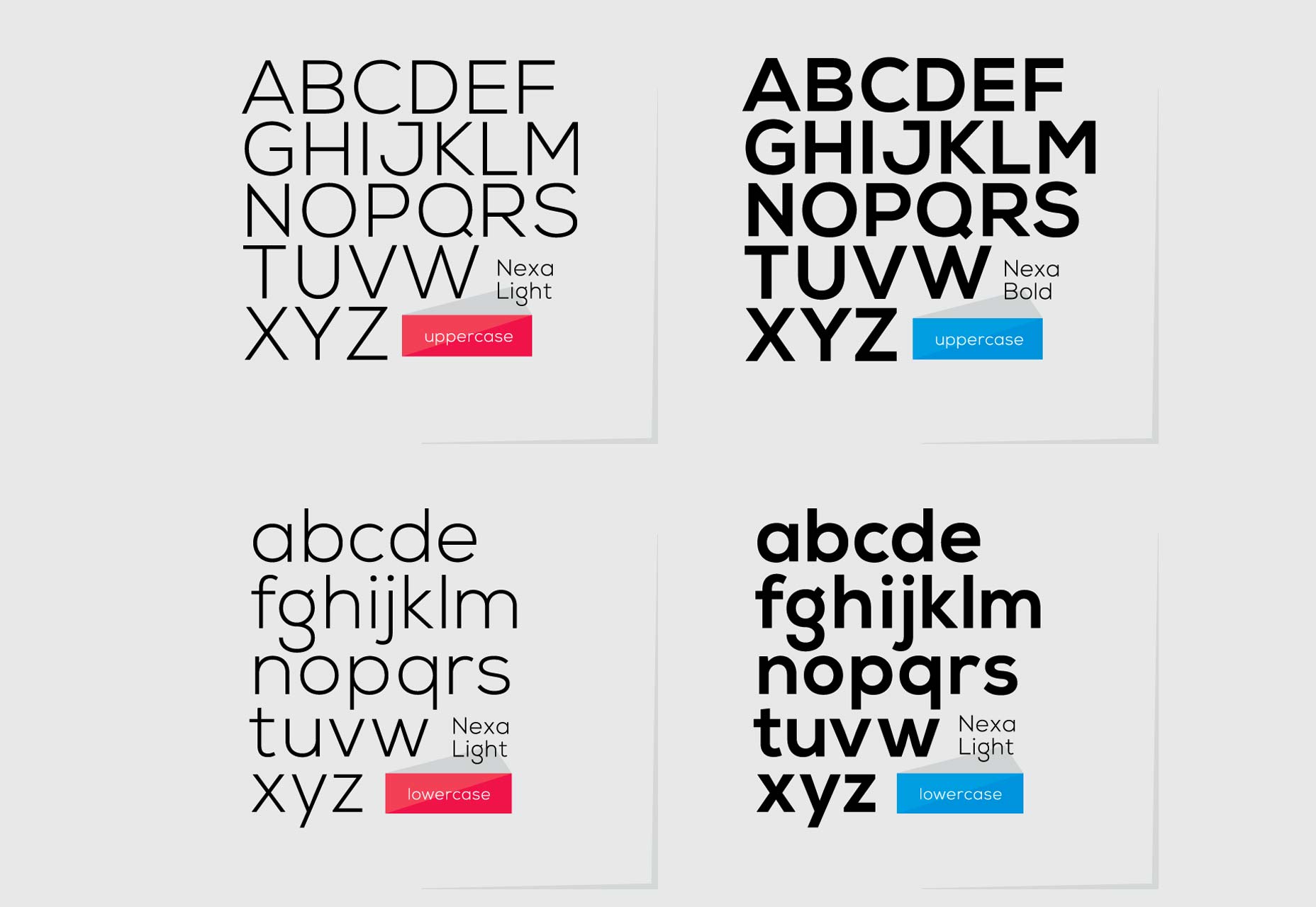
2. Nexa
Nexa Light, and Nexa Bold, are both available to download for free. They are a little more expressive than some of the typefaces in this list, notably the lowercase g and the uppercase J and Q. Much of the basic form is inspired by Gotham, and Nexa is great for branding projects.
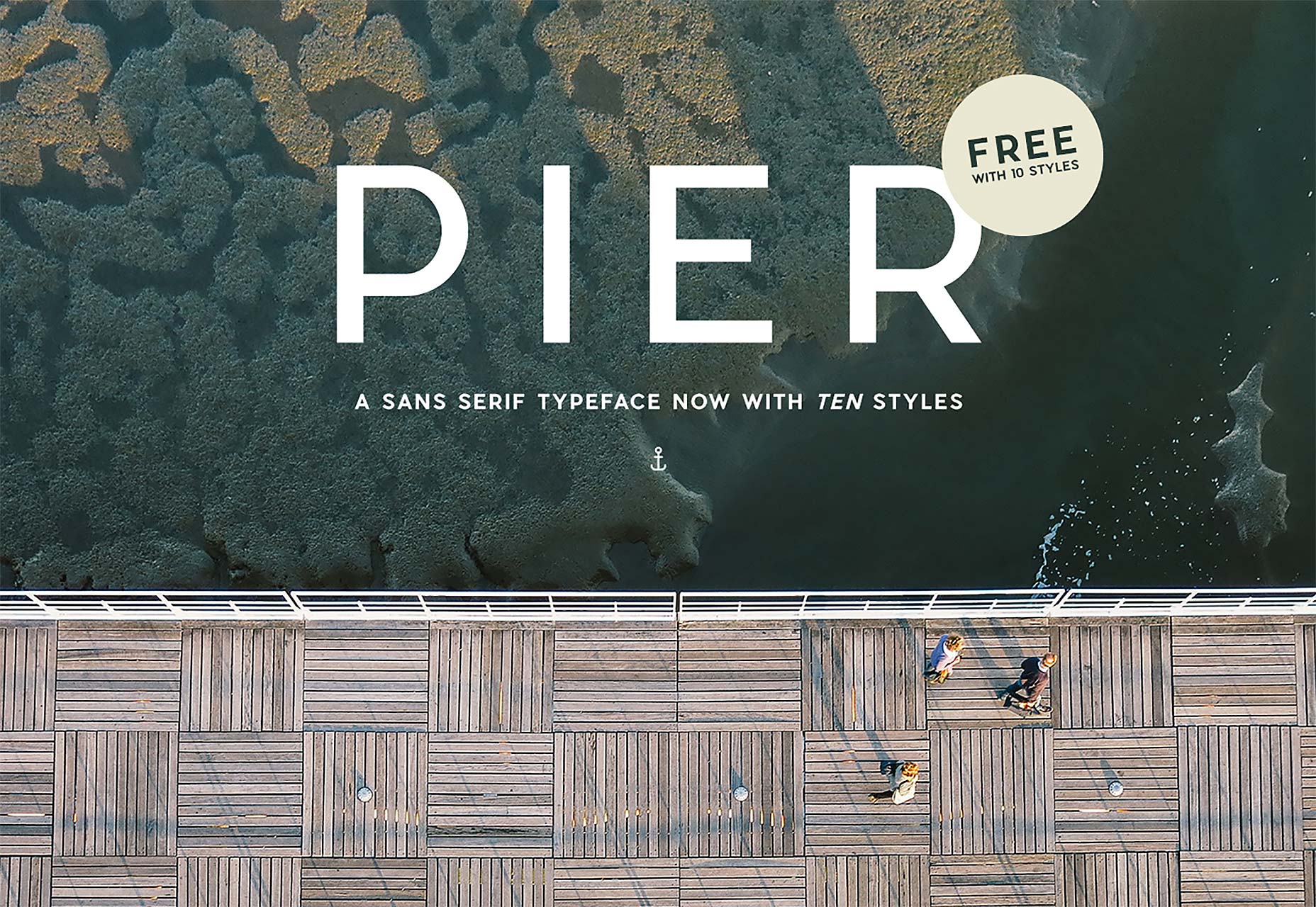
3. Pier Sans
Mathieu Desjardins’ Pier Sans is a free font with 10 styles. Similarly geometric to Gotham, Pier Sans pushes the 1930s feel a little further. Perhaps a touch more Miami than Manhattan.
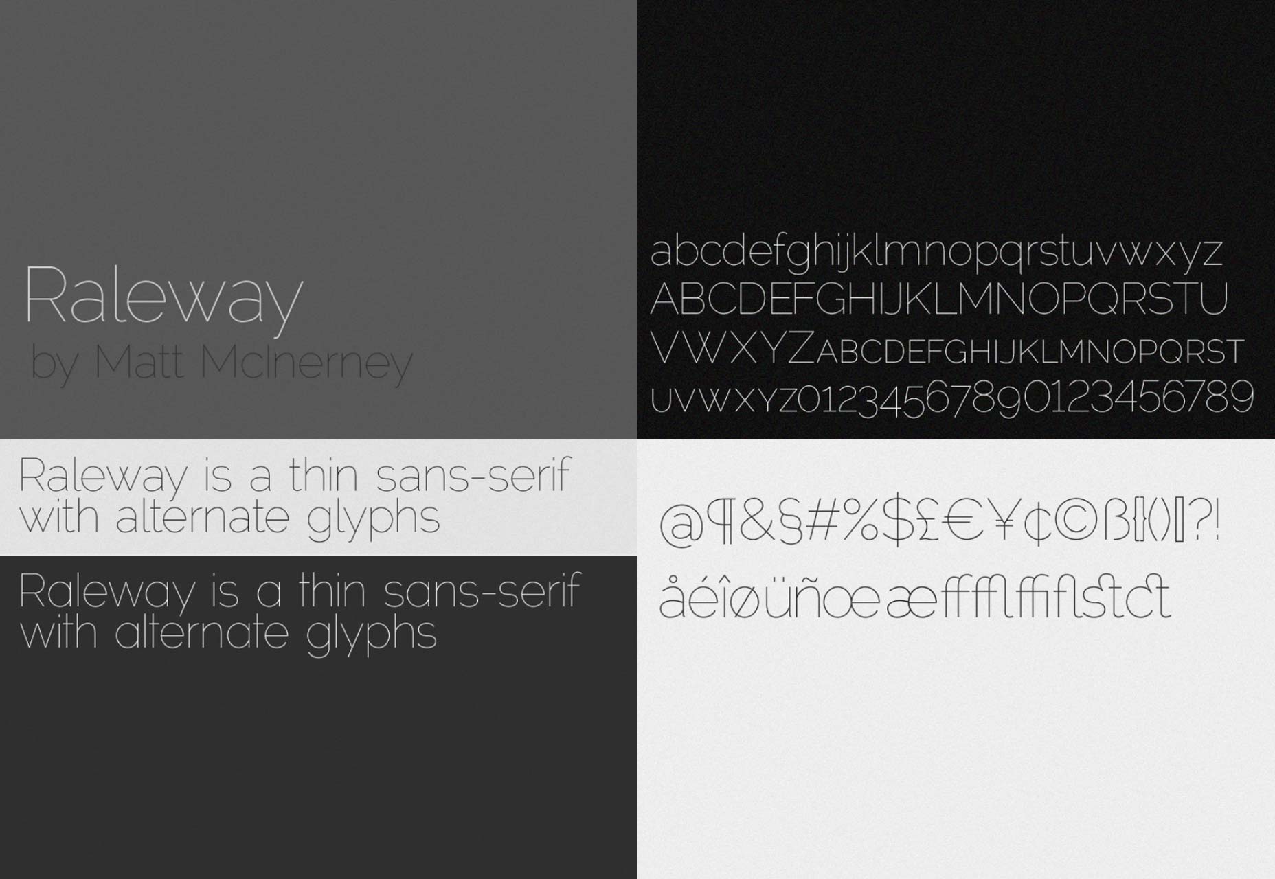
4. Raleway
Raleway is a comprehensive geometric sans-serif in 18 fonts. Weights range from thin to black, and each weight has an accompanying italic. Intended for use at display sizes, it is close to Gotham in numerous ways, with the obvious exception of the spine on the S.
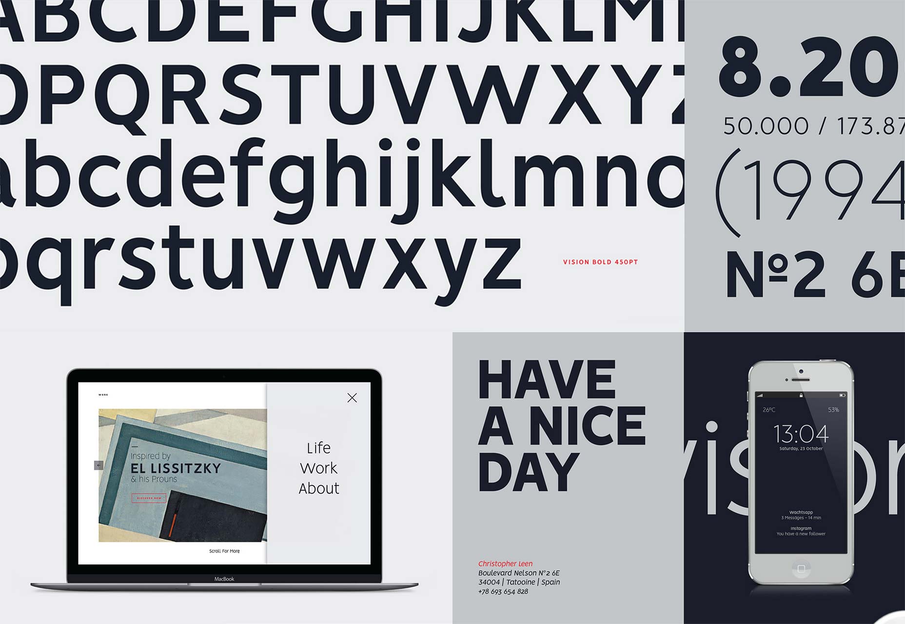
5. Vision
Vision is an entire family of 12 fonts free for both commercial, and non-commercial work. A fraction more humanist that Gotham, especially in the lowercase, Vision uses the same basic letterforms with a slightly narrower, less rounded skeleton.
6. Museo Sans
If Gotham is overused, it is only marginally more overused than the next typeface in our list. Museo Sans is wildly popular with web designers because it offers the same aesthetic, for nothing. Museo Sans 500 can be downloaded for free for commercial and non-commercial work.
7. Gothvetica
Gothvetica: Gotham, mixed with Helvetica. The sort of mashup that only seems like a worthwhile endeavour when type designers get together for one too many drinks. But somehow it works. It’s a fun project that’s free for non-commercial work.
8. Gothic A1
Gotham is understandably American, considering its roots in the architectural identity of New York, but the popularity of its simple modernism extends far beyond America shores. Gothic A1 is a free sans-serif with similar a similar feel, but with extensive support for Korean as well as Latin characters.
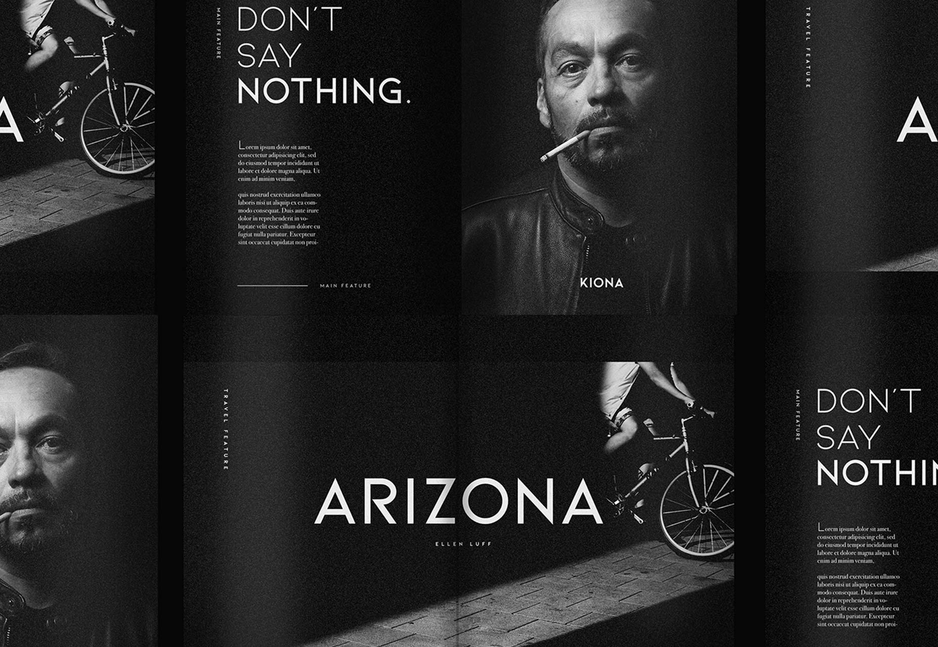
9. Kiona
Kiona is a minimal geometric uppercase typeface that feels similar to Gotham in many of its characters. But Kiona emphasises the diagonal in its distinct K, and R. Kiona light, bold, and semibold are all premium fonts. Kiona regular is free to download.
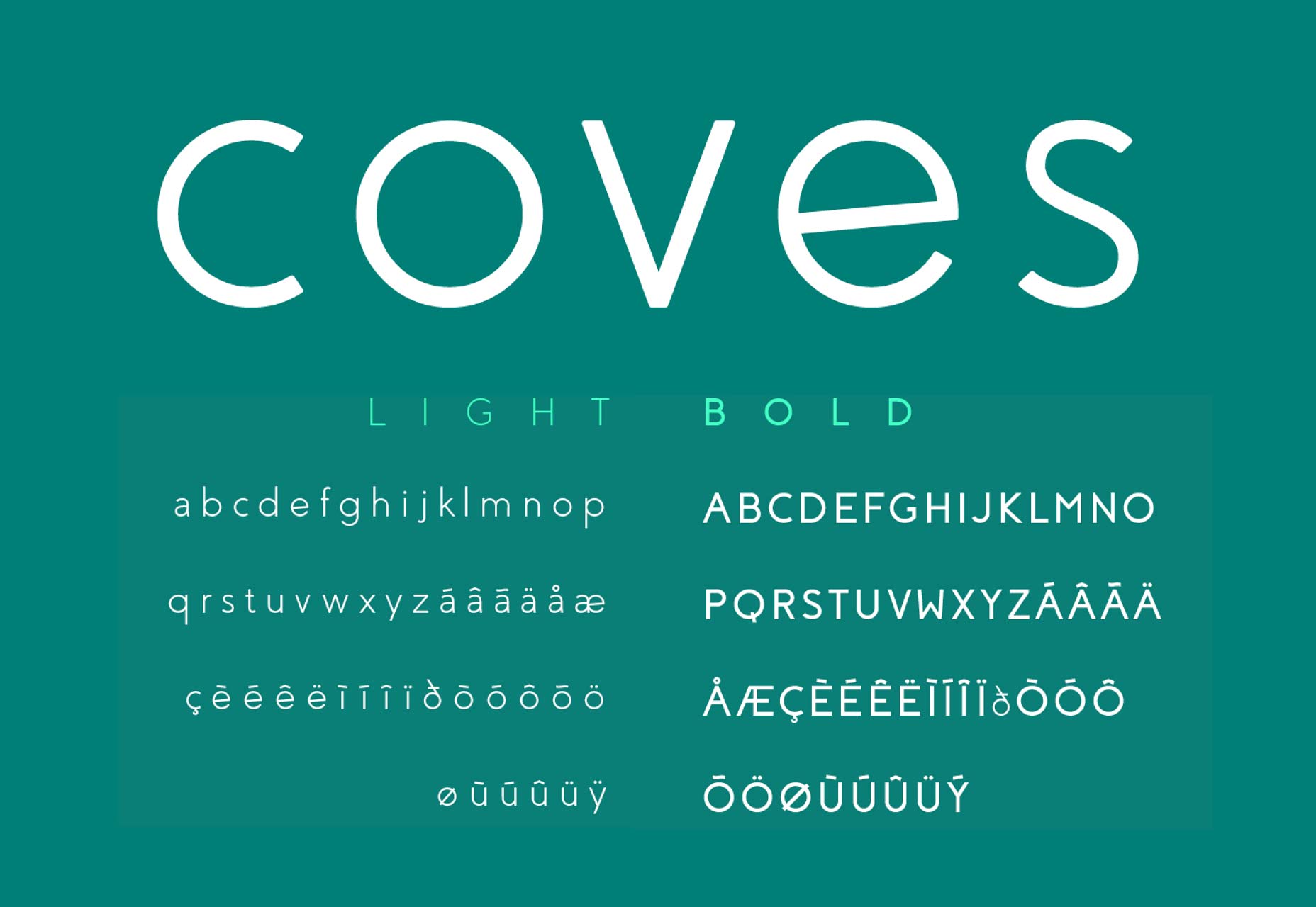
10. Coves
Coves is a simple geometric sans-serif that shares much of its DNA with Gotham, the apex on the M, the lack of cross-bar on the J, the shape of the double-height a, all follow the same pattern. It’s free for personal use, but for commercial use you’ll need a license.
Bonus: 5 Premium Font Alternatives to Gotham
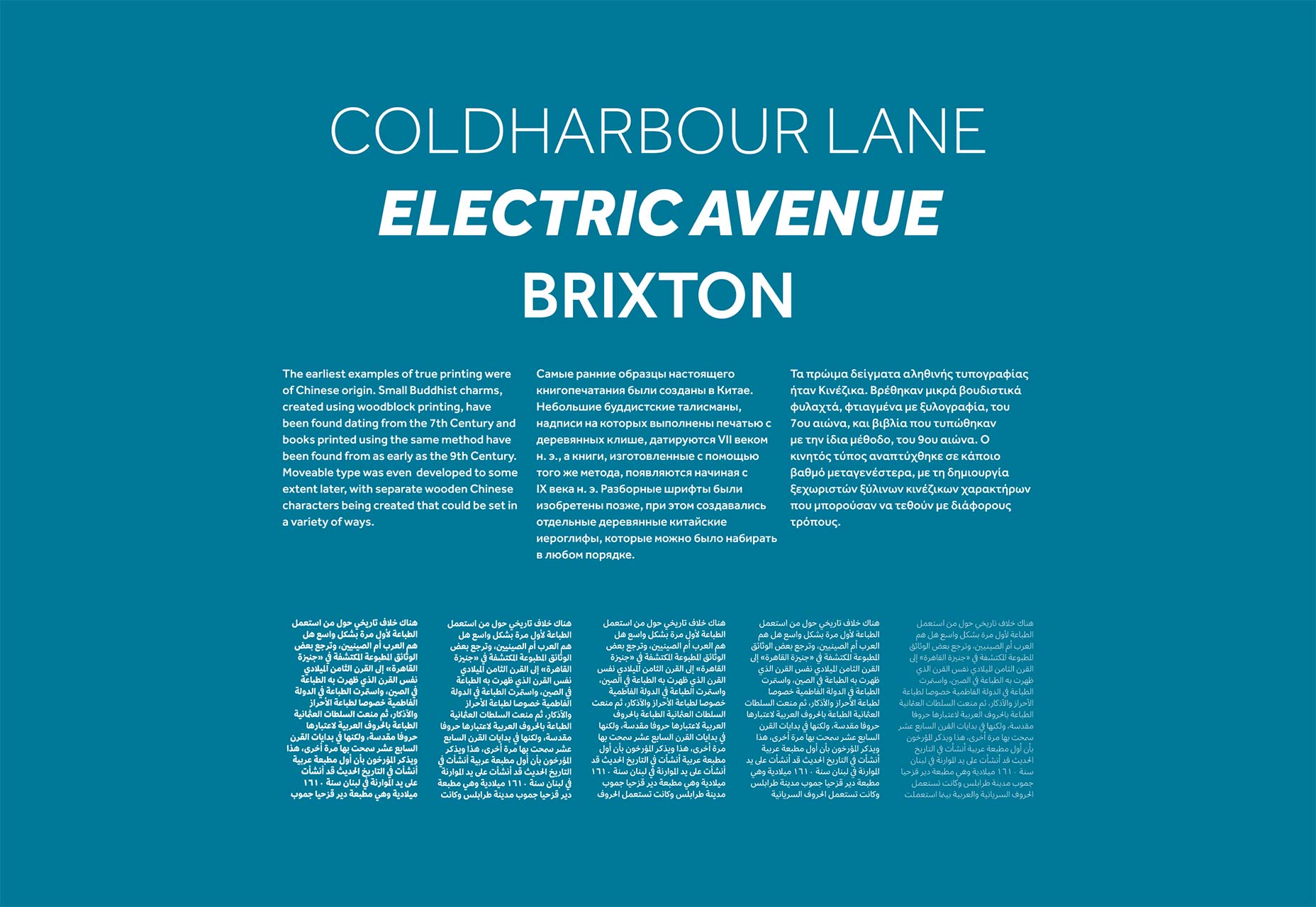
The sheer volume of work involved in designing a complete typeface family means that when typefaces are a labor of love, they normally focus on a few key weights or styles. Commonly you’ll get a regular and a bold, but no italic. The exception is when a project is taken on by a community of volunteers, such as the team behind Montserrat, when it is able to grow into a wider set of fonts.
If you need a comprehensive set of characters, or a variety of weights, then a premium font family could be the answer.
Premium fonts aren’t necessarily better than their free alternatives, but the designers have been able to invest the time necessary to draw more glyphs.
Here are five premium alternatives to Gotham, for those that need a little more flexibility.
If you love Gotham but want to opt for something different, why not pick a typeface by the same designer. Mallory is a little more expressive in heavy weights, but is similarly proportioned.
Effra is a highly flexible family of fonts that unusually includes support for Arabic script, if you’re designing for an international client Effra is a prudent choice.
Every week users submit a lot of interesting stuff on our sister site Webdesigner News, highlighting great content from around the web that can be of interest to web designers.
The best way to keep track of all the great stories and news being posted is simply to check out the Webdesigner News site, however, in case you missed some here’s a quick and useful compilation of the most popular designer news that we curated from the past week.
Note that this is only a very small selection of the links that were posted, so don’t miss out and subscribe to our newsletter and follow the site daily for all the news.
Grapedrop – Free, Responsive, Web Page Builder for your Next Project
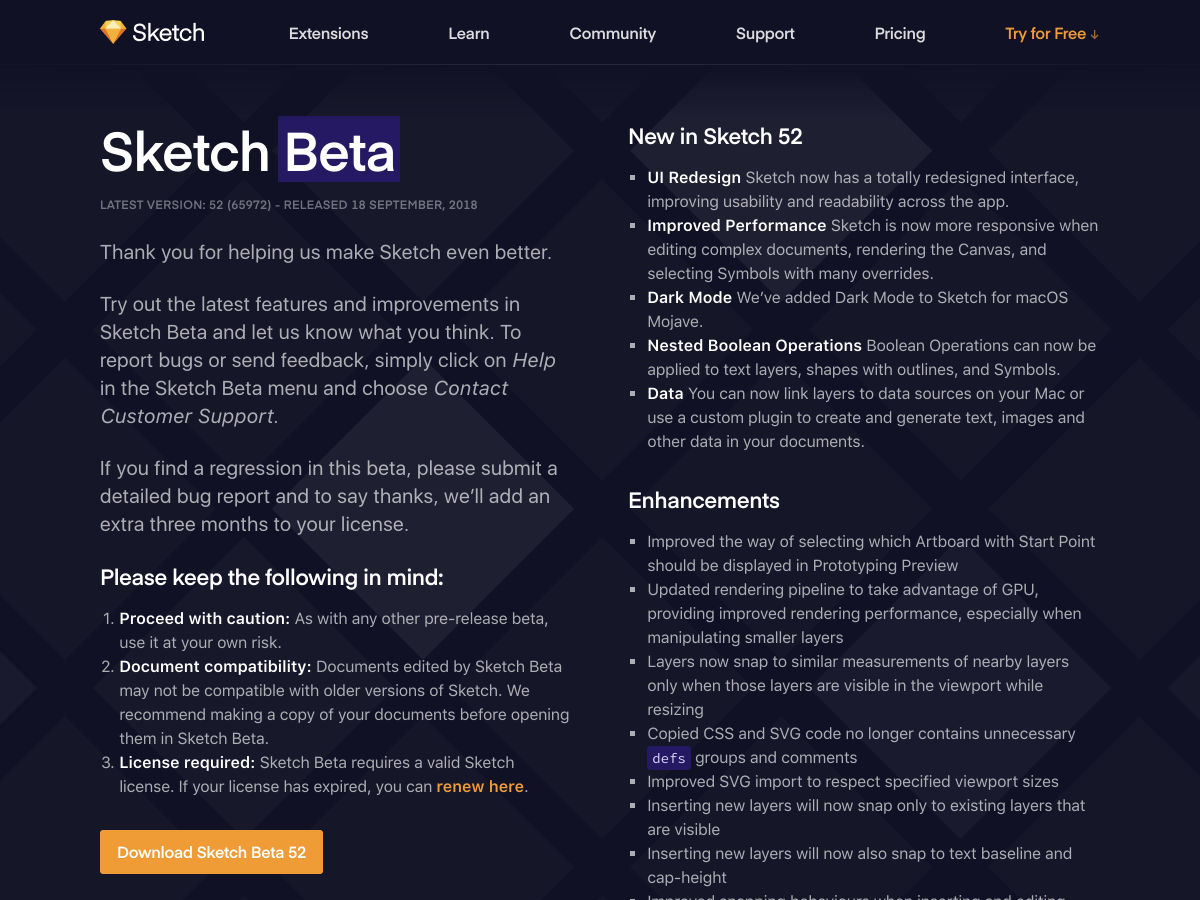
Sketch 52 Beta with New UI and Darkmode
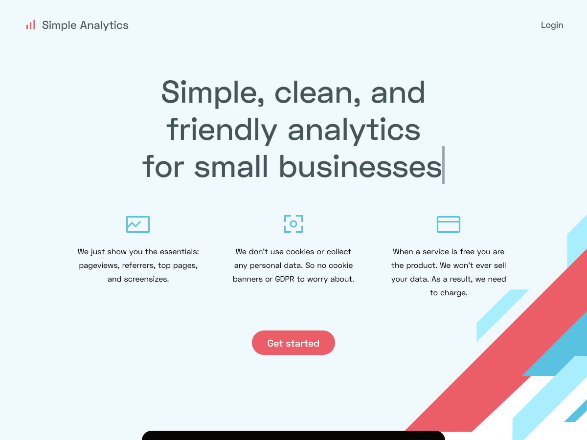
Simple Analytics – Simple, Clean, and Privacy-friendly Analytics
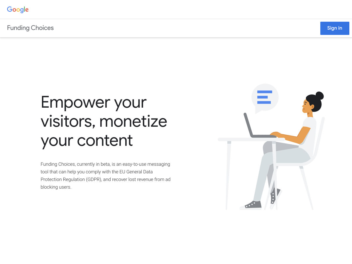
Funding Choices – Google’s New Tool for GDPR Compliance and Content Monetization
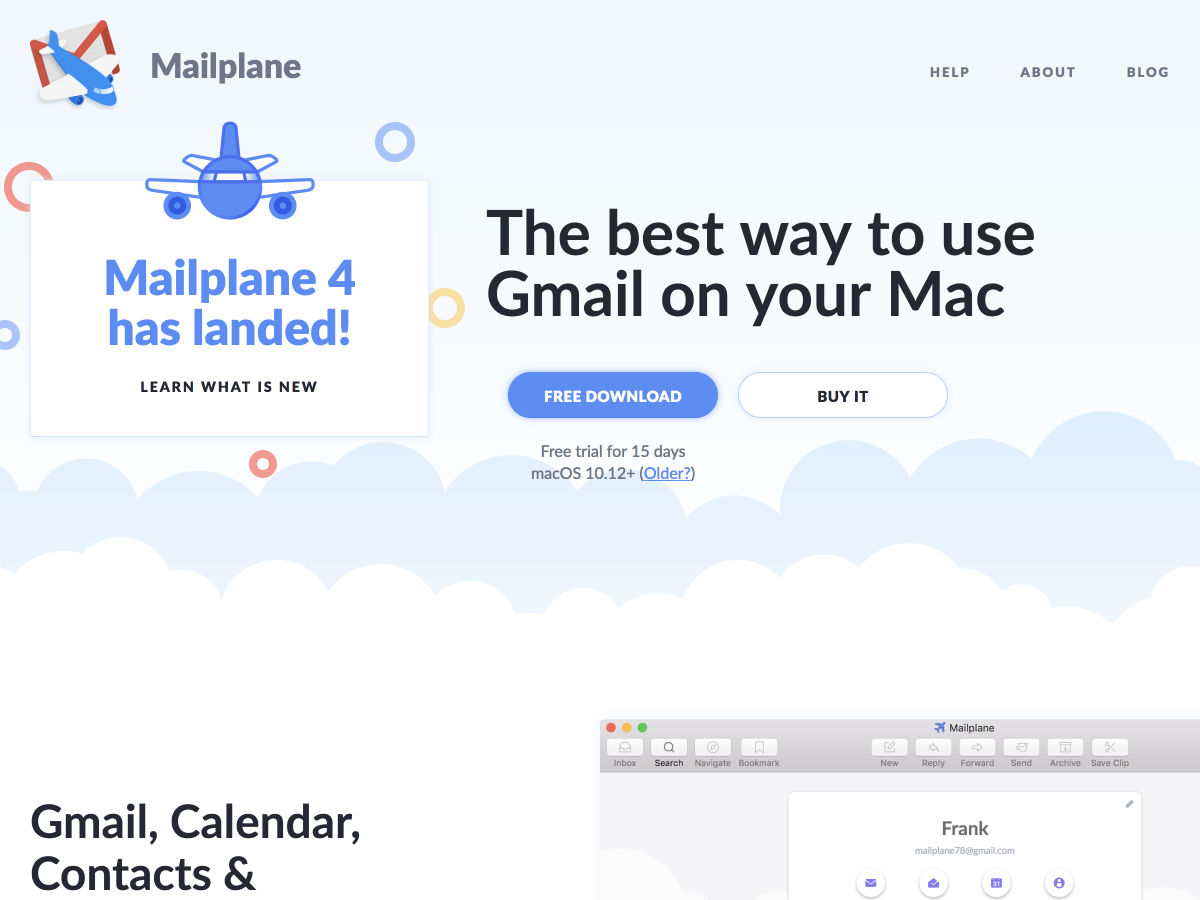
Mailplane 4 – The Best Way to Use Gmail on your Mac
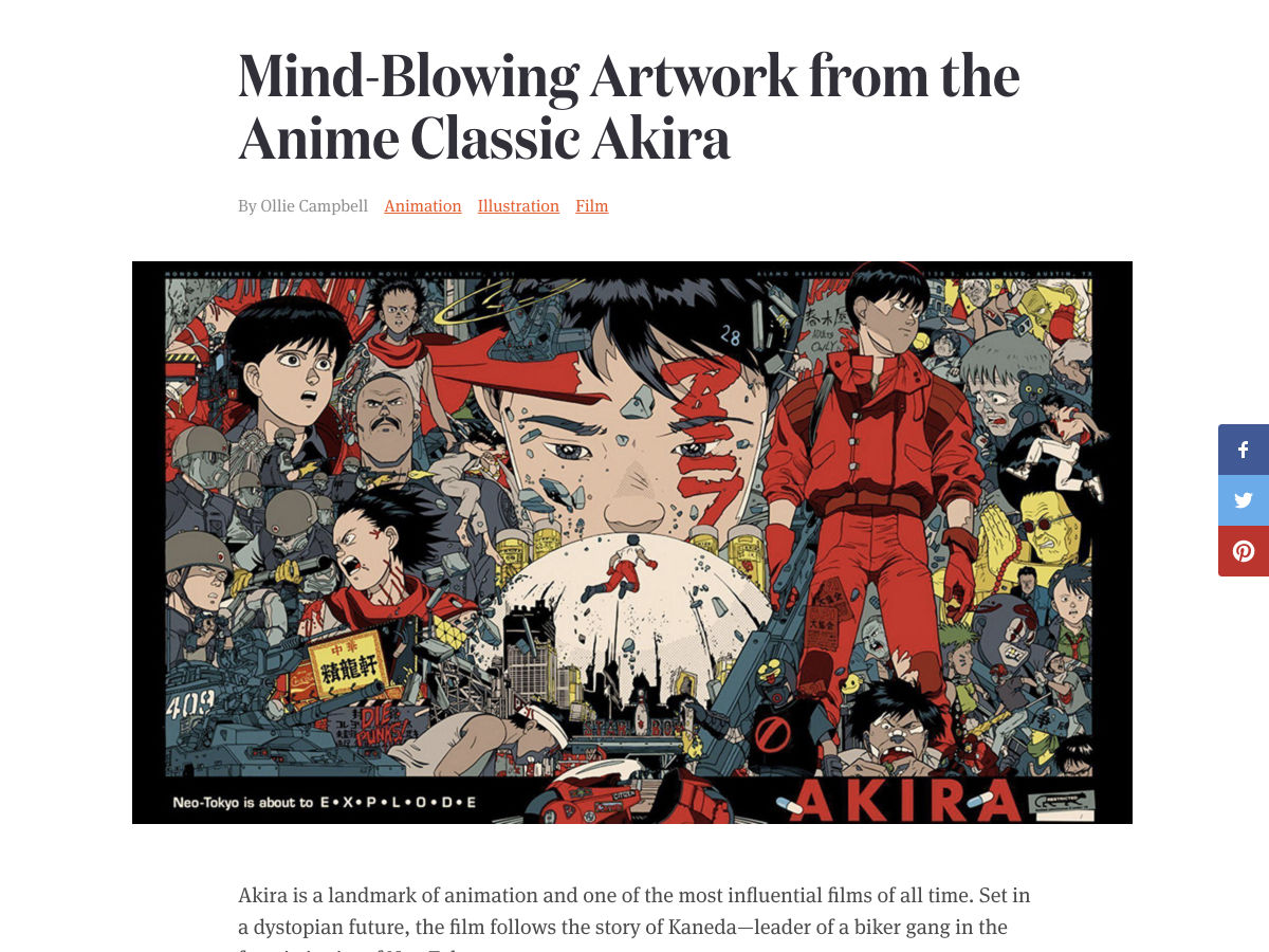
Mind-Blowing Artwork from the Anime Classic Akira
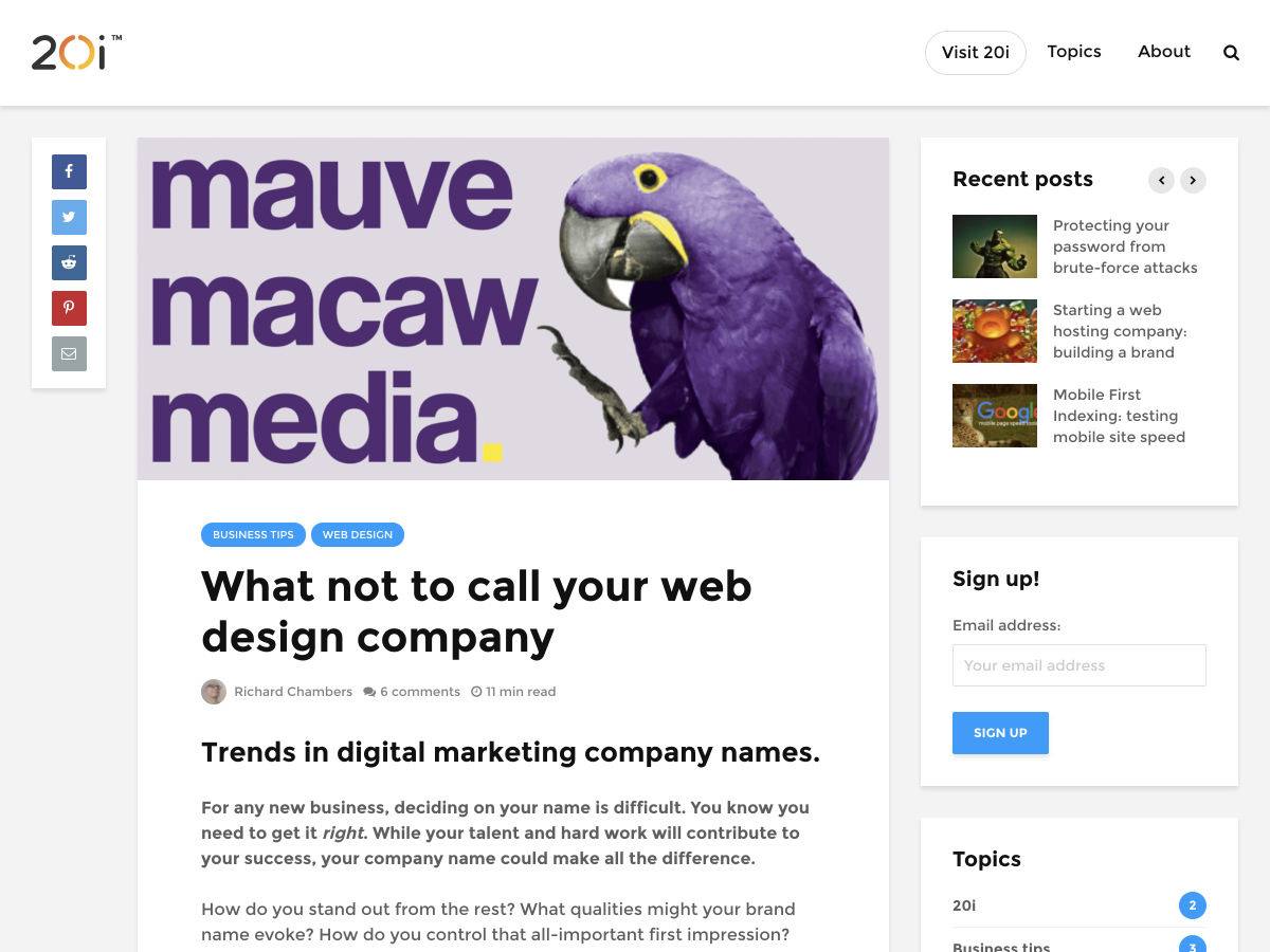
What not to Call your Web Design Company
The Rise and Demise of RSS
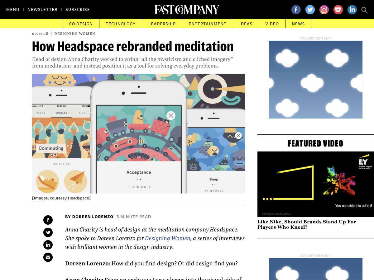
How Headspace Rebranded Meditation
Ever Wonder Why the Most Popular Apps are Starting to Look the Same?
Designers Need to Keep Old People in Mind
Parody Site: Hello We are Agency (Tip – Refresh the Page for New Designs)
Xara Cloud – The Simplest Design Tool for Business Documents
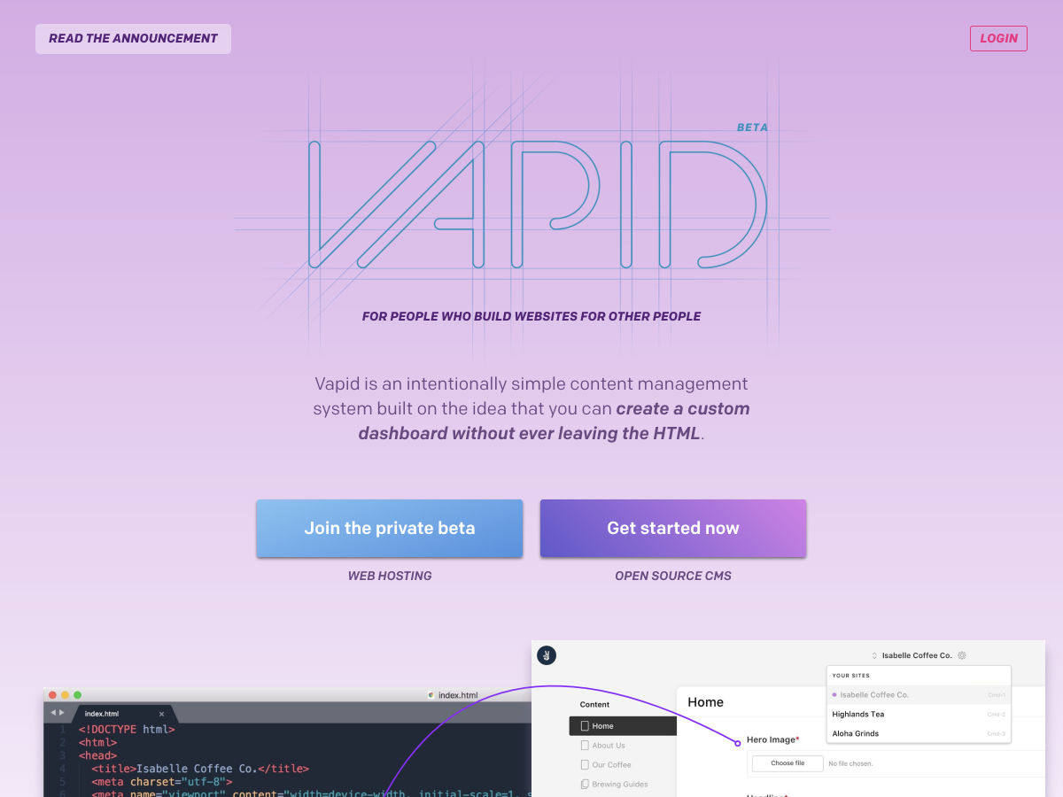
Vapid: An Intentionally Simple CMS
Why Good Design Principles Can Create Better Designs
This AI Dreams in Tulips
Turn Off Push Notifications
Decide Better with a Decision Matrix
How to Slack Smarter? – A UX Case Study
Facebook is Letting Job Advertisers Target Only Men
New Logos and Identities for John Lewis Partnership by Pentagram
How Catchy Interface Illustrations Can Enhance UI Design
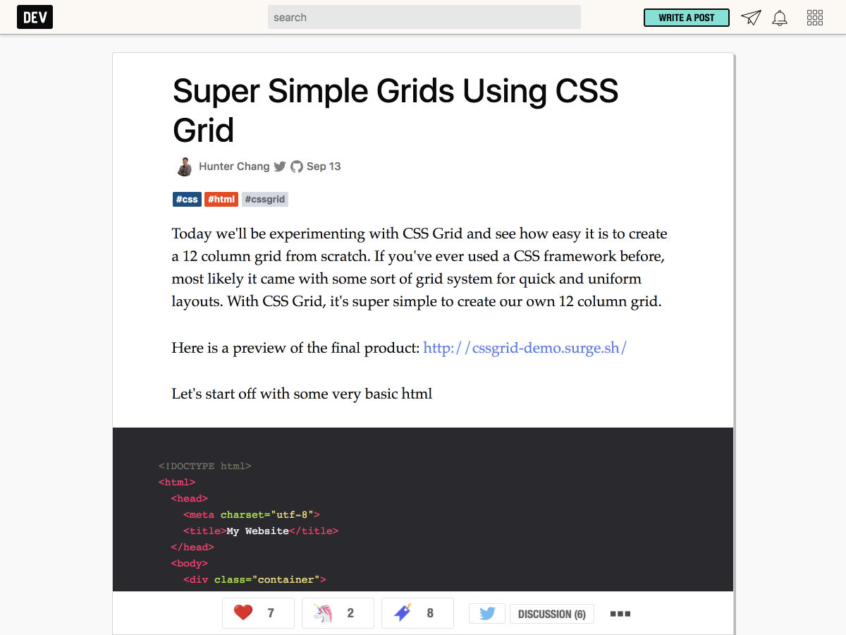
Super Simple Grids Using CSS Grid
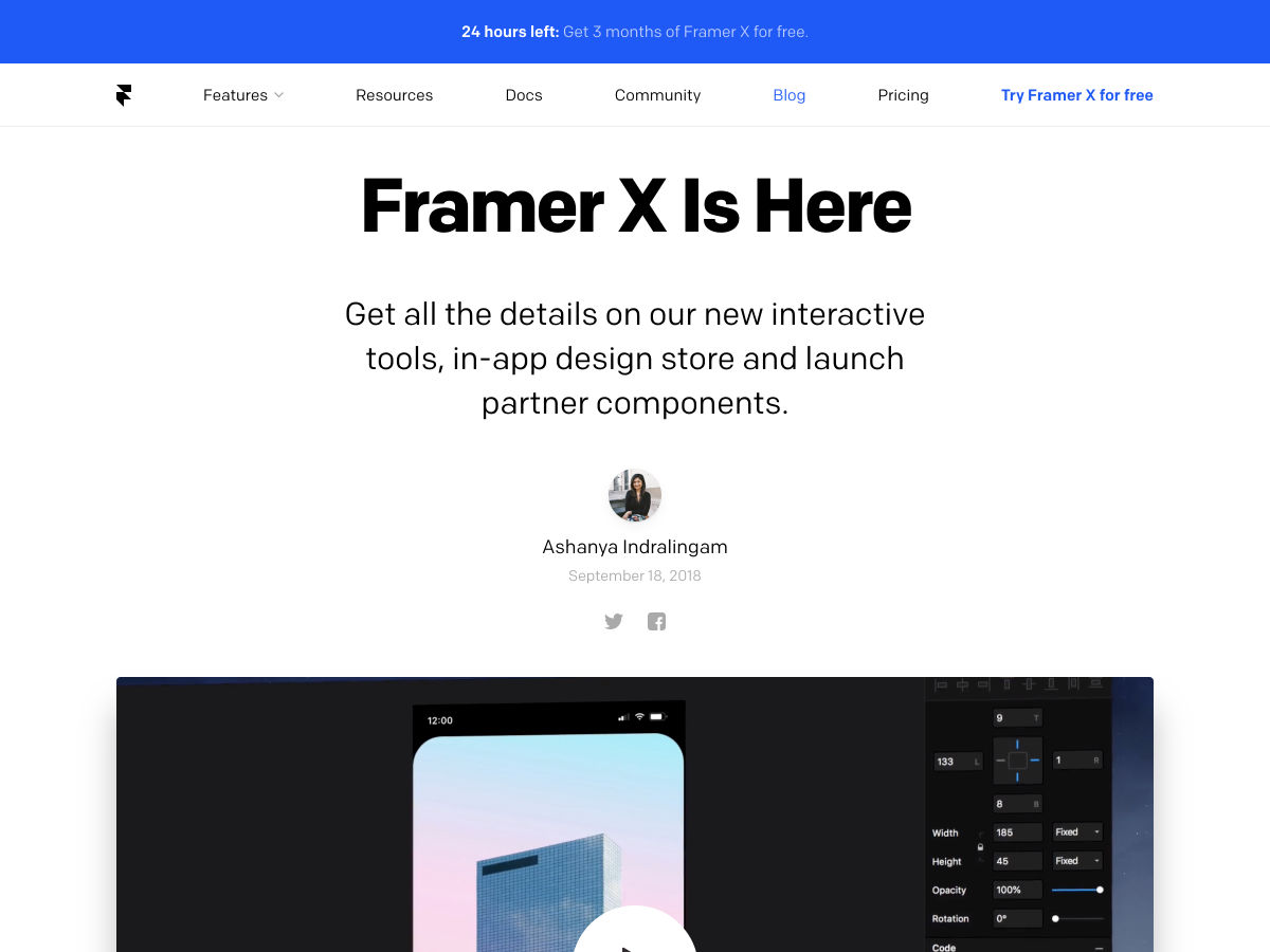
Framer X is Here
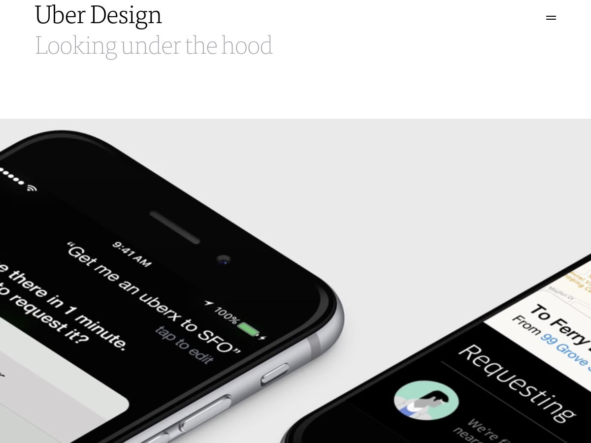
Uber Design by Ueno. A Case Study.
Want more? No problem! Keep track of top design news from around the web with Webdesigner News.
Tutorials achieve their goal only when they are simple, concise, and offer all the information need. As graphic designers, we have to constantly be learning new tricks that could recommend us for more and important jobs. The digital illustration is a popular field among designers due to its versatile style and the freedom it offers. Today, we will take a close look at Digital Illustration Tutorials That Will Take Your Skills To the Next Level.
Tutpad is a platform where designers can share their knowledge with everybody through step-by-step tutorials. The variety of articles aim to help both beginners and experienced designers. Some of the topics they provide tutorials on are: Digital Illustration Tutorials, Animation, Photography, Typography, UX/UI, 3D, etc.. We personally find Tutpad one of the best virtual teachers and we recommend that you don’t miss it out. Below, we have cataloged some of their video tutorials, but on the website, you have access to more written tutorials. We hope that your job will become easier, by following these amazing digital illustration tutorials:
1. Illustration: Create an Ice Cream sticker
2. Illustration: Create Old School Flowers | TUTPAD
We strongly believe that every person should learn for as long as they live, and this doesn’t exclude graphic designers. Now that we went thorough some beginner level digital illustration tutorial, it’s time to move to intermediate difficulty tutorials. Check them out:
9. How to make a Birthday Card in Adobe Illustrator – Maria Keller
10. How to create a winter village in Adobe Illustrator – Maria Keller
11. How to draw Profiles in Adobe Photoshop
12. How To Paint A Fire Princess in Adobe Photoshop – Sarita Kolhatkar
13. How to create a floral illustration with type in Adobe Illustrator – Mary Winkler
14. How to create a funny monster in Adobe Illustrator – Yulia Sokolova
15. How to create a Letter to Santa in Adobe Illustrator – Maria Keller
16. How to create a Halloween poster in Adobe Photoshop – Sarita Kolhatkar
Moving on, the next tutorials will teach you advanced techniques for a quality-driven work. Here they are:
A designer I work with was presenting comps at a recent team meeting. She had done a wonderful job piecing together the concept for a design system, from components to patterns and everything in between that would make any front-end developer happy.
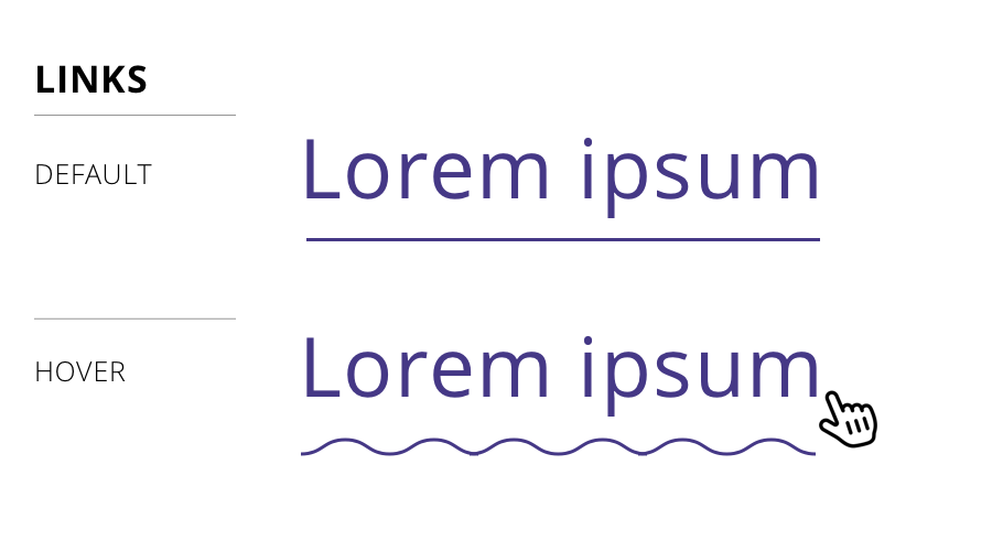
But there was a teeny tiny detail in her work that caught my eye: the hover state for links was a squiggle.
Default link (top) and hover effect (bottom)
Huh! Not only had I not seen that before, the idea had never even crossed my mind. Turns out there are plenty of instances of it on live sites, one being The Outline. That was the one that was implementation that inspired the design.
Cool, I figured. We can do something like a linear background gradient or even a background image. But! That wasn’t the end of the design. Turns out it’s animated as well. Again, from The Outline:
Whoa! That’s pretty wild. I wasn’t sure how to approach that, honestly, because animating any of my initial ideas would be difficult, especially for cross-browser support.
So, how did The Outline do it? Turns out, it’s SVG. We can make a squiggly path and animate it pretty easily:
But that’s kinda crappy because we can’t really animate that. We need better values for that. However, we can inline CSS directly on the SVG in the background-image property. We can’t simply copy and paste the SVG code into the property, but we can with some proper encoding:
And, since SVG can contain its own styles within the markup, the animation can be tossed right there in the background-image property, the same way we would do it with CSS in an HTML document head or inline CSS in HTML.
I have no idea if an animated squiggle makes for a good user experience and, frankly, that’s not the point of this post. The point is that The Outline had a fun idea with a slick CSS implementation.
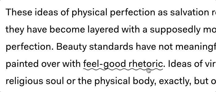
That got me thinking about other non-standard (perhaps even unconventional) hover styling we can do with links. Again, tossing aside usability and have a grand ol’ time with CSS…
The Border to Background Effect
Maybe that same bottom border on the default link can grow and become the full background of the link on hover:
This is the story about my user design internship. I’m not saying that your internship is going to be anything like mine. In fact, if there’s one thing I can say to shape your expectations, it would be this: be ready to put them all aside. Above all else, remember to give yourself space and time to learn. I share my story as a reminder of how much I struggled and how well everything went despite my difficulties so that I’ll never stop trying and you won’t either.
It all started in May 2018, when I stepped off the plane in Granada, Spain, with a luggage at my side, laptop on my back, and some very rusty Spanish in my head. It was my first time in Europe and I would be here for the next three months doing an internship in UX design at Badger Maps. I was still pretty green in UX, having been learning about it for a barely a year at this point but I felt ready and eager to gain experience in a professional setting.
Follow along as I learned how to apply technical knowledge to complete the practical design tasks assigned to me:
Create a design system for our iOS app using Sketch;
Design a new feature that would display errors occurring in data imports;
Learn the basics HTML, CSS, and Flexbox to implement my design;
Create animations with Adobe Illustrator and After Effects.
This article is intended for beginners like me. If you are new to UX design looking to explore the field — read on to learn if a UX design internship is the right thing for you! For me, the work I ended up completing went well beyond my expectations. I learned how to a design system, how to compromise design with user needs, the challenges of implementing a new design, and how to create some “moments of delight.” Every day at the internship presented something new and unpredictable. At the conclusion of my internship, I realized I had created something real, something tangible, and it was like everything I had struggled with suddenly fell into place.
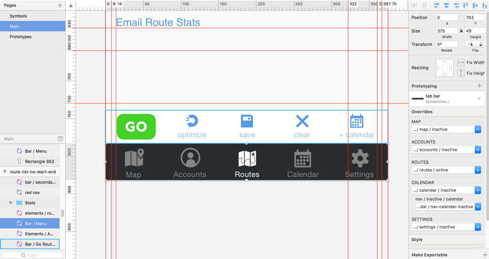
My first task was to create a design system for our existing iOS app. I had created design systems in the past for my own projects and applications, but I had never done them retrospectively and never for a design that wasn’t my own. To complete the assignment, I needed to reverse engineer the mockups in Sketch; I would first need to update and optimize the file in order to create the design system.
Working with organizing the Sketch file to create a design system. (Large preview)
It was also at this opportune moment when I learned the Sketch program on my computer had been outdated for about a year and a half. I didn’t know about any of the symbols, overrides and other features in the newer versions. Lesson learned: keep your software updated.
Creating footers and working with overrides in Sketch. (Large preview)
Before worrying about the symbols page, I went through the mockups artboard by artboard, making sure they were updated and true to the current released version of the application. Once that was done, I began creating symbols and overrides for different elements. I started with the header and footer and moved on from there.
As a rule of thumb, if an element showed up in more than one page, I would make it a symbol. I added different icons to the design system as I went, building up the library. However, it quickly became clear that the design system was evolving and changing faster than I could try to organize it. Halfway through, I stopped trying to keep the symbols organized, opting instead to go back and reorganize them once I had finished recreating each page. When I stopped going back and forth between mockups and symbols and worrying about the organization for both, I could work more efficiently.
It was easy to come to appreciate the overrides and symbols in Sketch. The features made the program much more powerful than what I was used to and increased the workability of the file for future designs. The task of creating the design system itself challenged me to dive deep into the program as well as understand all the details of the design of our application. I began to notice small inconsistencies in spacing, icon size, or font sizes that I was able to correct as I worked.
A caption to be shown below the image. (Large preview)
The final step was to go back into the symbols page and organize everything. I weeded through all the symbols, deleted those not in use and any replicas. Despite being a little tedious, this was a very valuable step in the process. Going through the symbols after working through the document gave me a chance to reevaluate how I had created the symbols for each page. Grouping them together forced me to consider how they were related throughout the app.
By going through this thought process, I realized how challenging it was to create a naming system. I needed to create a system broad enough to encompass enough elements, specific enough to avoid being vague, and that could easily be understood by another designer. It took me a few tries before I landed upon a workable system that I was happy with. Ultimately, I organized elements according to where they were used in the application, grouping pieces like lists together. It worked well for an application like Badger that had distinct designs for different features in the app. The final product was a more organized file that would be a lot easier to work with for any future design iterations.
Modernizing the design with new header designs. (Large preview)
As a capstone to this project, I experimented with modernizing the design. I redesigned the headers throughout the app, drawing on native apple apps for inspiration. Happily, the team was excited about it as well and are considering implementing the changes in future updates to the app.
Overall, working a Sketch file to such detail was an unexpectedly helpful experience. I left with a much greater fundamental understanding of things like font size, color, and spacing by virtue of redoing every page. The exercise of copying existing design required a minute attention to detail that was very satisfying. It was like putting together a Lego model: I had all the pieces and knew what the end product needed to look like. I just needed to organize everything and put them together to create the finished product. This is one of the reasons why I enjoy doing UX design. It’s about the problem solving and piecing together a puzzle to create something that everyone can appreciate.
Dashboard design for the Badger web application. (Large preview)
Chapter 2: The Design
The next part of my internship allowed me to get into the weeds with some design work. The task: to design a new import page for the Badger web application.
The team was working on redesigning the badger to CRM integration to create a system that allowed users to view any data syncs and manage their accounts themselves. The current connection involves a lot of hands-on work from badger CSAs and AEs to set up and maintain. By providing an interface for users to directly interact with the data imports, we wanted to improve the user experience for our CRM integration.
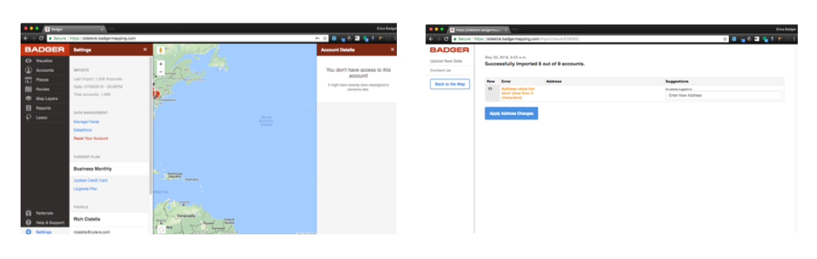
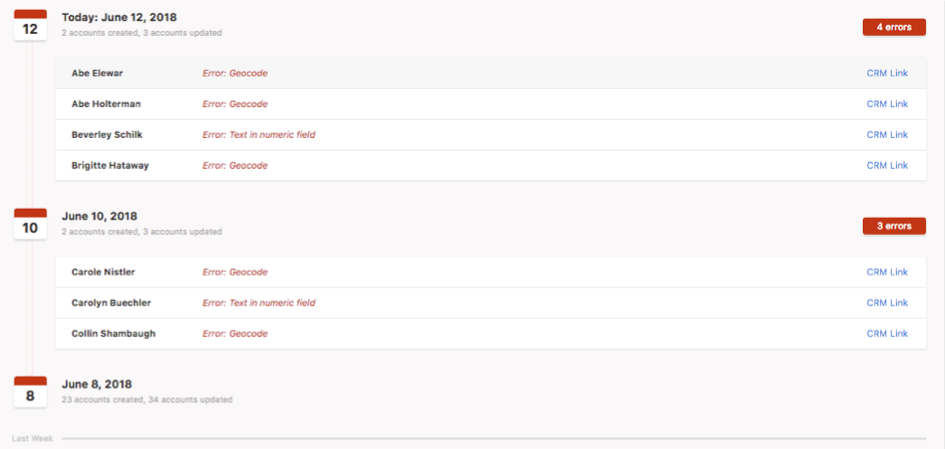
Existing process: Users currently integrating Badger with their Salesforce accounts can’t manage the flow of information between the two. They can’t view any errors in data being imported to Badger or easily see the status of their import. To the right is the existing errors view for users importing via spreadsheets. We want to improve this user experience and make it accessible to Salesforce-integrated users as well. (Large preview)
My goal was to design a page that would display errors occurring in any data imports that also communicated to users how and where to make the necessary changes to their data. If there were more errors associated with a single import or users would like to view all errors at once, they should be able to download an excel file of all that information.
Objectives
Create an import page that informs the user on the status of an import in process;
Provide a historical record of account syncs between Badger and the CRM with detailed errors associated with each import;
Provide links to the CRM for each account that has an import error in Badger;
Allow users to download an excel file of all outstanding errors.
User Stories
Badger customer with CRM account: As a customer with a CRM, I want to be able to connect my CRM to my badger and visualize all data syncs so that I’m aware of all errors in the process and can make changes as necessary.
Badger: As a badger, I want users to be able to manage and view the status of their CRM integration so that I can save time and manual work helping and troubleshooting users syncing their badger to their CRM accounts.
Before I really delved into the design, we needed to go through some thinking to decide what information to show and how:
Bulk versus continuous imports Depending on the type of user, there are two ways to import data to Badger. If done through spreadsheets, the imports would be batched and we would be able to visualize the imports in groups. Users integrated with their CRMs, however, would need to have their Badger data updated constantly as they made changes within their CRM. The design needed to be able to handle both use cases.
Import records Because this was a new feature, we weren’t absolutely sure of the user behavior. Thus, deciding how to organize the information was challenging. Should we allow users to go for an infinity scroll in a list of their history? How would they search for a specific import? Should they be able to? Should we show the activity day-by-day or month by month?
Ultimately, we were only able to make a best guess for each of these issues — knowing that we could make appropriate adjustments in the future once users began using the feature. After thinking these issues out, I moved into wireframing. I had the opportunity to design something completely different and this was both liberating and challenging. The final design was a culmination of individual elements from various designs that were created along the way.
Design Process
The hardest part of this process was learning to start over. I eventually learned that forcing something into my design for solely aesthetic purposes was not ideal. Understanding this and letting my ideas go was key to arriving at a better design. I needed to learn how to go start over again and again to explore different ideas.
First few iterations: Experimenting with the placement of the header, buttons, and list design. Feedback at this point and for the next few days was consistently as it should be: ‘let’s see what else we can do.’ But the advantages to running like a headless chicken was that I occasionally stumbled upon some corn kernels of gold that I used in the final design. (Large preview)
One design exploration that stretched a little too far from the badger application. After this, I circled back a little but the final design really benefited from exploring such different ideas. (Large preview)
Challenges
1. Using white space
Right off the bat, I needed to explore what information we wanted to show on the page. There were many details we could include — and definitely the room to do it.
Initially, I was very intimidated at the prospect of having a lot of white space and a minimalistic design so tried really hard to come up with filler information, 75% of which our users wouldn’t really need. Then I crammed it all into my design, permitting minimal breathing room. A very good attitude for a city planner in San Francisco; not so much for creating user centric design. (Large preview)
All the unnecessary information added way too much cognitive load and took away from what the user was actually concerned about. Instead of trying to get rid of all the white space, I needed to work with it. With this in mind, I eventually chucked out all the irrelevant information to show only what we expect our users to be most concerned about: the errors associated with data imports.
This was the final version:
Imports organized according to day and month. This was a more logical organization for our purposes, especially because synchronizations between the CRM and Badger were continuous, not just on demand. (Large preview)
2. Navigation
The next challenge was deciding between a sidebar versus a header for displaying information. The advantages to the sidebar was that the information would be consistently visible as the user scrolled. But we also had to ensure that the information contained in the sidebar was logically related to what was going on in the rest of the page.
The header offered the advantage of a clean, single column design. The downside was that it took up a lot of vertical real estate depending on how much information was contained in the header. It also visually prioritized the contents of the header over what was below it for the user.
Iteration exploring the top navigation. Cons: users would scroll through the list of imports to view errors and have to scroll back up to see the summary. The contents and location of the two cells to the right was also confusing. It didn’t make sense for the two cells to scroll with the rest of the page because they were a summary of all information to its left. But it would make for a confusing user experience if they didn’t scroll. Overall, the organization of the information on the page was misaligned with the design. (Large preview)
Once I worked out what information to display where, the sidebar navigation became the more logical decision. We expect users to be primarily concerned with the errors associated with their imports and with a large header, too much of that information would fall below the fold. The sidebar could then be a container for an import and activity summary that would be visible as the user scrolled.
Sidebar design: After I decided on having a sidebar, it came down to deciding what information to include and how to display it.
Different sidebar design explorations. The design became increasingly simple as I narrowed in on the information the users wanted to see. (Large preview)
I struggled to create a design that was visually interesting because there was little information to show. For this reason, I once again found myself adding in unnecessary elements to fill up the space although I wanted to prioritize the user. I experimented with different content and color combinations, trying to find the compromise between design and usability. The more I worked with it, the more I was able to parse down the design to the bare bones. It became easier to differentiate useful information from fillers. The final product is a streamlined design with just a few summary statistics. It also offers great flexibility to include more information in the future.
Final design: Subtext beneath the buttons removed and the accounts created/accounts updated information is placed in its own container and shifted down to add visual interest. (Large preview)
Import process: The import progress page was created after the design for the import page was finalized. The biggest design challenge here was deciding how to display the in-progress import sync. I tried different solutions from pop-ups and overlays but ultimately settled with showing the progress in the sidebar. This way, users can still resolve any errors and see the historical record of their account data while an import is in progress. To prevent any interruptions to the import, the ‘Sync data’ and ‘Back to Badger’ buttons are disabled so users can’t leave the page.
Sync data and Back to Badger buttons disabled to prevent users from interrupting the sync and going back to the application. (Large preview)
This project was my first experience with any type of coding. Although I had tried to learn HTML and CSS before, I had never reached any level of proficiency. And what better way to start than with a mockup of one’s own design?
Understanding the logic of organizing an HTML document reminded me of organizing the Sketch document with symbols and overrides. However, the similarities ended there. Coding felt like a very alien thing that I was consistently trying to wrap my head around. As my mentor would say, “You’re flexing very different muscles in programming than you are in design.” With the final product in hand now, I’m fully convinced that learning to code is the coolest thing I’ve learned to do since being potty trained.
The first challenge, after setting up a document and understanding the basics, was working with Flexbox. The design I had created involved two columns side by side. The right portion was meant to scroll while the left remained static. Flexbox seemed like a clean solution for this purpose, assuming I could get it to work.
Implementing Flexbox consisted of a lot of trial and error and blind copying of code while I scrambled through various websites, reading tutorials and inspecting code. With guidance from my mentor through this whole process, we eventually got it to work. I will never forget the moment when I finally understood that by using flex-direction: column I would get all of the elements into a single column, and flex-direction: row helped placed them in one row.
It makes so much sense now, although my initial understanding of it was the exact opposite (I thought flex-direction: column would put elements in columns next to each other). Surprisingly, I didn’t even come to this realization until after the code was working. I was reviewing my code and realized I didn’t understand it at all. What tipped me off? In my CSS, I had coded flex-direction: row into the class I named column. This scenario was pretty indicative of how the rest of my first coding experience went. My mental model was rarely aligned with the logic of the code, and they often clashed and went separate ways. When this happened, I had to go back, find my misconceptions, and correct the code.
After setting up Flexbox, I needed to figure out how to get the left column to stay fixed while the right portion scrolled. Turns out this couldn’t be achieved with a single line of code as I had hoped. But working through this helped me understand the parent-child relationship that aided me immensely with the rest of the process.
Vertical timeline with calendar icons. (Large preview)
Coding the vertical timeline and the dial was also a process. The timeline was simpler than I had originally anticipated. I was able to create a thin rectangle, set an inner shadow and a gradient filling to it, and assign it to the width of each activity log.
The dial was tricky. I tried implementing it with pure CSS with very little success. There were a few times I considered changing the design for something simpler (like a progress bar) but I’m quite happy I stuck with it.
A major struggle was getting outside progress dial to overlap the background circle along the border. This was where I changed the design a little bit — instead of having the unloaded portion of the progress dial cut out, it overlaps all around. It was a compromise between my design and code that I was initially unwilling to make. As it turns out, however, I was satisfied with the final result and once I realized this, I was happy to make that compromise. The final dial was implemented via JavaScript.
There was a moment in my coding process where I threw every line of code I’d ever written into every class to try to make it work. To make up for this lack of hindsight, I needed to spend quite a while going through and inspecting all the elements to remove useless code. I felt like a landlord kicking out the tenants who weren’t paying rent. It was most definitely a lesson learned in maintaining a level of housekeeping and being judicious and thoughtful with code.
The majority of the experience felt like blind traversing and retrospective learning. However, nothing was more satisfying than seeing the finished product. Going through the process made me interact with my work in a way I had never done before and gave me insight into how design is implemented. In all of my expectations for the internship, I never anticipated being able to code and create one of my own designs. Even after being told I would be able to do so on my first day, I didn’t believe it until after seeing this page completed.
Chapter 4: Working With Baby Badgers
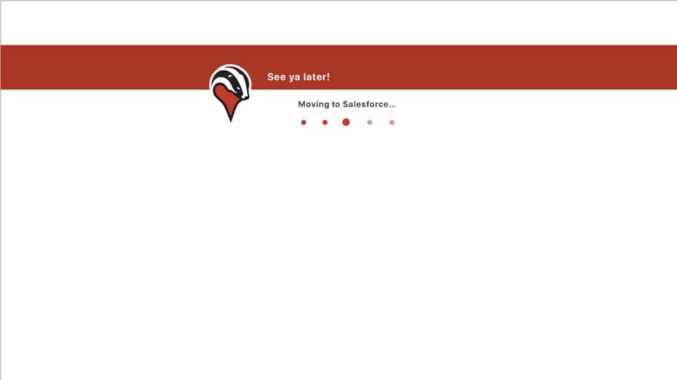
As part of the process integrating Badger users with their CRM accounts, we needed our users to sign into their CRM — requiring us to redirect them out of badger to the native CRM website. To prevent a sudden, jarring switch from one website to another, I needed to design intermediate loading pages.
One of the first mockups of a sample static redirection page. It was simple and fulfilled its purpose but did little else. (Large preview)
I started out with your run-of-the-mill static redirection page. They were simple and definitely fulfilled their purpose, but we weren’t quite happy with them.
The challenge was to create something simple and interesting that informed the user they were leaving our website in just a few seconds it was visible. The design would need to introduce itself, explain why it was there, and leave before anyone got tired of looking at it. It was essentially an exercise in speed dating. With that in mind, I decided to try animations — specifically that of a cheeky little badger, inspired by the existing logo.
Using the badger logo as a starting reference point, I created different badger characters in Adobe Illustrator. The original logo felt a little too severe for a loading animation, so I opted for something a little cuter. I kept the red chest and facial features from the original logo for consistency and worked away at creating a body and head around these elements. The head and stripes took a while to massage into shapes that I was happy with. The body took the form a little easier, but it took a little longer to find the right proportion between the size of the head and the body. Once I nailed that down, I was ready to move onto animating.
My first instinct was to try a stop-motion animation. I figured it was going to be great — a lá Wallace and Gromit. But after the first attempt and then the second, and all the ensuing ones, it became clear that watching that show as a child had not fully equipped me with the skills required to do a stop-motion animation.
I just wasn’t able to achieve the smoothness I wanted, and there were small inconsistencies that felt too jarring for a very short loading animation. Animation typically runs at 23 frames per second, and my badger animation only had about 15 frames per second. I considered adding more frames, but upon suggestion from my mentor, decided to try character animation instead.
This was the first time I had animated anything that was more than 5 moving parts and there was definitely a learning curve to understanding how to animate a two-dimensional character in a visually satisfying way. I needed to animate the individual elements to move by themselves independent of the whole in order to make the motion believable. As I worked on the animation, the layers I imported became increasingly granular. The head went from being one layer to five as I learned the behavior of the program and how to make the badger move.
I anchored each limb of the body and set each body part as a child to the parent layer of the body. I set the anchor points accordingly at the top of the thighs and shoulders to make sure they moved appropriately and then, using rotations and easing, simulated the movement of the body parts. The head was a tad bit tricky and required some vertical movement independent of the body. To make the jump seem more realistic, I wanted the head to hang in space a little before being pushed up by the rest of the body, and to come down just slightly after the rest of him. I also adjusted the angle I tried to make him seems as if he were leading with his nose, pointing up during the jump, and straightforward while he ran.
The overly anthropomorphic feet were abandoned from the original designs. They were one of the last changes made to baby badger. I hadn’t considered how odd human toes looked like on a badger.
The animation featured on the page redirecting the user back to badger displayed the baby badger running back to badger with a knapsack full of information from the CRM.
Animation of baby badger running back to the badger application.
And finally: the confused badger. This was done for the last page I needed to create: an error page notifying the user of unexpected complications in the integration process. And what better way to do that then a sympathetic, confused badger?
Design exploration of the baby badger face. (Large preview)
The tricky part here was combining the side profile of the existing cartoon badger and the logo to create a front-facing head shape. Before beginning this project, I had never once seen a real live badger. Needless to say, Badger has found its way into my google image searches this month. I was surprised to see how flat the head of a badger actually is. In my first few designs, I tried to mimic this but wasn’t satisfied with the result. I worked with the shape some more, adjusting the placement of the nose, the stripes, and the ears to achieve the final result:
Swirly eyes inspired by the possum from the movie Fantastic Mister Fox.
This animation process has forced me to take my preexisting knowledge to a higher level. I needed to push myself beyond what I knew rather than limiting myself with what I thought I could do. I originally started with the stop-motion animation because I didn’t trust myself to do character animation. By giving myself the chance to try something new and different, I was able to achieve something that exceeded my own expectations.
Designs expanded from the original baby badger to be printed and used around the office and on marketing material. (Large preview)
Conclusion
The three months I spent at my internship were incredibly gratifying. Every single day was about learning and trying something new. There were challenges to everything I did — even with tasks I was more familiar with such as design. Every time I created something, I was very insecure and apprehensive about how it would be received. There was a lot of self-doubt and lots of discarded ideas.
For that reason, it was incredible to be part of a team and to have a mentor to lead me in the right direction. Being told to try something else was often the only encouragement I needed to try something else and achieve something bigger and better. I like to picture myself as a rodent in a whack-a-mole game, being hit on the head over and over but always popping up again and again. Now the struggles and challenges have come to an end, I only want to do it all over again.
I appreciate what I’ve learned and how I was pushed to go beyond what I thought I could do. It’s crazy to see how far I’ve come in a few months. My understanding of being a UX designer has grown immensely, from figuring out the features, to hammering out the design, and then writing front-end code to implement it. This internship has taught me how much more I have to learn and has motivated me to keep working. I’ve come to understand that what I can do should never be limited by what I know how to do.
Frustrated with your client? Beginning to wish you’d never taken this job on in the first place? Do you just need some feedback so that you can move forward?
Picture it: You’ve managed to land a great gig with a well-paying client and you can’t wait to get started and produce some of your best web design work…But then days elapse into weeks and the project just isn’t moving forward. The client replies to you sporadically, doesn’t fully answer your questions, and seems mega evasive.
This sometimes happens. Hey, things come up and get clients get busy. The problem is that you have requirements too, and a “busy” client is killing your schedule and your motivation.
So what do you do?
There’s no need to bail out just yet. In this article, we’re going to take a look at how you can speed up the whole process with slow clients.
1. Don’t Ask Too Much From a Client
If you’ve created multiple different designs for your client to review, plus you’ve got a few new color scheme ideas that you need to run by them, understand that this sort of feedback is heavy going and can overwhelm a busy client.
We know that it’s the client’s project that you’re working. And while you’d think they should be always available to check up on their project, clients often have several things on the go at once.
From now on, you need to take some responsibility. Is it necessary to have a client check every little thing that you do? Or can you get away with slimming down the amount of feedback that you need? If you can, do that.
A good client doesn’t want to—and shouldn’t have to—micromanage you. If you’ve got a massive list of things you want feedback on, find a way of narrowing it down. If you really do have eight templates to show them, cut them back to five.
Take some responsibility and don’t put too much on a client’s plate.
2. Clarify Issues as Soon as Possible
When clients give you a brief, they’ll typically ask if you have any questions. Instead of thinking “No, I’ll be okay for now,” or “I can ask a question at a later date,” use their invitation to ask questions right there and then.
A client might be available to answer at the time, but they might not be as available later on.
Moreover, asking for clarity as soon as possible means that you can just crack on with the job.
If there is something that you aren’t clear about, ask as soon as you can. That way, you can both move forward.
3. Set Expectations
From the start, you could explain to the client that you value, and expect good communication and feedback, and that these things help you to stay motivated and on track.
Of course, you’re also aware that you can’t talk to the client all the time, so why not schedule a brief weekly “catch-up/feedback session” to discuss the project and where you are at?
At the beginning of your project, it’s also important that you lay out what you can do and what you cannot do. Perhaps your client owns an eCommerce store for example and wants marketing services but you only design websites. Let them know this at the beginning to avoid disappointment.
4. Get Them Excited About the Project
It stands to reason that the more excited a client is about a project, the more they’ll want to talk about it, and the faster they’ll respond to your questions.
The easiest way to get a client excited about a project is to deliver your best work. If you deliver a draft that you know is second-rate, their own enthusiasm, motivation and passion for the project might take a dip.
Worse still, it weakens your relationship with them.
Instead of delivering a draft just for the sake of delivering a draft, hand in only your best work. Refine and tweak until you know that what you’ve got is so good that a client will be excited enough to respond and tell you what to do next.
The best thing is, that if a client sees the awesome work you’ve delivered so far, they’ll be so excited to see the end result that they’ll encourage you to stay on track.
5. Show your Own Passion For This Project
If a client can see that a freelancer or agency is super passionate about their project, it fires their own passion.
Rather than a client inspiring you, you can inspire the client!
How so?
A great idea is to get them excited about the tools you’ll be using for this project. Perhaps you could shoot them a message that goes a little like this:
“Hey! So, I’ve been mapping out this project, and wanted to show you some of the awesome tools I’m going to be using. For example, check out this neat POS that’s going to help your clients pay both online and offline.” Or you could show them examples of chatbots that you are going to implement on their website. You could also offer them the option to install a page builder.
Clients want to see you take an interest in their project. By showing your passion, you might be able to speed them up. Pretty soon they’ll be thinking, “Hey, this person really cares about my project. Perhaps I should start prioritizing it some more.”
6. The Follow up Email
If your client becomes unresponsive you must send an effective follow up email.
First, though, don’t become panicked by your clients lack of response. Don’t make assumptions about their thought process. You don’t want your email to come across as naggy.
The point of sending a follow up email is to move the process forward so that you can take further action on the project. Explain this to your client. Let them know that their lack of response may push back the project deadline, which can affect a variety of other projects either directly or indirectly.
It’s also best to have a single point of contact. If you require feedback from 4 different members of staff at a company, its going to be extremely difficult to get approval from each of them.
Conclusion
These are some ways to speed up the web design process with slow clients. All in all, though, there will be times when you’ll just need to have some patience. Clients don’t mind being nudged from time to time, but busy people don’t like to be nagged. Put our tips in place and have some patience with your clients.
Mysterious hooded computer guys doing mysterious hooded computer guy .. things! Who knows what kind of naughty digital mischief they might be up to?
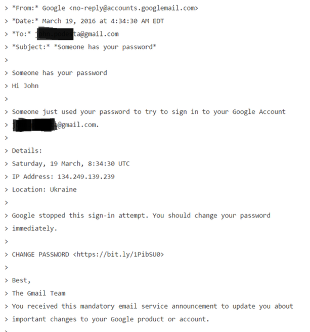
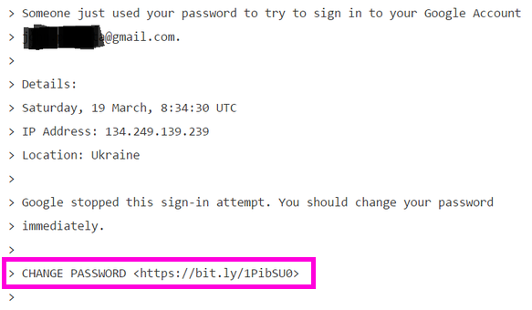
Unfortunately, we now live in a world where this kind of digital mischief is literally rewriting the world’s history. For proof of that, you need look no further than this single email that was sent March 19th, 2016.
If you don’t recognize what this is, it is a phishing email.
An attacker slurped up lists of any public emails of 2008 political campaign staffers.
One 2008 staffer was also hired for the 2016 political campaign
That particular staffer had non-public campaign emails in their address book, and one of them was a powerful key campaign member with an extensive email history.
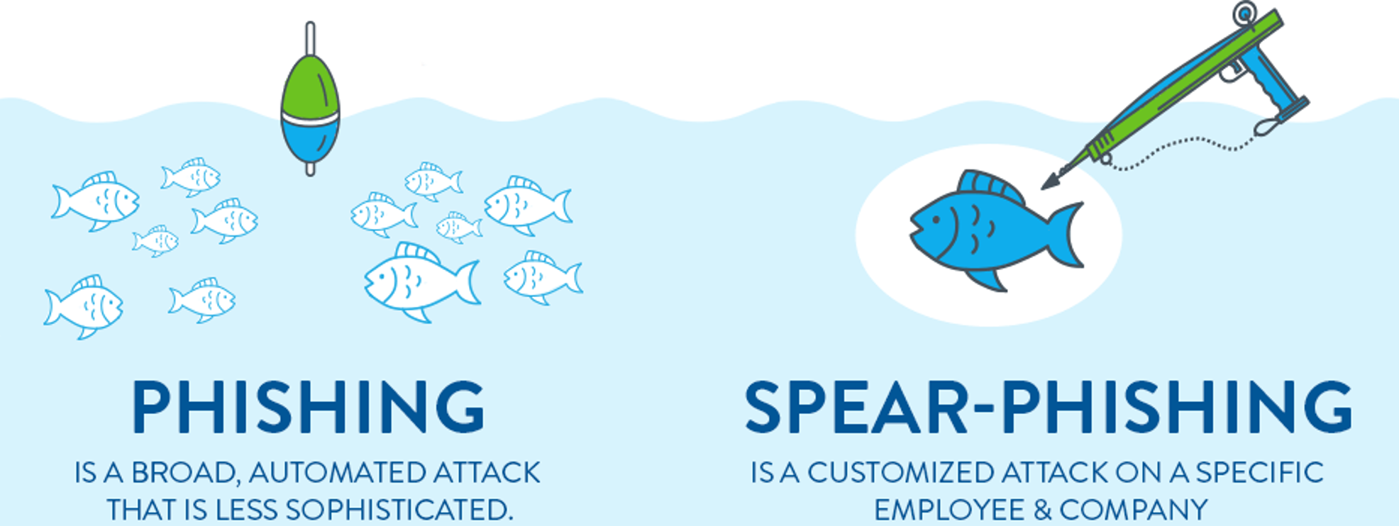
On successful phish leads to an even wider address book attack net down the line. Once they gain access to a person’s inbox, they use it to prepare to their next attack. They’ll harvest existing email addresses, subject lines, content, and attachments to construct plausible looking boobytrapped emails and mail them to all of their contacts. How sophisticated and targeted to a particular person this effort is determines whether it’s so-called “spear” phishing or not.
In this case is it was not at all targeted. This is a remarkably unsophisticated, absolutely generic routine phishing attack. There is zero focused attack effort on display here. But note the target did not immediately click the link in the email!
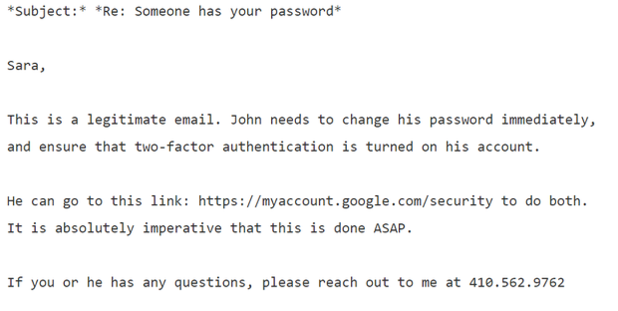
Instead, he did exactly what you’d want a person to do in this scenario: he emailed IT support and asked if this email was valid. But IT made a fatal mistake in their response.
Do you see it? Here’s the kicker:
Mr. Delavan, in an interview, said that his bad advice was a result of a typo: He knew this was a phishing attack, as the campaign was getting dozens of them. He said he had meant to type that it was an “illegitimate” email, an error that he said has plagued him ever since.
One word. He got one word wrong. But what a word to get wrong, and in the first sentence! The email did provide the proper Google address to reset your password. But the lede was already buried since the first sentence said “legitimate”; the phishing link in that email was then clicked. And the rest is literally history.
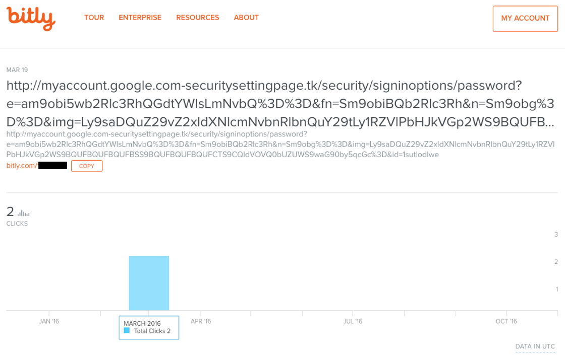
What’s even funnier (well, in the way of gallows humor, I guess) is that public stats were left enabled for that bit.ly tracking link, so you can see exactly what crazy domain that “Google login page” resolved to, and that it was clicked exactly twice, on the same day it was mailed.
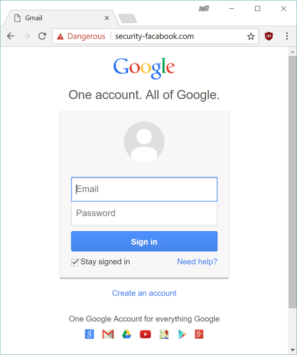
As I said, these were not exactly sophisticated attackers. So yeah, in theory an attentive user could pay attention to the browser’s address bar and notice that after clicking the link, they arrived at
Note that the phishing URL is carefully constructed so the most “correct” part is at the front, and weirdness is sandwiched in the middle. Unless you’re paying very close attention and your address bar is long enough to expose the full URL, it’s … tricky. See this 10 second video for a dramatic example.
(And if you think that one’s good, check out this one. Don’t forget all the unicode look-alike trickery you can pull, too.)
I originally wrote this post as a presentation for the Berkeley Computer Science Club back in March, and at that time I gathered a list of public phishing pages I found on the web.
Of those five examples from 6 months ago, one is completely gone, one loads just fine, and three present an appropriately scary red interstitial warning page that strongly advises you not to visit the page you’re trying to visit, courtesy of Google’s safe browsing API. But of course this kind of shared blacklist domain name protection will be completely useless on any fresh phishing site. (Don’t even get me started on how blacklists have never really worked anyway.)
It doesn’t exactly require a PhD degree in computer science to phish someone:
Build a realistic copy of a login page that silently transmits everything you type in those login fields to you – perhaps even in real time, as the target types.
Harvest email addresses and mass mail a plausible looking phishing email with your URL.
I want to emphasize that although clearly mistakes were made in this specific situation, none of the people involved here were amateurs. They had training and experience. They were working with IT and security professionals. Furthermore, they knew digital attacks were incoming.
The … campaign was no easy target; several former employees said the organization put particular stress on digital safety.
Work emails were protected by two-factor authentication, a technique that uses a second passcode to keep accounts secure. Most messages were deleted after 30 days and staff went through phishing drills. Security awareness even followed the campaigners into the bathroom, where someone put a picture of a toothbrush under the words: “You shouldn’t share your passwords either.”
The campaign itself used two factor auth extensively, which is why personal gmail accounts were targeted, because they were less protected.
The key takeaway here is that it’s basically impossible, statistically speaking, to prevent your organization from being phished.
Or is it?
Nobody is doing better work in this space right now than Maciej Ceglowski and Tech Solidarity. Their list of basic security precautions for non-profits and journalists is pure gold and has been vetted by many industry professionals with security credentials that are actually impressive, unlike mine. Everyone should read this list very closely, point by point.
Everyone?
Computers, courtesy of smartphones, are now such a pervasive part of average life for average people that there is no longer any such thing as “computer security”. There is only security. In other words, these are normal security practices everyone should be familiar with. Not just computer geeks. Not just political activists and politicians. Not just journalists and nonprofits.
Everyone.
It is a fair bit of reading, so because I know you are just as lazy as I am, and I am epically lazy, let me summarize what I view as the three important takeaways from the hard work Tech Solidarity put into these resources. These three short sentences are the 60 second summary of what you want to do, and what you want to share with others so they do, too.
1) Enable Two Factor authentication through an app, and not SMS, everywhere you can.
Logging in with only a password, now matter how long and unique you attempt to make that password, will never be enough. A password is what you know; you need to add the second factor of something you have (or something you are) to achieve significant additional security. SMS can famously be intercepted, social engineered, or sim-jacked all too easily. If it’s SMS, it’s not secure, period. So install an authenticator app, and use it, at least for your most important credentials such as your email account and your bank.
Have I mentioned that Discourse added two factor authentication support in version 2.0, and our just released 2.1 adds printed backup codes, too? There are two paths forward: you can talk about the solution, or you can build the solution. I’m trying to do both to the best of my ability. Look for the 2FA auth option in your user preferences on your favorite Discourse instance. It’s there for you.
(This is also a company policy at Discourse; if you work here, you 2FA everything all the time. No other login option exists.)
2) Make all your passwords 11 characters or more.
It’s a long story, but anything under 11 characters is basically the same as having no password at all these days. I personally recommend at least 14 characters, maybe even 16. But this won’t be a problem for you, because…
3) Use a password manager.
If you use a password manager, you can simultaneously avoid the pernicious danger of password re-use and the difficulty of coming up with unique and random passwords all the time. It is my hope in the long run that cloud based password management gets deeply built into Android, iOS, OSX, and Windows so that people don’t need to run a weird melange of third party apps to achieve this essential task. Password management is foundational and should not be the province of third parties on principle, because you never outsource a core competency.
Bonus rule! For the particularly at-risk, get and use a U2F key.
In the long term, two factor through an app isn’t quite secure enough due to the very real (and growing) spectre of real-time phishing. Authentication apps offer timed keys that expire after a minute or two, but if the attacker can get you to type an authentication key and relay it to the target site fast enough, they can still log in as you. If you need ultimate protection, look into U2F keys.
I believe U2F support is still too immature at the moment, particularly on mobile, for this to be practical for the average person right now. But if you do happen to fall into those groups that will be under attack, you absolutely want to set up U2F keys where you can today. They’re cheap, and the good news is that they literally make phishing impossible at last. Given that Google had 100% company wide success against phishing with U2F, we know this works.
In today’s world, computers are now so omnipresent that there is no longer any such thing as cybersecurity, online security, or computer security – there’s only security. You either have it, or you don’t. If you follow and share these three rules, hopefully you too can have a modicum of security today.
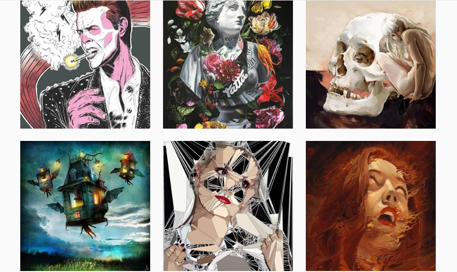
It’s no mystery that sometimes comfort strikes in and “work” sounds like the most dreadful word ever. In those times small things like the stain on the wall, the split ends of our hair, the music videos we are listening to seem to be more interesting than anything else. Hence people spend a lot of time on the internet, especially on Instagram and Facebook, we’ve decided to catalog Instagram Artists That Will Inspire You as a graphic designer, web developer, letterer, typography artist, photographer…
Webdesignledger’s goal is to always provide our readers with information, inspiration, and resources. We understand that sometimes your brain as a creator simply stops producing ideas worth investing in. Fortunately, the quantity of information the world wide web is limitless. Literary. If you wanted to watch all the videos on Facebook, Instagram, and Facebook that have ever been produced, you’d need quite a few lives. Add to that the amount of images people upload on all the existent platforms daily. The amazing thing about these facts is that we can benefit from it. However, it is our job to look for inspiration in the right place. Funny cat and dog videos might not contribute to your creativity. Are you interested to find out what could actually bring your sparkle back? Then check out these Instagram artists:
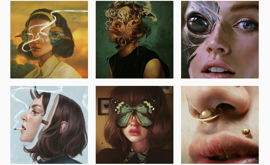
Dana is an art collector, we could say. Her gallery includes pieces of work of other artists that simply mesmerize anyone watching. She gives credits to all the featured artists, that way you can view their work entirely.
This surrealist artists will challenge your brain and imagination in ways you never thought possible. I’ve never seen so much sensitivity and grotesque in one photo until now.
Jady might be your go to artist when you need a quality job done. Her flawless typography and impeccable drawing abilities place her up in the top letterers world-wide.
A place where the invisible drivers of our humanity and universe are manifested into physical form.
Chad’s work is very unusual and a traditional thinker can’t absorb and comprehend it completely. All we can do, instead, is thank the artist for sharing his craziness with us.
If you liked out top today and would like to see more similar blog posts, make sure you let us know in the comment section below. We are open to any suggestions for potential future articles of this kind. Would you like to be featured in one of our daily blog posts? Contact us at webdesignledger.blog@gmail.com and we’ll share the steps with you.
Prototypes serve as useful sources of information for web designers and developers. They encourage team collaboration and can provide useful information to stakeholders. They also serve as testing platforms.
In addition, they provide developers with useful and usable information. It is often easier to understand and work when compared to pure documentation.
It takes the best UI prototyping tools to create the most useful prototypes. But that’s especially the case for prototypes of complex or interactive designs.
How do you evaluate app and website prototyping tools? When doing so, take note of their ability to clearly demonstrate visual consistency. They should also be able to properly present interactive design accuracy. We have done this for the three top tools described below.
Collaboration features and capabilities are also important. As is the quality and usability of the assets provided to developers at design handoff.
One of the things prototyping tools do best is to help designers and design teams avoid rework by picking up design errors, omissions, or ambiguities early in the design phase. Of equal importance is how they can often speed up the design process through information sharing.
These and other capabilities you should insist on in app and website prototyping tools are clearly in evidence in Justinmind, an app prototyping tool that provides over 4,000 premade UI elements to work with and a central platform for application definition.
Designers like the way Justinmind serves to optimize designer-developer communications and speeds up the design process, and how easily it integrates with Sketch, Photoshop, and other commonly-used design tools. Developers appreciate how this prototyping tool enables design teams to provide them with clear, complete, and accurate design specs featuring clearly specified gestures, interactions, and transitions for mobile apps.
A feature you’ll love is the ability to add your own images and design assets from other design tools, your file system, and even from your browser.
Give Justinmind a try – you can download it for free.
Supernova is one of the coolest prototyping tools on the market not only because of some of its added features and functions, but because of the way it works and what it does. It’s almost like owning a set of interactive prototyping tools that eliminate the need for prototyping.
That’s really not the case, although one of the things Supernova does best is to take a Sketch design and convert it in to production ready code for iOS, Android, and React Native systems – a new and different approach to prototyping.
Supernova’s set of prototyping tools are free to use although you will have to pay for code exporting. Supernova is currently available for use on the Mac, but other platforms will be added in the near future.
Savah App’s comprehensive set of prototyping capabilities clearly establishes it as one of the best prototyping tools on the market; which is of course why it is included in this list of three.
It provides a one-stop platform for prototyping, information sharing, and design team collaboration. Savah App will help you automate your design phase workflow. You can sync your design screens with Dropbox and Sketch, Google Drive and share prototyping results with team members, clients, and stakeholders for feedback and comments.
Savah App tests your prototypes across all devices including Smartwatch and iPhone X. It also password protects the design information stored in its prototype repository. Savah App-produced prototypes are also maintained under version control, and you can view and compare different versions on side-by-side screens.
Savah App is one of the best prototyping tools available for use by freelancers and small teams. Several plans, including a free plan, are available.
The Benefits of Prototyping
Like any design method, prototyping has its advantages and disadvantages. The latter somewhat outweighed the former in the past. That time, the prototyping tools employed were less sophisticated. App and good interactive prototyping tools were almost unheard of.
Today, the discussion is not about the advantages vs. disadvantages. It is about how to make the best use of the advantages these tools bring to the table. The best prototyping tools in the current market have made prototyping quite affordable. This is due to the time saved and their ability to demonstrate the appearances, look and feel. They can perfectly present the functionality of large, complex, interactive software systems.
What are the benefits you can expect? You’ll get them in the top prototyping tools described above. They are almost the same for UI prototyping tools or interactive prototyping tools. Same goes for app and website prototyping tools.
Prototypes help designers to more accurately interpret systems requirements. They can help discover omissions, and also eliminate ambiguities.
Prototypes can indicate whether or not a software product will do what it is intended to do; as opposed to what it can do.
Prototypes help developers understand how a proposed system is expected to function.
Prototyping saves time and eliminates a need for rework. It does so by catching problems early in the design phase.
Prototypes are excellent vehicles for exchanging design information. They help to nail down what a product needs to do, how well it must do it, and ensure it meets its intended purpose.
Prototypes provide the means to address loose ends and firm up the final design.
Prototyping gives project stakeholders a sense of involvement in a project.
Prototypes can make cost and schedules estimating much easier for developers. It can also facilitate resource requirements estimating processes.
Finally, prototyping can create reference points or markers. These can be referred to in the event of disputes further along in the development stage.
Conclusion
How did you find the design tools addressed in this article? They are excellent examples of the benefits of a set of top prototyping tools brings to the table. They show what prototyping tools can do for you and your design team.
Note that each of these tools does much more than simply build a prototype. Where they really shine is in team collaboration and information sharing. Do not forget about a handoff of clear and accurate design information to developers.
You never know where the next Grand Debate™ in front-end is going to come from! Case in point: we just saw one recently based on a little Twitter poll by Max Stoiber in which 57% of people got it wrong. There were reactions ranging from the innocuous hey fun a little brain teaser! to the state of web education is in shambles and beyond.
I heard from a number of folks that they just felt sad that so many people don’t know the answer to a fairly simple question. To be fair, it was (intentionally, I’m sure) rather tricky! It wasn’t really a question about CSS — it was more about the idea that the order of HTML attributes doesn’t matter. It’s the order of CSS that does.
One extreme response I saw said that front-end stuff like this is needlessly complicated and getting it wrong is almost a point of pride. This sentiment was so strong that I heard it suggested that people who know the answer have filled their brains with unless information and that somehow makes them a worse developer. Equally extreme were suggestions that writing HTML and CSS raw like that should always be avoided in favor of tooling abstractions to “fix” these “problems.”
(Excuse the quotes there, I’m not trying to pick a side so much as to emphasize that not everyone considers these problems that need to be fixed.)
Another take was that the vibe would be different if something similar happened in JavaScript-land. The perception is that it’s embarrassing or bad not to know JavaScript basics, but not knowing HTML and CSS basics is the fault of the language, or that the value of knowing it is not worth bothering to understand.
At the same time, this poll became the perfect mirror to see the strong opinions people have about front-end practices. Fascinating, really.
Here are a few more takes from folks who chimed from their own blogs:
I hate that this has somehow become some “old guard” vs. “new guard” thing.
The problem with drawing lines like this: whichever side you find yourself on, there are some whackos out there throwing ridiculous arguments into the mix. And now people on the other side associate that viewpoint with you.
It doesn’t bother me too much that people are getting the question wrong. Everyone is at different stages in their career and everyone has different problems they’re facing in their daily tasks, so sure, not everyone is going to know this yet.
I do find it a bit alarming just how many folks got it wrong though.
One the one hand (and this will somewhat simplify each ‘side’, for the sake of brevity, not disrespect to either), we have those, and I’d on balance probably include myself in this camp, who’d argue that the core technologies of the Web are precisely that–foundational, and a deep understanding of them conceptually (not necessarily an encyclopedic knowledge of every syntactic aspect) is fundamental working knowledge for professional Web developers.


