For a quite long period of time, pictures existed only in black and white. When we look at these pictures, we can’t truly connect and relate to the people in them. They look so far back in time that it’s hard to imagine what it was like to be them. But that alien feeling vanished when a talented artist decided to add color to the pictures. The colorized old photos no longer look like they were taken one hundred years ago, but yesterday. Don’t believe me? Keep reading!
Despite the fact that critics didn’t embrace the whole idea of modernized old photos, Jordan Lloyd didn’t get discouraged at all. Out of passion for art, he transforms old photos that capture moments and scenes from history into colorized, updated ones. The cool part is that they have never been seen in color. Except for the people who were actually present when the photos were taken.
When you’re missing the color, you are kind of looking at the entire composition as a whole; whereas when you add the color, you start looking at the photograph in a slightly different way. You start picking up all these really interesting details you might not notice before, says Jordan Lloyd.
When the perspective changes, we get the impression that all these images suddenly come to life. But the process takes time and commitment. The practice of adding color to old pictures is not a new one. People used to colorize photos by hand, but the result is quite far from looking realistic. This is where tools like Photoshop come in handy.
The secret to doing the research for the colorization is that we now have a wealth of information, it’s just knowing where to look.
The artist looks into diaries, memoirs, advertisements, and the actual clothes of the people in the pictures that have been kept at museums, in order to make sure that the colors are loyal to the originals.
The longest I’ve spent on an image is nearly a month.
After diligent research on a certain picture, the artist takes time to restore any flaw that the photo picked up, such as cracks and scratches. Then, he makes sure the colors he uses to colorize it truly represent the historical moment. The next and last step demands the most knowledge. Jordan analyzes the picture closely in order to determine how the light in the atmosphere interacts with the objects or the people in the photos.
You can usually tell what the atmospheric conditions were based on things like shadows, triangulation of location, and things like that.
Below, we have cataloged some of the artist’s pieces of work. Let us know what you think about it in the comment section below.
Dave and I had Jen Simmons on ShopTalk the other day. Jen was talking about Intrinsic Web Design and how one of the core tenets of it is grids with rows and columns that don’t necessarily change at the same rate or ones that have essentially different rules for how they behave.
I’m just wrapping my head about this, and definitely don’t fully understand it. Here’s what it seems like to me, numbered 1-4 based on the “strength” (I guess?) of the width.
.grid {
  display: grid;
  grid-template-columns:
    1fr                  /* #4 - Weakest, will fill remaining space */
    minmax(50px, 100px)  /* #3 - Will only start changing when other columns force it */
    20%                  /* #1 - Definite size, steady */
    auto                 /* #2 - Indefinite size, entirely based on content, pushy */
  ;
}
This is much different from quite a long history of how we’ve set up grid columns in the past. Float-based grids typically use percentages (a definite size) to set columns. Same with inline-block-based grids, typically.
Even with grid, if you set up all your columns with all percentages or all fractional units, you’d likely have a steady grid in which the content inside won’t mess with sizing. But Jen is saying that it’s interesting to have a grids where the content has a say in how they size. Embrace it. Sounds fun to me.
But anyway, say you’re setting up a grid that uses mixed values for column widths like this. Don’t do that with totally empty columns, otherwise, you’ll get a false sense of how those columns will behave.
Just look at this demo where these four grids have the exact same setup and all that is different is the amount of text in each column.
A plain-language romp through the trials and tribulations of z-indexby Isabel Brison. On the surface, z-index seems simple. It’s a number and it represents what is on top of what… assuming it is positioned… and assuming it is within the same stacking context as the other things.
… that is the gist of it: stacking contexts are caused by a variety of properties and the main reasons for their existence are performance concerns and ease of implementation by browsers. They are not always related to z-index or ordering; they pop up wherever it makes sense to have several elements all on the same layer for rendering purposes.
Images are critical. Whether it is marketing banners, product images or logos, it is impossible to imagine a website without images. Sadly though, images are often heavy files making them the single biggest contributor to the page bloat. According the HTTP Archive’s State of Images report, the median page size on desktops is 1511 KB and images account for nearly 45% (650 KB) of that total.
That said, it’s not like we can simply do away with images. They’re too important to the overall user experience. Instead, we need to make our web pages load really fast with them. In this guide, we will cover all of the ins and outs of lazy loading images, a technique that helps improve the time it takes for a web page to load by deferring image loads until they are needed.
Before we dive right in, here is a sample video that demonstrates the concept. In short, a gray placeholder box is rendered on the page until it scrolls into view—at which point the actual image loads in place of the box.
Chapter 1: What is Lazy Loading?
We often associate the word “lazy” with avoiding work as long as possible, or the sheer act of wanting to do nothing at all.
Similarly, lazy loading defers the loading of resources on the page as long as they are not needed. Instead of loading them right away, which is what normally happens, we allow them to load later.
Lazy Loading is a set of techniques in web and application development that defers the loading of resources on a page to a later point in time—when those resources are actually needed instead of loading them up front. These techniques help in improving performance, better utilization of the device’s resources and reducing associated costs.
The technique of lazy loading can be applied to just about any resources on a page. For example, even a JavaScript file can be held back if it is best not to load it initially. Same deal for an image—load it when we need it.
We will stick to lazy loading images in this guide, but it’s good to know it can be applied to other assets.
Chapter 2: Why Lazy Load at All?
If the user never scrolls to the point of the page that contains the image, then the user will never see that image. It also never loads in the first place because, hey, it was never needed.
You may already start to see how this benefits both you and the user. Here are two of the advantages we get with lazy loading.
Performance Gains
The obvious benefit is that we get smaller web pages that load faster. Lazy loading reduces the number of images that need to be loaded on a page up front. Fewer image requests mean fewer bytes to download. And fewer bytes to download means the page renders faster than if those bytes and requests were being made.
This ensures that any device on any network is able to download and process the remaining resources much faster. Hence, the time from request to render becomes smaller and the page becomes usable much earlier. Win-win!
Cost reduction
The second benefit is for you as a website administrator. Cloud hosting services, like Content Delivery Networks (CDNs) or web servers or storages, deliver images (or any asset for that matter) at a cost based on the number of bytes transferred. A lazy loaded image may never get loaded if the user never reaches it. Thus, you may reduce the total bytes delivered on the page and ultimately save yourself a few pennies in the process. This is especially true for users that instantly bounce off a page or interact only with the top portion of the content.
The reduction in bytes transferred from your delivery network or server reduces delivery costs. This will become more apparent as we explore lazy loading in the coming sections.
Just how much will you save? You can find out which images are a candidate for lazy loading and how many bytes you can save on the initial page load by using the Google Lighthouse audit tool. This has a section dedicated for offscreen images. You can also use ImageKit’s website analyzer to identify if your website uses lazy loading or not apart from other critical image related optimizations on your page.
Lazy loading is critical not only to good performance but also to deliver a good user experience. Since combining performance and user experience with lazy loading is important and challenging, we will continue to address this topic in more detail throughout this guide after we have looked at different ways to lazy load images.
Chapter 3: Lazy Loading Techniques for Images
There are two common ways that we load images to a page: the tag and the CSS background-image property. We will first look at the more common of the two, the tag and then move to CSS background images.
Lazy loading images in an image tag
Let’s start with the typical HTML markup for an image:
<img src="/path/to/some/image.jpg" />
The markup for lazy loading images is pretty similar.
Step one is to prevent the image load up front. The browser uses the src attribute of the tag to trigger the image load. It doesn’t matter if it is the first or the 1,000th image in your HTML. If the browser gets the src attribute, it will trigger the image to be downloaded, regardless of whether it is in or out of current view.
To defer the load, put the image URL in an attribute other than src. Let’s say we specify the image URL in the data-src attribute of the image tag. Now that src is empty and the browser won’t trigger the image load:
Now that we’re preventing the image from loading, we need to tell the browser when to load it. Otherwise, it will never happen. For this, we check that as soon as the image (i.e. its placeholder) enters the viewport, we trigger the load.
There are two ways to check when an image enters the viewport. Let’s look at both of them with working code samples.
Method 1: Trigger the image load using Javascript events
This technique uses event listeners on the scroll, resize and orientationChange events in the browser. The scroll event is pretty clear cut because it watches where the user is on a page as scrolling occurs. The resize and orientationChange events are equally important. The resize event occurs when the browser window size changes, whereas orientationChange gets triggered when the device is rotated from landscape to portrait, or vice versa.
We can use these three events to recognize a change in the screen and determine the number of images that become visible on the screen and trigger them to load accordingly.
When any of these events occur, we find all the images on the page that are deferred and, from these images, we check which ones are currently in the viewport. This is done using an image’s top offset, the current document top position, and window height. If an image has entered the viewport, we pick the URL from the data-src attribute and move it to the src attribute and the image will load as a result.
Note that we will ask JavaScript to select images that contain a lazy class. Once the image has loaded, we’ll remove the class because it no longer needs to trigger an event. And, once all the images are loaded, we remove the event listeners as well.
When we scroll, the scroll event triggers multiple times rapidly. Thus, for performance, we are adding a small timeout to our script that throttles the lazy loading function execution so it doesn’t block other tasks running in the same thread in the browser.
Note that the first three images in this example are loaded up front. The URL is present directly in the src attribute instead of the data-src attribute. This is essential for a good user experience. Since these images are at the top of the page, they should be made visible as soon as possible. There’s no need to wait for JavaScript to load them.
Method 2: Trigger the image load using the Intersection Observer API
The Intersection Observer API is relatively new. It makes it simple to detect when an element enters the viewport and take an action when it does. In the previous method, we had to bind events, keep performance in mind and implement a way to calculate if the element was in the viewport or not. The Intersection Observer API removes all that overhead by avoiding the math and delivering great performance out of the box.
Below is an example using the API to lazy load images. We attach the observer on all the images to be lazy loaded. Once the API detects that the element has entered the viewport, using the isIntersecting property, we pick the URL from the data-src attribute and move it to the src attribute for the browser to trigger the image load. Once this is done, we remove the lazy class from the image and also remove the observer from that image.
If you compare the image loading times for the two methods (event listeners vs. Intersection Observer), you will find that images load much faster using the Intersection Observer API and that the action is triggered quicker as well— and yet the site doesn’t appear sluggish at all, even in the process of scrolling. In the method involving event listeners, we had to add a timeout to make it performant, which has a slightly negative impact on the user experience as the image load is triggered with a slight delay.
However, like any new feature, the support for Intersection Observer API is not available across all browsers.
This browser support data is from Caniuse, which has more detail. A number indicates that browser supports the feature at that version and up.
Desktop
Chrome
Opera
Firefox
IE
Edge
Safari
58
45
55
No
16
No
Mobile / Tablet
iOS Safari
Opera Mobile
Opera Mini
Android
Android Chrome
Android Firefox
No
46
No
67
69
62
So, we need to fall back to the event listener method in browsers where the Intersection Observer API is not supported. We have taken this into account in the example above.
Chapter 4: Lazy Loading CSS Background Images
A common background image in CSS:
.my-class {
  background-image: url('/path/to/some/image.jpg');
  /* more styles */
}
CSS background images are not as straightforward as the image tag. To load them, the browser needs to build the DOM tree as well as the CSSOM tree to decide if the CSS style applies to a DOM node in the current document. If the CSS rule specifying the background image does not apply to an element in the document, then the browser does not load the background image. If the CSS rule is applicable to an element in the current document, then the browser loads the image.
Huh? This may seem complex at first, but this same behavior forms the basis of the technique for lazy loading background images. Simply put, we trick the browser into not applying the background-image CSS property to an element, till that element comes into the viewport.
Here is a working example that lazy loads a CSS background image.
One thing to note here is that the JavaScript code for lazy loading is still the same. We are still using the Intersection Observer API method with a fallback to the event listeners. The “trick” lies in the CSS.
We have an element with ID bg-image that has a background-image. However, when we add the lazy class to the element, we can override the background-image property by setting the value of it to none in the CSS.
Since an element with an ID and a class has higher specificity in CSS than an ID alone, the browser applies the property background-image: none to the element initially. When we scroll down, the Intersection Observer API (or event listeners, depending on which method you choose) detects that the image is in the viewport, it removes the lazy class from the element. This changes the applicable CSS and applies the actual background-image property to the element, triggering the load of the background image.
Chapter 5: Creating a Better User Experience With Lazy Loading
Lazy loading presents a great performance benefit. For an e-commerce company that loads hundreds of product images on a page, lazy loading can provide a significant improvement in initial page loads while decreasing bandwidth consumption.
However, a lot of companies do not opt for lazy loading because they believe it goes against delivering a great user experience?(i.e. the initial placeholder is ugly, the load times are slow etc.).
In this section, we will try to solve some concerns around user experience with lazy loading of images.
Tip 1. Use the Right Placeholder
A placeholder is what appears in the container until the actual image is loaded. Normally, we see developers using a solid color placeholder for images or a single image as a placeholder for all images.
The examples we’ve looked at so far have used a similar approach: a box with a solid light gray background. However, we can do better to provide a more pleasing user experience. Below are some two examples of using better placeholders for our images.
Dominant Color Placeholder
Instead of using a fixed color for the image placeholder, we find the dominant color from the original image and use that as a placeholder. This technique has been used for quite some time by Google in its image search results as well as by Pinterest in its grid design.
Pinterest uses the dominant color of the image as the background color for image placeholders.
This might look complex to achieve, but a very simple way of accomplishing this is to scale down the image to down to a 1×1 pixel and then scale it up to the size of the placeholder—a very rough approximation but a simple, no-fuss way to get a single dominant color. Using ImageKit, the dominant color placeholder can be obtained using a chained transform in ImageKit as shown below.
<!-- Original image at 400x300 -->
<img src="https://ik.imagekit.io/demo/img/image4.jpeg?tr=w-400,h-300" alt="original image" />

<!-- Dominant color image with same dimensions -->
<img src="https://ik.imagekit.io/demo/img/image4.jpeg?tr=w-1,h-1:w-400,h-300" alt="dominant color placeholder" />
The placeholder image is just 661 bytes in size compared to the original image that is 12700 bytes—19x smaller. And it provides a nicer transition experience from placeholder to the actual image.
Here is a video demonstrating how this effect works for the user.
We can extend the above idea of using a dominant color placeholder further. Instead of using a single color, we use a very low-quality, blurred version of the original image as the placeholder. Not only does it look good, but it also gives the user some idea about what the actual image looks like and the perception that the image load is in progress. This is great for improving the perceived loading experience. This technique has been utilized by the likes of Facebook and Medium.
LQIP image URL example using ImageKit:
<!-- Original image at 400x300 -->
<img src="https://ik.imagekit.io/demo/img/image4.jpeg?tr=w-400,h-300" alt="original image" />

<!-- Low quality image placeholder with same dimensions -->
<img src="https://ik.imagekit.io/demo/img/image4.jpeg?tr=w-400,h-300,bl-30,q-50" alt="dominant color placeholder" />
The LQIP is 1300 bytes in size, still almost 10x smaller than the original image and a significant improvement in terms of visual experience over any other placeholder technique.
Here is a video demonstrating how this effect works for the user.
It is clear that using either dominant color or LQIP placeholders provides a smoother transition from the placeholder to the actual image, gives the user an idea of what is to come in place of that placeholder, and improves loading perception.
Tip 2: Add Buffer Time for Images to Load
When we discussed different methods to trigger image loads, we checked for the point of time where the image enters the viewport, i.e. the image load is triggered when the top edge of the image placeholder coincides with the bottom edge of the viewport.
The problem with this is that users might scroll really fast through the page and the image will need some time to load and appear on the screen. Combined with throttling possibly further delaying the load, the user may wind up waiting a few milliseconds longer for the image to show up. Not great for user experience!
While we can get a pretty good user experience using the Intersection Observer API for performance and LQIP for smoother transitions, there is another simple trick that you can use to ensure that the images are always loaded completely when they enter the viewport?: introduce a margin to the trigger point for images.
Instead of loading the image exactly when it enters the viewport, load it when it’s, let’s say, 500px before it enters the viewport. This provides additional time, between the load trigger and the actual entry in the viewport, for the images to load.
With the Intersection Observer API, you can use the root parameter along with the rootMargin parameter (works as standard CSS margin rule), to increase the effective bounding box that is considered to find the intersection. With the event listener method, instead of checking for the difference between the image edge and the viewport edge to be 0, we can use a positive number to add some threshold.
If you watch the following screencast closely, you’ll notice that the fifth image in the sequence is loaded when the third image is in view. Similarly, the sixth image is loaded when the fourth is in view, and so on. This way, we are giving sufficient time for the images to load completely and, in most cases, the user won’t see the placeholder at all.
If you didn’t notice earlier, in all our examples, the third image (image3.jpg) is always loaded up front, even though it is outside the viewport. This was also done following the same principal: ?load slightly in advance instead of loading exactly at the threshold for better user experience.
Tip 3: Avoid Content Reflow
This is another trivial point, which if solved, can help maintain a good user experience.
When there is no image, the browser doesn’t know the size it will take up. And if we do not specify it using CSS, then the enclosing container would have no dimensions, i.e. it will be read as 0x0 pixels.
When the image loads, the browser will drop it into the screen and reflow the content to fit it. This sudden change in the layout causes other elements to move around and it is called content reflow, or shifting. Michael Scharnagl goes into great depth explaining how this creates an unpleasant user experience.
This can be avoided by specifying a height and/or width for the enclosing container so that the browser can paint the image container with a known height and width. Later, when the image loads, since the container size is already specified and the image fits into that perfectly, the rest of the content around that container does not move.
Tip 4: Avoid Lazy Loading Every Image
This is a mistake that developers often make because it’s super tempting to think that deferring image loads is good all the time. But, like life itself, it is possible to have too much of a good thing. Lazy loading might reduce the initial page load, but it also might result in a bad user experience if some images are deferred when they should not be.
We can follow some general principles to identify which images should be lazy loaded. For example, any image that is present in the viewport, or at the beginning of the webpage, should probably not be lazy loaded. This applies to any header image, marketing banner, logos, or really anything that the user would see when initially landing on a page. Also, remember that mobile and desktop devices will have different screen sizes and hence a different number of images that will be visible on the screen initially. You’ll want to take the device that’s being used into account and decide which resources to load up front and which to lazy load.
Another example is any image that is even slightly off the viewport in the initial load should not probably not be lazy loaded. This is going by the principle discussed above—load slightly in advance. So, let’s say any image that is 500px or a single scroll from the bottom of the viewport can be loaded up front as well.
One more example is if the page is short. It may be just a single scroll or a couple of scrolls, or perhaps there are less than five images outside the viewport. In these cases, you can probably leave lazy loading out altogether. It would not provide any significant benefit to the end user in terms of performance and the additional JavaScript that you load on the page to enable lazy loading will offset any potential gain you get from it.
Chapter 5: Lazy Loading’s Dependency on JavaScript
The entire idea of lazy loading is dependent on JavaScript being enabled and available in the user’s browser. While most of your users will likely have JavaScript enabled, it is essential to plan for cases where it is not.
You could either show a message telling users why the images won’t load and encourage them to either use a modern browser or enable JavaScript.
Another route is to use the noscript tag. However, this approach comes with some gotchas. This question thread on Stack Overflow does a great job addressing these concerns and is a recommended read for anyone looking to address this set of users.
Chapter 6: Popular JavaScript Libraries for Lazy Loading
Since environments and implementation details can vary across browsers and devices, you might want to consider a tried and tested library for lazy loading rather than spinning something up from scratch.
Here is a list of popular libraries and platform specific plugins that will allow you to implement lazy loading with minimal effort:
>Yet Another Lazy Loader: This library uses the Intersection Observer API and falls back to event-based lazy loading for browsers that do not yet support it. This is great for just about any HTML element but unfortunately does not work on background images in CSS. The good news is that it supports IE back to version 11.
lazysizes:?This is a very popular library with extensive functionality. It includes support for responsive image srcset and sizes attributes and provides superb performance even though it does not make use of the Intersection Observer API.
WordPress A3 Lazy Load: There are plenty of lazy loading WordPress plugins out there, but this one comes with a robust set of features, including a fallback when JavaScript is unavailable.
jQuery Lazy: A simple library that uses a jQuery implementation.
Once you have implemented lazy loading, you will likely want to check that it’s working as intended. The simplest way would be to open up the developer tools in your browser.
From there, go to Network > Images. When you refresh the page for the first time, you should only see loaded images in the list.
Then, as you start scrolling down the page, other image load requests would get triggered and loaded. You can also notice the timings for image load in the waterfall column in this view. It would help you identify image loading issues if any or issues in triggering the image load.
Another way would be to run the Google Chrome Lighthouse audit report on your page after you have implemented the changes and look for suggestions under the “Offscreen images” section.
Conclusion
We have covered a lot of ground about lazy loading images! Lazy loading—if implemented well—can have significant benefits on your site’s performance the loading performance while reducing the overall page size and delivery costs, thanks to deferring unnecessary resources up front.
So, what are you waiting for? Get started with lazy loading images now!
(This is a sponsored article.) The modern web is very unified. Designers use the same patterns, and, as a result, websites created by different people look like clones. The only way to stand out from the crowd is via content. Content is what brings people to your website in the first place.
Tilda is a website builder that can be used to create websites, landing pages, online stores and special projects. Tilda’s creators practice a “content-first” philosophy: Content precedes design. Being big fans of storytelling, they came up with block mechanics for creating websites, so that users not just create web pages, but also tell stories about their products or services. And it helps to turn visitors to customers more effectively.
This article is a story of how Tilda differs from other website builders and how it helps you focus on what you know and love, without having to think about technical stuff — because you often don’t have time to learn technical things. Below are a few key benefits of using Tilda to create websites.
Blocks Mechanics
When designers make websites, they often have to implement the same objects over and over again. This not only makes the design process tedious, but also takes up valuable time.
To solve this problem, the Tilda team created blocks, which are commonly used modules. This modular editing mechanism is at the core of the platform. When you create a website, you don’t need to use a hardcoded template; all you need to do is choose predesigned blocks that satisfy your requirements.
You have access to a library of 450 blocks. This library is updated constantly. To facilitate navigation between blocks, Tilda organizes them into categories. Each block in a collection is categorized either by function (for example, cover) or by meaning (for example, product reviews, “our team”, etc.).
A collection of 450+ blocks to suit almost any kind of content. (Large preview)
All blocks have been created by professional designers, so you don’t need to worry about the core design properties. Also, all blocks work harmoniously together, so you don’t need to worry about how to adjust one block to another.
You might be thinking, “Does this mean that all websites created using blocks will look like clones?” No. Think of a block as a skeleton: It gives you something to modify according to your own needs. Tilda gives you a lot of control over the details. Almost everything in a block is adjustable.
Tilda allows you to customize blocks using the content and settings areas. Click on the “Content” button to edit all of the information that a block contains. The “Settings” button allows you to adjust different parameters, such as the visual appearance of a block. If you want to change the text, click on it and change it directly on the screen. To replace a picture, simply drag it from the folder on your computer.
The following are the biggest advantages of using blocks:
Readability
Tilda puts a strong focus on typography. Tilda’s team take care of all typographic elements such as line length, spacing and font sizes to harmonious proportions. Every block is perfectly balanced to make the reading an enjoyable experience.
Responsiveness
There’s no need to spend any time optimizing pages for tablets and smartphones.
Visual appearance
The appearance of the blocks can be changed dramatically: the sizes of text and images, buttons — you can do everything on your own on the tab ‘Settings.’
Solving complex problems
Using blocks, you can solve pretty complex tasks such as collecting applications or selling goods and services.
Zero Block
No matter how rich a default collection of blocks is, some users will always want to create something truly unique. Precisely for this case, Tilda provides a Zero Block editor: a built-in editor for creating your own blocks. Think of it as a graphic editor for your website that lets you explore your creativity: add text, shape, button, image, video, tooltip, form, even insert HTML code; move, transform and hide every element on the canvas. You can start from scratch and create new unique blocks!
All you need to do to start using the editor is to click the “Zero” button on a newly created page. Zero Block allows you to manage every detail of your design. You can change the style options for objects, change their position, change their size and more.
Here is how this process looks:
Using Zero Block it’s possible to turn a promising idea into reality by designing a bespoke block. (Large preview)
Just like regular Blocks, Zero Blocks are adaptive. Tilda provides five modes for adapting content to different screen sizes. You can preview a design in the following screen modes:
mobile (portrait mode),
mobile (landscape mode),
tablet (portrait),
tablet (landscape mode),
desktop.
Zero Block can be used together with existing blocks. It’s possible to convert an existing block into a Zero Block and modify it however you like.
Animated Effects
Animation brings a sense of interactivity to the user experience. Properly incorporated, animation make a website’s elements come alive. There a lot of different ways in which adding motion can benefit users. For example, you can use animation to focus the user’s attention on a particular object (such as by assigning a specific animated effect to a call-to-action button to direct the user’s attention to that element) or for purely aesthetic purposes (such as to create a sense of craftsmanship).
Tilda allows you to create stunning interactive pages without any code. Tilda provides three types of animation, which we’ll go over now.
1. Basic Animation
In all standard blocks, you can adjust the appearance of any element to make the website more alive and interesting. For example, you can add an animated effect for a cover title.
Animations work in all blocks, except for the slider. All you need to do to add an animated effect is simply select the desired effect in the block settings.
2. Extended Animation In Zero Block
With Tilda, you can also create a step-by-step animation where any element of the page can be a part of motion sequence. Tilda allows you to set the trajectory of elements. You can implement complex behaviors for elements on the page and add maximum interactivity.
An example of step-by-step animation (Large preview)
In addition to the appearance effects, you can adjust parallax and fixing. Parallax enables objects to move at different speeds when users scroll a page. Fixing allows you to fix an object on the screen during the scroll. You can play with following parameters: speed, duration, delay, event triggers for starting the animation.
Make elements come alive with animation!
Here is a quick video that demonstrates how to create a complex animated effect.
3. Specially Designed Blocks
Those blocks are designed to add animation effects. You can also create animation using special blocks, such as:
a typewriter effect,
a galaxy effect for covers,
an animated slideshow for covers
Templates
While templates and blocks sound pretty similar to each other, they are different. Templates are for common use cases (such as landing pages for businesses, event pages, blogs, etc.); they can be used as a base and later changed according to your own style. Choose a template that’s most relevant to your project, and customize it according to your preferences. Unlike many other website builders, Tilda doesn’t force users to select a template from a list. It’s entirely up to you whether to use a template or start with a blank slate.
Tilda provides ready-made templates for landing pages, online stores, etc. Save time by using predesigned store templates. (Large preview)
It’s also possible to design your own template. All you need to do is design your own page and save it as a template. You can share the template with others.
SEO Optimization
The web has over 1 billion websites and is continually growing. All of those websites are competing for visitors. In today’s competitive market, search engine optimization (SEO) &mdash improving a website’s rankings in search results — is more important than ever, and it’s become a critical task of web designers.
The great news about Tilda is that it’s a search-engine-friendly platform; websites created with Tilda are automatically indexed by search engines. A robots.txt file (which contains special instructions for search engine robots) and a sitemap.xml file (which lists the URLs of the website) are generated automatically.
Users can improve search results using special settings:
You can manage title and description settings and set meta tags for HTML objects (for example, alt tags for images).
Add h1, h2 and h3 tags. The h1 heading carries the most weight for search engines.
Set https or http, www or non-www, and 301 redirects (a 301 redirect improves SEO when you change a URL).
Users have access to Tilda’s “Webmaster Dashboard”. This tool tests a website against basic recommendations from search engines and identifies errors that would affect indexing. The tool is available in “Site Settings” ? “Analytics and SEO” ? “Tilda Webmaster Dashboard”. Users can click “Check Pages” in “Critical Errors and Recommendations” to see which pages need work.
Tilda Webmaster Dashboard, a tool for SEO. (Large preview)
If you want specific recommendations on SEO optimization, consider reading the guide to SEO by Tilda.
Fonts
95% of the information on the web is written language. As Oliver Reichenstein states in his article “Web Design Is 95% Typography”: Optimizing typography is optimizing readability, accessibility, usability(!), overall graphic balance.
Geometria font, designed by Gayaneh Bagdasaryan and Vyacheslav Kirilenko, courtesy of Rentafont. Free to Tilda users. (Large preview)
I’ve already mentioned that Tilda has a strong focus on typography, but it is worth saying a few words about the font collection. Fonts have a direct impact on a website’s aesthetics. Tilda users have access to a rich font collection. Tilda integrates with Google Fonts and Typekit. Users can use distinctive fonts such as Futura, Formular, Geometria, Circe, Kazimir and others provided by Rentafont.
Data Collection Forms
The primary goal of the business is creating and keeping customers. And one of the main tools that allow business to work with it customers is forms. Forms allow customers to send applications and feedback, or subscribe to mailing list. Using Tilda, you can create vertical, horizontal, pop-up, and step-by-step forms. The library has a separate category with ready-made design options.
In vertical forms, you can add an unlimited number of fields. For each field you can choose its type: drop-down list, checkbox, phone number, file attachment, etc. Tida provides a few special form fields such as ‘Split’ and ‘Calculator.’ The ‘Split’ field allows you to divide the form into a few steps. The ‘Calculator’ field allows you to calculate the cost using a specific formula and shows the cost to the visitor before sending. This can be extremely useful for e-commerce websites (during product purchase).
Tilda integrates with various data-receiving services. It helps you solve common problems with data collection, such as:
Connecting emails, Telegram or Slack messengers, Trello or Google Table to quickly proceed new applications.
Running email campaigns and collecting email subscribers
Set up a form on Tilda and connect it to mailing lists in MailChimp, UniSender, SendGrid or GetResponse.
Collecting data about online orders into a CRM system
Trello, Pipedrive and AmoCRM are CRM systems that all have native integration with Tilda. All you need to do to start receiving the data is to link up your account.
Tilda has a built-in constructor for emails which allows you to create a nice looking email from blocks in no time. You can connect MailChimp, UniSender, SendGrid services and send mail directly from the Tilda interface. If you use other email services, email builder still can be useful for you — you can download HTML code of a template created in Tilda and use it in your service.
Built-In Analytics
Tilda has built-in analytics that show basic measurements of a website’s effectiveness: page views, page conversions, visitor engagement, etc. These key performance indicators satisfy the basic needs of users. It’s possible to view high-level details (general performance) and page-specific data.
Tilda has an embedded webmaster panel that allows for analysis of a website without third-party tools. (Large preview)
Tilda users can view source, medium and campaign tags in the UTM table. If you click the tag itself, you will be taken to a page where you can see statistics linked to this parameter, such as visitors, sessions, leads and a detailed view by day.
While Tilda analytics will cover you in 90% of cases, sometimes you need more data. At such times, you might need to switch to Google Analytics. Tilda allows you to connect Google Analytics and Google Tag Manager to monitor your website’s traffic. You don’t need to code in order to add Google counters to your pages; simply add your account to the page settings when setting up Analytics tracking.
Online Store Functions
Building online stores is one of the most common tasks of web designers. Unlike with other types of websites, web designers need to not only create a great design but also integrate with payment gateways. The great news is that Tilda has built-in e-commerce tools that enable you to build a small online stores in minutes, not hours or days.
Shopping Cart
Tilda’s users can add a shopping cart to their website. The cart widget is universal, and you can use it to sell both goods and services. The cart is integrated with the order form, which you can customize as you want. Simply add the fields you need, and you’ll get the information you need.
The order form is very user-friendly. Visitors will be able to add a number of products and change the quantity of a product. You can modify checkout form wherever you like — for example, you can add a few different delivery options and/or a special field for promo codes. The final sum is calculated automatically. After successful payment, the customer will receive an email with order details (this feature is configured in the payment systems settings).
Activate the shopping cart block from the “Store” category.
Accept Payments On Your Website
Receiving payment online might seem like a problem. But with Tilda, you don’t need to worry. Setting up payment gateways is very easy. All you need to do is choose your preferred way of taking payments: credit card, PayPal or Stripe. The order details will come to your email, Google Drive or CRM — you can connect any data reception service.
Assign a payment system in the “Payment systems” tab in “Site settings”. (Large preview)
Features For Web Developers
Tilda provides a few excellent features for web developers:
Tilda API for website integration
Bespoke code
You can always add advanced functionality to your website with code. It’s easy to add bespoke HTML code, JavaScript or CSS to your Tilda website. You can add HTML code using the “Insert HTML” block or embed any type of code, including script and style tags.
Data exporting
What if you don’t want to depend on Tilda and want to host your website on your servers? No problem. Everything you make on Tilda can be easily exported in an archive. To export your code, go to “Project Settings” ? “Export”. The archive will include static HTML code and all files, such as images, CSS and JavaScript. The exported code is ready to use; all you need to do to run the website is unpack the archive and copy the files to your server.
Publication Platform
Tilda isn’t just a website builder. It’s also a powerful cloud-based platform for publication. Websites created using Tilda can be published on Tilda’s servers or exported to yours. Below are a few benefits of using Tilda’s publication platform.
Hosting Not Needed
With Tilda, you don’t need to pay for hosting. Tilda guarantees a high loading speed and DDoS protection.
Optimized Page Speed Out Of The Box
The high loading speed is provided by the content delivery network (CDN), which is used to store images. All websites created on Tilda have lazy-loading enabled by default. This allows content to be downloaded very quickly, even on mobile devices.
Connect Your Domain Name
Assigning a unique address to your website is easy. Just go to “Project Settings” ? “Domain”, and put your domain name in the “Custom Domain” field.
Configure HTTPS
Tilda provides free HTTPS for its users. Installing an SSL certificate is relatively easy. Go to “Settings” ? “Analytics and SEO” ? “Tilda Webmaster Panel” ? “HTTPS Settings”, and generate your free certificate.
Who Tilda Is For
Now that you know what Tilda is and what features it has, it’s time to discuss how web designers can use this tool. According to Tilda’s team, the tool is used for a few purposes:
Creating websites for business
It could be a company website or a small online store.
Creating landing pages
A landing page that gathers people to a conference, presents a new product or describes a special project.
Create a corporate blog or online magazine
It’s possible to create an outstanding visual presentation for an article or a case study using Tilda.
Validating a hypothesis
Create a website that serves as a proof of concept. For example, create a landing page and verify whether people are interested in the product or service.
Learning web skills
Tilda educates designers by providing examples of how to create things right.
Examples Of Websites Created Using Tilda
Tilda’s team also collects the best examples of websites built using the tool on its inspiration page. Below are a few inspiring websites that were designed with Tilda.
You can also read what people say about Tilda on the Capterra and Product Hunt (Tilda became Product of the day in 2016)
Trend Reports
Tilda helps you to display high-quality images, videos and text in a fully customizable gallery. “Visual Trends 2018” by Deposit Photos is an excellent example of how to present visual information interestingly and engagingly.
When it comes to creating web pages for events, it’s essential to present a lot of information in a logical and easy-to-scan way. Check out UX Sofia 2018, a website for a UX conference. It combines different information, such as the main talks and workshops, information about speakers, and the location, in easy-to-scan chunks.
The purpose of a landing page is to convert visitors into customers. A lot of factors can affect conversions, but it’s clear that better-designed landing pages outperform competitors. Check Metric.ai‘s landing page, which has a tool that estimates a project’s profitability.
In the modern world, the first interaction between a customer and business happens online. People visit a website and decide whether they want to do business with that company. Design plays a vital role in the decision. When a website looks fresh and modern, there’s a better chance that people will work with the company. Quantum Attorneys uses a lot of popular visual effects (vibrant colors, duotones, attention-grabbing typography) to create a truly unique feel for visitors.
People often come to a website for inspiration. Inspiration can come in many forms. But sometimes, a relatively simple design can arouse a lot of emotions. White space is one of the most significant aspects of design. Check out Buro247‘s project called Silent Rebellion Fashion. The black and white aesthetic paired with the white space create a unique feel.
The free plan allows you to create one website using a collection of 50 fundamental blocks. This plan has a few limitations: You can’t connect your own domain, and a UI element saying “Made on Tilda” will be placed on all pages by default.
The personal plan is $10 per month. This plan allows you to create one website and provides access to the full blocks collection. It also allows you to configure a custom domain. There are no extra charges when you create an e-commerce website.
The business plan is $20 per month. It includes everything in the personal plan but also allows you create up to five websites and to export source code.
Conclusion
Whatever website you want to create, whether it be a landing page, an online store or a personal blog, your goal is to make the content and design work together harmoniously and play off each other. With Tilda, it’s become much easier to achieve that harmonious balance.
Register in the platform today and try all the features yourself.
Placeit offers thousands of smart templates which you can customize by simply clicking a few options, while still keeping a professional layout. You won’t have to worry about resolution, dimensions or proportions. We promise your designs will always look sharp since there’s no way you can mess it up.
The Brilliance of Web Designing
1. It’s as Easy as Breathing
Anyone can design, even you. Yes, you! Don’t trust us? Give it a try.
2. It’s so Fast You’ll Think You Just Missed It
It’s like watching a movie, the hard part is choosing which one, after that you just have to enjoy. You can play with all of Placeit’s smart templates before deciding which design suits your brand the best.
3. Get Yourself an Original Design
You can customize each template as much as you want to ensure you get an original design. From choosing your brand’s color, to uploading a custom image or selecting a graphic that represents who you are, Placeit lets you create unique content that speaks for you.
4. You Can Do It All on Your Own
If you’re not a designer, there’s no need to hire one, Placeit designs for you, allowing you to create amazing visuals without needing the skills and expertise. And if you’re a designer, you’ll be saving golden time!
5. Responsive Designs
Is your app available for iPhone and iPad? Showcase it on a mockup that highlights its best features on both devices! Placeit has hundreds of mockups of multiple devices so you can promote your apps and responsive websites like the pros.
6. Pixel Perfect
This means that every image you create on Placeit will have the highest resolution for you to comfortably use on its intended medium, be it web or print. This ensures your image will always look smooth!
7. Professional Templates
Every template is tailored by a team of skilful designers, so no matter how much you experiment, your design is bound to be beautiful and professional.
8. Everybody Gets a Perfect Match
There is a huge variety of templates, over 12k and counting, with different styles, and formats. Placeit guarantees you’ll find what you’re looking for.
9. So You’re a Startup… We Have the Whole Kit
Every branding asset you can think off, starting from your core logo itself. All you need to boost your marketing efforts with one single tool.
10. Unlimited Downloads
Can’t decide for a single mockup, flyer, video, logo or social media graphic? Get them all! With Placeit’s Unlimited Plan, you can download the entire library for just $29/mo. What else will you ever need?
Using a Logo Generator for Your Brand
How does it work? Very simple, Placeit’s logo maker is a lifesaver, you can choose a specific niche for your logo or use them all.
All you need to do is type the name of your brand and… voilá! Have a look at a full library of logo opportunities for your brand’s name.
Once you find the one that is perfect for you, then you can further customize it. You can change the graphics, colors, fonts and in some cases, even the layout!
Design Core Branding Assets in Seconds!
Designing compelling marketing materials for your business is something you’ll be able to do in just a matter of seconds thanks to Placeit’s wide array of design templates. Get started with flyer and business card templates to showcase your newly designed logo and then move over to amazing ad banners, promo videos and social media images to make the most of your business through online promos and giveaways!
Create Hundreds of T-Shirt Designs in Seconds!
Placeit’s t-shirt design templates will help you upscale your online t-shirt business like the pros. There are tons of different tshirt templates to choose from so you can find the one that represents your brand the best, then all you need to do is customize it, and like all things Placeit, it takes just a few seconds to create professional designs that look a million bucks.
Every Mockup You’ll Ever Need
Whether you are looking to promote a new app or website with iPhone or MacBook mockups, your clothing brand on t-shirt mockups or a branding project with banner mockups, Placeit has your back with the largest mockup library you can think of. And the best part? These mockups are customizable straight from your browser, which means you don’t need to use Photoshop or other editing tools, just upload your image file and watch it come to life instantly.
And there’s so much more added every day! Visit Placeit to discover all the new templates you can customize and download today!
[– This is a sponsored post on behalf of Placeit –]
As per usual, we dedicate our Mondays to design agencies that we believe are worth sharing. Red Couch Creative, inc. is a flexible agency, passionate about helping any brand, big or small. If you are looking for a personal touch, odds are that these guys got you covered. The specialize in any field that your project needs to succeed: Design, Branding, Development, SEO, Coding, and Photography.
Red Couch Creative, inc. is a graphic design agency that focuses on developing new and innovative ideas to help your business thrive. You don’t have to worry about being overcharged because the team is always updating you on costs.
We only charge for design and development time – phone calls and correspondence emails are always free of charge – and we don’t pad our billing. We live up to the highest ethical standards, which keeps our clients coming back. We’re always ready and willing to give you an estimate on any project as well as work within your marketing budget…
Red Couch Creative, inc. is no stranger to repeat clients. Most of their clients have been with them for over five years, and some of them more than ten. This is a good sign for a company that builds other companies’ identities.
What do they do?
As I said before, Red Couch Creative, inc. is good at a lot of things. They have a multitude of talents that are seemingly limited only by your imagination. His are some of the fields this talents cover:
Print Design: the agency will take your packaging, catalogs, branding style guides and annual reports to a new level of quality.
Logo Design: the logo is the face of your business; get it done right or spruce up the old one.
Photography: the agency’s 360° turntable will help get the perfect shot for your product’s debut.
Website Design: web design can make you or brake you. They specialize in building websites from the ground up, so that you can be sure that your website functions and looks perfectly.
SEO: they work diligently to make sure your website is SEO-driven.
Mobile Responsiveness: with today’s tech, a mobile-friendly design is a must.
In case you aren’t already convinced, here are some examples of what you can expect from Red Couch Creative, inc.:
Fireside Mallow
S’mores Kit Packaging
Boise Family Homes
Logo Design
Boise Family Homes
Brochure Design
Relic Coffee
Package Design
Pepsi
Bottle Design
Owen Floor Covering
Logo Design
Thank you for stepping by. We hope that you enjoyed this blog post. If you are a design studio and would like to be featured on our blog, make sure you drop us an email at webdesignledger.blog@gmail.com and we will let you know what you need to do.
As a web UI developer and designer, there are countless things to learn and only so many hours in the day. There are topics I’ve purposefully avoided, like mobile and offline application development because, at some point, you have to draw a line somewhere in the millions of shiny new topics and get some work done. One of the areas I’ve avoided in the past is browser extension development. I didn’t understand how they worked, what the development environment was, or how permissions interacted with overriding pages because, frankly, I didn’t think I was interested.
Then one day, my very talented designer/developer friend Natalie Schoch asked me to get her Chrome Extension across the finish line. She had the front-end prototyped, but needed some help plugging in the data set and with interactive JavaScript. The project is called Wordsmith and it’s out now at the Chrome Extension Store. It’s a free and aesthetically pleasing way to learn new vocabulary as you browse the web. The extension surfaces a new vocabulary word, along with its definition and synonyms in each new tab.
Anyway, enough plugging the new thing we made and on to the fun of figuring out Chrome Extensions!
Wouldn’t it be nice to make a beautiful, highly-functional and UX-optimized website? Especially so without constantly being constrained in your efforts due to a lack of time? A limited budget can also be annoying at times. The answer always seems to be that you have to work harder and accept results that might be satisfactory. Yet, they fall far short of what you had envisioned.
It’s never a nice feeling to know you could have done better if only you had the time and money to do so. There’s a way out of this dilemma, and you may find it a surprisingly simple one. It doesn’t involve a pact with the devil, selling your first born, or even worse, plagiarizing.
What it does involve is pre-built websites. These are the design aids that are in tune with existing industry design standards. They come pre-packaged with an excellent UX design.
Introducing Be Theme, the Premier Source of Pre-Built Websites
Be Theme is one of the best, if not the best, go-to resources for pre-built websites. It has a selection of over 370 and counting that address more than 30 different industries. Yes, you can have so many pre-built websites at your disposal. Then, there’s not much involved in finding a suitable theme for any business website.
As far as saving time and money is concerned, you can easily customize a website from tip to toe. In fact, you will have it up and running in half a day.
Using prebuilt websites when you have limited resources
Here are ways you can use pre-built websites in your quest to deliver a stunning business website. You can do so quickly and with limited resources.
Find eye-candy color schemes that stand out
It can be tricky, and sometimes a little exasperating to try and find a color scheme. Especially if you are looking for something in perfect tune with a business client’s wishes. Once you come across the right color palette, you still have to take care of it. It should not clash with or overwhelm the website’s content.
You won’t have to concern yourself with either of these issues when you use a pre-built website. Be Theme features a collection with 30+ different industry sectors covered. Each of them comes with its choice of color palettes.
Your savings will be in terms of time spent researching. Also, you will save a lot of time negotiating with your client. This is not to mention the time it can take to make proper use of a given color palette.
Keeping up with the latest trends is a key to a successful career as a web designer. Most web designers know this. Most of them have a problem keeping current because of the sheer volume of work they are faced with day in and day out.
So, following the latest design trends ends up near the bottom of the barrel as far as priorities go.
Be Theme prides itself in keeping up with the latest trends. This is evidenced in their pre-built websites in addition to their other core features. You needn’t feel ashamed or neglectful if you’re not on top of the latest trends. That’s been taken care of.
Build interactive websites that create a memorable experience
Building an interactive website has its own set of rules and tricks of the trade. Done correctly, your website should have no trouble attracting and engaging visitor. It will easily entice them to stick around for a while.
You can choose parallax sliders, scrolling effects, animations, or all the above. Either way, there are many ways they can be worked into your website designs. Creativity is key here, but creativity suffers when the time is short, and the budget is scarce. This is where pre-built websites with interactivity build in can save the day.
Designing a perfect look for a client’s specific business
There is a problem of defining a perfect look. It is that the meaning is usually different from one business type or niche to another. Once you’ve settled on the perfect look, you have to act fast since some trends change with the seasons. Last year’s perfect look won’t always satisfy this year’s clients’ requirements.
Do not wander around for the perfect look at the expense of getting real work accomplished. Instead, why not choose a pre-built website that’s already in tune with existing standards?
By doing so you’ll be well on your way to matching your client’s business to a T.
Books have been written and courses have been given on UX design. It’s a skill that many web designers have yet to master. Consequently, it typically takes lots of time to build a flawless user journey. You could farm the design work out, or simply give it your best shot in the time you have available.
Do not compromise quality to avoid blowing your budget or missing a deadline. Instead, it is better to use a pre-built website that comes pre-packed with an outstanding UX.
If you’ve been a web designer long enough, you know that working with limited resources is par for the course. Try as you might, it’s a lose-lose situation that’s hard to avoid.
You’re sailing along fine one moment, and you find yourself with too much work on your hands the next. Day to day interruptions take a toll on your efficiency as well.
You shouldn’t really have to work all-nighters or hope that maybe you’ll have some free time next weekend.
That won’t be the case when you have a wide variety of pre-built websites to choose from and work with. Be Theme has more than 370 of them. They address more than 30 different industries. They come pre-packed with color schemes, automation, and special effects. The top-notch UX features and functionality are also there!
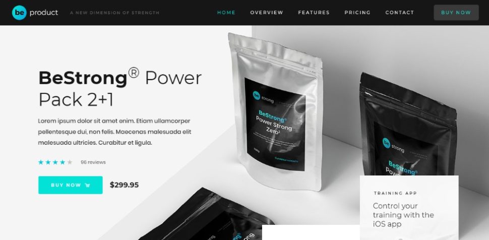
When it comes to making money, some companies will do whatever it takes to get people inside their establishment. But does that kind of business tactic even work?
In my opinion, if you have to lie or trick your consumers into a sale, well then, that won’t obviously work! You might be able to attract a good amount of foot traffic (and even make some sales from the deceitful strategy), but let’s look at the big picture. If traffic levels won’t sustain and you’re handling more refunds than sales, the approach was a total failure. I’d suspect that to happen with a lot of people who attempt to use trickery to boost business both in the real world and digital space.
That’s why, today, I’m dedicating this post to dark patterns. We’re going to talk about what a dark pattern is, look at some well-known examples and then talk about why they’re always a bad idea — even if your client tries to convince you otherwise.
Designing Friction For A Better User Experience
In experience design, friction is usually the opposite of being intuitive or effortless. However, that doesn’t mean that it’s always bad for the users. Read related article ?
What Are Dark Patterns?
The phrase was coined by Harry Brignull, a UX research specialist. According to Brignull:
“Dark Patterns are tricks used in websites and apps that make you buy or sign up for things that you didn’t mean to.”
He has since developed a website dedicated to the worst of the worst Dark Patterns:
As you can see here, Brignull has defined one of the types of dark patterns used on the web. This specific example comes from Microsoft’s usage of a bait-and-switch pop-up that doesn’t behave as it should. I’m going to explain why this was such a huge problem for Microsoft’s users down below.
How Are Dark Patterns Used In Web Design?
In total, Brignull classifies dark patterns into 12 categories. I’m going to include each of them — as well as some of my own — in the following guide:
1. Bait and Switch
This happens when a user assumes that a specific reaction will take place upon engagement with a website. Typically, this is based on expectations set by the rest of the web. In the case of a bait-and-switch, however, an undesired response is the result.
Microsoft used this tactic a couple years back when it was trying to get users to make the recommended update to Windows 10. (That’s the image above from Brignull’s website.) Users claimed that, when X’ing out of the pop-up, their systems automatically updated without consent. The “X” should have indicated that the user did not want to proceed, but it did the opposite.
Now, here’s the thing. Software does need to be updated in order to keep systems running quickly and securely. However, if you’re tricking users into initiating an update they don’t want or aren’t prepared for, you could face serious consequences if it goes wrong. For instance, this woman won $10,000 as a result of the damage the Windows update caused her system.
These kinds of dark patterns don’t always lead to destructive consequences though. Sometimes they’re just really disruptive to the user experience.
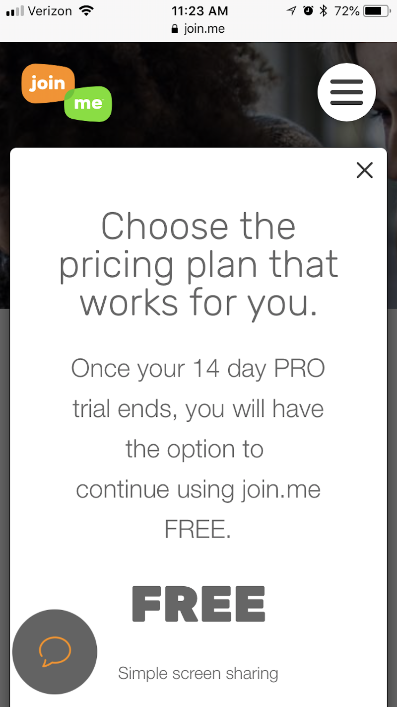
For example, I was looking at the join.me website as I researched solutions for screen sharing with my clients. While looking over the pricing options, the contact widget from the bottom of the screen opened into this pop-up:
Join.me asks if I want to talk to someone through live chat. (Source: join.me) (Large preview)
I wasn’t in need of assistance at the time, so I clicked the “X” in the right corner of the pop-up. However, upon doing so, this is what I saw:
Join.me initiates live chat when the “X” is clicked. (Source: join.me) (Large preview)
I was surprised to see this page as I most definitely had not asked to “Start Chat”. Then, once I realized what this full-page pop-up was attempting to do, I immediately wanted to exit out. But the way to do that is in the top-left corner, which threw me for a bit of a loop as the “X” from the original pop-up was in the top-right.
The entire experience with the live chat probably consumed no more than five seconds of my time, but it still was a jarring one. I tried to take an action that said, “No, thank you,” but I was forced to engage. It’s like being in a restaurant and having the server bring you a dessert menu or tray even though you explicitly told them you weren’t interested.
If you want to annoy your visitors and prove to them that you’re not listening, use this dark pattern.
Confirmshaming was pretty popular in pop-ups about a year or two ago. Users would see the pop-up and have two options:
The positive option would encourage them to move towards conversion;
The negative option would shame them for making a seemingly bad choice by not doing so.
There are still a number of websites that you’ll see do this, though there’s far fewer of them these days what with many designers steering clear of pop-ups on mobile.
Personally, I don’t think the shaming in this pop-up is that bad compared to others I’ve seen. You know the ones I’m talking about. The positive CTA says something like, “Yes, I want to double my revenue this year!” The other says something like, “No, I want my business to crash and burn!”
The intention in using confirmshaming CTAs is to use the consumers’ fears to talk some sense into them. But is that really what’s happening here? While I’m sure this strategy does work on some users, I don’t know if most people would fall for it.
My suggestion here would be to stay away from shaming visitors altogether. If you want to use the double-CTA method, however, opt for something like ghost buttons. This strategy aims to give you the same outcome: get visitors to click through and/or convert. However, it does it with subtle design persuasion. In other words:
This button that’s big and colorful is deserving of your attention;
This button that’s devoid of life is here (if you want it) but we’re happy if you want to ignore it altogether, too.
3. Disguised Ads
Generally, it’s pretty clear when an ad — even a native one placed mid-content — is there for promotional purposes. However, when an ad cannot clearly be distinguished as such, this can be an issue for visitors.
If you follow what happens in the world of influencer marketing on social media, you might recognize this problem with deception from Instagram. Basically, here’s what was (and still is) happening:
Users who promote products or content as a form of advertisement or sponsorship are supposed to explicitly declare the promotion as such. That’s because they’re getting paid for their efforts and it’s not a genuine recommendation on their part.
When influencers fail to announce that such endorsements are paid placements from brands, users may be deceived into buying something because they believed it to be a valid recommendation. And that’s a major problem.
“If there is a ‘material connection’ between an endorser and an advertiser — in other words, a connection that might affect the weight or credibility that consumers give the endorsement — that connection should be clearly and conspicuously disclosed, unless it is already clear from the context of the communication.”
The same should hold true when it comes to on-site advertisements, but there’s been no real regulation of this thus far. That said, we do recognize certain disguised advertisements for what they are: dark patterns.
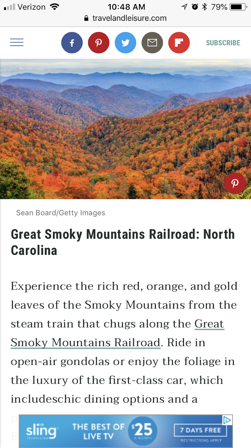
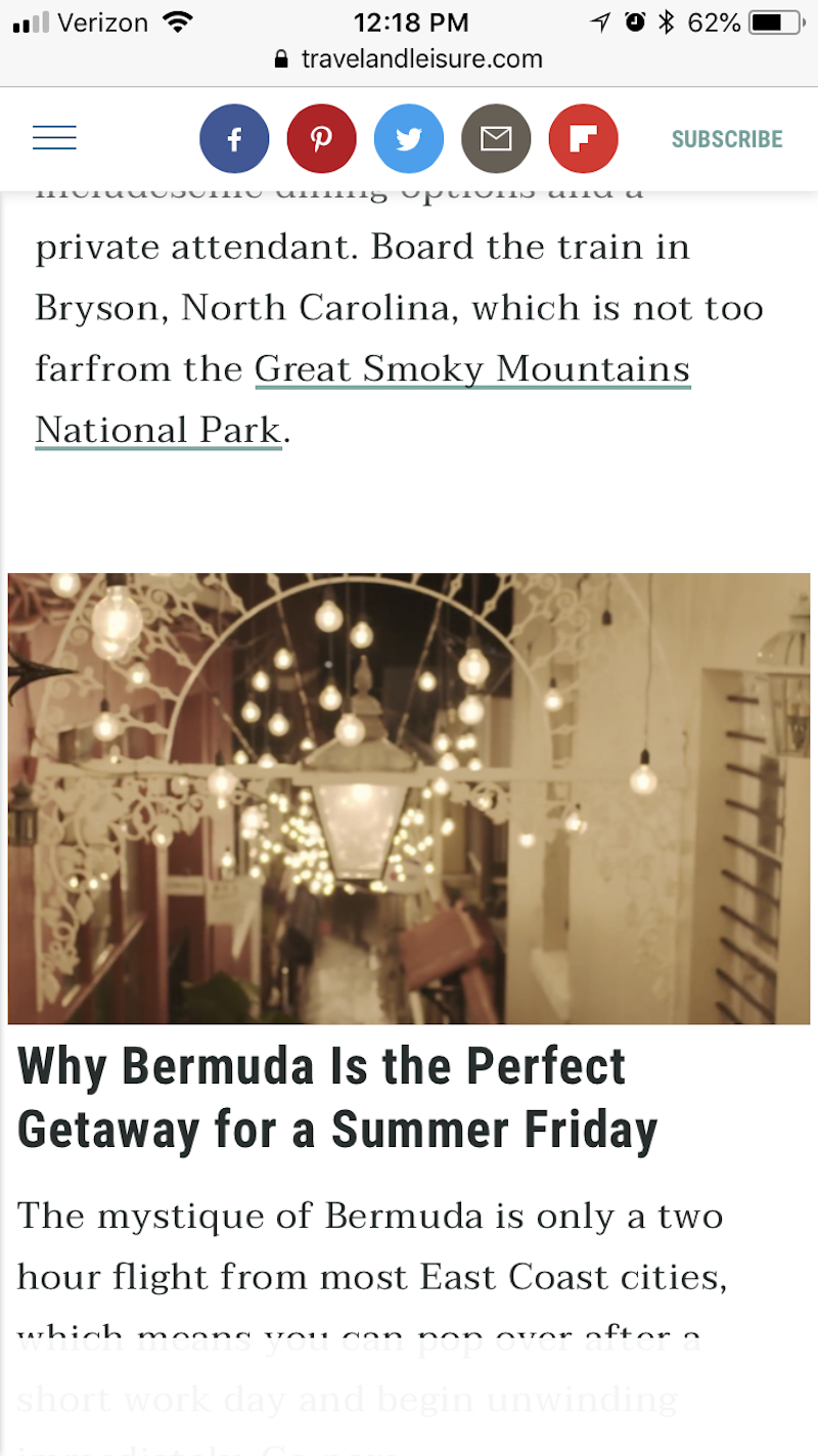
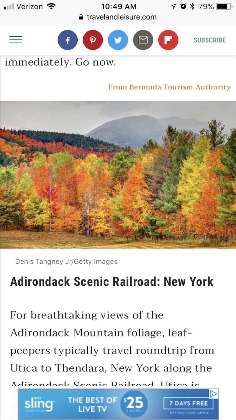
As I was reading an article about the best places to experience changing autumn colors in the United States, I became quite enraptured by the images included.
As I skimmed further down, I encountered this image — or what I thought was an image.
Travel & Leisure injects advertisement that looks just like article into the post (Source: Travel & Leisure) (Large preview)
Once the page fully loaded (which took more than a few seconds), I realized this was a video. At this point, a couple of thoughts ran through my mind:
Did I scroll too far? Were the rest of the fall foliage trip recommendations in a slider above?
Why is a Bermuda summer vacation included on a list about fall foliage?
I decided to keep scrolling through the identically-formatted text for Bermuda to see what came next, and then I noticed a note beneath it that read “From Bermuda Tourism Authority”:
Once I got past the native video ad that looked exactly like the rest of the page, I was able to read the rest of the post. But it left a bad taste in my mouth.
I had set out to see some cool imagery and pick up some tips for fall travel, but was tricked. Albeit, the dark pattern only got me temporarily, but it still disrupted the experience and made me wonder what other deceptions would abound. What if all the ideas in this post or anywhere on the site solely came from sponsors and not from actual trips worth taking?
If you leave your visitors wondering whether or not they can trust your website, then you’ve gone down a bad path, m’friends.
4. Forced Continuity
This type of dark pattern occurs when someone signs up for a “free” trial, but is required to share credit card information during the intake process. Then, when the trial period ends, their credit card is charged without warning.
For users that don’t pay attention to these kinds of things and assume that brands won’t take advantage of them, this form of deception will definitely not go over well. In addition to losing the trust and business of these users, your business could be penalized if a credit card company or local business bureau gets involved.
Although this kind of dark pattern usually doesn’t have anything to do with design, it’s still one worth knowing about as a designer. That’s because you can use various design strategies and layouts to point potential customers to those revealing details about automated payments and what-not.
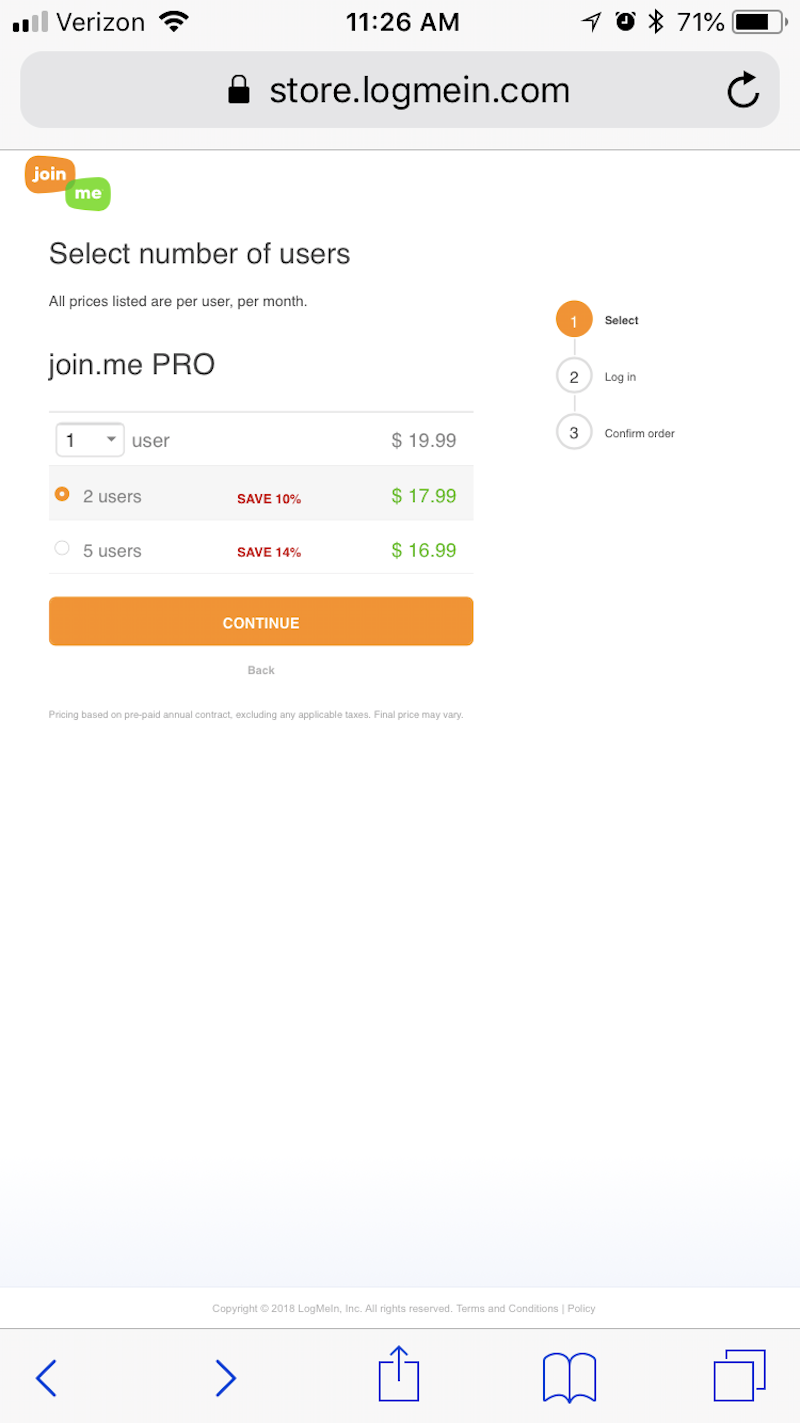
I’m going to use join.me once again for my next example.
On join.me’s pricing page, you’ll encounter three plans — each with an associated cost. It’s actually not until you locate the much smaller and non-highlighted CTA that you can explore more about what comes with each plan:
Join.me hides details about its plans with a hard-to-find CTA. (Source: join.me) (Large preview)
For users that discover this CTA, they’ll be able to explore the features of each plan within this detailed pop-up:
Join.me only mentions the free plan once users ask for more information. (Source: join.me) (Large preview)
I was quite happy to discover that join.me has a free plan. However, in order to gain access to it, you have to sign up for the PRO plan. This is what’s included in the trial:
Join.me requires credit card information for a PRO plan trial. (Source: join.me) (Large preview)
Once you’ve submitted your user and purchase details, you’re then granted access to a free, 14-day trial. If you choose not to proceed with PRO, only then can you gain access to the free plan that join.me doesn’t readily advertise.
Now, this example deviates slightly from the above-mentioned point. Or at least I hope it does. Since I haven’t purchased a trial of join.me, I can’t tell you if this site auto-charges after the trial without warning. That said, the way in which the free plan is mentioned and the way in which users are able to get it, leads me to believe that it’ll be difficult to cancel the PRO plan before the trial ends.
5. Friend Spam
Logging into websites and apps with social media accounts or Google is a common thing nowadays. Nevertheless, the companies that are using your list of friends to spam your contacts, however, is (hopefully) not.
That said, one major brand was found guilty of this and is now having to pay $13 million as a result: LinkedIn.
It appears that LinkedIn used its users’ contact lists for personal gain. Basically, it offered an “add connection” feature on its website in the early 2010s. This enabled users to quickly connect with people they knew or, rather, to send them a message and ask them to connect on LinkedIn.
While the service seems fair enough (after all, it can be difficult to track down previous acquaintances and workers on your own), LinkedIn still took it too far.
What should have been a simple email that said, “Hey, so-and-so wants to connect with you on LinkedIn,” turned into a number of follow-up emails to those contacts. The unwarranted harassment wasn’t necessarily the problem. The biggest problem was that LinkedIn crafted these emails in a way that made it seem as though it was coming directly from the known acquaintance.
This just goes to show you that it doesn’t matter how popular or well-revered your platform is. If you abuse your users’ trust for your own personal gain, there’s going to be a major backlash. A $13 million lawsuit is definitely a severe consequence, but even just the loss of customers should be enough to deter you from this dark pattern.
6. Hidden Costs
This one is self-explanatory. You do some shopping online, you’re satisfied with the items you’ve added to your cart, and so you decide to finally go to checkout where you discover costs you were unaware of.
While you might not believe this is a matter that you as a designer have a hand in, I’d urge you to take a look at this dark pattern example from Southwest Airlines:
The total price from Southwest Airlines appears independent of the individual flight prices. (Source: Southwest Airlines) (Large preview)
As I looked for a roundtrip flight between Albany, NY and Atlanta, GA, I was presented with various pricing options. Time of day, number of layovers and so on affected how much I would have to pay on each leg of my journey. That’s to be expected.
However, what I hadn’t expected was that the total price displayed before checkout would be off from what I thought it to be. As you can see here, this final page doesn’t even show the prices of the individual legs of the trip anymore. It just shows the total cost and then asks me to continue on.
That’s when I realized there were tiny “Includes taxes and fees” and “Show fare breakdown” messages beneath the Total line. When I expanded them, I encountered this:
When it comes to travel and hospitality, it’s normal to expect charges for things like carry-on bags, resort fees, and so on. Still, this wasn’t what I expected to show up and there was no real mention of it made as I selected my flights earlier on. What’s worse, many of these charges aren’t even explained.
Now, there are some travel sites that handle this sort of thing in a reputable manner. However, I assume that many of them prefer to go the Southwest Airlines route of manipulating design and typography in a way that keeps extra charges hidden from plain view.
Misdirection on a website is really no different than a magician’s trick. The website draws your attention to one thing while doing something deceitful somewhere else.
A good example of this is subscription forms for online publications. You usually see this when a magazine belongs to a much larger brand. Other magazines from the publisher are then promoted during the sign-up process. And it’s typically nothing more than a pre-checked checkbox at the bottom of the form that asks if you also want to subscribe to their newsletters or subscriptions.
For example, here is the Eater newsletter subscription form:
A seemingly tradition newsletter subscription form from Eater. (Source: Eater) (Large preview)
It’s not all that strange that the form sits at the top of the page. Or, at least, it wouldn’t be if it were the only subscription offered.
But as you scroll down, you can see that the Today newsletter is automatically checked:
Eater automatically signs me up for a daily email. (Source: Eater) (Large preview)
That would be okay, except that I was on the Eater Philly website. I didn’t want generic Eater news. I wanted news related specifically to the area of the U.S. that I live in. I also don’t know if I was too crazy about a daily newsletter.
If I were to scroll down even further on the page, I’d discover more newsletter options:
Thankfully, none of these were checked on my behalf, but it’s still strange that all these options are placed below the form, including the city selection:
Eater also includes city-specific newsletter subscriptions. (Source: Eater) (Large preview)
By “hiding” checkboxes and pre-selecting one for your users, you’re putting them in a position to receive messages that they’re not likely to be happy to receive. When they unsubscribe from those emails and state the reason such as “I never signed up for these communications.” That’s no good.
8. Price Comparison Prevention
For many users, mobile websites are visited for the purposes of doing research. Having access to multiple devices to simultaneously search with or having one device to take on the go to complement the on-site shopping experience, is a benefit many shoppers greatly enjoy.
However, if you prevent users from being able to easily compare prices within your website, it’s probably because you’re hiding something.
With the Southwest Airlines example I mentioned above, the website prevented me from tracking the individual prices of each leg of my trip. That was a pain since it required me to write them down somewhere so I could make sure I wasn’t exceeding my budget in the end.
Then, there’s this airline that just won’t reveal prices at all: British Airways.
British Airways forces you to compare flight times before showing prices. (Source: British Airways) (Large preview)
As you can see here, you can skim through flight times and stopover options on British Airways. While you can compare the times and number of stops against one another, prices aren’t actually revealed until you select a trip.
This makes the experience of booking a flight through British Airways incredibly annoying — to say the least. While prices can be compared, it requires a number of back-and-forths to gather that information. And, chances are good that if you hit the browser “Back” button, it’ll reset the data and you’ll have to re-enter all your trip information from the beginning.
While it’s nice that the designers of this mobile site inform visitors that prices aren’t revealed at this stage, the call to do so is a bad choice on British Airways’ part.
9. Privacy Zuckering
Here’s the basic premise of this dark pattern: When a design or piece of content does not make it clear that the sharing of data is optional or doesn’t present an easy way out of it, this would be a case of Zuckering.
I’m sure Mark Zuckerberg wouldn’t be too happy to know that Brignull named this one after him, but Facebook is known for luring users into giving more information than they have to — which is why this one is aptly named.
One example of this I run into often doesn’t actually occur on Facebook. Instead, it’s one I encounter on BuzzFeed when I’m taking a break from writing. Here’s what happens:
My brain starts to hurt and I find myself needing a quick distraction. I go to the living room, sit on my couch and pull out my phone. I immediately go to BuzzFeed’s quiz section. They’re entertaining and I know I can get through them quickly. Like this one about movies:
I start the quiz and quickly get into a groove of reading the question, looking at the entertaining graphics and choosing my answer. It’s a great mind-numbing activity that helps me reset.
This is an unrelated question that BuzzFeed has snuck into my quiz. It usually occurs two or three paces down the page. This example happens to be completely unrelated to the quiz I was taking, so I was able to spot it right away. But sometimes they do a very good job of blending the topics so that I’m fooled into providing them with a revealing answer.
When your design incorporates additional interactive elements that don’t actually need to be engaged with, you should let users know that’s the case. Not only is it a waste of time — especially for mobile users — but it distracts from the rest of the experience.
10. Roach Motel
The trademarked product “Roach Motel” from Black Flag is one that lures cockroaches and other pests into a sticky situation that is then very difficult to get out of. This is exactly what some websites do.
In some instances, a roach motel occurs when a website or app makes it incredibly difficult to delete an account or unsubscribe from a list. You’ll most commonly see this with free trials of SaaS products.
In other cases, it might be a landing page a visitor has fallen into, but is unable to back out of using the website’s navigation (since it’s gone). Instead, users have to rely on the browser’s Back button, which can be a pain if it resets any work that had been inputted prior to that landing page.
The first page of the ticket purchase form is fine. You indicate what price range you want your tickets to fall within and then you choose how many you need. Seems pretty straightforward.
What’s odd, though, is that it now says “Add to Cart.” It’s my assumption that I’ll be able to choose my specific seats at that point.
What happens instead is that the Wells Fargo Center automatically chooses my tickets and adds them to the cart. I had no say in which seats I wanted. Instead, the most expensive tickets for $1,250 were added to my cart.
At this point, I decide that I want to back out and try to find better seats. When I click on “change seats”, it takes me back to the original page where I get to make only vague choices about where I want to sit and how much I want to pay. The trash icon below does the same thing except that it completely clears out the tickets in my cart. Either way, I’m left feeling helpless as I have no control over the experience.
In a last ditch effort, I thought I’d move on to the next step to see if I had any more control there. I clicked on “cost details”, saw the associated charges and upgrades (which I hadn’t expected) and realized I could only “Checkout” at that point:
I eventually decided not to buy these tickets because I had no control over the process and because of how stuck I felt once I got deep inside it.
As you design journeys for your own users, don’t do this to them. Give them an easy way to reverse their tracks and to back out of a process if they’re unhappy with it. And, if it can be helped, give them more control over the choices and customizations they make. It’s hard enough to convert mobile users, don’t turn them off from your mobile website altogether because of this.
11. Sneak into Basket
There are typically two ways users will find an unexpected item in their shopping cart. The first is by the website automatically adding it on. The second is by the website tricking the user into adding it themselves by placing a checkbox or other add-on option in a spot where something else should be.
For mobile users that are in a hurry, they might not even think to read the button that appears. It’s big, bold and appears directly beneath the form. Why not click it?
However, upon closer inspection, you’ll see that “Yes, Add $5 to My Order” is what this CTA button calls for. Now, someone reading that quickly might read that as “Yes, Add to My Order” thinking it’s referring to the tickets.
It’s not until the mobile user makes one more swipe on their phone that they see the actual checkout button:
The real checkout button requires three full swipes of the Central Park Zoo page. (Source: Central Park Zoo) (Large preview)
As users, we are trained to understand how common web elements act. A contact form follows a simple formula:
Fill out the pertinent details.
Click the button to complete the purchase.
It’s an easy 1-2 punch to execute as a web designer. However, when you throw something in your users’ pathway that resembles a button, you’re very likely to trip them up in the process. Or you’ll find a lot of angry visitors who unknowingly added and paid extra money because of the confusing way the form was designed.
12. Trick Questions
This one happens a lot with things like exit-intent pop-ups. By using language that is confusing or incorrectly written (like a double negative), the site is able to keep visitors put until they realize their mistake in understanding the question.
Tricky messaging can also be used to drive up costs. Here is what I experienced when trying to order flowers from 1-800-Flowers:
I was pretty happy with this floral arrangement and thought the large would be nice for my friend’s table. As I scrolled down, I saw this checkbox for “FREE Shipping.” I didn’t bother to click on the “i” icon since I figured, “What more do I need to know about free shipping and no service charges? Sounds like a good deal to me.”
The free shipping promise from 1-800-Flowers isn’t what it seems to be. (Source: 1-800-Flowers) (Large preview)
After clicking the box, this message about the Celebrations Passport appeared, but I didn’t bother to pay attention to it. Once the box was checked, I quickly moved on to enter my zip code; I wanted those flowers delivered ASAP.
As I continued to select a delivery date, this upsell screen appeared on my phone. I considered it briefly and decided I don’t need any of these add-ons. I couldn’t find an “X” button, so I clicked “Continue” and hoped that none of these items had been added to my purchase.
I finally arrived at my shopping cart and discovered that ‘12 Months of Passport’ had also been added to my cart. Thankfully, I screenshotted the process for the purpose of this article. Otherwise, I would’ve had no idea where the add-on came from. Granted, it ended up here because I didn’t read the details closely.
That said, when you lead with something like “FREE shipping”, how many customers do you think will take time to read any further? We all understand what that phrase means in most contexts. By not clearly stating that this was a 1-800-Flowers upgrade, many users are likely to select that box and end up with an unintended item at checkout.
In addition to Brignull’s list, I want to add a couple more dark patterns that I find especially perturbing on the mobile web and in mobile apps.
This reference to navigation doesn’t really pertain to the hamburger menu mobile visitors use on websites. Instead, I’m referring more to those websites that have blog posts and quizzes that span multiple pages.
In some cases, I’m sure this is done for the purposes of keeping load times on individual pages fast. However, a properly optimized server and a website with a solid caching mechanism shouldn’t have those sorts of problems, even with a page loaded with images. My guess? These websites create multiple pages for a single post for the purposes of superficially bolstering the number of page views they get.
The image above shows what a typical quiz looks like from the MagiQuiz website. Engaging imagery, question and answers to choose from.
However, the image below is what the typical quiz interface looks like when you actually scroll through it. It’s littered with advertisements, distractingly breaking up the experience of the quiz on the page:
As if those in-line ads weren’t enough, users finally get to the bottom of the page to find this:
The “Continue” button is hidden among ads and indicates it’s not the end of the quiz. (Source: MagiQuiz) (Large preview)
It’s not actually the bottom of the quiz at all. All of that scrolling and skipping past unrelated ads made the quiz take so long, and now there’s still more to do in order to reach the payoff. That sucks — if you ask me!
Unfortunately, quiz sites such as MagiQuiz aren’t the only ones that do this. Major publishers like Forbes are guilty of this as well, breaking up otherwise short stories (no more than 800 or 1,000 words) into multiple pages. If this were a way to conserve server bandwidth, that would make sense, but I’m guessing this dark pattern is used for mainly selfish reasons.
14. Made-You-Look Notifications
One final dark pattern I want to call out is the made-you-look notification. I usually see this sort of thing on mobile apps that claim that I have activity or communications to look at. Since I’m already active on those apps, it’s usually not a big deal to open them and see what all the fuss is about. Sure, it’s annoying to discover the notification was just to remind me to respond to someone, but it’s not a problem if I was going to be in there anyway.
Mobile websites, on the other hand, shouldn’t be making use of this dark pattern. If there’s no history of engagement, then visitors’ attention should not be drawn to something that won’t improve the experience.
1-800-Flowers, again, is guilty of using this particular dark pattern:
See how my inbox has a green number “1” hovering over it? It looks just like email reminders you’d get from Gmail or Outlook, right?
Here’s the problem with this: Before today, I’d never been to the 1-800-Flowers website nor do I have an account with them. Yet, my eye was drawn to that message sitting in my inbox. It’s just a gut reaction I have. When I see that someone has messaged me, it’s usually from a client that I want to get back to ASAP. It’s that sense of urgency that compels me to instantly click to find out what action is needed.
I knew the message that appeared wouldn’t be of relevance to me even before I clicked it, but I needed to see what it said.
As you can imagine, I wasn’t too happy to see an unhelpful promotion like this waiting for me. It’s not even like 1-800-Flowers went to the trouble of promoting flowers for an upcoming occasion (like homecoming events or the approaching holiday season). They just wanted to distract me from what I set out to do in the first place.
Honestly, I’m not sure what 1-800-Flowers (and other brands that do this) hoped to gain from this dark pattern. When people come to a flower delivery site, they typically know what they’re there for. Let them take the user journey you’ve already so carefully planned it out for them and leave those urgent notifications for websites or apps that can share personalized content and messages with their users.
Wrapping Up
Okay, so what have we learned here? To begin with, dark patterns are a way to use design and content to trick users into taking an unintended action. Still, are they effective?
In all honesty, I’m going to guess that — initially — dark patterns work on many visitors. For companies that are only concerned with the superficial success of a website (i.e. visits, page views, and sales), then that may be a good thing.
For companies that understand that short-term gains in these areas can easily be outweighed by losses from refunds, low customer retention rates and lawsuits, dark patterns will ultimately prove not to be worth it.
Deceitful design tactics won’t get you anywhere good with your visitors. Not only does this deception hurt your ability to gain customer loyalty, but it hurts the overall user experience online.
Think about it: enough users get burned by a certain type of website (say, a SaaS tool that makes it difficult to cancel). So, now they comb through every field in the sign-up or check-out process because they’re nervous about being overcharged or sucked into a bad deal. Or they spend so much time digging through your site trying to find some hint that gives the jig away. At the end of the day, users just give up or avoid making those kinds of purchases online altogether.
The user experience should be fast and easy and take visitors on a straight and narrow path to conversion — not make them second-guess their decision to be there in the first place.


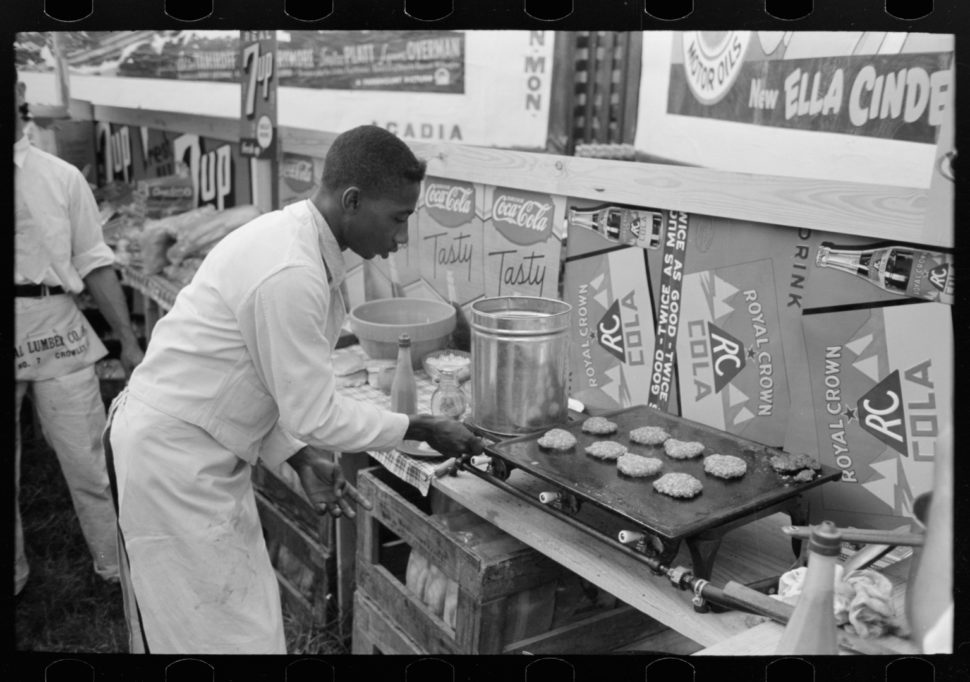
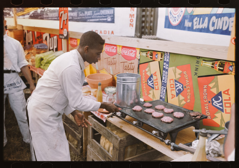
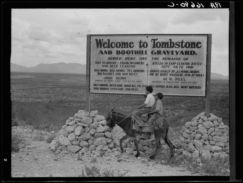
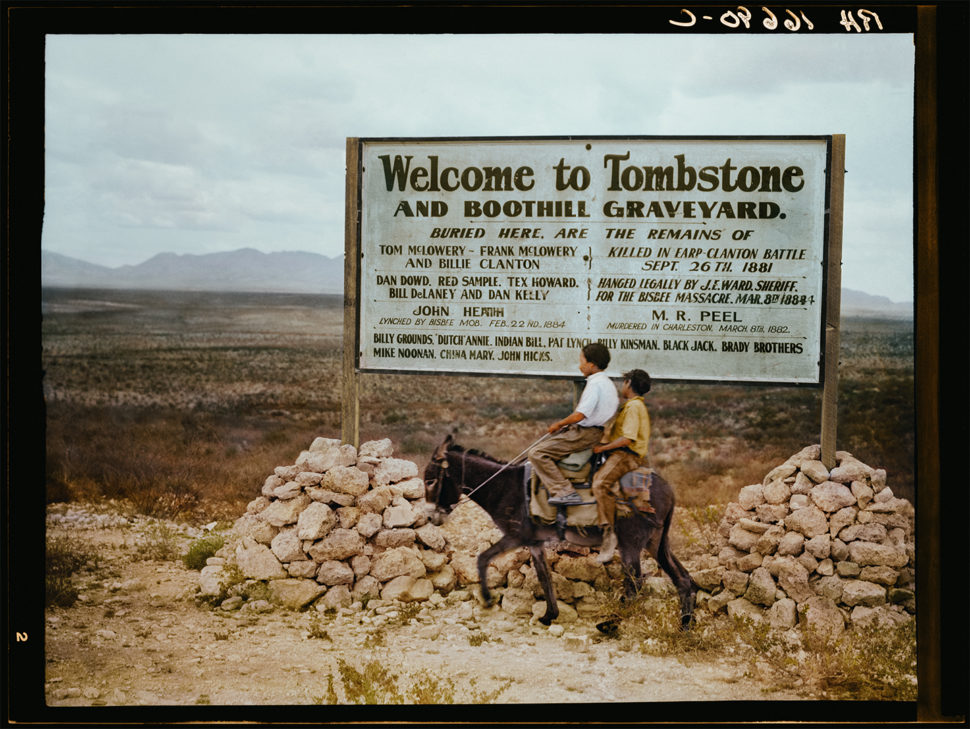


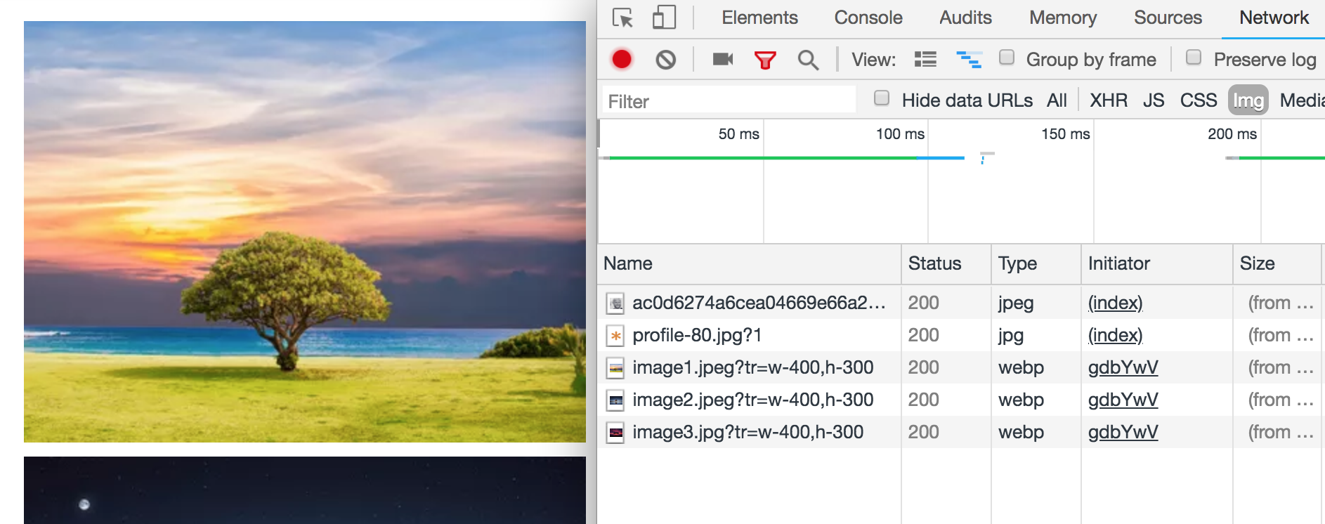


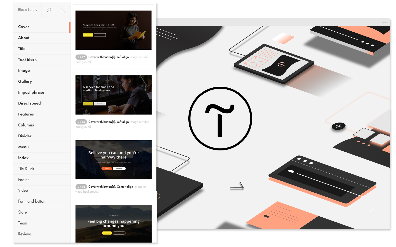

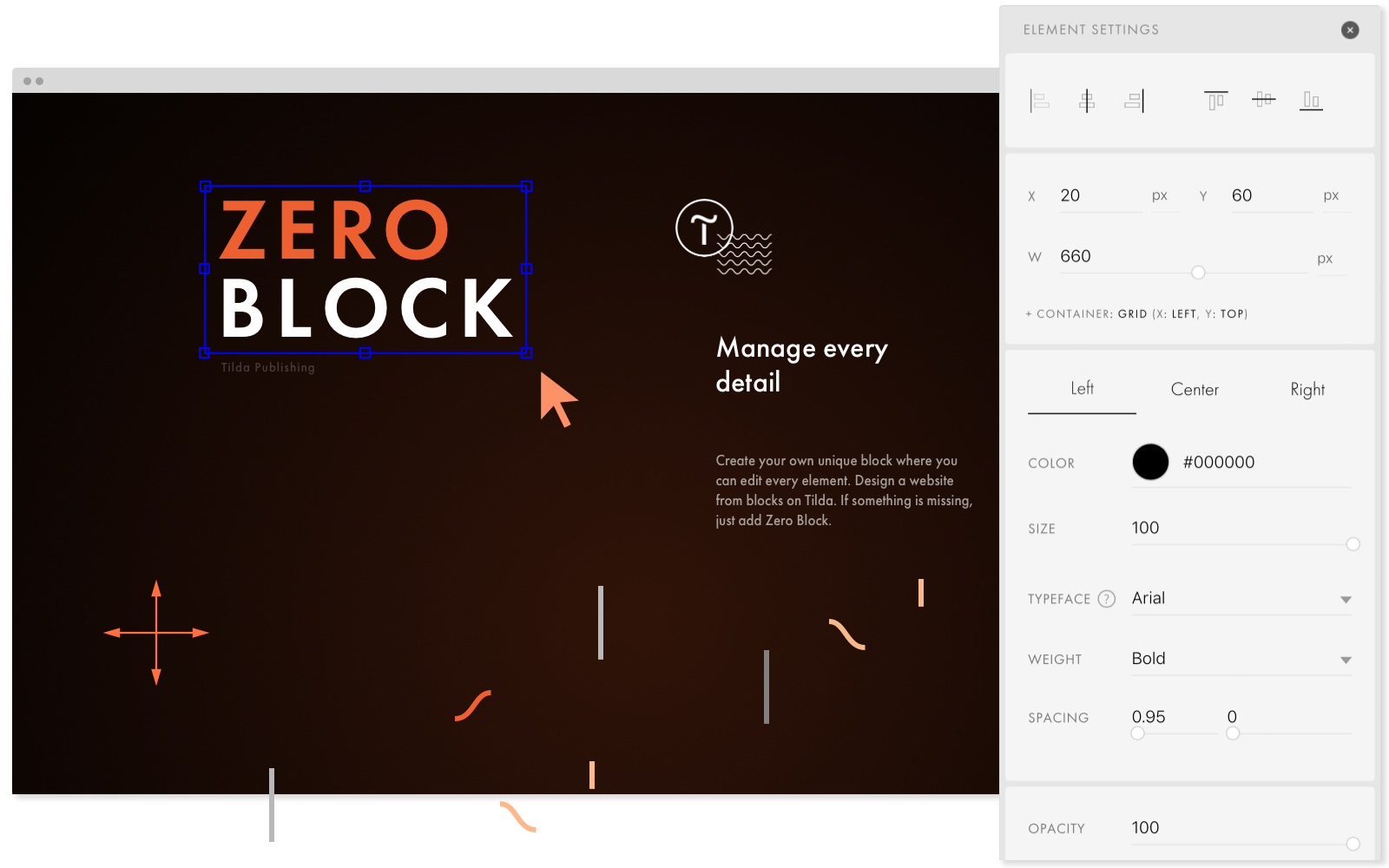


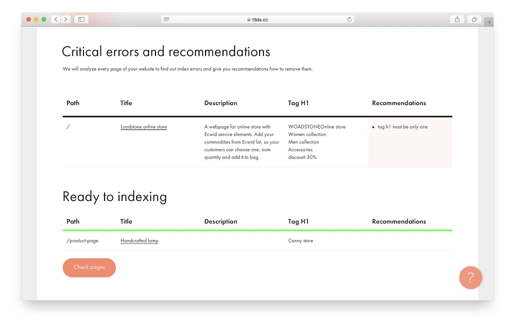
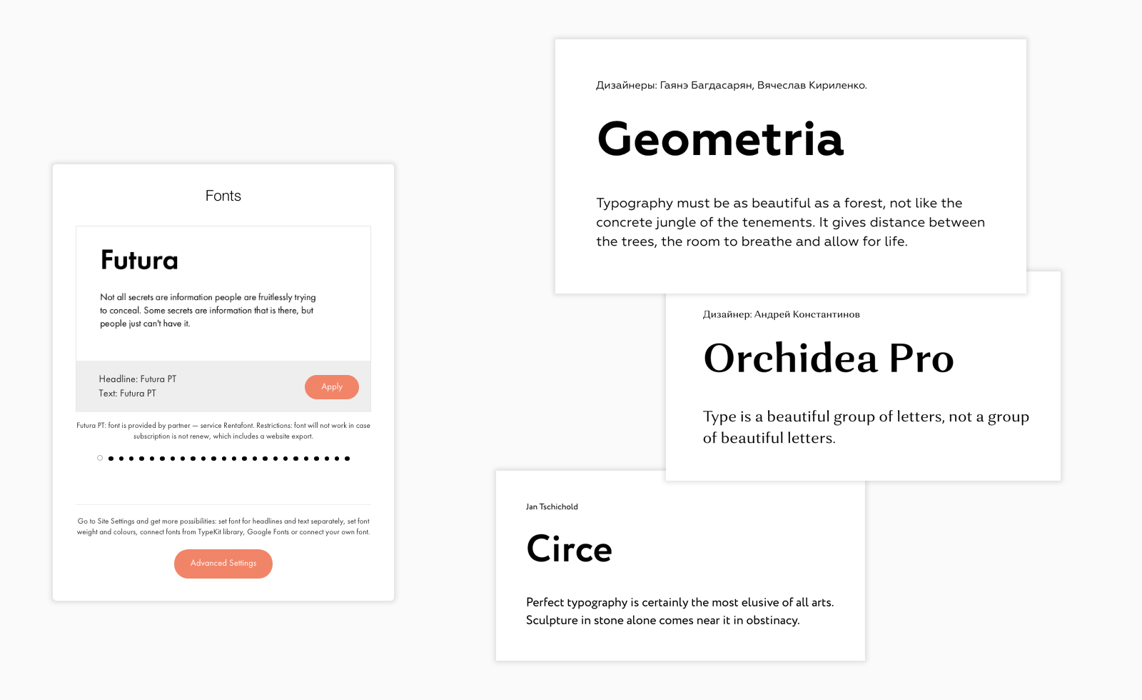


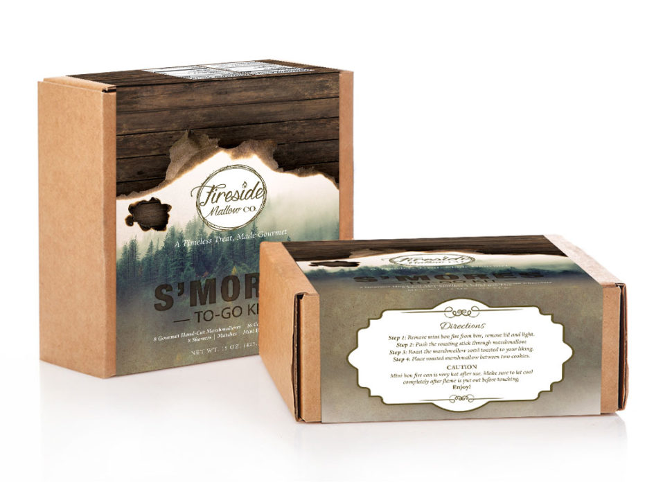
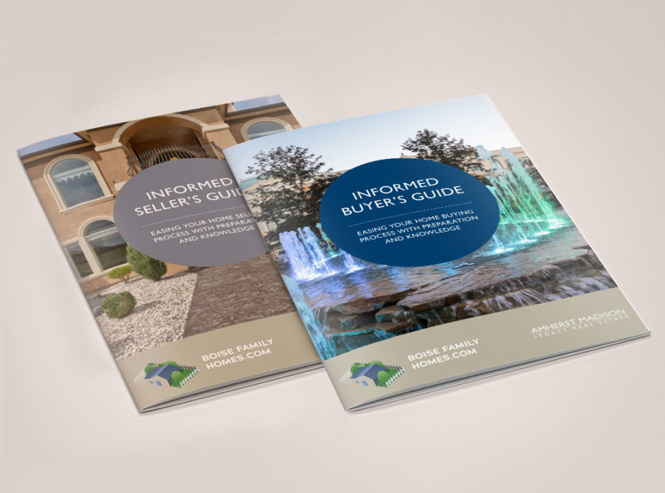
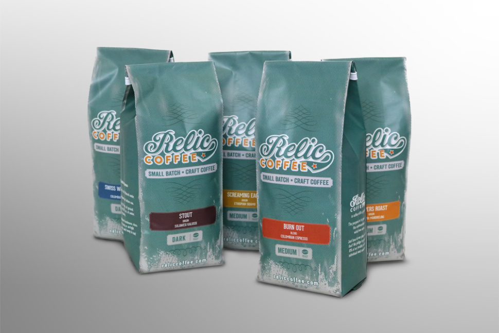
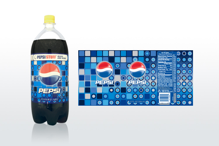
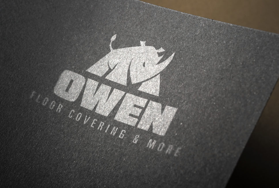