There are 2 kinds of problems that can arise when using webfonts; Flash of invisible text (FOIT) and Flash of Unstyled Text (FOUT) … If we were to compare them, FOUT is of course the lesser of the two evils
If you wanna fight FOIT, the easiest tool is the font-display CSS property. I like the optional value because I generally dislike the look of fonts swapping.
If you want to fight them both, one option is to preload the fonts:
Preload is your friend, but not like your best friend … preloading in excess can significantly worsen performance, since preloads block initial render.
Even huge sites aren’t doing much about font loading perf. Roel Nieskens:
I expected major news sites to be really conscious about the fonts they use, and making sure everything is heavily optimised. Turns out a simple Sunday afternoon of hacking could save a lot of data: we could easily save roughly 200KB
Part of the story is that we might just have lean on JavaScript to do the things we need to do. Divya again:
Web fonts are primarily CSS oriented. It can therefore feel like bad practice to reach for JavaScript to solve a CSS issue, especially since JavaScript is a culprit for an ever increasing page weight.
But sometimes you just have to do it in order to get what you need done. Perhaps you’d like to handle page visibility yourself? Here’s Divya’s demonstration snippet:
const font = new fontFace("My Awesome Font", "url(/fonts/my-awesome-font.woff2)" format('woff2')")
  font.load().then (() => {
    document.fonts.add(font);
    document.body.style.fontFamily = "My Awesome Font, serif";

    // we can also control visibility of the page based on a font loading //
    var content = document.getElementById("content");
    content.style.visibility = "visible";
    })
The font-display descriptor in @font-face blocks is really great. It goes a long way, all by itself, for improving the perceived performance of web font loading. Loading web fonts is tricky stuff and having a tool like this that works as well as it does is a big deal for the web.
It’s such a big deal that Google’s own Pagespeed Insights / Lighthouse will ding you for not using it. A cruel irony, as their own Google Fonts (easily the most-used repository of custom fonts on the web) don’t offer any way to use font-display.
Summarized by Daniel Dudas here:
Google Developers suggests using Lighthouse -> Lighthouse warns about not using font-display on loading fonts -> Web page uses Google Fonts the way it’s suggested on Google Fonts -> Google Fonts doesn’t supports font-display -> Facepalm.
Essentially, we developers would love a way to get font-display in that @font-face block that Google serves up, like this:
The lead on the project says that caching is an issue with that (although it’s been refuted by some since they already support arbitrary text params).
Adding query params reduces x-site cache hits. If we end up with something for font-display plus a bunch of params for variable fonts that could present us with problems.
They say that again later in the thread, so it sounds unlikely that we’re going to get query params any time soon, but I’d love to be wrong.
Option: Download & Self-Host Them
All Google Fonts are open source, so we can snag a copy of them to use for whatever we want.
Once the font files are self-hosted and served, we’re essentially writing @font-face blocks to link them up ourselves and we’re free to include whatever font-display we want.
Option: Fetch & Alter
Robin Richtsfeld posted an idea to run an Ajax call from JavaScript for the font, then alter the response to include font-display and inject it.
const loadFont = (url) => {
  // the 'fetch' equivalent has caching issues
  var xhr = new XMLHttpRequest();
  xhr.open('GET', url, true);
  xhr.onreadystatechange = () => {
    if (xhr.readyState == 4 && xhr.status == 200) {
      let css = xhr.responseText;
      css = css.replace(/}/g, 'font-display: swap; }');

      const head = document.getElementsByTagName('head')[0];
      const style = document.createElement('style');
      style.appendChild(document.createTextNode(css));
      head.appendChild(style);
    }
  };
  xhr.send();
}

loadFont('https://fonts.googleapis.com/css?family=Rammetto+One');
Clever! Although, I’m not entirely sure how this fits into the world of font loading. Since we’re now handling loading this font in JavaScript, the loading performance is tied to when and how we’re loading the script that runs this. If we’re going to do that, maybe we ought to look into using the official webfontloader?
Option: Service Workers
Similar to above, we can fetch the font and alter it, but do it at the Service Worker level so we can cache it (perhaps more efficiently). Adam Lane wrote this:
self.addEventListener("fetch", event => {
  event.respondWith(handleRequest(event))
});

async function handleRequest(event) {
  const response = await fetch(event.request);
  if (event.request.url.indexOf("https://fonts.googleapis.com/css") === 0 && response.status < 400) {
    // Assuming you have a specific cache name setup
    const cache = await caches.open("google-fonts-stylesheets");
    const cacheResponse = await cache.match(event.request);
    if (cacheResponse) {
      return cacheResponse;
  }
  const css = await response.text();
  const patched = css.replace(/}/g, "font-display: swap; }");
  const newResponse = new Response(patched, {headers: response.headers});
  cache.put(event.request, newResponse.clone());
    return newResponse;
  }
  return response;
}
Even Google agrees that using Service Workers to help Google Fonts is a good idea. Workbox, their library for abstracting service worker management, uses Google Fonts as the first demo on the homepage:
// Cache the Google Fonts stylesheets with a stale while revalidate strategy.
workbox.routing.registerRoute(
  /^https://fonts.googleapis.com/,
  workbox.strategies.staleWhileRevalidate({
    cacheName: 'google-fonts-stylesheets',
  }),
);

// Cache the Google Fonts webfont files with a cache first strategy for 1 year.
workbox.routing.registerRoute(
  /^https://fonts.gstatic.com/,
  workbox.strategies.cacheFirst({
    cacheName: 'google-fonts-webfonts',
    plugins: [
      new workbox.cacheableResponse.Plugin({
        statuses: [0, 200],
      }),
      new workbox.expiration.Plugin({
        maxAgeSeconds: 60 * 60 * 24 * 365,
      }),
    ],
  }),
);
One of the reasons Google might be dragging its heels on this (they’ve said the same), is that there is a new CSS @rule called @font-feature-values that is designed just for this situation. Here’s the spec:
This mechanism can be used to set a default display policy for an entire font-family, and enables developers to set a display policy for @font-face rules that are not directly under their control. For example, when a font is served by a third-party font foundry, the developer does not control the @font-face rules but is still able to set a default font-display policy for the provided font-family. The ability to set a default policy for an entire font-family is also useful to avoid the ransom note effect (i.e. mismatched font faces) because the display policy is then applied to the entire font family.
This article is part of a series in which I attempt to use the web under various constraints, representing a given demographic of user. I hope to raise the profile of difficulties faced by real people, which are avoidable if we design and develop in a way that is sympathetic to their needs. Last time, I navigated the web for a day with just my keyboard. This time around, I’m avoiding the screen and am using the web with a screen reader.
What Is A Screen Reader?
A screen reader is a software application that interprets things on the screen (text, images, links, and so on) and converts these to a format that visually impaired people are able to consume and interact with. Two-thirds of screen reader users choose speech as their screen reader output, and one-third of screen reader users choose braille.
Screen readers can be used with programs such as word processors, email clients, and web browsers. They work by mapping the contents and interface of the application to an accessibility tree that can then be read by the screen reader. Some screen readers have to manually map specific programs to the tree, whereas others are more generic and should work with most programs.
Accessibility Originates With UX
You need to ensure that your products are inclusive and usable for disabled people. A BBC iPlayer case study, by Henny Swan. Read article ?
Pie chart from the Screen Reader Survey 2017, showing that JAWS, NVDA and VoiceOver are the most used screen readers on desktop. (Large preview)
On Windows, the most popular screen reader is JAWS, with almost half of the overall screen reader market. It is commercial software, costing around a thousand dollars for the home edition. An open-source alternative for Windows is NVDA, which is used by just under a third of all screen reader users on desktop.
There are other alternatives, including Microsoft Narrator, System Access, Window-Eyes and ZoomText (not a full-screen reader, but a screen magnifier that has reading abilities); the combined sum of these equates to about 6% of screen reader usage. On Linux, Orca is bundled by default on a number of distributions.
The screen reader bundled into macOS, iOS and tvOS is VoiceOver. VoiceOver makes up 11.7% of desktop screen reader users and rises to 69% of screen reader users on mobile. The other major screen readers in the mobile space are Talkback on Android (29.5%) and Voice Assistant on Samsung (5.2%), which is itself based on Talkback, but with additional gestures.
Popularity of mobile screen readers: Ranks VoiceOver first, Talkback second, Voice Assistant third. (Large preview)
I have a MacBook and an iPhone, so will be using VoiceOver and Safari for this article. Safari is the recommended browser to use with VoiceOver, since both are maintained by Apple and should work well together. Using VoiceOver with a different browser can lead to unexpected behaviors.
How To Enable And Use Your Screen Reader
My instructions are for VoiceOver, but there should be equivalent commands for your screen reader of choice.
VoiceOver On Desktop
If you’ve never used a screen reader before, it can be a daunting experience. It’s a major culture shock going to an auditory-only experience, and not knowing how to control the onslaught of noise is unnerving. For this reason, the first thing you’ll want to learn is how to turn it off.
The shortcut for turning VoiceOver off is the same as the shortcut for turning it on: ? + F5 (? is also known as the Cmd key). On newer Macs with a touch bar, the shortcut is to hold the command key and triple-press the Touch ID button. Is VoiceOver speaking too fast? Open VoiceOver Utility, hit the ‘Speech’ tab, and adjust the rate accordingly.
Once you’ve mastered turning it on and off, you’ll need to learn to use the “VoiceOver key” (which is actually two keys pressed at the same time): Ctrl and ? (the latter key is also known as “Option” or the Alt key). Using the VO key in combination with other keys, you can navigate the web.
For example, you can use VO + A to read out the web page from the current position; in practice, this means holding Ctrl + ? + A. Remembering what VO corresponds to is confusing at first, but the VO notation is for brevity and consistency. It is possible to configure the VO key to be something else, so it makes sense to have a standard notation that everyone can follow.
You may use VO and arrow keys (VO + ? and VO + ?) to go through each element in the DOM in sequence. When you come across a link, you can use VO + Space to click it — you’ll use these keys to interact with form elements too.
Huzzah! You now know enough about VoiceOver to navigate the web.
VoiceOver On Mobile
The mobile/tablet shortcut for turning on VoiceOver varies according to the device, but is generally a ‘triple click’ of the home button (after enabling the shortcut in settings).
You can read everything from the current position with a Two-Finger Swipe Down command, and you can select each element in the DOM in sequence with a Swipe Right or Left.
You now know as much about iOS VoiceOver as you do desktop!
Navigating By Content Type
Think about how you use the web as a sighted user. Do you read every word carefully, in sequence, from top to bottom? No. Humans are lazy by design and have learned to ‘scan’ pages for interesting information as fast as possible.
Screen reader users have this same need for efficiency, so most will navigate the page by content type, e.g. headings, links, or form controls. One way to do this is to open the shortcuts menu with VO + U, navigate to the content type you want with the ? and ? arrow keys, then navigate through those elements with the ?? keys.
Another way to do this is to enable ‘Quick Nav’ (by holding ? along with ? at the same time). With Quick Nav enabled, you can select the content type by holding the ? arrow alongside ? or ?. On iOS, you do this with a Two-Finger Rotate gesture.
Setting the rotor item type using keyboard shortcuts. (Large preview)
Once you’ve selected your content type, you can skip through each rotor item with the ?? keys (or Swipe Up or Down on iOS). If that feels like a lot to remember, it’s worth bookmarking this super handy VoiceOver cheatsheet for reference.
A third way of navigating via content types is to use trackpad gestures. This brings the experience closer to how you might use VoiceOver on iOS on an iPad/iPhone, which means having to remember only one set of screen reader commands!
You can practice the gesture-based navigation and many other VoiceOver techniques in the built-in training program on OSX. You can access it through System Preferences ? Accessibility ? VoiceOver ? Open VoiceOver Training.
After completing the tutorial, I was raring to go!
Case Study 1: YouTube
Searching On YouTube
I navigated to the YouTube homepage in the Safari toolbar, upon which VoiceOver told me to “step in” to the web content with Ctrl + ? + Shift + ?. I’d soon get used to stepping into web content, as the same mechanism applies for embedded content and some form controls.
Using Quick Nav, I was able to navigate via form controls to easily skip to the search section at the top of the page.
When focused on the search field, VoiceOver announced: ‘Search, search text field Search’. (Large preview)
I searched for some quality content:
Who doesn’t love Impractical Jokers? (Large preview)
However, when I activated the button with VO + Space, nothing was announced.
I opened my eyes and the search had happened and the page had populated with results, but I had no way of knowing through audio alone.
Puzzled, I reproduced my actions with devtools open, and kept an eye on the network tab.
As suspected, YouTube is making use of a performance technique called “client-side rendering” which means that JavaScript intercepts the form submission and renders the search results in-place, to avoid having to repaint the entire page. Had the search results loaded in a new page like a normal link, VoiceOver would have announced the new page for me to navigate.
There are entire articles dedicated to accessibility for client-rendered applications; in this case, I would recommend YouTube implements an aria-live region which would announce when the search submission is successful.
Tip #1: Use aria-live regions to announce client-side changes to the DOM.
<div role="region" aria-live="polite" class="off-screen" id="search-status"></div>

<form id="search-form">
  <label>
    <span class="off-screen">Search for a video</span>
    <input type="text" />
  </label>
  <input type="submit" value="Search" />
</form>

<script>
  document.getElementById('search-form').addEventListener('submit', function (e) {
    e.preventDefault();
    ajaxSearchResults(); // not defined here, for brevity
    document.getElementById('search-status').textContent = 'Search submitted. Navigate to results below.'; // announce to screen reader
  });
</script>
Now that I’d cheated and knew there were search results to look at, I closed my eyes and navigated to the first video of the results, by switching to Quick Nav’s “headings” mode and then stepping through the results from there.
Playing Video On YouTube
As soon as you load a YouTube video page, the video autoplays. This is something I value in everyday usage, but this was a painful experience when mixed with VoiceOver talking over it. I couldn’t find a way of disabling the autoplay for subsequent videos. All I could really do was load my next video and quickly hit CTRL to stop the screen reader announcements.
Tip #2: Always provide a way to suppress autoplay, and remember the user’s choice.
The video itself is treated as a “group” you have to step into to interact with. I could navigate each of the options in the video player, which I was pleasantly surprised by — I doubt that was the case back in the days of Flash!
However, I found that some of the controls in the player had no label, so ‘Cinema mode’ was simply read out as “button”.
Focussing on the ‘Cinema Mode’ button, there was no label indicating its purpose. (Large preview)
Tip #3: Always label your form controls.
Whilst screen reader users are predominantly blind, about 20% are classed as “low vision”, so can see some of the page. Therefore, a screen reader user may still appreciate being able to activate “Cinema mode”.
These tips aren’t listed in order of importance, but if they were, this would be my number one:
Tip #4: Screen reader users should have functional parity with sighted users.
By neglecting to label the “cinema mode” option, we’re excluding screen reader users from a feature they might otherwise use.
That said, there are cases where a feature won’t be applicable to a screen reader — for example, a detailed SVG line chart which would read as a gobbledygook of contextless numbers. In cases such as these, we can apply the special aria-hidden="true" attribute to the element so that it is ignored by screen readers altogether. Note that we would still need to provide some off-screen alternative text or data table as a fallback.
Tip #5: Use aria-hidden to hide content that is not applicable to screen reader users.
It took me a long time to figure out how to adjust the playback position so that I could rewind some content. Once you’ve “stepped in” to the slider (VO + Shift + ?), you hold ? + ?? to adjust. It seems unintuitive to me but then again it’s not the first time Apple have made some controversial keyboard shortcut decisions.
Autoplay At End Of YouTube Video
At the end of the video I was automatically redirected to a new video, which was confusing — no announcement happened.
There’s a visual cue at the end of the video that the next video will begin shortly. A cancel button is provided, but users may not trigger it in time (if they know it exists at all!) (Large preview)
I soon learned to navigate to the Autoplay controls and disable them:
This doesn’t prevent a video from autoplaying when I load a video page, but it does prevent that video page from auto-redirecting to the next video.
Case Study 2: BBC
As news is something consumed passively rather than by searching for something specific, I decided to navigate BBC News by headings. It’s worth noting that you don’t need to use Quick Nav for this: VoiceOver provides element search commands that can save time for the power user. In this case, I could navigate headings with the VO + ? + H keys.
The first heading was the cookie notice, and the second heading was a
entitled ‘Accessibility links’. Under that second heading, the first link was a “Skip to content” link which enabled me to skip past all of the other navigation.
“Skip to content” link is accessible via keyboard tab and/or screen reader navigation. (Large preview)
Tip #6: Provide ‘skip to content’ links for your keyboard and screen reader users.
Navigating by headings was a good approach: each news item has its own heading, so I could hear the headline before deciding whether to read more about a given story. And as the heading itself was wrapped inside an anchor tag, I didn’t even have to switch navigation modes when I wanted to click; I could just VO + Space to load my current article choice.
Whereas the homepage skip-to-content shortcut linked nicely to a #skip-to-content-link-target anchor (which then read out the top news story headline), the article page skip link was broken. It linked to a different ID (#page) which took me to the group surrounding the article content, rather than reading out the headline.
“Press visited, link: Skip to content, group” — not the most useful skip link result. (Large preview)
At this point, I hit VO + A to have VoiceOver read out the entire article to me.
It coped pretty well until it hit the Twitter embed, where it started to get quite verbose. At one point, it unhelpfully read out “Link: 1068987739478130688”.
VoiceOver can read out long links with no context. (Large preview)
This appears to be down to some slightly dodgy markup in the video embed portion of the tweet:
It appears that VoiceOver doesn’t read out the alt attribute of the nested image, and there is no other text inside the anchor, so VoiceOver does the most useful thing it knows how: to read out a portion of the URL itself.
Other screen readers may work fine with this markup — your mileage may vary. But a safer implementation would be the anchor tag having an aria-label, or some off-screen visually hidden text, to carry the alternative text. Whilst we’re here, I’d probably change “Embedded video” to something a bit more helpful, e.g. “Embedded video: click to play”).
The link troubles weren’t over there:
One link simply reads out “Link: 1,887”. (Large preview)
Under the main tweet content, there is a ‘like’ button which doubles up as a ‘likes’ counter. Visually it makes sense, but from a screen reader perspective, there’s no context here. This screen reader experience is bad for two reasons:
I don’t know what the “1,887” means.
I don’t know that by clicking the link, I’ll be liking the tweet.
Screen reader users should be given more context, e.g. “1,887 users liked this tweet. Click to like.” This could be achieved with some considerate off-screen text:
Tip #7: Ensure that every link makes sense when read in isolation.
I read a few more articles on the BBC, including a feature ‘long form’ piece.
Reading The Longer Articles
Look at the following screenshot from another BBC long-form article — how many different images can you see, and what should their alt attributes be?
Screenshot of BBC article containing logo, background image, and foreground image (with caption). (Large preview)
Firstly, let’s look at the foreground image of Lake Havasu in the center of the picture. It has a caption below it: “Lake Havasu was created after the completion of the Parker Dam in 1938, which held back the Colorado River”.
It’s best practice to provide an alt attribute even if a caption is provided. The alt text should describe the image, whereas the caption should provide the context. In this case, the alt attribute might be something like “Aerial view of Lake Havasu on a sunny day.”
Note that we shouldn’t prefix our alt text with “Image: ”, or “Picture of” or anything like that. Screen readers already provide that context by announcing the word “image” before our alt text. Also, keep alt text short (under 16 words). If a longer alt text is needed, e.g. an image has a lot of text on it that needs copying, look into the longdesc attribute.
Tip #8: Write descriptive but efficient alt texts.
Semantically, the screenshot example should be marked up with
and elements:
<figure>
  <img src="/havasu.jpg" alt="Aerial view of Lake Havasu on a sunny day" />
  <figcaption>Lake Havasu was created after the completion of the Parker Dam in 1938, which held back the Colorado River</figcaption>
</figure>
Now let’s look at the background image in that screenshot (the one conveying various drinking glasses and equipment). As a general rule, background or presentational images such as these should have an empty alt attribute (alt=""), so that VoiceOver is explicitly told there is no alternative text and it doesn’t attempt to read it.
Note that an empty alt="" is NOT the same as having no alt attribute, which is a big no-no. If an alt attribute is missing, screen readers will read out the image filenames instead, which are often not very useful!
My screen reader read out ‘pushbutton-mr_sjdxzwy.jpg, image’ because no `alt` attribute was provided. (Large preview)
Tip #9: Don’t be afraid to use empty alt attributes for presentational content.
Case Study 3: Facebook
Heading over to Facebook now, and I was having withdrawal symptoms from earlier, so went searching for some more Impractical Jokers.
Facebook takes things a step or two further than the other sites I’ve tried so far, and instead of a ‘Skip to content’ link, we have no less than two dropdowns that link to pages or sections of pages respectively.
Facebook offers plenty of skip link keyboard shortcuts. (Large preview)
Facebook also defines a number of keys as shortcut keys that can be used from anywhere in the page:
Keyboard shortcuts for scrolling between news feed items, making new posts, etc. (Large preview)
I had a play with these, and they work quite well with VoiceOver — once you know they’re there. The only problem I see is that they’re proprietary (I can’t expect these same shortcuts to work outside of Facebook), but it’s nice that Facebook is really trying hard here.
Whilst my first impression of Facebook accessibility was a good one, I soon spotted little oddities that made the site harder to navigate.
For example, I got very confused when trying to navigate this page via headings:
The “Pages Liked by This Page” heading (at the bottom right of the page) is in focus, and is a “heading level 3”. (Large preview)
The very first heading in the page is a heading level 3, tucked away in the sidebar. This is immediately followed by heading level SIX in the main content column, which corresponds to a status that was shared by the Page.
‘Heading level 6′ on a status shared to the Page. (Large preview)
As a general rule, it’s a good idea to have sequential headings with a difference no higher than 1. It’s not a deal-breaker if you don’t, but it’s certainly confusing coming to it from a screen reader perspective and worrying that you’ve accidentally skipped some important information because you jumped from a h1 to a h6.
Tip #10: Validate your heading structure.
Now, onto the meat of the website: the posts. Facebook is all about staying in touch with people and seeing what they’re up to. But we live in a world where alt text is an unknown concept to most users, so how does Facebook translate those smug selfies and dog pictures to a screen reader audience?
Facebook has an Automatic Alt Text generator which uses object recognition technology to analyze what (or who) is in a photo and generate a textual description of it. So, how well does it work?
How do you think this image fared with the Automatic Alt Text Generator? (Large preview)
The alt text for this image was “Image may contain: sky, grass and outdoor.” It’s a long way off recognizing “Cambridge Cathedral at dusk”, but it’s definitely a step in the right direction.
I was incredibly impressed with the accuracy of some descriptions. Another image I tried came out as “Image may contain: 3 people, including John Smith, Jane Doe and Chris Ashton, people smiling, closeup and indoor” — very descriptive, and absolutely right!
But it does bother me that memes and jokes that go viral on social media are inherently inaccessible; Facebook treats the following as “Image may contain: bird and text”, which whilst true is a long way off the true depiction!
Sadly, Facebook’s alt text does not stretch to images-with-text-on. (Large preview)
Something I noticed on Facebook, happens on Amazon, too. The search button appears before the search input field in the DOM. That’s despite the fact that the button appears after the input field visually.
The ‘nav-fill’ text input appears lower in the DOM than the search button. (Large preview)
Your website is likely to be in a logical order visually. What if somebody randomly moved parts of your webpage around — would it continue to make sense?
Probably not. That’s what can happen to your screen reader experience if you aren’t disciplined about keeping your DOM structure in sync with your visual design. Sometimes it’s easier to move content with CSS, but it’s usually better to move it in the DOM.
Tip #11: Make the DOM order match the visual order.
Why these two high profile sites choose not to adopt this best practice guideline with their search navigation baffles me. However, the button and input text are not so far apart that their ordering causes a big accessibility issue.
Headings On Amazon
Again, like Facebook, Amazon has a strange headings order. I searched via headings and was most confused that the first heading in the page was a heading level 5 in the “Other Sellers on Amazon” section:
‘First heading, heading level 5, Other Sellers on Amazon’. (Large preview)
I thought this must be a bug with the screen reader, so I dug into Amazon’s source code to check:
The h5 ‘Other Sellers on Amazon’ appears on line 7730 in the page source. It is the first heading in the page. (Large preview)
The h1 of the page appears almost 10,000 lines down in the source code.
The ‘Red Dead Redemption 2 PS4’ h1 appears on line 9054. (Large preview)
Not only is this poor semantically and poor for accessibility, but this is also poor for SEO. Poor SEO means fewer conversions (sales) — something I’d expect Amazon to be very on top of!
Tip #12: Accessibility and SEO are two sides of the same coin.
A lot of what we do to improve the screen reader experience will also improve the SEO. Semantically valid headings and detailed alt text are great for search engine crawlers, which should mean your site ranks more highly in search, which should mean you’ll bring in a wider audience.
If you’re ever struggling to convince your business manager that creating accessible sites is important, try a different angle and point out the SEO benefits instead.
Miscellaneous
It’s hard to condense a day’s worth of browsing and experiences into a single article. Here are some highlights and lowlights that made the cut.
You’ll Notice The Slow Sites
Screen readers cannot parse the page and create their accessibility tree until the DOM has loaded. Sighted users can scan a page while it’s loading, quickly determining if it’s worth their while and hitting the back button if not. Screen reader users have no choice but to wait for 100% of the page to load.
87 percent loaded. I can’t navigate until it’s finished. (Large preview)
It’s interesting to note that whilst making a performant website benefits all, it’s especially beneficial for screen reader users.
Do I Agree To What?
Form controls like this one from NatWest can be highly dependent on spacial closeness to denote relationships. In screen reader land, there is no spacial closeness — only siblings and parents — and guesswork is required to know what you’re ticking ‘yes’ to.
Navigating by form controls, I skipped over the ‘Important’ notice and went straight to the ‘Tick to confirm’ checkbox. (Large preview)
I would have known what I was agreeing to if the disclaimer had been part of the label:
<label>
  Important: We can only hold details of one trip at a time.
  <input type="checkbox" /> Tick to confirm you have read this. *
</label>
Following Code Is A Nightmare
I tried reading a technical article on CSS Tricks using my screen reader, but honestly, found the experience totally impossible to follow. This isn’t the fault of the CSS Tricks website — I think it’s incredibly complex to explain technical ideas and code samples in a fully auditory way. How many times have you tried debugging with a partner and rather than explaining the exact syntax you need, you give them something to copy and paste or you fill it in yourself?
Look how easily you can read this code sample from the article:
slash slash first we get the viewport height and we multiple it by one [pause] percent to get a value for a vh unit let vh equals window inner height star [pause] zero zero one slash slash then we set the value in the [pause] vh custom property to the root of the document document document element style set property [pause] vh dollar left brace vh right brace px
It’s totally unreadable in the soundscape. We tend not to have punctuation in comments, and in this case, one line flows seamlessly into the next in screen reader land. camelCase text is read out as separate words as if they’d been written in a sentence. Periods such as window.innerHeight are ignored and treated as “window inner height”. The only ‘code’ read out is the curly brackets at the end.
The code is marked up using standard
and HTML elements, so I don't know how this could be made better for screen reader users. Any who do persevere with coding have my total admiration.
Otherwise, the only fault I could find was that the logo of the site had a link to the homepage, but no alt text, so all I heard was “link: slash”. It's only in my capacity as a web developer that I know if you have a link with an attribute href="/" then it takes you to the website homepage, so I figured out what the link was for — but “link: CSS Tricks homepage” would have been better!
I gave myself the challenge of navigating the Twitter app and writing a Tweet, with the screen off and using the mobile keyboard. It was harder than expected and I made a number of spelling mistakes.
It was pretty cool to activate Screen Curtain mode with a triple-tap using three fingers. This turned the screen off but kept the phone unlocked, so I could continue to browse my phone without anyone watching. This feature is essential for blind users who might otherwise be unwittingly giving their passwords to the person watching over their shoulder, but it also has a side benefit of being great for saving the battery.
Summary
This was an interesting and challenging experience, and the hardest article of the series to write so far.
I was taken aback by little things that are obvious when you stop and think about them. For instance, when using a screen reader, it's almost impossible to listen to music at the same time as browsing the web! Keeping the context of the page can also be difficult, especially if you get interrupted by a phone call or something; by the time you get back to the screen reader you've kind of lost your place.
My biggest takeaway is that there's a big cultural shock in going to an audio-only experience. It's a totally different way to navigate the web, and because there is such a contrast, it is difficult to even know what constitutes a ‘good' or ‘bad' screen reader experience. It can be quite overwhelming, and it's no wonder a lot of developers avoid testing on them.
But we shouldn't avoid doing it just because it's hard. As Charlie Owen said in her talk, Dear Developer, the Web Isn't About You: This. Is. Your. Job. Whilst it's fun to build beautiful, responsive web applications with all the latest cutting-edge technologies, we can't just pick and choose what we want to do and neglect other areas. We are the ones at the coal face. We are the only people in the organization capable of providing a good experience for these users. What we choose to prioritize working on today might mean the difference between a person being able to use our site, and them not being able to.
Let us do our jobs responsibly, and let's make life a little easier for ourselves, with my last tip of the article:
Tip #13: Test on a screen reader, little and often.
I've tested on screen readers before, yet I was very ropey trying to remember my way around, which made the day more difficult than it needed to be. I'd have been much more comfortable using a screen reader for the day if I had been regularly using one beforehand, even for just a few minutes per week.
Test a little, test often, and ideally, test on more than one screen reader. Every screen reader is different and will read content out in different ways. Not every screen reader will read “23/10/18” as a date; some will read out “two three slash one zero slash one eight.” Get to know the difference between application bugs and screen reader quirks, by exposing yourself to both.
COBOL is a programming language that was originally designed in 1959, an era that many people might think of as being “before computers”. That’s not true, of course; they just didn’t have computers at home. The language is still being used by some businesses on giant mainframe computers. It’s a bit like Linux: people interact with it every day, they just don’t know it.
The point here is simple: the world more or less runs on old code, and that’s not always a bad thing. We, as designers and front end developers, could learn a thing or two.
We generally think of older code as being slower and less secure. This actually varies greatly depending on the system in question. Hey, how many script kiddies do you know that could hack into anything running on COBOL, when they might not even know what it is? Sometimes old code is just more dependable.
All that work to get rounded corners into the spec, and we started using Metro-inspired flat design practically the next day
Now on the Front End, this is an issue of compatibility. IT departments around the world are doing a better job of updating their software, and most individuals use browsers that update themselves. Even so, there are some use cases when you can’t afford to let any potential user fall through the cracks. There will be times when certain bits of CSS3 just aren’t available to you, when you might have to go back to a float-based layout, or even—God forbid—back to XHTML. Pushing the envelope is fun, but there will be times when old code is just plain better better than a polyfill.
Hey, it’s not like we use rounded corners nearly as often as we used to, anyway. All that work to get rounded corners into the spec, and we started using Metro-inspired flat design practically the next day.
Government
Governments should ideally be using the latest, greatest, and most secure back end code, but they don’t. I mean, governments are known for being out of touch, and out of date. It’s sort of what they do. While this approach is often terrible for policy and backend code, it’s ironically kind of a boon to compatibility on the front end.
Anyone working in the government sector has a moral responsibility to make sure everything they make is backwards compatible enough for every single one of their constituents to access it. This includes people with aging family computers, even people whose only contact with the Internet happens in libraries, people who only have a smartphone, or what-have-you.
I mean, it’s government. When people cannot access the services a government provides, then government may as well not exist. In a case like this, a site that can be used on old browsers is literally a matter of public welfare.
Side Note: Internal Web Apps in Government and Publicly-funded Services
Have you ever seen a library’s online catalog that wasn’t a little ancient? Publicly-funded services like libraries wish they got the IT budgets that even stingy corporations are willing to front. Working on ten-year-old (or older) hardware is not at all uncommon. This happens in constituencies all over first world countries and the developing world alike, in small towns and big fancy states.
Don’t even get me started on federal agencies worldwide. If the department doesn’t generate massive revenue or bundles of good PR, chances are that they’ll get stiffed in the budget meetings. When it comes right down to it, politics affects UX. If you’re making something for internal use by a public service or governmental department, ask them what hardware they’re using. Ask to see their worst and oldest machines, because your website/app has to work on them.
Health Services
Whether it’s a site for a health insurance provider, a hospital’s internal management application, or just an app that helps you get to a health provider faster, backwards compatibility is an imperative. While doctors might get paid plenty, that’s not necessarily a guarantee for the IT departments, and people of every economic class get sick at some point.
It’s just that, not to put too fine a point on it, any hiccup in these systems in this context could literally kill people. It might be a rare thing, but what developer or designer wants even one death on their conscience? It puts a whole new kind of pressure on cross-browser layout testing.
Ecommerce and Other Generally Massive Sites
Thankfully, a site that doesn’t load for everyone in the wonderful world of ecommerce isn’t going to kill people… probably. All you have to lose is money. Of course, no one likes that.
Now small sites in general, and niche or luxury-focused ecommerce sites can get away with targeting a smaller number of browsers to maintain compatibility with. Any design researcher worth their salt will figure out what browsers their users prefer, and go with that.
The bigger your audience, though, the larger the number of people who use “non-standard” browsers. It’s just kind of how that goes. When the numbers get bigger like that, even if it’s only a few percentage points, it becomes less forgivable to ignore those users. This is especially true for publicly traded companies. Shareholders may not respond well to excuses like, “But who cares about Edge?”
Anywhere People Don’t Upgrade Their Hardware Often
Governments, public services, and hospitals aren’t the only places that get stuck with old hardware and software. It happens in companies all around the world. Administrators everywhere really seem to like their standardized systems, even when those systems might be a little out of date.
Companies big and small can end up feeling very afraid of change. In the big ones especially, one single day of having their systems out of commission represents a loss that, even if it would be a justified short-term sacrifice, feels too risky. Old hardware just comes with the territory.
You will, as always, have to assess each job as it comes. Some days you’ll be living in the future, and on others, well… 2009 was a simpler time. Enjoy the nostalgia.
During the past few months, I’ve been actively teaching myself how to draw and animate SVG shapes. I’ve been using CSS transitions, as well as tools like D3.js, react-motion and GSAP, to create my animations.
One thing about animations in general and the documentation these and other animation tools recommend is using easing functions. I’ve been working with them in some capacity over the years, but to be honest, I would never know which function to choose for which kind of animation. Moreover, I did not know about the magic that goes into each of these functions, the notable differences between them, and how to use them effectively. But I was fine with that because I knew that easing functions somehow “smoothed” things out and mostly made my work look realistic.
Here, I present to you what I learned about easing functions in the form of a primer that I hope gives you a good understanding as you dig into animations.
How I got into easing functions
I tried to re-create a pattern called rotating snakes, an optical illusion that tricks the brains into thinking that circles rotate and “dance” when they are not.
I quickly found a gap in my knowledge when trying to build this out. It’s hard! But in the process, I discovered that easing functions play a big role in it.
I turned to JavaScript to draw a bunch of concentric circles in SVG using a library:
for (i = 1; i <= 10; i++) {
  drawCircle({radius: i * 10});
}
This was the result:
But that clearly does not look anything like the picture.
As I thought things through, I realized that I was looking for a certain property. I wanted the change in radius of the concentric circles to be small at the beginning and then become larger as the radius increases.
This means that the linear increase in radius using i++ won’t do the trick. We need a better formula to derive the radius. So, my next attempt looked something like this:
let i = 1;
let radiusList = [];
let radius = 0;
while (i <= 10) {
  drawCircle({radius: i * 10});
  if(i < 4) { i = i + 0.5 } else { i = i + 1 }
}
…which got me this:
Hmm, still not what I wanted. In fact, this deviates even further from the pattern. Plus, this code is hardly customizable unwieldy to maintain.
So, I turned to math for one last attempt.
What we need is a function that changes the radius organically and exponentially. I had an “Aha!” moment and maybe you already see it, too. Easing functions will do this!
The radius of each circle should increase slowly at first, then quickly as the circles go outward. With easing, we can make move things along a curve that can slow and speed up at certain points.
A quick Google search landed me at this gist which is a well-documents list of easing functions and really saved my day. Each function takes one input value, runs formulae. and provides an output value. The input value has to be between 0 and 1. (We will dig into this reasoning later.)
A quadratic easing function looked promising because all it does is square the value it receives:
The difference between this pattern and my first two attempts was night and day. Yay for easing functions!
This little experience got me really interested in what else easing functions could do. I scoured the internet for cool information. I found old articles, mostly related to Flash and ActionScript which had demos showing different line graphs.
That’s all pretty outdated, so here’s my little primer on easing functions.
What are easing functions?
They’re a type of function that takes a numeric input between 0 and 1. That number runs through the specified function and returns another number between 0 and 1. A value between 0-1 multiplied by another value between 0-1 always results in a value between 0-1. This special property helps us make any computation we want while remaining within specific bounds.
The purpose of an easing function is to get non-linear values from linear value inputs.
This is the crux of what we need to know about easing functions. The explanations and demos here on out are all geared towards driving home this concept.
Easing functions are a manifestation of the interpolation concept in mathematics. Interpolation is the process of finding the set of points that lie on a curve. Easing functions are essentially drawing a curve from point 0 to point 1 by interpolating (computing) different sets of points along the way.
Robert Penner was the first to define easing functions and create formulae for different ones in his book.
The five types of easing functions
There are five types of easing functions. They can be mixed, inverted and even mashed together to form additional, more complex functions. Let’s dig into each one.
Linear easing functions
This is the most basic form of easing. If the interval between the points we interpolate between 0 and 1 are constant, then we then form a linear easing function.
Going back to the concentric circles example earlier, increasing the radius of the initial circle by a constant amount (10px in that example) makes a linear function.
It should come as no surprise that linear is the default easing function. They’re extremely simple because there is no curve to the animation and the object moves in a straight, consistent direction. That said, linear functions have their drawbacks. For example, linear animations tend to feel unnatural or even robotic because real-life objects rarely move with such perfect, straight motion.
Quadratic easing functions
A quadratic easing function is created by multiplying a value between 0 and 1 by itself (e.g. 0.5*0.5). As we learned earlier, we see that this results in a value that is also between 0 and 1 (e.g. 0.5*0.5 = 0.25).
To demonstrate, let’s make 10 values between 0 and 1 with a quadratic function.
const quad_easing = (t) => t*t;
let easing_vals = [];
for(let i = 0; i < 1; i +=0.1) {
  easing_vals.push(quad_easing(i));
}
Here’s a table of all the values we get:
Input Value (x-axis)
Quadratic Eased Value (y-axis)
0
0
0.1
0.01
0.2
0.04
0.3
0.09
0.4
0.16
0.5
0.25
0.6
0.36
0.7
0.49
0.8
0.64
0.9
0.81
1
1
If we were to plot this value on a graph with x-axis as the original value and y-axis as the eased value, we would get something like this:
Notice something? The curve is practically the same as the ease-in functions we commonly find, even in CSS!
Cubic, Quartic and Quintic easing functions
The final three types of easing functions behave the same, but work with a different value.
A cubic easing function is creating by multiplying a value between 0 and 1 by itself three times. In other words, it’s some value (e.g. t), cubed (e.g. t3).
Quartic functions do the same, but to the power of 4. So, if t is our value, we’re looking at t4
And, as you have already guessed, a quintic function runs to the power of 5.
The following demo will give you a way to play around with the five types of functions for a good visual of how they differ from one another.
“An ease-in-out is a delicious half-and-half combination, like a vanilla-chocolate swirl ice cream cone.” — Robert Penner
Ease in and ease out might be the most familiar easing animations. They often smooth out a typical linear line by slowing down at the start or end (or both!) of an animation.
Ease-in and ease-out animations can be created using any of the non-linear functions we’ve already looked at, though cubic functions are most commonly used. In fact, the CSS animation property comes with ease-in and ease-out values right out of the box, via the animation-timing-function sub-property.
ease-in: This function starts slow but ends faster.
ease-out: This function starts fast and ends slower.
ease-in-out: This function acts as a combination of the others, starting fast, slowing down in the middle, then ending faster.
These curves can be created in JavaScript as well. I personally like and use the bezier-easing library for it. Easing.js is another good one, as is D3’s library (with a nice example from Mike Bostock). And, if jQuery is more your thing, check out this plugin or even this one.
See, it’s pretty “ease”-y!
I hope this little primer helps illustrate easing functions and interpolation in general. There are so many ways these functions can make animations more natural and life-like. Have a look at Easing.css for a UI that allows you to create custom curves and comes with a slew of preset options.
I hope the next time you use an easing function, it won’t be a blackbox to you. You now have a baseline understanding to put easing functions to use and open up a ton of possibilities when working with animations.
More on easing
We’ve only scratched the surface of easing functions here, but there are other good resources right here on CSS-Tricks worth checking out to level up even further.
It’s all too easy to go crazy with the imports and end up with megabytes upon megabytes of JavaScript. It can be a problem as that weight burdens each and every visitor from our site, very possibly delaying or stopping them from doing what they came to do on the site. Bad for them, worse for you.
There is all sorts of ways to keep an eye on it.
You could have a peak on Bundlephobia
Bundlephobia will give you a look at the total size — both zipped and unzipped — along with download times, the number of required sub-dependencies it has, and whether or not it can be tree-shaked (tree-shook? tree-shaken?).
Speaking of “phobia,” there is also Package Phobia that shows the publish and install sizes of individual packages:
You could let VS Code tell you right in the editor
Your import and require statements can lett you know the size of that particular inclusion with the Import Cost extension.
Is the Visual Composer Website Builder the same as the old Visual Composer? Is it a 2.0? Is WP Bakery a new product? Is it just rebranding (cause if it is, it’s a damn poor one)?
This confusion has upset many of our users, as well as our long-term partners.
And for good reasons.
What started as a minor problem quickly snowballed into a confusing mess that we did not handle right. Partly, because we got swallowed whole into the snowball and had to roll down with it. But also because we naively believed we could “fix it” (spoiler alert: we could not.)
So we decided to write this post for two big reasons.
First and foremost, we wanted to apologize for making an already messy situation worse. Ok, much worse.
We’re Deeply Sorry for the Confusion Created Around Visual Composer
And, most important, we’re sorry for not explaining what caused this mess from the very beginning.
Secondly, we wrote this post to finally explain what caused it from the very beginning.
As you’ll see, it’s quite a brain-twisting journey that led us onto this path. Things happened gradually, and the more we tried to “fix” problems along the way, the deeper they got.
Where It All Started: Changing the Name of Visual Composer Page Builder
You’ve probably seen that name dozens of times, on every major WP theme page. It was included as a premium plugin in many of your favorite themes.
So why would we decide all of the sudden to change the name our best-known product?
Short answer – we didn’t have a choice.
As for the long answer, you can watch the story unfold in the video or you can read it below.
This is a different tool from the Visual Composer Page Builder and we wanted to make that crystal clear to our users (clearly, that did NOT go according to plan).
The Page Builder was an Envato-exclusive product with lifetime license (like all products sold with Envato).
The Website Builder, our new product, was meant to go in a different direction.
We tried to move away from the lifetime license model, because our new product was more complex in features, and built for a growing part of our users whose website building needs have rapidly evolved.
All this and the new React.JS technical stack meant much higher development costs that could only be sustained with a yearly license model.
We also wanted to be directly in touch with our users to offer them stronger, faster support.
But what happened next was anything but what we had planned:
We Missed One Key Detail That Forced Us Into a Difficult Decision
And that “detail” was our contractual limitations with Envato. In short, we couldn’t sell another product under the name of Visual Composer outside their platform.
So we had to choose between 2 options:
1. We tone down our new product to fit the lifetime license model and put it up on the marketplace, or…
2. We change the name of the product we already had on Envato, Visual Composer Page Builder, so we could lift our contractual limitations.
So we thought long and hard about this, and eventually decided to change the name of the Visual Composer Page Builder, the plugin we had on the marketplace, to WP Bakery.
It was a tough decision, but it was the only way we could maintain the quality of our new product.
And That’s How the Visual Composer Page Builder Became WP Bakery
At this point, we were swamped with work on our new product and overwhelmed with all the unplanned changes.
We were in the eye of the storm and couldn’t see the big picture:
The massive confusion we had created for Visual Composer users.
People were not only confused about the name change from Visual Composer Page Builder to WP Bakery.
But they were completely puzzled about our new product, Visual Composer Website Builder.
They didn’t understand whether this was a rebranding of the old Page Builder or a totally new product.
And it’s 120% our fault.
That’s why we decided to walk you through the whole journey, in an effort to make things as clear as possible.
What is Visual Composer Website Builder and What Does it Do?
You have a free version and a Premium version with extra features (and more to be added next year).
There are hundreds of ready-to-use content elements to choose from, so you’ve got extra freedom to implement your vision.
You can play around with the drag-and-drop block and see your changes instantly (no more time wasted going back and forth).
You can use Visual Composer Website Builder with any theme, which means you can integrate it into your existing themes.
You can also choose from a handful of ready-to-use WordPress templates for different types of pages (landing pages, portfolios, corporate websites, product pages and many more).
We’ve set up two types of page editing: frontend editor and tree view. If you use the tree view, you’ll be able to navigate through the elements available on a page which speeds up the process.
A big plus: there’s a header, footer, and sidebar editor available in the Premium version of the product. You’ll also have access to a wide variety of add-ons (you can get them from the Visual Composer’s dedicated Hub or get them from third-party developers).
So What Exactly Are the Differences Between Visual Composer Website Builder and WP Bakery?
We got this question a lot lately, so I’d like to take an extra minute to explain these differences here.
First of all, Visual Composer Website Builder is not the ‘premium’ version of WPBakery. It is a completely different product that incorporates the feedback we received from users in the past few years.
We wanted to help them achieve more with one single product, so we created the new product as a platform that can easily be extended according to the users’ needs and desires.
Visual Composer Website Builder’s code was built from zero with React.Js. It doesn’t use any of the WordPress shortcodes. This helps to achieve better performance.
A key difference between the two products is that WP Bakery is only for the content part, while Visual Composer Website Builder allows you to build a complete website (with Headers and Footers).
Another thing that sets the two apart is that WP Bakery is shortcode based, while Visual Composer Website Builder is not.
This helps you in two ways:
it allows you to generate clean code;
it doesn’t get messy if you disable the plugin (like it happens with shortcode-based plugins).
Finally, Visual Composer Website Builder comes with a cloud-based Hub. From which you can download only the elements you need. As a result, you don’t bloat your website with unwanted assets.
There’s a full list of the difference between the two products that you can check right here.
And if you have any questions, please leave a comment and we’ll try to clarify things for you as well as possible.
Thank you for reading this – we really appreciate you taking the time to walk through this journey with us.
[– This is a sponsored post on behalf of Visual Composer –]
(This article is kindly sponsored by Adobe.) User interfaces are evolving. Voice-enabled interfaces are challenging the long dominance of graphical user interfaces and are quickly becoming a common part of our daily lives. Significant progress in automatic speech recognition (APS) and natural language processing (NLP), together with an impressive consumer base (millions of mobile devices with built-in voice assistants), have influenced the rapid development and adoption of voice-based interface.
Products that use voice as the primary interface are becoming more and more popular. In the US alone, 47.3 million adults have access to a smart speaker (that’s one fifth of the US adult population), and the number is growing. But voice interfaces have a bright future not only in personal and home use. As people become accustomed to voice interfaces, they will come to expect them in a business context as well. Just imagine that soon you’ll be able to trigger a conference-room projector by saying something like, “Show my presentation”.
It’s evident that human-machine communication is rapidly expanding to encompass both written and spoken interaction. But does it mean that future interfaces will be voice-only? Despite some science-fiction portrayals, voice won’t completely replace graphical user interfaces. Instead, we’ll have a synergy of voice, visual and gesture in a new format of interface: a voice-enabled, multimodal interface.
In this article, we’ll:
explore the concept of a voice-enabled interface and review different types of voice-enabled interfaces;
find out why voice-enabled, multimodal user interfaces will be the preferred user experience;
see how you can build a multimodal UI using Adobe XD.
The State Of Voice User Interfaces (VUI)
Before diving into the details of voice user interfaces, we must define what voice input is. Voice input is a human-computer interaction in which a user speaks commands instead of writing them. The beauty of voice input is that it’s a more natural interaction for people — users are not restricted to a specific syntax when interacting with a system; they can structure their input in many different ways, just as they would do in human conversation.
Voice user interfaces bring the following benefits to their users:
Less interaction cost Although using a voice-enabled interface does involve an interaction cost, this cost is smaller (in theory) than that of learning a new GUI.
Hands-free control VUIs are great for when the users hands are busy — for example, while driving, cooking or exercising.
Speed Voice is excellent when asking a question is faster than typing it and reading through the results. For example, when using voice in a car, it is faster to say the place to a navigation system, rather than type the location on a touchscreen.
Emotion and personality Even when we hear a voice but don’t see an image of a speaker, we can picture the speaker in our head. This has an opportunity to improve user engagement.
Accessibility Visually impaired users and users with a mobility impairment can use voice to interact with a system.
Three Types Of Voice-Enabled Interfaces
Depending on how voice is used, it could be one of the following types of interfaces.
Voice Agents In Screen-First Devices
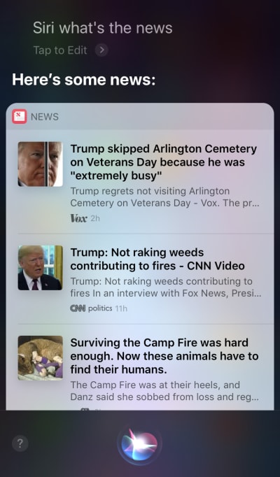
Apple Siri and Google Assistant are prime examples of voice agents. For such systems, the voice acts more like an enhancement for the existing GUI. In many cases, the agent acts as the first step in the user’s journey: The user triggers the voice agent and provides a command via voice, while all other interactions are done using the touchscreen. For example, when you ask Siri a question, it will provide answers in the format of a list, and you need to interact with that list. As a result, the user experience becomes fragmented — we use voice to initiate the interaction and then shift to touch to continue it.
Siri executes a voice command to search for news, but then requires users to touch the screen in order to read the items. (Large preview)
Voice-Only Devices
These devices don’t have visual displays; users rely on audio for both input and output. Amazon Echo and Google Home smart speakers are prime examples of products in this category. The lack of a visual display is a significant constraint on the device’s ability to communicate information and options to the user. As a result, most people use these devices to complete simple tasks, such as playing music and getting answers to simple questions.
Amazon Echo Dot is a screen-less device. (Large preview)
Voice-First Devices
With voice-first systems, the device accepts user input primarily via voice commands, but also has an integrated screen display. It means that voice is the primary user interface, but not the only one. The old saying, “A picture is worth a thousand words” still applies to modern voice-enabled systems. The human ?brain? has incredible? ?image?-?processing? abilities — we? ?can? ?understand? ?complex? ?information? ?faster? ?when we? ?see? ?it? ?visually. Compared to voice-only devices, voice-first devices allow users to access a larger amount of information and make many tasks much easier.
The Amazon Echo Show is a prime example of a device that employs a voice-first system. Visual information is gradually incorporated as part of a holistic system — the screen is not loaded with app icons; rather, the system encourages users to try different voice commands (suggesting verbal commands such as, “Try ‘Alexa, show me the weather at 5:00 pm’”). The screen even makes common tasks such as checking a recipe while cooking much easier — users don’t need to listen carefully and keep all of the information in their heads; when they need the information, they simply look at the screen.
Amazon Echo Show is basically an Amazon Echo speaker with a screen. (Large preview)
Introducing Multimodal Interfaces
When it comes to using voice in UI design, don’t think of voice as something you can use alone. Devices such as Amazon Echo Show include a screen but employ voice as the primary input method, making for a more holistic user experience. This is the first step towards a new generation of user interfaces: multimodal interfaces.
A multimodal interface is an interface that blends voice, touch, audio and different types of visuals in a single, seamless UI. Amazon Echo Show is an excellent example of a device that takes full advantage of a voice-enabled multimodal interface. When users interact with Show, they make requests just as they would with a voice-only device; however, the response they receive will likely be multimodal, containing both voice and visual responses.
Multimodal products are more complex than products that rely only on visuals or only on voice. Why should anyone create a multimodal interface in the first place? To answer that question, we need to step back and see how people perceive the environment around them. People have five senses, and the combination of our senses working together is how we perceive things. For example, our senses work together when we are listening to music at a live concert. Remove one sense (for example, hearing), and the experience takes on an entirely different context.
For too long, we’ve thought about the user experience as exclusively either visual or gestural design. It’s time to change this thinking. Multimodal design is a way to think about and design for experiences that connect our sensory abilities together.
Multimodal interfaces feel like ?a more? ?human? ?way? for ?user? ?and? machine to communicate. They open up new opportunities for deeper interactions. And today, it’s much easier to design multimodal interfaces because the technical limitations that in the past constrained interactions with products are being erased.
The Difference Between A GUI And Multimodal Interface
The key difference here is that multimodal interfaces like Amazon Echo Show sync voice and visual interfaces. As a result, when we’re designing the experience, the voice and visuals are no longer independent parts; they are integral parts of the experience that the system provides.
Visual And Voice Channel: When To Use Each
It’s important to think about voice and visuals as channels for input and output. Each channel has its own strengths and weaknesses.
Let’s start with the visuals. It’s clear that some information is just easier to understand when we see it, rather than when we hear it. Visuals work better when you need to provide:
a long lists of options (reading a long list will take a lot of time and be difficult to follow);
data-heavy information (such as diagrams and graphs);
product information (for example, products in online shops; most likely, you would want to see a product before buying) and product comparison (as with the long list of options, it would be hard to provide all of the information using only voice).
For some information, however, we can easily rely on verbal communication. Voice might be the right fit for the following cases:
user commands (voice is an efficient input modality, allowing users to give commands to the system quickly and bypassing complex navigation menus);
simple user instructions (for example, a routine check on a prescription);
warnings and notifications (for example, an audio warning paired with voice notifications during driving).
While these are a few typical cases of visual and voice combined, it’s important to know that we can’t separate the two from each other. We can create a better user experience only when both voice and visuals work together. For example, suppose we want to purchase a new pair of shoes. We could use voice to request from the system, “Show me New Balance shoes.” The system would process your request and visually provide product information (an easier way for us to compare shoes).
What You Need To Know To Design Voice-Enabled, Multimodal Interfaces
Voice is one of the most exciting challenges for UX designers. Despite its novelty, the fundamental rules for designing voice-enabled, multimodal interface are the same as those we use to create visual designs. Designers should care about their users. They should aim to reduce friction for the user by solving their problems in efficient ways and prioritize clarity to make the user’s choices clear.
But there are some unique design principles for multimodal interfaces as well.
Make Sure You Solve The Right Problem
Design should solve problems. But it’s vital to solve the right problems; otherwise, you could spend a lot of time creating an experience that doesn’t bring much value to users. Thus, make sure you’re focused on solving the right problem. Voice interactions should make sense to the user; users should have a compelling reason to use voice over other methods of interaction (such as clicking or tapping). That’s why, when you create a new product — even before starting the design — it’s essential to conduct user research and determine whether voice would improve the UX.
Start with creating a user journey map. Analyze the journey map and find places where including voice as a channel would benefit the UX.
Find places in the journey where users might encounter friction and frustration. Would using voice reduce the friction?
Think about the context of the user. Would voice work for a particular context?
Think about what is uniquely enabled by voice. Remember the unique benefits of using voice, such as hands-free and eyes-free interaction. Could voice add value to the experience?
Create Conversational Flows
Ideally, the interfaces you design should require zero interaction cost: Users should be able to fulfill their needs without spending extra time on learning how to interact with the system. This happens only when voice interaction resemble a real conversation, not a system dialog wrapped in the format of voice commands. The fundamental rule of a good UI is simple: Computers should adapt to humans, not the other way around.
People rarely have flat, linear conversations (conversations that only last one turn). That’s why, to make interaction with a system feel like a live conversation, designers should focus on creating conversational flows. Each conversational flow consists of dialogs — the pathways that occur between the system and the user. Each dialog would include the system’s prompts and the user’s possible responses.
A conversational flow can be presented in the form of a flow diagram. Each flow should focus on one particular use case (for example, setting an alarm clock using a system). For most dialogs in a flow, it’s vital to consider error paths, when things go off the rails.
Each voice command of the user consists of three key elements: intent, utterance and slot.
Intent is the objective of the user’s interaction with a voice-enabled system. An intent is just a fancy way of defining the purpose behind a set of words. Each interaction with a system brings the user some utility. Whether it’s information or an action, the utility is in intent. Understanding the user’s intent is a crucial part of voice-enabled interfaces. When we design VUI, we don’t always know for sure what a user’s intent is, but we can guess it with high accuracy.
Utterance is how the user phrases their request. Usually, users have more than one way to formulate a voice command. For example, we can set an alarm clock by saying “Set alarm clock to 8 am”, or “Alarm clock 8 am tomorrow” or even “I need to wake up at 8 am.” Designers need to consider every possible variation of utterance.
Slots are variables that users use in a command. Sometimes users need to provide additional information in the request. In our example of the alarm clock, “8 am” is a slot.
Don’t Put Words In The User’s Mouth
People know how to talk. Don’t try to teach them commands. Avoid phrases like, “To send a meeting appointment, you need to say ‘Calendar, meetings, create a new meeting’.” If you have to explain commands, you need to reconsider the way you’re designing the system. Always aim for natural language conversation, and try to accommodate diverse speaking styles).
Strive For Consistency
You need to achieve consistency in language and voice across contexts. Consistency will help to build familiarity in interactions.
Always Provide Feedback
Visibility of system status is one of the fundamental principles of good GUI design. The system should always keep users informed of what is going on through appropriate feedback within a reasonable time. The same rule applies to VUI design.
Make the user aware that the system is listening. Show visual indicators when the device is listening or processing the user’s request. Without feedback, the user can only guess whether the system is doing something. That’s why even voice-only devices such as Amazon Echo and Google Home give us nice visual feedback (flashing lights) when they are listening or searching for an answer.
Provide conversational markers. Conversational markers tell the user where they’re at in the conversation.
Confirm when a task is completed. For example, when users ask the voice-enabled smart home system “Turn off the lights in the garage”, the system should let the user know that the command has been successfully executed. Without confirmation, users will need to walk into the garage and check the lights. It defeats the purpose of the smart home system, which is to make the user’s life easier.
Avoid Long Sentences
When designing a voice-enabled system, consider the way you provide information to users. It’s relatively easy to overwhelm users with too much information when you use long sentences. First, users can’t retain a lot of information in their short-term memory, so they can easily forget some important information. Also, audio is a slow medium — most people can read much faster than they can listen.
Be respectful of your user’s time; don’t read out long audio monologues. When you’re designing a response, the fewer words you use, the better. But remember that you still need to provide enough information for the user to complete their task. Thus, if you cannot summarize an answer in a few words, display it on the screen instead.
Provide Next Steps Sequentially
Users can be overwhelmed not only by long sentences, but also their number of options at one time. It’s vital to break down the process of interaction with a voice-enabled system into bite-sized chunks. Limit the number of choices the user has at any one time, and make sure they know what to do at every moment.
When designing a complex voice-enabled system with a lot of features, you can use the technique of progressive disclosure: Present only the options or information necessary to complete the task.
Have A Strong Error-Handling Strategy
Of course, the system should prevent errors from occurring in the first place. But no matter how good your voice-enabled system is, you should always design for the scenario in which the system doesn’t understand the user. Your responsibility is to design for such cases.
Here are a few practical tips for creating a strategy:
Don’t blame the user. In conversation, there are no errors. Try to avoid reponses like, “Your answer is incorrect.”
Provide error-recovery flows. Provide an option for back-and-forths in a conversation, or even to exit the system, without losing important information. Save the user’s state in the journey, so that they can re-engage with the system right from where they left off.
Let users replay information. Provide an option to make the system repeat the question or answer. This might be helpful for complex questions or answers where it would be hard for the user to commit all of the information to their working memory.
Provide stop wording. In some cases, the user will not be interested in listening to an option and will want the system to stop talking about it. Stop wording should help them do just that.
Handle unexpected utterances gracefully. No matter how much you invest in the design of a system, there will be situations when the system doesn’t understand the user. It’s vital to handle such cases gracefully. Don’t be afraid to let the system admit a lack of understanding. The system should communicate what it has understood and provide helpful reprompts.
Use analytics to improve your error strategy. Analytics can help you identify wrong turns and misinterpretations.
Keep Track Of Context
Make sure the system understands the context of the user’s input. For example, when someone says that they want to book a flight to San Francisco next week, they might refer to “it” or “the city” during the conversational flow. The system should remember what was said and be able to match it to the newly received information.
Learn About Your Users To Create More Powerful Interactions
A voice-enabled system becomes more sophisticated when it uses additional information (such as user context or past behavior) to understand what the user wants. This technique is called intelligent interpretation, and it requires that the system actively learn about the user and be able to adjust their behavior accordingly. This knowledge will help the system to provide answers even to complex questions, such as “What gift should I buy for my wife’s birthday?”
Give Your VUI A Personality
Every voice-enabled system has an emotional impact on the user, whether you plan for it or not. People associate voice with humans rather than machines. According to Speak Easy Global Edition research, 74% of regular users of voice technology expect brands to have unique voices and personalities for their voice-enabled products. It’s possible to build empathy through personality and achieve a higher level of user engagement.
Try to reflect your unique brand and identity in the voice and tone you present. Construct a persona of your voice-enabled agent, and rely on this persona when creating dialogs.
Build Trust
When users don’t trust a system, they don’t have the motivation to use it. That’s why building trust is a requirement of product design. Two factors have a significant impact on the level of trust built: system capabilities and valid outcome.
Building trust starts with setting user expectations. Traditional GUIs have a lot of visual details to help the user understand what the system is capable of. With a voice-enabled system, designers have fewer tools to rely on. Still, it’s vital to make the system naturally discoverable; the user should understand what is and isn’t possible with the system. That’s why a voice-enabled system might require user onboarding, where it talks about what the system can do or what it knows. When designing onboarding, try to offer meaningful examples to let people know what it can do (examples work better than instructions).
When it comes to valid outcomes, people know that voice-enabled systems are imperfect. When a system provides an answer, some users might doubt that the answer is correct. this happens because users don’t have any information about whether their request was correctly understood or what algorithm was used to find the answer. To prevent trust issues, use the screen for supporting evidence — display the original query on the screen — and provide some key information about the algorithm. For example, when a user asks, “Show me the top five movies of 2018”, the system can say, “Here are top five movies of 2018 according to the box office in the US”.
Don’t Ignore Security And Data Privacy
Unlike mobile devices, which belong to the individual, voice devices tend to belong to a location, like a kitchen. And usually, there are more than one person in the same location. Just imagine that someone else can interact with a system that has access to all of your personal data. Some VUI systems such as Amazon Alexa, Google Assistant and Apple Siri can recognize individual voices, which adds a layer of security to the system. Still, it doesn’t guarantee that the system will be able to recognize users based on their unique voice signature in 100% of cases.
Voice recognition is continually improving, and it will be hard or nearly impossible to imitate a voice in the near future. However, in the current reality, it’s vital to provide an additional authentication layer to reassure the user that their data is safe. If you design an app that works with sensitive data, such as health information or banking details, you might want to include an extra authentication step, such as a password or fingerprint or face recognition.
Conduct Usability Testing
Usability testing is a mandatory requirement for any system. Test early, test often should be a fundamental rule of your design process. Gather user research data early on, and iterate your designs. But testing multimodal interfaces has its own specifics. Here are two phases that should be taken into account:
Ideation phase Test drive your sample dialogs. Practice reading sample dialogs out loud. Once you have some conversational flows, record both sides of the conversation (the user’s utterances and the system’s responses), and listen to the recording to understand whether they sound natural.
Early stages of product development (testing with lo-fi prototypes) Wizard of Oz testing is well-suited to testing conversational interfaces. Wizard of Oz testing is a type of testing in which a participant interacts with a system that they believe is operated by a computer but is in fact operated by a human. The test participant formulates a query, and a real person responds on the other end. This method gets its name from the book The Wonderful Wizard of Oz by Frank Baum. In the book, an ordinary man hides behind a curtain, pretending to be a powerful wizard. This test allows you to map out every possible scenario of interaction and, as a result, create more natural interactions. Say Wizard is a great tool to help you run a Wizard of Oz voice-interface test on macOS.
Designing For Voice: The ‘Wizard Of Oz’ Method (Watch on Vimeo)
Later stages of product development (testing with hi-fi prototypes) In usability testing of graphical user interfaces, we often ask users to speak out loud when they interact with a system. For a voice-enabled system, that’s not always possible because the system would be listening to that narration. So, it might be better to observe the user’s interactions with the system, rather than ask them to speak out loud.
How To Create A Multimodal Interface Using Adobe XD
Now that you have a solid understanding of what a multimodal interface is and what rules to remember when designing them, we can discuss how to make a prototype of a multimodal interface.
Prototyping is a fundamental part of the design process. Being able to bring an idea to life and share it with others is extremely important. Until now, designers who wanted to incorporate voice in prototyping had few tools to rely on, the most powerful of which was a flowchart. Picturing how a user would interact with a system required a lot of imagination from someone looking at the flowchart. With Adobe XD, designers now have access to the medium of voice and can use it in their prototypes. XD seamlessly connects screen and voice prototyping in one app.
New Experiences, Same Process
Even though voice is a totally different medium than visual, the process of prototyping for voice in Adobe XD is pretty much the same as prototyping for a GUI. The Adobe XD team integrates voice in a way that will feel natural and intuitive for any designer. Designers can use voice triggers and speech playback to interact with prototypes:
Voice triggers start an interaction when a user says a particular word or phrase (utterance).
Speech playback gives designers access to a text-to-speech engine. XD will speak words and sentences defined by a designer. Speech playback can be used for many different purposes. For example, it can act as an acknowledgment (to reassure users) or as guidance (so users know what to do next).
The great thing about XD is that it doesn’t force you to learn the complexities of each voice platform.
Enough words — let’s see how it works in action. For all of the examples you’ll see below, I’ve used artboards created using Adobe XD UI kit for Amazon Alexa (this is a link to download the kit). The kit contains all of the styles and components needed to create experiences for Amazon Alexa.
Let’s go into prototyping mode to add in some voice interactions. We’ll start with voice triggers. Along with triggers such as tap and drag, we are now able to use voice as a trigger. We can use any layers for voice triggers as long as they have a handle leading to another artboard. Let’s connect the artboards together.
Once we do that, we’ll find a new “Voice” option under the “Trigger”. When we select this option, we’ll see a “Command” field that we can use to enter an utterance — this is what XD will actually be listening for. Users will need to speak this command to activate the trigger.
Setting a voice trigger in Adobe XD. (Large preview)
That’s all! We’ve defined our first voice interaction. Now, users can say something, and a prototype will respond to it. But we can make this interaction much more powerful by adding speech playback. As I mentioned previously, speech playback allows a system to speak some words.
Select an entire second artboard, and click on the blue handle. Choose a “Time” trigger with a delay and set it to 0.2s. Under the action, you’ll find “Speech Playback”. We’ll write down what the virtual assistant speaks back to us.
We’re ready to test our prototype. Select the first artboard, and clicking the play button in the top right will launch a preview window. When interacting with voice prototyping, make sure your mic is on. Then, hold down the spacebar to speak the voice command. This input triggers the next action in the prototype.
Use Auto-Animate To Make The Experience More Dynamic
Animation brings a lot of benefits to UI design. It serves clear functional purposes, such as:
communicating the spatial relationships between objects (Where does the object come from? Are those objects related?);
communicating affordance (What can I do next?)
But functional purposes aren’t the only benefits of animation; animation also makes the experience more alive and dynamic. That’s why UI animations should be a natural part of multimodal interfaces.
With “Auto-Animate” available in Adobe XD, it becomes much easier to create prototypes with immersive animated transitions. Adobe XD does all the hard work for you, so you don’t need to worry about it. All you need to do to create an animated transition between two artboards is simply duplicate an artboard, modify the object properties in the clone (properties such as size, position and rotation), and apply an Auto-Animate action. XD will automatically animate the differences in properties between each artboard.
Let’s see how it works in our design. Suppose we have an existing shopping list in Amazon Echo Show and want to add a new object to the list using voice. Duplicate the following artboard:
Let’s introduce some changes in the layout: Add a new object. We aren’t limited here, so we can easily modify any properties such as text attributes, color, opacity, position of the object — basically, any changes we make, XD will animate between them.
Two artboards: our original shopping list and its duplicate with a new item. (Large preview)
When you wire two artboards together in prototype mode using Auto-Animate in “Action”, XD will automatically animate the differences in properties between each artboard.
And here’s how the interaction will look to users:
One crucial thing that requires mentioning: Keep the names of all of the layers the same; otherwise, Adobe XD won’t be able to apply the auto-animation.
Conclusion
We’re at the dawn of a user interface revolution. A new generation of interfaces — multimodal interfaces — not only will give users more power, but will also change the way users interact with systems. We will probably still have displays, but we won’t need keyboards to interact with the systems.
At the same time, the fundamental requirements for designing multimodal interfaces won’t be much different from those of designing modern interfaces. Designers will need to keep the interaction simple; focus on the user and their needs; design, prototype, test and iterate.
And the great thing is that you don’t need to wait to start designing for this new generation of interfaces. You can start today.
This article is part of the UX design series sponsored by Adobe. Adobe XD tool is made for a fast and fluid UX design process, as it lets you go from idea to prototype faster. Design, prototype and share — all in one app. You can check out more inspiring projects created with Adobe XD on Behance, and also sign up for the Adobe experience design newsletter to stay updated and informed on the latest trends and insights for UX/UI design.
There are two opposing views on using non-polyfillable new web features that I find are both equally common in our industry:
Websites don’t need to look the same in every browser. The concept of progressive enhancement helps with that. There are tools, even native language features, that help with this.
If browser support isn’t where I want it to be, it’s just exotic eye candy for demos and not to be used.
I’m not sure I’d say either one of these is more or less correct than the other.
I also imagine it doesn’t come as much of surprise that I support the thinking behind #1. It’s perfectly possible to design and implement things that behave differently in different browsers and conditions. That’s essentially what responsive design is, and that’s pretty much the entire internet now.
The backbone of progressive enhancement is starting with a working foundation that works everywhere and layering design and functionality on top of that, when possible. There are even native language features to support the idea. @supports rules allow us to write CSS that can do something if a feature is supported and do something else if it isn’t.
This is the entire use case for Modernizr and it has 22,804 stars.
I don’t want to argue against progressive enhancement. Remember, I just said I support that thinking. But I do have some empathy for people and teams that choose not to go there, and end up developing more of a #2 attitude.
It is a bit more work to develop and design features that work in different ways. It might be work that is absolutely worth doing. Or it might not. Either way, it does complicate things. It’s more code, it requires more attention and testing, and it’s a bit harder to reason. It’s technical debt.
Let me be preemptively defensive again: technical debt can be fine, and even intentional. We all incur it in everything we build. My point is that it is helpful to be smart about it and take on an amount of technical debt that is feasible for you to look after in perpetuity.
You might argue that building on a progressive enhancement foundation is, in a sense, less technical debt because you’re building on such a sturdy foundation that less testing and constant tending to is required. Perhaps!
I do get behaving like a #2. It feels safer. It feels like you’re being cautious and responsible. “Hey that’s neat,” you think. “I’ll revisit it in a few years to see if I can use it for real.” I might argue that 1) that’s no fun and 2) almost counter-intuitively, it means you aren’t willing to take a progressive enhancement approach which may make your code ultimately more frail.
It depends, I suppose. It depends on what exactly you’re trying to do. It depends on the weight of that techinical debt. It depends on the team and the rate of developer churn. It depends on documentation. It depends on testing and QA.
This is pretty wild: Adrian Roselli has made a series of rather complex Venn diagrams using nothing but CSS. With a combination of the Firefox dev inspector, plus a mixture of CSS Grid and the shape-outside property, it’s possible to do this and without a ton of hacks, too.
I also think it’s super cute that Adrian has made the code snippets in this post look like the display from an old monitor, like the one Chris recently broke down.


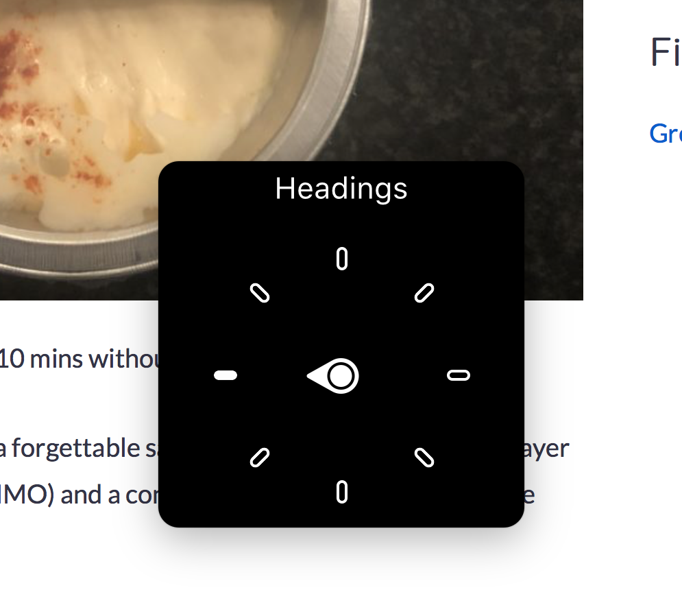


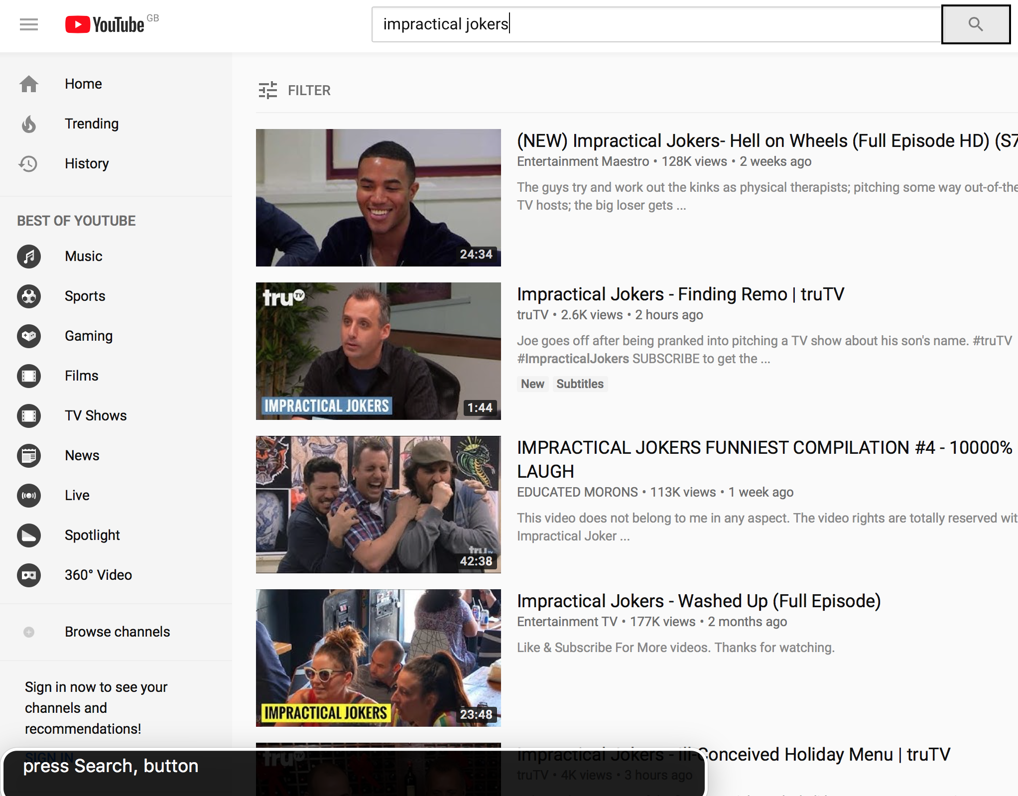


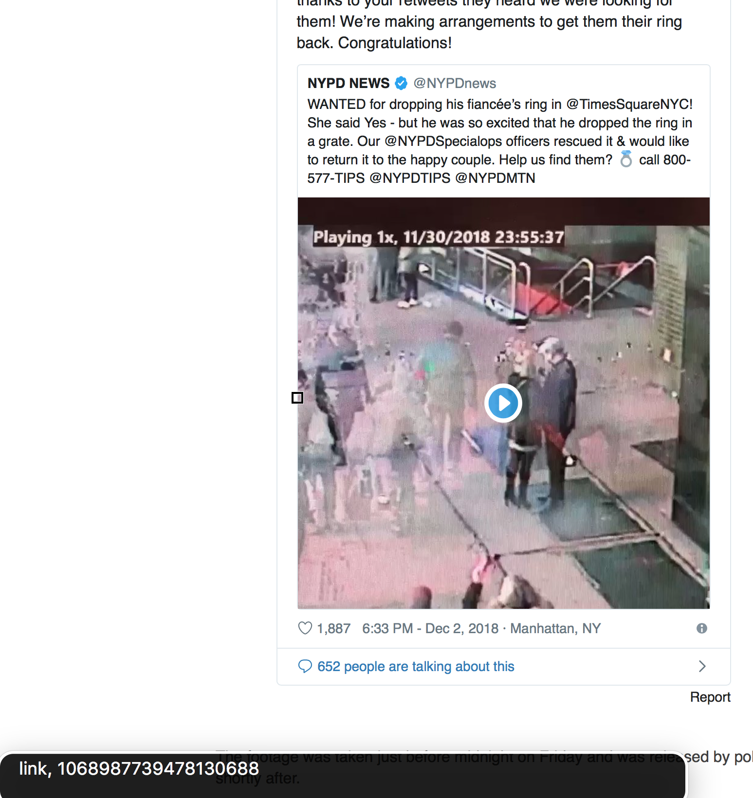


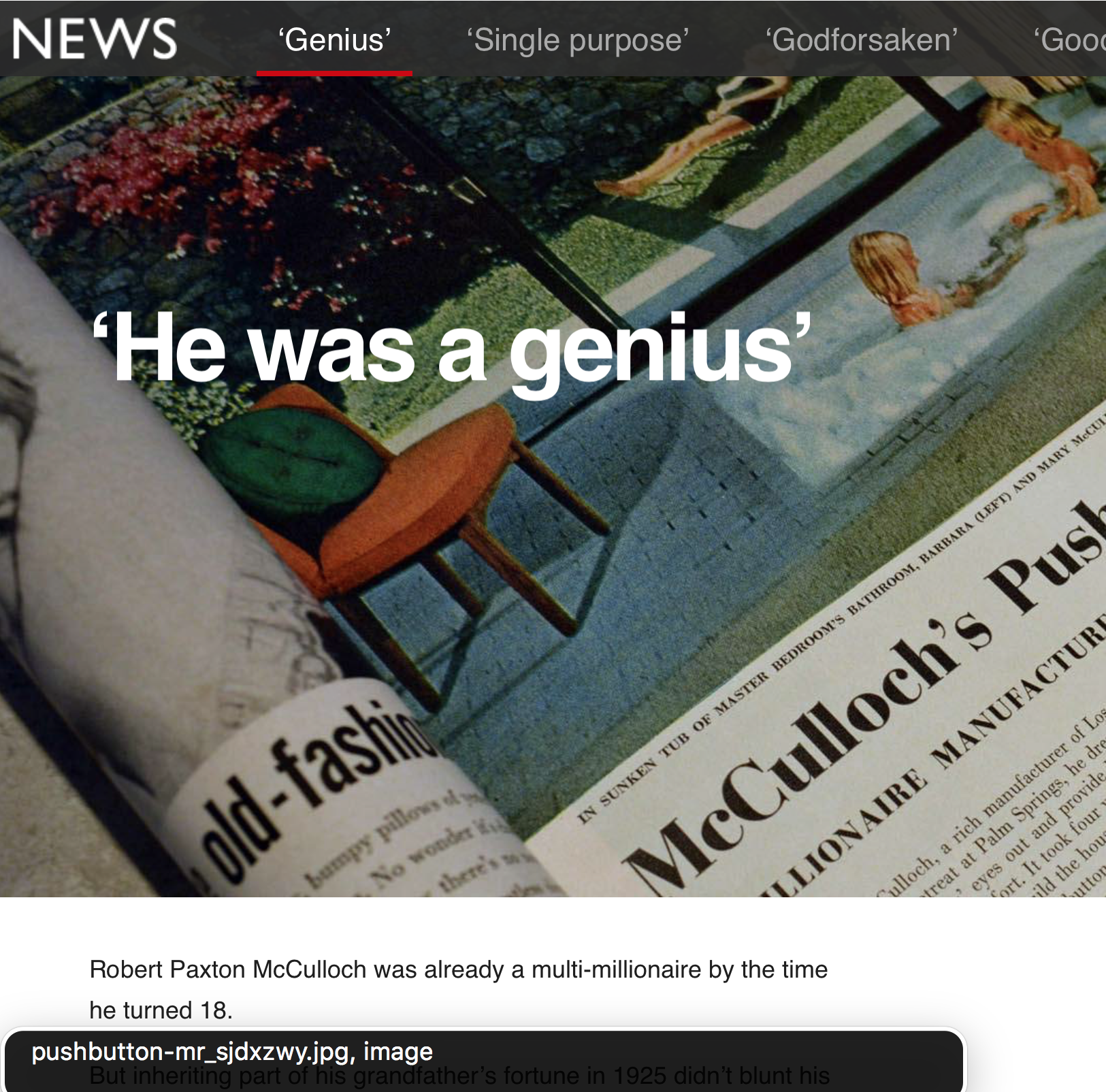


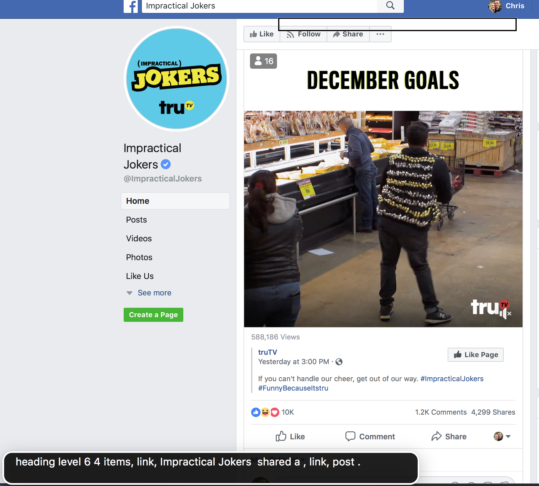
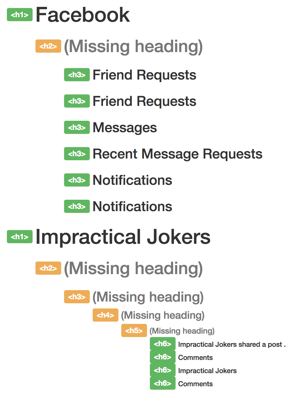


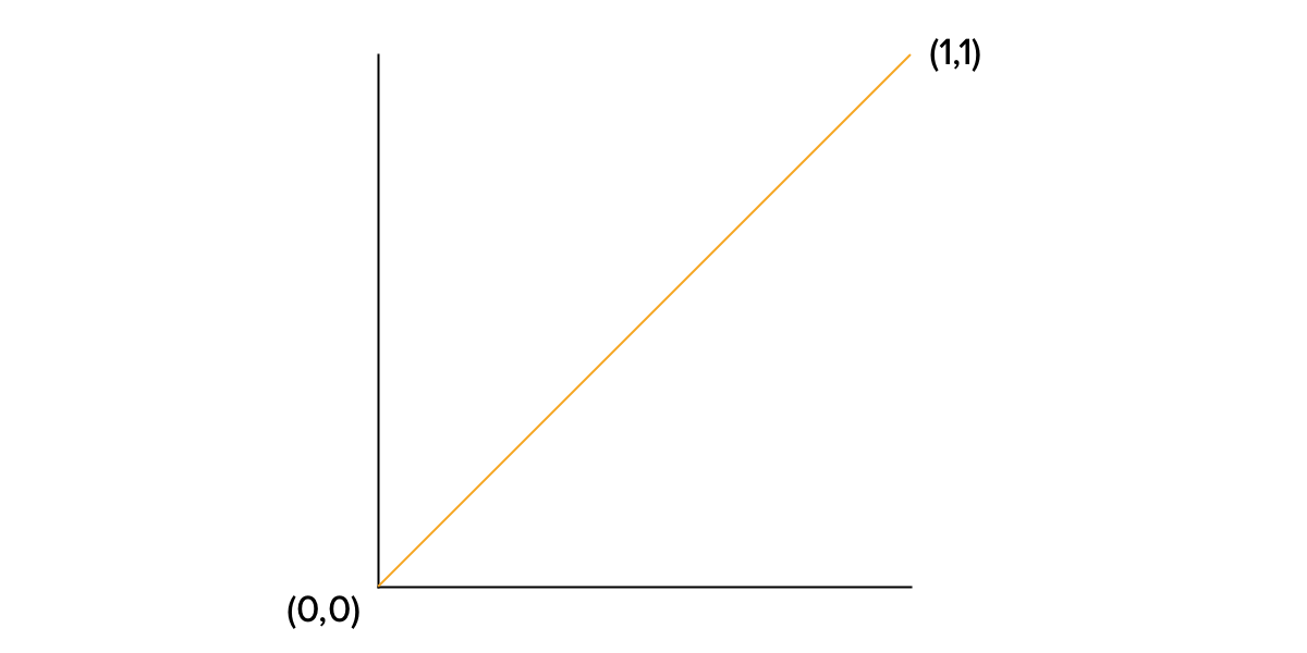
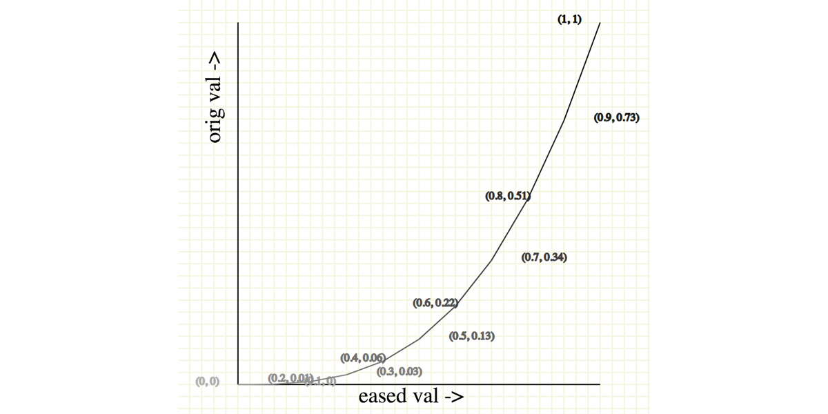
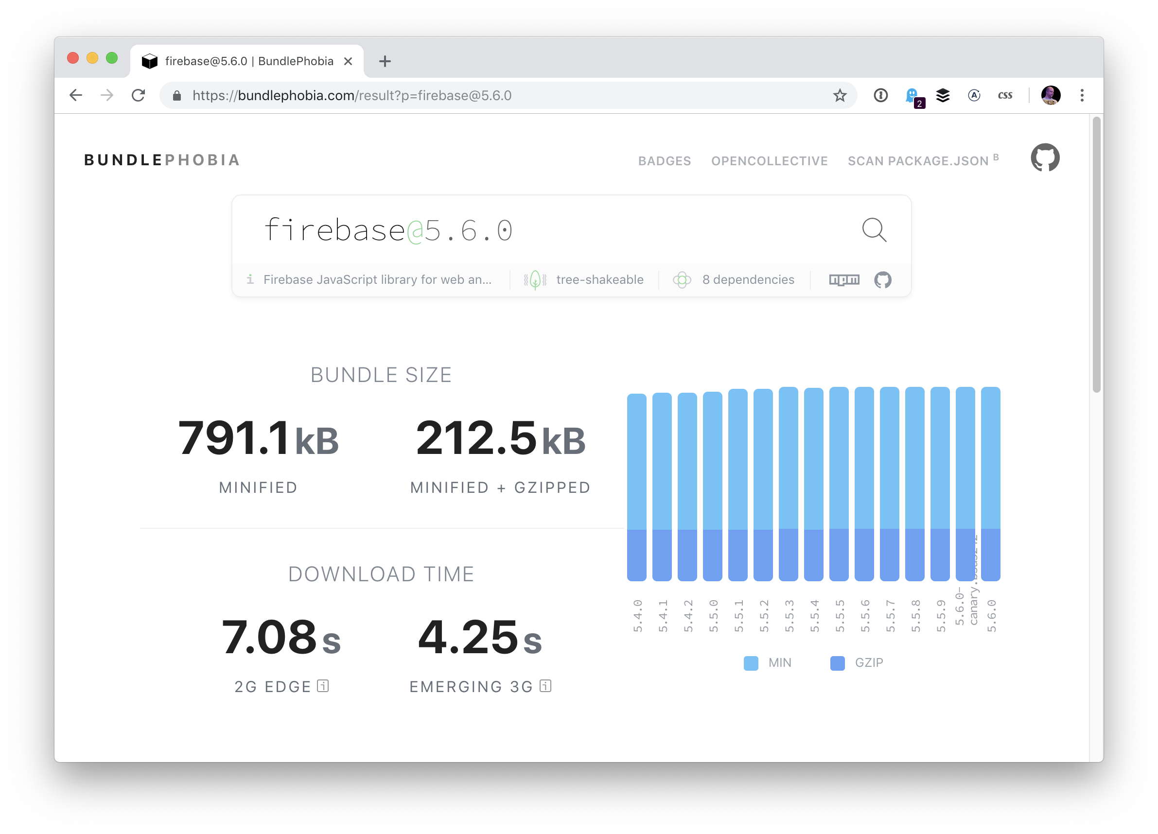
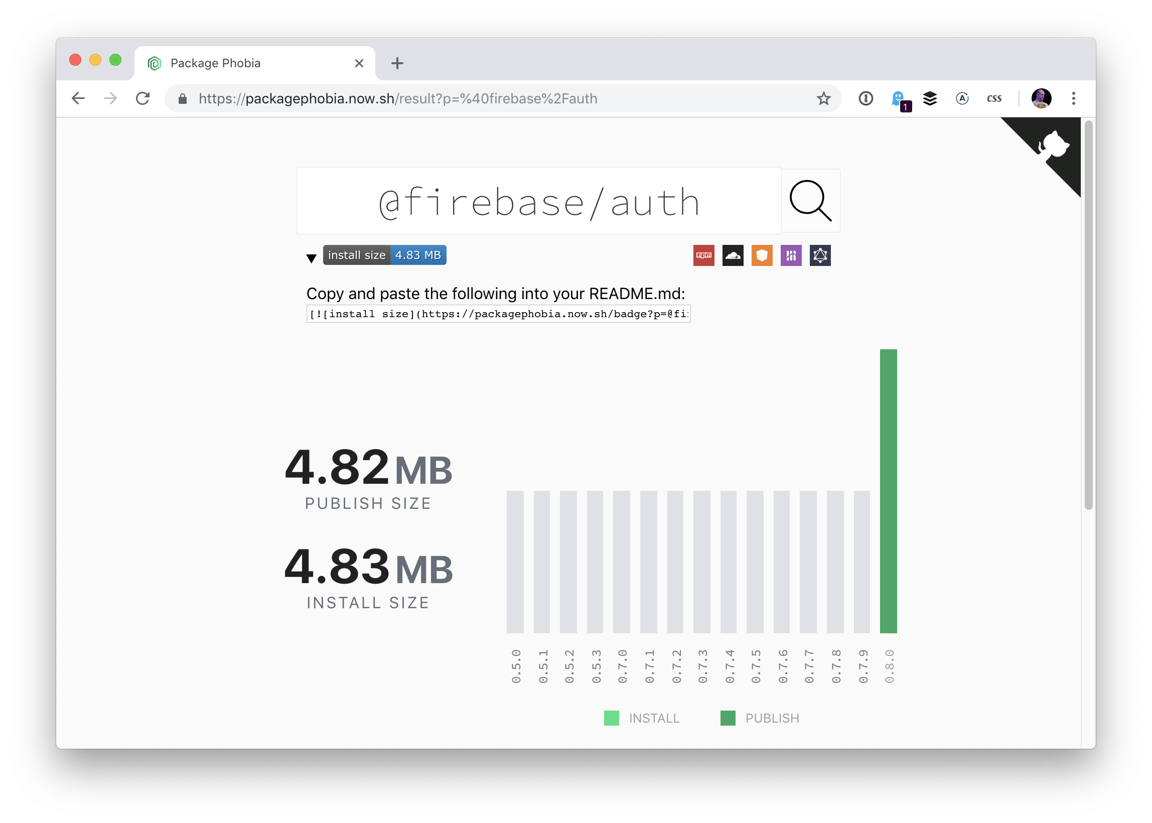
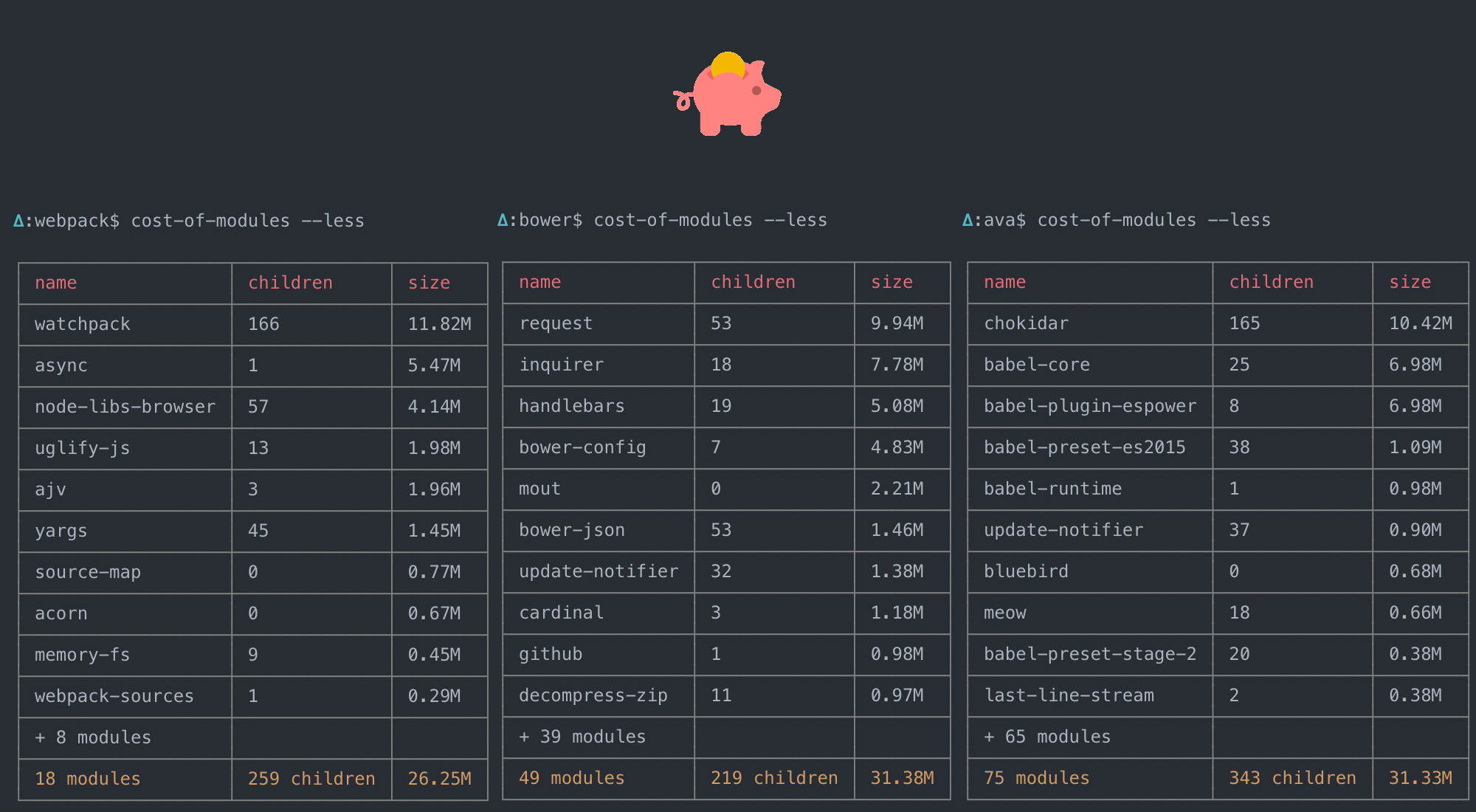

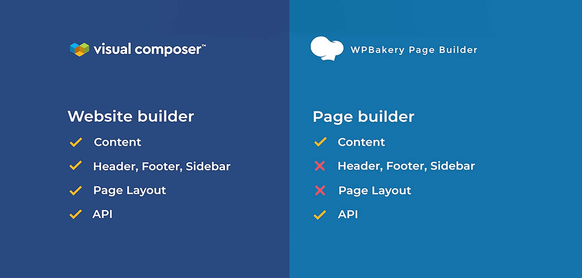
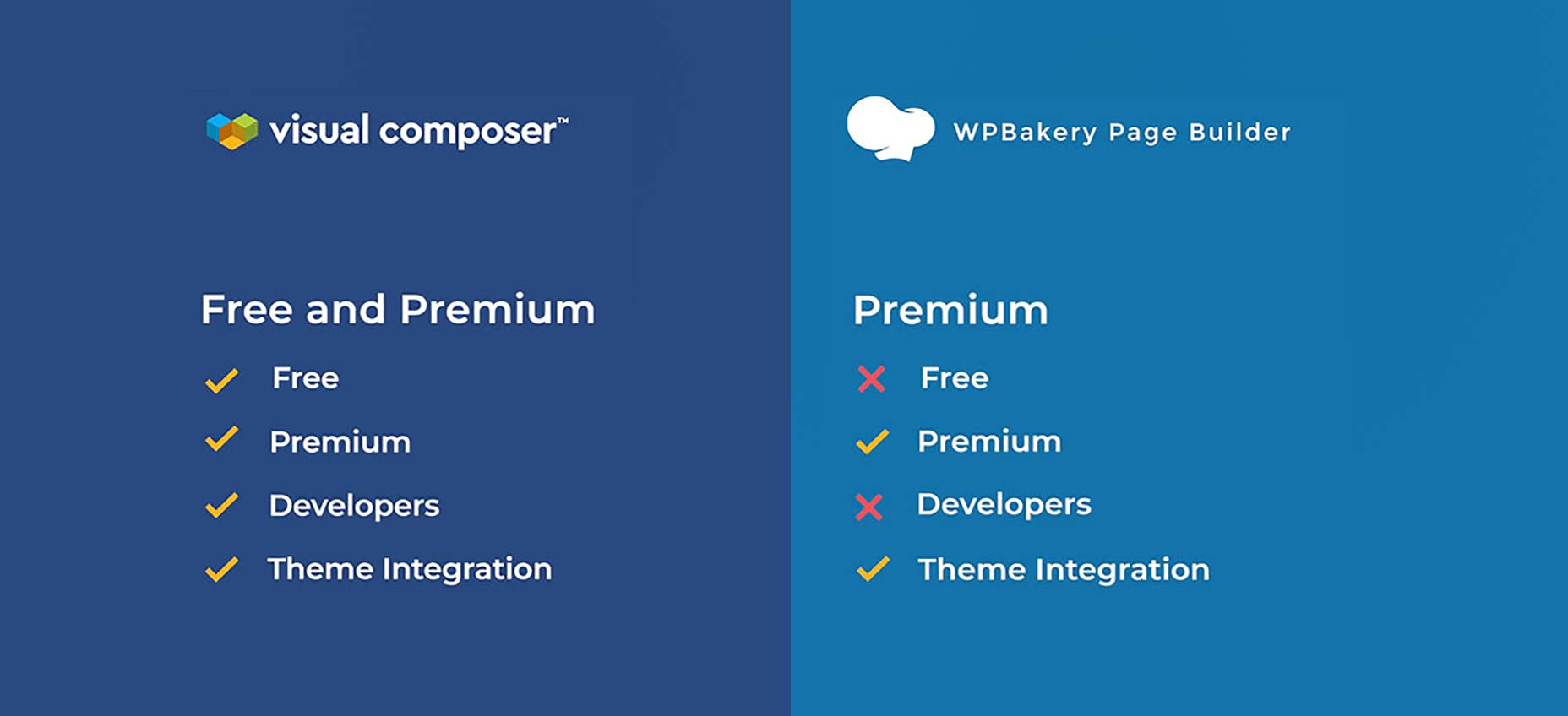